Category Archives: Controlled Conditions

Filters

Author:
Category:

Final Images and display ideas – Naomi White inspired Photographs (Anthropocene)

Final Images

Image Gallery

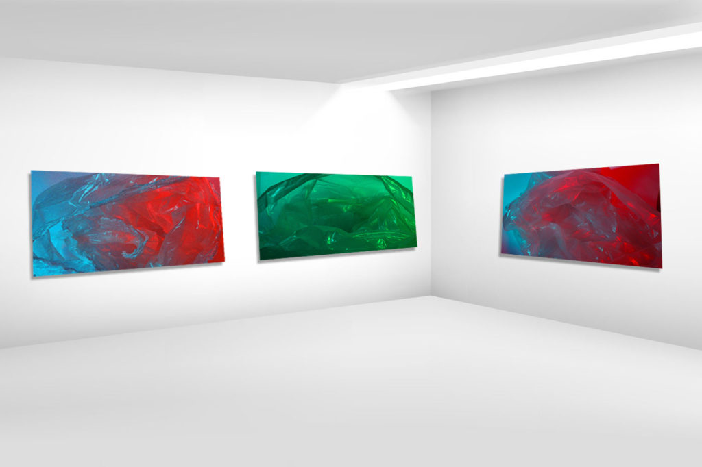
Ideas for displaying

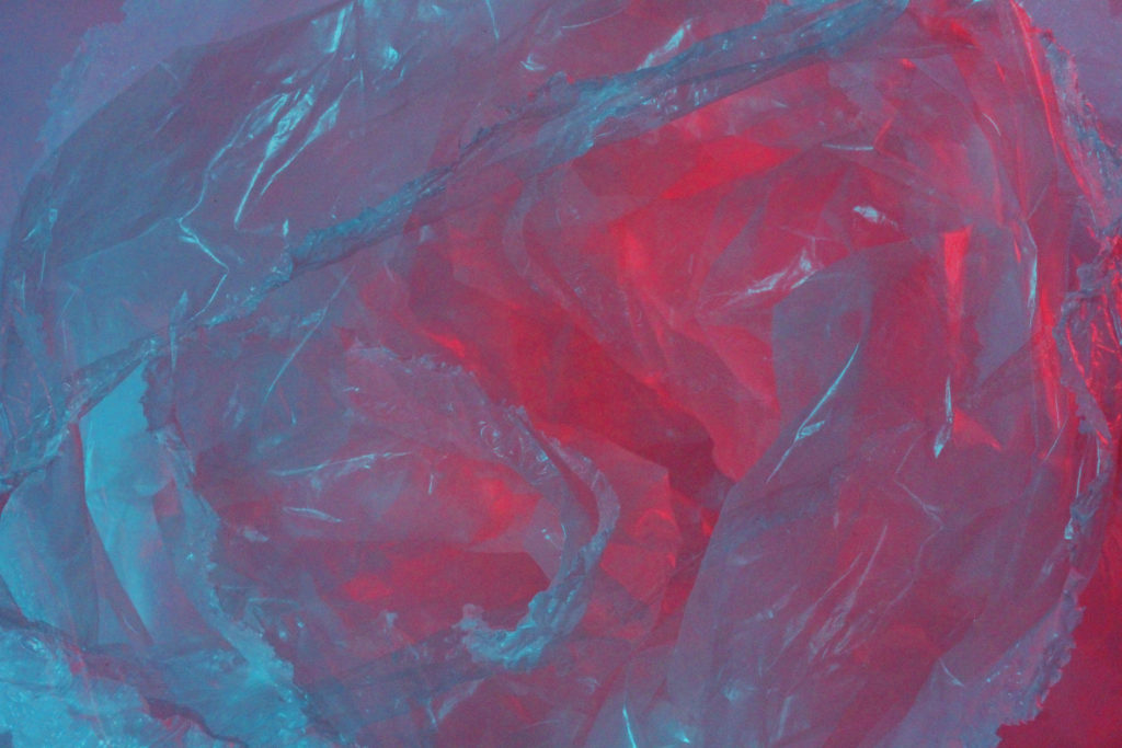
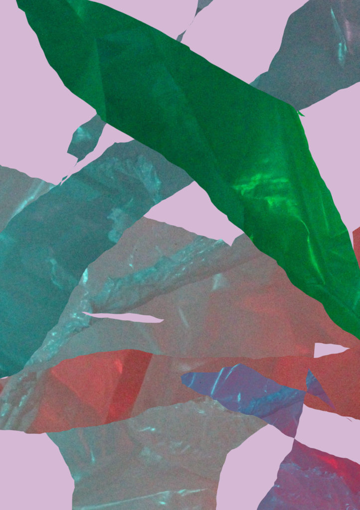
To display these images I could print them onto clear or coloured acetate, which is similar to the material taken in the original image. I think clear acetate would keep the colours in the similar tones as they are in my final edits, whereas coloured acetate may alter the colours and tones of the final displayed image.

I could also print the images out onto printing paper and burn the edges of the paper. I feel like this would reinforce the original idea of Anthropocene, with humans causing more harm to the environment rather than helping it.

Anthropocene – Photographer Case Studies

Andrew Moore

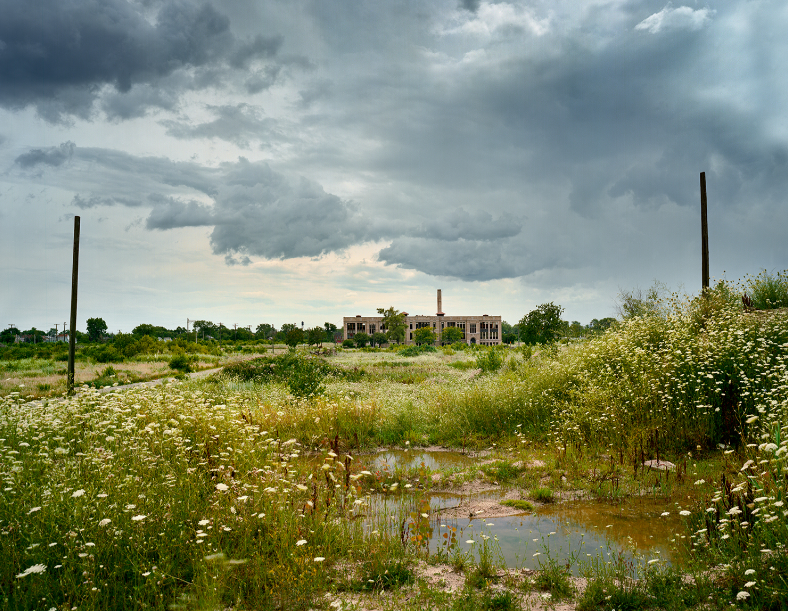
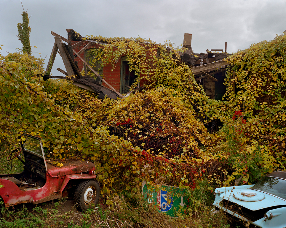
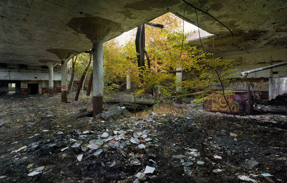
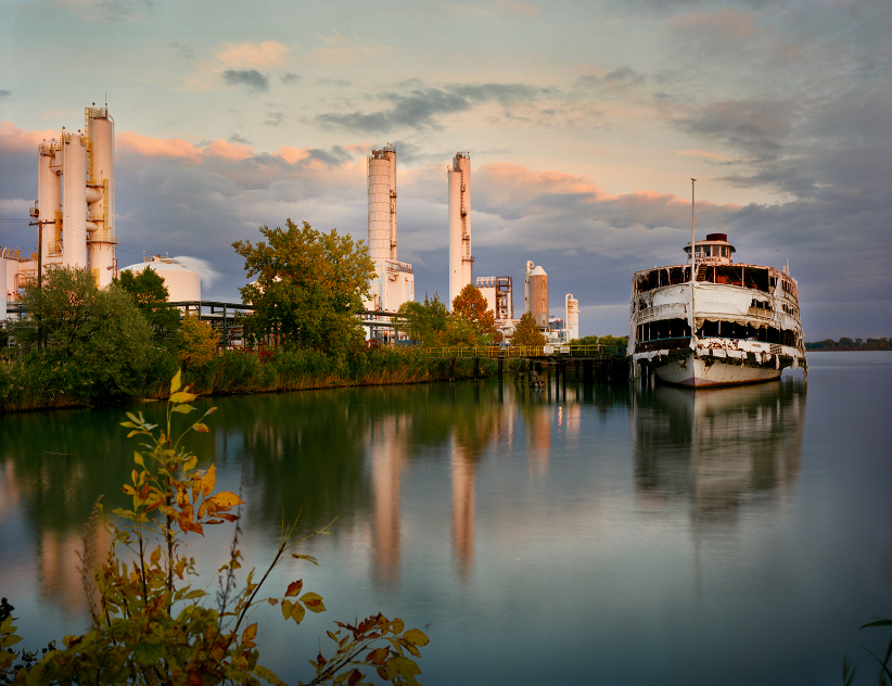
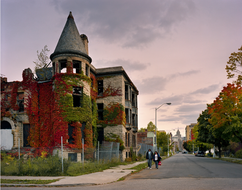
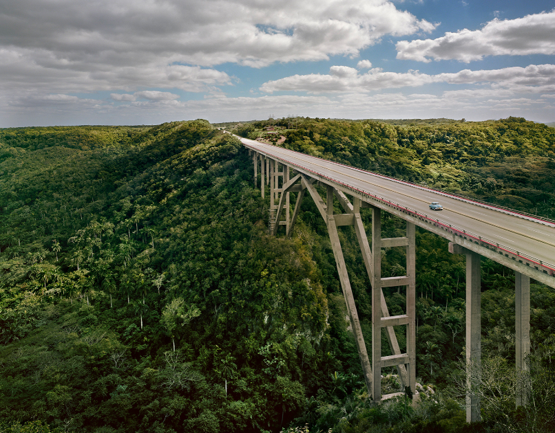
Andrew Moore is an American photographer, born in 1957, who documents the effect of time on natural and built landscapes. His series includes work made in Cuba, Russia, Bosnia, Times Square, Detroit, The Great Plains, and most recently, the American South. Moore was a lecturer on photography in the Visual Arts Program at Princeton University from 2001 to 2010. Presently he teaches a graduate seminar in the MFA Photography Video and Related Media program at the School of Visual Arts in New York City. He captures his images in a journalistic, documentary type fashion, photographing landscapes where man’s impact on the surroundings is being challenged by the power of nature. I felt drawn to Moore’s work due to his talent in capturing a sort of mid-stage between industrialization and natural landscapes, the observer can clearly see elements of nature in his images- however there is also a sense of impending urbanisation creeping into each image, may it be in the background or the main focus. I wish to take inspiration from this element of Moore’s work and portray the idea of ‘nature fighting back’ in one of my photoshoots.

Edward Burtynsky

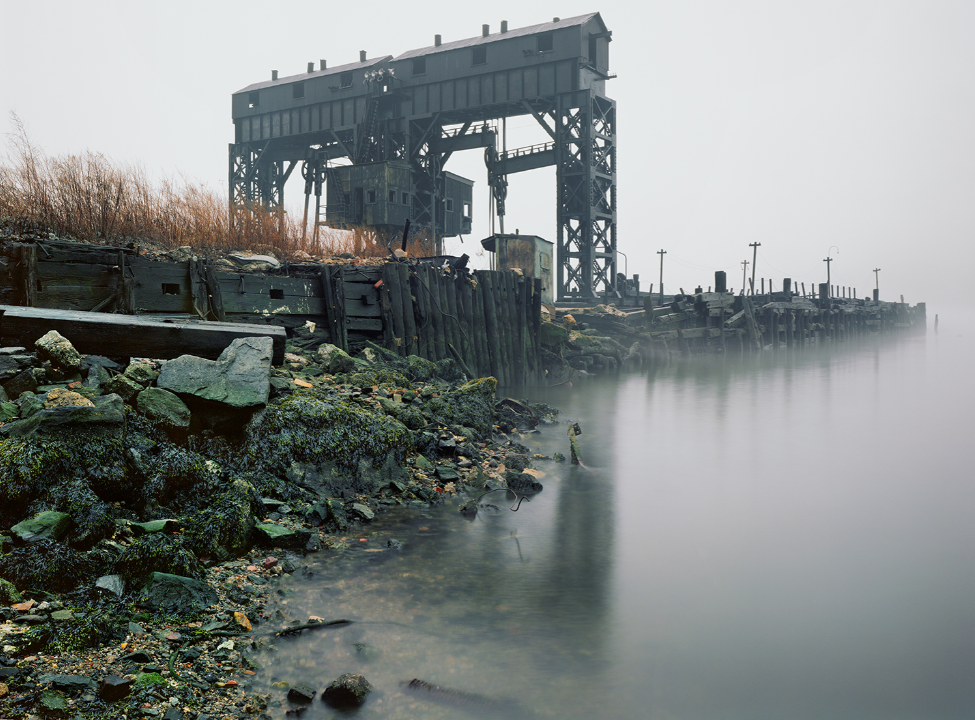
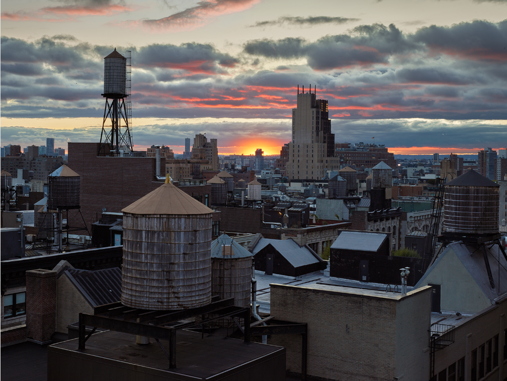
Edward Burtynsky is a Canadian contemporary photographer, born in 1955 of Ukrainian heritage in St. Catharines, Ontario. He received his BAA in Photography/ Media Studies from Ryerson University in 1982, and in 1985 founded Toronto Image Works, a darkroom rental facility, custom photo laboratory, digital imaging and new media computer-training centre catering to all levels of Toronto’s art community. Early exposure to the sites and images of the General Motors plant in his hometown helped to formulate the development of his photographic work. His imagery explores the collective impact we as a species are having on the surface of the planet; an inspection of the human systems we’ve imposed onto natural landscapes. Burtynsky’s work really inspired me when researching different Anthropocene photographers as I enjoy the way he captures repetition throughout his images with an interesting camera point of view, I wish to reflect the way he captures our world’s rapid industrialization through landscape photography.

Burtynsky was part of the team with Nicholas de Pencier and Jennifer Baichwal who created ‘The Anthropocene Project’, in an extract from Burtynsky’s essay, “Life in the Anthropocene” he wrote “we hope to bring our audience to an awareness of the normally unseen result of civilization’s cumulative impact upon the planet. This is what propels us to continue making the work. We feel that by describing the problem vividly, by being revelatory and not accusatory, we can help spur a broader conversation about viable solutions. We hope that, through our contribution, today’s generation will be inspired to carry the momentum of this discussion forward, so that succeeding generations may continue to experience the wonder and magic of what life, and living on Earth, has to offer.”

Image Comparison

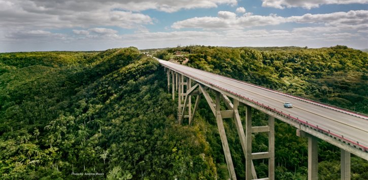
I chose to compare this image taken by Andrew Moore to one of Edward Burtynsky’s images as I believe they both hold similarities and differences with their use of techniques in the formal elements. Moore’s image was captured at Via Blanca, Cuba in 2012 and Burtynsky’s was released in ‘The Anthropocene Project’ in 2018. The first clear similarity is that both photographers have captured leading lines produced by roads that draw the observer’s attention through the images, creating a sense of movement and energy. Moore’s leading line is straight and thick, guiding the observer’s eye into the distance and background of the photograph- Burtynsky’s image also leads them to the background, however his captured line is thin and curves around the top right of the photo. The comparison between these two uses of leading lines symbolizes how the industrialization of our planet will continue on into the future, becoming more and more accepted and normal- just as Burtynsky’s line bends and blends more into it’s surroundings than Moore’s earlier captured photograph. Furthermore, there is a similar grainy rough texture in both images, created by the busy amount of subject captured; the trees in Moore’s image create a spiky feeling however they also have a sense of serenity that produces a more calm atmosphere, which is juxtaposed greatly with the out-of-place motorway that cuts through them.

In addition, there are also several differences between each image, for example their composition and camera point of view. Moore has captured his landscape from a lower perspective, and while it is not at eye-level, it still creates a more grounded impression by bringing the observer closer to the subject. In comparison, Burtynsky’s photograph is captured with a birds-eye point of view, symbolizing the biblical connotations of man looking down on all he has created as if he were a God. Moreover, the actual location of each landscape image is a significant difference between the photographs, with Moore’s showing the woodlands and forests in Cuba being industrialized and Burtynsky’s demonstrating the mass industrialization of cities and towns. Burtynsky’s image holds zero negative space, it’s cramped composition creates an uneasy and overwhelming atmosphere as the repetition of buildings and structures surrounding the winding road connotes the idea of a dystopian, homogeneous society where everything and everyone is the same. The trees and nature which are reflected over and over again in Moore’s image suggests that the beauty in our natural environment is still trying to push against human impact and urbanization, connoting the idea that there may still be hope. Lastly, Moore’s image holds more vibrant and saturated colours than those seen in Burtynsky’s photograph, the blue sky in the background of the image gives the impression that if humans are still destroying the planet by using fossil fuels and increasing CO2 emissions, mass industrialization will continue on into the future, however if we do something about the destruction of our world now there is hope moving forward that the environment can be saved.

Comparing Naomi White’s work to my own (Anthropocene)

Comparison between Naomi White’s work and my own

Naomi White | Crescendo, Plastic Currents (2012) | Available for Sale |  Artsy
“Crescendo” part of “Plastic Currents” series – Naomi White (2012)
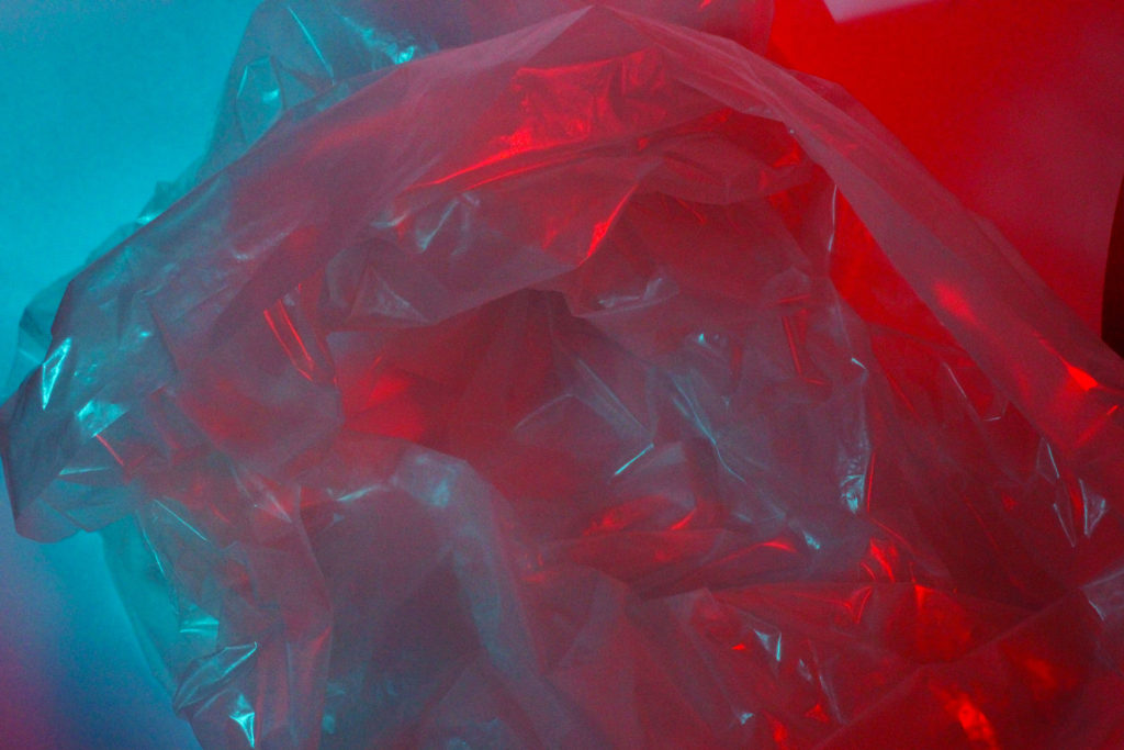
My work

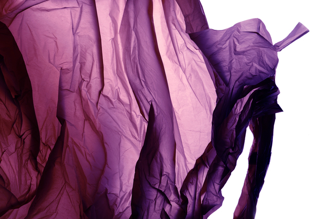
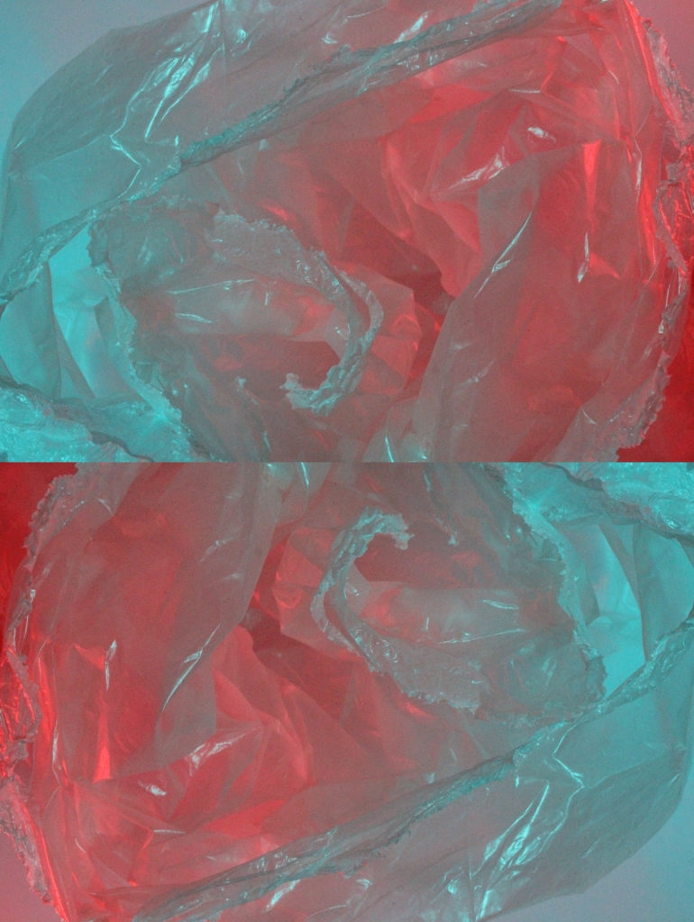
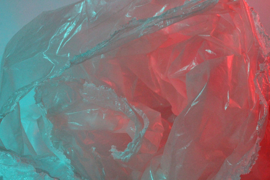
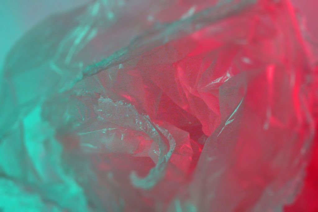
The prominent similarities between my work and the work of Naomi White and my work is the use of plastic in order to create art. Furthermore, the colours in both photographs are vibrant and the tones are very contrasting within both images. Finally, there is a strong sense of contrasting shadows and highlights due to the use of studio lighting.

On the other hand, there is also visible differences between the image created by White and my own work. For example, White only uses one colour in her photos, which creates a jarring contrast against the white background. However, because I used coloured acetate over the studio lights, multiple tones and colours are projected onto the plastic. Furthermore, my image lacks the blinding, white background that White uses in order to create an intense juxtaposition between the coloured plastic.

Overall, I believe my recreation of Naomi White’s work was successful because they carry similar ideas and messages, however I altered specific aspects of Naomi White’s work in order to make my images more unique and prove that White’s work is an ideal influence in terms of Anthropocene.

editing testing

Test 1 b/w

Test 2 Blur

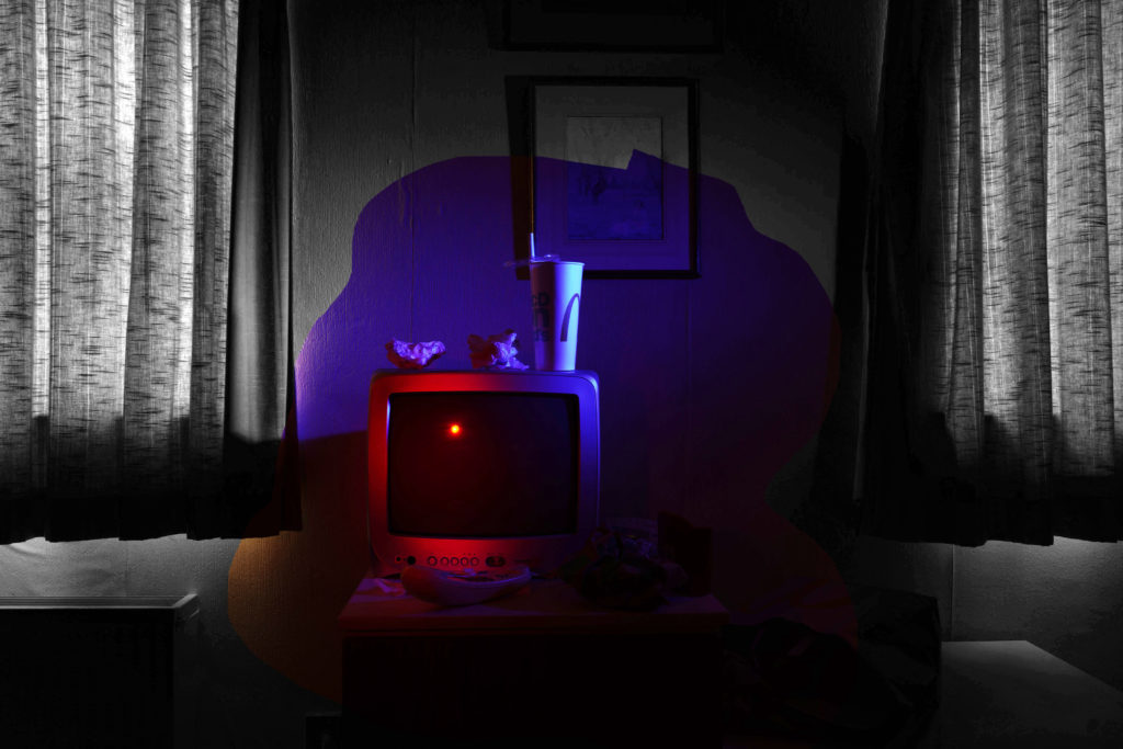
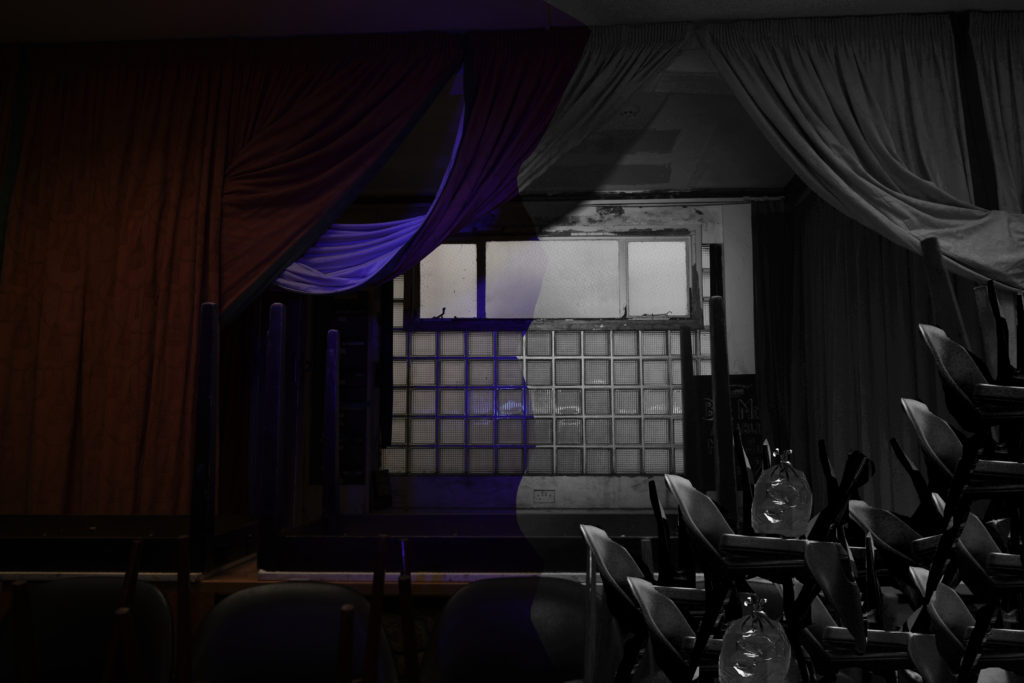
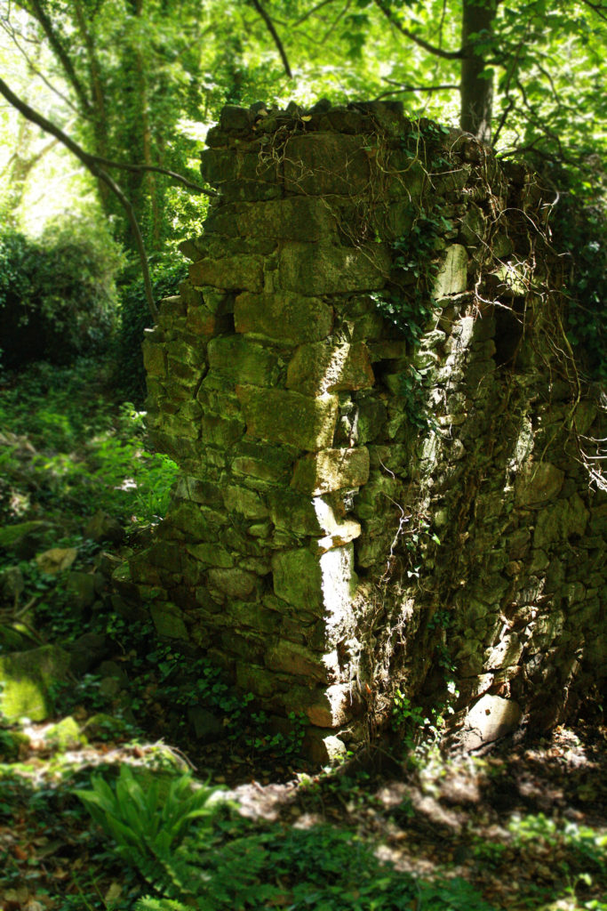
I wanted to edit my photos to explore new ideas and meanings. To create a story between humans and nature. For that I used photoshop. I decided to use different special effects like black and white, blur… For the first picture I used the lasso tool to select the middle after that I inversed to select only the outside part of the it . I choose to put the outside in black and white because I wanted to give an more sad atmosphere to it. I highlighted the objects to show the waste. For the second picture I decided to use the lasso tool again to have two parts one that is full of rubbish and the other that is clean. To create the part full of waste I cut out parts of chairs from another photos then I pasted them on my image. With these effects I want to show a side that we could have if we do not pay attention to what surrounds us. The two tests represent the waste that we live with. For the third one I decided to do something simpler I use a picture from my second shoot because it had more nature to it. I just use the blur tool to demonstrate the nature vanishing bit by bit.


Anthropocene: Comparison + Evaluation

Comparison

Yao Lu -  Smoke-like Clouds at Zhongshan, 2006  | Bruce Silverstein Gallery
Yao Lu – Smoke-like Clouds at Zhongshan, 2006
One of my Outcomes

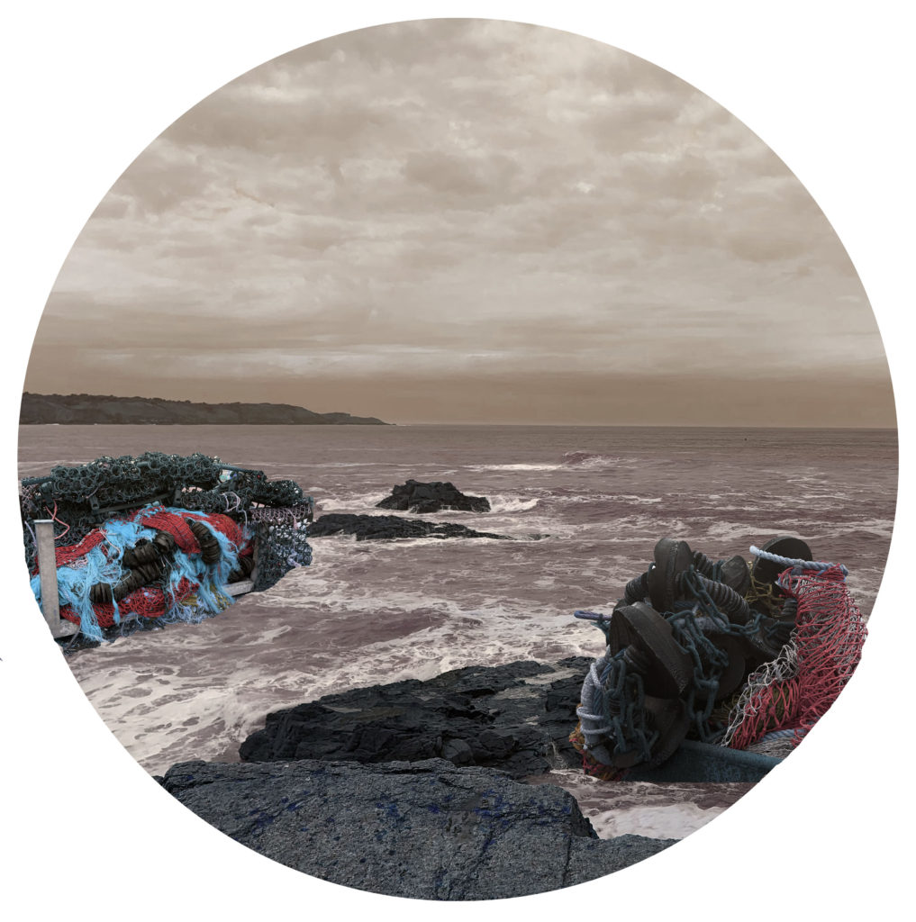
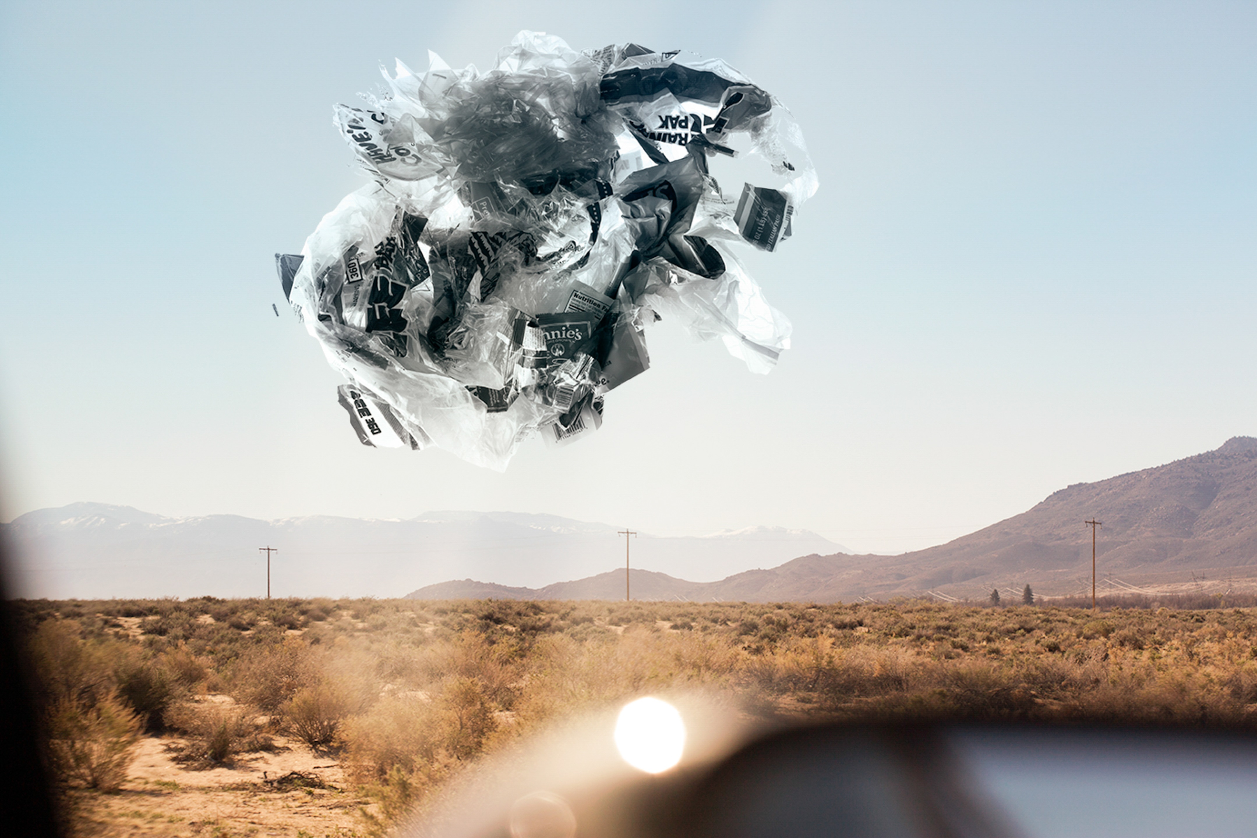
Differences – The layout of both images is different as mine has a clear horizon that splits the image in the top middle thrid with a straight line, whereas Yao Lu’s is a horizon made from the mountain tops which is in the very top third. I also left most of the natural landscape in the image, however Lu covered all/most of the natural landscape with waste and netting. The colouring in Lu’s image is more muted and made of more neutral colours. Mine is muted but there is certain aspects, specifically the added waste piles where it is more graphic and vibrant. the overall style of Lu’s image is very painterly and delicate, but mine is more graphic and bold.

Similarities – Both images have the same concept of photo montaging waste in the form of the natural landscape. Both images are overall warmer toned. Also the images have been framed and cropped to be circular in the same way.

Evaluation

Even though the final outcomes I had planned in my head looked more like Yao Lu’s painterly photographs I am happy that the non-natural aspects of the image (the fishing abandoned equipment), are more graphic and contrast with the natural landscape that should be there. This gives the image more contrast physically and metaphorically in the sense that the earth is turning into a waste land because all these waste products that human kind have made and harmed the earth with are going to be the new reality as the natural landscapes are being damaged and slowly disappearing. therefore based on this I have clearly shown the theme of Anthropecene, how the earth is changing based on human error, through my series images.

Further photoshop experimentation – Naomi White (Anthropocene)

Experimenting with Photoshop

Original Image
Edited by adjusting tones and colours
Edited using duplicate layers
Edited using duplicating layers, lowering opacity and altering tones
Edited using iris blur tool

Experimenting with landscapes

Shipwrecked V by Naomi White on artnet
“Shipwrecked V” – Naomi White (2017)

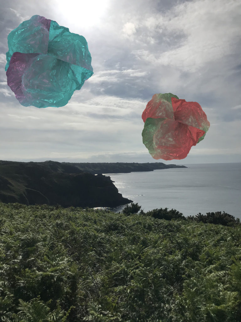
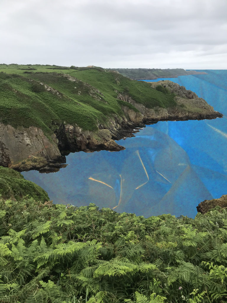
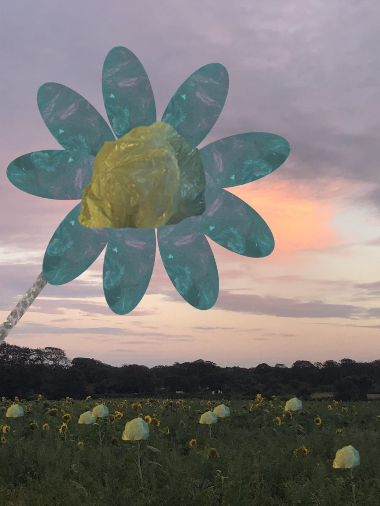
To edit these images, I cut out sections of my plastic bag images with the magnetic lasso tool and pasted them onto sections of my landscape images from one of my previous projects. I also changed the hues of the colours and tones of the sections of plastic bag in order for it to fit better into the environment. I think these images look at Anthropocene in a more obvious and direct way, in the sense that nature is being replaced by artificial materials.

More abstract exploration

Naomi White | SHIPWRECKED III (2017) | Available for Sale | Artsy
“Shipwrecked III” – Naomi White (2017)

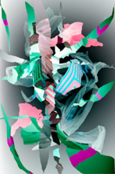
To edit this image, I used the magnetic lasso tool to cut out shapes of the plastic bags, and layered them onto one layer.

Naomi White inspired image editing (Anthropocene)

Original and Edited Images

Original Image
Edited Image
Original Image
Edited Image
Original Image
Edited Image

How I edited my photographs

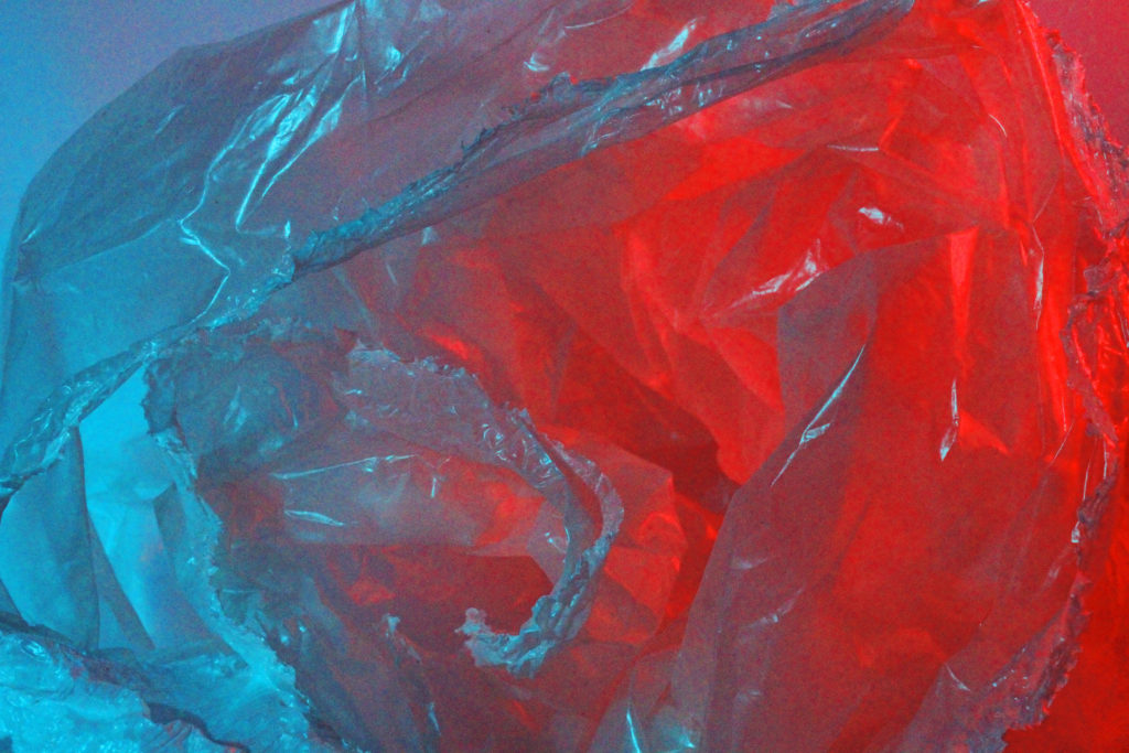
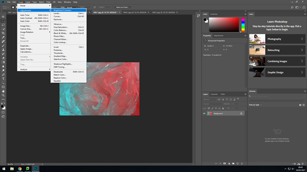
First, I lowered the brightness of my image and increased the contrast in order to create a stronger contrast between the different colours and provide darker tones to the image.
I then altered the curves setting of the image to darken the shadows of the image, and to increase the brightness of the highlights within the photo.
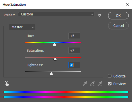
I increased the hue of the image to a blue-tone to enhance the blue hues of the image. I also increased the saturation and decreased the lightness to make the colours more vibrant and contrasting.
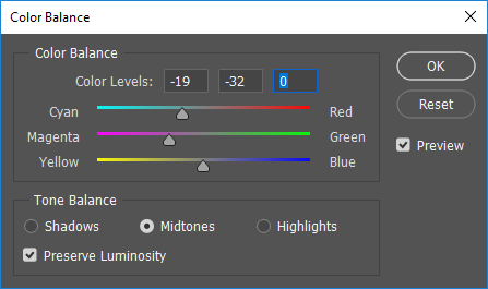
To further bring out the blue and red tones of the image, I altered the colour balance to increase cyan-toned colours and magenta-toned colours. This makes both the blues and the reds more vibrant, creating a more juxtaposing contrast.

CC – Anthropocene Photo shoots

MAIN PIECE PHOTO SHOOT / PLAN

For my main piece, I am creating a photo manipulation to raise awareness about ocean pollution, so I need photos of :

– Rubbish
– Fishing Gear (nets, buoys)
– Underwater
– The sea
– The coastal headline
– Boats
– Rocks

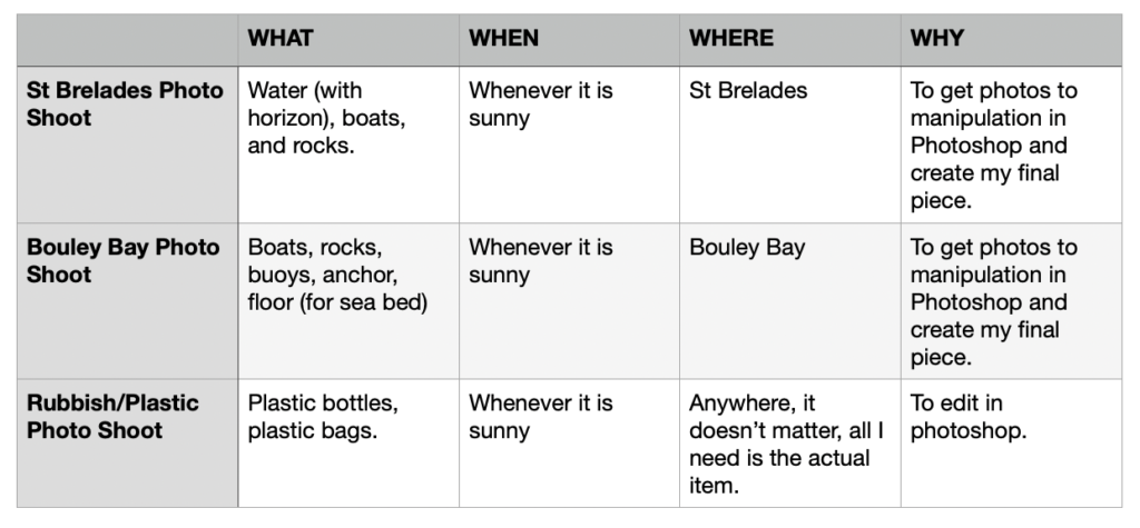
I made a table to visually display all the photo shoots I need to do for my main piece.

ST BRELADES PHOTO SHOOT

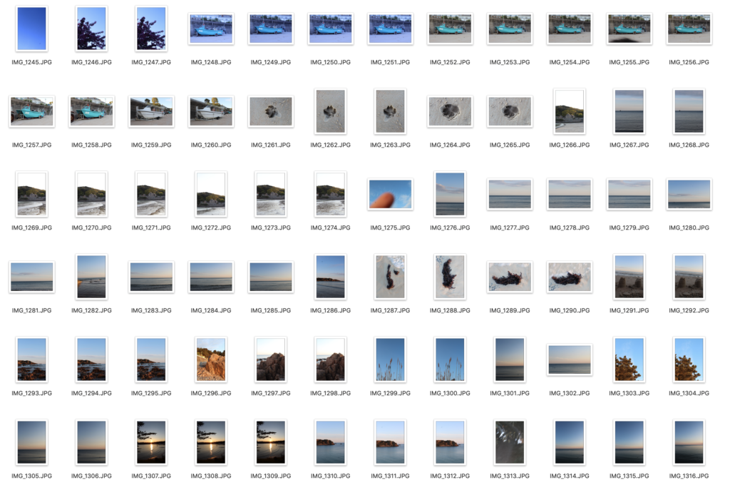
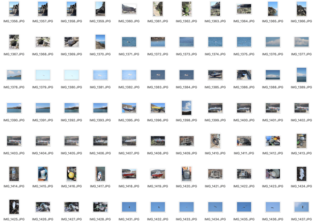
I went to St Brelades in the evening when it was clear, and took photos at the end of the beach that the pier was at. Then moved towards Quasine. Firstly I took photos of the boats in the sand, then in the middle of the beach, I took photos of the sea with the horizon in. I plan to make that the surface of the sea in my final piece. After went to the rocky area, and took photos the larger rocks.

BOULEY BAY PHOTO SHOOT

I decided to get more photos, as I didn’t really like the lighting and the reflections of the sunset from the St Brelades photo shoot. Firstly, I started near the island to get photos of the rocks. Then I went to the end of the pier where I got another photo looking out to the sea. Then lots of photos of boats, and there was a man putting his boat into the sea, so I was able to get a clear picture of the bottom of the boat, which had some buoys on. Additionally, I got some pictures of sea gulls, which I could add into the sky. in Photoshop.

RUBBISH / PLASTIC PHOTO SHOOT

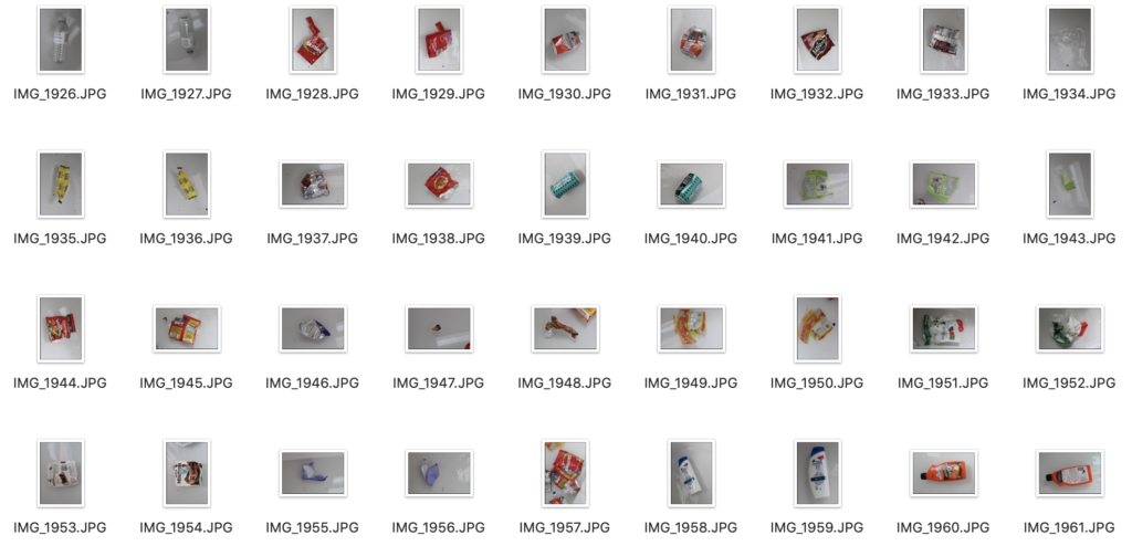
I took photos of various waste and plastic items, such as, plastic water bottles, plastic bags, crisp packets, and, cans. Nothing complicated, I positioned the subject in the centre of the frame, and for the items that had weight like plastic bags, I filled with air to make it look like it would be floating, so it would be easier to blend in Photoshop, and not look out of place.

SECOND PIECE PHOTO SHOOT / PLAN / (If I have spare time)

If I have spare time I plan to create a photo manipulation of space. For my photos I need :

– Galaxy
– Foreground photo (white house in St Ouens)
– Moon

GALAXY PHOTO SHOOT

I would need to go to a place where there is no light pollution. St Ouens would be a good place. I would need to bring a tripod and a camera. The camera settings would be at the lowest f-stop number, manual focus on the brightest star, wide angle lens (35mm), 800-3200 ISO, shutter speed is 25-30 seconds, but no longer as it would create star trails.

FOREGROUND (WHITE HOUSE) PHOTO SHOOT

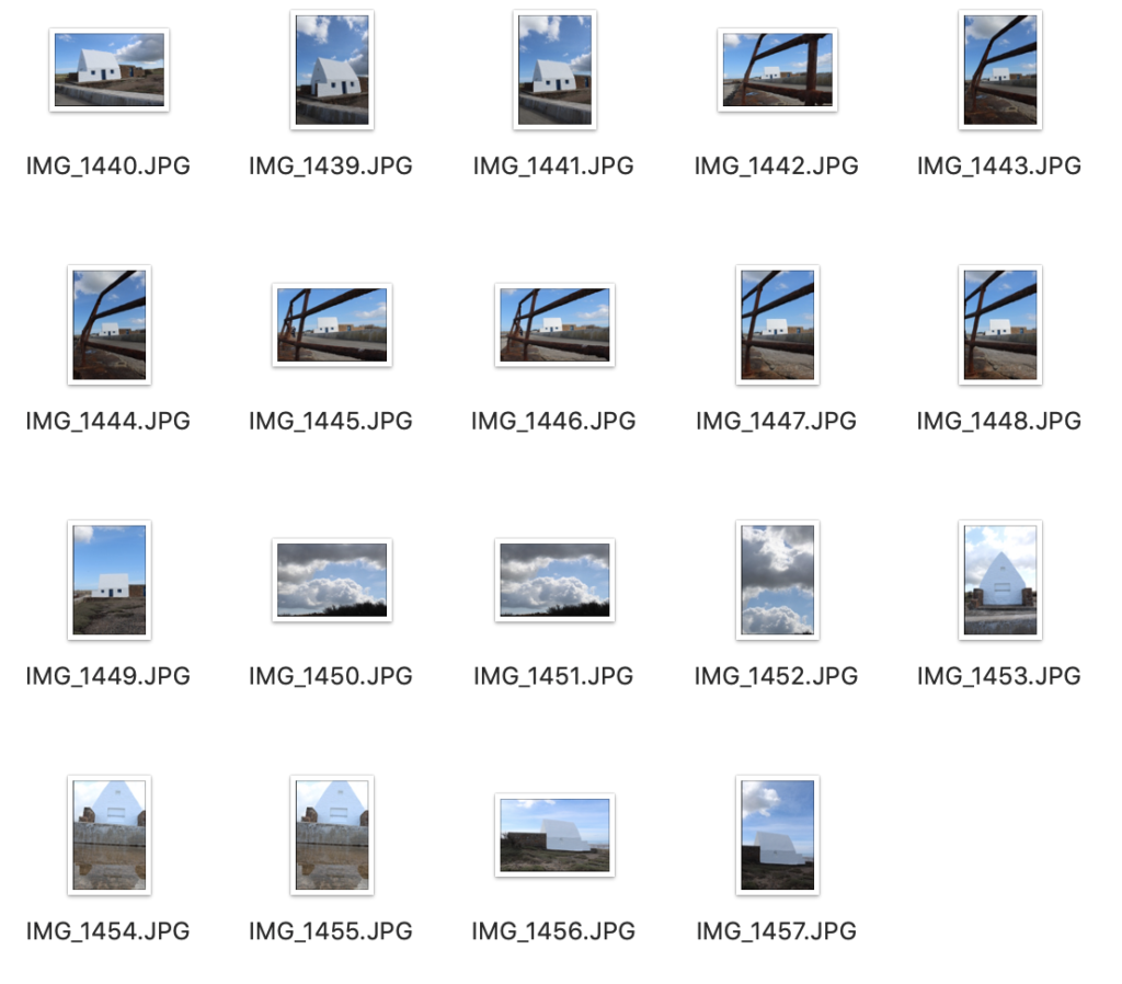
I need a subject that would be the foreground, I chose the White house. I would need to go when there is natural light, so I went in the morning (10am) as there was good light and no people.

MOON PHOTO SHOOT

I chose to take photos when there was a full moon. I would use the same setup as the galaxy photo shoot, except the lens. I would use a 300mm lens the capture the moon, with a 1 second shutter speed.

CC – conceptual Realism

WHAT IS CONCEPTUAL REALISM?

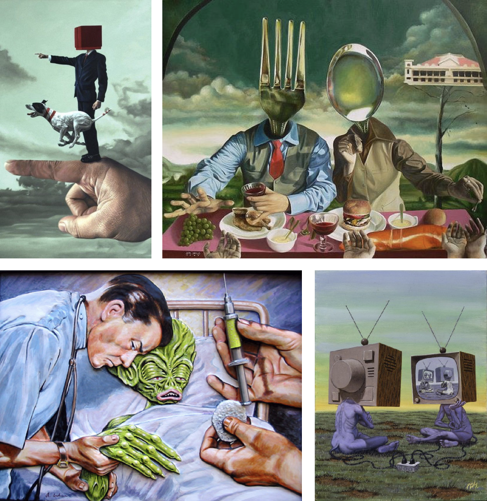
Conceptual realism is the theory that abstract universals, unobservable general classes or ideal types have a reality that is independent, equal and sometimes superior to the reality of their individual parts or specific examples.
These images display the “abstract universals” to an extreme extent, almost what someone is imaging or a weird dream.

The first one shows how it can be almost realistic, and this is the style which I will base my main piece on, as well as Dillon Saw and Sebnem Coskun.

HOW IM GOING TO ACHIEVE THIS?

I my case, I am going to create a piece which visualises conceptual realism on the topic of plastic pollution. I will create a crazy concept promoting the negativity of plastic pollution, all whilst staying in the boundaries of when someone sees my work, they ask themselves, “Is that a photo?” and “Is this real?”

Naomi White inspired photoshoot (Anthropocene)

Photoshoot plan

Naomi White inspired photoshoot

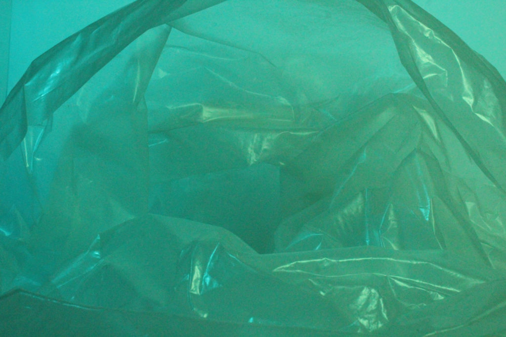
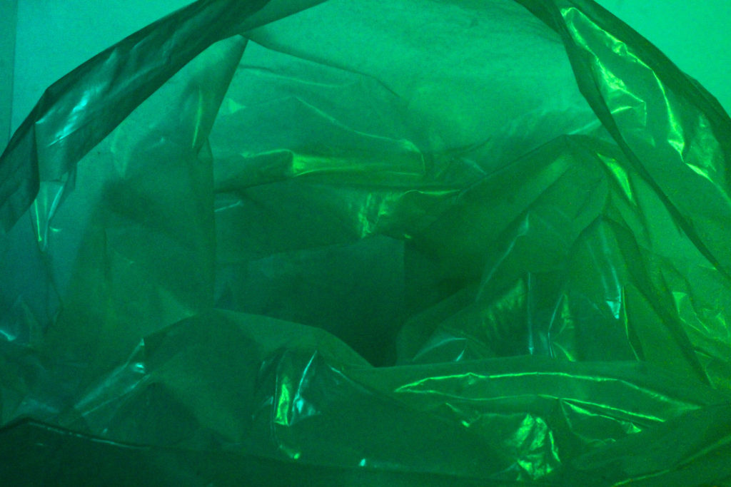
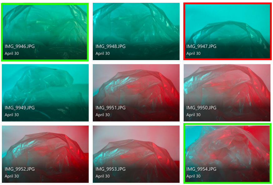
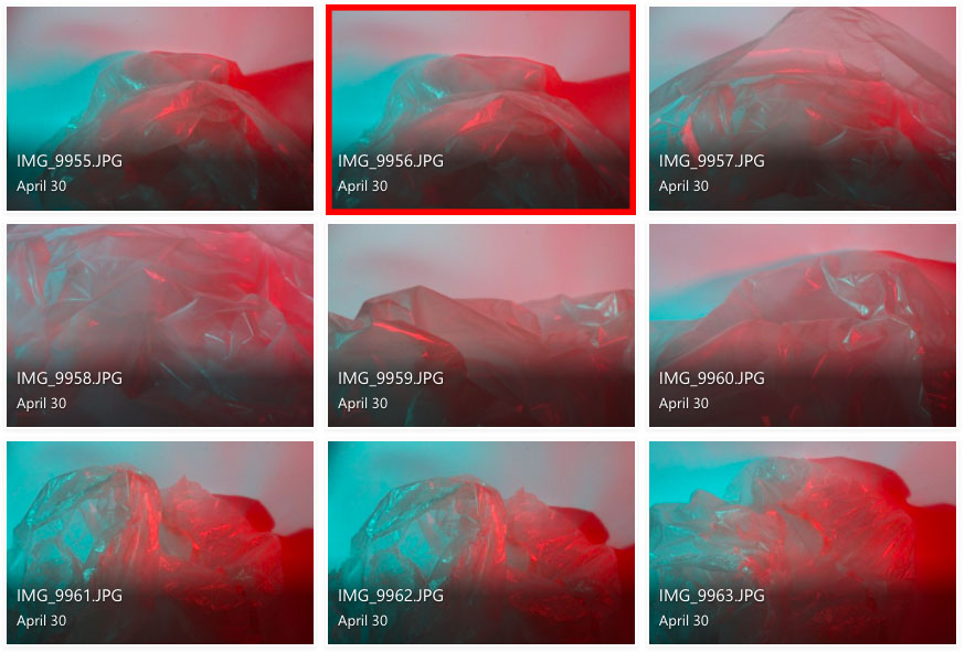
I feel like the images highlighted in red are my least successful images as the contrast in tone and texture aren’t as prominent and I just think overall these images are not as interesting to look at.

In my opinion, the photographs highlighted in green are more successful images as the contrasting tones are more enhanced within these images, and there is also a strong juxtaposition in texture. I feel like these images overall are better recreations of Naomi White’s work compared to my other images.

To edit these images I will further enhance the vibrant, contrasting colours to create an intense juxtaposition between colours.

Camera and light settings

To achieve these results in my photoshoot, I used bright studio lighting to create harsh shadows and highlights within the photographs. I also covered the lights with a layer of coloured acetate which reflected the colour off the plastic in order to project the juxtaposing colours and create a clear contrast.

I kept the camera on it’s manual setting and adjusted the shutter speed to a faster speed of 1/1000, the aperture as f/32 and an ISO of 50 as I wanted the image to be still-life and I didn’t want to capture any blurry movements.

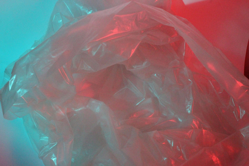
My best images