


Overall I think I have successfully achieved what I wanted to do when planning out my exam and ideas for the theme of Anthropocene. My goal was to show what our natural environment might look like in the future due to Anthropocene which is the effect us humans have on our planet. I have successfully used ideas from my chosen photographers as they both use photo montage and many photo-shop skills to edit opposite ideas/objects in our planet together. I have presented my ideas through editing our town/tall and built up areas in Jersey onto our coast and beach in St. Ouens to show what will most likely happen if we don’t protect our green lands and natural environments.
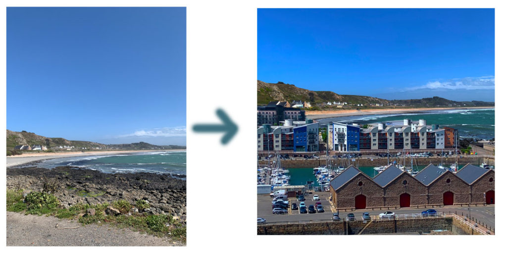
I have successfully use many different Photoshop tools in order to produce and get to my final image. The tools I used the most were the ‘Quick Selection Tool’ and the ‘Eraser’ to make sure I cut out each building and area well while also getting rid of any extra background sections I didn’t need. When you compare my original photo, of just the beach, to my final finished and edited images I think it has quite a shocking impact on the viewer as it really does create an idea in their head that if we don’t protect our environments our beaches will all look the same and the amazing views will be ruined by many new roads and buildings. This is the effect I wanted to create and I think I have linked it back to the theme of Anthropocene very well as it shows how we changed our planet over the years and most of the time it causes a negative impact.
Evaluating two of my final images-

In both of my images I have used natural lighting, I took my images during the day in sunny weather as I wanted the sky to be as clear as possible and the sea to be photographed perfectly. I have slightly increased the saturation levels on my images as I wanted to make them more brighter and create a warm temperature as my two chosen photographers use extremely bright colours when editing.I focused my lens on the whole image as I didn’t want it to only focus on one building or area of the image. When taking my images I took them on a fast shutter speed as I didn’t want my images to end up being blurry as I took all my images from a very high perspective therefore I had to keep my camera still. I also didn’t use a slow shutter speed as that would have captured the movement of the cars,people and waves in the sea which would have made it extremely difficult to edit and layer the images over each other. When it came to editing my images individually I didn’t want to over or under edit them in any way too much as I wanted them to look as natural as possible to create a more realistic impact/image in the viewers mind.
I took both of my images in colour as I was inspired by my chosen photographers. In both of my images I would say I have a good range of different colours as the sky and bay are both very bright and blue whereas the buildings/town are more dull and filled with more generic colours like grey and browns. I tried to keep the composition of my images into three sections, I wanted the sky to be the top section however I did crop a lot of the sky down as I didn’t want it to take up too much length of the image and I wanted the main focus to be the buildings. I then always tried to make sure the sea and main part of the built up section was right in the middle as I think that’s the first section the viewer focuses on right away. For the bottom layer of my images I experimented with different sections in each image, such as using parking lots for one or editing roads and more of the green ares of town into there.
For the conceptual side of photography I wanted to have a good idea for Anthropocene. The meaning behind both my images was to make whoever is looking at my images aware of what our future could look like or will look like, if we don’t protect our environments as we humans do anything to any spare land left as every country wants to be more modern and urbanized as the years go on. One of my chosen photographers, Jesse, also is the reason I thought of this idea as one of her image shows a mountain that reflects a massive museum building on the river below it showing what our land gets turned into eventually with a huge car park surrounding the natural environment. I think this idea is very effective as it really shows the true meaning behind Anthropocene and the effect we have on our planet , which once again I think have successfully achieved through sticking with my plan.
Critique- If I was to change something about my final outcome or the way I produced my final images it would be to also take more close up images of individual tall buildings or offices in Jersey so that when it comes to editing , instead of cutting out areas and big sections of buildings all next to each other I could just cut out individual images and spread them all neatly across the bay/coast. This may have made my final images all more different from each other as I could move the different single buildings around and place them wherever I want to as well as re-sizing them.
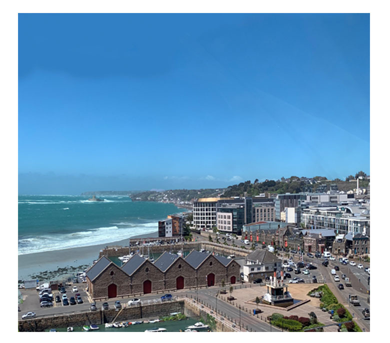
Comparing one of my final image to Jesse Treece (my chosen photographer)
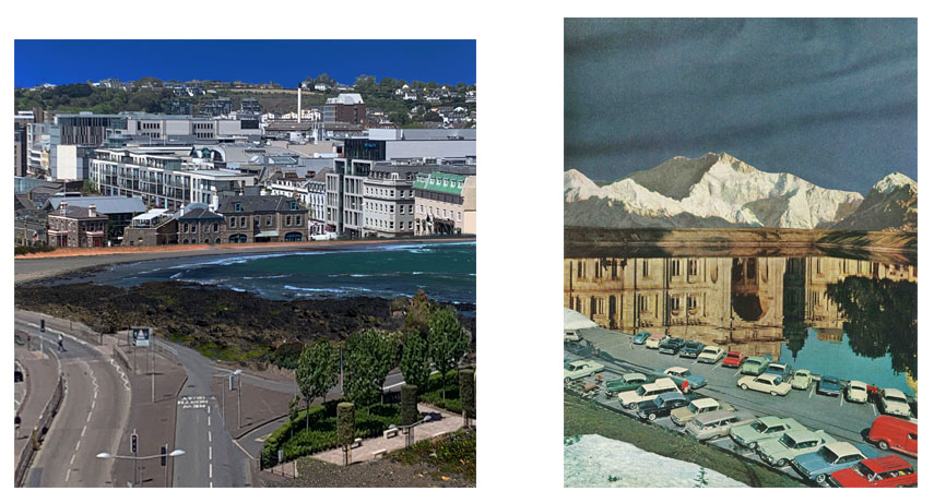
Overall I think I have been inspired by my chosen photographer very well as she uses photo montage/layering which is what I had to do in order to produce my final image.
Technical-I took both of my images in the day light which consists of natural lighting on a sunny day in order to get a nice colour of the sea. However Jesse’s images are more cartoon like therefore you cant tell whether she actually took those images or copied from a different source, however both of our images are in the day as you can see the light blue sky reflecting on the water in her image, implying its day time. Jesse’s image is definitely more over saturated and brighter as the colours of the cars pop out and the white mountain contrasts sharply against the darker background. Compared to my image that hasn’t been saturated as much in order to keep it natural as I didn’t want to use mountains in my pictures as Jersey doesn’t have them. Both of our images create quite a cold tone/temperature to having more blues and darker colours in the image than more oranges and reds, this creates a more sad atmosphere. Both of our images have been taken from a more wider and further away angle. By doing this we both captured more of the image and there’s a lot more to look at and analyse than a close up photo, as both photos are landscape in my opinion they look best when taken the furthest away.
Visual- Both of our images are in colour which makes the image brighter and easier to analyse as sometimes black and white photos can hide details due to the colours all blending together. I cropped my image down to not get as much sky in it as I wanted the main focus of the image to be the urban section and where I manipulated the image the most. Whereas Jesse’s image probably hasn’t been cropped down as it has the mountain as its highest view then the reflective middle section and the cars at the bottom, broken down into 3 sections, this can make the image appear more longer whereas mine has more of a square shape. We both use aspects of natural and urban environment. Such as , I used the sea/coast for my natural and Jesse used a river or water bank and the mountains. I then used buildings and a section of our town in Jersey whereas Jesse used cars and a big museum like building in her image that’s being reflected on the water.
Conceptual- We both wanted to contrast two images together to juxtapose opposite ideas, such as I wanted to show how our natural environment will eventually get built on top of or turned into a city if we don’t do anything to protect our land, showing what we humans do to our planet linking it to the theme of anthropocene. Whereas Jesse’s image shows a natural environment ( the mountains) and reflects a building onto the river showing what it can and most likely will get turned into.
From my chosen images in the previous blog post I am going to use photoshop in order to edit my images together.
Firstly I upload my chosen image of st ouens as my starting image as I want to edit over the bay and beach. I then open up a second image of my chosen urban image, I find sections and areas of the image that I think will look good and fit over the coastal image best. Once I’ve figured that out I use the ‘ Quick Selection Tool’ and cut out the parts that I want to use over my first image, I copy that specific area and paste it on top of the image of st ouens. I then moved and dragged it around until it fit into the perfect space and where the buildings looked the most natural. The last tool I use is the ‘Eraser’ tool in order to smooth out the edges on the buildings and to blend the two images together to make it look more realistic.
I want to show the original photos first in order to show how I’ve changed and manipulated them using Photoshop skills and the urban images
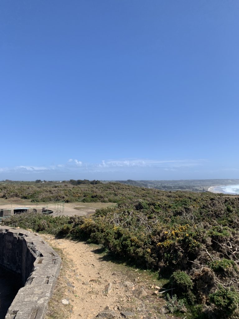
These are the main images I used for my background / the ‘original’ images;
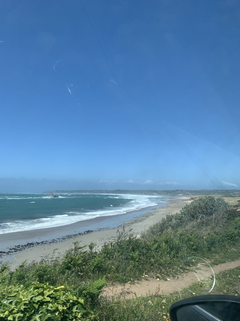
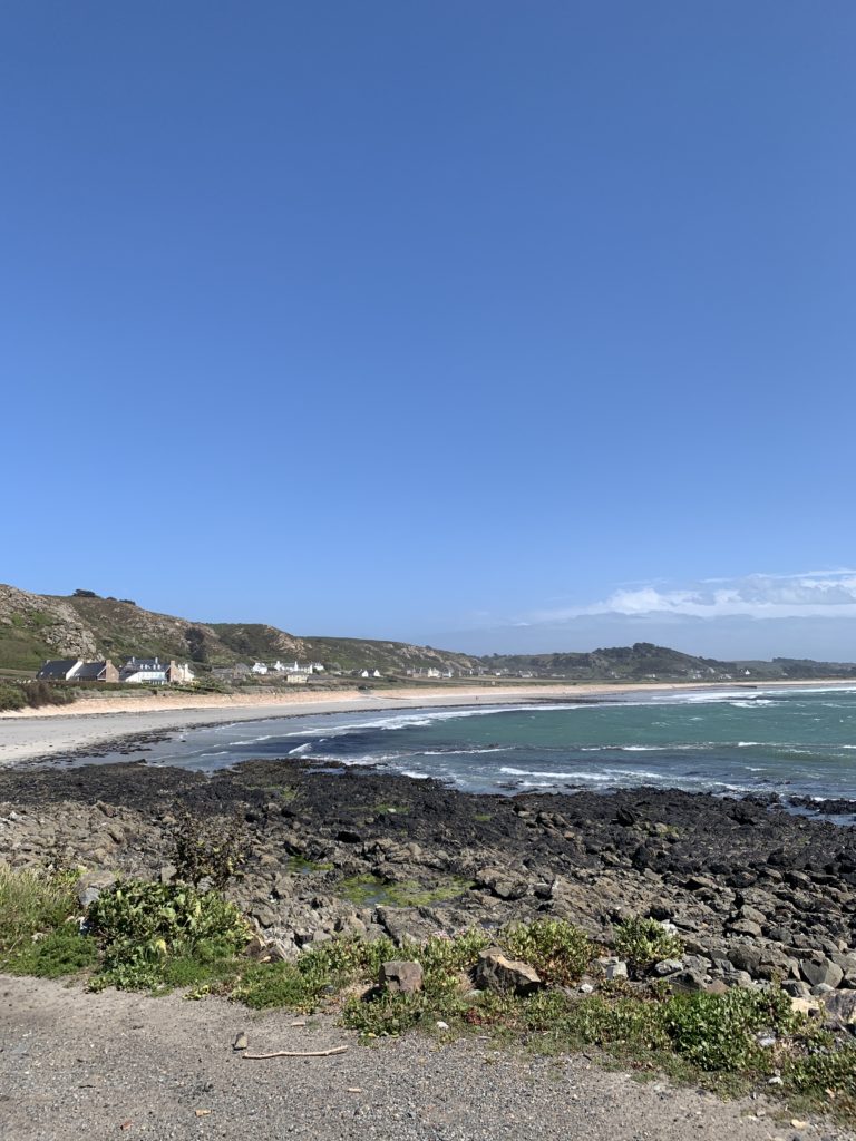
before and after-
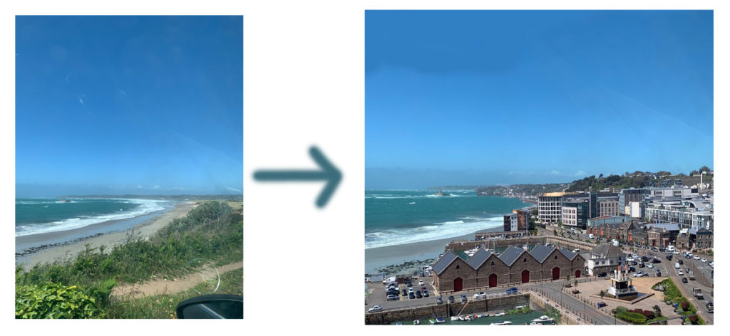
My final and edited images;
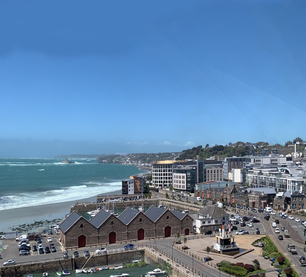

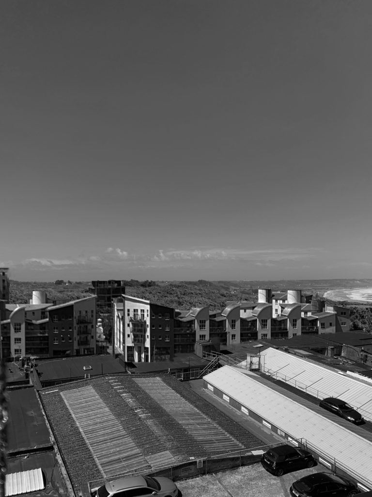

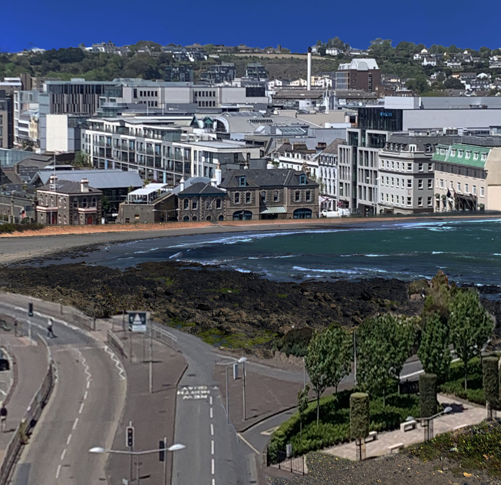
Overall, I’m extremely happy with how my photo-shop/ editing turned out. I used all the sections of the urban photos that I wanted to and the most built up areas in order to create this idea of what the future might look like. I used 3 main coastal images that I used as my background/ base image each time as they were the most open and clear images that allowed me to have plenty of space to edit on and paste buildings into. I used a mix of rows of buildings and buildings from the harbor to create different ideas and impacts. I kept four of my images in colour as my chosen photographers also edit their photos in colour, however I did change one image into black and white to create a more sad atmosphere as the changes in an ‘anthropocene’ topic mostly have a negative effect on our planet. I wanted to explore this idea through building up our natural environments , the beach, with buildings.
Before I was happy with my final 5 images I experimented a few times to make sure I was happy and confident with the ‘Quick Selection’ tool and I would be able to neatly and precisely cut out the buildings I want to use over my St. Ouens images. It also took me some time to make sure I adjusted the shape and length of the buildings that I wanted to use right and they fit into the shape of the bay well enough to make it look natural.
When I was editing I used the ‘eraser’ tool almost every time I pasted in a new section to make sure there were no random edges or background colours that looked wrong and unnatural over my original image. When I was placing and re sizing the images I always wanted to make sure my longer and further away town images were at the back of the coastal image to make it look as naturally placed as I could. Therefore, I then used the photos of the harbor and the roads a lot closer when I edited them over St.Ouens to create an illusion of those buildings being the closest.
When I finished using my Photoshop tools and all the final digital manipulation, I merged or flatted all the images down into one and adjusted the brightness,saturation and contrast to give a more warm and brighter finish. The last part of my editing process was cropping the image down. My original images had a lot of the sky showing therefore I cropped almost more than half of it to make the editing/buildings the main focus as it was placed in the center of the overall image.
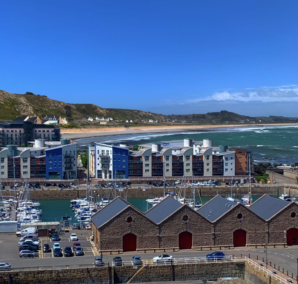
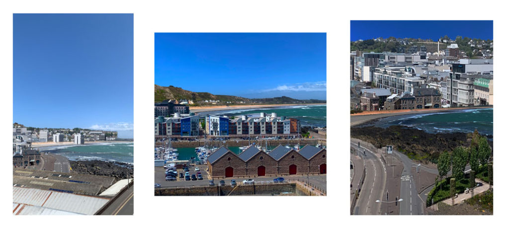
For my two photo shoots , I took photos of st ouens and the coastal/bay area of Jersey for my first shoot. For my second shoot I went up to fort regent in order to capture the urban area of Jersey with plenty of builds. I chose to photograph those areas for my shoots in order to be able to edit them together and successfully produce my final image that fits into the theme of Anthropocene.
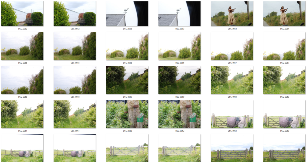
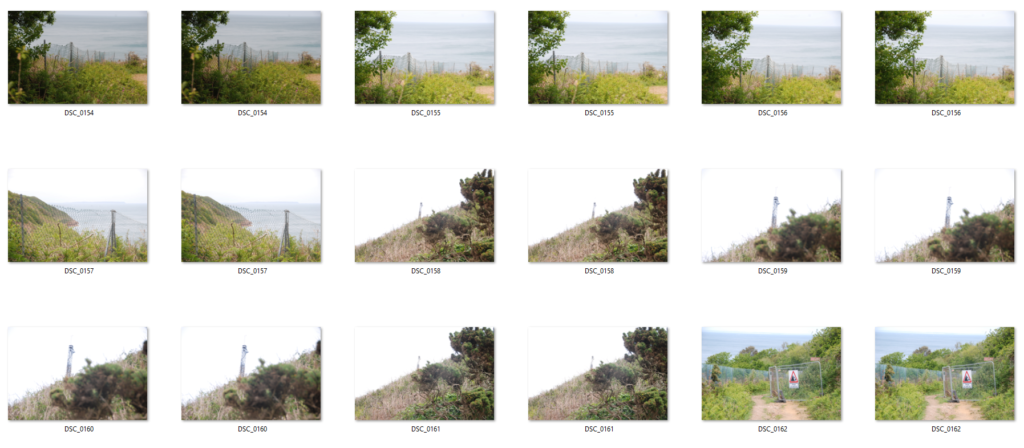
contact sheets-
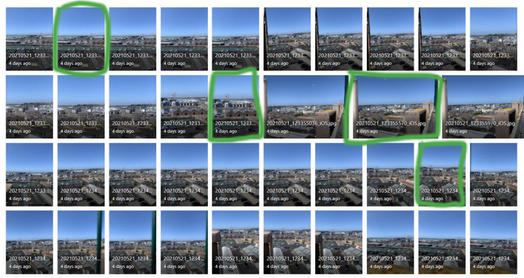
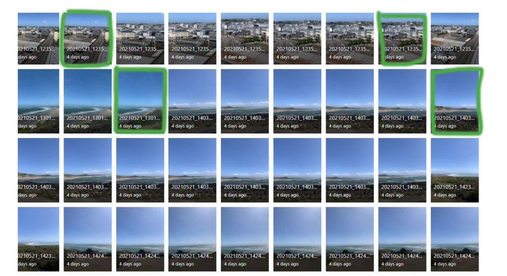
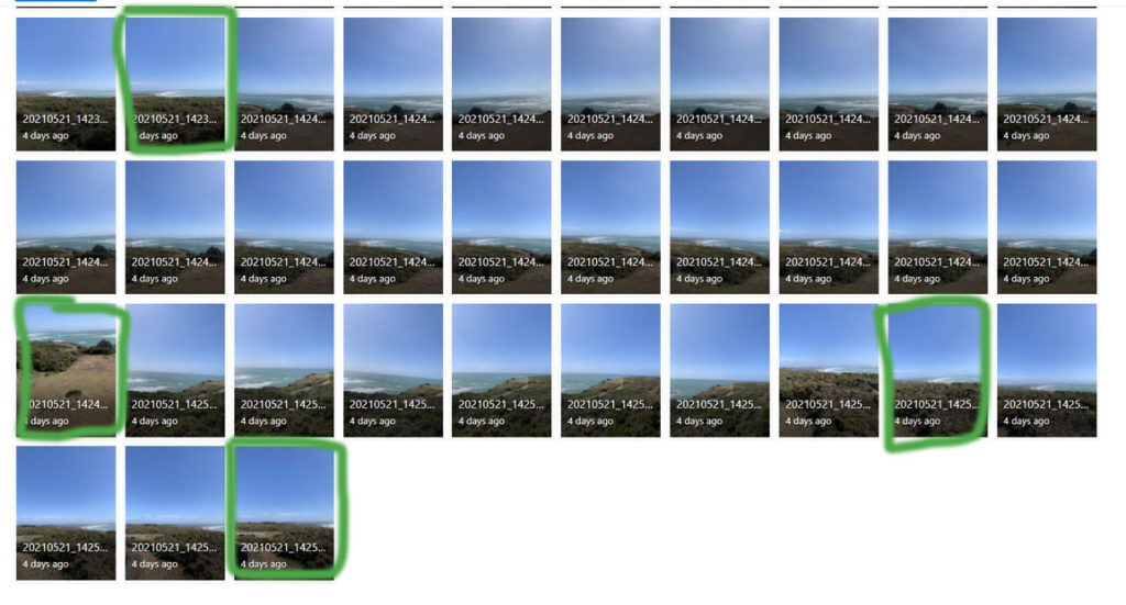
I have selected my favourite images or the images I will be using to make my final image and to use when I edit them on Photoshop. I chose the photos that captured the whole bay in a clear way and I wanted to make sure it was very open with some sand to make the edited buildings on it look more natural. I also selected the images where I photographed the most amount of buildings and from a good angle to make editing them easier and look more natural. Having more space and open areas will create a better and bigger impact on my final image as I’ll be able to add more buildings and move them around until they fit perfectly and look the most natural.
With these chosen photographs I’m now going to use Photoshop and edit them together. My Anthropocene idea is to show how our bay/ coastal areas will most likely turn into urban areas or get built on top of which fits into the Anthropocene project. By using Photoshop for this I will successfully produce my final images and take inspiration from my chosen photographers as they both use photo manipulation too.
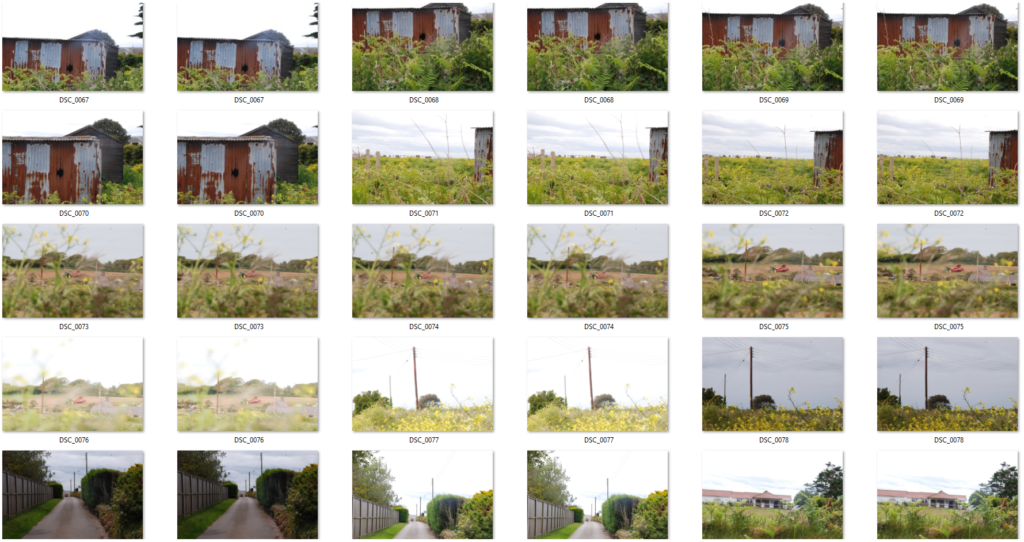
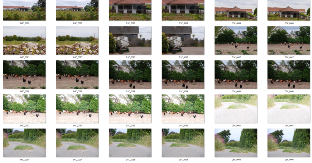
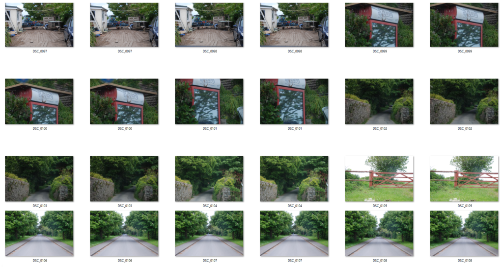
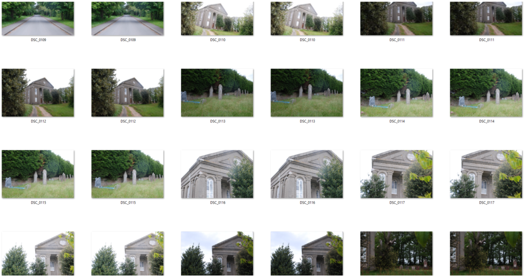
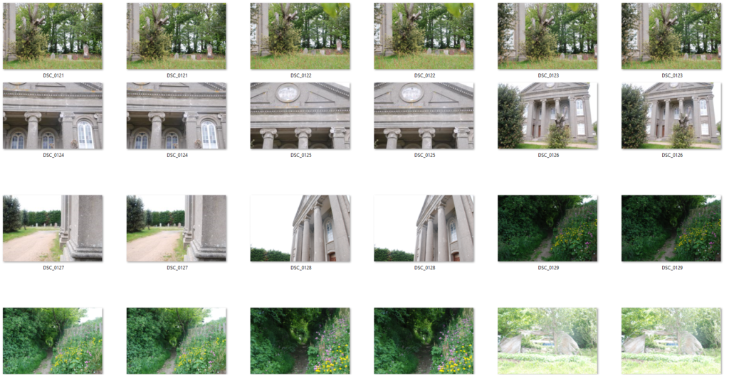
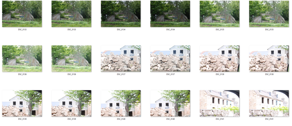
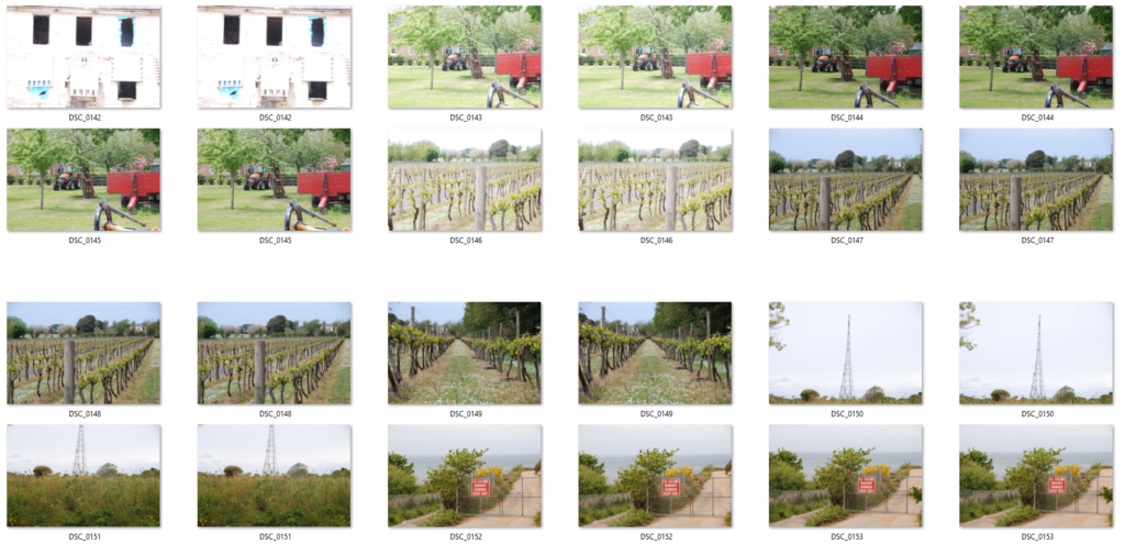
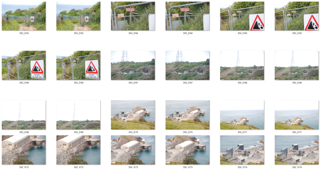
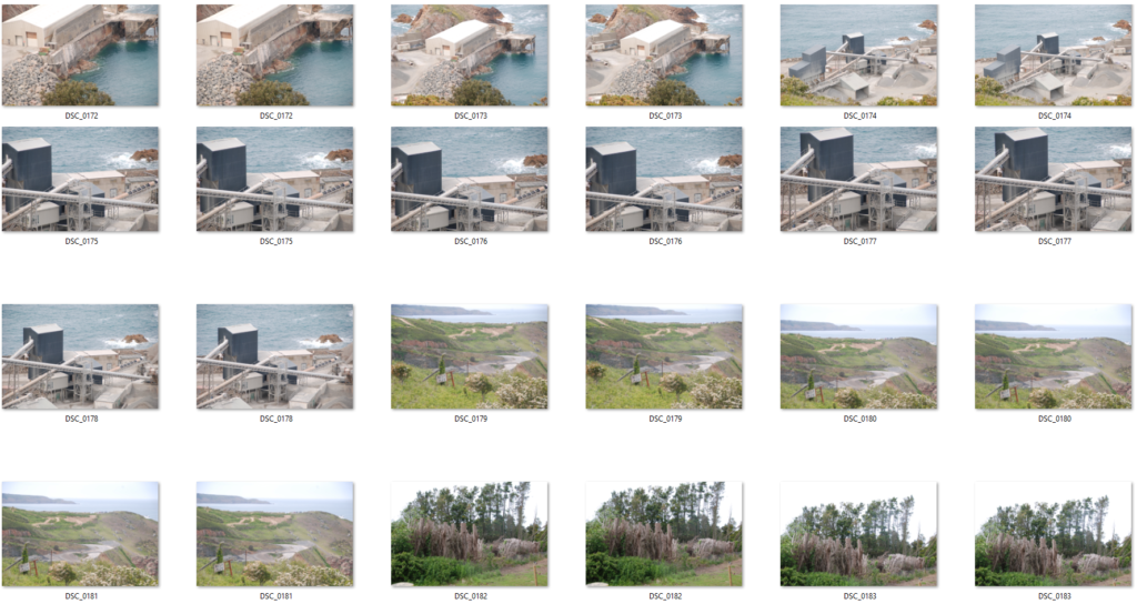
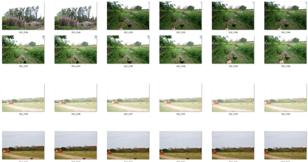
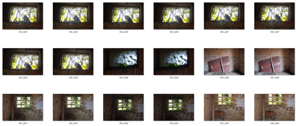
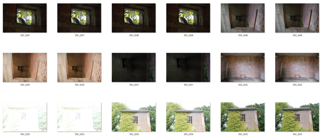
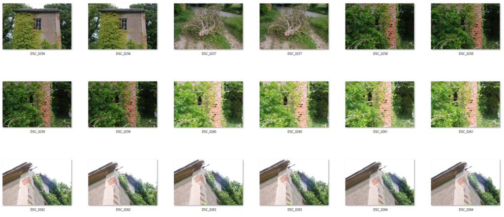
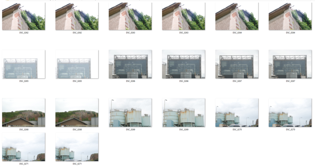
Contact Sheets From Both Shoots
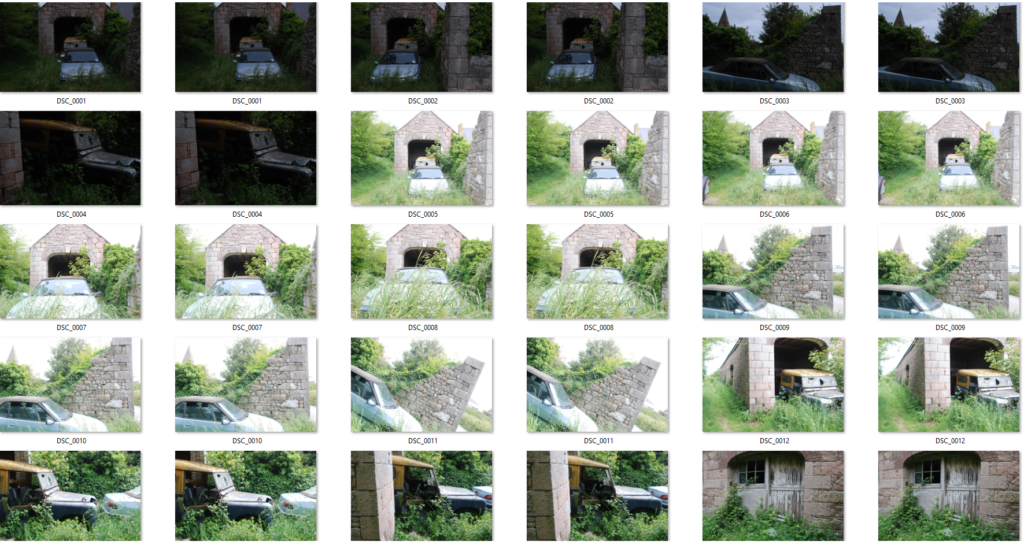
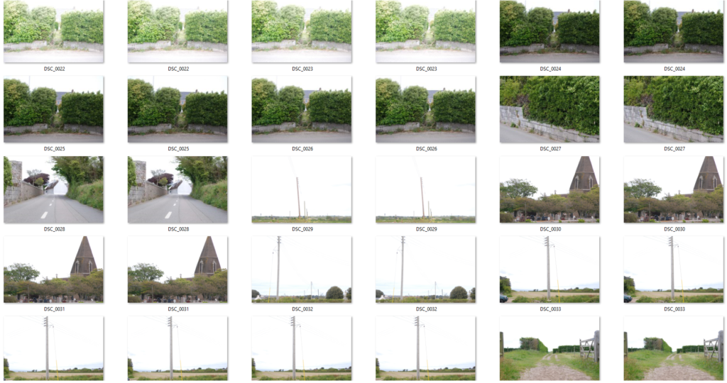
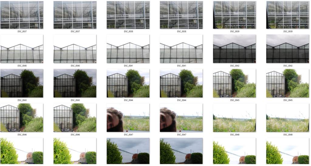
Final Edits
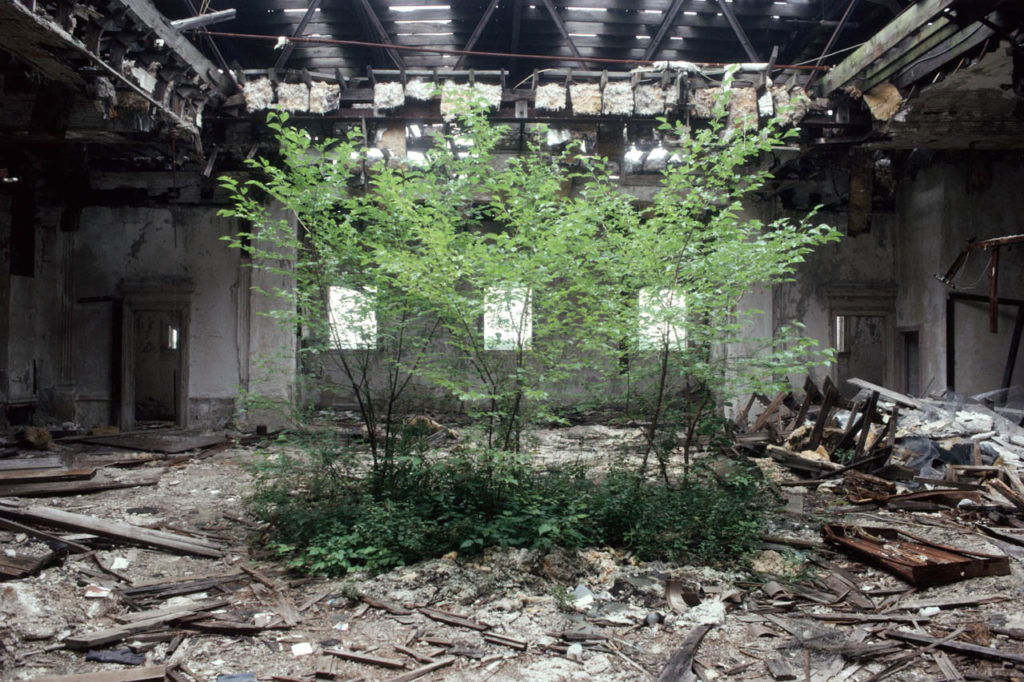
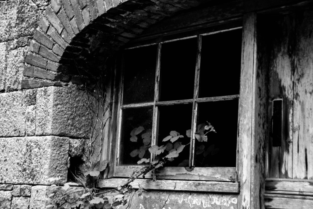
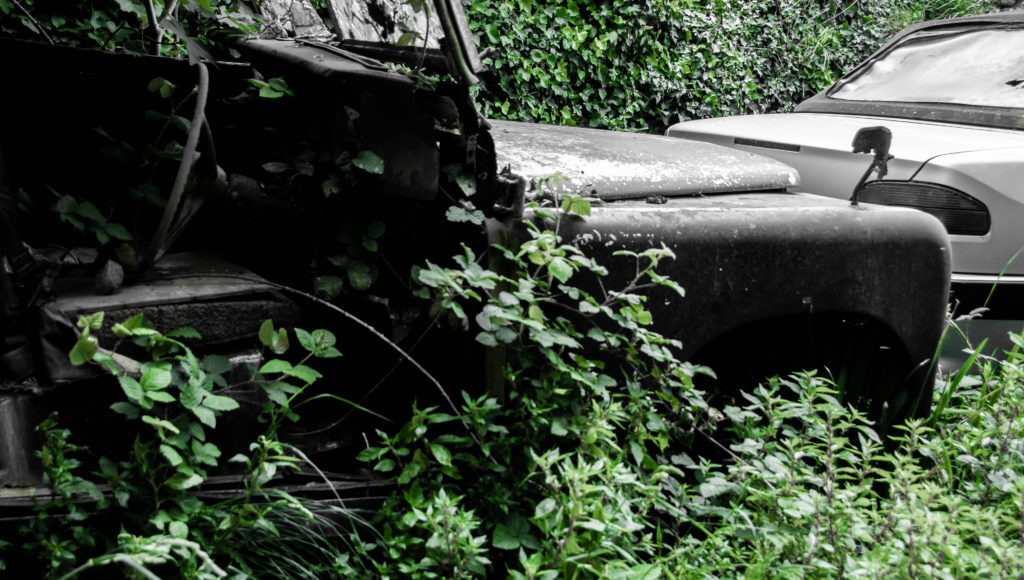
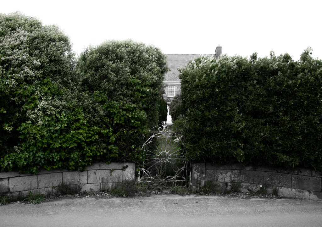
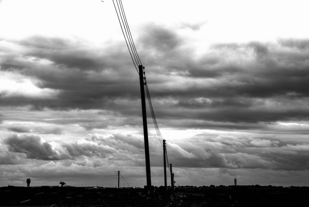
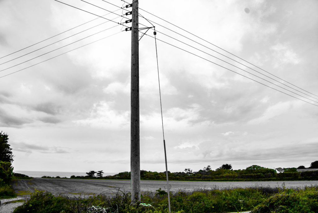
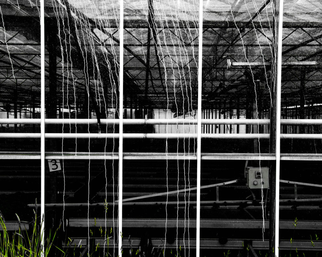
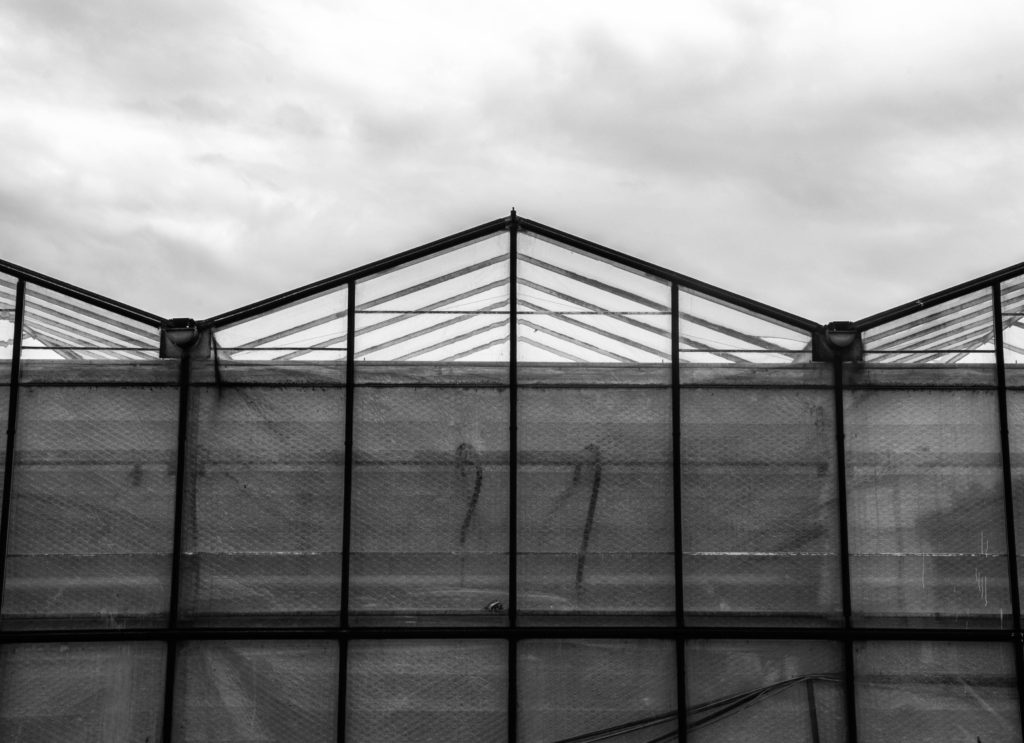
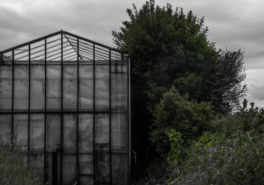
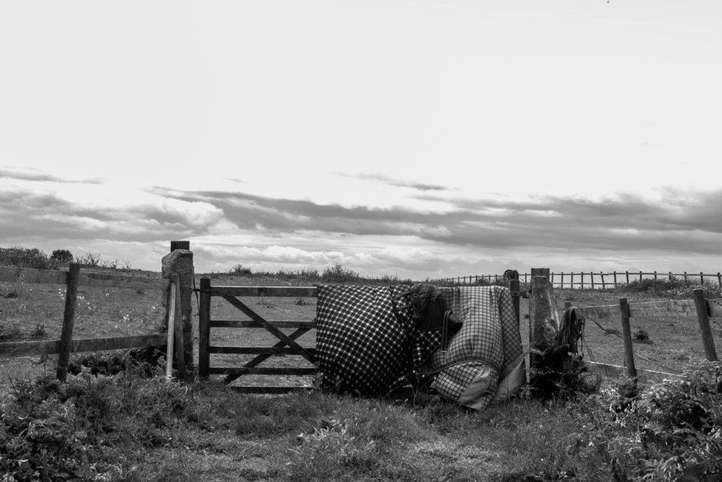
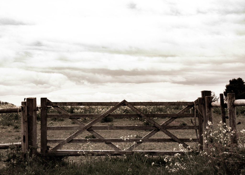
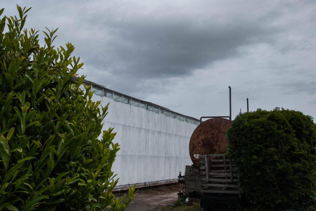
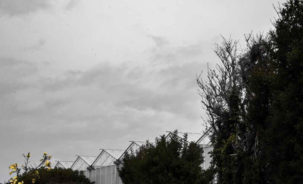
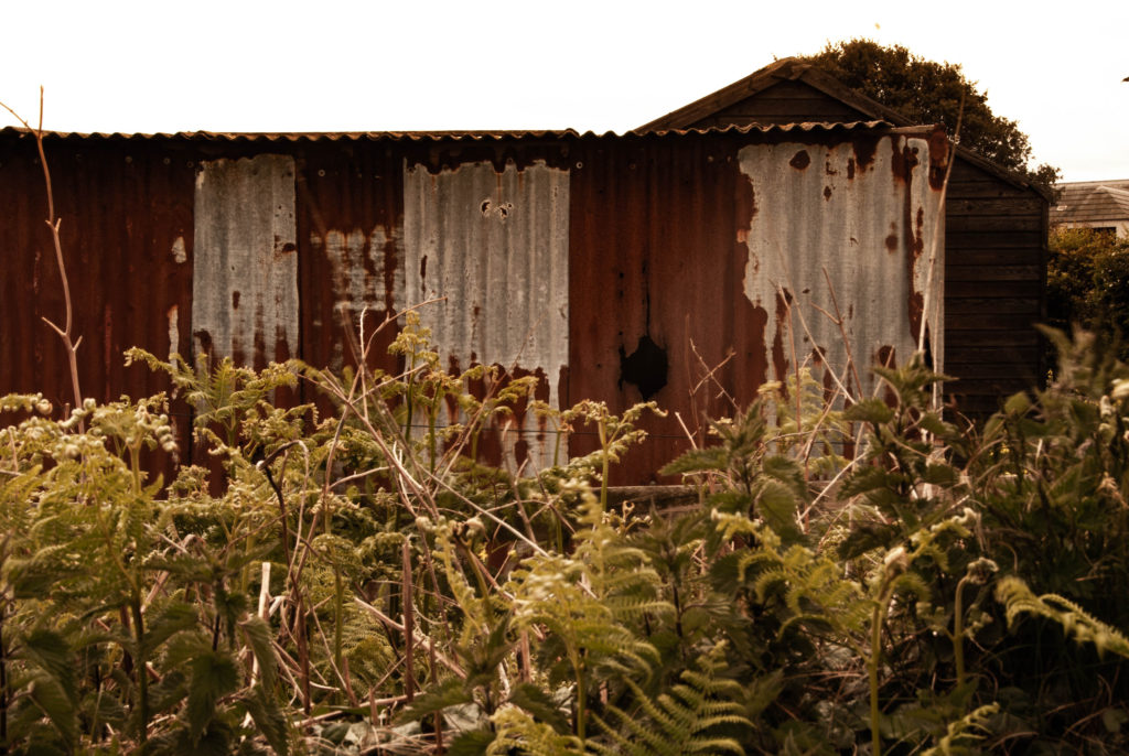
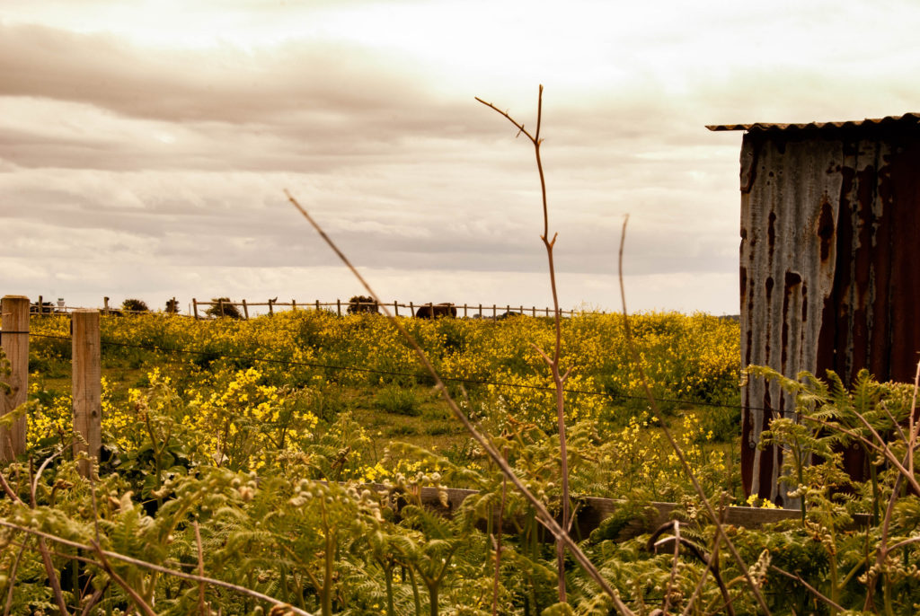
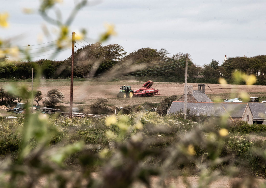
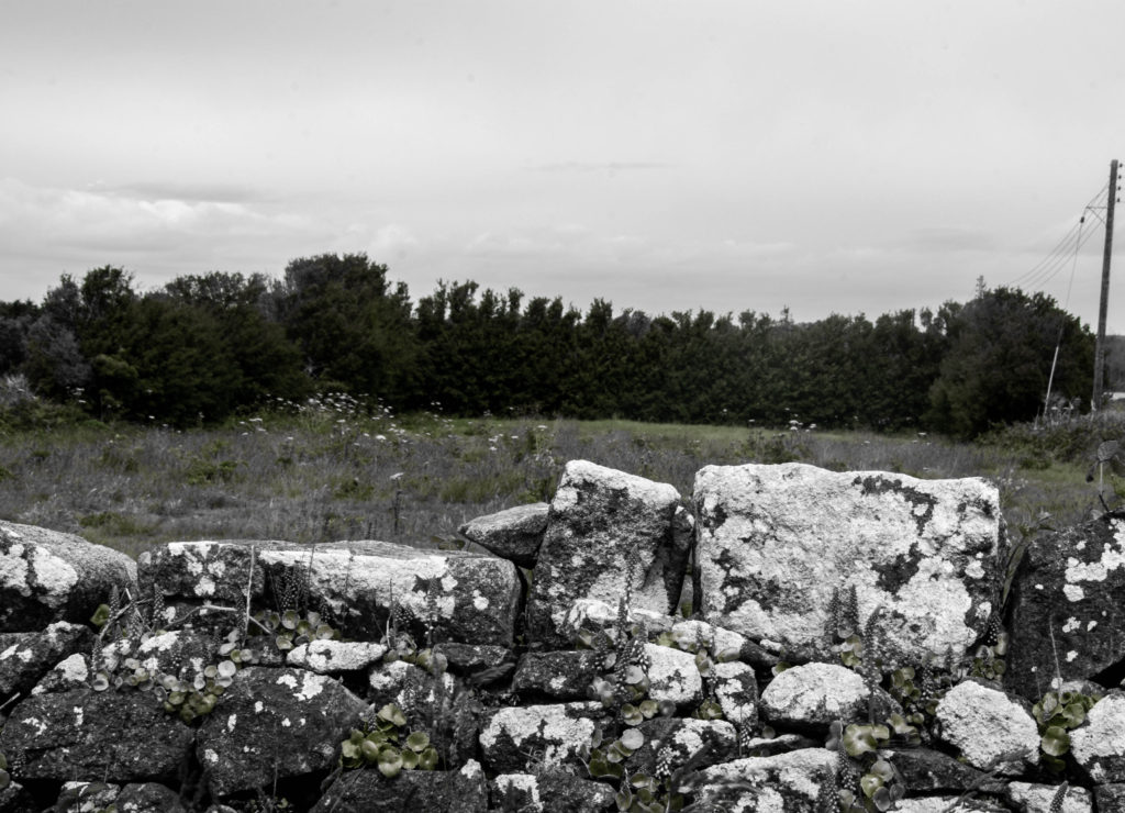
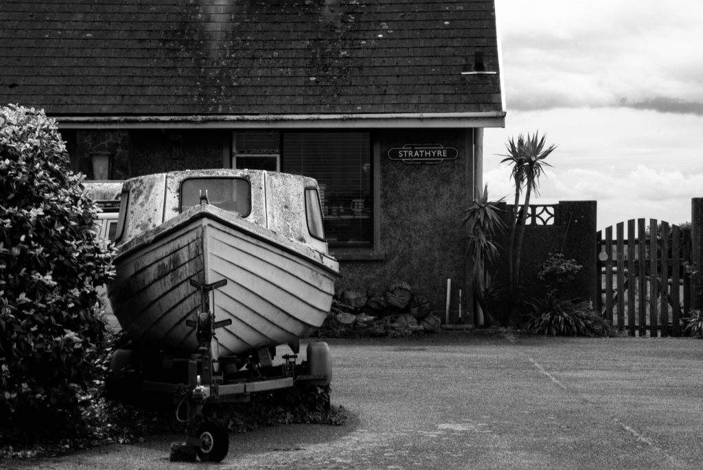
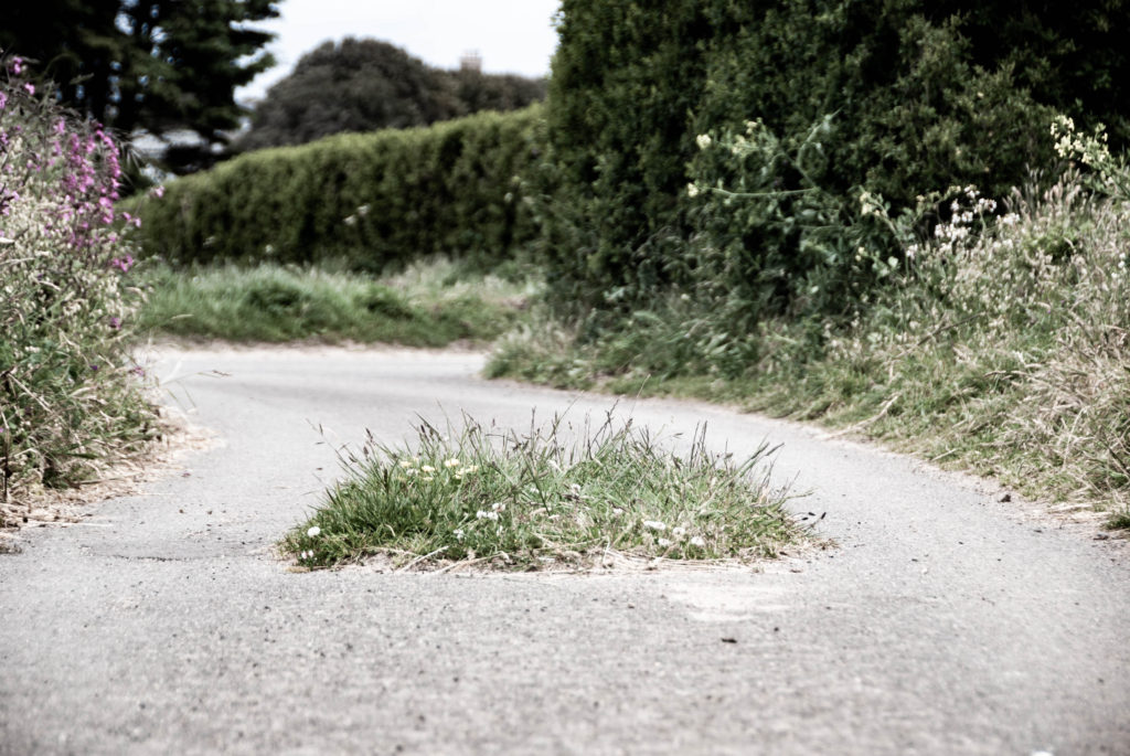
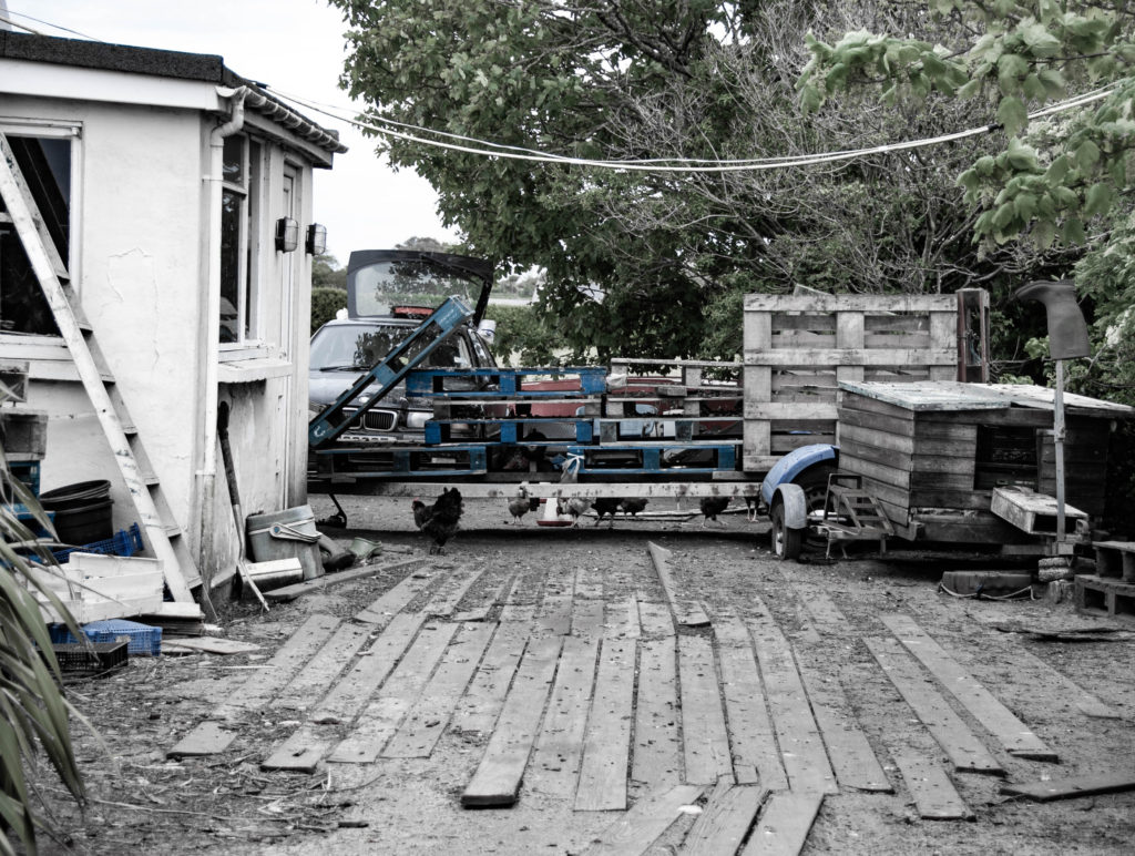
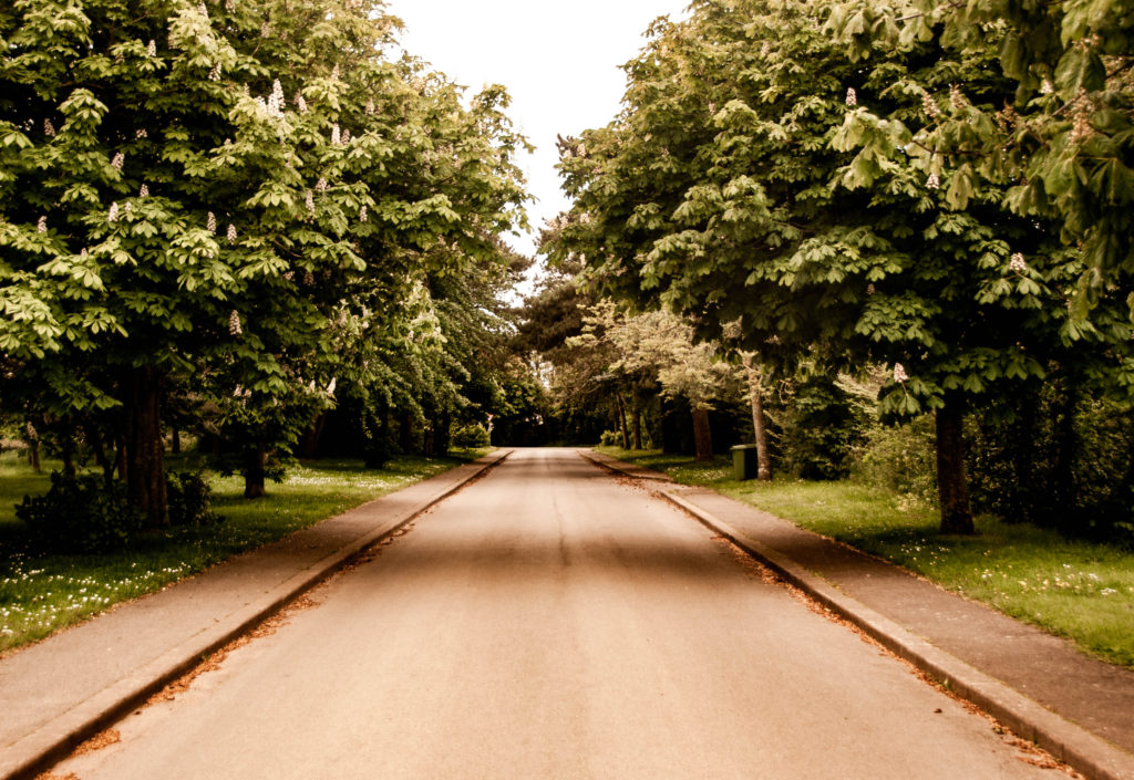
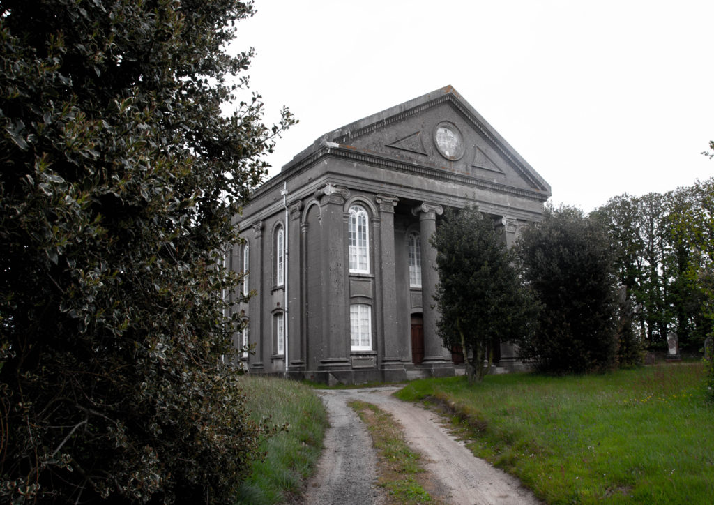
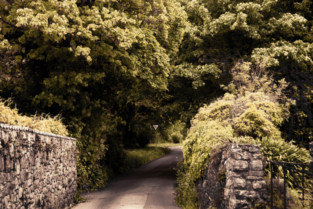
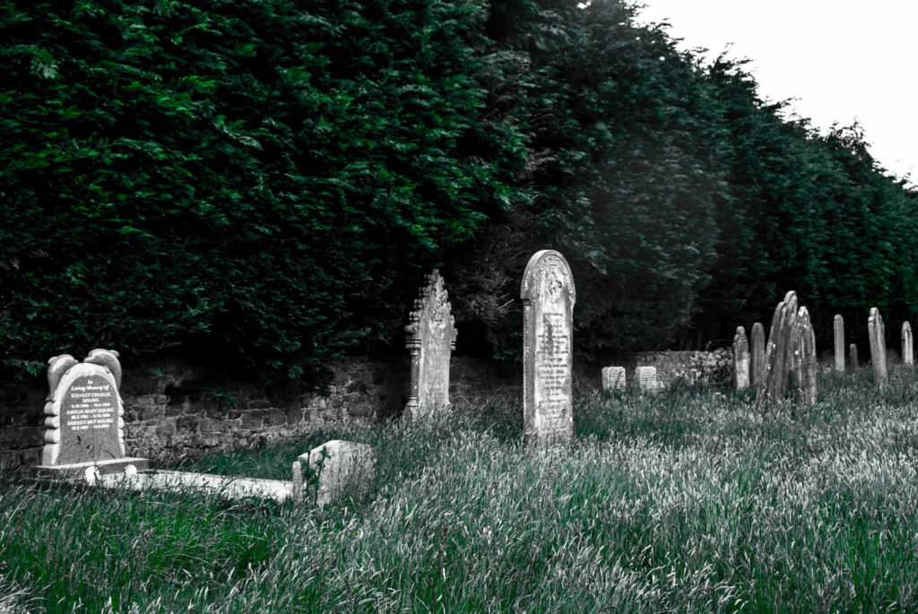
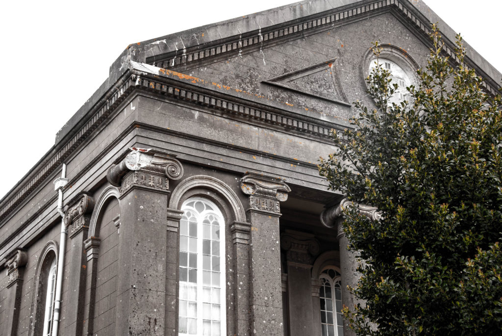
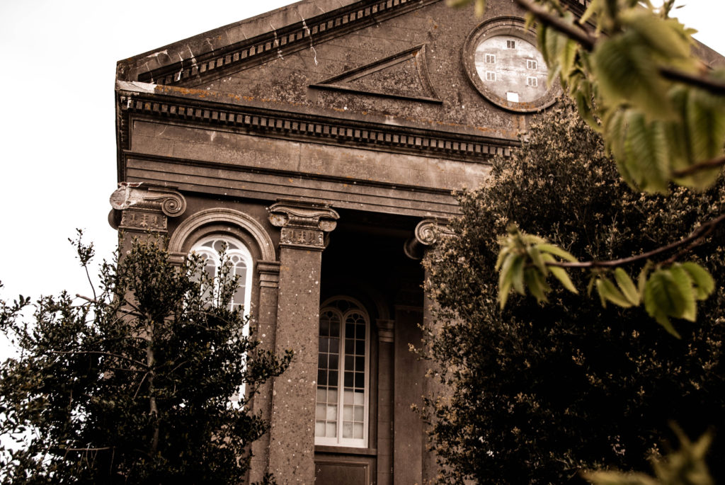
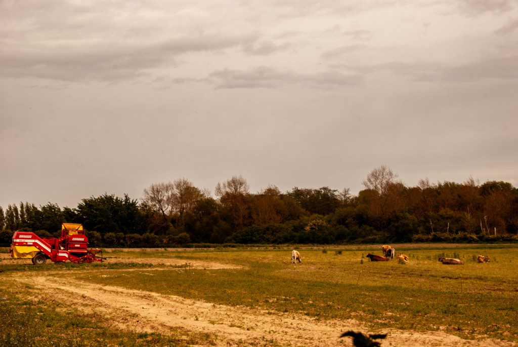
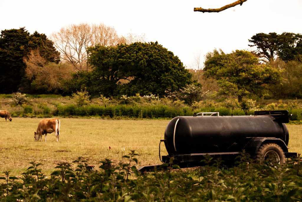
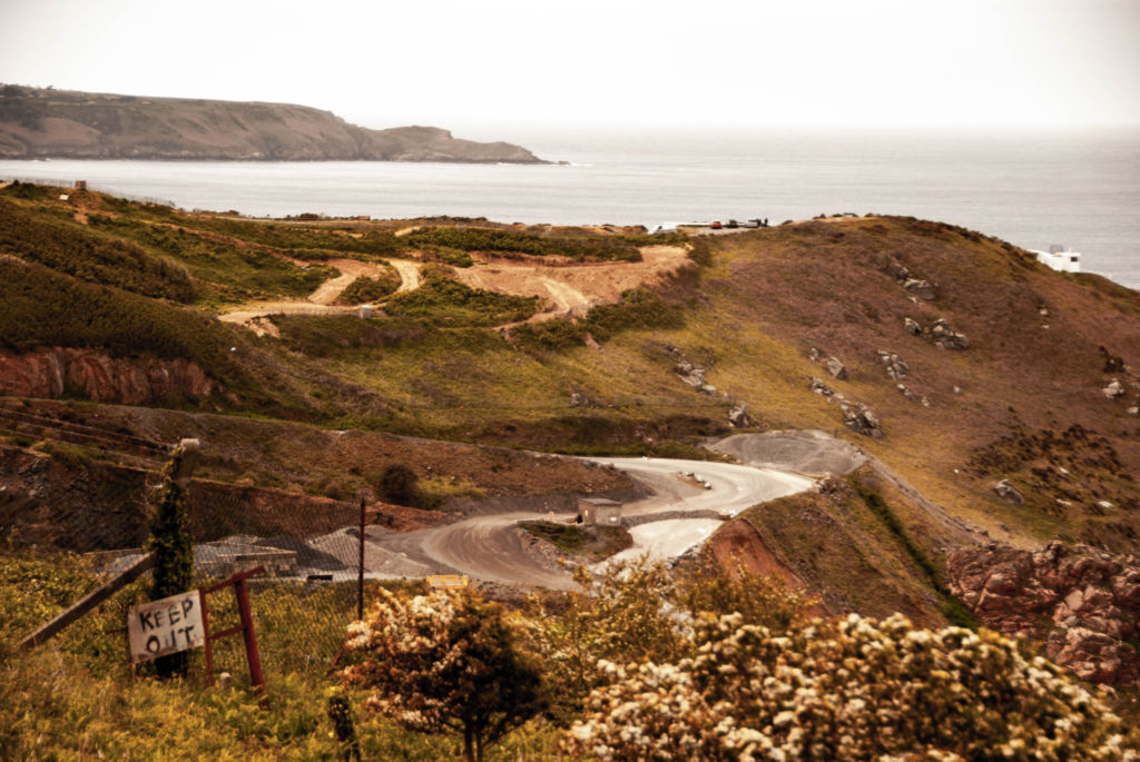
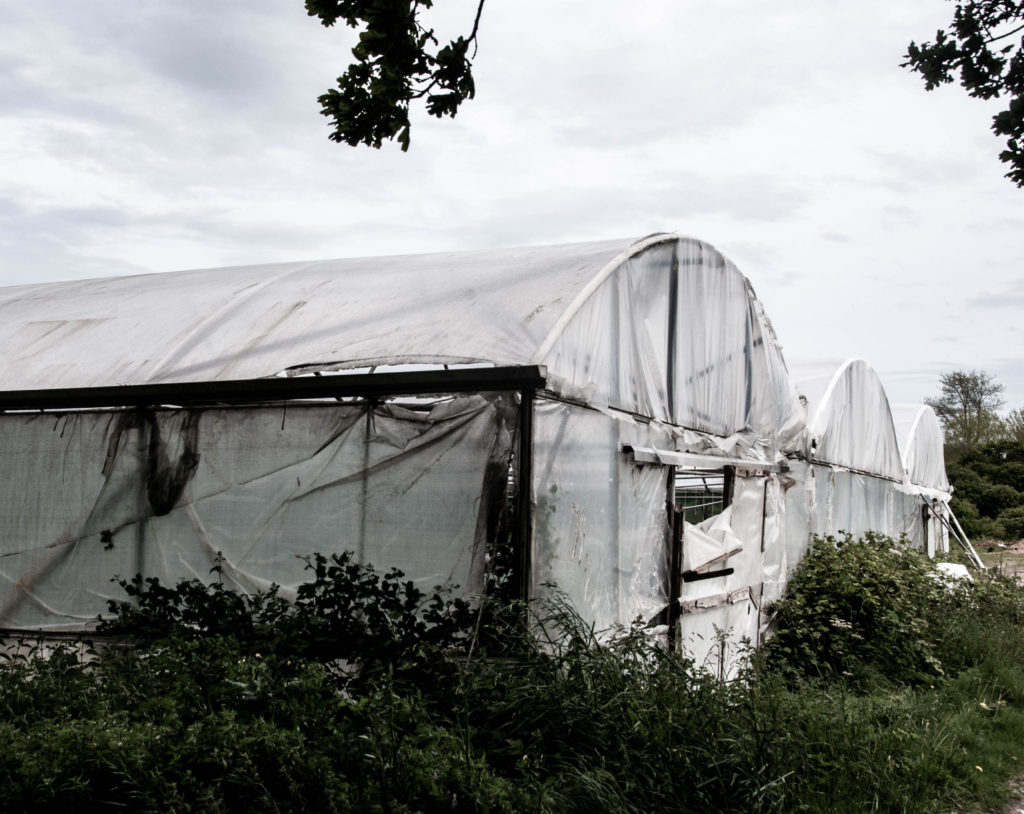
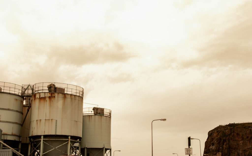
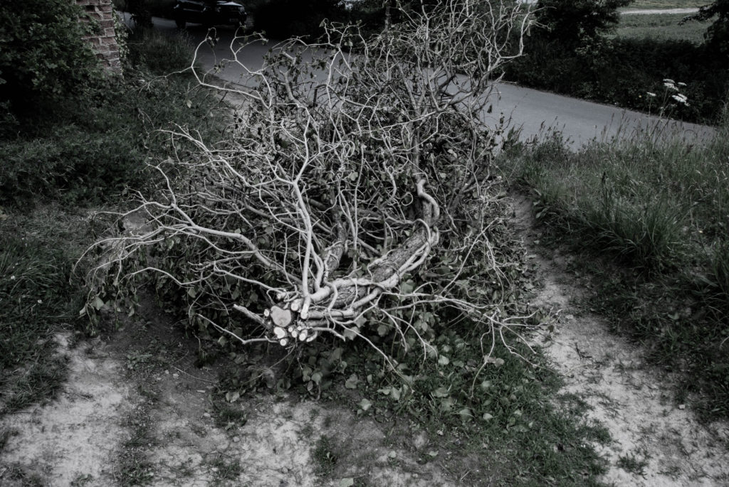
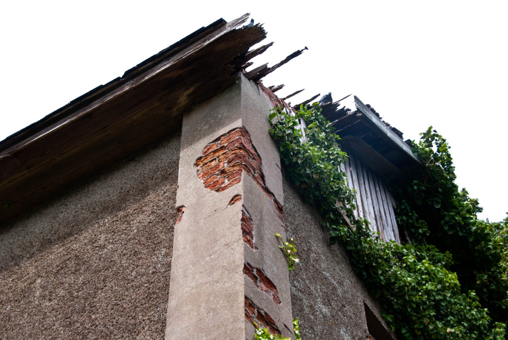
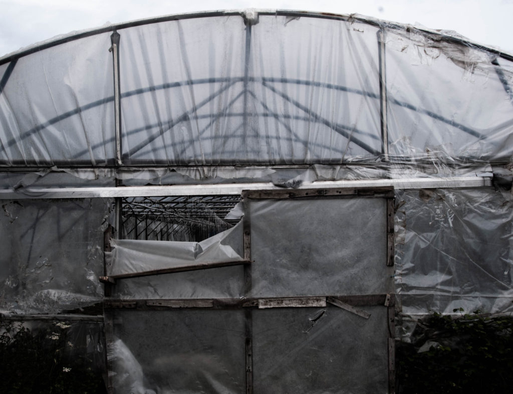
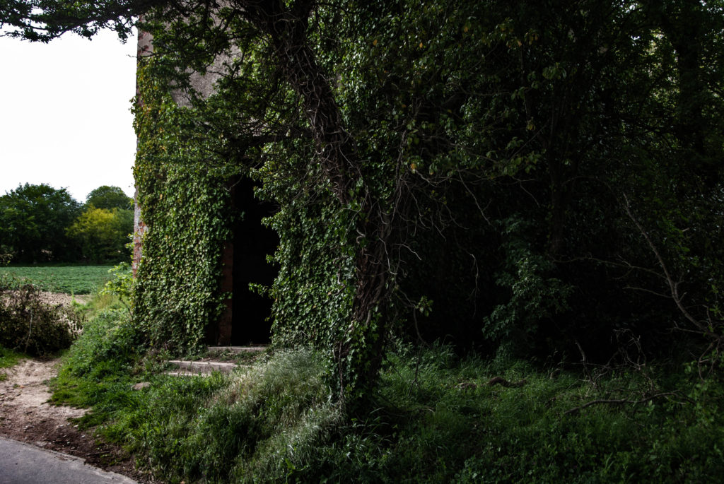
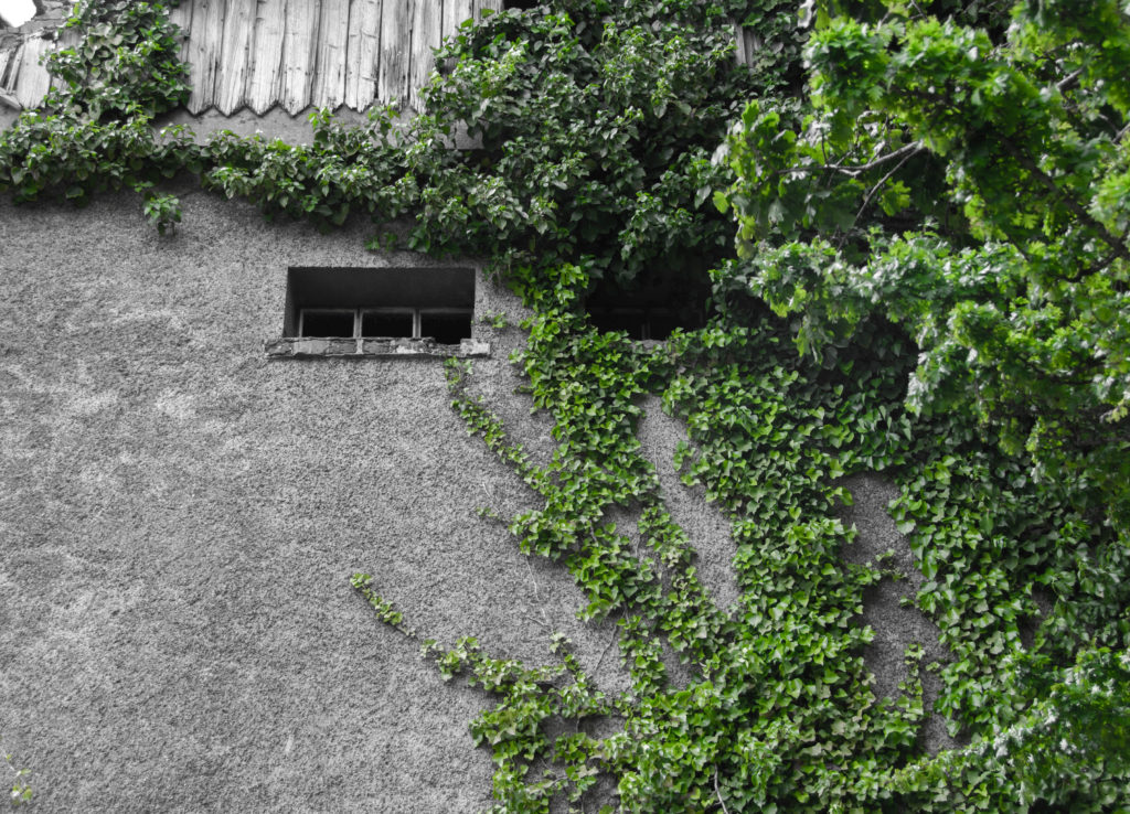
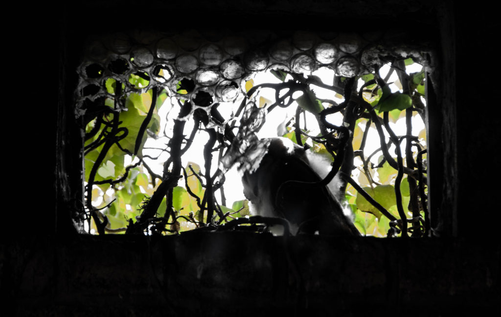
I am reacting to the works of Camilo Jose Vergara and George Marazakis so I focused on a film look with lower saturation on some images and warmer monotone colour schemes on others.

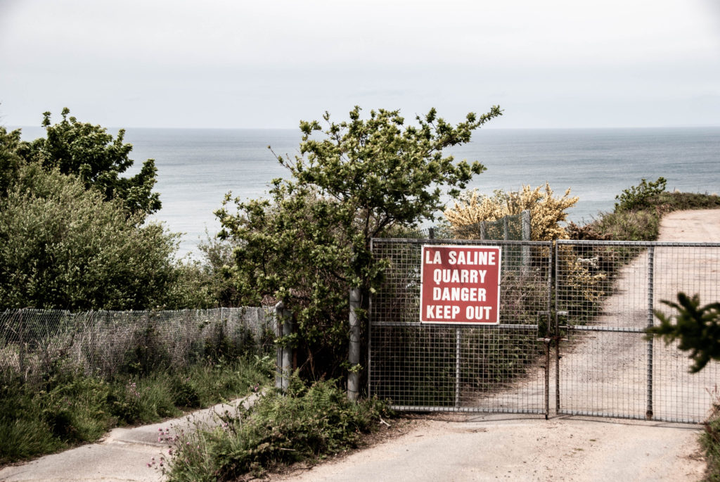

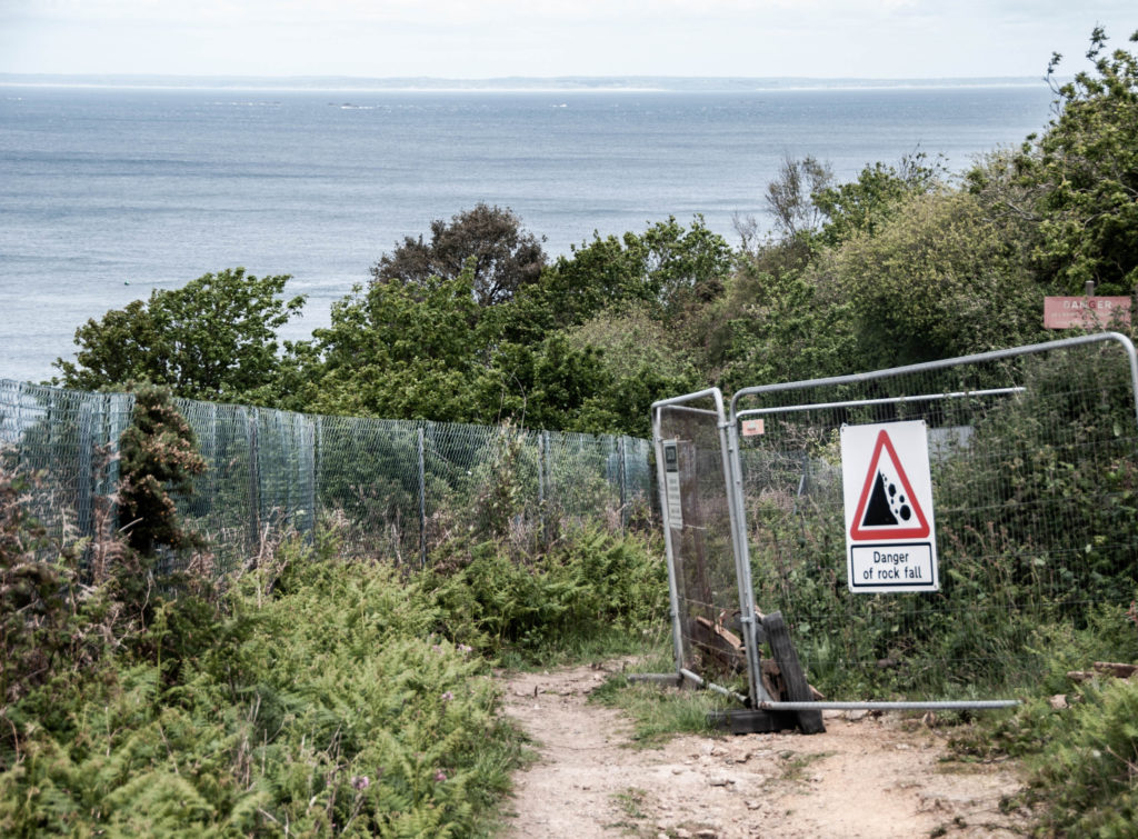
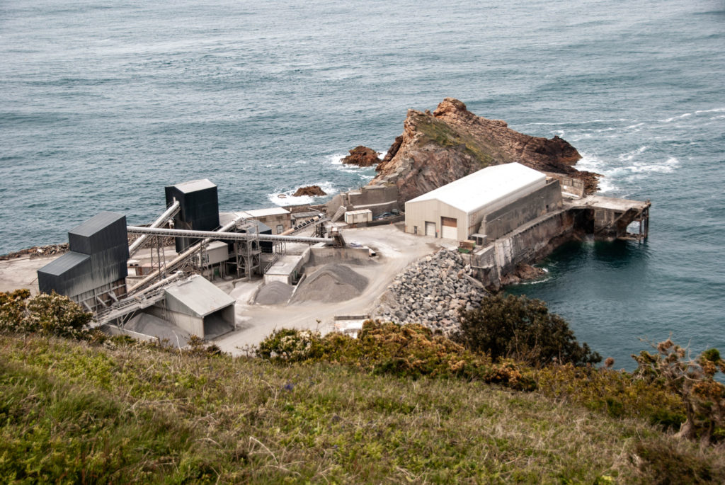

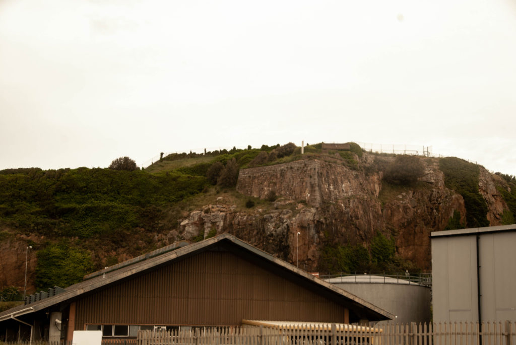
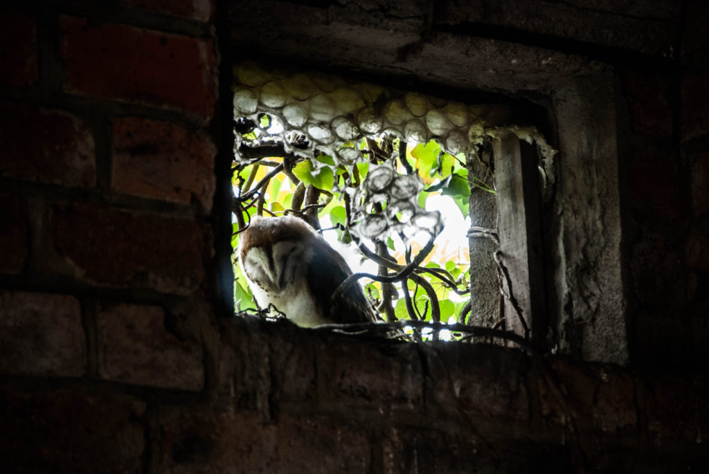
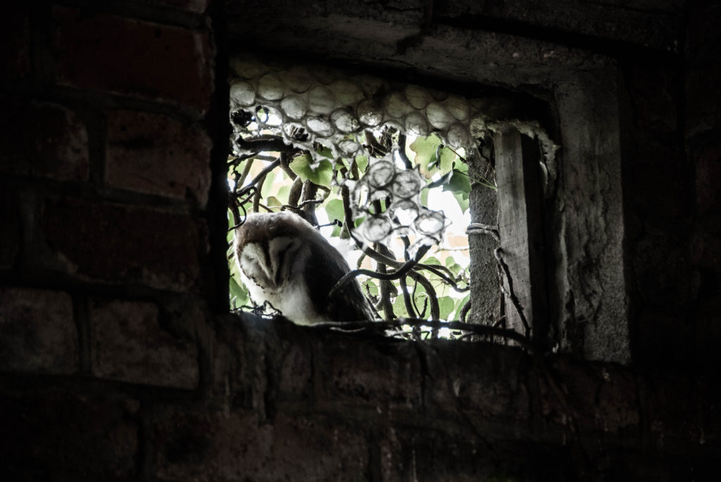
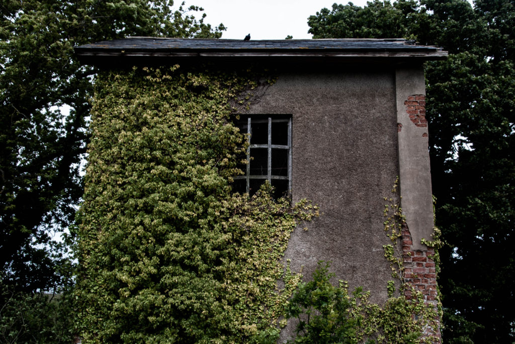
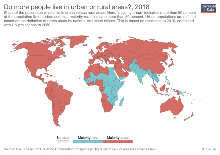
As the image above displays, the percentage of people residing within urban and industrial areas is becoming increasingly concerning in terms of land conservation and environmental effects. This is due to the fact that as a result of mass urbanisation, it is predicted that this current 55% of the global population, living in such places, will increase dramatically to 68% by the year 2050. This constant development not only means that rural areas will become increasingly rare along with the species inhabiting them, but environmental issues, such as air pollution and declining water quality, will become far worse, far more quickly than we have ever seen.

In addition, the increase of such heavily polluted and populated areas can lead not only to worsening environmental issues, but declining mental health and well being, and also a loss of culture. This is due to the fact these places possess far more stressors, such as overcrowded places, higher violence levels and less social support, compared to areas that incorporate the existing nature into the layout and of these cities. Furthermore, these dense concrete places are a victim of their own design, as they are more vulnerable to extreme weather and environmental conditions, that such large places of development cause.
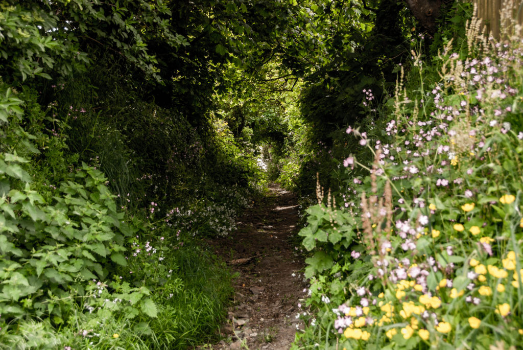
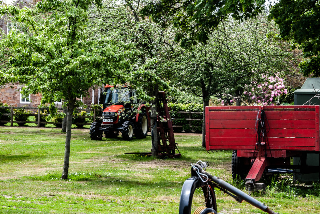
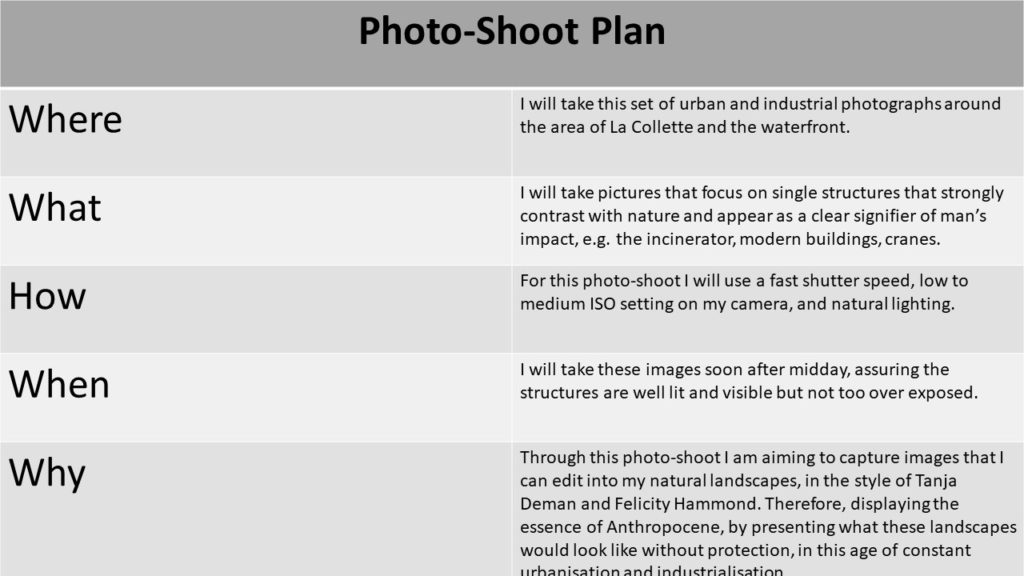
With this photo-shoot I will aim to photograph structures that are signifier of these types of densely populated urban landscapes. Although in Jersey we are fortunate to have a large amount of rural landscapes, it can be said that with the ever-growing population of the island and its need for housing, continuous development of buildings such as flats, put this nature in danger.
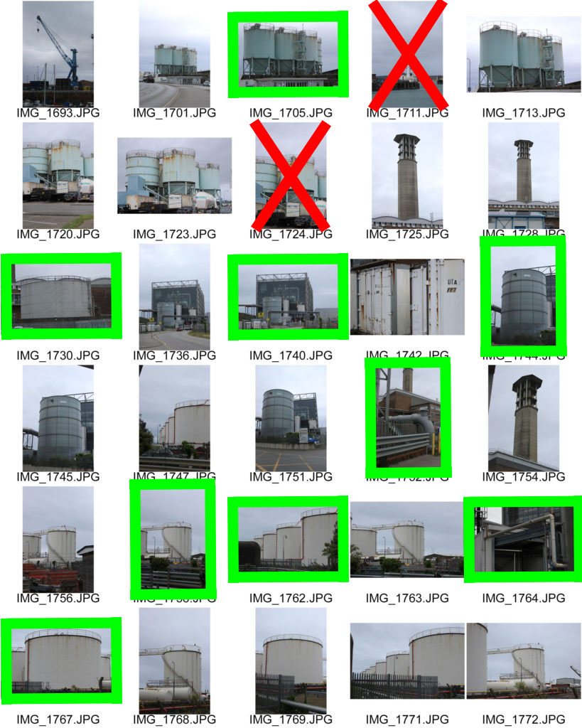
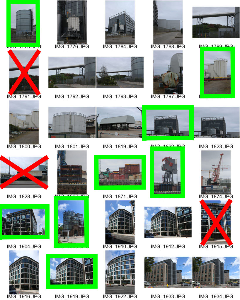
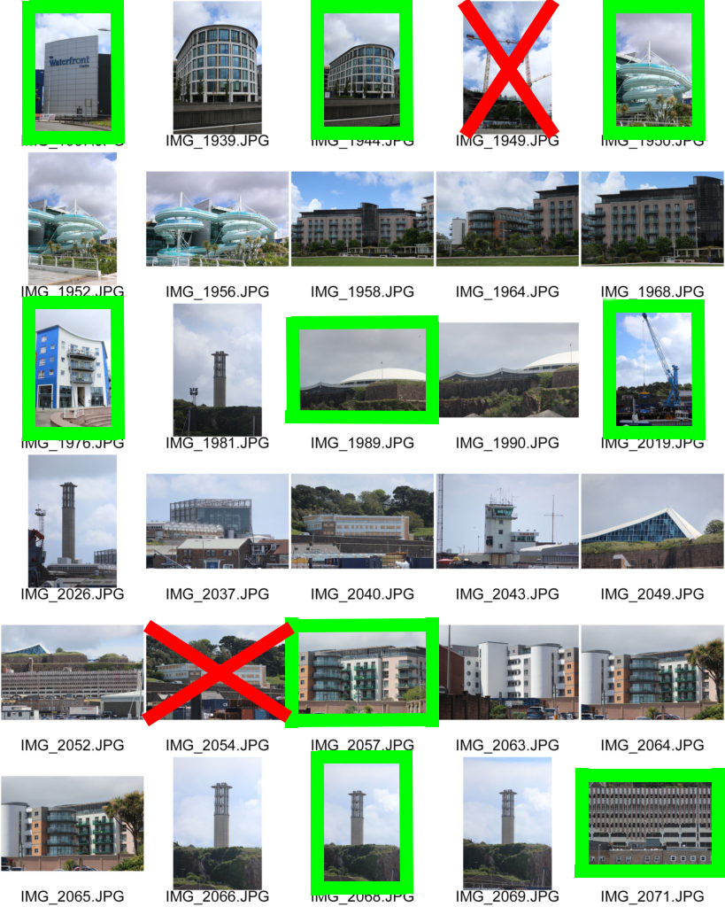
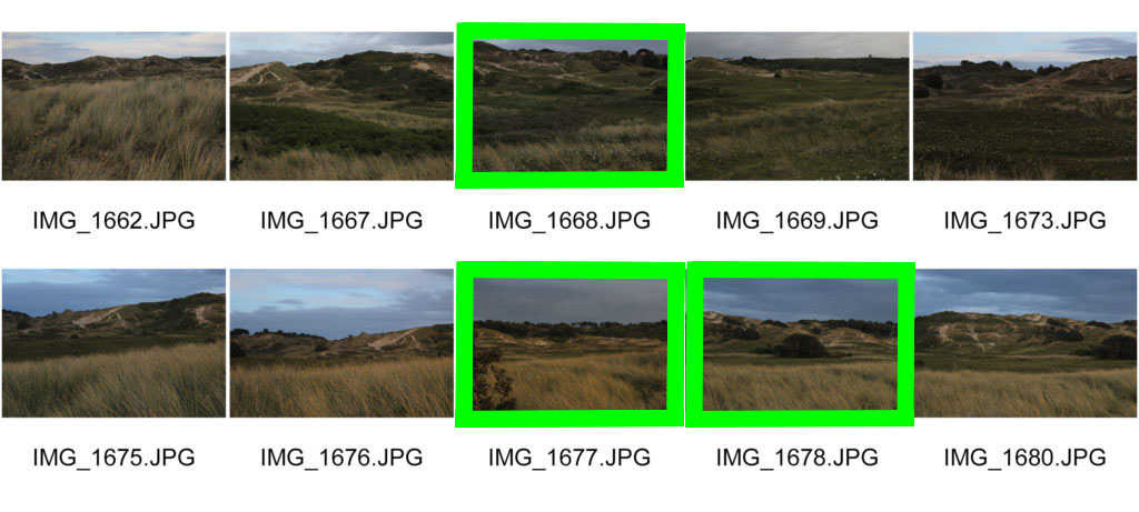
Here I have highlighted in green, the photographs that I think turned out best and will work well when combined with the natural landscape images. Also, I have crossed out the images in red that may have been blurry or are under or over-exposed, these are the photographs that I definitely will not edit for my final product.
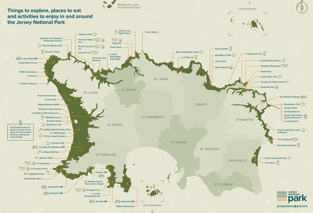
Jersey’s National Park is a unique area of conserved land, that stretches along the coasts of Jersey. This protection of Jersey’s natural coastline was created in 2011, following a peaceful protest in 2009, in which 7,000 islanders created a human chain along the large stretch of St. Ouen’s bay. This protest was the result of the people of Jersey’s frustration with the constant coastal developments occurring around the island, obstructing the island’s natural beauty, and called for the government to heavily regulate any future developments in these places, to which they complied to. This conserved land now possesses 16% of the island’s land mass, due to people’s love and appreciation for nature.
However, many places are not so fortunate to have regulation’s like this in place, to protect the small portion of nature we have not yet destroyed as humans on this earth. With this photo-shoot I want to bring to attention why it is essential that places are protected from the negative impact the Anthropocene era has inflicted on the earth.
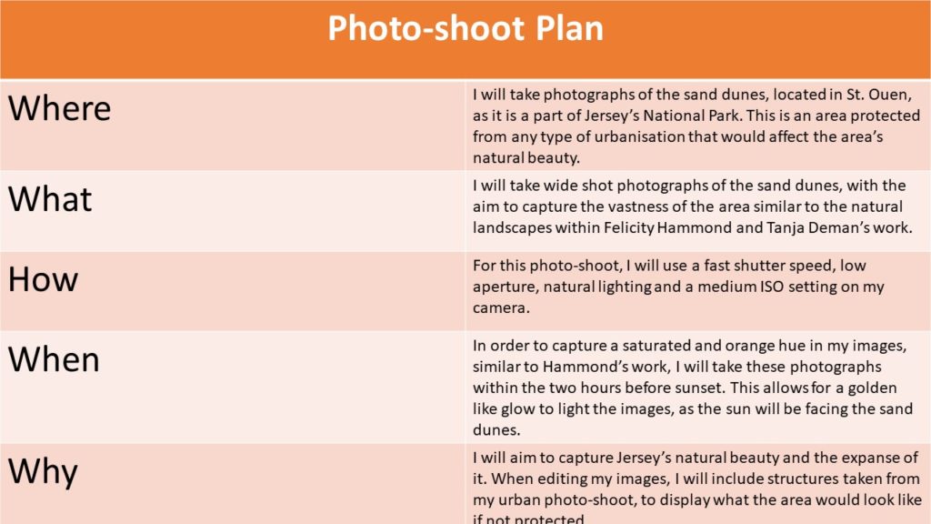
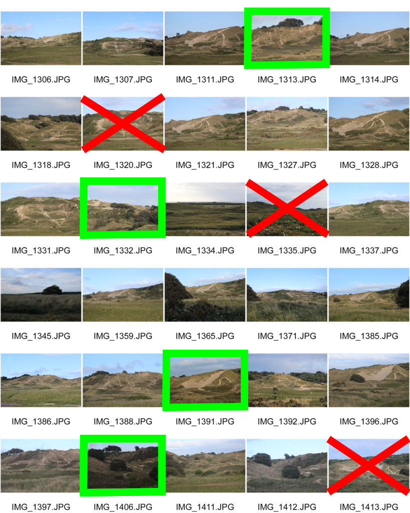
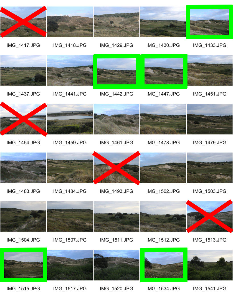
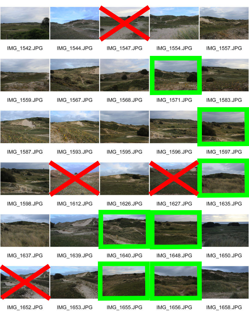
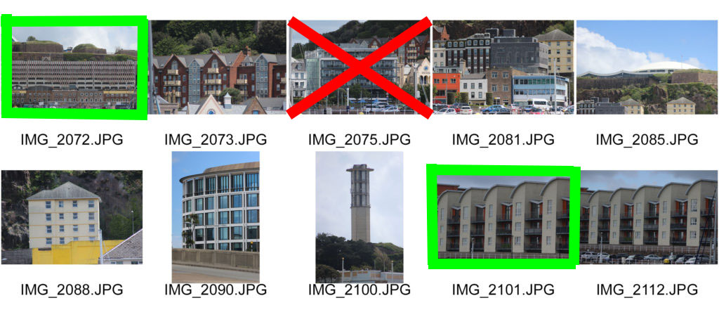
Here I have highlighted in green, the photographs that I think turned out best and will work well when combined with the industrial and urban structures. Also, I have crossed out the images in red that may have been blurry or are under or over-exposed, these are the photographs that I definitely will not edit for my final product.
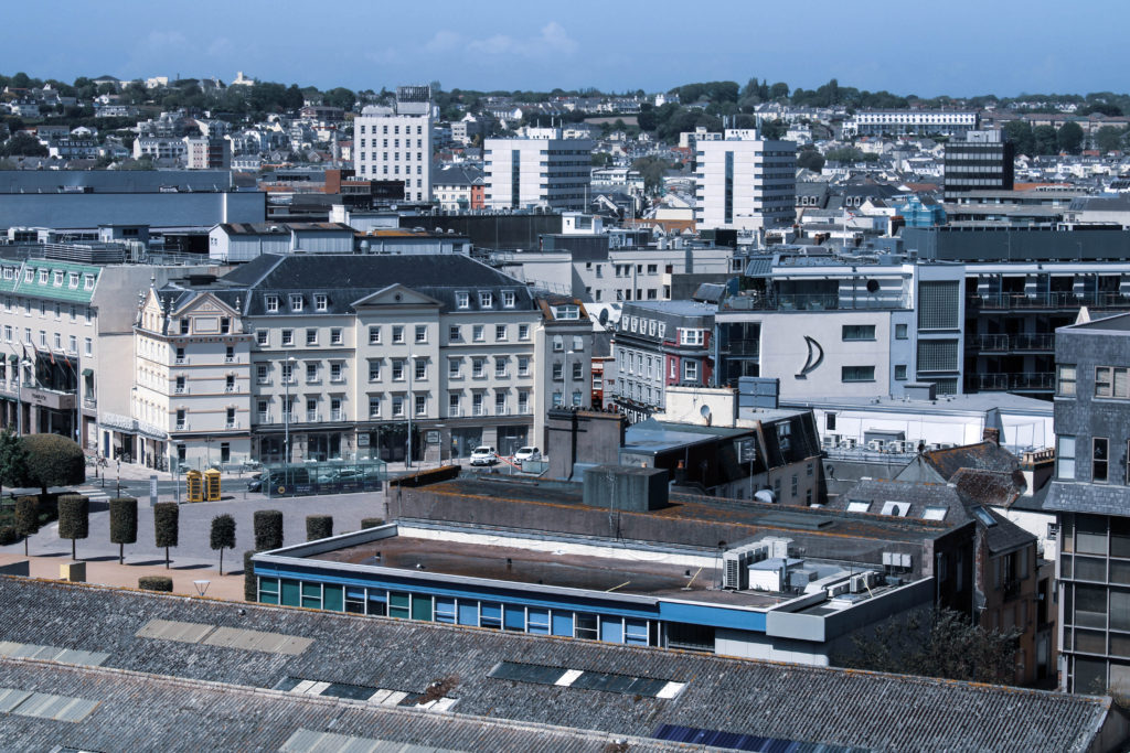
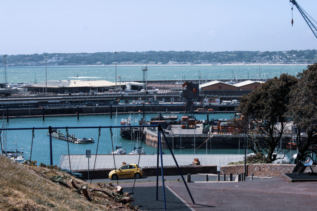
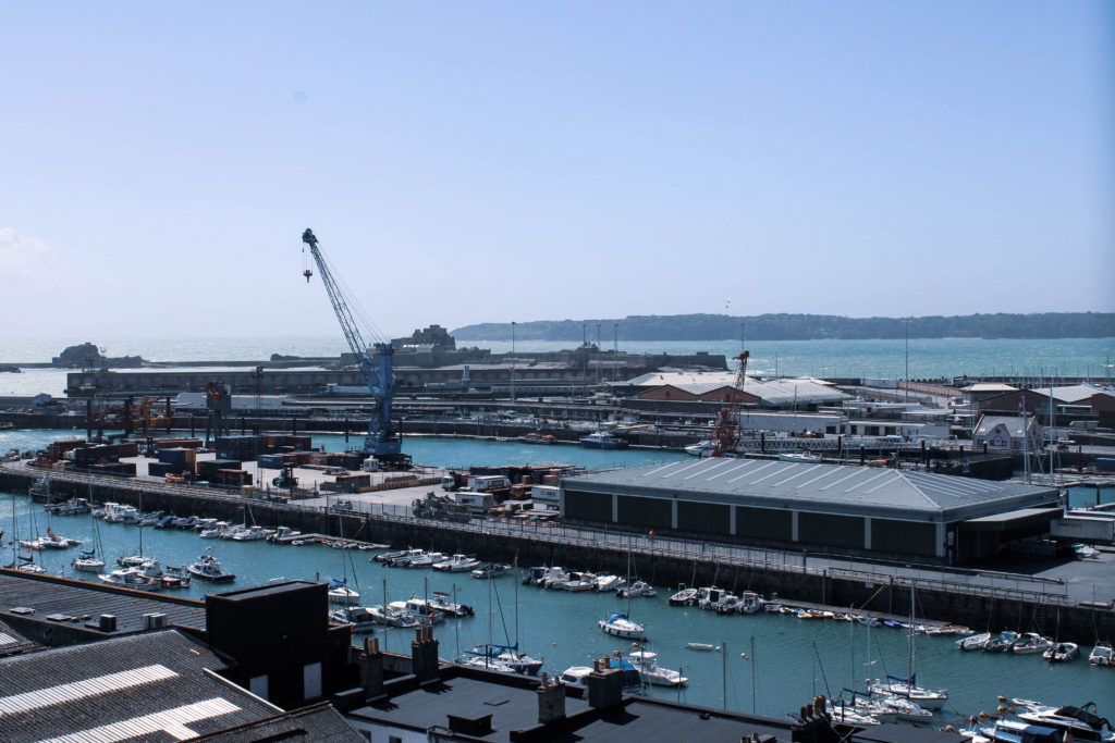
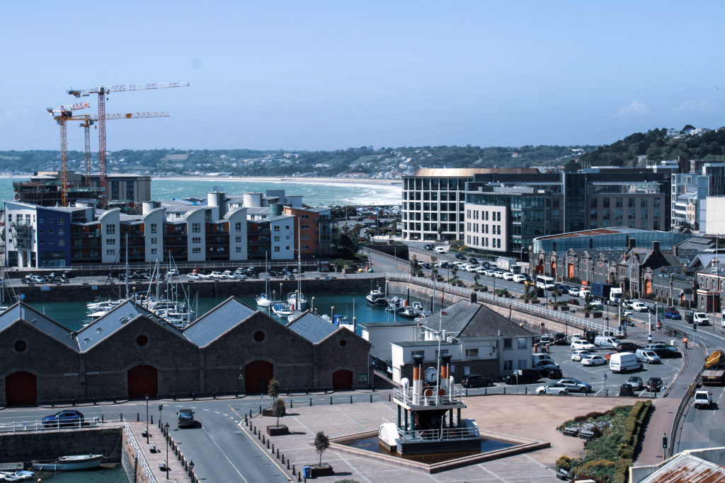
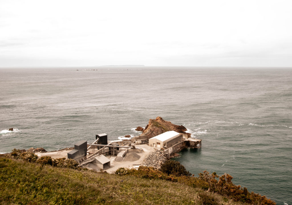
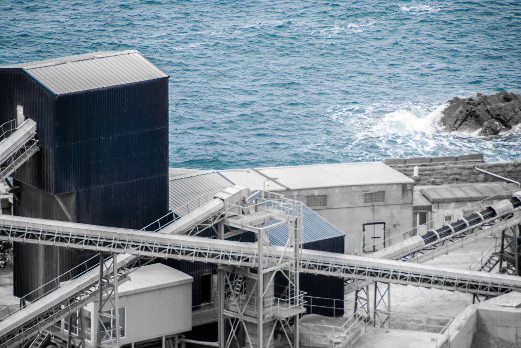
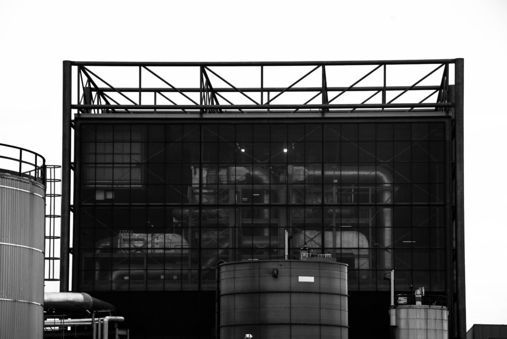
During my editing process for this photoshoot I decided to demonstrate how cold and senseless our world is becoming as a result of mass industrialization – I heightened the whiteness of each image using Adobe Lightroom to reflect Burtynsky’s dystopian and modernized landscapes, symbolizing how human impact may fulfil modern aesthetics, however it also destroys natural habitats. When editing I found it important to keep the cold tones and blue hue across the images in order to suggest how the industrialization of natural landscapes is cold-blooded and eradicates the feeling and warm atmosphere that is produced by unrefined and rural areas of civilization. In Lightroom I turned down the temperature of these images and slightly decreased the vibrancy to further the idea of an unconcerned damaged world. In addition, I wanted to refrain from cropping any of my Edward Burtynsky inspired images as I believe the plain clear skyline in each of the photograph’s backgrounds gives the impression of there being a clear solution to the global problems in this day and age, allowing nature to thrive without destroying it for commercial/industrial purposes – linking with the Anthropocene idea that humans are the single most defining force on the planet as a result of mass industrialization.
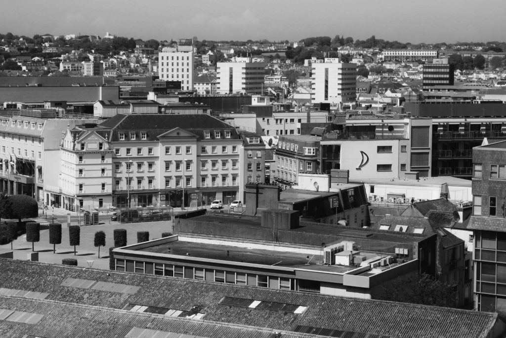
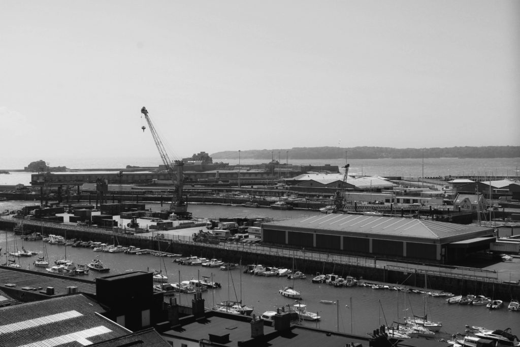
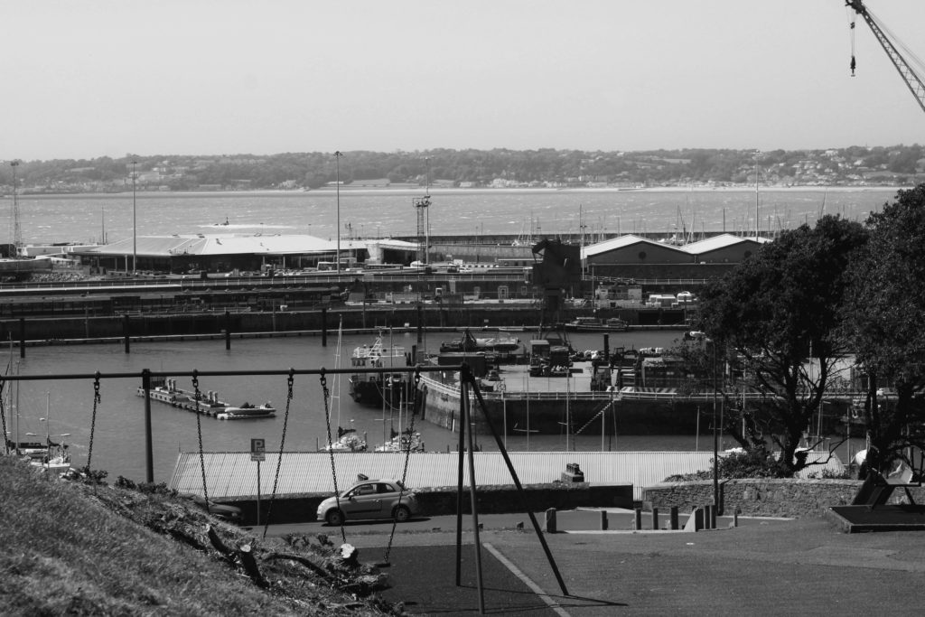
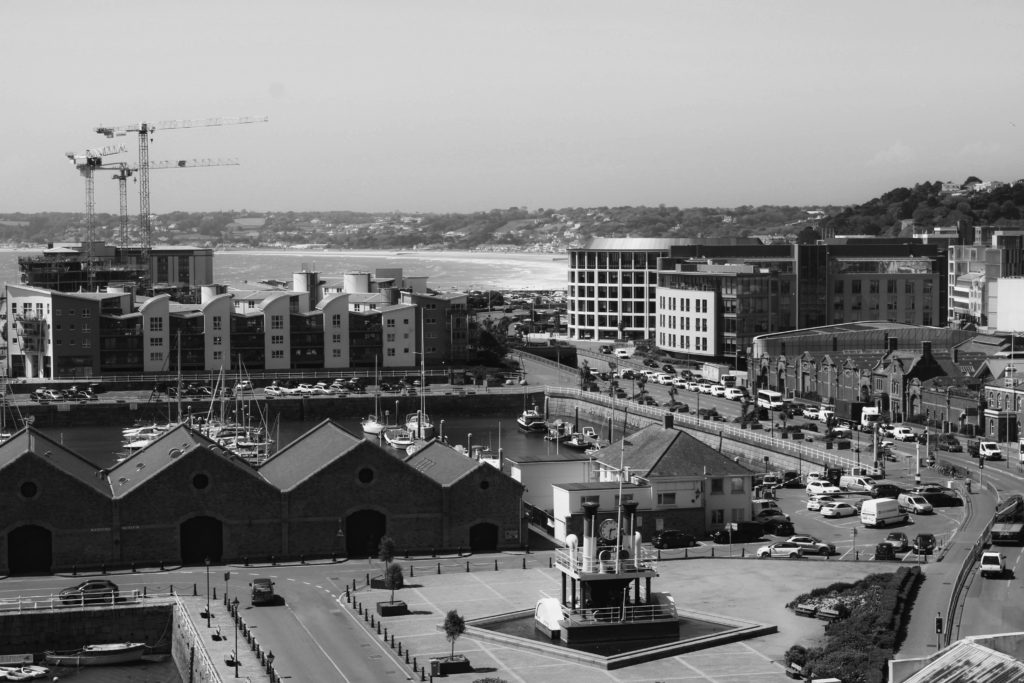
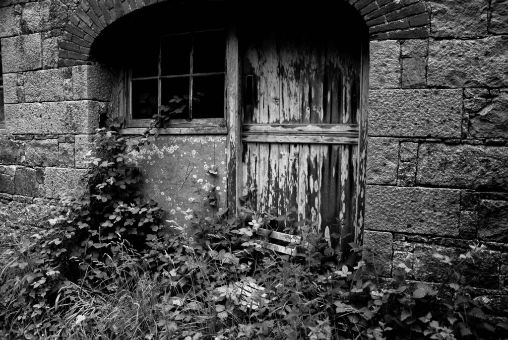
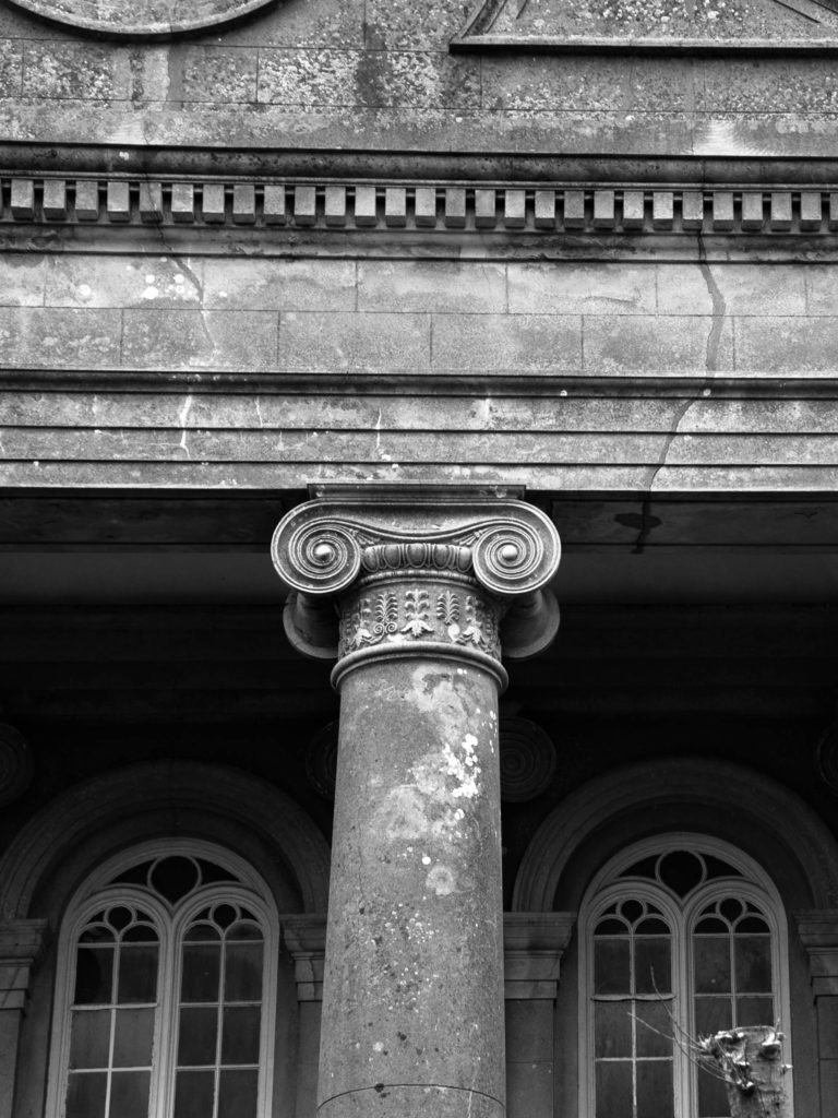
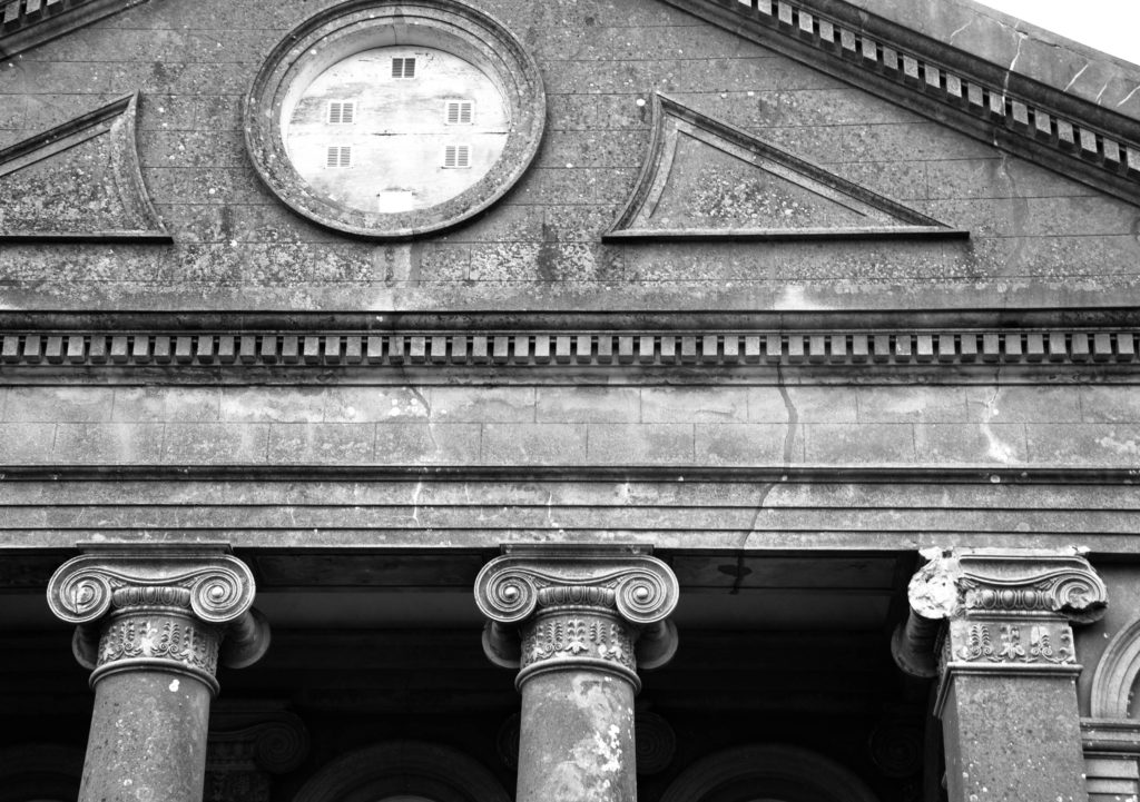
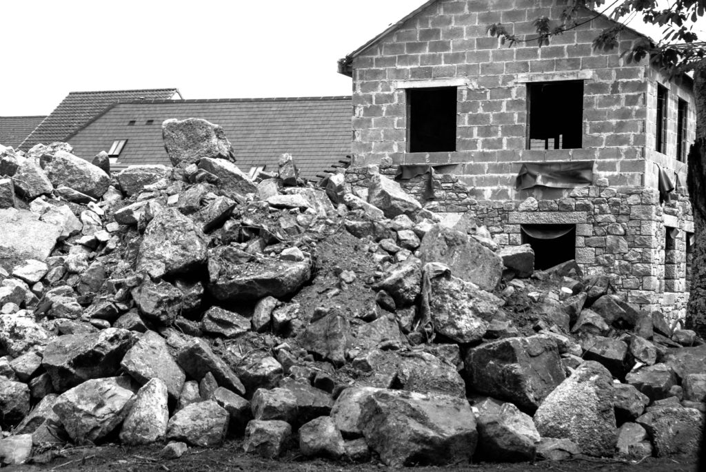
I chose to edit these specific same four photographs in black and white to experiment further with how colour can effect the atmosphere of an image. I edited the photos in Adobe Lightroom by turning down the saturation and vibrancy fully, heightening the contrast slightly to create darker tones. This wide range of light and shade in my images creates a more sombre atmosphere for the observer, the monochrome filter adds drama and creates a vintage feel linking to black and white photographs from the past. I believe this editing choice gives the impression and idea that Jersey’s landscapes hold so many memories for those that have lived here their whole lives, grandparents may have once had a home, or went to school here when the landscape was not industrialized – the black and white nostalgic atmosphere created juxtaposes with that which has been captured; a modern land with age-old memories. Furthermore, I believe that editing these images greyscale has emphasized the sheer amount of repetition within them, for example as the contrast is heightened it draws the observers attention to the darkest areas of the images. As these more shaded areas fall on the windows and doors photographed, it creates a grainier texture due to the high amount of times these subjects are echoed throughout. I think that editing these images with a black and white filter has added a dramatic yet nostalgic effect, juxtaposing with how these Jersey landscapes have been modernized over time. However, the monochrome effect does not provide as much of a cold atmosphere and doesn’t show the observer how man-kind is apathetic towards nature, I believe the cold temperature/coloured editing displays how society views their creations as inventive without seeing the danger behind how mass industrialization effects our planet – when deciding final compositions I will need to consider which editing choice works best.
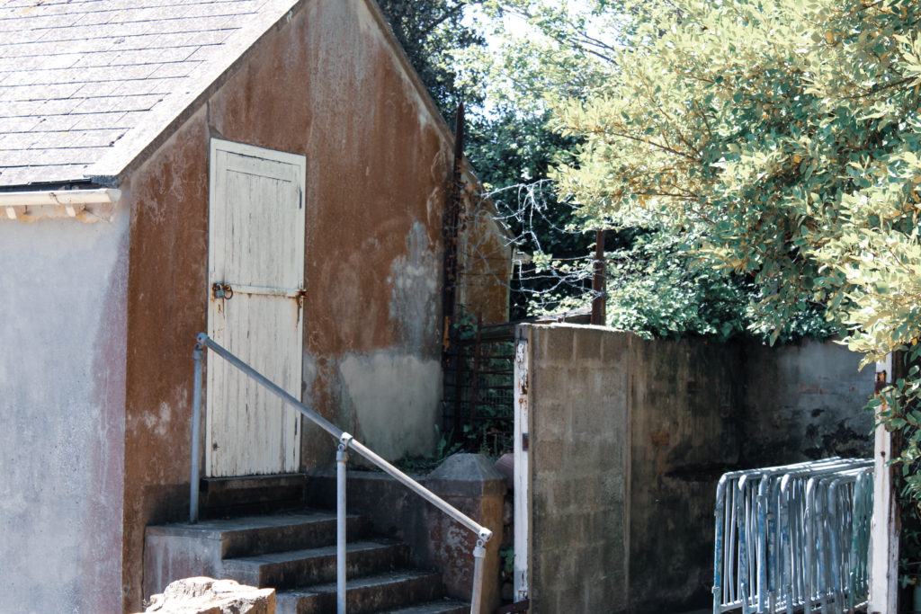
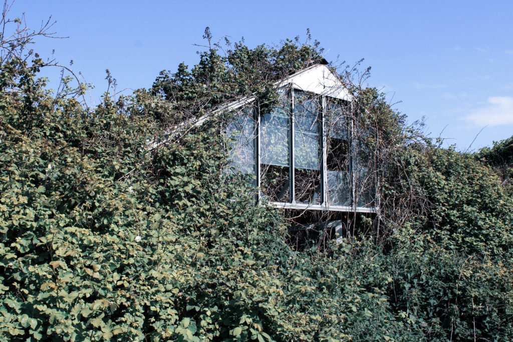
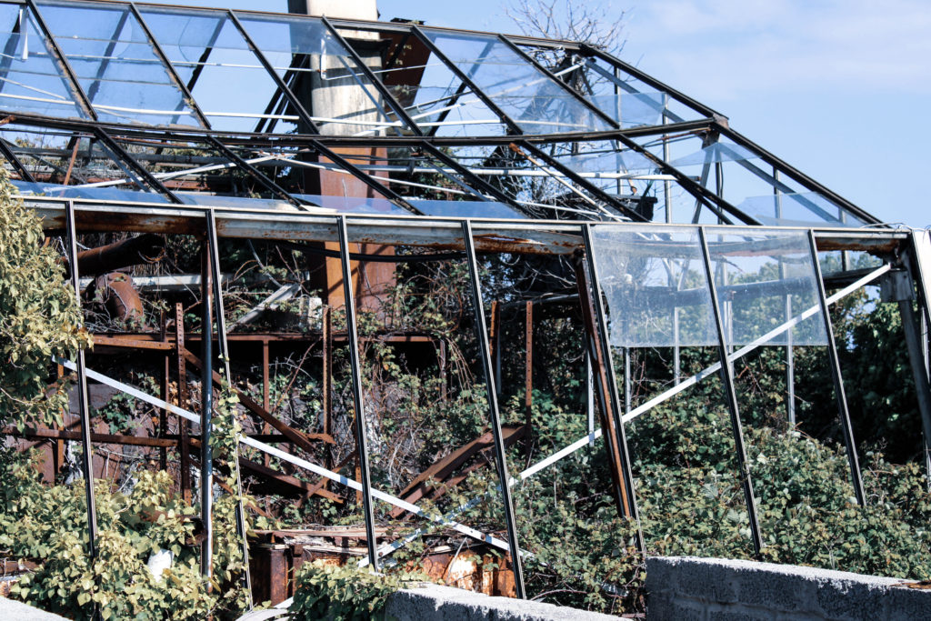
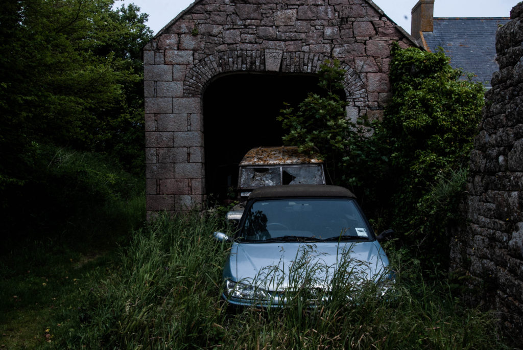
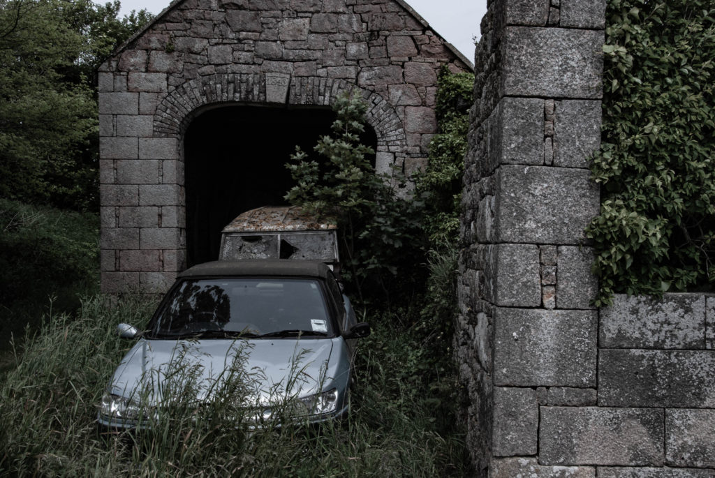
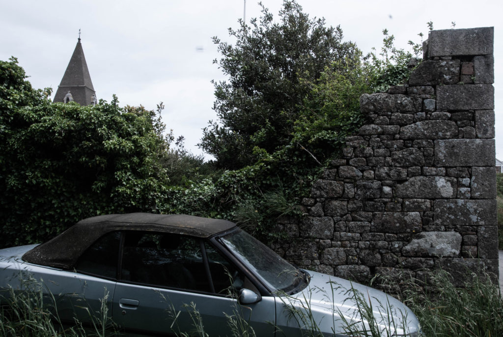
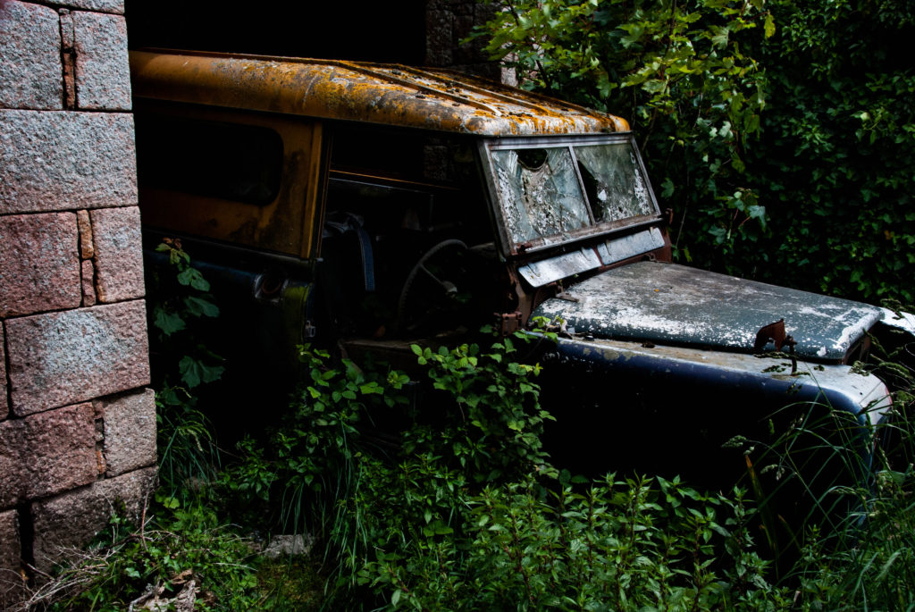
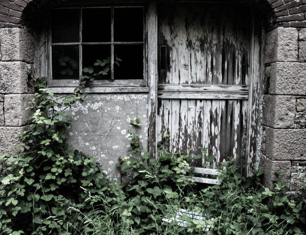
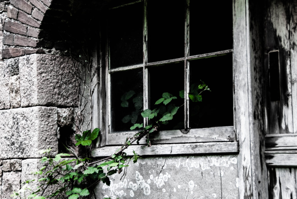
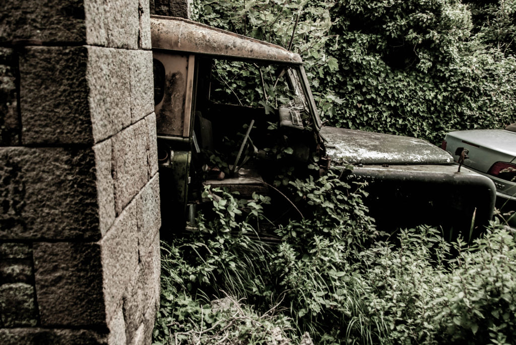
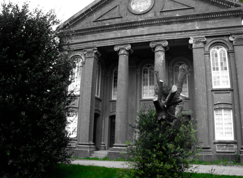
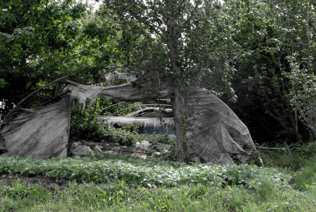
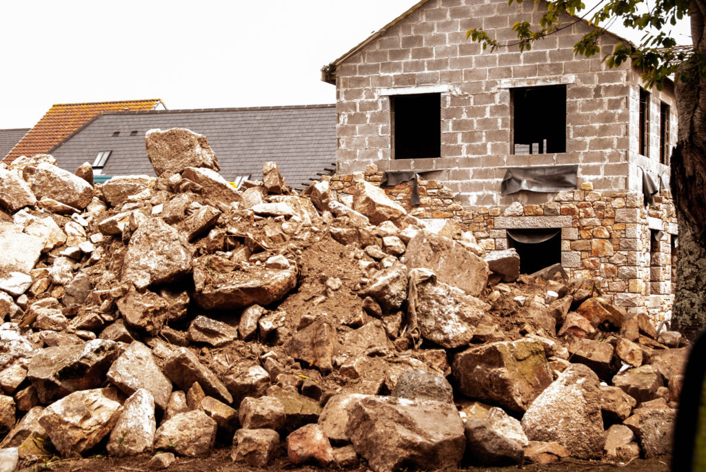
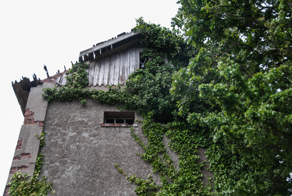
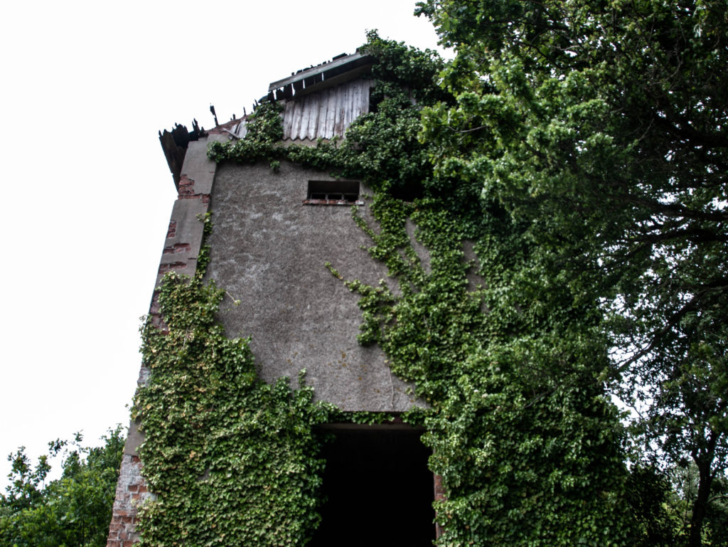
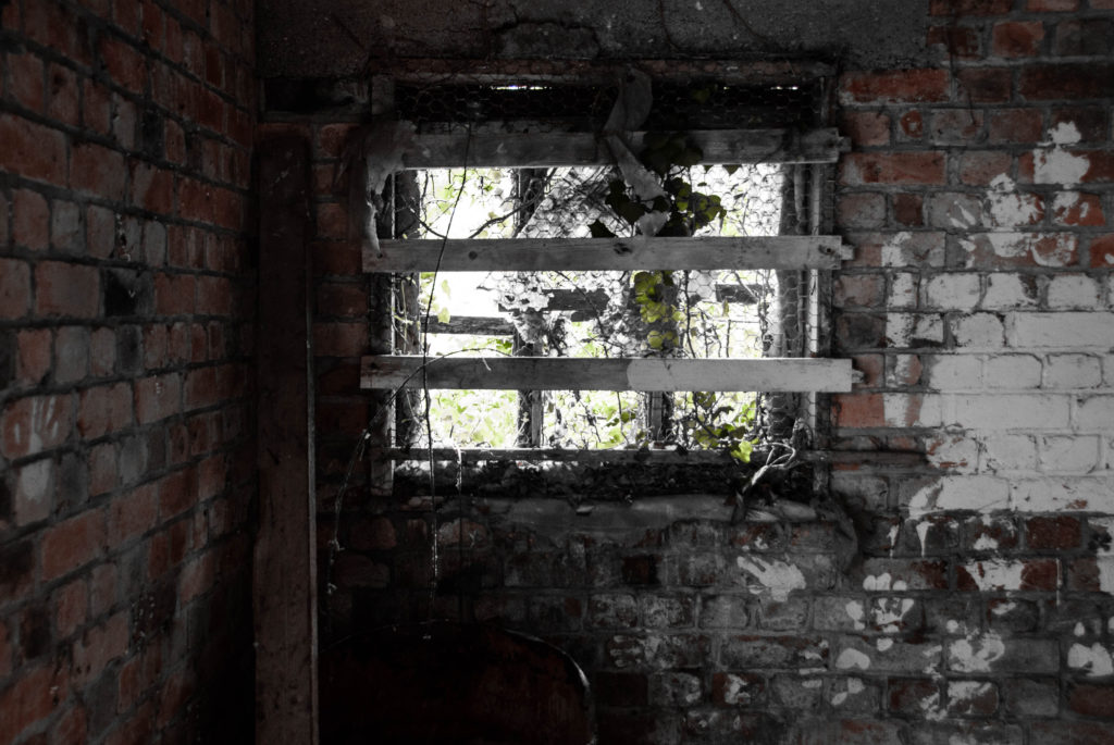
I chose to edit these three images from my Andrew Moore inspired photoshoot to demonstrate how human impact on the natural environment makes its beauty deteriorate, even with nature trying to fight back. During my editing process I made the decision to turn down the saturation and vibrancy of these images in order to reflect the dismal atmosphere that is present in these locations, the muted colours mirror how man-kind’s creations try to silence nature by destroying it. Additionally, I decreased the temperature of the original blue hue that fell across the image’s skylines as I believe they added too much of a bright happy atmosphere which is not what I wanted to portray. I also slightly decreased the exposure to produce a more gloomy and abandoned mood around these photographs to symbolize how these neglected landscapes had been left to ruin. I believe that making the choice to carry out more harsh editing on these images links to the idea of Anthropocene strongly, connoting the idea that man-kind’s ‘editing’ of landscapes is wrecking the unrefined blessing of nature – I plan on setting out my final images in a sequence which shows the growing industrialization of our world, which with this editing choice will be furthered seeing the absence of colour increase as man-kind’s effects take their toll.
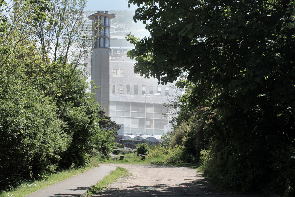
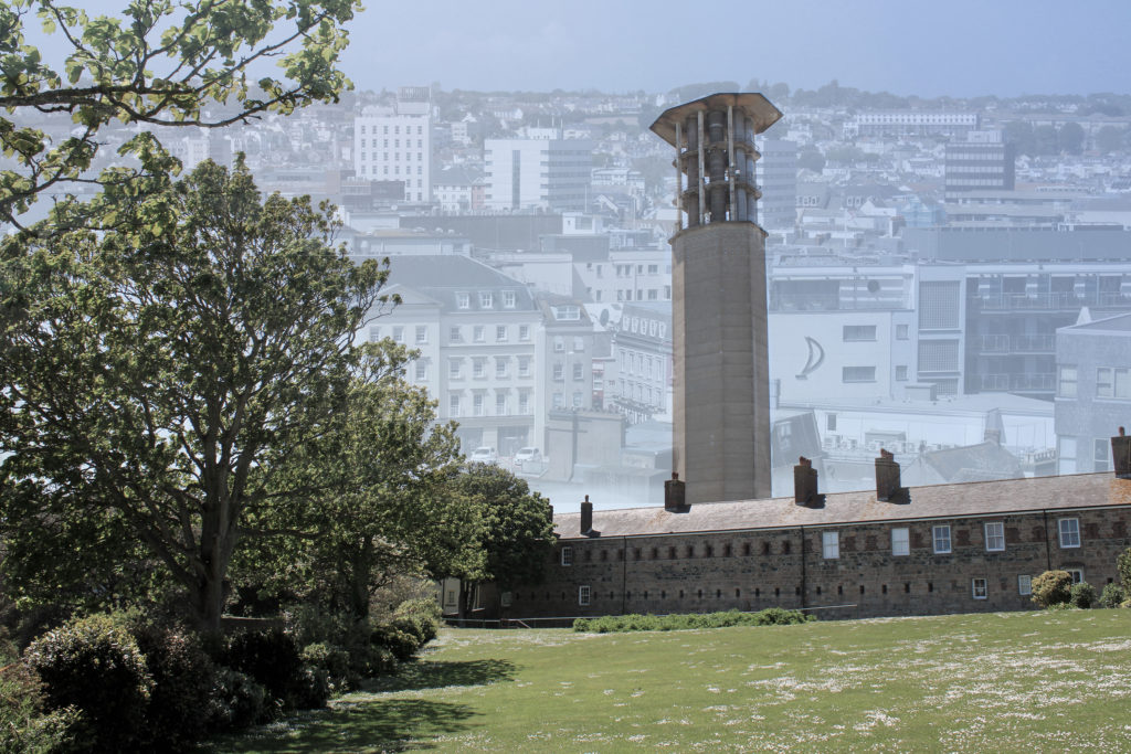
I decided to experiment by creating two multi-exposure images on Adobe Photoshop by merging four different photographs, two from my Andrew Moore inspired shoot and two from my Edward Burtynsky shoot. In Photoshop, I lowered the opacity of the two Burtynsky inspired images and placed them over the other’s skyline. My idea when creating these multi-exposures was to reflect how the future of our planet may look if mass industrialization continues. In the background, the faint St Helier skyline I have edited on really effects the texture of the images as the repetition of buildings and windows creates a more cluttered and artificial feeling. As the modernized setting continues on and disappears into the background it connotes the idea that Anthropocene will proceed into our world’s future, as a wider depth of field is formed. In terms of shape in these images, the geometric patterns from the modern buildings juxtapose greatly with the organic shapes of the trees captured in the foreground. This gives the impression that mass industrialization will not only destroy the natural landscapes of our planet, but also the way society views themselves; the blocky/structural architecture symbolizes how man-kind are becoming robotic homogeneous beings that have no care for the environment around them. The composition of these images also links to Anthropocene ideas, for example the second multi-exposure edit uses the rule of thirds to show the stages of industrialization without needing a sequence of lined up images. The foreground demonstrates nature untouched by man, the mid-ground hints at man’s slight interference with the environment and the background clearly shows mass industrialization. While this technique has its pros, there are also cons surrounding how the ‘stop urbanization’ message could be understood and possibly lost in translation due to the cramped texture and dull vibrancy throughout, as I wanted to reflect the beauty of nature compared to the banal devastation formed by industrial landscapes.
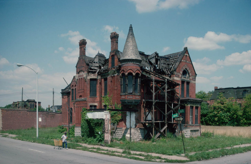
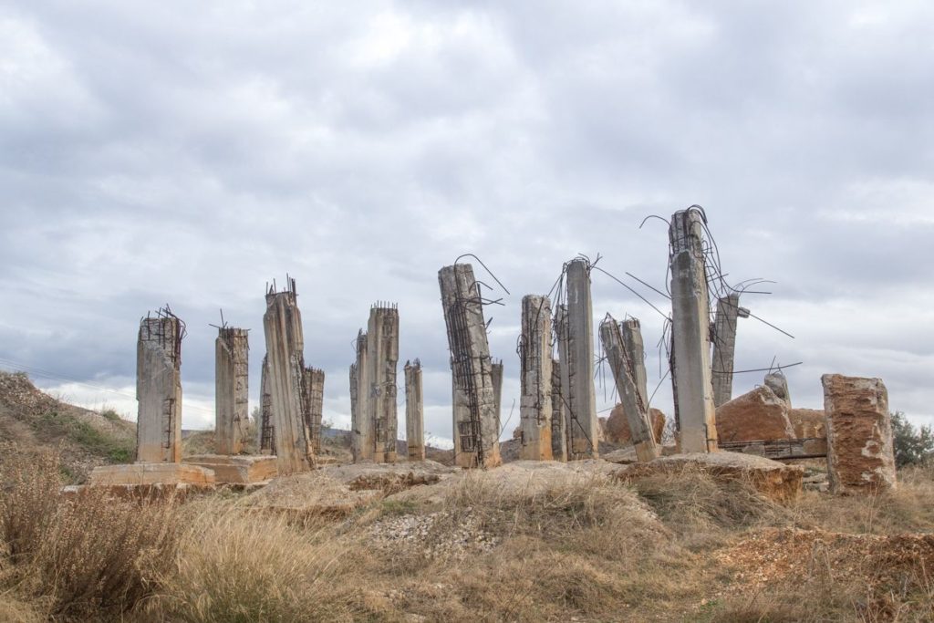
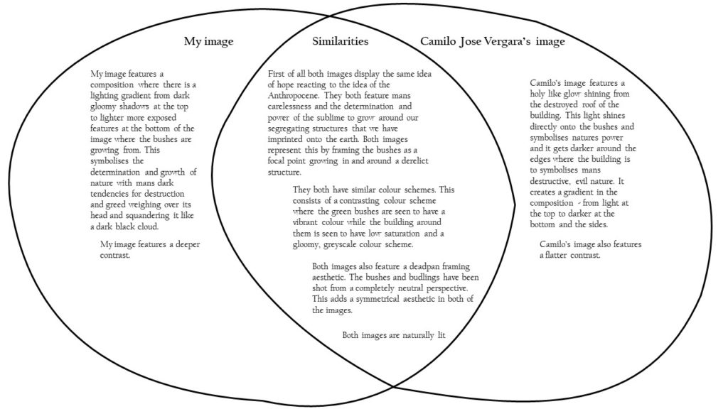
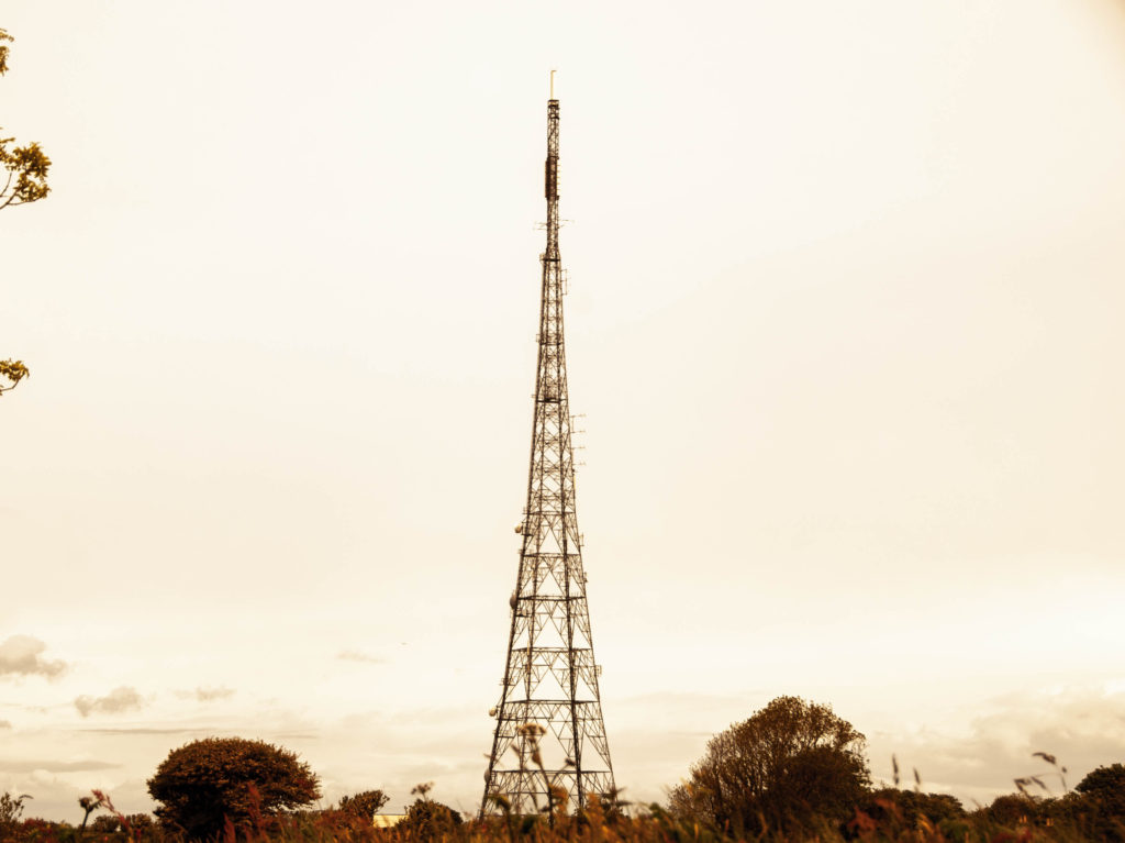
Both images feature a reaction to the Anthropocene. They do this by capturing the essence of mans reckless footprint on the natural environment and man’s greed and carelessness of having to constantly industrialise and destroy the natural environment and then move on swiftly without care. This is seen in these images where the focal point is placed on the derelict structures by framing them in the centre of the composition in a symmetrical fashion.
Both images have similar structural features, they both contain many vertical leading lines created by the structures and the neutral perspective at which they are shot. Both images also contain a deep depth of field with the structures in the foreground and the clouds and various other elements stretching far into the background.
These images differ in their colour schemes as Camilo’s image features a more saturated look with a wider tonal range which creates a deep contrast in the image. The image also contains a wider range of colours whereas George’s image contains a monotone, warmer colour scheme with shallow range of colours. Georges image is also flatter in terms of contrast, it has a narrower tonal range.