All posts by Wiktoria J

Filters

Author:
Category:

REPETITION, PATTERN, RHYTHM REFLECTION AND SYMMETRY –

Alfred Stieglitz – patterns in the sky

He was an American photographer and modern art promoter who was instrumental over his fifty-year career in making photography an accepted art form. In addition to his photography, Stieglitz was known for the New York art galleries that he ran in the early part of the 20th century, where he introduced avant-garde to many European artists to the U.S.
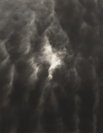
The Key Set: 1918–1937
patterns in the sky 1918-1937

Harry Callahan – natural forms

Callahan left almost no written records—no diaries, letters, scrapbooks or teaching notes. His technical photographic method was to go out almost every morning, walk through the city he lived in and take numerous pictures. He then spent almost every afternoon making proof prints of that day’s best negatives. Yet, for all his photographic activity, Callahan, at his own estimation, produced no more than half a dozen final images a year. He worked with multiple exposures-double and triple exposure, blurs, large and small format film.

An Intuitive Approach: Harry Callahan's Depiction of Nature |  Huxley-Parlour Gallery
Trees at lake shore (1912-1999)

Compare and contrast-

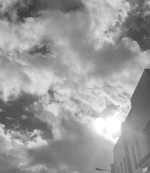
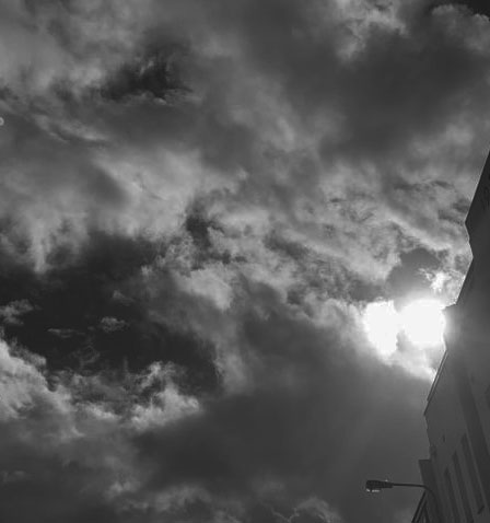
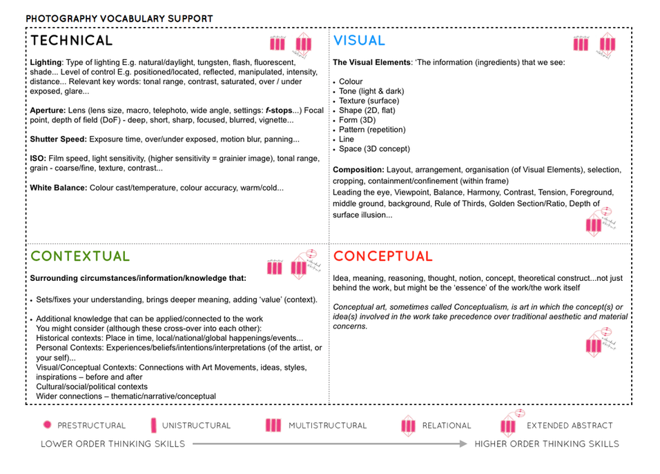
Technical– The lighting in both photos have light and dark tones and different sections of the photo are in contrast with each other. In Alfred’s photo the clouds are very dark and grey as they are surrounding the small spot of sunlight that’s trying to shine through. The photo looks like it was taken in natural light as it’s of the sky which is a natural environment. Whereas the Harry’s photo contains extremely sharp contrasts between the black and white. The trees are completely black and the background surrounding them is white which makes the shape of the trees very visible. Both photos look like they’d be taken on a high shutter speed as no movement would be in the photos and neither photos look blurry. Harry’s photo is taken with a wide lens whereas Alfred’s photo is quite zoomed in to capture the sun peaking through. Both photos probably had to be on quite a high IOS level in order to capture the sunlight coming through the clouds(in Alfred’s photo) and the white background behind the trees(in Harry’s photo).

VISUAL- Both photos are of the natural environment but in a different form. Alfred’s photo is of the sky which both dark and light tones without any particular shape as it’s photographing the clouds and sun. The only repetition there is the clouds whereas in Harry’s photo repetition is clearly shown through the trees. In Alfred’s photo the shape of the trees are very defined because of the background being white which creates a very sharp contrast.

CONTEXTUAL- There isn’t much historical context behind both photos and not a personal meaning either. I think that both photos where just taken in order to show the different ways an abstract photo may be presented , as they chose to do that through nature.

CONCEPTUAL- I think that neither photographs have a meaning as it isn’t a photo that’s trying to get a message across to viewers as both of the photographs aren’t powerful enough. I think that both artists wanted to photograph the idea of ‘abstract’ in their own way.

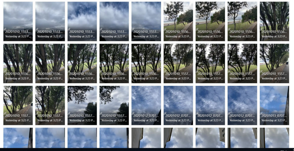
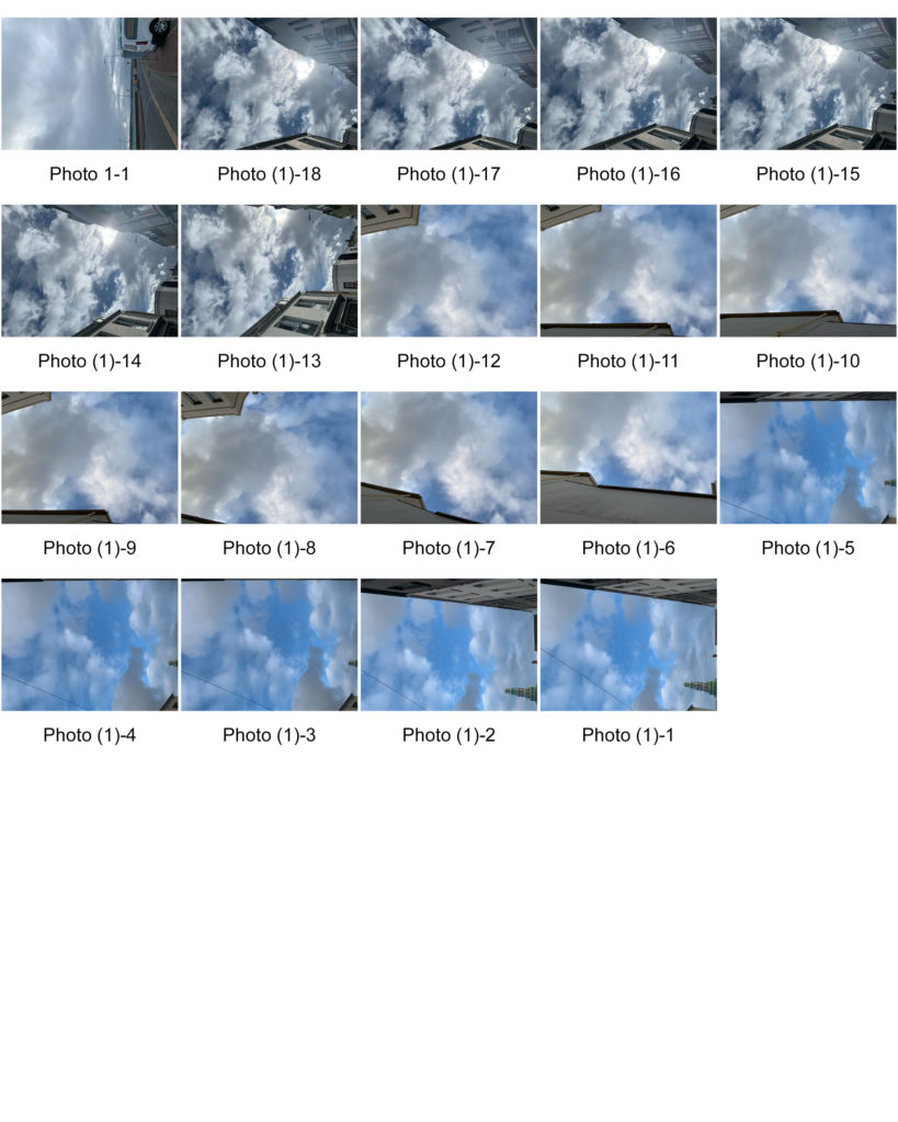
MY RESPONSE- contact sheets;

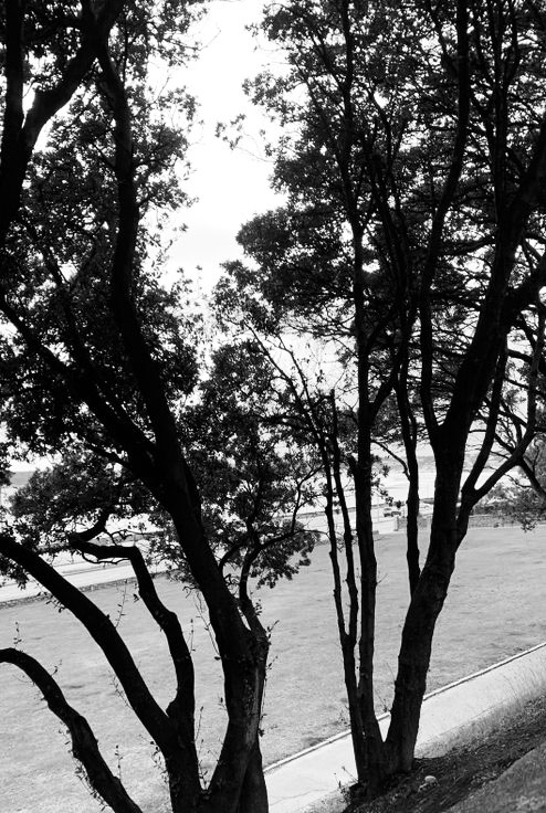
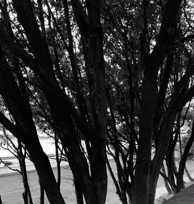
Plan- I went out during the day when the sky wasn’t all blue and clear but neither when it was so cloudy you couldn’t see the sun. I wanted to capture the sun peaking and shining through the clouds. I then went out closer to the beach because that’s where the sky is the most open without any tall buildings surrounding it and I photographed the trees near it. I took photos of them because I knew when I edit them on Photoshop they would turn out similar to Harry’s style and they were very symmetrical due to the way I photographed them.
Evaluation

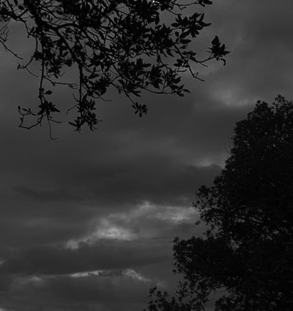
I took photos of the sky during the day time as Alfred’s photos are taken in the daylight and not at night. If I was to take the photos at night you wouldn’t be able to see the clouds. I waited till the sky was filled with dull clouds and photographed them from a low angle to create the perspective of looking up. I waited till the sun came out too in order to capture it peaking and shining through the clouds in the way that Alfred does. I also took photos of the nature when I found repetitive sections of it, such as trees being behind each other in a repetitive order.

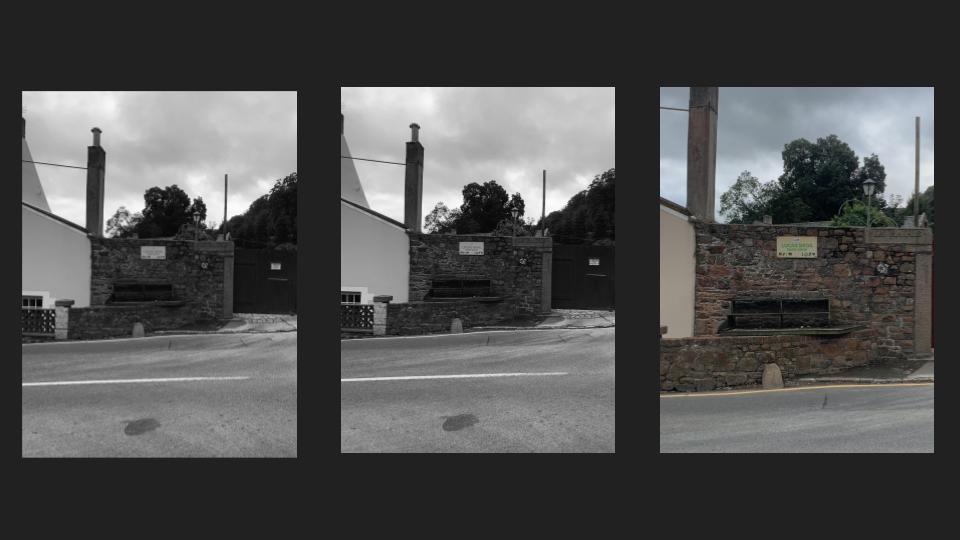
My favourite images in black and white and cropped

Overall I like how my photos turned out because I captured the sun coming through the clouds which creates a similar effect to Alfred and I think my photos turned out in a style similar to his. I also like how the second group of photos I took of the nature turned out because by turning them black and white , the background goes much lighter than the trees as they get completely darker and the shape of them becomes much more defined. The trees also turned out quite symmetrical and repetitive which makes it even more similar to Harry’s work.

surface and colour

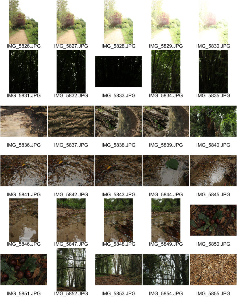
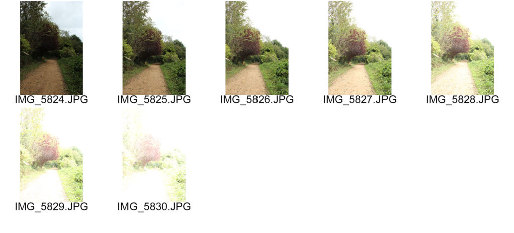
Exploring with ISO settings-

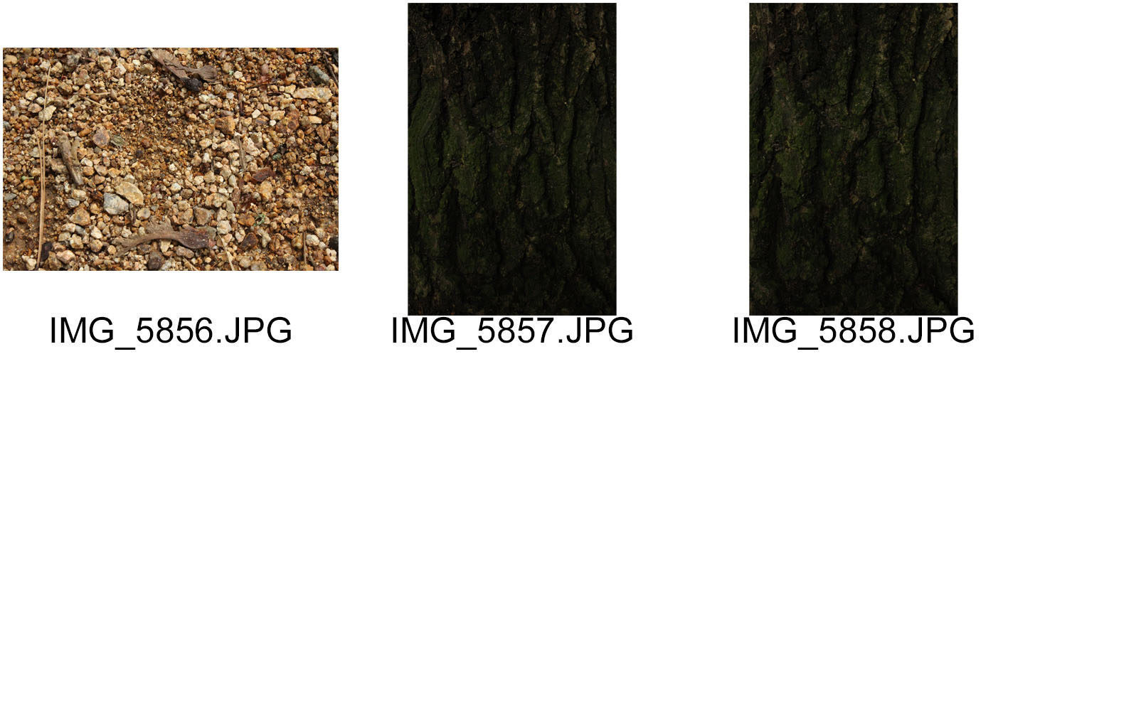
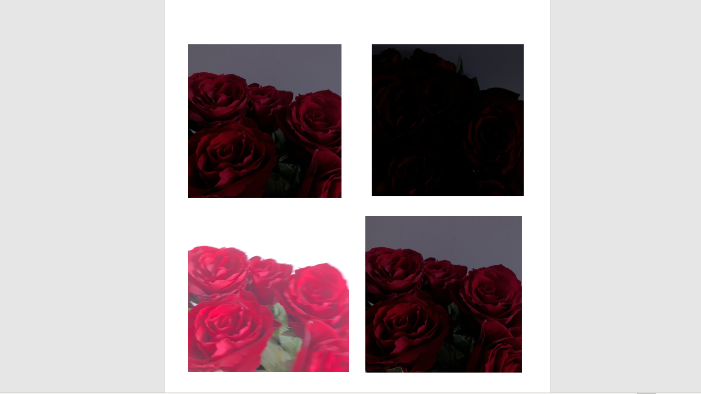
I photographed the woods in different IOS settings. As you can see the lower the IOS setting was , for example in the first photo it was 400, the less light got in and it was very dark and almost all black. I then photographed it each time I increased the IOS setting and as you can see the photo got much more lighter and the last photo turned out almost white.

SURFACES-

Ernst Haas- Ernst Haas was an Austrian-American photojournalist and color photographer. During his 40-year career, Haas bridged the gap between photojournalism and the use of photography as a medium for expression and creativity.

He focuses on a variety of surfaces such as roads, reflections in mirrored buildings or even water. My process for this photo shoot will be to take photos of different parts of a road such focus on the surface of the pavement and even certain areas like a zebra crossing. I will also photograph reflections in puddles or windows and if it rains then keep the background out of focus and make the raindrops the main focus.

Ernst Haas — Robert Klein Gallery

My response-

AARON SISKIND– Aaron Siskind was an American photographer whose work focuses on the details of things, presented as flat surfaces to create a new image independent of the original subject. I was inspired by the photographs he took of the roads and all the different broken textures. I’m going to take own photos in the style of Aaron Siskind as his work fits perfectly into the theme of texture.

Here’s some of my favourite photographs he’s took-

Aaron Siskind — Robert Klein Gallery
Literally Abstract - Aaron Siskind - John Paul Caponigro – Digital  Photography Workshops, DVDs, eBooks : John Paul Caponigro – Digital  Photography Workshops, DVDs, eBooks

RESPONSE- CONTACT SHEETS

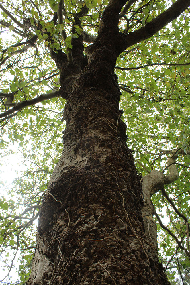
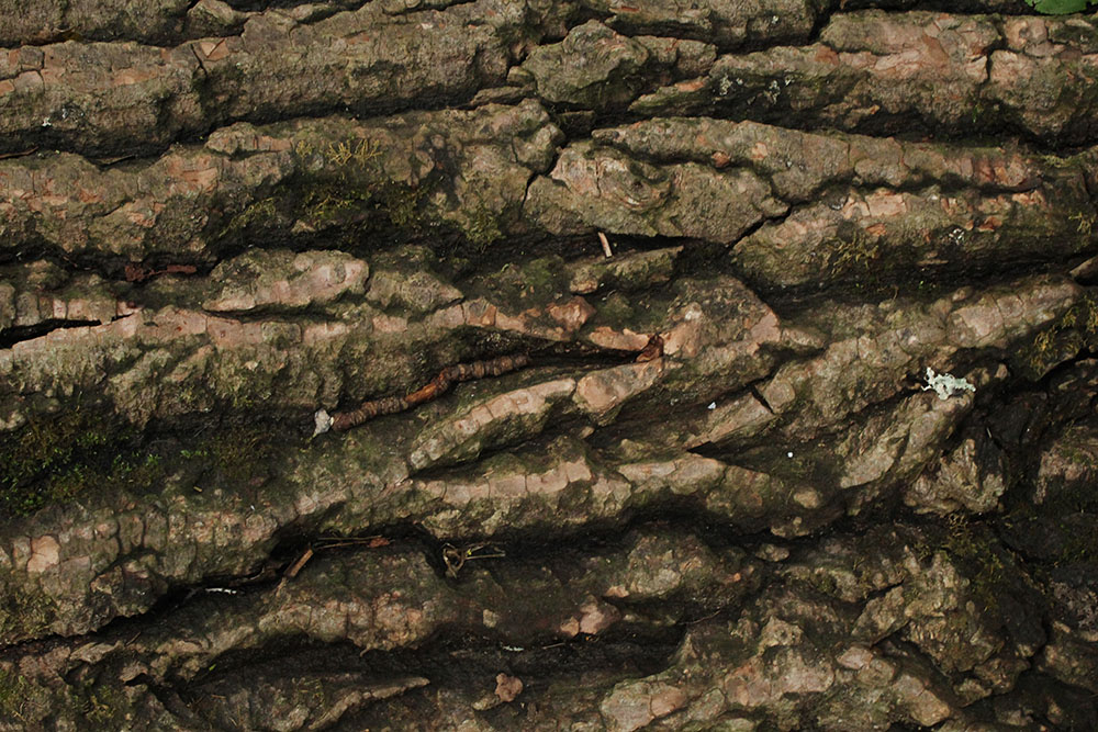
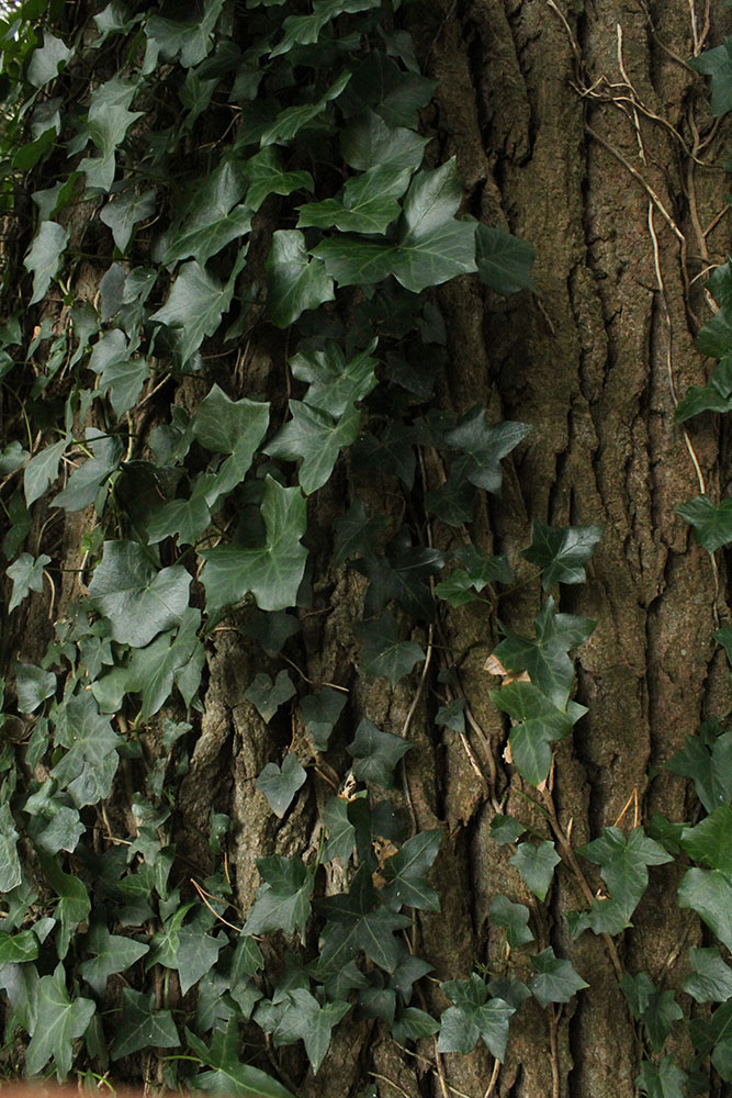
My main focus during this photoshoot was to take photos and capture different textures I could spot in the woods. For example, I took photos of various parts of broken woods and trees, the reflection in the small stream and several branches. I took photos of extremely tall trees from a much lower angle in order to create the illusion of the tree looking right over the person looking at my photograph, this also makes the tree seem much bigger than it actually is. While I was doing that I was using different IOS settings, as you can see in my contact sheets I had to take the same photo a couple of times to get the perfect lighting with the IOS setting. The darker the setting was the more details you could see on the tree barks and cores as the colour was much sharper and you could see the patterns on them a lot more clearer. I also took photos of corners of roads as I wanted to take photos in the style of Aaron.

My favourite photos

EVALUATION-

I really like how my photo shoot in the woods turned out because I wanted to focus on the different textures and reflections in the stream as well as exploring the different IOS settings. I was inspired by Aaron because he captures texture in a different way such as paint or wood peeling off different walls which is why I wanted to photograph the broken tree barks and photograph them up close. By changing the IOS settings it made a big difference in how much detail you could see in each photo and how much light was getting let in.

Repetition photoshop

original photo
new edited image

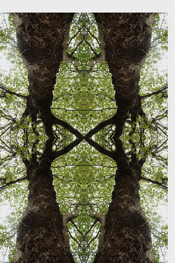
PROCESS- I selected all of my original photograph and added extra canvas size to then paste it again, I then flipped the photo horizontally to the right. I then created a new layer and added more canvas size at the top to paste the two images over but vertically now to create my final image. Once I finished that I increased the hue and saturation slightly to create a brighter effect.

looking and seeing

Ralph Eugene Meatyard

Ralph Eugene Meatyard Sets the Stage | UKNow
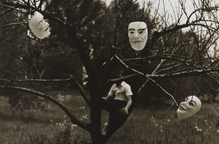
“Untitled” work from 1963 by Ralph Eugene Meatyard. Courtesy of Fraenkel Gallery.

Ralph Eugene Meatyard (1925–1972) lived in Lexington, Kentucky, where he made his living as an optician while creating an impressive and enigmatic body of photographs. 
This photographer experiments with the focus on his work. In this image he focused his camera and most likely has used f.2 to focus on the masks and the branches on the trees. The background isn’t in focus and the boy sitting on the tree is slightly blurry. In this photo Ralph might have also changed the exposure as the masks and the boys shirt are much lighter than the tree which makes them stand out right away.

Uta Barth

no title]', Uta Barth, 1995–7 | Tate
unknown

 She is interested in drawing attention to the viewer’s perception and separating the image from the thing depicted. Her images can appear quite abstract, partly through the use of deliberately blurred information. In this film she describes her interest in “light, perception and this visual acuity to the mundane, fleeting, ephemeral, everyday kind of information.”

Regarded for her “empty” images that border on painterly abstraction, the artist carefully renders blurred backgrounds, cropped frames and the natural qualities of light to capture incidental and fleeting moments, those which exist almost exclusively within our periphery. Looking at her work I think she uses f.32 all her work is out of focus. For this image I think she used f.2 as the persons hand is in focus and the main first eye-catching aspect. Even though the background is blurred out you can still make out that it’s people walking across the road or street. This gives an abstract touch to the photo as it makes the viewer try to figure out what they’re looking at and what it may be.

Exploring different aperture settings 

Fundamentals of Photography – Photographing the world

When taking photos it’s important to explore and change the aperture settings. Changing the focus helps with capturing what you want to be the main focus of the image. For example, the lower your aperture is (from f/1.8 to f/5.6) the closest objects to you will be in focus or the main subject and they may appear much darker as little light is coming in very fast, whereas if your taking your photos with your aperture on a higher setting (from f/8 to f/32) everything will be in focus or sometimes the whole image may be slightly out of focus and completely white as the lens is letting much more light come in.

Changing your aperture creates different depth of fields and even any movement in your photos may cause a blur.  As aperture changes in size, it alters the overall amount of light that reaches your camera sensor and therefore the brightness of your image.

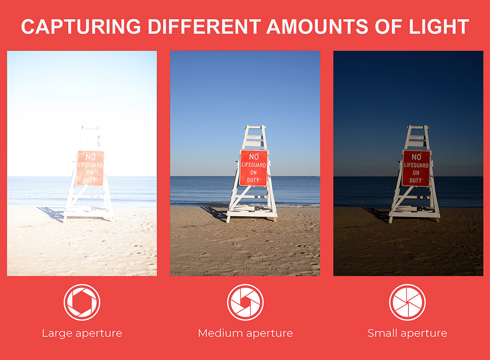
Here’s another example of how the aperture affects the light settings-

What is Aperture? Understanding Aperture in Photography

As you can see the smaller your aperture is the less light is captured through the lens making the photo much darker. The larger your aperture is the more light is captured which makes your photo very exposed to light and they appear very bright and almost white.

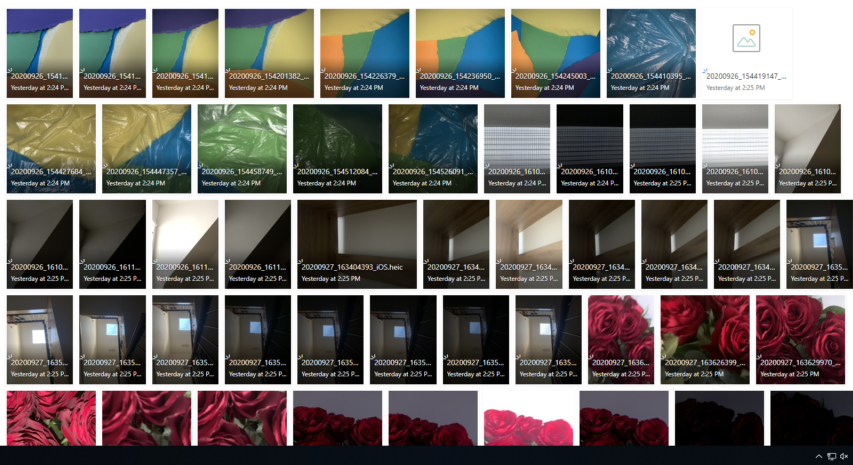
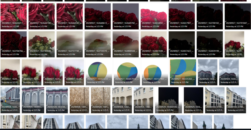
MY CONTACT SHEETS-

RESPONSE-

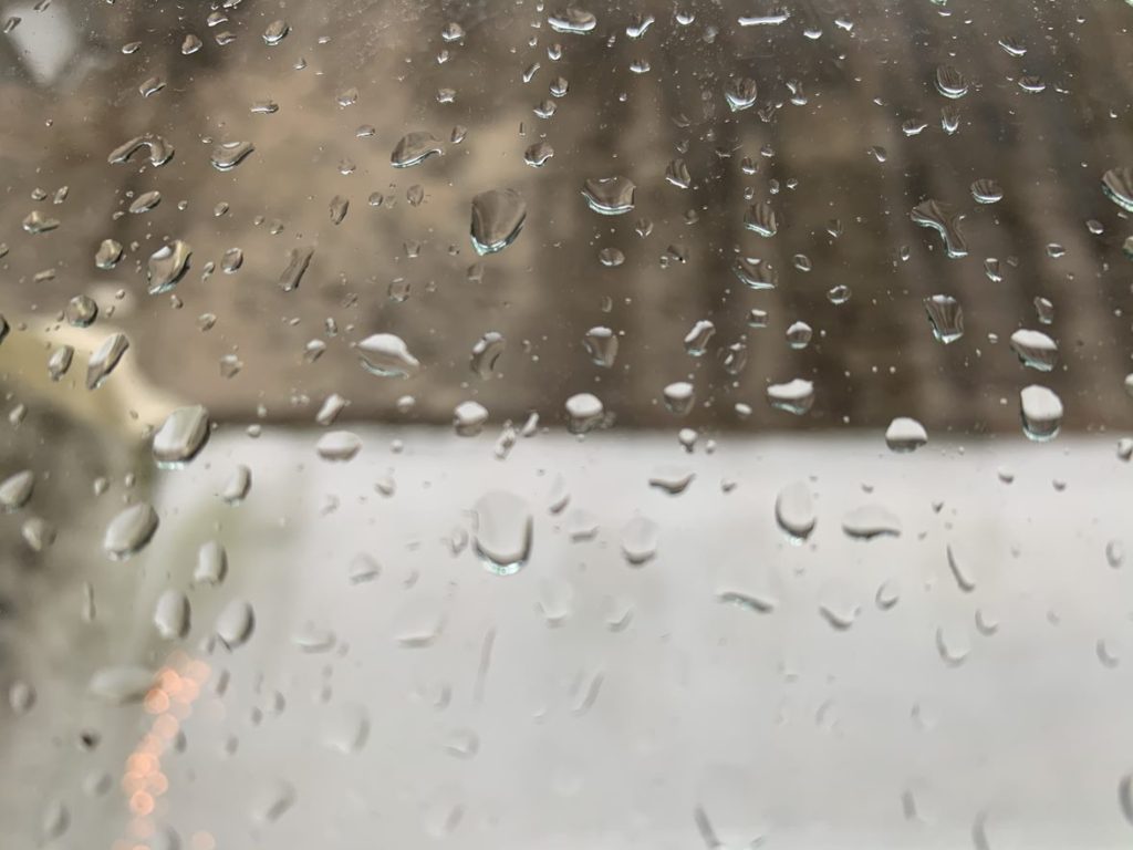
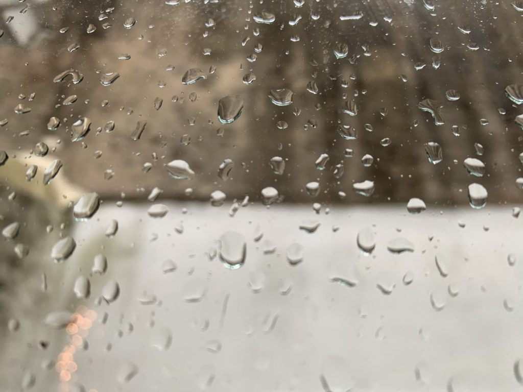
ADJUSTING FOCUS-

I focused the camera on the raindrops to make the background blurry and out of focus, I did this by using f/2.8 which concentrates on the closest thing/object to the lens.

MINIMALISM- in different aperture

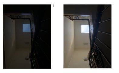
You can see the difference in the lighting of the photos when I changed the aperture settings and the two photos look completely different. I used a small aperture for the first photo and you can straight away see that the photo is much darker and you can see the sky more clearer as it’s bluer. I then used a larger aperture for the second photo and the photograph turned out much lighter and the sky turned out more white than blue as there was more light getting captured. I photographed this from a staircase looking completely upwards.

COLOUR AND CROPPING

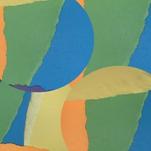
I ripped the different coloured paper into different shapes and then photographed them layered on top of each other as you can see in my contact sheets. I next cropped the image on photoshop into a circle and layered the four different images with each other to create a multicoloured abstract photograph.

APERTURE SETTINGS-

Process- I photographed a rose in different apertures to see how they would look like in different lighting and if the colour would be more enhanced or dull. As you can see when I used a smaller aperture the photo turned out almost black as very little light was coming through and being captured, you can slightly see small tones of red. Compared to when I used a larger aperture the photo was much more bright and the roses were very visible but slightly blurry as I used a slower shutter speed.

EVALUATION of my work- overall I wanted to explore a few different sectors of abstract photography to see what looks the best in various exposures. I used different aperture settings and found out that it can completely change how your photo looks.

ALBERT RENGER-PATZSCH- THE WORLD IS BEAUTIFUL

Albert Renger-Patzsch | [Stairwell, View from Below] | The Met
Stairwell, View from Below ca. 1929
This image has an empty alt attribute; its file name is gallery-ss.png
Some of my favourite photographs he took-

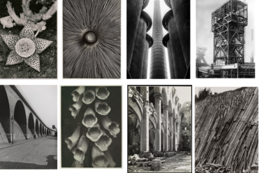
Introduction – He was a German photographer and a pioneering figure in the New objectivity movement, which sought to engage with the world as clearly and precisely as possible.  He wanted to produce his own recording of the world. Most of his work was in black and white and there’s no sight of humans or life in any of his photography. He mainly photographed wildlife, images of traditional craftsmen, formal studies of mechanical equipment, commercial still lifes, and landscape and architectural studies.

Most of his photos include objects being repeated in the natural environment. He uses a mix of tones for every image- some include warm tones and others are much darker with harsher tones.

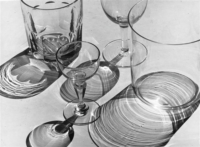
Glas by Albert Renger-Patzsch on artnet
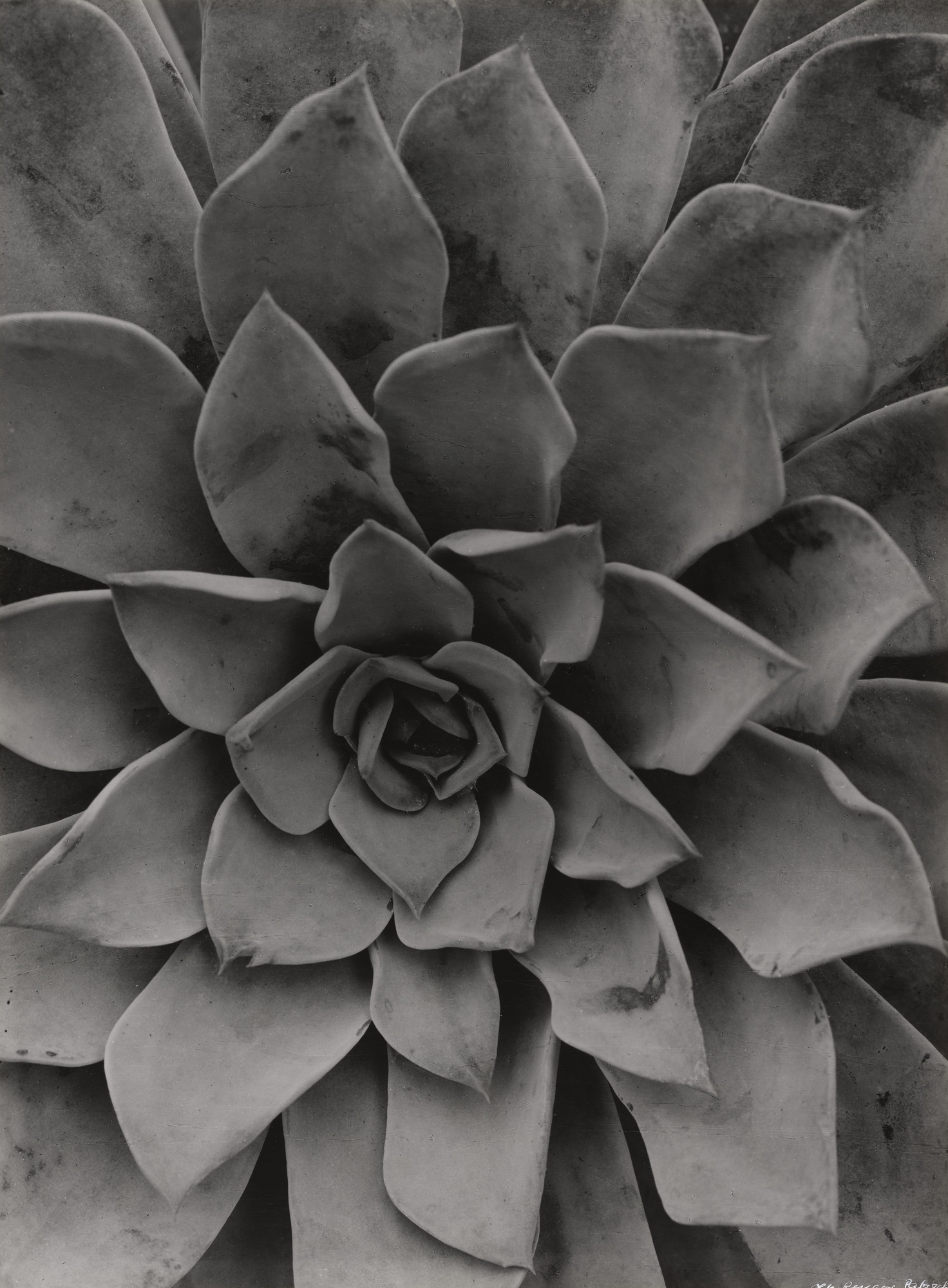
Albert Renger-Patzsch. Echeveria. 1922 | MoMA
ECHEVERIA (1922)

IMAGE ANALYSIS/ COMPARISON;

SIMILARITIES-Both photos are in black and white and have a range of different mid-tones. They’re both photographs of something artificial and not abstract. Both of these photos don’t have a distracting background as the photo of the plant is so close up you can’t see anything behind it and the photo of the glasses is taken in front of a white background- this makes the objects stand out a lot more and the tone and colour around the cups is made to appear much harsher.

DIFFERENCES– One photograph is of a plant and to do with nature whereas the other image is different types of glasses as the shadows of them are being reflected beneath them. Another difference is that the photo of the plant is very close up and zoomed in when the other is quite far and you can see the whole shape and size of each glass. The photograph of the plant is portrait in comparison to the glass photograph which is landscape. The photograph of the glasses looks like it would have set up lighting behind it to create the shadow effect whereas the plant photo is more in the natural light hence why it’s less bright.

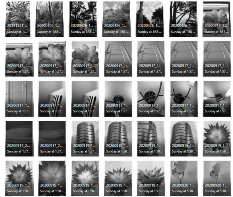
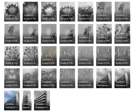
CONTACT SHEET-

A contact sheet is a piece of photographic paper on to which several or all of the negatives on a film have been contact-printed. This allows you to view all of your photographs. The purpose of a contact sheet is to be able to quickly scan a series of images to find the keepers or the ones chose to be enlarged.

MY PHOTOS-

This image has an empty alt attribute; its file name is PHOTO.png
This image has an empty alt attribute; its file name is PHOTO-2.png

Process of my work

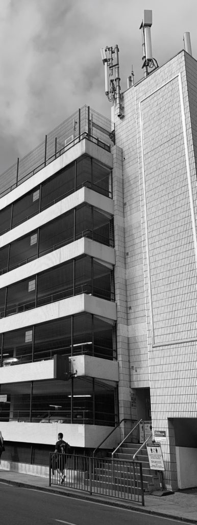
I took photos of nature, objects such as wine glasses and a building (car park) to explore all different kind of scenes to photograph as ALBERT RENGER-PATZSCH does. I tried to photograph things that had repetitive shapes or were in an interesting position to explore the different shadows/ tones I could create.

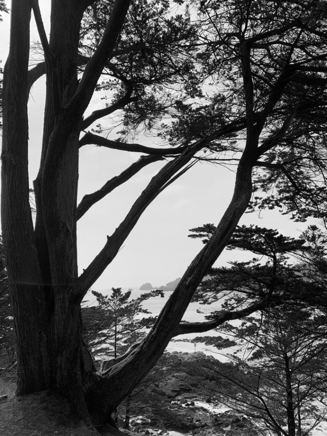
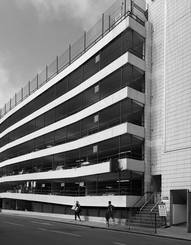
Here are some of my favourite photos;

EVALUATION– these are my favourite photographs I took because I wanted to look at the nature side and the architecture side. I tried to photos in a similar way that Albert does which is focusing on repetitive patterns or far away shots of nature.

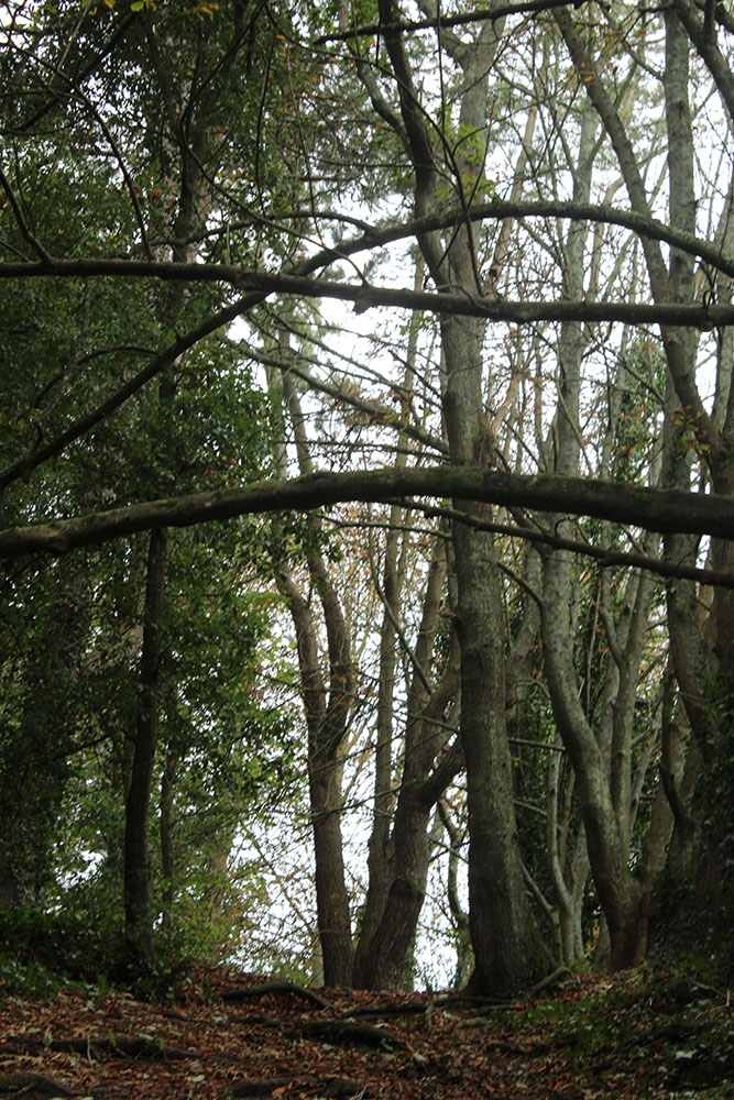
I really like how my photos in the woods turned out because by taking them in black and white you can really see the details and contrast between all the different tones. I took most of them far away so that the whole shape of the tree was visible as the more I would photograph the more the trees would be lined up in a repetitive pattern. I was inspired by one of his photos which shows how the trees kept going and going which created an illusion of the woods getting smaller as you looked into the photo.

I like how the photos of the car park turned out because you can remarkably see the contrast between the colours white and black as the design of the car park is going up in blocks in a repeated pattern. I cropped one of the images down to only focus on that specific segment to really make the pattern the main focus of the photo. I shot it at a slightly lower angle as I wanted to create an illusion of the car park being a lot larger and getting the full shape of it photographed- as Albert usually takes photo of building from a lower angle. The reason I didn’t choose the other car park photos was that cars got in the frame and I wanted to focus on just the building.

Black light

Keld Helmer Petersen– introduction

Keld Helmer Petersen - Flotte plakater - Køb online her
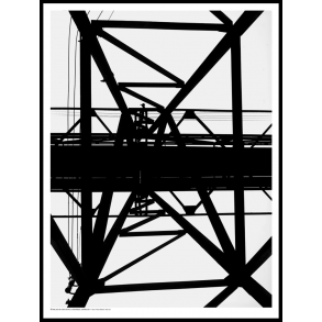
1956- pylon, kastrup

Keld Helmer-Petersen is one of the most influential Danish photographers in the 20th Century. He was an international pioneer in colour photography and was a central figure in not only Danish but also European modernist photography. His career spanned 70 years and he had strong interest in modern architecture, industrial areas and structures. He was very prolific and continuously experimented and challenged the many possibilities of the photographic image.

He experimented intensely with various photographic techniques, such as camera-less images or photograms which were created in the darkroom. He created pure abstract image creations ongoingly from 1949, but especially in the 1970s and 1980s. 

Process– I chose four of my images that I liked the most and edited them on Photoshop in the same style as him. I went onto Image> Adjustments>Threshold. I then adjusted the threshold as to how I wanted it. I wanted the a mix of completely dark tones and white tones without any mid tones to get the same contrast as Keld gets in his images.

Evaluation- personally I like how how the top two images turned out because by turning the photo completely black and white you can see all the small details on the trees and branches that you couldn’t in colour and it really defines the shape of the trees as it contrasts from the white .

I like how the bottom two turned out but not as much as the first because there’s still some uneven mid tones around the photos and it doesn’t create that sharp effect of black and white next to each other.

PHOTO ANALYSIS

Arnold Newman | Portrait of Alfred Krupp | 1963

Image result for arnold newman alfred krupp
Picture

Background/context- The photographer, Arnold Newman,  was born in New York City in 1918, and attended high school in Miami. He studied painting at the University of Miami on scholarship for two years, before—having run out of financial support for his studies—moving to Philadelphia to work as a photographer.

Technical – the lighting is not natural it looks more focused on Krupp and the background behind him to make him the main focus/subject. The light surrounding Krupp is much darker than the rest of the photo which creates a mysterious atmosphere around him and portrays him as someone evil as the trains and entertainment behind him are very lit up.

Visual- The photograph is in colour. The background around him is quite symmetrical and the photo is taken from a higher viewpoint which shows that the photographer is looking over him. This creates an idea that the photographer thinks he’s better than Krupp. The background behind him is getting smaller as it goes on which draws attention to Krupps face right away .

Conceptual- Arnold Newman was a Jewish American photographer who wanted to tell the world that Alfred Krupp was an evil person as he was very powerful due to being a German Nazis. The angle at which the photo was taken indicates that Arnold Newman wants to create the idea of him being more powerful and in control.

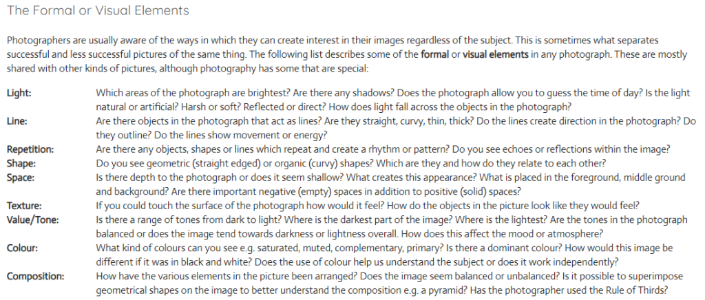
The formal elements research-

Many of the most famous and influential photographers are successful because they instinctively use these formal elements to create the best photograph they can whilst in front of the camera. This can be because the compose image with precision or that they recognize the perfect moment to press the shutter.

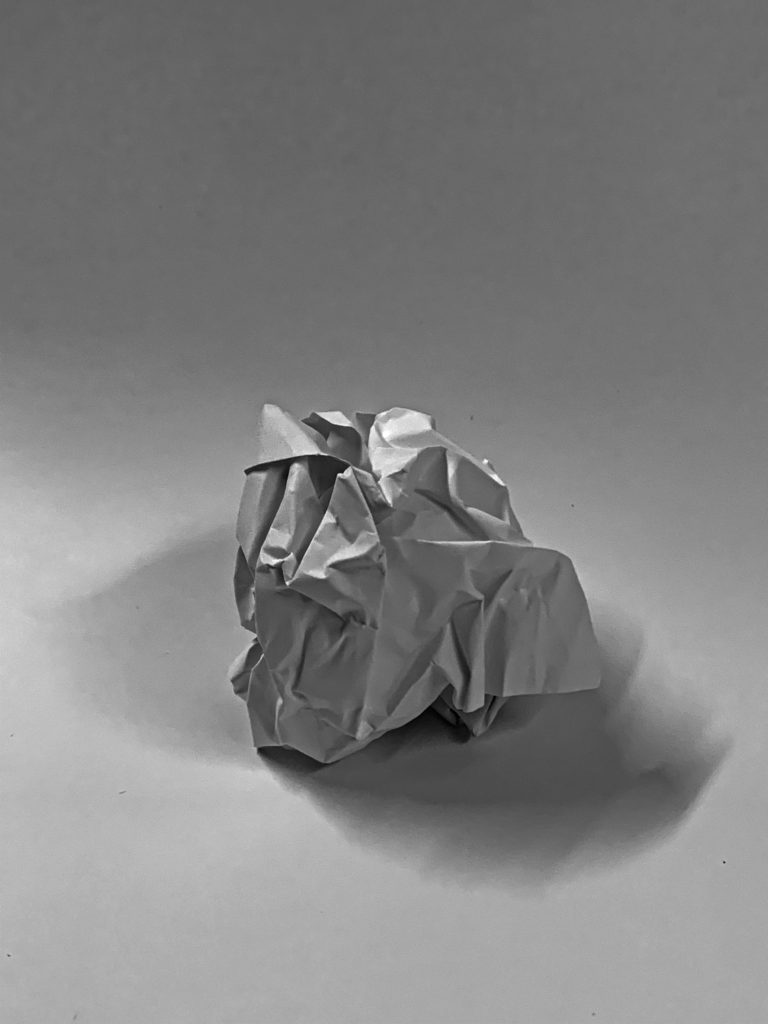
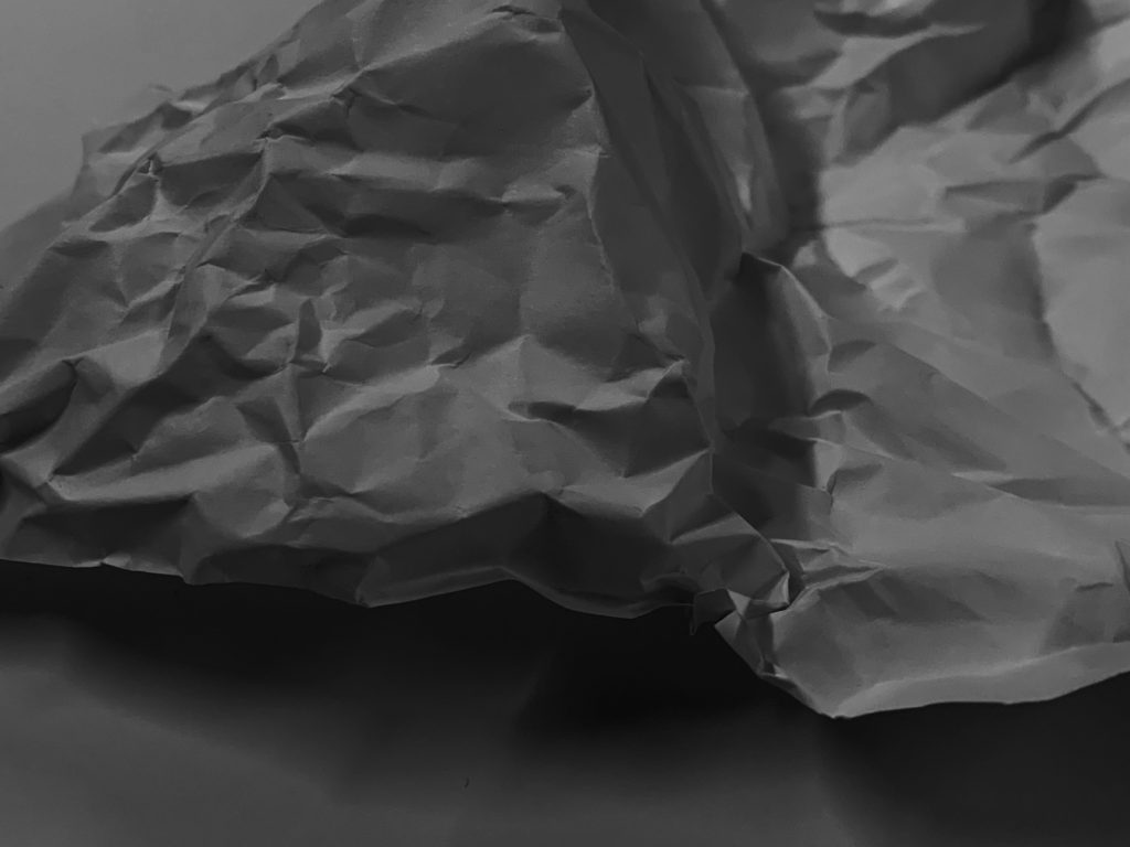
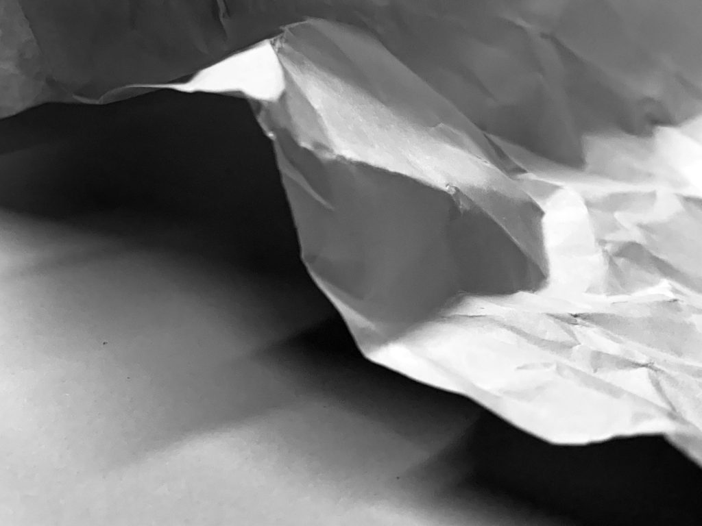
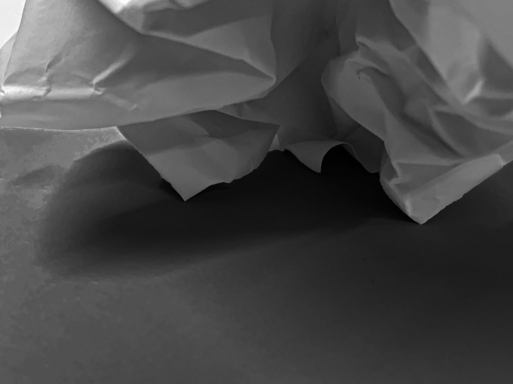
During one lesson, we took photos of paper in different lighting to show how the tone changes drastically and the darker tones become much more sharp. The photos were then uploaded on Photoshop and edited.

Analysing the elements for all my photos;

Line/ shape- because the photos are of paper there isn’t a lot of straight lines. Most are jagged and very unnatural. The shape of all the paper is very unsymmetrical and there’s not really a shape that can be seen in any photos apart from the one that’s a paper ball.

Light- there are some light parts and some very dark parts of the paper. This is due to the light being off which made the sharp sections very dark and there were shadows created. By editing the photographs further it made the edges more harsh.

Repetition– there’s not a lot of repeated lines or shapes as all the lines are very different and the creases are all over the paper.

Space- I photographed the paper quite close to make sure all the creases are visible but I took one where you could see the whole paper ball because I wanted the shadow to be shown underneath it. By taking the photos up close the viewer is getting to see all the details.

Texture– when the lights were turned off and I edited the photos further you could really see the texture of the creases better as the texture became more sharp and it looks more harsh when its darker in contrast to when it’s light as it looks more soft.

Value/ tone– The photos contain a mixture of all different tones. Some areas of the paper are mid-tones but there’s a lot of dark tones surrounding the edges as well as a lot of soft tones.

Composition- The images look unbalanced as there’s a lot of different lines and creases all over the place. The elements have been arranged it a random order as the creases were not planned.