All posts by Wiktoria J

Filters

Author:
Category:

photoshoot 1-

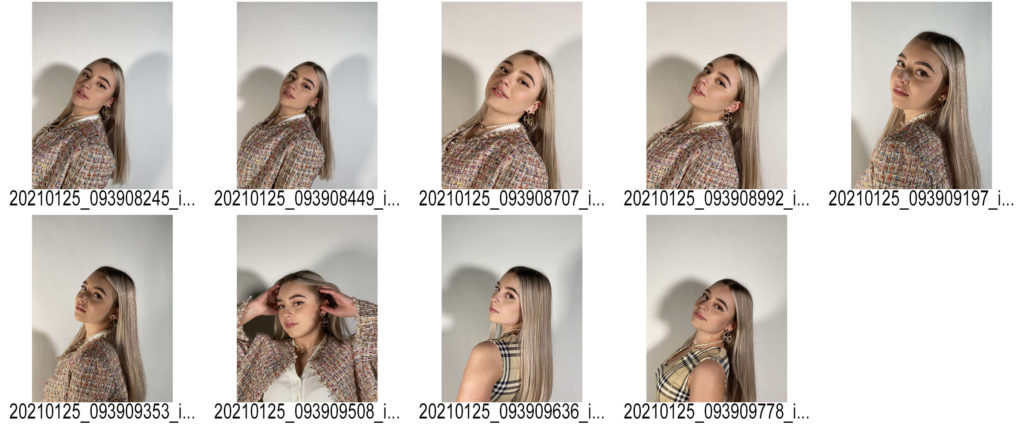
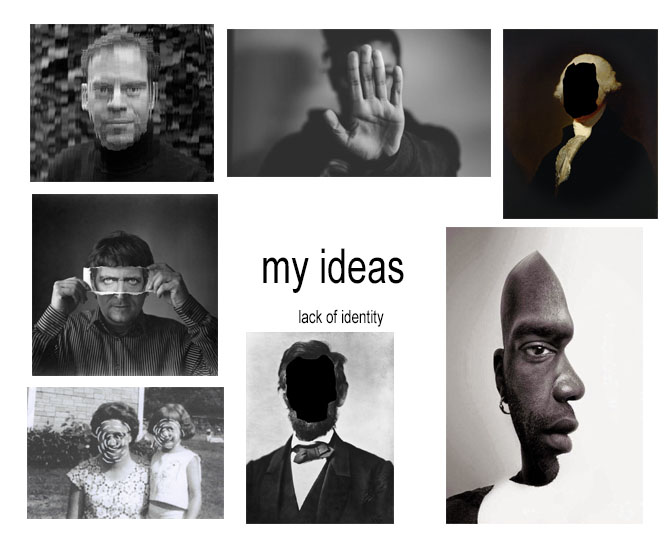
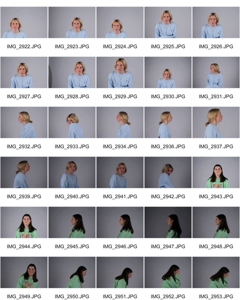
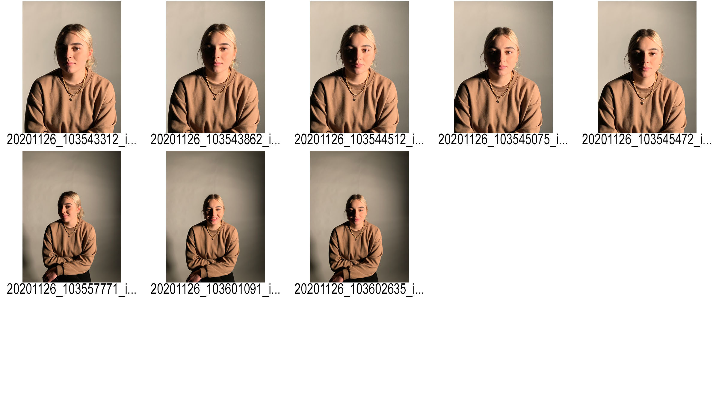
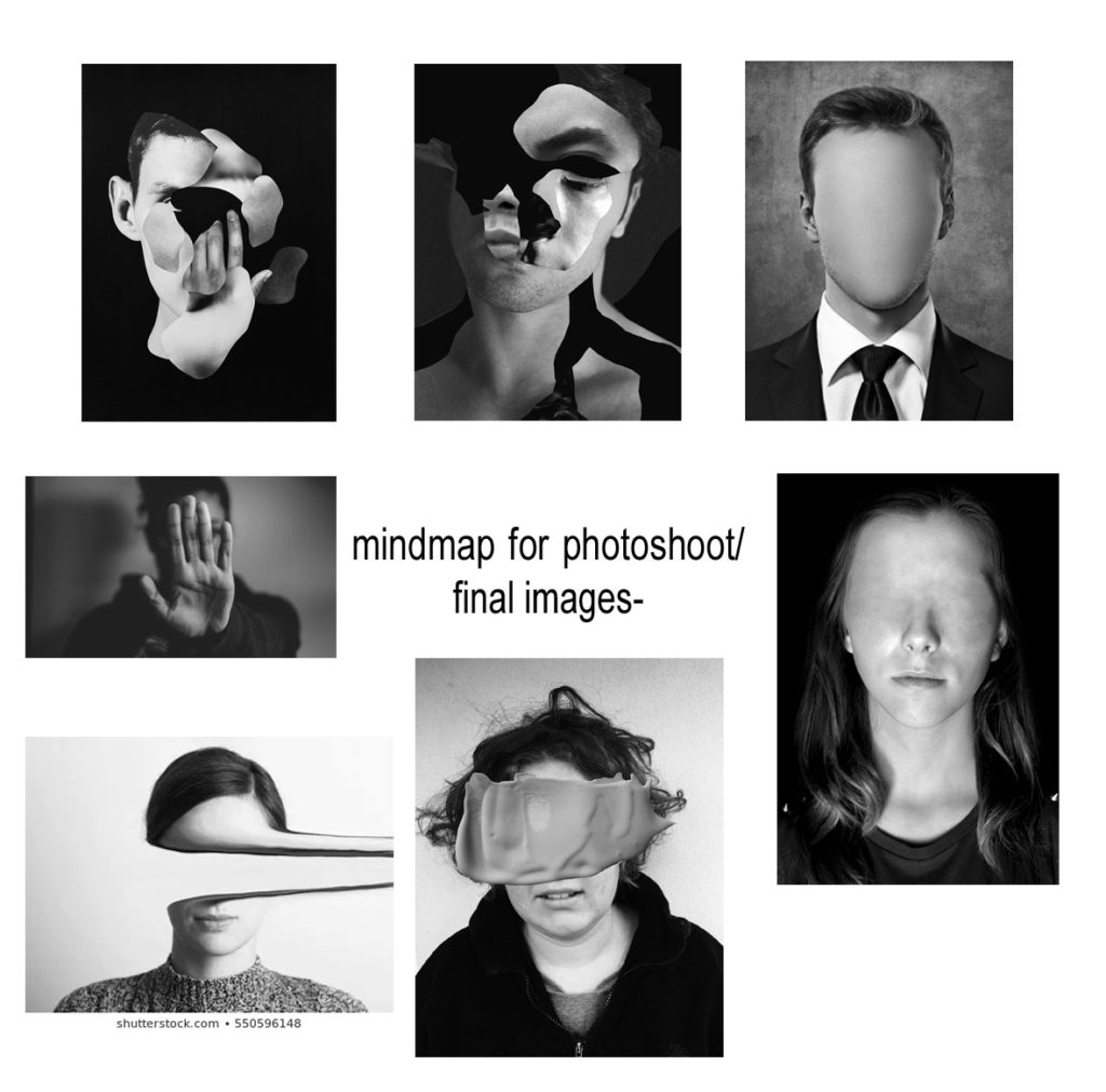
Plan- As I’m looking at the theme of lack of identity I wanted my first photo shoot to be simple head shots and photographs with a lot of editing. I want to cut out the face of the model and blur it out to introduce ‘lack of identity’ through that way. I’m going to photograph my friend in the studio with very light and bright lighting in the studio.

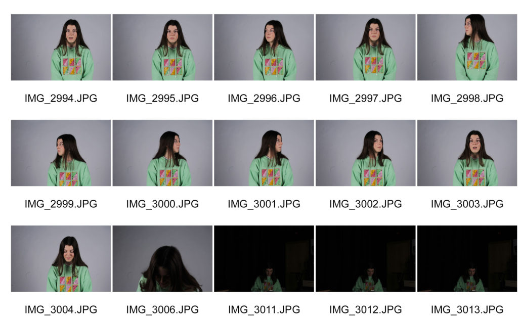
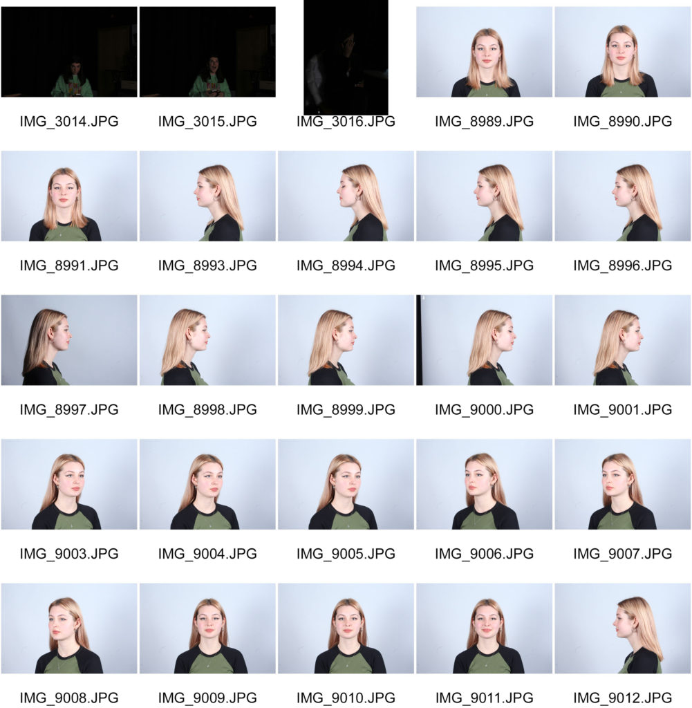
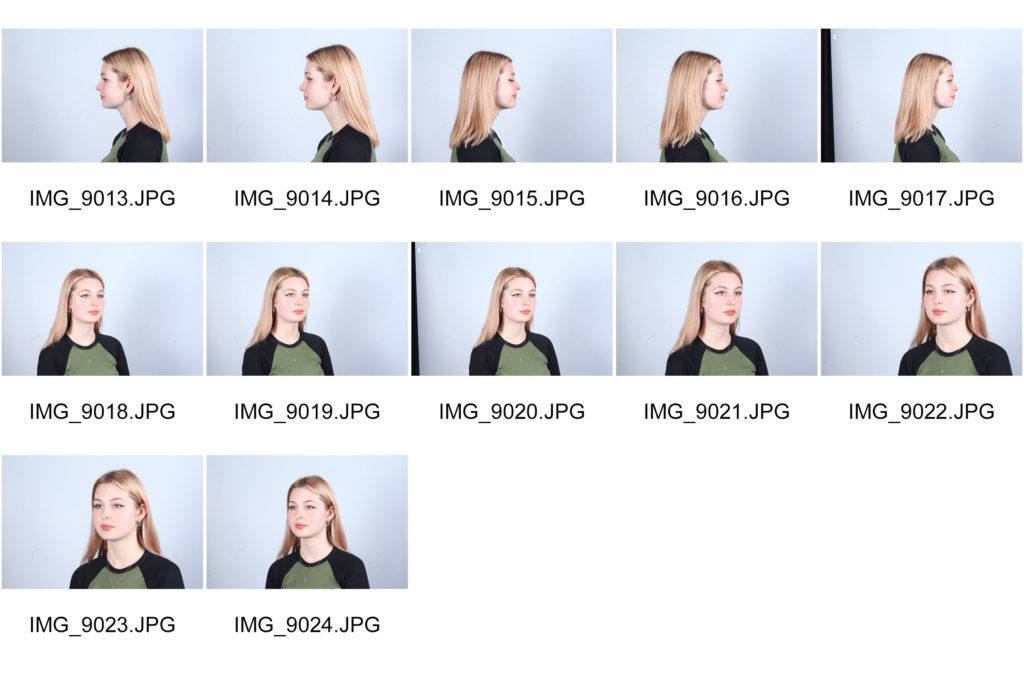
contact sheet

I picked out my best photos and wanted to edit them on Photoshop by turning them mostly black and white inspired by the artist I chose to study. I also overlayed my images with different watercolour backgrounds to disguise the face and I cut out each image and layered them on top of each other. I later edited the final edits and digitally drew a line over the eyes as it’s the way I wanted to present lack of identity which is the theme I chose.
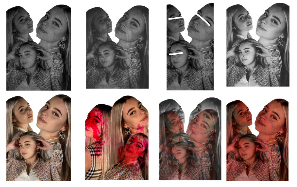
different editing to help select my final image;

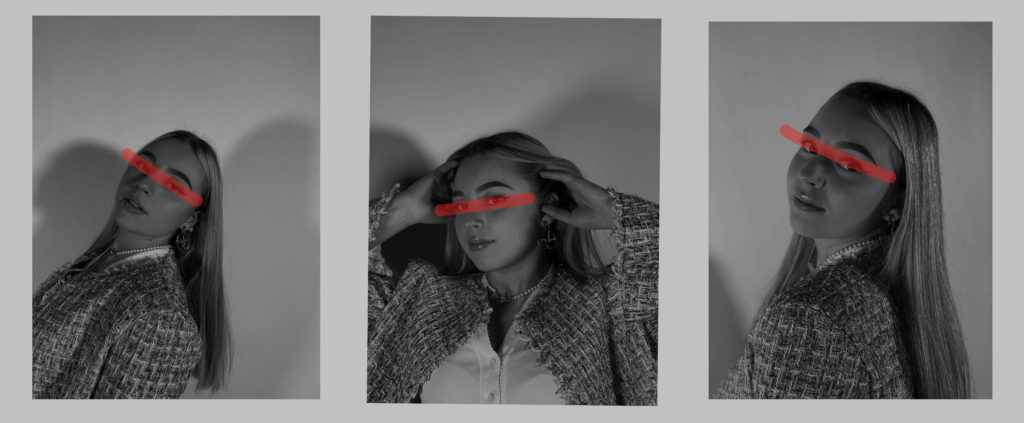
The first type of editing I wanted to try out is just simple drawing over the face by simply picking out my 3 favourite photos an draw red over the eyes with the ‘pencil tool’ to disguise the identity.
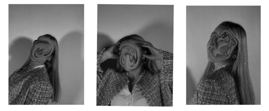
The second option for editing my images I wanted to try out is using the ‘liquify’ tool. I changed the brush to a small size and dragged the face face around till it created this swirl that looked right and completely changed her identity, if not erased it. I was happy with how my editing with this tool turned out because it got rid o her identity.
I wanted to combine the two for my last editing time. I used the ‘liquify’ tool again but this time I only selected and dragged her eyes which is similar to the first edit but dragging her eyes instead of drawing over them.
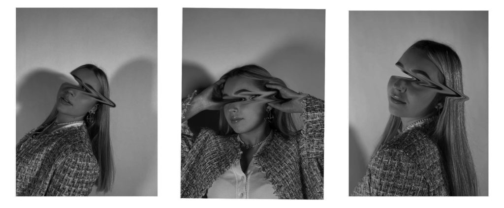
I used the quick selection tool and selected my friends face completely. I then used the ctrl+t option to select that part and I dragged it out of frame to create this lack of identity idea. I really like how these turned out as doing it digitally was quicker than printing my images out and cutting her face out. This makes the viewer think about what kind of face was there previously and why isn’t it there anymore. I wanted to present lack or loss of identity through loads of editing because as students it can be so hard to figure out who you are or who you want to be in the future as we’re still so young and have so much to yet experience and figure out about ourselves.
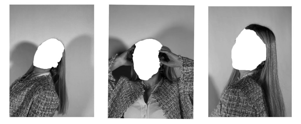
Final image and analysis+personal response

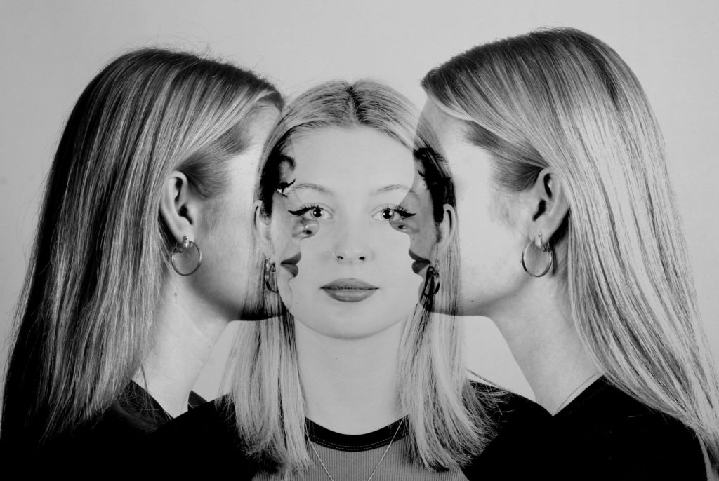
I used one-point lighting for these images and edited them in black and white as the photographer I chose (Jack Davison) to link my ideas to photographer their images in black and white. I feel like it makes it the photos look more dull and mysterious which fits perfectly with my idea of lack of identity. I tried to edit it in a way that shows different tones and shades of dark . My friends face is directly composted in the middle of the photo as I wanted her to be in the center and the main eye-catching subject. No distractions in the background helps with making her the only focus. I wanted to use 3 images lined next to each other as I think it gives you more to look at instead of just one image. By using 3 images I wanted to show that everyone has a view different personalities or even identities and it fits into my idea of lack of identity as people try to discover what they’re actually like and why we act different around others.

I like how I used the’ liquify tool’ because it links back to my chosen photographers work. I used more editing in my images whereas he uses more props such as hands and flowers to cover the face already. I only dragged the eyes out as I still wanted some of the face to be revealed, by erasing her eyes it took a big part of her identity away as you can’t really make out what she looks like anymore. I want the meaning behind it to be that sometimes we can be blind towards who we actually are and as young people or students we haven’t yet truly discovered our identity or who we yet will be.

I achieved what I wanted to do and I presented my idea of lack of identity very well through the way I edited my images. I think I linked my work back to my chosen photographer well, as Jack Davison also blurs his models faces out and cuts out parts of the faces into weird shapes. I cropped most of my images down so it’s just very focused on the face instead of the whole body and a background as it’s the style the photographer works with too.

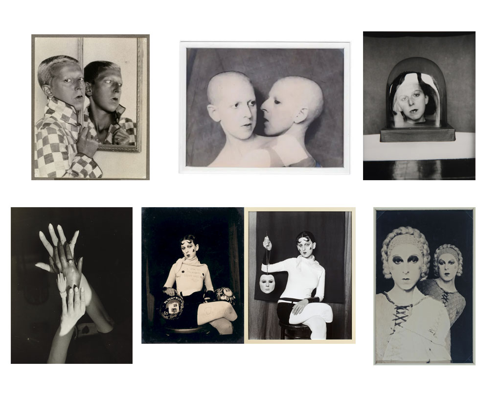
Claude Cahun case study

Claude Cahun was a French lesbian photographer, sculptor and writer. Who is best known for self-portraits.

Cahuns work was both political and personal, she continued to take photos of herself throughout her early years and didn’t believe in having a gender.

She was largely written out of art history until the late 1980s ,when her photographs were included in an exhibition of Surrealist photography in 1986. She is known for her self-portraits that portray her as ambiguously gendered.

Some examples of her work and photographers;

analyzing an image;

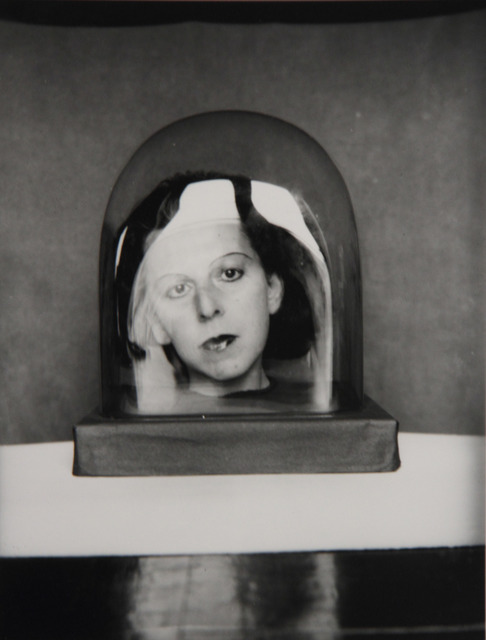
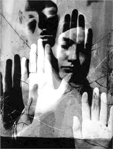
Claude Cahun - 12 Artworks, Bio & Shows on Artsy

technical- The lighting is mostly dark with some very light areas and shadows. The dark areas and light areas contrast very well and sharp against each other as both tones are very different. The lighting doesn’t look natural but the reflection on the glass suggests that some sort of sunlight is coming through to create that shadow. The image is very sharp and focused as the photo isn’t blurry.

visual- The image is black and white with a mixture of different dark and light tones that contrast each other. The glass around the womans head creates a 3D effect as the reflection on the glass circles around her. The composition of this image is very well done as her face is directly in the center of the image and it grabs the viewers attention directly at her. There’s not much happening in the background either which really makes her the main focus of the image.

conceptual- I think that this image has a very powerful meaning and idea behind it. Claude Cahun was trying to figure out what her true identity is herself and maybe by photographing a woman locked in this glass is trying to show how she felt when she didn’t really know how she truly felt about who she was and felt like she was trapped behind this identity crisis which is being presented by the glass is this image. The image also being in black and white creates a sad mood and negative perspective as the woman’s facial expressions don’t look to happy either.

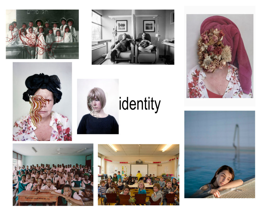
The photographer I chose to look at is Jack Davison to inspire my photoshoots for lack of identity.

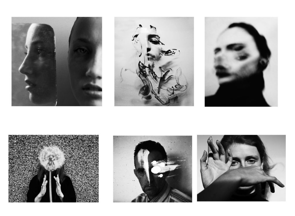
Jack Davison (b. 1990) is a London-based photographer. Davison studied English Literature at Warwick University but spent most of the time experimenting with cameras. Since the age of 14 he has continuously photographed those around him.

https://www.jackdavison.co.uk/

some examples of his photography-

I chose to look into his photography because I like the way he finds many different ways to cover the face and mask the identity of someone. All of his images are very interesting and gets you to think how you see that person and the way you view them.

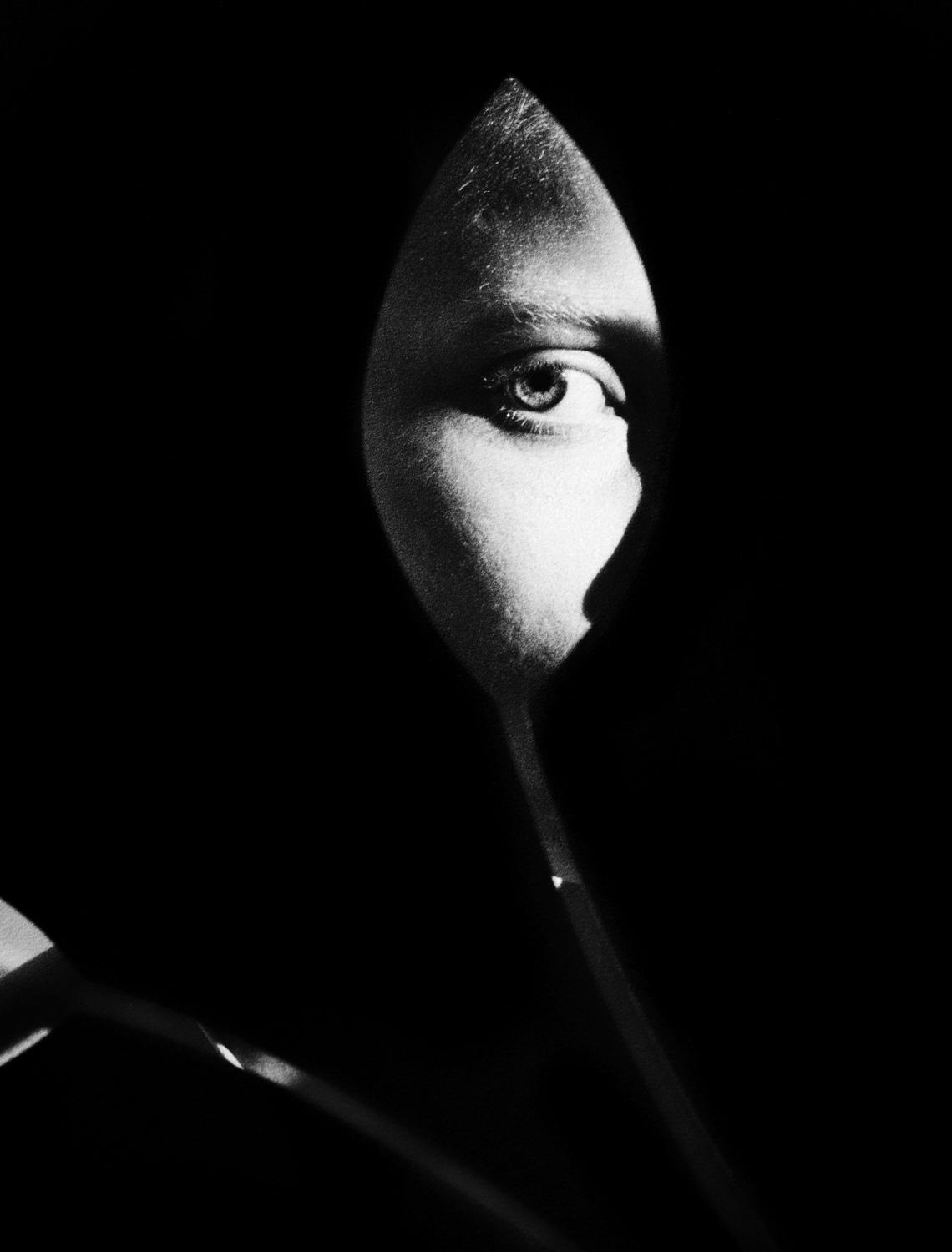
analysing one of his images;

Jack Davison
unknown

technical- the main tone and lighting in this image is extremely dark and the background is completely black. The light used on the eye however does look natural as its very soft. The lighting on the eye being a lot lighter than the rest of the image draws your attention directly to the eye and the flower shape it has been edited into. This is very similar to Claude Cahun as the womans face is also directly in the middle and the center of the image where the light is a lot lighter. The image is very sharp as the details of the eye is very clear and the image isn’t blurry which means the shutter speed wasn’t on a low setting.
visual- The photograph is taken or has been edited in black and white with a completely black background surrounding the eye. The photo has been edited into a cut out of a flower which looks like a tulip and only the models eye has been used. The eye is directly in the center of the photo making it the first thing that grabs your attention and by making the background completely black the eye stands out the most. The eye contrasts with the dark background very well as the two tones (light and dark) look very sharp against eachother which defines the flower shape even more.

conceptual- The image being only the eye gives off an idea that the person wants to hide their identity completely and not show their face. Editing it into a flower shape may also link it to the person in some way and maybe they have a story about their life that links with it.

Comparing Claude with Jack – Both photographers take or edit their images in black and white which creates a sad or mysterious mood- it depends how you see the photo. Claude looks at identity different than David through photographing himself and exploring his own identity whereas Jack photographers other people and tries to mask or hide their identity in different ways such as editing parts of their faces into shapes or he has other photos where the models shake their heads to create a blurry look or they put their hands out in front of their faces to cover them.

identity and place

Identity- the definition of identity is who you are, the way you think about yourself, the way you are viewed by the world and others. This may be presented by the characteristics that define you. An example of identity is a persons name.

Identity can be influenced by many different factors such as a place, belonging, gender identity or even loss of identity. For example if someone is from a certain place/country they might take photos of the place they grew up in to show what their surroundings were like which might have influenced their identity they have today.

DOUBLE EXPOSURE

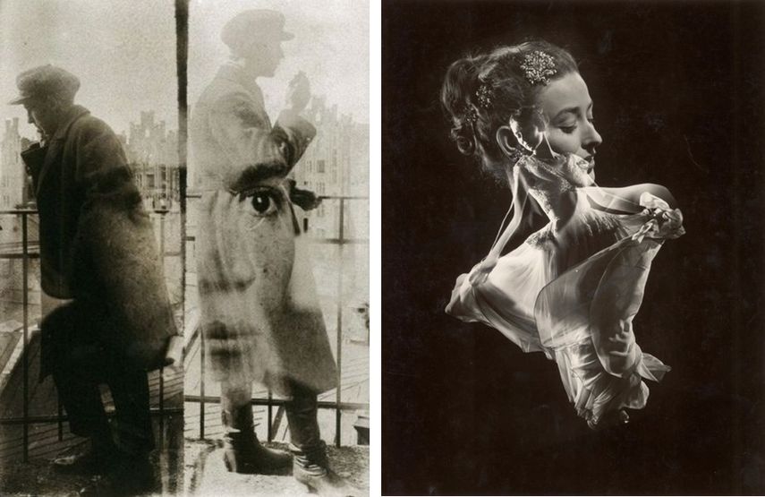
In photography and cinematography, a multiple exposure is the superimposition of two or more exposures to create a single image, and double exposure has a corresponding meaning in respect of two images. The exposure values may or may not be identical to each other.

Some examples of double or multi exposure- Looking at Man Ray

Man Ray was an American visual artist who spent most of his career in Paris. He was a significant contributor to the Dada and Surrealist movements, although his ties to each were informal. He produced major works in a variety of media but considered himself a painter above all

What Is Photomontage - The Definition and History | Widewalls

Turning my headshots into double exposure images through photoshop-

Procedure-

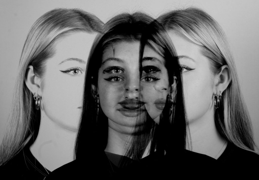
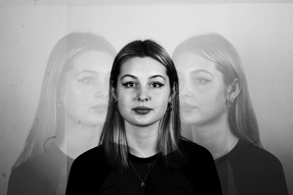
I opened 3 to 4 images of my model that I took for the ‘headshot’ blog post and I copied and pasted them over on top of each other in the area that I wanted it to be in. Once I was happy with where all the images were placed I used the ‘overlay’and the ‘opacity’ option to alter how strong I wanted them to over lap each other and how visible each image was. I changed all my images to black and white for a much clearer effect as I didn’t want different colours to clash with another when I overlay them. Using black and white also creates a more sad and mysterious effect which I wanted as using double exposure makes images look abstract and changes the way you see objects or people. Overall I really like how my images turned out and how I edited them because it makes you analyse the image in more depth a lot is going on and makes you focus on different areas of the image.

FINAL IMAGE-

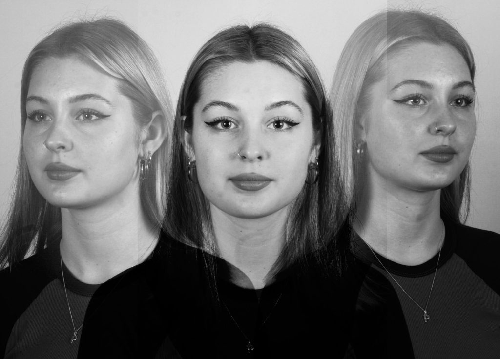
This is the final image I have edited. Once I got comfortable with the overlaying tools and did a few edits prior to this one I knew how I wanted my final image to look like. I selected three of my favourite photos of my friend and turned them black and white as well as decreasing the brightness and increasing the contrast as I wanted all 3 images to be a lot more darker and have sharp contrasts between the white and black tones. By using the overlay option this makes the image look a lot more abstract and using 3 images instead of 1 shows you every side of the model which creates this idea of multiple personalities. Using double exposure is very useful when you try to show a model expressing loads of different emotions on their face and then creating and merging it all into one image however I didn’t do that as I wanted to create a simple image for my first try.

headshots

Using continuous lights and flash lights for 3 photo shoots;

Photoshoot 1– different lights- soft and hard

Photoshoot 2– different face expressions and moods on model.

Photoshoot 3– taking really close headshots so all you can see is the face and a small part above the shoulders.

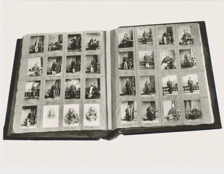
Taking inspiration from; Henry Mullins is one of the most prolific photographers represented in the Societe Jersiase Photo-Archive, producing over 9,000 portraits of islanders from 1852 to 1873 at a time when the population was around 55.000. The record we have of his work comes through his albums, in which he placed his clients in a social hierarchy.

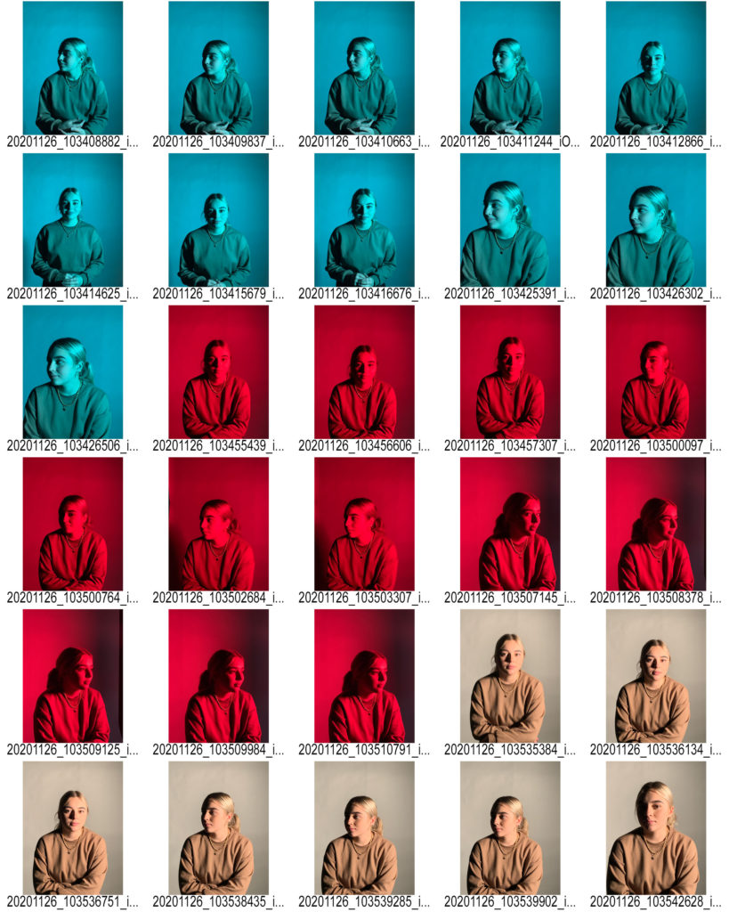
CONTACT SHEETS-

For all my photos I used two point lighting- flash heads in this case. Every time I pressed the camera the flash lights would go off. I took the photos in the dark so that when the flash comes on the lighting would be very bright creating no shadows on the face.

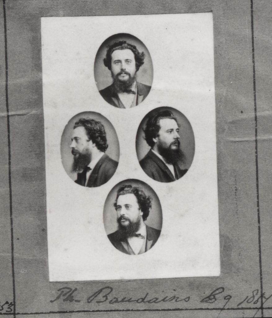
Diamond cameo background-

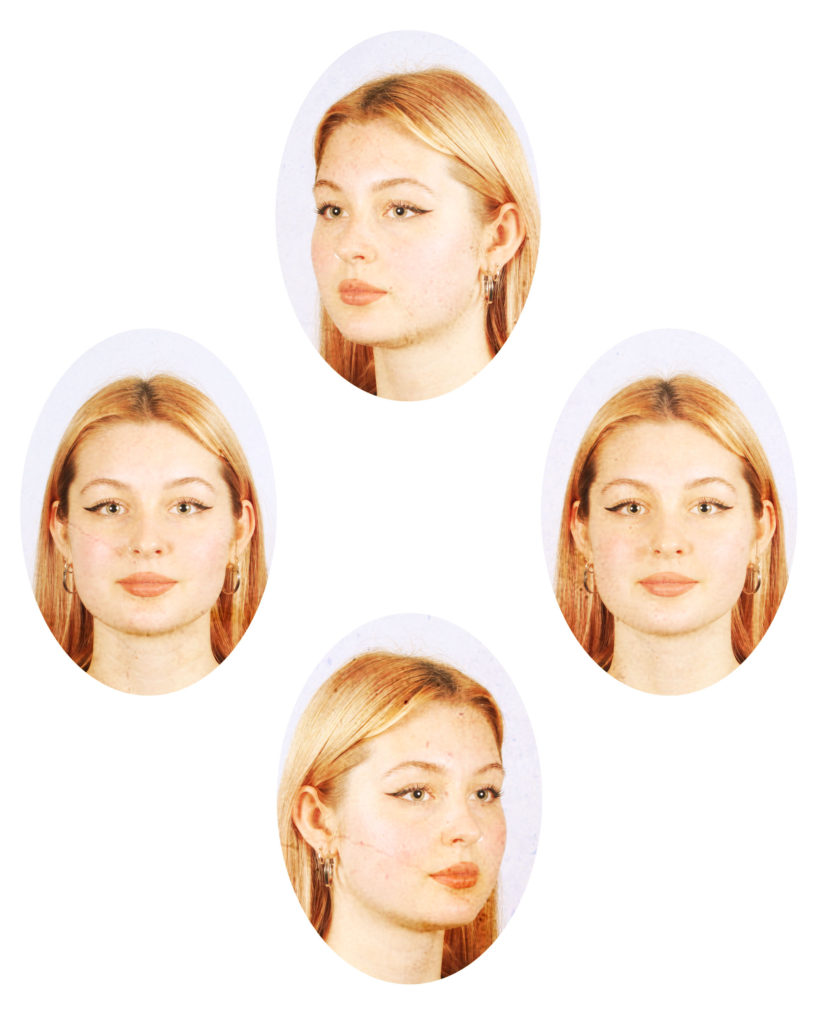
The Patent Diamond Cameo photograph was registered by F.R. Window of London in 1864. Four small oval portraits (1″ x 3/4“) were placed on a carte de visite in the shape of a diamond, each portrait being of the same person photographed in a different position. A special camera made by Dallmeyer was used in which the one glass negative was moved to a new position in the back of camera after each portrait had been taken, and when the paper print had been pasted on the card a special press was used to punch the four portraits up into a convex cameo shape

Taking inspiration from Henry Mullins-

Henry Mullins started working at 230 Regent Street in London in the 1840s and moved to Jersey in July 1848, setting up a studio known as the Royal Saloon, at 7 Royal Square. Initially he was in partnership with a Mr Millward, about whom very little is known. By the following year he was working alone and he continued to work out of the same studio for another 26 years.

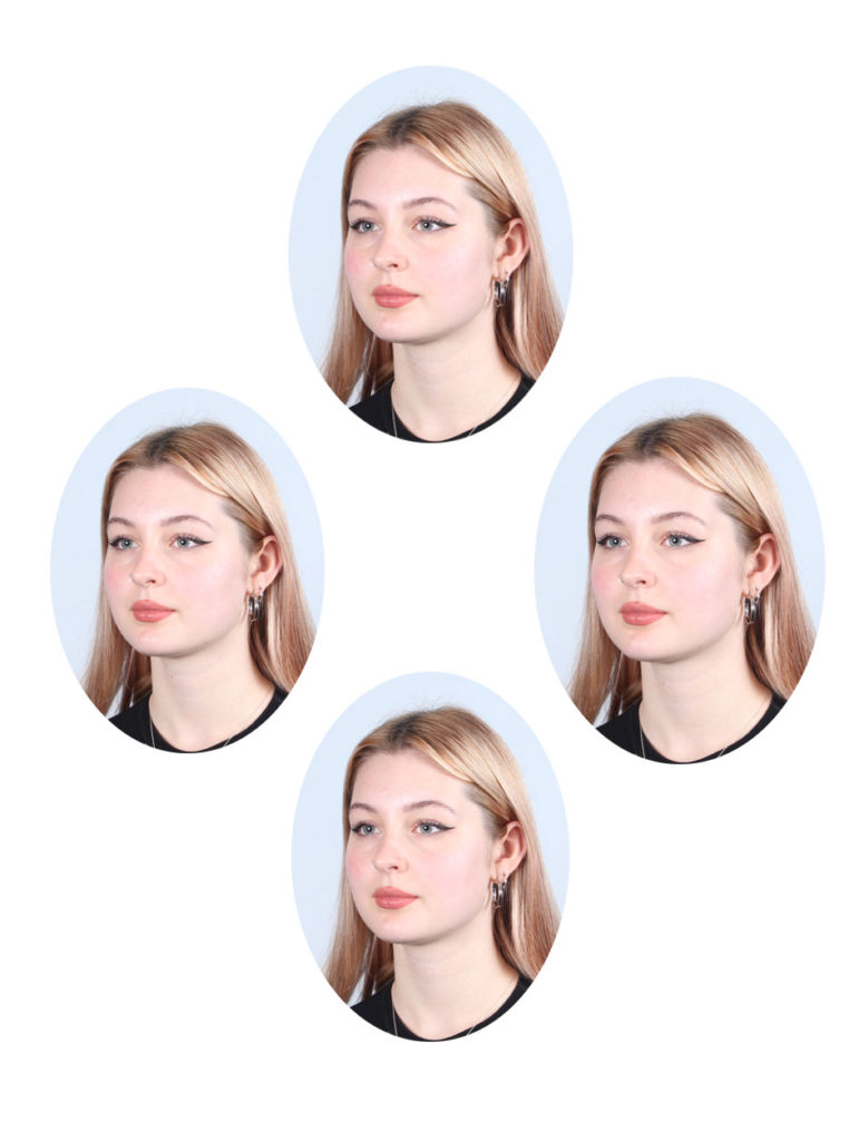
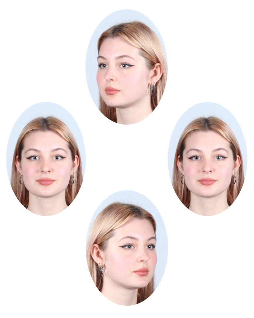
Using photoshop to create a diamond cameo;

Using two different images and adding an old paper effect-

Procedure– I cut out oval shaped sections of my images and copied them over to a ‘New’ layer. I then flipped one image horizontally and afterwards I took an ‘old paper effect’ image from google and pasted it on top of my diamond photos. Once it was pasted in, I over-layed the image so that it creates a subtle effect as the original old diamond photos.

STUDIO PORTRAITS 1

Why do we use studio lighting? Studio lighting is an essential addition to most photographers’ arsenal. It allows us to create natural lighting effects in a variety of situations, and is far more controllable than a flashgun. And, with so many options available nowadays, it doesn’t have to be confined to a studio

One- point lighting only involves one light and this would be the key light. This light has the most influence on how the lighting and photo turns out. Two-point lighting involves  two opposing directions with the light sources are 180 degrees apart. Three-point lighting involves three lights called the key light, fill light and back light.

In television, film, stage, or photographic lighting, a fill light may be used to reduce the contrast of a scene to match the dynamic range of the recording media and record the same amount of detail typically seen by eye in average lighting and considered normal.

Chiaroscuro, in art, is the use of strong contrasts between light and dark, usually bold contrasts affecting a whole composition. It is also a technical term used by artists and art historians for the use of contrasts of light to achieve a sense of volume in modelling three-dimensional objects and figures

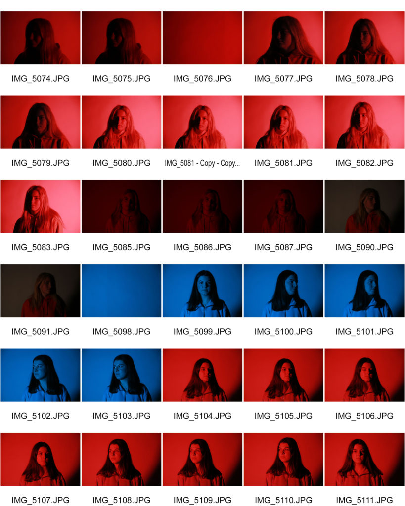
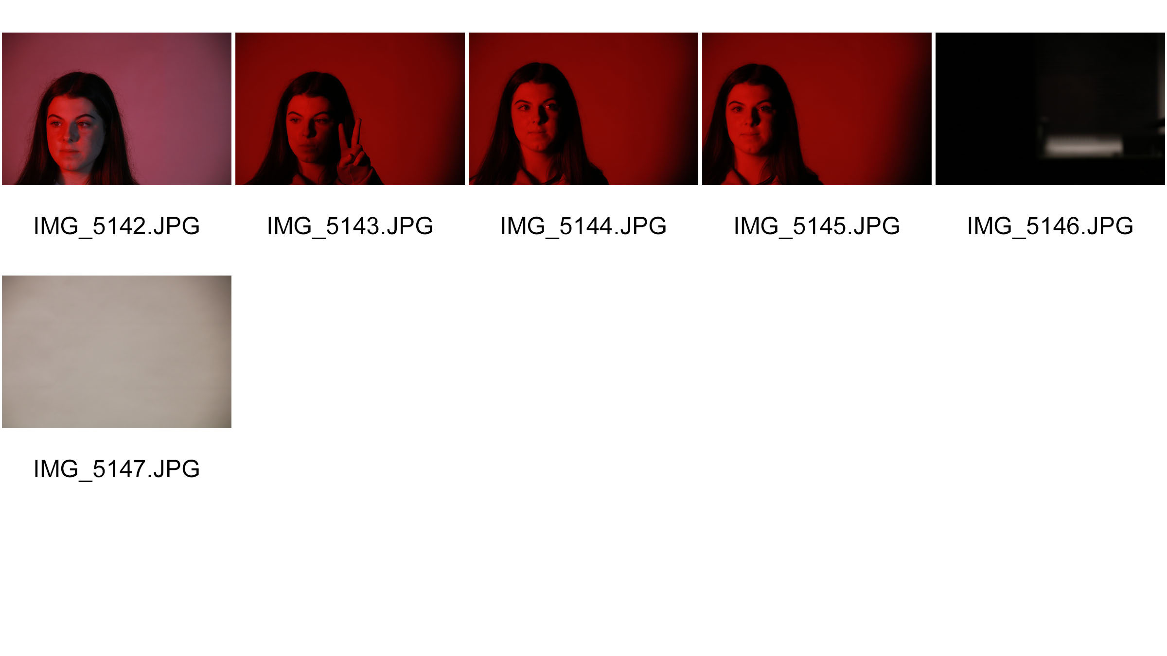
TAKING PHOTOS IN THE STUDIOone point lighting and trying out Chiaroscuro

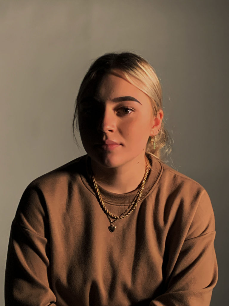
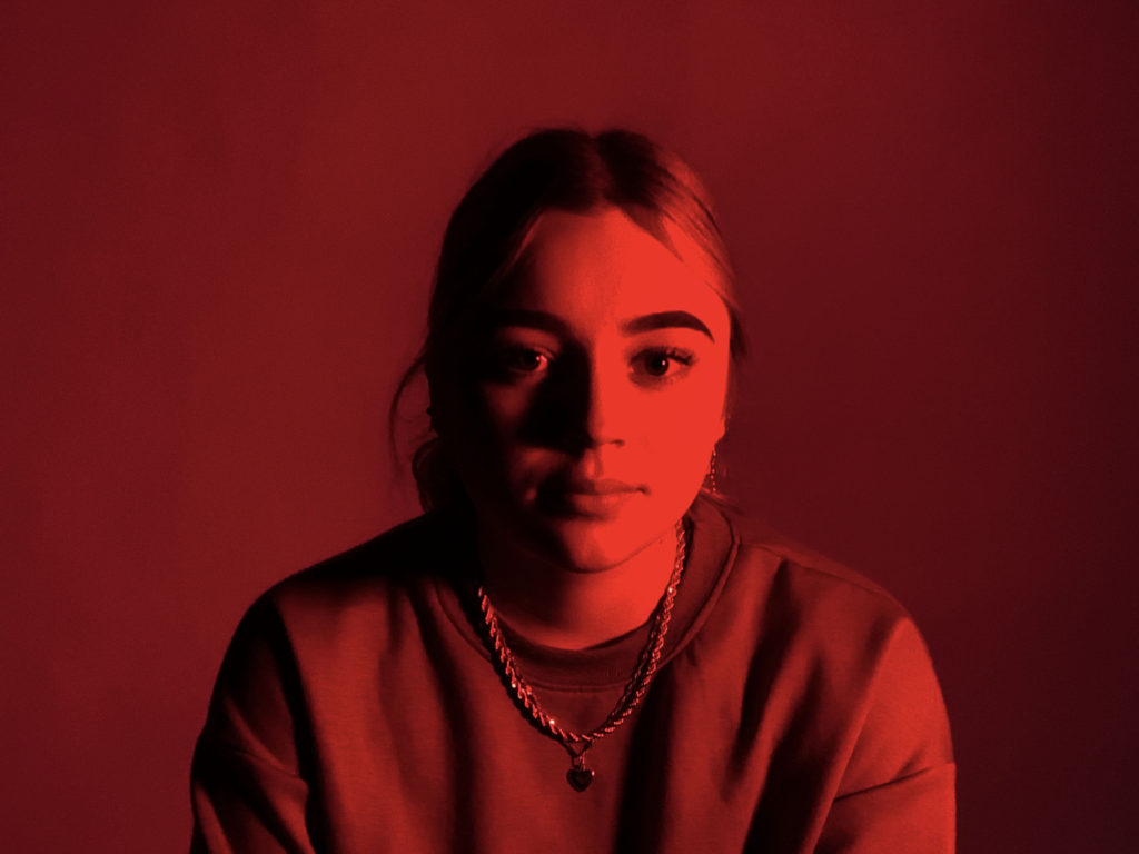
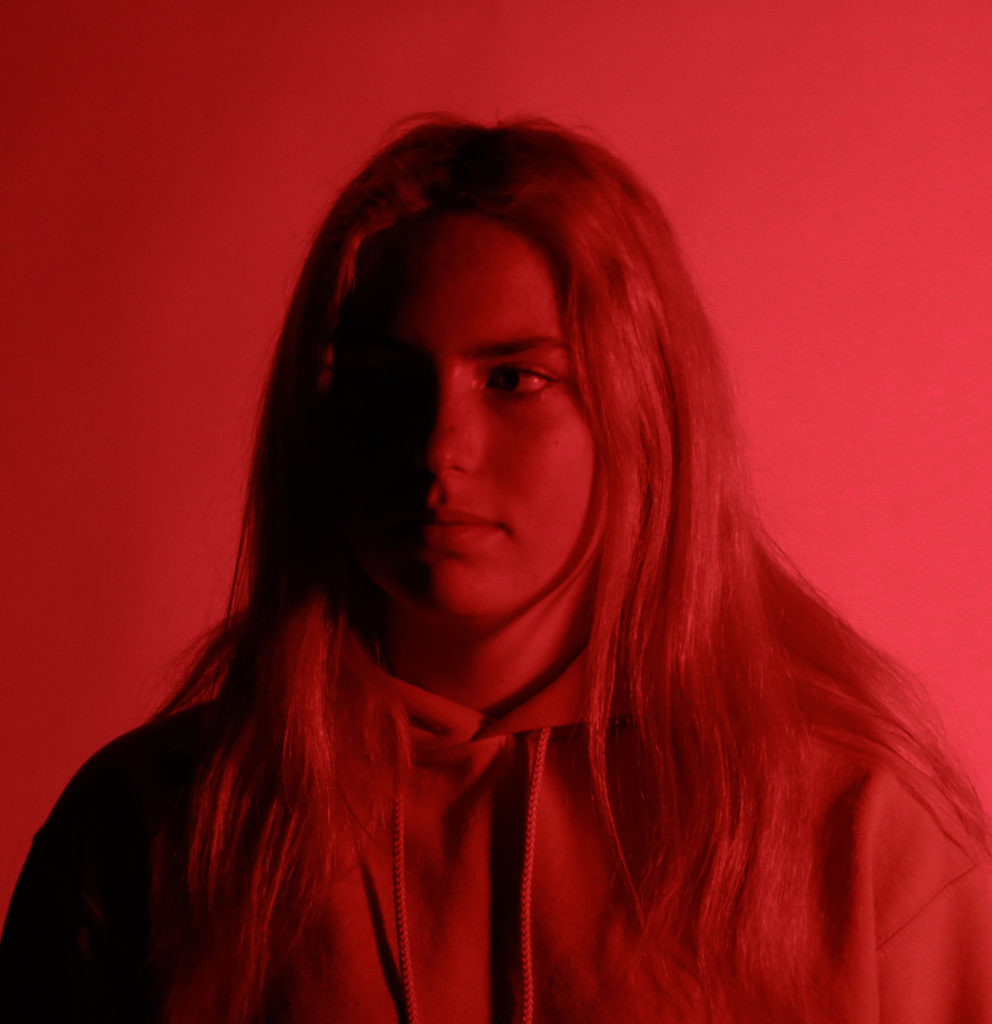
Procedure- For all my photos I only used one light as this photo shoot is focused on using one point lighting. I also experimented with a red and blue filter over the light to try create different coloured shadows. I got my models to either face left or right which created that dark shadow on only one side of their face. I also only had the light on the right side of the studio room so that the light would only beam and reflect on one side. I made sure my settings were on a high shutter speed to make the photos not turn out blurry.

Overall, I like how all of my images turned out because I got to use only one light and I created the shadow on one side of my models face which is what I wanted to achieve.

Here are some of my favourite and edited photos;

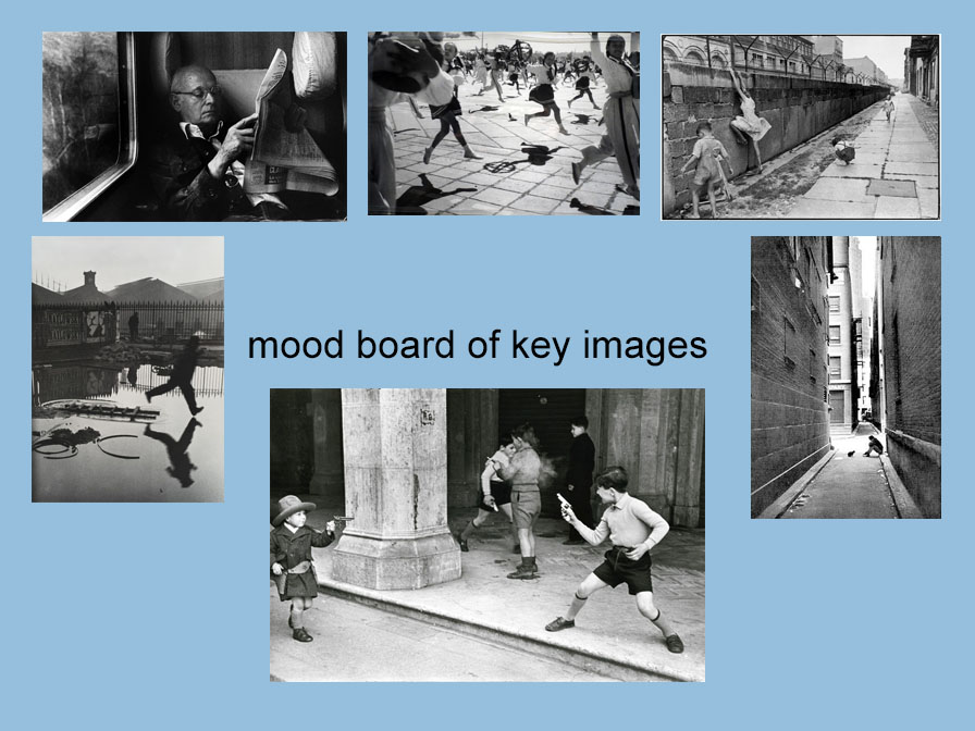
Henri Cartier – Bresson and “The Decisive Moment”

Henri CartierBresson (1908-2004), arguably the most significant photographer of the twentieth-century, was one of the co-founders of Magnum Photos in 1947 and champion of the “decisive moment”. He brought a new aesthetic and practice to photography, initiated modern photojournalism, and influenced countless followers.

He enjoyed street photography and viewed photography as capturing a “decisive moment”

Analysing one of his images-

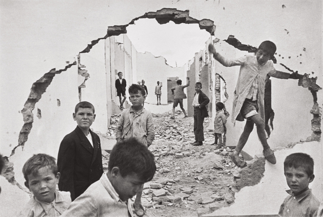
Henri Cartier-Bresson | Seville, Spain (1933) | Artsy
Seville, Spain 1933

Technical- It looks like this photo is taken in natural lighting as there would be no way of getting artificial lighting in at this scene. There’s a lot of contrast between the white and black sections of the photograph especially seen when there are 3 young boys wearing black suits and the rest are in normal white clothing. There’s no colour which creates quite a cold tone and the photo is taken from further away making the whole background visible. Its a sharp and focused photo which was most likely taken on a high shutter speed as it’s not blurry.

Visual – The photo is in black and white with many different tones of light and dark. There’s an oval like shape of the walls which creates a suttle frame for the photo and gives me the illusion of looking through into a different world. The boys standing on the edges makes it easier to look into the photograph.

Contextual- This photo was taken in 1933. This photograph has sometimes been misinterpreted as a document of the Spanish Civil War, but it was made three years before that war began.

Conceptual– Knowing that was this photo was taken 3 years before the Spanish Civil War makes the viewer think about what might have happened to all the young boys during the war- did some of them fight and be soldiers or did some not make it?

Henri Cartier- Bresson was one of the co-founders of Magnum photo agency in 1947. He was the first foreign professional photographer to be allowed into the USSR since the death of Stalin in 1953.

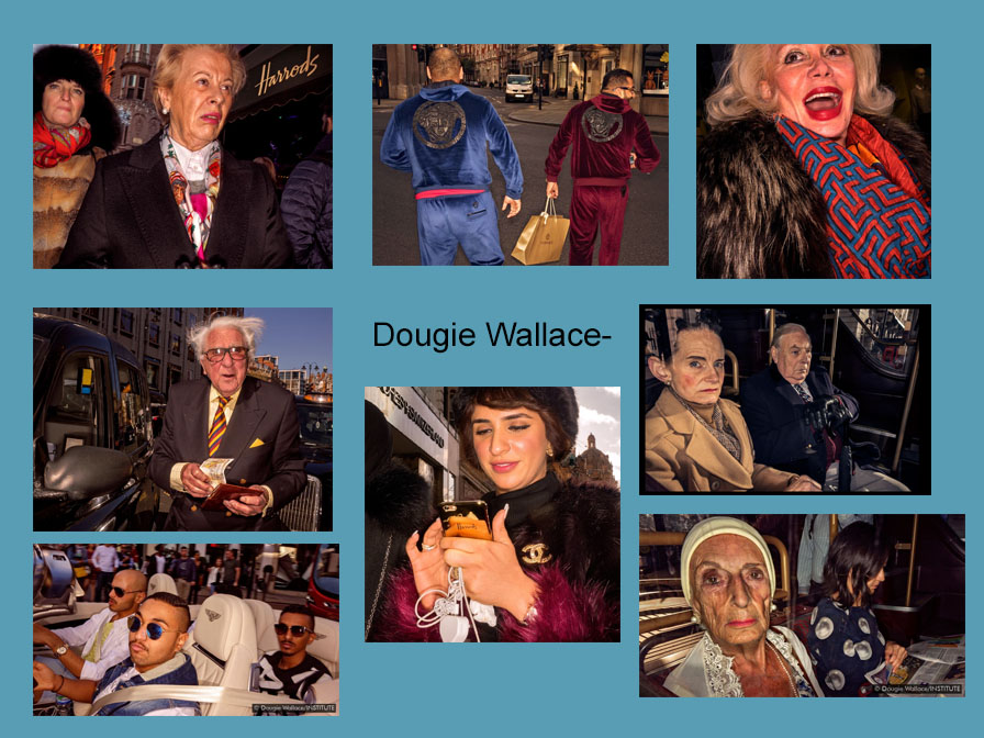
Comparing to Dougie Wallace-

Dougie walks around the British streets and photographs random individuals that he thinks stand out or have interesting characteristics. Once he spots the person he wants to photograph he simply gets up really close to the them and quicky takes a photo with the flash on. He uses the flash because it creates the idea of a busy atmosphere and anxiety as large cities tend to be packed with different individuals and are always very busy.

Differences- Dougie uses flash when he takes his photos whereas Henri doesnt. Dougies work is in colour and there’s more going/ movement in his photos compared to Henris photography which is all in black and white and has a powerful meaning behind each photo. Dougies work makes you think that you’re there in the city as the photos are so close to the different individuals , however Henri’s photographs his work from a lot further away and tries to capture the background as well as the people.

Similarities- Both Dougie and Henri focus on street photography and try to capture how different people live or lived. There’s not many similarities between the two because they have both very different styles of capturing various moments in the streets.

I think that both of Dougie and Henri have completely different intentions when trying to capture street photography. Dougies photos are very vivid with colour and the atmosphere of the photo is chaotic whereas Henri’s photos are dull and black and white which creates a sad atmosphere and as if there’s a meaning or story to tell behind each photo.

Portraits

A portrait is a painting, photograph, sculpture, or other artistic representation of a person, in which the face and its expression is predominant. The intent is to display the likeness, personality, and even the mood of the person

What makes a portrait a portrait?It should say something about the person you are photographing or the person you are creating with the camera

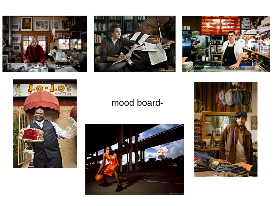
An environmental portrait is a portrait executed in the subject’s usual environment, such as in their home or workplace, and typically illuminates the subject’s life and surroundings. The term is most frequently used of a genre of photography.

The best to take an environmental portrait is to spend time getting to know the individual you’re photographing, chose the perfect location, use props if you need to, posing, direct eye contact to make sure the subject is engaged with the camera and use good camera settings.

LOOKING AT ENVIRONMENTAL PORTRAITS-

“An environmental portrait is a portrait executed in the subject’s usual environment, such as in their home or workplace, and typically illuminates the subject’s life and surroundings.

Examples of some well known environmental photographs –

Image result for famous environmental portraits
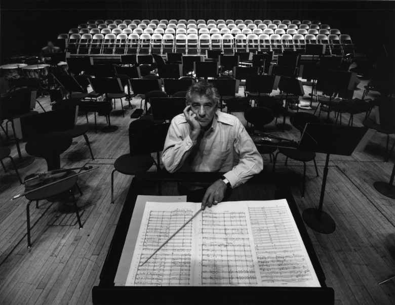
Arnold Newman : Leonard Bernstein , 1968
Image result for august sander
August Sander : Brick Layer, 1928

The photographer I chose to look at – Mary Ellen Mark

Mary Ellen Mark was an American photographer known for her photojournalism, documentary photography, portraiture, and advertising photography. She photographed people who were “away from mainstream society and toward its more interesting, often troubled fringes

Analyzing one of her photographs

Looking Back at a Master: Mary Ellen Mark | Shutterbug
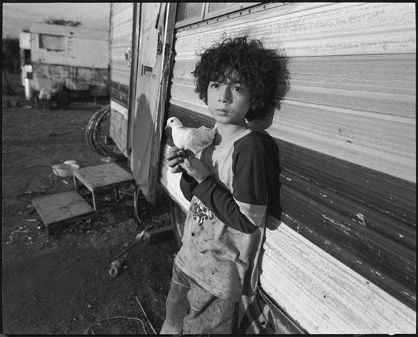
looking back at a master Mary Ellen Mark, 2010

In this portrait you can see that the young boy isn’t posing and it’s not a formal shoot as he’s leaning back on the camper van behind him. It’s a half body portrait and it’s been taken further away than a normal head shot would be taken. The portrait is taken from the same angel as the boy’s perspective. It’s in black and white which in some way creates a sad effect and mood as there’s no bright colours.

An environmental portrait can tell you a lot about the subject being photographed, for instance, in this photo you can assume that the boy hasn’t been raised in a wealthy area due to the background around him and the dirty clothes. The boy is holding an animal which implies he might have been raised on the countryside. On the other hand the dove he’s holding may symbolize innocence and hope as he’s only young and is living in poor life conditions. He isn’t directly engaging with the camera as there’s no eye contact but his facial expression is sad as he isn’t smiling which might indicate fear.

Composition- in the photo the black and white lines behind the boy on the camper van are drawing the attention directly towards the boy as they’re slightly slanted and go directly towards him making him the main subject. The campus he’s at is quite dirty and depressing as there’s nothing pleasing to look at.

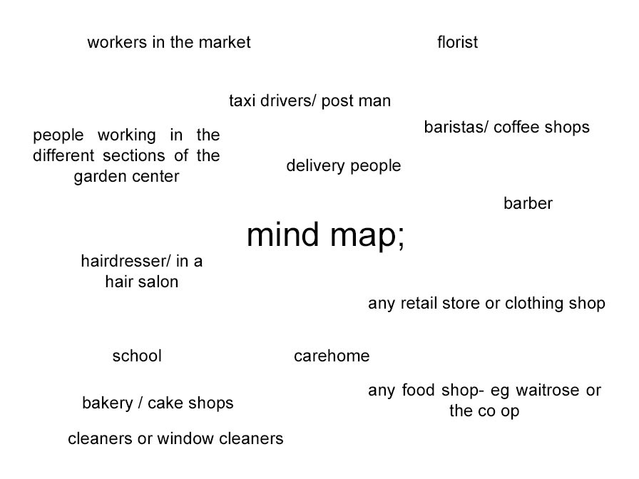
My photo-shoot action plan-

  • who– a stranger/worker in their everyday working environment or a family member
  • what– an individual working and someone was is surrounded in their working environment.
  • when– after school , go to the market or shop and ask permission to take photos.
  • why- to capture people in their everyday environment and the background that surrounds them on a daily basis.
  • how- take them on my camera in natural lighting.

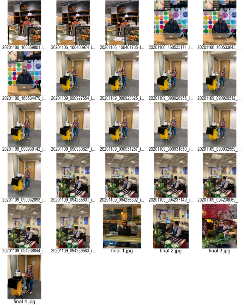
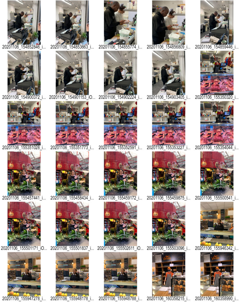
MY CONTACT SHEET-

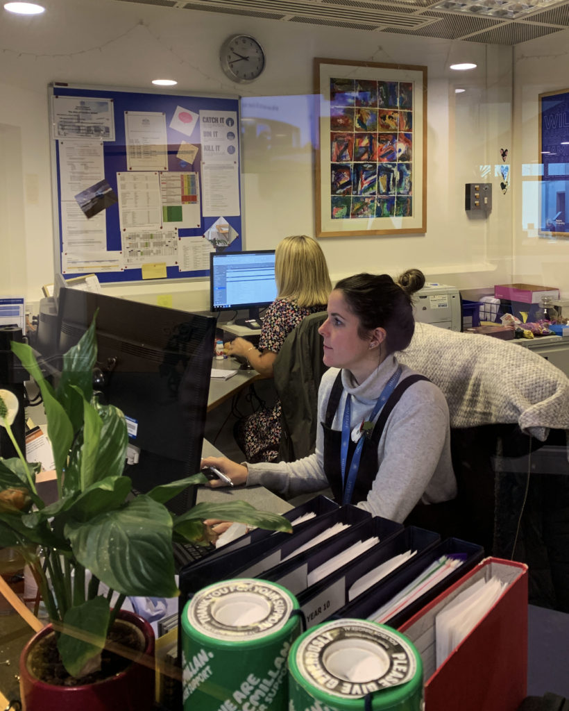
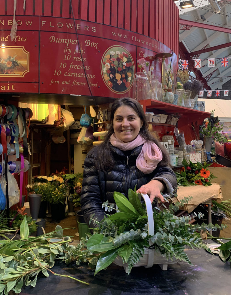
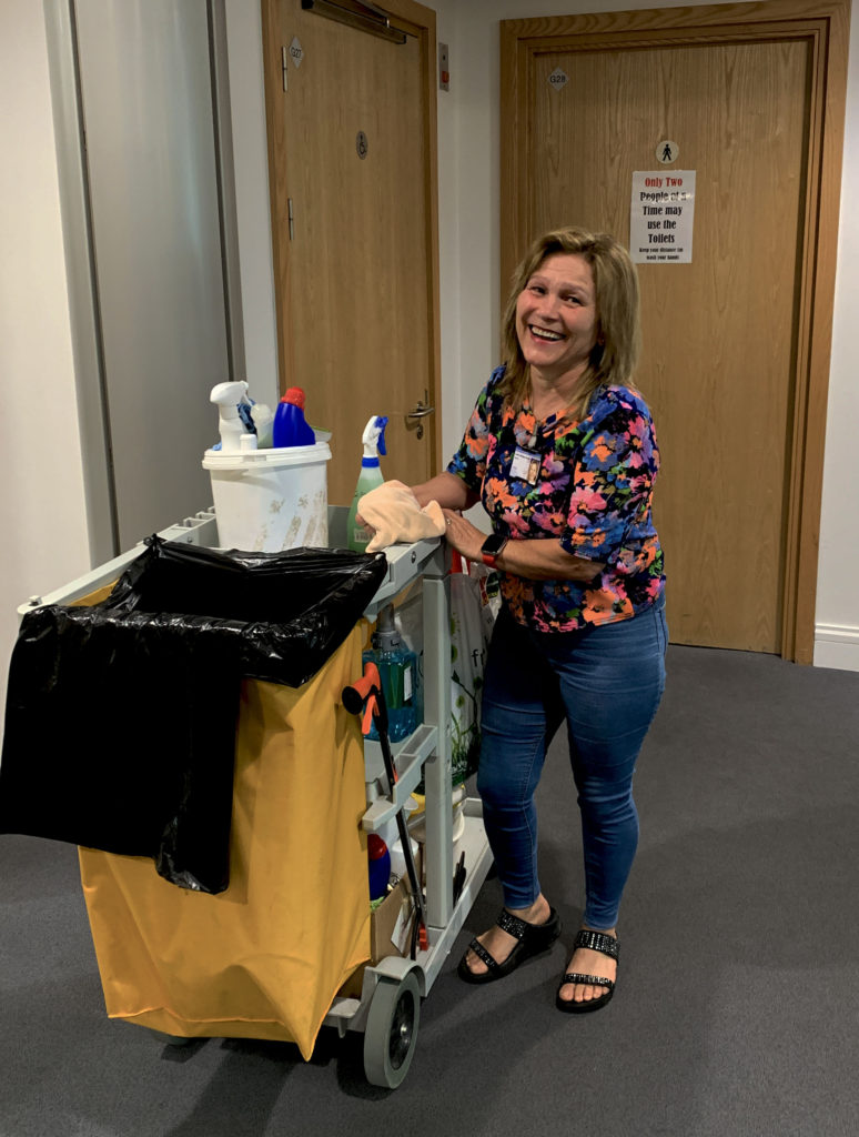
I went into town , to the market and fishmarket, to take photos of workers in their working environment. I photographed a few different sections of the market to get a variety of different backgrounds.

Some of my favourite and edited photos;

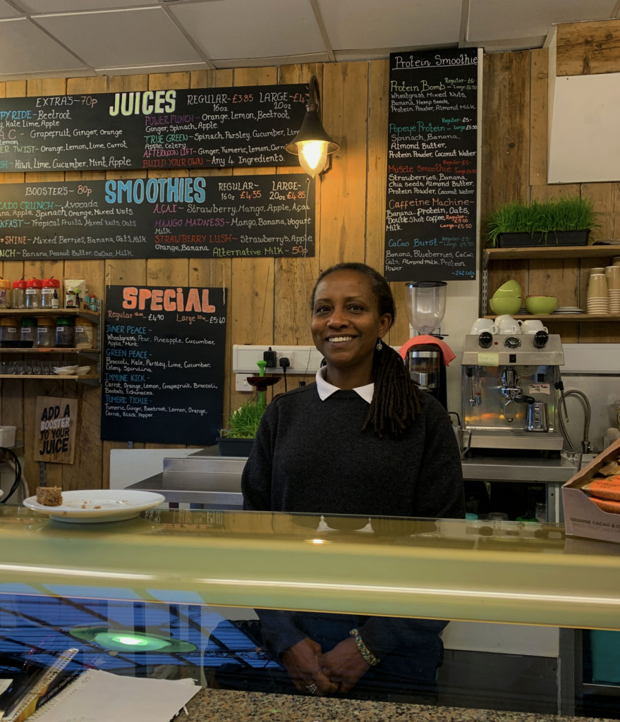
These are my favourite photos I took because I think they all capture the working environment perfectly as well as it being a portrait. Only one photo I took was a full body shot and the rest you could only see half of their body as they were behind desks. I wanted them to smile to create the mood of a happy working environment instead of them looking sad.

SELECTING AND FINALISING AND DISPLAYING

My most successful images-

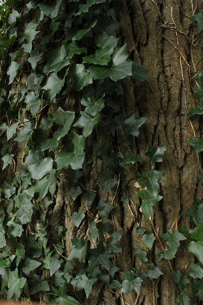
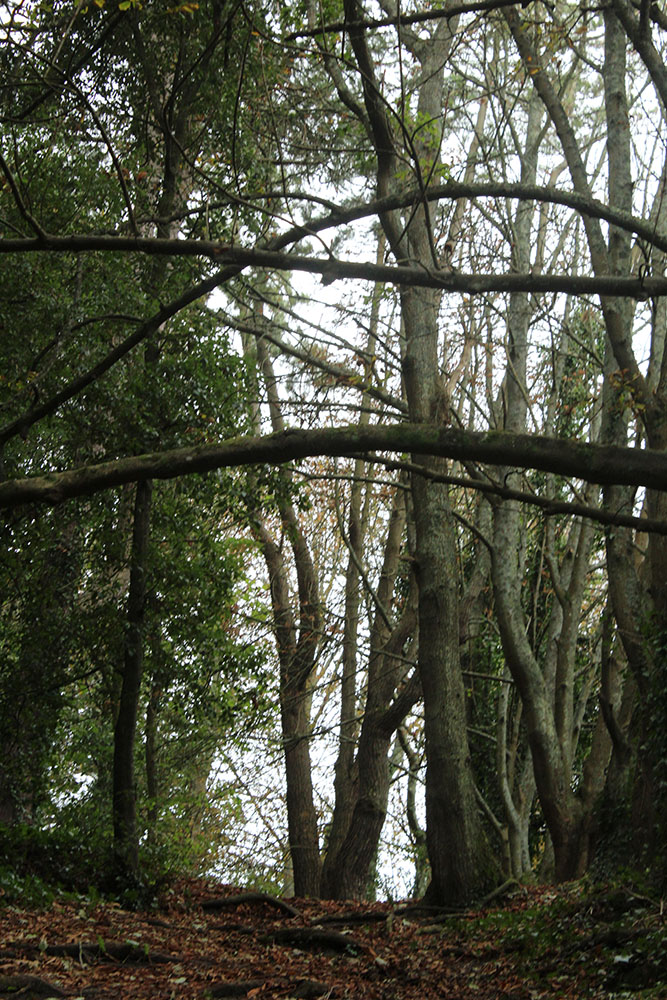
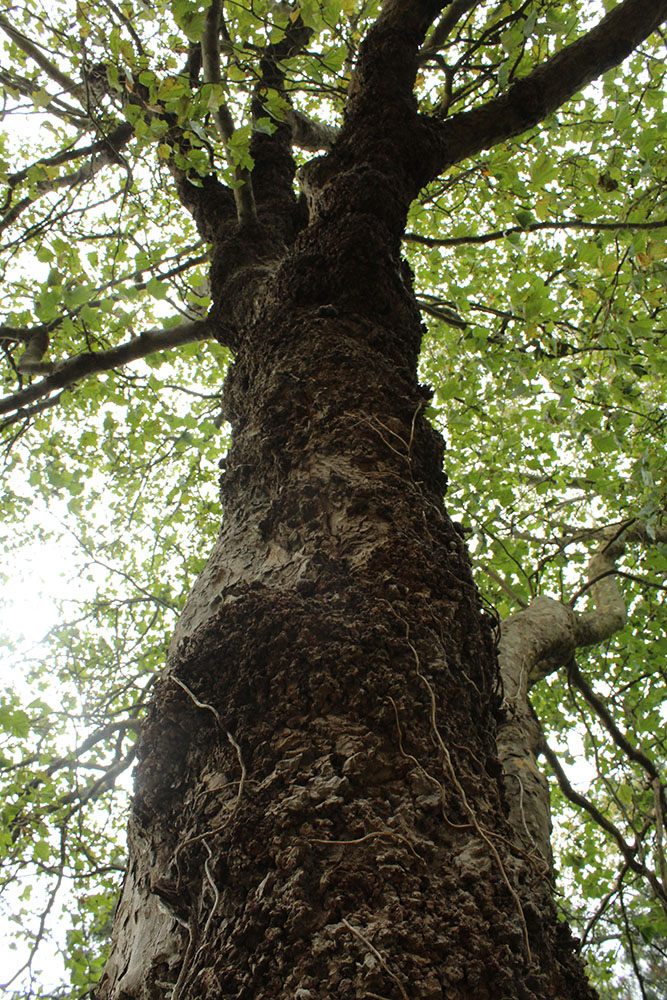
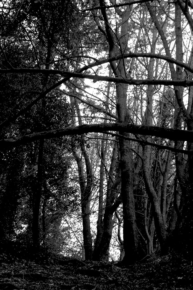
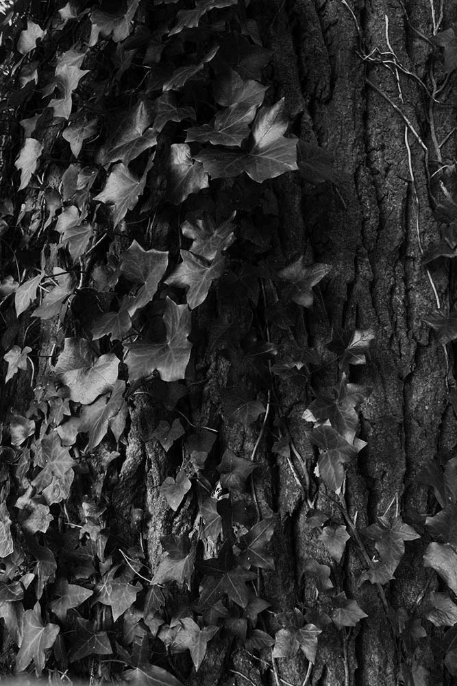
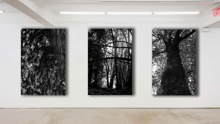
I’m going to display my photography through a set of 3 images, a triptych, I want to make sure all of my photos have something in come- I have picked nature. I made sure my images don’t clash with each other and that they’re not random.

Finalising them on photoshop-

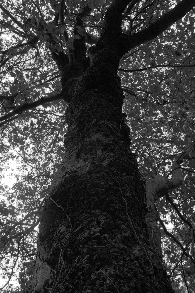
On Photoshop I turned all my 3 photos black and white and adjusted the contrast and exposure slightly to make the photos darker than they were originally. I did this to make the texture more visible

WHY- I decided to chose these photographs because they all fit into the same theme that I wanted to do- which was nature. I decided to turn them black and white to show the tones and contrast more as there’s a variety of different ones.

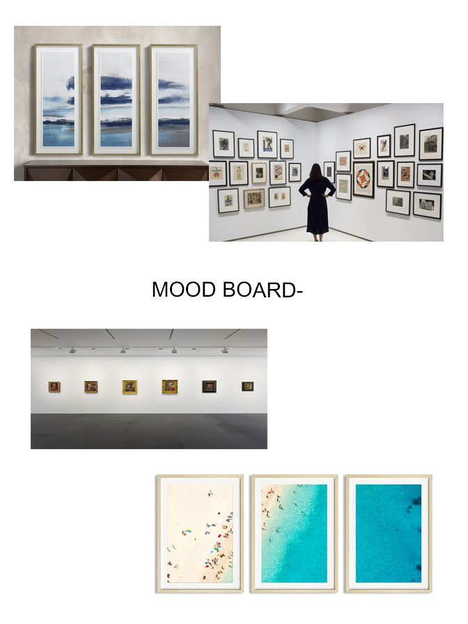
Presenting it on an empty gallery through using Photoshop-