All posts by Wiktoria J

Filters

Author:
Category:

narrative and sequencing

STORY: What is your migrant community story?
Describe in;

3 words; a migrant story

sentence; a migrant story showing the different backgrounds within the Jersey community.

paragraph;

NARRATIVE: How will you tell your story?

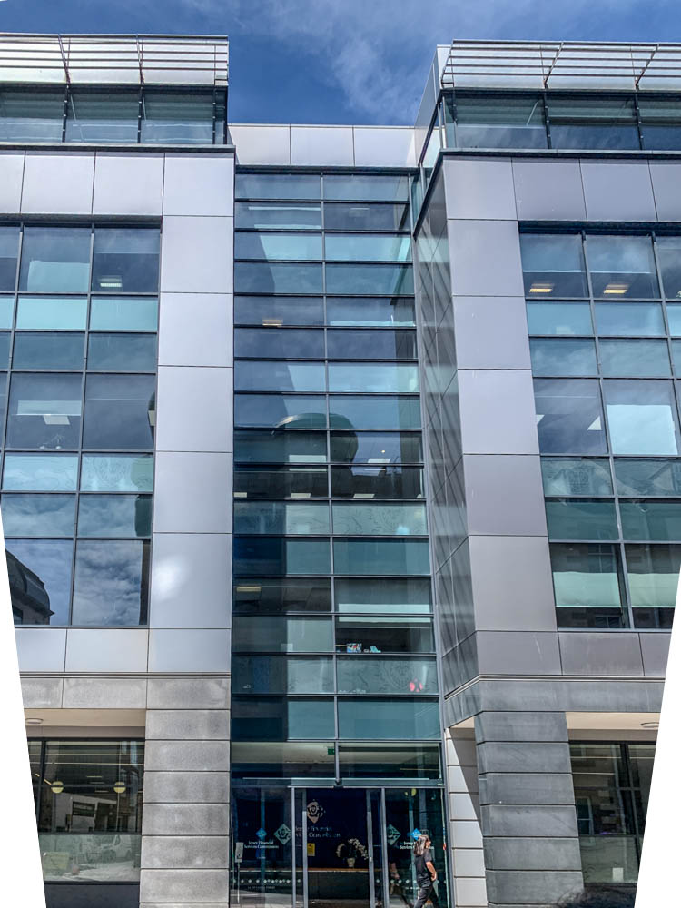
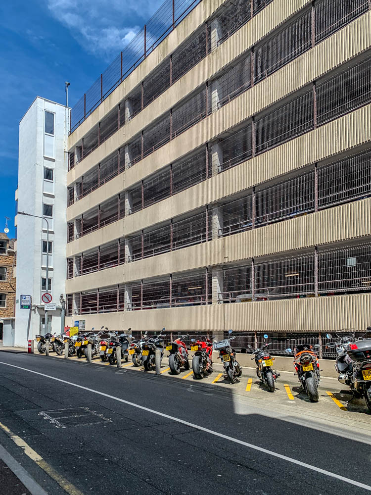
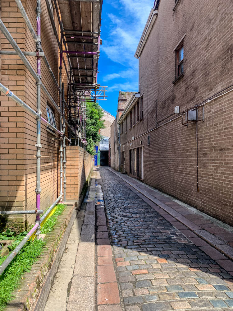
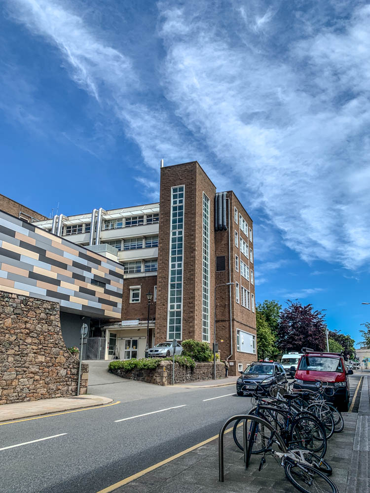
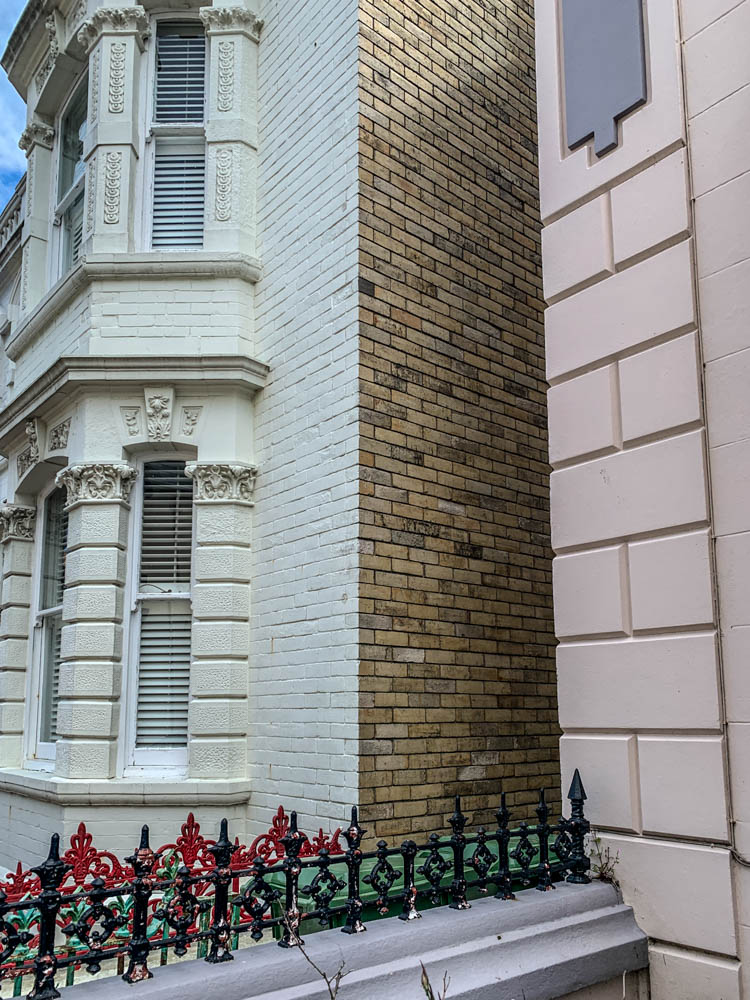
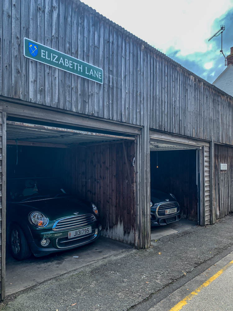
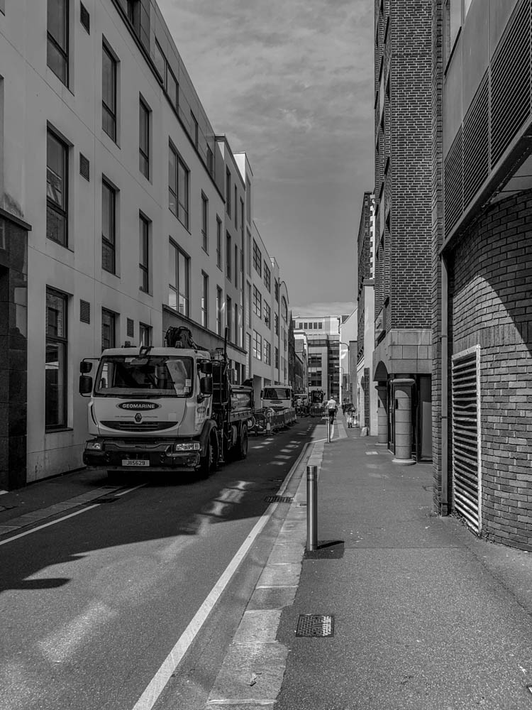
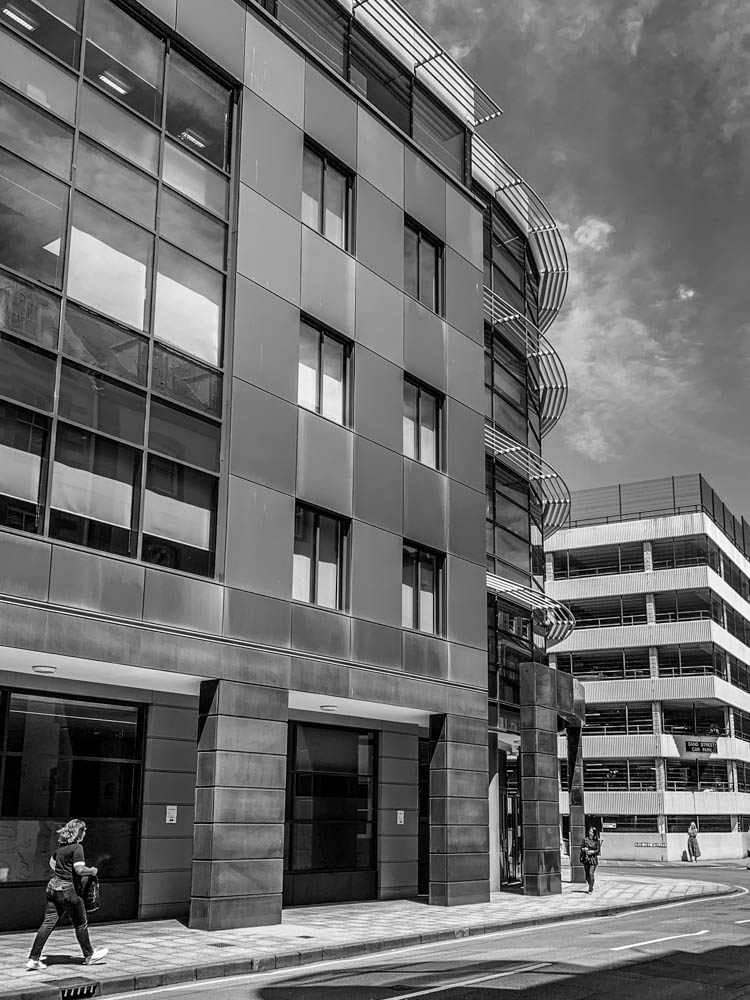
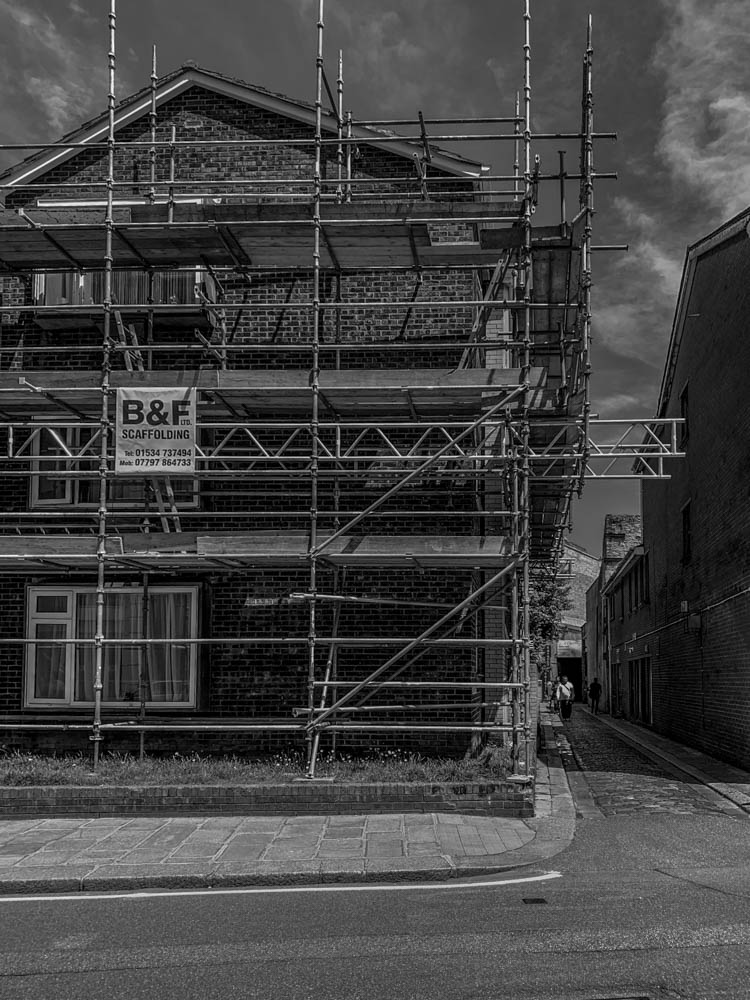
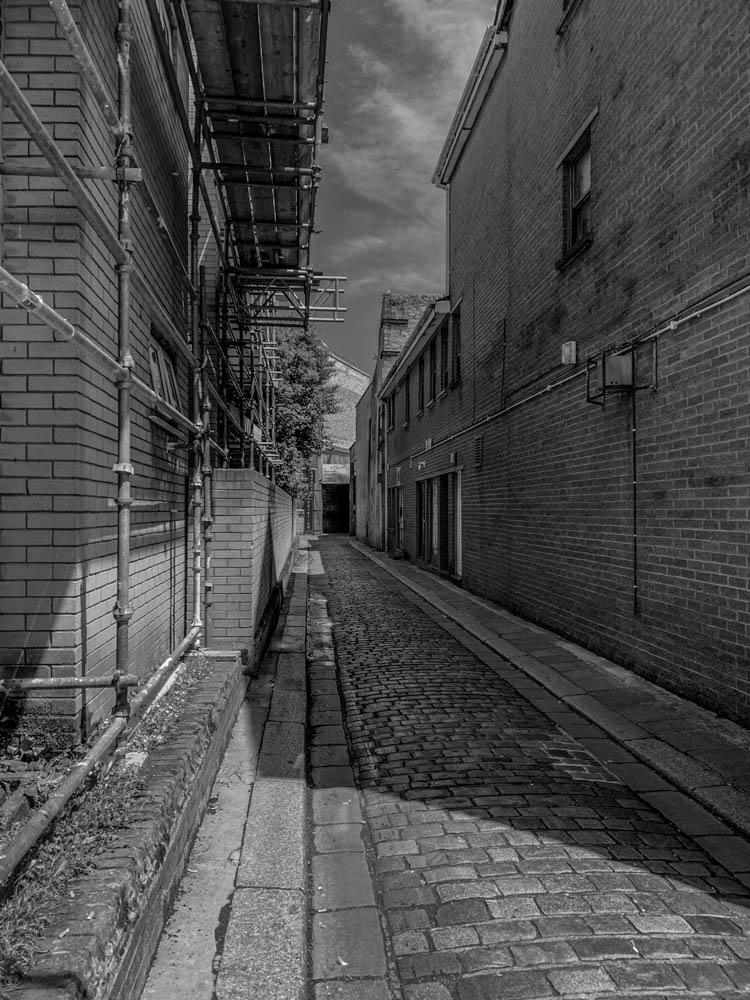
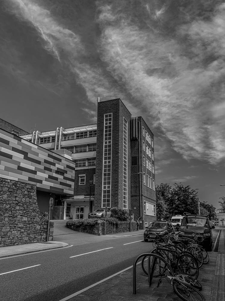
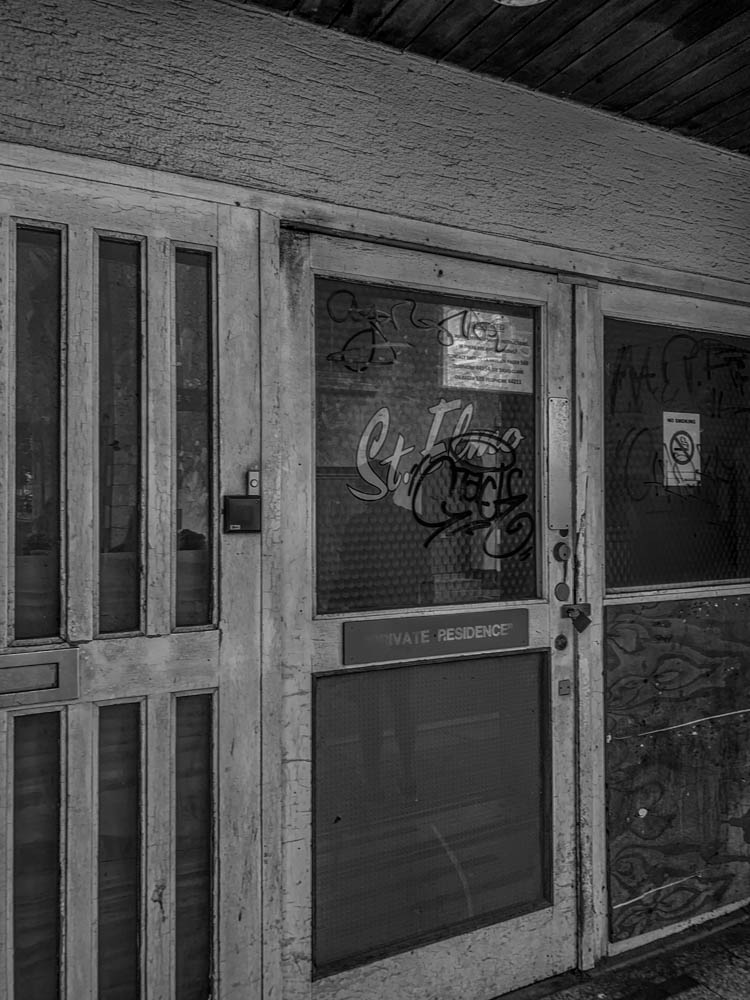
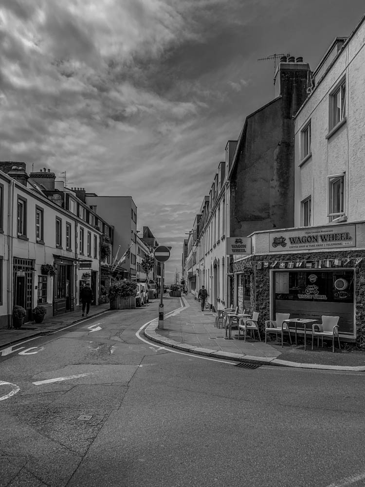
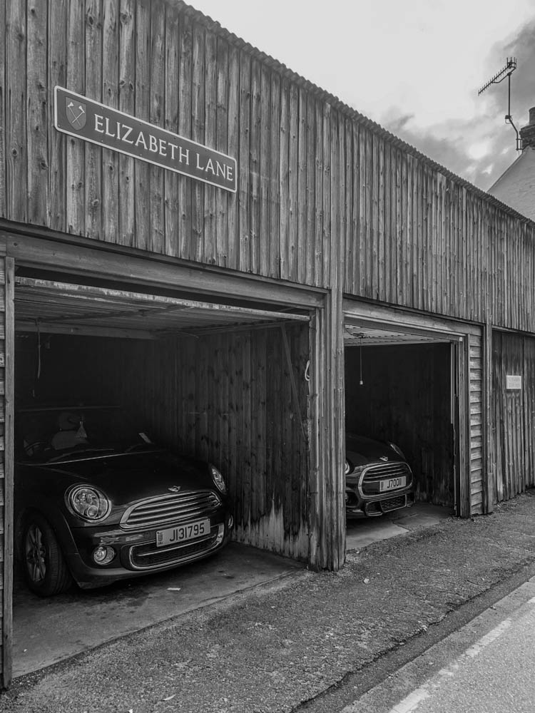
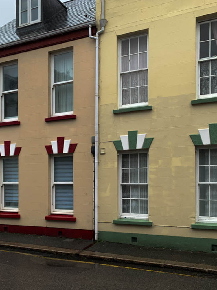
My own images I took around St.Helier especially near town that i have ordered specifically to tell my story.

AUDIENCE: Who is it for?

I think anyone in Jersey would be a suitable audience as anyone can learn about all of the different communities Jersey has and how we can see it visually. I also think future students or anyone living in Jersey in 30/40 years time would look back at my images to see how much Jersey has changed and how the people and community used to look like.

here’s my process of me selecting what images I would use and how I would sequence them;
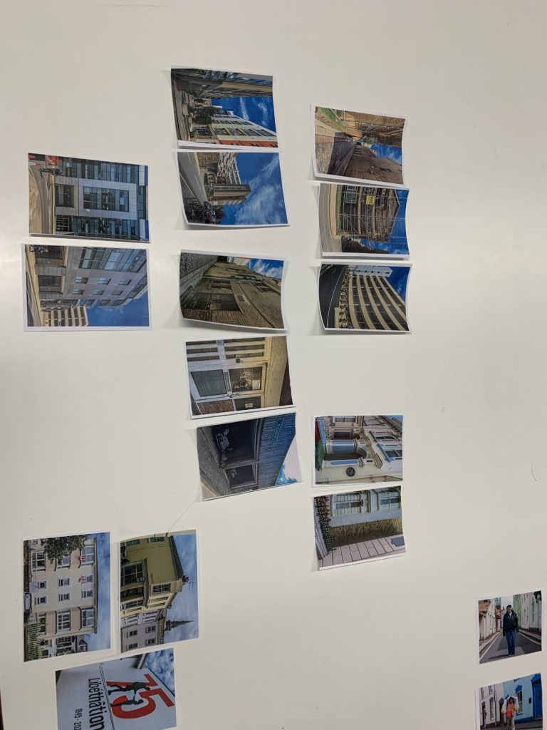
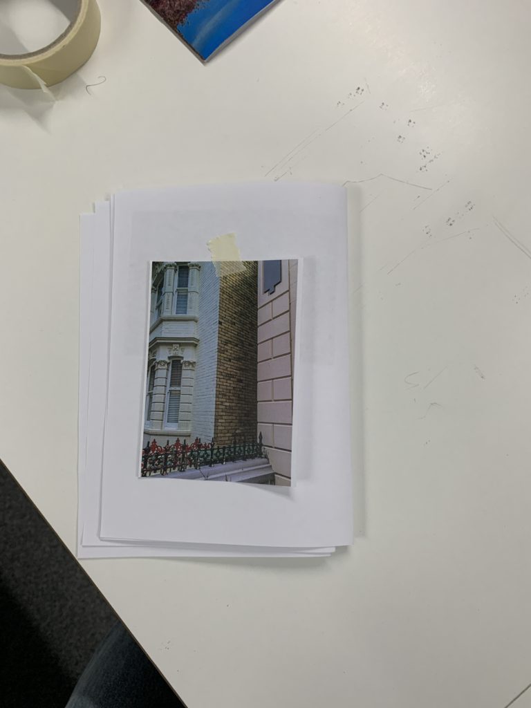
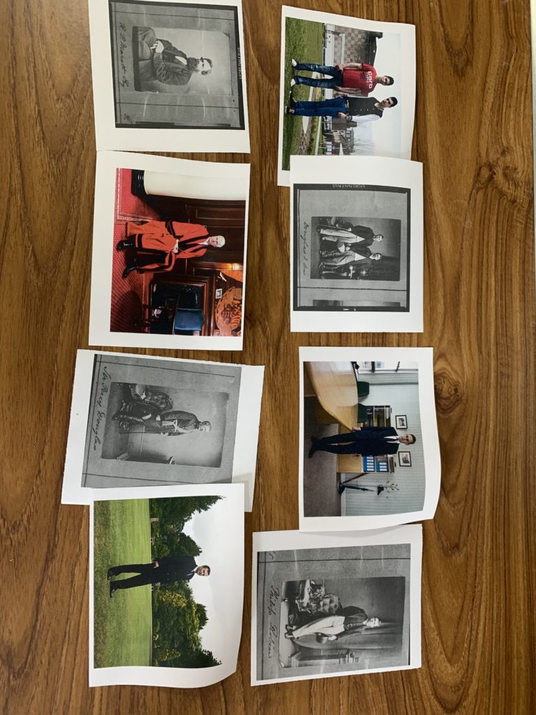
firstly i put out all my images I was happy with and wanted to use in my narrative story. I started off by grouping similar images together if they had something in common. This made it easier when trying to figure out the order of my images. Here’s an image showing how I decided to group them;
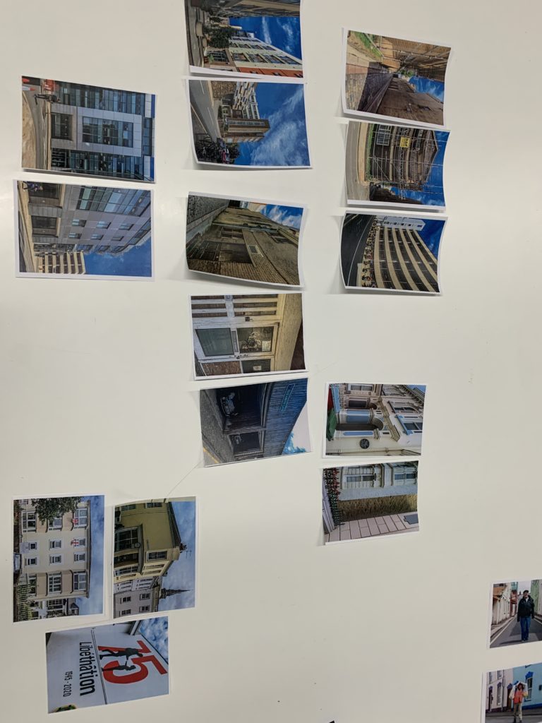
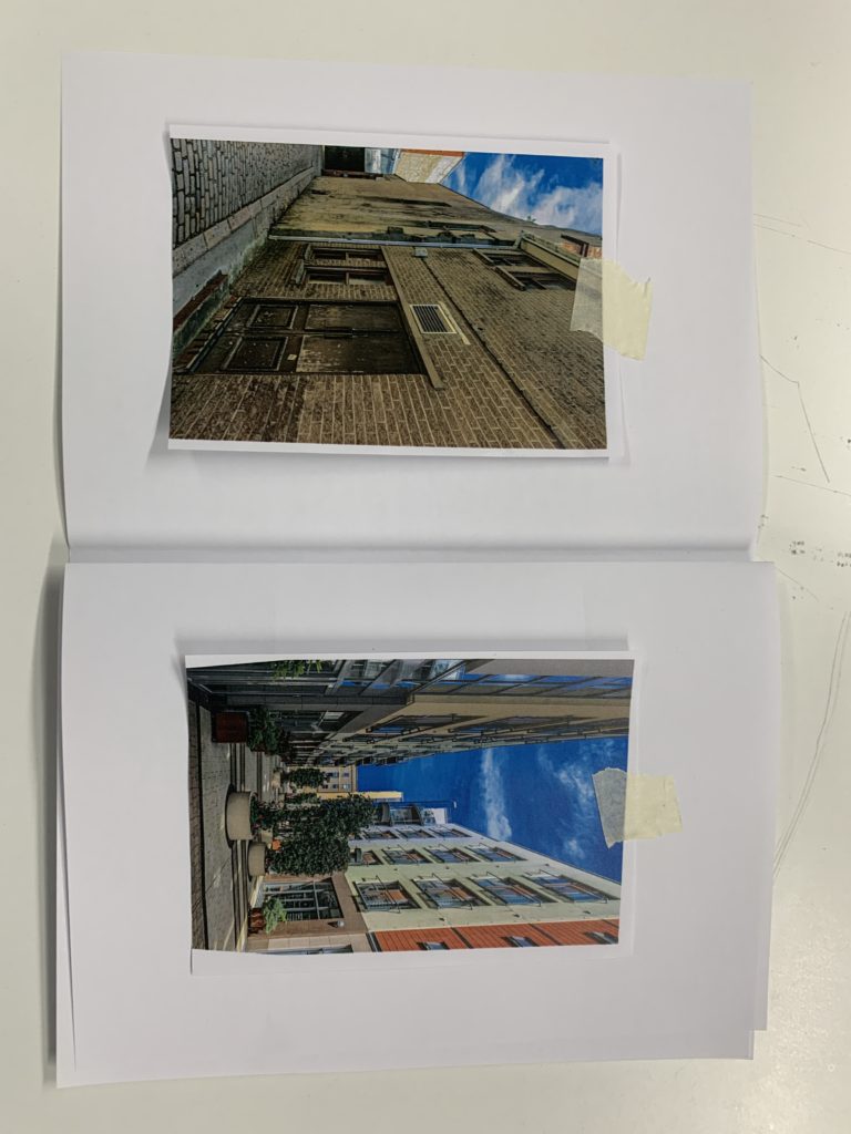
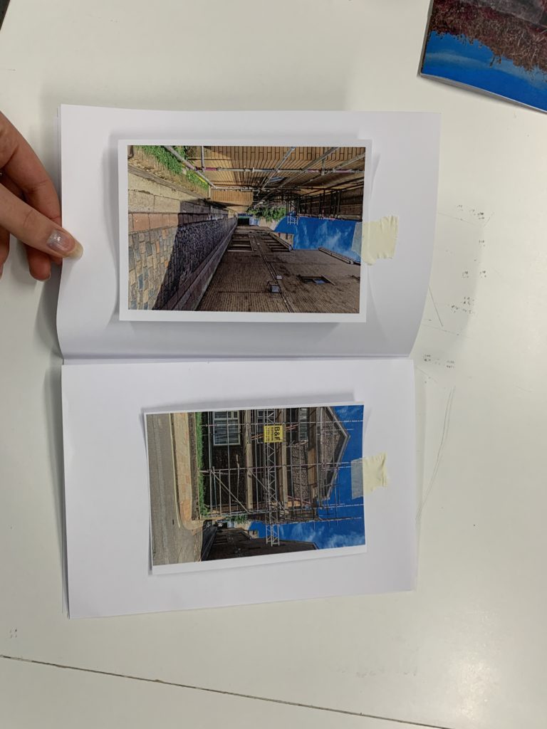
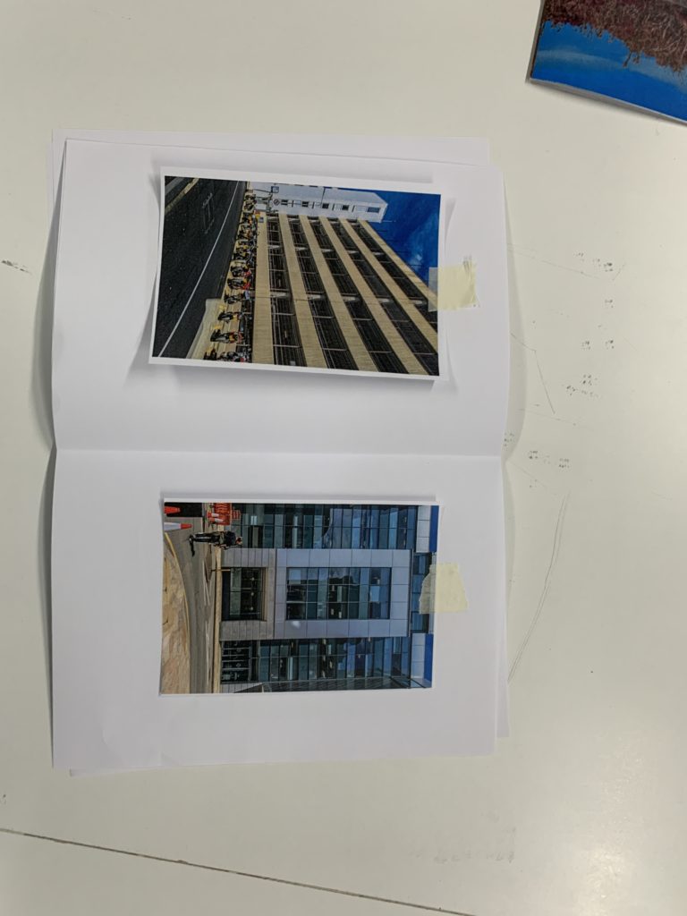
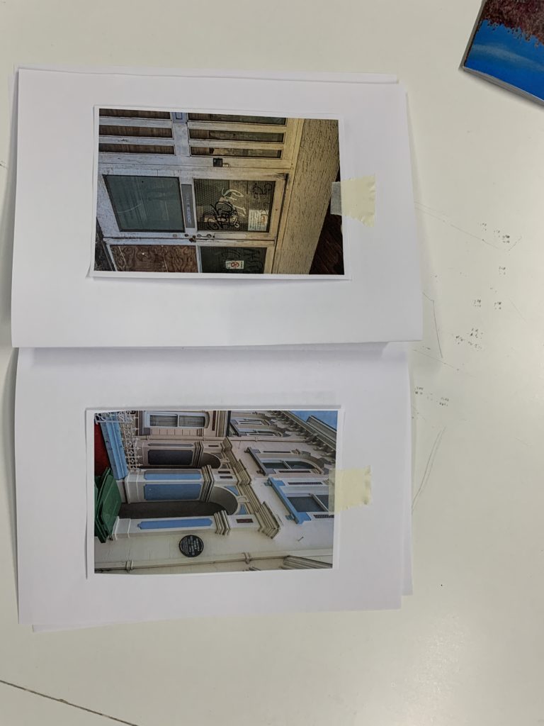
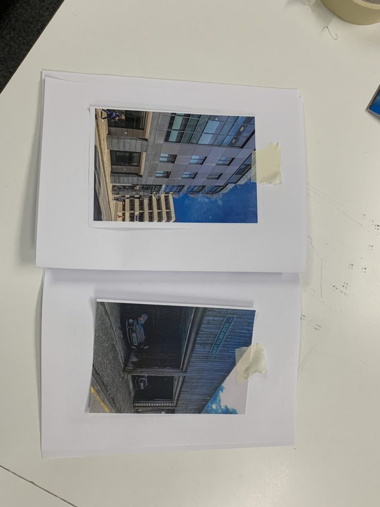
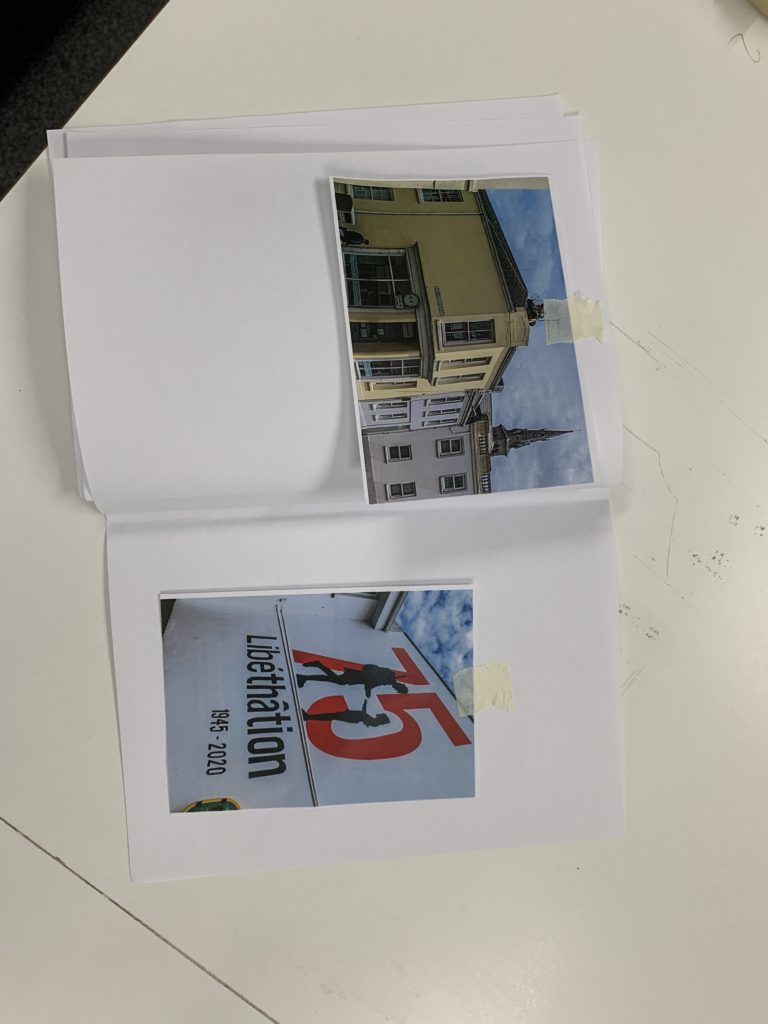
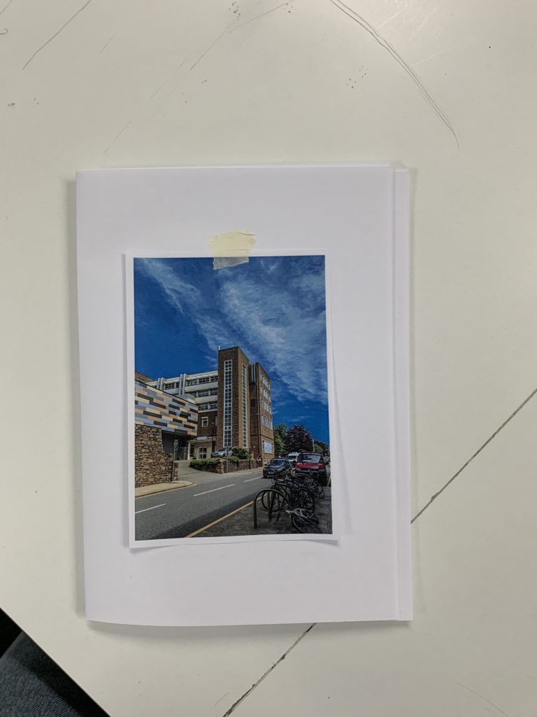
I then made a small A5 book from 4 pieces of paper to create a 16 page leaflet. By doing this I could play around with my printed images and decided what photos I wanted on what page. Here’s a few images showing how I placed my images in the book.

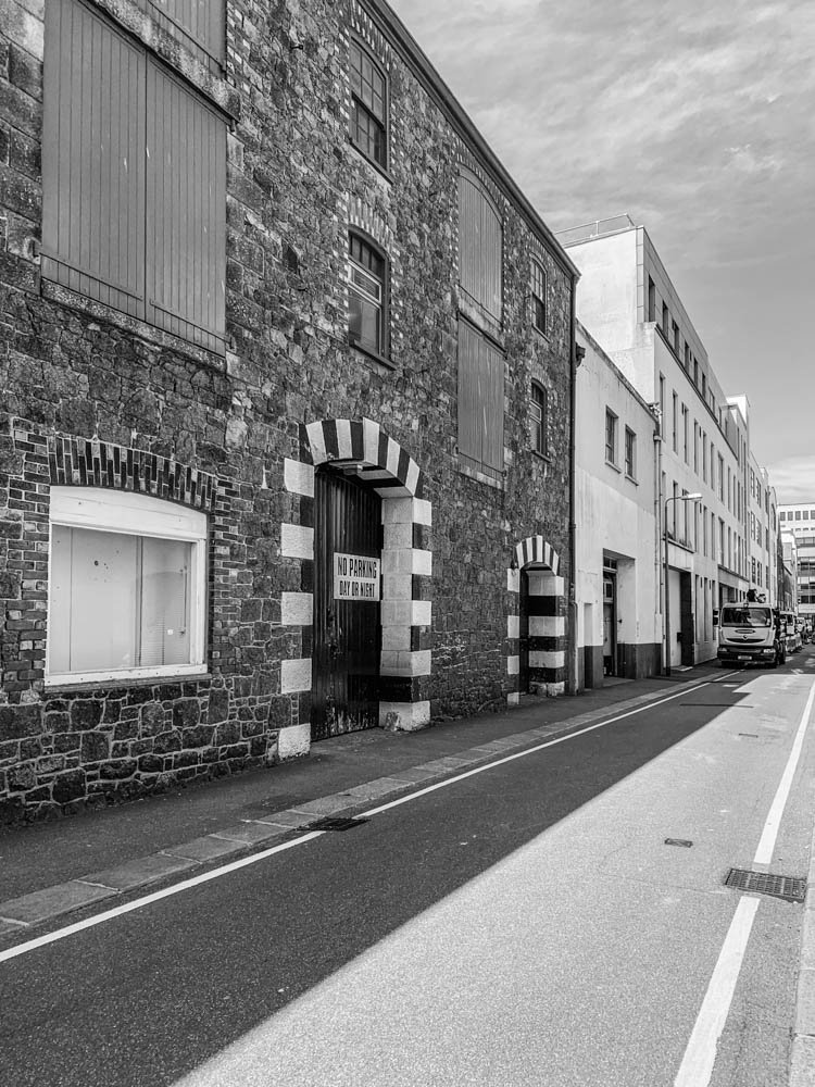
This is just a draft of the order that I want my images to be in. I tried to match images that have something in common opposite each other or that are completely juxtaposing each other. I wanted my first image on the first page to be a wide angle image that shows town from a further away angle as well as being on the outskirts of town, which is why I chose the image of the hospital to be my first image. Then as you look through the book I wanted to include images of really close up shots of images such as doors and streets to give an insight into what town is like if you were to walk through it. I wanted to create a sense of looking into town from far away and slowly as you flick through the pages you get more inside town, getting an idea of what the community is like as you explore our town.

I only put one image to be used on a double page as I wanted to have one image on per page to create a good comparison between images on each page. I started with the first image being my furthest away shot of town and my last final image being my closest shot of town, someones door and front of house , to create the sense of walking through town and when you’ve seen all the different cultures and communities that’s when my booklet finishes- at the closest shot as there’s nowhere else to go. I used some images that are similar and have something in common such as my image of the construction and the really old and abandoned alleyway , this was because in both images you can see fences and it has the same atmosphere as both images look like they’re taken in a poor area and not looked after section of town. I also experimented with using two images next to each other that are completely different and contrast well against each other, such as the extremely wealthy estate in jersey with very tall and colourful buildings that are surrounded with well looked after benches and plants in contrast to the dark and dirty alley way that is all broken and dull.

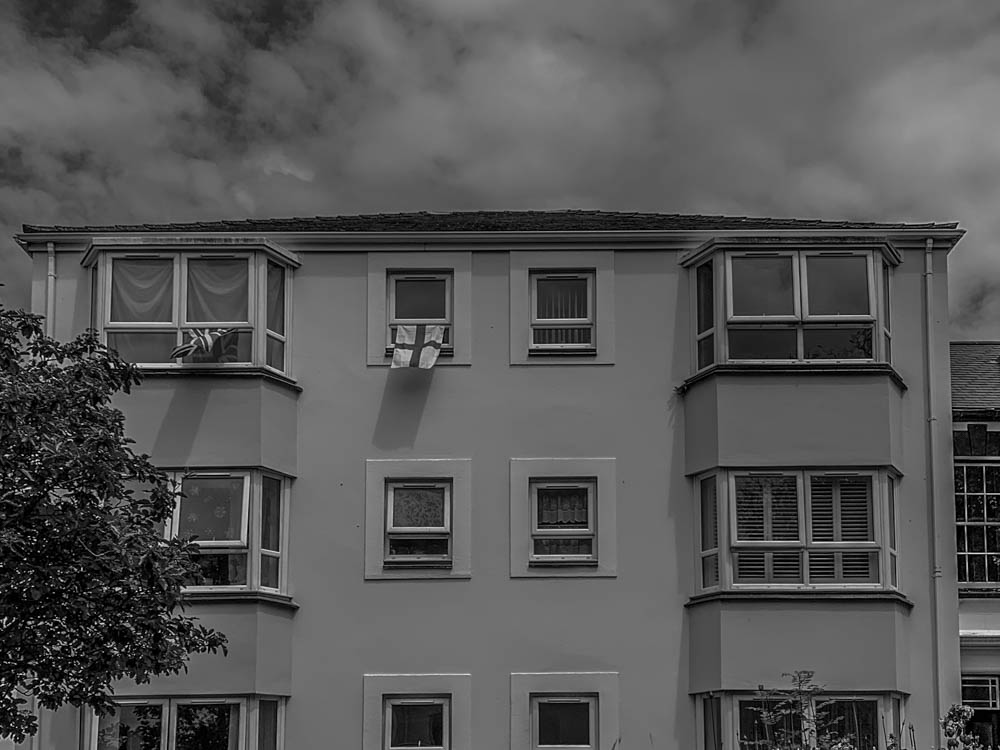
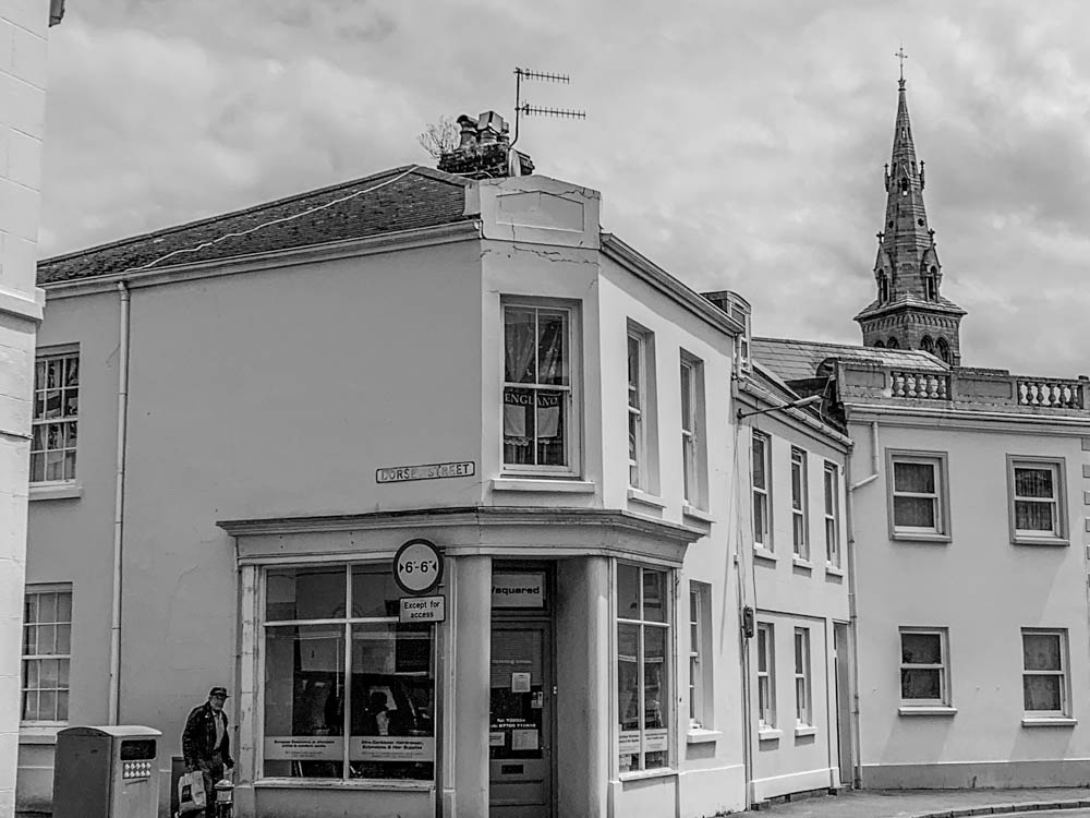
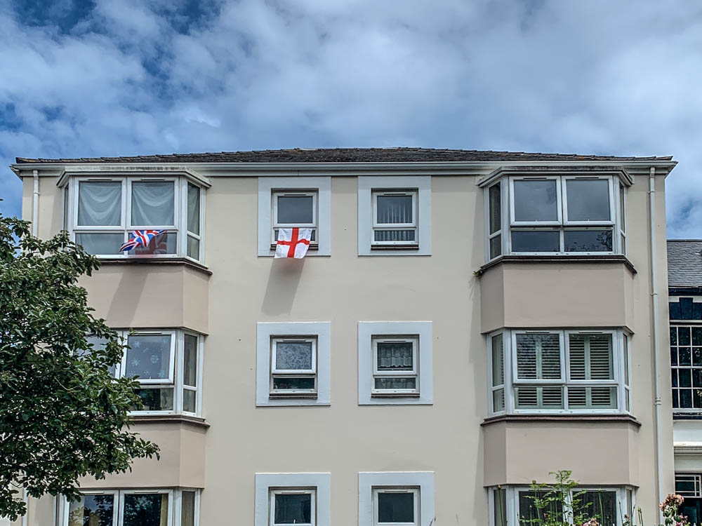
Overall in my story I wanted to show the diversity of cultures and different areas that we can experience just through walking in town when you pay attention to all the details. My story shows the different living situations and how different peoples houses or flats look even though they all live in town. As well as walking on french/Portuguese quarters and then through the wealthy resident area you can definitely see a difference right away. I also photographed different flags that were put up on individuals windows which shows a representation of different backgrounds. Im happy with my final selected and edited images as well as the order I’ve put them in because it’s showing the story I’m trying to tell.

essay- jersey archive

How are archives a repository of knowledge? 
 

Archives are an extremely important part of our history and help us understand our background through a visual representation. Archives represent three keywords – history, knowledge and power. This is because we learn through looking at images and doing research into our past that allows us to get knowledge about our history and what jersey or any place anyone has lived in looked like before. All this information and archives together gives us power as we can educate ourselves and what we do with this information is powerful as it gives us a more detailed insight into our past. Archival records take many forms, including correspondence, diaries, financial and legal documents, photographs, and moving image and sound recordings. All state governments as well as many local governments, schools, businesses, libraries, and historical societies, maintain archives. To understand the concept of archives in more detail we took a visit to the Societe Jersiaise Photographic Archive. This is where over 36,000 images are stored from the mid-1840s to this present day. We got to learn about different photographers that influenced and shaped jersey photography for life as well as learning about all the unique techniques and processes these photographers used when it came to producing or even taking their photographs- such as daguerreotype, calotype, salt paper prints, wet plate collodion, albumen prints, autochrome and colour transparencies. Personally, the archives I keep are photos on my phone as I have so many, I like to store them for years to be able to look at them whenever I want as well as keeping and making photo albums of images of me and my friends to have a more visual copy of them instead of a digital copy only. 

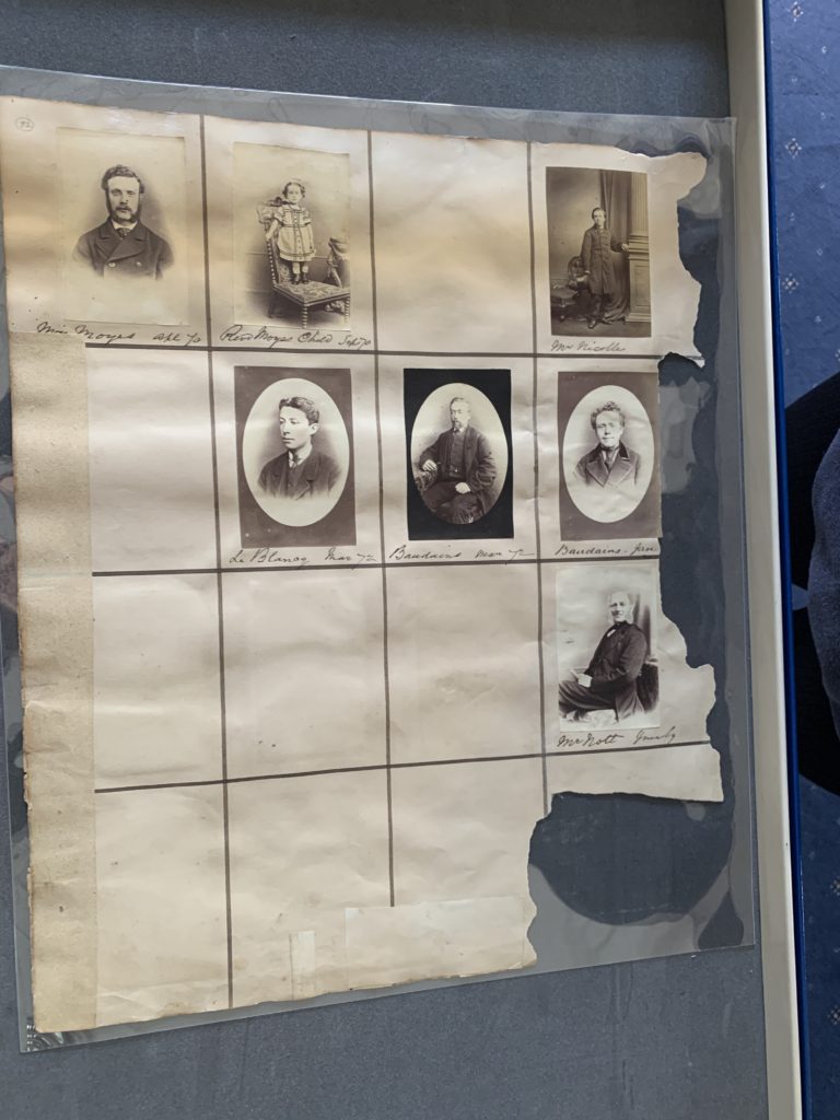
The photographer we chose to look at on our visit to the Societe jersiaise was Henry Mullins. Henry Mullins was the first professional photographer to come to Jersey and establish a portraiture business in the very early days of photography. Mullins started working at 230 Regent Street in London in the 1840s and moved to Jersey in July 1848, setting up a studio known as the Royal Saloon, at 7 Royal Square. His focus was portrait photography – just under of his 10,000 photos are all digitally stored online and all of them are portraits. He took all his images in black and white and in an environment that fit the background of the individual he was photographing to allow us to gain knowledge and greater insight into what their life may have been like. His images of jersey people give us so much knowledge and him documenting all these different individuals lets us learn about people’s different classes, their wealth, how they dressed and basically how their everyday life may have been for them. Just by looking at all the different people in his images, we can learn about how people in the upper class dressed back in the day as they would usually be the individuals who wore suits or were photographed in offices and presented themselves well compared to the individuals who were dressed in old clothes and in a poor living environment such as just a chair or even standing outside or in a farm. Having Henry Mullins photograph the jersey community and society all the way from the mid-1840s allows us to gain knowledge about our early days and how different people’s lives or jobs were compared to how jersey functions in the present day. 

This image has an empty alt attribute; its file name is 20210628_103308770_iOS-768x1024.jpg
This image has an empty alt attribute; its file name is 20210628_085510290_iOS-768x1024.jpg

This is one of the photographs that Henry Mullins took that I will choose to analyse. This photo is a portrait as that was his main focus. His image is in colour and the technique he used was Daguerreotype, in this image we can see a woman sitting on a chair ready to be photographed. A daguerreotype image is taken  on a mirror-like silver surface and will appear either positive or negative, depending on the angle at which it is viewed, how it is lit and whether a light or dark background is being reflected in the metal. The darkest areas of the image are simply bare silver; lighter areas have a microscopically fine light-scattering texture. The surface is very delicate, and even the lightest wiping can permanently scuff it. Her hair is nicely put together and shes wearing a very formal dress which can tell us a lot about her wealth status, which I’m guessing shes upper class by the way shes dressed and the chair she is sat on looks very fancy. This creates knowledge for us as we get an idea of what women maybe in their later 20s to 30s looked like from different classes. It gives us an insight into how they dressed and what the fashion was like.

Henry Mullins - Jerripedia

to read more about daguerreotype images use this link- https://en.wikipedia.org/wiki/Daguerreotype

Overall, I think photo archives give us so much knowledge about our society in the early days and how our history has all been photographed in order for us to be able to reflect and keep learning about our past. It gives us such a rich insight into what we used to wear, the different job roles individuals had and allows us to see the difference in class and wealth throughout the years just through simple portrait photography – as Henry Mullins focused on. Photo archives are also important in educating us on how to improve as a society and seeing images from our past they help us in shaping our future. This has inspired me into thinking out my own photography project and our key theme which is identity and community. Just through photographing different individuals in town or around jersey will educate someone else in 50+ years’ time by looking at my images and they’ll be able to gain knowledge of what jersey used to be like in 2021 and onwards, they would be able to see what we wore in this present day and the difference still between our wealth status. Therefore, archives are so important to our society, and it helps us to learn, and we can gain a better understanding of our history as well as gaining knowledge of different individuals that used to live in Jersey as they all shaped our future and our day to day living standards.  

jersey archive- photoshoot 2

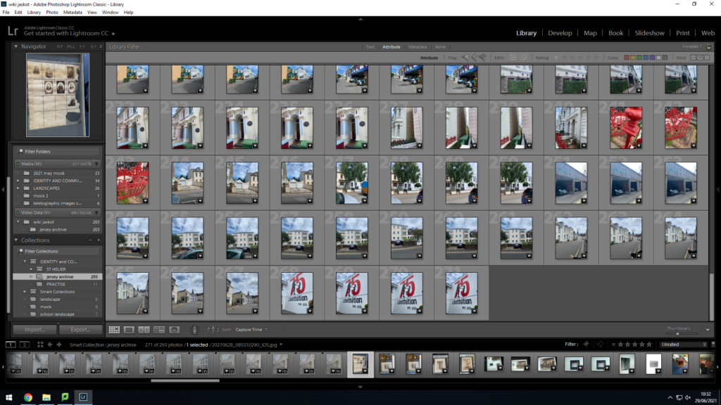
We went to the Jersey Archive, and I’m going to use Lightroom to edit all my images and select the ones I want as well as rate them to be able to find my best images for my sequences collection.

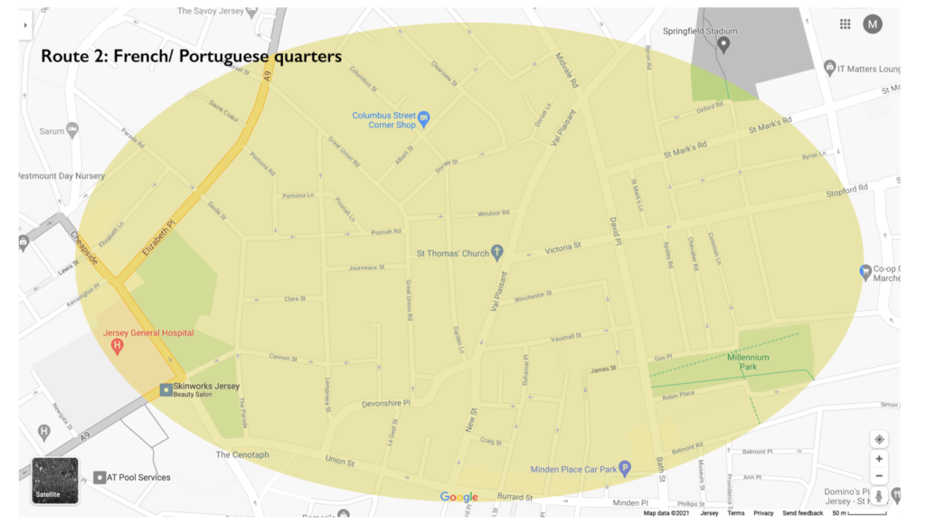
here is a map showing where we walked around to take these images, mostly the French and Portuguese quarters as well as some rich resident areas

here is the process;

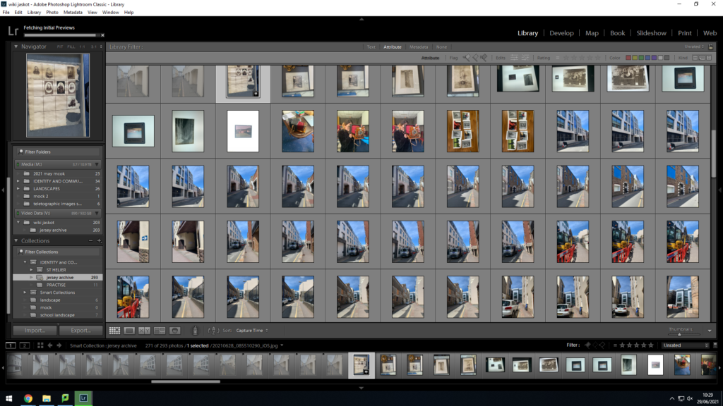
these were all my images i imported..

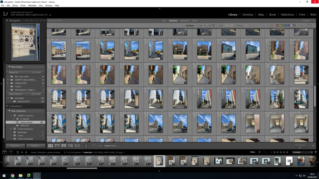
In order to pick the images that turned out the best and not have any repeating images, I used the tool of pressing either P or X, this would help me select the images I actually wanted to work with, here are the images that I all pressed P on;

as you can see , this helped me narrow down my choices and work with a less amount of photos however with the ones I really liked and wanted to continue editing.

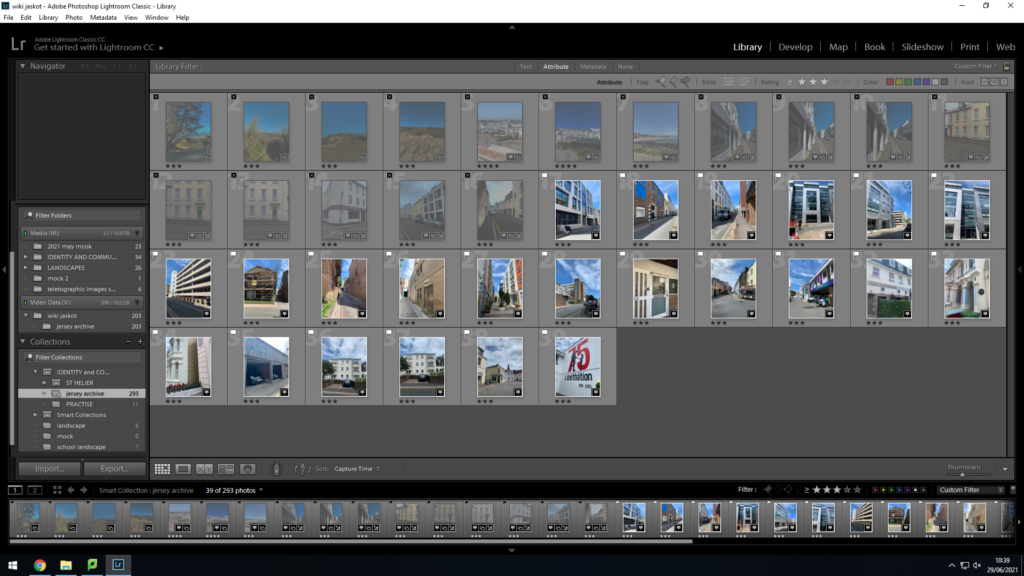
I rated all my images either 2 or 3 stars, 2 being I may need to re think them and 3 being I want to continue editing them now, I then switched the filter onto images rated 3 stars or higher and these were the final images I ended up with, now ready to edit them.

The images that I rated 3 stars stayed in my library and I then decided to develop them and edit them. I did two versions of editing, I kept them in colour and developed them and after that I changed them all to black&white to see what version I like more-

Here are my final developed images;

in colour;

in black and white;

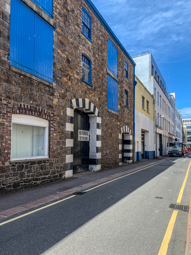
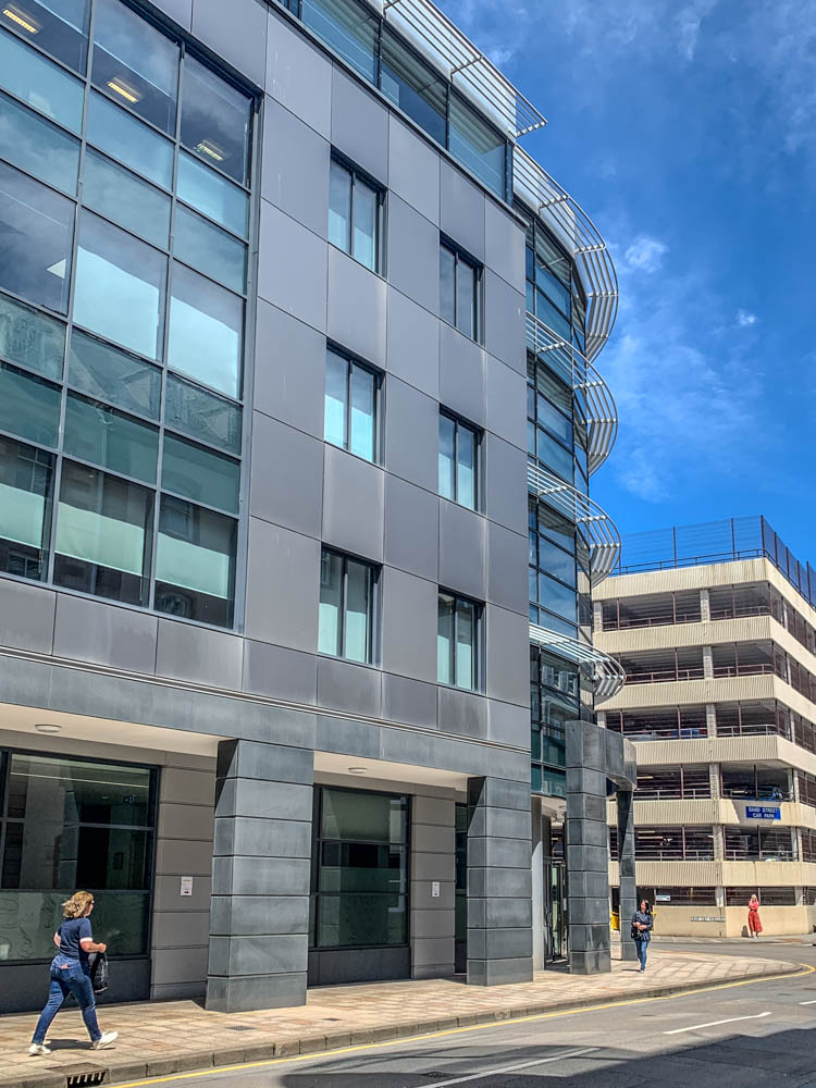
these are my final images that I have developed and edited. I edited my set of images in colour using different contrast and exposure options to make sure they were edited in the way I was happy with how they look and I tried to keep the same style throughout all my images to not have any images that dont fit in or stand out too much.

Once I was happy with editing my coloured version set of images I also wanted to turn them all black and white and develop them further on. I did this to see whether I prefer the coloured or black and white set of images.

I do like how vibrant my coloured set of images are and turned out however I think when it comes to sequencing my images and putting them into a small book I will use the black and white set of images as it does match the photographers I’ve been looking at more as nearly all the old images of Jersey are in black and white to and I think I matched the tones between all the images well.
artist reference- identity and community

for my first chosen photographer I have decided to look into Will Lakeman‘s work. He looks into social housing buildings and photographs many different buildings and flats which show the whole structure and community of Jersey.

some of his work-

I wanted to look at his work and take inspiration from him as I want to photograph town and look at the community within st. helier.

The second contemporary photographer I want to look at is Robert Adams he is an American photographer who has focused on the changing landscape of the American West. His work first came to prominence in the mid-1970s through his book The New West and his participation in the exhibition New Topographics. He looks at the community by focusing on taking photos of simple buildings and areas of a city that identify a place.

some of his work-

analysis of their images-

Will Lakeman image-

This image I have chosen to analyse uses lots of colour as well as having extremely dark almost completely black areas in order to create a very sharp and powerful contrast between the beaming coloured lights. This photo was taken at night or perhaps just right after the sun has set as there are still some light blue undertones in the sky however that could just be the powerful reflection of the coloured lights. The lights in each flat are very bright which capture the viewers attention directly at the building as the rest of the image is just a dark background consisting of cars and street lamps. The building being centered right in the middle of the image has a powerful effect as it makes it the main focus and grabs your attention right away being able to see all the different colours of the light that are shining through the flats. The trees on the ground level have also been positioned well in the image as the two trees at the front are well lined up with the two columns of windows going up the apartment building. I think this image really makes you think about how there are so many little lives in each window in the building and almost every colour reflecting tells a different story as everyone in the building thats living there has such a different background. I think this photographer captures the idea of Identity and Community’ very well as identifies Jersey as lots of buildings with so many stories inside and it can give you an idea of what town would look like if you were going to walk through it at night. I think Will waiting for the perfect time , night time, to capture this image as it let him capture all the different colours and night time is when the day is coming to an end which means that is when everyone is home together which creates this safe feeling of the community being shown.

Robert Adams image-

ROBERT ADAMS (B. 1937)

In contrast to Will, Robert Adams image I chose to analyse is very different and the complete opposite. I like how simple yet effective Roberts images are at capturing the community to show what the living environment of that city is. His image contains very strong contrasts between black and white, as well as using a variety of different tonal shades. This allows you to see all the houses more clearly as they stand out extremely from the dark shades that surround them. The composition of this image is done very well as the houses are photographed on the bottom half of the image and the sky is the upper half of the image. This separates the image well and creates an even divide between the two. The sky is a lot lighter than the houses which creates a very powerful contrast. I dont think there’s any meaning behind Robert Adams images as his focus was to just photograph the simplicity of buildings and different communities in certain cities or towns he visited.

EDITING IN LIGHTROOM – photoshoot

French and Portuguese quarters;

To start my editing process i imported images into a new collection i made. I used ctrl and P and X to select my favourite images. By clicking P lightroom would flag my image making it one of my chosen images and clicking X made sure I dont use the images when editing further/into the second stage.

After selecting my favourite images, I use the star ratings to rate my images from 1-5 stars. Images that I rated 3+ stars i will keep and continue to edit them in the next stage.

Once i filtered out my images and kept the ones with 3+ star ratings I used the compare tool to decide which image I like more when I had 2 similar images

I then went onto develop mode and edited all my final chosen images.

some of my final and edited images;

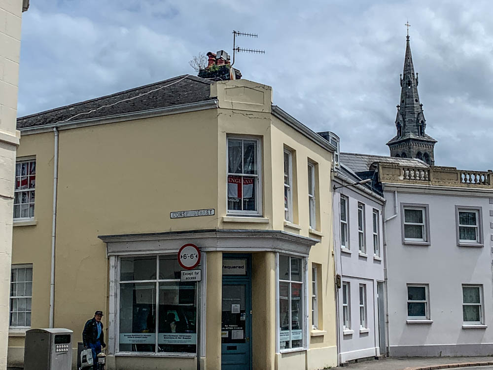
I took photos in St.Helier around town of the where the rich quarters used to be back in the days as well as mixing it with some roads that are known to be the french and Portuguese roads , most of buildings used to be huge houses with many floors and rooms however now they all have turned into flats and usually get sold for quite a cheap price.

identity and community- research

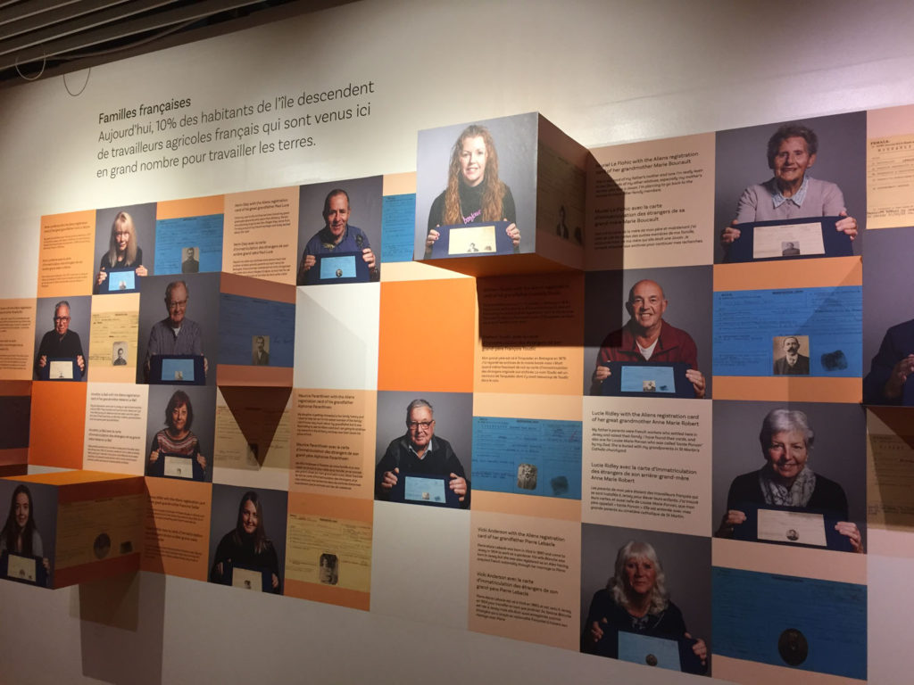
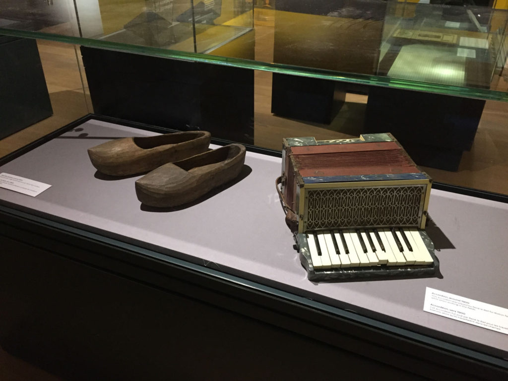
To start our Year 13 project, we have started looking at the culture and immigration of Jersey. By looking at these aspects in more detail it creates a better understanding of what life used to be like at Jersey and the culture/history behind certain areas and buildings we have here. Taking a trip down to the Jersey Museum allowed us to visually see and learn about the migration with-in Jersey and what caused it and how it was during those times. The exhibition allowed everyone to learn about different stories and how Jersey was influenced and impacted by this.

here are some images of what was at the exhibition and for context;

all of these displays allowed us to see the history of immigration visually and more clearly.

here’s an example of one story for reference-

Jean Janvrin was one of the merchant traders who operated the triangular cod trade between the Gaspé, the West Indies and the Mediterranean. The Janvrin family had been involved with the transatlantic trade for several generations.

In common with many traders Jean maintained a base at St Aubin on the Rue du Crocquet. His house, L’Anciennette was located on the right hand side of the road in part of the building that is now St Aubyn’s Hotel Apartments. The house was bought in 1803 by Jean from Thomas Pipon’s creditors. Pipon had gone bankrupt and the house was sold into the Janvrin family in order to help him pay his debts.

artist reference – historical

The photographer I want to study in more detail and analyse his work is Henry Mullins. Henry Mullins is a very famous photographer especially in Jersey’s history as he was one of the first famous photographers to influence Jersey photography. The unique thing about his photography is that all his images were portraits of people. This is quite important and powerful for our history as it shows us visually what individuals of different class looked and dressed lie in the 80s. His photography allows us to see a visually representation of Jersey’s culture back in the day and how much it has evolved over all these years up until now, such as fashion

Henry Mullins started working at 230 Regent Street in London in the 1840s and moved to Jersey in July 1848, setting up a studio known as the Royal Saloon, at 7 Royal Square. Initially he was in partnership with a Mr Millward, about whom very little is known. By the following year he was working alone and he continued to work out of the same studio for another 26 years.

For a brief period in the 1860s he also worked in London, but judging by the collection of his photographs which is now held by La Société Jersiaise, he found plenty of willing sitters in the island prepared to pay half a guinea (promoted as “one half of that in London”) to have their portrait taken by him.

analysis of one of Henry’s photographs-

Henry Mullins - Jerripedia

As you can see this photo is a portrait photo that has been taken in black and white. His face and body has a much darker tone compared to the background that is just all plain white, this nicely contrasts together and makes him stand out in the portrait. Mullins would have mostly likely used natural lighting and photographed this young man in a studio as the background is all white or even in his own home. He’s positioned to be photographed directly in the center of the image which makes him the main subject and focus, as this is a portrait photograph. You can probably figure out his class and wealth status just by having a look at what he’s wearing. He’s dressed in a neat dark suit with a tie which suggests he’s most likely middle or upper class as he would definitely need to have money to buy a good looking suit instead of just being in old slacks and photographed in a farm. Him being dressed well also suggests he probably has a good earning job and his hair looks well put together too. This is why Mullins taking portraits is very important and empowering as you can see and tell so much just from one image.

Some more examples of Henry’s photographs-

evaluation and critique

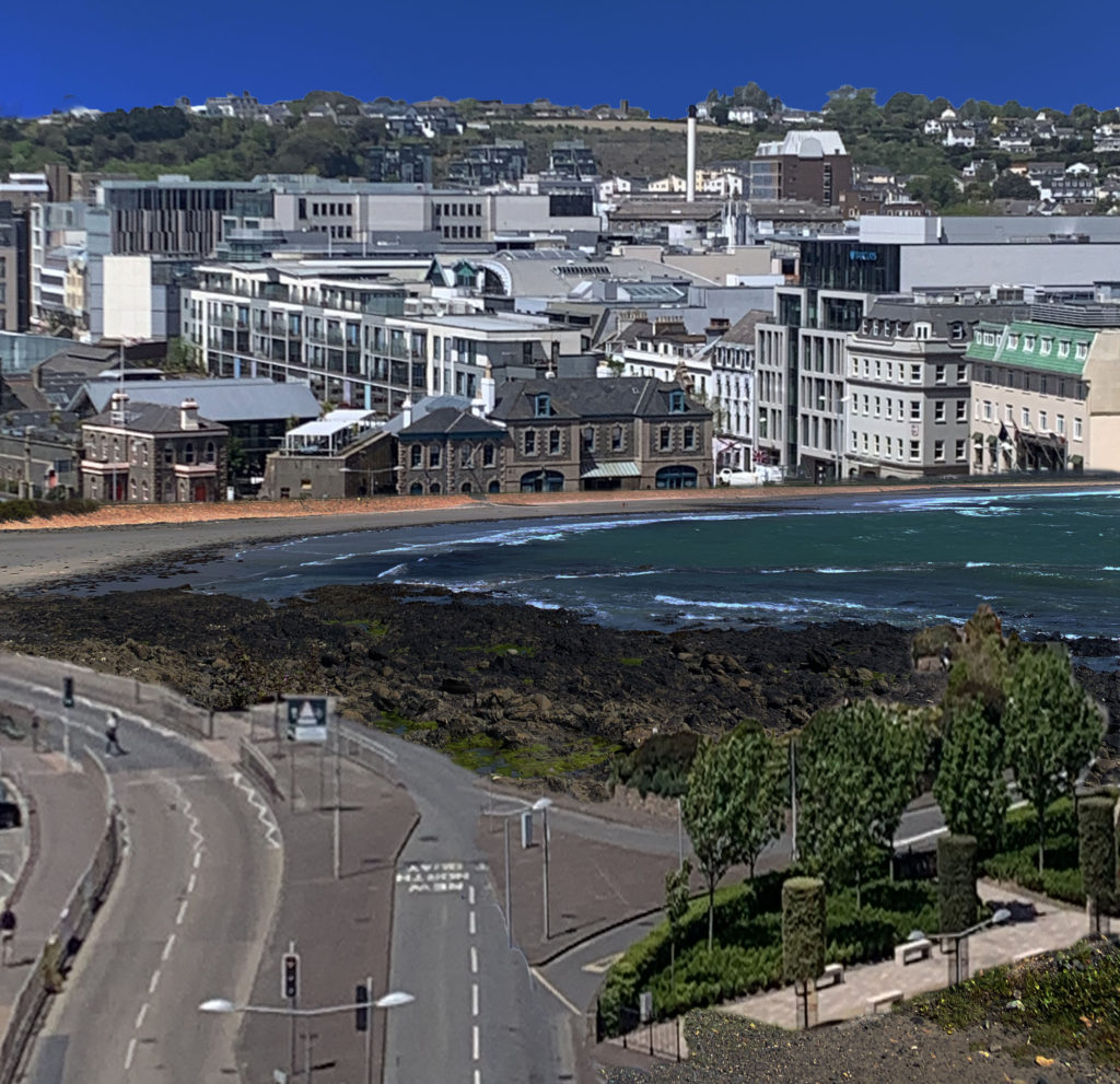
Overall I think I have successfully achieved what I wanted to do when planning out my exam and ideas for the theme of Anthropocene. My goal was to show what our natural environment might look like in the future due to Anthropocene which is the effect us humans have on our planet. I have successfully used ideas from my chosen photographers as they both use photo montage and many photo-shop skills to edit opposite ideas/objects in our planet together. I have presented my ideas through editing our town/tall and built up areas in Jersey onto our coast and beach in St. Ouens to show what will most likely happen if we don’t protect our green lands and natural environments.

I have successfully use many different Photoshop tools in order to produce and get to my final image. The tools I used the most were the ‘Quick Selection Tool’ and the ‘Eraser’ to make sure I cut out each building and area well while also getting rid of any extra background sections I didn’t need. When you compare my original photo, of just the beach, to my final finished and edited images I think it has quite a shocking impact on the viewer as it really does create an idea in their head that if we don’t protect our environments our beaches will all look the same and the amazing views will be ruined by many new roads and buildings. This is the effect I wanted to create and I think I have linked it back to the theme of Anthropocene very well as it shows how we changed our planet over the years and most of the time it causes a negative impact.

Evaluating two of my final images-

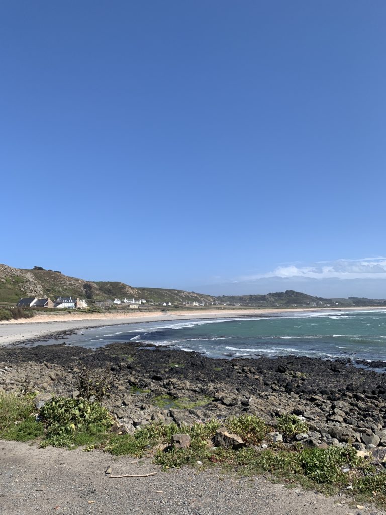
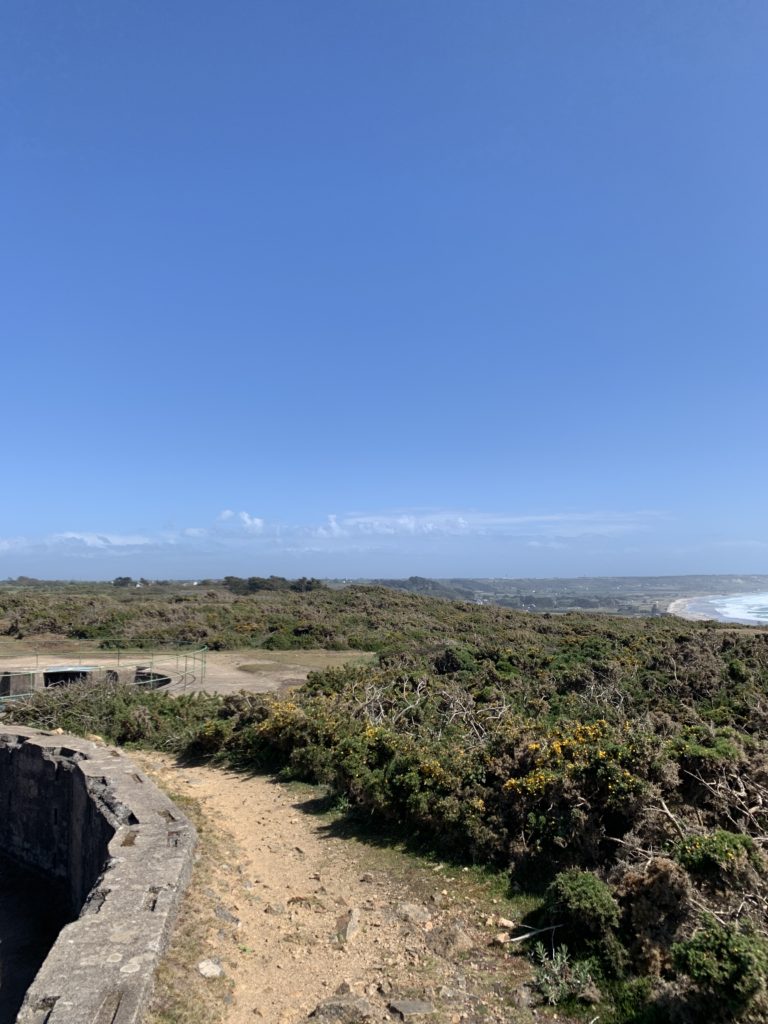
In both of my images I have used natural lighting, I took my images during the day in sunny weather as I wanted the sky to be as clear as possible and the sea to be photographed perfectly. I have slightly increased the saturation levels on my images as I wanted to make them more brighter and create a warm temperature as my two chosen photographers use extremely bright colours when editing.I focused my lens on the whole image as I didn’t want it to only focus on one building or area of the image. When taking my images I took them on a fast shutter speed as I didn’t want my images to end up being blurry as I took all my images from a very high perspective therefore I had to keep my camera still. I also didn’t use a slow shutter speed as that would have captured the movement of the cars,people and waves in the sea which would have made it extremely difficult to edit and layer the images over each other. When it came to editing my images individually I didn’t want to over or under edit them in any way too much as I wanted them to look as natural as possible to create a more realistic impact/image in the viewers mind.
I took both of my images in colour as I was inspired by my chosen photographers. In both of my images I would say I have a good range of different colours as the sky and bay are both very bright and blue whereas the buildings/town are more dull and filled with more generic colours like grey and browns. I tried to keep the composition of my images into three sections, I wanted the sky to be the top section however I did crop a lot of the sky down as I didn’t want it to take up too much length of the image and I wanted the main focus to be the buildings. I then always tried to make sure the sea and main part of the built up section was right in the middle as I think that’s the first section the viewer focuses on right away. For the bottom layer of my images I experimented with different sections in each image, such as using parking lots for one or editing roads and more of the green ares of town into there.

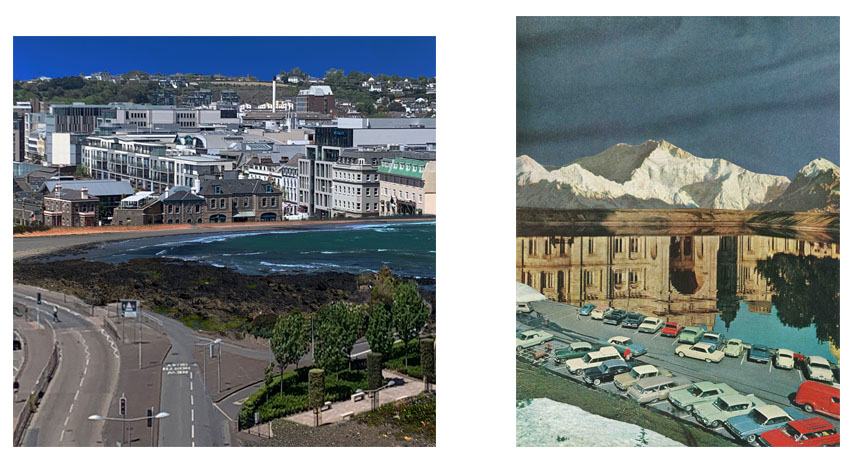
For the conceptual side of photography I wanted to have a good idea for Anthropocene. The meaning behind both my images was to make whoever is looking at my images aware of what our future could look like or will look like, if we don’t protect our environments as we humans do anything to any spare land left as every country wants to be more modern and urbanized as the years go on. One of my chosen photographers, Jesse, also is the reason I thought of this idea as one of her image shows a mountain that reflects a massive museum building on the river below it showing what our land gets turned into eventually with a huge car park surrounding the natural environment. I think this idea is very effective as it really shows the true meaning behind Anthropocene and the effect we have on our planet , which once again I think have successfully achieved through sticking with my plan.

Critique- If I was to change something about my final outcome or the way I produced my final images it would be to also take more close up images of individual tall buildings or offices in Jersey so that when it comes to editing , instead of cutting out areas and big sections of buildings all next to each other I could just cut out individual images and spread them all neatly across the bay/coast. This may have made my final images all more different from each other as I could move the different single buildings around and place them wherever I want to as well as re-sizing them.

final outcome

Comparing one of my final image to  Jesse Treece (my chosen photographer)

Overall I think I have been inspired by my chosen photographer very well as she uses photo montage/layering which is what I had to do in order to produce my final image.

Technical-I took both of my images in the day light which consists of natural lighting on a sunny day in order to get a nice colour of the sea. However Jesse’s images are more cartoon like therefore you cant tell whether she actually took those images or copied from a different source, however both of our images are in the day as you can see the light blue sky reflecting on the water in her image, implying its day time. Jesse’s image is definitely more over saturated and brighter as the colours of the cars pop out and the white mountain contrasts sharply against the darker background. Compared to my image that hasn’t been saturated as much in order to keep it natural as I didn’t want to use mountains in my pictures as Jersey doesn’t have them. Both of our images create quite a cold tone/temperature to having more blues and darker colours in the image than more oranges and reds, this creates a more sad atmosphere. Both of our images have been taken from a more wider and further away angle. By doing this we both captured more of the image and there’s a lot more to look at and analyse than a close up photo, as both photos are landscape in my opinion they look best when taken the furthest away.

Visual- Both of our images are in colour which makes the image brighter and easier to analyse as sometimes black and white photos can hide details due to the colours all blending together. I cropped my image down to not get as much sky in it as I wanted the main focus of the image to be the urban section and where I manipulated the image the most. Whereas Jesse’s image probably hasn’t been cropped down as it has the mountain as its highest view then the reflective middle section and the cars at the bottom, broken down into 3 sections, this can make the image appear more longer whereas mine has more of a square shape. We both use aspects of natural and urban environment. Such as , I used the sea/coast for my natural and Jesse used a river or water bank and the mountains. I then used buildings and a section of our town in Jersey whereas Jesse used cars and a big museum like building in her image that’s being reflected on the water.

Conceptual- We both wanted to contrast two images together to juxtapose opposite ideas, such as I wanted to show how our natural environment will eventually get built on top of or turned into a city if we don’t do anything to protect our land, showing what we humans do to our planet linking it to the theme of anthropocene. Whereas Jesse’s image shows a natural environment ( the mountains) and reflects a building onto the river showing what it can and most likely will get turned into.

editing/photoshop

From my chosen images in the previous blog post I am going to use photoshop in order to edit my images together.

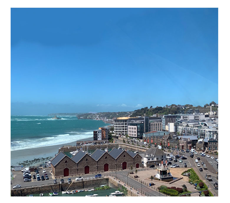
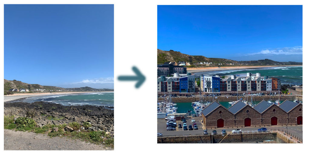
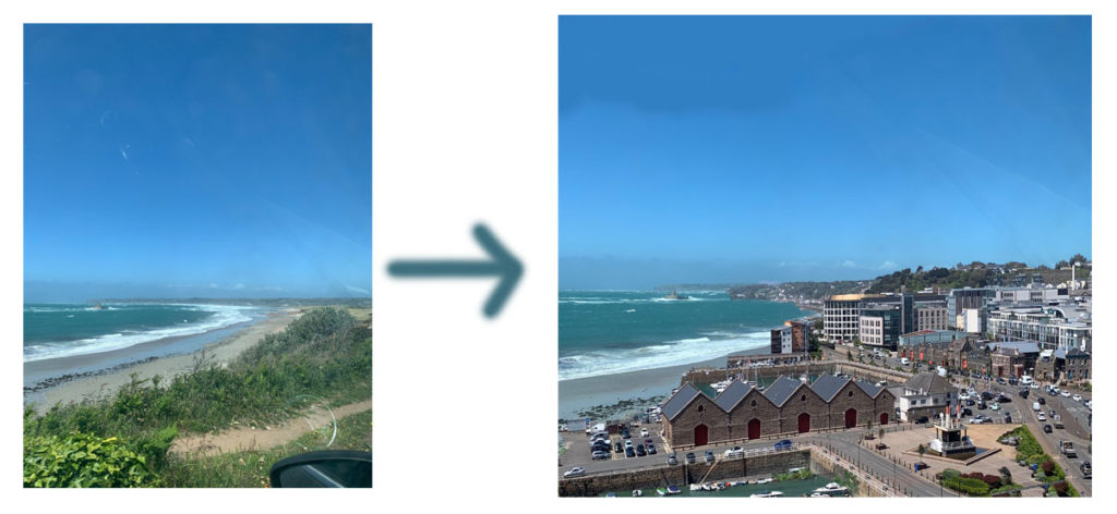
Firstly I upload my chosen image of st ouens as my starting image as I want to edit over the bay and beach. I then open up a second image of my chosen urban image, I find sections and areas of the image that I think will look good and fit over the coastal image best. Once I’ve figured that out I use the ‘ Quick Selection Tool’ and cut out the parts that I want to use over my first image, I copy that specific area and paste it on top of the image of st ouens. I then moved and dragged it around until it fit into the perfect space and where the buildings looked the most natural. The last tool I use is the ‘Eraser’ tool in order to smooth out the edges on the buildings and to blend the two images together to make it look more realistic.
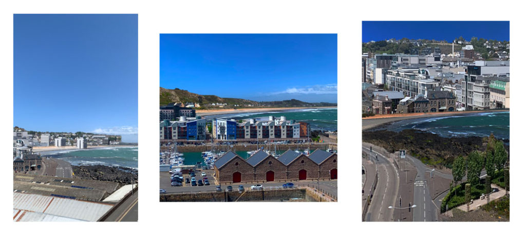
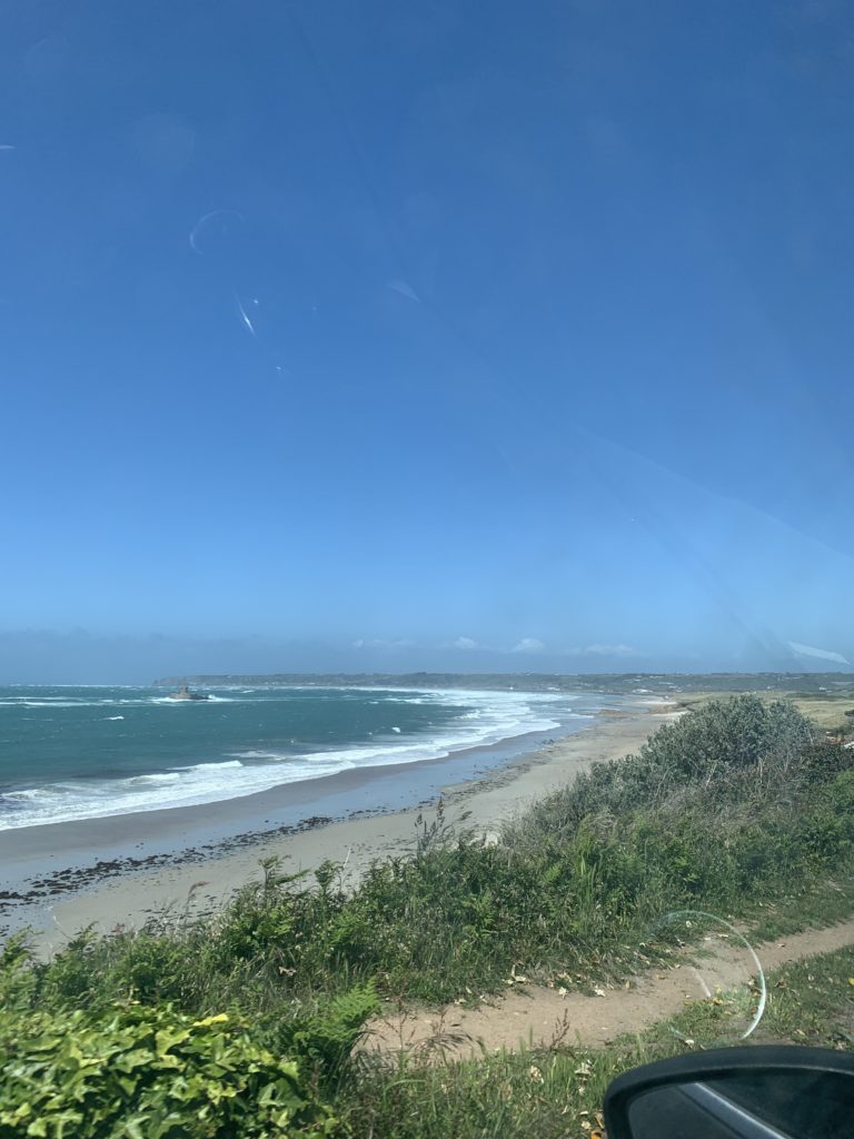
I want to show the original photos first in order to show how I’ve changed and manipulated them using Photoshop skills and the urban images

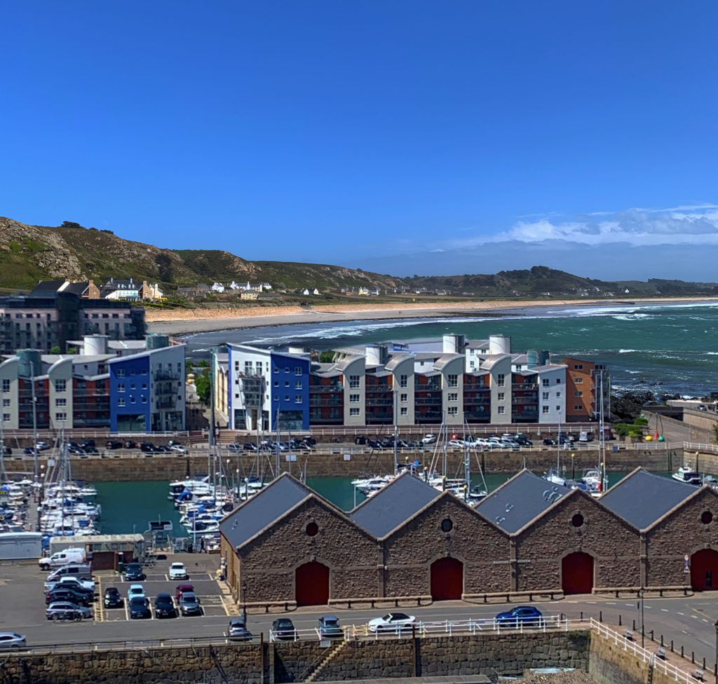
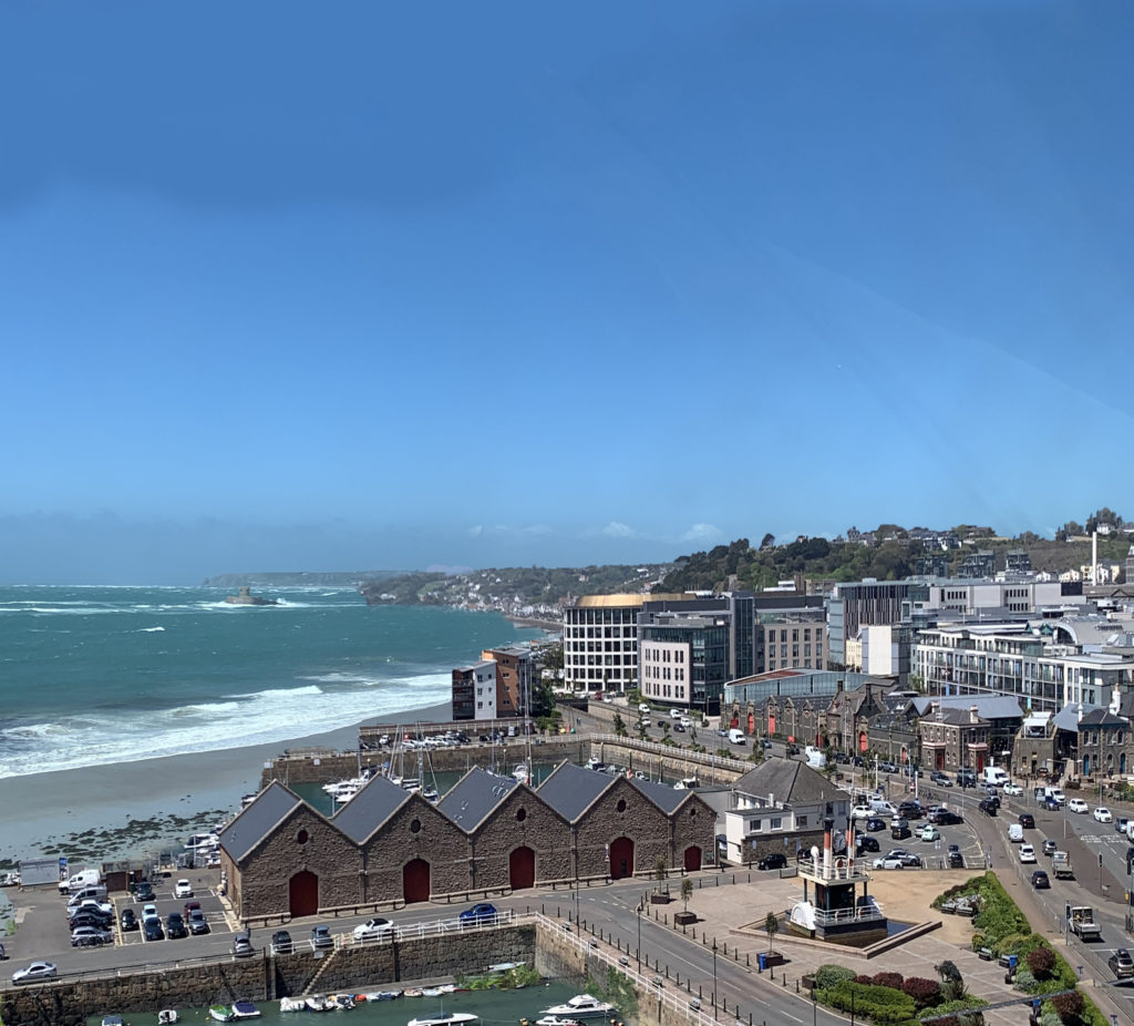
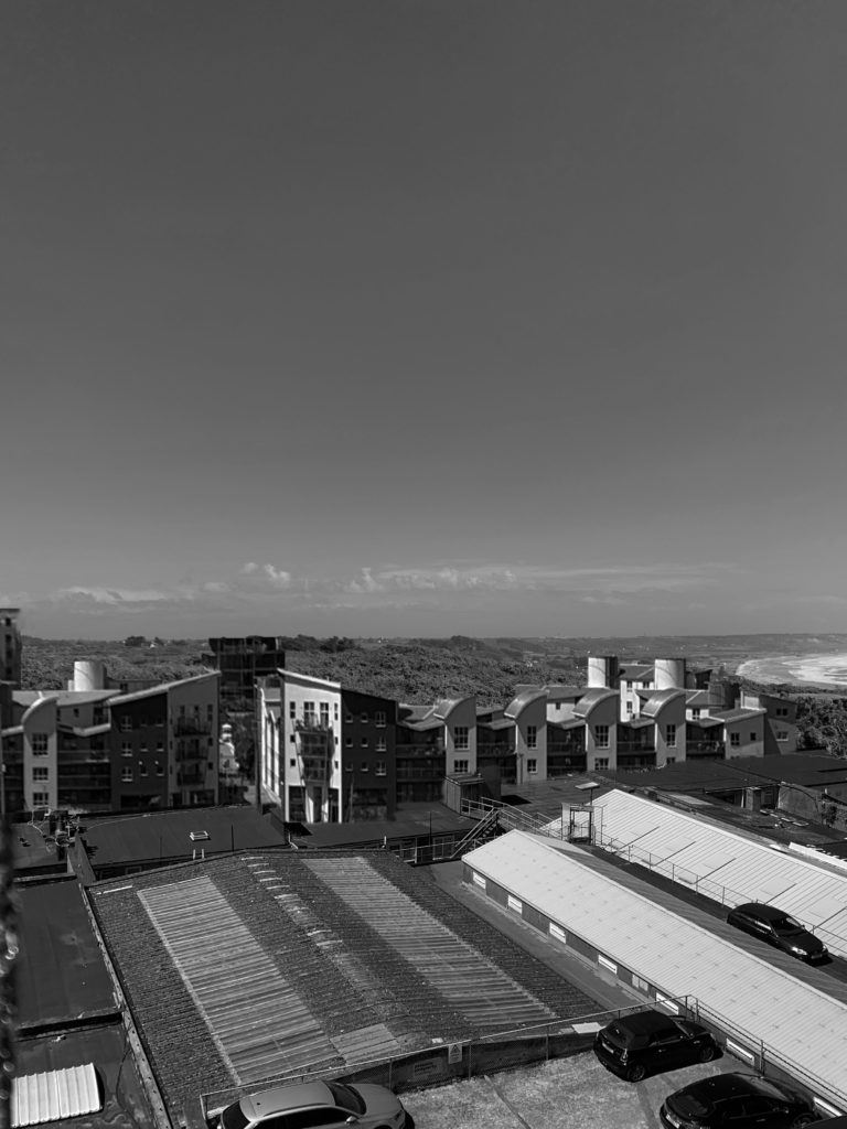
These are the main images I used for my background / the ‘original’ images;

before and after-

My final and edited images;

Overall, I’m extremely happy with how my photo-shop/ editing turned out. I used all the sections of the urban photos that I wanted to and the most built up areas in order to create this idea of what the future might look like. I used 3 main coastal images that I used as my background/ base image each time as they were the most open and clear images that allowed me to have plenty of space to edit on and paste buildings into. I used a mix of rows of buildings and buildings from the harbor to create different ideas and impacts. I kept four of my images in colour as my chosen photographers also edit their photos in colour, however I did change one image into black and white to create a more sad atmosphere as the changes in an ‘anthropocene’ topic mostly have a negative effect on our planet. I wanted to explore this idea through building up our natural environments , the beach, with buildings.

Before I was happy with my final 5 images I experimented a few times to make sure I was happy and confident with the ‘Quick Selection’ tool and I would be able to neatly and precisely cut out the buildings I want to use over my St. Ouens images. It also took me some time to make sure I adjusted the shape and length of the buildings that I wanted to use right and they fit into the shape of the bay well enough to make it look natural.

When I was editing I used the ‘eraser’ tool almost every time I pasted in a new section to make sure there were no random edges or background colours that looked wrong and unnatural over my original image. When I was placing and re sizing the images I always wanted to make sure my longer and further away town images were at the back of the coastal image to make it look as naturally placed as I could. Therefore, I then used the photos of the harbor and the roads a lot closer when I edited them over St.Ouens to create an illusion of those buildings being the closest.

When I finished using my Photoshop tools and all the final digital manipulation, I merged or flatted all the images down into one and adjusted the brightness,saturation and contrast to give a more warm and brighter finish. The last part of my editing process was cropping the image down. My original images had a lot of the sky showing therefore I cropped almost more than half of it to make the editing/buildings the main focus as it was placed in the center of the overall image.