All posts by Wiktoria J

Filters

Author:
Category:

newspaper evaluation

EVALUATION-

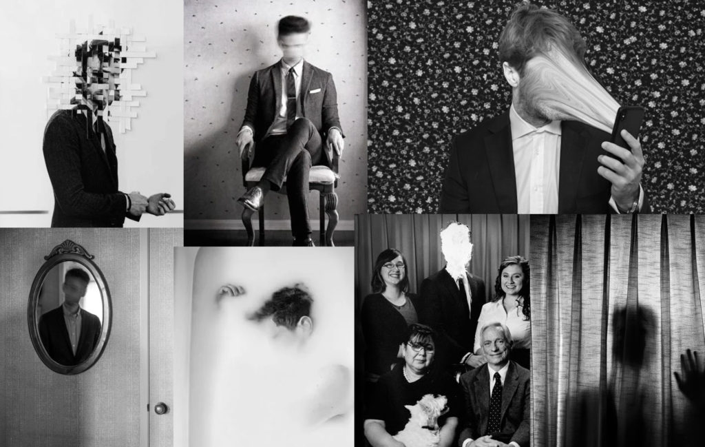
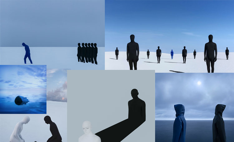
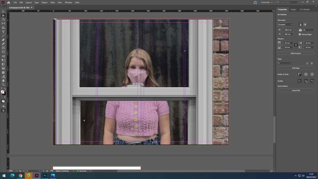
Overall, I really enjoyed being part of the newspaper as I thought it was a great way to show all of our progress from year 12 up till now. It showed the variety of different outcomes we came up with throughout many of our different personal photoshoots. Putting all of our best images together was a good idea as everyone would be able to see the different topics and ideas we have worked on in the past 2 years. I used most of my images from year 12 as I had the most opportunities to go out in that year and take different photoshoots as well as some challenging ones as taking candid street photography and of people in their work environment. I think that displaying our work all together is a clever way and we were able to summarise our two years of taking photographs into one place.

IDENTITY & COMMUNITY Newspaper

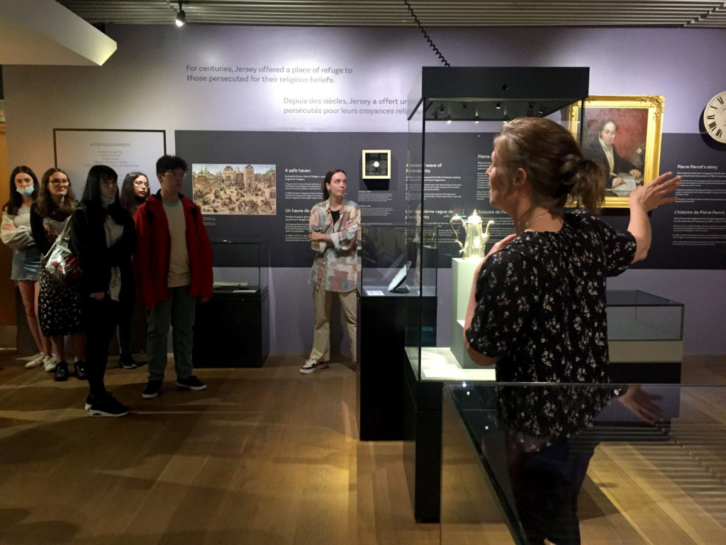
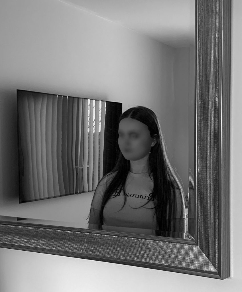
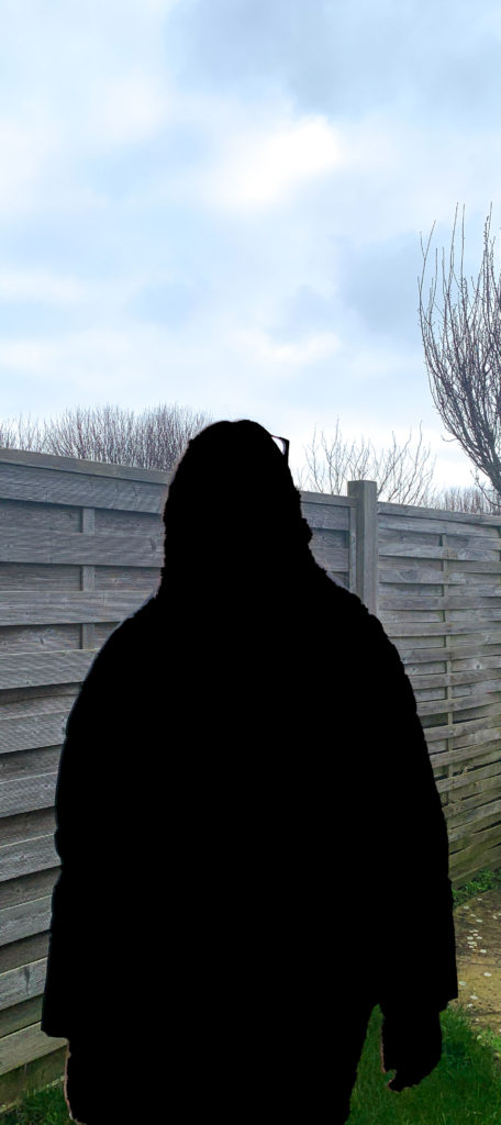
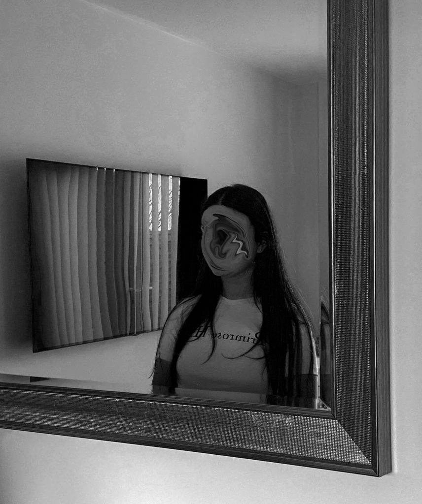
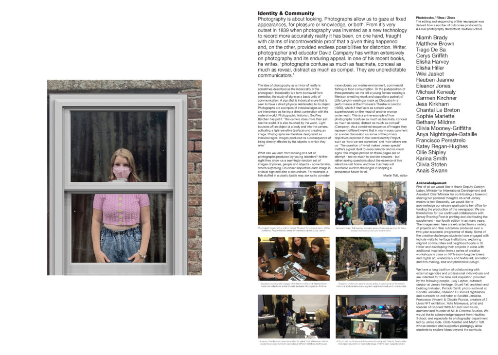
The images seen on the pages of this newspaper supplement are extracted from a variety of projects and final outcomes produced over a two-year academic programme of study by a group of A-Level photography students at Hautlieu School. In their final year the themes of Identity and Community offered a specific focus and through a series of creative challenges students developed a body of work that were inspired, partly from visiting heritage institutions to learn about aspects of Jersey’s unique history of immigration and exploring migrant communities and neighbourhoods in St Helier in a series of photo-walks. In the classroom additional inspiration was provided from workshops on NFTs (non-fungible token) and digital art, embroidery and textile art, animation and film-making, zine and photobook design led by professional artists, designers and teachers.

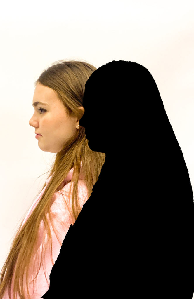
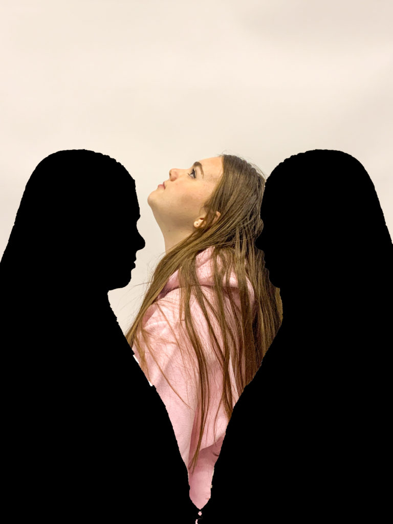
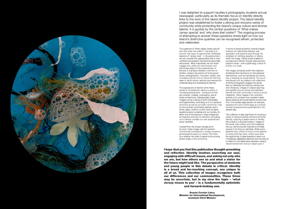
As part of the research and contextual studies students were asked to engage with some of the key questions raised by the Government of Jersey’s Island Identity project and explore through their own photographic studies how they interpret and identify distinctive qualities of island life. What can we learn from looking at a set of photographs produced by young islanders? At first sight they show us a seemingly random set of images of places, people and objects – some familiar, others surprising. On closer inspection each image is a visual sign and also a conundrum. For example, a fish stuffed in a plastic bottle may ask us to consider more closely our marine environment, commercial fishing or food consumption. As a combined sequence of images they represent different views that in many ways comment on a wider discussion on some of the primary objectives explored in the Island Identity project, such as ‘how we see ourselves’ and ‘how others see us.’

The newspaper was kindly sponsored by Deputy Carolyn Labey, Minister for International Development and Assistant Chief Minister who in her foreword shares her personal thoughts on what makes Jersey special to her in context of the Island Identity project led by her department. She says, ‘identity involves searching our soul, engaging with difficult issues, and asking not only who we are, but how others see us and what a vision for the future might look like. The perspective of students and young people in this debate is critical. Identity is a broad and far-reaching concept, one unique to all of us. This collection of images recognises both our differences and our commonalties. These times may be uncertain, but in my view the topic – ‘what Jersey means to you’ – is a fundamentally optimistic and forward-looking one.’

The Identity and Community newspaper is the fourth supplement produced in collaboration between Hautlieu School Photography Department and Jersey Evening Post. In 2018 the first issue was The Future of St Helier and last year the themes of Love & Rebellion explored experiences of isolation and lockdown during the coronavirus pandemic. Photographer and teacher Martin Toft, comments: ‘The question of ‘what makes Jersey special’ matters a great deal to every islander and as visual signs, the images printed on these pages are an attempt – not so much to provide answers – but rather asking questions about the essence of this island we call home, and how it actively will overcome current challenges in shaping a prosperous future for all.’

Various workshops and school trips for inspirations, recording and experimenting with new images and ideas of making

final project – mounting

Once I had my final prints back I wanted to make sure I display them in a good and clear way. I started off with picking out my background and I wanted to display them on one big white backdrop foam. However as I had a few images I needed to glue two foams together to make one massive one

I started off with arranging my images in different ways and making sure I select the right images, this made me not use two of my small images as they didnt look presentable and didnt go together

I then decided to use 3 strips of background and glued them onto the back of my backdrop as i had to join two big pieces of foam together, doing it this way would secure them together.

I then started to play around with my images again and tried to find the correct order. I started off with using small images in the centre but I realised I didn’t like it that way and it left too many gaps on the outside. I then placed by largest images on the centre and immediately realised I preferred it that way as it drew your eye onto the large images and then the small a2 ones around the outside, this created a nice contrast between the colour and black and white images.

Once I was happy with my images I decided to spray glue them and stick them onto the foam. I was very happy with my final displayed outcome as I fit my images onto one massive foam and it showed all the different aspects of my work.

displaying my work

After I finished my personal project, I printed some of the final outcomes from my previous work from y12 and wanted to display it .

I ended up putting all my photos on mounted backgrounds and used spray glue to make sure the images stay, I had to precisely cut them all out and trim them. as well as my final images I printed out my zine project which was about jersey’s history and different environments/ cultures. this was a booklet and I have some images down below showing my final outcomes;

I had some extra images for some of these outcomes therefore I experimented with my work and placed some of my smaller prints on top of the larger ones, this way it created a good illusion and gave the images a more abstract look.

final outcomes

I went onto Artsteps to design my final gallery display of my images. I wanted to do a walk in gallery.

I selected my template and began to import my images and displaying them onto the walls.

Once I placed the images I wanted on the walls I could walk around the gallery and see all my photos.

I did a walk in gallery instead of just placing them all on on wall as I wanted it to seem more real and included my top picks.

I then started to think about how I would like my final prints to look like once I frame them so I decided to go on photoshop and create a small design for them. I used my favourite images from my photobook.

I want my images to be presented on a black canvas or paper and here is the layout I would like to have them in;

analysing my photo book and images

Overall, I think I presented my ideas and topic very well through using many editing processes to achieve my final outcome and showing mental health through photographs.

Here are some images of how my final photobook design turned out to look like;

I used about 2-3 different template designs and tried to keep them consistent throughout my book and change the order of them around to create a good contrast of layouts going in my book. I mostly stuck with using full bleed spreads, photo being in the centre or photo being slightly to the right of the double page. As well as changing the layouts I also changed the page colour to black on some images that I thought the image would contrast well with if being placed onto a black page. I did this to show how some days can be better or worse with using coloured pages and the colour black is there to represent sadness and a dark atmosphere.

I kept changing my images around to avoid having the same ones on the same pages or on the next spread. I used photos I thought either went really well together or images that contrast with each other to create juxtaposition in my book. However I did repeat some of my images to create the illusion of how everyday can feel the same when struggling with your mental state as you do the same things everyday just experience different emotions

Comparing my work to my chosen photographers;

This image has an empty alt attribute; its file name is mood-board-1-1-1024x649.jpg

Overall, I achieved my first photo shoot by taking inspiration from Edward. It gave me ideas on how to edit my images and edit them in a way that presents my topic – mental health. It allowed me to use the blur tool as well as the wrap tool and select certain features such as the face to crop it out or blur it out. I was inspired by the photos of looking at yourself into the mirror as I think it shows how you’re looking at your own reflection and you dont even know who you are anymore as well as there being two sides of you- one looking into the mirror and the blurry reflection of yourself.

Here are some examples of my images that I took being inspired by Edward.

I tried to keep the overall images simple and natural as I wanted to create an everyday life effect apart from the studio photos. I got my model to face a mirror and then lay on her bed and face a mirror as well. I though that these images would be perfect for my topic as I can work with them and edit with them. I also got my model to sit on chairs and stairs to create everyday natural settings. I also edited most of these images in black and white to create a sad atmosphere and show the mood of the images.

This image has an empty alt attribute; its file name is mood-b-2.jpg

The other photographer that inspired me with my photo shoot and editing process was Isaak. I was very intrigued by his editing style and when you read more about his work you realise how his story matches his images and how he presents his experience with mental health through photography. This helped me to understand how you can show mental health in a visual way and inspired me for my second and third photoshoot. He created individual silhouettes and shadows to represent himself and his mental state through loneliness and using cold colours such as blue which creates a sad atmosphere. This helped me to use many photoshop tools and transform my images and creating a different meaning which presented my topic very clearly.

my photos;

I also decided that I wanted to add my essay onto the end of my photobook as I think my essay links really closely into my photobook and explains a lot about the topic I chose to portray- mental health.

I then realised that it would be better to have my essay in columns instead of a big text as it looked more clear and was easier to read , I also included the images that I used in my essay to give some examples of the work I was looking at and my photographers work examples.

The last thing I did was adding a front and back cover, I wanted it to be all black like I have planned from the beginning as my topic is quite dark and serious I wanted my book to look the theme. I then thought of a title and named it “mind.” as mental issues happen inside someone’s mind and its about what goes inside everyone’s head.

Evaluation- overall, I think I presented my topic very clearly in my photobook and achieved the final outcome that I wanted. I used a mix of simple portrait photos as well as many editing processes such as blurring, selection tool, cutting out images and filling them in as well as the quick selection tool. All of this helped me to present mental health visually which I took inspiration from my two chosen photographers. As Edward focuses on simple , black&white ,self portraits and blurring out his face, whereas Isaak uses editing software’s and creates an abstract representation of mental health.

newspaper design-

  1. FULL-BLEED: Select one image as a full-bleed spread.
  2. JUXTAPOSITION: Select 2 images and experiment with different combinations.
  3. SEQUENCE: Select a series of images (between 4 – 12) and produce a sequence either as a grid, story-board, contact-sheet or typology.
  4. MONTAGE: Select an appropriate set of images and create a montage of layered images. You may to choose to work in Photoshop for more creativity and import into InDesign as one image (new document in Photoshop 400mm(h) x 280.5mm(w) in 300 dpi)

we have decided to make a newspaper full of our old coursework and previous images and use them. I have decided to include images from my zine, summer project and natural landscapes.

I set up InDesign to start exporting my images and set out my layout for the newspaper. I will include a full-bleed, juxtaposition and a montage.

I found my previous work that I have used when exploring landscape photography, I used these three final images and wanted to include them together as they all set a mood and atmosphere by the use of dark tones, I thought these three would work well together so I decided to keep the best one and strongest image as one image on one page then put the two smaller ones together on the left page.

For my juxtaposition images I wanted to include two completely opposite images. Therefore I decided to use a very colourful image of the beach with very warm colours and tones and pair it with a very dark and gloomy image of the woods , both contrast very well between each other.

For my grid pages , I wanted to use my zine and jersey community photos as I had a few of them so I wanted to at least include four images. I chose my favourite ones mostly of tall buildings and old back streets with construction as I like how it shows how Jersey has both, very open and new office buildings as well as uncared roads and old broken houses.

Finally, for my last page I wanted to use a double bleed and use images I took from the summer project at the start of year 12, the purpose of this shoot was to show how covid affected everyone’s lives.

Once I was done with my layout, I packaged my layout out and it was ready to go in the newspaper.

book design-

Once I had all my images edited through using Lightroom to select my favourite images by rating them and comparing them, I then moved onto photoshop and edited them to make them all finalised. Once I had everything ready, i exported th final edits back into Lightroom and this where I worked on my book design.

On Lightroom, there’s an option called ‘Book’, this turned all my images into a book template which was really helpful as it allowed me to see all my images laid out on a virtual representation of a book.

This is how my first layout looked;

This was just how my book was laid out when I selected the feature, all my images were randomly allocated. I then began to sequence my images in the order I felt right and conceptual.

There were many template options to choose from so I had to make sure to select about 3-4 frames/templates to keep my layout consistent throughout the book.

These were the types of templates I had an option of picking, there was lots of choices however as most of my images were portrait , I mostly used the portrait templates and a double bleed which I could use of my few landscape images for.

These were the templates I had as my favourites and wanted to keep it consistent with these templates throughout my book design.

This was very first and basic re arrangement of my images, I just started to pair specific images together that I thought would maybe work well, I didnt select any templated yet and I left the front and back cover blank in order to think about it at the end

I spent some time choosing the templates for each page, I used 4 of the same templates each time to keep it consistent and in a good layout and I also included a few full doubles spread bleeds as I think this creates a bigger impact on some photos and really gets the viewers attention.

I used many different templates such as a full bleed which took up both pages and 3 different templates throughout my book such as a small template , one slightly to the right and one that was filled in from the top to the bottom of the page but the sides had a white border. I decided to not use any outlines around the images as I didnt think it fit in with my concept for this book.

I also made some of my pages have a black background colour as I thought a dark colour around the images would work much better than white pages as it fits much more naturally with the mood of this book and makes the topic come across more sad and darker which is what you consider with mental health. I also repeated some of images to create a sense of a routine and how everyday you wake up and feel differently , its almost like youre re living the same routine.

book specification-

My book will be about mental health and the narrative will show how mental illnesses can make you feel and affect your everyday life. The narrative of my story shows a lot of repetition to show how everyday feels the same however you just feel different and experience different emotions.

narrative; 3 words; health, wellbeing, feelings

Sentence; Story about how mental health affects someone’s life

Paragraph; My story shows how have a mental illness can make you feel on an everyday basis and how it affects your lifestyle. I did this through editing my images and making them more conceptual exploring different feelings that come along with having a mental illness. I used the studio and a natural home environment to try get both achieve the best outcomes and make my editing better.

Design; I want my book to have a simple look with a hard cover with just one main colour most likely black. Im not going to add any text in my book apart from my essay and I want my book to have a variety of colour and black and white images, which is how I’ve edited my images. I’m going to use the same type of paper throughout my book with no different textures. I want the format of my book to include both portraiture and landscape images to have a variety of different formats that create nice contrasts , all pages being A4 with a maximum of 40 pages. I want my book to be a hard cover and the binding to be an image wrap as a dust jacket usually gets ruined. I want the cover to be a card graphic cover. I want the title of my book to be relevant and intriguing making sure it goes with my topic- mental health. I include many different editing designs throughout my book and repeat a few of the same editing designs as well as some images to create the idea of everyday feeling the same but dealing with different emotions. The image sizes throughout my book are a variety of different sizes, I used small templates, full zooms where one image takes up a whole page and a few double bleeds where one image takes up two full pages. I also include some images that have a small template on one page and one small square image right next to it to create a nice contrast. I have chosen my images to have a specific sequences where the images either link together or have a good juxtaposition and contrast between to ideas. I repeat some of my images to give the idea of everyday feeling the same but with different emotions. My essay is completely linked with my images as my essay is about how photographers use photography to represent mental health and different ways to illustrate it through processes such as editing.

shoot 2 and 3

for my second and third shots, I took photos in a home environment, as I’ve already done my photos in the studio. I wanted to have a natural environment with daylight lighting and show mental health in a personal environment such as someone home and everyday living. I wanted to do this shoot as both of my photographers either take images outside or manipulate them or all at home.

for these images, I’m going to go through the same process as my first shoot. I imported all my images onto lightroom to help me edit them first and slightly touch them up before I manipulate them on photoshop, the first thing I began to do it is rate my images from 1-5 on stars. this really helped me pick the images I wanted to use for my final project and the ones I didn’t want to use at all.

I uploaded all my images began to rate them from 1-5. I rated the images I wanted to use as 3 stars, 2 stars as the ones I would look at again and gave 1 star to the images I didn’t want to include at all.

all my images were uploaded before I rated them
I then began to rate them

once I rated all my images from 1-3, this helped me get rid of images I didn’t want to work with and it narrowed it down to fewer images that I definitely wanted to use and edit, and then work on them in photoshop.

I selected the 3 stars icon and this showed me all the images I wanted to use for my project.

once I had the images I wanted to work with, I began to edit them individually on lightroom. I edited the hue and colour on all my images as well as cropping some and straightening them up, I did this to have the basic layer of editing done before I take them onto photoshop.

this is the editing process I went through with every image, once I was happy with each image I had a collection of all my photos ready and done to be taken to photoshop.

I now had all my images edited exactly how I wanted them to be. these are the images I used and downloaded to then use on photoshop and develop them by being inspired by my photographers and manipulating them to present my theme of mental health.

all my edited images

I edited most of my images quite dark to create a sad atmosphere and tension in order to present my topic, in order to present loneliness and a dark mood at home with mental illnesses.

editing my images on photoshop-

I exported all my edited images onto photoshop and this where I began to edit them properly, ready for my final outcome.

I would always start my editing process through using the Drag Selection Tool, this allowed me to selected specific sections of the image, in this case I would select the models face, I did this by dragging a box over her face and this tool would automatically select her face.

I would then go onto Filter, select the Blur option and then the Blur Lens option, this automatically blurred out her face and I adjusted it to how I wanted.

This section allowed my adjust the strength of the blur and how sharp I wanted it to be.

For my images that are all black shadows, I would select her whole figure in the same way but this time instead of blurring the selected area I clicked on Layer, then Fill New Layer and then Solid Colour

I would then Select the colour Grey and select Darken Colour to make the shadow all black

I carried on doing the same editing process for all my images by selecting the face each time and blurring it out.

I also experimented with the Liquify option where it allowed me to distort the face completely and make it look almost melted

This is what the editing process looked like when I selected the liquify option, I only selected the face so it only let me liquify the face instead of liquifying parts of the body as well where it would all blend together and not look right.

I also changed a few of my images into black and white so that it fits in with the mood of my topic and express the feelings of sadness and darkness.

This is how my edited images turned out;

Overall, I think I edited my images very well in order to make them fit in with my topic about mental health. I also took a lot of inspiration from my two chosen photographers and interpreted their editing and style of work into my project. I used a variety of different editing tools which really helped me to develop this project. I used blurring techniques, liquifying options , lots of layering, cutting and cropping, and shadow fills as well as quick selection tools. This helped me to present mental health in a visual way by editing all my images very specifically to fit the mood and atmosphere for each photo.

Planning & Recording: Shoot 1 – response to initial idea

For my personal project, I wanted my first photoshoot to be taken in the studio, using bright lighting and a white backdrop. I used one of my friends as my model to achieve this. the first photoshoot was inspired by both my artists, as they use a lot of editing in their photography. I took some simple headshots and full-body portraits to have a big selection of photographs to edit and work with. the photographs I use, I will later use to edit through photoshop and cut out the models silhouette to create the same effect as Gabriel, to present mental health as two subconscious silhouettes standing next to each other which fits in with my topic of identity. one representing us as human and the other as the mind, ill achieve this through doing many different layers on photoshop and cutting and dropping different images over each other. I set up the studio with two big one-point lightings and a white backdrop as it would help me with editing. these images I first took are just to work with and being able to take several images will help me achieve to get 5-10 final images from my first shoot that are fully edited.

to help me start off with my editing process, I uploaded all my images from my first shoot onto Lightroom. this enabled me to view all my images on one software and I was then able to select the images I wanted to definitely work with, and get rid of the images that I thought weren’t as good as the others or I didn’t want to include in my editing process. for example if the model was moving or I didn’t position my camera correct I wouldn’t want to include these images.

i started with uploading everything into one file from my first shoot. this allowed me to get a quick preview and have all my images together.

this when allowed me to go through my images and rate them from 0-5 stars and pick and flag my favourite images using z on the keyboard. I rated the images I wanted to use as 3, 2 as the ones I wasn’t too sure about and 0 as the ones I definitely didn’t want to include.

I then rated and selected all my images which really helped me narrow down my images, and I had a selection of my favourite images, knowing which ones I was going to work and edit with easily. this process helped me narrow down my images to 36 photos, once I clicked on the images I rated 3 stars.

I then began to edit my photos which I was now happy with through lightroom, just for the basic editing process. such as cropping my images and making sure I was happy with the size of them, straightening them up and any more alterations I needed to make before starting the big editing part on photoshop.

I began to edit all the images I selected and rated 3 stars. I adjusted the shadows, brightness, saturation, hue and colour levels- especially focusing on the white balance as I wanted that to be on a very high level in order to make the white backdrop appear as bright as possible to make it easier to work with on photoshop and make it focus just on the model, and the silhouettes when I complete my editing. this completely gets rid of the background and creates no distractions making it look like there’s nothing there. I also cropped certain images and straightened out the full-body portraits.

my final images edited;

once I was ready with my final selection of photographs and they were all fully edited I moved on to using photoshop, where I was going to turn these images into final photos with loads of layering and cutting out.

editing on photo-shop;

I selected one image by one and made sure to edit them perfectly , being inspired by my chosen photographers. I selected my first image and began to think about how I wanted to edit this image. I wanted to blur the models face out completely. I achieved this by exporting the images from Lightroom to Photoshop and I then selected my first image to do this. I used the ‘Object Selection Tool’ to help me achieve this effect. I used the mouse and made a box around the models face, this tool then allowed me to completely automatically select her facial structure. I then went to ‘Filter‘ , which I then clicked on ‘Blur Gallery’ and from that option I selected ‘Lens Blur’. This helped me to achieve my first image, with the models face being blurred.

I continued to use the same editing process for the rest of my images that I wanted to blur out.

For my second set of editing, I wanted to create a dark shadowed silhouette, I did this by selecting the ‘Object Selection Tool’ , which I dragged over the whole body, this then automatically cut out the shape of her silhouette. I then went onto ‘Layer’ and ‘New Fill Layer’ which allowed me to select ‘Solid Colour’ and I picked a black darkened colour to fill in her silhouette.

I then combined the two editing processes to come up with an image that included both

I continued to experiment with my images, and keep playing around with the order and cutting of them. I did this for about an hour just to create some basic ideas of what I want my final images to look like, I wanted to experiment different placings and order of the silhouettes as well as whether i wanted to use a shadow or blurred face.

these are the sort of images I would come up with to get some sort of ideas. The more I experimented with my images, the more confidence I felt with using the tools and made editing a lot more easier. All these filled in silhouettes are inspired by Gabriel Isaak.

I continued to edit my images with the ‘Object Selection Tool’, and filling in the shadow with a black solid colour as well as blurring out the individual face out in some images. Whenever I wanted to use one of more silhouettes or images in one, I would simply drag out the layer , use the ‘Object Selection Tool’ then use the ‘Move Tool’ and drag it into the image I wanted to build over , this way only the silhouette would cut over instead of the whole image which is all that I needed.

I experimented in a variety of different ways , moving the shadows around and seeing where I would like to have them positioned, I used the colour blue in one of my images to represent sadness to have a contrast between colours as it stands out.

I would open up a few images , in this case two, then create a new plain white file to have a white background. I would use the ‘Object Select Tool’ which would cut out the figure perfectly and then drag it onto the plain white document. I then select one of the figures again and fill it in with a solid colour shadow , all black to represent the mental state, behind the girl, show her inner state and thats not how it seems on the outside.

Overall, I think my editing process was very well achieved as I explored many different editing tools and used many editing processes. I selected either only the face or the whole silhouette for each photo, then I would either blur it all out or create a shadowed silhouette by dropping in a solid colour into the selected area. Whenever I had two silhouettes in one photo, I would simply drag out a photo , select the specific area and drag it over to my background image as an extra layer. I got a lot of inspiration from my artists too which helped me to achieve these final outcomes. All my images present mental health in a visual way and has a meaning behind each photo.