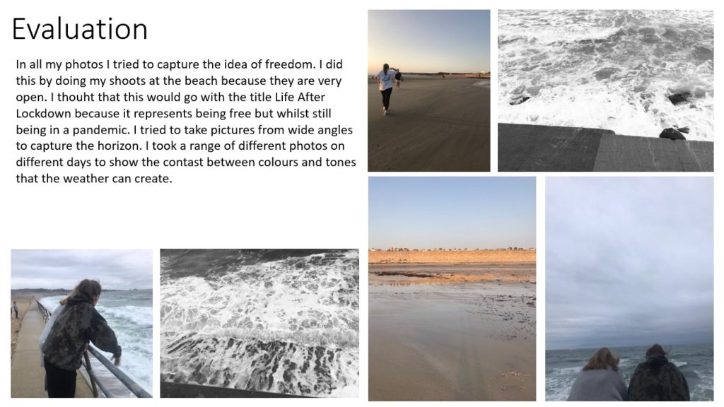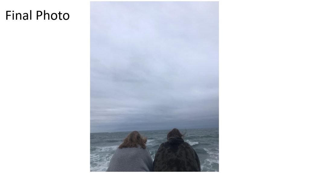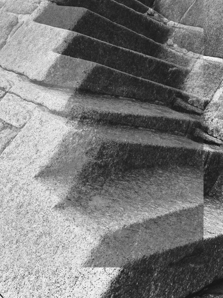
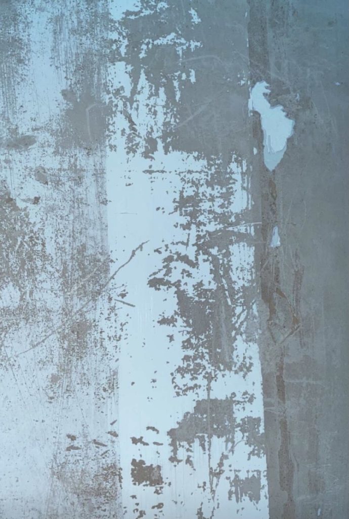
In Photoshop I duplicated my photograph and layered it on top of the background photograph. I then changed the opacity of the image layered on top so both pictures could be seen.

In Photoshop I duplicated my photograph and layered it on top of the background photograph. I then changed the opacity of the image layered on top so both pictures could be seen.
Frank Hallam-Day
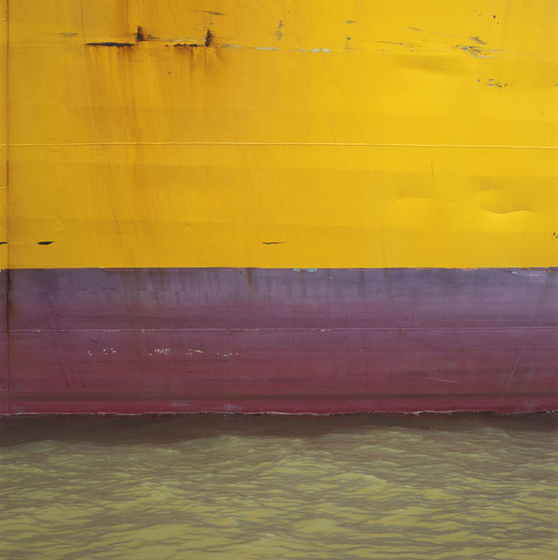
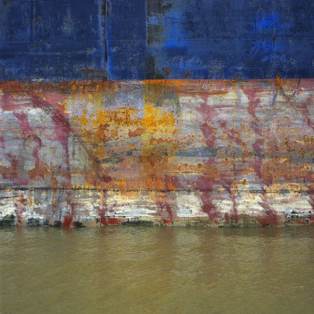
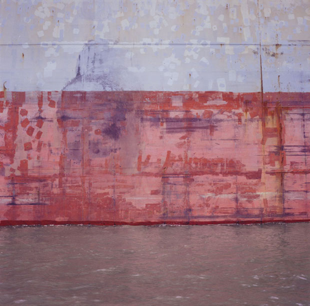

Image Analysis
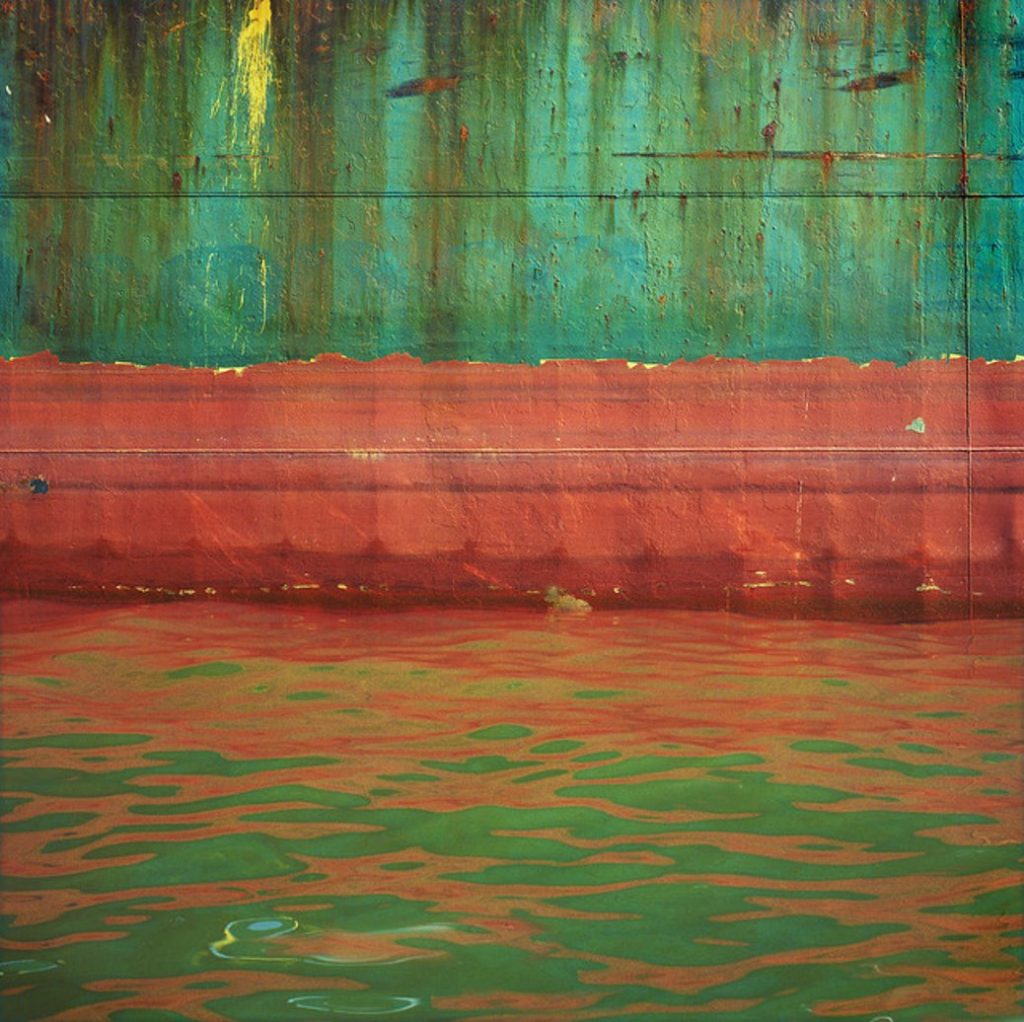
In this image Day uses a lot of lines and shapes. His work is very flat due to the composition being straight and the lines being horizontal. The colours Day uses are very bright and vibrant, these are seen throughout the image because the colours reflect onto the sea. In his work no shadows or lighter areas can be seen meaning that the image has no depth and is one dimensional. There is contrast in the photo between the side of the ship and the ocean, the side of the ship has rough, jagged and straight lines whereas the water has more rounded flowing lines that aren’t as straight. The texture of the image is rough on top due to the rust and the peeling paint, however on the bottom it has a less rough texture on the bottom due to the water and the reflection in it. There is also a repetition of horizontal lines and colours throughout the photo because of the reflection in the water.
Response



















Evaluation
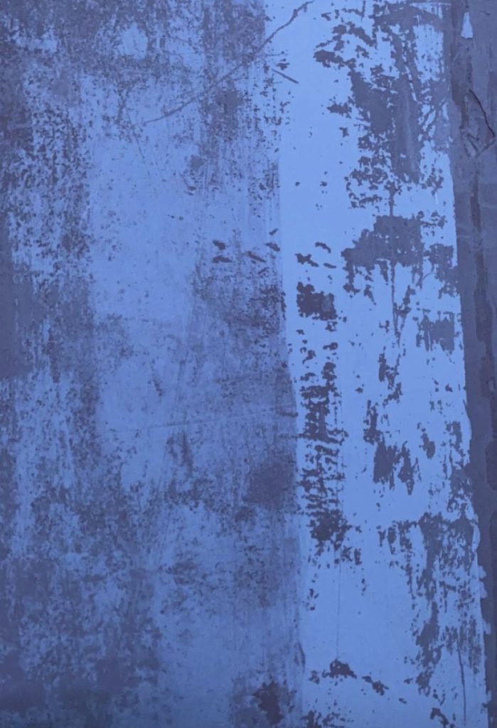
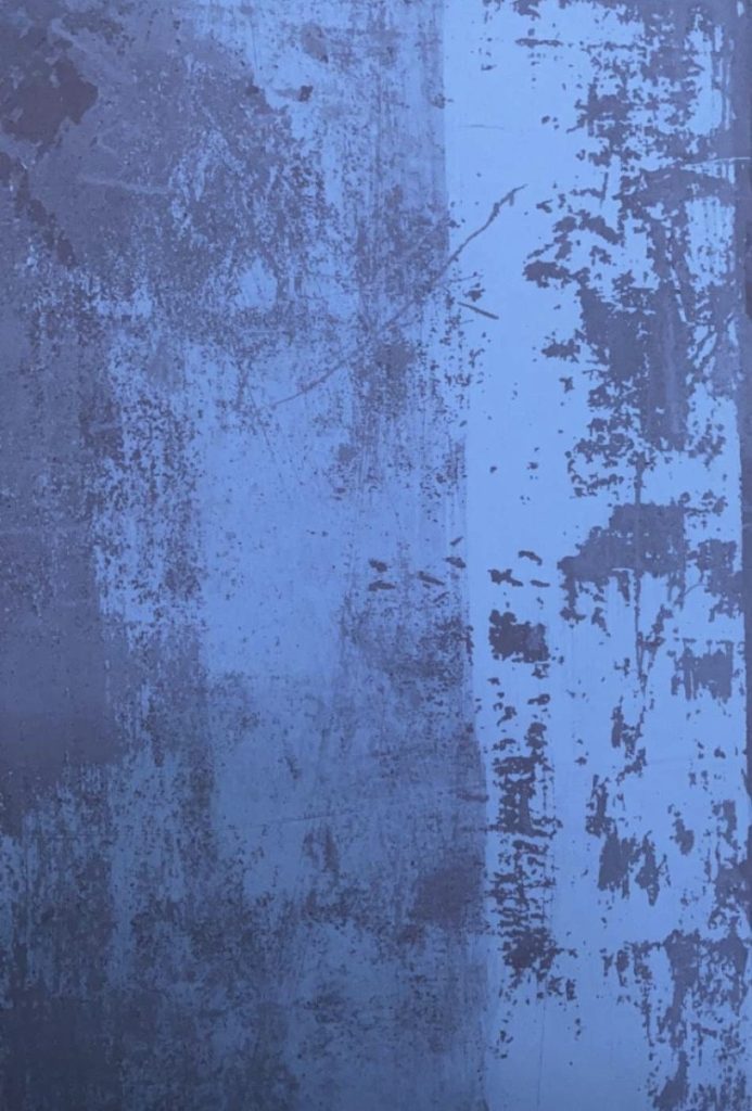
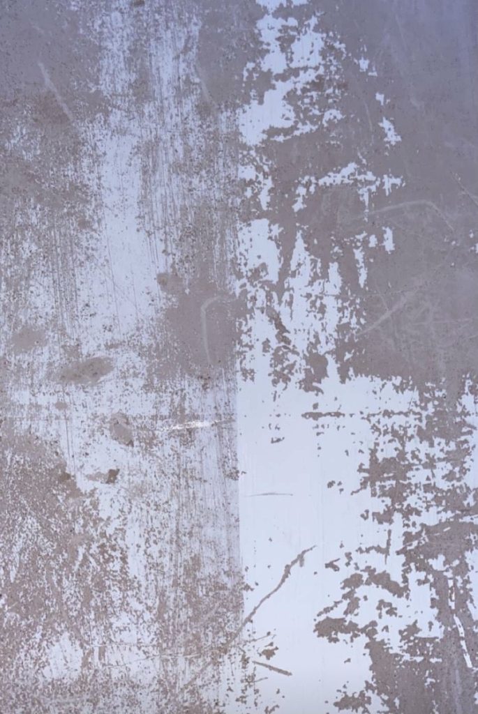
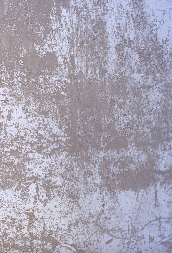
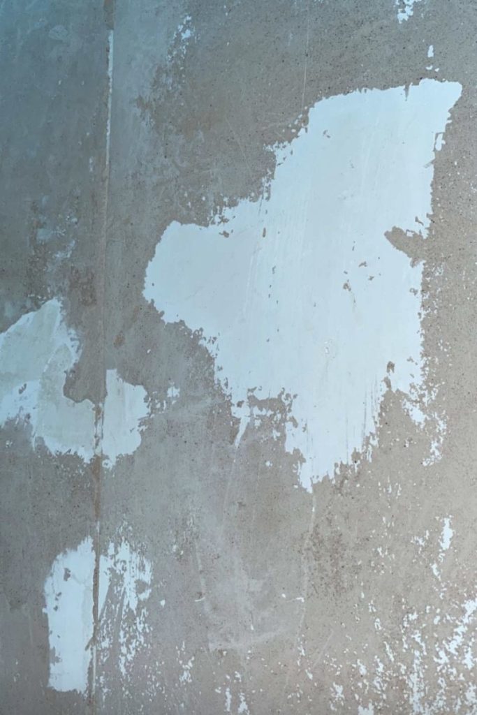
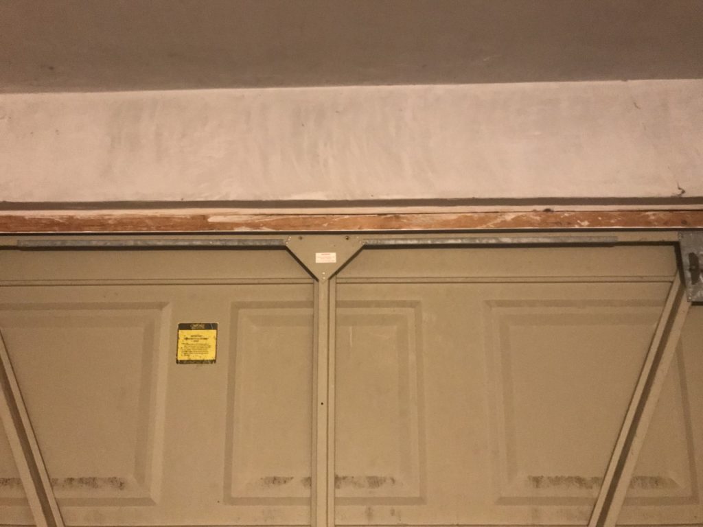
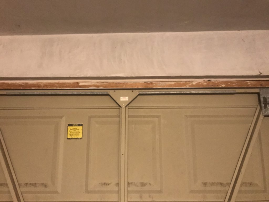
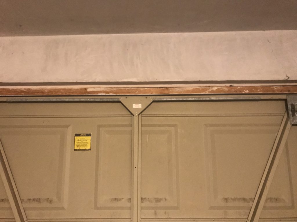
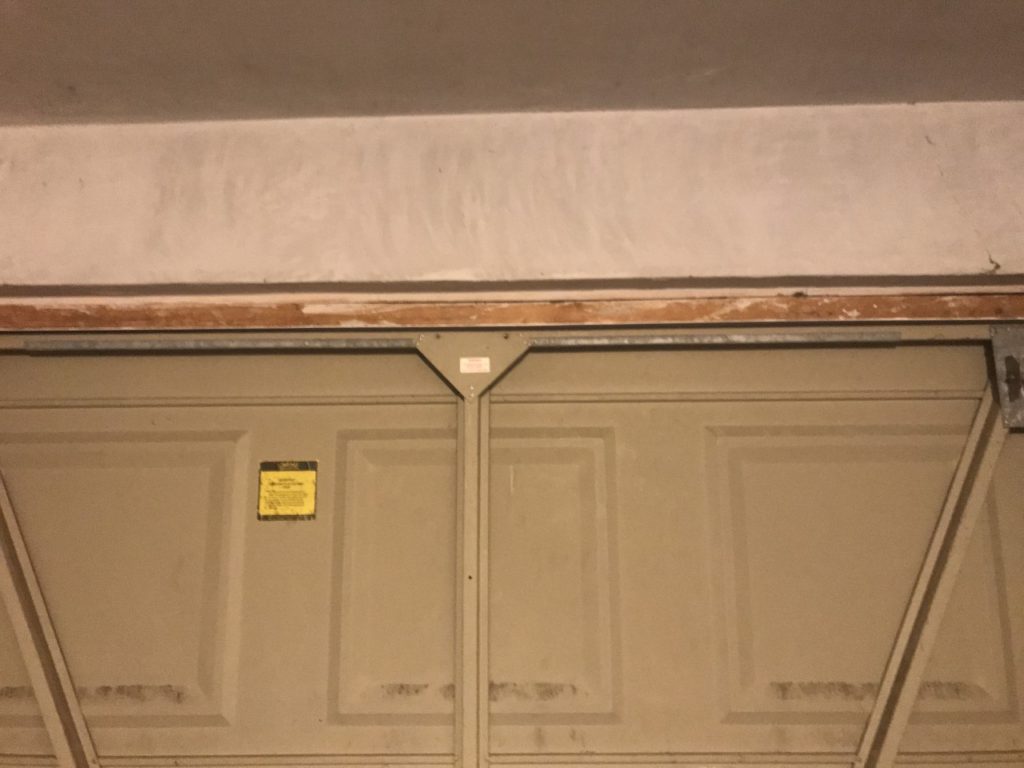
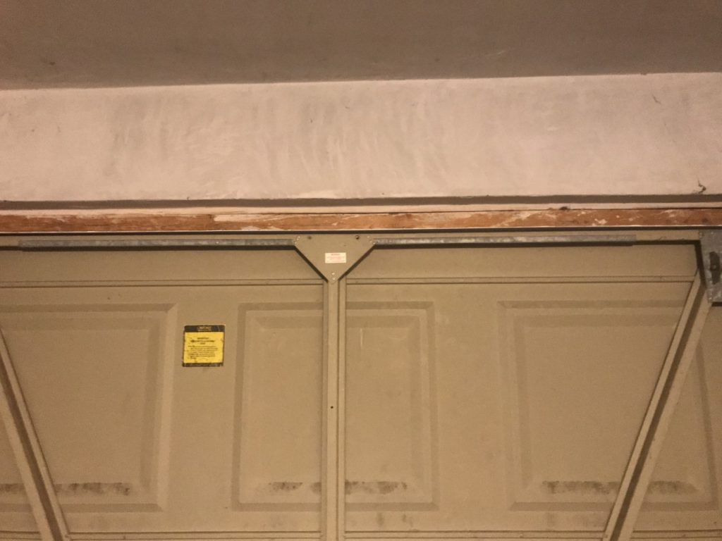
In my work i tried to capture lines and proportions in the same way that Hallam-Day does. I took photos of a stripped wall that had a lot of marks and lines, I also chose these because they have a very flat look to them which Hallam-Days work has.
Final image

Ralph Eugene Meatyard
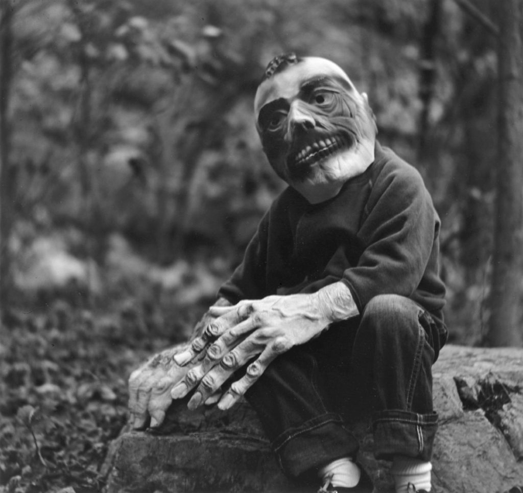
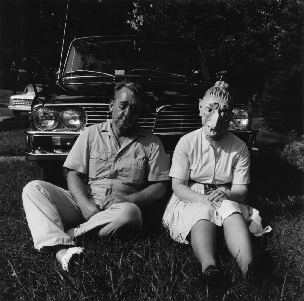
Ralph Eugene Meatyard was an American Photographer who lived during the mid 20th century. He experimented with many forms of photography by using different exposures and motion blur. In his work Meatyard captures dark and eerie scenes using people in frightening ways.
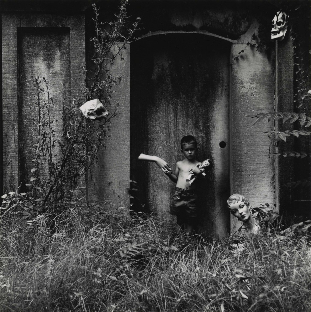
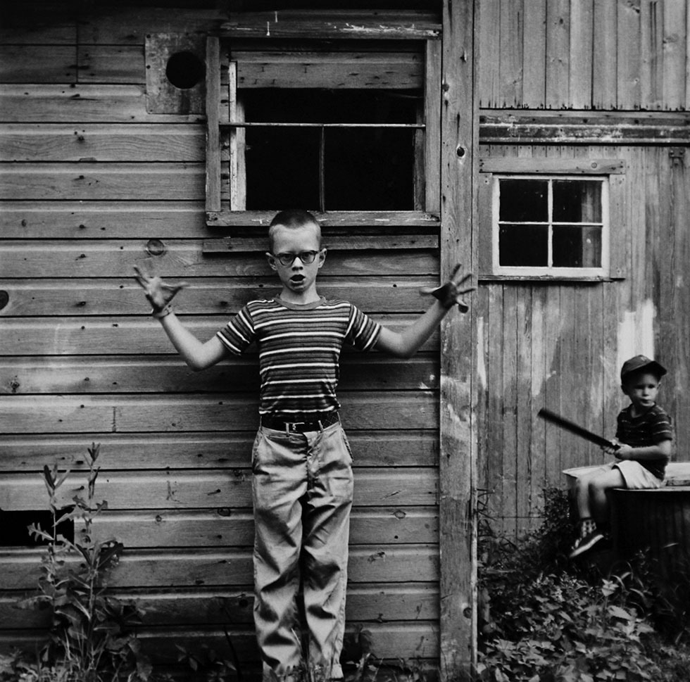

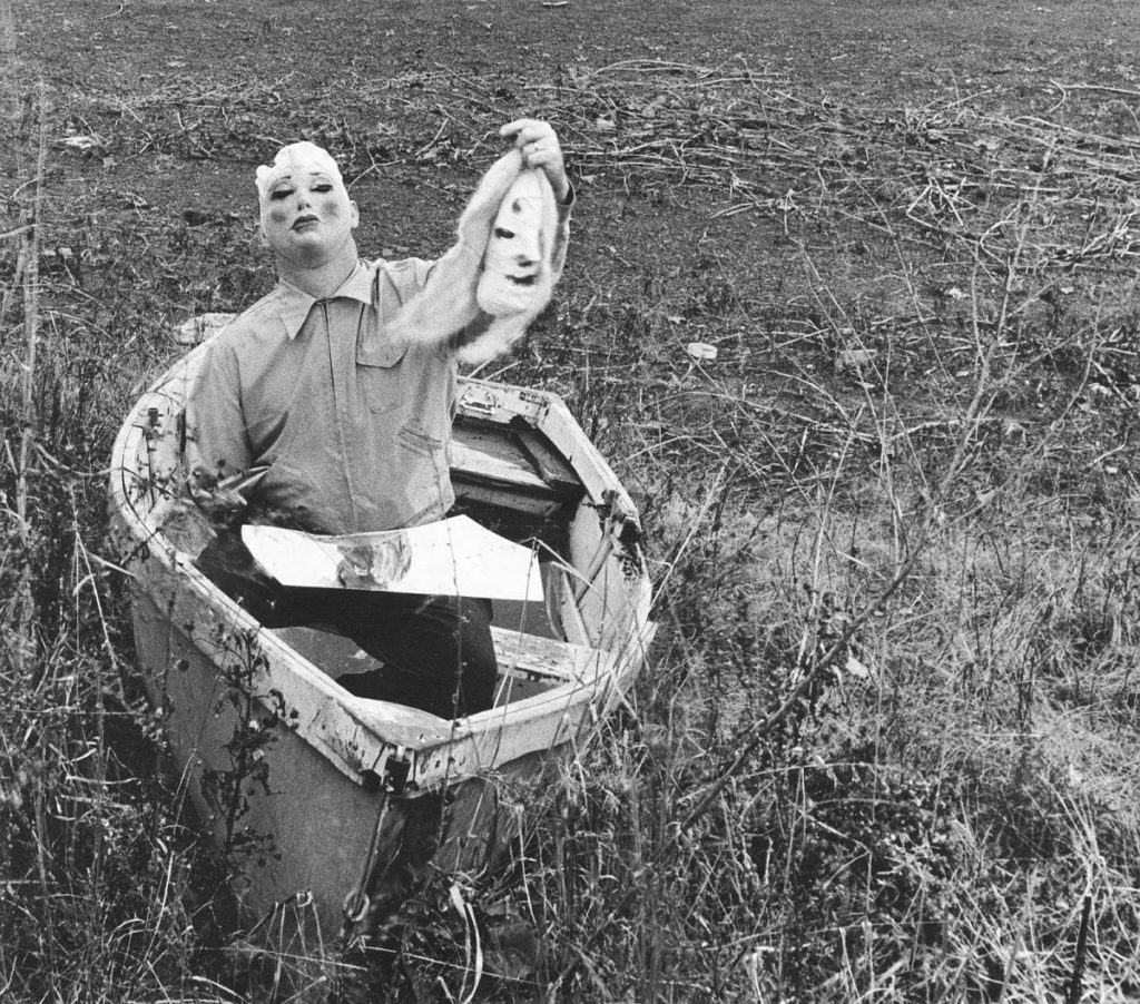

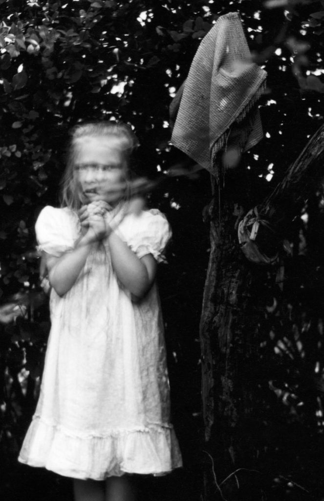
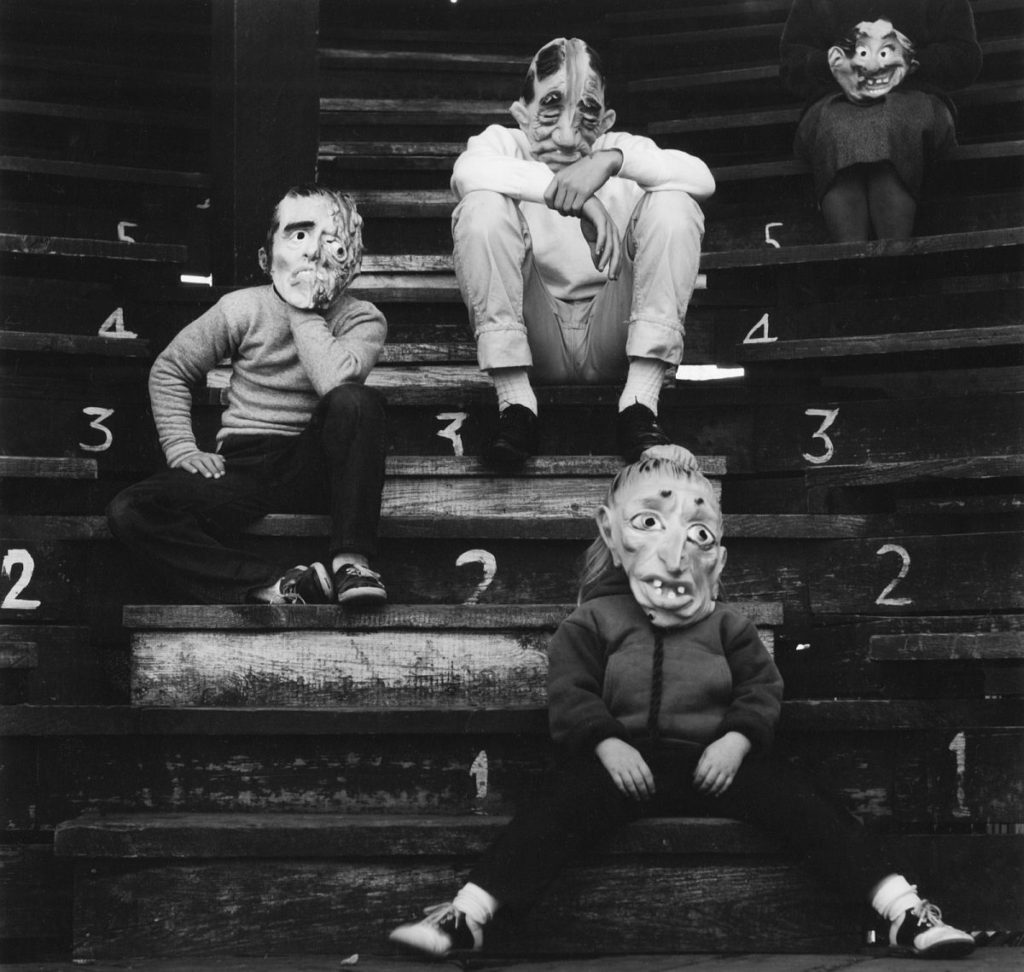
Focus
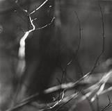
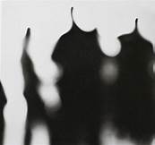
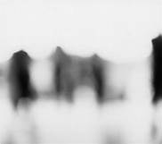


Response
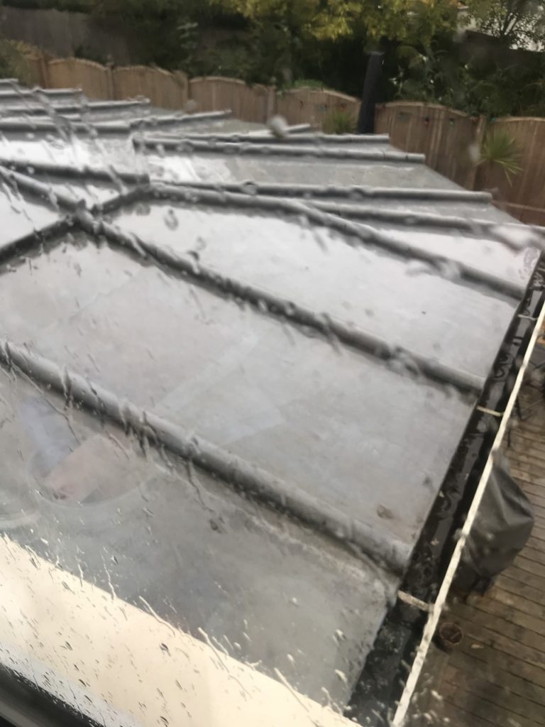


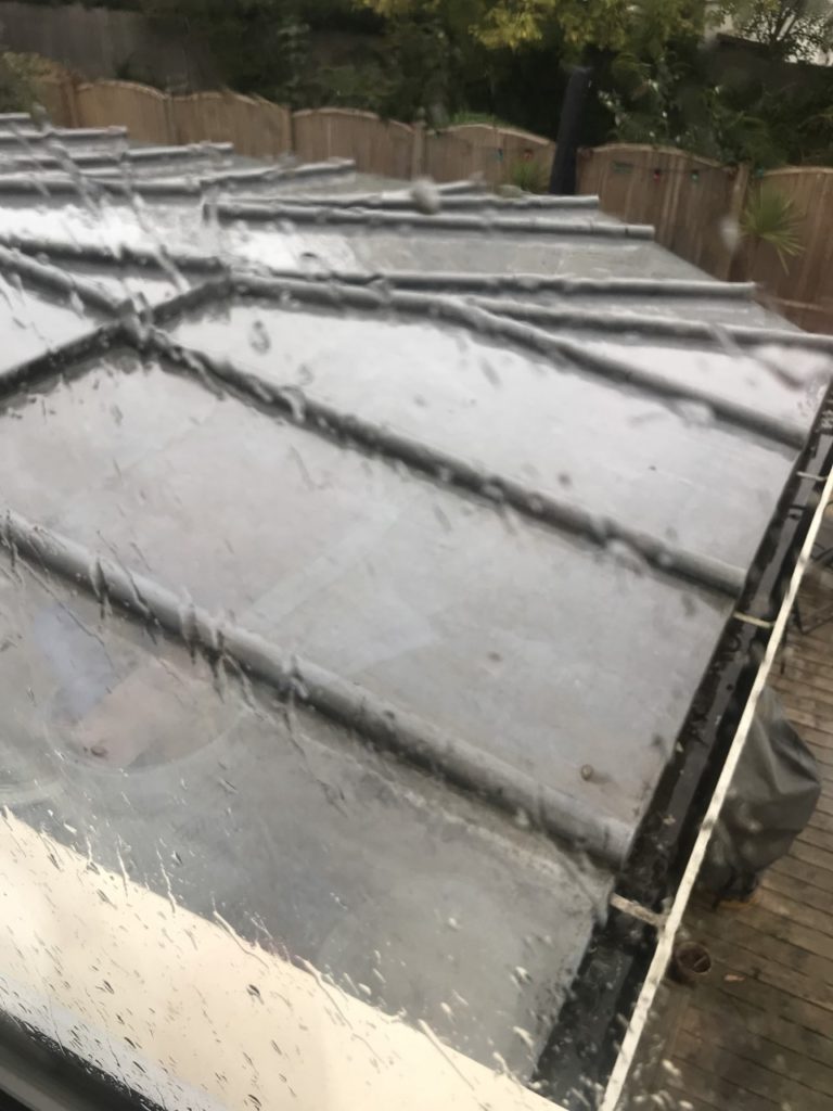


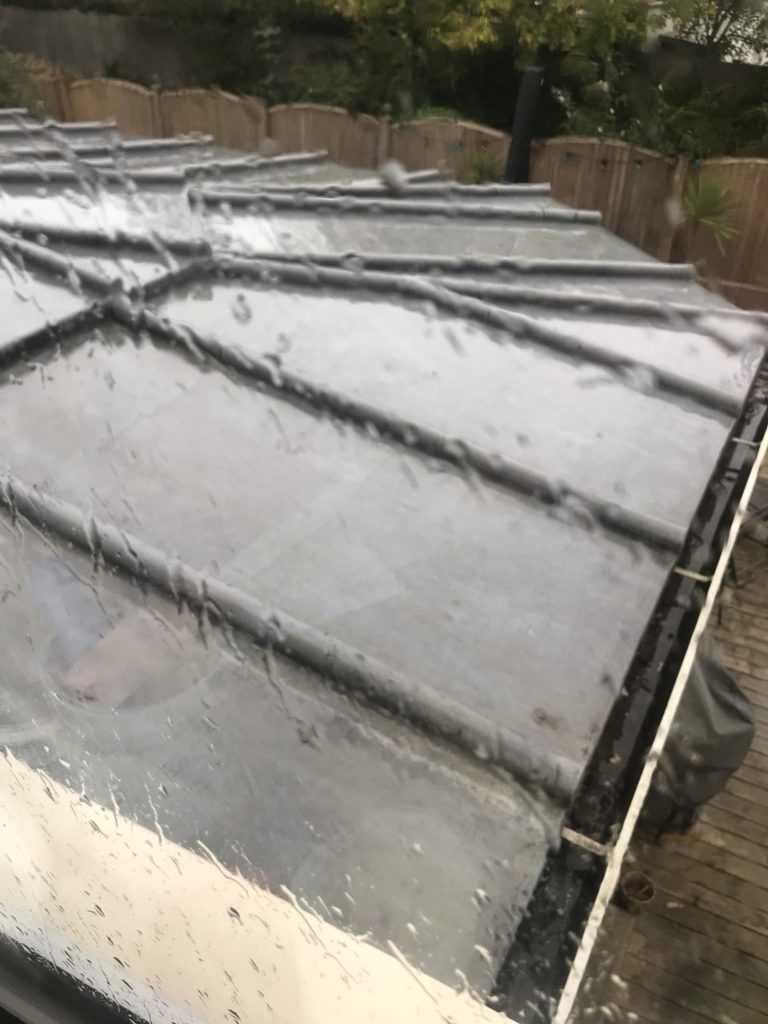
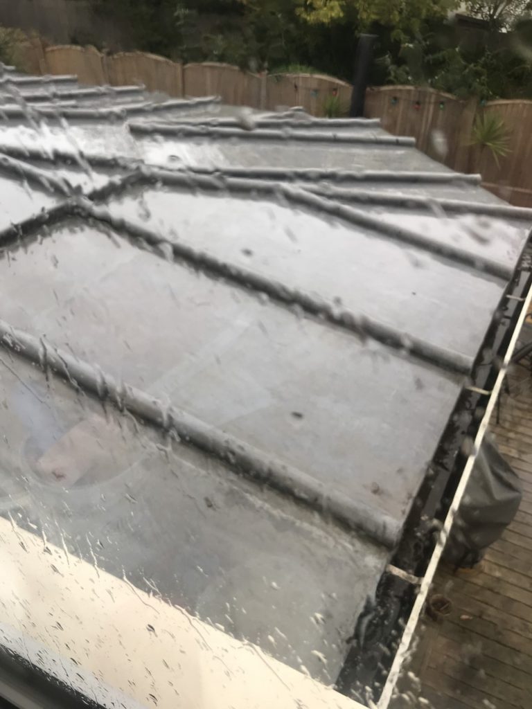


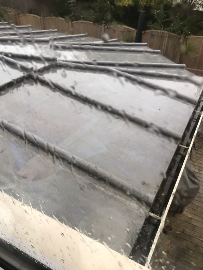


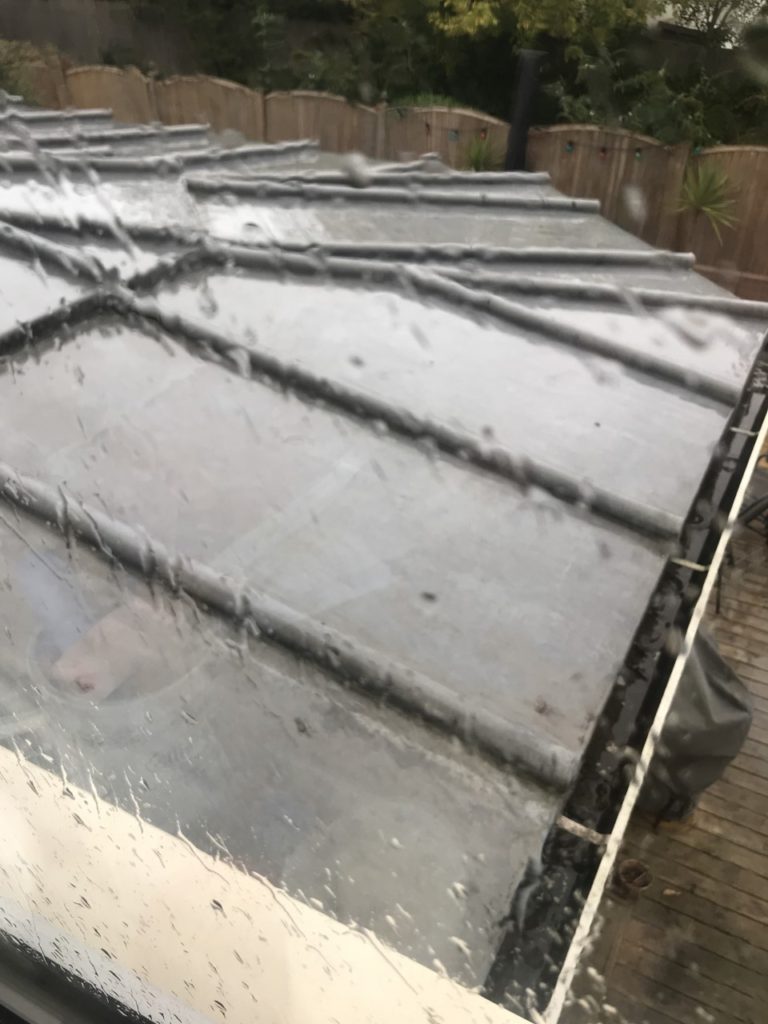












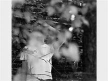
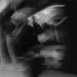
In my photographs i tried to focus in on certain parts of what i was photographing. I did this to try create the same effect that Meatyard crated in his work.
Keld Helmer-Peterson

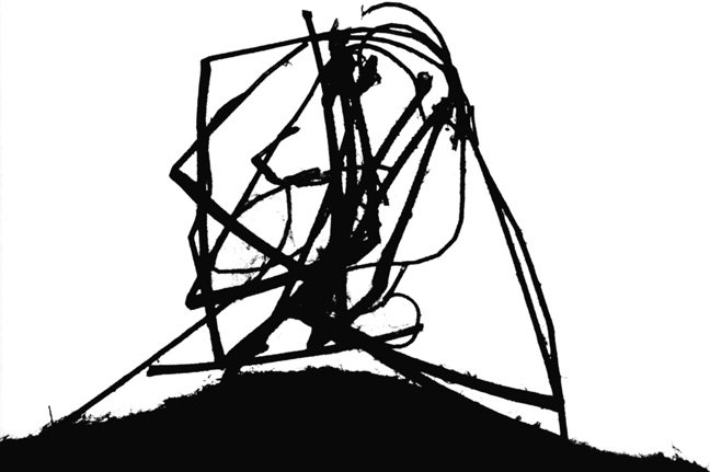
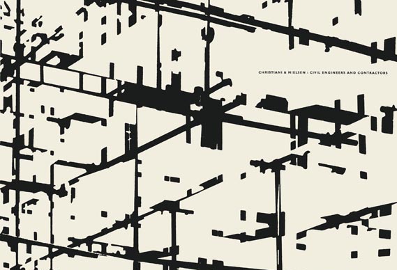
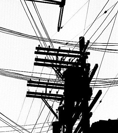
Keld Helmer-Peterson was a Danish photographer. He produced some of the influential work of the 20th century. Most of Helmer-Petersons work consists of two colours, black and white. These to colours are in contrast and create very abstract shapes. In the late 20th century he became interested in figurative shapes found in objects and architecture. In Helmer-Peterson a lot of very dark and very light tones can be seen with the white tones in the background and the black tones in the foreground. These tones also create a stark silhouette against the background that makes his images seem flat. He also uses lots of lines in his, these are quite abstract and give his images a strange composition.
Response
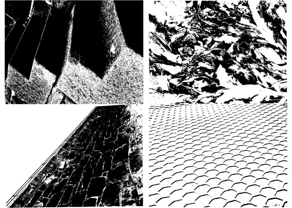
In my response i tried to use photographs that contained quite abstract lines and shapes. I edited them to give a flat look that Helmer-Peterson captured in his work. Using photoshop to edit my images gave them the harsh, flat feel that Helmer-Peterson would create when editing his images.
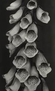
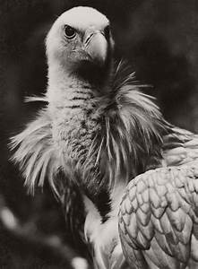
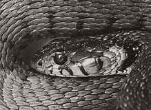
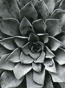
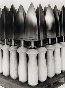
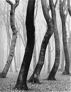
Albert Renger-Patzsch was a German born photographer living in the twentieth century. He is widely associated with the New Objectivity movement taking place in Germany. This movement was against the idea of expressionism. In Renger-Patzsch’s work order and tradition can be seen clearly throughout, this is what expressionism challenged. Expressionism sort out to express emotion rather than nature and tradition, this is what the New Objectivity and Renger-Patzsch’s work doesn’t capture.


Analysis

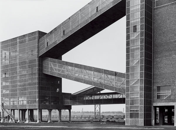
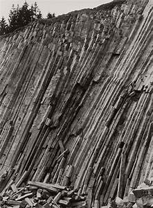
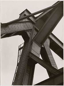
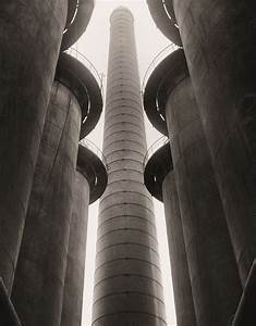
In his work it is clear that Renger-Patzsch uses tone and light to create depth. He contrasts very dark tones with very light tones. He also uses lots of repetition in his work, this repetition can be seen in the shapes he finds.
In the first image the repetition is obvious. The lines in the photo cross the image diagonally creating a triangular shape in the top right half of the image. The crevices in the wall create dark triangular shadows, these contrast with the tone on the outer walls which is a lighter grey. The round shapes on top of the crevices create a rhythm that flows to the background of the photo.
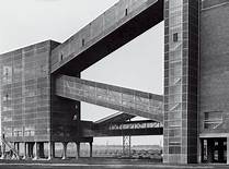
In the second image repetition can be seen in the lines. these lines are shown on the sides of the building and the way the building is shaped. A depth is given with the way Renger-Patzsch angled his camera. Dark, black tones sit beneath the lighter grey and white tones in the sky and on the front of the building. A rough texture is captured on the side of the building which is in direct contrast with the flat sky.
Response
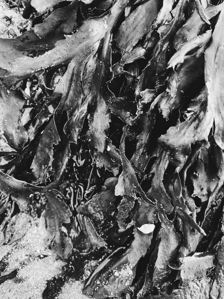

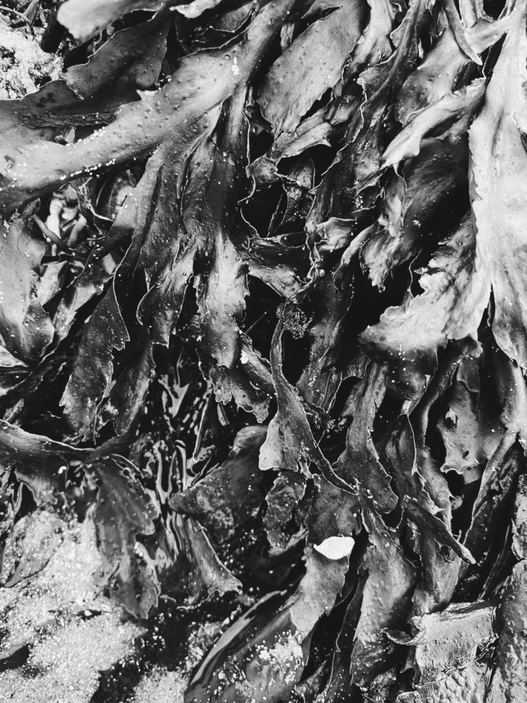
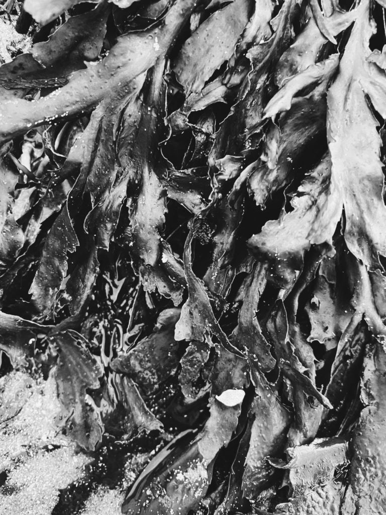

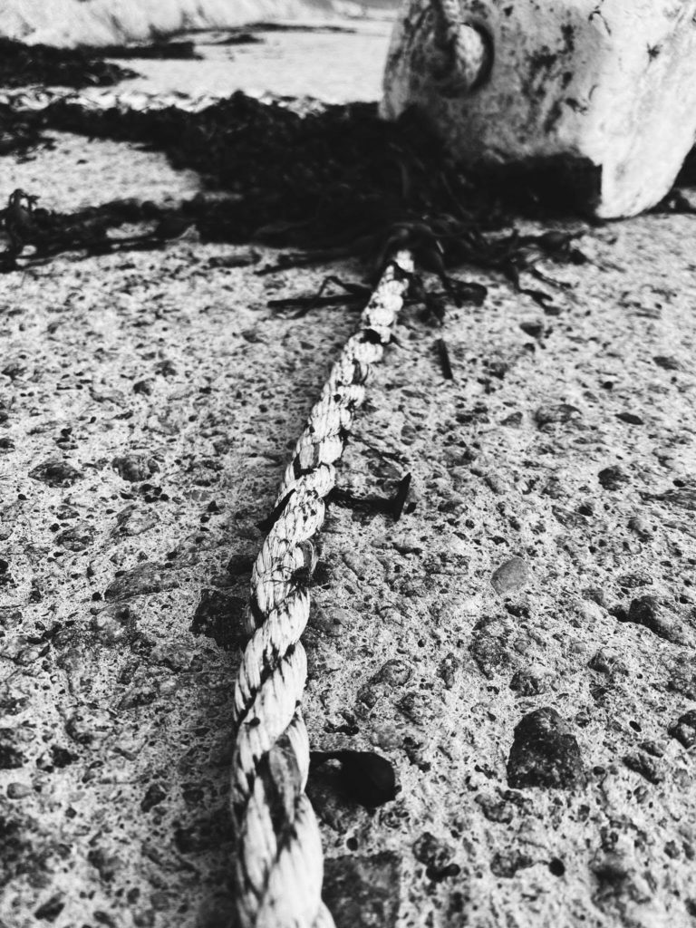
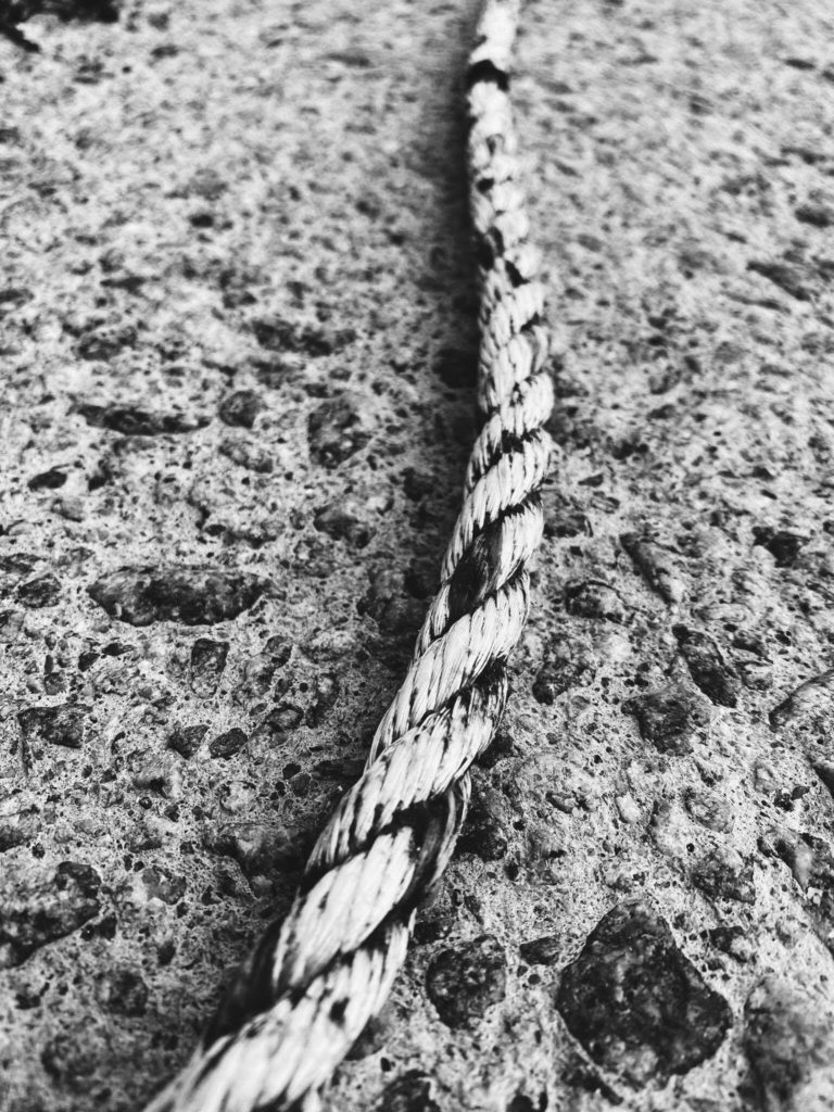

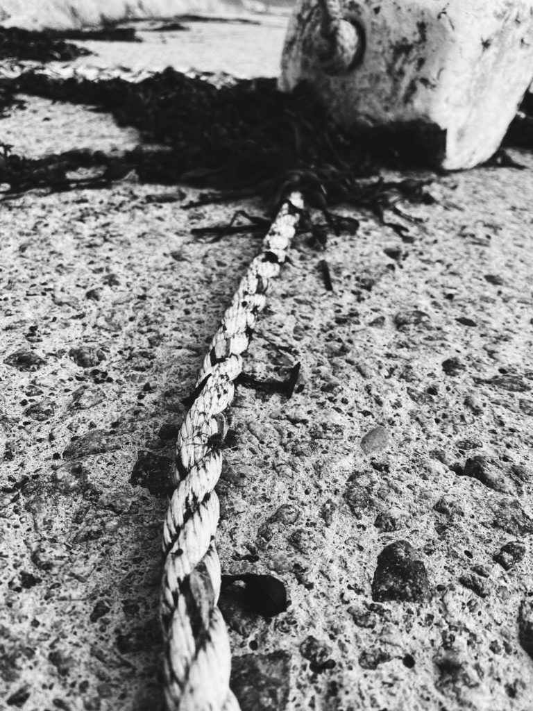
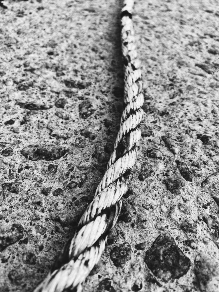

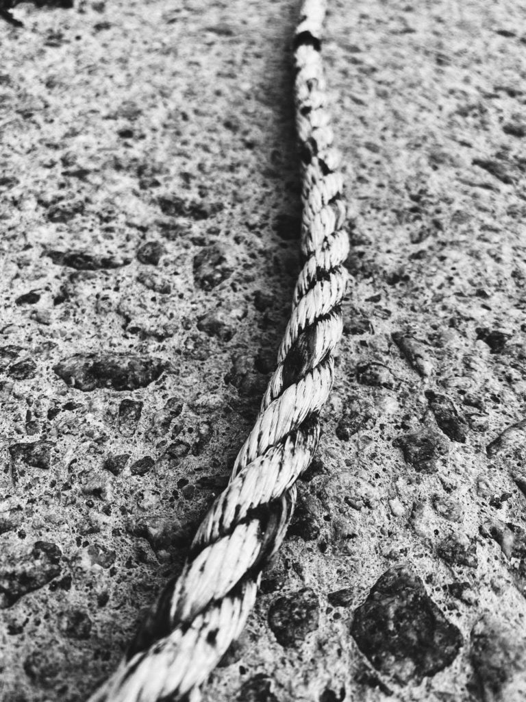
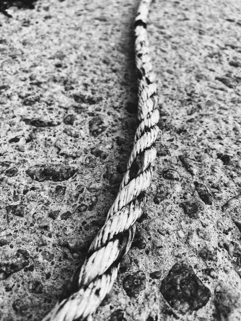

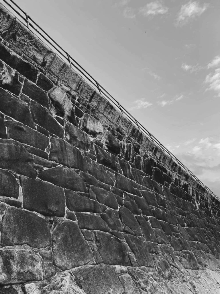
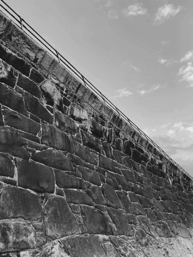
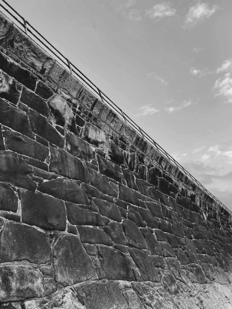
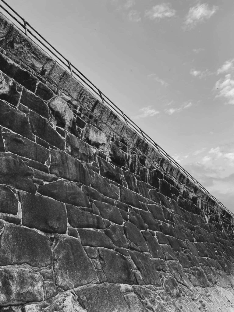
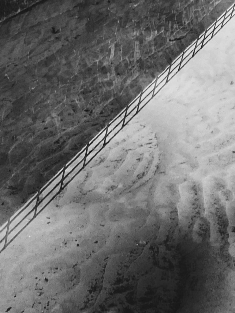
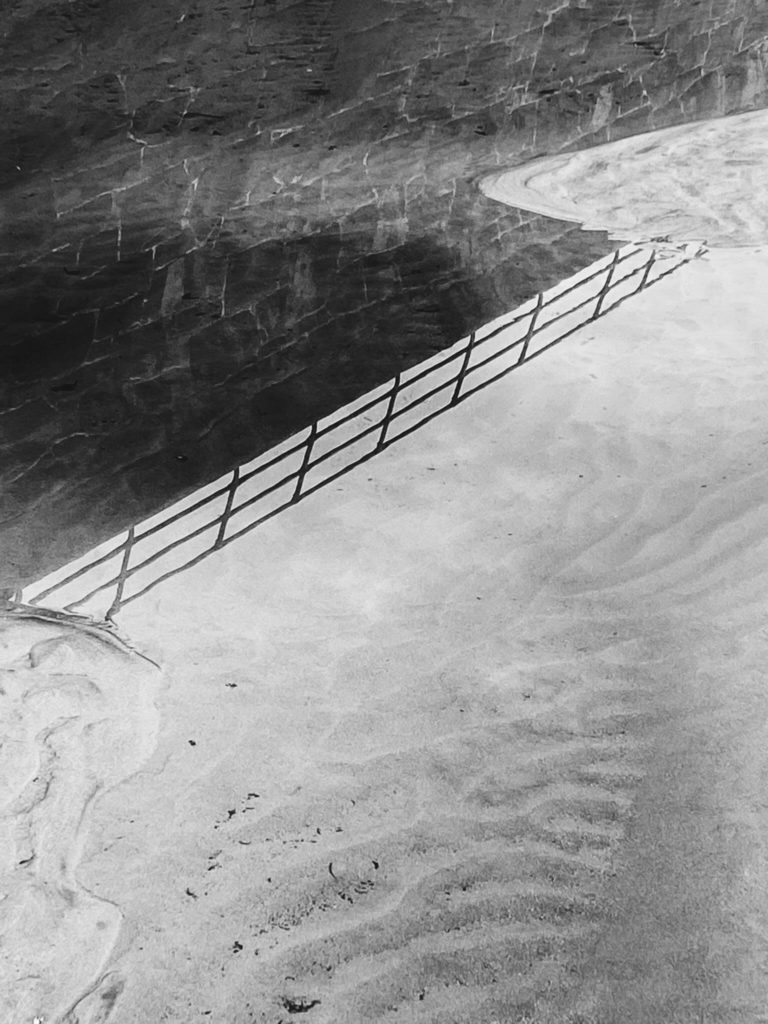

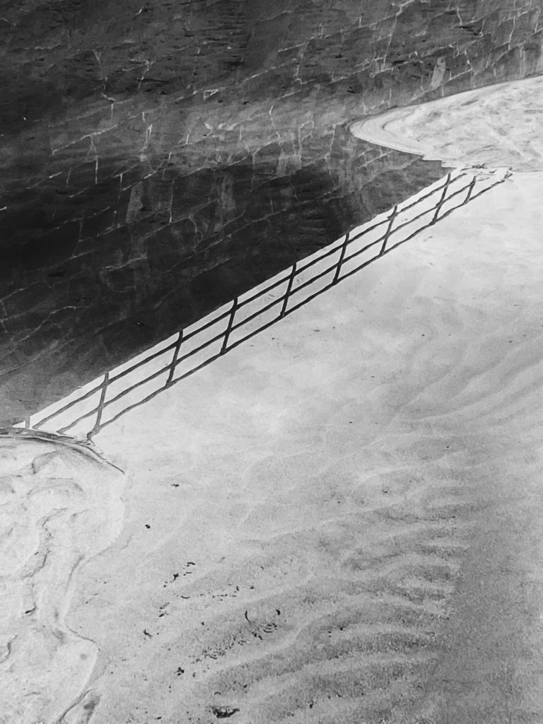
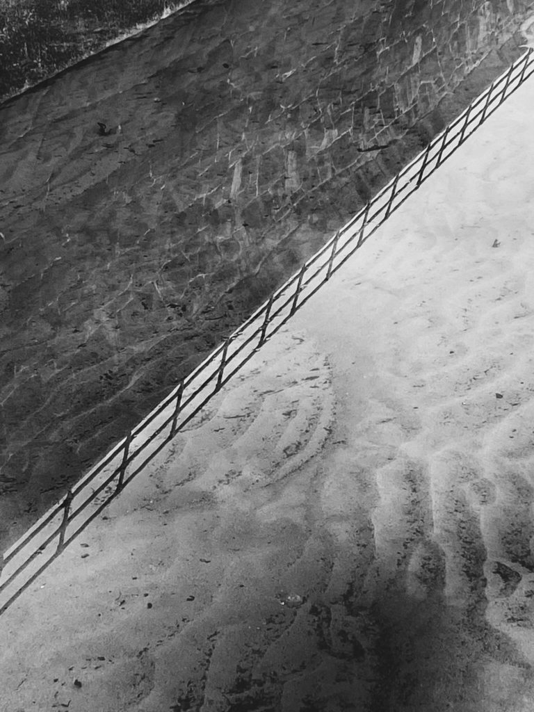
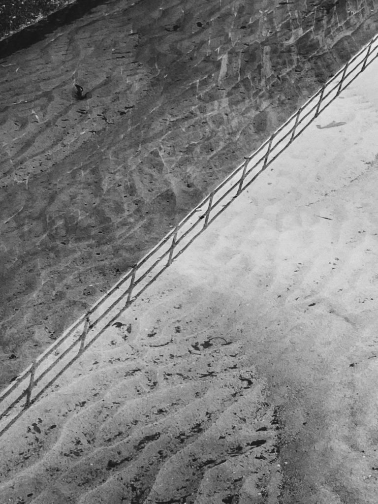
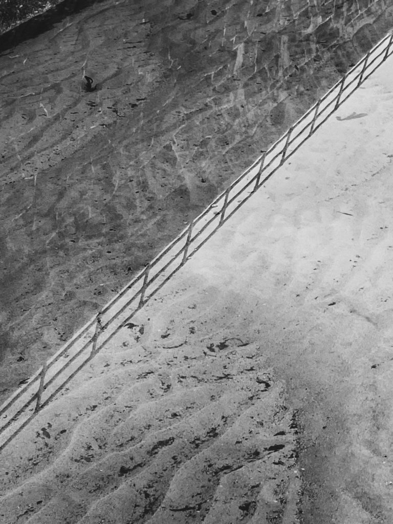
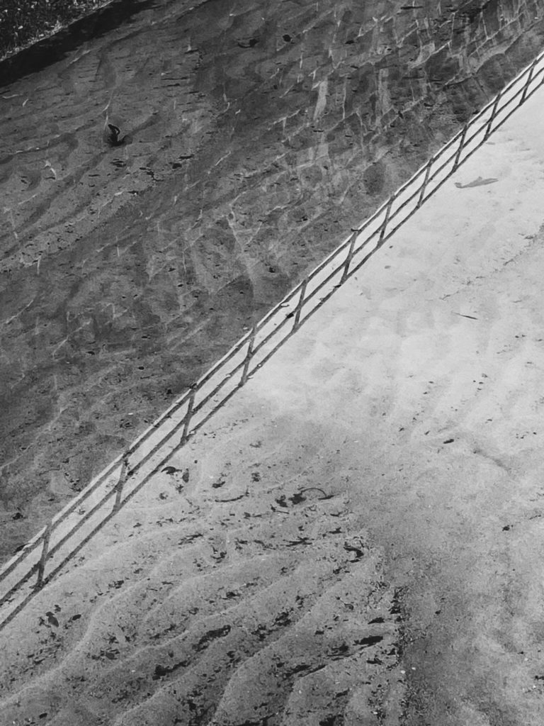
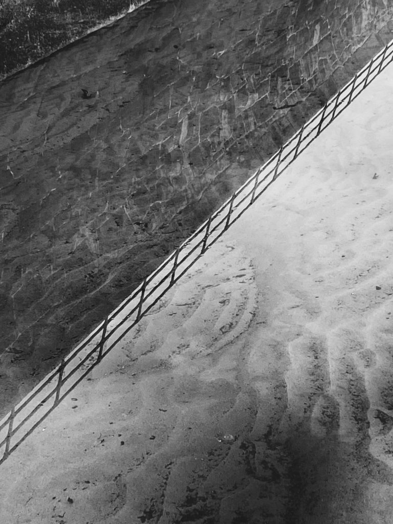


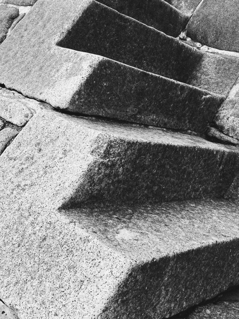


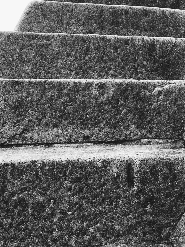

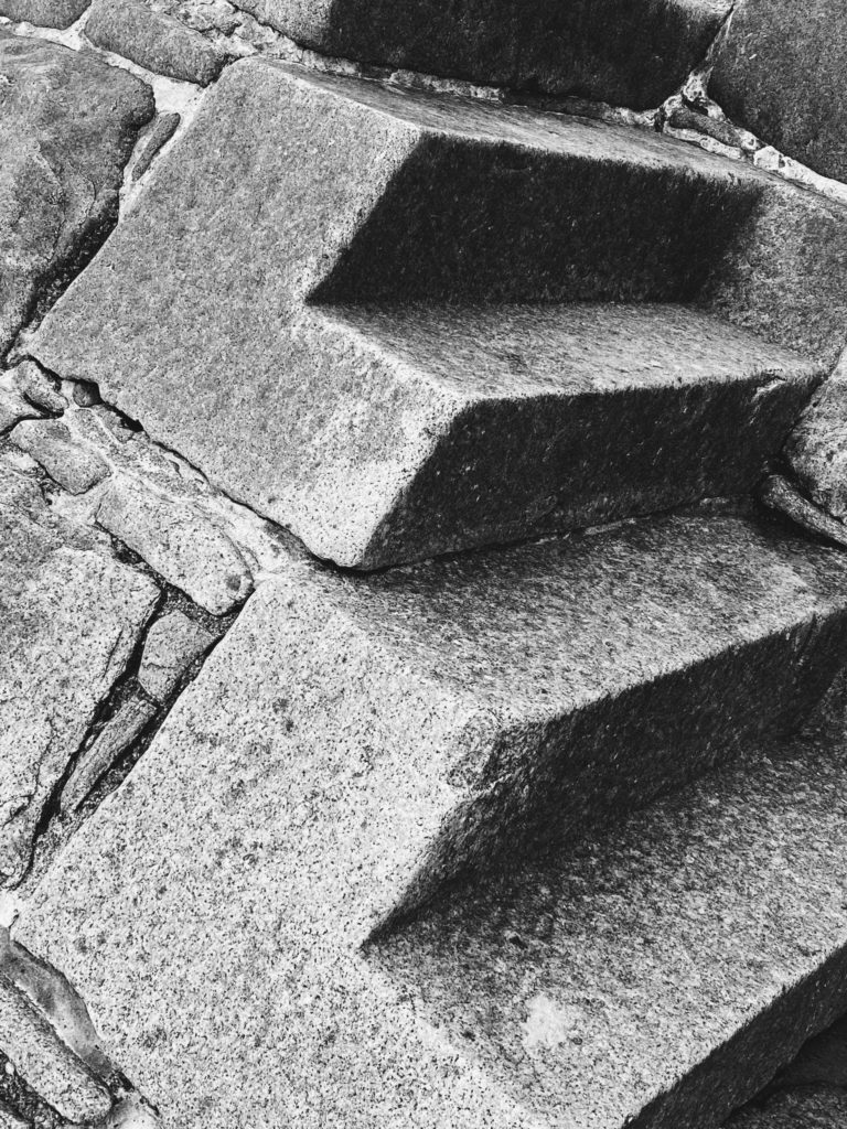
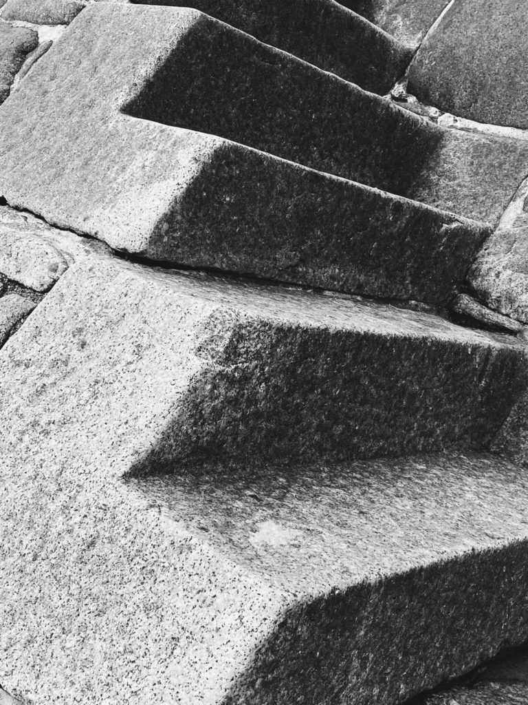
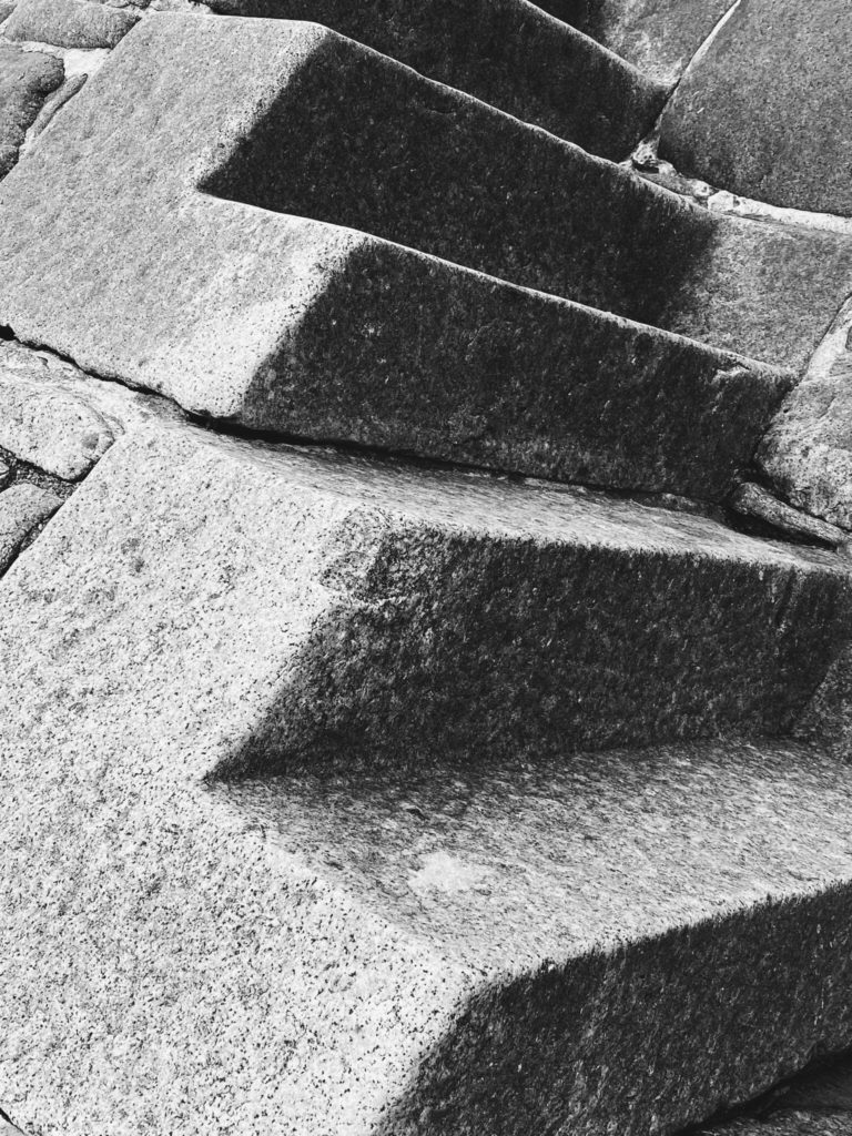

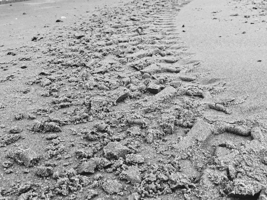
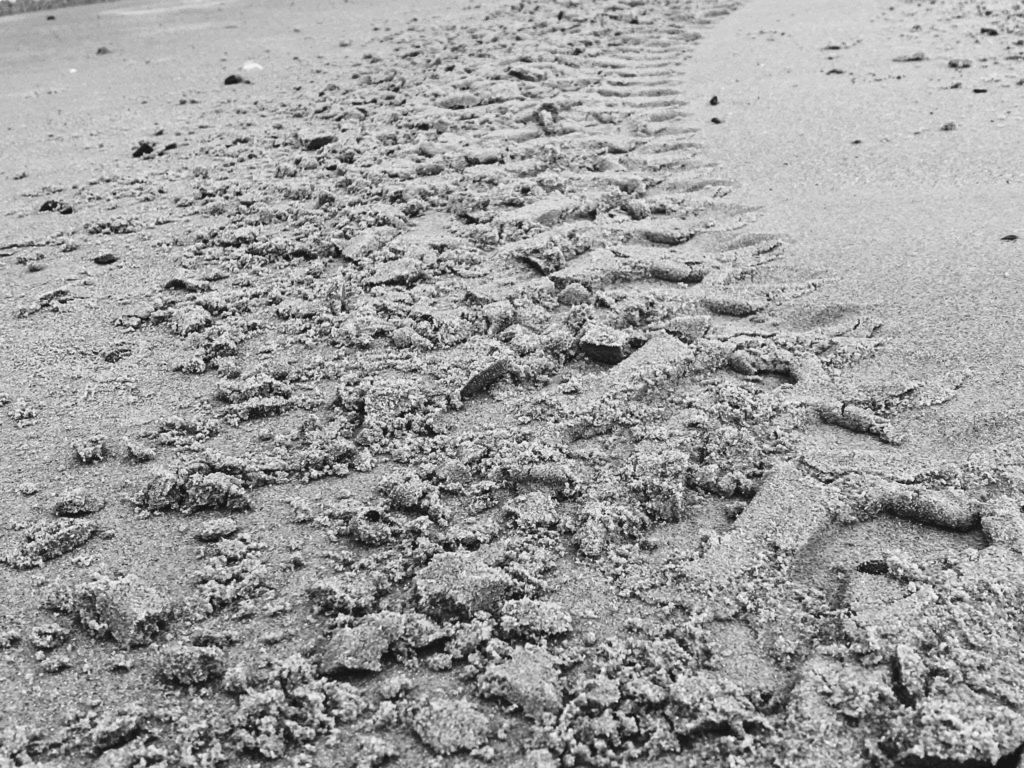
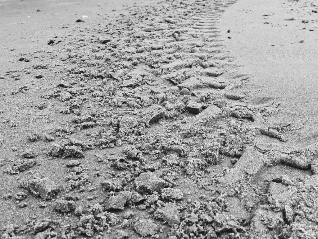
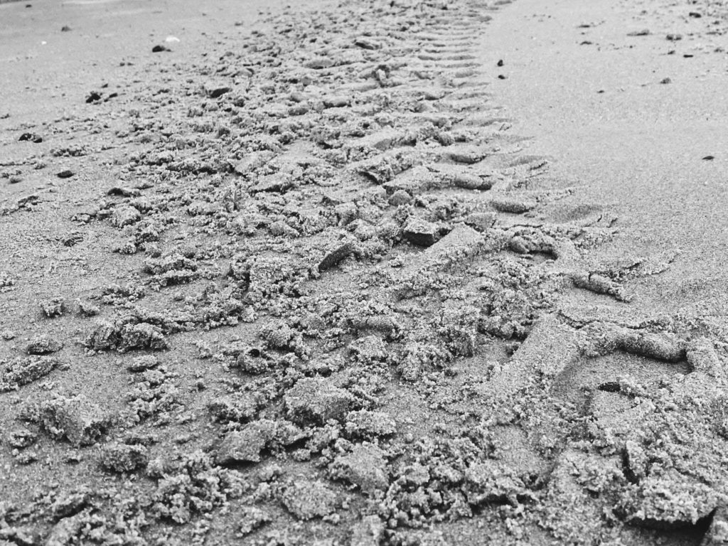
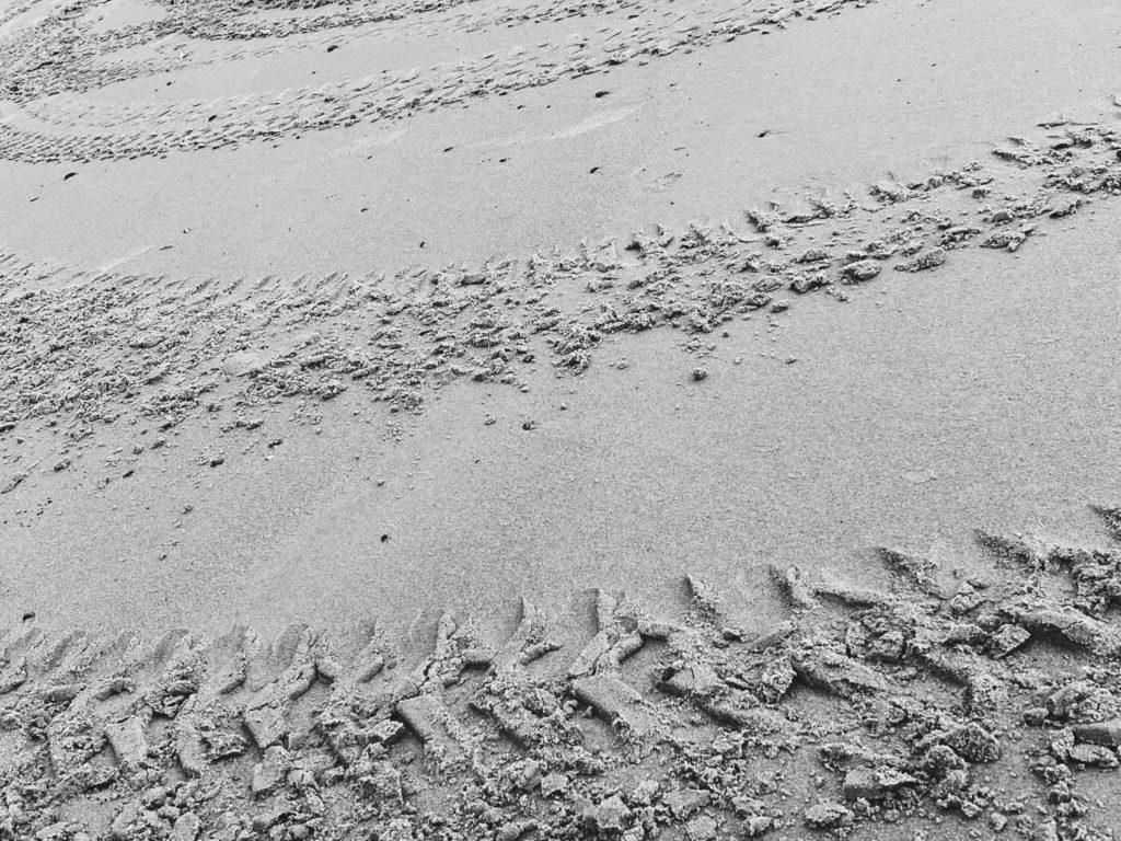
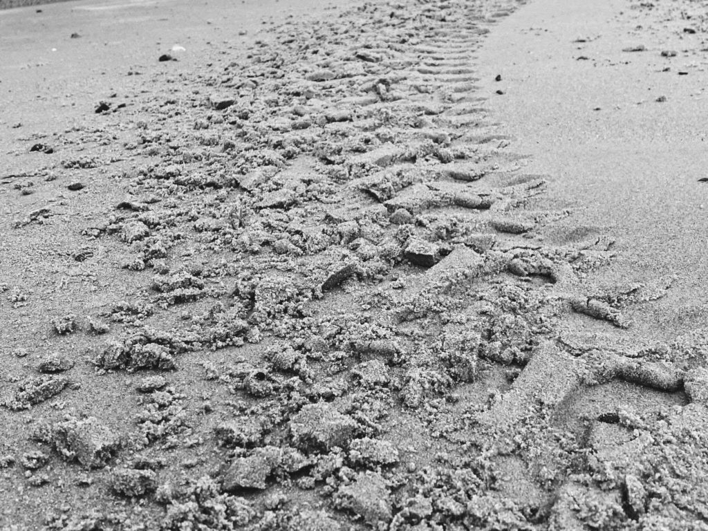

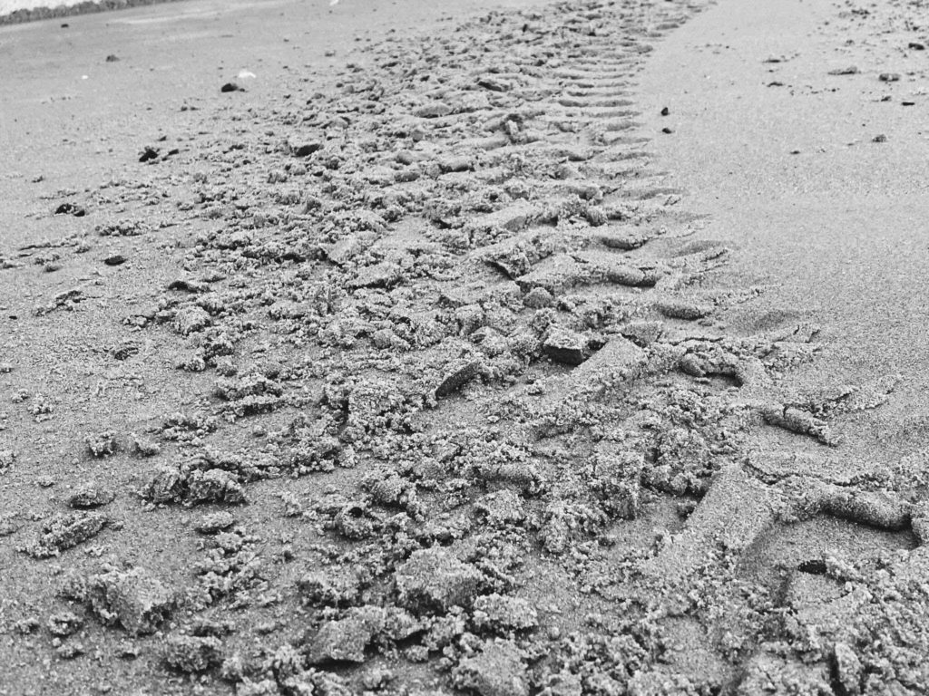
A contact sheet is a a group of images all put together in an order. On one contact sheet will be all the images from one photo shoot. They help to archive the negatives to be quickly scanned.


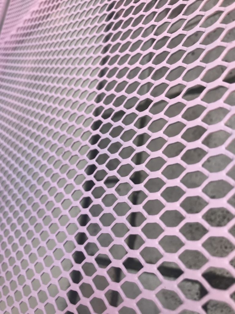
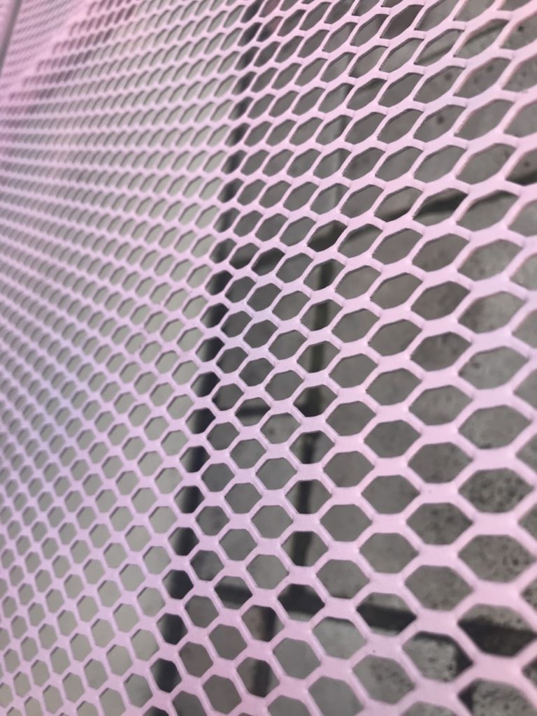
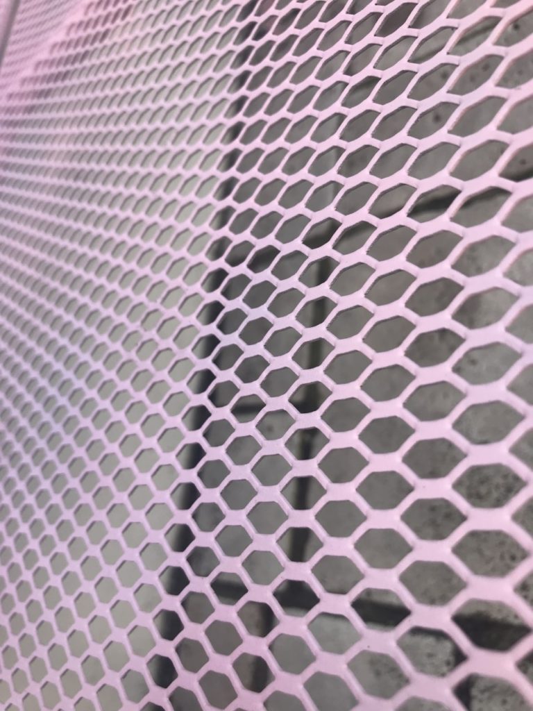
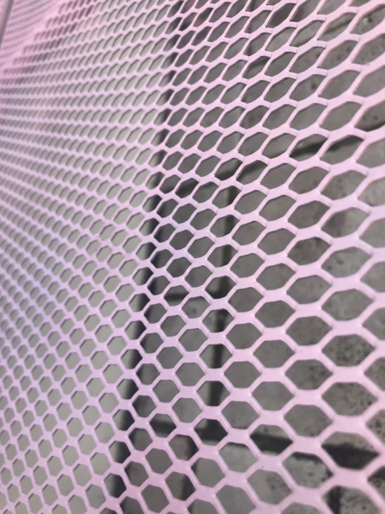
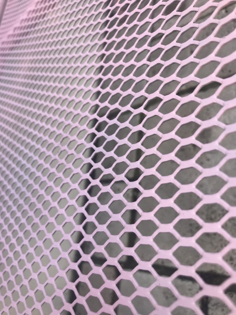


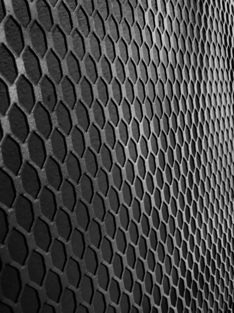

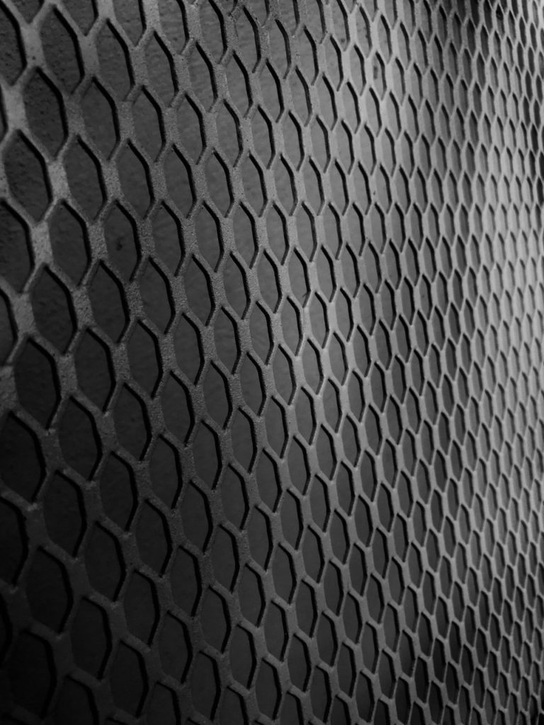
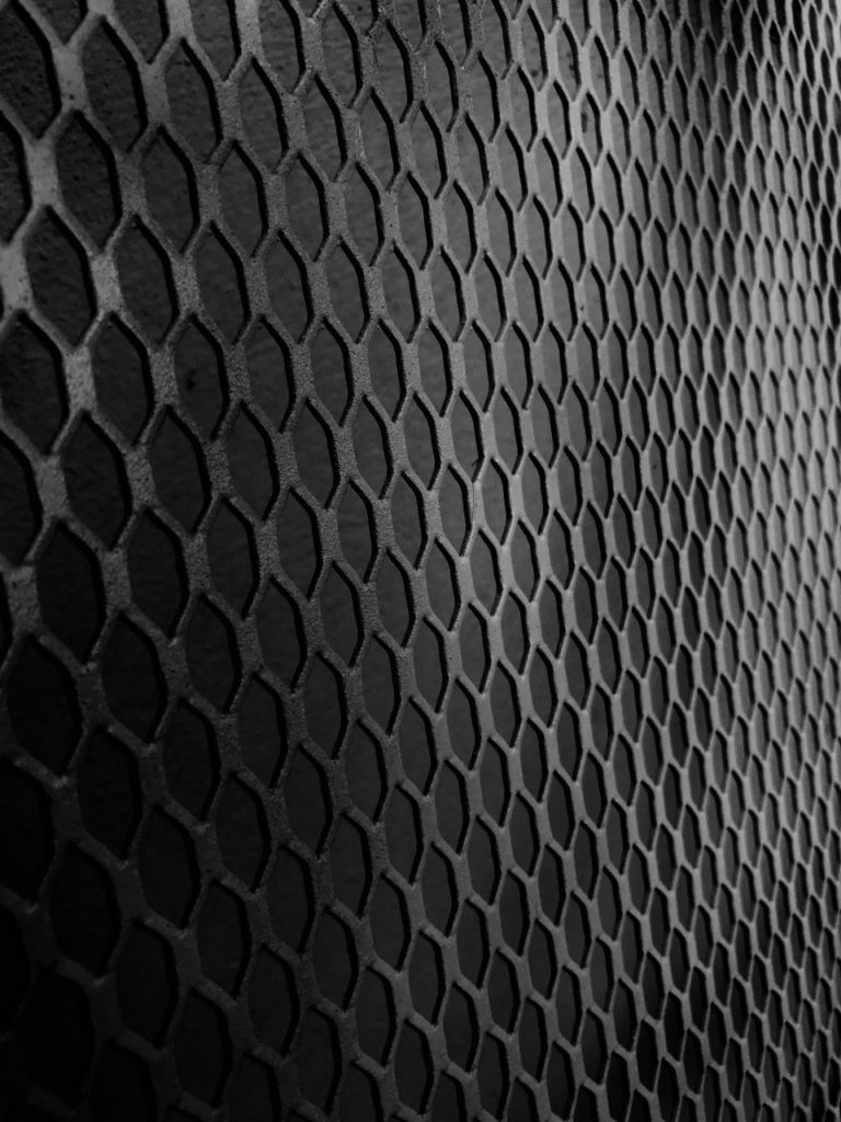

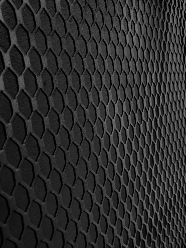
This is a contact sheet from one of my photo shoots. It is of the back of a bench and has been edited into black and white to capture the shadows and the highlights. I also changed the contrast so the highlights were more visible.
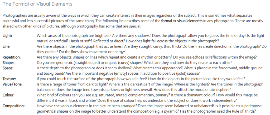
The formal elements are used by famous photographers all around the world. They are the parts that create some of the most praised images in the world. They help create interesting and professional images.
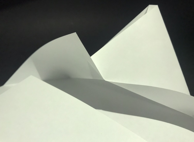
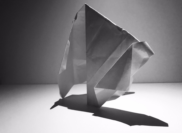
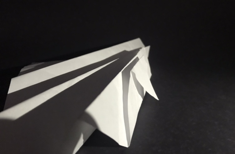
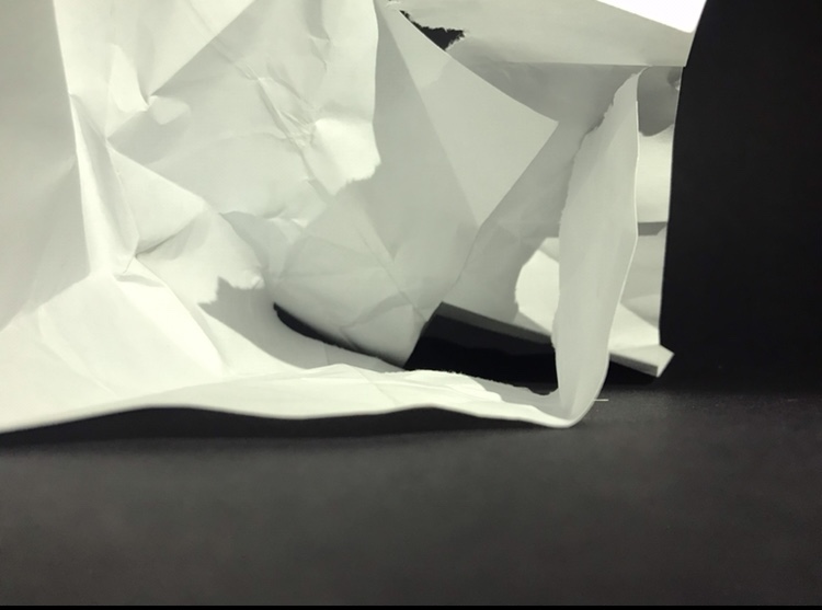
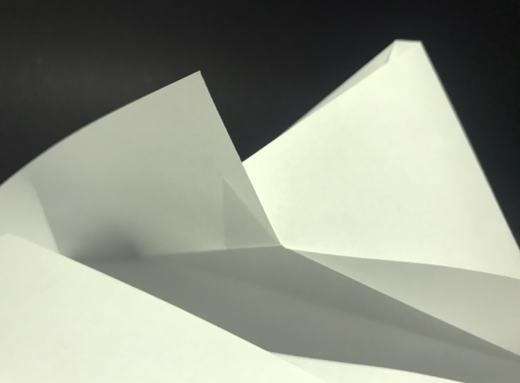
In class I took photos of paper shaped and folded in different ways using different backdrops and lighting.



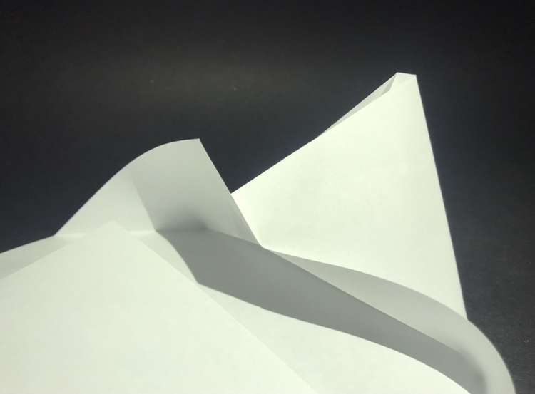
Analysis
Light – In my second and third image the lighting is quite harsh and creates dark, contrasting shadows. This was done by using downward facing, close lighting. In my fifth image the lighting is softer creating less contrast in tones and fainter lines.
Line – In my fourth photo the lines are quite abstract and unnatural due to the way I crumpled the paper. This contrasts with the sharp, straight lines on the edges of the paper. In my first image the lines are very harsh and impactful. This is also due to the lighting coming from the side.
Repetition – There are repetition of triangular shapes in my second and third image and in my first image the lines repeat and are parallel.
Space – In my third photo there is a sense of depth due to the way it folds behind each other. I think all the photos have a depth to them because of the way they are set out and folded.
Texture – The lines in the photo would feel sharp and flat whereas some of the crumpled paper would feel more rough.
Tone – In all my photos a range of tones can be seen. In my first and second image the tone fades and is not as sharp as the other images. They also don’t contain as dark shapes and lines.
Colour – In my first and last image the dominant colour is black with hints of grey and white. This is different to the other photos where the dominant colour is white and grey.
Composition – In my second and last image the paper has been arranged into a sort of pyramid formation.

At the forefront of the photograph an old man can be seen. Natural light floods the background leaving dark shadows rising from beneath the man. He is looking menacingly down the lens of the camera while his hands, clasped together, help to hold up his tanned face. The camera has been positioned to be looking directly through the center of two dark grey pillars. The light from the back surrounds his face and is reflected along the side of his cheeks and down to his chin with dark shadows peeking from the creases of his mouth. In the background the symmetry is elongated with two trains on either side of the image. Dark grays and black can be seen dominating the bottom half of the photograph whereas brighter colours such as white, red, orange and blue can be viewed in the upper half. There are also leading lines that can be viewed coming up through Krupps arms leading to his eyes, this creates a triangular shape. These can also be seen leading from the edge of the light coming through the top of the photograph.
The man in the photograph looks cold and frightening but in reality he is harmless in that moment. His name is Alfred Krupp and During WWII him and his family helped the Nazis move people to concentration camps. This photo captures the man that he is, cold, dark and frightening.
