Storyboard

Moodboard
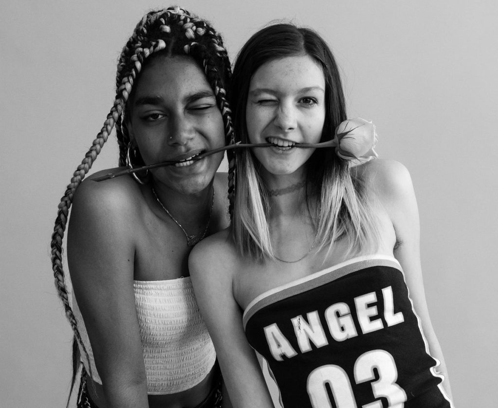

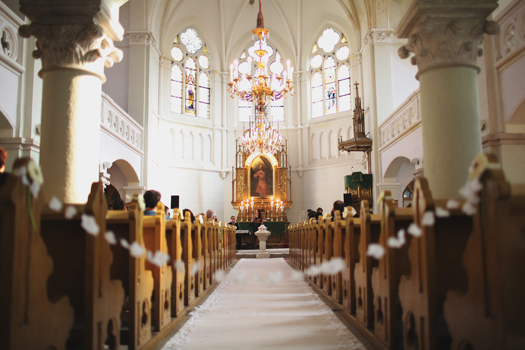

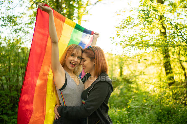
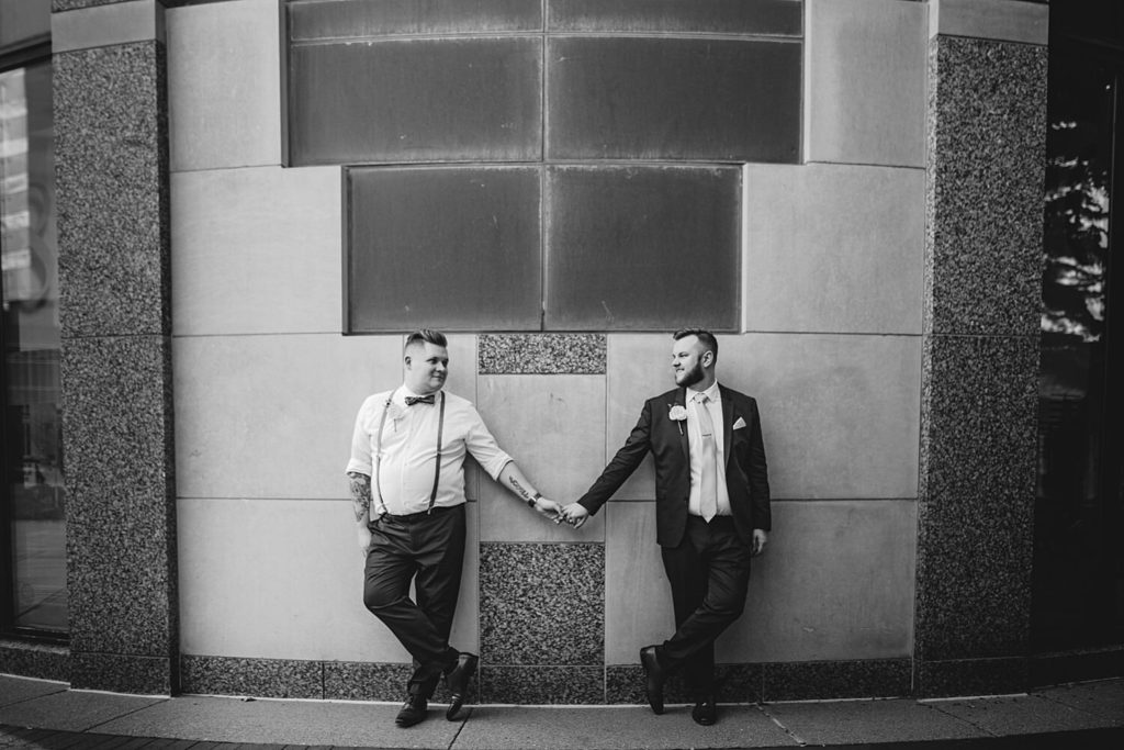
© ryaninman.com
Plan

Storyboard

Moodboard


Plan

Statement of intent
STATEMENT OF INTENT: Reflect and review your mind-map and mood-board AND produce a statement of intent that clearly defines how you wish to interpret the theme of COMMUNITY as a 30 sec animated film and digital image:
3 words: Love thy neighbour
A sentence: “Thou shalt love the Lord thy God with all thy heart, and with all thy soul, and with all thy mind. This is the first and great commandment. And the second is like unto it, Thou shalt love thy neighbour as thyself” (Matthew 22:37-39)
A paragraph: The LGTQ+ community has been oppressed by various communities about their beliefs and practices, one being Christians. This is disappointing to think about because Jesus says to “Love thy neighbour” in Matthew 22:37; love not judge. As personally being part of both communities, I have found a way to balance same sex attraction and The Kingdom of God, so I found it my duty to show to Christians the sort of hurt and anxiety they cause to people part of the LGTBQ+ community, remind them that they should not judge but love and help these people. Another example that Christians should remember to follow can be seen in John 7:53-8:11:
53 Then each of them went home, 1 while Jesus went to the Mount of Olives. 2Early in the morning he came again to the temple. All the people came to him and he sat down and began to teach them. 3The scribes and the Pharisees brought a woman who had been caught in adultery; and making her stand before all of them, 4they said to him, “Teacher, this woman was caught in the very act of committing adultery. 5Now in the law Moses commanded us to stone such women. Now what do you say?” 6They said this to test him, so that they might have some charge to bring against him. Jesus bent down and wrote with his finger on the ground. 7When they kept on questioning him, he straightened up and said to them, “Let anyone among you who is without sin be the first to throw a stone at her.” 8And once again he bent down and wrote on the ground. 9When they heard it, they went away, one by one, beginning with the elders; and Jesus was left alone with the woman standing before him. 10Jesus straightened up and said to her, “Woman, where are they? Has no one condemned you?” 11She said, “No one, sir.” And Jesus said, “Neither do I condemn you. Go your way, and from now on do not sin again.”
This powerfully shows that Christians should not condemn anyone but help them in faith and love.
For this film we are not trying to agree or disagree with the topic of “is homosexuality a sin” rather try and find a balance and peace between the 2 communities.
We will do this by having same sex actresses go into a church, read the Bible to show that they are helping each other in the faith, then when they make eye contact the film cuts to snaps of them running away from society and judgement; we did this to reveal that sometimes the pressure is so hard on these people that sometimes it feels like just giving up and running away to live your fantasy. We then will snap to riots to powerfully show to the viewer the kind of pressure the LGBTQ+ community faces. Finally, the film will go back to the actresses reading the verse “Love thy Neighbour” strongly recommending not to push either community away but helping them and direct them to the Father (God) instead of condemning them.
The zine
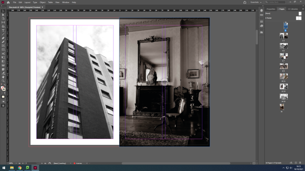
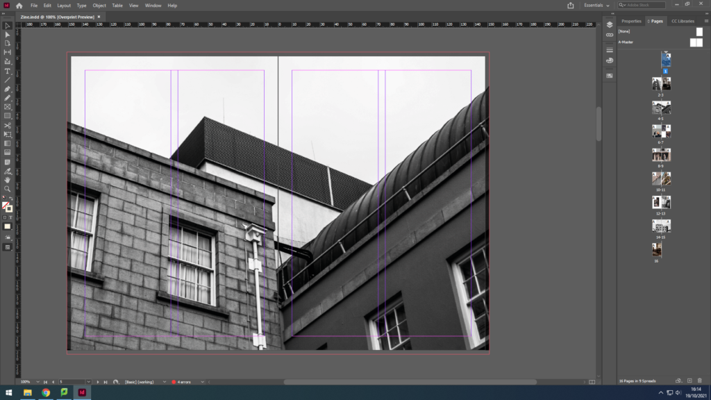
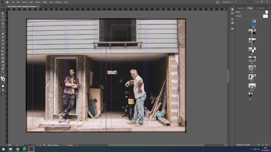
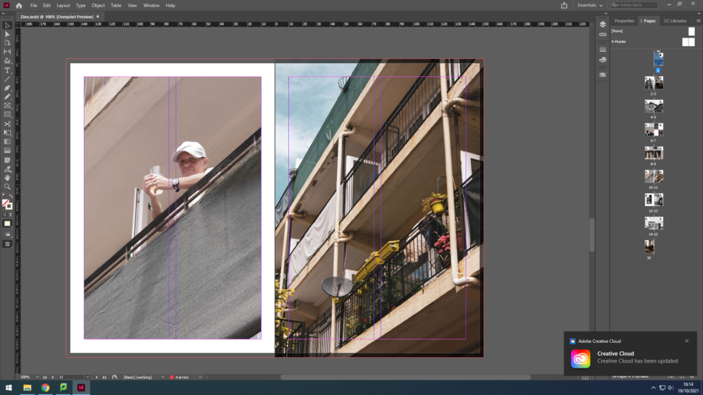
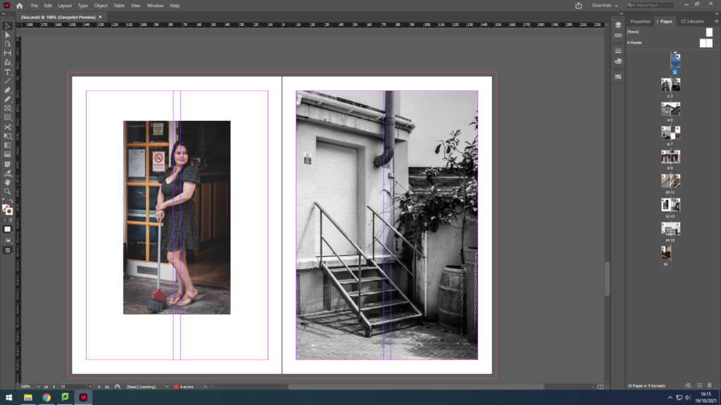
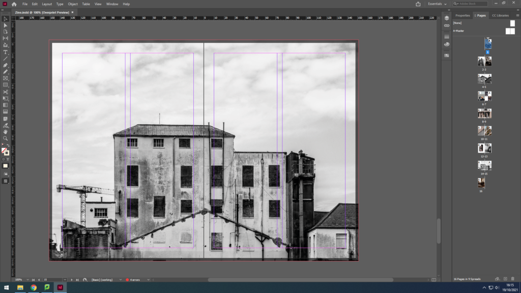
Due to printer issues, I was not able to print my zine successfully, so here is the zine in Adobe Design:



Evaluation
In conclusion, I believe my zine for identity and community powerfully portrays the different uniformity of the Jersey community. For example, I was able to capture the more elderly jersey community; a couple, a man waiting for his beloved, helping each other in love. I also captured the young generation; a young man fixing an automobile. To link the young and the wiser community together I have captured an adult man in his 50s in his garage fixing some items. These 3 examples can clearly show the successfulness of my zine for this project, for, not only does it juxtapose between the old and new generation, but it also makes sure to relate to the ways every individual is unique in their own way, such as, the photograph with the elderly couple gives a sense of unity, dependent on each other whereas the other images show a sense of individualism offering the idea that dependence is old-fashioned, and individualism is the new style.
Although, the zine also manages to illustrate other cultures. For instance, we can see a woman, dressed in black who has Asian heritage; she is standing outside the Gradees restaurant as an attempt to allow the residents to taste different foods from her culture like Half Roast Duckling with Orange sauce, which is a common dish in some lovely parts of Asia.
Therefore, we can understandably observe the prosperous of this zine on Identity and Community.
What are zines?
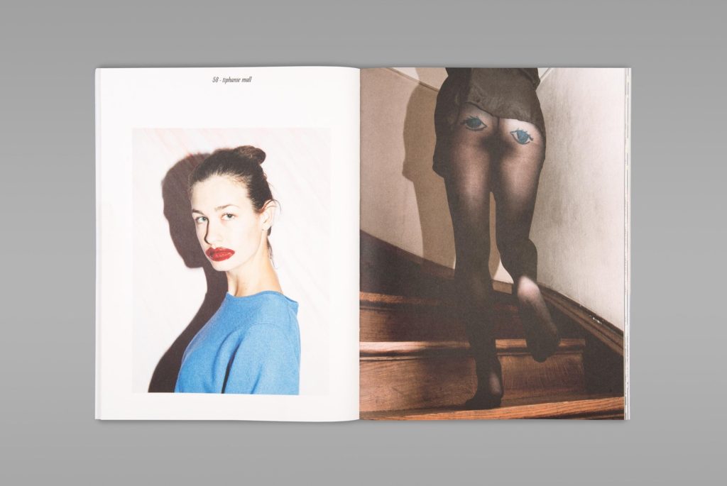
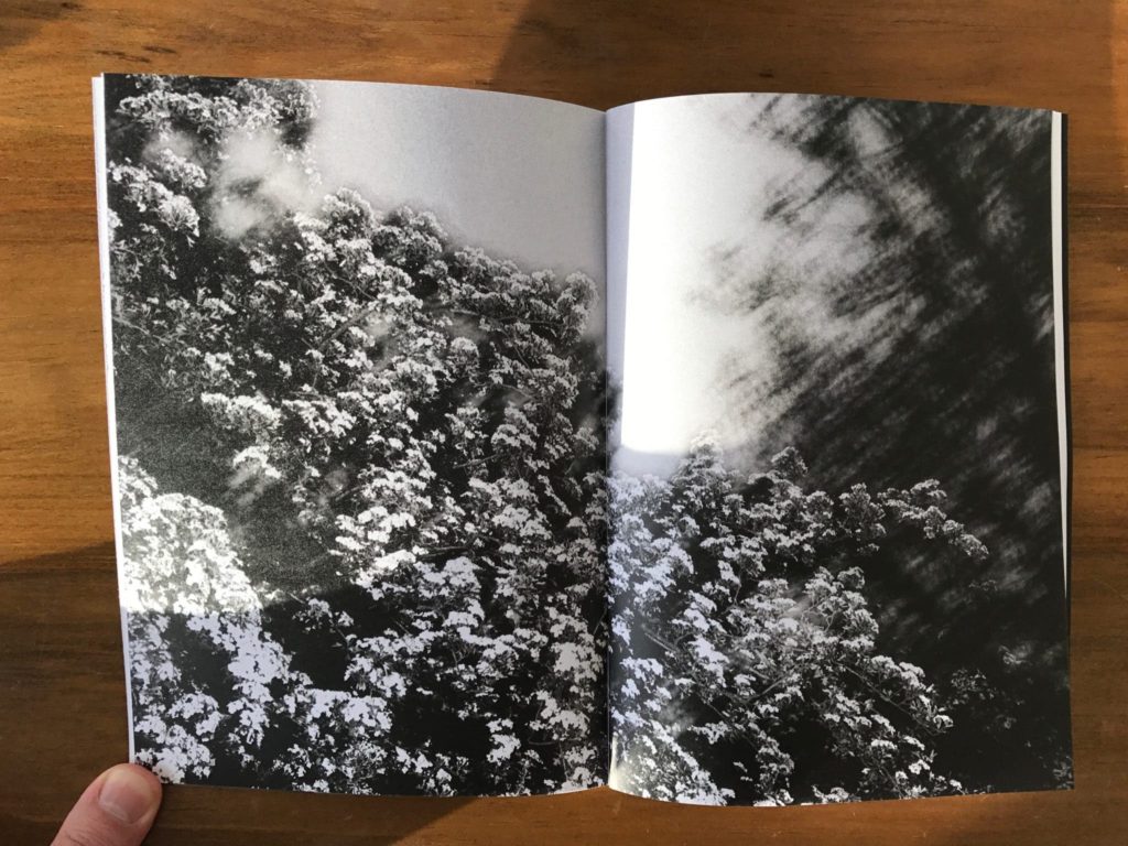
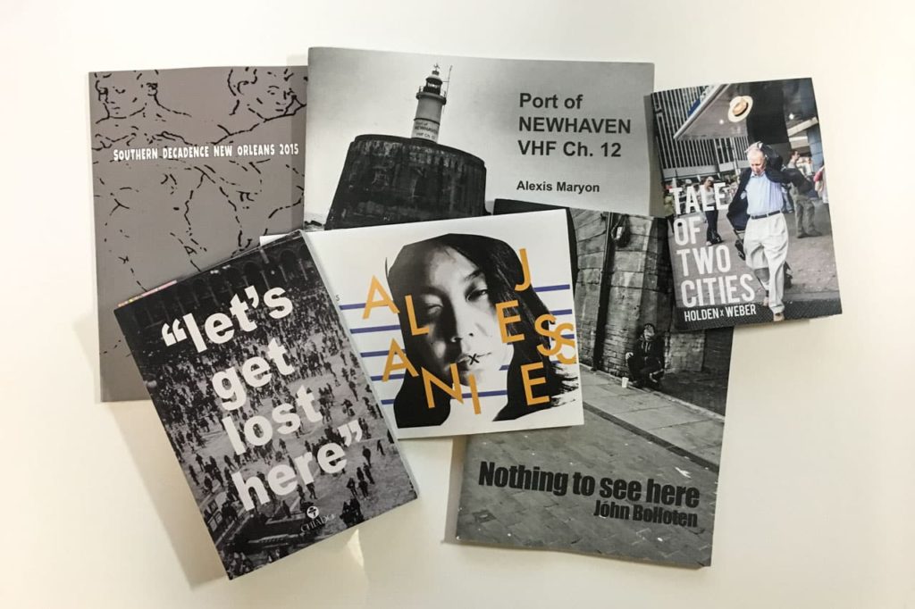
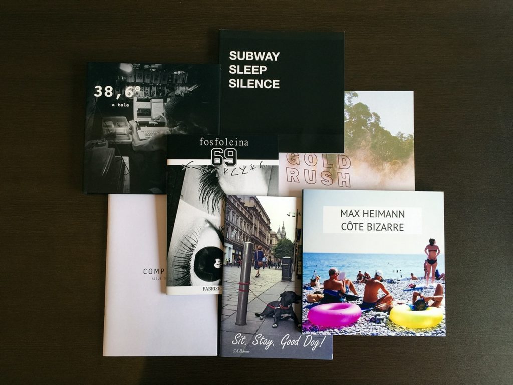
A zine is similar to a magazine; a series of images to present a project of choice in a physical manner.
It allows the artist to control and narrate their own story in the way they find best.
They may include writing but, commonly zines are quite empty in literature but are rich in emotion since an image speaks 1000 words.
The author has the ability to use visual stimuli to express a series of emotion and narrative.
Planning
For this project I will work in Microsoft InDesign since it allows for an easy make of zines.
Front and back cover:
Inside pages:
How I produced my Zine:
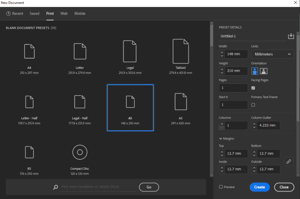
Firstly, I opened Adobe InDesign and selected the A5 pre-set which automatically creates the document in the right size:
I then started creating my main page with the bleed:
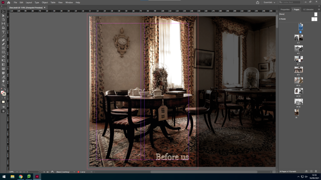
In order to achieve this I had to resize the original image on photoshop in to the right size so that it fits this frame perfectly, and creates a perfect bleed.
I then started inserting my images by creating an image box and going to file > place and selecting my images.
Often I’d select similar images and insert them in a 2 page layout. Such as:
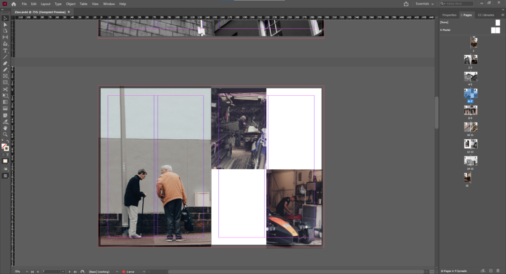
Here we can successfully see that I have selected the images which have the back of people’s heads and creatively placed them so that they relate in a way.
Similarly, I put the pictures that relate to a building together, for example:
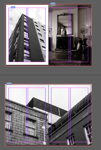
I kept adding images that relate together in my zine in order to formulate a type of story, such as: the community that came before us vs the new one all work together to make the present community.
Justification
I agree to a large extent that my zine making is successful, this is because the location of my images in the zine are aesthetically appealing to me and work towards telling a story. However, in my opinion the zine needs more pictures so this is something I will take into consideration when producing my next zine.
Archives
“Everyone today has a story; the world’s an archive.”
― Anne Rice, The Wolf Gift
An archive is a database with records holding the history of humanity. These include, books, certificates, photographs, items and more.
These records actually gives the current and future generations knowledge of previous events, what the world used to look like in the past in comparison to today. They may also provide context which helps us understand why a certain picture was taken, it provides reference points between information sources which improves our knowledge of the world and past.
The reason to looking back into the past is so we learn about various events but most importantly past mistakes so we do not repeat history.
Only nine months after it was initially published in the major centres of England and France, photography arrived in Jersey on May 9 of 1840.
It features 19th-century photographs by notable photographers such as William Collie, Charles Hugo, Thomas Sutton, and Henry Mullins. The collection includes collections from late-nineteenth-century studios by Jersey photographers such as Ernest Baudoux, Albert Smith, and Clarence Ouless.
In the 21st century, we have had a major photo-journalist, the Emile Guiton-archive archive, who’s an honorary curator and the founder of the Photo Archive of Société Jersiaise, which contains more than a thousand negative images by Dunham Percival.
Along with this, we got the chance to see Mullins’s portraits of Victorian islanders as preserved on the pages of his photograph albums, which served as a catalogue of clients for his professional
practice at the time.
Henry Mullins
Henry Mullins began his working at 230 regent Street, London in the 1840s. During this time he was part of the circle of photographic pioneers at the Royal Polytechnic Institute, Regent Street, London here the first photographic studio in Europe opened in 1941. Mullins then went to Guernsey in the summer of 1847 and ultimately moved to Jersey in 1848 and set up a studio called the Royal Saloon at the 7 Royal Square in St. Helier.
By 1849 he worked alone and began his work on Cartes de visite which translates to visiting cards. They were daguerreotype photographs which for Mullin, his subjects were people. He would take portraitures of family and their children. By the end of his life, he had created an album of at least 9,000 portraits of islanders between 1852 and 1873, Jersey population at the time was 55.00 therefore he managed to capture at least 16% of the population.
He was one of the most prolific photographers of the first generation of Jersey photographers in the mid-nineteenth century.
He ended up being the photographer of choice for leading members of Jersey society and successful local and immigrant families. It was common for his portraits to be printed on a visiting card which were commercial photographs created using egg whites to glue the photographic graphic chemicals to the paper. This is what a daguerreotype is. These cards were very small normally measuring 54×89 mm and commonly mounted on a piece of card measuring 64 by 100 mm. However, Mullin mounted his shots on an album.

Image analysis
Substance:
This image was taken in the 19th century by Henry Mullins.
Obviously, this is a daguerreotype; as mentioned above, “It was common for his portraits to be printed on a visiting card which were commercial photographs created using egg whites to glue the photographic graphic chemicals to the paper.”
It was taken to document the types of people in Jersey.
Composition:
Considering the image was taken in the 19th century, the composition of this image is quite amazing. For example, Mullins has successfully centred the subject. This suggests he used the rule of thirds to compose the image. This allows enough space for the subject to appear while revealing pieces of the background equally.
Evidently, the focal point of this image is the man. He appears to be important since he is wearing a uniform and uniforms were typical of someone of authority. Considering his dead stare, it may be argued he’s part of the military since they are normally serious. May be argued he’s a soldier since we see no medals.
Mise En Scène:
As mentioned in Composition:
We can successfully see Mullins has captured an image of someone of authority.
He’s dressed in uniform with buttons and a collar which usually suggest military.
His appearance is quite radiant but serious at the same time; having his eyes fixed on a specific point.
He appears to have a bag with him since there is a strap going over his chest.
Techniques:
This daguerreotype is a direct-positive procedure that creates a very detailed picture on a sheet of copper with a thin silver layer without the use of a negative. To fix the picture, the plate has been submerged in sodium thiosulfate or salt solution and subsequently toned with chloride gold.
Atmosphere:
This photograph makes me feel quite intimidated since he looks important.
This image also has me wondering who this man actually is, is he a soldier? Sergeant?
Lighting:
The lighting in this image is quite low due to the quality of the daguerreotype. However, it may be argued that artificial lighting was used since it was taken in a studio and only one part of his face us properly lit.
Obviously, there are dark tones in this image due to the process used.
Conclusion
In summary, I largely agree that we can really learn from prior photos. As noted earlier: “These records actually inform current and future generations of previous events about what the planet used to look like in the past. They can also provide a context which enables us to understand why a certain photograph has been shot, which provides points of reference between data sources that enhance our understanding of the world and the past.” In order to display the difference in classes we learned, for example.
Through his work we have also learned that everyone is human at the end of the day. His role, power and dressing are simply the only distinction between people.
In addition, it’s vital to look back at the past in order not to repeat past errors such as the holocaust but to learn about diverse events that have made humanity to where we are today.
On the other hand, I felt that photos and archives are vital for conveying a tale, for showing how people used to be and how we have thus far evolved.
Henry Mullins has led me to portray people from a range of professions for my own project. And to use film to generate an effect comparable to photographs of Mullins. I’ll take my time on vacations to Madeira (my place of birth), go to museums and possibly archives, and photograph Madeira and Jersey, since they have both shaped my identity.
Migrant history of Jersey
On the 7th of June 2021, Hautlieu Photography class got to take part in a visit to the Jersey museum where we were the last to see the exhibition: People Make Jersey.
During the exhibition we got to learn from a wide variety of topics the types of people in Jersey. For example, we got to learn about how French Protestants found refuge in Jersey since in 1572, the Massacre of St. Bartholomew, the Catholics killed thousands of Protestants. It wasn’t until 1598 that King Henry IV enable citizen rights to the Protestants, but by then they have found refuge in other places, such as Jersey. We can see the Protestants impact on the island nowadays since there are many protestant churches still running service, we have Jehovah’s witness’ still in operation and many of the older generation are Protestant and attend service.
I, personally, took interest in my own culture and managed to find a beautiful love story from 1930s – 40s. In 1930s, Edouard Alho came to Jersey from Madeira (my birth-place) to work as a waiter at the Merton hotel, he then became the head waiter. During World War 2, he went back to Portugal but came back in 1948 and got marry to a beautiful local girl named Betty. He then watched Jersey get back together, the Merton hotel become of the largest hotels in the channel islands. He then retired in 1984 after 50 years of service for the Merton.
In addition, we got to learn about how rich houses were structured back in the 20th century. For example, we got to learn about the drawing rooms: the drawing room was considered to be the heart of the home. This drawing room from the museum was made by a Jersey man, Mr Philippe Nicolle Senior. He used carpenters from his own shipyards to lay the beautiful wooden floors. They would also caulk the boards with tarred strings since they had experience from the deck of a ship.
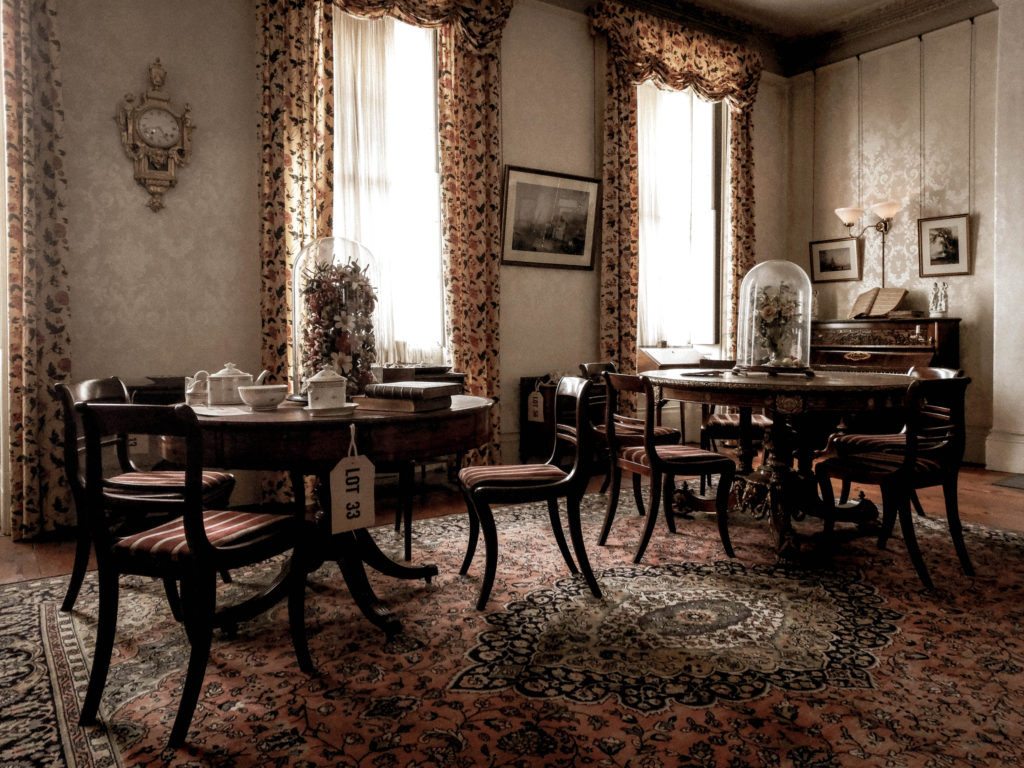
The Drawing Room
For his drawing room, Mr. Philippe was wise investing in the new gas system rather than oil in 1830. The family also beautifully decorated the room with luxury having wallpapers made by the renowned French manufacturer Jean Zuber & Co, established in 1797, maker of the finest hand blocked papers.
The residents also enjoyed music as you can clearly see by the upright piano with a large selection of sheet music housed in a charming burr walnut cabinet. As seen below:

Since our society used to be a patriarchal society, the ladies really appreciated the tables in which to do their needlework. The table includes tea or play-cards, an exceedingly ornate table made by the Hollands with the highest quality marquetry of mahogany, rosewood, satinwood and a manner of exotic woods, occasionally formed into portraits of famous artists of both the modern and ancient worlds.
To entertain the visitors, the room contained a perfect tea set made in the finest porcelain by the New Hall factory. Also, the paper Mache chair and japanned table are excellent examples of the New Hall factory. The chair, inlaid with mother of pearl, is in the latest London fashion.
As you can powerfully observe, we have learnt a lot from our trip to the museum. We learned about migration in Jersey, the contents of the finest rooms and how Jersey has changed over the years.
Therefore, the visit to the museum was very useful and inspirational.
Anthropocene
Anthropocene can eventually be regarded as an era in which people have had an enormous influence on the earth. Climate change, for example; atmospheric, air and ocean warming from fossil fuels. But human age is not just a change in the climate. It involves plastic pollution that has hit whole ecosystems.
In 2019, Climate activist Greta Thunberg (16) addresses the United Nations Climate Change Action Summit in New York City by saying:
“You have stolen my dreams and my childhood with your empty words. And yet I’m one of the lucky ones. People are suffering. People are dying. Entire ecosystems are collapsing. We are in the beginning of a mass extinction, and all you can talk about is money and fairy tales of eternal economic growth. How dare you!”
You could think, “How did we get there?” Greta tackled the key problem vigorously; covetousness. Man is greedy and seeks for his own want ever since the beginning of the time. Whether it’s land, money, oil, religion, revenge or more, our world’s selfish and clever race, man, is likely to be destroyed. Having said this, experts have indicated that, because of global warming, we have now seen 75% of species disappear, and that the level of sea has increased, leading to many deaths.
The elder generation is dying with our world, so that the damage inflicted by our predecessors might be resolved for our younger generation. Greta says, “
“This is all wrong. I shouldn’t be up here. I should be back in school on the other side of the ocean. Yet you all come to us young people for hope..”
This quote shows how unfair this is to all of the young people. Another important point she raises is:
“You say you hear us and that you understand the urgency. But no matter how sad and angry I am, I do not want to believe that. Because if you really understood the situation and still kept on failing to act, then you would be evil. And that I refuse to believe.”
This depicts successfully how powerful people do nothing. The Supreme Macists have used it as their attempt to populate Mars instead of using the billions (or possibly trillions of dollars) of renewable energy to resolve climate change or increase our defence against asteroids. The rich first go, because the rich most likely do. This already shows human egotism.
I hope you can see our initiative open-mindedly, grasp the risk and help us do something. What am I doing? What are you doing? I’m spreading awareness.
Planning and ideas
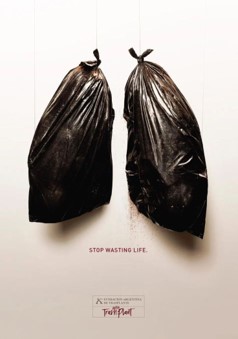

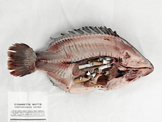

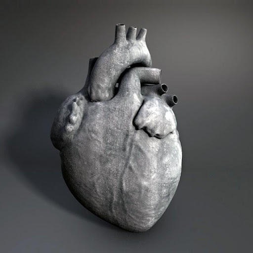
My purpose is to give my photographs with a message of danger and terror so that I become more conscious of climate change, Anthropocene, pollution and much more.
In order to accomplish so, I want to take photographs of dead fish, similar to the one above, with some plastic in them. I’ll do this to illustrate how our garbage, which we toss away, is “fine,” hurts and kills other species. I’m going to require a white and black backdrop to make Scott Laserow’s image of a fish with plastic on it, which is in black and white.
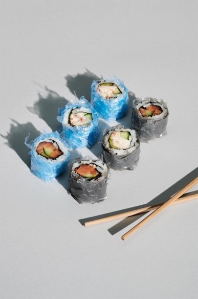
I will also try to reproduce the plastic sushi photos to represent how plastics has entered the food chain, leading to plastic consumption.
I have also thought about making a double exposure with my polaroid camera. This picture would show a twofold fire- and land exposure combined to raise awareness of climate change and how the fire danger in some kind of a natural environment has grown.
One of my thoughts was to take a cardiovascular picture. I plan from the market to acquire this heart. The photo would look like it was floating in a cow’s heart with a black or blank background. I aim to snap a shot with my heart and then add garbage slowly, plastic, paper, straws, etc. This is to attempt to send out the idea that if you or anybody wouldn’t let it to your heart, why would you? I can also make this heart a heart-fashioned earth by double exposure; double exposure enables me to keep the form and texture of the heart while the earth is overlaid.
My final plan is, for now, to photograph my 1930 box Brownie Junior n.2 and try to spoil the fire-fighting pic. Not everything, only enough to shoot a blazing image. This will generate a sense of worry as I damage the picture… But they might also assume that we do the same, not literally, for our world, but we think that it’s worth collecting our waste as someone takes it up, but who knows where that trash ends?
Location: The location for this photoshoot will most likely be at home due to easy accessibility. Since I’m doing a double exposure of land vs fire I will be clearly be shooting outside too.
Lighting: The lighting for this project will obviously be some parts natural and some artificial since I’m shooting both inside and outside.
I will choose to shoot during bright hours so that the Box Brownie can capture the scene in a successful way. Otherwise, I’ll try shooting with a slower shutter speed.
For the inside shooting, I will have to use my room lights, table light, phone light and natural lighting from the windows to powerfully capture the texture and structure of my objects while also creating some strong shadows.
Camera Setting: I plan to use Automatic mode for this shoot, since it’s faster, automatically chooses the best ISO, shutter-speed, and aperture which means my images will come out as clear as possible.
I may also try using other shooting modes like manual in order to demonstrate greater understanding and manoeuvre of the cameras.
For the polaroid camera I will attempt to use the double exposure mode to bring my ideas into reality.
Displaying my final ideas: My main plan to display my final ideas is to create a video with music, if this fails, I’ll try doing a virtual gallery through photoshop or create a VR gallery as usual. Although, I have done this enough times.
Artists
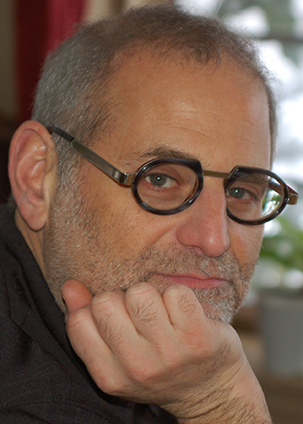
Scott Laserow
Scott Laserow has worked for over 30 years in the media sector and showcases his distinct and creative style in print media, online designs and animations. He won 75 significant national and international honours and was included in 60 publications in 48 shows covering 16 countries.
He has been a full-time professor of graphics and interactive design from foundation through graduate classes at the Tyler School of Art at Temple University in Philadelphia. Scott was the one responsible at school for introducing new technology and set up his own interactive curriculum, teaching identities and branding, animation, web design, digital apps and tablets and more.
He states that,
“In 2004, I discovered the power of the poster and how it could help support humanitarian causes throughout the world,”
That’s right because he has taken part in several causes. In many international magazines, for example, his posters were published in the cover of GRAPHIS posters in 2015. Now he is a judge for a large number of poster races.
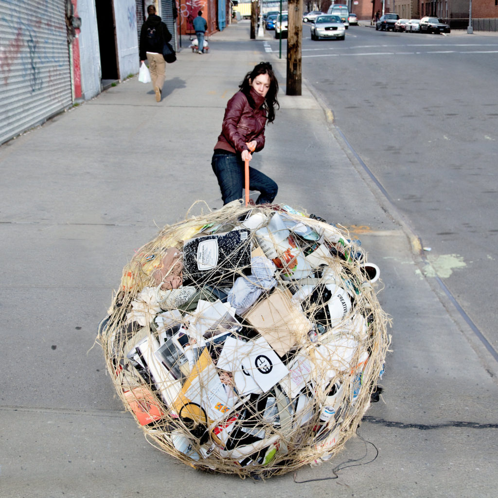
Mary Mattingly
Mary Mattingly is an activist of climate change and utilizes photography to communicate a message about topics such as sustainability and climate change and displacement via her work on portable building and sculptural ecosystems. An example of this is given in the above picture; the following answers are provided on your website:

We can clearly see here her efforts to encourage people not just to warn against environmental degradation, but to take care of the environment.
In her other projects, however, we are witnessing the vast majority of their labour under the weight of their possessions, refugees of a tainted past seeking a better future in the natural environment, we see how they try to build a better existence, and make easy and useful survival strategies.
Image Analysis

Scott Laserow
Substance:
We can assume that this image was originally in a digital format for the reason that it’s of higher quality than film.
The image was taken inside of a studio with a black background (which could be easily edited in).
This image was most likely a poster since Scott has worked in posters since 2004. This being said, the aim of this image was probably to tell a message about plastic pollution in the oceans. This can also be seen as protest art since it’s trying to bring our attention to how our own actions are impacting other beings, slowly destroying and suffocating them.
Composition:
The main focal point of this image is in fact the fish with plastic wrapped around it.
Author has powerfully used the rule of thirds to compose this image as the fish is positioned in the centre.
The main colours of this image are black and white tones. He purposely used the black and white technique to create this image to portray a sense of light vs dark and may also have used it to show the type of darkness our sea life are starting to live in, but the lighter tones may suggest a better future for our ecosystems if we take action now.
Lighting:
The light in this black and white image seems to be coming from the front as there are some shadows behind their head which could suggest that the light is indeed coming from the front. Evidently, the light seems to be artificial as the background is black and
There are soft shadows and dark tones throughout the image. For example, the bottom of the picture is darker than the top. The image is artificial, but the camera seems to have focused on the bright sides first as the image seems to be a bit naturally underexposed as there are soft lights and soft shadows throughout the image.
Techniques and editing: (evidently black and white filter or camera were used)
A fast shutter speed was powerfully used to produce this image as the subject (fish) has been shot to a razor-sharp focus.
The depth of field for this image appears to be quite large as most of the image is fixed. This was used to capture as most of the setting as possible while keeping a crisp detail to the image.
The artist may have purposely artificially underexposed the image to keep it in focus and so it isn’t too bright or too dark just the perfect tone.
The camera is still as this is a shot of a subject and all the details are in focus suggesting that the camera was stationary; a tripod was likely used.
Atmosphere:
The photograph makes me feel shocked at knowing that fish live and grow in this type of environment, all because of us and our toxic waste.
The photograph seems to be communicating a message of plastic pollution since the fish is half made of / covered with plastic. And, at the bottom it reads, “2/3 of the worlds fish suffer from plastic ingestion.”
My response to this image is shock and disgust due to the thought of, “how have we come to this?”
Response:
I will attempt to use the same black and white techniques to capture my shots to make it alike the original artist.
In order to incorporate elements into my own work I will need to make sure most or some of my subjects are of fish and there are elements of plastic throughout the images.
Similarly, Scott has influenced my shots by following his key theme which is the theme of Anthropocene. The alignment of subjects and set-up have also influenced my own future set of images.
I like this photograph since it portrays just exactly how dangerous plastic indigestion can be for our ecosystems and us since we have, at some point, eaten microplastics.

Mary Mattingly
Substance:
We may presume that this image was initially captured in digital format since it is higher quality than film, has a higher ISO, and is cleaner because film contains more dust particles than digital.
The image was taken outside with a street view.
According to Mary, the objective of this image is to assist her “avoid superfluous product purchases and use things for their entire useful life” as well as “measure my Ecological Footprint and identify ways to lessen it.”
Composition:
The key focus of this image is the woman carrying her own plastic waste around.
The author has effectively employed the rule of thirds to design this image, with the woman and the mound of garbage in the center.
The dominant colors in this image are grey and white; there are many other colors, such as green and blue, but the major ones are grey and white. This was most likely done to demonstrate how gloomy and dreary our planet has become as a result of our own garbage.
Similar to Scott’s image, the white could represent a hopeful future.
Lighting:
In this shot, the light is coming from above, effectively lighting the whole landscape. This allows the camera to focus more easily.
There are a variety of lighter tones across the image, which provides better illumination for the camera to concentrate on, resulting in a higher quality image that is precisely exposed.
Techniques and editing: (evidently black and white filter or camera were used)
A fast shutter speed was powerfully used to produce this image as the subject (fish) has been shot to a razor-sharp focus.
The depth of field for this image appears to be quite large as most of the image is fixed and there is a wide show of scene. This was used to capture as most of the setting as possible while keeping a crisp detail to the image.
The artist may have strongly used editing technology like Lightroom to energetically adjust the photograph to its perfect brilliance
A tripod was visibly used since there is 0 to no shake in the image which would be difficult to do with just holding the camera, unless a fast enough shutter-speed was used.
Atmosphere:
This image makes me wonder how much litter a single person is capable of making in a couple of months. Also, I feel fairly forewarned and motivated to take better care of our environment and, most likely, to begin recycling more, since there are several objects that might be turned into something new while effectively decreasing hazardous waste.
Response:
I plan to employ a similar strategy to Mary in order to educate people about the corruption and degeneration of our ecosystems, as well as to propose easy solutions that will motivate them to alter little behaviors that will have a big influence one day.
I will incorporate elements of plastic in my images so that it makes it easier to show how this artist has inspired me.
I appreciate this shot because it enlightens us on how much people have changed the environment in order to make our lives simpler, but in doing so, we have made it more difficult for ourselves.
Comparing Scott and Mary’s images
Scott:
What their work have in common:
Mary:
Additional artists
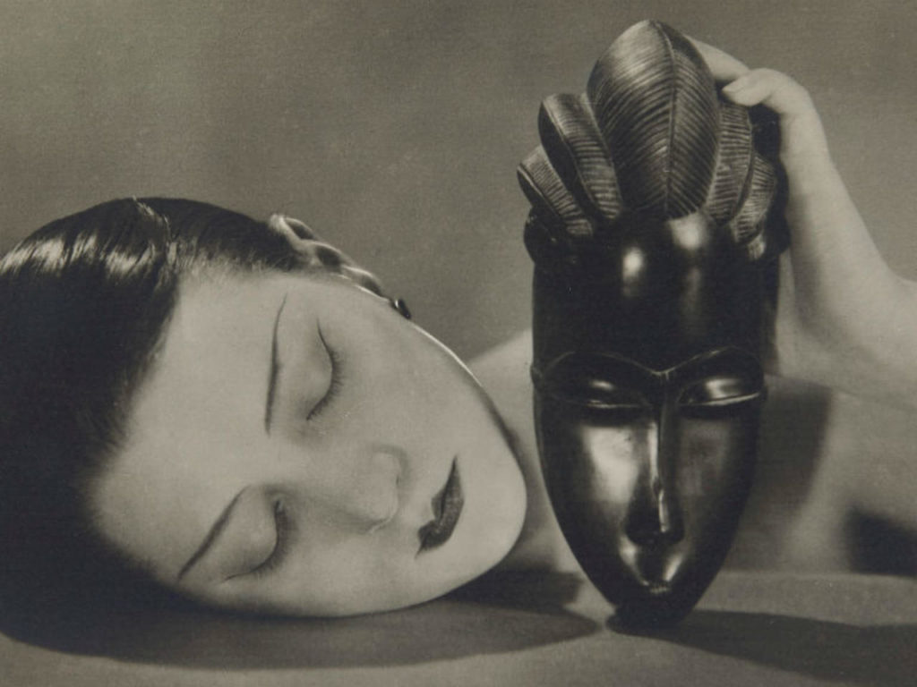
Man ray
Man ray was a famous photographer who explored surrealism and had a huge impact on the DADA and surrealist movement.
He was most known for, as stated above, surrealistic photographs to which he called “rayographs”, which makes reference to his name.
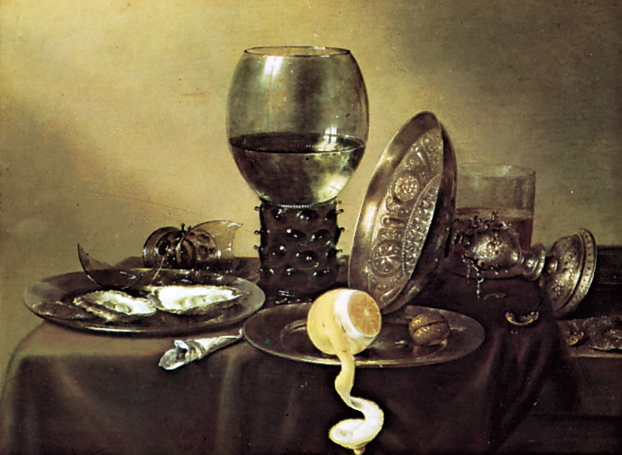
Willem Claesz Heda
Willem Claesz Heda was a Dutch, golden age artist who explored still life art / vanitas.
Vanitas used to be quite dull, as they were usually monochrome.
Through Vanitas, artists would represent great power and wealth, as the art would contain only a few objects like a skull, fruit, books. However, as time went by, Vanitas began to lighten the mood, the palettes became more diverse. Objects were often tumbled together, suggesting the conditional overthrow of the achievements they represent.
Contact sheets


Final Outcomes
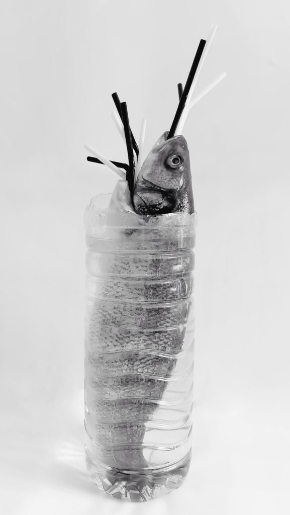
Fish plant
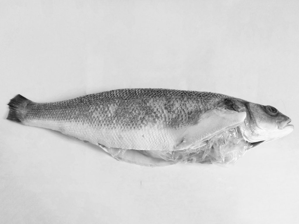
Fish’s diet
These are my favourite outcomes as they strongly matched my imagination of what I wanted these images to look like.
The first is an image of a fish, with plastic straws, in a plastic bottle filled with water. This was done to look like some sort of surrealistic plant; the bottle is the vase, the fish is the plant and the straws are the flowers, hence the name, “Fish plant”.
In a similar manner, the second image is of a fish with plastic coming out of its stomach. To which I gave the name of “Fish’s diet”.
These were done to indicate to the viewer that the plastic we throw away starts becoming part of sea life’s diet which ultimately kills them as they can’t digest plastic.
Furthermore, these photographs were shot to depict the concept of the Anthropocene; human effect on the environment. This is intimately related to the Anthropocene since it demonstrates human effect on other eco-systems.
Props, models, and composition are clearly used in these image sets. For example, I’ve placed the topics in the centre to direct the viewer’s attention to the problem first.
I’m hoping that by sharing these photographs, others may be inspired to take better care of their plastic waste.
Relation to my key artists:
Similarity / Relations:
Difference / own adaptation:

Plastic diet
This image was created to show how microplastics are starting to become part of our food chain since “2/3 of the worlds fish suffer from plastic ingestion.”
You may notice this image is one of the only ones with colour, this was purposely done to show an example of the different types of plastic that we could be eating without knowing. It was also done to differentiate from the monochromatic theme inspired by Scott Laserow and have some relation to Mary since she uses colour in most of her projects.
Relation to my key artists:
Similarity / Relations:
Difference / own adaptation:
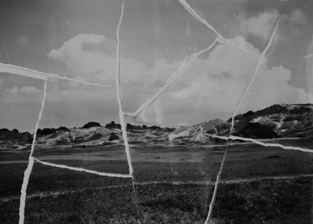
Irreversible

Never the same
These images were actually taken with a Box brownie jr. 2 (1930).
These 2 images above were created to show 2 things:
Relation to my key artists:
Similarity / Relations:
Difference / own adaptation:
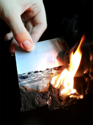
End of an era…
I chose the title “End of an era…” since people are, in a sense, putting an end to our planet. With sea levels and greenhouse gas emissions growing, only God knows how long we will be on this planet. This is also evident in the image, which depicts a gorgeous landscape photograph being torched by a person, reinforcing the idea that people are ruining the environment.
In some ways, the repercussions of global warming can be seen in this image, as the fire is burning the photograph and, as a result of global warming, we are seeing more fire breakouts worldwide. Here is an example of the harm done in Australia 2020:
“As of 14 January 2020, 18.626 million hectares (46.03 million acres) was burnt or is burning across all Australian states and territories. … In New South Wales, the fires burnt through more land than any other blazes in the past 25 years, in addition to being the state’s worst bushfire season on record.”
Wikipedia
The image also features an individual clutching the burning picture, which was done to communicate a sense of concern to the spectator; not only because the picture is burning (since developing the film and printing the image is extremely expensive and time consuming), but also because the viewer can see the flames moving closer to the human’s fingers, which may burn them. This might imply that humans are the ones causing damage to the planet but they will one day suffer because of it.
However, the use of ellipsis was used to demonstrate that THIS DOES NOT HAVE TO BE THE END; there is still hope for humankind by doing simple things like not driving as much to cut pollution.
Relation to my key artists:
Similarity / Relations:
Difference / own adaptation:
Editing


The editing for these photographs was primarily done by hand. The fish with plastic, for example, were all made by hand. My photographs were captured with my Samsung A80 48 megapixel 3D camera (better at increasing depth of images). And, owing to Samsung’s innovative image processing software, the camera was able to take a single image and alter it with several filters all on its own. As a result, I picked the black and white photograph as the best. It also fits with the Anthropocene idea.
I’ve also used editing software like Snapseed to remove some dirt and lines from the backgrounds of my photographs to make them seem clearer, and I’ve used the perspective tool to modify the angle of my products and subjects to centre them, which could be done to implement the rule of thirds. I’ve used Photoshop to resize my photographs, and I’ve used the healing + duplicating tool to smooth out the background on my photographs. I utilized Samsung Gallery’s editing tools to convert my photographs to monochrome since it has a stronger monochrome filter than other applications, which makes them seem fairly grey and high in contrast.
Furthermore, another man-made image alteration was attempted with the “End of an era…” image, but owing to the DSLR’s inability to concentrate on other things other than the fire, I wasn’t able to record a wide range of photographs of one of my photographs of the Sand dunes burning. As a result, I discovered Photofunia, a website that edited the fire for me.
Presentation
Final Evaluation
To be honest, I am really thrilled about sharing with you this initiative and helping to open your eyes to the reality we all claim to conceal or ignore.
My favourite photographs are the “Fish Plant”, the “End of an era…” and “Fish’s diet” since they fit with my imagination, are excellent quality and strongly connected with the topic of Anthropocene/human environmental influence and are pretty weird and artistic.
On the other hand, for different reasons, the further pictures made for this project did not prevail. For example, the contrasts are rather deeper, not so strange as the triumphant results, are really low in quality and, in my opinion, rather difficult to look at. However, they achieve their goal by sending the word of human effect to biodiversity, biophysical habitats and other resources.
The presentation of my images was a remarkable and unusual method to show my pictures in a new and original way. Since I used VR galleries for some time, it has changed. For I used Canva to make this movie, the music was free to use. In addition, I have used the Anthropocene topic in the YouTube video presentation to encourage the public to look after our planet better and therefore make a connection between Mary and I.
Finally, I accept this assignment to some extent and my final results were successful in achieving their major objective.
The New Topographics

Topographics was a term used by William Jenkins during 1975 as a word to describe a group of American photographers whose shots had an identical but clever aesthetic; they were monochrome, orthodox of urban / industrial landscapes in an attempt to show how humans have shaped the land. These photographers included: Robert Adams, Lewis Baltz, Bernd Becher and Hilla Becher.
Urban landscape was/is used to show an increase in population living in an urban / man built settlements. It is known as “the art of visual and structural integration of a set of buildings, streets and places that form the urban environment ” which aims to present a sense of scenery of man made settlements.
This type of photography powerfully illustrates how man have affected the Earth and evolutionized the land ourselves with earthly elements such as iron to build infrastructures. It can also serve as a way to show how we are polluting our own planet, created for our benefit; being destroyed by its own elements; science has shown that noble gases, which have been increased by engine working, have effected the ozone layer.
Stephen Shore
Stephen Shore is a famous photographer who has been widely known for over 45 years and the first living photographer to have a one-man show at the Metropolitan Museum of Art in New York, after Alfred Stiegliz.
In the 1970s he inspired many photographers in colour photography and in the use of the view camera for documentary work.
In his letter to a young artist, he states that he’s been teaching at Bard College for more than 20 years and has had the “opportunity to meet graduate students at several institutions over the years.”
He also states that he believes “art is made to explore the world and the culture, to explore the chosen medium, to explore one’s self.”
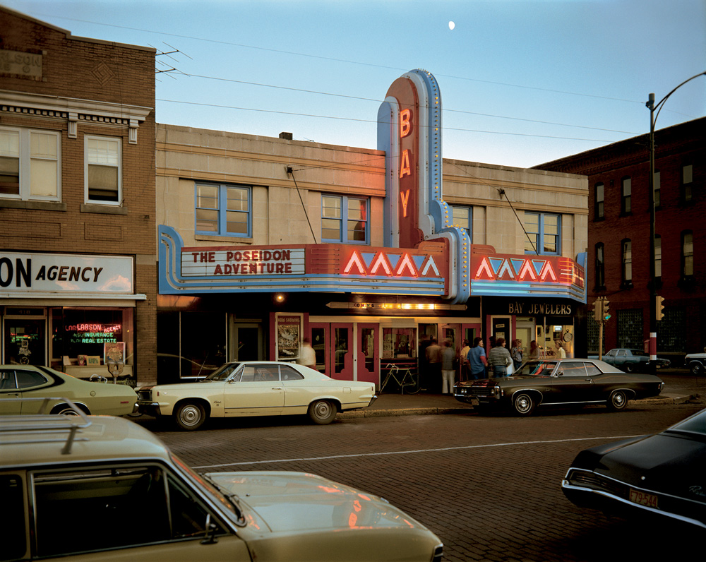
Image Analysis
Light:
The brightest part of the image is clearly the sky as it’s naturally illuminated by the sun, then the sign which grabs the viewers / habitant’s attention.
There are dark shadows and tones suggesting
The background is a bit of sky which shows natural lighting being used coming from behind. Also, since there is a 1/3 of the image containing a natural setting / environment it could show how man made structures have taken over the natural environment.
Space:
There is an ideal dream of 3D space in this 2D picture because of the monocular profundity signals utilized and caught by the photographic artist.
Texture:
The surface of these buildings feel damaged. I know this because there are a few cracks which could show how humans are breaking the natural environment. The texture of the rest of the objects in the image feel metallic, cold,
Lines / Binocular and monocular depth cues:
There is evidence of repetition of angular, vertical and horizontal lines in this industrial image in order to create a perception of height.
There is a strong variety of occlusion which creates and helps us perceive this as a 3D image. Height in plane also plays a role in this image showing that bigger objects must be closer to “us” and smaller objects must be further away creating a 3D illusion.
Shape and form:
This image has various shapes due to the urban context. For example, there are rectangular and circular shapes suggesting an industrialised environment as these shapes aren’t very common in nature. There are also triangular shapes along the lit sign showing the same thing.
There is also depth in this image as well as height and width adding to the 3D form in this 2D image. For example, relative size, occlusion, cast shadows and interposition all play a role in helping us perceive this image to be 3D.
Colour:
There is a vast amount of colour in this image spanning past the primary colours. These colours include, blue, red, yellow, brown, black, grey and more. In contrast to Ansel Adams we can clearly see a development in cameras as well as the environments.
The bright primary colours would suggest how bright and amazing this “new man-made world” is but the dark tones could also show the sinister background of such places as some towns were built by slaves.
Planning
Contents:
For this project, my main goal is to capture an urban area in the most artistic and creative way as I possible can. This will include pictures of town, building, etc, except cars.
Location:
My location will be focused around town and Fort Regent as those are the most industrialised and well known areas. I will have a go at capturing other places in order to get a vast majority of photographs and stand out.
Lighting:
For this shoot, I will be able to clearly use natural lighting since it’s an outdoor
shoot plus, it permits my pictures to seem natural and permits ME to capture the
natural scene of the land.
Camera Setting:
For this project I’ll set the ISO to a hundred since the weather seems to be sunny with the shutter speed at 1/500 so as to let enough light-weight in.
I may conjointly set the camera to automatic mode in order that the camera determines all aspects of exposure, choosing exposure parameters in keeping with the appliance at intervals the constraints of correct exposure, in conjunction with exposure, aperture, focusing, light-weight metering, white balance, and equivalent sensitivity.
Contact sheets
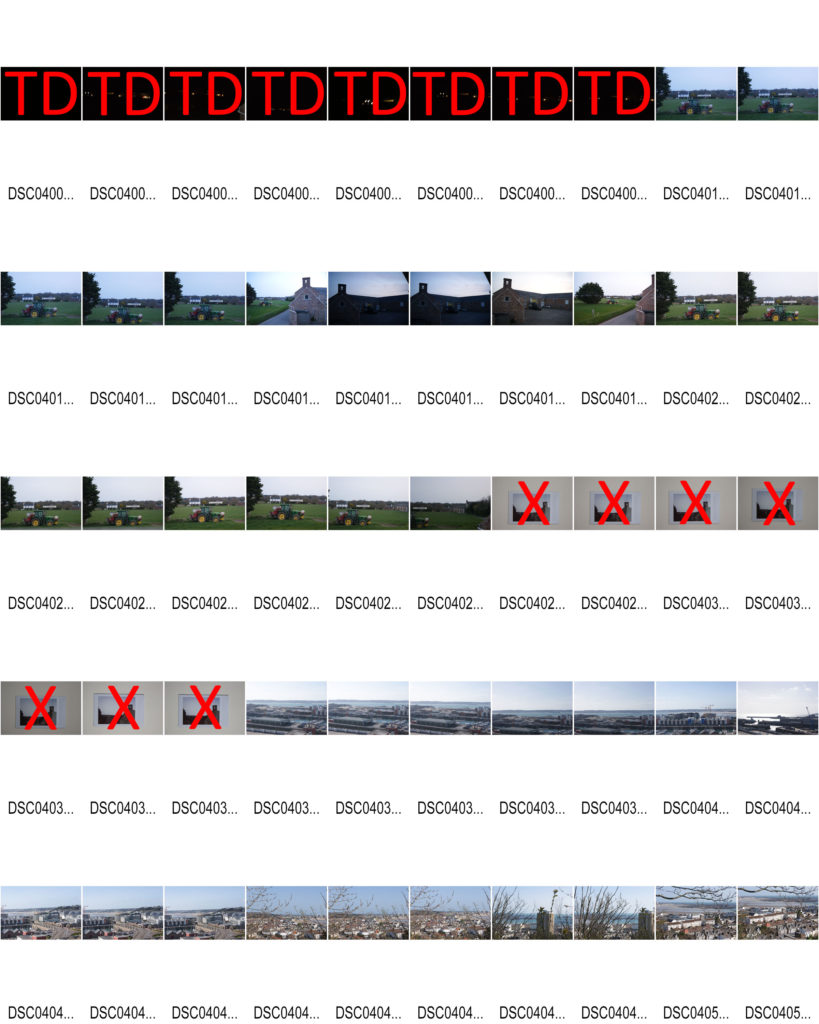
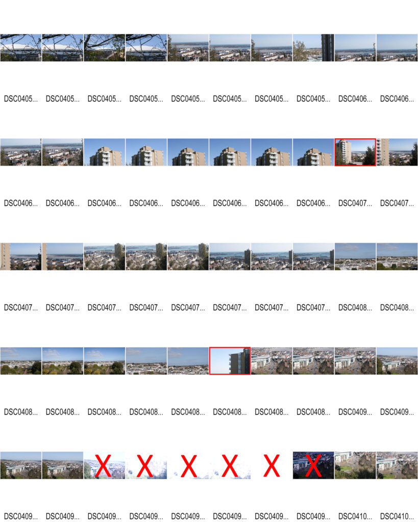
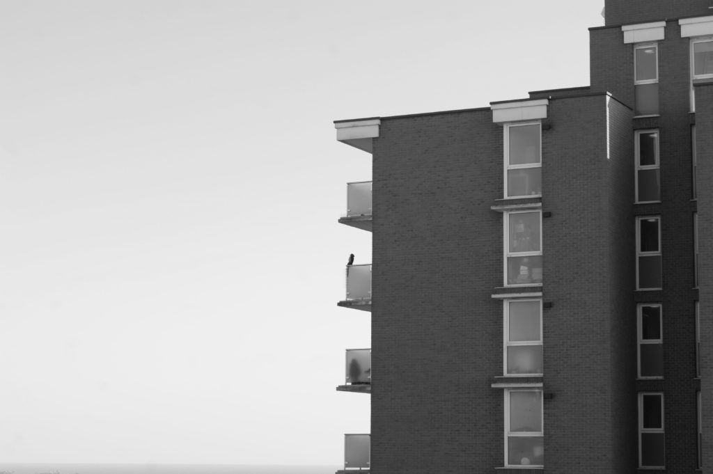
Sat by the balcony
I have decided to call this image “Sat by the balcony” due to the fact the owl statue creates an illusion that someone or something is sat on the balcony.
For this image I used the cameras auto focus and auto mode in order for a quick and automatic shot with perfect ISO, Aperture and shutterspeed.
The image is in black and white due to the aesthetic and message portrayed in this whole Landscape topic; industrialization appears to be ruining nature turning white trees darker for example. Therefore, I am attempting to create the same effect but with urban landscapes.
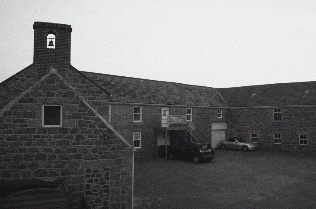
By the bell
For this image, I used the camera’s autofocus and auto mode to shoot quickly and automatically with perfect ISO, aperture and shutter speed.
The image is black and white due to the beauty and information displayed in the entire landscape theme. For example, industrialization seems to be destroying nature by blackening the white trees. Therefore, I tried to create the same effect with the urban landscape.
I have tried to use the rule of thirds to compose the image and make it more intriguing to the viewer.
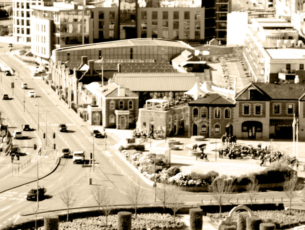
2021 but 1960
For this image, I used the camera’s autofocus and auto mode to quickly and automatically shoot with perfect ISO, aperture, and shutter speed.
Due to the beauty and information displayed throughout the landscape theme, the images are vintage related to past images and the era when Shore was born (20th century). Also, 1960 was one of my favourite eras and this filter is perfect for the first project on urban landscapes.
I tried to use the rule of thirds to compose the image and make it more attractive to the public.
In my opinion, this project was average. This is because there is powerful use of lines, composition, lightening, selection and imagery. But there is little to no manual work as most was done by the Auto mode.
I really do like the image that gives a 60s vibe as it’s my favourite epoch where most of the industrialization has already taken place. I think it is successful in a way as it shows the audience the present time but gives a retro feeling. This may also be said to create a juxtaposition or as I like to call it a paradox; “past” and present in one image sort of contradicting each other.
The black and white images add to the vintage theme but are also aesthetically pleasing as for the first image we have the building on one side and the sky on the next which powerfully shows the use of the rule of three and makes it pleasing and peaceful to look at.
In conclusion, although my images may be successful I agree to a certain extent I need to use more of the manual mode, see what ISO, shutter speed and aperture work best in different lighting and settings and apply it to future projects since most of the images came out underexposed or over exposed which limited my selection of images drastically.
Double Exposure
Melissa Bissel
Melissa Bissel (bottom left) is an in-home documentary and lifestyle photographer who lives in Massachusetts. She states in her blog, “I take seriously the privilege of being welcomed into your home as your family documentarian. Together we will capture the memories of what makes you, your family and the life you have created together, its very own kind of special.”
She has experimented with double exposure as shown on the top right.
Double exposure is the art of immerging two or more images and creating an overlay to create different abstract and creative images. Most artists use Photoshop for this art form as they are able to use blending, opacity and exposure levels to properly adjust each overlay.
Melissa clearly has explored this theme as her project powerfully show evidence that some layers are clearer than the others.
Planning


Contact sheets


This is my favourite outcome, I have called it “Madness” as it powerfully depicts different emotions; one is still, calm, the other is laughing and the other one seems to be between laughing and crying, sort of like the Pseudobulbar affect.
I have chosen this image as my final outcomes because it successfully relates to the mood board and Melissa as both our models are female; the image is in black and white and there is at least 3 evidences of multi-exposure.
This image was taken using a Sony Alpha 380 DLSR.
It was taken using 100 ISO and a 1/160 shutter speed.
These images were shot using 2-point lighting; one to the side of the subject and one facing the background in order to clarify, lighten and remove any shadows on the picture.
It has been edited using Snapseed and photoshop in order to:
•Sharpen and increase details so the image is clear.
•Turn the image in to black and white.
•Create the double exposure
Naturalistic Landscape
What is a landscape?
Landscape photography is an art form which focuses on areas of land and how they interact with natural/man-made structures. It includes things like the mountains, hills, rivers, vegetation, architecture, weather like lighting, sunny and rainy, and so much more.
Photographing landscapes is very important since landscapes are prone to evolution; the land we see now may not have looked the same 50 years ago. This can have a relation to memory and enable us to reflect on the past and remember our ancestors or how life used to be back then.
Ansel adams
Ansel Adams was born in the 20th February 1902 and sadly passed away April 22nd, 1984. As a child Adams was always into art; he taught himself how to play the piano at the age of 12. He then started taking lessons and looked to pursue music. Evidently, Adams was always very artistic. In the end, he gave up his love for music and aimed to pursue another passion of his, photography.
Adams grew up in a house in the middle of the sand dunes of the Golden Gate. This seemed to have influenced his love for nature as he started to take photographs with a Kodak no. 1 Box and would go out to hike, explore and climb just to take a photograph that matched his visual mind/imagination. For example, he once hiked with his friends up a stiff dome just to take this amazing photograph in 1927:

After this picture was taken in Adam’s first High Trip, he met Albert M. Bender who influenced Ansel a lot and began the preparation and publication of Adam’s first portfolio; Parmelian Prints of the High Sierras.

Image analysis
Light:
The brightest part of the image is obviously the snow since it is white.
The background is dark black since the artist has experimented with different exposures to match what he wanted the image to look like.
This photograph contains natural lighting and seems to be coming from behind since it is successfully lighting the whole scene.
Space:
There is a perfect illusion of 3D space in this 2D image due to the monocular depth-cues used and captured by the photographer.
Texture:
The surface of this mountain is rocky, hard and cold. The rocky parts of the mountain may be used for climbing. The smooth surface of the snow reflects light, adding sparkle and making the photograph more appealing.
Lines:
There is a common repetition of vertical lines in this natural image communicating a sense of height since they extend upwards towards the sky. In this photograph, vertical lines may suggest danger and adventure since Adams did have to hike up this mountain to capture this image. For religious people the vertical lines could be linked with spirituality, our soul rising towards the heavens once we die which relates to Ansel Adam’s work since the image is black and white which is commonly linked to death.
There is a slight curve by the left side of the mountain (<) successfully leading the eye to the top of the mountain making it the main focal point.
Shape and form:
This image has an organic shape since it’s an image taken in nature and also it is irregular and asymmetrical.
There are various shapes you can see in this image such as: a cuboid which makes the mountain making it seem like an old book and triangles making the points.
There is also depth in this image as well as height and width adding to the 3D form in this 2D image. For example, relative size, occlusion, cast shadows and interposition all play a role in helping us perceive this image to be 3D.
Colour:
The brightness of the colours found in this image are dark which suggests a lack or use of dim natural lighting, as in afternoon. The dark colours may also convey a sense of cold and mystery.
The intensity of the colours are pretty dull creating a serious atmosphere. In this image the artist has captured the seriousness of the scene with dull, grey imagery.
Planning
Contents:
I will attempt to capture natural areas of Jersey such as Queen’s valley.
Location:
As mentioned above, the location will be primarily around Queen’s valley
since its a large environment with different kinds of views and aesthetic.
Lighting:
For this shoot, I will clearly use natural lighting since it’s an outside
shoot plus, it allows my images to look natural and allows me to capture the
natural scene of the land.
Camera settings:
For this project I may set the
ISO to 100 since the weather appears to be sunny with the shutter speed at
1/500 in order to let enough light in.
I may also set the camera to
automatic mode so that the camera determines all aspects of exposure, selecting
exposure parameters consistent with the appliance at intervals the constraints
of correct exposure, together with exposure, aperture, focusing, light-weight
metering, white balance, and equivalent sensitivity.
Contact sheets


Tree Blend
This is one of my final outcomes and it’s called Tree Blend because there is a branch in the middle of this photograph which blends with the reservoir.
It was taken using a Fujifilm instax mini 90 NEO CLASSIC with a coloured polaroid.
In order to put the polaroid on the blog, I had to “scan” it with my Sony Alpha 380, clearly edited the “scanned” polaroid with Lightroom and photoshop in order to make it monochrome and look quite old so that it is easier to relate to the key artist.
In comparison to Ansel Adams, both our shots are in black and white, there is a strong balance between the black and white tones and both our images are both of natural landscapes.
However, Ansel Adams used a film camera whereas I used a polaroid and DSLR camera. In addition, his photographs are sharper than mine as his film was most likely professionally scanned.

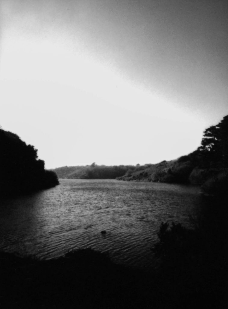
This outcome was taken employing a Fujifilm instax mini ninety modern CLASSIC with a coloured film.
In order to place the film on the web log, I had to “scan” it with my Sony Alpha 380, clearly altered the “scanned” film with Lightroom and photoshop so as to form it monochrome and appearance quite recent in order that it’s easier to relate to the key creator.
In comparison to Ansel Adams, each our shots are in black and white, there’s a robust balance between the black and white tones and each our pictures are each of natural landscapes.
However, Ansel Adams used a film camera whereas I used a polaroid and DSLR camera. Additionally, his images are swindler than mine as his film was possibly professionally scanned.

This shot was used a DSLR. In contrast to Ansel Adams, our images is are black and white, with a strong balance between the black and white tones, and each of our images is of natural landscapes.
However, my shot is evidently framed differently as it is circular to represent the earth. Apart from that I think this image is a successful outcome inspired by Ansel Adams.
Lastly, I agree to a large extent that I have powerfully managed to create my own photographs inspired by Ansel Adams.
To capture a greater essence of the time period and kind of camera Adam’s has used, I decided to take 2 photographs in film (polaroid) format. Although it isn’t the same type of film Ansel used it served and gave my outcomes this vintage look which matched my inner view of the outcomes (what I have imagined the photographs to look like). In addition, as explained above: images are in black and white, with a powerful balance between the black and white tones, and every of our pictures is of natural landscapes.
Nevertheless, my images are evidently of different types of landscape; Ansel Adams looked at the mountainous kind of landscapes whereas I had to adapt to my own environment but still managed to create a few mountainous illusions as shown in outcome 1. Again, as mentioned above, the main differences are that However, some of my shots are manifestly framed otherwise because it is circular to represent the world and “Ansel Adams used a film camera whereas I used a polaroid and DSLR camera. Additionally, his images are swindler than mine as his film was possibly professionally scanned.”