All posts by Sophie M

Filters

Author:
Category:

The Formal Elements – Paper

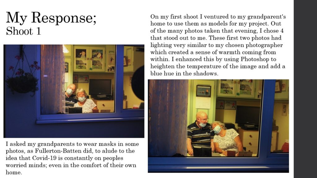
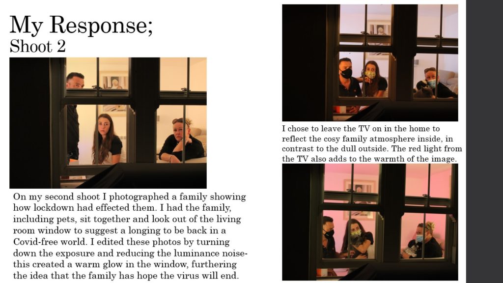
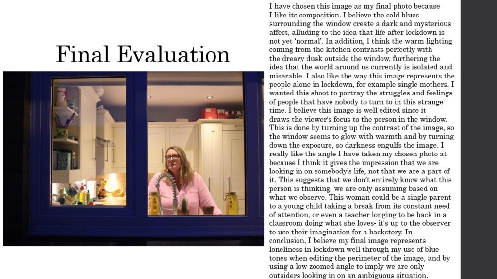
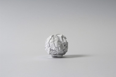
In class this week we experimented with abstract photography by using our phones to photograph paper in different ways. I was inspired by photographers such as Martin Creed, who took a photo of some A4 paper crumpled into a ball to connote the disappointment of things not going to plan.

work illustration
Martin Creed | Work No.88

I was inspired by Creed’s impreciseness of subject and I wanted to create images without an exact form so they could be ambiguous to the observer. Nevertheless, I also wanted to photograph the different shapes and structures paper could make. I did this by ripping, folding, crumpling and bending the paper to create a range of images that symbolized different things.

Contact Sheets

Paper Experimentation

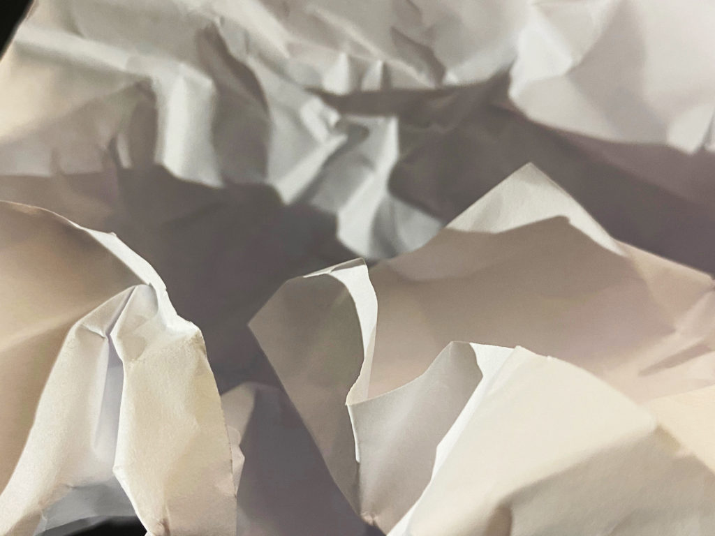
I really enjoyed the ambiguity of this image I took, I believe it shows the paper in an abstract way so it is hard to tell whether it’s paper at all. I took this close up shot of some crumpled up paper in hopes to create an image to represent ice, glaciers and icebergs. I believe I achieved this through my use of harsh lighting to create dramatic highlights with some mid-tone shadows. I edited this image on photoshop by increasing the exposure to give a brighter impression, and by sharpening the edges to reflect the crisp white colour palette of the photo. Similarly, I increased the contrast of the image to intensify the rough texture and acute lines of the paper.

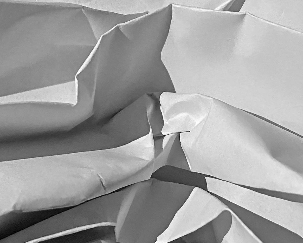
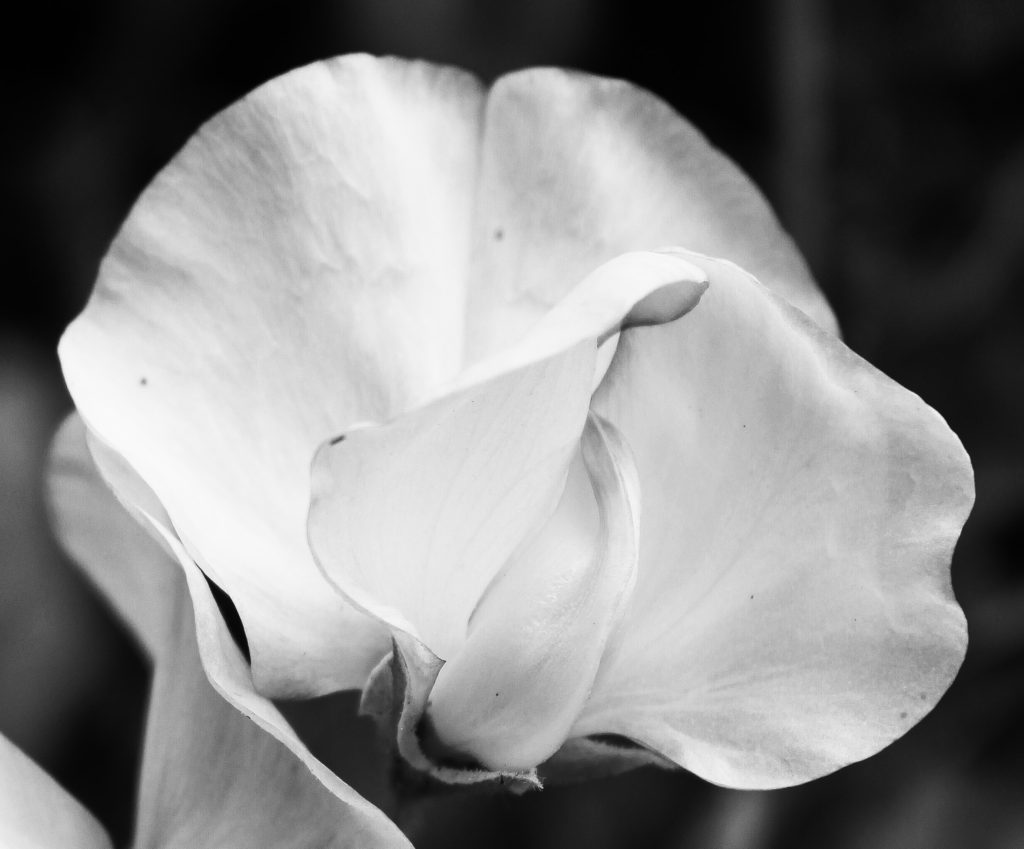
In this image, I bended and squished the paper to create a photo with more curved lines instead of bold harsh ones. I believe this produces a smoother, more flowing texture. However, the sudden bursts of irregular shadows create dramatic moments throughout the image. Secondly, I have edited this image to be monochrome to experiment with tone and colour. I believe the low saturation of the photo creates a gloomy, dull atmosphere in the image. I have also zoomed in on the paper in this photo to further the theme of ambiguity, I purposefully took this shot with no black empty space to draw focus to the centre swirl of the image. Personally, I think this photo of plain paper looks almost flower-like, with large curved petals surrounding a swirl, similar to a rose.

Final Photo Analysis

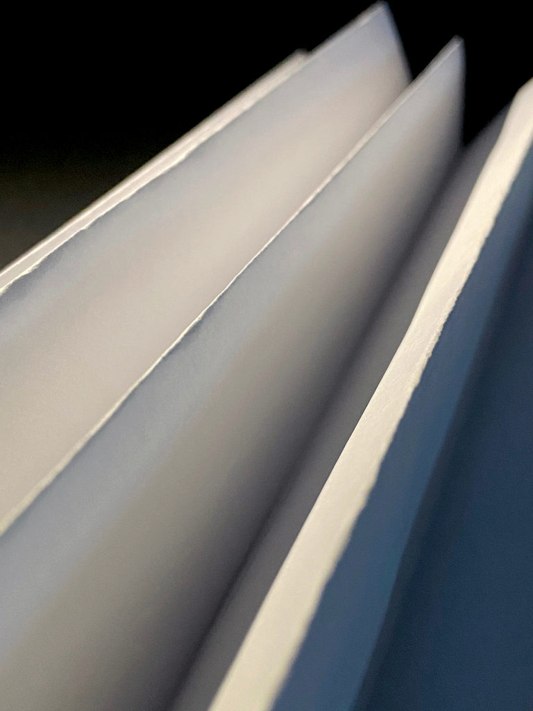
Light: My image has been lit by a strong artificial light coming from the bottom left which creates harsh shadows on the right. My dark, unlit background enhances the folds of paper and I have amplified this by increasing the contrast of the image.
Line & Shape: There are very strong straight lines in this photo that create a sharp shape throughout the image. The folds of paper look almost like book pages and the juxtaposition between the dark and light lines catch the observer’s eye.
Repetition: This image holds lots of lineal repetition with parallel lines and reflection of light. The shafts of artificial light hitting the left of the image create a dramatic rhythm. Additionally, the sharp creases of paper that repeat throughout the image draw the observer’s eyes up along the photo from one corner to the other.
Space: The space of the image is quite shallow and narrow, this is because I was close to the subject. I made sure the observer couldn’t see any other objects in the background of the image by limiting the space shown above and using a black sheet of paper to cover any unwanted distractions.
Texture: My image has a rigid texture, produced by the sharp edges of the folded paper. The points of the paper also create a jagged, rough texture.
Value/Tone: The image contains a wide range of tones going from very dark to very light. In the background, the dark black emptiness contrasts with the bright white highlights. In addition, there is a subtle blue hue in the bottom right shadow, possibly created by the blue undertones in the other phone torch I used to light the subject. The image has low saturation and vibrancy because I believe it intensifies the paper’s already muted colours.
Composition: The diagonal lines of the image and the close-up shot create a sense of drama. Also, the long folds draw the observer’s attention to just above the middle of the image, where the paper is most in focus. I created this affect by having a large depth of field so the top and bottom of the image was out of focus, and the one crease in the middle was a clear focal point.

The World Is Beautiful

Albert Renger-Patzsch

Albert Renger-Patszch (1897-1966) was a German photographer associated with The New Objectivity. In the early 1920’s he worked as a press photographer for the Chicago Tribune before becoming a freelancer. Patzsch published his first book entitled The Choir Stalls Of Cappenberg in 1925, and has his first museum exhibition in 1927.

In 1928, Patzsch published his second, best known, book The World Is Beautiful- which is a collection of one hundred of his photographs in which natural forms, industrial subjects and mass-produced objects are presented with the clarity of scientific illustrations. These types of subjects are what Patzsch thrived to photograph.

The New Objectivity was a movement in German art that arose during the 1920s as a reaction against expressionism. Patzsch’s work fits with this movement because he believed that the value of photography was in its ability to reproduce the texture of reality, and to represent the essence of an object. He wrote that the secret of a good photograph is it’s realism, he wanted people to ‘leave art to the artists’ and ‘endeavour to create photographs which will last because of their photographic qualities.’ Artists such as Max Beckmann, Christian Schad and Otto Dix were also part of The New Objectivity movement.

Patzsch Photo Gallery

Patzsch’s photographs are monochrome, using very harsh dark and light tones, with high contrast and low exposure. He uses lots of repetition in his images with industrial buildings and nature, showing elements of the world in their natural forms. Patzsch also takes his photos from many abstract positions, some extremely close to the subject, some from below, he uses a wide range of camera angles and zoom. Many of his photos have a rough spiked texture due to the business of his images and the detailed subjects in them.

Patzsch Photo Comparison

These two images are from Albert Renger-Patzsch’s collection ‘The World Is Beautiful.’ In the first image we can see a gloomy forest filled with tall trees, a representation of nature. However in the second image the subjects are imposing industrial towers, clearly man-made. Also, both images are edited with a monochrome, unsaturated filter- a staple of Patzsch’s photography. One similarity we can see in these images is the repetition of cylindrical objects. In the first image, the trees in the forest are unique with twisted branches and of different shapes and sizes. Contrastingly, the towers in the second image are repeated, however in a uniformed manor with identical structures and shapes. Additionally, the towers look almost like tree trunks themselves, linking to The New Objectivity and the idea that nature is being ruined and replaced by man-made industrial buildings and objects. Moreover, the subjects in both images are not fully in shot, as the frame cuts off the tops of the trees and towers, which connotes the idea that man cannot fully see the damage they have done to the world, they are oblivious.

Nevertheless, there are also many differences between these two Patzsch images. For example, the photos are taken from very opposite camera angles, the first from an eye-level medium shot and the second from a low angle medium shot. The first image’s angle shows nature surrounded by more and more nature, suggesting the power of the environment is fundamentally superior to mankind. However, the angle of the second image paints the industrial towers as intimidating, looking down on everything below them, implying man is always watching. Furthermore, we can see a significant difference in the depth of field in the images. The first clearly has more depth, as we can see trees going far back disappearing into the mist. The second has certainly got depth, however the focal point of the middle tower draws the observers attention, so not much else can be seen in the background. Additionally, the images have contrasting lighting, with the first having much more muted highlights and the second having very bright over-exposed highlights in the background. Patzsch could have purposefully done this to symbolise how nature is being forgotten and ‘muted’ in our minds, whereas industrial buildings and man-made factories thrive while destroying our environment.

My Response – Contact Sheets

In this first shoot, I photographed industrial buildings around the island that I believed best linked to Patzsch’s work. I focused on capturing man-made buildings and objects, looking at the range of tone and texture created by metal and stone. I also looked for repetition of buildings, windows and fences to add more rhythm to my images as Patzsch does.

In my second shoot, I captured elements of nature to link to Patzsch’s photography of the environment. I focused on photographing abstract flowers with rough and soft textures, tall trees with twisted branches and insects that symbolise the beauty of nature.

Final Edited Photos

Final Images

I have chosen these three images as my final evaluation because I believe the nature photos compliment each other well, while contrasting strongly with the industrial. Firstly, I love the high contrast of all these images and the sharp central focal point they all hold. I like the way both of the flower images have a circular shape, I believe the rounded perimeter’s of the subjects help to draw the observer’s attention and focus to the centre of the image. I also believe this contrasts with the second image as it contains more straight lines and geometrical shapes- clearly man made. Next, I really enjoy the repetition of the petals and flowers in image 1 and 3, I think it links well to Patzsch’s work on The New Objectivity. Additionally, I think the natural photos compliment the industrial as both have harsh dark tones and bright highlights. However, in the background of the first and last image, there are dark tones and shadows which enhance the white highlights of the flowers, painting them as clean and pure. Yet, in the industrial image, the bright highlights are in the background creating a dark silhouette of the structure. I chose to photograph this building in such a way to reflect Patzsch’s intimidating industrial images and to contrast with the purity of the environment. The camera angle of this image is also from below the subject which alludes to the idea of man looking down on society.