All posts by Sophie M

Filters

Author:
Category:

Environmental Portraits

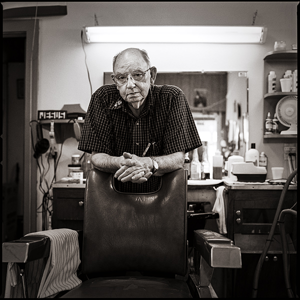
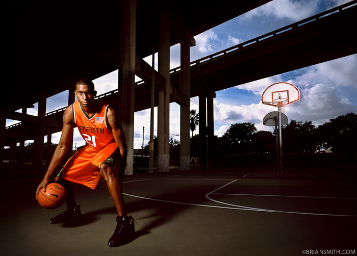
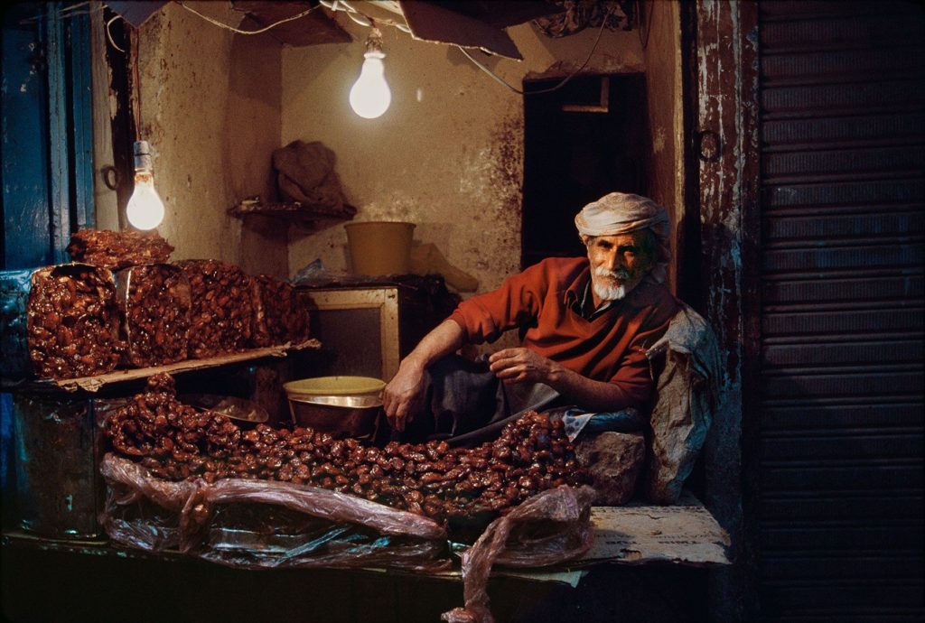
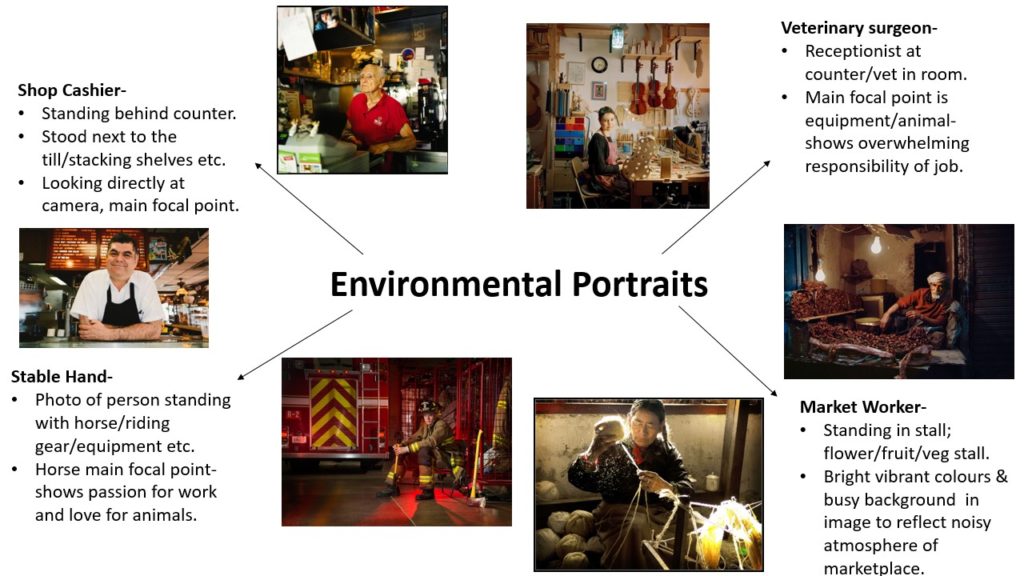
An environmental portrait is a portrait executed in the subject’s usual environment, such as in their home or workplace, and typically illuminates the subject’s life and surroundings. The subjects of these images are usually surrounded by objects which relate to their craft, may that be their career or hobby. Environmental portraits should allow the observer to identify the subjects job easily by using a well lit setting and clear links to their work around or on them.

Environmental Portraits Mood Board

Image Analysis – Arnold Newman
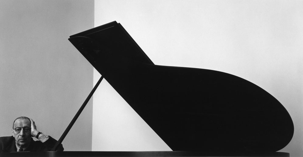
Arnold Newman | Portrait of Russian composer Igor Stravinsky | December 1, 1946

This environmental portrait of Igor Stravinsky (1882-1971) was captured by American photographer Arnold Newman (1918-2006). Newman is noted for his environmental portraits, where he photographed many famous artists and politicians. Igor Stravinsky was a Russian composer, pianist and conductor-widely considered one of the greatest and most versatile composers of the 20th century. In this portrait image, Newman has created an abstract composition as the subject Stravinsky is placed in the bottom left corner, only barely being seen. Therefore, the piano outweighs the subject alluding to the idea that music plays such an important role in his life. Additionally, the shape of the instrument itself resembles a musical note, which mixed with the immense size of the piano could symbolize how overwhelming the power of music is on society and culture. Newman has captured this image with a black and white filter, possibly due to the cameras used in 1946, which creates a high contrast of dark and light tones. There is not a vast range of tone in this image, primarily it consists of one main highlight, mid-tone and shadow- the darkest area being the piano and the lightest being the wall behind. This opposition between a harsh black and a bright white really makes the piano stand out in the photograph; it creates a clear focal point for the observer. Furthermore, there are many geometric shapes and lines in this photo which create a rigid sharp texture. These acute lines also add to the unsettling atmosphere of the image as their definite structures allude to the idea that Stravinsky’s career is at times strict and harsh in order for him to succeed above others in the industry.

Environmental Portraits Mind-Map
Photoshoot Plan

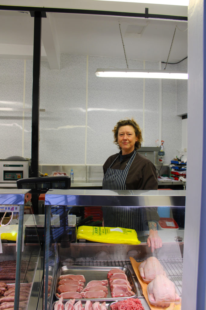
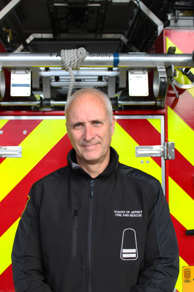
Who – I plan on photographing the people who work in the market, such as butchers, florists and chefs. I also wish to photograph some essential workers in the time of Covid-19, such as cashiers, postmen and firemen.

What – I aim to capture the subjects looking directly at the camera, surrounded by their working environment and/or showing them doing their job.

When – I hope to take some of these images on Tuesday, November 10th as the weather will be sunny and dry for any outdoors shots. I also aim on doing a shoot on Wednesday, November 11th in the evening as the market won’t be as busy and crowded.

Where – On Tuesday, my plan is to travel to St Helier and go around town looking for any postmen or binmen that may be working. I will also head to St Brelade to photograph the firemen at the station. On Wednesday, I aim on going to the market in St Helier to capture my evening photos.

Why – I will take these photos to demonstrate my understanding of environmental portraits and to show people in their working environments. I also want to show how these people feel at the moment of the shoot, letting them act however they wish to in front of the camera.

How – I am going to produce this photoshoot using my Canon EOS 2000D with natural lighting for the outdoor shots and artificial ceiling lighting for the indoor shots. I will use a short aperture to capture the subjects face as the main focal point in my photos.

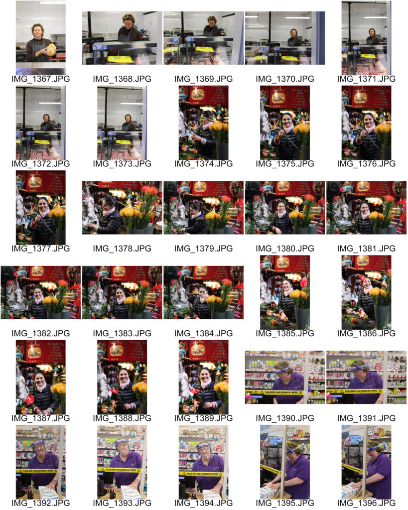
Contact Sheets
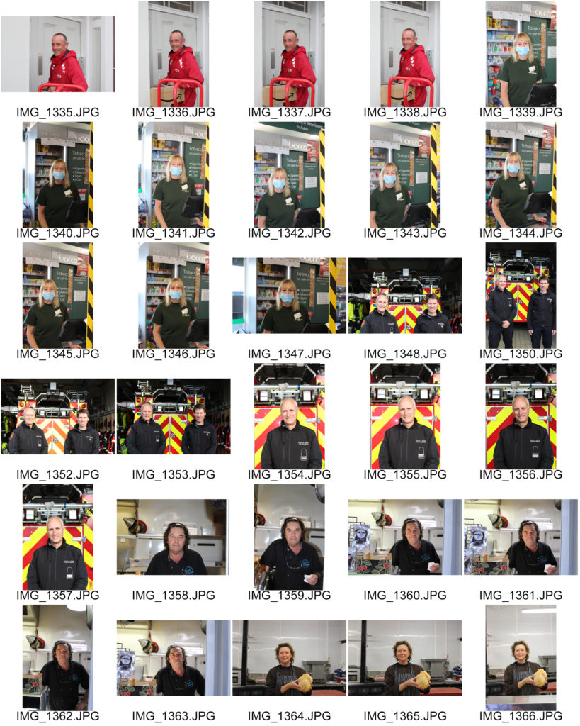
Final Edited Images

Final Images

I have chosen these two images of a florist and a fireman as my final selection as I believe they show clear environmental portraits, linking to each other through colour and composition. Firstly, both images hold repetition of saturated warm colours, such as yellow and red, which reflect the cheerful atmosphere created by the subjects smiling facial expressions. Additionally, I think these images work well together because of their similar compositions. Image one has the subject in the centre, with her work environment surrounding her in the foreground and background. This allows the observer to connect with the image as the camera is at eye level with the subject smiling down the lens, creating a friendly and welcoming atmosphere. Nevertheless in image two, the subject is similarly placed in the centre of the photograph- however his work environment is directly behind him showing he is the main focus and importance in the image. Furthermore, the fire engine behind the main subject in image two holds diagonal thick lines which create direction and lead our focus towards him. These straight leading lines also produce quite a harsh texture in image two, which alludes to the harsh reality of a fireman’s job and shows how strict and precise he must be in order to save someone’s life. This contrasts well with image one as it holds a softer texture due to the more organic and natural shapes created by the flowers and ribbons surrounding the woman. Overall, I believe these two images show strong environmental portraits which reflect the atmospheres and challenges one has in these particular careers.

Image Analysis- Alfred Krupp Portrait

Image result for arnold newman alfred krupp
Arnold Newman | Portrait of Alfred Krupp | 1963

In this image, American photographer Arnold Newman has taken a portrait of German industrialist Alfred Krupp. Krupp’s family ran factories during World War 2 making ammunition and weapons for Nazi’s- he insisted on using Jewish prisoners from concentration camps to work at the factories.

In the foreground, Krupp is positioned in the centre of the image between two symmetrical pillars that stand behind him, Newman has deliberately made him the main focus. The camera is angled slightly above Krupp’s eye level and he is looking directly at the camera lens with a sinister expression, giving the impression Krupp is confident. The dark shadows around the perimeter of the image contrast with the natural daylight coming from above through skylights. This casts shadows on his face, particularly around his eyes which makes Krupp look more menacing and mysterious. I believe Newman did this purposefully to paint Krupp as a villain and to give the image negative connotations.

In the background, we can see lots of lineal patterns with repeated shapes along with industrial equipment and what seems to be trains, it is possible the photo was taken in one of Krupp’s factories. It is clear Newman has used a high aperture as the whole image is in focus, allowing us to clearly see the factory’s assets, alluding to the idea that Newman knew the truth about what Krupp and his family had done during the war and that he wasn’t going to hide it from the camera or the world. Furthermore, the repetition of lights above Krupp’s head could symbolize the many lives he ended by being a Nazi sympathizer and providing weapons/ammunition to them.

The image looks a little under exposed with a high contrast and dark tones throughout. There is also a subtle green hue surrounding the image which links to the idea that Krupp is malicious since green is often associated with evil and wickedness. The colours of the image have low saturation and are not the best quality, this suggests the photo was taken with an older camera. The lack of vibrancy creates a dull, lifeless atmosphere, again symbolizing the lives lost by the hands of Nazi soldiers/supporters. I believe Newman portrayed Krupp in this vicious way to expose him for his crimes and to get justice for Jewish people, after all Arnold Newman was Jewish himself so taking this shot let him finally have his revenge and find peace.
Portraiture Introduction

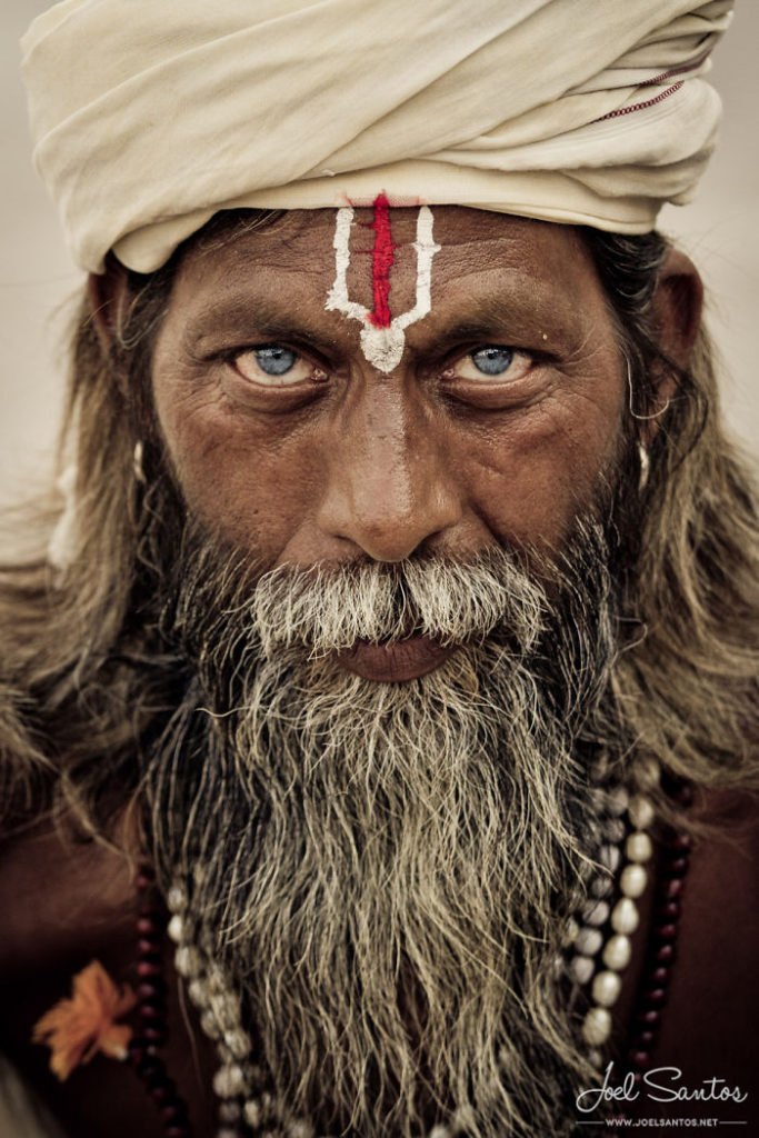
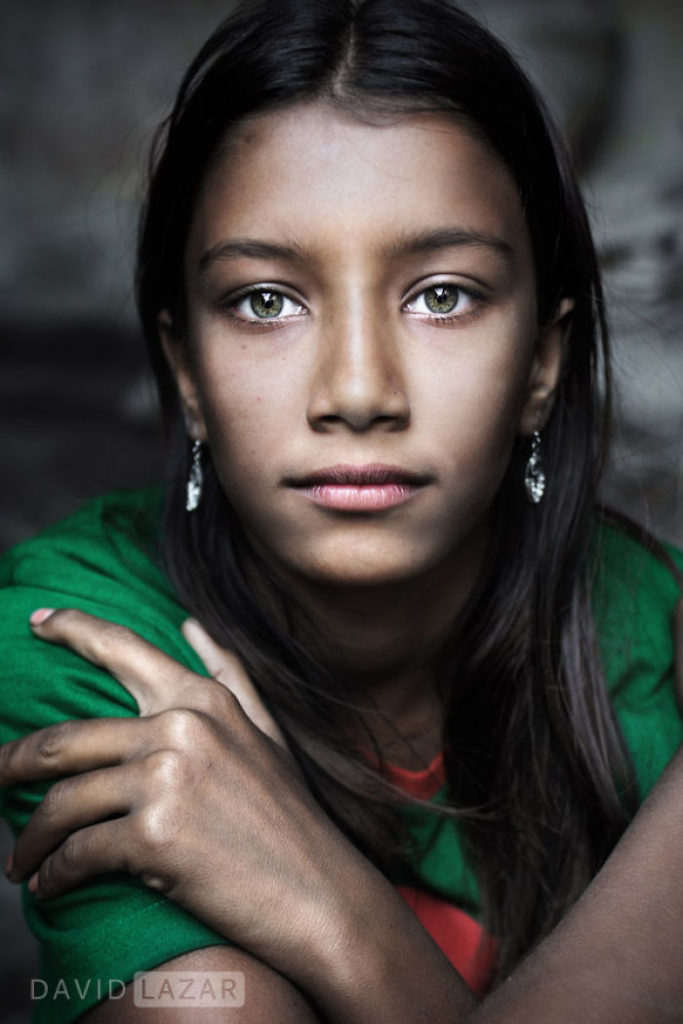
Portrait photography captures a person or group of people- it demonstrates their personalities by using different poses, background environments and lighting. Photographers take different approaches when photographing people for portraits, the four main types are environmental, constructionist, candid, and creative. It is important, when taking portrait images, that the subject and photographer are both aware of the type of atmosphere and personality they wish to portray in every photo.

Mood Board – Iconic Portraits

Contemporary Portrait Photography

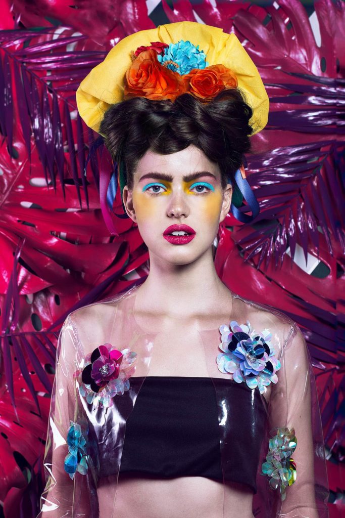
Contemporary Portrait Photography is highly focused on the values of the modern world, however it does not have to ignore a prior historical context. Contemporary portraits can either reinforce or challenge modern ideas and feelings by portraying different emotions.

Fernando Rodriguez

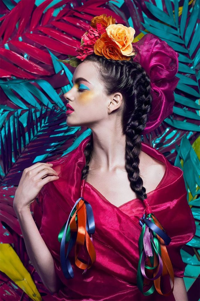
An example of Contemporary Portrait Photography is this series of images by Fernando Rodriguez. Fernando Rodriguez is a Mexico City based photographer, who was inspired by Frida Kahlo’s iconic self portraits. Rodriguez has reimagined Frida’s recognisable portraits into contemporary pop-art style images. These images combine historic traditional hairstyles with vibrant futuristic outfits, bringing together moments of the past and present in a highly stylistic manner.

Selecting And Finalising Abstract Unit

Selected Images – Water & Reflections

Selected Images – Nature & Aperture

Selected Images – Saul Leiter & Shutter Speed

Gallery Presentation

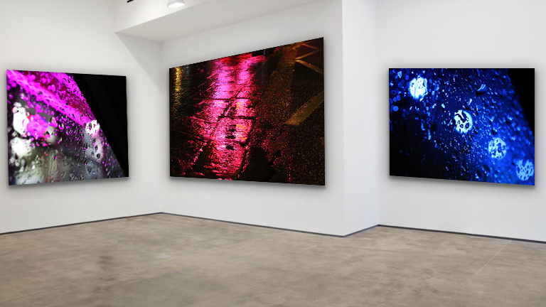
I have chosen this set of 3 images because I believe they link to each other well and hold many photographic techniques. For example, these images have a rough rigid texture due to their uneven surfaces. The repetition of water in the photos produces a 3D-like effect and show rhythm & movement. Additionally, each image has a bold dominant colour. The raindrop photograph on the left has a dominant magenta colour which creates an eye catching effect next to the dark black shadows that diagonally fall beside it. The central image has a warmer pink dominant tone which stretches from the top to the bottom of the photo. This bold colour is reflected on to the street puddle, creating a river-like effect and a main focal point for the observer. The far right image has a dominant blue colour, which creates a cooler temperature in the image. Furthermore, each image has a diagonal composition which captures the bright artificial light in an abstract way. The high contrast between highlights and shadows in these photos draw focus towards the center of the images. I think this series of vibrant and textured images form a striking display, sure to capture people’s attention.

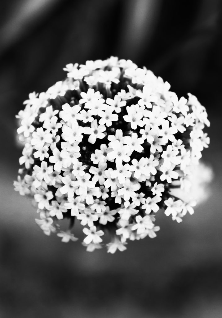
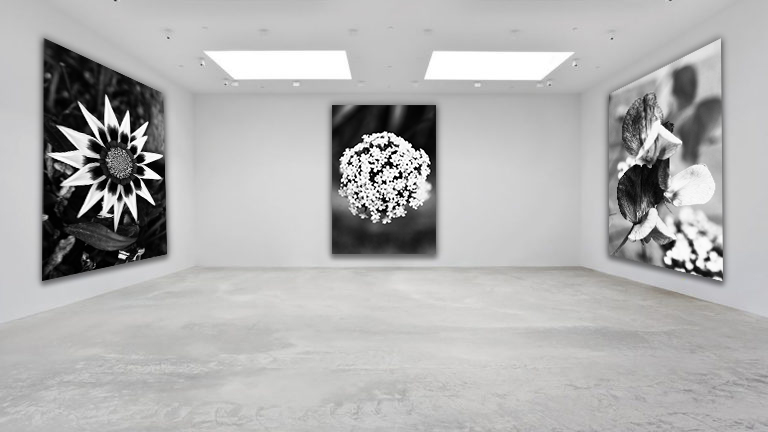
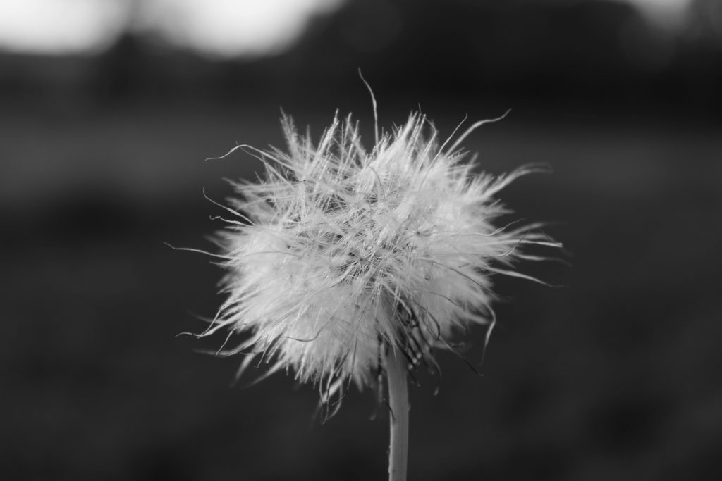
Secondly, I have chosen these 3 nature-based images as I like the similarities and techniques they hold. In each image I have captured a singular flower using a low aperture setting to let it have complete focus. I really like the way these images show a shallow depth of field because of their harshly blurred backgrounds. Additionally, I have edited this set of images with a black and white filter as they reflect the work of Albert Renger-Patzsch. Furthermore, I enjoy the way each image links to one another in terms of composition. The main floral subject of my images falls directly in the centre of the frame, creating a clear focal point for the observer. Also, the main subjects in the images all have a similar circular shape which adds to the organic natural mood of the photos. I have also arranged these images in a dark to light gradient pattern, with the far left image holding the most shadows and the far right holding more highlights. The high contrast in these images really mirrors Patzsch’s work and creates a dramatic series of compelling photos.

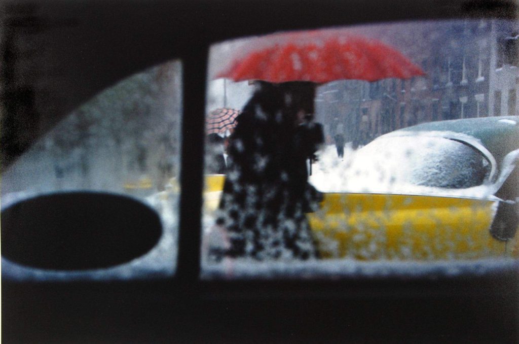
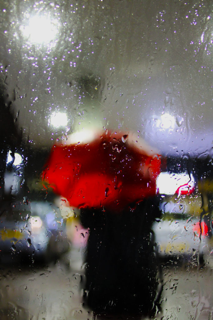
Finally, I have chosen this set of 4 images to present in a gallery format because of their link to Saul Leiter’s ‘Red Umbrella’ work. One thing I enjoy about these photographs is the repeated motif subject which can be spotted in all images. I think this adds a sense of atmosphere and story to this series as it is like we travel with the umbrella, visiting new locations and scenes. Another thing I really like about this series of images is the clear focal points they hold. The striking colour of the red umbrella draws the observer’s attention while still allowing them to take in the whole mood of the image. Moreover, these images work well together because of their warm temperature and range of hot colours, which creates a cosy atmosphere. In addition, these images hold lots of experimentation with shutter speed and aperture which reflect Leiter’s abstract way of capturing photographs. I really like how this series of images has turned out in this gallery setting as I believe their bright saturated colours and abstract subjects create an eye-catching display.

Repetition, Pattern, Rhythm Reflection and Symmetry – Patterns In The Sky

Moodboard

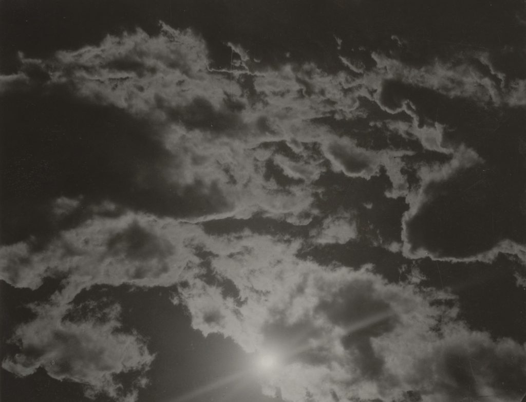
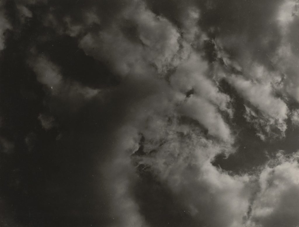
Alfred Stieglitz – Equivalents

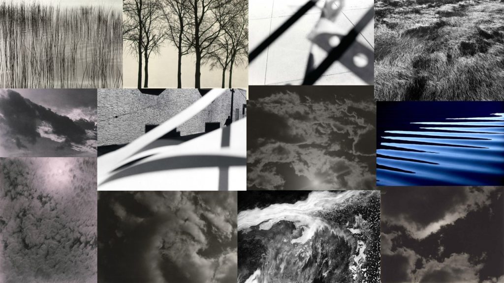
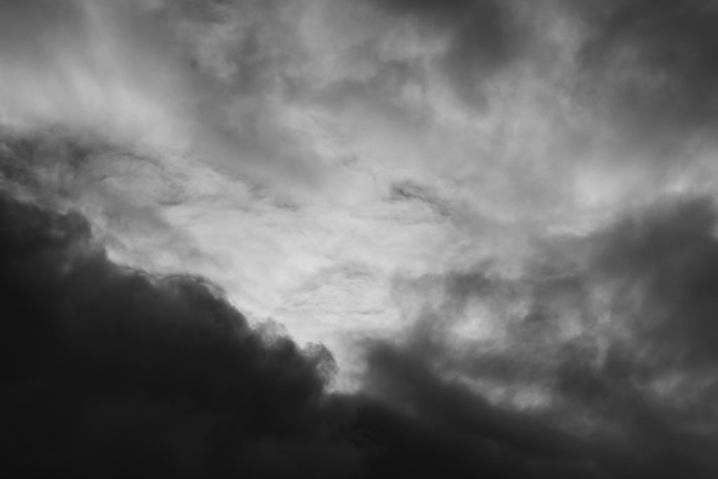
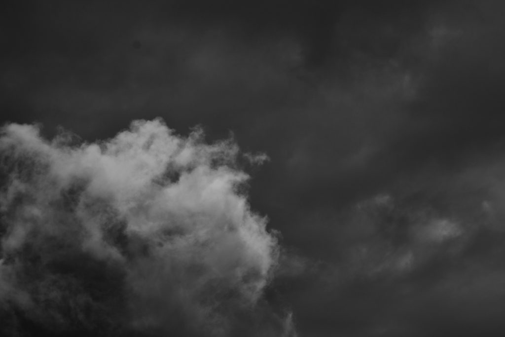
Alfred Stieglitz (1864-1946) was an American photographer who in the summer of 1922 began photographing abstract formations of clouds in the sky. Stieglitz called these images ‘Equivalents’ and argued that visual art could evoke the same emotions and have equally as much power as music. Music was clearly an inspiration. Instead of describing the visible surfaces of things, Stieglitz wanted his work to express pure emotion, representing the artist’s own inner state. What I really enjoy about his work is his use of muted grey and white tones, I believe they create an atmospheric and dramatic image. Additionally, I want to reflect the depth of Stieglitz’s work as he captures the clouds in repetitive patterns which stretch over the foreground and background of his images. This creates a deep depth of field as it alludes to the idea that more clouds continue behind the ones captured in the images.

Photo shoot Plan

Who – My plan is not to capture any people as the subjects of these images as they are based on Alfred Stieglitz’s ‘Equivalents’ work. The only person involved in the shoot will be myself taking the photographs.

What – My focus in this photo shoot will be capturing the abstract patterns made by clouds in the sky, I will attempt to photograph the light and shadow created by the clouds, similar to Stieglitz.

Where – I plan on taking these photos in my garden as it gets a lot of sunlight in the evenings so I will be able to experiment with the placement of the sun. I also plan on capturing some images of the sky in St Helier as there is lots of room to move around in order to photograph from different angles and perspectives.

When – On Wednesday 14th October I am planning on doing this photo shoot as the weather is meant to be sunny with clouds in the sky. I also want to take these images late afternoon as the sun will be lower in the sky which will create a more dramatic contrast between the shadows behind the clouds and the clouds themselves.

Why – I want to reflect Alfred Stieglitz’s work ‘Equivalents’ by photographing the obscure shapes made by clouds, I also want to mirror Stieglitz’s intentions on his images evoking emotion and representing visual art as more than just a nice thing to look at.

Contact Sheets

Edited Images

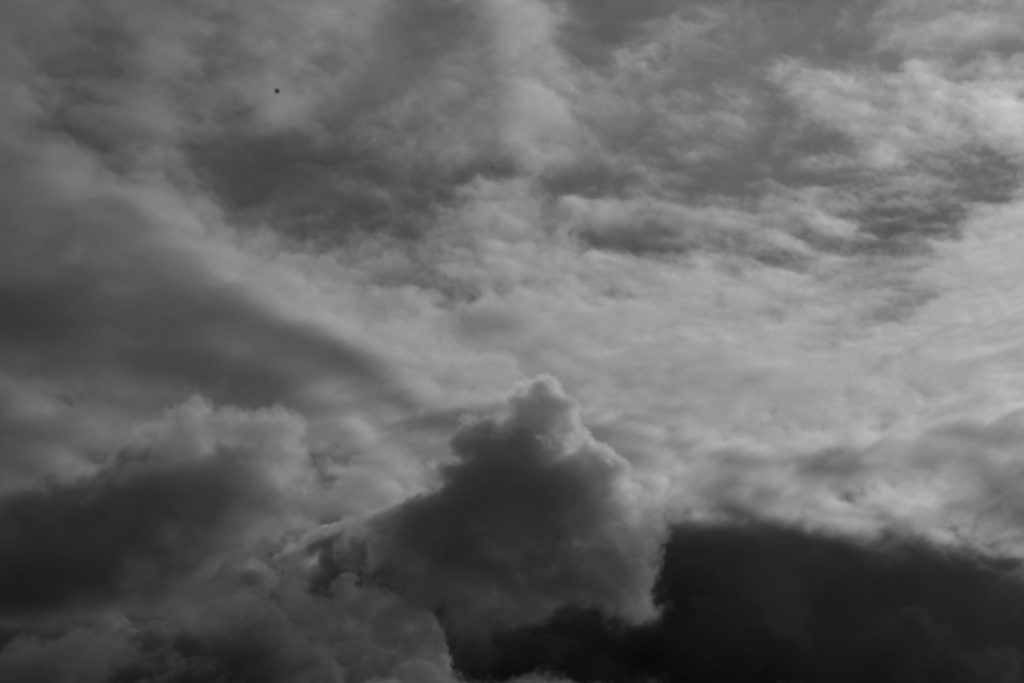
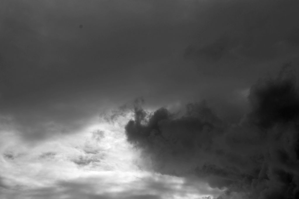
I edited these selected images on Photoshop in order to reflect Stieglitz’s work. First, I adjusted the images to black and white as many of Stieglitz’s photos were taken in the 1920’s, hence the unsaturated filter. Secondly, I used the ‘brightness/contrast’ tool to increase the contrast of my photographs and decrease the brightness, I did this to enhance the highlights of my images by darkening the shadows surrounding the clouds, similar to Stieglitz. Lastly, I experimented with the ‘levels’ tool to move and stretch the brightness levels of my photos, this allowed me to mirror Stieglitz’s dull and heavily shadowed work.

Final Images

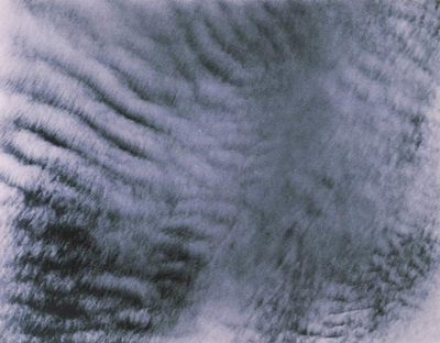
I have selected these two photos as my final images because I believe they reflect Stieglitz’s ‘Equivalents’ series whilst also incorporating my style of photography. One thing I really like about my first image is how I have captured the repetition of horizontal lines created by the clouds. I believe this forms a large depth of field which gives the impression of a never-ending blanket of clouds which stretches far beyond what’s seen in frame. Furthermore, my first image holds a fluffy texture due to the soft natural lighting that falls behind the clouds. This delicate texture reflects Stieglitz’s work as he captured photographs which contained muted tones, creating a smooth effect for the observer. Additionally, the repeated organic shapes of the clouds in this image create a sense of movement and rhythm, as if the blanket of clouds is travelling across the frame. Lastly, in this first image, I enjoy how I have photographed a highly shadowed image similar to Stieglitz. The thin bursts of highlights between the gloomy clouds draw the observers attention as they contrast greatly with the surrounding darkness.

In addition, I really like how in my second final image I have captured a dramatic contrast between light and shade. The harsh black and white tones of this photograph juxtapose each other very effectively. I believe the bright white light draws focus to the centre of the image as it is engulfed in dark shadows which allows the highlights to stand out more. This alludes to the idea of heaven and hell, as the pure white light is shining above a dull blackened sky, connoting the idea of goodness coming from within. Moreover, when capturing this image I increased the shutter speed to under expose my photo. I believe this has contributed to the dim tones which mirror Stieglitz’s series of images. Additionally, the texture of this image is quite soft due to the curved natural shapes of the clouds repeated throughout the photograph. In the top right of this image there are a lot of grey tones outlined by white highlights, this furthers the soft texture and creates a cotton-wool-like effect. Lastly, this image holds a large depth of field as the central point where the light is shining through alludes to the idea of more brightness hiding behind the dark clouds, out of the observer’s view.

Surface and Colour

Saul Leiter

Saul Leiter (1923-2013) was an American photographer who focussed on street photography and abstract expressionism. He started out as a painter so was heavily influenced by colour, shape and using his camera to create his abstract vision of reality. Leiter was well-known for his black and white work, however in around the 1990’s his personal colour photography was discovered, it still has an impact and inspires people today.

Leiter’s work holds lots of warm saturated colours which usually come from the artificial light of cars and shop windows. Additionally, he uses a range of focal lengths to show depth in his images. I really like his style of photography and the way he captures vibrant images in low light situations, it suggests he uses a high ISO so his lens is more sensitive to light. Furthermore, Leiter’s work differs in texture in each image, for example the image in the top right holds a sharp texture as the focal point is on the rain in the foreground. However, if we look at the bottom left image Leiter has created a softer texture by blurring the photograph, possibly using a shorter aperture.

Photo shoot Plan

Who – For one of my shoots I plan on capturing images of my mum with an umbrella, taken through the car window.

What – I have an idea to photograph vivid colours from street lights, shop windows, a red umbrella and neon signs. Also, I wish to capture raindrops as the fall down my car window.

Where – For the location of my photo shoot I plan on driving around St Helier to photograph the streets of town at night. This will hopefully reflect Leiter’s street photography with the vibrant colours reflecting from shop windows and signs.

When – I plan to do this photo shoot on Monday 5th October once the sun has set. It is due to rain that evening which will allow me to capture the raindrops on my car windows and on the street pavements.

Why – The reason for my shoot is to experiment with ISO and White Balance to see how it effects the colour of images. My photographs will be inspired by Saul Leiter’s work, capturing rain on windows and people with vibrant umbrellas.

My Response – Contact Sheets

Edited Images

I edited these images on Photoshop and focused on enhancing the bold colours and high contrast. I used the ‘Vibrance’ tool to heighten the saturation of my images in order to reflect the work of Saul Leiter. Additionally, I experimented with the ‘Brightness/Contrast’ tool so I could explore different ways of drawing the observer’s attention towards my chosen focal point, using bright highlights and very dark shadows to catch their eye.

Final Images

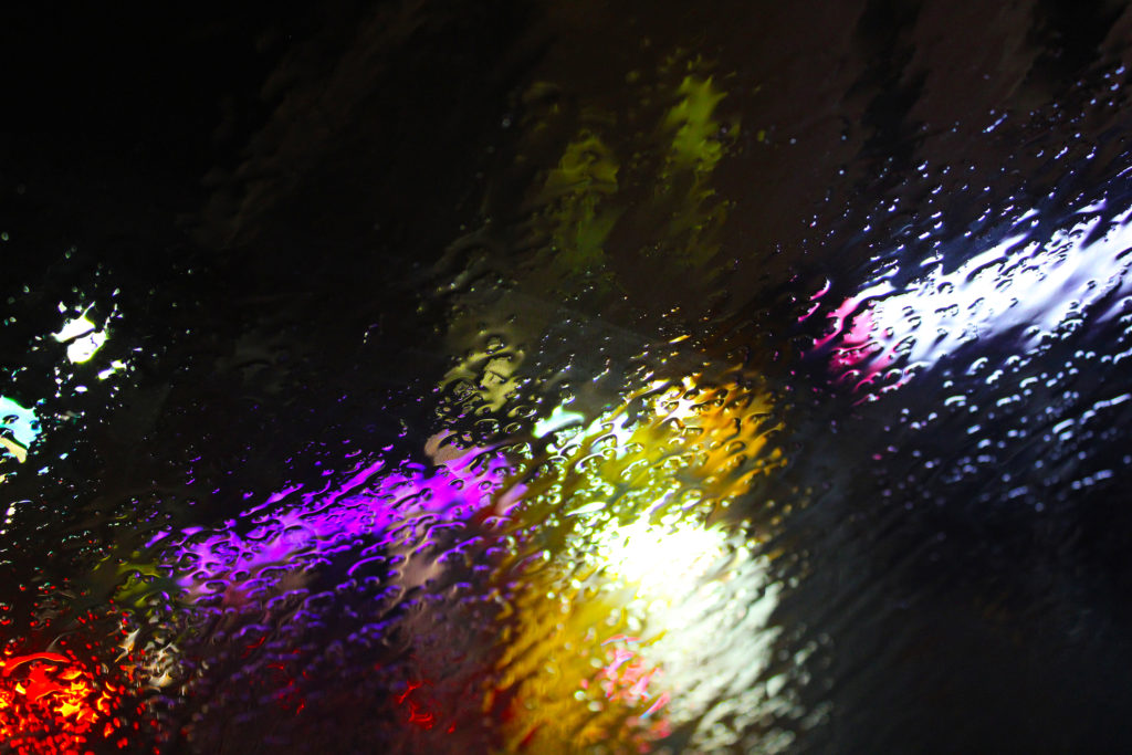
I have chosen these 5 final images as I believe their vivid colours complement each other well. Additionally, I really like the vibrant pink tones in the first image as I believe they provide a warm temperature to the image which reflects Leiter’s work. I enhanced this by increasing the saturation and contrast of the image to allow the bold fuchsia colours to stand out more against the black shadowed pavement. My first image also holds lots of artificial light from a neon shop sign. This bold lighting reflects off the puddles and creates an abstract composition with two beams of light forming leading lines down the image. Also, I like the way this image has an unbalanced rigid texture because of the irregular dips in the pavement. My second image reflects Leiter’s ‘Red Umbrella’ work. I really like the way the image has two obscure focal points, one being the clearly focused raindrops on the window, and the other being the bold red umbrella that is blurred in the centre. I used a shorter aperture to capture this image and have payed attention to the rule of thirds in my composition as the photo could be split into 3 separate sections.

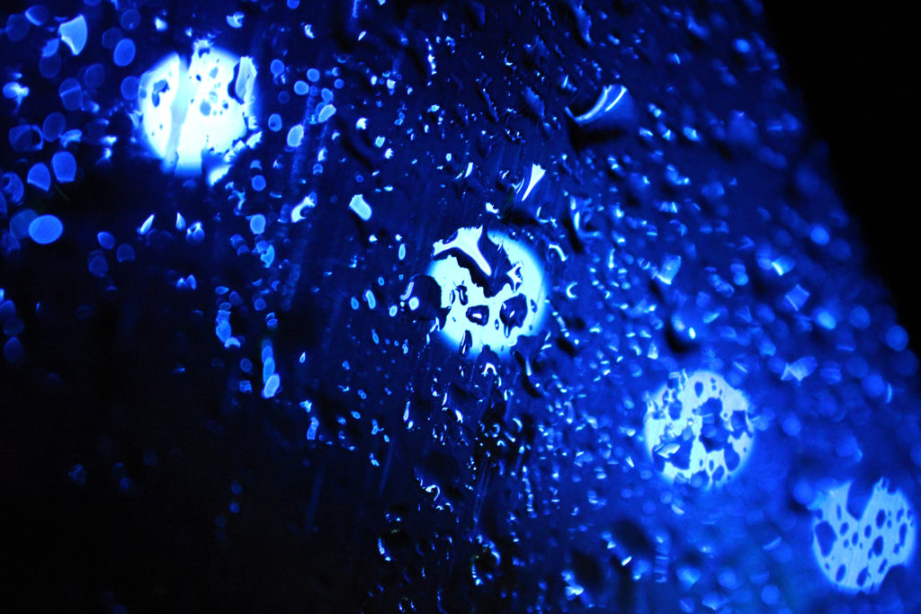
In my third and fourth images I have been inspired by Leiter’s work where he captures rain on windows. I experimented with the white balance of these images when taking them because the abstract artificial lights behind the rain made it easier to explore the different settings. The first ‘rain on window’ image has a clear focal point just below centre, which is created by the strong leading lines of water flowing down the glass. Furthermore, the warm orange and pink tones blurred behind the rain create a shallow depth of field. In the second image, the blue hues that dominate the photo produce a cold icy temperature which contrasts to Leiter’s warm cosy work. I wanted to create this contrast to experiment with different colour temperatures to see how they added or took away from my images. I really like the repetition in this image with the four fluorescent circles of light as I believe they contrast with the dark blue shadows in the image. These two images also seem have a bumpy uneven texture as the raindrops create strange 3D-like effect. I have chosen the fifth photo as one of my final images because of its obscure out of focus nature and the warm colours which are reminiscent of Leiter’s work. I really like the soft texture this image holds because of its blurred effect, I created this by switching my camera to manual focus in order to capture an unfocused photograph. I also think the clear focal point of the red umbrella draws the observer’s attention to the centre of the image, allowing them to take in every warm colour surrounding the subject.

Repetition, Pattern, Rhythm Reflection And Symmetry – Image Comparison

Comparison – Harry Callahan & Nick Albertson

I have chosen to compare a natural form image by Harry Callahan to an abstract image by Nick Albertson. Harry Callahan was an American photographer who was well-known for both his colour and black & white photographs. His work focuses on repetition, patterns and textures while also containing a high contrast between shadows and highlights. Nick Albertson is an American visual artist who uses mundane utilitarian objects to create abstract structural forms, photographing them using repetition, light and shadow.

There are many similarities between these two images, one being both photographers capture of vertical lines. Harry Callahan photographs the straight leading lines of pond reeds which reflect off the waters surface, creating a highly textured image with movement and rhythm. Additionally, Nick Albertson captures his vertical lines in the thick red tape, which stretch a uniform pattern from the top to the bottom of the image. These orderly lines create an abstract atmosphere in the image as the placing of the subjects are systematic and rigid, which contrasts with the obvious movement in Callahan’s work. There is also immense amounts of repetition in both images as the leading vertical lines echo throughout the photographs. Moreover, both images hold a sharp texture as they appear to have pointed edges and harsh lighting.

However, there are also many differences within these images. For example, Callahan’s photograph is of a natural form in its organic environment, whereas Albertson has captured a man-made form in an abstract ambiguous way. Furthermore, Callahan photographs his images in black & white whereas Albertson has bright saturation. The dominant colour red that Albertson captures creates a bold eye catching image and its vibrancy draws attention from the observer. Contrastingly, Callahan’s black and white image holds dark shadows which contrast greatly with the bright white highlights reflecting from the water. This creates a mysterious, enigmatic atmosphere within the photo as the shadowed reeds look silhouette-like against the water. In addition, these images are taken with very different lighting. Callahan uses natural light to capture his image as he is photographing the environment presently, without disturbing or changing it. However, Albertson uses harsh studio lighting in order to capture the everyday object in an abstract way. This artificial lighting choice adds to the unnaturalness and ambiguity of the image and shows how the composition of any mundane object, depending on perspective, can change how people identify it.

Repetition, Pattern, Rhythm Reflection and Symmetry – Reflected Image

Creating Reflections & Symmetry

Original Image
Edited Image

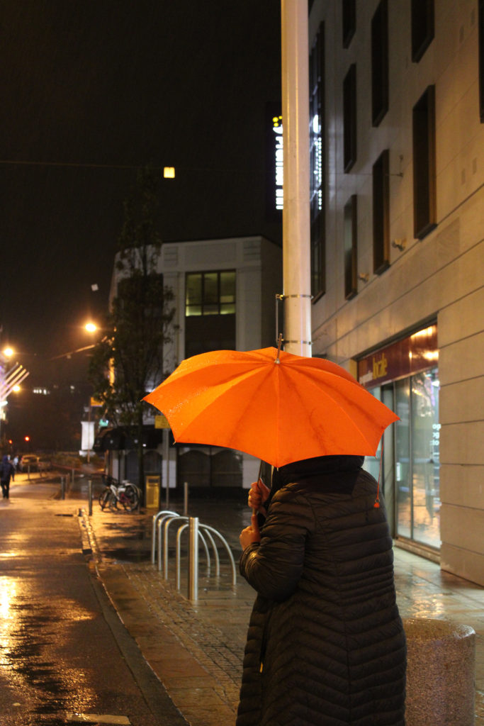
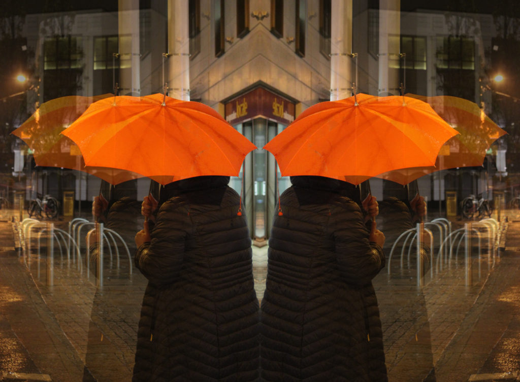
In today’s lesson we experimented with Photoshop by creating a reflected image. First, I increased the canvas size of my image so I could copy and paste it next to the original photograph. Next, I used the ‘transform’ tool to flip the copied image horizontally so it gave the impression of the woman standing back to back with another. Additionally, I pasted the original image again to experiment with the opacity of the photograph and to create an echoed effect on the image. I copied this more opaque image and flipped it on the opposite side. Lastly, I flattened the image so all the layers became one. I really like how this abstract image came out as I believe it shows movement and rhythm, as if the woman is walking backwards into the other.

Looking And Seeing

Ralph Eugene Meatyard

Ralph Eugene Meatyard (1925-1972) was an American photographer and made his living as an optician while creating an impressive and mysterious body of photographs. Meatyard’s photographs explored many genres and experimented with new means of expression, from dreamlike portraits; often set in abandoned places, to multiple exposures, motion-blur, and other methods of photographic abstraction. Meatyard has two series where he experiments with depth of field and focus, below is his work ‘No Focus’ where he has photographed figures without a specific focal point, creating a blurred effect.

‘No Focus’ Analysis

Meatyard’s series ‘No Focus’ is very abstract and ambiguous as you cannot tell what the blurred figures are. I really like this approach to photography as I believe it makes the observer think and be imaginative which their conception of the images. These photographs hold lots of dark, light and mid-tones which create a mysterious atmosphere and a sense of obscurity. The texture of these images is very soft and relaxed as the unfocused camera lens does not capture any sharp edges that may reside in the shot. Meatyard may have used a slower shutter speed, such as 1/2, to capture these unclear images so that more light could enter through the lens while it was open for a longer amount of time.

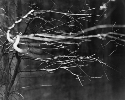
‘Zen Twigs’ Analysis

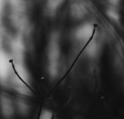
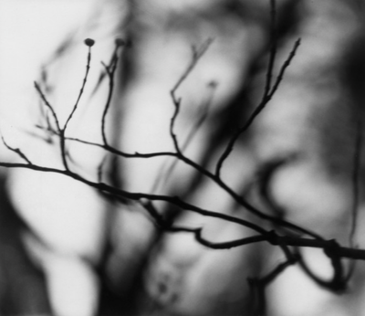
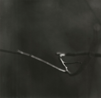
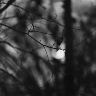
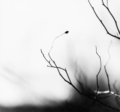
Meatyard also has a series called ‘Zen Twigs’ where has has experimented with the aperture settings on his camera. He has photographed twigs and tree branches in black and white, focusing clearly on specific points of the branch to create a shallow depth of field and a smaller focal point. For this series of photographs, Meatyard has most likely used a small aperture, such as F/2, to blur the background and areas surrounding the branch in order to create abstract images with depth. Meatyard’s work also consists of many harsh dark shadows which contrast with the bright highlights creating a range of tones and enhancing the silhouette-like outline of the branches. In these images we can see natural curved, jagged and straight lines in the foreground which form a rough texture, however the blurred shadowed branches in the background produce a softer texture as there are no defined lines drawing attention.

Contact Sheets

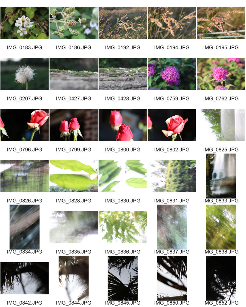
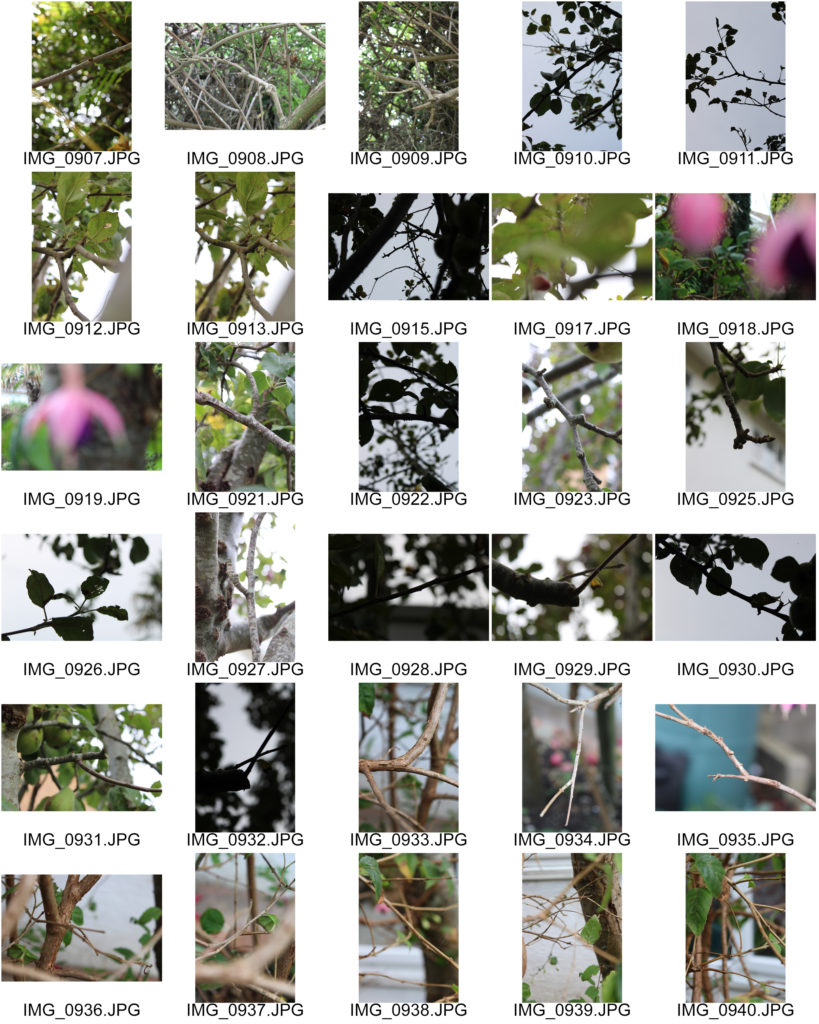
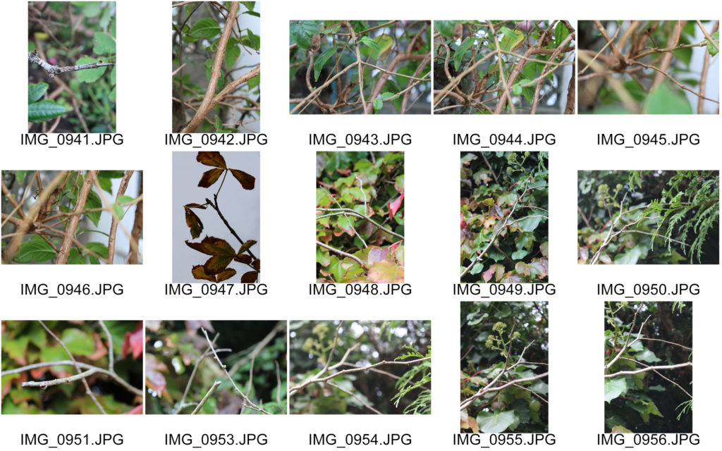
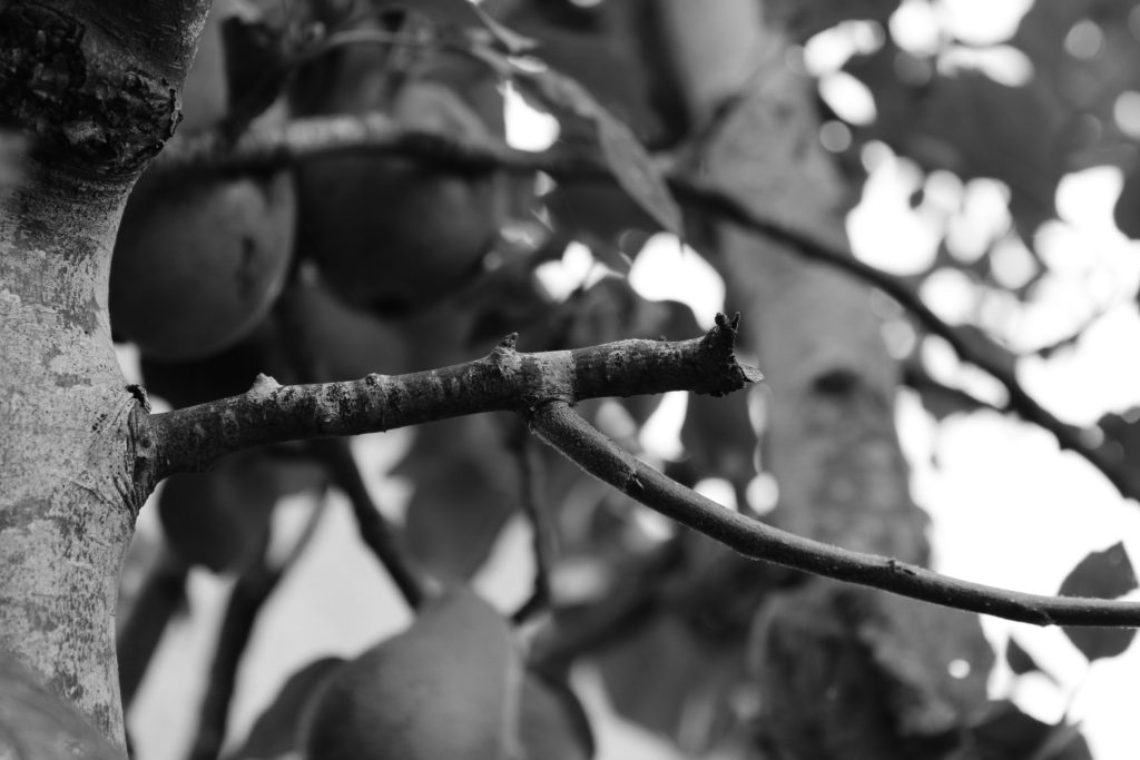
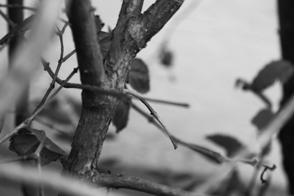
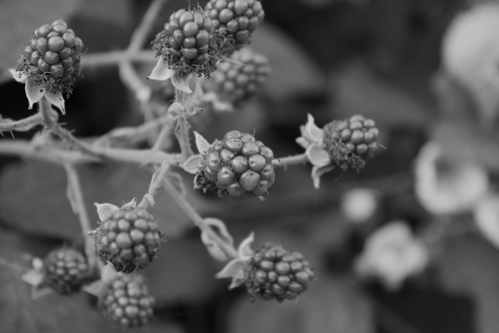
In my photo shoots I experimented with photographing natural forms such as leaves, twigs, flowers and trees. I was inspired by Meatyard’s ‘No Focus’ and ‘Zen Twigs’ series, therefore I used a range of aperture sizes and shutter speed lengths. I plan on editing my images to black and white in order to reflect Meatyard’s work, while also using my own experimentation with contrast and exposure.

Selected Edited Images

Final Images

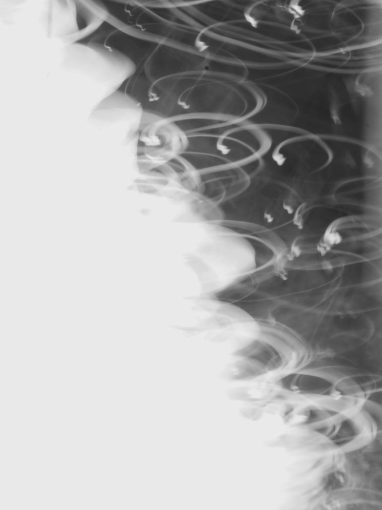
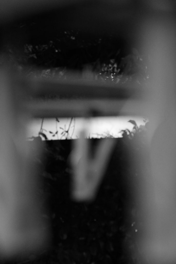
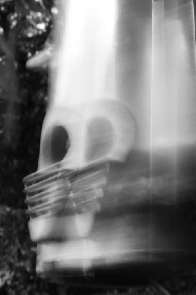
I have chosen these 5 photos as my final images as I believe they explore the strong dynamics of depth of field and focus. In the first two images I was inspired by Meatyard’s ‘No Focus’ series. I experimented with a slower shutter speed, which allowed more light to enter my camera lens and created a blurred image. In the first image I used a low angle shot to capture a silhouette-like photograph. My highlights were in the background which enhanced the dramatic shadows of the subject in the foreground. I enjoy the ambiguity of this image as I believe the blurred black objects have no specific geometric shape, therefore it is up to the observer’s interpretation as to what the image is really of. Furthermore, I experimented with under exposing this image to add to its mysterious dark mood, I believe it created a more heavily shadowed image with harsh black tones contrasting greatly with the soft grey highlights in the background. I also really like how the second photo came out, I think the slow shutter speed produced an abstract image containing a motion blur and repetitive effect. In addition the image of a birdfeeder looks almost unrecognisable because of its echoed pattern overlapping the original subject which creates quick movement and rhythm in the photo.

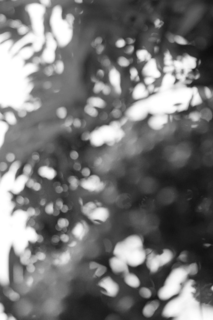
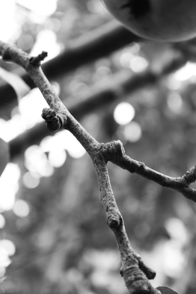
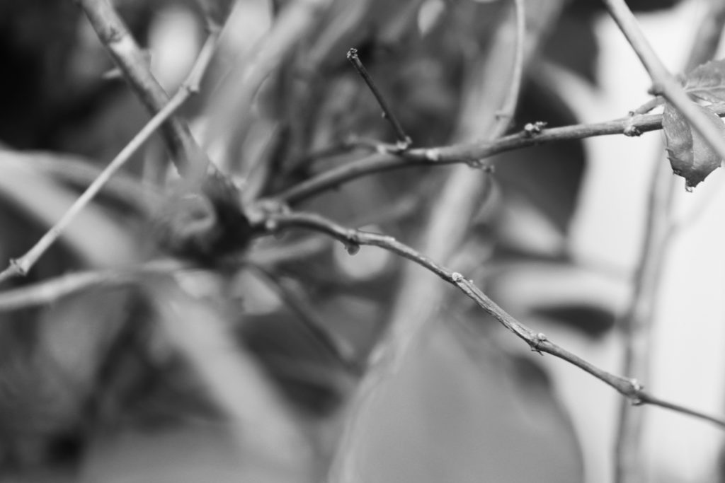
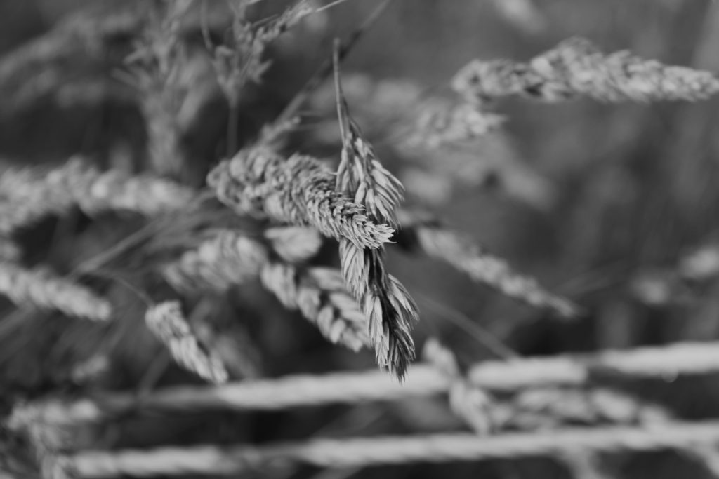
In the last three photos I experimented with aperture, similar to Meatyard’s ‘Zen Twigs’ series. The first twig image has a clear focal point in the foreground as the twig is sharp and is the only focused element of the photograph. Additionally, I really like the strong highlights in the background of this image as I believe they enhance the focus on the twig by surrounding it with bright light and drawing the observer’s attention to its rough texture. In the second twig image the focal point is not central, but a little to the bottom right. This creates an abstract photo as moments of the foreground are unfocused which again draws focus to the clear branch. The image also contains many repeated natural shapes, such as leaves, which add to the busy texture and composition of the piece. Personally, I believe this benefits the photo as it shows the frequent power of nature and the natural world as it is untouched. The final image holds lots of natural repetition and has a strong central focal point. I enjoy its subtle highlights and shadows, which mixed with the soft texture created by the blur, creates a balanced calm image. Finally, I love the shallow depth of field created by the short aperture size in all of these final three images as it creates a dramatic focal point for the observer and reflects the abstract nature of Meatyard’s work.

Black Light

 Keld Helmer-Petersen

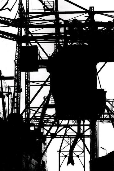
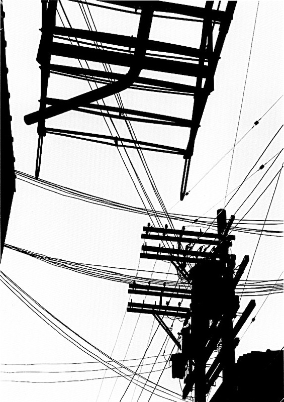
Keld Helmer-Petersen was one of the most influential Danish photographers in the 20th Century. He was an international pioneer for colour photography, however he also published several books of high contrast black and white images. Helmer-Petersen had a strong interest in industrial buildings and modern architecture, much of his work is centered around man-made structures. This is similar to the work of Albert Reneger-Patzsch, who inspired Helmer-Petersen greatly. His work also focuses on minimalism, using harsh tones of black and white and no mid tones.

What I really enjoy about Helmer-Petersen’s work is the dramatic contrast in his images. I believe it creates a sense of mystery as the high juxtaposition between black and white presents the industrial structures as silhouettes, alluding to the idea that the man-made world is dark and enigmatic. Additionally, I really like the bold straight lines in his work which repeat in each image. I think they display stillness and solitude in his work, which mixed with the shallow depth of field, create clear focal points for the observer.

My Unedited Images

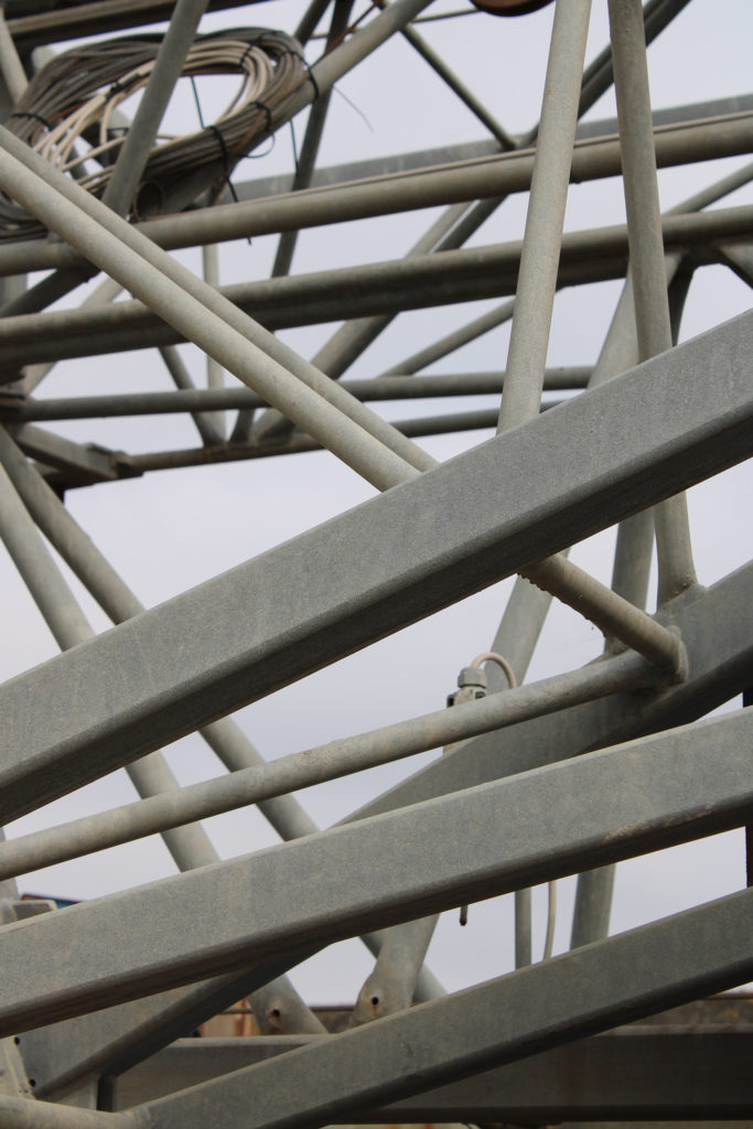
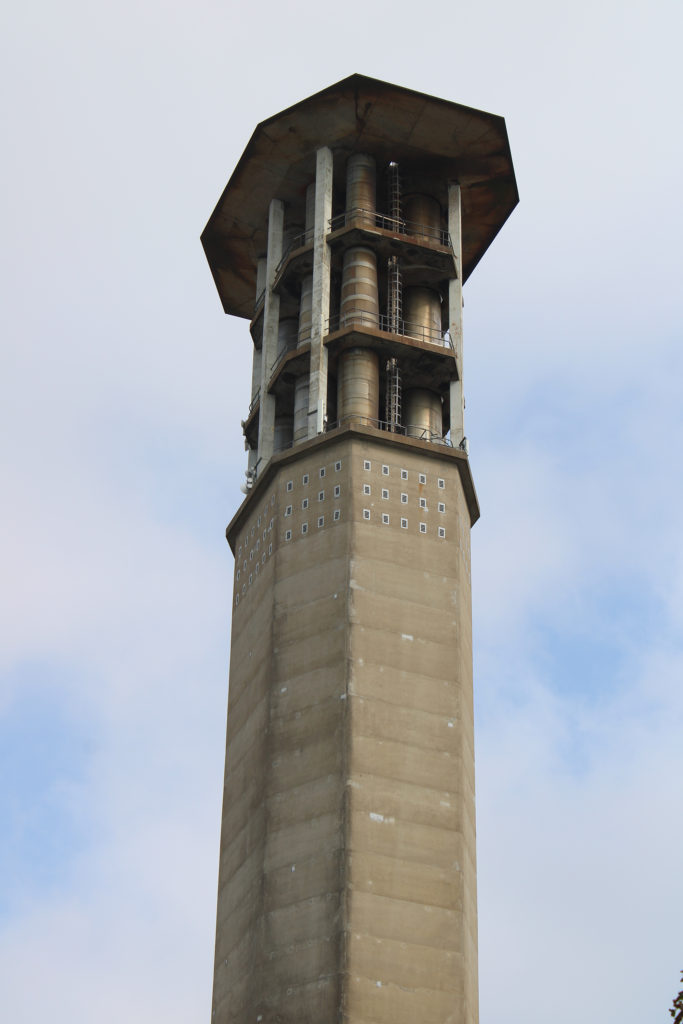
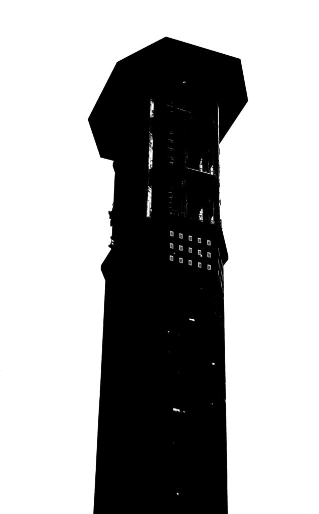
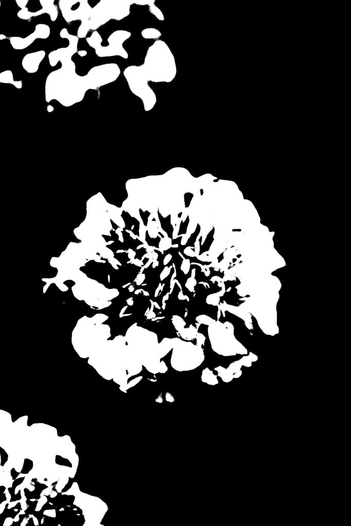
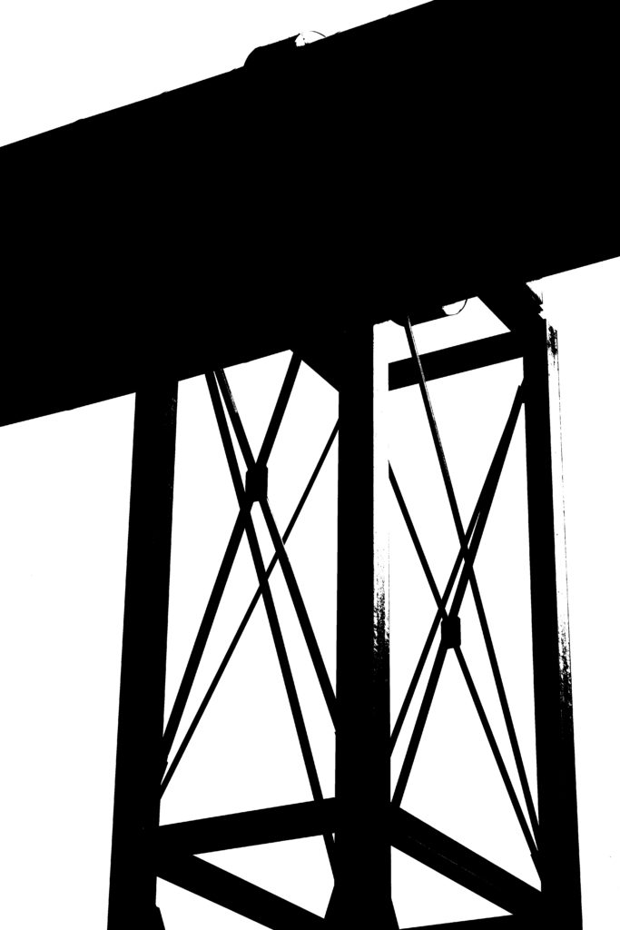
I have chosen these 5 images to edit in the style of Keld Helmer-Petersen because I believe their blank backgrounds and architectural subjects reflect Helmer-Petersen’s minimalist Black Light images. Furthermore, I think these photos hold similar bold straight lines to his work and will work well when edited with high contrast. Although Helmer-Petersen’s images are focused on industrial buildings, I want to also experiment with a nature image to compare the difference between having a dark background to a light. I believe the image will still reflect his work as it will hold minimalistic qualities in its blank background and high contrast between the highlights and shadows.

Final Edited Images

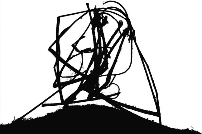
I edited my final images on Photoshop using the threshold tool to overly enhance the contrast and to change the photos to black and white. I really like how abstract my images have come out, I think the bold black lines draw the observer’s attention to the uniform structures which create an animation-like effect in the images. Moreover, I believe these edited photos reflect Helmer-Petersen’s work immensely as they replicate the silhouettes and juxtaposition seen in his images. In addition, I think the experimentation with the nature image, using a dark background and having a white focal point, provides a different approach to Helmer-Petersen’s work while still reflecting his harsh contrast and sharp black & white tones. Lastly, I really like the shallow depth of field in these images, it exaggerates the negative space surrounding the geometric structures in the foreground and the static atmosphere of the photographs.