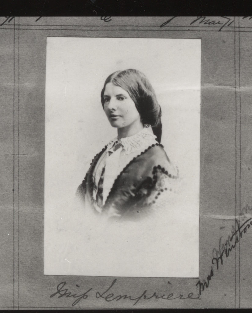
All posts by Sophie M

Filters

Author:
Category:

Identity and Place – Julian Germain Shoot

Why Julian Germain?

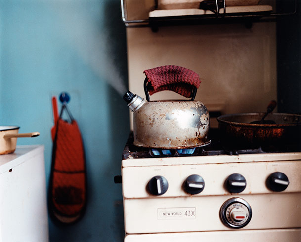
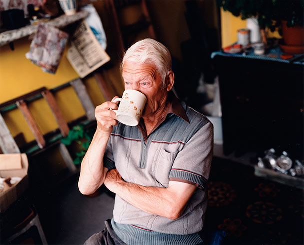
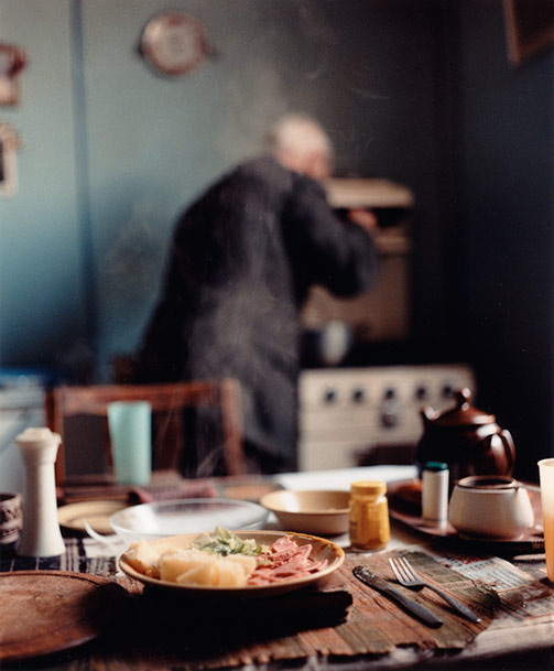
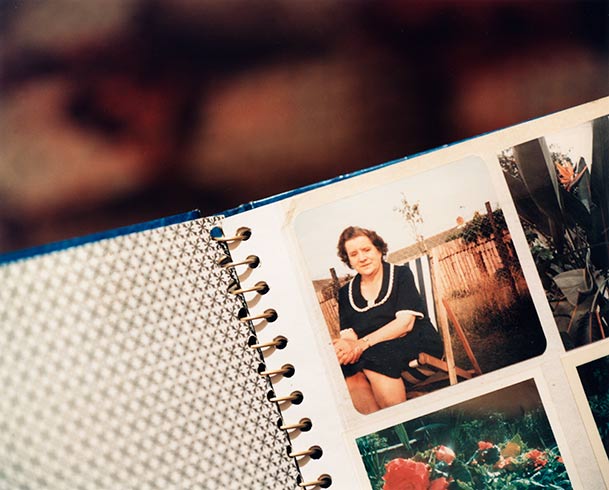
Julian Germain’s project ‘for every minute you are angry you lose sixty seconds of happiness’ has immensely inspired me, I really love the way he takes such naturalistic images in an environment his subject is clearly familiar and comfortable in. Many of the photographs in this project have a candid nature, as if Germain has just asked his subject to carry on with his day like he was not being photographed. I think this adds to the warm atmosphere created in the images as it gives the impression the subject is at ease, letting us look into his life as if we were family or friends. I have also chosen to study this work of Germain’s because of it’s connection to family identity, and identity changing over time. Many of Germain’s images depict his subject as reminiscing through photo albums of his past- I think this really symbolizes the importance of how we’ve grown up with family and how it can mould and form our identity throughout our life. Furthermore, I aim to capture images similarly to Germain in the sense of photographing my subjects in an environment close and personal to them. I think this will successfully show how our identity is connected to the places we feel most like ourselves, places we feel safe and comfortable in.

Photoshoot Plan

Who – I plan on photographing my grandparents throughout this identity project as I strongly associate them with influencing my identity throughout my life. My grandparents are very special to me, my closeness to my family stems a lot from their efforts to bring us together regularly and their constant positive view on life inspires me daily.

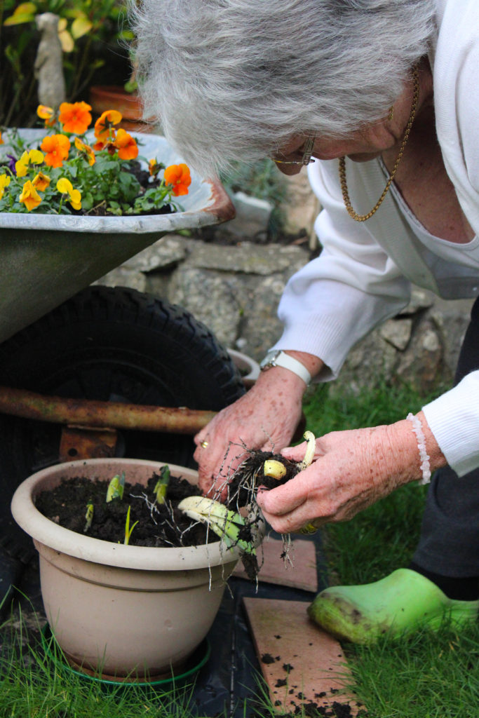
What – I am going to capture images of my grandparents going through their day as normal, looking at the camera when they want to and also capturing candid shots of them around their house. I plan on photographing them doing tasks such as cooking, gardening, reading and doing crosswords.

Where – I will be conducting this photoshoot at my grandparents house in St Brelade because it is the place they feel most comfortable and secure. I will move around the house with them, taking some shots in the garden, kitchen, lounge and any other rooms they go into.

When – I plan on taking these images on Sunday 17th January as the weather is meant to be sunny which will be perfect for any outdoor shots I may take. I aim to spend the day at their house and take photos into the evening to get a different lighting perspective, hopefully reflecting the orange hue seen in Germain’s images.

How – I will attempt to capture images using the natural lighting provided around their home, such as ceiling lamps and sunlight from windows. If any problems occur with lighting being too dim, I plan on bringing my standing light from home to add any more highlights if needed.

Why – My aim in producing this photoshoot is to capture images that reflect the work of Julian Germain, while also providing an insight into me and my family’s personal identity. I want to take images that show the importance of place linking with identity, connoting the idea that a certain home or room can impact our identity over time.

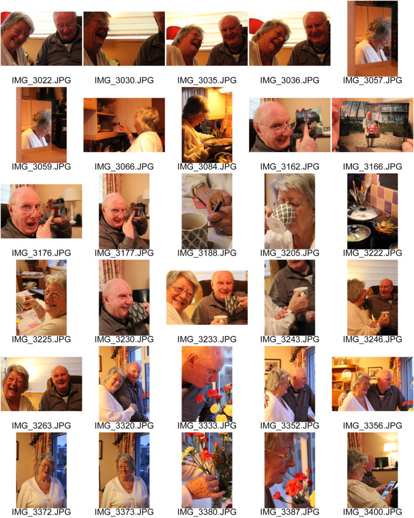
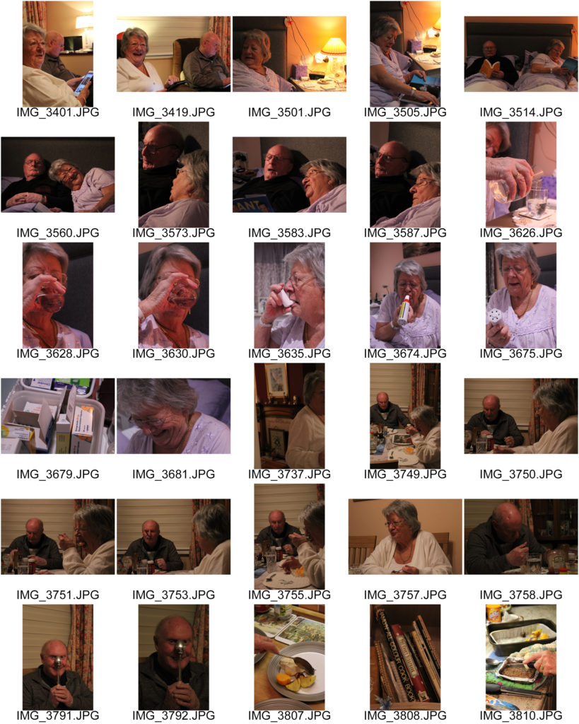
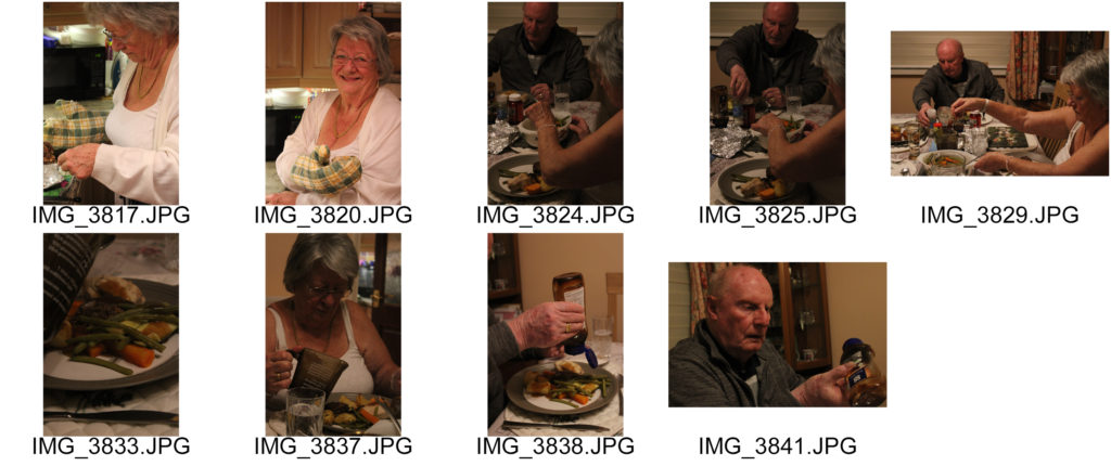
Contact Sheets
Selected Group Images

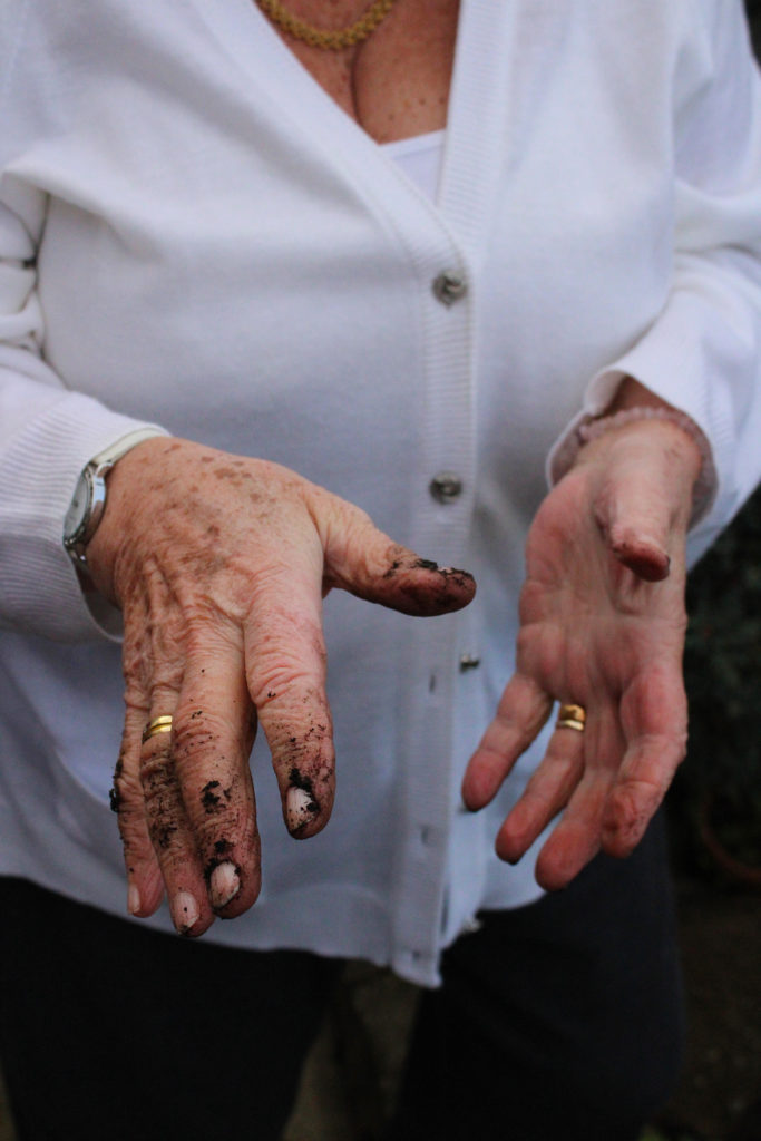
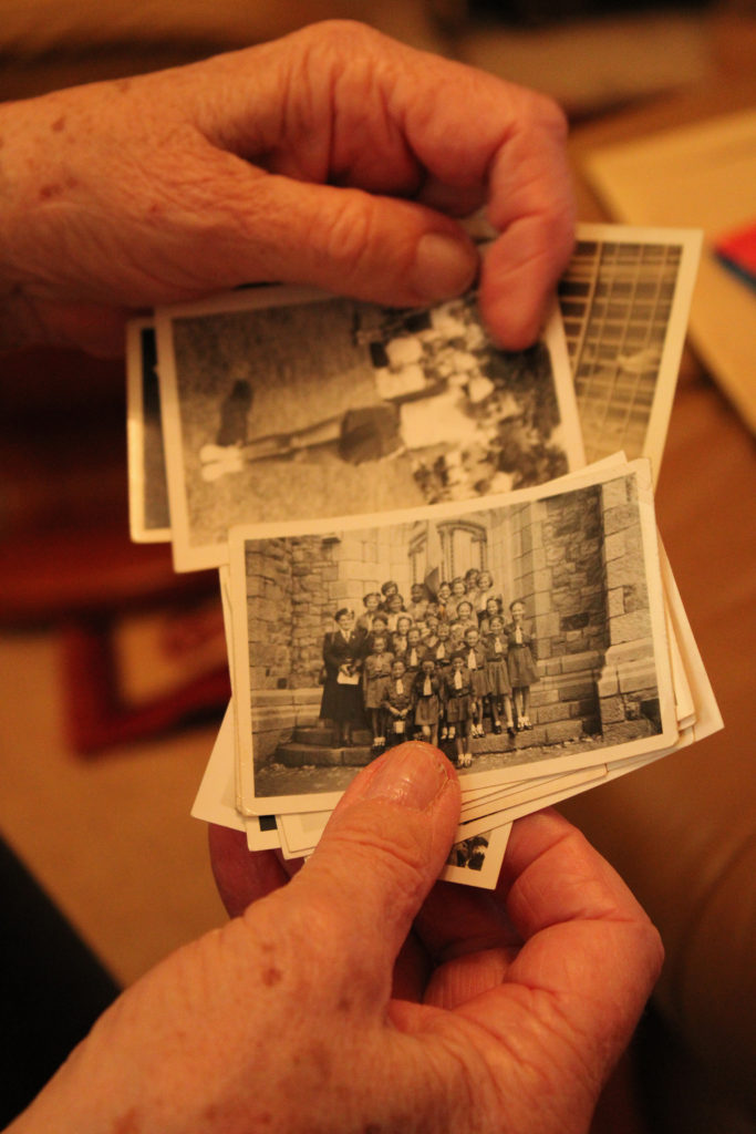
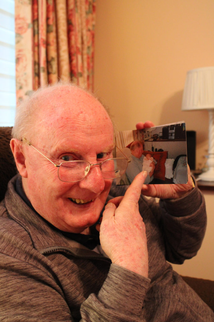
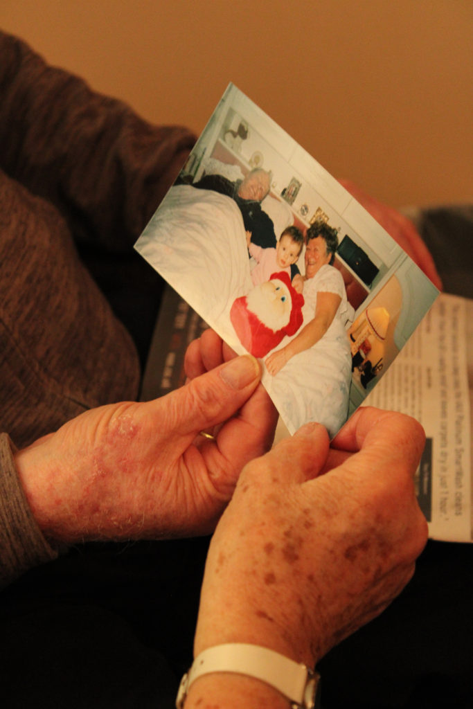
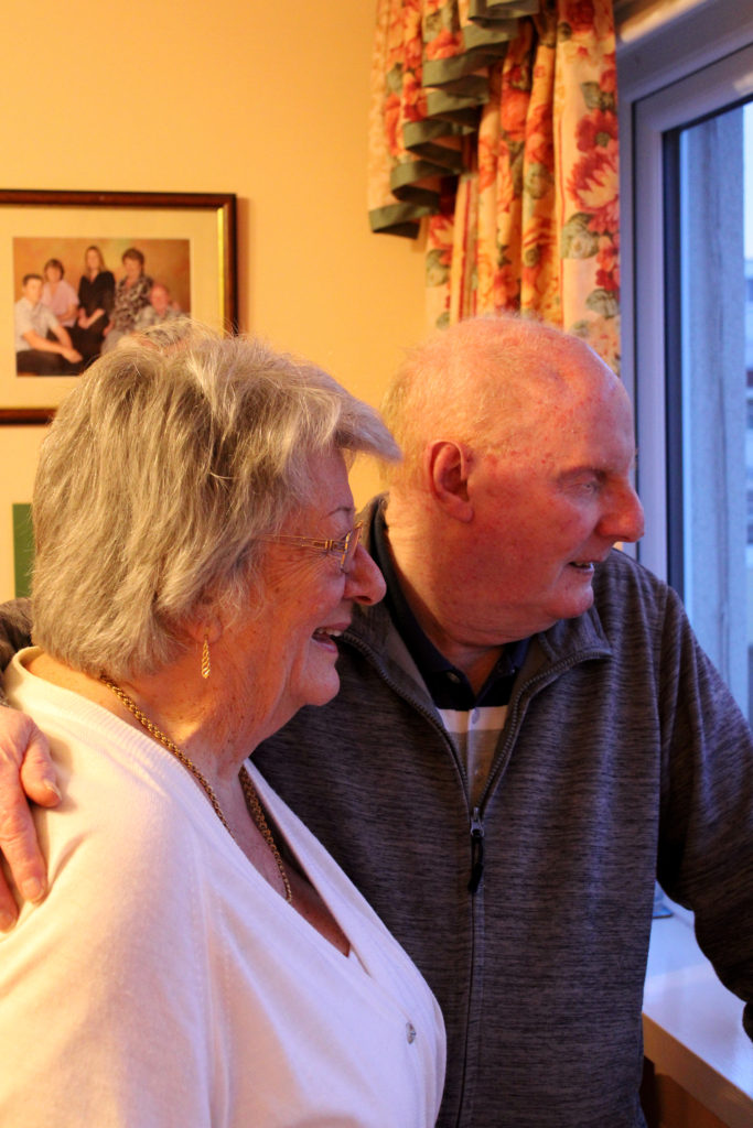
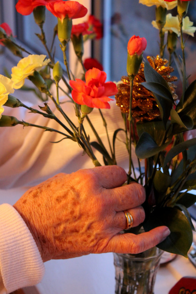
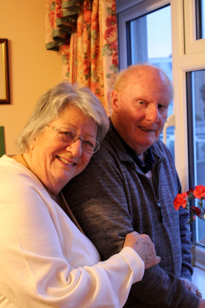
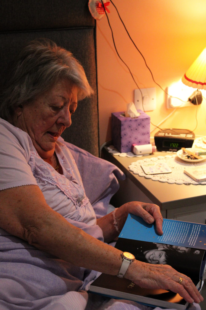
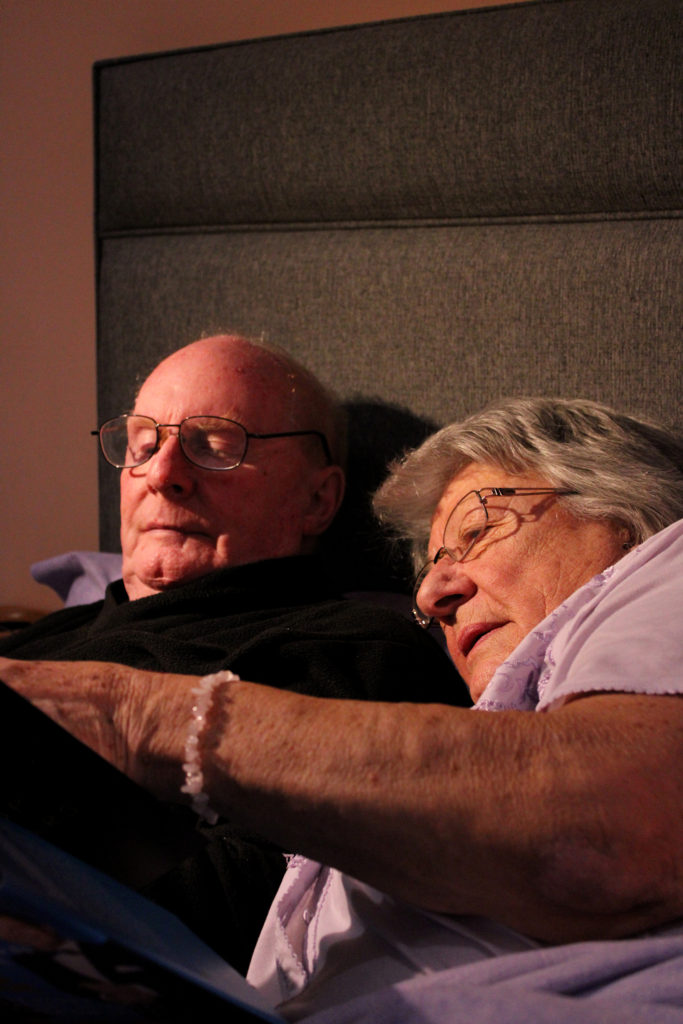
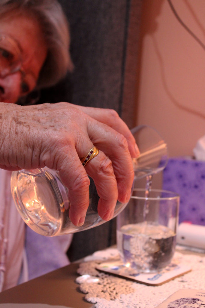
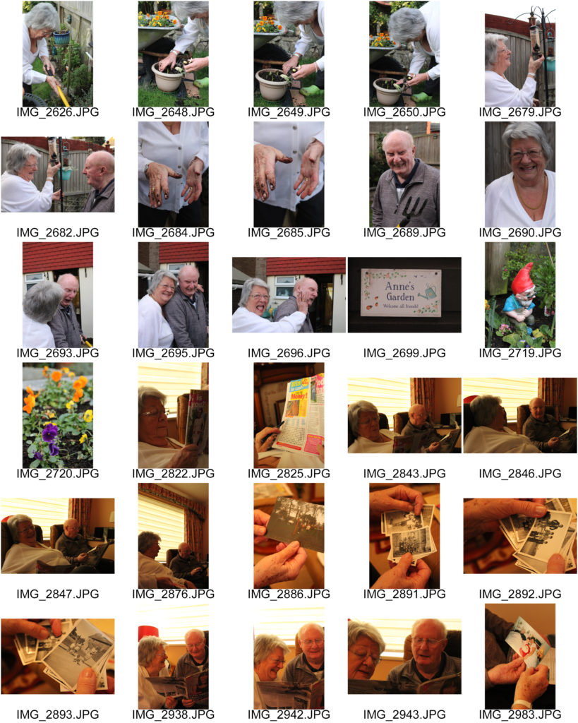
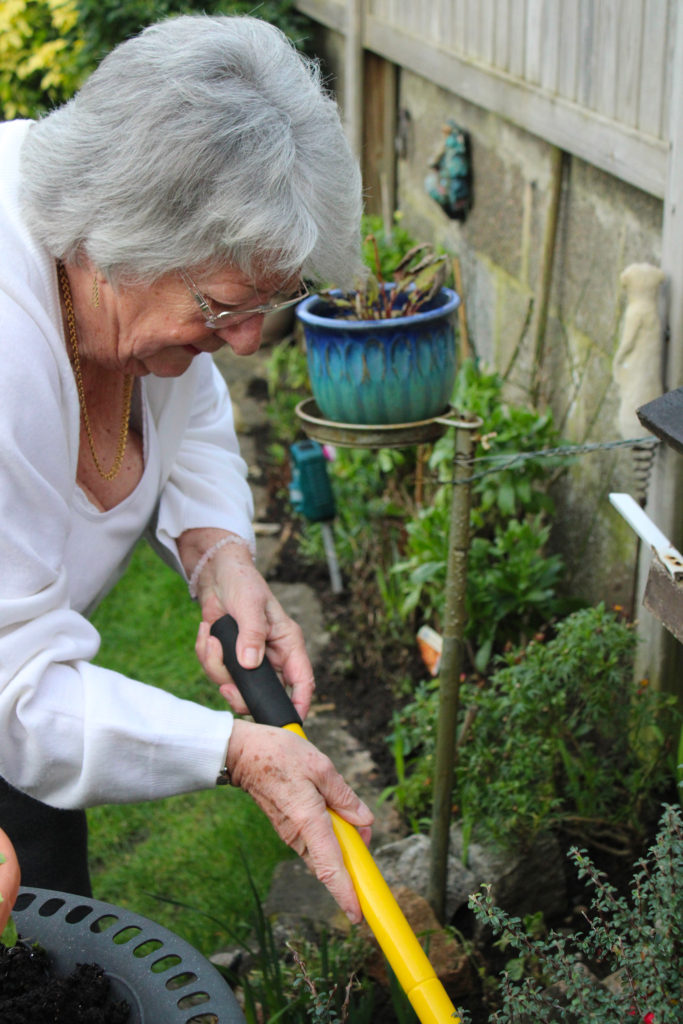
During this photoshoot, I decided to take the approach of capturing images that linked to each other in trios. I wanted to reflect the warm cosy atmosphere created in Germain’s images while also adding a element of my ideas to set out these images in storytelling sequences. I really love how the photographs from this shoot turned out, I did minimal editing on them, only touching up brightness here and there which I believe adds to the naturalistic mood of these pieces. Additionally, I love how each sequence tells a different story about my grandparents and family’s life. The first set of images depicts my grandmother doing what she loves the most, gardening. Whenever I arrive at my grandparents home you can bet my nan will be ‘pottering in the garden’ as she calls it. I like the contrasting compositions of these images as I believe the differing camera angles create an inclusive atmosphere, as if the observer is stood in the garden with her. Furthermore, in my second sequence I really enjoy the way the images tell the story of family and identity over time- similar to Julian Germain’s study. I captured these images of my grandparents reminiscing through old photographs with a focus on their hands, I believe hands are like windows into somebody’s past; they tell a story through marks and lines that can embody someone’s identity entirely. I like how these images have a strong contrast of dark and light tones and a subtle orange hue throughout.

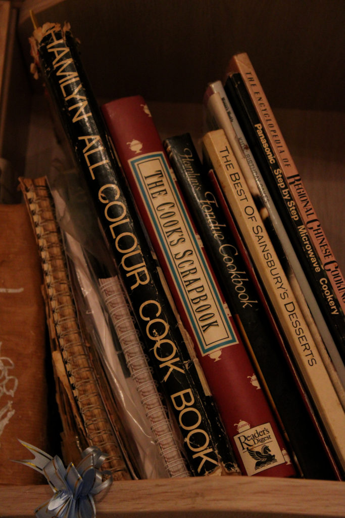
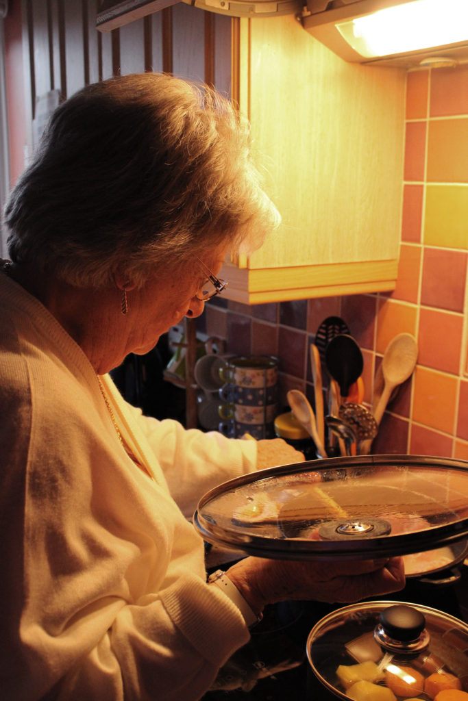
My third sequence shows my grandparents admiring their garden and bringing elements of nature inside their home- my family identify greatly with nature and there are always flowers displayed in my grandparents house. I love the vibrant colours of blue from the window, red from the flowers and peach from the wall which form a fun playful atmosphere, giving the impression my grandparents find joy in the beauty of the environment- furthering Germain’s ideas on finding happiness in the small things. My forth group of images show my grandparents doing what they usually do before bed- they love to read or fill out crosswords together. I really like how the main colours in these images, orange, pink and purple, create a comfortable mood reflecting their love for their home and each other. I also love the strong contrast between highlight and shadow in this sequence and also the repetition of the shade lilac. My final set of photos displays the moments before and during dinner time- it tells the story of my grandmother’s love of cooking and providing for her loved ones. The tangerine hue and high saturation of these images gives a welcoming impression and connotes the feeling of happiness and warmth, I think this really shows how my family identify with our care for each other. I really like the darker tones in these photos, it presents the evening in a calm way and reflects Germain’s naturalistic personal work.

Identity and Place – Claude Cahun/Julian Germain Case Study

Claude Cahun

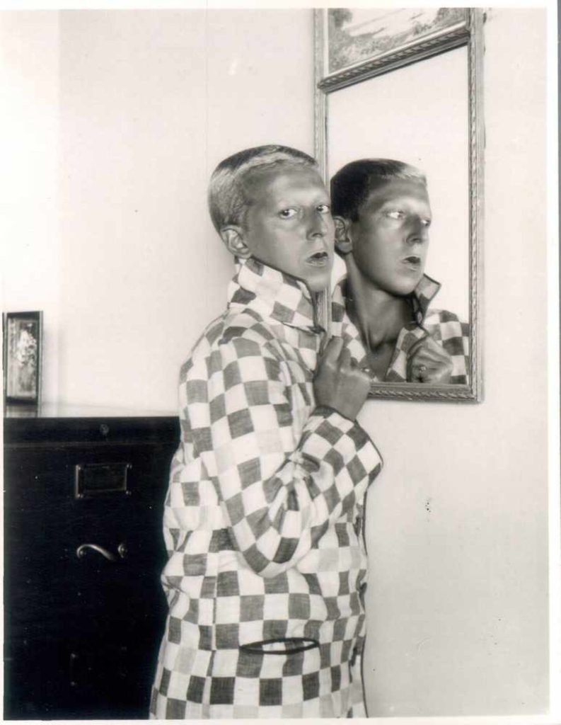
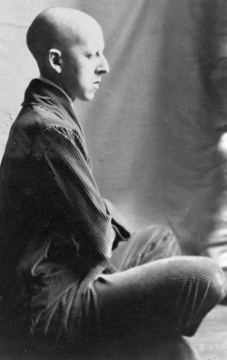
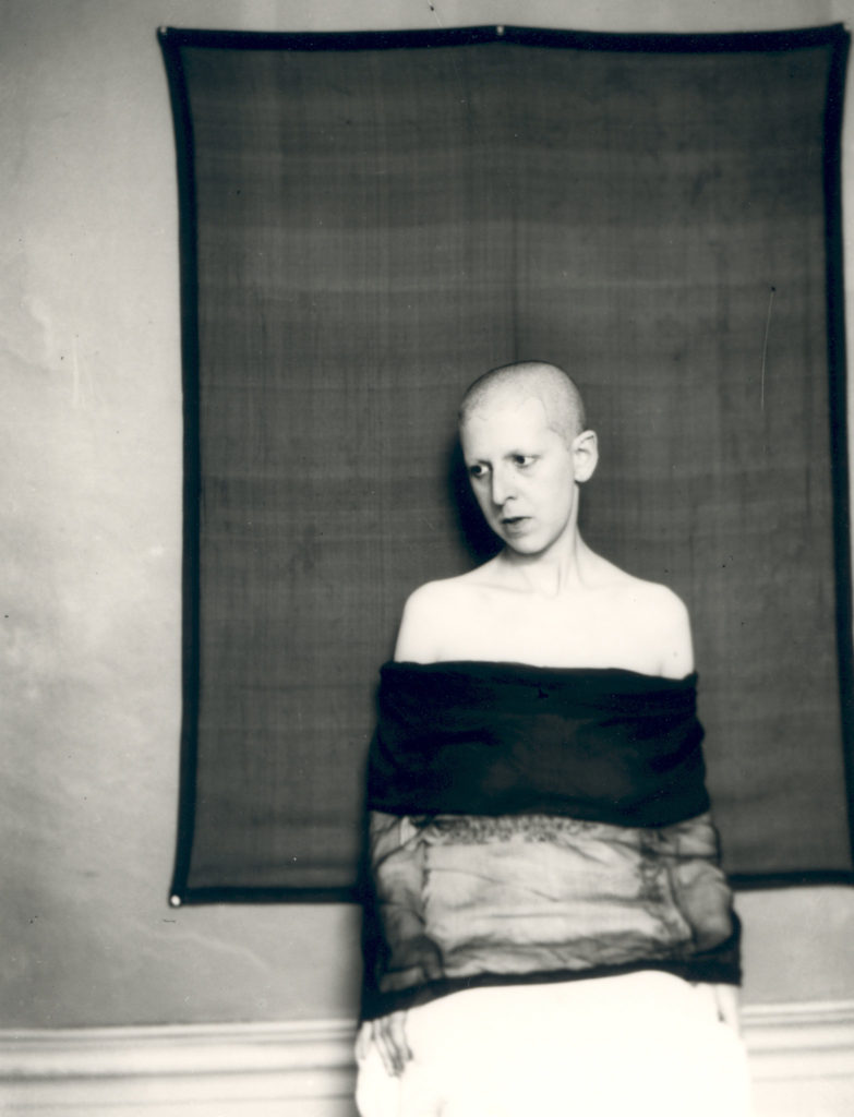
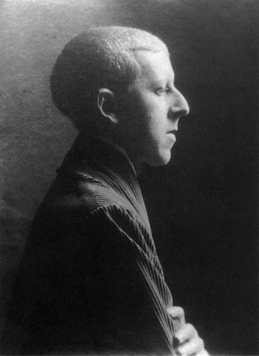
Claude Cahun (1894-1954) was a French surrealist photographer known for her highly staged self-portraits exploring gender and identity. Cahun experimented with photographing herself in clothing that was not conventionally feminine or masculine, she was born ‘Lucy Renee Mathilde Schwob’ and in 1919 chose the pseudonym Claude Cahun as it was more sexually ambiguous. In 1937 Cahun settled in Jersey, disguised as a non-Jew, and during WW2, being passionately against war, produced anti-German fliers and placed them in soldier’s pockets secretly. It is clear that Cahun’s beliefs undermined the authority and society at the time as she went out of her way to disrupt ‘normality’ in her images. Additionally, Cahun’s androgynous appearance reflects her views on how identity and gender are just ideas formed by society, not set rules everyone needs to follow. Many of Cahun’s works can be found in The Museum of Modern Art in New York, the Museum of Fine Arts in Boston and the San Francisco Museum of Modern Art, along with many others.

Julian Germain

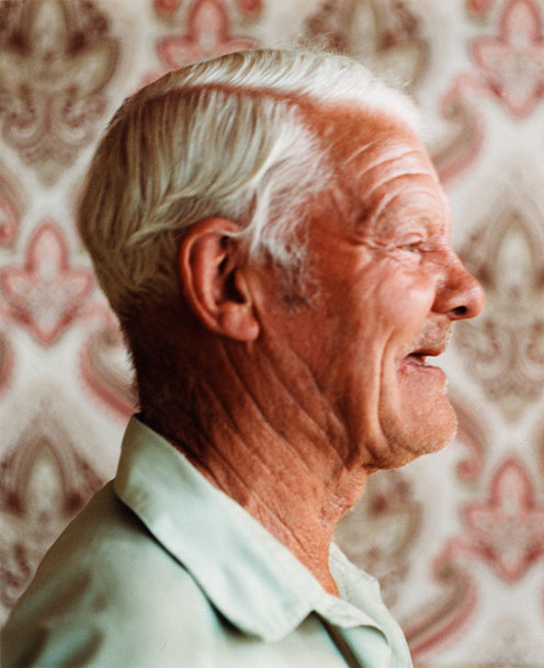
Julian Germain is a British photographer who studied photography at The Royal College of Art in London. Germain’s project ‘for every minute you are angry you lose 60 seconds of happiness’ is a series of photographs made over 8 years of the quiet, contemplative existence of Charles Snelling, an elderly man living alone in a small house in Portsmouth, shown alongside pages from Snelling’s own photo albums. Germain met Snelling in 1992, he describes how his subject lived in a very unique house full of colours like orange and yellow- it was unlike anything he’d seen before. I really love this particular project of Germain’s because of it’s beautiful message depicting how the most important things in life cost nothing at all, he wanted to show people with a profound understanding of who they are and what they stand for, something that cuts across all cultures. I believe this holds a strong link to ‘identity’ as Germain captures the individuality of his subject in an environment important to him. This project really stood out to me when deciding on initial ideas because of it’s close link to family also, I hope to take images of a similar standard in my study.

Image Comparison

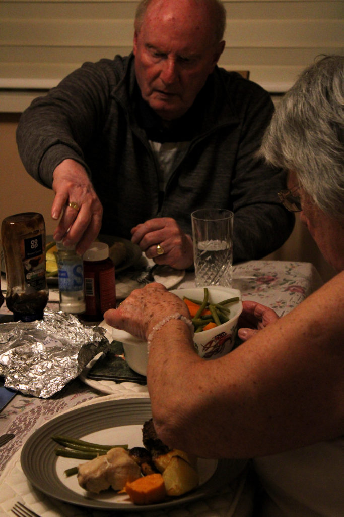
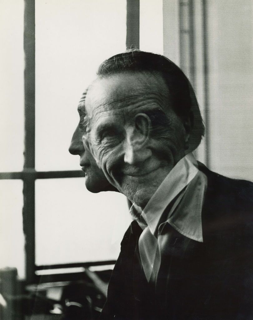
Although Cahun and Germain’s style of photography does not focus on the same concept of identity, these 2 images hold many visual and technical similarities. For example, the composition of each image is extremely similar as both subject’s are looking away from the camera with their bodies angled side-on to the lens. In Germain’s image, this may symbolise his subject’s bright view on the world, as if he is looking out of a window and seeing it’s beauty, furthered by his smiling facial expression. However, in Cahun’s image this composition creates a more closed-off atmosphere, suggesting Cahun has a more negative view on the world and on society. In addition, both images seem to have similar lighting coming from the right of the photo, which creates the main highlights on the front of the subject’s face. This lighting also produces similar shadows in the images, falling behind the subject’s neck and across the left side of their face. Nevertheless, it is clear that Cahun has used a more harsh artificial lighting and that Germain has made use of natural sunlight through a window to capture these images. This sharp lighting in Cahun’s image initiates a more intense dramatic atmosphere whereas Germain’s creates a soft cheerful mood. Another difference between these images are the photographer’s choice of background. Cahun is positioned in front of a dark blank background, possibly symbolising their views on how society’s minds are blank to new ideas and beliefs revolving gender and identity. Contrastingly, Germain’s subject is stood in front of a highly patterned background. The repetition in the wallpaper could suggest the subject has a large family, with the repeated shapes representing family members like a family tree. Furthermore, both of the image’s subjects have similar facial features. Cahun portrays themself with conventionally masculine attributes, such as short hair, in order to disrupt gender norms and go against what society expects. Germain’s masculine subject has a very similar hairline to Cahun, showing that certain facial features or hairstyles are not reserved for a certain gender.

Identity and Place – Introduction

What is identity?

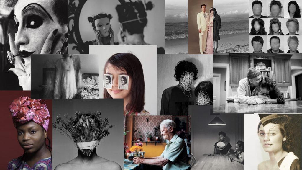
Over the course of time, identity has come to mean several different things and people interpret the word in their own unique ways. A dictionary definition of the word will tell you identity is ‘the fact of being who or what a person or thing is,’ however identity is a word that holds many meanings. You may define identity as your culture, where you are from and how you’ve grown up- yet somebody else may have a completely opposite perception of the word such as identity meaning gender, personality or looks. Identity has been explored through photography for decades, it gives an understanding into people’s lives and beliefs by presenting them in their truth, or opposingly in how they want others to believe is true. Frequently, identity is changing and being influenced by our views on the world- some may say your identity is moulded by your surroundings and environment.

Identity Mood-board

Identity Mind-map

Initial Ideas

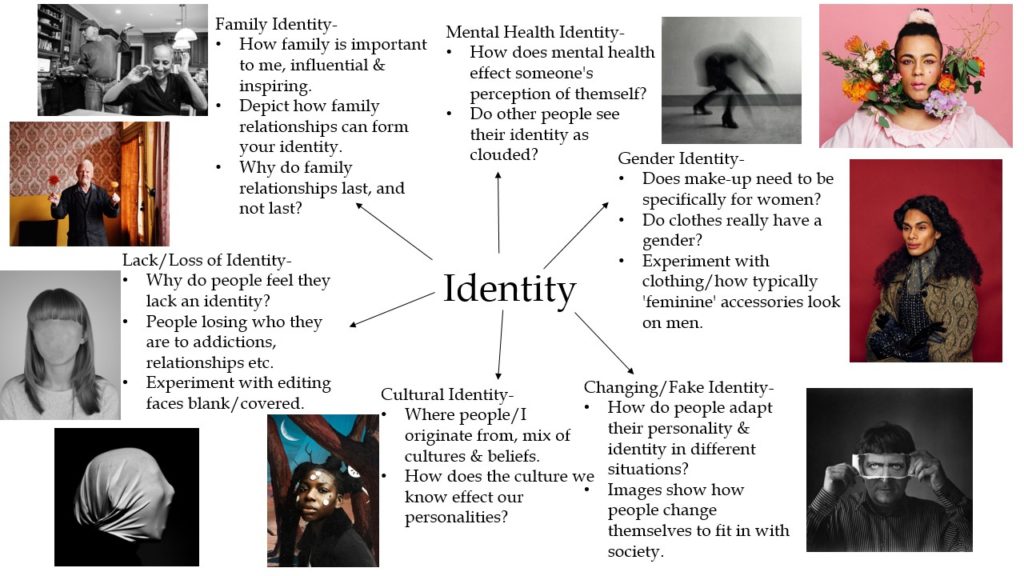
Personally, identity is influenced by countless things, but specifically upbringing and family. I like the idea of doing a project focusing on the identities and lives of my grandparents, as they have been extremely influential to me throughout my life and inspire me daily. I plan on documenting certain moments of their day and producing a sequence of images showing how their relationship is so important in their lives and mine. My concept is to demonstrate how family relationships and love can shape someone’s identity and how my grandparent’s past and upbringing has impacted my family today. To experiment with the ‘place’ aspect of this project I plan on experimenting with scenarios around my grandparent’s home as it is a place of safety and security for them, full of memories from over the years and things that bring them comfort. I want to show how identity is not only formed by our perception of our self- it is influenced by past memories of nostalgia and our changing passions in life.

Up Close Portraits

Satoshi Fujiwara

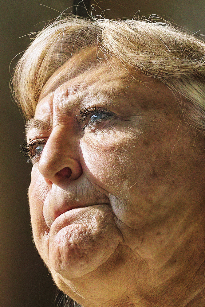
Satoshi Fujiwara is a Japanese photographer who has been based in Berlin since 2012. In one project of Fujiwara’s work, he has taken inspiration from Michael Haneke’s 2000 film ‘Code Unknown’, in which there is a scene where a character secretly photographs different people sitting opposite him on the train. Fujiwara was influenced by this technique of candid photography and similarly captured images of strangers on Berlin trains. In an interview with Lens Culture, Fujiwara described how he shot and edited his images in a way to keep his subject’s identities anonymous. It is clear that Fujiwara captured these images during daytime, as the direct sunlight provides natural lighting on his ‘model’s’ faces.

Photoshoot Plan

Due to having to isolate from school because of the COVID-19 pandemic, I will not be able to use the photography studio to conduct this photoshoot. Instead I plan on creating a ‘home studio’ using a blank white wall as a background and lighting my subject with a multi head floor lamp. Although it will be more of a challenge to re-create Fujiwara’s up close work from home, my idea is to only take inspiration from his project and work with the lighting/set up I am able to create at home.

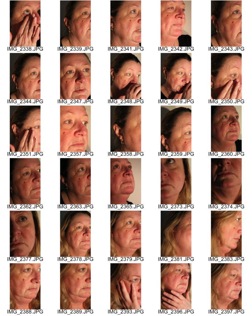
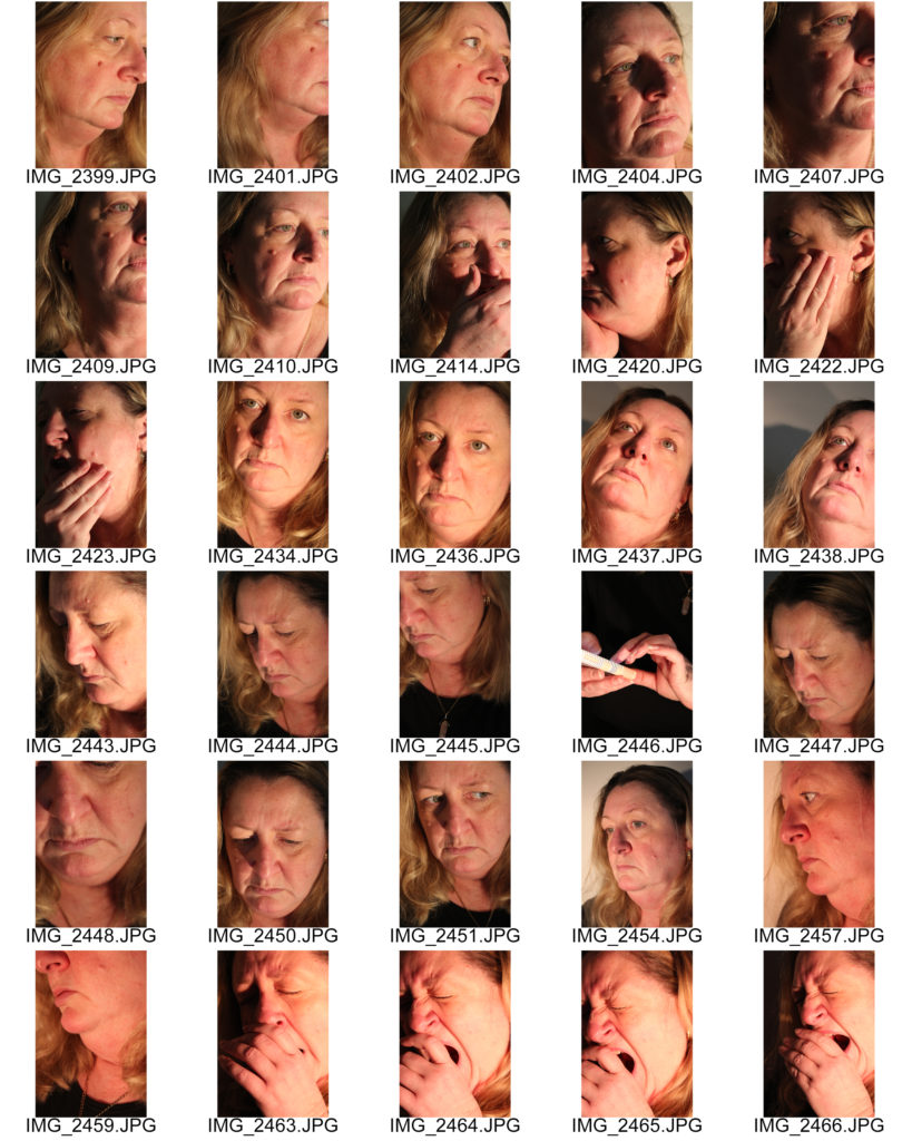
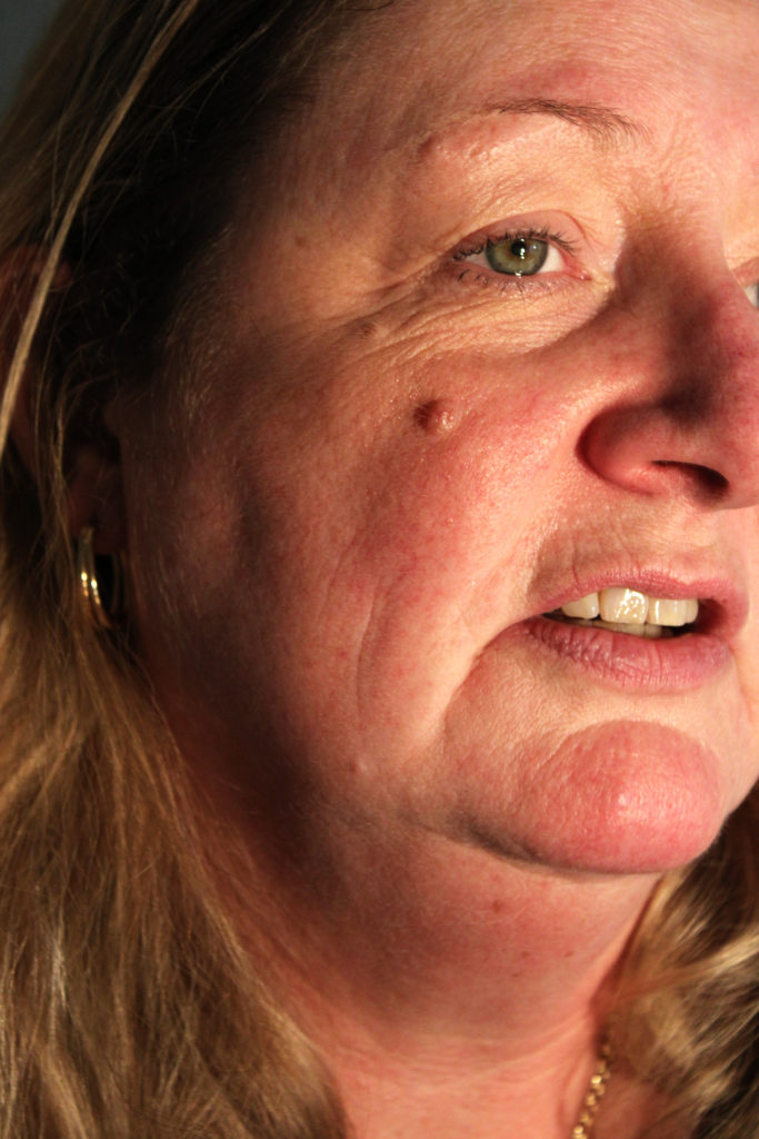
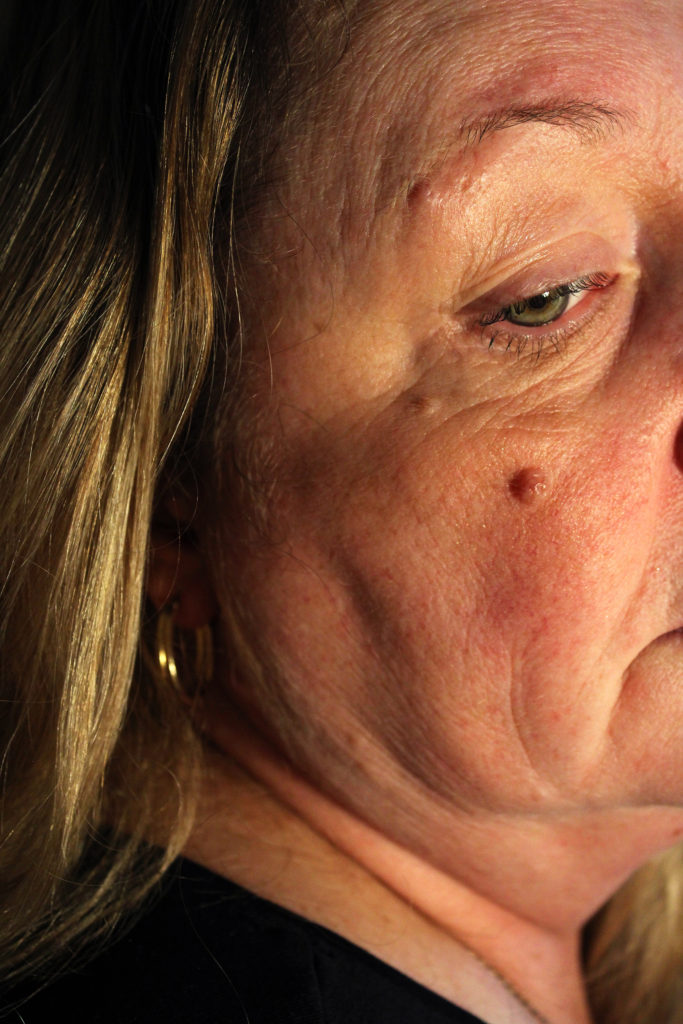
Who – I plan on photographing my mum for this shoot as she is comfortable being in front of the camera and will be relaxed while I capture images that are quite invasive and close to her face.

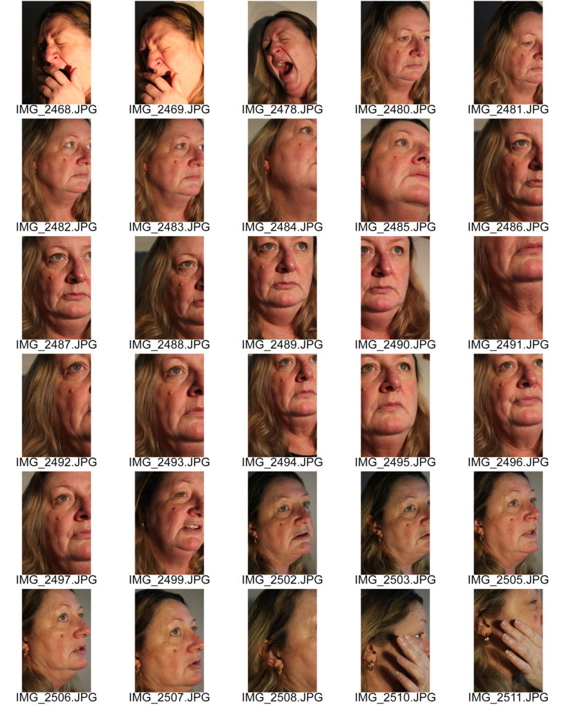
What – I will be capturing images of close-up facial features such as lips, jaws, cheeks as well as close-ups of the full face. I plan on asking my model to have a conversation with me while I take some of the photos in order to capture natural images.

Where – As previously mentioned, I will have to conduct the photoshoot at home by creating a studio and using lighting I have around the house. I plan on taking these images in my lounge, as I have a blank white wall that can serve as a plain background for the shoot.

How – I will attempt to create shadows on and around the subject’s face by moving the different heads of the lamp I plan on using to different positions to highlight contrasting parts of her face.

Why – I wish to experiment with how close-up images can distort someone’s face so it is almost unrecognisable, taking inspiration from the works of Satoshi Fujiwara when he was influenced by the film ‘Code Unknown’.

Contact Sheets

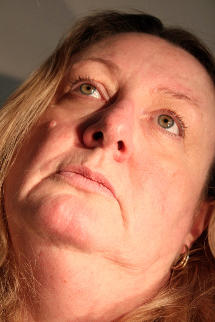
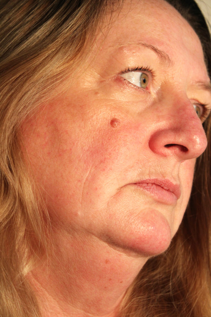
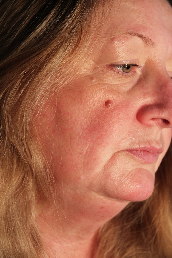
Selected Images

Comparison to Satoshi Fujiwara

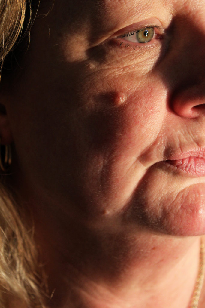
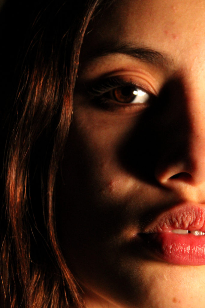
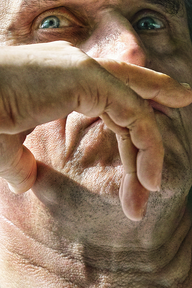
Satoshi Fujiwara uses natural sunlight to capture his candid images, I have recreated this in my shoot by directing my lighting to form harsh shadows across my subject’s face, similar to those Fujiwara took on the Berlin trains. This reflects the chiaroscuro technique used in renaissance paintings to create drama and atmosphere in images, it shows the strong contrast between light and dark. This use of shadow and highlight creates a more intense mysterious atmosphere in mine and Fujiwara’s images, which is furthered by the subject’s longing facial expression looking away from the camera. Similarly, both image’s direction of light on the subject’s face create a clear focal point for the observer at the subject’s eyes. They appear to have a glossy texture that catches the observer’s attention against the otherwise shadowed face. Nevertheless, Fujiwara has captured his image from a low camera angle whereas I have angled my camera at eye-level. I chose to photograph the subject in this way in hopes of creating a more ambiguous image and allowing the observer to interpret the subject in their own way. I believe an eye-level angle helps achieve this as it does not give the impression that the subject is looking up or down on whomever is looking at the image, therefore not giving them a set status.

Final Image Analysis

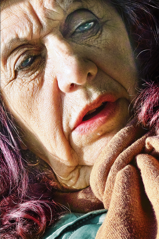
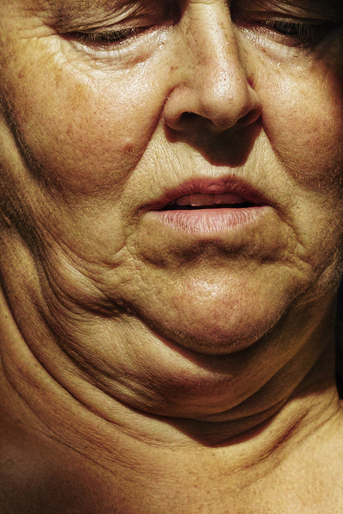
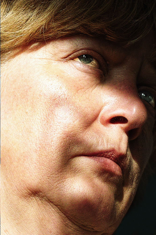
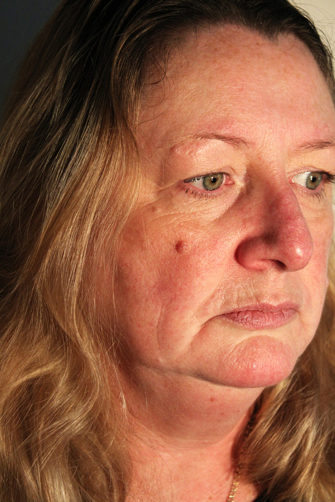
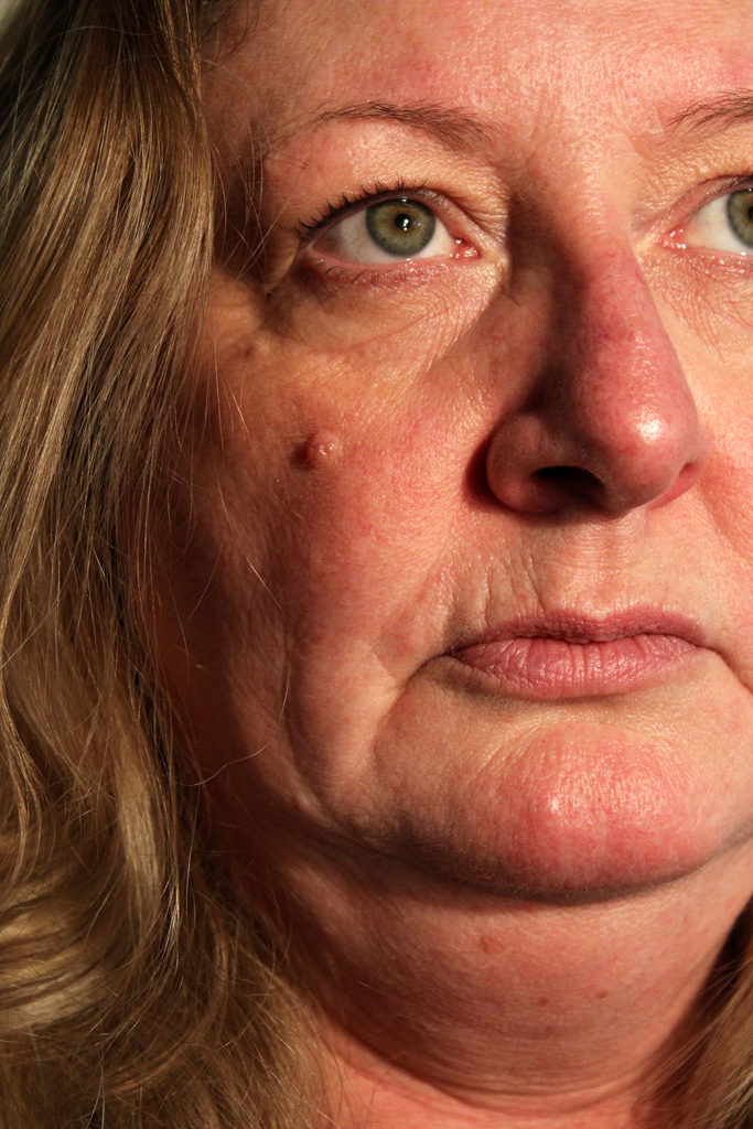
I have chosen this image for my final ‘Up Close’ portrait because I believe it successfully mirrors Fujiwara’s candid photography and abstract portraiture technique. Due to my subject having red undertones in her skin, along with bright green eyes, it creates a dispersed focal point for the observer- as green and red are complementary colours, letting each stand out as equally as the other. Additionally, the lighting I used in this shoot mixed with the subject’s skin tone creates a warm orange hue over the portrait. The texture of this image is formed by the lines and imperfections of the subject’s skin, for example due to the creases and furrows around her lips and eyes it produces quite a rough texture. These lines don’t exactly show physical movement in the photograph, but more like movement in time. They allude to the subject’s age and past by showing change over a period of time and how it can impact or alter someone’s appearance. Furthermore, the lighting of my final image creates subtle shadows which fall across the left of the subject’s face. Due to the placement of my main lighting source, the most prominent highlight can be seen on the top of the subject’s nose. This opposes with the shadows that fall around the subject’s nostril and shows the contrast between the lightest and darkest point of the image. I really enjoy the way this photograph shows the subject in a natural relaxed position, I believe it reflects Fujiwara’s images as the model is not posing or looking at the camera.

Studio Portraits – 2 Point Lighting + Multi-Exposure

2 Point Lighting Photoshoot Plan

2 Point Lighting – This style of lighting usually consists of 2 main light sources, a key light and a fill light. The key light illuminates the subject while the fill light removes any unwanted shadows that the key light has created. It is important to note that the second ‘light’ could actually just be a reflector or wall that allows the light to bounce off it onto the subject.

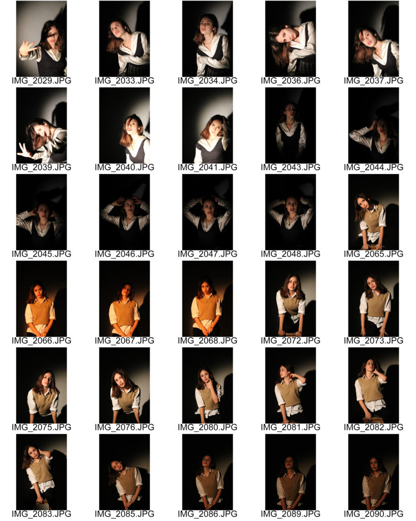
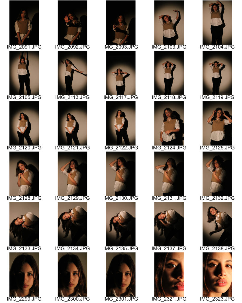
My plan for this photoshoot is to have a 2 point lighting set up in the studio at school, I will photograph my friend who is comfortable in front of a camera in hopes of capturing images of a professional standard. I am going to use a spotlight to the left of my subjects face and a panel LED light to the right. I plan on using different coloured gels over my two lights to experiment with complementary and contrasting colours. Additionally, I want to explore using different camera angles and compositions. For example, I plan on taking headshots, close-ups, mid-shots and long-shots in hopes of producing a range of images with different compositions and seeing how the camera angle effects the lighting and atmosphere of the photo.

Contact Sheets

Selected Images

Final 2 Point Lighting Portrait

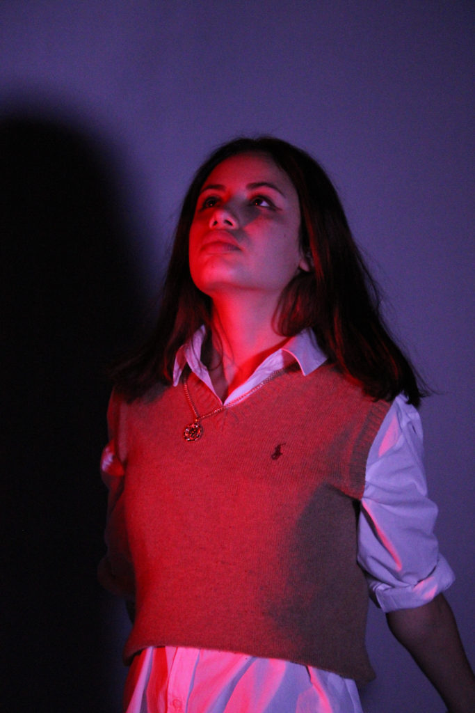
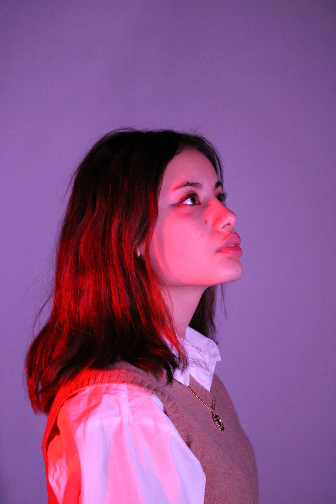
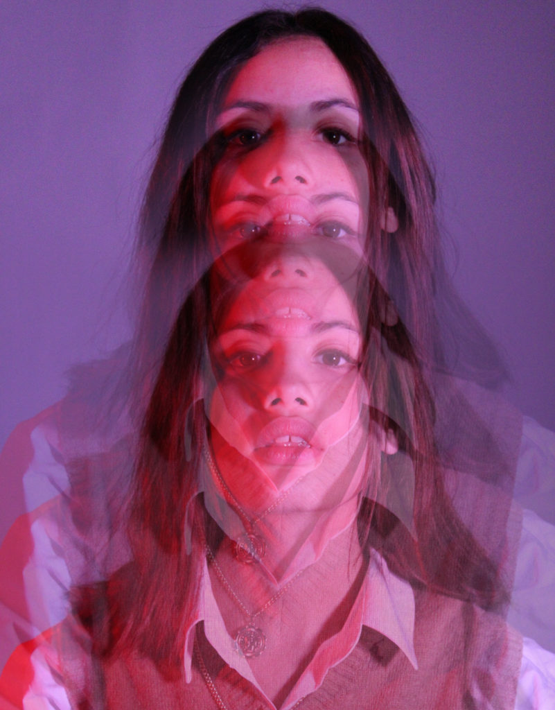
I chose this image for my final 2 point lighting portrait due to its highly saturated colours and clear abstract lighting. My image was taken using artificial lighting, with gel colours providing a contrast in tones. I really enjoy the way the red lighting highlights the subjects face, creating an effect similar to sunlight shining through a window. As I had set up this light to the left of my subject, it allows the warm colour to fall across the photograph and gradually gradient to a less saturated tone. Additionally, I used red and purple gels in this image to experiment with clashing colours. I love the way the purple lighting provides a subtle background colour while emphasising the bold red highlights that fall across the subject. Moreover, I believe this contrast in colour forms a warm inviting mood in the image which is furthered by the subject’s direct eye contact with the camera. Furthermore, due to the harsh lighting of my photo, several dark lines can be seen on the subjects clothing and neck which contrast with the bright red surrounding them. The dark areas of this image clearly direct the observer’s focus, for example as my subject has dark hair and eyes they stand out against the pastel background, creating a clear focal point in the centre of the subject’s face.

Double/Multi-Exposures

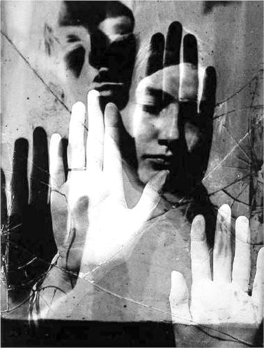
I decided to experiment with creating some double/multi exposure images from this photoshoot, similar to the work of photographer Man Ray and his work during the Surrealism movement- more info on Man Ray can be found here https://www.manray.net/ and examples of his work are below. I produced these images by layering different photos, and sometimes the same photo, from the shoot on top of each other on Photoshop. I reduced the opacity of one layer to produce the ‘multi exposure’ effect which I believe creates a more abstract atmosphere in my images. In addition, the bold colours of these photos mixed with the strange composition created by the multi exposure editing makes the subject appear alien-like and resembles something you may see on a sci-fi movie poster. I really enjoy the way this editing has created such a contrast in mood and context from the previous in this shoot, I like how the repetition of the subject gives the impression she is moving quickly. Furthermore, the repetition in these photographs symbolises echoes of the past, especially in the top right image where it seems as if the subject is leaving her body behind, conveying the idea of time moving swiftly on.

Studio Portraits – 1 and 3 Point Lighting

Studio Lighting

Lighting in an image is such an important factor, it can not only determine how bright or dark an image is but also how different the mood or atmosphere is. Studio lighting is used because it allows us to manipulate the lighting of a photograph to create a desired texture, vibrancy or shadow on our subject. Studio lighting also allows photographers to experiment with different styles and perspectives when capturing an image, it is important for them to be able to photograph abstractly and naturally.

1 Point Lighting – This style of lighting involves just one light, the key light, which is the main light source that lights up the subjects face. Images taken using 1 point lighting usually contain lots of shadows surrounding the subject, this is due to the singular light providing the only highlights in one specific spot. This lighting style can create very dramatic and abstract images due to the contrast between the bight highlights and dark shadows.

Rembrandt – Chiaroscuro Technique

Chiaroscuro is an art and photography technique which shows a bold contrast between light and dark. It is an Italian term which translates as light-dark, and refers to the balance and pattern of light and shade in a painting or drawing. Painters of the Renaissance and Baroque periods used this technique to create a dramatic atmosphere in their work to interest and excite their viewers. For example, above are two paintings by the Baroque painter Rembrandt, who used Chiaroscuro to illuminate one side of his subjects face- therefore leaving the other in shadow creating an impressive dramatic image. Rembrandt’s contrast between light and dark was inspirational throughout the baroque period, many other artists produced similar paintings such as Caravaggio and Johannes Vermeer.

Peter Lindbergh

Peter Lindbergh (1944-2019) was a German fashion photographer and film director. Considered a pioneer in photography, he introduced a form of new realism by redefining the standards of beauty with timeless images. His humanist approach and idealisation of women sets him apart from other photographers as he privileges the soul and the personality. Lindbergh is considered to be one of the most influential contemporary photographers to date and his use of Chiaroscuro in his images produces a mysterious atmosphere which intrigues the observer greatly.

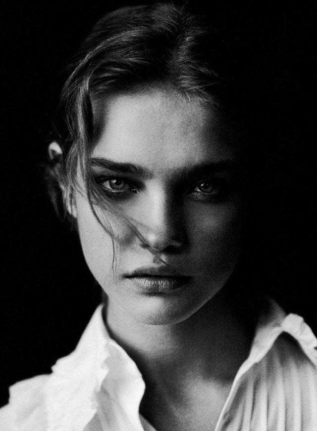
Peter Lindbergh | Natalia Vodianova | Vogue Italia, May 2003

Lindbergh uses Chiaroscuro in this image to create a cinematic shot that captivates the observer. He has clearly used 1 point lighting to illuminate the left side of the model’s face, which produces a dark shadow on the right. Additionally, Lindbergh’s images are black and white which furthers the mysterious mood created by the deep shadows falling across the model’s face. The tonal range in this image is limited to a main white highlight, grey mid-tone and black shadow- with the darkest point of the image in the background. This black background produces negative space in the photograph, emphasising the focal point of the subject by allowing her to stand out against it. Furthermore, the harsh contrast between light and dark in this image creates several sharp lines. For example, on the models nose we can see a straight dark line formed by the Chiaroscuro lighting. The composition of the image is not abnormal to those usually printed in a vogue magazine, as the subject is directly addressing the observer through eye contact straight down the camera lens. Also, the model’s eye contact with us creates an enticing atmosphere in the image, supported by the secretive shadows that surround her.

Photoshoot Plan

Who – I plan on photographing a friend who has done modelling in the past in hopes of capturing images with more professional poses. Additionally, my model will be comfortable in front of the camera so will be relaxed when experimenting with different angles and poses.

What – I will attempt to photograph my model using Chiaroscuro, letting shadows fall across her body, face and the background of the photograph.

Where – My plan is to do the photoshoot in the photography studio in school as the professional lighting equipment will allow me to create the Chiaroscuro images more easily and effectively.

Why – I am going to produce this photoshoot in hopes of broadening my knowledge of using studio lighting and shadows to create different moods and atmospheres in my images. I also wish to experiment with lighting techniques and take inspiration from Peter Lindbergh’s work.
How – I plan on using 1 point lighting with a spotlight to create most of my Chiaroscuro images, I wish to experiment with changing my camera’s white balance and ISO settings whilst also changing the whiteness of my lighting to find the most effective lighting colour.

Contact Sheets

Selected Images

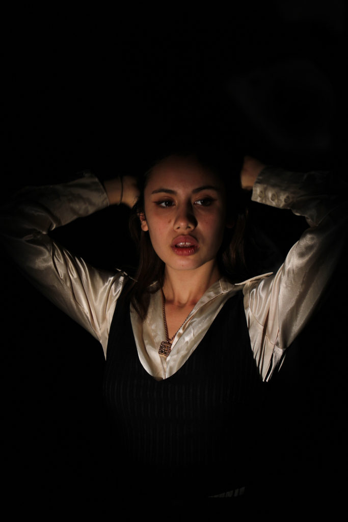
Final 1 Point Lighting Portrait

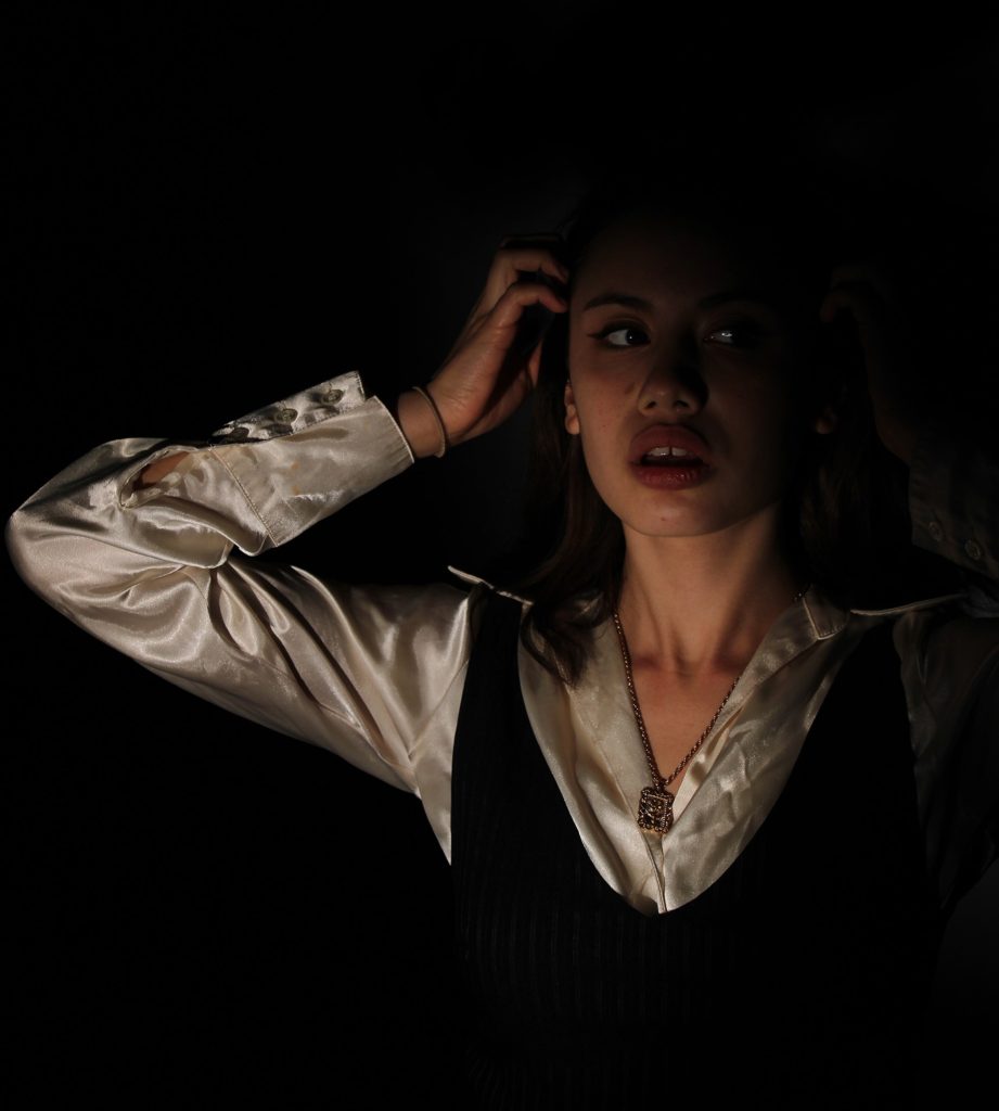
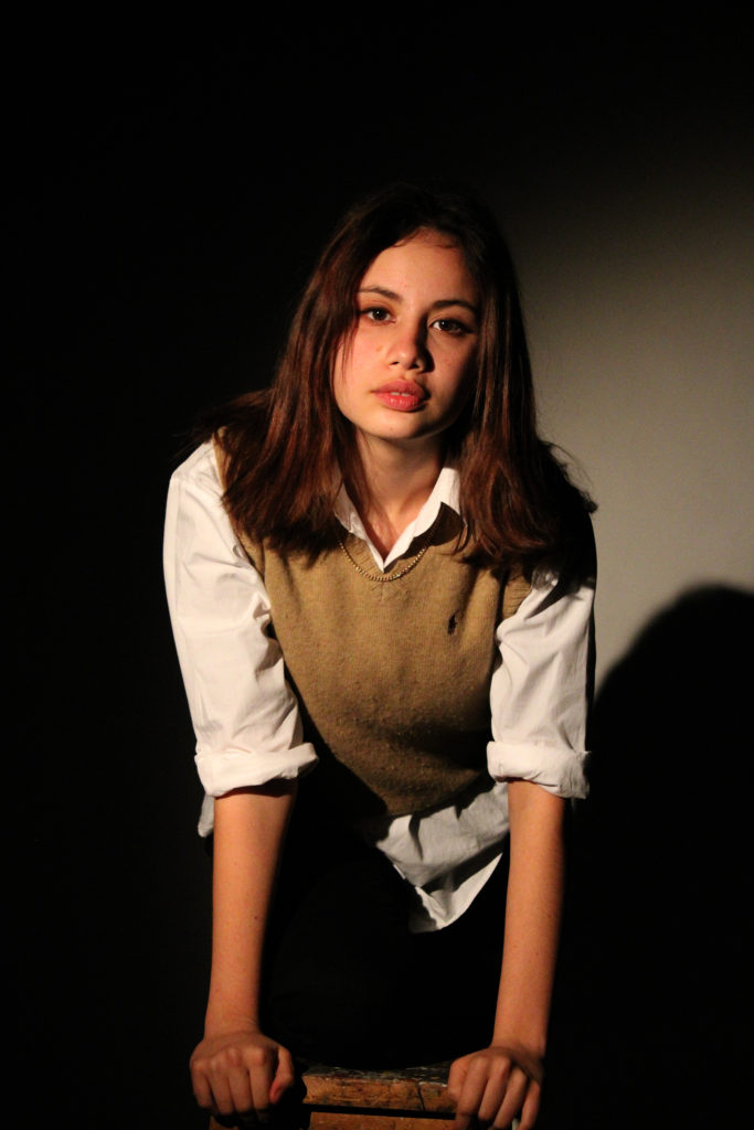
I have chosen this photograph for my final 1 point lighting image as I believe it shows a successful example of chiaroscuro and the abstraction of using a singular light. I produced this image using a spotlight to create the 1 point lighting set up, I had the key light positioned to the left of my subject and angled slightly below their chin pointing upwards. This therefore produced dark shadows surrounding the subject and falling across the right side of their face as my key light was close enough to her that it limited the highlights falling anywhere else. I believe this manipulation of shadows has created a mysterious atmosphere as the limited light connotes the idea that the subject is being consumed by the darkness. Additionally, with the subject not having direct eye contact with camera lens it forms a cold and disconnected aura in the image, almost as if she is looking away from the light because of a darker temptation. I experimented with changing my white balance to ‘daylight’ so I could manipulate the image’s lighting to look like ‘golden hour’, however after consideration I re-took my image with the automatic white balance as the warmer lighting didn’t reflect the desired cold atmosphere. Similar to the work of Peter Lindbergh, my solid black background allows the subject to stand out clearly. However, there are still moments in my photograph where parts of the subject blend with the shadow, for example as she is wearing a black vest it creates the impression she is being absorbed into the background. I think that I have succeeded in creating a dramatic image using chiaroscuro and 1 point lighting as my contrast in light and dark alludes to a clear story and produces a mysterious atmosphere.

Experimenting With 3 Point Lighting

3 Point Lighting – This style of lighting in photography involves 3 main sources of light usually in 3 different positions. The main light sources used are a key light, fill light, and backlight. In 3 point lighting images, in order for the subject to not blend with the background, the backlight is used to separate them. 3 point lighting is one of the most popular lighting set-ups in photography as it allows the photographer to clearly illuminate their subject and limit the amount of shadows created around them.

During the photoshoot I also wanted to experiment with using 3 point lighting to minimise the amount of shadows and see how it changed the atmosphere of my images. My plan was to keep the singular spotlight to the left of my subject, while also adding a ring light in the middle and a LED panel light on the right. I experimented by using warmer tones in one light compared to colder in the others to see how it would effect the image’s composition of shadows.

Final 3 Point Lighting Results

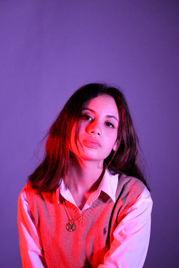
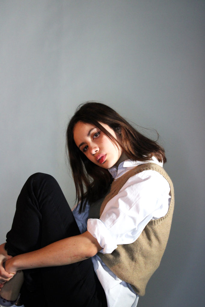
It is clear that by adding 2 more lights to this photoshoot it creates a completely different mood in the images. Before, the dark shadows surrounding and engulfing the subject created a secretive mysterious atmosphere. However, now by adding the ring light and panel, the photographs are brighter and clearer for the observer. This change in lighting created a more playful happy mood, nevertheless I still wanted to experiment with the subject’s facial expressions to see if I could change it further. By having her make direct eye contact with the camera lens while sitting in relaxed positions, it shows the subjects confidence and lets her connect with the observer. I angled the camera slightly above her eye-level to prevent the idea that the subject was looking down the lens in an intimidating manor. Instead, I believe this additional lighting and engagement with the observer creates a more laid-back atmosphere and a welcoming mood.

Diamond Cameo

Henry Mullins

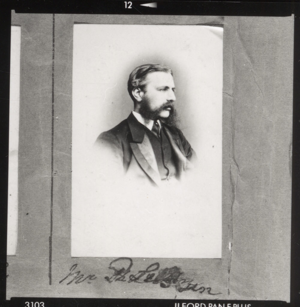
Henry Mullins was the first professional photographer to arrive in Jersey and start a portraiture business in the very early days of photography. Henry Mullins started working at 230 Regent Street in London in the 1840s and moved to Jersey in July 1848, setting up a studio known as the Royal Saloon, at 7 Royal Square. He would photograph the upper class such as doctors and political elites as they were able to afford to visit his studio.

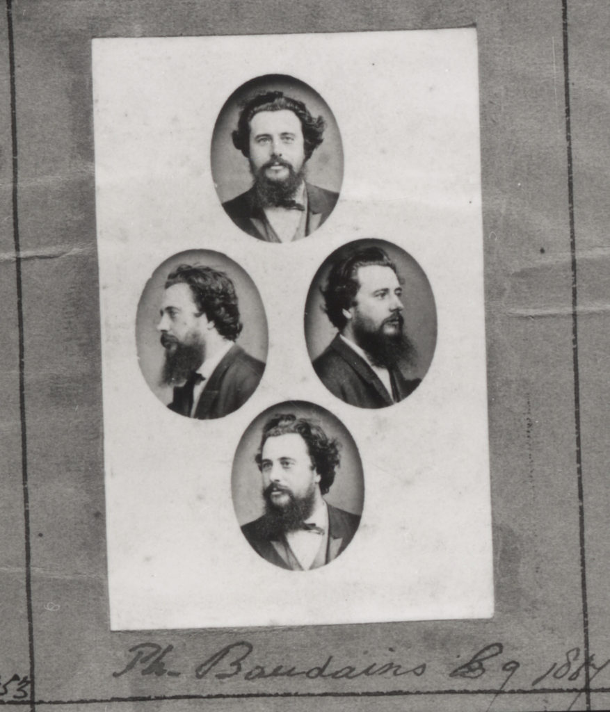
Henry Mullins| Headshot of Philip Baudains

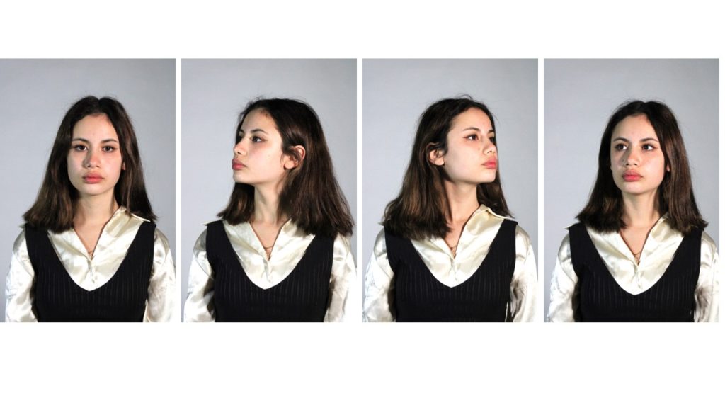
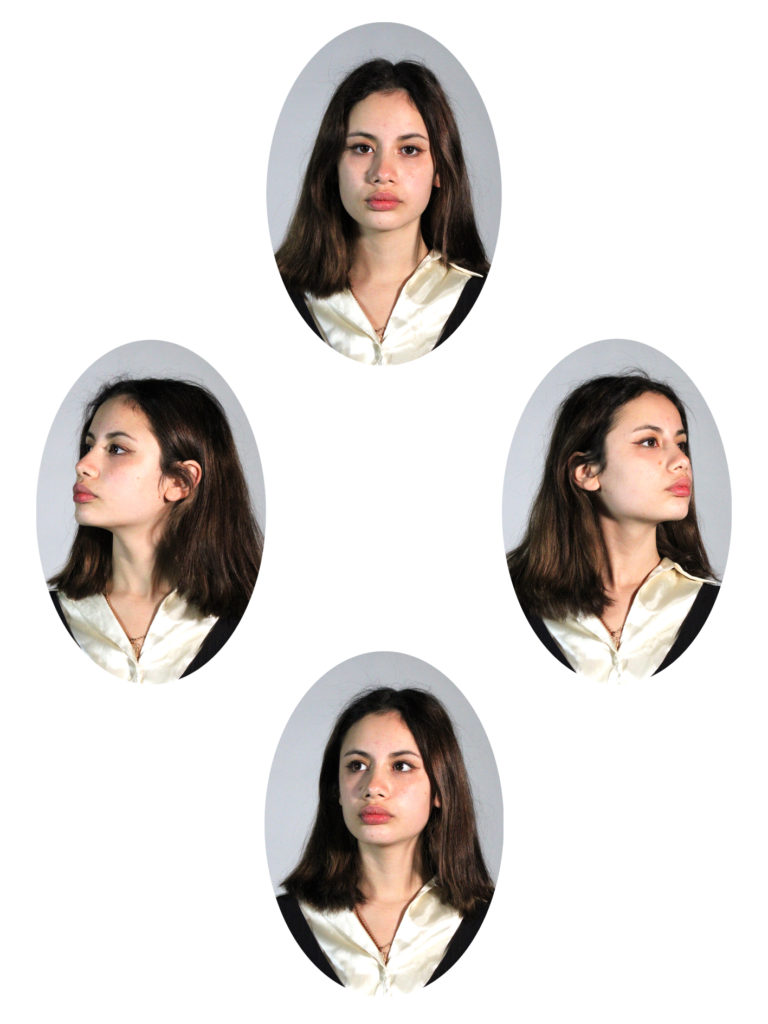
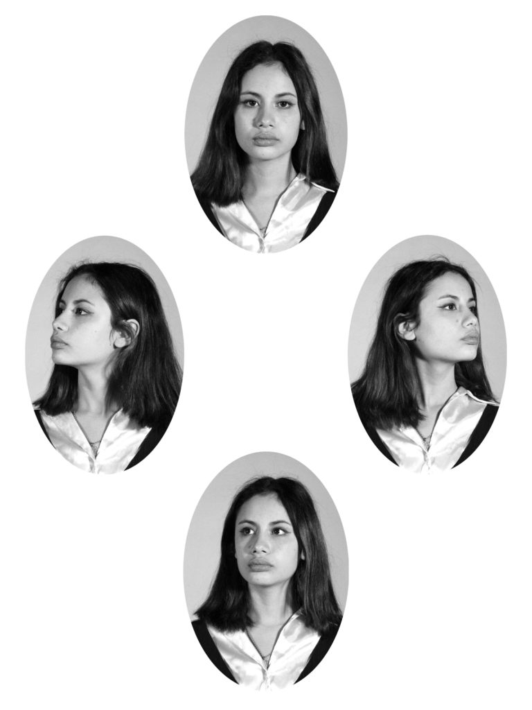
Above is a diamond cameo, created by Mullins, of Constable and Deputy of St Helier Philip Baudains taken in the 1800’s. I wish to recreate this style of photography by capturing the same subject in the same setting, turning their head to different positions, with a monotone facial expression. My plan is to experiment with two-point lighting to produce bright clear images that will be easily seen in the diamond cameo format.

More examples of Henry Mullins’ Work

My Images

Editing Process

To create my diamond cameos, inspired by Henry Mullins, I first produced a photoshoot using two-point lighting. My camera’s white balance was set to daylight (5000K) and I used a fast shutter speed of 1/125 in order to capture bright portraits with limited shadows on the subjects face. When editing my images I slightly heightened the exposure and brightness to further this effect. Next I used the Elliptical Marquee tool in photoshop to draw an oval shape around the subject, I then copied and pasted this circular image onto a white background. I repeated this four times to produce my final diamond cameo portraits, I also experimented with editing a black and white filter onto my cameos to mirror Mullins’ work further.

Final Diamond Cameos

Street Photography And Candid Portraits

Inspiration – Brassai

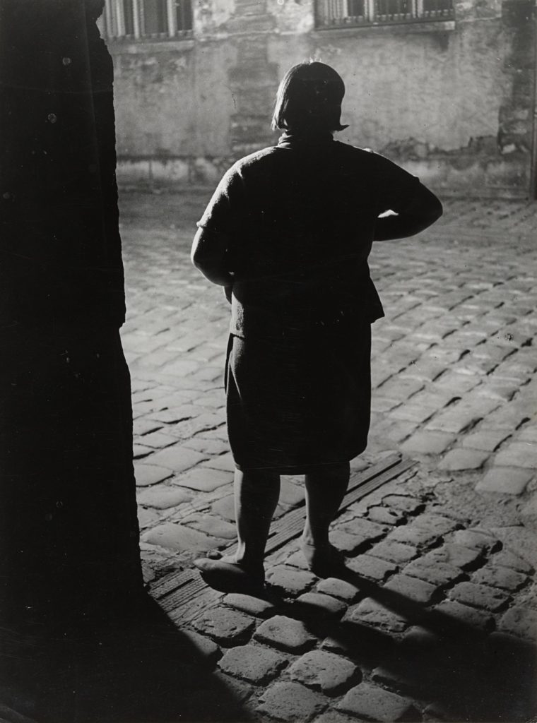
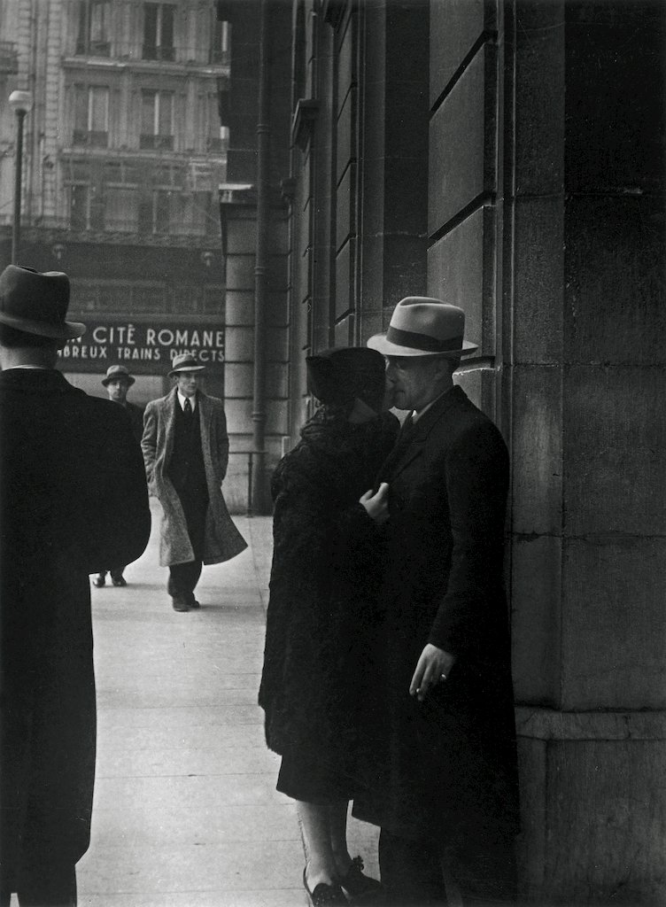
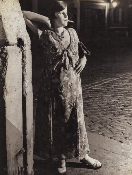
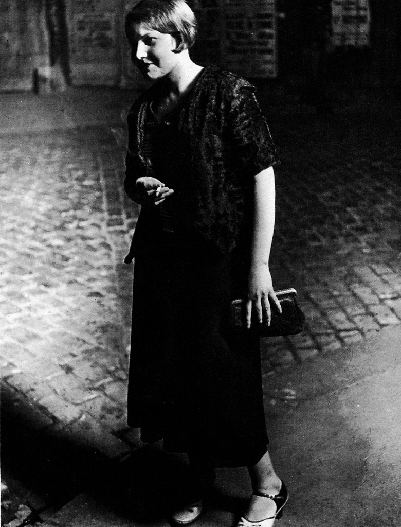
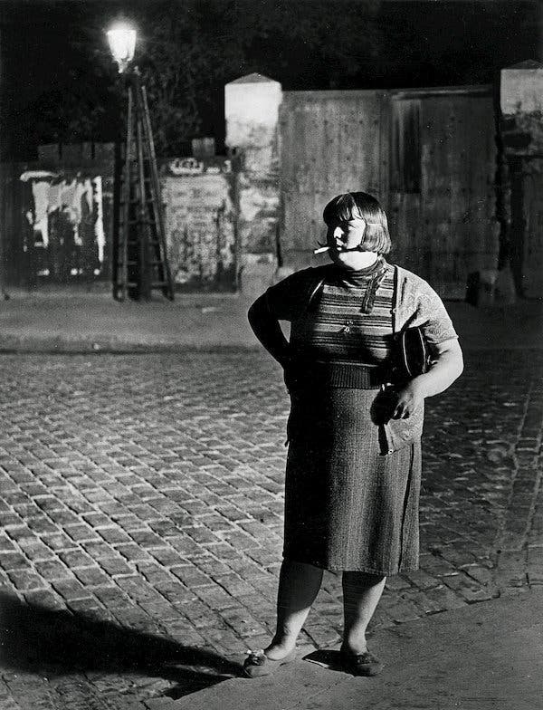
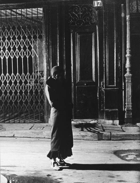
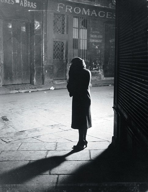
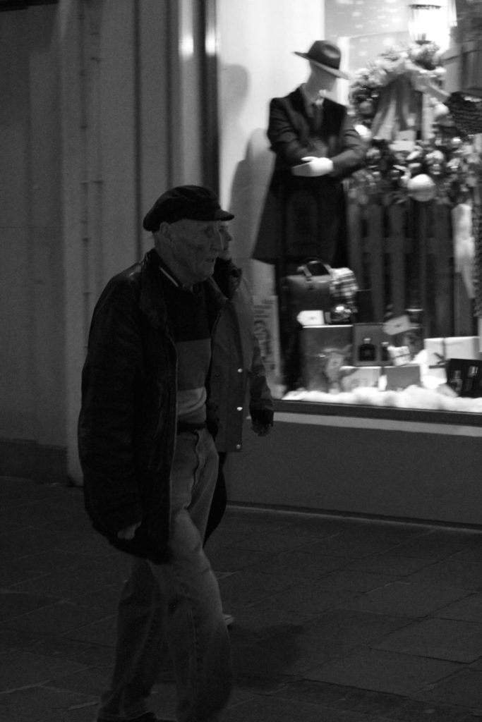
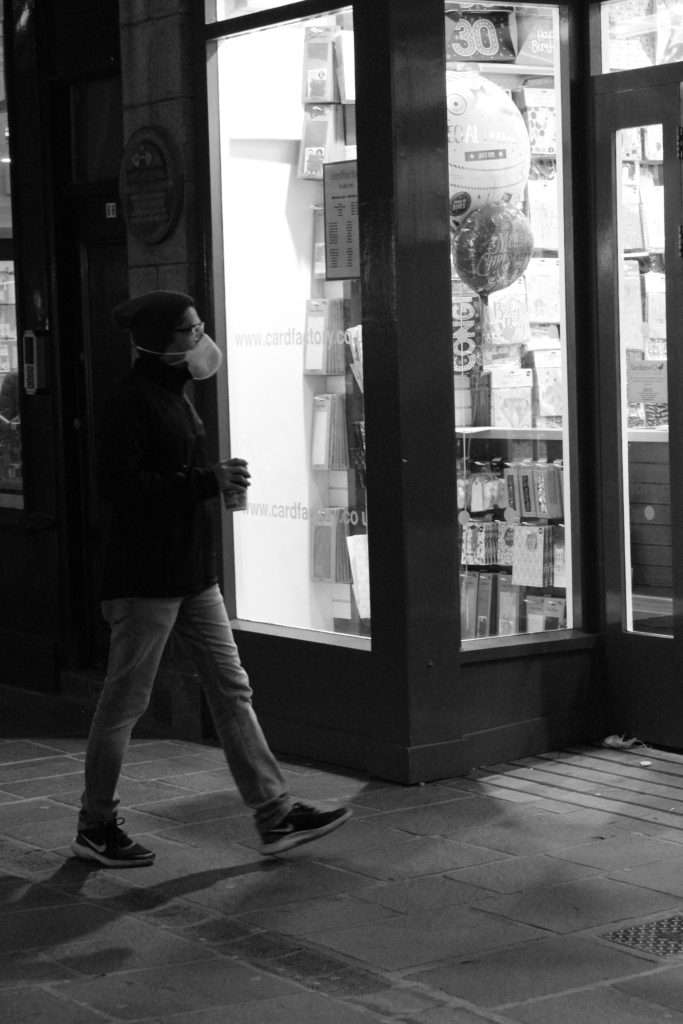
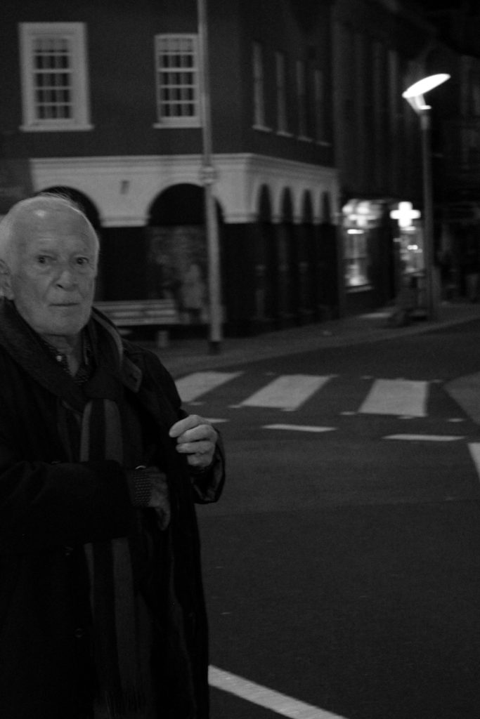
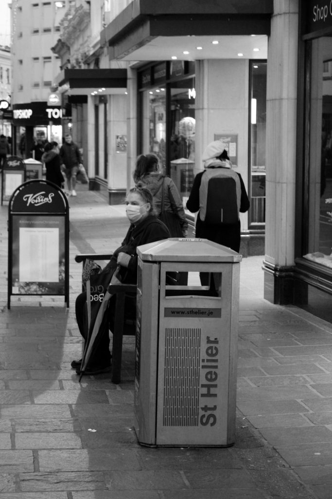
Brassai (1899-1984) was a Hungarian-French photographer who rose to international fame in France in the 20th century. He is widely celebrated for his signature photographs of Parisian night life and his book ‘Paris By Night.’ Brassai wanted to ‘immobilize movement’ rather than capturing the hustle of the city, he took his images in unfamiliar places to capture the overlooked and forgotten. Brassai stated “most of the time, I was inspired by my everyday life. I believe it is the most sincere and humble depiction of reality, of the most trivial, that leads to the fantastic.” I really enjoy how Brassai captures his street photography in darkness as it creates a mysterious and eerie atmosphere in his images. I also like how he only photographs a minimal amount of subjects in the images as I believe this adds to the desolate, abandoned settings where he captures his photos.

Photoshoot Plan

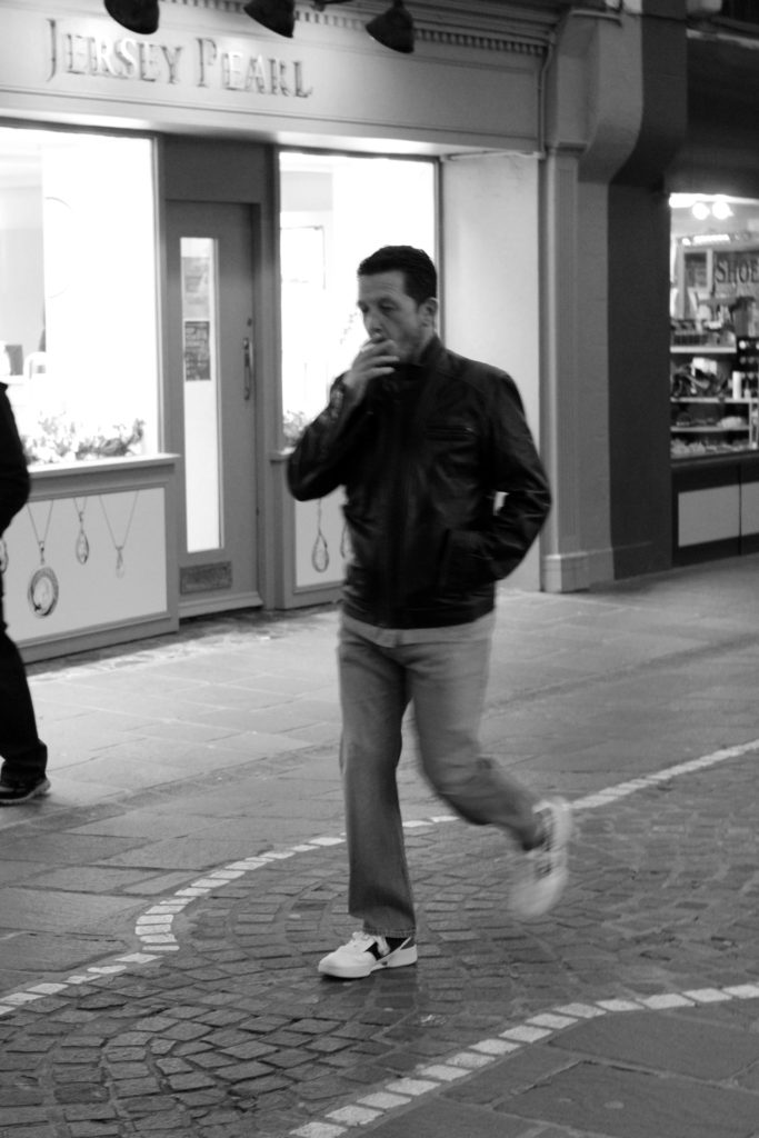
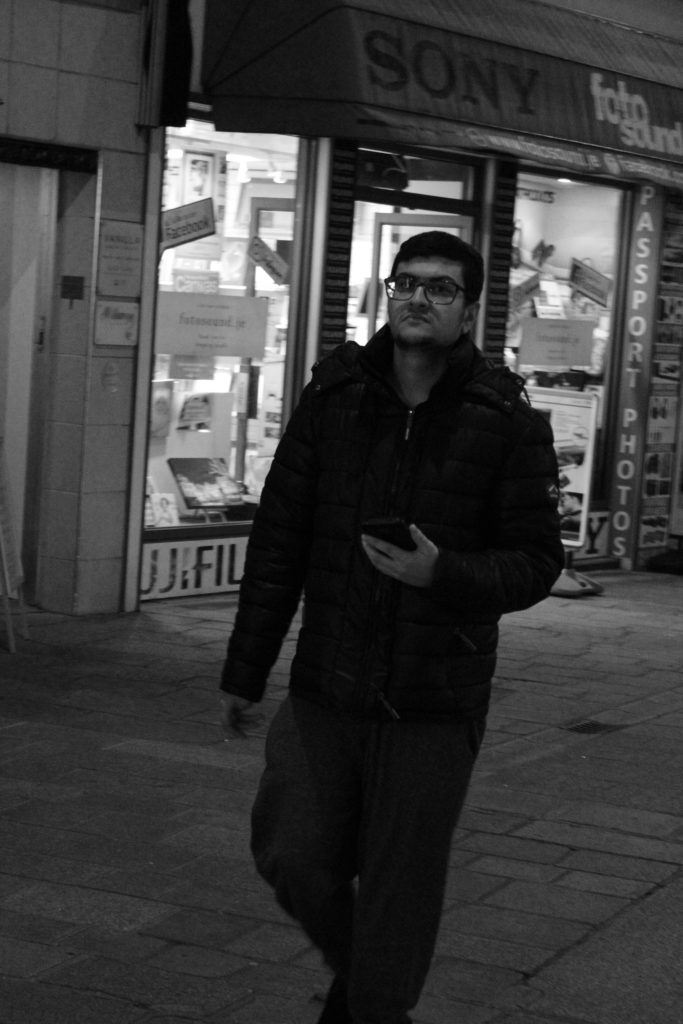
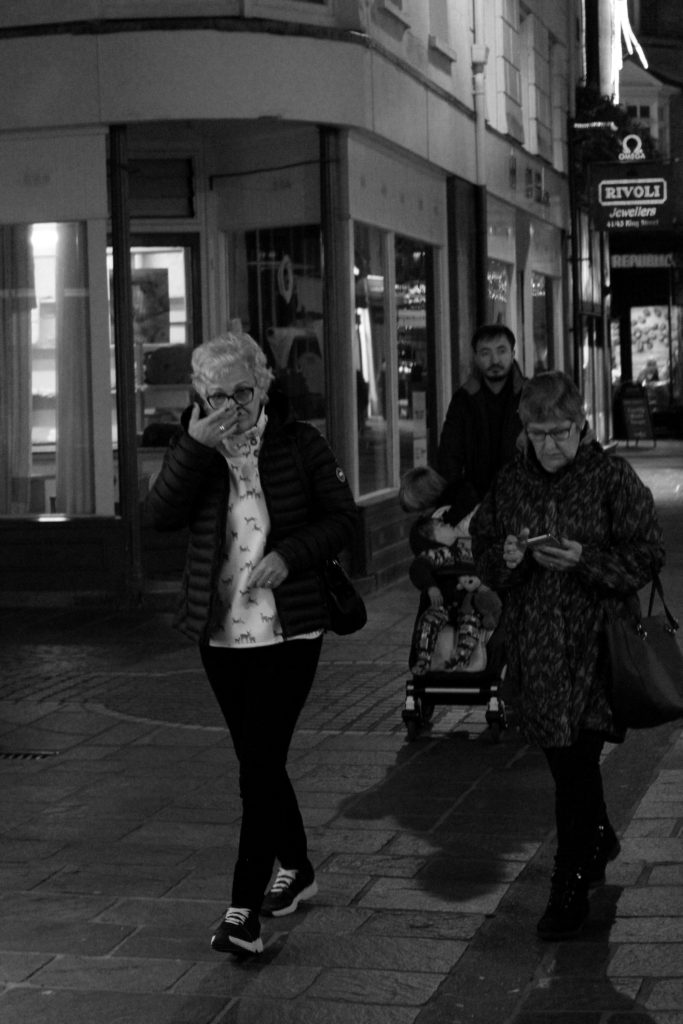
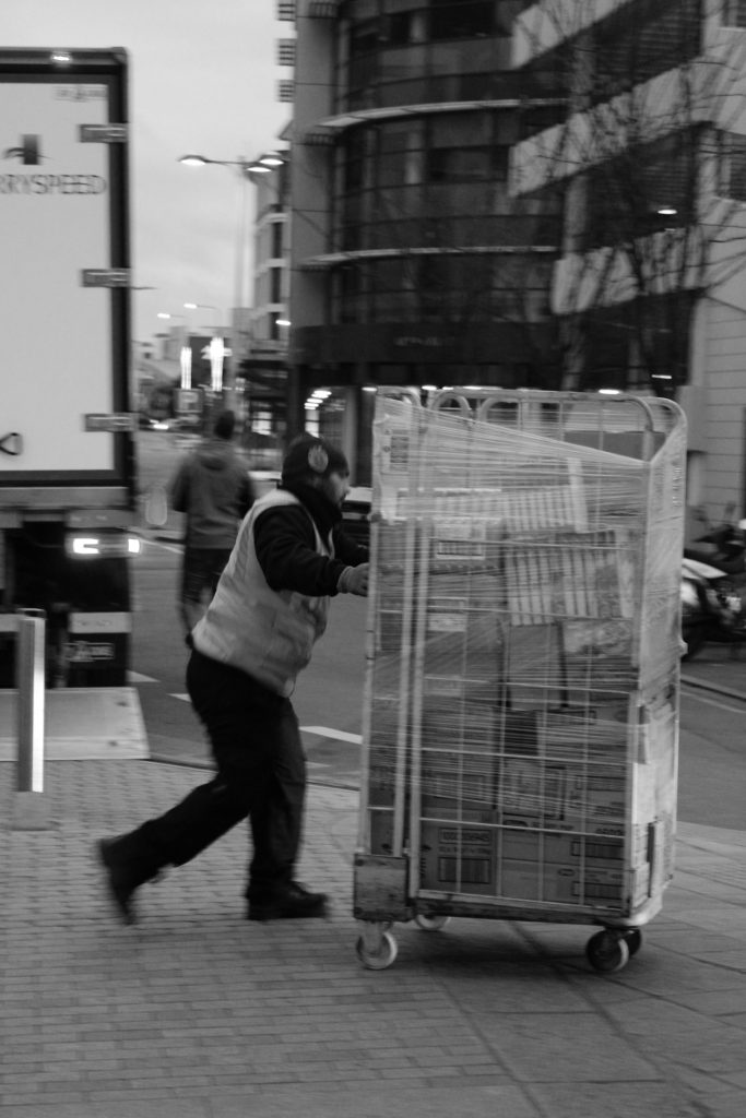
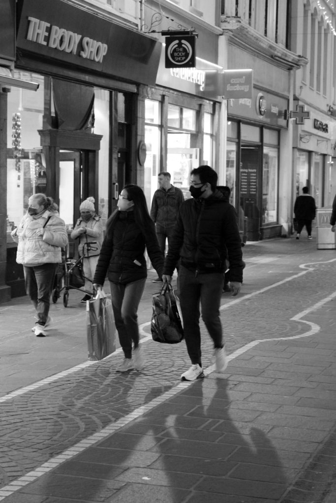
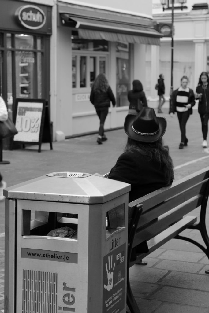
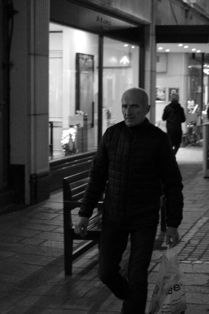
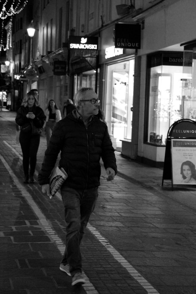
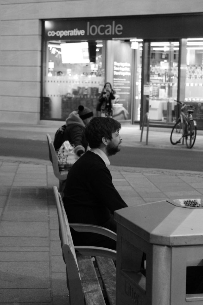
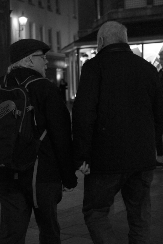
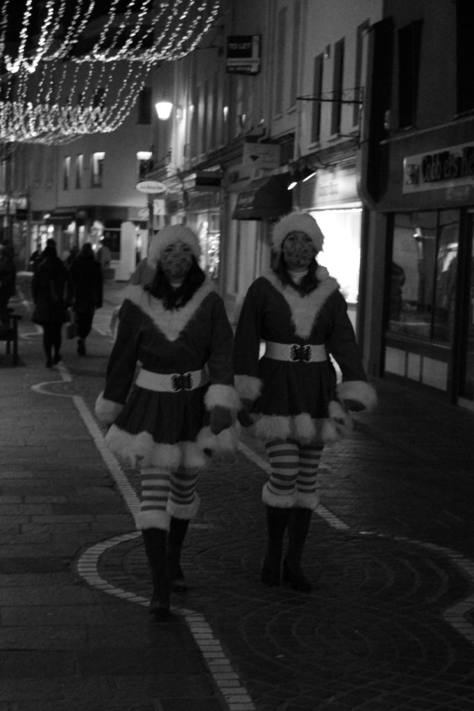
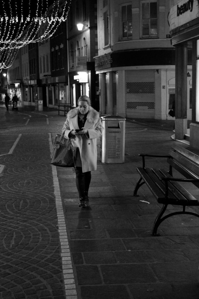
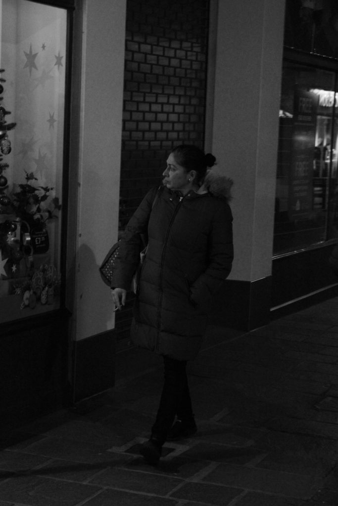
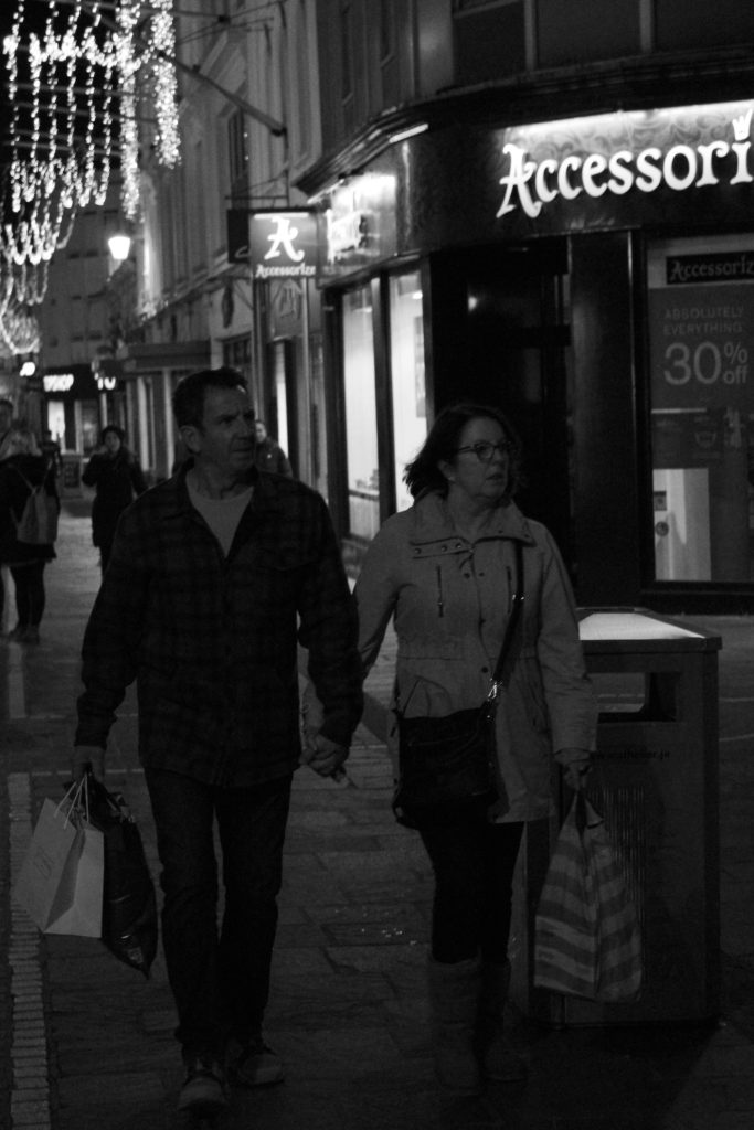
Who – My aim is to photograph a range strangers with different ethnicities, clothing styles and moods. I hope to capture people with mid-shots, long-shots and some from behind to mirror Brassai’s street photography work.
What – I hope to capture people walking around town with shopping bags, phones, handbags and any other items that could tell the observer more about their personality and life.
Where – I am going to do this photoshoot in St Helier, in the main high-street in town, due to the fact that many people will be walking around there so I will have a range of different people to capture images of.
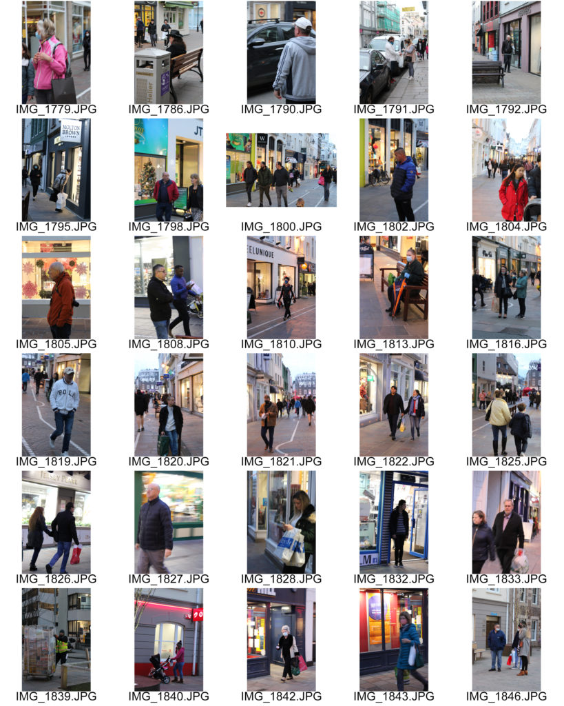
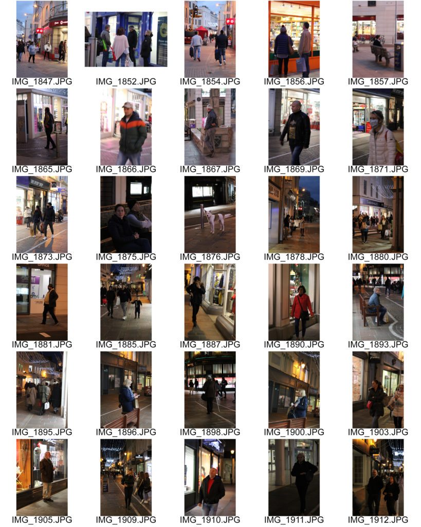
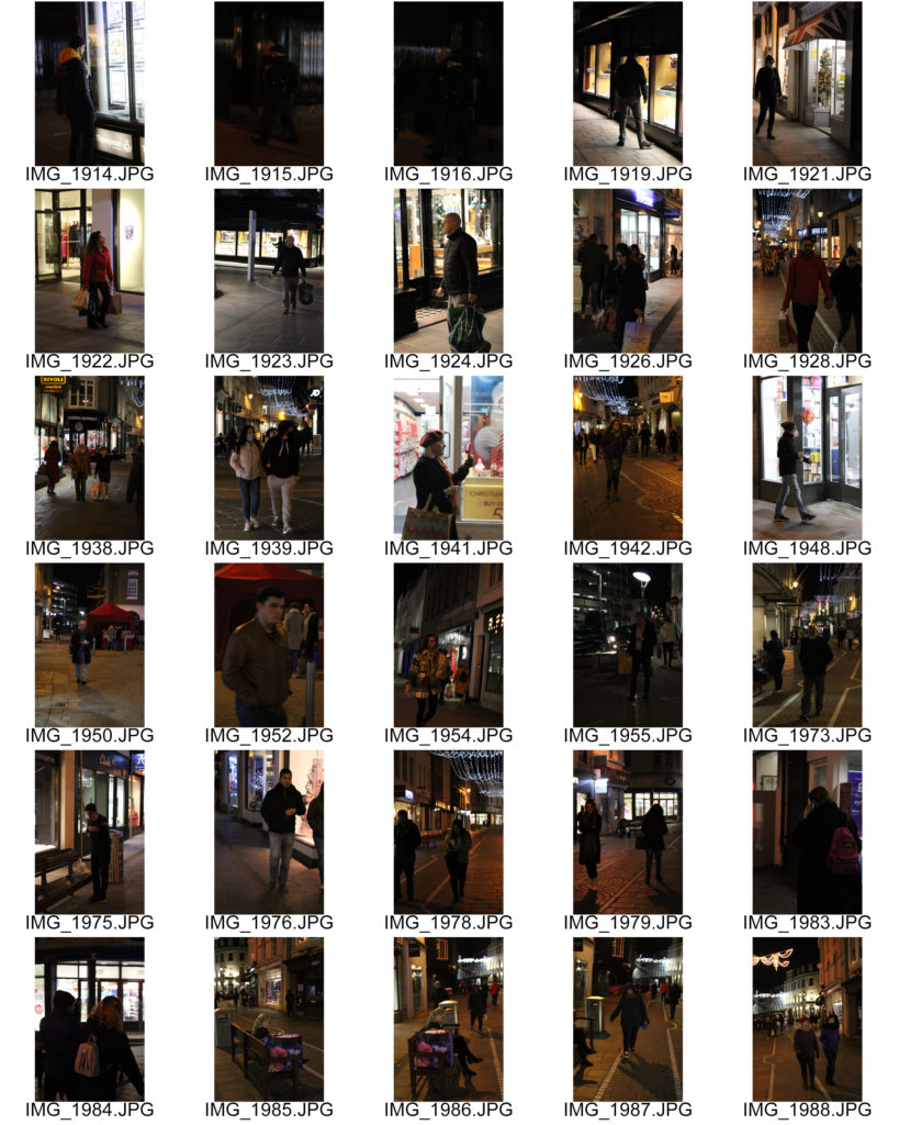
When – My plan is to complete this photoshoot on Saturday 21st and Thursday 26th of November as during Saturday afternoon’s many people are usually in town and on Thursday night its the beginning of ‘late night shopping’ so I will be able to take night-time photos similar to Brassai.

Why – I aim to take photos of people in their natural state with no posing or pre-discussed settings, I am doing this in order to capture raw moments in time and be aware of my surroundings.

How – I plan on walking through town with my camera in different positions to capture people from abstract angles. Additionally, I am going to act as though I’m taking photos of the Christmas lights, so not to draw attention and make people act differently being on camera.

Contact Sheets

Final Edited Images

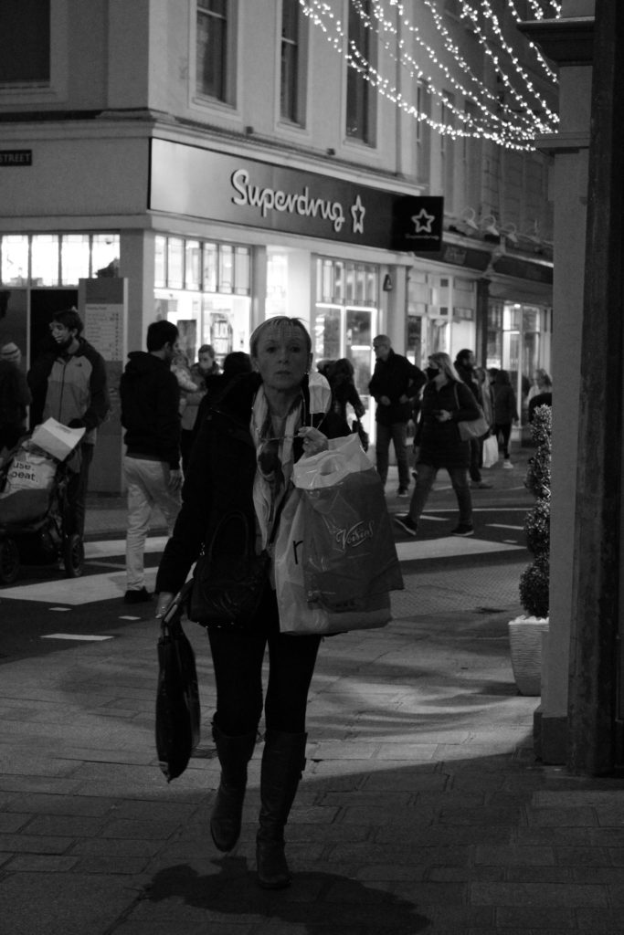
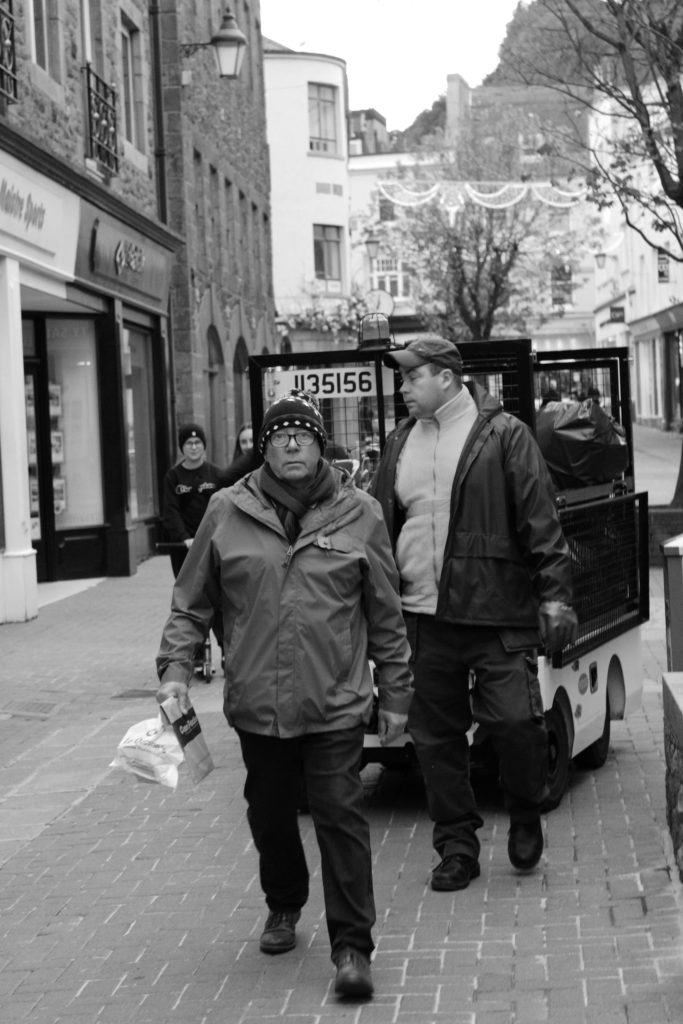
Final Images

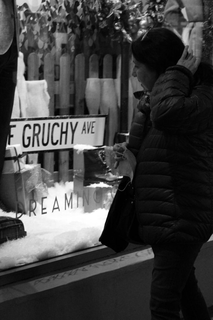
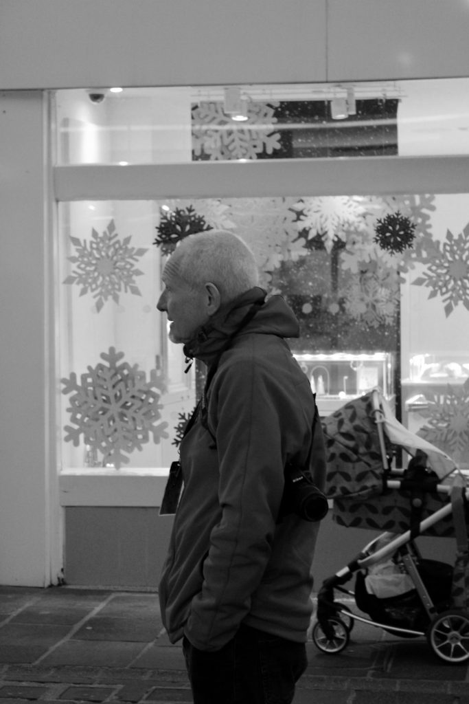
I have chosen these two images as my final selection as I believe they successfully mirror Brassai’s work while also linking to each other in terms of connotations and meaning. Firstly, I edited my images with a black & white filter to create a mysterious dull atmosphere. This monochrome filter also allows the observer to make judgments on the images without the influence of specific colours symbolising different meanings. Additionally, both photos have a high contrast of highlights and shadows; image one has the dominant tone of white whereas image two has more dark shadows surrounding the subject. In addition, the composition of my images reflect each other greatly as both subjects are stood facing side-on, away from the camera, in the foreground of the photographs. Furthermore, my final images have quite a shallow depth of field as limited landscape and space can be seen in the background. Nevertheless, the minimal space I have captured in the background of my images vastly helps allude to their meaning. In both photographs you can see an elderly man in the foreground and some sort of connotation to youth in the background- image one with a pram and image two with athletic modern clothing. This creates an impression of growth and memory as it shows the juxtaposition of young and old.

The Decisive Moment – Henri Cartier-Bresson

Henri Cartier-Bresson

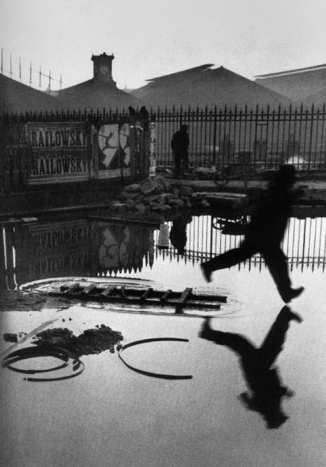
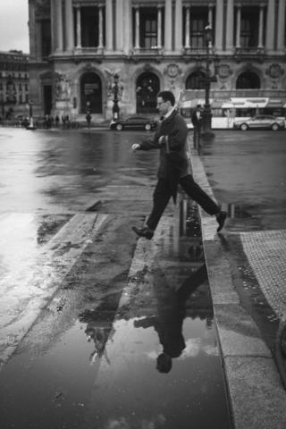
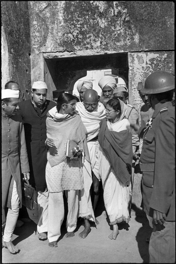
Henri Cartier-Bresson was a French Humanist photographer, he was born in 1908 and was considered a master of candid photography. He pioneered the genre of street photography, and saw it as capturing a decisive moment. Cartier-Bresson’s street photography shows a range of different cultures and environments, he uses his camera to catch glimpses of stranger’s lives at random moments. In 1947, following the aftermath of World War Two, Henri Cartier-Bresson, Robert Capa, George Rodger and David Seymour founded The Magnum Photos agency- which represents some of the world’s most renowned photographers.

Mood Board – Key Cartier-Bresson Images

Image Analysis

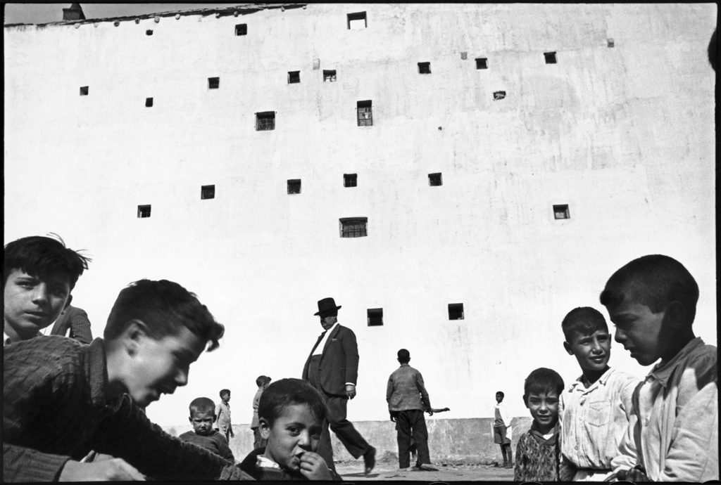
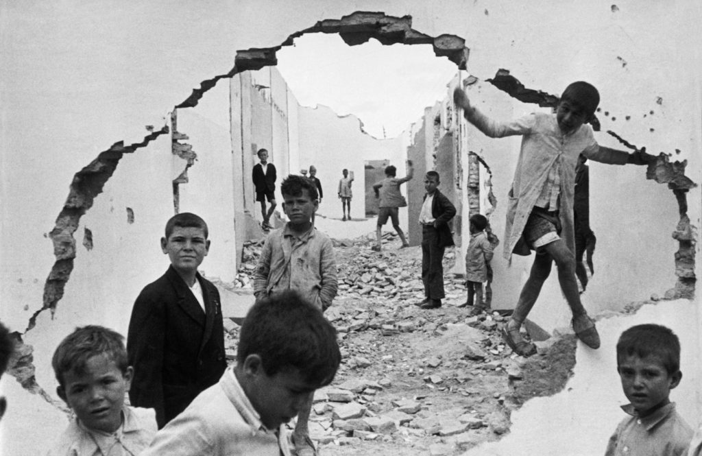
Henri Cartier-Bresson | Children in Seville, Spain | 1933.

This black and white candid portrait photograph was taken by Henri Cartier-Bresson at the beginning of his career as a photographer. By first looking at this image one might guess it was captured during the Spanish Civil War (1936-1939) due to the broken structures and rubble surrounding the children. However, this image was taken in 1933 before the war, creating a sense of foreboding as children are playing in the destruction caused by a war that hasn’t yet occurred. In addition, the image has an abstract composition as the large geometric hole in the wall acts like a frame on the photo. This connotes the idea that we are only observers looking in on a situation, ripping a hole into other people’s lives without seeing the full picture. Furthermore, the image holds a wide depth of field with the window-like hole creating a tunnel to the background of the photo. It is clear the image was taken during daytime as the natural lighting creates an overexposed skyline in the top centre, forming natural shadows. The darkest points of this image fall on the children’s clothing, faces and bodies which contrast immensely with the bright white walls on the wrecked buildings. Additionally, the harsh black shadow on the crack of the wall creates a clear focal point for the observer, persuading them to look through the void to the centre if the image. Moreover, we can see that Cartier-Bresson has used a fast shutter-speed to capture this photo as some of the children appear to be moving however, they aren’t particularly blurred.

Image Comparison

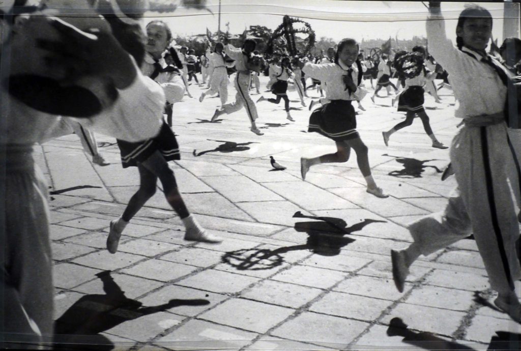
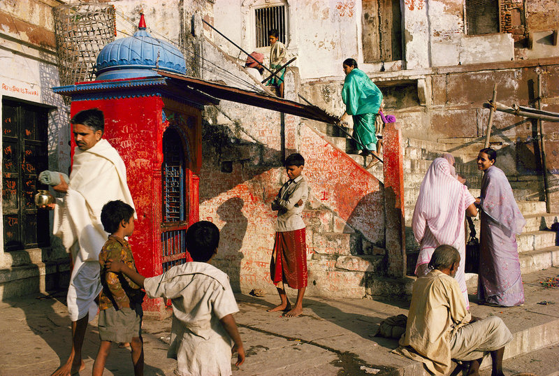
This image was taken by Raghubir Singh (1942-1999), an Indian photographer who was most known for his documentary-style images he captured of people in India. Visually, there are many key differences between Singh’s image compared to Cartier-Bresson’s. For example, Singh has captured a colour image, with the dominant colour red repeated in the subject’s clothing and surroundings, whereas Cartier-Bresson’s image is monochrome black and white. This contrast in colouration creates different atmospheres in the images. The warmer tones in Singh’s alludes to feelings of comfort and happiness, supported by the visual closeness of the people being photographed. However, the dark dreary black and white tones in Cartier-Bresson’s image creates a more sombre atmosphere and connotes ideas of sadness and regret. Additionally, Singh’s image has a rougher texture due to the scratches and marks on the surrounding walls, Cartier-Bresson has captured a less busy image with plain white walls enclosing the subjects in. This contrast in texture could symbolise the busy lives of the subjects in Singh’s image, as all of them appear to be moving quickly with purpose, however the subjects in the other image seem to just be playing. Lastly, while both images have natural lighting, it is clear Singh’s image has been taken earlier in the day to Cartier-Bresson’s as the shadows are more prominent and fall to the left of the image.

Nevertheless, there are also many similarities within these images, for example it is clear both images have been captured with a fast shutter-speed as the subjects are clearly moving yet are not blurry. Furthermore, both images have a similar composition as the abstract shape created by the hole in Cartier-Bresson’s image resembles the positions the subjects in Singh’s image are standing in. If you were to trace the cracked shape onto the second image, it would look like the people have created it with their bodies- like a dot-to-dot. In addition, there are similarities within the lines in these images, with Cartier-Bresson capturing the rigid lines of the destroyed wall and Singh capturing the jagged lines of the stairs. These irregular patterns allude to the idea that these people’s lives can take an unexpected turn due to the environments they live it. The messages portrayed in the photographs are very much alike, with both connoting the idea that we are only spectators observing someone else’s life. In my opinion, these images epitomise ‘Street Photography’ as they capture people naturally in their daily lives, letting us imagine their backstories without really seeing the full picture.

Street Photography Introduction

What is Street Photography?

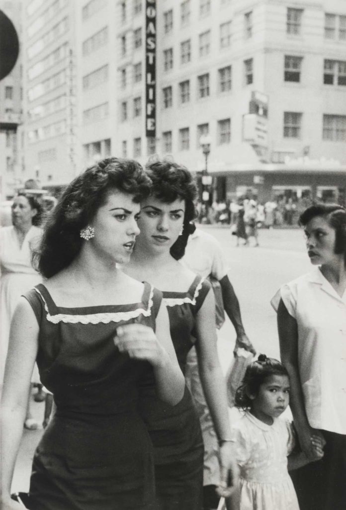
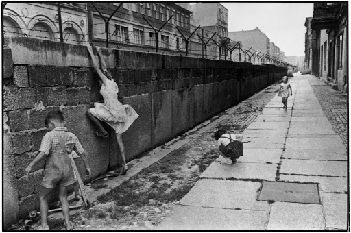
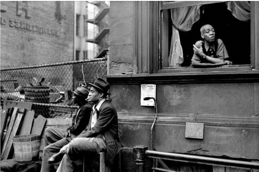
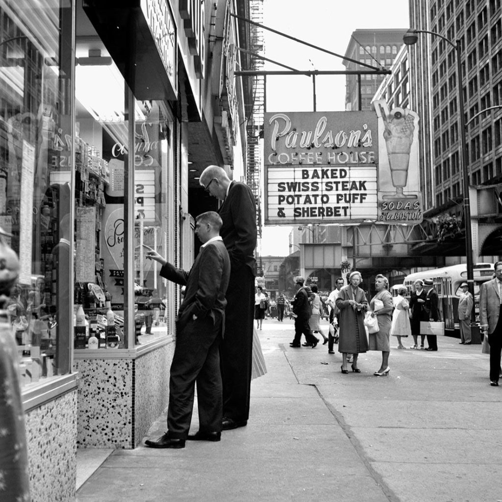
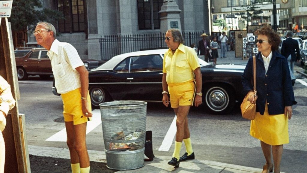
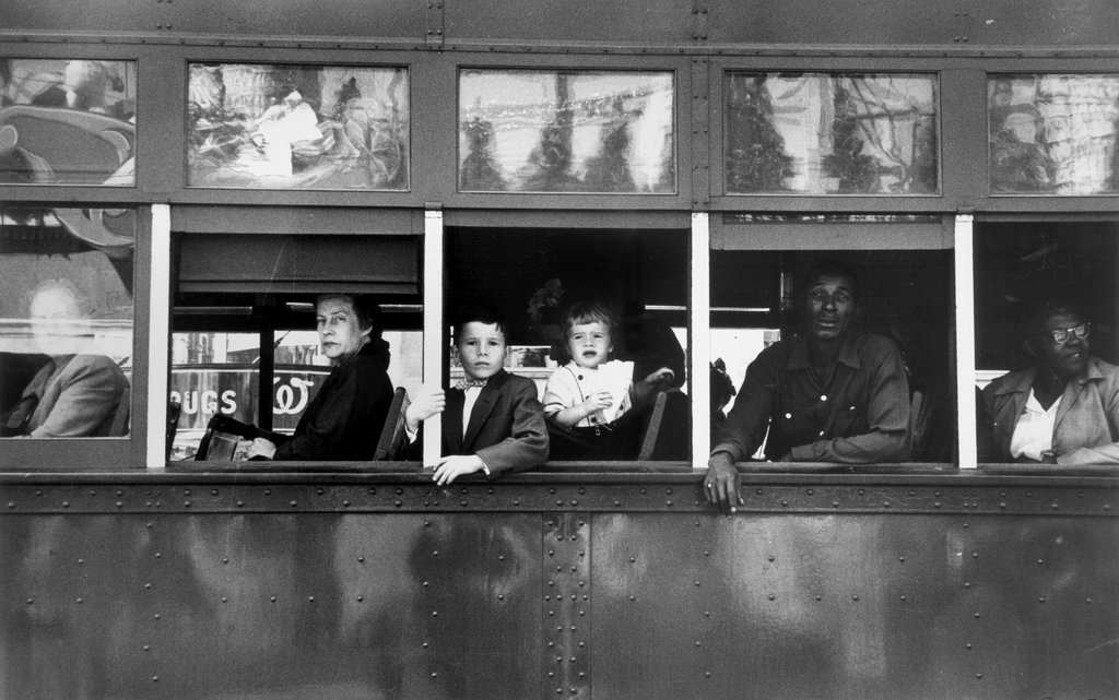
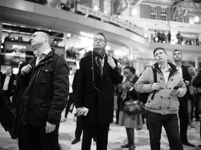
Street photography is a genre of photography in which the photographer captures candid images of strangers around them, usually without their knowledge. Street photography depicts the everyday life of strangers as it captures them in a natural, not-posed environment, allowing the photographer to produce images that hold a, sometimes ambiguous, story. This style of photography provides opportunities for photographers to subtly capture the lives of strangers, images range from political riots to people just walking to the shops, each hold their own backstory.

Famous Street Photography Examples

Street Photography – Bruce Gilden

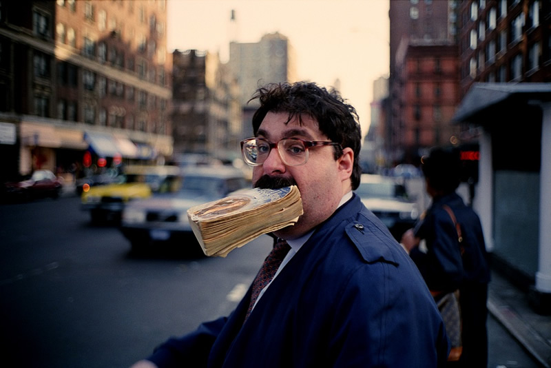
Below is a video of Bruce Gilden, an American street photographer best known for his candid close-up photographs of people on the streets of New York City, using a flashgun. The video shows Gilden capturing confrontational close-up images, taking photos of strangers in real time without any prior discussion or plan.