All posts by Sophie M

Filters

Author:
Category:

Personal Inversigation – Artist References

Robert Darch

Robert Darch (1979 – present) is a British artist-photographer based in the South West of England, he studied at Plymouth University and holds an MFA with distinction in Photographic Arts and a MA with distinction in Photography & the Book. He also has a BA with honours in Documentary Photography from Newport, Wales. A quote from Darch’s website about his work reads ‘His practice is motivated by the experience of place, in which the physical geography and material cultures of places merge with impressions from contemporary culture that equally influence perception. From these varied sources, both real and imagined, he constructs narratives that help contextualise a personal response to place.‘ This statement is what initially drew me to Darch’s work, his way of capturing a sense of a person’s identity within a place is something I would really like to respond to and reflect on. In 2018, Darch released his first published photobook titled ‘The Moor’ which depicts a fictionalised dystopian future situated on the bleak moorland landscapes of Dartmoor. Drawing on childhood memories of Dartmoor alongside influences from contemporary culture, the narrative references local and universal mythology to give context but suggests something altogether more unknown. I see Darch’s work as a subtle hint towards romanticism, showing the misty, idyllic and aesthetically pleasing areas of the English countryside while holding deeper meanings surrounding mental health and societal issues.

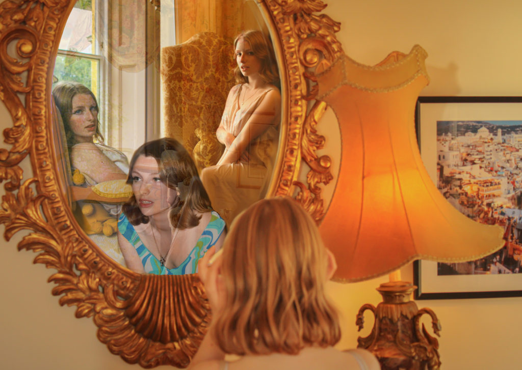
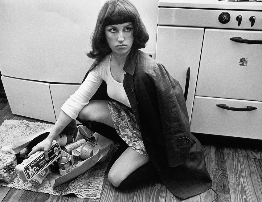
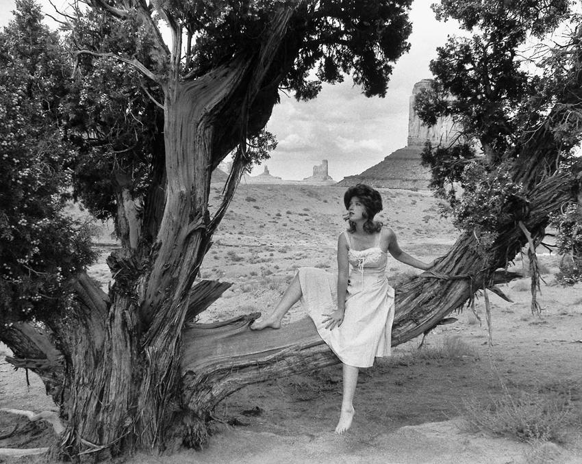
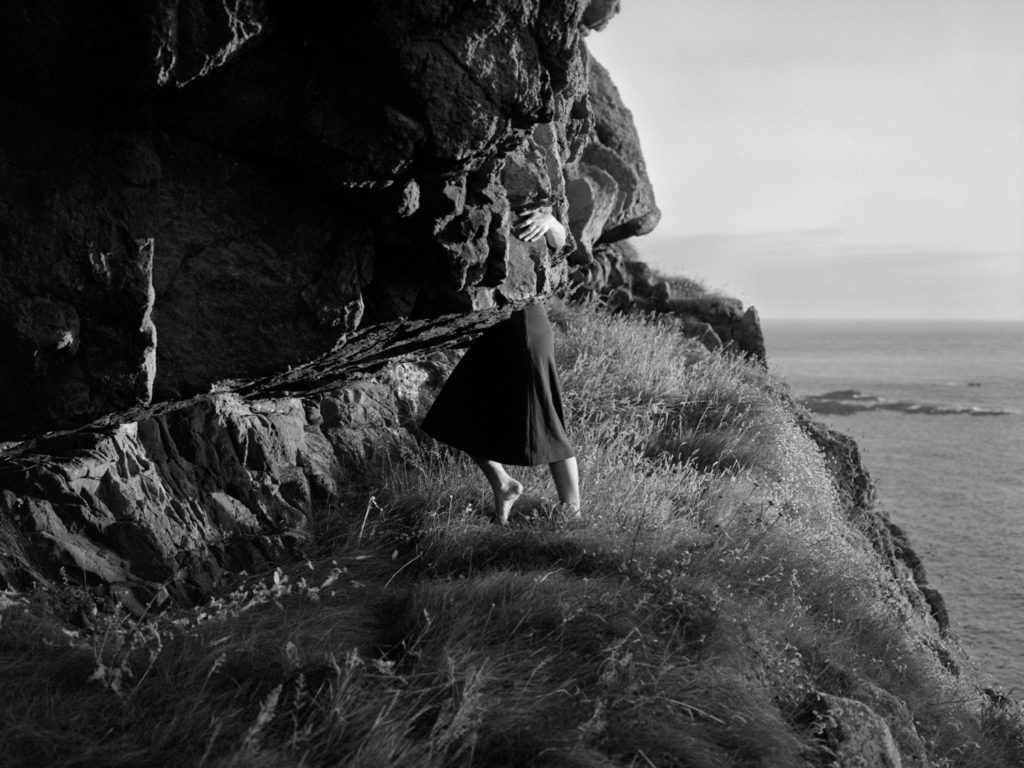
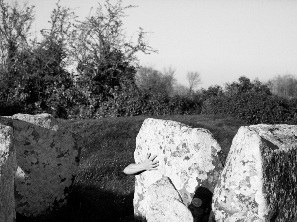
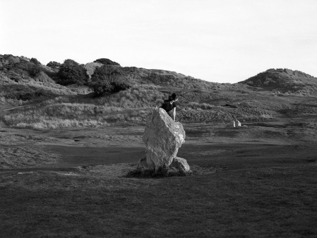
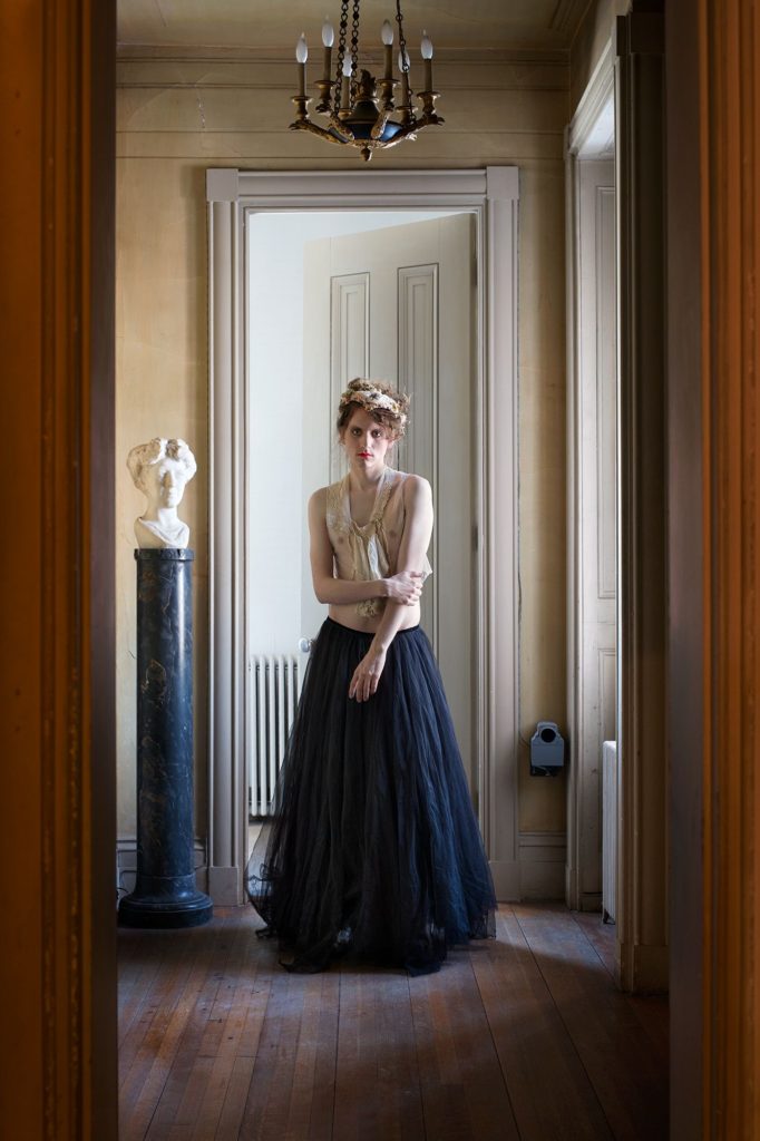
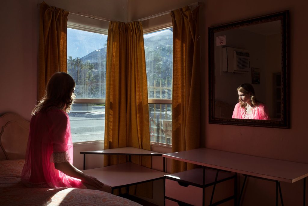
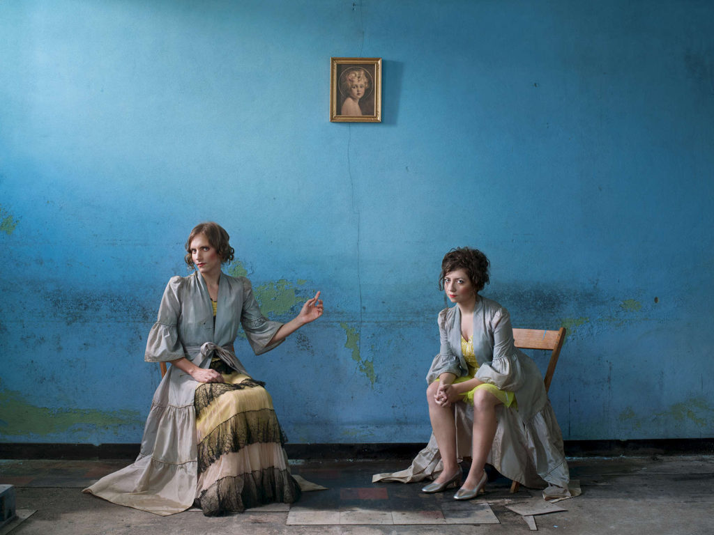
Vale – By Robert Darch

Darch’s project ‘Vale’ has been the most inspirational source for my personal investigation, at the age of 22 Darch suffered from a minor stroke, followed by a period of ill-health which would affect him for the majority of his twenties. As a coping mechanism during convalescence, he retreated into a world of fictional narratives, of indoor spaces and eventually a physical move back to his familial home of Devon. Slowly, he began to reset his narratives, his place in the world, and the expectations of his youth. An unseen enemy threatening his own body and psyche was mitigated by escapism and wish-fulfilment. They way Darch captures fantasy juxtaposed with realism in his work is something I would really like to replicate during my project. While Darch’s illness had more physical effects on his body, my project will focus on the mental effects of illness – I believe his work still relates to the mind and can be viewed in several ambiguous lights. An extract from Darch’s website on Vale reads; “The fictional worlds into which Darch escaped, exhibited characteristics which were at once benign and threatening. An interest in the English sense of the eerie had been with him since childhood, notably the writings of James Herbert, the Dartmoor of Conan Doyle and such touchstones of ‘coming-of-age’ cinema as Rob Reiner’s Stand by Me. As Darch’s period of retreat from the world lengthened, further influences were incorporated into this mix, from British standouts such as Jonathon Miller’s Whistle and I’ll Come to You (1968) to the Italian Giallo film movement of the 1970s and the atmospheric and psychological Japanese horror revival of the early 2000s. Vale is a result of this percolation and loss. It is the fictional space where Darch is able to relive and re-imagine a lost period in his life, journeys with friends both through physical spaces and through time. On one level its subjects could act as stand-ins, allowing him to explore winding rivers in late summer evenings, empty country roads and ancient English woodlands. But as the journey continues, multiple readings quickly become apparent. Despite possibly providing a positive escape from Darch’s ‘vale of despond’, it is the sense of the eerie which becomes unavoidable.”

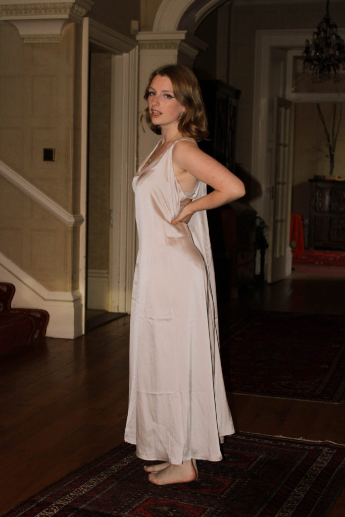
The whole concept on Darch’s work in ‘Vale’ has inspired me to create images that follow fictional narratives, a story to escape the frantic modern world similar to ones I’d create as a child. Bringing back memories of places I would go to get away from the trivialities of life, woodland walks, rooms around the home, family gardens etc – I would like to revisit these places and create a sequence of fictional realities. The topic of anxiety in children and young people has often had simplified and quite belittling representation, in this project I aim to take inspiration from Darch to show these issues through landscapes and abstraction, provoking thoughts from the observer on the topic.
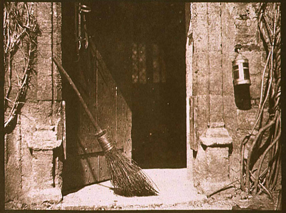
‘Vale’ Images –

Josef Sudek

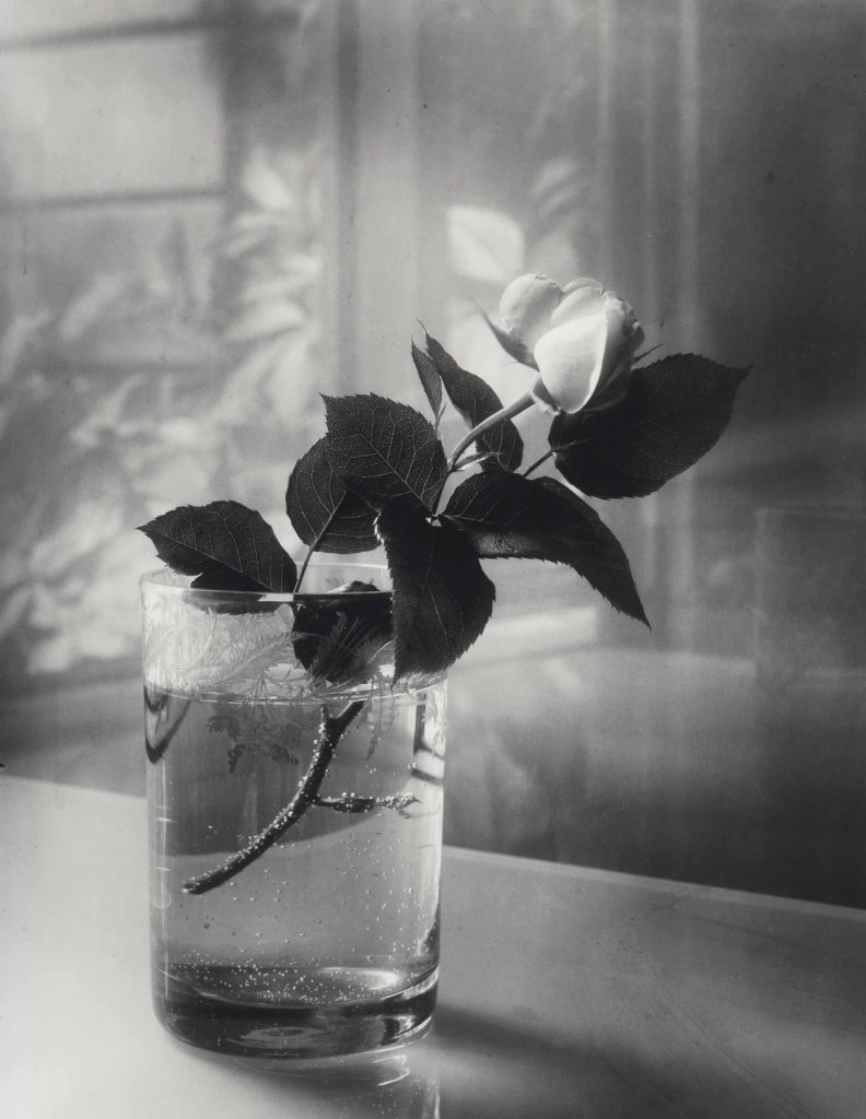
Josef Sudek (1896-1976) was a Czech photographer, extremely well-known for his work on still-life photography as well as black and white images of Prague, interiors and landscapes. Prior to taking an interest in photography, Sudek worked as an apprentice bookbinder before serving in the Austro-Hungarian Army during the First World War, when he was wounded and subsequently lost his right arm to amputation. He was a member of the Prague Club for Amateur Photographers from 1920-24, and studied photography at the State School of Graphic Arts in Prague from 1922-1924. Much of Sudek’s early work was inspired by that of Clarence White, who espoused a Pictorialist approach to light and form – something I would like to experiment with during my personal investigation. Many of Sudek’s most memorable images were taken from the window of his small studio, documenting his humble courtyard during changing weather and light conditions. During the 1920s, Sudek created a series of photographs of disabled Czech soldiers; in 1927 he was one of the founding members of the renegade Czech Photographic Society, dedicated to documentary photography. His series of photographs of the renovation of the St. Vitus Cathedral in which he juxtaposed architectural details of the cathedral with the abstract forms of workers’ tools won him the title of official photographer for the city of Prague in 1928. Nevertheless, the area of Sudek’s work that intrigues me the most is his documentation of flowers, usually stood in clear vases near his studio windows. The way Sudek documented changes in weather, atmosphere and seasons in his still-life images portrays to me the idea of as the surroundings change, reality changes too. Sudek once said  “Everything around us, dead or alive, in the eyes of a crazy photographer mysteriously takes on many variations,” he explained, “so that a seemingly dead object comes to life through light or by its surroundings.”

Sudek’s Pictorialism Influences

Sudek was influenced by the concerns of Impressionism, Pictorialism, and Czech Poetism, but throughout his life, remained faithful to his own stylistic and emotional proclivities of introspection. His work holds the same dream-like, soft atmospheres that many other Pictorialist photographers captured, for example the work of Alfred Stieglitz and his study of clouds in ‘Equivalents’. Sudek’s use of windows, documenting overcast foggy days through frosted glass, additionally adds to his Pictorialist style – his use of light and aperture settings creates this soft blur around his subject flowers, almost replicating that of an oil painting. As Sudek was creating and photographing during the change of an art movement from Pictorialism to Modernism throughout the 1920’s and 1930’s, his work holds an almost vintage feel when compared to those being created during the same time period. I believe his photography has a mystery and ambiguity to it, the images can be observed and analysed in such different ways as his influences at the time were slowly leaving what was ‘in fashion’ or expected during this development in art movements. The soft blurs and focus of Sudek’s still life photography is something I would like to experiment and work with during my personal study, however I have the idea to not use the same sepia tones as Sudek, and instead try editing in a less vibrant, toned down colour to relate and link up more with the work of Robert Darch, representing escapism and realities.

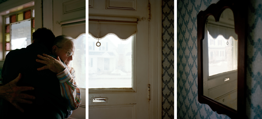
Sudek’s Still Life Images –

Artist’s link to physical illness;

Both chosen artists have gone through difficult points in their lives, with Darch suffering from a stroke at a young age and Sudek losing his arm during the war. In respect to my project, both artists have used photography as a method of escapism from an illness/disorder that had impaired them throughout their life – I would like to explore how elements of their images may have deeper meanings in regards to symbolism of weakness or hope. Although Sudek’s images are not known to have been made with his impairment in mind, I can still recognise themes of optimism in a time of ill-health through his project; as if the flowers are symbols of life continuing, adapting in a new environment after being cut down from their home plant – they are still able to live in a singular glass of water, therefore hinting towards hope. Nevertheless, Darch’s work noticeably conveys a sense of escaping from reality through vibrant colours, dream-like compositions and golden hues that relay this idea of ‘the light at the end of the tunnel’. Though Darch reflects his sickness throughout his project, it is done subtly, with Darch himself stating ‘during the illness I no longer wanted to turn the camera inwards, to linger on the reality of my situation, preferring to lose myself in fictional constructs of the mind’. This fictionality in his work is honest and raw, giving the observer a glimpse into his mind where he would create narratives to escape from his own dismal one, yet still showing his optimistic outlook on life. Though these artists focus on physical illness, I would like to use their style of photography, however looking at the effects of mental illness throughout my life.

Links to further resources;

Biblioscape on ‘Vale’ by Robert Darch

Sudek’s book ‘The Window of my Studio’

An interview with Robert Darch on ‘Vale’

Personal Investigation – Statement of Intent

Identity Mind-map

Identity Moodboard

Write a Statement of Intent that clearly contextualises;
What you want to explore?
Why it matters to you?
How you wish to develop your project?
When and where you intend to begin your study?

Make sure you describe your chosen theme (IDENTITY & COMMUNITY), subject-matter (topic, issue), artists (inspirations, references) and final outcome (photobook, film).

Statement Of Intent

The discussion of teenager’s mental health is growing in everyday society, some disregard it and some understand it’s increasing prominence; I wish to create a study on the theme ‘Identity’ surrounding the topic of anxiety. I have personally suffered from generalised anxiety disorder from a young age, it has always been a part of my life and I am still learning to deal and live with it, however it is not something I am ashamed of. I am grateful for the knowledge I have that I am not alone on this journey, many of my friends and family are also affected by it so can understand and help each other through any days or moments in life that are particularly difficult. I really want to use photography as a medium to explore how I have coped with anxiety throughout my life, focusing on the idea of finding safety and comfort in certain places around my home, family member’s homes and areas around the island that have always made me feel less anxious. The whole concept of anxiety has been quite normalised in today’s society, having both positive and negative effects, as some feel less alone while others feel less seen. Highlighting this topic, by studying the positive areas of life where I have felt most safe, is very important to me; what matters to me most is creating a truthful display on a personal topic. My ideas for the development of this project are to capture some still life images around my home, using windows in many compositions with reflections of sunlight being a reminder of hope. An artist that has interested me while researching this type of imagery is Daniel Blaufuks, whose are naturalistic yet orchestrated scenes in his images hold questions around memories and nostalgia. Additionally, I have really connected with the work of Robert Darch and his project ‘Vale’, where he documents rooms in and around his home that he has lived in isolation with throughout his struggles with illness. I would really like to develop my project by taking inspiration from Darch’s photography, possibly capturing moments of countryside walks I would go on when feeling anxious during lockdown or visiting the woodlands I would explore as a child – highlighting the idea of ‘escaping reality’ through made up stories and games to keep my mind away from getting worried or scared. I aim for my final outcome to be a photobook that is able to capture and focus on the positive memories dealing with anxiety, where I’ve felt safe and loved by those around me while also showing moments of fear and realism to contrast.

History and Origins of Photography

‘Fixing the Shadows’ documentary notes + further research;

The medium of photography has been around for much longer than many think, with the first known record of the ‘Camera Obscura’ in a Chinese text called ‘Mozi’ from 500 BCE, however more commonly known to have been invented in 1021. The Camera Obscura consists of a box, tent, or room with a small hole in one side or the top. Light from an external scene passes through the hole and strikes a surface inside, where the scene is reproduced, inverted and reversed – similar to a projector. This invention captured peoples imagination for photography, the ability to manipulate light and project scene onto a surface made people question how they could fix this image to make ‘the photograph’. And Louis Daguerre did exactly that, he created fixed images known as ‘Daguerreotype’s’ where each unique image was printed onto a silvered copper plate, accurate and detailed with a mirror-like quality. A statement on the Daguerreotype medium reads ‘Louis-Jacques-Mandé Daguerre invented the daguerreotype process in France. The invention was announced to the public on August 19, 1839 at a meeting of the French Academy of Sciences in Paris. American photographers quickly capitalized on this new invention, which was capable of capturing a truthful likeness.’ Nevertheless, by 1860 there were several other photographic techniques that were quicker to produce and less expensive than the Daguerreotype, therefore it lost popularity.

William Henry Fox Talbot was an English scientist, inventor and pioneer of photography, best known for his development of the calotype, an early photographic process that was an improvement over the previously mentioned Daguerreotype. In Talbot’s calotype technique, a sheet of paper coated with silver chloride was exposed to light in a camera obscura; those areas hit by light became dark in tone, yielding a negative image. The calotype was invented around the same time as the daguerreotype in 1840, however society was slow to adapt to Talbot’s method as the daguerreotype was still majorly successful, people questioned the authenticity and ability of the calotype. Compared to the daguerreotype, many people saw the calotypes differences as flaws. The process was slower, chemicals weren’t regulated and often impure which lead to inconsistent results and prints often faded over time. Also, depending on the type of paper used, the texture of the paper could interfere with the image. During this time in the world of photography, the Romanticism art movement was prominent, people started to recognise the similarity between Talbot’s technique (when changing the paper to create a softness) and the delicate brush strokes and portrayal of the sublime in Romanticism art works. In the photography documentary ‘Fixing The Shadows’ I watched, the medium of photography is described as ‘the easiest medium in which to be competent, but the hardest to create your vision’ For the first time, people began considering the calotype as artistic; the first half of the process mechanical, but the second half of the process developing the tonality was an art.

American entrepreneur George Eastman is one of the most well known photographic pioneers who helped to bring the photographic use of roll film into the mainstream. Working in a bank, Eastman first became interested in photography when he decided to document one of his family holidays, little did he know this would be the start of one of the biggest photographic revolutions. In 1880, Eastman opened the Eastman Dry Plate and Film Company, his first camera ‘the Kodak’ was sold in 1888 and consisted of a box camera with 100 exposures. The Kodak camera allowed photographers to create images with more ease, as it was smaller and cheaper, giving opportunities for more of society to become photographers as it was accessible for all. The name Kodak was chosen as Eastman believed products should have their own identities, he wanted a name without any prior meanings or links to other products/languages etc. Later, in around 1900, Eastman introduced the Kodak Brownie which was originally intended to be a children’s camera sold for one dollar. Kodak roll film was affordable, it interested late 19th and early 20th century society as the film technique was new and exciting for them, the original Kodak camera and Kodak Brownie revolutionised the way in which photography was viewed, encouraging more people to get involved and create their own masterpieces.

Personal Investigation – Reviewing and Reflecting

1. Describe which themes, medium (photography, film), approaches (documentary, tableaux, conceptual), artists (incl contextual references to art history, movements and isms) and photographic skills, processes, techniques and methods (incl learning new software) inspired you the most and why.

2. Include examples of both previous and current experiments and imagery to illustrate your thinking.

3. Produce a new mind-map and mood-board based around how you interpret one/ or both theme(s) of IDENTITY & COMMUNITY using new artists inspirations and visual references etc. Reflect on the Island Identity project and also consider themes more broadly (see below)

Inspirations throughout the course;

During the photography course, in both year 12 and 13, we have learnt a considerable amount of photographic techniques around portraiture, landscapes and abstract images. My favourite medium to use is taking still shots on a camera, although I have enjoyed learning about film making and taking moving shots I believe my skills lie more in the world of static photography. I believe I do well in portraying a certain storyline or narrative with my images, it is something I wish to continue in my personal investigation – I was very inspired by the work I created in response to photographer David Hilliard during my Identity and Place project. I enjoy the way he captures naturalism in his images, they connote a sense of normality and honesty that I really loved recreating. I have taken lots of inspiration from the documentary technique of photography, I believe it allows the observer to understand the subject more within their storyline. I really enjoy using natural lighting in my images, I have used it during the course a lot more than artificial lighting and am therefore more confident photographing with it.

More on how Hilliard inspired me.

My Response to Hilliard

Additionally, I was inspired by our year 12 abstract photography project, specifically studying repetition, pattern and rhythm. The photographer Ernst Haas was one I really enjoyed looking at, I enjoyed his use of repeating lines and shapes to create movement and rhythm in his images. I gained inspiration from the abstract unit as I loved experimenting with how different shapes and patterns could represent meaning and themes – I want to continue learning about how I can manipulate an image in terms of geometric aestheticism, using symmetry and repetition to connote ideas of memories being re-lived. I also really enjoyed studying Saul Leiter during the abstract unit, his use of colour and distorted aperture settings were really interesting to experiment with. I found inspiration with how Leiter captured windows and reflections in his images, I like how the abstract elements are still recognisable as everyday sights and objects – a sense of normality is something I really hope to experiment with further in the course. Additionally, I was influenced strongly by colour during my Saul Leiter study, I wanted to exaggerate the bold colours I captured to create an expression of freedom and non-naturalism. Previously in the course I focused on black and white photography, however during this project I enjoyed working with colour and emphasising different emotions through tones and hues.

During the photography course I have enjoyed learning about different software, such as Adobe Photoshop, Lightroom, Premier Pro and InDesign. Creating a Zine during the course has inspired me to produce a photobook for my final assessment. I believe having a physical copy of my work, where I can layout sequences of images with narratives and meaning, allows me to better use my imagination. I have been influenced throughout the course by several different artists, photographers and creative individuals that demonstrate ideas through different mediums – I look forward to experimenting further with the compositional elements of photography in this Identity project. The three areas of study that I have mentioned and shown evidence of above have been my most enjoyable parts of the course – I have been inspired by creating meaning and speaking out on prominent topics during year 12 and 13, this is something I wish to continue working on during my new project.

Community NFT – Final Image and Video

Link to video;

Womankind

https://web.microsoftstream.com/video/ebad8b1c-a10f-4ba2-b4bd-803164699d50?list=studio

Final Image;

Evaluation

Overall, I believe that our final image and film have turned out very successful as they relate strongly to our initial intentions of commemorating the women who have fought for their own rights throughout history. I am really proud of what we have accomplished during this project, learning new skills on different software such as Premier Pro has been really beneficial in discovering the limitless elements of photography and all we can do with it. I believe our final film succeeded greatly due to our setting, lighting, camera angle and casting – using a model who has such a timeless look helped us portray different decades and styles which all together sustained the aesthetic of our film. Additionally changing our idea to using a static camera shot, instead of panning along as the model moved, assisted with the fluidity of each video; we developed our ideas well as a team by working together and listening to each other’s input. I believe that our message comes across clearly in our film through our use of visual imagery and audio, the idea to use clips from historical interviews helped focus on our main objective. Our final image was created by choosing our 4 favourite images from our shoot and editing them together to form a collage as if our model were seeing different versions of herself through a mirror. I believe we really captured a sense of pride in this image, it represents looking back on the empowerment and rights we have been given by our ancestors, feeling confident in oneself of all that has been accomplished. One part of this image that I think works particularly well is its repetition of the colour orange, symbolising strength and confidence being such a bold colour while also keeping a theme of regality throughout. If we were to have more time on this project I would have liked to improve my skills in digital animation using Adobe After Effect, we brainstormed how we could use this software in our final film but couldn’t come up with an idea of the right standard. Nevertheless, I am extremely pleased with how our final film and image have evolved and developed – I believe they represent a fight for gender equality and female empowerment successfully.

Statement

The evolution of women’s rights into the future Metaverse, a time when diversity and equality are the norms, where a woman can choose what she does with her body without the input from the government and society around her. The concept of our NFT film is to explore the three major waves of feminism in the last 100 years and to celebrate the women who have fought for women in the present to have equal rights to men. The name of our film came from a play on words for Mankind, because as a society in general we are referred to regarding men, by switching the prefix Man to Woman we are making a statement on the power of women collectively. We capitalised the K as an ironic reference to the stereotype of women being gentle and sweet-tempered. Conveying ideas about women’s rights throughout the years, suffragettes, protesters and so on, we show the cyclical theme of women standing up for what they believe in and gaining confidence, that we should all have, in themselves.

Community NFT – Editing Video in Premier Pro

Setting The Scene – Location;

While on location filming our NFT video, using our plans from the storyboard we created, my group chose three rooms in the house that rightly portrayed our three different eras. The first room shows a rustic, un-modernised kitchen with antique original tiles and cabinets to represent our early 1900’s housewife’s home. The lighting in this room was perfect for filming, with large windows spanning from the ceiling to the floor right in front of where we planned to set up the camera, providing perfect natural light to set the scene and highlight our model’s face. To fit with our idea of showing different decades, we edited this clip with a black and white filter to replicate old silent films. We also really loved the range of geometric shapes in this location as it hinted towards the idea of order and tidiness, stereotypical ‘housewife qualities’ that broke down as our video went on. Our next room we chose was a living area with two red patterned sofas relating to those of the 60’s and 70’s, we loved the minimalistic background of this shot as the blank orange walls provided lots of negative space to draw the observer’s attention towards our models actions. We felt a need to increase the vibrancy of each clip as our film went on, therefore we edited with lower saturation and warmer tones that were more reminiscent of old film camera photographs. However, the one part of this location that could steal the observer’s gaze, for all the right reasons, was the watercolour painting of a woman sat in a field of flowers. We really loved having this painting in the centre of our shot as it conveyed the feminine stereotypes we were highlighting in this whole project, relating back to our embroidery inspiration of ‘The Bugs and the Lovers’ and keeping that motif of flowers flowing throughout our piece. Our final location for representing the modern day woman, confident and assured of herself, was anther living/office area that held a grand mirror that had regal tones of wealth and luxury. As described in our storyboard, we wanted to feature a mirror for our model to admire herself in before leaving frame, and we thought this one was perfect. The golden warm tones from the artificial lighting also helped provide links to happiness and comfort in our final shot.

Audio Editing;

We wanted to create a piece of inspiring audio with links to moments in history that defined waves of the feminist movement to play underneath our film, of course due to copy right we had to find a piece of royalty free music. I researched the free music website Audio Library and found composer Scott Buckley – his instrumental song ‘Luminance’ worked perfectly for our film, with elements of drama, suspense but an overall a calm atmosphere to be juxtaposed with historical audio clips, this piece of music worked well. We also had the idea to find clips from certain women’s rights activists throughout history to layer over the top of this instrumental track. I searched on YouTube to find feminism interviews, our first is taken from Christabel Pankhurst’s 1908 speech recording, protesting for the women’s right to vote, she states ‘the ministers suffragettes, who form the women’s social and political union, are engaged in the attempt to win the parliamentary vote for the women of this century’. Our second historical audio recording is from a NBC news report in the 1970’s on the Women’s rights movement, this woman states ‘we now have ten million women backing this particular measure before congress, that’s ten million women who are united through their organisation.’ Our final audio recording is representing the modern woman of empowerment and self love, it is from Britta Badour’s 2019 poem entitled ‘Dear Young Woman’ where she reads ‘whatever you’re going through as a woman, you have the choice to make for yourself for how gentle and kind you are with yourself’. In Adobe PremierPro, I layered this audio clips over each other to create a piece of sound that told a story throughout our films movement.

Montage Images;

During our video editing process we experimented with how creating a montage for the end of our film would impact the overall message. We wanted to find images from several different decades, highlighting the suffragettes/suffragists as well as present day women fighting for equality and the rights to their own bodies. Each member of our group researched some of the most prominent protests/marches for equality in history, collating a set of images that we wanted to include in our montage. Using a mix of black and white/colour images was something we really wanted to feature. After choosing each photograph we wanted in our montage, we used Adobe Photoshop to create a GIF of our images using the instructions below;

How to make a GIF in Photoshop
1. Create layer for each image
2. Window > timeline
3. Select > Create Frame Animation
4. Drop Menu > Make frames from Layers
5. Timeline > select Forever
6. File > Export > Save for Web Legacy > reduce image size to 720 x 720 pixels

By using a GIF format to create our montage it gave us the ability to speed up the duration of each image, producing a fast paced series of photos that sat in time with the music underscoring our film. We wanted this montage to go at the end of our film to really finalize our message that these issues of inequality are still going on to this day.

Our Title;

As a group we discussed developing a title that summarised our views and message altogether. We came up with the idea of ‘WomenKind’ – a play on words for ‘mankind’, a word that is meant to refer to the whole human race however only refers to the male gender in the process, switching to ‘Woman’ to create a statement on collective women empowerment. We are not suggesting in this pun, or in this entire project, that women are better than men – that idea has been mentioned nowhere – we are simply drawing attention to the fact that for centuries women and men alike have fought for female empowerment and gender equality, we are giving our thanks and telling their stories. Additionally, we decided to capitalise the ‘K’ in kind to hint at the irony surrounding the stereotype of women being weak and submissive, showing kindness to all. This is clearly juxtaposed with our film celebrating the strong powerful women who still continue to fight for equality, our title highlights and challenges the parodic representation of women throughout history.

Behind the Scenes;

Community NFT – Photoshoot

Our Photoshoot

As planned in my Storyboard Blog Post, on October 14th my group went to shoot on location at Carmen’s grandmother’s house. We aimed to create images inspired by Lissa Rivera and Cindy Sherman, keeping our Clare Rae inspired shots for our video footage. Each member of our group took images on their own cameras for this shoot, however the final edits are comprised of my shots which we all worked hard on creating unique compositions and lighting for. I focused on photographing in areas of warm lighting, with side lamps, ring lights and natural sunlight as our source; I wanted to create an atmosphere of confidence and playfulness in these images. Each member of our group walked around the house to find rooms and areas where interesting images could be taken, we tried to focus on finding patterned wallpaper, similar to Rivera’s work, as well as rooms with mirrors, fireplaces and symmetrical backgrounds that could create dynamic changes. During our photoshoot we experimented with how using flash would disrupt or help the lighting of an image, for some it helped massively by providing natural highlights on our models face as well as illuminating the background – however, in rooms with an abundance of natural lighting the flash created highly over exposed images that did not reflect the warm tones as we had hoped. I really enjoyed experimenting with the White Balance, Shutter Speed and ISO of my camera to see how changing the setting slightly could effect an image so greatly.

Flagged Unedited Images;

In Adobe Lightroom I imported all 324 of our photoshoot images and used to ‘flagging’ tool to select which ones were the most successful. When choosing these I looked for photographs with interesting compositions, sometimes I found asymmetrical images a lot more intriguing as they showed freedom and fun, qualities of our fully empowered modern woman that, in some images, we wanted to portray. After flagging our favourite images (screenshots seen above), I went through them again giving them a 1 to 5 star rating. Any images with 5 stars I then went on to edit and refine, touching up exposure and brightness mostly, to link more to Rivera’s work and convey a sense of empowerment. When editing, I wanted to keep the warm undertones that I captured in the raw shoot as I believe they helped represent the comforting atmosphere of a woman in her own home, feeling confident and safe within herself.

Best Images – Edited;

Our images show understanding of stereotyping, taking inspiration from Cindy Sherman’s work by photographing our model in a stereotypically feminine outfit, stood/sat in exaggerated poses to create an ironic display of the female gender. We wanted to use these ideologies surrounding women to form a basis for our shoot, using irony to suggest our model feels proud of her femininity as she uses it for her own empowerment, not for the pleasure of others. Locations for these images around the house include bedrooms, offices and lounges – each holding a different stereotype being squashed by our models confidence and satirical representation of how women were (and still are) seen in society.

Image Analysis

I have chosen to analyse this image from my feminism photoshoot as it shows a clear link to all three artists I have studied with use of the formal elements and thematic composition. The first element of this image that I really enjoy is the warm lighting that creates an orange hue throughout, conveying a sense of comfort and security. The dominant colour of orange, as well as creating warmth, also helps the observer understand the subject better as the bright colour connotes ideas of confidence and happiness, things our ’empowered new-age woman’ feels in a free, equal society. The dark lighting that covered this location helped us form an image with depth and meaning from the colours that the natural sunlight, coming through a window out of frame on the right, created. This lighting also illuminated the space around our main subject, as if she were emerging from a place of purity and serenity, symbolic of a heavenly light that surrounds her while she admires herself. The range of tones in this image is quite unbalanced, with the focal point at the brightest point in the centre being surrounded by a much larger border of dark shadow. This creates an atmosphere of mystery and secrecy, linking to Clare Rae’s secretive images were she hides parts of her body so they cannot be exploited for the male gaze. The use of repetition in this piece is seen from the mirrors reflections around the edges, creating distorted versions of our models features eg. arms, hands etc, further linking to our studied artists ironic portrayal of the female gender. The reflections create some rhythm in the image, relating to the idea of flowing water around her; connoting ideas of freedom and fluidity. The overall composition of the piece adds an interesting take on the theme also, we cannot actually see the model’s physical body in the image, only a reflection of her standing out of frame. This raises the question, is she really there? Or is this maybe a ghost from the past looking in on a changed world, possibly an echo from future generations looking back on what women have accomplished – the ambiguity is for the observer to imagine.

Community NFT – Storyboard and Planning

What is a storyboard?

A storyboard is a visual outline for the video you are planning to make, they are usually hand drawn, however in recent times storyboards have been created digitally in computer software. The format of a storyboard is usually chronological, helping the creators visualise the video before filming begins. Storyboards also include notes about what is meant to happen in the video, like little captions describing the process from beginning to end. A completed storyboard may look similar to a comic strip, it is like a visual script for the production team to fully plan how they want the video to look. Click here for more on storyboards.

Storyboard Examples;

What is Storyboarding? - MozartCultures
Storyboard Examples - Information Technology - A Digital Focus

Our Storyboard;

Our group created the storyboard below to help us plan how we wanted our video shoot to go, describing the different shots and how we imagined them playing out on screen. Firstly, we started with the simple title of ‘Women’ for our NFT film – however, later in the process we changed out idea to the title ‘WomanKind’; a sort of play on words to mankind while also hinting at the stereotypes of women needing to be sweet and innocent, in other words ‘kind’. Our opening shot is planned to be of a wooden door, large and imposing, taking up the entire frame. We plan on having someone open the door from the other side to lead the camera into the first room, we also aim to edit this first sequence with a black and white filter to represent the timeline it portrays. We plan for our second scene to show a woman, dressed in typical early 1900’s attire with an apron, whisking something in a bowl walking through her kitchen. We will set the camera on a tri-pod in the centre of the room and follow the woman as she moves, before seeing her stop to put on a ‘Votes for Women’ protest sash. We want the satire of the ‘innocent housewife’ to juxtapose with her later fierce and strong mood as she walks off through a different door on the other side of the room. Our third and forth scenes will follow the same filming format, however in the second our model will pick up a ‘Women’s Rights’ sign before leaving, wearing a 60’s/70’s inspired dress and edited with a dull saturation (colour appearing as time moves on, and more rights for women are put in place). Our last shot is planned to show our model in a idealistic world of freedom, walking into frame and looking at herself in a mirror, feeling confident within her femininity and loving herself without it needing to be sexualised for the male gaze. We plan for our model to look straight at the camera lens and smile before leaving through a final door into a world where she can feel confident and comfortable.

Video Shoot Planning

Who – The model we are using for this video shoot is the same woman we had in our initial photoshoot images. Caitlin has a timeless look about her, she is also an actress who is comfortable in front of the camera and has confidence in portraying the different emotions we want to convey; eg, sadness, anxiety, excitement, happiness.

Where – We plan on using one of our group member’s grandmother’s home for our video shoot due to its vast space, rooms, doorways and availability for use. The house we aim to film in is also decorated with similar regal furniture and wallpaper as the work of Lissa Rivera, who is our main source of inspiration for the project.

When – We aim to conduct this video shoot on Thursday October 14th as the weather is meant to be bright and sunny, resulting in perfect natural lighting for the shots we want to film in the kitchen (a room with very big windows). Additionally, on this day we all have a free period last lesson which provides the perfect time to film before it gets too dark.

How – We are planning to film using my Canon camera and tri-pod so all the footage is in one place and it is easy to find for editing. We will attempt to create transitions between doorway to room – however if this is not possible in the space we are in, we have a plan B on how to film our video, using a simpler format.

Why – We want to create this video to shed light on the decades of struggle that women have gone through to get equal rights, we know that we are lucky enough to live on an island where equality is noticed and seen, for the most part, however we also realize there are many countries and areas where women do not have the same rights as men and still need to fight everyday for the privileges that should be theirs for free. We want to create a video showing a timeline of women’s rights activists during the different waves of feminism, connoting ideas of freedom and passion for what they believe in.

Community NFT – Embroidery Workshop

Yulia Makeyeva

On Wednesday the 29th of September we took part in an embroidery workshop with Yulia Makeyeva, an emerging multi-disciplinary artist who grew up in Russia and is now based in Jersey. Yulia has a background in art history, silversmithing and jewellery making, however turned her full attention to art in 2019. She likes to use photography to help her observe textures, patterns and shapes in everyday objects – she uses these observations to create artwork that is unique and unexpected. Yulia experiments with different mediums in her artwork, using sewing, painting, drawing and photography to create dynamic pieces with storylines and meanings. She has an interest in concepts of memory, responsibility, stereotypes, borders, boundaries and multiculturalism, and is also working on a range of projects involving historical research.

A statement from Yulia reads ‘I like to push the boundaries of the ordinary. Exploring the capabilities of materials, I learn through making. I draw inspiration from my home, family and surroundings – any texture, object, light movement, story, music, etc. can become a starting point. At a research stage, before making a decision, I play with the idea in my head and with the material in my hands, tactility is very important. Actual making process comes further, usually in the form of labour-intensive contemplative repetition. What do I want to say with my art? I want to reveal a different angle and engage the viewer into an active dialogue with the world around.’

Her Work;

Inspiration

During our embroidery workshop, we did some further research into our project by looking through various collections of embroidered work in books around the class. In one of these books we discovered this piece by Ghada Amer and Reza Farkhondeh called ‘The Bugs and the Lovers’, created from a series of drawings they made together in 2005. Two pink roses are the main focus of their piece, with various insects dotted around the watercolour flowers which symbolize the stereotypes of romanticism, women being delicate and frail. It is difficult to see from the image, however sewn into the painting is an outline of a couple making love, with emphasis on the woman’s face and body – there is obvious irony in Amer’s subject matter choice. The pink colour of the flowers and the symbolic metaphors for a woman’s innocence and fragility are juxtaposed by the explicit embroidery that overlaps, it creates the impression of women being comfortable within themselves in a society that still views them as weak and naive. This piece links to our idea on showing the representation of women as it evolves through the different waves of feminism, when deciding what to sew for my embroidered piece I took inspiration from the flowers and pink tones.

Ghada Amer & Reza Farkhondeh | The bugs and the lovers | 2008 

Experimenting with text

During this workshop, we were given the task to create a piece of embroidery inspired by our NFT Community project – taking inspiration also from ‘The Bugs and the Lovers’, I wanted to create a piece with a soft colour palette of pink and white to represent innocence and purity, some stereotypical qualities of women. We had a range of materials to work with, the main being some large fabric panels from the People Make Jersey exhibition which were placed on tables around the room for us to use in our pieces. I had the idea to cut out different words and phrases that linked with the idea of women’s rights and feminism, such as ‘who risked her life’ and ‘house workers’. I wanted to sew these phrases onto a piece of fabric that linked to Ghada Amer and Reza Farkhondeh’s work, using the motif of flowers for fragility. After gathering all of my words, fabrics and threads I decided to lay them all out in an order that created a story – I came up with the verse ‘woman; forced hope. her sacrifice, gratitude.’ The meaning I wish to be interpreted from these words is one of justice and fighting – the forced hope of generations of women fighting for the same thing year after year, the sacrifices made by suffragettes and other freedom fighters, the gratitude we feel for those who have fought for us in the past; women.

The words I cut out from the exhibition panels and the fabric I planned on using.
Image.jpeg
My verse set out on the fabric I planned to use for my piece.

Final Embroidery Piece

The aim of our workshop was to combine traditional methods of making art (analogue), such as embroidery and stitching with digital media like photography to create a short stop animation movie as a GIF. My GIF above was created on Adobe Photoshop using these steps –

1. Create layer for each image
2. Window > timeline
3. Select > Create Frame Animation
4. Drop Menu > Make frames from Layers
5. Timeline > select Forever
6. File > Export > Save for Web Legacy > reduce image size to 720 x 720 pixels

My GIF shows the process of my embroidery, however it also tells a story of repetition – hinting at the years of constant fighting for equality through the 19th and 20th century. The overlapping images the come together one by one create a dynamic animation conveying ideas of the same thing happening (or not happening) over and over again. Furthermore, as each new word or phrase is sewn on it gives the impression of time moving forwards, more and more women standing up for what they believe in and fighting for the rights they deserve. I wanted to convey a sense of irony also in my piece, using colours like pink to juxtapose the hard hitting message within my text. The motif of flowers that also features hints towards the stereotypes of women, the metaphor of a flower is often used to describe a women to make her seem feeble and weak – the opposite to the women described in my verse. Additionally, I wanted to use different coloured cotton and thread to sew the words on to the fabric -I began by using a thick red wool to sew in the word ‘forced’, again irony as I had to force the needle through the two fabrics to sew them together, but also symbolic of the struggles and pain that past and present activists have to go through, representing passion/blood//danger. Other materials I used to sew into my piece were thin threads of cotton in different shades of pink, showing repetition and symbolism of women throughout. The flimsiness of the cotton also adds to the idea of a stereotypical woman’s place, doing jobs around the house that do not require strength or muscle – all creating a pun towards the representation of women throughout history.

Community NFT – Artist Research

Cindy Sherman – Untitled Film Stills

Cindy Sherman (1954-present) is an American filmmaker and photographer who focuses her work on critiquing themes of gender and identity. In her early years Sherman created fine art, however abandoned painting for photography while attending the State University of New York at Buffalo, and in 1976, moved to New York to pursue a career as a photographer. Her work has been the subject of many museum exhibitions, including those at The Museum of Modern Art in 2019, and at the National Portrait Gallery, in London during 2019. Sherman captures self portraits, her most notable body of work are her ‘Untitled Film Stills’ which feature the artist herself as a model in various costumes and poses, and are her portrayals of female stereotypes found in film, television, and advertising – all captured in black and white. In the film stills, rather than quoting from recognizable movies, Sherman suggests genres, resulting in characters that emerge as personality types instead of specific actresses. The first six images of the series depict the same blonde actress at various stages of her career. Later, the character appears as a seductress, waiting at home for her lover – then afterwards Sherman might be seen as the trope of the diligent, stay-at-home wife who remains attractive and available to her husband.

Sherman’s Film Stills have been described as “a hybrid of photography and performance art that reveals femininity to be an effect of representation.”. Sherman states “I like making images that from a distance seem kind of seductive, colourful, luscious and engaging, and then you realize what you’re looking at is something totally opposite,” she reflected. “It seems boring to me to pursue the typical idea of beauty, because that is the easiest and the most obvious way to see the world. It’s more challenging to look at the other side.” Sherman on being a female photographer; “There’s a theory that there were so many women photographers at the time because we felt nobody else was doing it. We couldn’t or didn’t really want to go into the male-dominated painting world, so since there weren’t any artists who were using photographs, we thought, ‘well, yeah, let’s just play with that.’ “

I love the way Sherman can create such a strong narrative in her images, each one tells a story and forms some sort of message towards the representation of women. Her style of photography is so interesting to me, her images are intimate and close, allowing the observer to feel connected to her scene. The black and white filter also evokes a sense of melancholy in her work, and her exaggerated ‘feminine poses’ seem to mock the portrayal of women in a patriarchal society. Her work holds strong links to feminist film theorist Laura Mulvey, and her ideas on ‘The Male Gaze’ stating; visual media that respond to masculine voyeurism tends to sexualise women for a male viewer. This sexism within the film industry is what Sherman has captured in her Untitled Film Stills, shedding light on the negativity of some feminine stereotypes.

In our project, we really want to take inspiration from Sherman’s series of images by replicating her stereotypical style and narratives. The ‘house-wife’ character is one we wish to represent in our NFT film, using ideas surrounding what stereotypically ‘should be a woman’s place’ and filming in the setting of a kitchen. We plan on our images holding hints towards a woman’s innocence eg, wearing white flowing dresses etc to show her purity and goodness. As we plan on using these shots in the early stages of our project, the timeline will begin in the first wave of feminism and will hold reference to the suffragette/suffragist movement of the late 1800’s – mid 1900’s.

Clare Rae – Never Standing On Two Feet

Clare Rae is an artist and photographer from Melbourne Australia, in her photographic practice Clare explores ideas of performance and gesture to interrogate and subvert dominant modes of representation. Her work is informed by the feminist theory, and presents an alternate and often awkward experience of subjectivity and the female body, usually the artists’ own. In 2017, Rae undertook an artist’s residency with Archisle: the Jersey Contemporary Photography Programme to research the archive of Claude Cahun works held by Jersey Heritage. It was during this time that she created the photographic series ‘Never Standing on Two Feet’, paying a homage to avant-garde artist Claude Cahun (1894-1954), drawing upon Cahun’s photographic archive to explore the female body, self-hood, ritual and the male gaze in cultural and geographical landscapes.

A quote from Clare Rae, on ‘Never Standing on Two Feet’ – “My series, Never standing on two feet, considers Cahun’s engagement with the physical and cultural landscapes of Jersey, an aspect of her work that has received little analysis to date. The photographs Cahun produced in Jersey are intimate. They explore an idea of self within the immediate environment and were produced in collaboration with her lover, Marcel Moore. Many threads of inquiry emerged for me while viewing the archive: Cahun’s performative photographic gestures; the nature of photographic performance for a lover; and the repercussions of imaging a woman’s body aging over time, to name a few.”

I really enjoy the way Rae’s self-portraits explore the coastal geography and Neolithic monuments of Jersey, relating body to place and creating a sense of mystery. Similar to how Cahun used self-portraiture to subvert the dominance of the male gaze, Rae has created a series of images that tease at the idea of women’s bodies being objectified, and women fighting back against this. As her portraits show parts of her body hidden away by the landscape, it conveys the ideas of 3rd Wave Feminism and the fighting women did for equal rights (including pay, reproductive rights, the ERA etc) during the early 90’s and 2000’s. The monochrome filter on these photographs creates an interesting atmosphere of mystery and sadness, representing the oppression of women still holding significance in society as time moves on.

For our community NFT project, we wish to take inspiration from Clare Rae’s ideas on women standing up for what they believe in and taking action towards their oppression. We have the idea to represent Women’s Rights Activism throughout the late 20th Century, using Rae’s technique of hiding parts of a woman’s body to make a statement on its constant sexualisation. We wish to do this by using a woman’s rights poster in shot, which will be lifted to hide our models torso as she walks past the camera – demonstrating activism, and hinting towards the exploitation of women.

Lissa Rivera – Beautiful Boy

Lissa Rivera is a photographer based in New York, she received her MFA from the School of Visual Arts, where she became fascinated with the social history of photography and the evolution of identity, sexuality and gender in relationship to material culture. Rivera grew up in a small town, without much excitement or things to do, therefore she had to create this excitement and wonder herself in order to capture images of meaning and significance. Most of Rivera’s images are staged and hold an almost regal atmosphere to them – her style of photography is expressive and vibrant, something our group wants to portray during our NFT film. Our group discovered Rivera from her project ‘Beautiful Boy’, where Rivera and her domestic partner use staged portraiture as an expressive way to explore male/female identity and reclaim a personal definition of beauty.

A statement Lissa Rivera made about her project in ‘Metal Magazine’; “Beautiful boy was born out of a series of conversations between my friend BJ and I about femininity, fantasy and gender. At the time we were not in a romantic relationship and had no idea of the future. On a subway ride home from a queer film screening, BJ (who is now my sweetheart) confessed that they preferred to be feminine and often wore dresses. In college he was able to be open about his gender expression, but since moving to the city and taking on a new job, it had become more complicated. We spoke about the struggles that we both felt with femininity, how femininity is still considered weaker and less valuable in our culture. I offered to take BJ’s portrait, so that he could see himself.” Additionally, Rivera states “It is important to show his femininity as strength. I want to feel empowered as well, and to have an intimate muse. Together we investigate feminine fantasies presented throughout the history of photography and cinema. The project is a way to “step inside” images that we have found alluring and examine what it is like to live each scenario out. We explore both our captivation and our ambivalence towards these depictions of femininity. By presenting my partner within the lineage of great beauties and populating the media with our images, we are reclaiming in our voice what is attractive and beautiful.”

I love the way that Rivera can capture such innocence and bravery in these images – they inspire and break gender norms that societies have created over the years. The compositions of her photographs hold symmetry and leading lines which draw the observers view towards the main subject. I really enjoy Rivera’s use of monochrome colours in her images, the blocky pinks, blues and browns hint at ideas of simplicity in a world of chaos – where one can truly be themselves without judgement or oppression. This theme is one we wish to take from Rivera’s work, the idea of being free as yourself, feeling comfortable in your femininity and allowing yourself to feel confident without the need for it to be sexualised.

For our NFT project, we are aiming to take inspiration from Rivera’s regal setting and style of photography. The curtains, chandeliers and extravagant wallpapers are all aspects we wish to replicate during our photoshoot due to their link with confidence, power and authority – all of which a woman must fight hard to have. We have the idea to use Rivera-style videos/images at the end of our community project, representing the timeline of women’s rights with this ending demonstrating empowerment and luxury.