All posts by Reuben J

Filters

Author:
Category:

REPETITION, PATTERN, RHYTHM REFLECTION AND SYMMETRY – COMPARISON

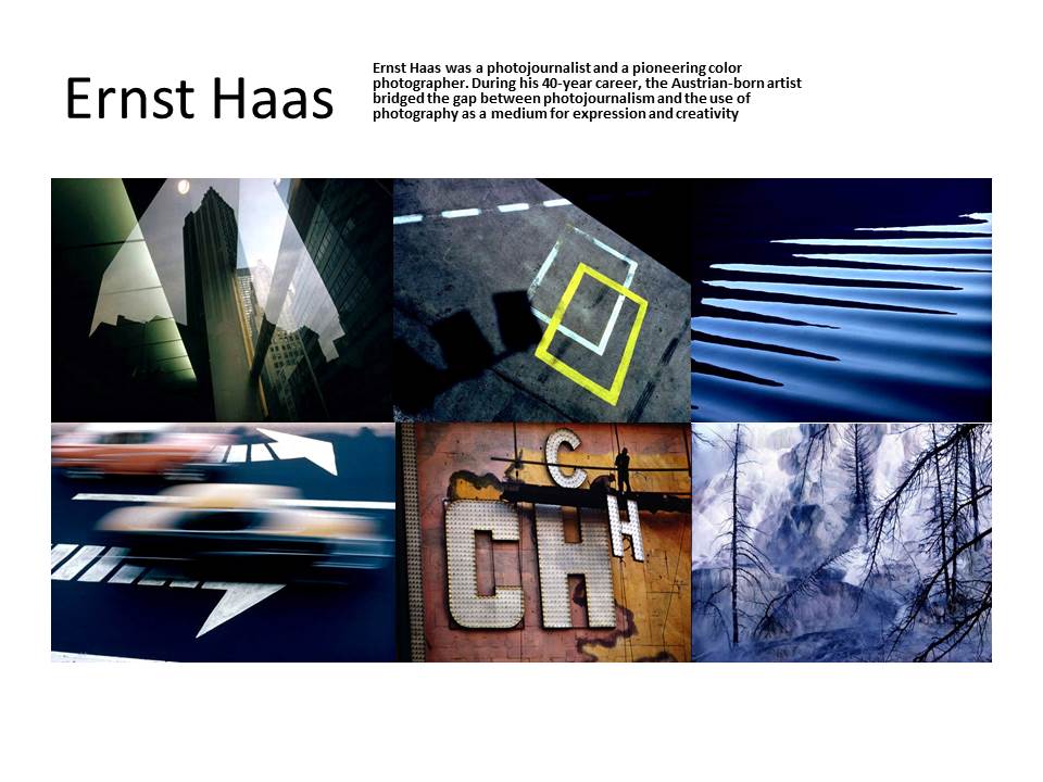
Ernst Haas vs Alfred Stieglitz

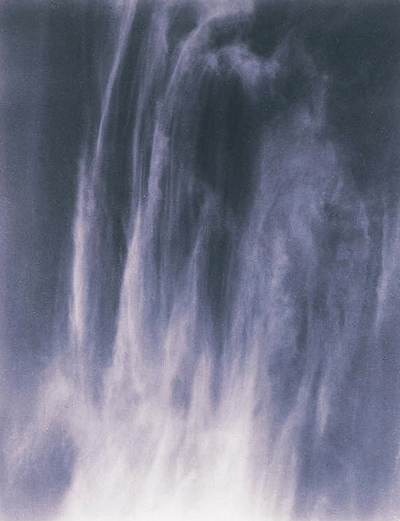
These two images from Ernst Haas and Alfred Stieglitz have a lot of similar features as well as many differences.

Alfred was born in 1864, which means that photography was a lot different to when Ernst was taking photographs as he was born in 1921. One key difference that can be seen is that Alfred took many of his photographs in gray scale, where as Ernst took lots of his photos in full colour.

Despite Alfred shooting his photographs in black and white, there is still a blue hue/tint to the image. This is similar to the Ernst image on the left as it also has a blue hue to it. This makes both images have a cold feeling to them. The cold blue tones also show the weather at the the time the photographs were shot. For example the blue tint to the cloud formations on the right show that there may have been a cold breeze in the air, and the blue hue in the left image emphasizes the coldness of the running water in the photograph. In both of the images, it adds more atmosphere and feeling to the photographs.

The lighting in both of these images seem similar. This is because there is a natural light source that can not be seen in the shot. In both images, the highlights and most exposed parts of the image is towards the bottom of the photograph. This emphasizes the depth of the images, as well as creating contrast between the front of the waterfall/cloud forms and the back of them.

The shutter speed of the Ernst image on the left is quite high, about 1/60-1/20. This is to create a smooth motion blur of the water falling down the rocks. This allows for the whole rock behind the water to be seen, and for it to be in focus by using a high aperture, eg. f22. This creates a similar effect to Alfred’s image on the right. This is because the cloud is stretched out as if it is flowing. Despite this image having a fast shutter speed, the cloud shape creates the effect of movement.

Both images create straight, directional lines from the top to the bottom of the frame. This again adds to the effect of movement within the photograph. Both images also have a darker background, adding more depth and contrast to the image.

Although both images look fairly similar, the camera angle, positioning and framing of the images are very different. Ernst’s image on the left seems to be taken from eye level, looking parallel to the floor directly towards the waterfall. The framing of the waterfall centered. Ernst has also stood a distance away from the waterfall and zoomed in with a lens, cutting off the edges and top of the waterfall, making the overall size of the waterfall unknown. Alfred’s image on the right has been taken from the ground looking up at a very high angle to capture the cloud. The cloud is centered in the middle of the frame, also slightly zoomed in but most edges of the cloud can be seen, giving a bit of scale to the image.

There is no official context to either of these images, but they are both of natural forms which create similar shapes and lines and they both seem to express nature.

Surface and Colour

Photographer inspiration

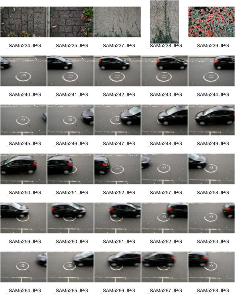
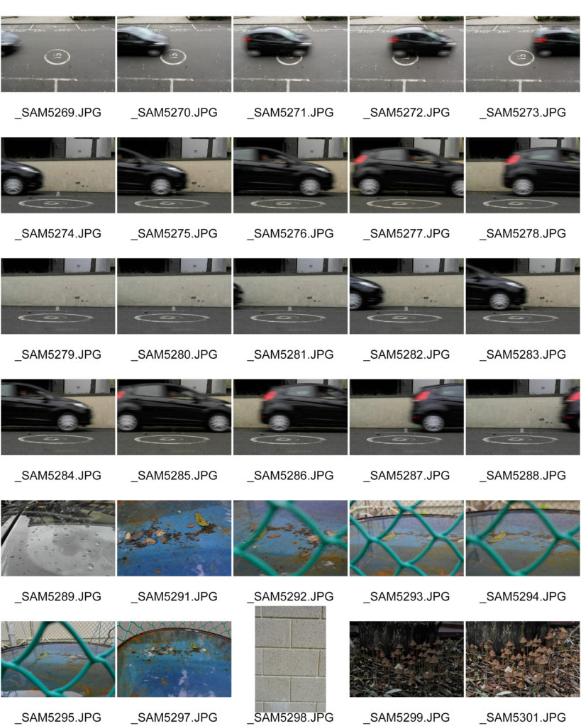
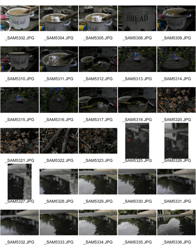
Raw Images

Selected Edited Images

Favorite Images

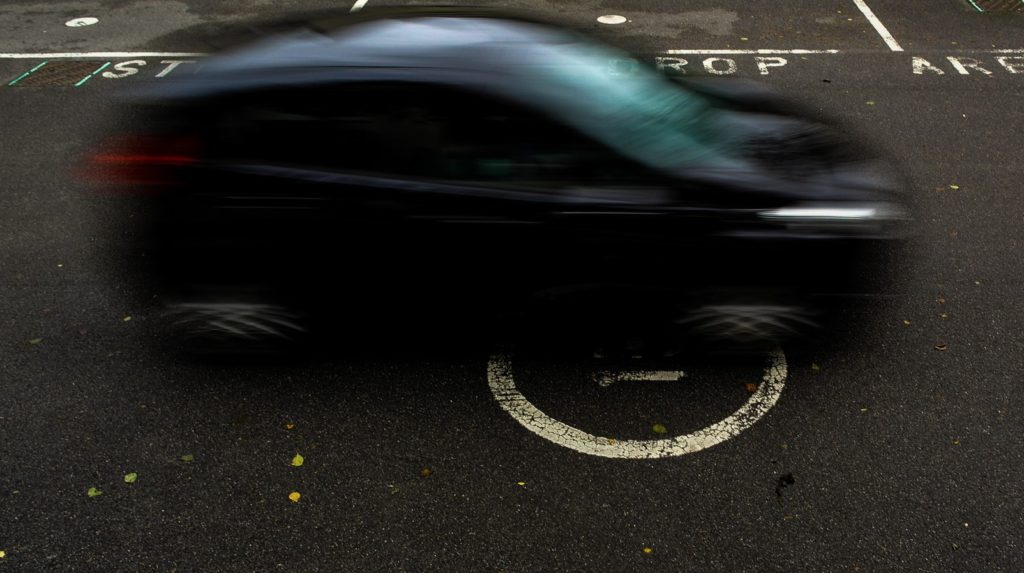
These final images best show the exploration of surface and colour throughout my photo shoots.

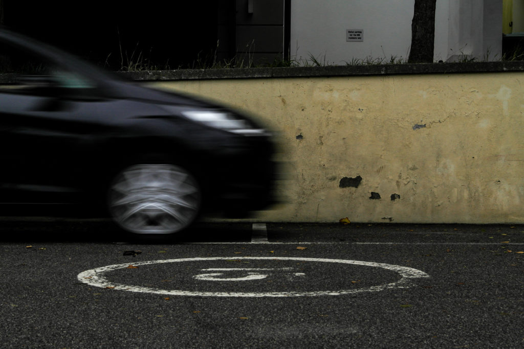
The first two images of cars directly respond to Ernst Haas’s photograph of moving cars with a slow shutter speed.

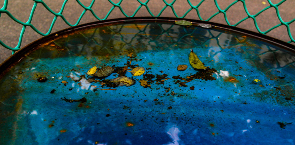
The next image responds to Ernst’s water photography, while showing vibrant colours under the surface of the water. I used Adobe light room to enhance the contrast and saturation of the image to bring out the bright colours of the barrel and the leaves in the water.

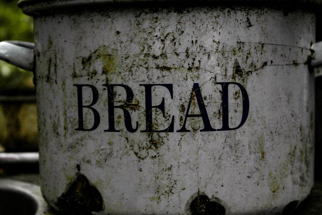
The remaining two images show examples of varying surfaces and textures in photographs, along with the contrast between the bright brown mushrooms and the dark, earthy background.

Black Lighting

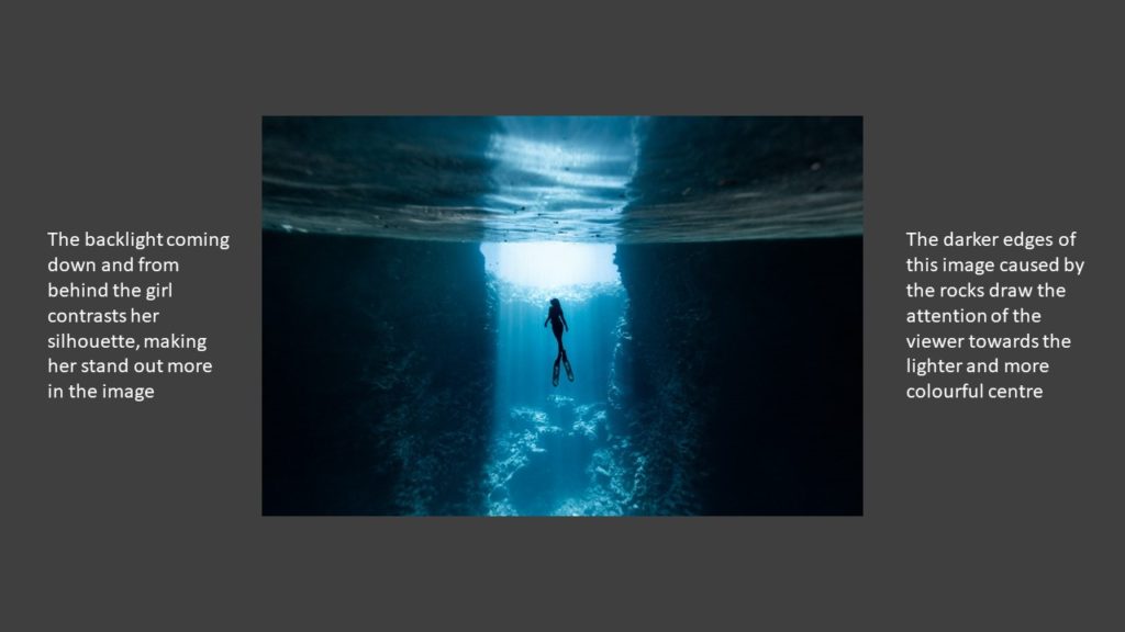
The black lighting technique is when source of light in a photograph is behind the subject, usually creating a dark silhouette of the subject.

This effect can also be achieved when editing a photograph in a software such as Photoshop.

Some examples of black lighting:

Keld Helmer-Petersen

My Images

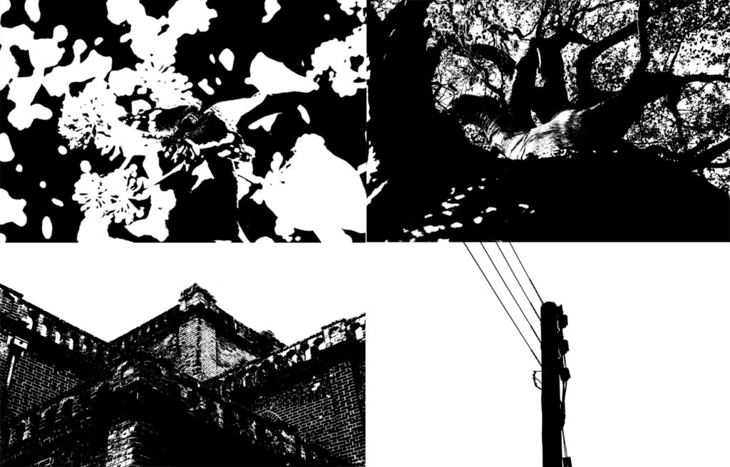
These images are similar to the work of Keld Helmer-Petersen because of the strong contrast between the highlights and the shadows, only using black and white. This creates a silhouette effect.

Looking and seeing

Ralph Eugene Meatyard

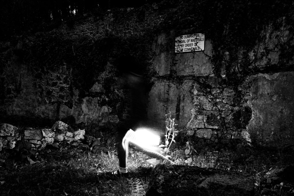
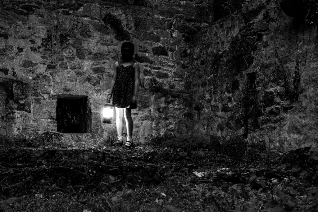
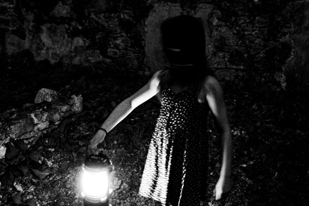
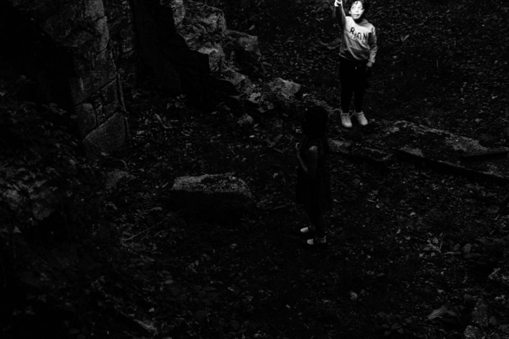
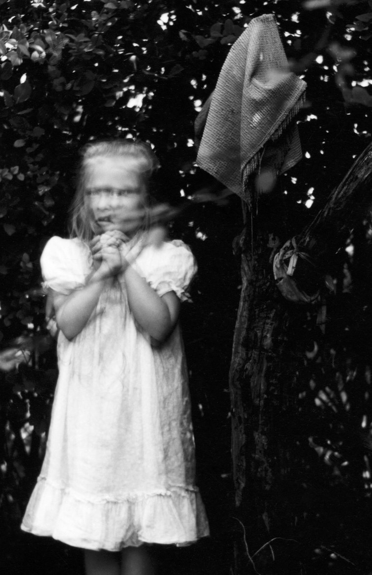
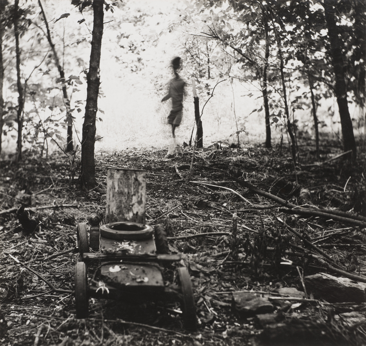
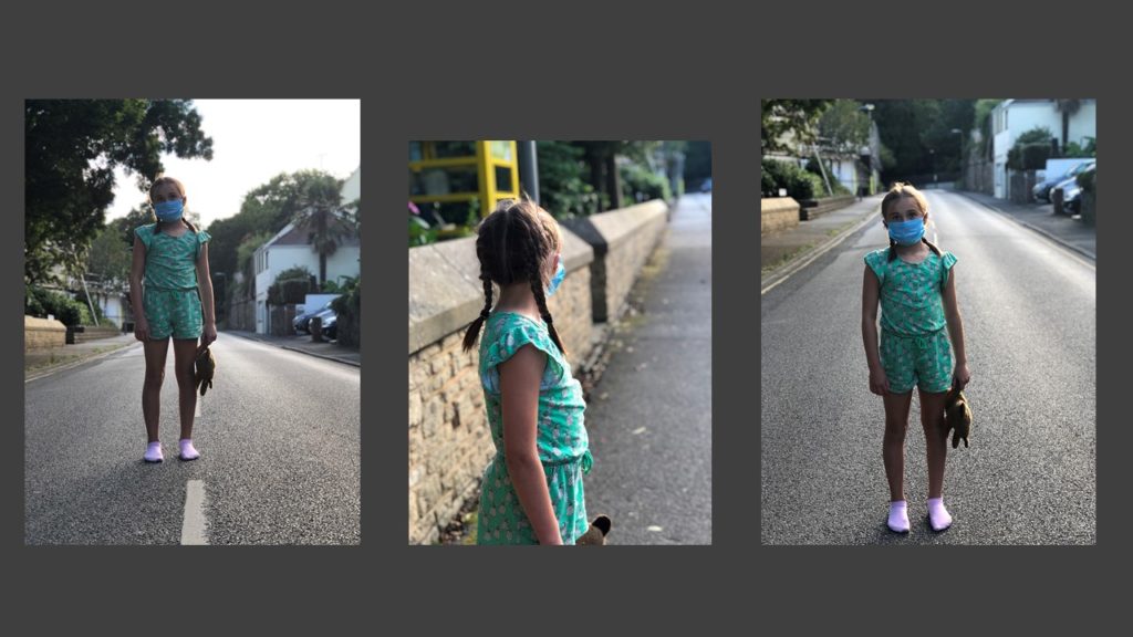
Ralph Eugene Meatyard’s (1925 – 1972) photography spanned many genres, but mainly focused on abstract photography. He shot all his images in black and white, lots of his photography is focused on children and adults in worn down areas with face masks on. He used different exposures, apparatuses and motion blur to create an uneasy feeling and a sense of confusion as the viewer has no context of the image and its purpose. Many of the subjects of the images are moving and are not in focus, and sometimes over exposed.

My photoshoot

My Favorite Images

I chose these final images as my best finished photographs because of the similar style to Ralph Eugene Meatyard such as these images:

Pursuing the Uncanny: Ralph Eugene Meatyard — Hite Art Institute,  Department of Fine Arts
The “Wildly Strange” Photographs of Ralph Eugene Meatyard

My final images resemble Meatyards work because of the strong black and white tonal contrasts with dark blacks and bright whites. In many of my images the subjects face is bury, much like Meatyards images.

The subjects face is also covered in the images, similar to some subjects of Meatyards images wearing masks.

The world is beautiful – Albert Renger-Patzsch

Albert Renger-Patzsch was born in 1897 and died in 1966 and was a German photographer who mostly shot in black and white and was associated with the New Objectivity

New Objectivity was a movement in German art in the 1920’s as a reaction against expressionism. It was a return to focus more on the objective world, instead of abstract or romantic. Some other artists that were associated with New Objectivity were Max Beckmann, Otto Dix, George Grosz, Christian Schad, Rudolf Schlichter and Jeanne Mammen.

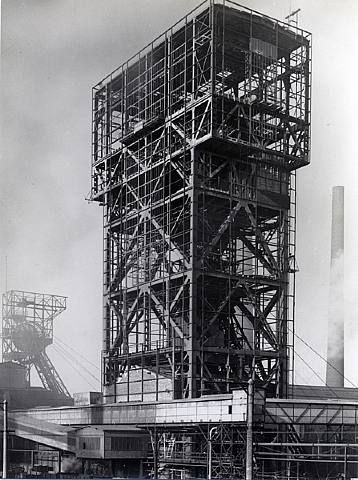
He made a book in 1928, ‘Die Welt ist schön‘, which translates to The ‘World is Beautiful’, which is a collection of hundreds of his photographs of industrial buildings and areas, mass produced objects and natural forms. These were all in black and white, usually with great contrast between the darks and lights in the image. Lots of his images also focused on geometric shapes and repetition throughout the image.

Image Analysis

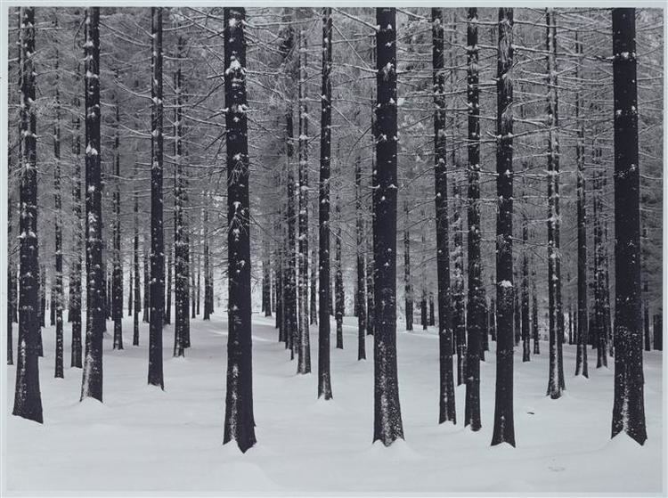
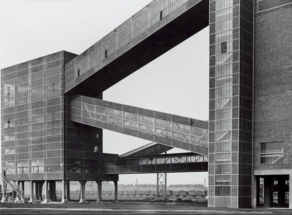
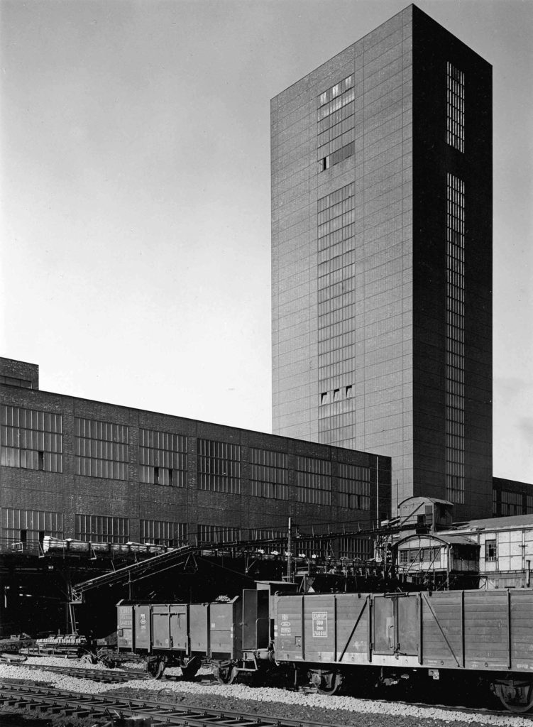
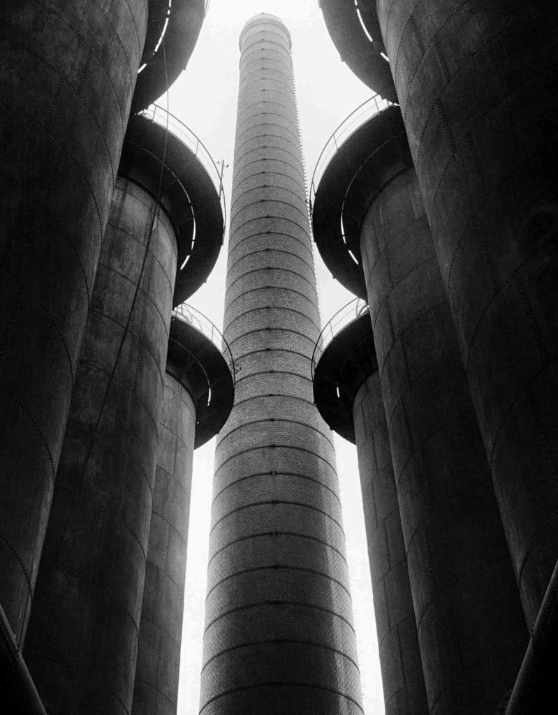
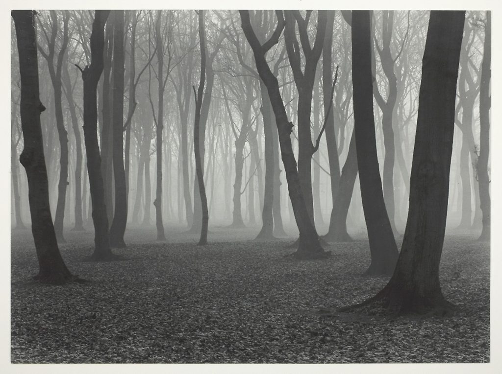
These are both images that Albert Renger-Patzsch took as a part of his ‘The World Is Beautiful’ collection.

One is an image of an industrial building, and one is an image of a deep natural woodland area, but they have many similarities aswel as differences.

Both images are taken in black and white which emphasizes the shadows created by the objects in the frame. This is seen in the dark shadows underneath the tops of the towers in the image on the left, as well and the gradient from light to dark grays on the rounded edge of the towers. These dark shadows are similar to the natural image on the right as the darkness of the trees create a silhouette against the light, foggy background, creating a high contrast between the focus objects and the background, which is also seen in the image on the left. The image on the left is very geometric with the towers and buildings completely vertical and straight in the frame. Where as the image on the right is more organic as the trees are all varying at the angle they are leaning, with different bumps and curves on each of them. The framing of the image on left is so that the image is almost completely symmetrical, which links to the idea of a man made factory creating hundreds of the same product. The image of the right is much less symmetrical and uneven, which shows the randomness of nature. Both images use layers and camera positioning to create a sense of depth. In the image on he left, the camera is focusing on a taller building behind 6 other smaller buildings which create a ‘tunnel’ towards the larger one. The bigger tower also has a lighter tone showing that it is further away from the camera than the other towers. Although both images are in black and white, the one on the right has more warm tones than the image on the left. The left image also has a higher contrast between the buildings and the sky because the whites of the sky are brighter with a higher exposure. This makes the right image more inviting as it gives off more warm as well as natural feelings. The photograph on the right was shot at chest height looking parallel to the ground to see into the woods through the trees, but the photograph on the left was shot from the ground looking up up at the buildings. This angle accentuates the size and scale of the buildings giving them more depth, as well as creating an immersive feeling of being surrounded by the buildings.
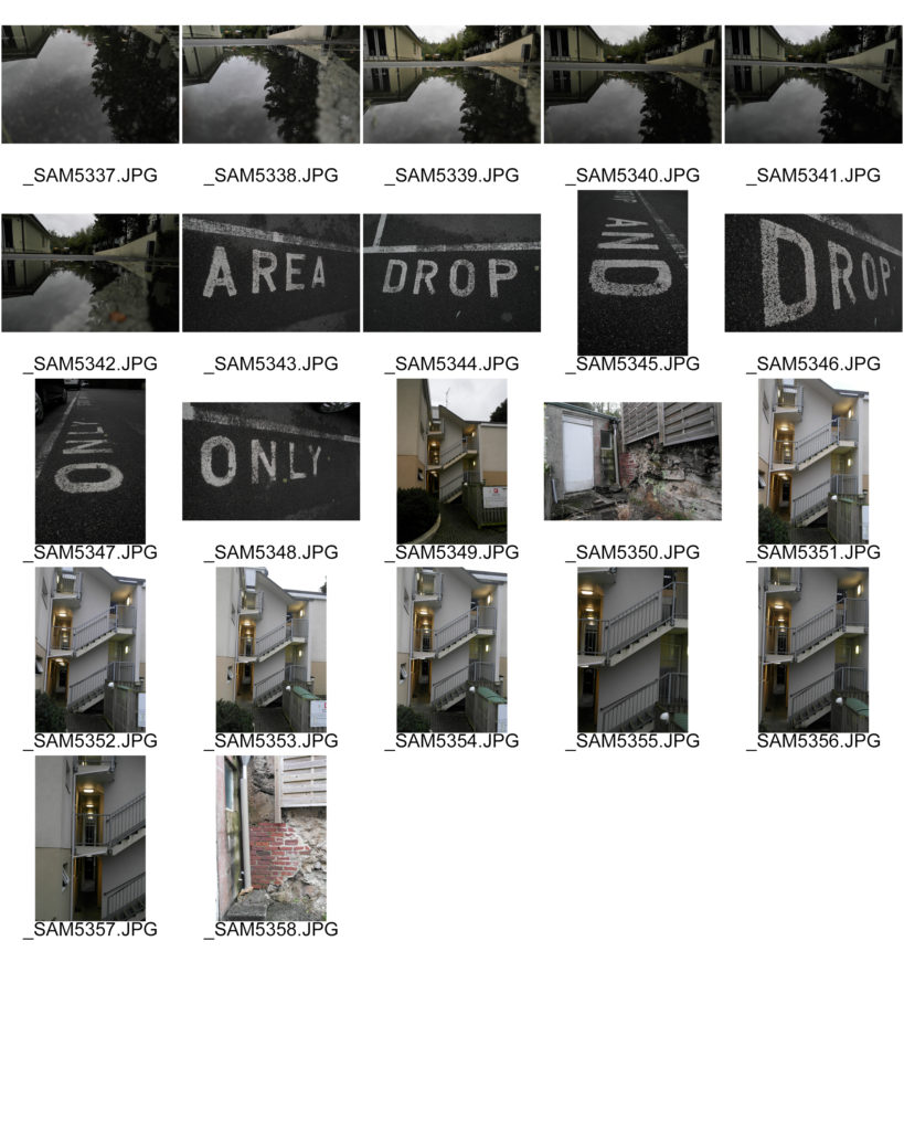
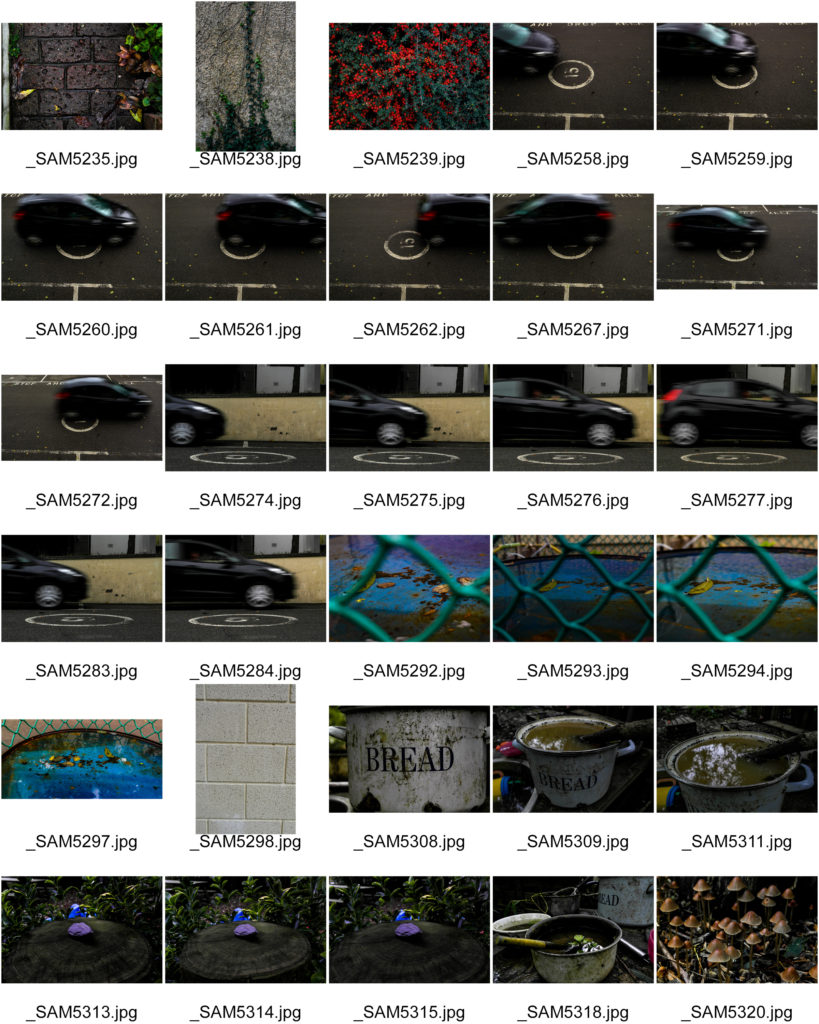
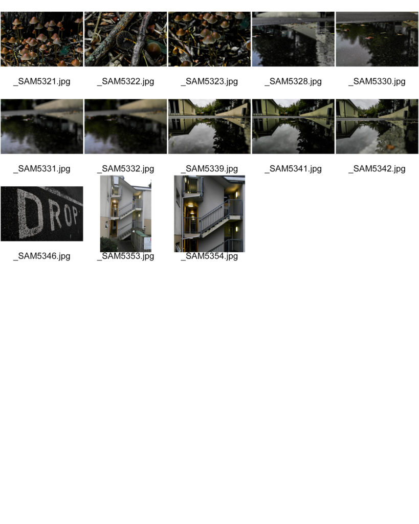
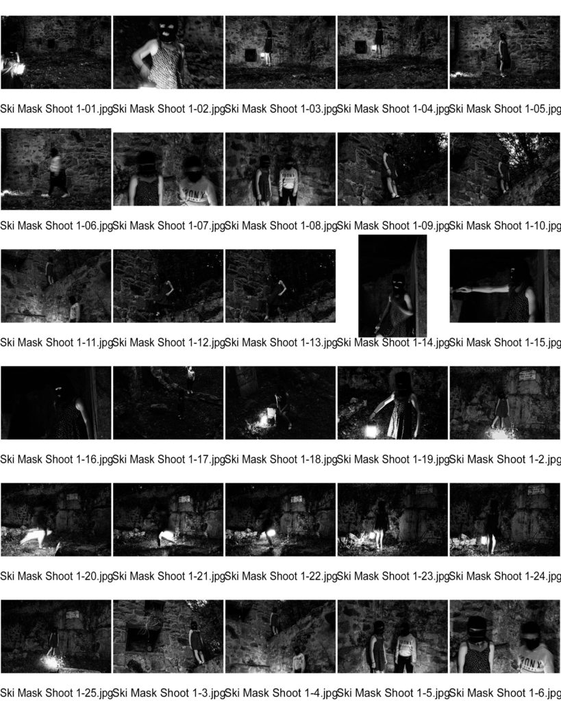
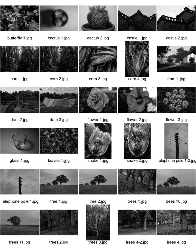
My images – Contact Sheets

A contact sheet is a way of displaying images from when film photography was commonly used. It is a sheet of printing paper that displays a whole shoot of multiple images. They provide a quick way to look at lots of images quickly in the same place.

Contact sheets were originally useful to quickly scan through a group of photographs to find the best ones to enlarge. Now it is used to quickly find the best ones to further edit and improve.

Favorite Images

The formal Elements – Paper

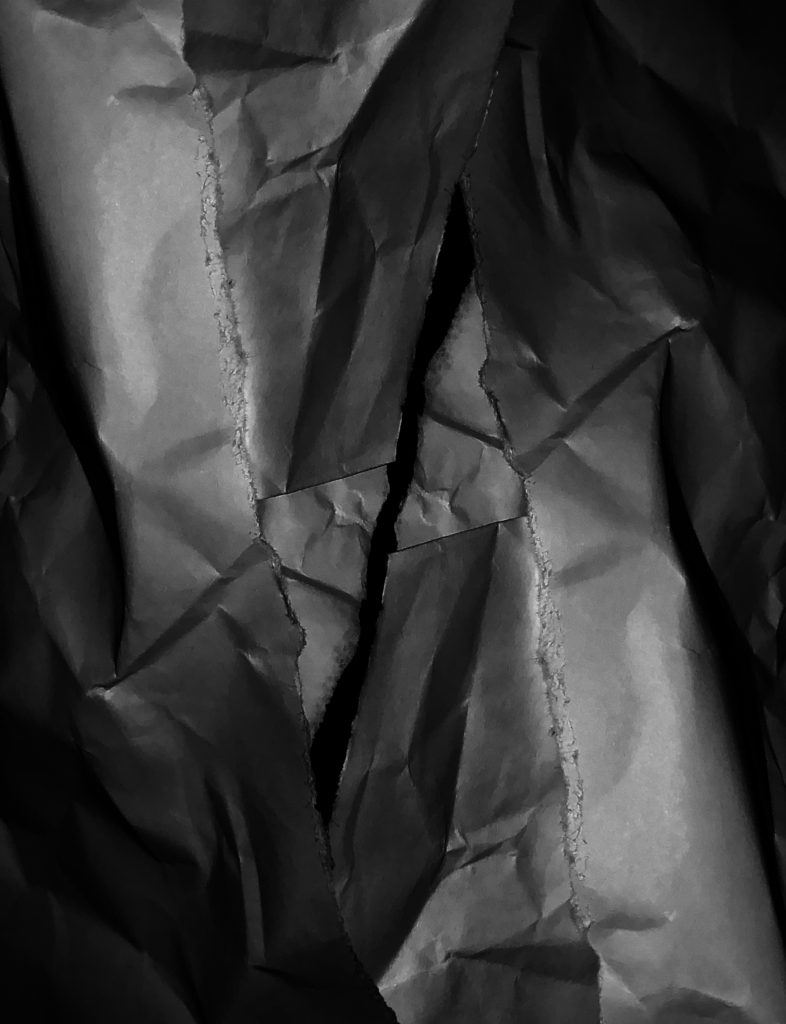
In this photograph, i shot a folded and ripped piece of paper.

Originally in the raw image the paper was only on the right hand side of the image, with unused, black space to the right of the image. In Photoshop i cut out the paper, duplicated it and flipped it over to create an upside down mirror image overlapping the original on the other side of the image to fill up the empty space. This also adds more layers and depth to the image.

I made the image black and white to further show the black and white tones and shadows.

I decreased to the exposure of the image and increased the shadows to even out the whites and the darks, and to emphasize the shadows created by the creases and folds in the paper. I changed the curves to darken the overall image without losing quality and details. These changes also bring out the rough texture of where the paper has been ripped.

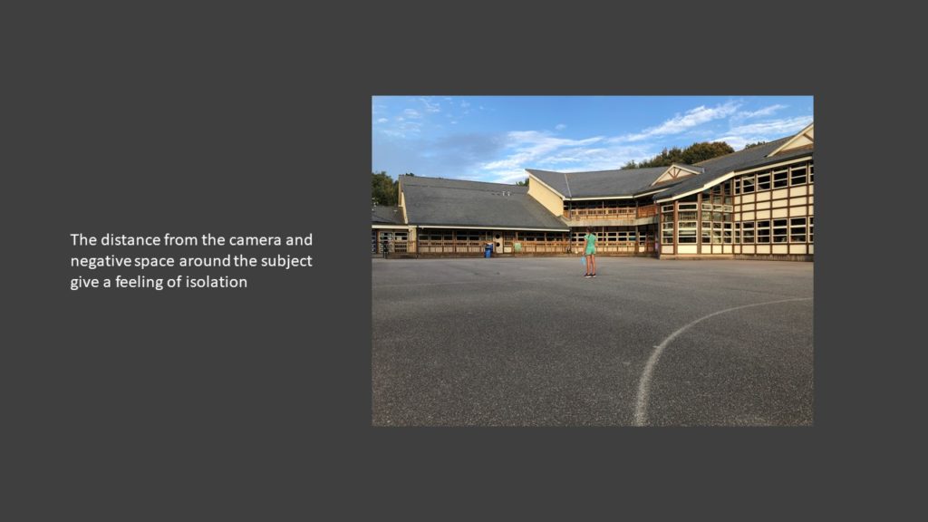
The edges of the image have more shadows and darkness than the rest of the image, drawing the viewer to the center of the image where the pieces of paper are no longer overlapping and there is black negative space, which contrasts to the busy outer parts of the image.

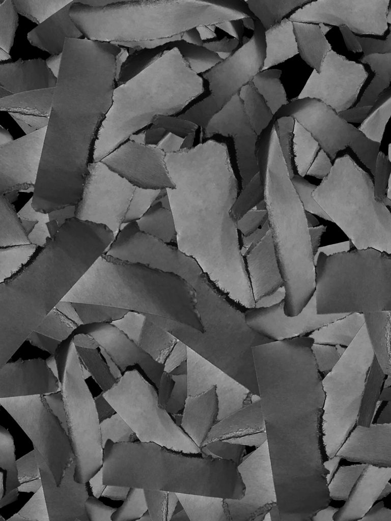
In this image i shot multiple small ripped up pieces of paper.

The original composition of this image was a small pile of strips of ripped paper. In Photoshop i cut out this group of paper and duplicated it multiple times behind the original pile, at different sizes and orientations. This is to add depth to the image and to take up negative space.

I also converted the photo to black and white to focus on the shadows and textures created by the multiple layers of paper.

I decreased the exposure, increased the darks and decreased the lights to make sure there was no over exposed parts of the photo. The darkened shadows also add depth as well as give emphasis to the rough textures where the paper had been ripped.

There is repetition of the same shapes and shadows where i have duplicated the paper to add depth and layers.

I used the curves feature in Photoshop to further bring out the darks and shadows whilst retaining detail and texture of the paper.

Alfred Krupp Analysis

Picture

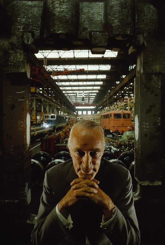
Arnold Newman | Portrait of Alfred Krupp | 1963

Alfred Krupp is positioned in the center of the frame in the foreground, looking directly into the lens of the camera, with his hands clasped under his chin. This is to make him seem intimidating to the viewer. He has been lit from above and from both sides, this creates dark shadows by his eyes, making him seem evil and provoke a negative feeling for the viewer.

Behind him is the entrance to a train factory which he owns. He is positioned in front of the entrance, as if he is blocking people from entering it. The walls and ceiling of the entrance is dark and draws the attention of the viewer to the center of the image, towards Alfred Krupp, making him seem like a powerful figure. In factory in the background is naturally sky lit through big windows in the ceiling, similar to those in a church or a cathedral.
The overall feel of the picture is negative with dark tones and mostly earthy colours. The lines of the roof in the background give the factory depth and size.
He is wearing a formal suit which contrasts from the hectic nature of the factory in the background. His hands are positioned in a triangular fashion which also shows power as a triangle is a strong shape.
Alfred Krupp has been portrayed in this negative yet powerful way because the trains his factory was making were used to transport Jewish people to concentration camps during the war.