All posts by Reuben J

Filters

Author:
Category:

Final Outcomes and Framing

Final Outcome Intentions

Anthropocene – ‘relating to or denoting the current geological age, viewed as the period during which human activity has been the dominant influence on climate and the environment.’

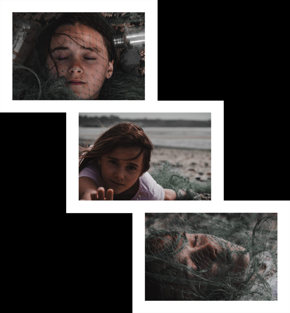
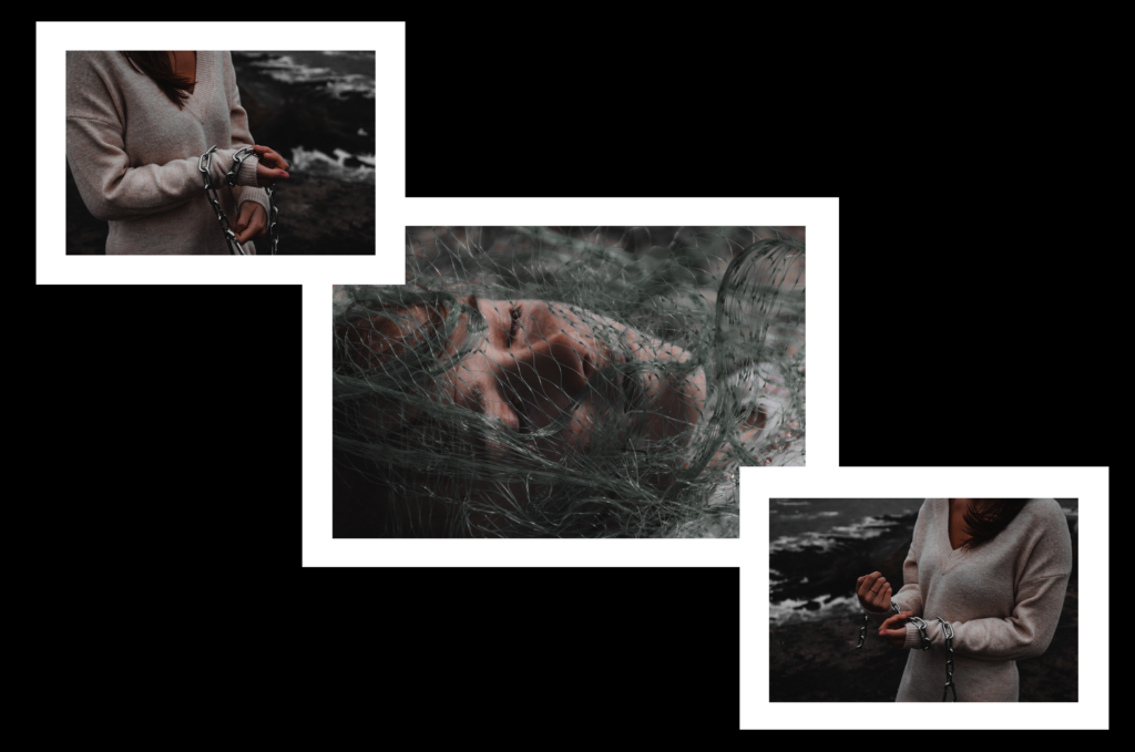
This whole project links to Anthropocene through how humans have affected the ocean wildlife. This is shown through the location and contents of my images. The abstract images induce the viewer to think more deeply then exactly what they can see, and to think about what parts of the image can symbolise. The chain and netting show how fish and other marine life is being trapped and killed through Anthropocene and humans actions.

The intention of these images is to (much like Jeremy Carroll) raise awareness and make people think more about Anthropocene as a whole.

Framing Ideas
vertical
triple – same size
triple – alternate sizes

Image Manipulation

image mirroring
image mirroring + layering

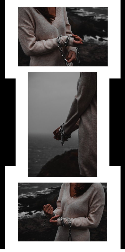
Final Outcomes

A5
A4
A5

I chose these images and this framing pattern because the images compliment each other giving symmetry to the overall display. The outer images are from my second photoshoot, providing earth colours and moody tones. They also are orientated so that the subject of the image faces the centre, large image in the display, this creates even looking outer edges to the display. The centre image is from my first photoshoot and provides colour and texture, while keeping the earth and moody tones.

Shoot 2 Comparrisons

For this photo shoot I took inspiration from both Lilli Waters and Jeremy Carroll. I used this to create Anthropocene themed images with features from Jeremy Carroll with a colour scheme and overall feel of Lilli Waters work.

The 'primal' photography of Lilli Waters is defiantly repairing her past —  art thy neighbour
Lilli Waters
Jeremy Carroll
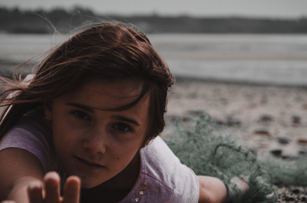
My Image

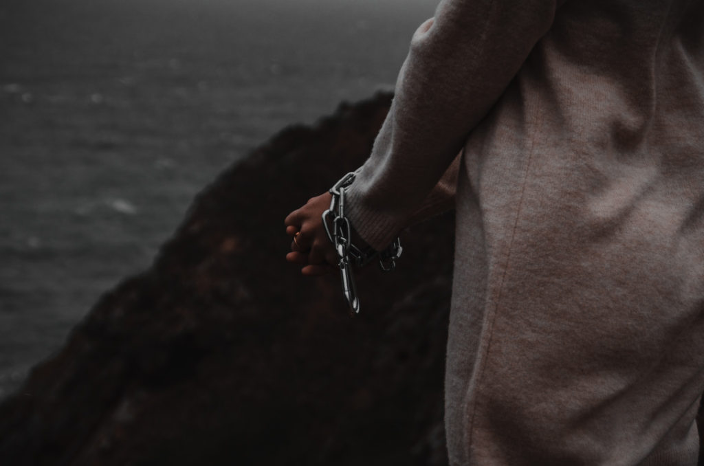
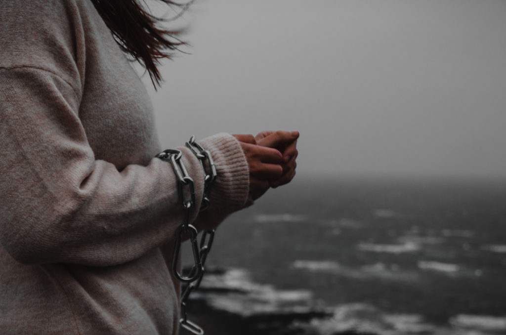
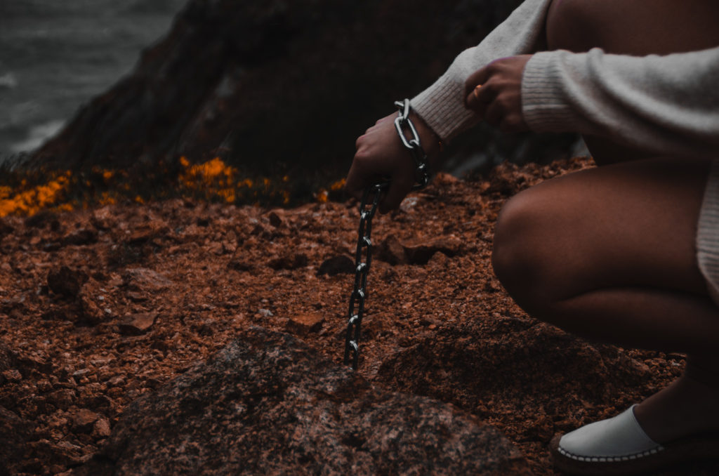
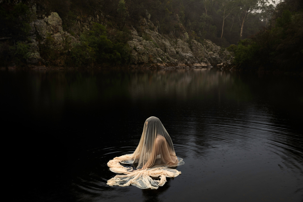
My image, as well as Lilli Waters image was lit with natural lighting on an overcast day. My image is framed closer up than Waters image and us using an aperture of about f.4, Where Waters image was taken from further away with a wider view of the background, also using a more narrow aperture to keep everything in the frame sharp and in focus. Like the first photo shoot, the shutter speed was fairly fast because of the bright natural light and movement of the subject in both images.

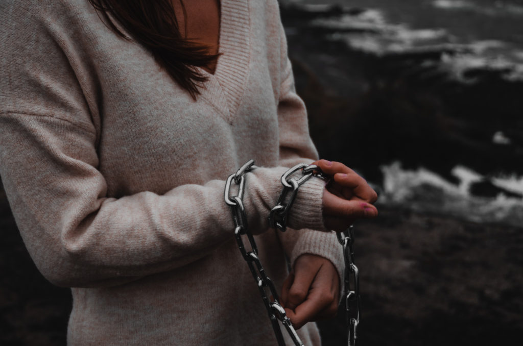
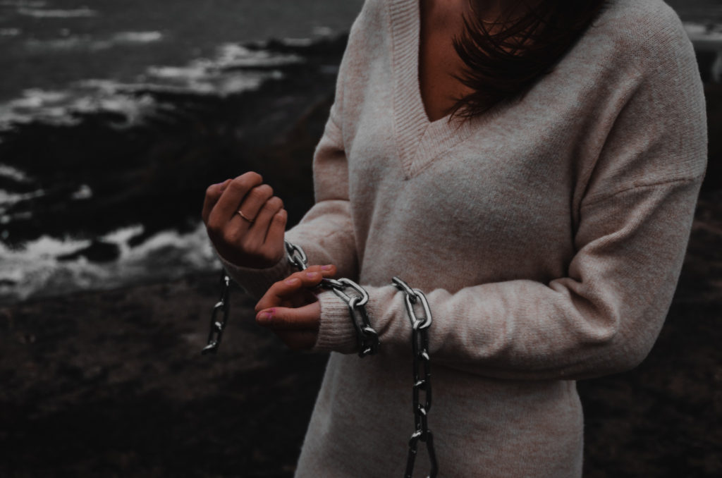
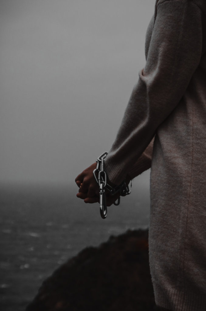
I used a similar colour palette as Lilli Waters by having the subject wear light coloured clothes to contrast to the dark earthy coloured background. I used the concept of the subjects hands being trapped from Jeremy Carroll, but used chains instead of bright coloured plastics to match with the colour and feel of Lilli Waters work.

This image represents how humans are endangering marine animals because of the chains restricting the subjects hands. The ‘marine’ aspect is displayed through the location of the photo shoot seen in the background of the image.
Shoot 2

Plan

My plan for this photo shoot was to combine the work of Lilli Waters by going to a natural open landscape on a cliff near the coast, and Jeremy Carroll by using a chain to represent how animals have been trapped by the pollution in the ocean

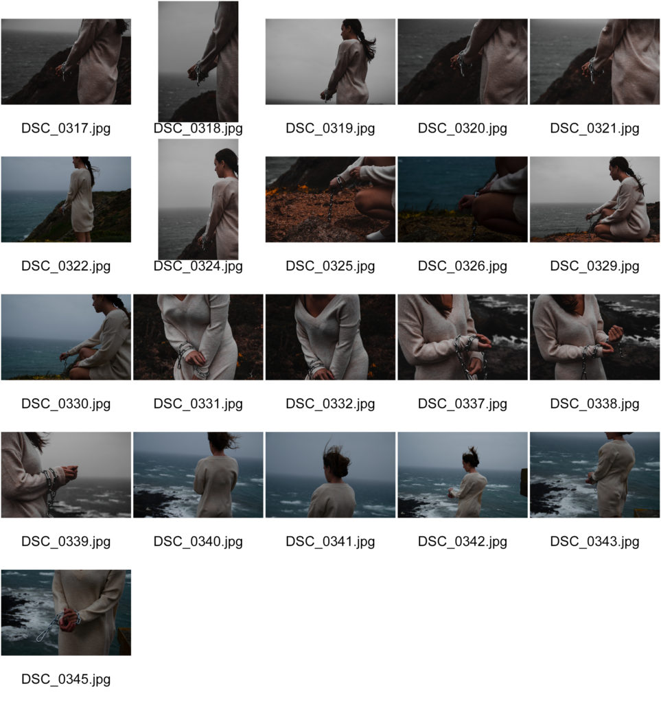
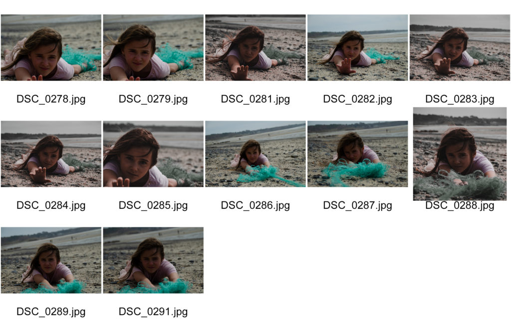
Contact Sheet

Editing Process

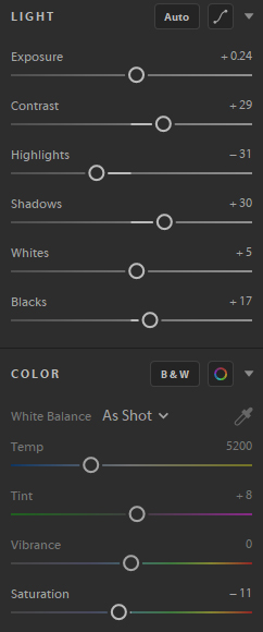
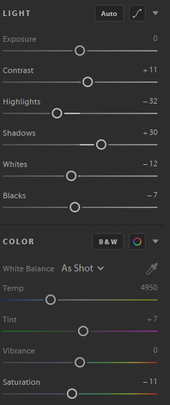
I edited these images similarly to my first photoshoot, with decreased highlights and increased shadows to create a more moody image. With these images I also increased the contrast to match the a similar overall look, lighting and colour scheme to Lilli Waters images.

Best Images

Lilli Waters

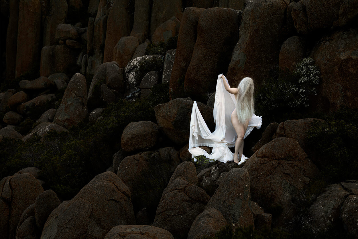
‘Lilli Waters (born 1983, Armidale, NSW) is a fine arts photographer whose work explores the human condition through dramatic images of the female form in haunting, windswept landscapes. A Lilli Waters image has a painterly quality, evoking the Pre-Raphaelites with macabre, foreboding elements, a jewel-like palette and a sensitive use of light. Waters makes use of translucent fabrics and long hair to obscure the identities of her subjects, suggesting that the image might be just as much a mirror for the viewer, as it is a portrait.’ – curatorialandco.com

I thought Lilli Waters work could be interpreted as linking to Anthropocene because the subject of the image is seen to be covered in a plastic like material, which links to Jeremy Carrols images of being trapped in fish netting. This combined with the location of the images being in natural landscapes further displays the anthropocentric nature of the images, humans effect (the subject) on nature (the background).

Inspiration Images

The 'primal' photography of Lilli Waters is defiantly repairing her past —  art thy neighbour
lilliwatersphoto
Lilli Waters - Underworld - Photography - Curatorial+Co.

Shoot 1 Comparrisons

My first photoshoot was inspired in the style of Jeremy Carroll and tried to create the same effect that he did on the viewer.

Jeremy Carroll
My Image

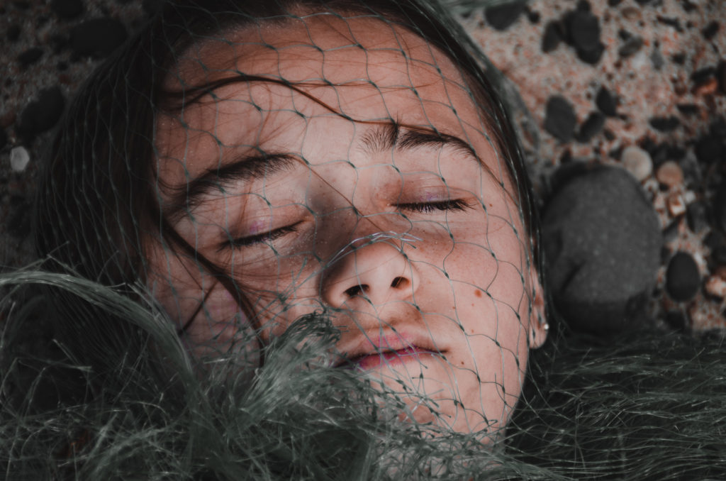
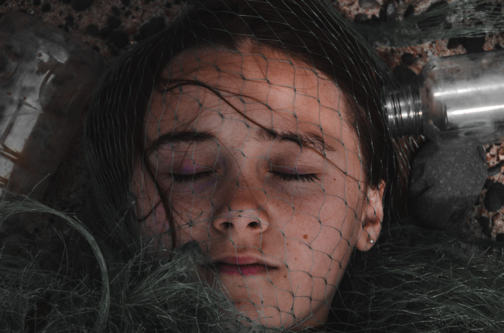
Jeremy’s image was taken with studio lighting, where my image was taken outside under natural lighting on an overcast day. The aperture of his image appears to be moderately high because everything in the shot is crisp and in focus. The aperture of my image was around f.4 because I wanted the front of the face to be in focus but the sand and surrounding bottles to be blurry. Jeremy most likely used a fast shutter speed because of the bright studio lights, I also used a fast shutter speed in my image because of he bright natural light and to compensate for the slight movements of the camera while I took the image. Both images have low ISO as they are crisp and not grainy.

Jeremys image has bright saturated colours with minimal shadows. My image has a darker more moody colour palette with lots of shadows to create a bigger impact on the viewer.

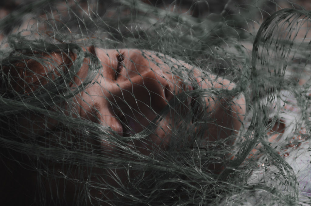
Both images show a person being trapped by netting and other marine pollution. Both symbolise how fish and other animals are affected negatively by the way humans pollute the oceans.

Shoot 1

Plan

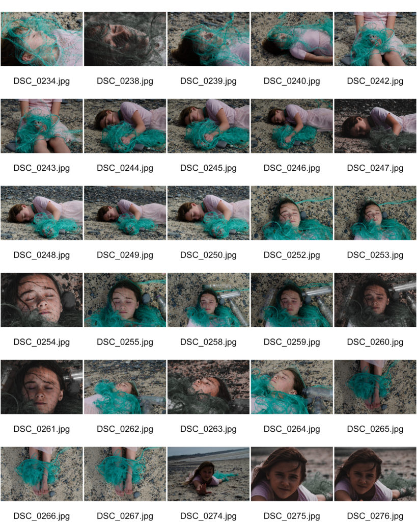
The plan for this photo shoot was to create a feeling of being trapped and effected by marine pollution. This would be done by using the beach as the photoshoot location and using plastics that can often be found floating in the sea of on the beach as litter.

contact Sheet

Editing Process

Here you can see that when editing this set of images, I made them more moody to create more of an impact on the viewer. I did this by decreasing the highlights and increasing the shadows. I also changed the temperature of the image to appear cooler with more blues and less orange and reds, along with this I decreased the saturation of the image. This gives the image less colour, again creatine a more impactful image.

Best Images

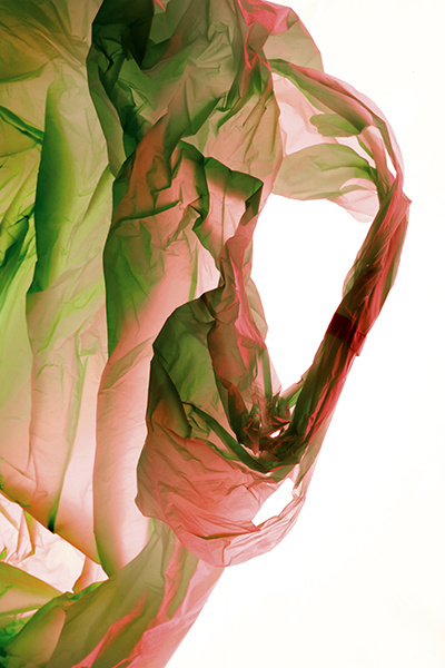
Jeremy Carroll

‘Jeremy Carroll is an artist and professional photographer who wants to change that (water pollution) by bringing the problem to the forefront of people’s minds. In order to illustrate what plastic pollution is doing to fish and sea mammals, he created an exhibit called “Entanglement.” It depicts humans entangled in the waste that is most commonly found in seawater and along beaches’ – thegreenparent.co.uk

Jeremy Carroll mainly focuses on closeup portraiture and abstract images displaying the effects of marine pollution. He shows the effect of the plastic in the oceans by wrapping it around the model, symbolising how it can trap and endanger marine animals in the same way. Jeremy Carroll chose this subject to tackle because he believes that marine pollution is a big problem and that his photography may highlight this problem and help reduce this pollution in the oceans.

Inspiration Images

ANTHROPOCENE

Anthropocene – ‘The Anthropocene is a proposed geological epoch dating from the commencement of significant human impact on Earth’s geology and ecosystems, including, but not limited to, anthropogenic climate change.’ – Wikipedia

Anthropocene displays the recent period in time where humans are having a large impact on the natural world. This is supported by evidence that atmospheric, geologic, hydrologic, biospheric and other earth system processes are now altered by humans.

Example Images

Visions of the Anthropocene: Our Planet, Today - Photographs by Edward  Burtynsky | LensCulture

COMPARISONS

Lewis Baltz Image

Lewis Baltz | Art, Biography & Art for Sale | Sotheby's

My Image

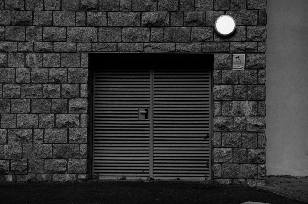
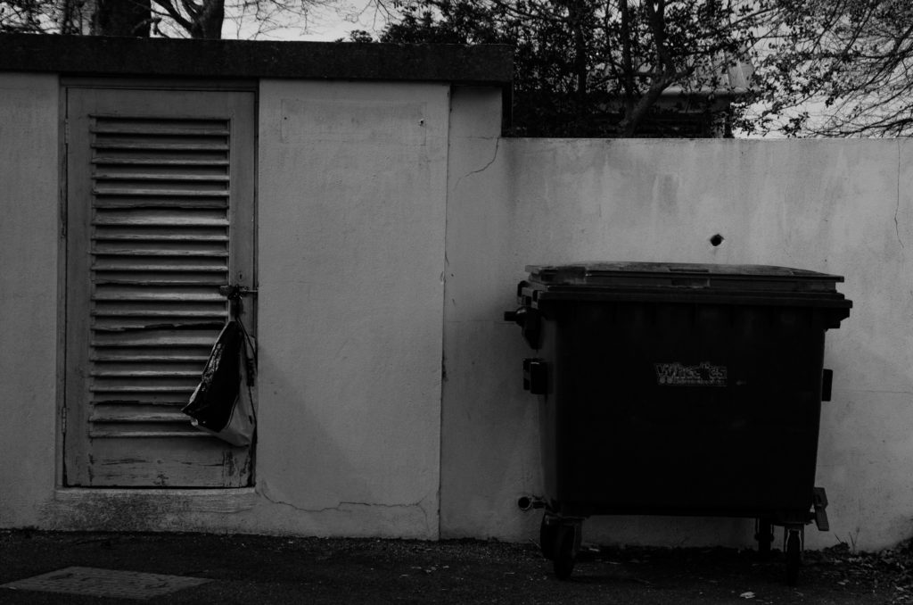
In both images, the lighting used is almost identical, Lewis’s image was lighted by natural light almost directly above the building being photographed. This is shown by the dark shadows being created on the door by the top of the door frame in both images. In my image, I used an aperture of f.9. This is to allow the whole door and texture of the surrounding surfaces to be in focus and sharp. Similarly to this, Lewis’s photograph appears to have been taken at a similar aperture because the door is in focus, as well as the texture on the surrounding surface, showing a moderately high aperture was used. The shutter speed i used was fairly high because if the bright natural light at the time the image was taken. Lewis Baltz may have used a similar shutter speed if the intensity of the light was similar to when i took my image. Also, the ISO is fairly low in both images, creating minimal grain within the image, making them more clear and crisp.

Both images use black and white to emphesise contrast. Lewis’s photograph was taken on a black and white camera with no post editing, where as i took my photo on a coloured DSLR camera, and edited it in post to appear in black and white. Both images have a large tonal range, with bright highlights on the walls and dark shadows at the top of the doors. The framing and shapes within both images are almost identical, the camera is facing directly towards the building at head hight, the floor takes up a very similar amount of space in each image and the right-angled shape of the door is in the direct centre of the frame. In my image, The texture of the surrounding wall is emphasised by being in focus through the use of a high aperture, aswel as increased contrast and shadows. In Lewis Baltz’s image, there is less texture on the building, but it can still be seen because of the large tonal range and high contrast of the image. Lewis’s image is very symetrical because of the plain surfaces and central framing of the doorway. Where as my image is less symetrical because off the added details/objects such as the door handle, circular light and sign.

Alltogether, both images are rather similar, using high contrast and tonal ranges, along with flat angles and geometyric shapes to create a good representation of the urban side of New Topographic Photography.

Shoot 2

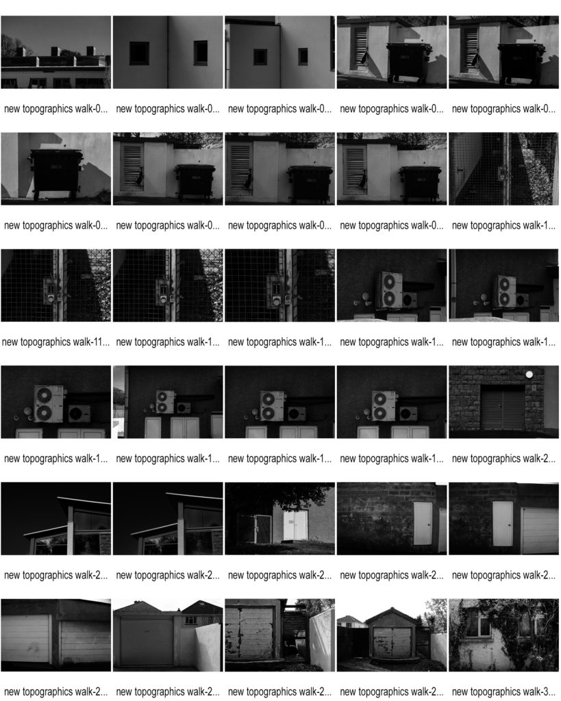
Contact Sheets

Favorite Images

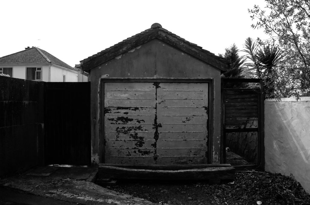
These are my favorite images because i think they best show the New Topographic and urban photography style. This is by framing the photographs directly towards a building/object looking flat towards the surface. As well as this, one of these photos is taken at a slight angle to show the dark shadows being created by the objects in the image, much like some of Lewis Blatz’s images.

Inspirations

Many of Lewis Baltz’s photography incluse industrial/mechanical objects/buildings, such as pipes, electrical boxes, air conditioning etc. I used this information to respond to one of his images of the side of a building containing lots of el;ectrical appliances and boxes:

Lewis Baltz - 49 Artworks, Bio & Shows on Artsy

My Final Outcome

Here I took a photograph of some air conditioning units and wires on the side of a building. The angle the image is taken at is much like Lewis Baltz because the camera is facing flat towards the wall, showing the shapes and right angles created by the objects in the frame. A difference between my image and Lewis Baltz’s image is that the background of my image (the wall of the building) is darker than the objects in the main focus of the image, whereas in his image the objects in the foreground are darker than the background. Although these light and dark tones are ‘inverted’ in each image, the same effect is achieved, making the focus of the image stand out more through the use of contrast between the tones used.