All posts by Olivia M-G

Filters

Author:
Category:

STudio Portraits

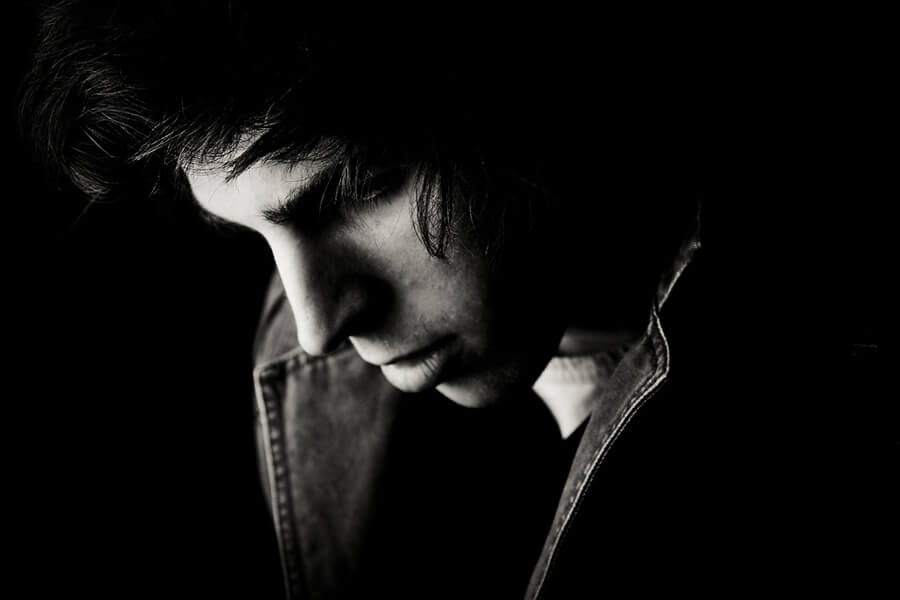
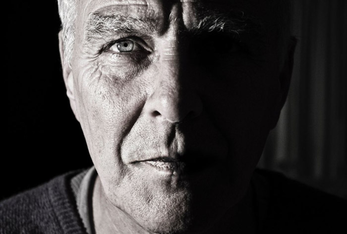
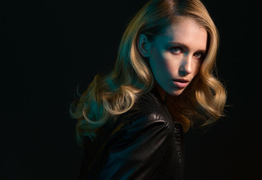
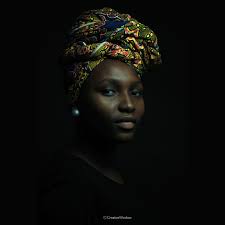
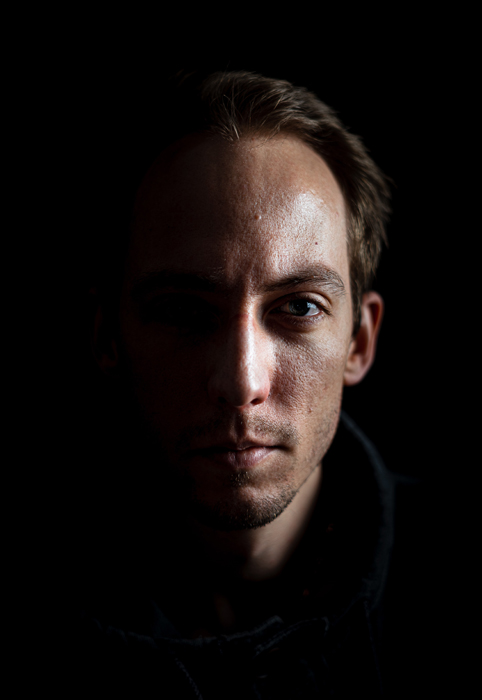
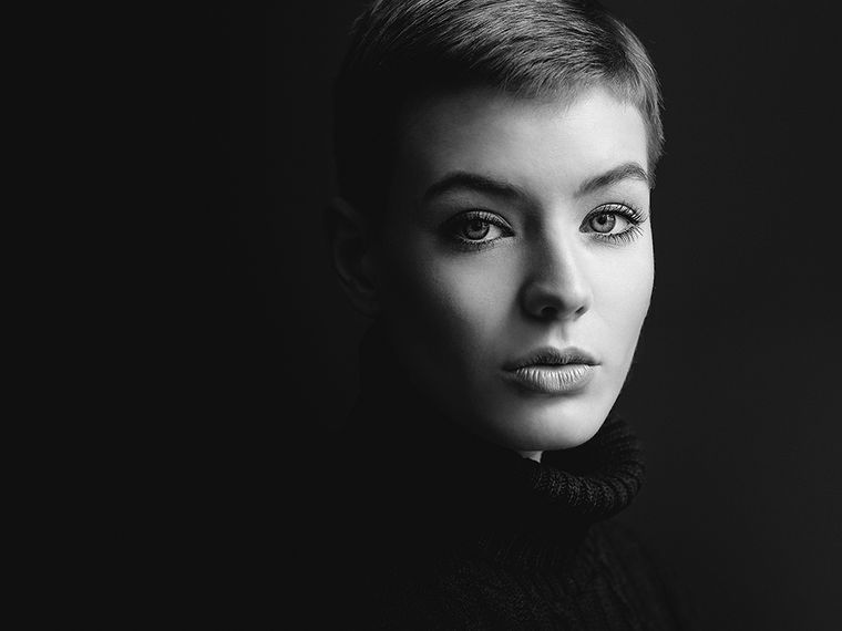
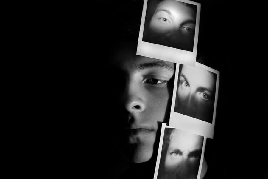
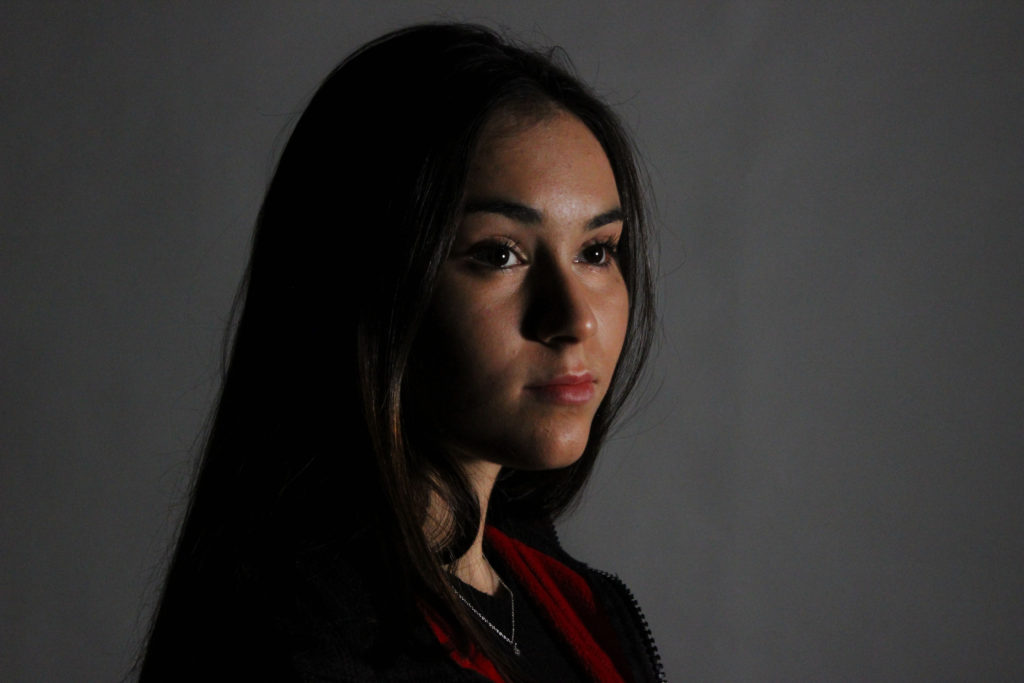
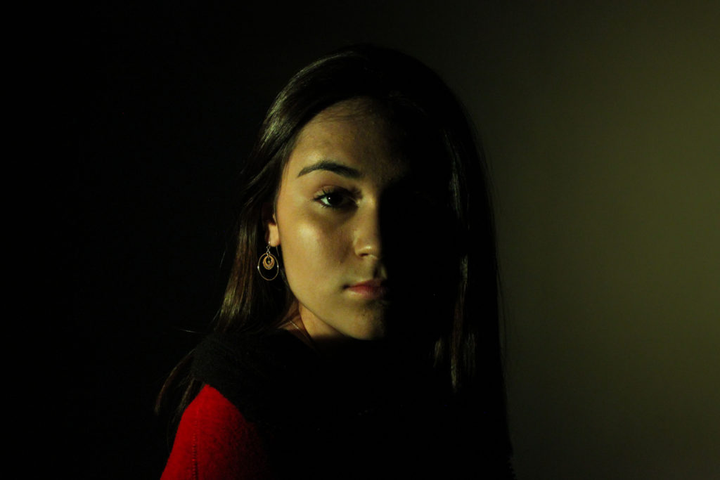
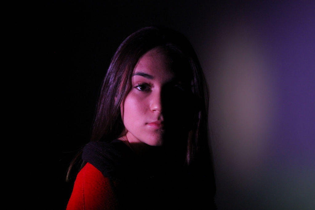
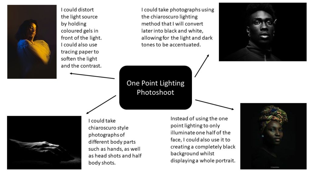
The use of artificial lighting offers many creative possibilities such as chiaroscuro, Rembrandt, hard and soft lighting. This can be done through the use of 1 and 2 point lighting. One point lighting is a type of studio portrait, in which only one light source is used to illuminate the subject, resulting in often dark and moody images. On the other hand, two point lighting is a type of studio portrait, in which two light sources are used to illuminate the subject, causing the images to often look clear, professional and shadow-less.

One Point Lighting and Chiaroscuro

Chiaroscuro is an Italian term literally meaning ‘light and dark’, and also is a method of lighting in which the use of contrast and shading is used to produce a composition. This type of lighting was originally showcased and developed to its full potential by artist Leonardo Da Vinci. Artist or photographers often use this technique in order to achieve a dramatic or impactful final image.

Analysis

Peter Lindbergh

Peter Lindbergh was a German fashion photographer, born in 1944, known best for his cinematic photography and being one of the most influential contemporary photographers. Lindbergh first started off his creative career by studying painting at the College of Art in Krefeld. After graduating Lindbergh turned to the medium of photography, later working for Stern Magazine.

Lindbergh was said to set himself apart from other photographers by redefining beauty standards in fashion photography. He did this by not defining the subject in the photographs by their age, and excessively retouching the images to conceal it. Lindbergh believed that photographers should “free women, and finally everyone, from the terror of youth and perfection”.
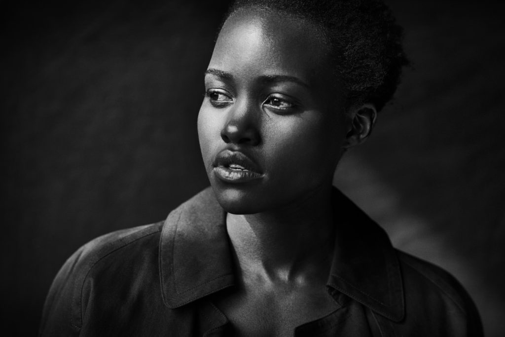
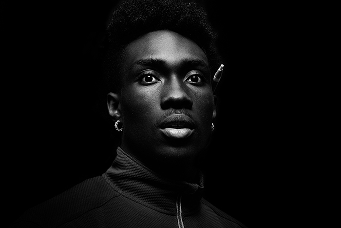
Lupita Nyong’o, photographed by Peter Lindbergh for the 2017 Pirelli calendar.

This black and white image taken by Peter Lindbergh displays a head shot of actress Lupita Nyong’o in one point lighting. By using this method Lindbergh has illuminated the left side of her face while casing a dark shadow on the other. In addition, it can be said that Lindbergh’s use of black and white, instead of colour, accentuates this chiaroscuro lighting and the contrast between light and dark. These contrasting tones also create various angular lines around the image, such as the sharp diagonal shadow line on her neck, which can be said to lead the viewer’s eye towards the focal point of her face. Here Lindbergh has centred Nyong’o in the centre of the image, which allows for almost an even amount of empty space either side of her and the main focus to be on the headshot itself.

Focusing on the technical aspects of this photograph, you can see that Lindbergh has used a fast shutter speed to capture this image, due to the fact that there is little to no blur and it was taken in a dark setting. Furthermore, he has also used a medium to large aperture, as you can see that the background has been given less focus than Nyong’o herself, allowing for a small depth of field. The one point studio lighting for this photograph also means that Lindbergh must have used a high ISO, so that the camera would be more responsive to the little amount of light in the room.

Photo-shoot
Plan
Contact sheets
Edited Images

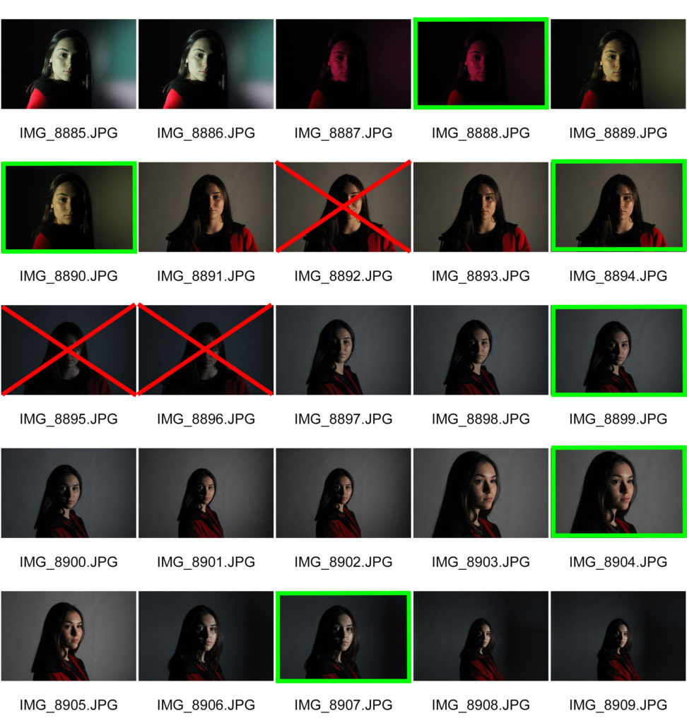
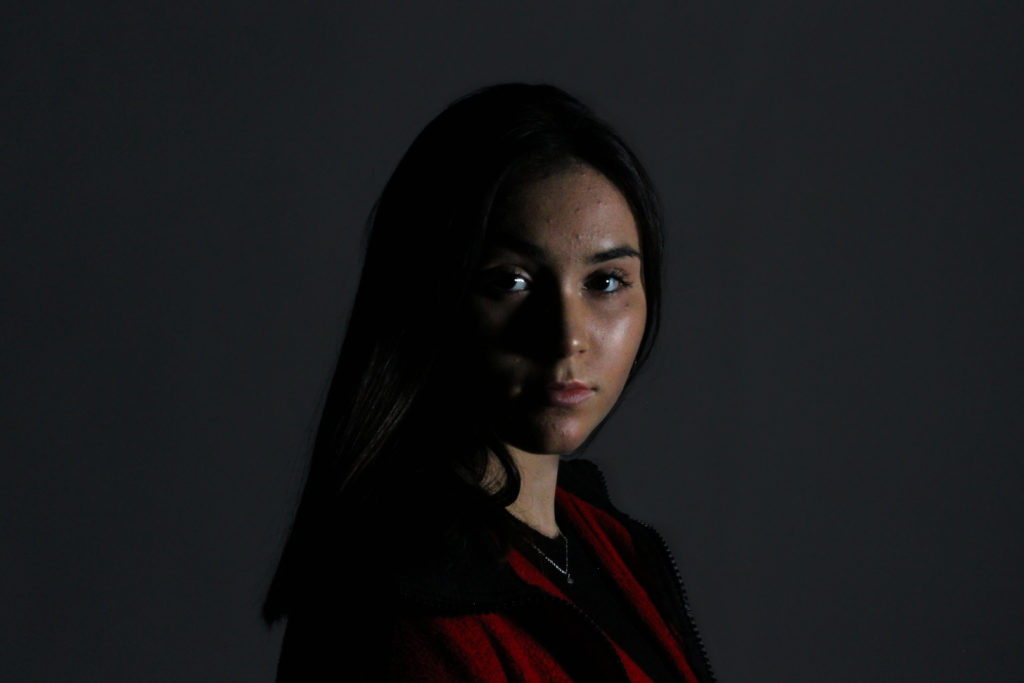
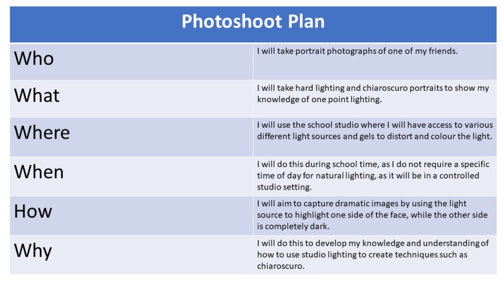
While editing these images I focused mainly on adjusting the exposure and contrast, so that my use of one point lighting would be best displayed. To do this I made sure my images were not too under or over exposed, allowing for a clear and sharp portrait. To further the effects of this type of lighting I increased the contrast on all of my images, in order to get a more dramatic chiaroscuro photograph. I also reduced some of the noise in the background of the images, due to low light.

Final Image
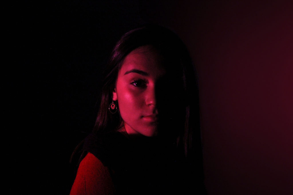
I believe that this is my best image from my studio one point lighting photoshoot, due to the fact that I think it best showcases the technique of chiaroscuro and the contrast between light and dark. In addition, it is also one of my sharpest images and is well centred with a basic background, allowing for the viewers attention to be drawn to the focal point of the subject in the image.

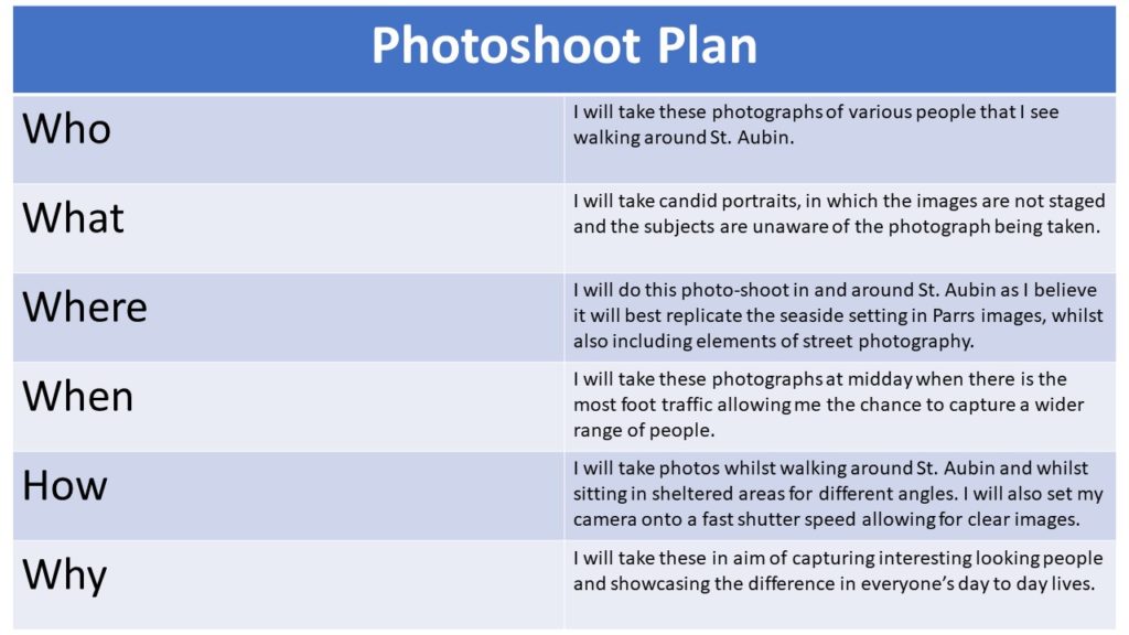
Candid portraits and street photography – PhotoShoot

Plan

Contact Sheets

Edited Images

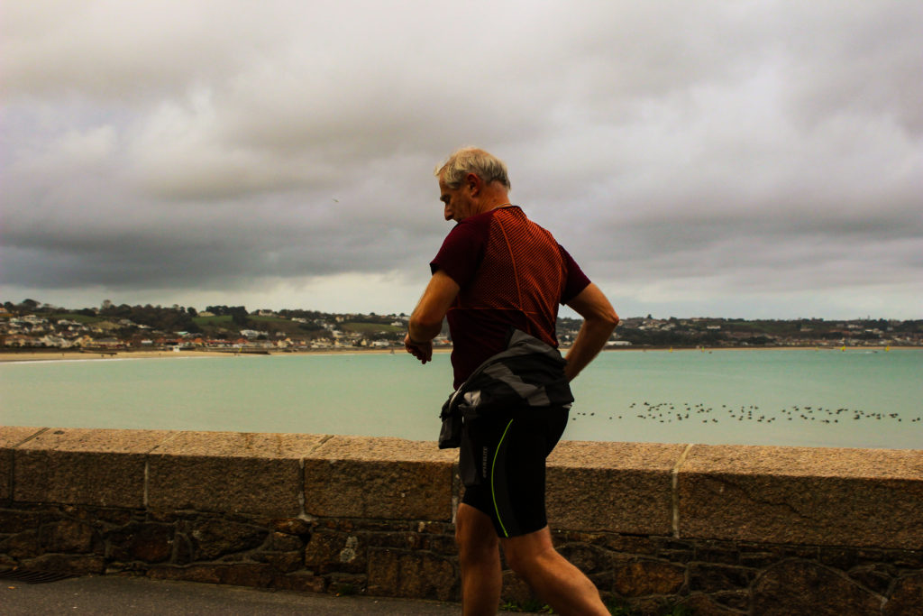
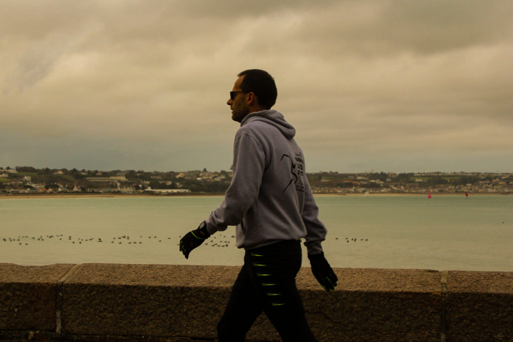
For these images I went about editing them focusing mainly on the tone and contrast of the images, using the previously studied photographer, Martin Parr as inspiration. I did this by first increasing the contrast, replicating Parr’s jarringly bold photographs. In addition, I also increased the warmth of the images, aiming to further embolden the seaside scene.

Final Image

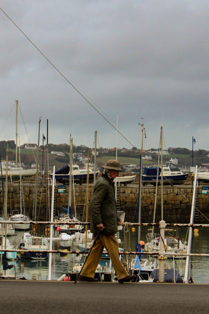
I believe this photograph to be my best as the woman in the image is wearing very vibrant colours and also she is well framed by the two walls either side. These walls along with the horizontal railings and the road lines in front of the harbour, create quite a geometric image full of leading lines.

The Decisive Moment

Henri Cartier-Bresson

Henri Cartier-Bresson was a humanist photographer, born in France in 1908, who is best known for his candid photography and his role in pioneering the genre that is street photography. His outlook on photography was that it is to capture a decisive moment, and that a camera is ‘an instrument of intuition and spontaneity’.

Analysis

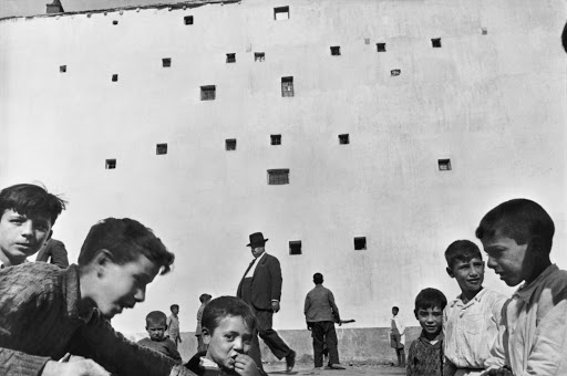
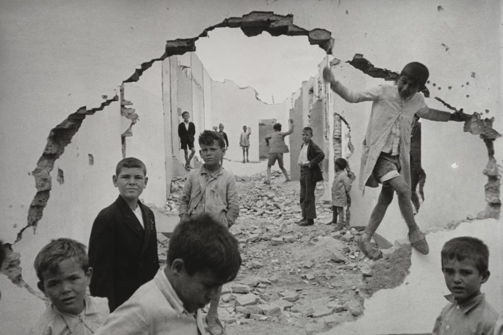
Henri Cartier-Bresson – Seville, Spain – 1933

This candid, black and white photograph, taken by Henri Cartier-Bresson, showcases what appears to be a war torn Spain with children playing in and amongst the ruins and rubble, however this image was in fact taken before the Spanish civil war in 1936. The hole in the wall, located in the foreground of the photograph, creates a geometric form, almost in the shape of a circle, which acts as a frame for the background of the image. Furthermore, it can also be said that the dark contrasting line around the hole acts as a leading line, and guides your eye up and around the image, leading you into the tunnel like street in the background. In addition, the tone of this photograph is quite light due to the white walls of the wreckage.
Here you can see that the lighting of this photograph is natural as the image has been taken outside by Bresson, therefore creating an almost overexposed background and natural shadows. It appears for this piece Bresson has chosen to take this photograph with a small aperture, allowing for a large depth of field, as the focus appears to be the same for the children in the foreground and the children in the background. In addition, this photographs seems as it was taken with a fast shutter speed, due to the fact that it was a candid portrait and they appear to be in motion, but aren’t blurry.

It can be said that with this photograph Bresson has intended to capture the differences in cultures and livelihoods, as the photograph is showcasing children playing amongst wreckage, meaning he could be aiming to cause people to recognise their privilege through guilt.

Comparison

Martin Parr

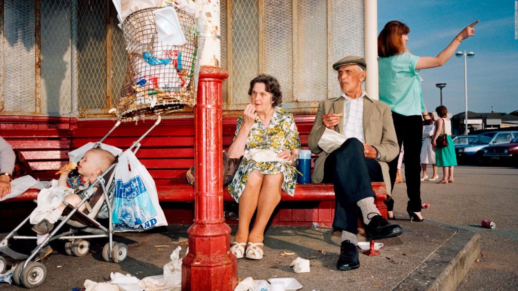
Martin Parr – GB. England. New Brighton. From ‘The Last Resort’ – 1983-85.

This candid photograph, taken by Martin Parr, differs substantially from Bresson’s image from a visual perspective, due to the fact that firstly this piece by Parr is in colour, whereas Bresson’s work is in black and white. In addition, the settings of each piece are highly contrasting in the sense that Parr showcases a somewhat excessively British sea side scene, whilst Bresson chooses to showcase what looks like a Spanish war ground. Also, Bresson’s photograph is far more geometrically structured than Parr’s, as this image appears to be more free flowing, whereas Bresson’s displays clear shapes and lines, such as the circle like hole in the foreground of his photograph.

However, from a technical point of view it can be said that these two images are quite similar, due to the fact that they have both been taken outside with natural light, causing natural shadows. Furthermore, both photographs appear to have the same amount of focus placed on the entire image, meaning that both have been taken with a small aperture, allowing for a large depth of field. Another way in which these two images share the same technical approach is that they were both taken with a fast shutter speed, you can see this in both images as the subjects being photographs seem to be in motion but are not blurry.

Conceptually however, I believe that these images differ in the sense that Parr’s image could be a portrayal of the joys of British culture and seaside getaways, causing the viewer to have a feeling of nostalgia, or even that as a country we might be overindulgent. On the other hand, I think that Bresson is aiming to show a country which is struggling and in times of need, causing the viewer to feel guilt.

Candid Portraits and street Photography

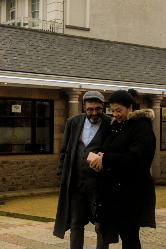
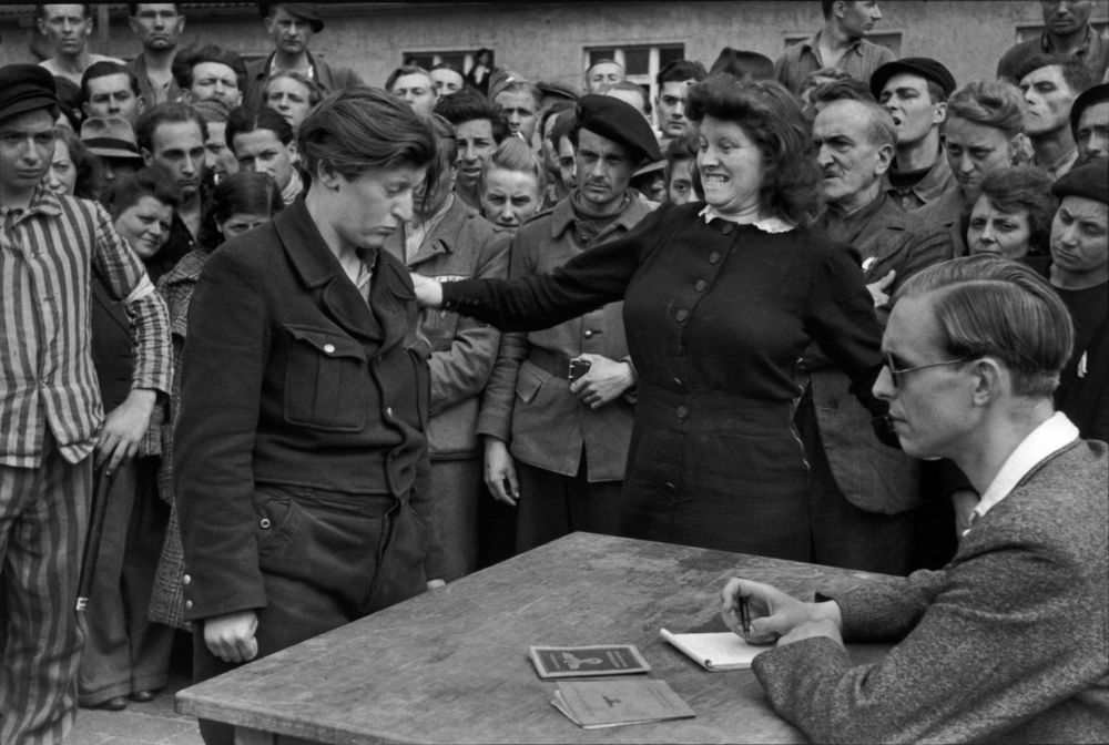
Street photography can be said to be a type of candid or documentary photography, that is used for art or inquiry, that showcases random occurrences and snapshots of life in public places, without it being set up or staged. Photographers who appropriate this genre of photography, usually aim to focus their images on one subject, such as a portrait.

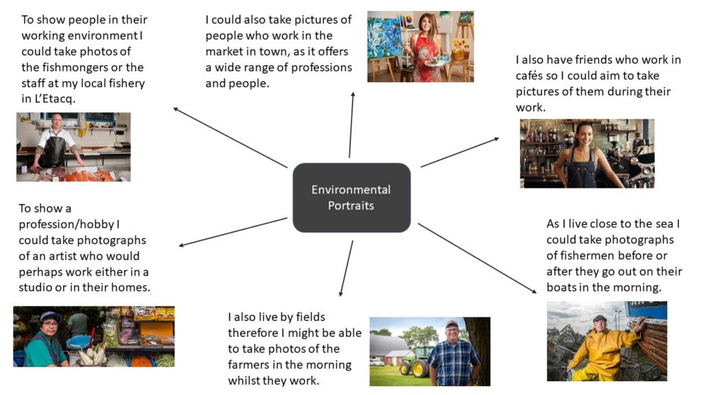
Environmental Portraits

An environmental portrait is a portrait executed in the subjects usual environment, such as their home or workplace, and typically illuminates the subject’s life and surroundings. The term is most frequently used as a genre of photography.

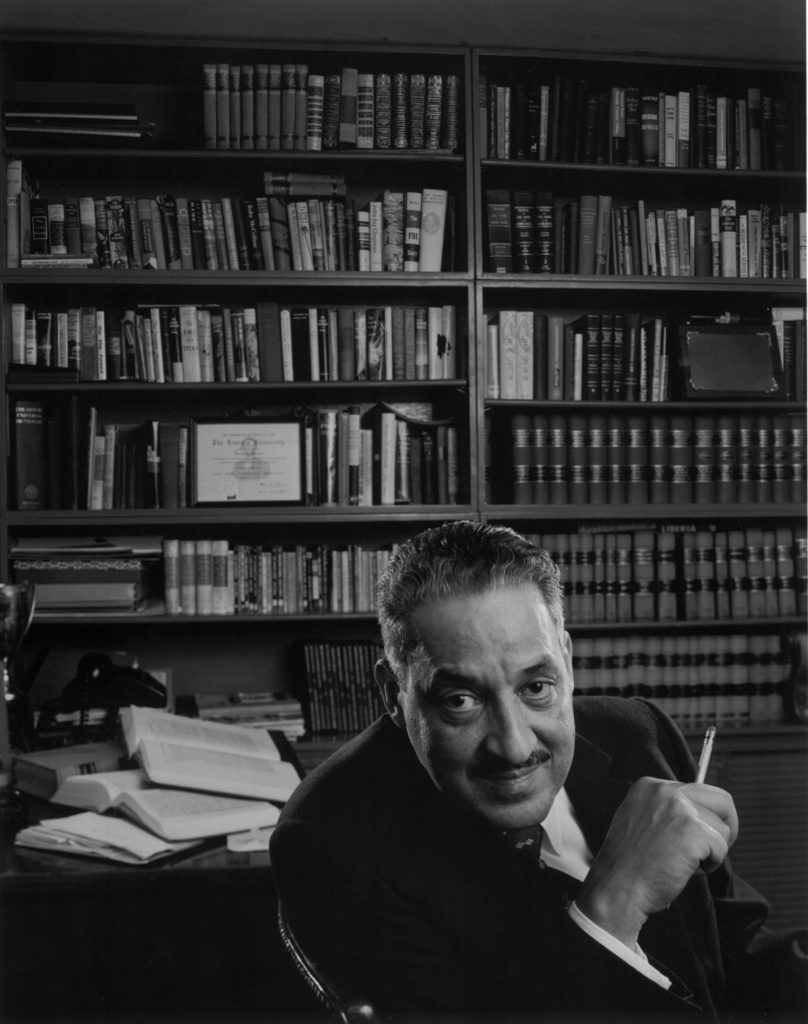
Arnold Newman

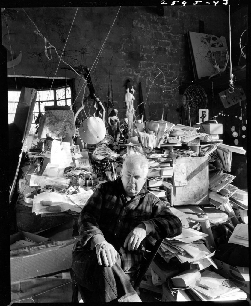
Arnold Newman was an American photographer, born in 1918 in New York, well known for his environmental portraiture work, which showcased a formal image of a subject surrounded by their work space or environment. Newman stated that he viewed his photography as an expression of himself, reflecting him and his fascination with people and the world around him. Newman was also often named the “Father of Environmental Portraiture”, with his work being displayed in museums all over the world.

Analysis

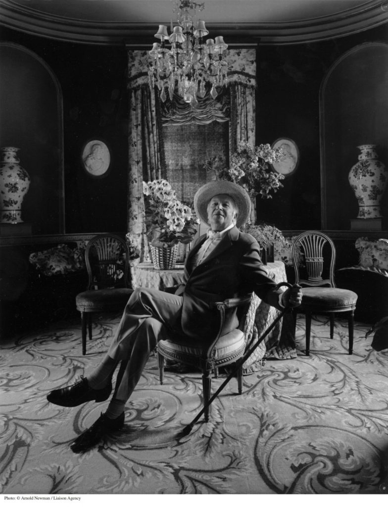
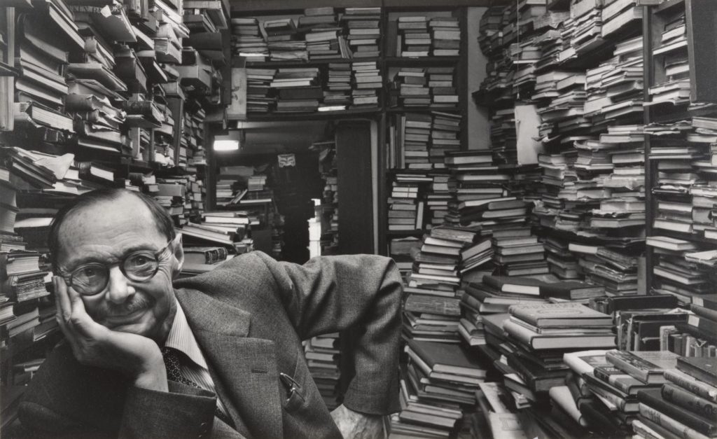
Arnold Newman – Erhard Weyhe – 1948

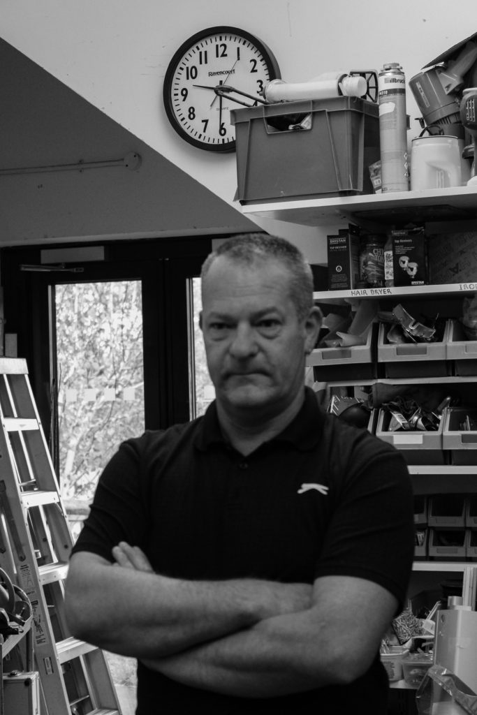
This black and white, half body portrait, taken by Arnold Newman, clearly displays the genre of environmental portraits, due to the subject of this image being Erhard Weyhe, an art book dealer, sitting among his immense book collection. Furthermore, here the subject, Weyhe, is displaying direct eye contact with the camera showing engagement, also whilst smiling suggesting an informal image. These stacks of books allow for short and interrupted leading lines, that guide your eyes around the background of the image, whilst making what would be empty space around the portrait feel cluttered and meaningful to the story of the subject. These books, that show the essence of his profession also act as a repetition of shape throughout the photograph.

In Addition, the lighting of this image appears to be the natural lighting of the work environment due to the highly contrasting tones between the book pages and the shadowed areas around the room, which would perhaps mean that it could be described as underexposed. Here you can see that Newman has chosen to take this picture with a small aperture, therefore allowing for a large depth of field meaning that the subject’s workplace environment is clearly showcased. Furthermore, the shutter speed used for this image is presented as fast, due to the fact that it is a clear and detailed photograph without any blurs.

In this photograph Newman has intended to present one of the great book dealers of his time, Erhard Weyhe, and to give an incite on his way of living and working. This lifestyle has been presented by Newman as a somewhat labouring and almost chaotic one, due to what looks like an interminable tunnel of books, pilled high. This depiction of Weyhe could be a sign of respect and appreciation from Newman towards his profession.

Environmental Portrait Photo-shoot

Plan

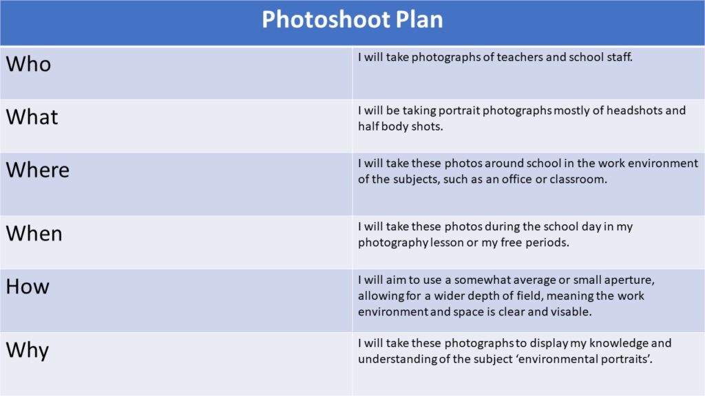
Photo-shoot plan

Contact Sheet

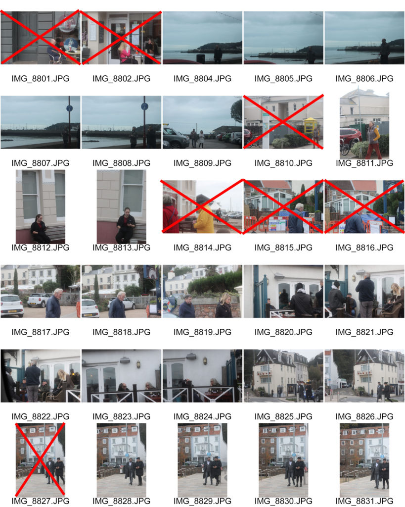
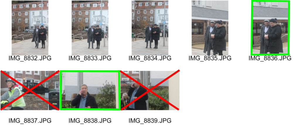
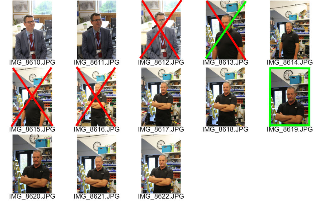
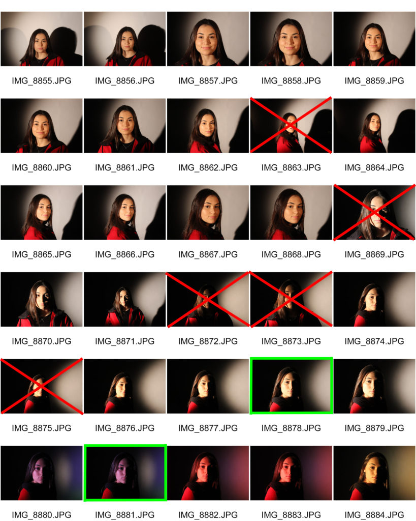
For this photo-shoot I used a fast shutter speed aiming to capture sharp images. Also, I used a small aperture for these portraits so their work environment would be clear due to the nature of the background. Here I have crossed images out in red that I will not edit, either because the subject is not engaging with the camera, or it is too over exposed or blurry. I have also highlighted the images I will edit in green as I believe them to be my best from this shoot, showing the fundamentals of environmental portraiture.

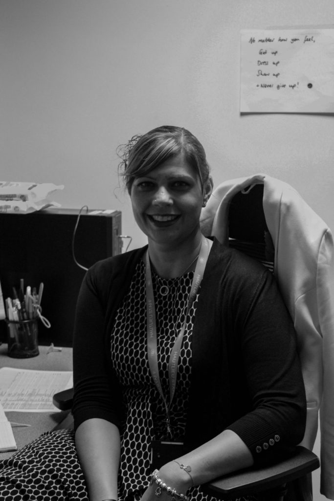
Edited Images

Final Image

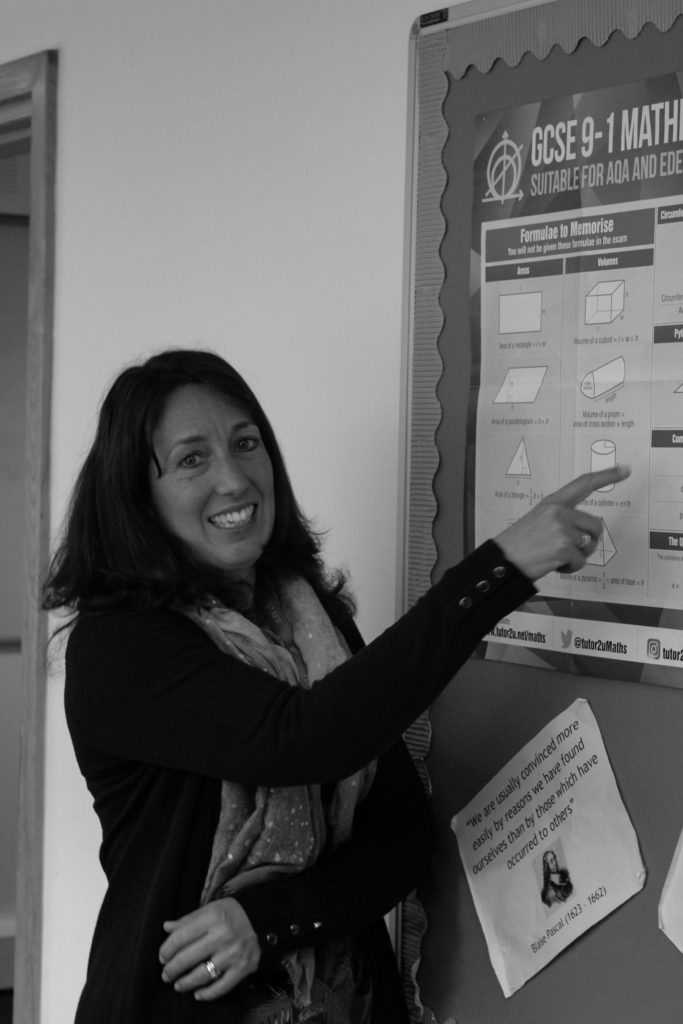
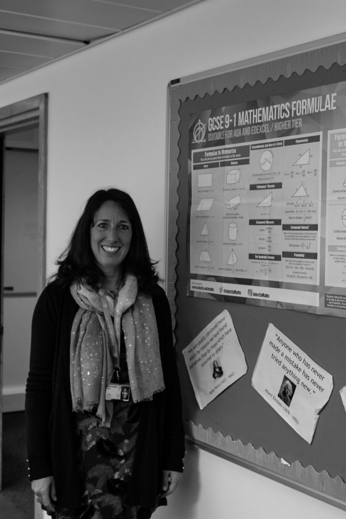
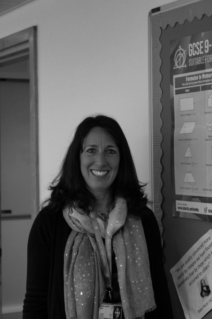
I believe that this is my best environmental portrait as it displays a clear half body image, with the subject surrounded by their work environment, shown on the board on the right. In addition, as the subject is smiling it causes the image to feel welcoming, reinforcing the profession qualities of teaching.

Modern Day Heroes

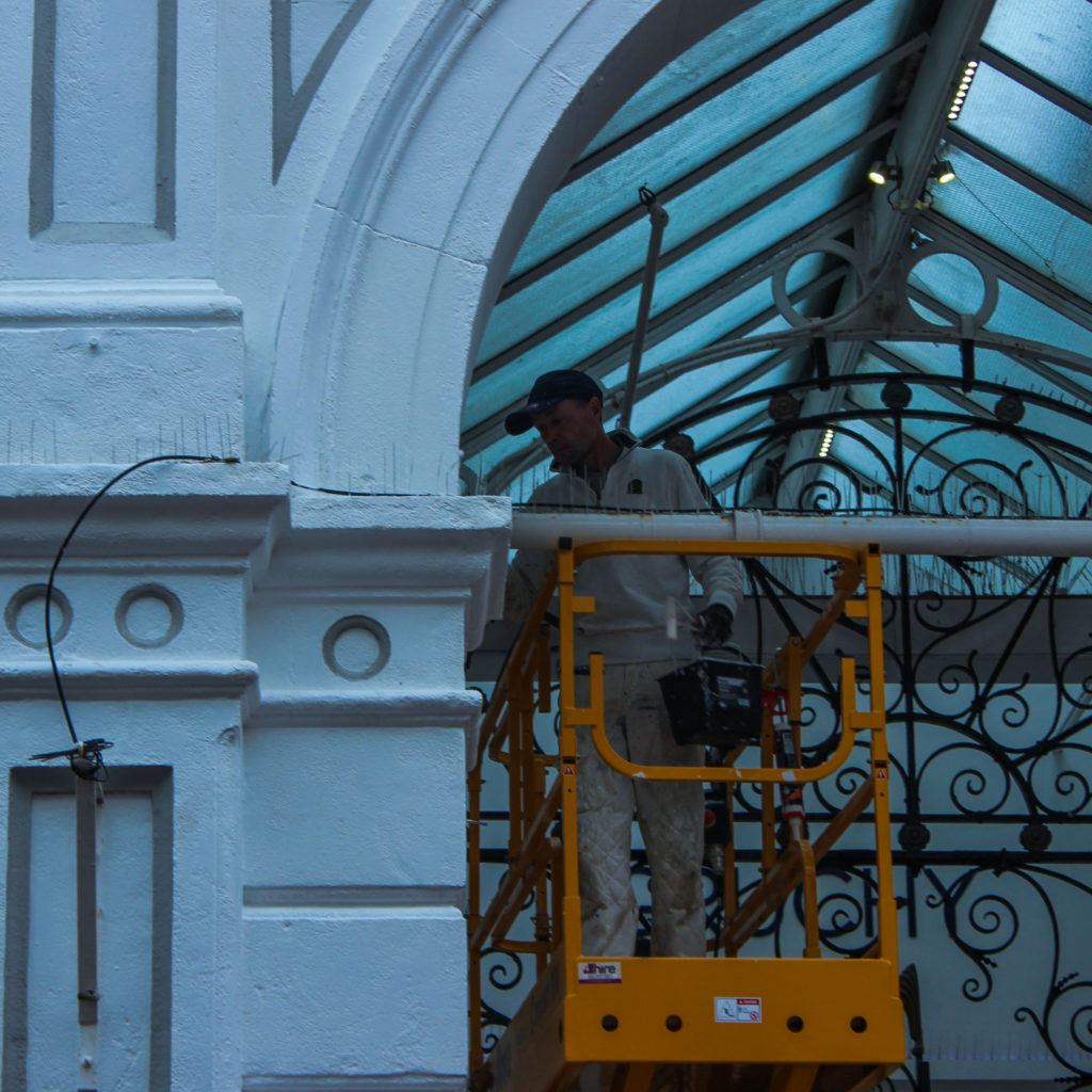
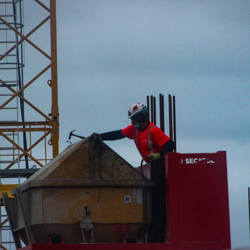
For this introduction to portraits, we had to take photographs of key workers or modern day heroes in their work attire. These key workers can come in all forms from the nurses and doctors who work on the front line, to the postmen and women who continued to do their job under such hazardous circumstances.

Contact Sheets

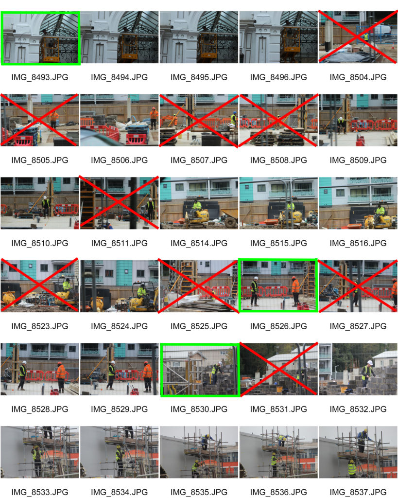
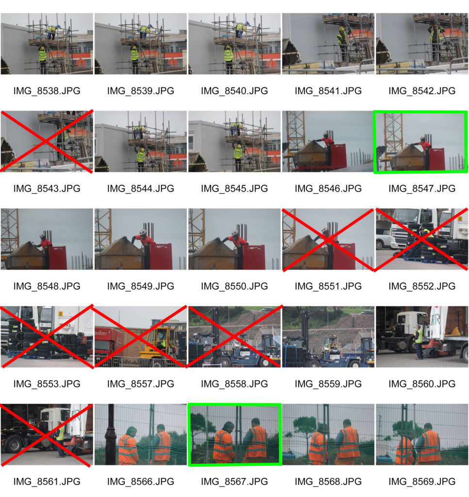
For this project I decided to focus on construction or repair workers that might have had to continue working during the lock-down stages of the pandemic to keep the island running. Here I have crossed out the images in red that I will not edit due to them being to blurry or not focusing on the topic of key workers. I have highlighted the images I will edit in green as I feel they best showcase the essence of the topic.

Edited Images

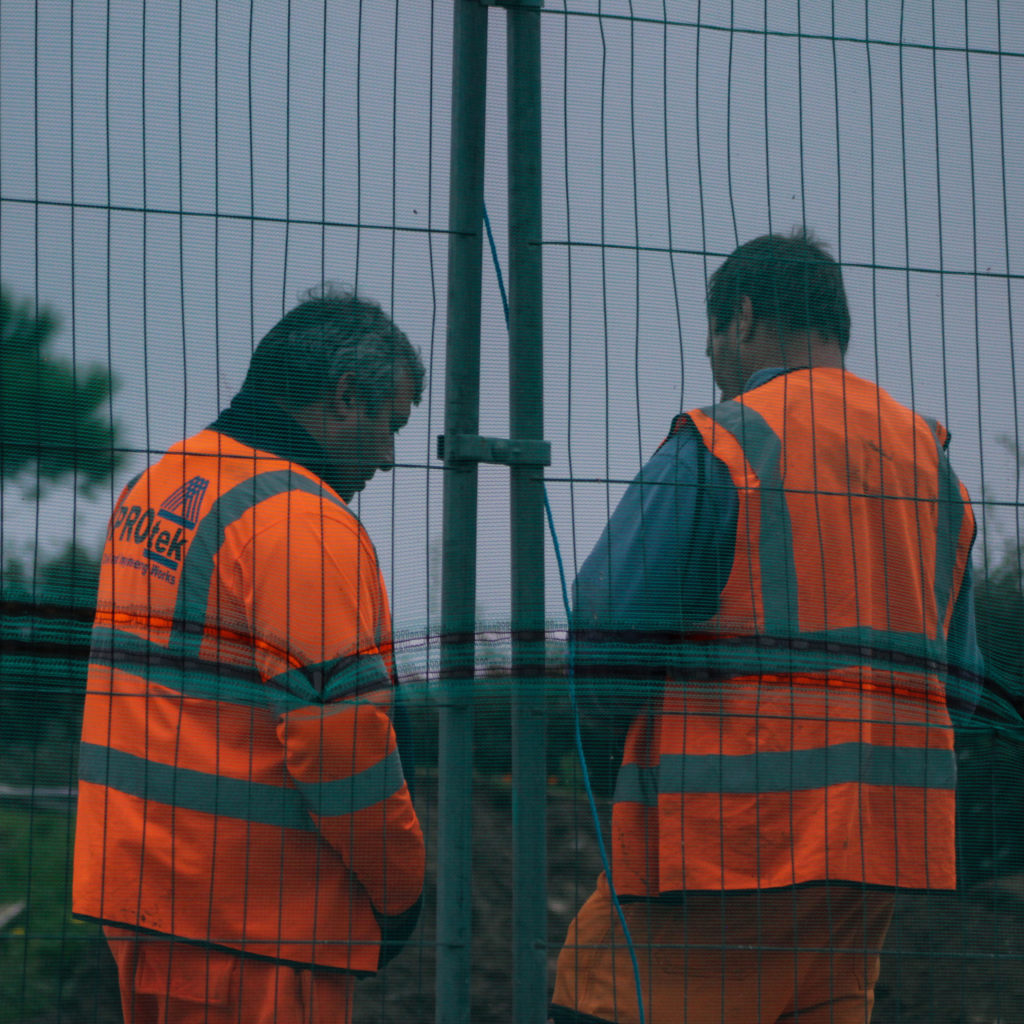
I believe that these are my best images as they display how life needs to carry on even in a global pandemic, and how people like this allow for that to happen. It could be said that they also incorporate this years theme of hope, as they are building for a future in which this pandemic no longer exists.

Portraits

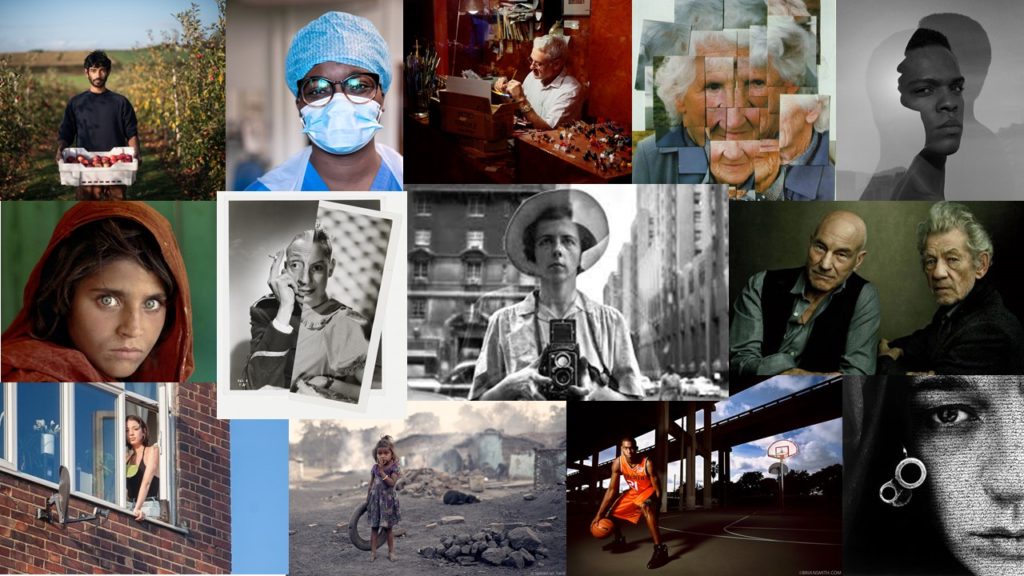
Portrait photography is a style of photography which is used to capture and document people, personalities and groups. This can be done through various methods such as environmental, candid, studio, photo montage, staged reality, and controlled condition photography. This genre of photography is important as it allows us to preserve history or display how we wish ourselves or others to be perceived.

Mood Board

Contemporary photography can be defined as a style in which photos showcase our own time period or the current world, rather than from earlier time periods.

Image analysis

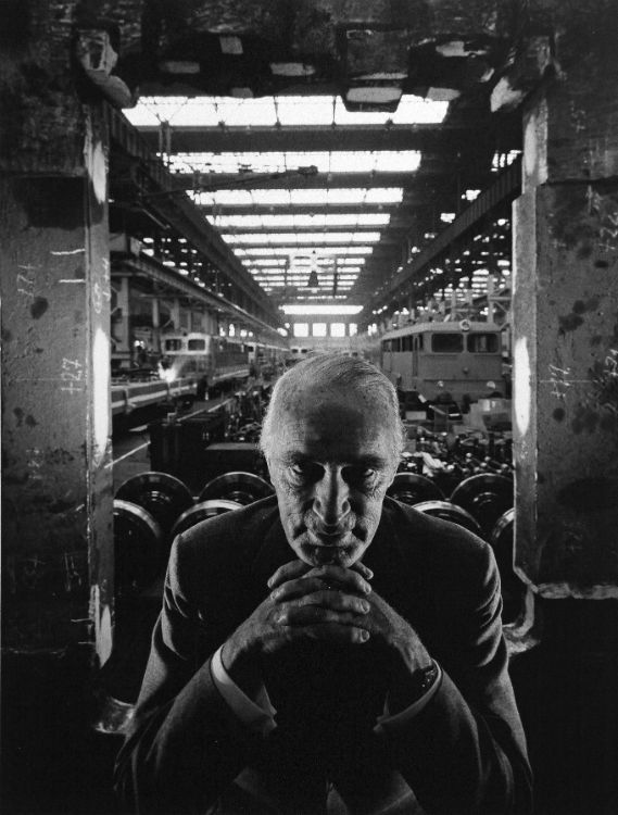
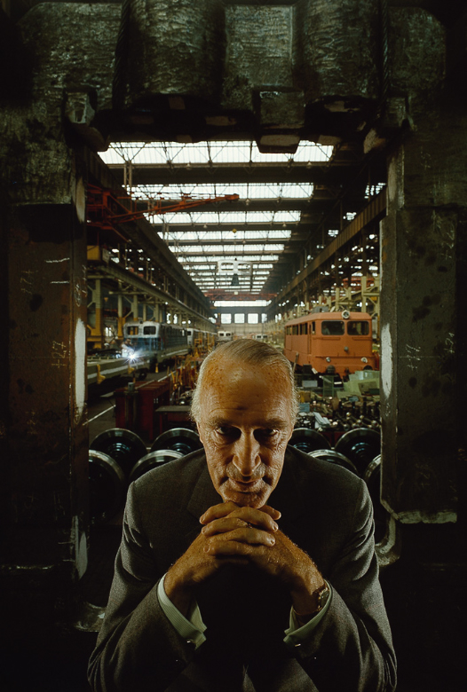
Arnold Newman | Portrait of Alfred Krupp | 1963

This colour Image, taken by Arnold Newman, showcases a portrait of Alfred Krupp. The photograph displays Krupp centered in the foreground of a train factory, framed by the pillars either side and above him. These pillars also lead your eye up to the skylights of the factory, which also lead your eye into the background of the image. In the background you can see trains being produced and made in the long dark room. The tone presented in this piece appears to be quite dark and moody, due to low exposure. The angle in which this image was taken, seems to look down on Krupp as if to belittle him, therefore creating a tense photograph.
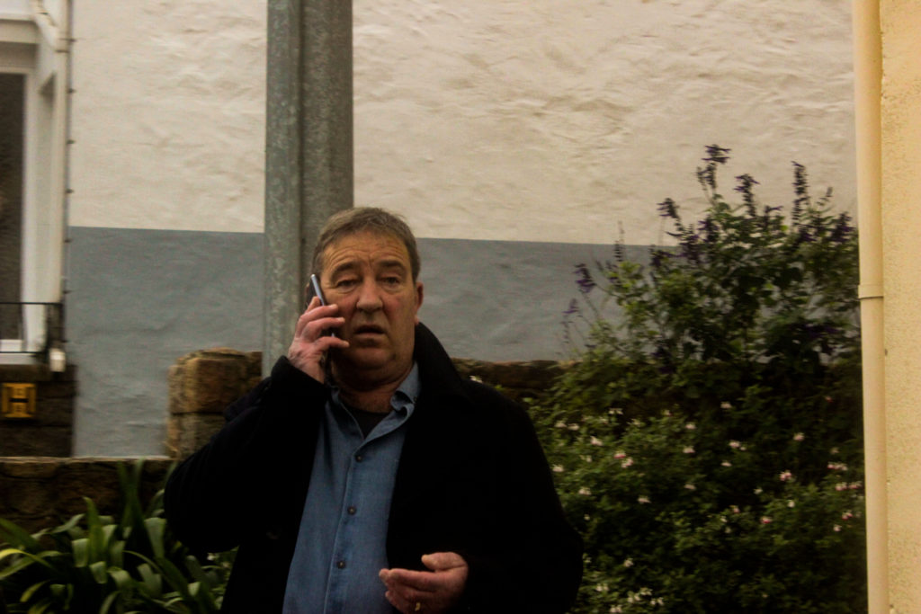
The lighting of this piece appears to be natural, originating from the sky lights, and slightly underexposed. This light contrasts with the harsh and dark shadows, which are surrounding Krupp, further intensifying the image. Due to the clear and defined image, not only in the foreground but the the background too, you could say that this image was taken with a low aperture and a fast shutter speed. This allows for you to not only to see Krupp clearly but also the trains in the background, meaning they must be of some significance to the story of the image.
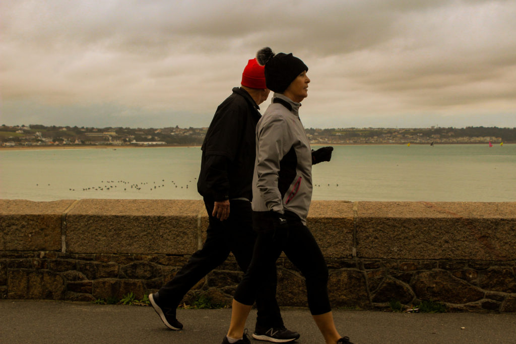
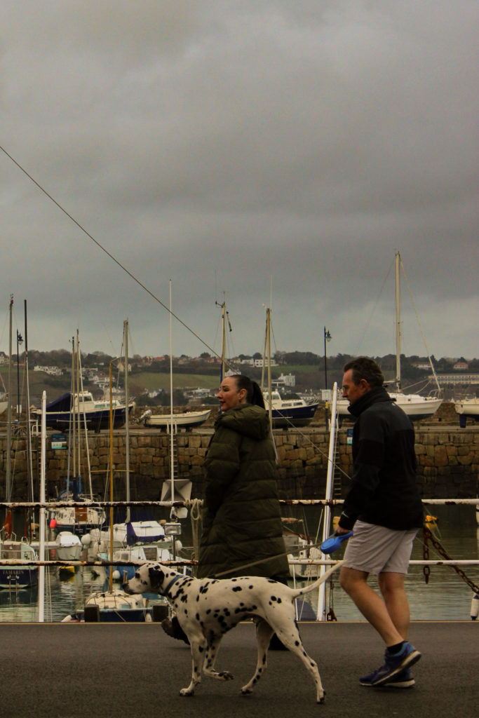
Newman took this particular image specifically of Krupp due to his participation in the Holocaust. This included Krupp supplying Nazi forces with weapons and ammunition during World War Two, using slave labour in factories. Meaning that as the war grew bigger so did Krupp’s profits. For this Krupp was sentenced to only six years in prison. In addition, this image is personal for Newman due to him being Jewish, which is seen in the belittling camera angle.

The message behind this image could be aiming to showcase the evil of Krupp and his actions, and from the way he is posed his lack of remorse. Furthermore, it may be an indicator of how people like him are still in power positions to this day, making a statement on the justice system and how it should be improved.

Selecting, Finalising and Displaying

Final Images

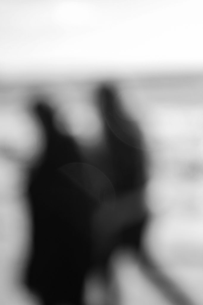
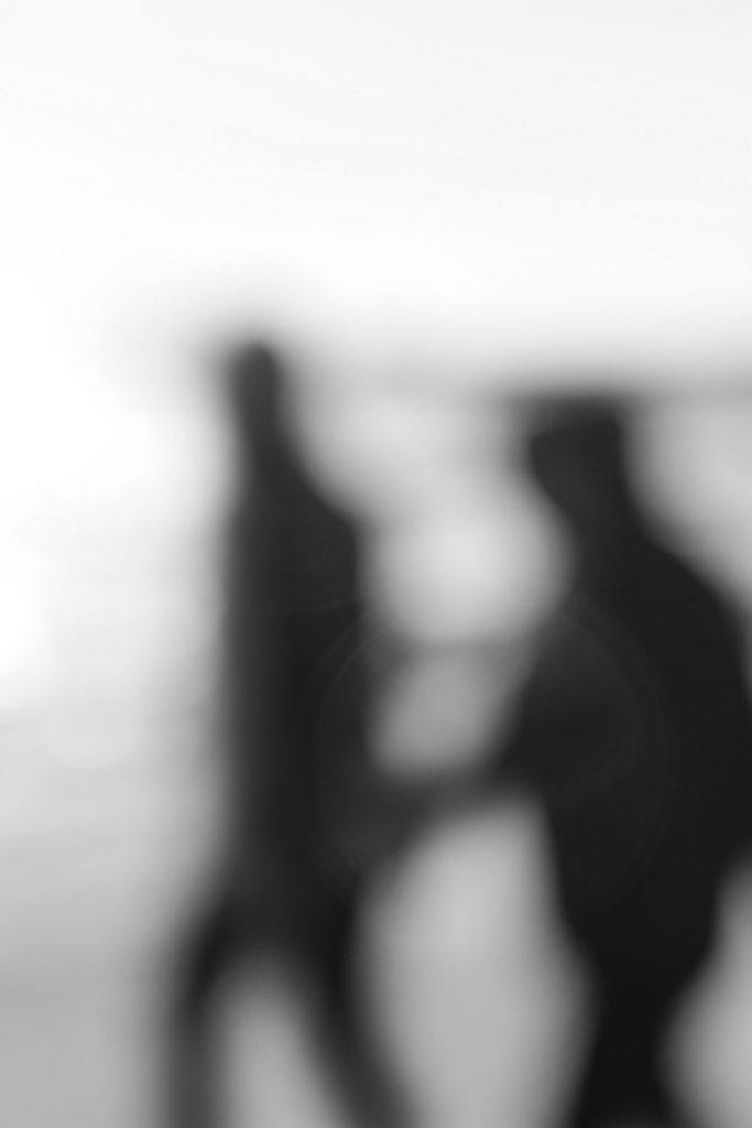
Ralph Eugene Meatyard Images

I believe this pair of images from my looking and seeing project, and my Ralph Eugene Meatyard inspired photoshoot, best display the formal elements of light and space through experimentation with focus. This is due to the fact I have used the overexposed light in the background to strongly contrast with the dark figures in the foreground. Also, using the Aperture priority setting on my camera I was able to take blurred photographs similar to Meatyard’s work.

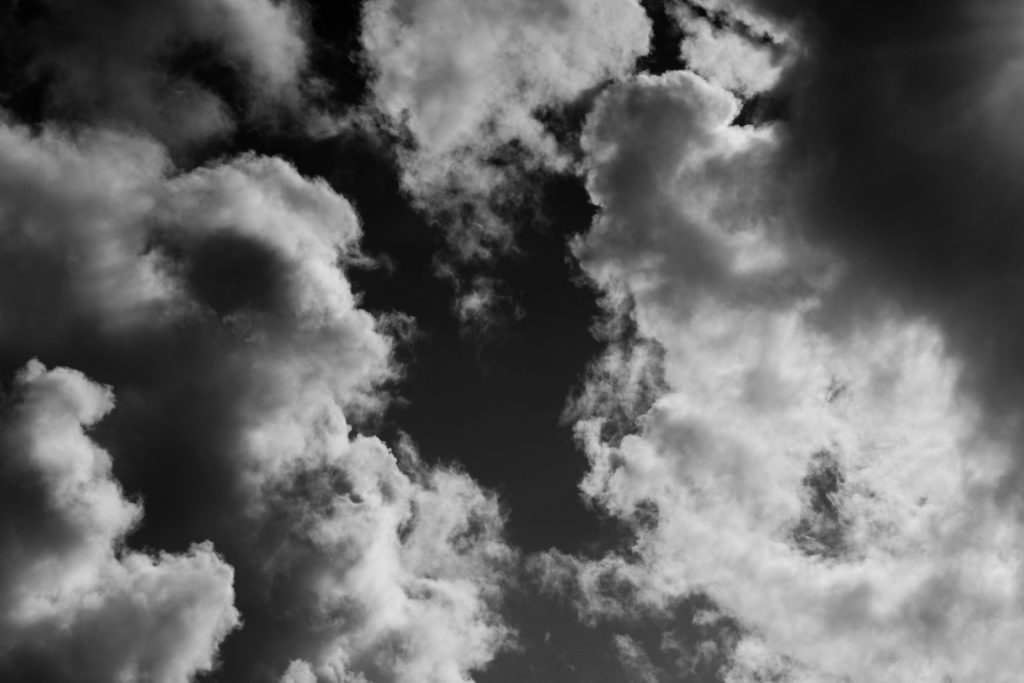
Alfred Stieglitz Images

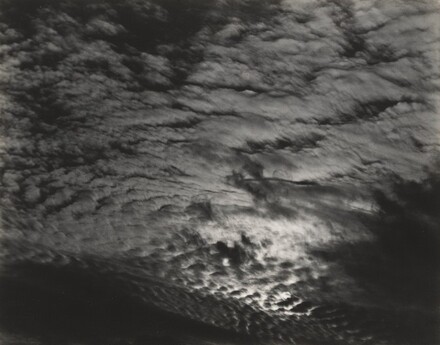
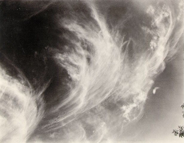
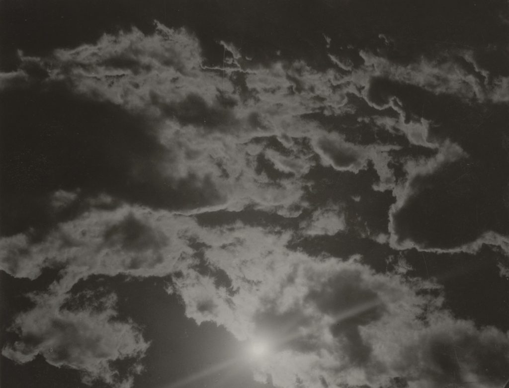
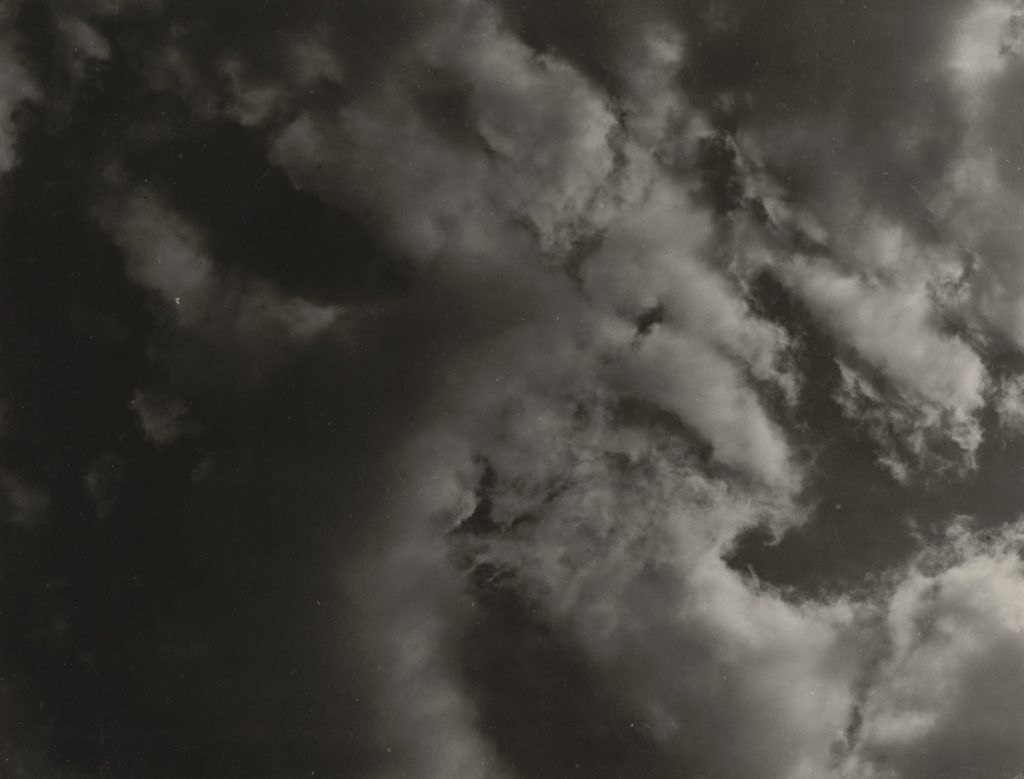
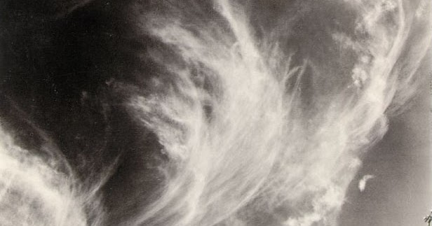
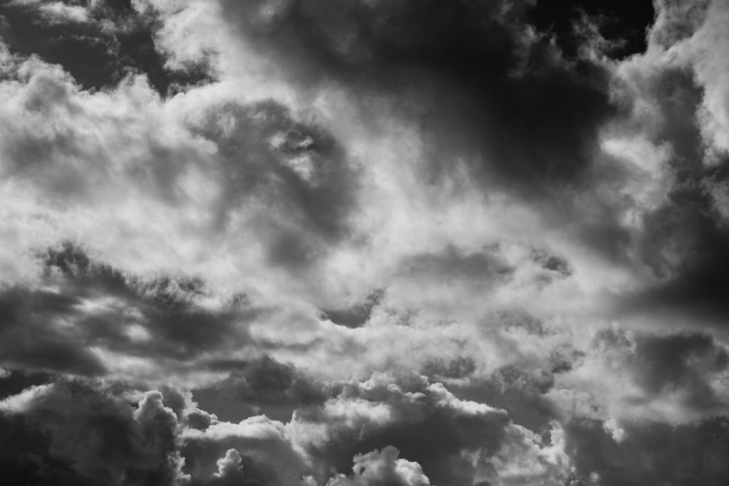
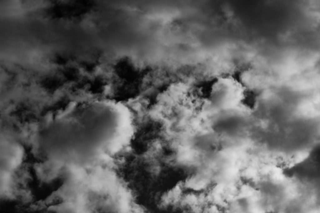
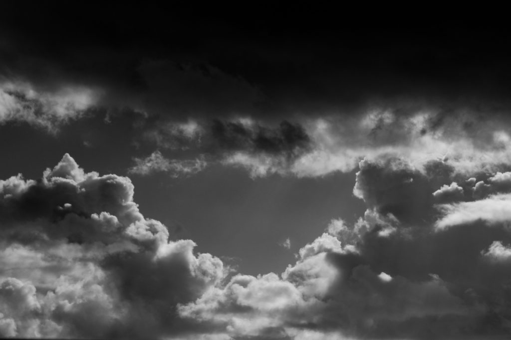
I believe that this pair of photos from my Repetition, Pattern, Rhythm, Reflection and Symmetry project, and the Alfred Stieglitz style photoshoot best display the formal element of repetition. This is as the clouds in the images create ever changing shapes and patterns that incorporates a unique texture to the pieces. Also by adjusted the white balance on my camera settings every now and then, I was able to take clear and sharp photos whilst the brightness continuously changed due to the clouds.

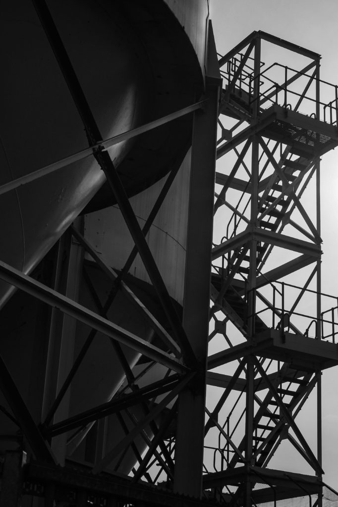
Albert Renger-Patzsch Images

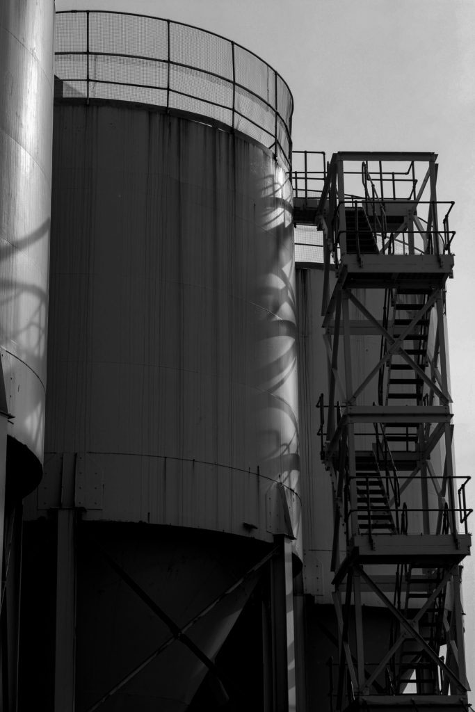
I believe that these images from my Albert Renger-Patzsch inspired photoshoot, best showcase the formal elements of line and shape. This is as the industrial structures create geometric patterns within the lines of the framework. By taking photos of architecture which could be perceived as mundane, I replicated Patzsch’s New Objectivity style of work.

Gallery Space

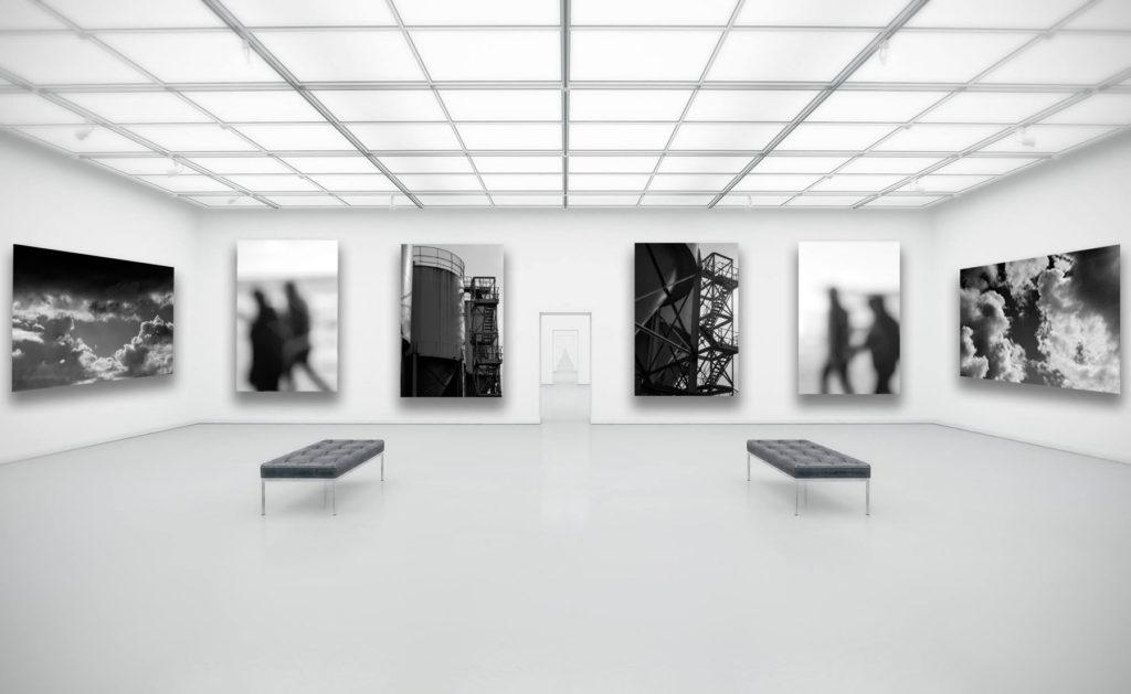
I selected these images to display in my gallery together as I believe that they best showcased the style and my understanding of the photographers I studied. These being my two cloud photos from my Alfred Stieglitz shoot, the two industrial architecture photos from my Albert Renger-Patzsch shoot, and two of my blurred images from my Ralph Eugene Meatyard inspired shoot. These images are all linked by the formal element of colour, this is as they have all been edited to be black and white.

To get these images into this format I first chose an empty gallery space image from the internet that matched the tones of my final images, and then uploaded it to Photoshop. I then dragged in my selected photos to the gallery, and then made the decision to have the four portrait image facing forwards, and the landscapes to the side, creating an almost symmetry. I also alternated the industrial and blurred images to allow the space to feel well balanced in tones. In order to create a more realistic look, I then edited in a drop shadow for each image in the opposite direction of the light source.

Repetition, Pattern, Rhythm, Reflection and Symmetry – homework

Mood Board and Ideas

Repetition, Pattern, Rhythm, Reflection and Symmetry Mood Board
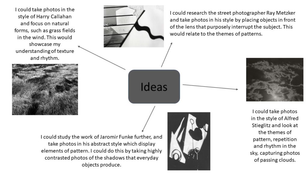
Mind map of ideas

Alfred Stieglitz

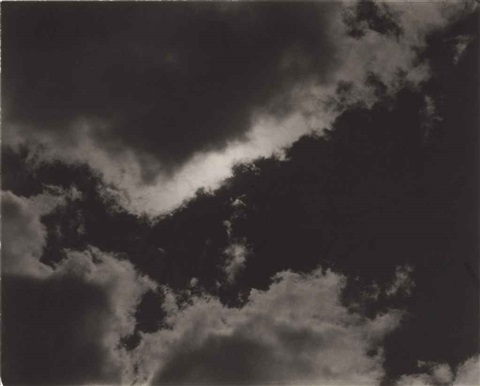
Alfred Stieglitz was an American photographer, born in 1864, who has been said to be instrumental in making photography an accepted art form. One of the ways in which he did this, was through his photo series ‘Songs of The Sky’, from 1923 to 1934, where he explored patterns and rhythm created in the clouds. His aim for the viewer was to cause them to have the same emotional response as him, at the moment in time he took the photo, and to also display that the content of a photograph was different from its subject.

Image Analysis

Alfred Stieglitz – Songs of the sky

This black and white photograph taken by Alfred Stieglitz, which is a part of his ‘Songs of The Sky’ series, displays a dramatic image of the sky in which the clouds are swirled around the photo, almost splitting it into two halves, a light side and a dark side. These streaks in the cloud’s curve create soft leading lines, causing your eyes to wrap around and be lead to the dark patch in the left hand of the photo. This area of the image strongly contrasts with the bright, highlighted, white clouds and the right half of the piece. In addition, the texture of this photo appears to be slightly rough and grainy, although this could be by choice or simply due to the time period in which this was taken, and the camera quality then.

You can see here that the lighting of this photograph must be natural as it is taken of the sky, and it also creates strong and dark shadows. I think that Stieglitz used a quick shutter speed here, as the clouds would have been moving, so he would need to do this in order to catch a crisp and sharp image. Also due to the fact that all of this frame is in focus, I believe that he used a small aperture, allowing for the whole of the image to be clearly seen and observed and creating a wide depth of field.

Furthermore, you can tell from the angle and the framing of this image, that Stieglitz was aiming to show a subjective point of view, creating an inclusive experience of that particular moment, like he does in his other pieces from the ‘Songs of The Sky’ series.

Stieglitz Inspired Photoshoot

Plan

Contact Sheets

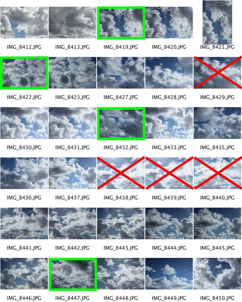
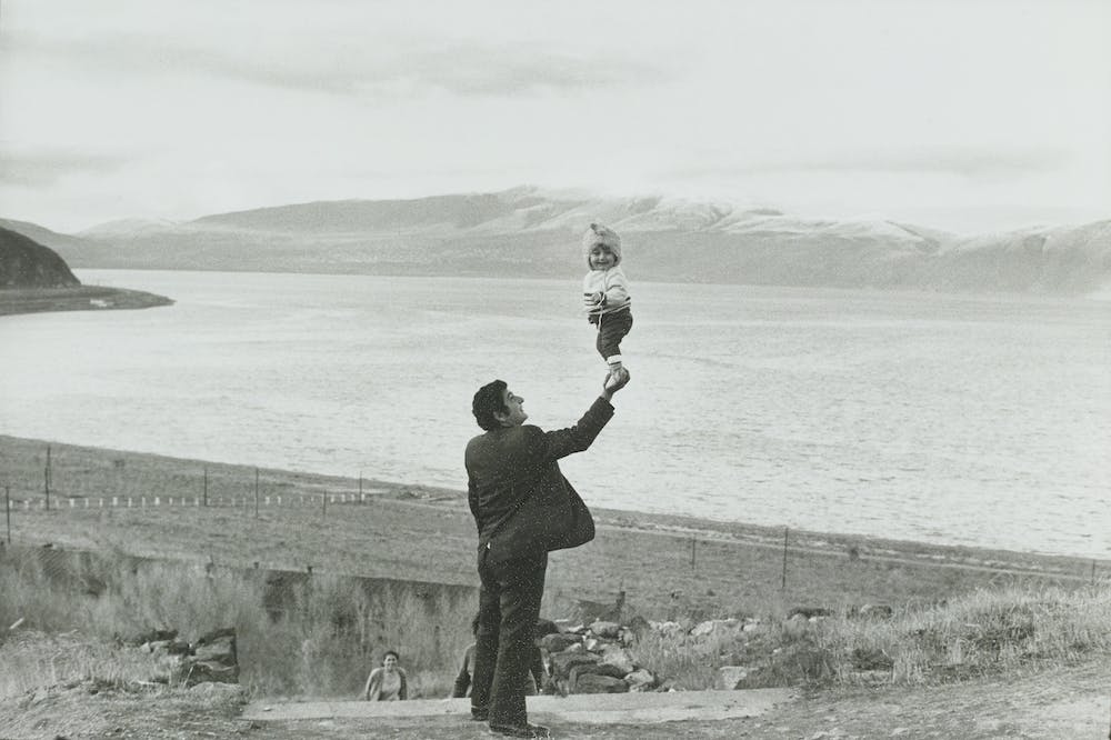
For this photoshoot I used fast shutter speed to allow me to capture sharp images of the moving clouds and the patterns they create. As the light changed throughout the shoot, I had to change the ISO and the white balance with it. Where I didn’t do this you can see some of my images are over exposed, which I have crossed out in red as I won’t be editing them. Although the photographs highlighted in green are the images I will edit, as I believe they best link to the themes of repetition, patterns, rhythm, reflection and symmetry, whilst also displaying a clear and focused image.
Photoshop Development

To create images that looked similar to the work of Stieglitz, I used photoshop to convert these images into black and white, whilst also increasing the contrast and texture, and lowering the exposure with the camera raw filter. After this, I went back with the dodge and burn tool to further define the shadows and highlights.
Final Image

I think that this edited image from my photoshoot in the style of Stieglitz is my best, as the space left in the center creates an almost triangle and with it a focal point, which is framed by the surrounding clouds. I also believe that this image could link to the theme of symmetry, although both sides are not identical, if the photo were split vertically down the middle and mirrored, it would result in a very similar final image.