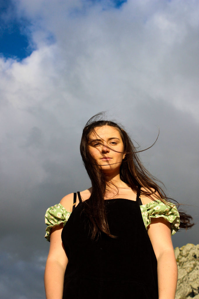
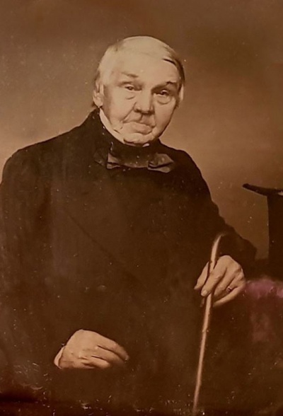
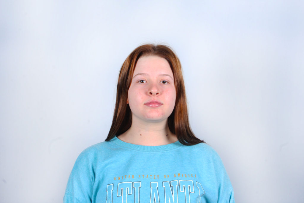
All posts by Olivia M-G

Filters

Author:
Category:

Up Close Headshots – Satoshi Fujiwara

Satoshi Fujiwara

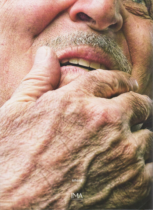
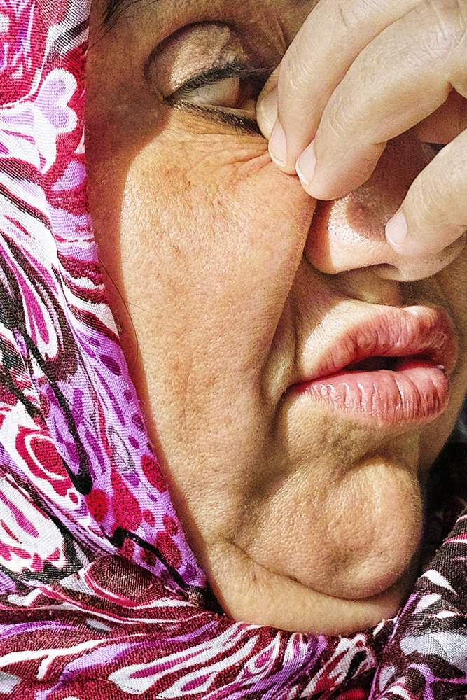
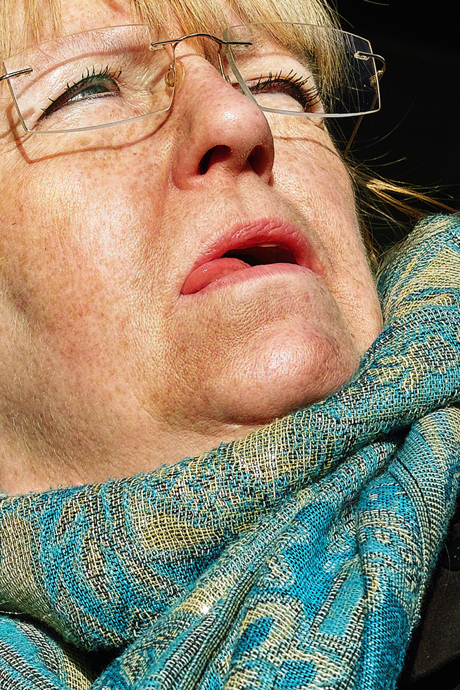
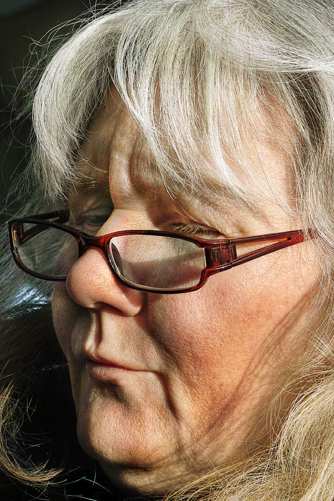
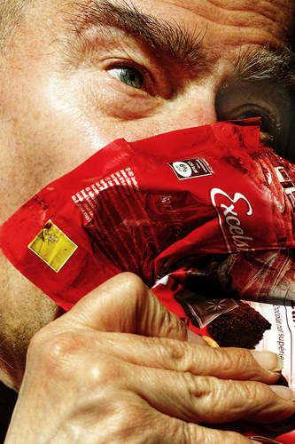
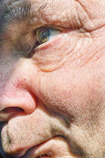
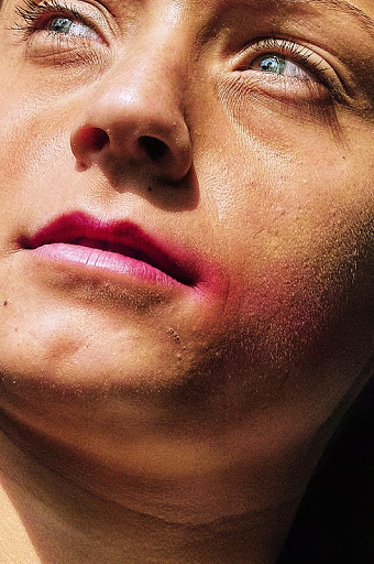
Satoshi Fujiwara is a Japanese photographer, based in Berlin, known for his jarringly different perspective on portraits, displaying extreme close ups, in which the entire face was confined within the frame, and digital manipulation. Fujiwara first developed his interest for photography through his career as a graphic designer and planner in an advertising company. This was due to a fascination with the way in which visual information was consumed and the impact it had on society. Furthermore, his exhibitions continued this commentary on society by presenting his work in a way which matched his innovative style of photography. This was done by printing his images onto PVC sheets and attaching them to the walls with various materials such as packaging tape and metal bars, causing the images to fold and slump around the gallery space, leaving the meaning of his presentation up to the interpretation of the viewers.

Analysis

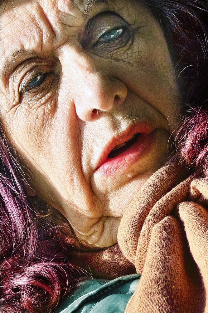
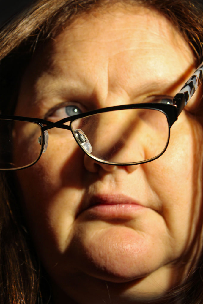
This colour image taken by Satoshi Fujiwara displays an extreme close up head-shot of a woman, which reveals the varying texture of her skin which appears coarse and cracked in some places but smooth in others. Also, the image posses a warm tone due to the yellow and orange tones in her hair, skin and glasses, which take up the majority of the photograph. Here Fujiwara has framed the image in a way which the face is confined in the frame, leaving very little empty space which can be seen on the right of the photograph. Another way that this jarring perspective makes for a complex composition is the defined wrinkles that run through the subjects face, creating leading lines across the image that draw your from the bottom of the composition upwards.

From a technical point of view, it can be said that the lighting used to take this photograph is hard one-point lighting, due to the fact that the background of the image is completely black, and the wrinkles in the face are intensified by dark, contrasting shadows. In addition, here Fujiwara seems to be using a large aperture, as again the small amount of background that can be seen, is plain and shows no important features that would add to the composition. As this photograph was taken in what looks like a dark setting, the ISO used for this image must be high, allowing for the camera to take in as much light as possible, to make the portrait visible. Looking at the definition in this photograph, Fujiwara most likely used a fast shutter-speed, due to the fact the woman also seems to be in motion, making it a more difficult task to produce such a high quality photograph.

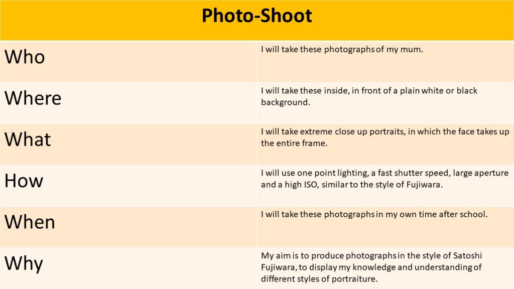
Photo-Shoot

Plan
Contact Sheets
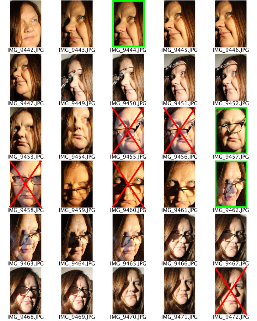
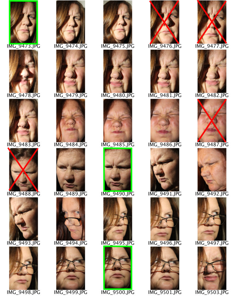
Here I have highlighted the photographs I believe are of the best quality and link to Satoshi Fujiwara’s work, in green, which I will later edit in photoshop. In red, I have crossed out the images that I will not edit, due to the fact that they are either over exposed or unfocused.

Edited Images

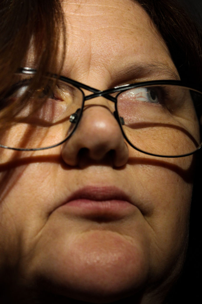
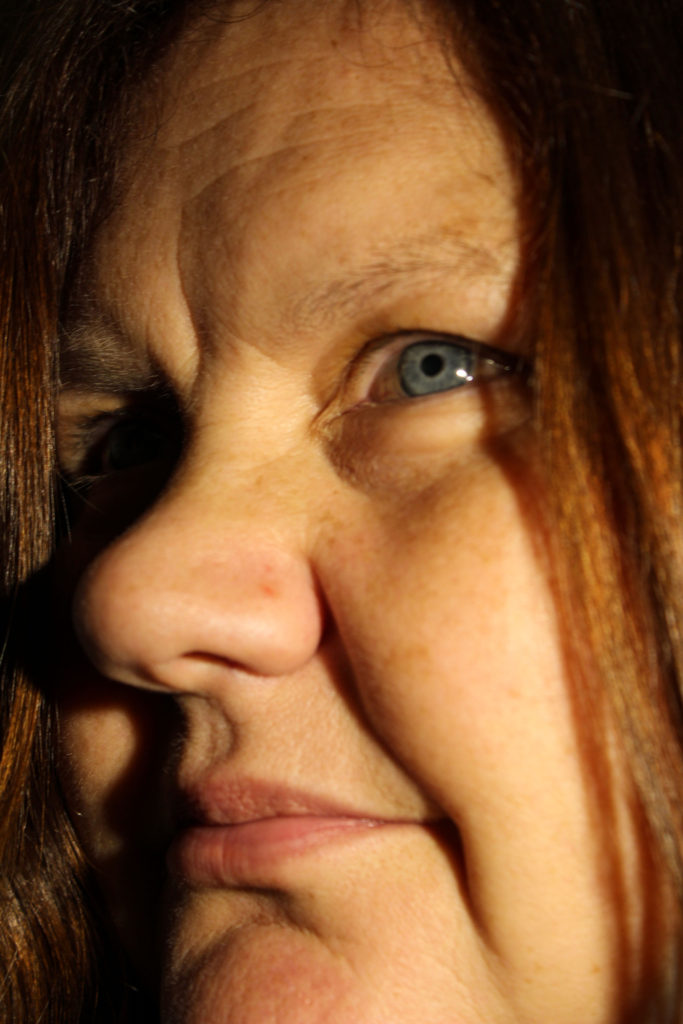
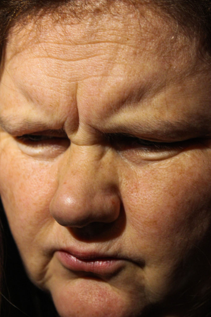
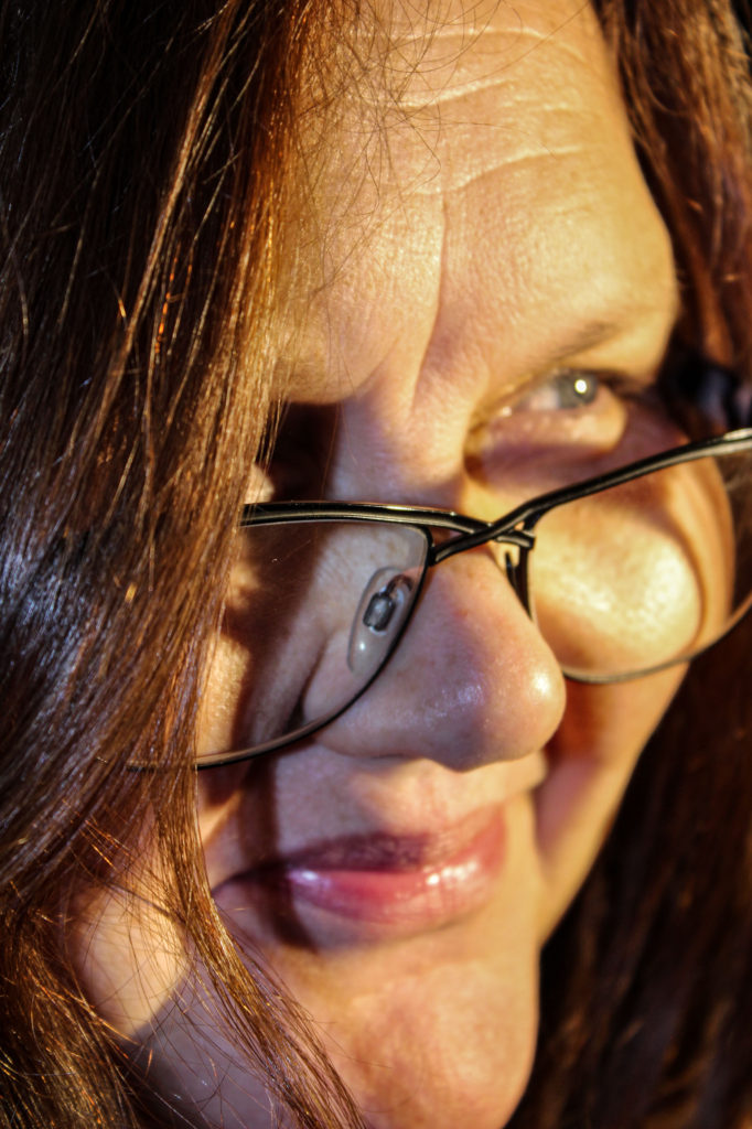
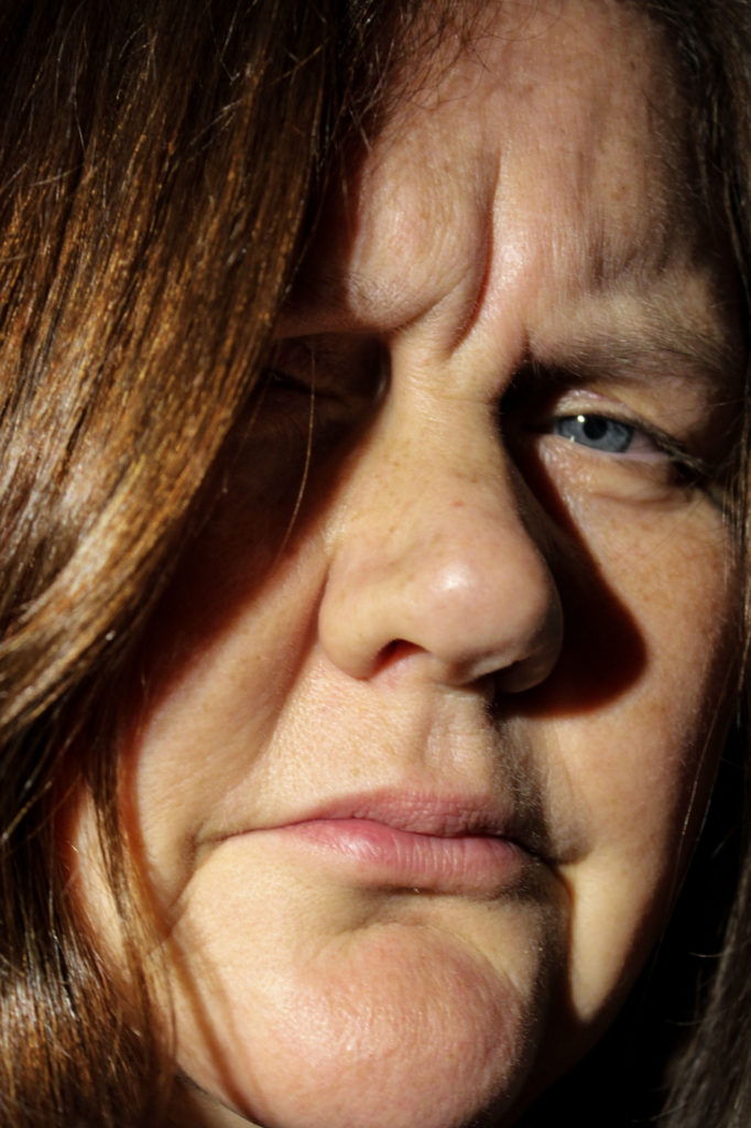
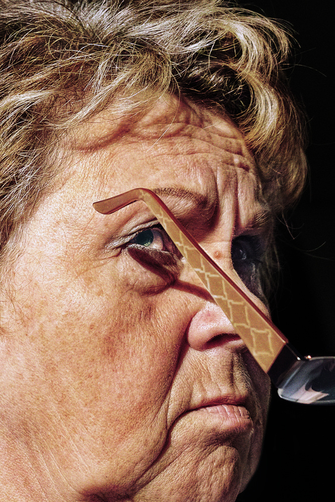
In order to make my photographs resemble the work of Fujiwara, I firstly increased the contrast of each photograph and slightly decreased the exposure, allowing for a sharper image . After I increased the shadows replicating the dark backgrounds in Fujiwara’s images. I also used the dodge and burn tool to intensify these highlights and shadows.

Final Image

I believe that this edited image is my best as it best displays similarities to Satoshi Fujiwara’s unique style of extreme close up photography. This is due to the dark background that is just about visible around the edges of the image, and the warm tone of the portrait. I also aimed to capture a dissaproving facial expression within this photograph, which can also be seen in some of Fujiwara’s work that often exhibits images that appear to be taken of guard.

Headshots – Double/Multi exposure

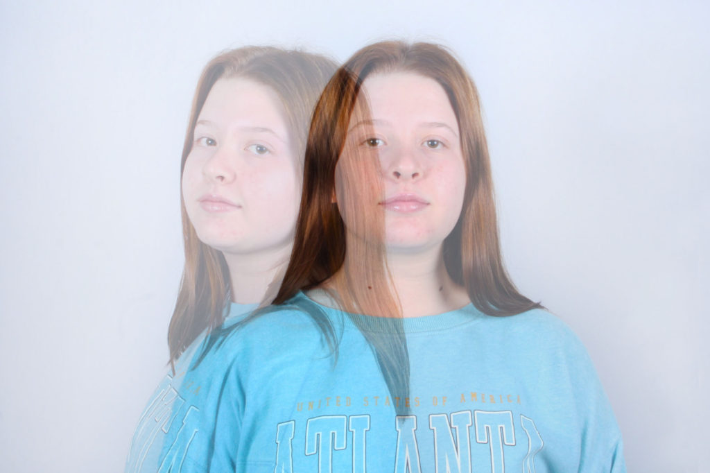
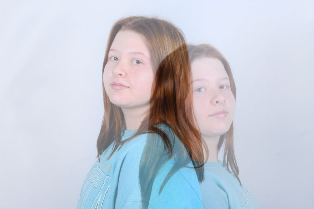
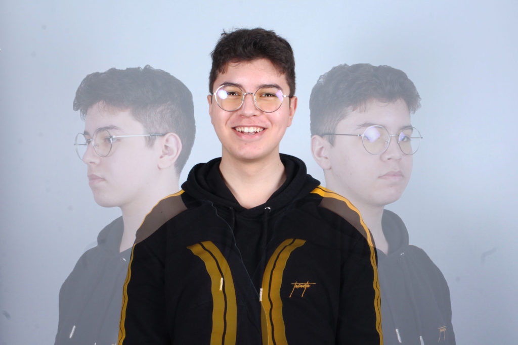
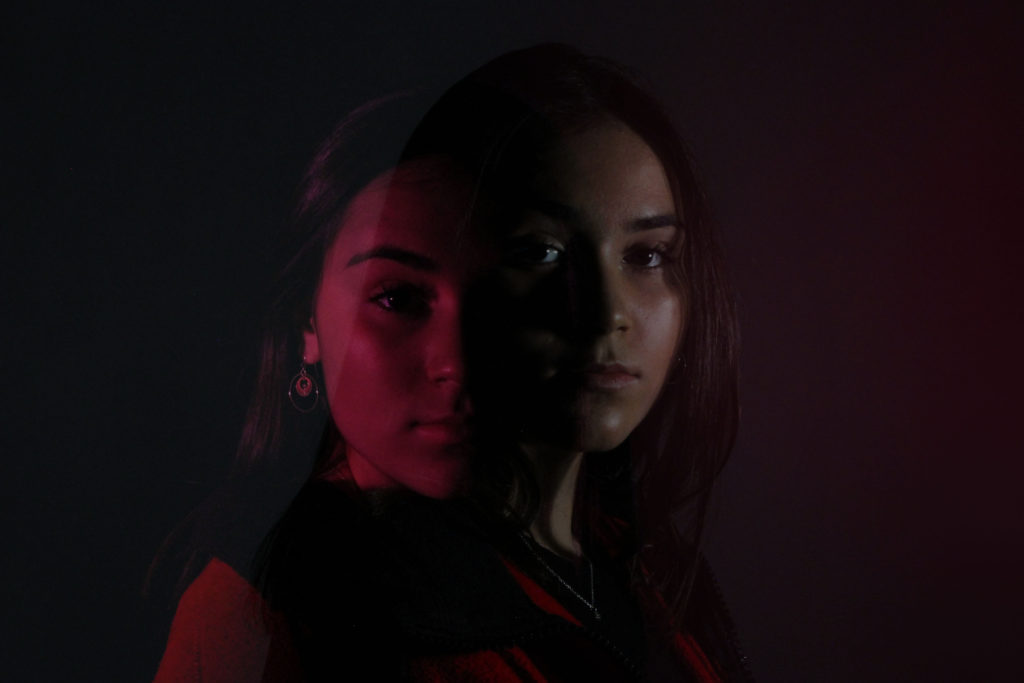
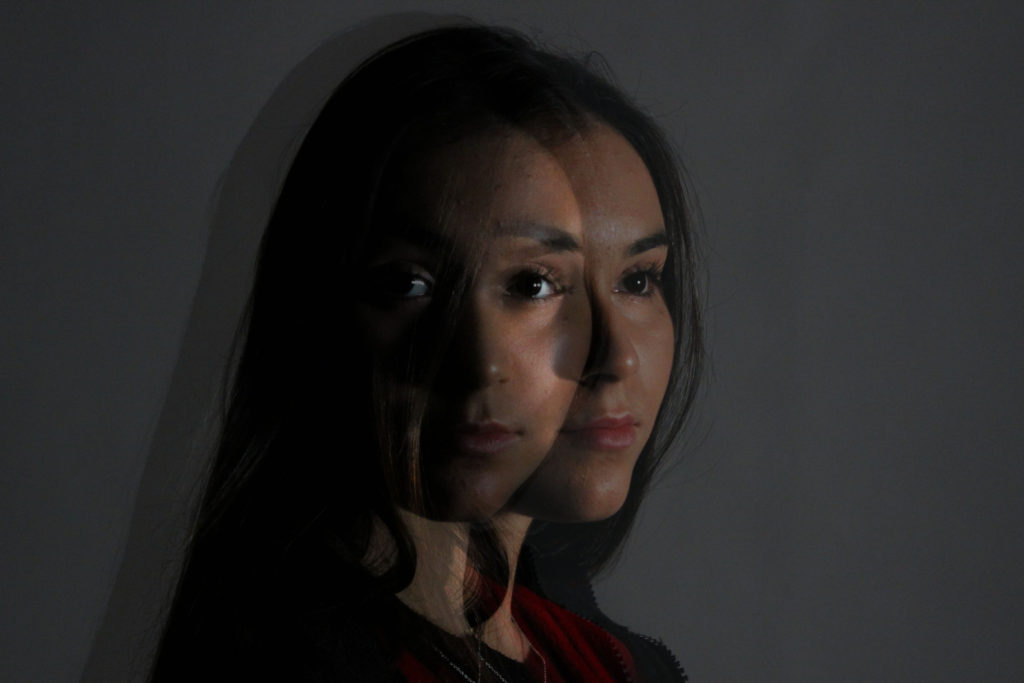
Double or multi exposure is a style of photography that superimposes two, or more, images to create one single image. This technique first emerged in the 1860s when it was used by photographers to earn more money, by making the subject of the photograph appear twice within one image. This originally was done by photographing over already used film, however nowadays we are able to create similar results using resources such as Photoshop.

Edited Images

For these double/multi exposure edits I took some of my previous studio portrait photography and edited them using Photoshop. To do this I dragged one portrait over another similar to it, and used the opacity tool to lighten the top layer, making it so both images are visible. I then adjusted the photographs and placed them making sure the faces were slightly apart from each other.

Self-Reflection

My first thoughts about the overall project are mainly positive as I believe I worked hard to achieve my final grade and am happy with my final images that I produced during this time. During this project I discovered how I am able to make my photography capture a deeper meaning and make it more personal to me. Although, I also found this aspect the most challenging out of the overall project as I found it difficult to focus in on one idea and theme of identity. The most important thing I learned personally is how photography can be used in countless expressive ways to get a certain message across. I think that I got in the way of my progress during the start of the project due to over thinking on how I could approach it. This, I think is one of the obstacles I must overcome to achieve a higher grade, through my research, development and analysis, which should make it easier for me in approaching the task. If I were to approach the problem again, I believe that by researching a wider range of photographers and artist to help me with ideas. In addition, I think I could also manage my time better during the controlled conditions by making a plan of how much time I would spend on each step, allowing me to finish everything and go back over my work and add to it. In the future I also want to be able to make my project even more personal to myself, which I think would improve my work, and spend more time on the photo-shoots allowing for higher quality images.

Identity and Place – Final IMages and evaluation

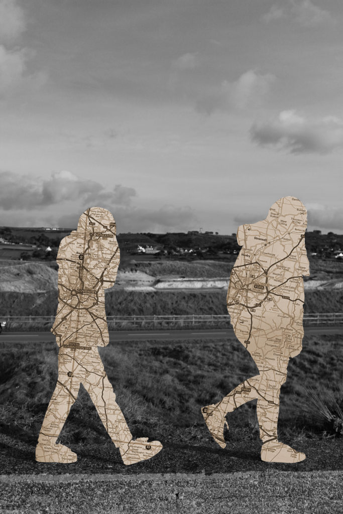
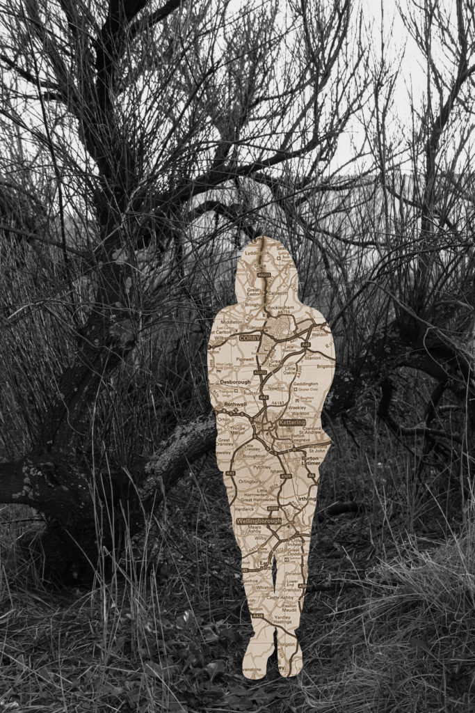
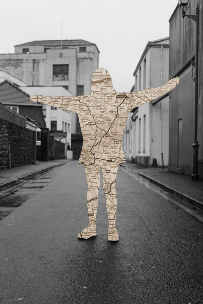
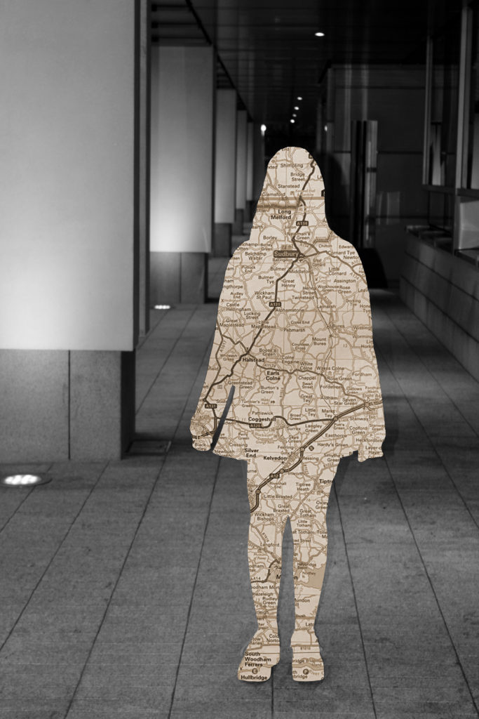
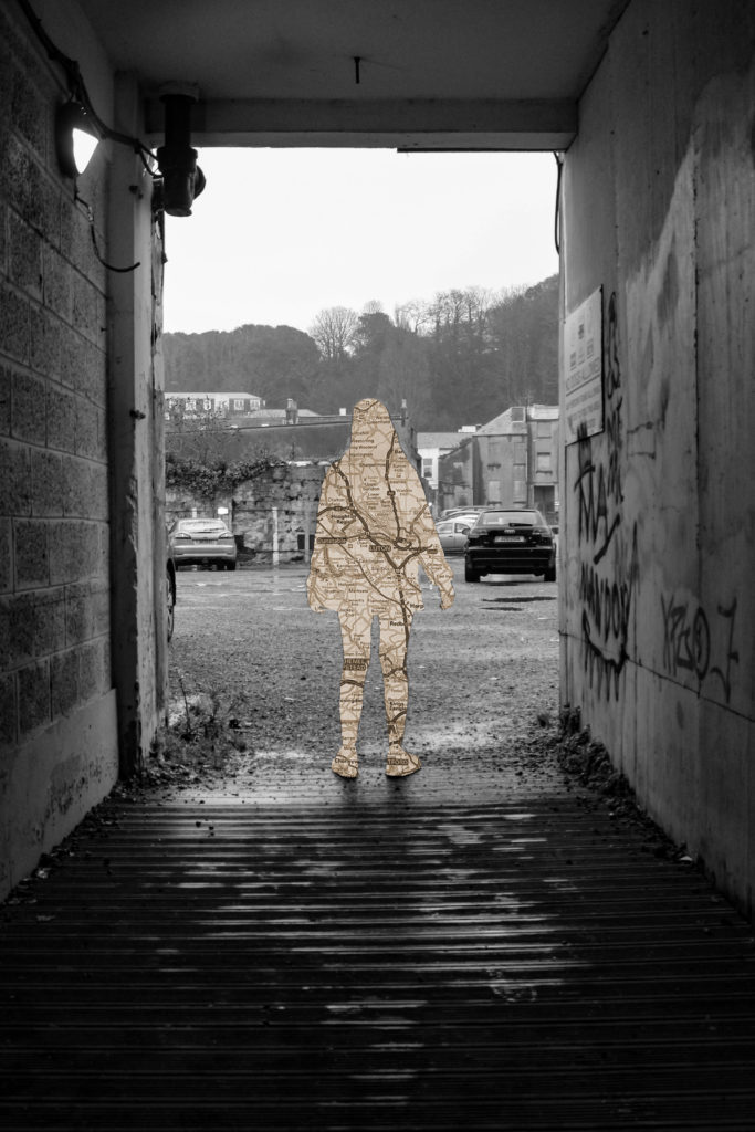
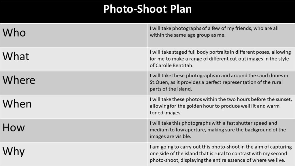
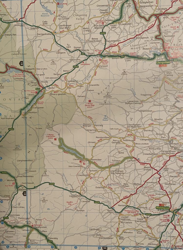
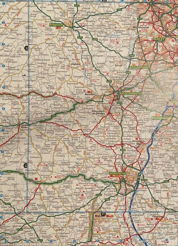
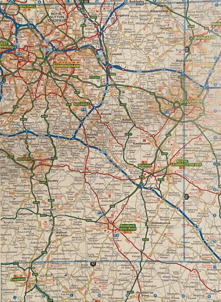
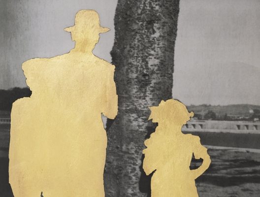
For my final Images I have edited four photographs from each photo-shoot and edited them to resemble Carolle Benitah’s work. Here I am looking at the theme of geographical identity by using photographs of my friends who’s families originated from all over the UK then moved to Jersey. I did this as I wanted to show how our small island is capable of occupying a mass amount of identities that have been shaped and influenced by different types of cultures and economic environments. In addition, I also wanted to signify the way in which Jersey has unified so many people from these drastically changing backgrounds. With this aim in mind, I have used Benitah’s style of edited and cut out the subjects of the photographs and replaced them with map images, edited into a sepia tone, containing the places their families were originally from.

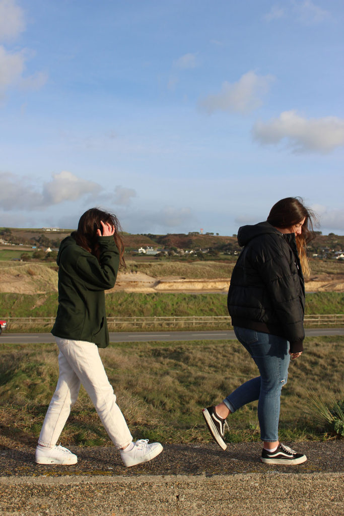
This image displays two of my friends with St. Ouen as the background setting representing the geographical identity of Jersey. The subject on the left, Robyn, has family that before moving to Jersey lived in Coventry, which is displayed within the map replacing her silhouette. Macy, the subject on the left, has family originally from areas in and around York, also presented in the map of her cut out.

This image of my friend India, within the rural setting of St. Ouen, showcases her geographical identity by displaying a map of Birmingham and its outskirts. This is as this was the place in which some of her family lived in before Jersey.

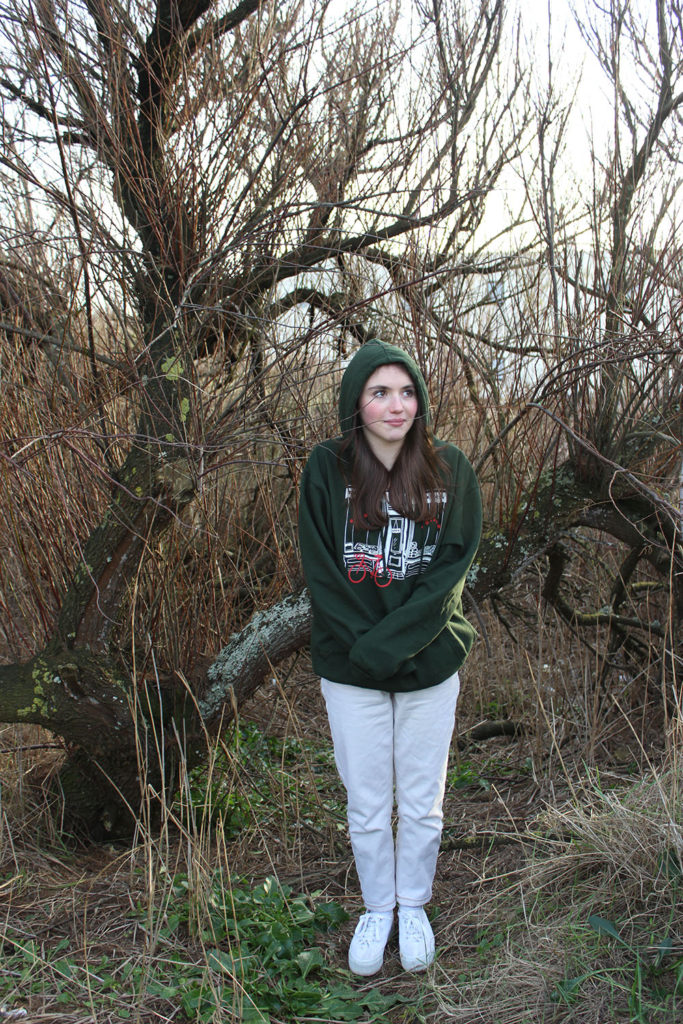
This Image with the background of an unruly tree located in St. Ouen, displays again my friend Robyn as the subject with the area of Coventry as her geographical identity. I believe this setting worked well to display my take on identity as we often refer to our backgrounds as our ‘roots’ and I believe that the roads within the maps best represent this, in both the literal and metaphorical sense.

This image displays three of my friends with St. Ouen as the background setting, showing Jersey’s rural side. On the left again is my friend Macy with a map of the areas surrounding York to showcase her heritage. The subject in the center is my friend Bella with North wales signifying her background.

Identity and Place – editing and experimentations

I will test and try out different methods of editing my photographs, in order to see which best suits my ideas of identity and place, using Carolle Benitah as inspiration.
Photoshop Experimentation

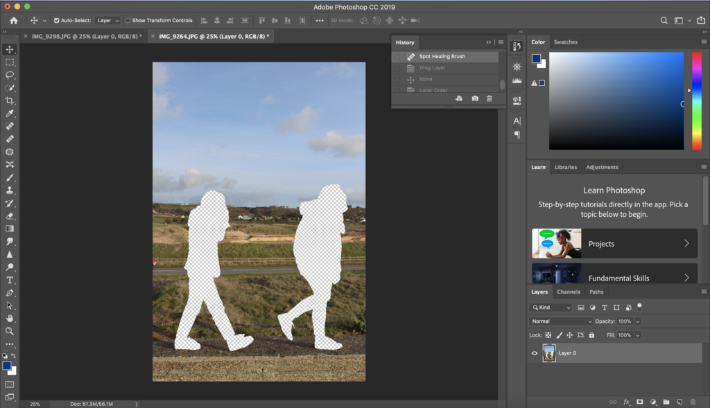
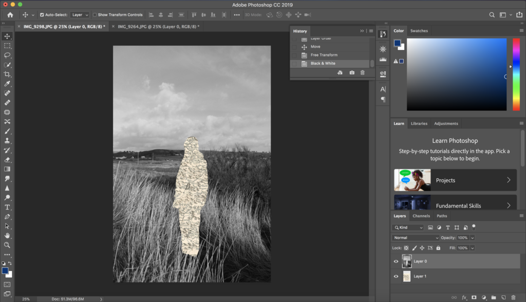
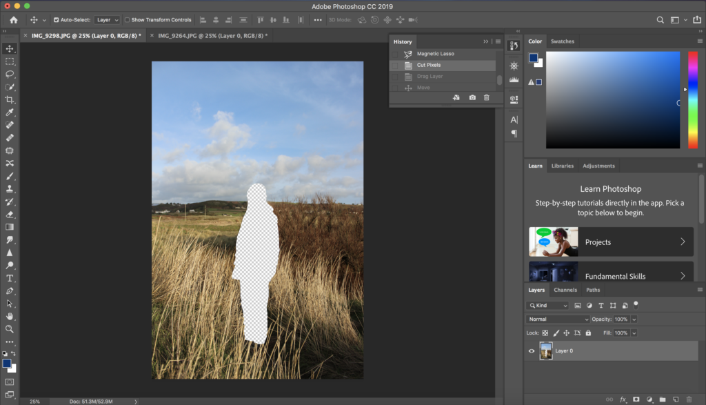
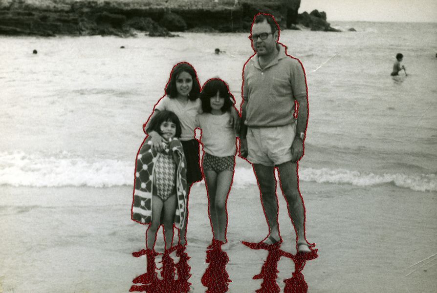
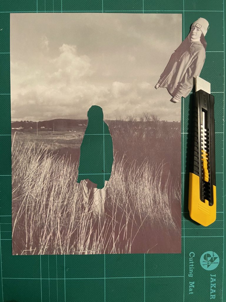
In Photoshop I attempted to practice editing my photographs in the style of Carolle Benitah. I did this by using the magnetic lasso tool to cut out the shape of the subject in the image, and then layering a plain sepia toned piece of paper underneath it, to show a link to her themes of loss of identity. I then also converted the original image into black and white, also similar to Benitah’s work, allowing for a contrast between the image and the cut out section.

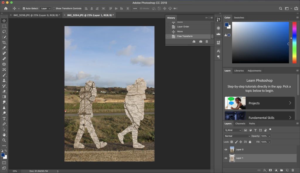
Next, I followed the same method of cutting out the subject with the magnetic lasso tool, in the style of Benitah, but instead of layering a plain background underneath I played around with my idea of identity and place and used sepia toned maps instead. These map images used link to the subject in the image, as it displays the place their families came from before Jersey.
Hand Experimentation

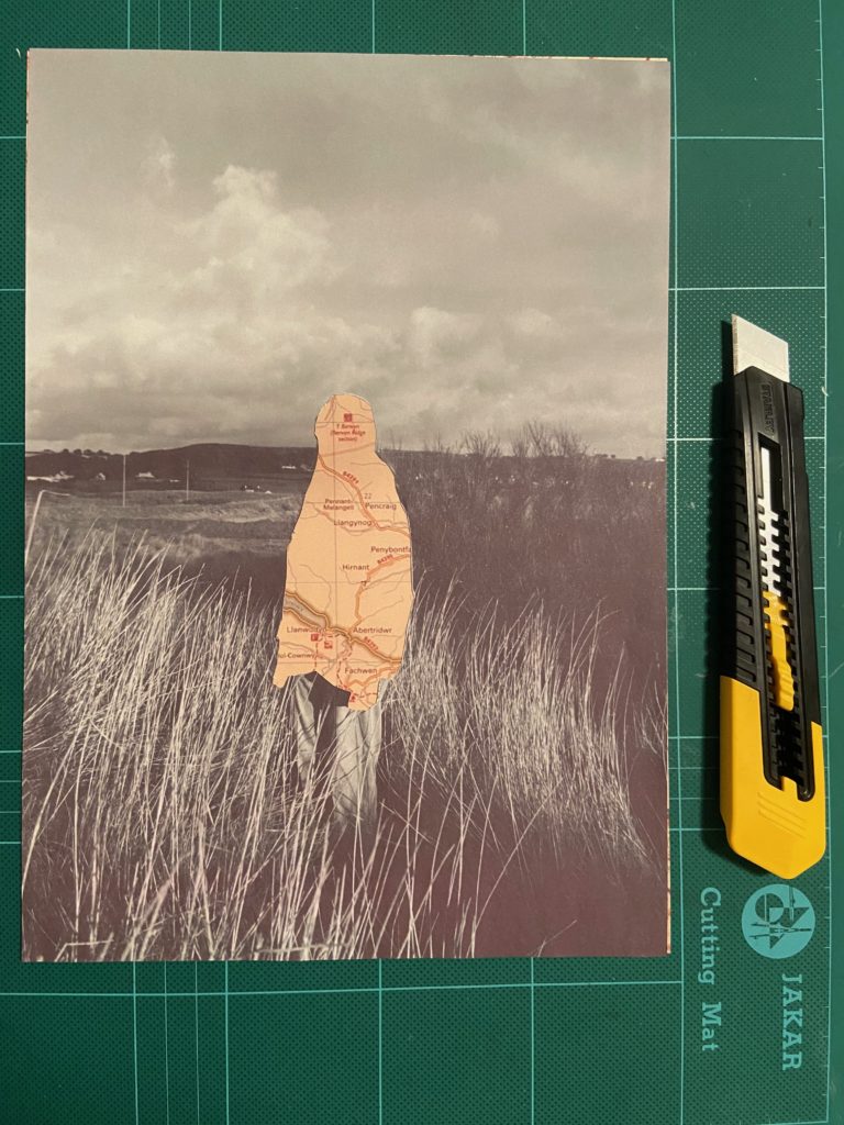
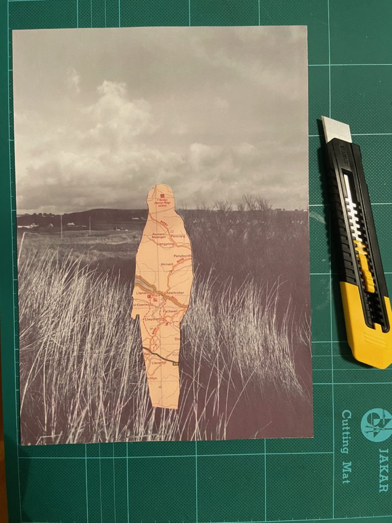
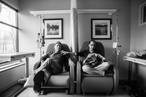
I also tried printing off my photographs in a black and white, then cutting out the subjects by hand using a craft knife, as this is similar to the method Benitah used to create her final pieces. I then printed of my map images that relate to the subjects identity, and layered them underneath the cut out sections.

I think for my final pieces I will use the Photoshop method of editing my images. This is as even though the hand cutting out method links more to Benitah, I will be able to produce a more precise and neater final product with Photoshop.

Identity and Place – Photo-Shoots

I decided to use Carolle Benitah’s work as inspiration to showcase the theme of geographical identity, with images taken around Jersey and people who’s families are not originally from here, like most people who live in Jersey, and have moved from various places. With this I aim to express how this one small island has brought together a wide range of identities that have been sculpted by different cultures, accents and beliefs into one place we all call home.

Photo-Shoot One

Plan

Contact Sheets

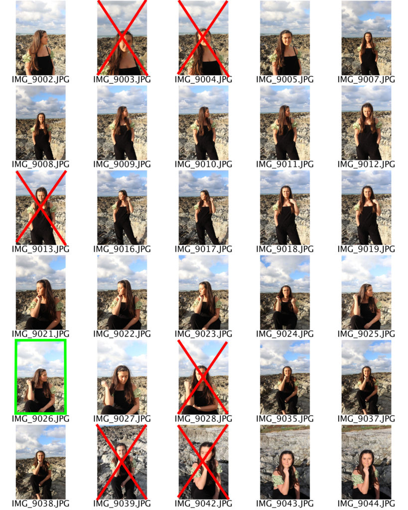
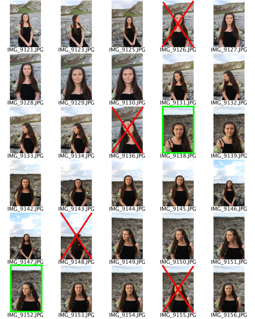
Here I have crossed out images in red that are not good enough to edit or use for my final pieces, as they are either too blurry, or under or over exposed. I have also highlighted images in green the photographs I believe will work well for my final pieces, due to the quality, variation in people and poses, and representation of the rural side of Jersey.

Photo-Shoot Two

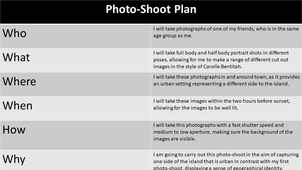
Plan

Contact Sheets

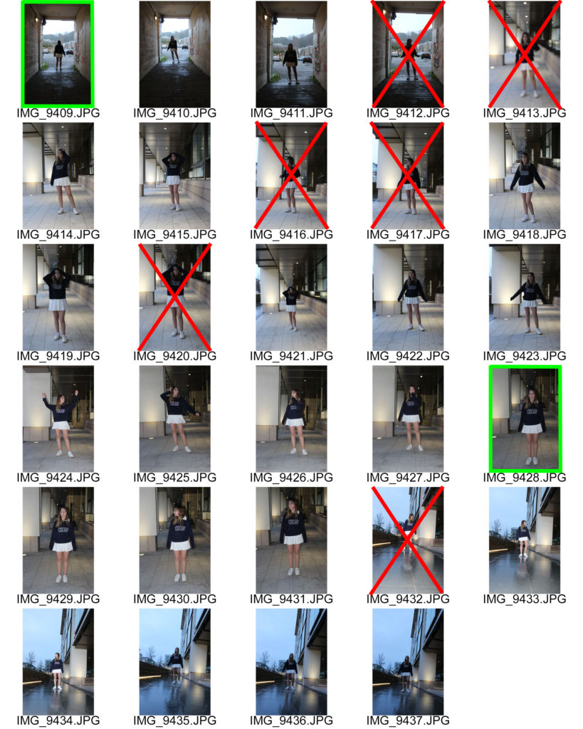
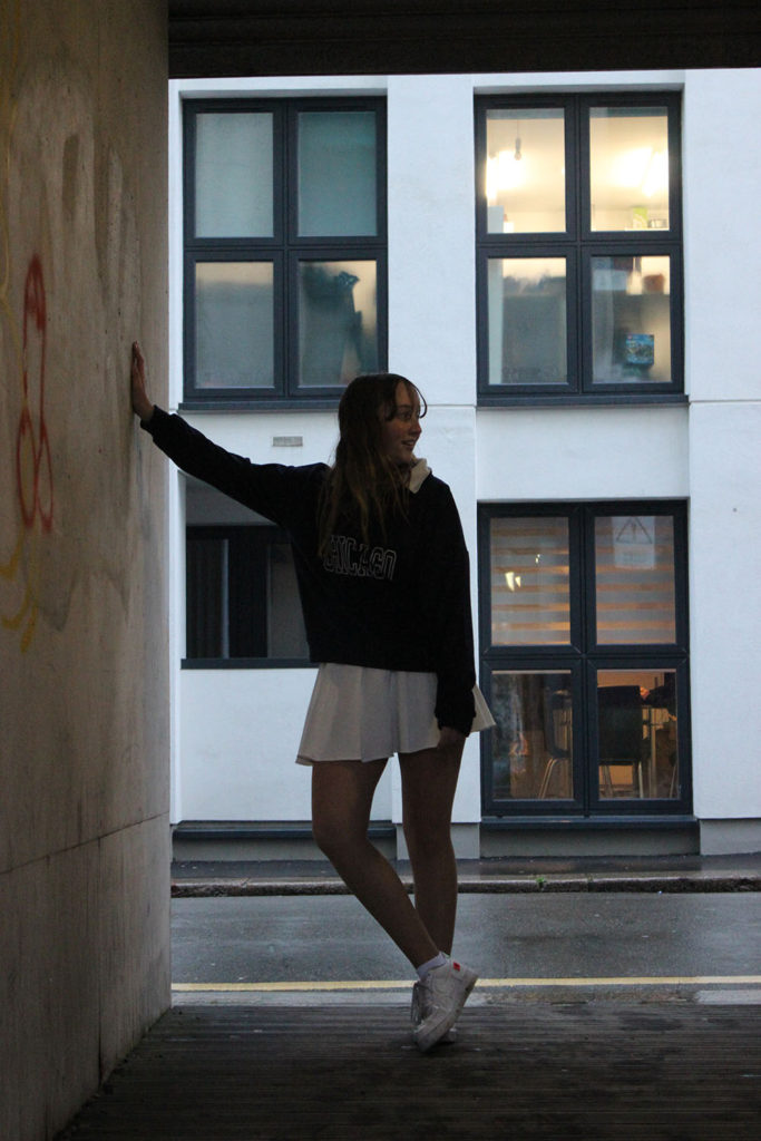
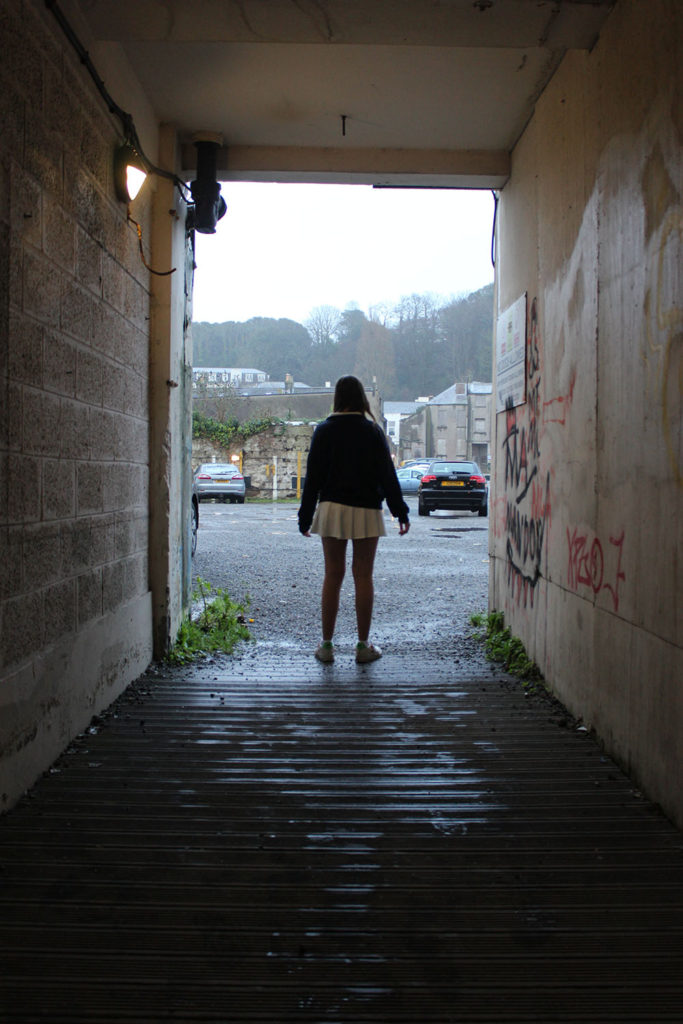
Here I have crossed out images in red that are not good enough to edit or use for my final pieces, as they are either too blurry, or under or over exposed. I have also highlighted images in green the photographs I believe will work well for my final pieces, due to the quality and representation of the urban side of Jersey.

Initial Image Selection

For my photographs which will later be edited into my final pieces, I chose four images from each photo-shoot to give a balanced view of the island. I believe that these are my best images and will work well when edited in the style of Carolle Benitah, as they display backgrounds that clearly represent the identity of Jersey, as the subjects will represent their own.

Map Images

I took at least two map images for each of the subjects featured in my photographs which display the place where their families came from before moving to jersey. I am doing this as I believe that Jersey is built from people who originate from all over and have many different backgrounds, allowing for our island to be diverse in culture and history.

Claude Cahun and Carole Benitah – Identity and place

Claude Cahun

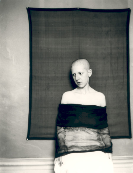
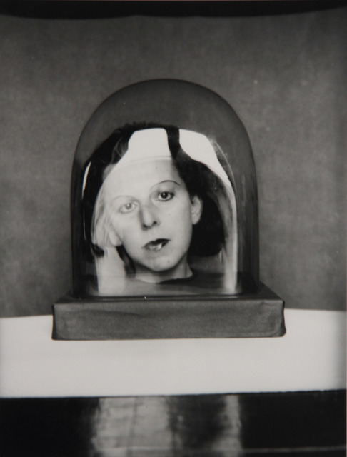
Claude Cahun, a French photographer, sculpture and writer born in 1894 to the name Lucy Renee Mathilde Schwob, was best known for their self-portraits, which often showcased a range of personalities. Cahun first began producing self portrait photographs at the age of 18 in 1912, and later took on the sexually ambiguous pseudonym in 1917, as she continued to combat the ideals of gender norms in her photography. Later moving to Paris alongside her longterm partner Marcel Moore, who she often collaborated with, Cahun continued to work on her surrealist portfolio.

In 1937 Cahun and Moore migrated to Jersey, just before the start of World War Two and the island’s German occupation. During this time the two soon became activists, in the effort to spread reports of Nazi crimes by creating anti-German fliers, criticising their authority, and placing them around the island. However, due to this they were later arrested and sentenced to death for their actions in 1944, although this was never carried out fortunately. Ten years later Cahun sadly died due to bad health, caused by her treatment in prison.

https://www.jerseyheritage.org/collection-items/claude-cahun

Analysis

Claude Cahun – 1927

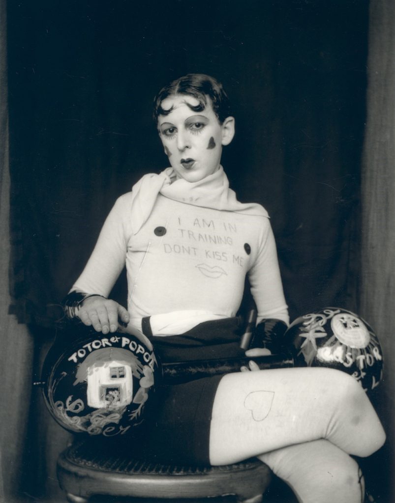
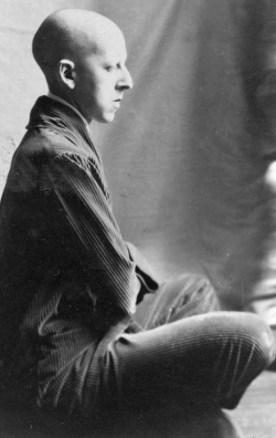
This black and white photograph, taken by Claude Cahun in 1927, displays a self-portrait of the photographer in which she has taken on the persona of a strong man or body builder that you may find at a circus or fair, during that time period. Here the pale white clothing, that matches the colour of her skin, contrasts dramatically with the dark black background behind her. This contrast between light and dark is also creating from the use of the dark dumbbell prop. The framing of this image by Cahun can be said to appear confining, as Cahun has placed herself so that she takes up most of the frame leaving little empty space.

The lighting used for this self-portrait appears to be two-point lighting, this is as there are only a small amount of shadows in the image but still a strong contrast between light and dark. Furthermore, it could be said that Cahun used a low aperture for this photograph, due to the fact that the foreground and background seem to have the same amount of focus placed on them. The ISO used for this image appears to be on a medium setting, allowing for there not to be too much light flooding in from the harsh lighting, but enough for the dark contrasting background to be visible.

In addition, this persona of a strongman or body builder does not portray all the masculine stereotypes that are associated with this type of person, but however showcases a more effeminate one. This is displayed through the Oscar Wilde type parting in the hair, the crossed leg pose and the hearts painted on the cheeks. This only further shows how Cahun challenged gender normativity by showing that she was able to switch her apparent gender at will comfortably.

Carolle Benitah

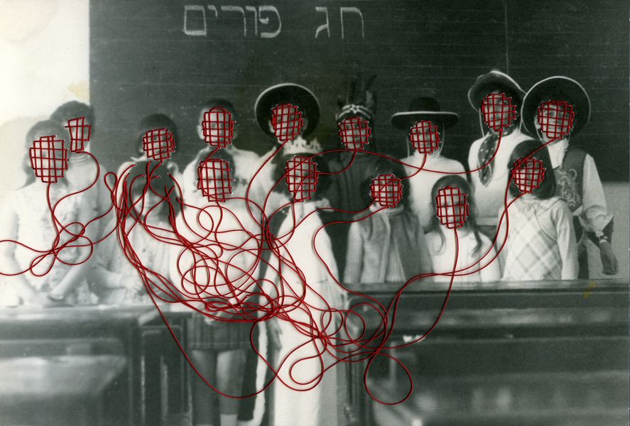
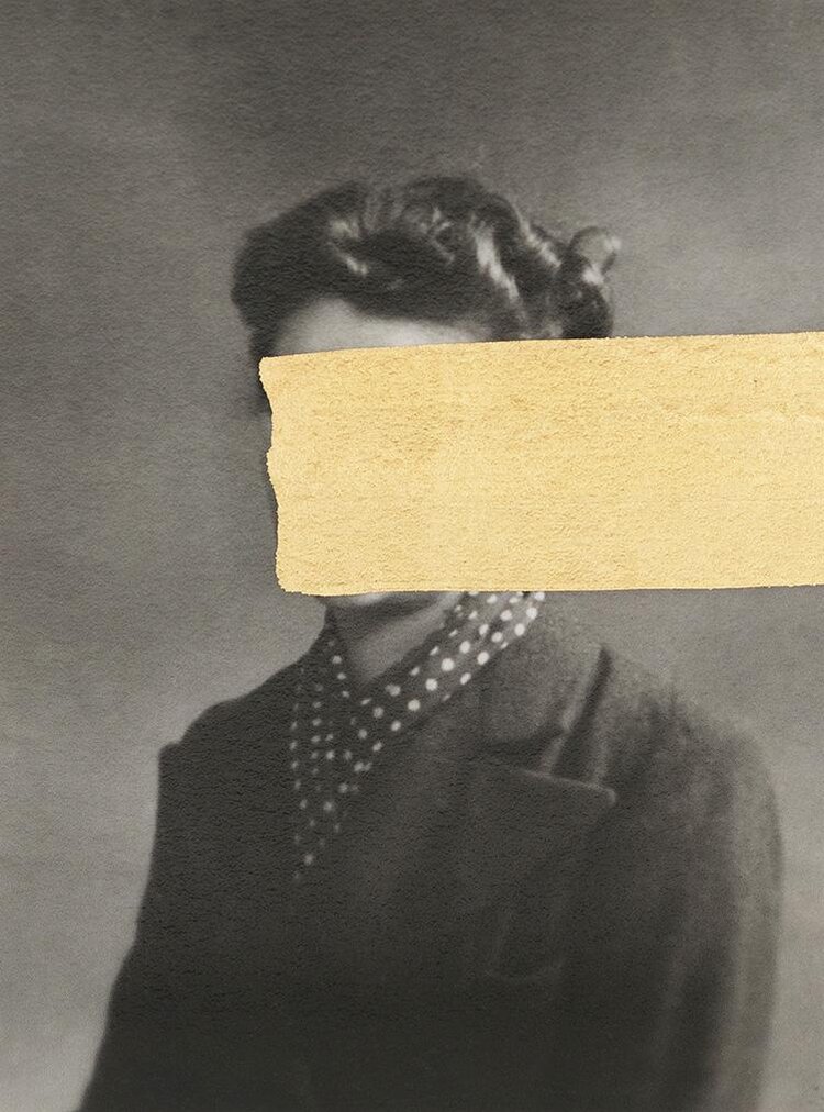
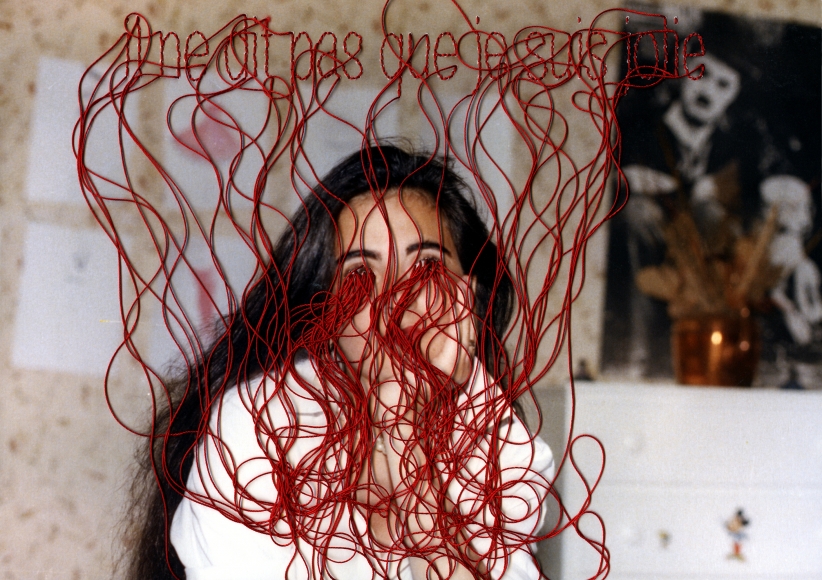
Carolle Benitah, born in 1965, is a French photographer best known for using her old family photographs to tell the story of her identity. Benitah does this by embroidering and cutting out certain sections of the portrait images. Benitah sees this style of work as allowing herself to expose the failings of her life and identity, and reinterpret her history. This acts as a sort of therapy for Benitah as she claims “I make holes in paper until I am not hurting any more”.

https://www.carolle-benitah.com/

https://www.lensculture.com/articles/carolle-benitah-photos-souvenirs

Comparison

Carolle Benitah – 2018

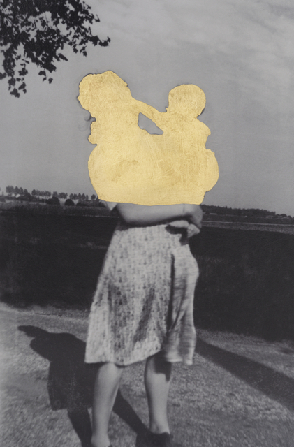
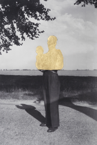
This sepia and, black and piece created by Carolle Benitah displays an old family photo of Benitah’s containing the subject positioned in the centre of the image, which is similar to the way in which Cahun placed herself in her self-portrait. Leading lines in this photograph are created by the horizon line, the line dividing what appears to be a wall and the see, and also the split created by the contrast in tones on the subject. These allow for your eyes to be drawn horizontally across the image. Dissimilar to Cahun’s photograph, there is a large amount of empty space around the subject of the portrait, meaning more attention is allowed for the background, which is a landscape rather than a studio backdrop seen in Cahun’s image.

Whereas Cahun used what appeared to be two point studio lighting, here Benitah has chosen an image taken with natural lighting, which you can tell due to the outside location. In addition, it appears that this photograph was taken with a low aperture like Cahun’s, due to the fact that the foreground and background hold a similar amount of focus. The ISO used to capture this photograph can be said to be lower than the ISO used in Cahun’s portrait, this is due to the fact that the natural light would flood the lens, causing the image to be over exposed, if it were higher.

Conceptually this piece differs largely from Cahun’s on the theme of identity, as it seems to show a loss, lack or even rejection of identity. This is due to the cut out sections of the subjects in the image, which could be representing an attempt to erase that part of her history. On the other hand, Cahun appears to take a completely different approach by doing what seems to be an embrace of her ability of changing identities.

Identity and Place

Identity can be defined as an individuals disposition or personality, or possessing a similarity or oneness with someone or something. A person’s identity can be influenced by a number of things, such as ‘place’, the environment that you live in, your upbringing or a sense of belonging. This means that the people or things you surround yourself with have large impacts on your life, and shape you into the person you presently are.

Mood Board

Ideas

Natural Light

Mood Board

Analysis

Rineke Dijkstra

Rineke Dijkstra is a dutch portrait photographer, born in 1959, best known for her work capturing small specific groups of people or communities, such as teenagers, mothers and soldiers. Dijkstra has claimed she does this as, “With young people everything is much more on the surface—all the emotions,” whereas as we grow older we tend to know how to conceal them. Usually, Dijkstra accompanies her portraits of these types of people alongside a seaside landscape.

Rineke Dijkstra: Beach Portraits –  2002

This colour portrait taken by Rineke Dijkstra displays a young girl positioned in the centre of the image among a seaside landscape. This positioning of the subject of the photograph creates an almost symmetrical looking image, which could be said to cause the portrait to look very formal and unnatural, combatting the background. Furthermore, the tone of this image appears to be very cold with blue being the prevailing colour of the photograph, seen in the sea, sky and the girl’s dress. In addition, the lines presented in this photograph seem to all be horizontal, for example the horizon line, the dived between the rocks and the sea, and the lines going across the girl’s dress. These lines lead your eyes across the image, allowing for not only the subject to be focused on but also the background.

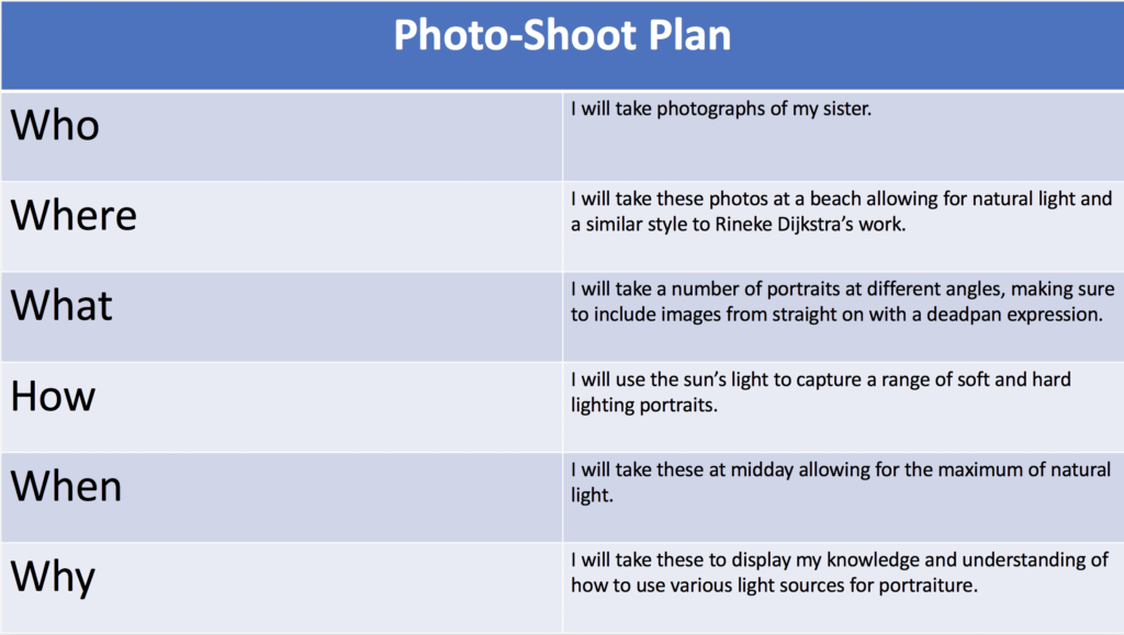
Here you can also see that the lighting of this portrait, like most of Dijkstra’s work, is clearly natural, due to the seaside setting. This allows for very few shadows, meaning it was most likely chosen to be taken at midday. This light also means that this image was most likely taken with a low ISO, so that the camera would not be over responsive to the large amount of light flooding the lens, meaning the photograph would not be over exposed. Moreover, the aperture used for this image appears to be low, allowing for a large depth of field, showcasing a defined background behind the subject. It can also be said that the shutter speed used here was fast, also due to the defined and clear photograph.

Photo-shoot

Plan

Contact Sheets

Edited Images

Final Image

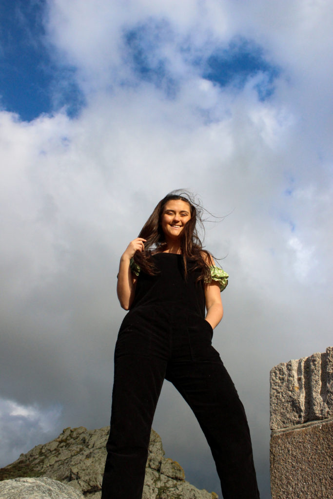
I believe that this is my best photograph from my natural light photo-shoot due to the fact that the subject of the portrait is well centred and displays a seaside landscape in the background, similar to Rineke Dijkstra’s work. Furthermore, it is also one of my sharpest photographs out of my edited images. I do also believe that this image displays my understanding of how to capture a clear portrait with the tool of natural light best.

HEAD SHOTS – Diamond Cameo

Henry Mullins

Henry Mullins was a portrait photographer known best for introducing professional photography to Jersey, after moving from London in July 1848, and setting up one of the first photography studios on the island. This was known as the Royal Saloon, located at 7 Royal Square. He promoted his business to Jersey locals by pricing his portraits at “one half of that in London”, half a guinea.

Mullins’ photographs have been preserved and stored online by https://societe-jersiaise.org/photographic-archive with his collection amounting up to 9600 images. Mullins was well known for printing his portraits on carte de visite paper, which was popular due to its small size, allowing friends to trade them amongst each other.

A technique often used by Mullins were the diamond cameo portraits, in which four different portrait angles were taken and printed onto one card, in the format of a diamond.

Diamond Cameo portrait of Philip Baudains, taken by Henry Mullins.

Analysis

Mr Bolton, photographed by Henry Mullins in 1849-50

This sepia toned image taken by Henry Mullins displays a Mr Bolton, almost a year after Mullins set up his business. This is said to be of a very high quality for its time, due to the fact that it captures facial details such as wrinkles and shadows sharply. In addition, here Mullins has showcased a strong contrast between light and dark, with the black suit Mr Bolton is dressed in and the bright tone of his skin.

For this portrait it appears that Mullins has chosen to use a two point lighting technique, allowing for little to no shadow behind the subject or around his face. The way in which Mullins has framed this image demonstrates a half body shot of Mr Bolton sitting down, also leaving little empty space around the subject, as the background is not important for the viewer of the photograph.

Photo-Shoot

Plan

Contact Sheet

Edited Images

For these two point lighting photographs, I started editing them by decreasing the brightness slightly, meaning the images wouldn’t be over exposed, and then increased the contrast allowing for a sharper image. I also used the dodge tool in order to make the facial highlights brighter, and to brighten the backgrounds of the photographs.

Diamond Cameos

In order to create these diamond cameo edits, I used the elliptical tool in Photoshop to cut out an oval shape from four of my best images for each person. I then copied these cut out sections and dragged them onto a blank A4 page, and arranged them into a diamond format. For my second diamond cameo edit, I also added a sepia tone over the cut out images, by using a sepia image from the internet and blended it over the top of the photos.