Comparing My Work to Felicity Hammond’s


Felicity Hammond – In Defence of Industry – 2017


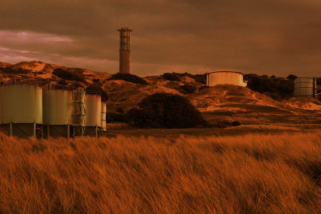
In order to produce this altered landscape edit, in the style of Felicity Hammond and through the lens of Anthropocene, I started off cutting out all of the structures I needed to use for that edit, from my urban landscape photo-shoot. After I had done this, I dragged the buildings onto my chosen photograph from my natural landscape photo-shoot one at a time. With each structure I adjusted the hue/saturation, brightness and contrast, and colour balance, to make sure the tones in that layer would match the tones and colours of the natural landscape, in order to make them fit in more with the landscape. Once I had done this, I then adjusted the perspective of the structure, meaning the angle of the layer would correspond with the angle at which I took the natural landscape from. Next I used the clone stamp tool to make sure the structure is embedded within the landscape, in the grass. Finally after doing this same process for the other three buildings I included in this edit, I added a solid orange colour as a layer and placed it over the flattened image, and selected the overlay option. This was done to cause the edit to look more similar to Hammond’s work. Then I also added a slight gradient overlay, starting from the bottom of the image.


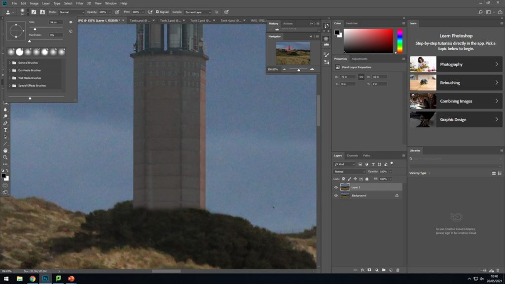

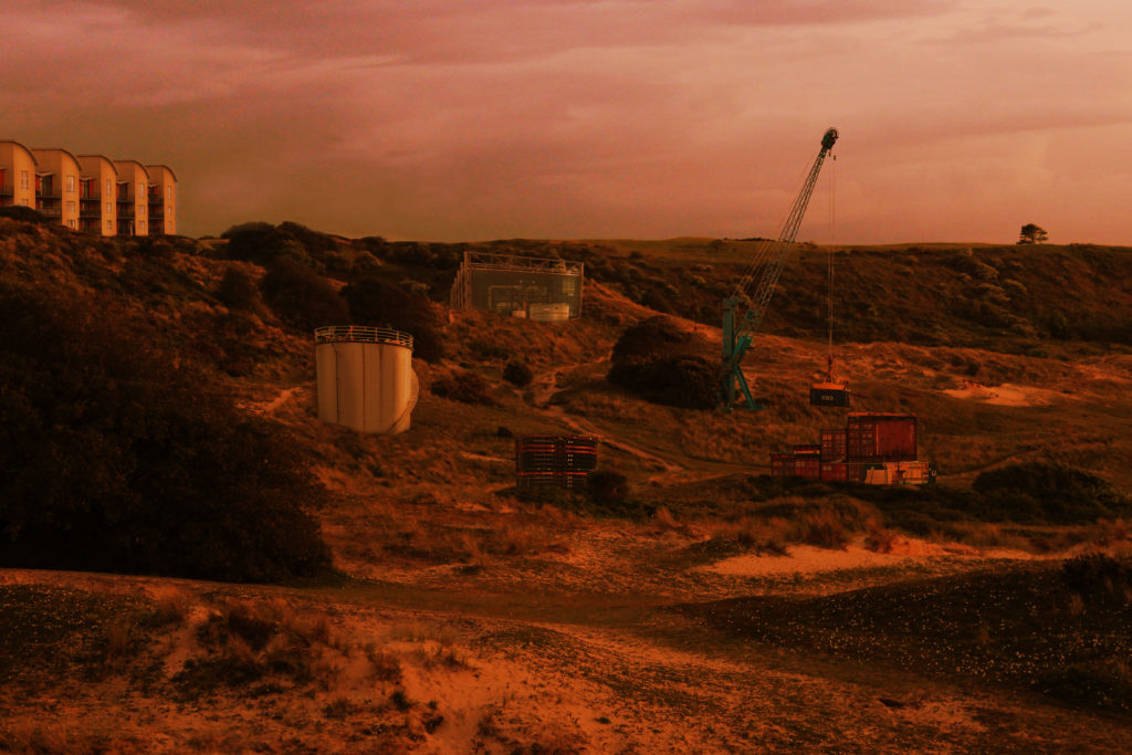
For this next edit I followed the same editing process as the image above, however using a different structures and a different base natural landscape.
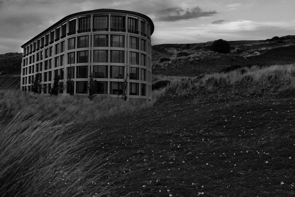
In order to create this altered landscape, in the style of Tanja Deman, I started off by cutting out the one structure I would need for this edit, from my urban landscape photo-shoot. With this edit I only used one building to replicate Deman’s work, as she usually has the focus on one structure instead of multiple. After this I then dragged the cut out image onto my chosen photograph, from my natural landscape photo-shoot. Next, I tried to match the tones and colours of both layers by adjusting the hue/saturation, brightness and contrast, and the colour balance. Once I had done this, I used the clone stamp tool to make it look as if the building was embedded in the grass. Then, after I flattened the image, I converted the image into black and white, whilst also adjusting the shadows and highlights. Finally, I used the dodge and burn tools to add slight adjustments, and highlight the side of the building that would have been facing the sun, if it were there .


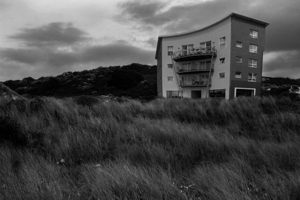
For this edit, also in the style of Tanja Deman, I followed the same editing process as the image above, although this time using a different structure and landscape.
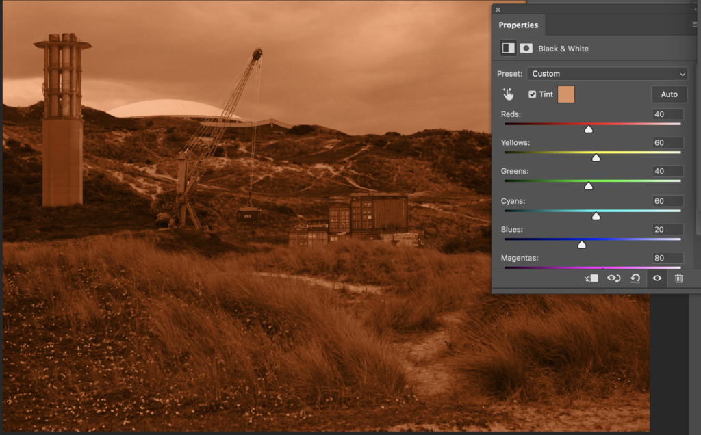
Here I have Started to experiment with the editing process, in which I will use to create a piece similar to Felicity Hammond’s, by creating a rough edit of industrialism in the natural landscape. Below is the initial collage that I will use to try out different methods of editing, with my aim to create work similar to Hammond’s ‘In Defence of Industry’ series.

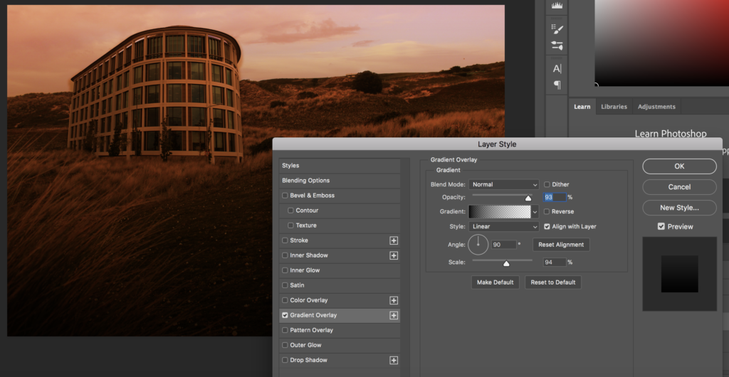
After putting a together a quick example of what my final piece may look like, I then attempted a few different ways of creating an orange tint over the photograph, again replicating Hammond’s work. Firstly, I edited the image first into black and white, to allow for a sepia style tint to be applied over the top of the image. I also attempted to achieve this orange hue by placing a solid colour as a layer over the edit, and then selecting overlay as a blending option. This style allowed for some of the colours in the image to show through as well, without it being all one tone. Finally, I tried including a light gradient overlay, to darken the bottom half of the image, which I believe could allow the viewers eyes to be eased into the altered landscape.



In addition to this, I also tried to experiment with editing in the style of Tanja Deman’s work, focusing on one single urban structure. I put together this rough edit to try to replicate her style, in which the urban structure largely contrasts with the surrounding nature. By doing this I am also allowing myself to have a clear idea of how I will produce my final products within the controlled conditions.

Initially, I started off by converting my altered landscape into black and white, adjusted the levels of the tones of colour, due to the fact that all of Deman’s work are presented in black and white. However, I then added an orange tint and gradient overlay, trying to see what it would look like if I were to combine the two photographer’s styles of altered landscapes. This produced what appeared to look like a slightly apocalyptic landscape. However, In my controlled conditions I will keep these type of edits in black and white, as it links more closely to the photographer.


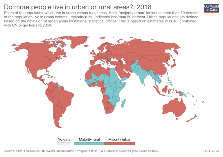
As the image above displays, the percentage of people residing within urban and industrial areas is becoming increasingly concerning in terms of land conservation and environmental effects. This is due to the fact that as a result of mass urbanisation, it is predicted that this current 55% of the global population, living in such places, will increase dramatically to 68% by the year 2050. This constant development not only means that rural areas will become increasingly rare along with the species inhabiting them, but environmental issues, such as air pollution and declining water quality, will become far worse, far more quickly than we have ever seen.

In addition, the increase of such heavily polluted and populated areas can lead not only to worsening environmental issues, but declining mental health and well being, and also a loss of culture. This is due to the fact these places possess far more stressors, such as overcrowded places, higher violence levels and less social support, compared to areas that incorporate the existing nature into the layout and of these cities. Furthermore, these dense concrete places are a victim of their own design, as they are more vulnerable to extreme weather and environmental conditions, that such large places of development cause.
With this photo-shoot I will aim to photograph structures that are signifier of these types of densely populated urban landscapes. Although in Jersey we are fortunate to have a large amount of rural landscapes, it can be said that with the ever-growing population of the island and its need for housing, continuous development of buildings such as flats, put this nature in danger.
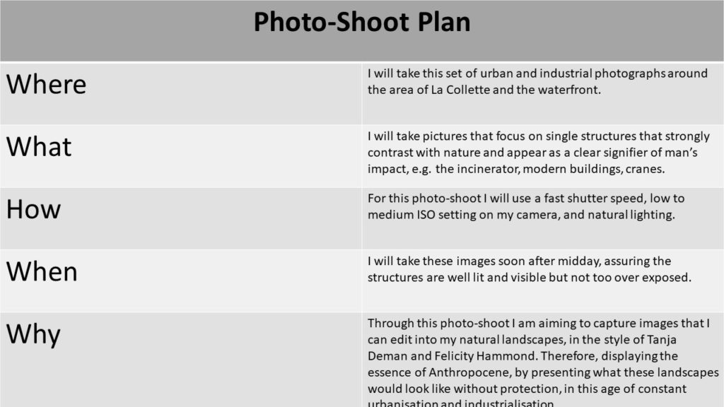
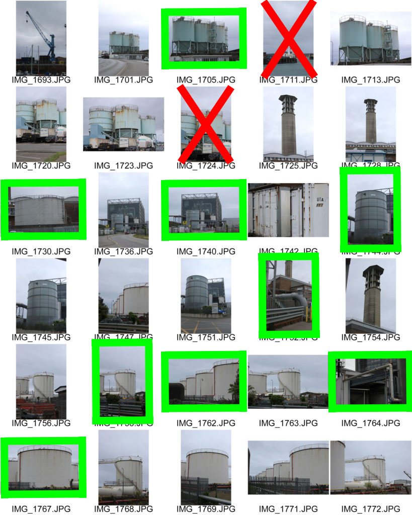
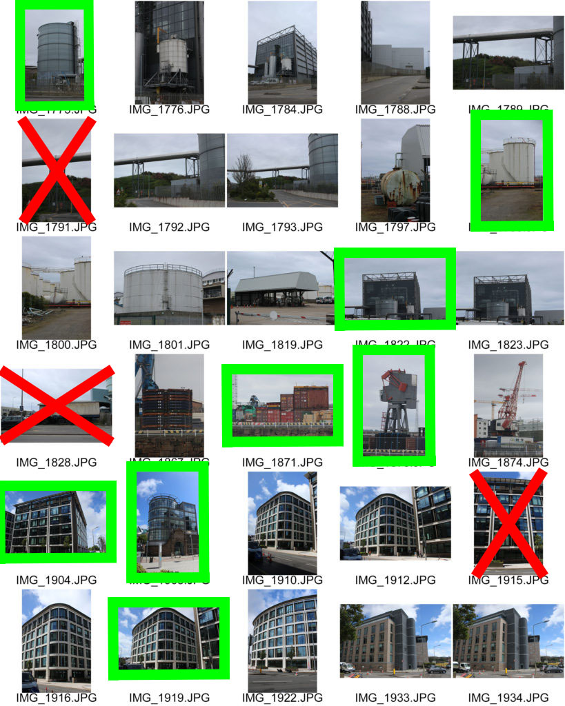
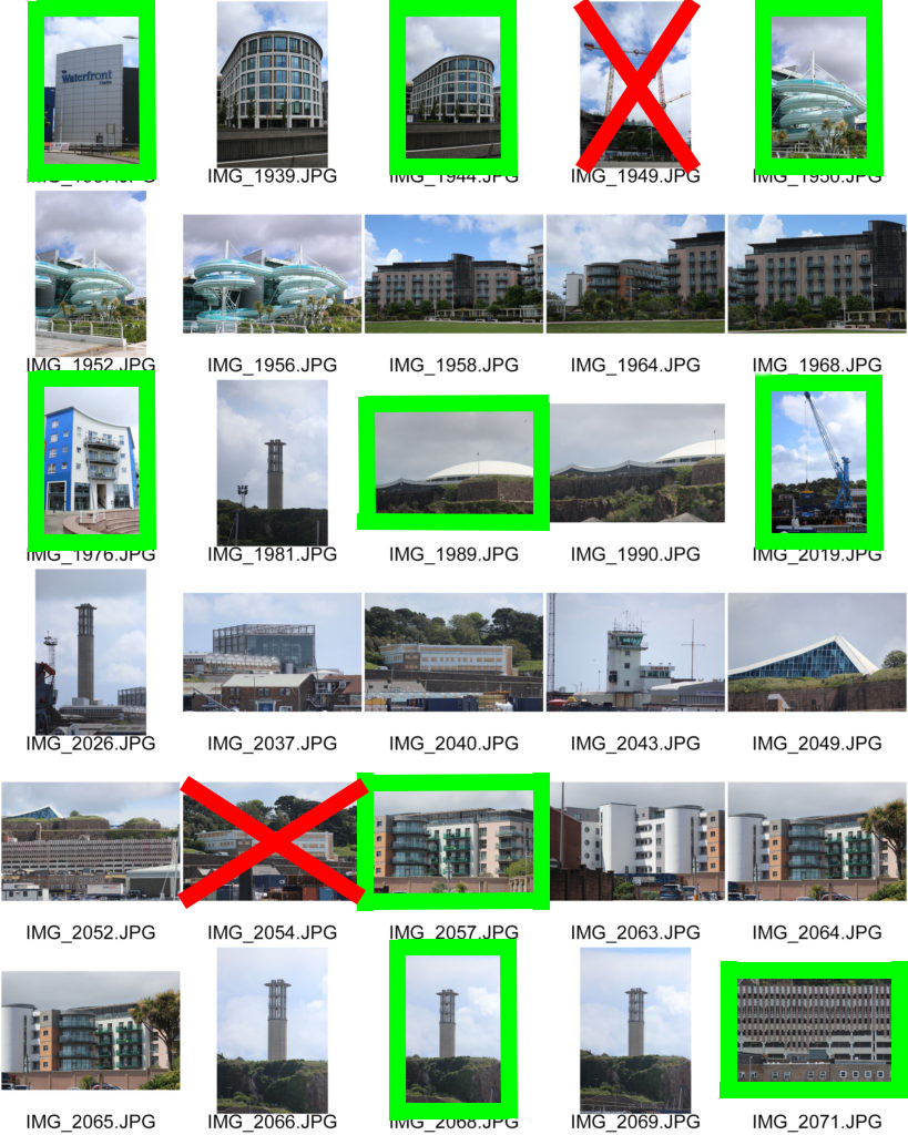
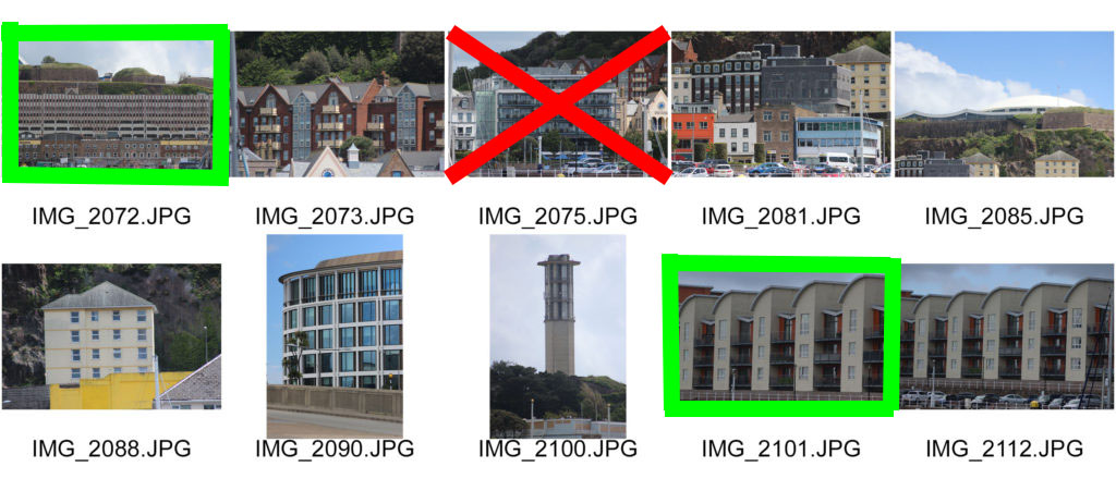
Here I have highlighted in green, the photographs that I think turned out best and will work well when combined with the natural landscape images. Also, I have crossed out the images in red that may have been blurry or are under or over-exposed, these are the photographs that I definitely will not edit for my final product.
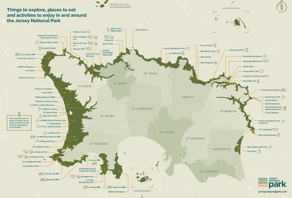
Jersey’s National Park is a unique area of conserved land, that stretches along the coasts of Jersey. This protection of Jersey’s natural coastline was created in 2011, following a peaceful protest in 2009, in which 7,000 islanders created a human chain along the large stretch of St. Ouen’s bay. This protest was the result of the people of Jersey’s frustration with the constant coastal developments occurring around the island, obstructing the island’s natural beauty, and called for the government to heavily regulate any future developments in these places, to which they complied to. This conserved land now possesses 16% of the island’s land mass, due to people’s love and appreciation for nature.
However, many places are not so fortunate to have regulation’s like this in place, to protect the small portion of nature we have not yet destroyed as humans on this earth. With this photo-shoot I want to bring to attention why it is essential that places are protected from the negative impact the Anthropocene era has inflicted on the earth.
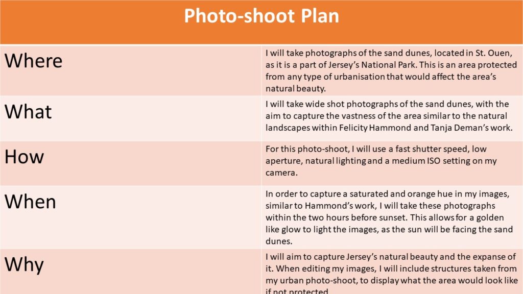
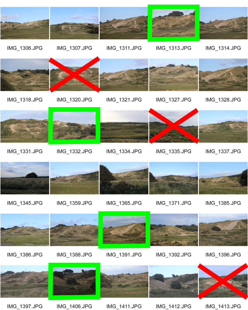
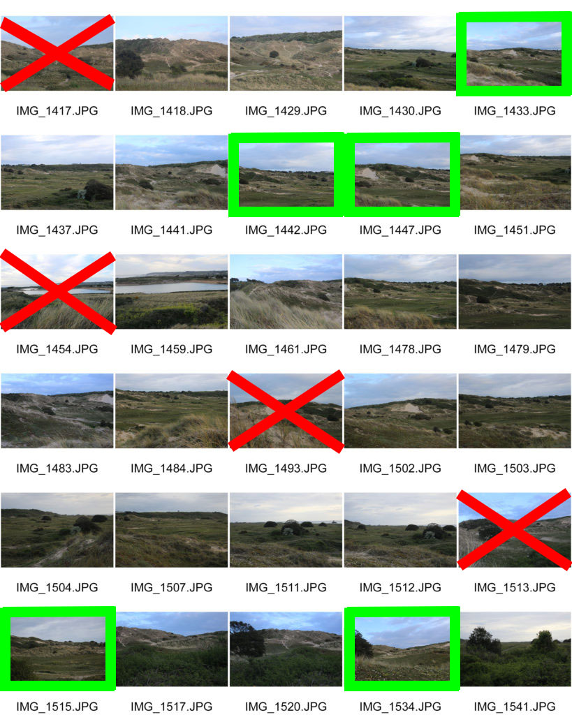
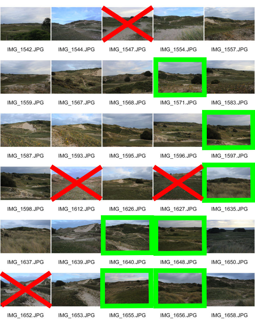
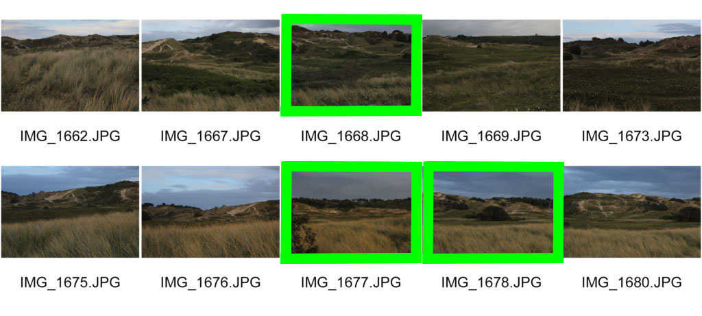
Here I have highlighted in green, the photographs that I think turned out best and will work well when combined with the industrial and urban structures. Also, I have crossed out the images in red that may have been blurry or are under or over-exposed, these are the photographs that I definitely will not edit for my final product.
Felicity Hammond, a British artist based in London, is best known for her landscape photography, which fixates on the incessantly changing landscapes and the debris left behind. She creates her pieces through various methods, the most frequented being collage. Hammond has also been known to create video collages, that focus on the earth’s climate crises, such as her piece named ‘Lagoon’, depicting what rising sea levels would do to a city. First studying Fine Art Photography at the University of Gloucestershire in 2011, Hammond then went to earn her MA in Photography at the Royal College of Art in 2014. Presently, Hammond is a lecturer at Southampton Solent University, which she claims helps her to be constantly thinking about ‘the ever-changing boundaries within photography’.
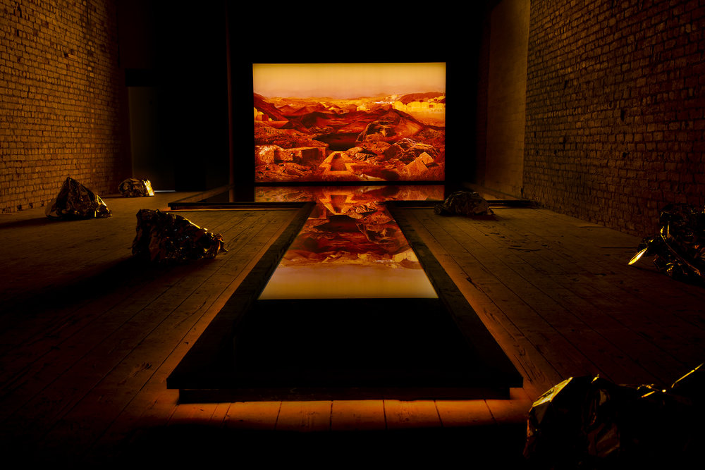
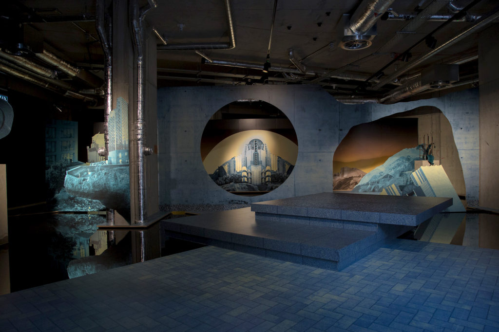
Hammond usually displays her works in an installation manner rather than the traditional gallery. For example for her project named ‘In Defence of Industry’, Hammond presented her image in front of a large light box, and above a water feature on the floor reflecting her landscape.
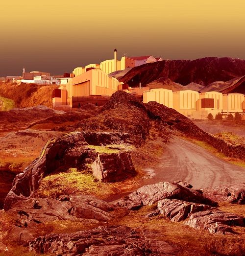
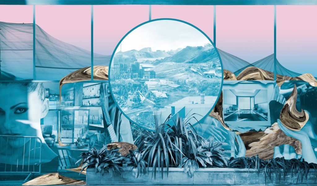


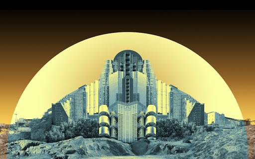
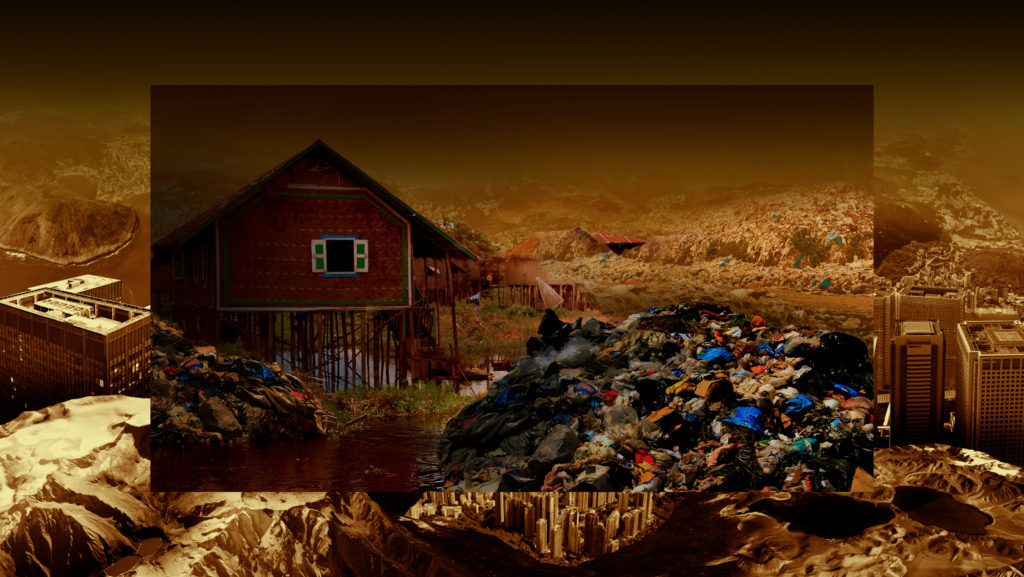

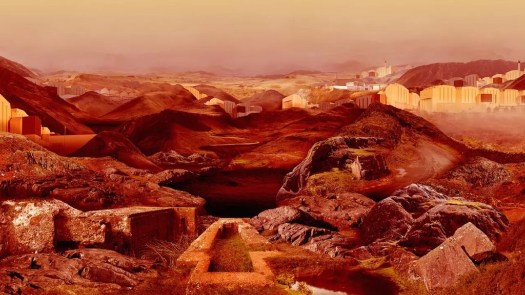
This altered landscape, created by Felicity Hammond, showcases a natural, rural landscape of hills and mountains, that has been invaded by large industrial structures. These beige and white incongruous buildings heavily contrast with the dark tone of the image and the shadows in between the hillsides. In addition, contrast in this piece can also be seen through the difference between the plain and boring tone of the industrial structures, and the rich and saturated hue this image possesses. The leading lines in this collage of images are presented through the ridges of the hills and mountains, as these peaks guide the viewers eye into the background, revealing more out of place structures hidden by the expanse of nature. Although these intrusive buildings look odd in such a rural setting, it can be argued that the focal point of this piece is the dark area of land in the middle, which appears to be a lake, due to it containing the darkest tone seen in the image and its central placement. Here Hammond also has appeared to apply the rule of thirds when taking the photograph for the natural landscape, as a result of the horizon line being located in the upper third of the image.
From a technical viewpoint, it can be said the natural landscape photograph was taken during the hours of sunrise or sunset due to the golden like sky in the background, and the dark orange tint, which may have been a mixture of natural lighting and digital editing by Hammond. This can also be said for the images needed for the buildings, as the front facing walls seem to be lit with the same golden glow. As a result of using natural lighting at this time, it is likely that Hammond used a medium ISO setting, making sure the photograph isn’t under or over exposed. The shutter speed used here was probably medium to fast, as there is no blur or evidence of movement, however the lens would have to be exposed to enough light to allow for a visible image. Furthermore, Hammond may have used a low aperture setting, meaning that the entirety of the rural landscape would possess the same amount of focus, allowing the viewer to explore the background of the image as much as the foreground.
Hammond created this altered landscape to display ‘the relationship between the industrial history of Barrow-in-Furness and the wider Cumbrian landscape’ in terms of its potential future with nuclear industry. Looking at this, it could be implied that here Hammond was aiming to bring attention to the issue revolving around the political side of the impact of nuclear industry. This may be referring to what could be at risk in the potential future, this being the natural landscapes surrounding this town and their need for defence.
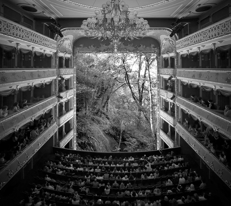
Tanja Deman, born in 1982 Split, Croatia, is best known for her altered landscape pieces, which showcase the juxtaposition between nature and urban landscapes. These works are created through various mediums by Deman, such as photography, film, collage and public art installations. With these she aims to produce pieces that display the ‘dynamics hidden under the surface of both built and natural environment’. After graduating the Academy of Fine Arts in Zagreb, Croatia in 2006, Deman has found success and since gone on to exhibit her work, in various forms, in places such as the USA, Germany, the Netherlands, Italy, the UK and many more.

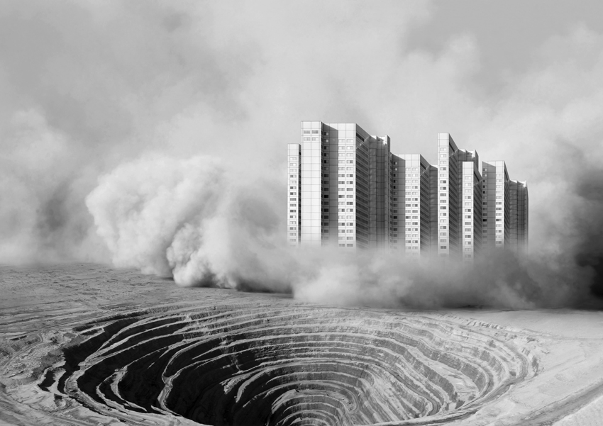


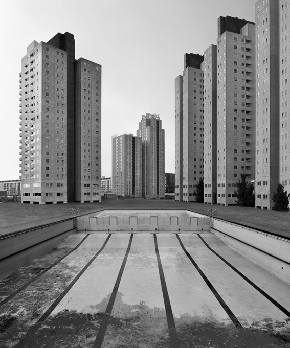
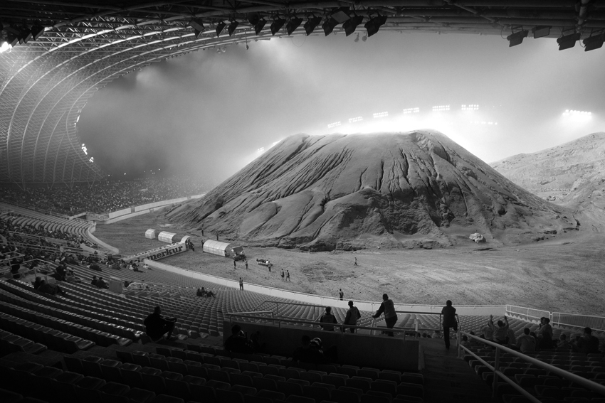
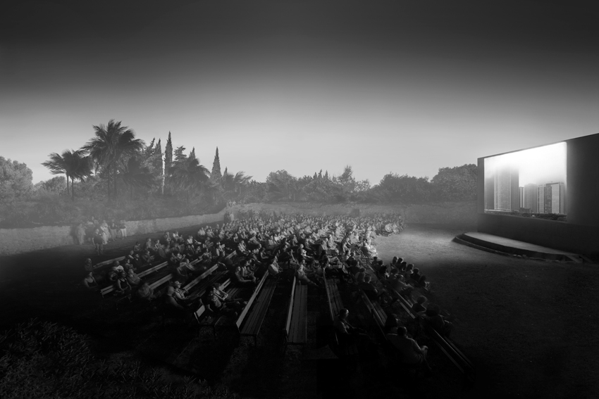
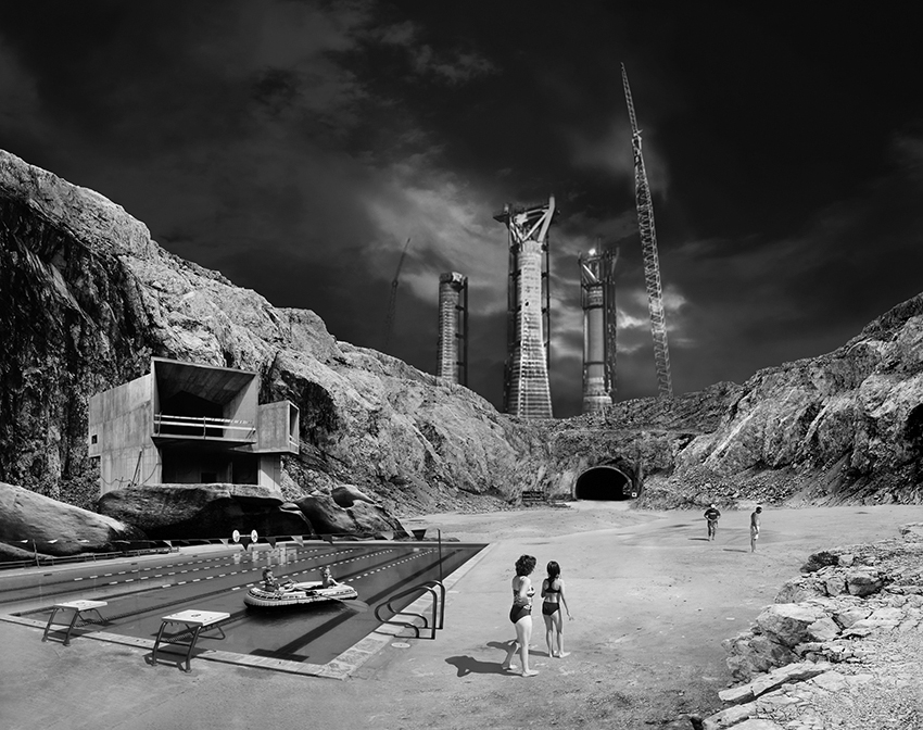
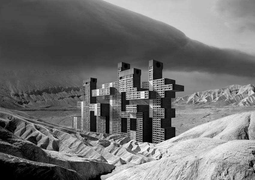
This black and white altered landscape created by Tanja Deman, displays a geometric urban structure surrounded by what appears to be a dry, desert like natural landscape. This dark, imposing building located in the centre of the image, causes a strong contrasts with the natural landscape, not just as it is the only man made structure visible, but also due to the fact it juxtaposes with the light tones of the encompassing hills and ridges. In addition, it can also be said that this contrast between light and dark is increased by Deman’s choice to produce this piece in black and white. It can be argued that this building is the image’s focal point, due to the central placement of the structure within the frame. Furthermore, the leading lines, which are created by peaks and ridges of the hills and mountains, guide the viewer’s eye across the image towards the focal point. It also seems that Deman has framed the photograph of the natural landscape, in order to create an enclosed piece of flat land in the centre, bordered by hills and mountains, in which the conflicting structure can be placed.
To look at this image technically, it can be said that to take the photographs required to produce this piece Deman most likely only used natural lighting at a time soon after midday. This can be seen through the harsh and angled shadows on the hillsides, and the dramatic clouds in the sky limiting the amount of sunlight. As a result of this, the ISO was presumably on a low to medium setting, allowing for the photographs to not be over exposed . Moreover, this also means that the shutter speed was probably on a fast setting, due to the large amounts of light flooding the lens and the lack of motion or blur visible in the piece. It appears tha Deman may have also used a low aperture here, as this broad landscape contains an even range of focus, meaning the viewer can see both the foreground and background clearly.
Taken from the project named ‘Fernweh’, Deman’s intention for this image, and the others in this series, was to showcase a visual representation of man’s incessant need to conquer and urbanise natural landscapes such as this, imposing its rational order on the land. This also explores what the consequences of these actions may lead to or have lead to, which is a constant desire for escapism within nature. With this, it could be implied that the Anthropocene era has been nature’s downfall, leading to the small areas it has been reduced to, becoming a place to escape our own creations.
Whilst both pieces share the same outlook on the anthropic impact on nature and how it is becoming more and more scarce in modern day society, the two images differ and correspond in some areas from a visual standpoint.
Colour: The two altered landscapes differ in this area, as whilst Hammond’s piece is heavily saturated, Deman’s piece is black and white.
Lighting: In both images it is clear that natural lighting was used in order to capture the photographs needed to produce each piece, due to expansive settings of the landscapes.
Tone: It can be argued that Deman’s image presents an intense contrast between light and dark, whereas Hammond’s displays a more gentle tonal range due to its saturated, orange tint.
Line and Shape: The two landscapes coincide in the way that the leading lines created by the peaks and ridges of hills or mountains, however they differ when it comes to the shapes these lines create. This is as in Deman’s piece these lines are harsh, jagged and almost geometric in shape, whilst Hammond’s are more curved and gentle.
Composition: These two altered landscapes are dissimilar when it comes to the composition of the image, as Hammond has incorporated various incongruous structures throughout her natural landscape, located in both the foreground and background, unlike Deman who has focused on one singular building and framed it in the centre of the image.
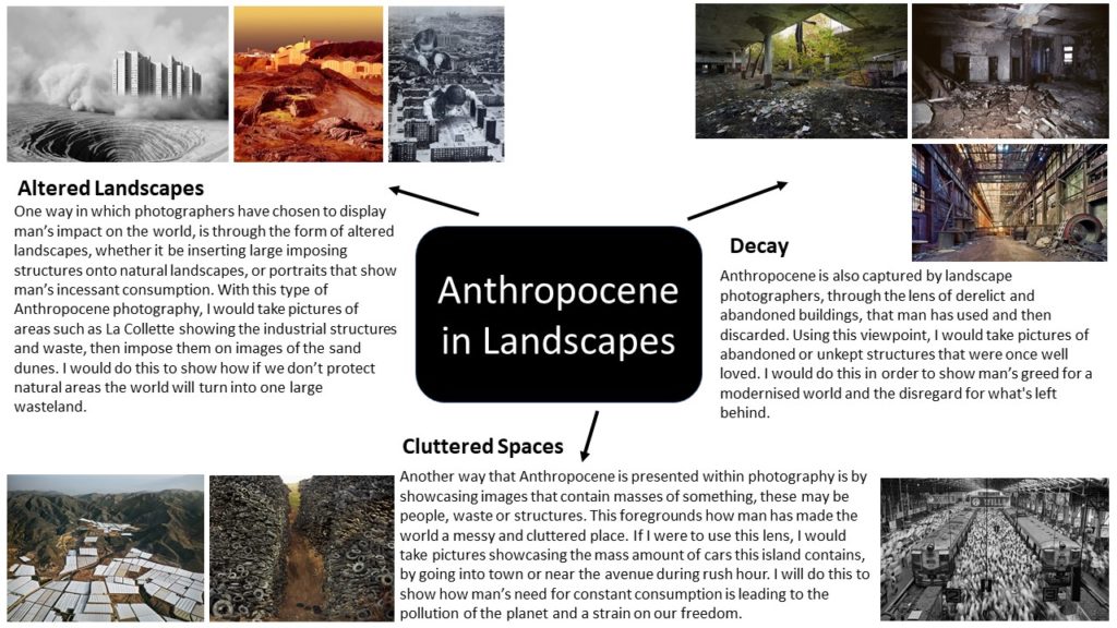
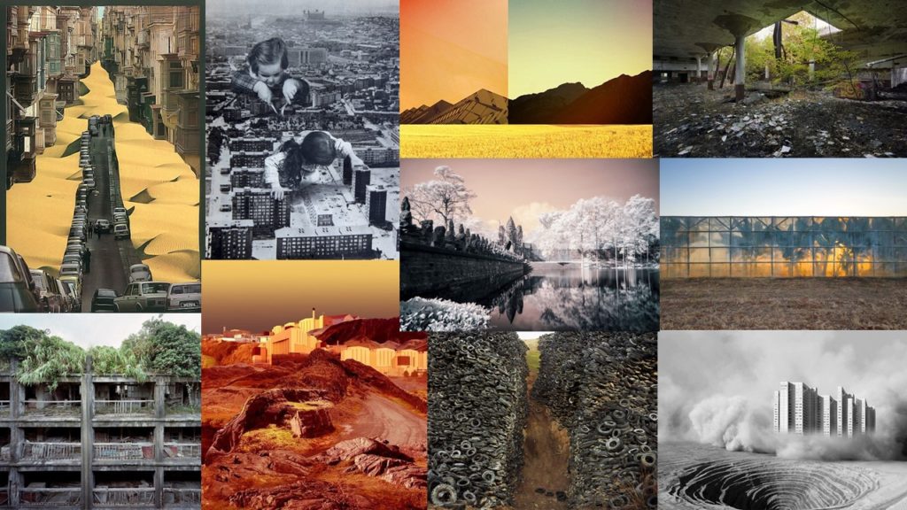
I am going to focus my work on Anthropocene that is shown through the form of landscapes, looking more at altered landscapes. I am planning on studying the work of photographers Felicity Hammond and Tanja Deman, as I wish to convey a similar message to what they present in their work, within my own photographs. One way I could portray a similar message denouncing man’s negative impact on the world is by photographing protected areas in Jersey, such as Jersey’s National Park, and edit in structures from La Colette and the tip to show what would happen to our beautiful landscapes if we didn’t conserve them.
Anthropocene is a term which is used to define the geological age that we are currently in, spanning from 2.6 million years ago to the present day, described as the time period in which humans have had the most impact and influence on this earth, including the environmental and climate status. Many artists and photographers also use this term, in order to categorize their works into the style that investigates and focuses on how us humans are altering the earth, and how it will affect us in the future. This is usually presented in many different ways, whether it be in the form of landscapes, portraits or abstracts.
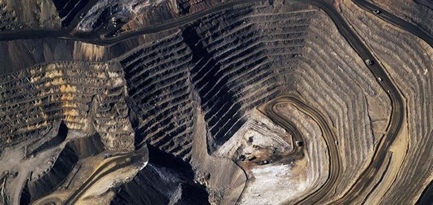
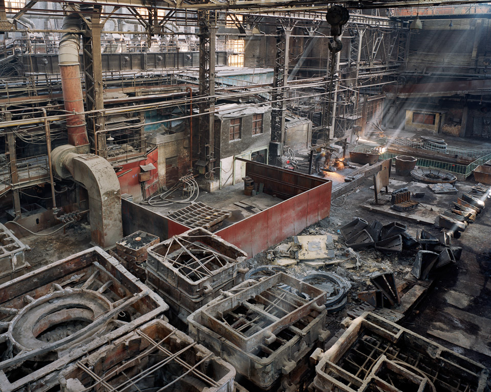
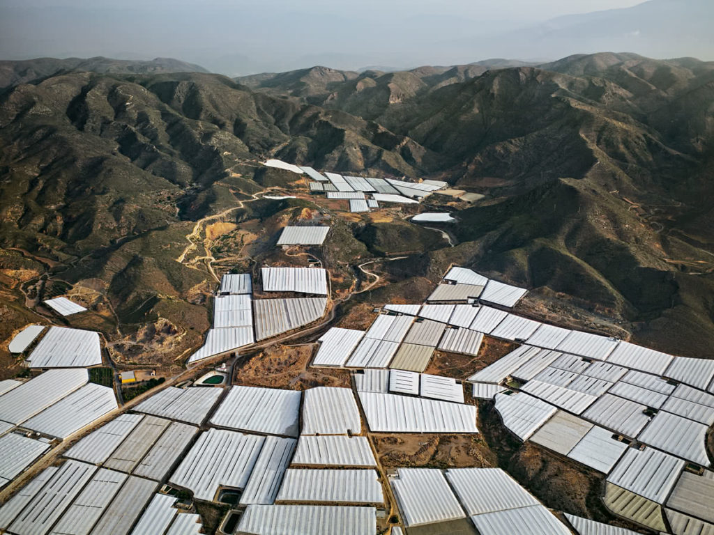
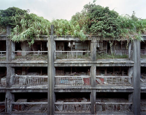


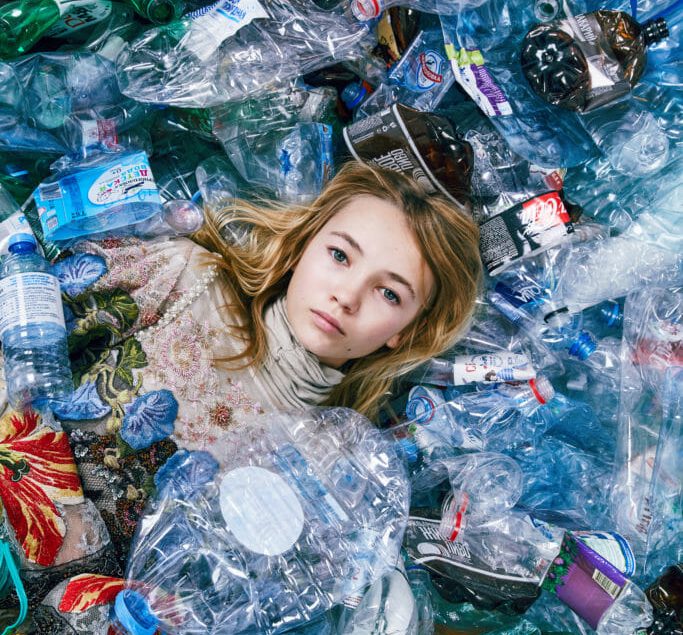



Gabriele Basilico was an Italian landscape photographer, born in 1944, best known for his fascination with the changing landscape that was becoming urbanised. Before taking on photography as a profession, Basilico first studied to be an architect, which may explain his eye for the geometric structures showcased in his work. This striking architectural photography soon caught peoples eyes, including the French Government which commissioned him to record the transformation of the Transalpine landscapes, amongst other photographers in which he was the only Italian. Later Basilico also went on to document the effects of the war in Beirut, the Lebanese capital, which had previously been ongoing for 15 years.
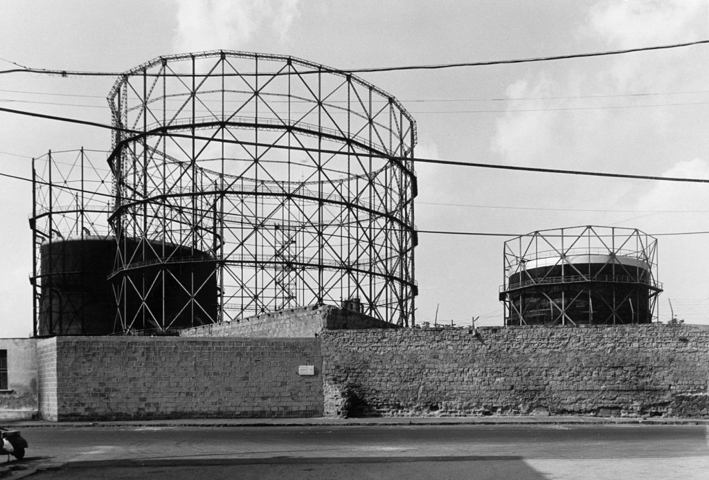
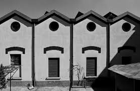
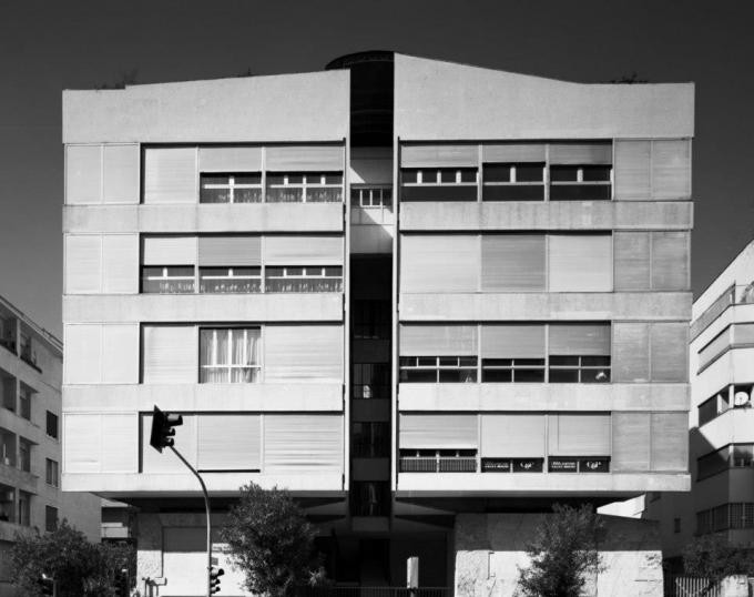
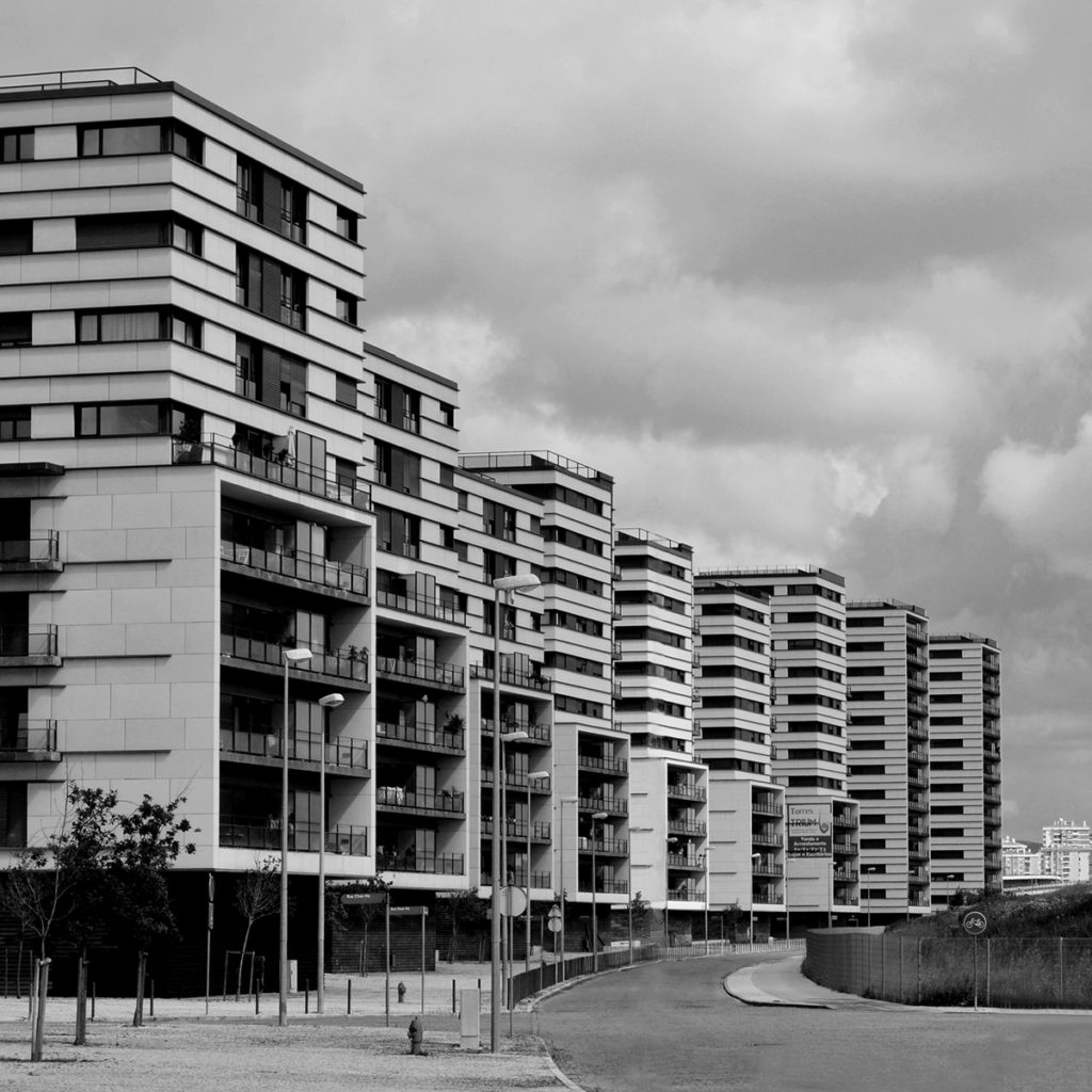
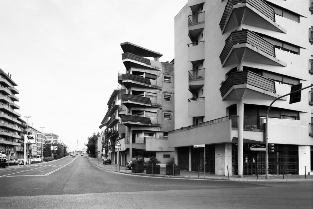
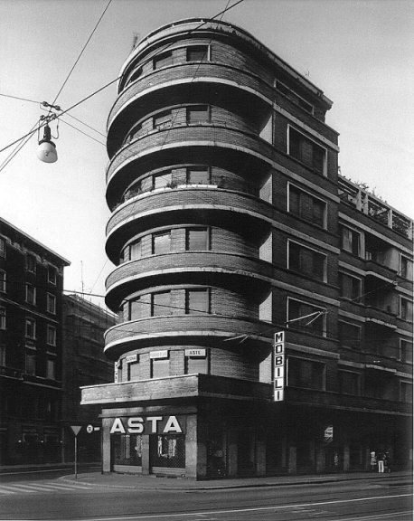
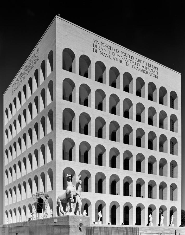
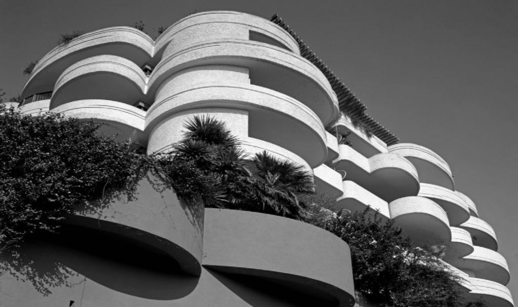
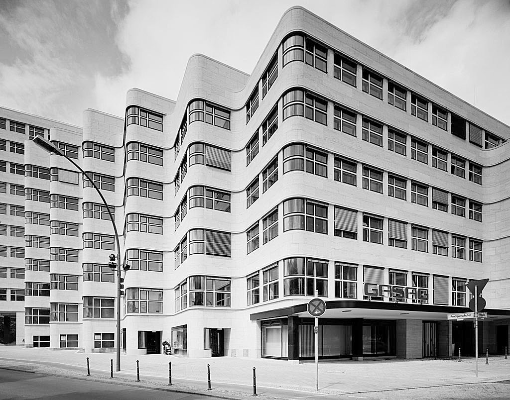

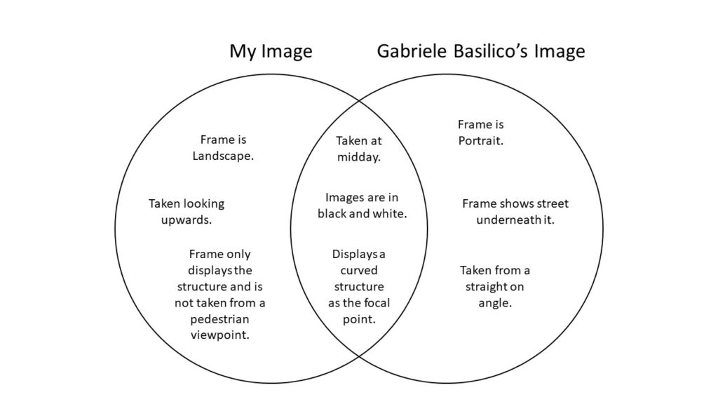
This black and white photograph taken by Gabriele Basilico showcases a curved building, located in the centre of the frame. This structure is framed by empty space both above and below the building, as the street shown appears to be desolate similar to the overcast sky. Here, it can be seen that Basilico took this photograph from a pedestrian viewpoint, looking slightly upwards. The leading lines in this composition are created by the curved, horizontal, white stripes that encompass the building, leading your eye from the right into the centre of the image, which is highlighted by the sun. In addition, these lines strongly contrast with the dark shadows underneath each balcony.
From a technical viewpoint, it can be said that Basilico only used natural lighting in order to capture this landscape, due to the fact it has been taken in a large open space outside, most likely at midday as the few shadows that are visible are going straight down, rather than at an angle. Furthermore, this means that the ISO setting used must have been a medium to low one, due to the large amount of natural light flooding the lens, allowing for a photograph that is not over exposed. This also could mean that Basilico used a fast shutter speed because of this large amount of light, also there are no visible blurs or movements here. It appears that the aperture was on a medium to low setting, as the focal structure is located far away from the photographer and the building in the background also seem to have a similar amount of focus placed on them.
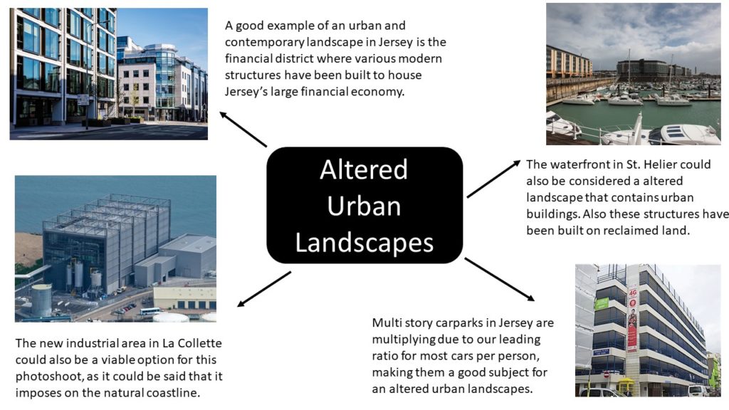
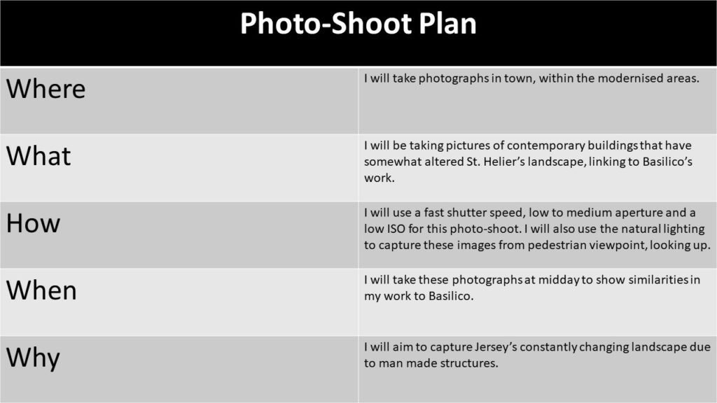
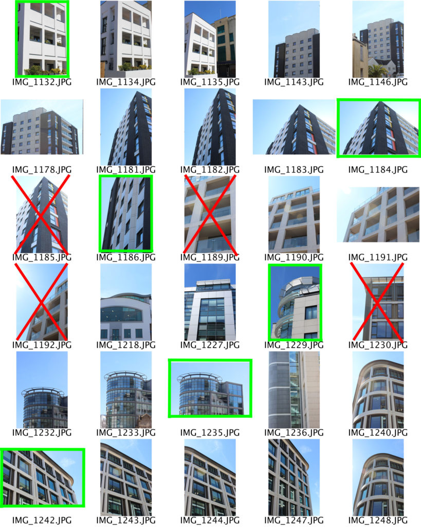
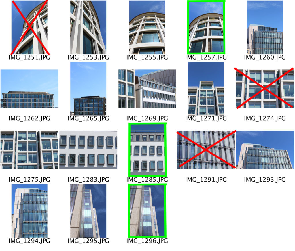
For this photoshoot I took pictures around the modernised areas of St. Helier, such as the finance and banking building along the Esplanade. Here I have highlighted the image I believe are my best, and wish to edit, and crossed out the images that are either over exposed or blurry.
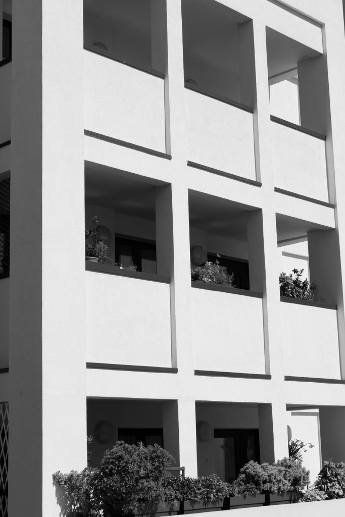
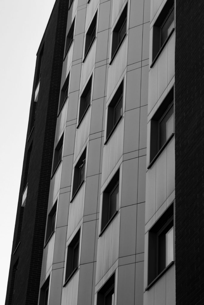
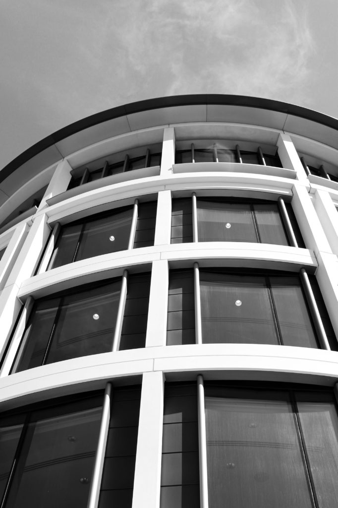
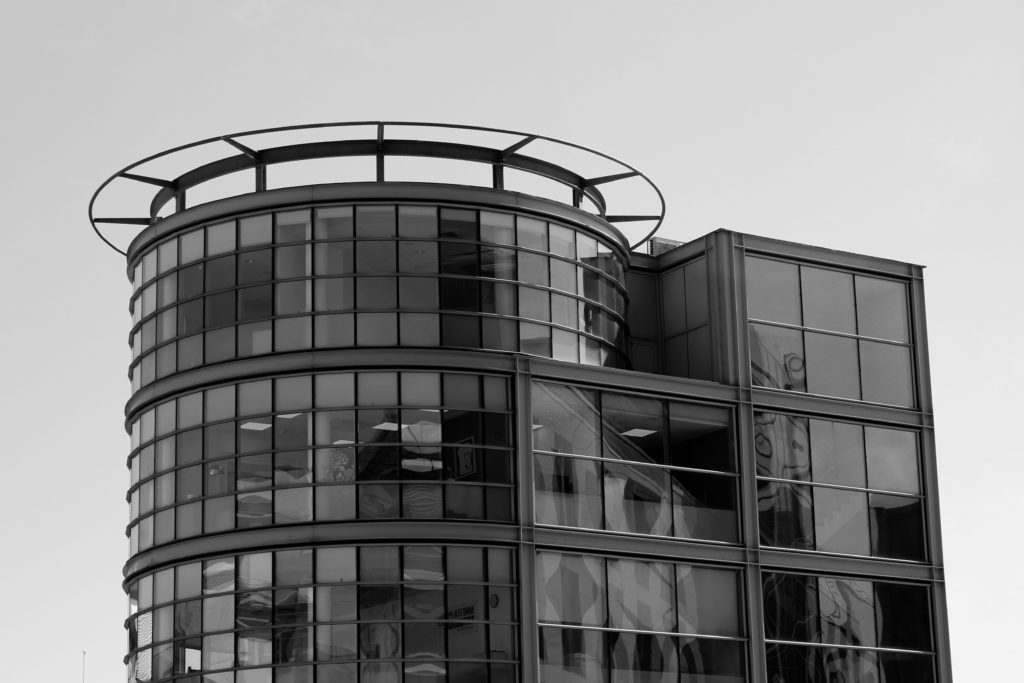

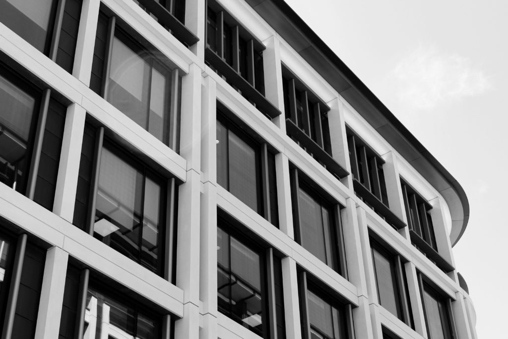
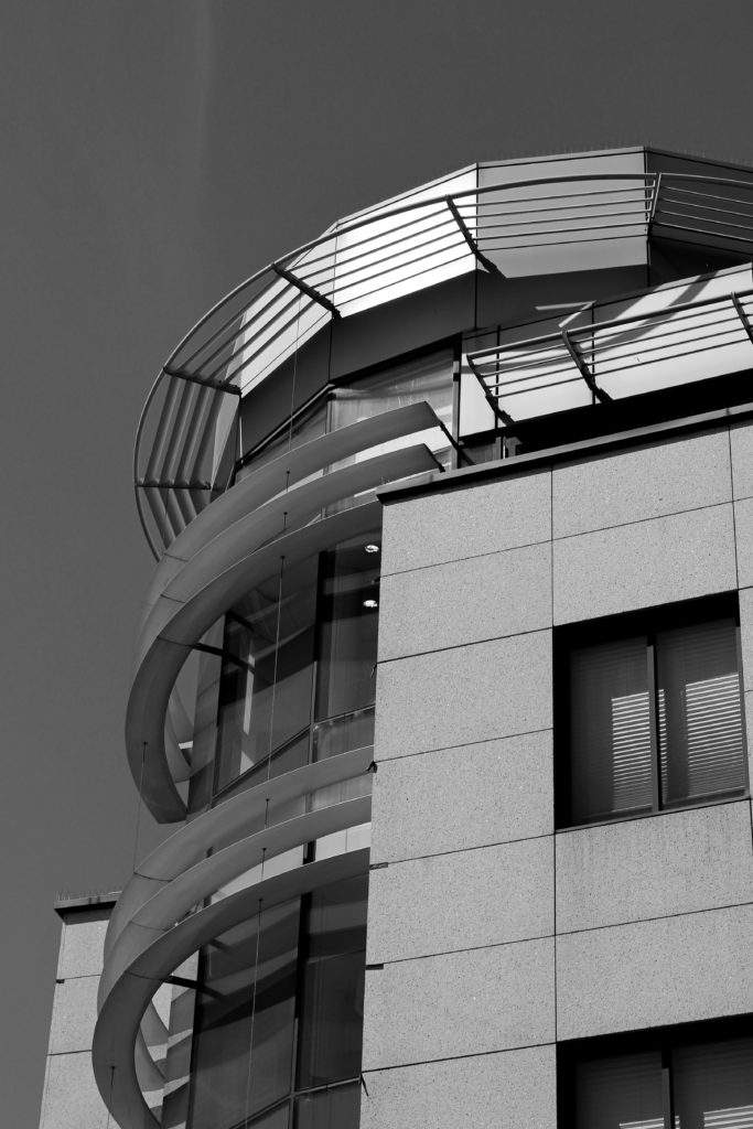
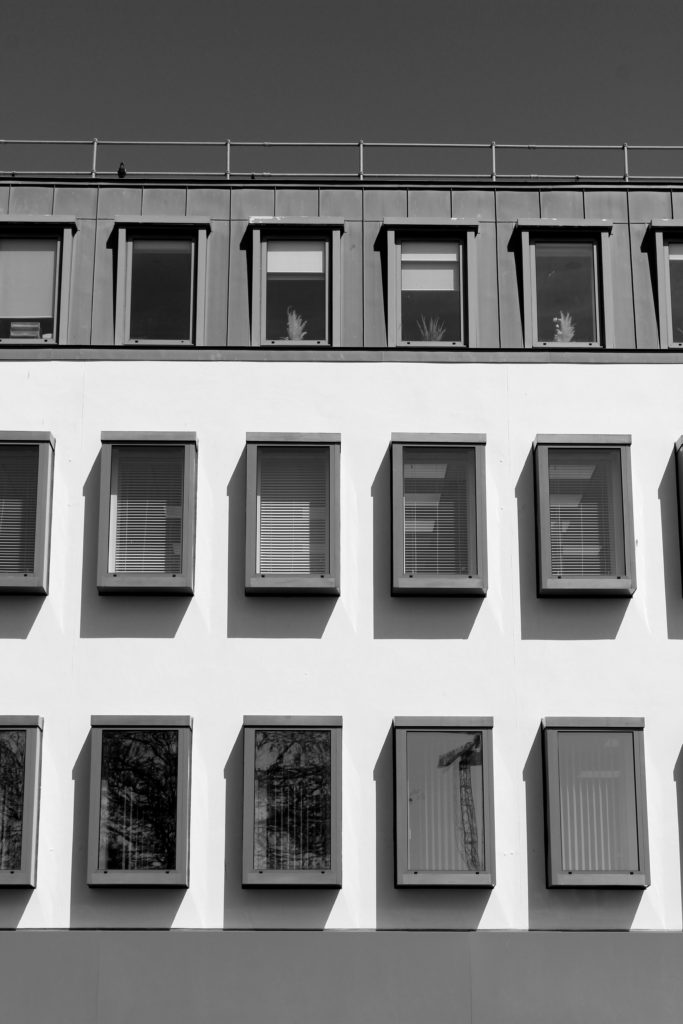
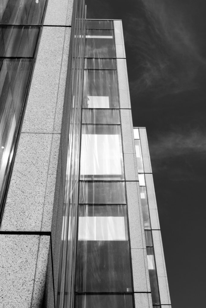
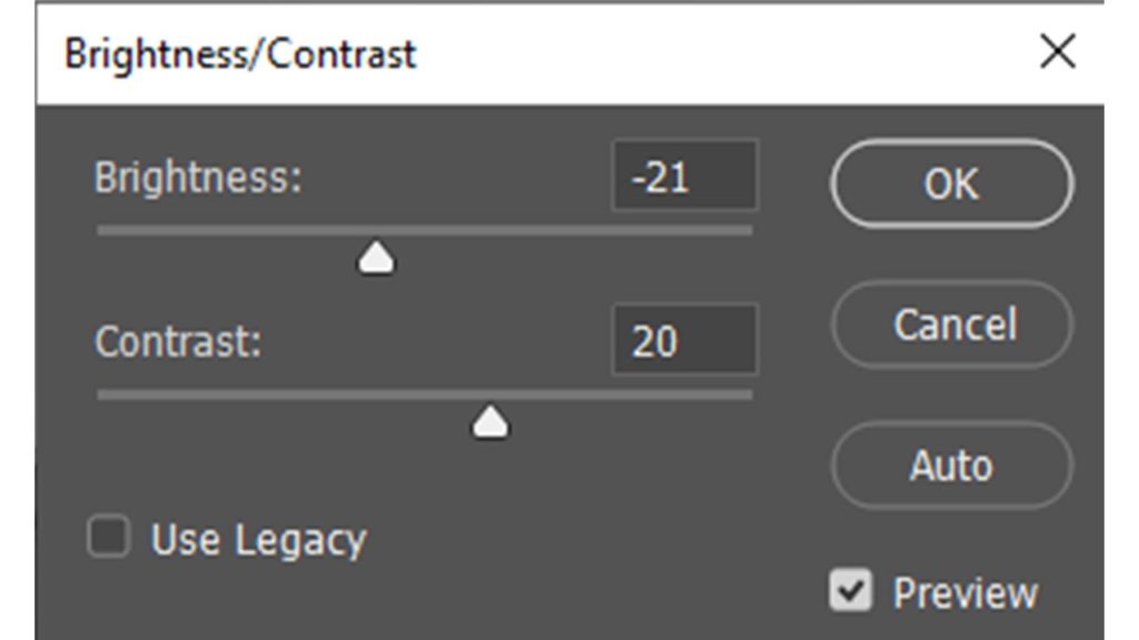
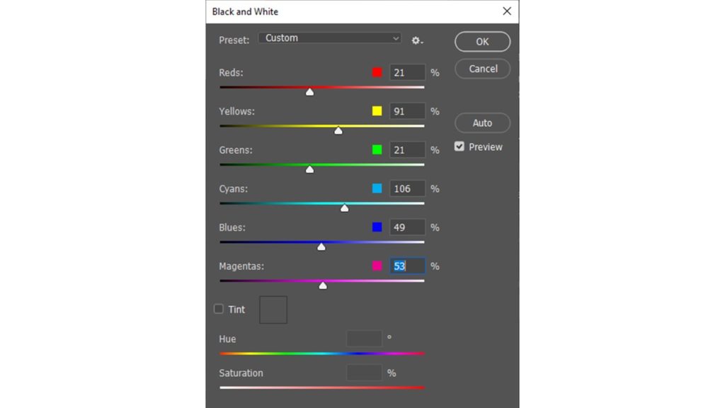
For these photographs taken in the style of Gabriele Basilico, I started off editing them by converting the images into black and white, in order to make them look similar to Basilico’s film photographs. I also adjusted other aspects, such as increasing the contrast to create a juxtaposition between light and dark.


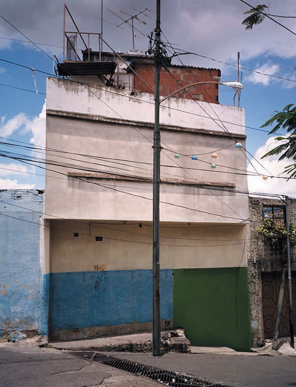
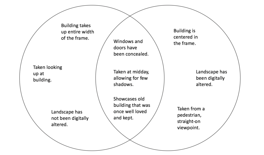
Alexander Apostol is a Venezuelan photographer, born in 1969, known for his fascination with the urban landscapes in the city of Caracas, which originated in the 1950s. Within some of Apostol’s photographs, he has digitally altered the buildings concealing any doors and windows in view, creating an almost lifeless looking structure of the past that would strongly juxtapose any modern day architecture.
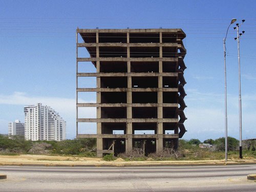


This colour photograph taken by Alexander Apostol displays a decaying building placed centrally in the image, in which the doors and windows have been edited out digitally, framed by the two smaller structures on either side. Leading lines in this piece by Apostol, are created by the telephone lines that are scattered around the image, guiding the viewer’s eye horizontally across the image, and the pole that dissects the photograph through the middle. These dark wires and pole also act as a strong contrast to the off white tone of the building. It can be said that Apostol took this photograph from a straight on pedestrian viewpoint, much like many photographers involved in the New Topographic movement.
From a technical viewpoint, it appears that Apostol has depended on the midday natural light to capture this photograph, as very few shadows can be seen here. In addition, this means that the ISO used to take this image would most likely be on a low setting, in order to produce a photograph that is not over exposed. Apostol also most likely used a fast shutter speed for this piece, as there is no visible blur or motion presented in the image. Furthermore, the aperture setting used must have been low as well, due to the clouds in the background being in focus as well as the focal point of the building.


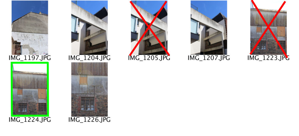
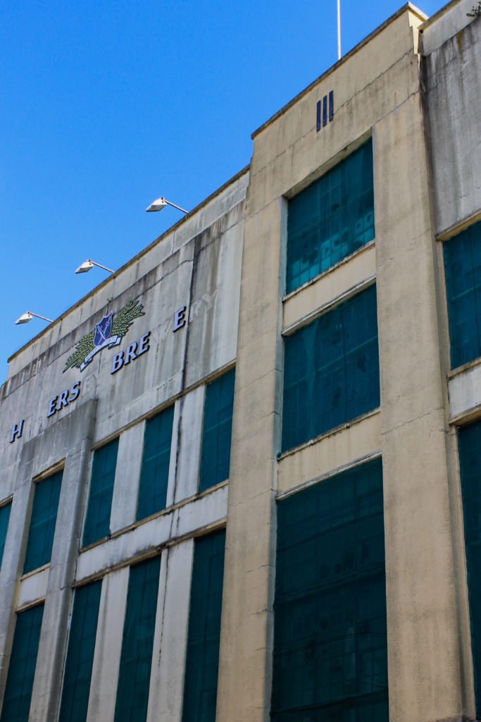
For this photo-shoot I walked around town near the old brewery and behind the post office taking pictures of buildings showing signs of decay or abandonment, such as boarded up windows and doors, mould and rust.


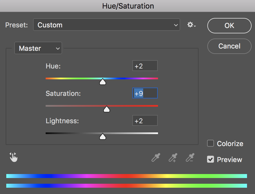
To edit my photographs in the style of Alexander Apostol I used photoshop to increase things such as the contrast, saturation, and texture of the images. I did this to enhance the sense of decay the buildings were undergoing.

