All posts by Olivia M-G

Filters

Author:
Category:

Statement of Intent

What you want to explore?

With this project I want to explore the subject of family, specifically generational and economic struggles that occur, as looking into my family history inspires me to create images that provide a truthful telling of the past. This topic also allows me to gain a wider understanding of my own identity and how I am in the place I’m in now.

Why it matters to you?

This matters to me as I believe that these issues are a part of everyone’s family identity, but in particular these are struggles that the older generations in my family have suffered and have had to work hard to distance themselves from. However these subjects are usually avoided when looking back on your family identity, due to it sometimes being considered taboo to talk about such topics, meaning you are sometimes unable to fully grasp the reality of your personal history. It is also something that I wish to learn more about myself as I continue this project, and hope to be closer to my family as a result of it. In addition, I believe it is important to talk about these things in order to destigmatise domestic struggles and not feel the need to present a picture perfect family.


How you wish to develop your project?

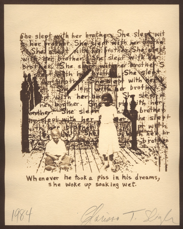
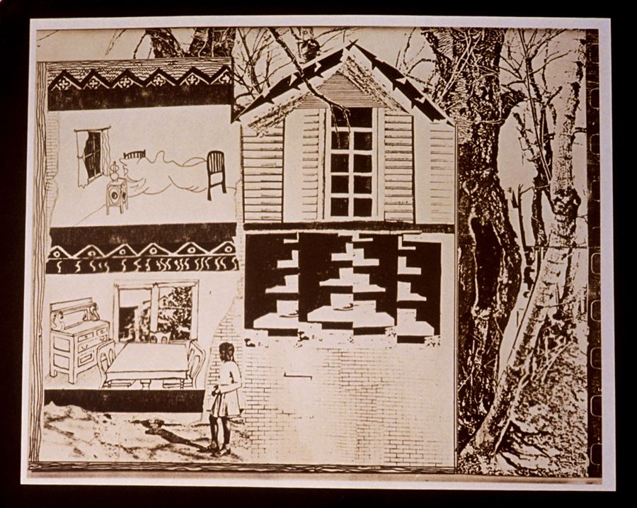
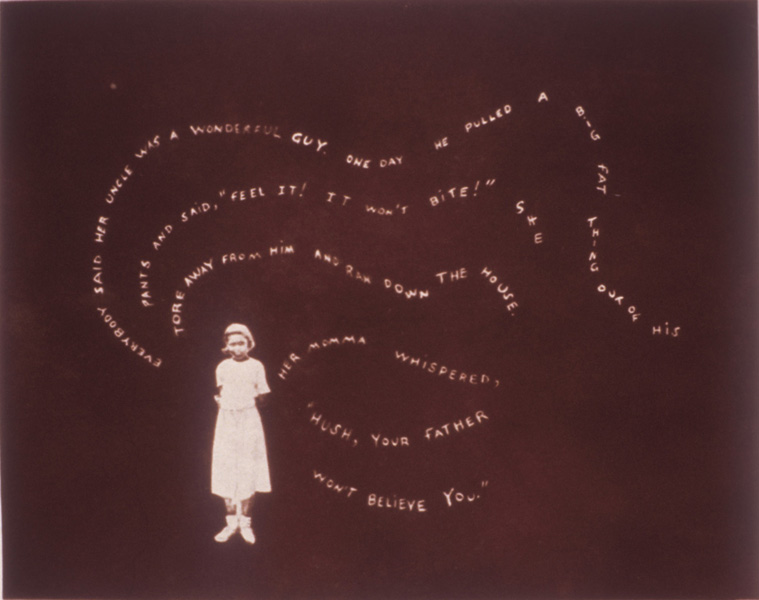
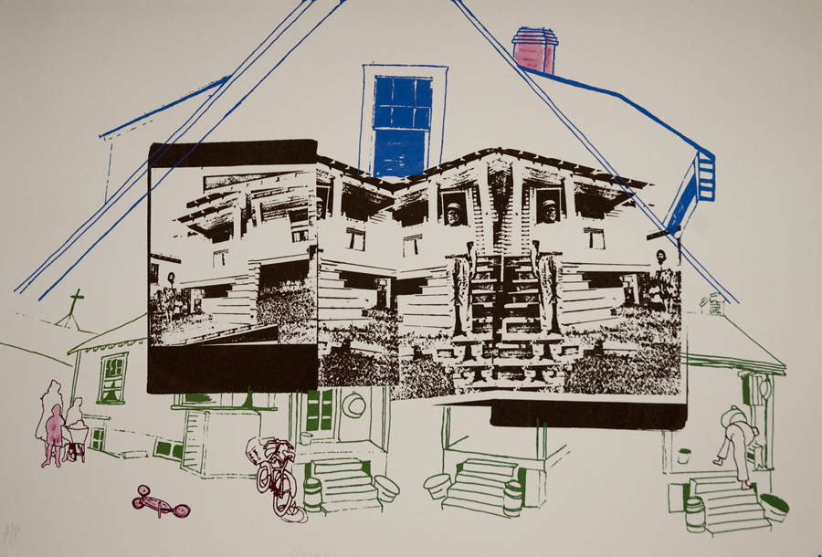
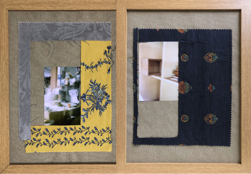
I wish to develop this project using various different mediums, such as stitching, collage and drawing in order to create my images. This is due to being inspired by artists such as Clarissa Sligh and Carolle Benitah, who produce their work in a similar manner. My aim is to do this using family archive photographs, documents and new sets of images that showcase my family in the present. With this I am hoping to focus on the upbringing and adult lives of my grandparent, comparing it to the lives they have created for their children and myself.


When and where you intend to begin your study?

I intend to begin this study by producing my first set of photographs in my house as well as other domestic settings taking family portraits, which will be staged. Once I create more artist studies I will have a better understanding of the style in which I want to shoot and what my final products will look like, using these artists as inspiration. After this I will be able to start these shoots during the holidays, as my family will be coming over for a short time from England.

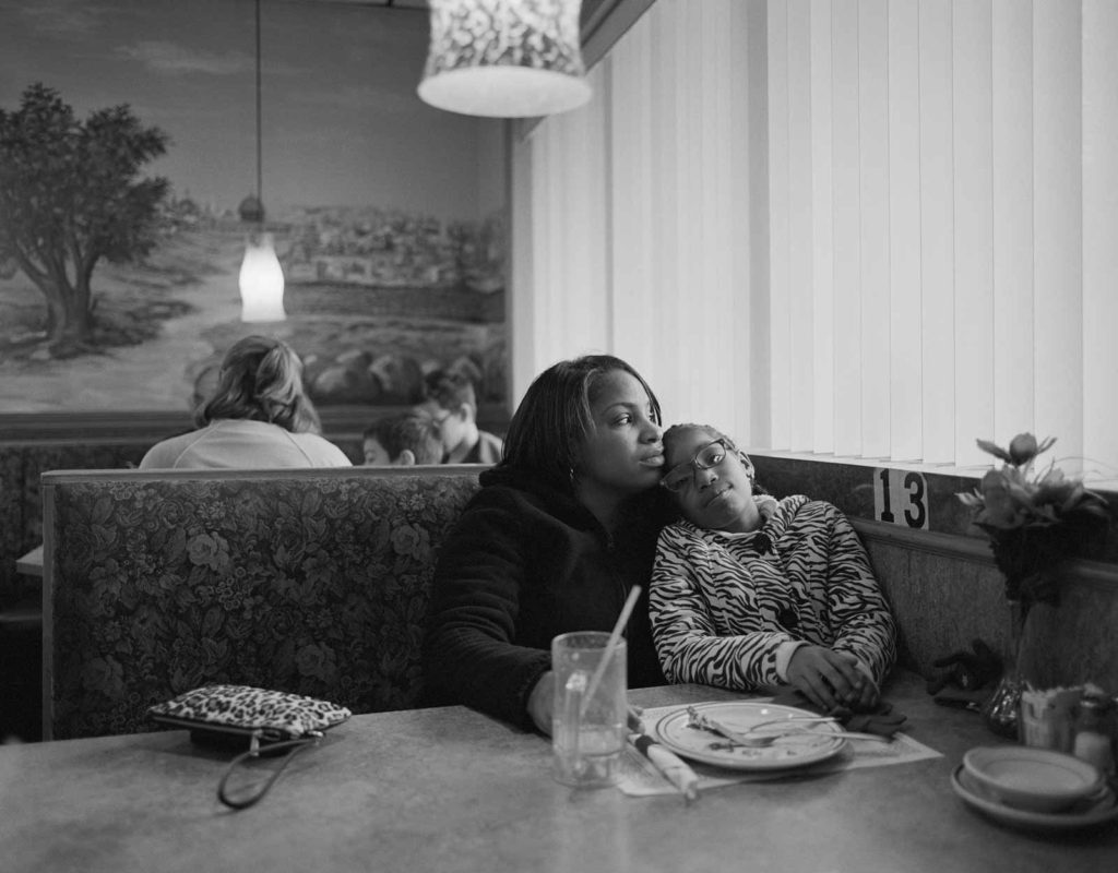
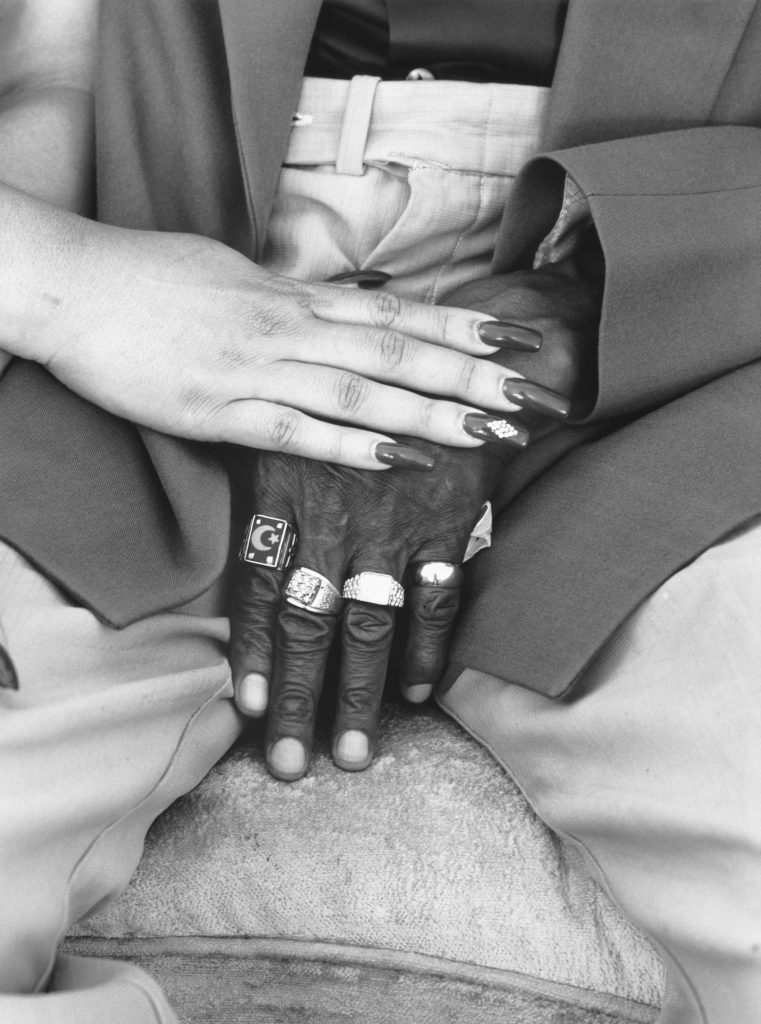
Contextual Study – LaToya Ruby Frazier

Quotes

“My inability to articulate in words the harmful and painful effects the environment placed on my family made me turn to visual art as an outlet”

“At times the text functions as an image and the photograph becomes the visual language that creates a tension.”

“I look for a narrative or context that will amplify the voices of the marginalized”

I agree with what Frazier is stating here, as I believe that photography can be used as a powerful tool for truth that is more difficult to communicate through words. I also agree that photography provides a platform for the minorities of the world and it is essential it is used in this manner.

Analysis

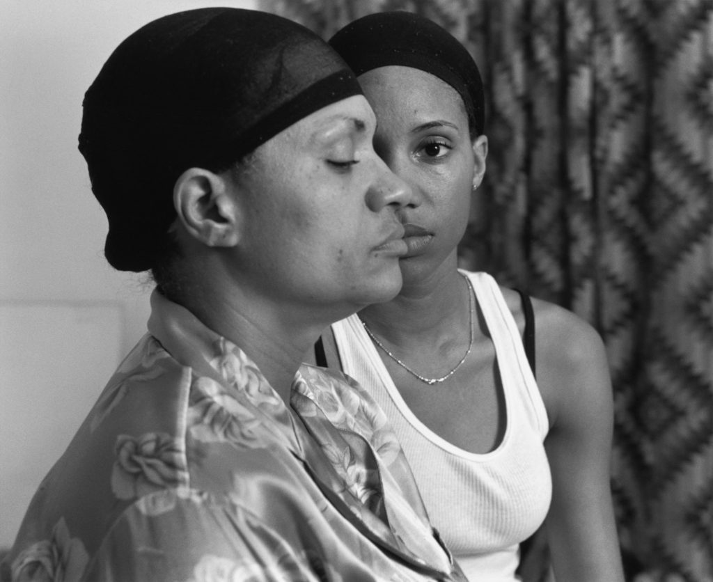
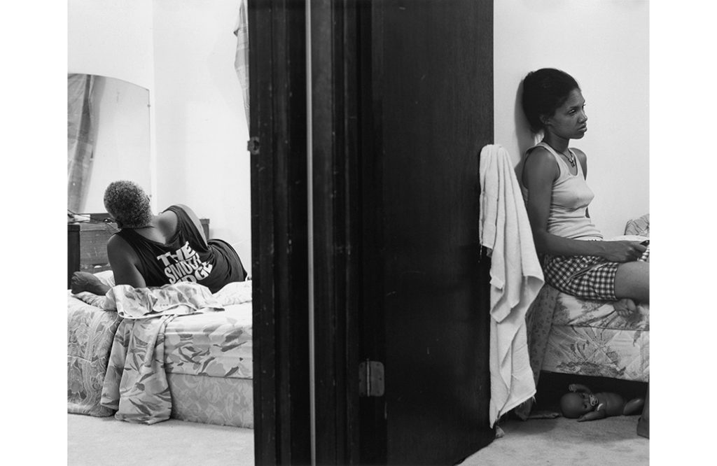
LaToya Ruby Frazier – Momme (2008)

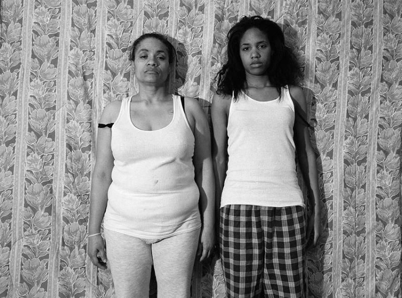
This black and white portrait photograph taken by LaToya Ruby Frazier showcases Frazier and her mother, with her mother in the foreground of the image peering down and concealing half of Frazier’s face, who is placed behind her and staring into the lens. Here the two women are framed centrally, with empty space on either side of them, allowing the dissection of Frazier’s face to occur in the centre. It can be said that leading lines in this image are created by the outline of the mother’s side profile, as it leads the viewers eye from the bottom left corner up and around the photograph towards the focal point, which I believe to be Frazier’s stern gaze, connecting with her features. The same can be said for the lines created by the folds in the curtains, which draw the viewers attentions down from the top of the image to Frazier in the centre. Contrast in this piece is created by the opposing tones of the mother and daughter’s matching hairnets with Frazier’s bright, white tank top.

From a technical viewpoint it can be said that Frazier took this image with artificial, soft lighting as if it were taken with the room lighting there would be shadows on the face similar to butterfly lighting, which there are not. Also the curtains are drawn behind them which minimises the possibility of Frazier using natural light. The aperture setting used here appears to be a mid to large as the domestic background behind the two subjects is slightly out of focus, allowing for more attention to be placed on Frazier and her mother. Furthermore, Frazier most likely used a mid to high ISO setting as it appears that the room is dark, with the exception of the artificial lighting placed in front of them, assuring the photograph would not be under exposed. It seems that the shutter speed setting used was a medium one, meaning there would be no blur due to movement but still allowing light to enter the lens for long enough to not create an under exposed image.

This image is a part of Frazier’s 2014 book ‘The Notions of Family’ which was an attempt to explore the legacy of racism and economic decline in America’s small towns. Here Frazier is trying to emulate the traditional black and white style of documentary photography, recording domestic subjects and settings. From the facial expressions conveyed in this piece it can be said that there seems to be some tension between the mother and daughter. This may be a comment on the effects the economic environment of Frazier’s home town (Braddock) has on her family. As well as this, these effects may result in strains of relationships, such as mother and daughter, as conversations on the topic of money are known for causing divisions, especially in a domestic setting. However, the matching hairnets the subjects in this image are wearing, may be a symbol of unity in Frazier’s family that still stands despite these strains. In addition, the position of Frazier and her mother can be argued to be a comment on generational reaction to injustice, with Frazier symbolising the rising voice of the youth who question and protest the governments fail to amend the crisis of poverty, in contrast with the older generations who may not see a reason to question the system in which they have lived their whole lives in.

Clarissa Sligh Artist reference

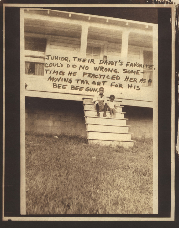
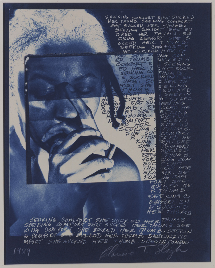
Clarissa Sligh, born in 1939, is an American artist and woman of colour who is best known for her work that comments on various social issues that relate to her own identity. Sligh creates her pieces through different mediums, including photography, collage and drawings. Sligh’s love for photography started at a young age, asking for a camera for her 12th birthday. However, Sligh only started to pursue this as a career path after quitting her job at NASA and working two part time jobs whilst taking painting classes at Howard University, after vowing to “find a richer life, with art making a part of it.”. It was here she claims she first started to see herself as an artist. Sligh’s series ‘Reframing the Past’, shown below, displays Sligh’s old family photographs and combines them with other images, drawings or text in a collage like manner. Here she re-reads and re-evaluates her family’s photo albums.

Analysis

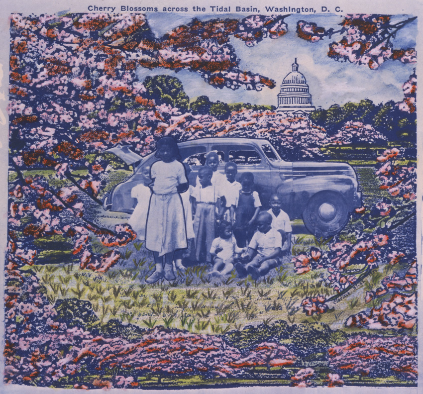
3_Cherry Blossoms_1984_3x2.5
Clarissa Sligh – Reframing the Past

This collage image created by Clarissa Sligh showcases an old photograph of Sligh’s family standing in front of what is most likely their family car, placed in a setting of blossoming nature in front of what appears to be the USA’s capitol building. This image seems to be composed of cut outs of images and drawings, which could be from a post card, however the portrait in the centre looks as if it has been blended into the illustrated background, meaning that Sligh may have uses a tool such as Photoshop to artificially layer these images. The black and white tone of Sligh’s family portrait strongly contrasts with the vibrance of the surrounding artificial setting. Here the branches of the cut out trees frame the central portrait, encircling it. These branches act as leading lines in this composition, drawing the viewer’s eye around the edges of the piece and into the centre photograph, which acts as the focal point of the image, as well as into the background towards the capitol building. There is little amounts of empty space in this piece, with the exceptions being the sky surrounding the capitol building and the illustrated grass in front of the portrait.

From at technical viewpoint, it can be said that from looking at the central image, natural light was used to take this photograph, as it is taken outside in an informal manner. This appears to have been taken at midday, due to the shadows being directly below the car and the children. As a result of the children in the image it is likely that a fast shutter speed was used to take this photography, as the younger children appear to still be in movement but are not blurry. In addition, the aperture used seems to have been small to mid setting, as the photograph is taken from further back, allowing to capture all the children, and the car behind them appears to have the same amount of focus placed on it. However as the remaining background has been cut out, it is hard to say this for definite. The ISO setting here was also most likely low, due to the large amounts of natural light entering the lens.

This piece of work is part of Sligh’s series ‘Reframing the Past’ which she stated was an attempt to re-evaluate and re-investigate her family photo album. She did this after realising that her early family album project was a produced through the lens of a stereotypical white American family, meaning that with this project her aim was to create a record of positive images of her black family. With this information, it could be argued that this image was an attempt to place her family in an idealistic setting in which she wished she was surrounded by in her youth. With this the capitol building in the background could represent the traditional American family values she feels she was deprived of. This may be a comment on racial injustice and how black people in The USA were forced to conform to colonialist views that white people were more civilised. This in turn forced many black people to have to surrender their cultural identities and backgrounds to these Eurocentric ones that they had been forced into. Alternatively, Sligh may also be trying to communicate how it actually felt to grow up in her family, surrounded by life and vibrance, which the original photograph may not fully indicate.

Personal Study – Mind Map and mood-Board

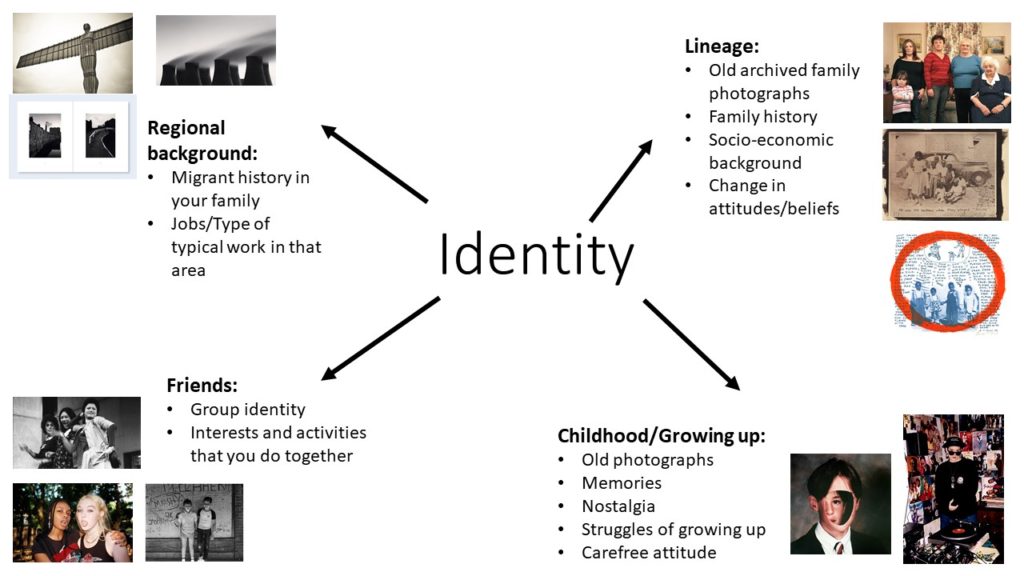
Here I have explored certain ideas that relate to the theme of identity, touching on subjects that I found interesting whilst studying the topic of Identity and Community in year 12 and 13. This allowed me to list any sub-topics I could go into within these categories and enabled me to think of ways I could link this to my personal identity. I am particularly interested in developing my knowledge of my family background through photography and collage. With this the subject of lineage or family would work best as it would allow me to explore some elements of childhood and regional backgrounds within it.

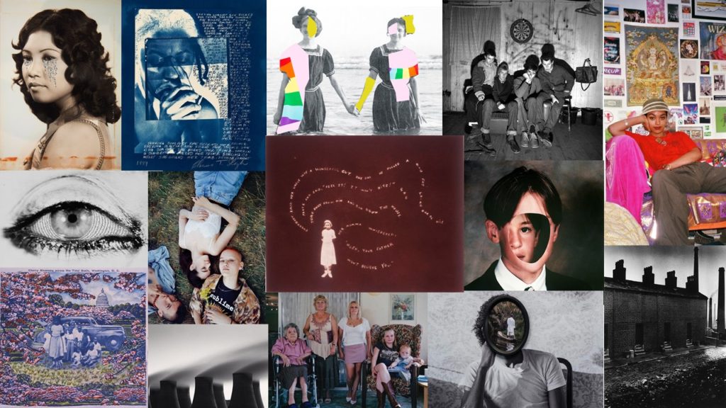
This mood board I have compiled includes photographs that relate to the four subjects stated in my mind map, with quite a few using multiple mediums to create one image, something I would like to experiment with and incorporate within my own work. The images I found especially interesting from researching these types of photography, were created by artist Clarissa Sligh who creates collages from her old family photographs to reshape the past in one of her projects, similarly to Carole Benitah.

Review and Reflect

During my time looking at the topic of Identity and Community in year 12 and year 13 I have learnt various ways in which to produce a final image or piece, in turn discovering what themes, mediums, movements, techniques and methods inspired me the most. With this I mainly focused on the medium of photography, however I have also explored how this form of expression can be elevated by incorporating other mediums such as embroidery and animation into my work. This was evident when looking at the works of Yulia Makeyeva, who adds to her photographic pieces by including textile and needlework in and around her images. We were also given the opportunity to take part in a workshop with her, learning the art of embroidery and experimenting with collage and stop motion animation.

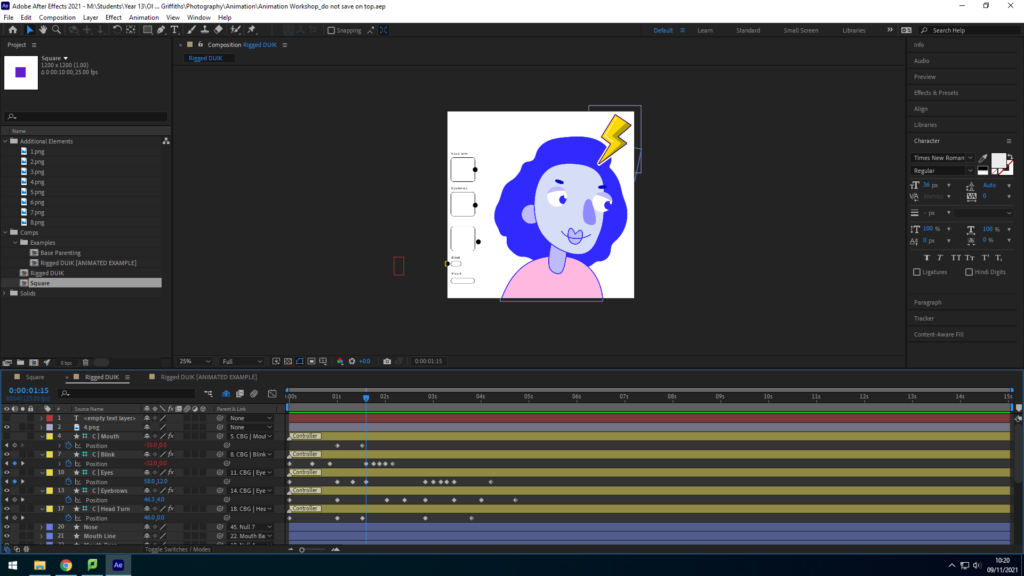
I was also fascinated by embroidery artist Billie Zangewa, who relates to the theme of identity and community through her autobiographical portrayals of womanhood and motherhood, using the technique of needlework. Another aspect of Zangewa’s work that interested me was her representation of the importance of women in society and the oppression they suffer coinciding with the feminist movement. In addition, I have also explored the medium of animation and learnt how to use programs such as Adobe After Affects in order to create such pieces, through the workshop with local animator Liam Nunn. With this we experimented with different sequences and movements, ultimately creating a ten second simple animation. This linked with the identity and community of the island due to the fact that Nunn has worked on various projects that showcase our islands unique identity with companies such as Jersey Dairy.

Animation experimentation

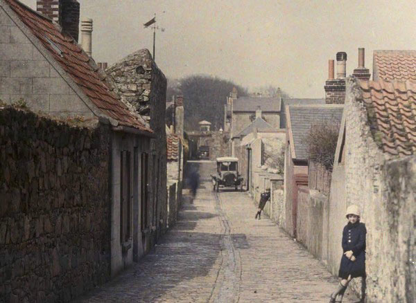
During year 12 I also developed my understanding and gained a new appreciation of the original photographic process and pioneers of photography on the island during the late 19th century and early 20th century, such as Emile Guiton who used the Autochrome process invented in 1903 to develop his photographs. This knowledge was gained through class visits to the Jersey Archives, which holds thousands of images that tell stories of the islands evolving identity. With this I found this particularly interesting as by looking at archived images it gave us an insight to the types of people and communities existing in Jersey at the time. We related this to our personal identities by researching our own family archives, and learning more about our lineage and regional backgrounds.

Emile Guiton, Marett Road

Overall however, what inspired me the most was when I had the opportunity to look at the work of Carolle Benitah, and her use of stitching and collage using archived family photographs to display her own personal identity, and how she wants to change it. This work inspired me to create work in a similar style to her, to showcase the identities of different people’s regional backgrounds, experimenting with collage.

Island Identity Project

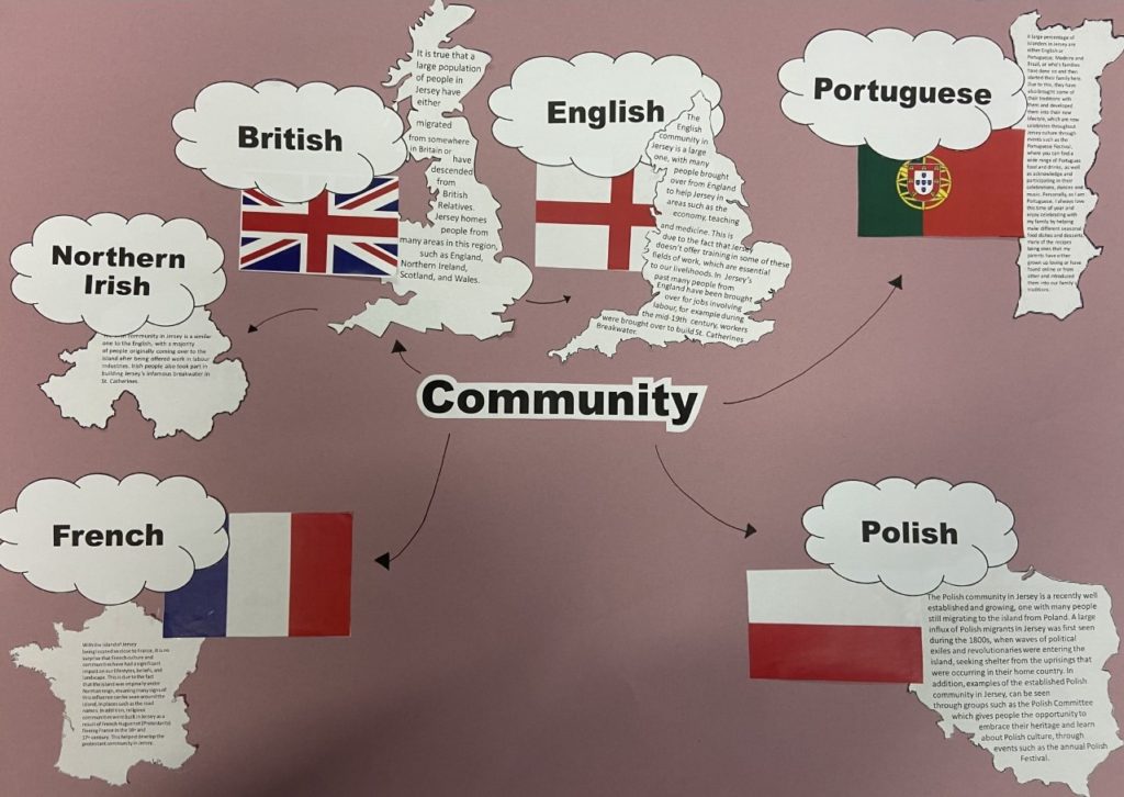
Here me and Toni researched the topic of community in our island’s identity, focusing on migrant and ethnic groups. With this we looked into the British, Portuguese, French and Polish communities that can be in Jersey and wrote about their origins and their influence on the island. We believed these many different cultures make Jersey special as they increase diversity and bring in new traditions. I think that this multiculturalism that we posses helps to define today’s Jersey as it is seen as a place of hope, new opportunities and welcoming people. I believe that this will only become more evident in the future, as people become more open minded and accepting of cultures that are not Anglo-centric. To solidify this multicultural identity in Jersey we should aim to provide more hostings of events and fairs that showcase these many cultures and educate people on their traditions and customs, such as the Polish fair that already occurs in Jersey. However, there are some barriers towards maintaining this positive island identity including the sky rocketing price of living on the island, which may potentially deter people of different ethnic and cultural backgrounds from moving to Jersey as well as staying here. This could possibly mean a drastic loss of diversity on the island.
This topic could be explored through photography or film by spending time with people from various cultures such as these, and telling their stories of migration as well as their first experiences and impressions of the island. You could also focus on more specific areas of these diverse communities, such as the food or music that acts as a unifier and brings people together. Inspiration for this could also be gained from participating in events and fairs celebrating the communities you wish to gain a wider knowledge of.
Overall I believe that Toni and I created a poster that successfully demonstrated the importance and the origins of communities on the island. Something that I think we could improve on if we were to do this task again, is to research in more detail the events and groups that already exists to help maintain these different cultures.
Evaluation

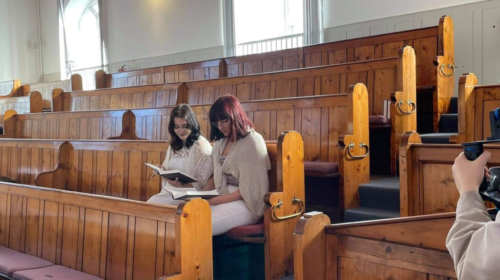
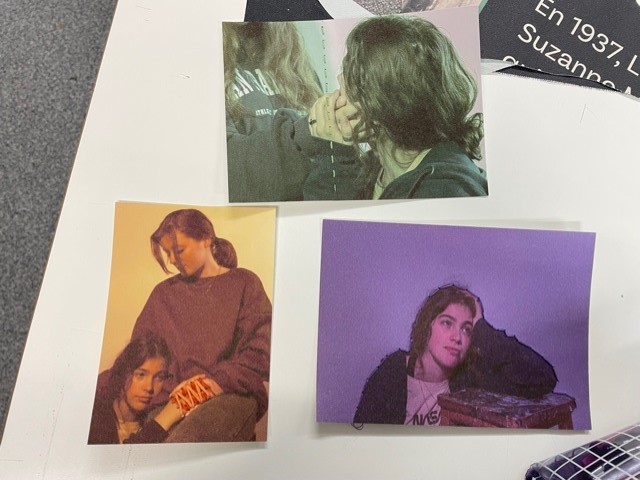
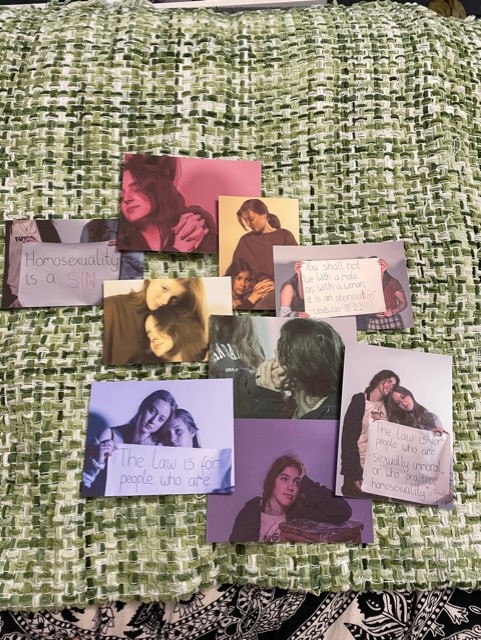
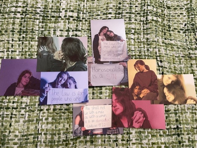
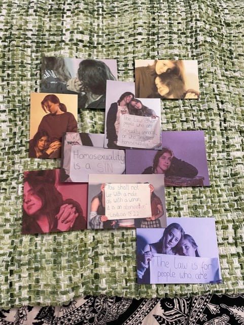
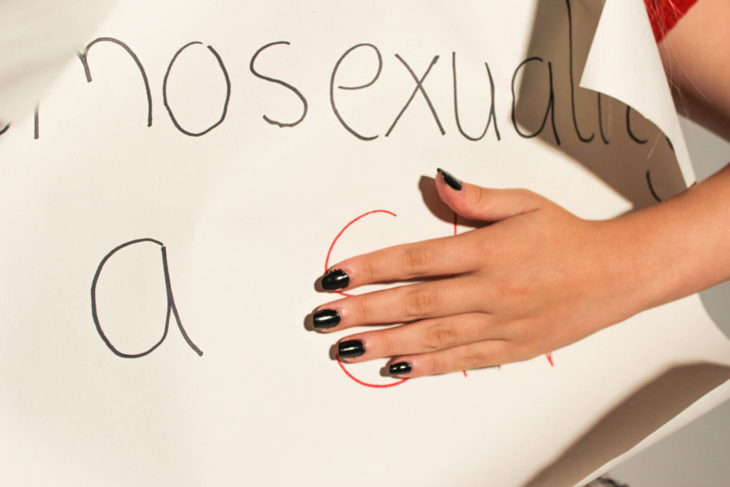
Overall, I believe that our film and still image that we produced as a group has been successful, due to the fact that we have achieved our goal by producing a visual representation of the turmoil and discrimination that people who are members of the LGBTQ+ and religious communities suffer, and with the film offered a light-hearted resolution. Some aspects of the film that I believe worked well and allowed for this to happen, were the religious setting scenes, due to the fact that we were able to shoot on location, in a real church. Furthermore, by using clothing to signify the comfort of the characters in different setting, for example wearing conservative white clothing in the church and leisurely and comfortable clothing in the dream sequence, I think it helped to enhance our vision. Another thing that helped the filming process, was using a camera frame to make scenes in which the camera is moving look smoother. Although this doesn’t mean that the camera was perfectly steady, it most definitely helped us produce a more professional outcome. On reflection, something I think we could improve on is the riot scenes, as we used stock video to make it feel more authentic. However, I think that if it were possible, we could have used footage that related more closely to the subject of our film, such as religious protests about the progressive laws towards the LGBTQ+ community. With our digital image, I think that by using the medium of embroidery to stitch over the collage, it created a sense of trauma that these people suffer. This is as it helped to represent how these verses and comments on their sexuality cause harm to the target whilst piercing them and break them down emotionally. If I were to comment on something that could be improved within this image, it would be to make the colours of the separate photographs bolder, by having them printed on a fabric or canvas material, instead of the thick paper we used. When viewing the film it can be said that we used NFT artist Fewocious as a source of inspiration, due to our story of a hidden and repressed LGBTQ+ identity, that can also be seen through his digital art. In addition, the NFT artist Hackatao can be said to be an inspiration for the composition of our final image, due to the fact that our photographs incorporated protest signs that have a similar essence to the written text within their work. In conclusion, I believe that these two pieces of work were successful responses to the theme of community, due to their message of unity and acceptance between the religious and LGBTQ+ communities.

Behind The Scenes of Production

2 Lives Statement

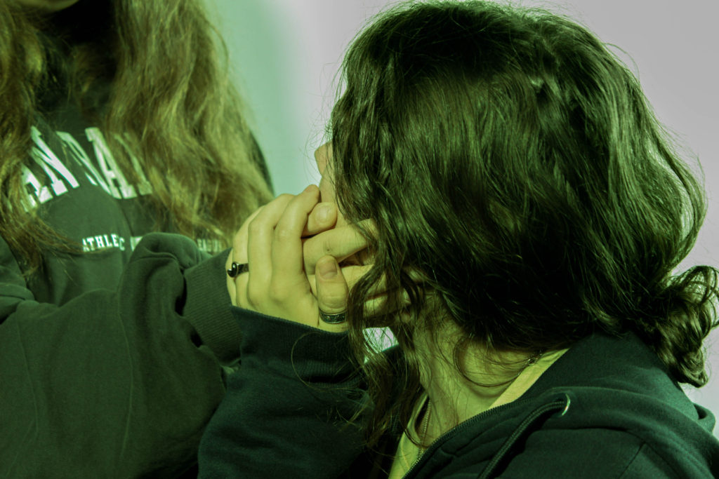
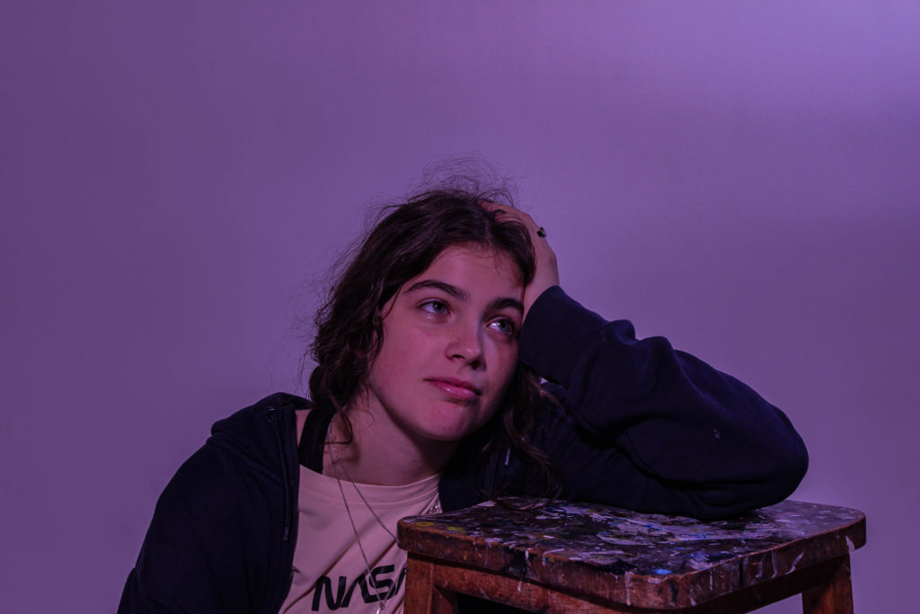
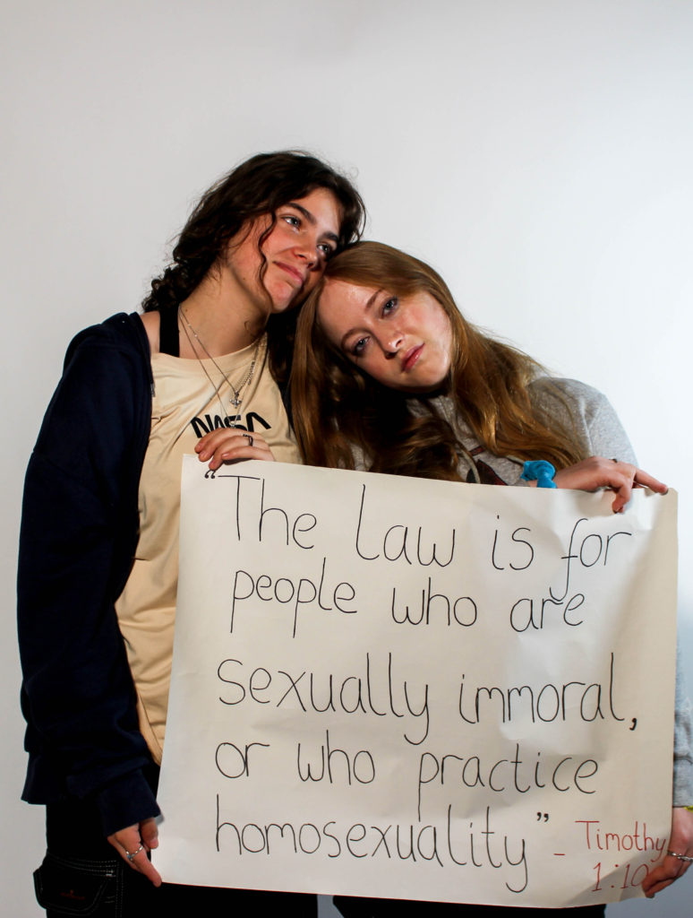
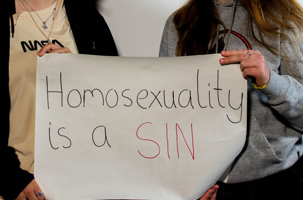
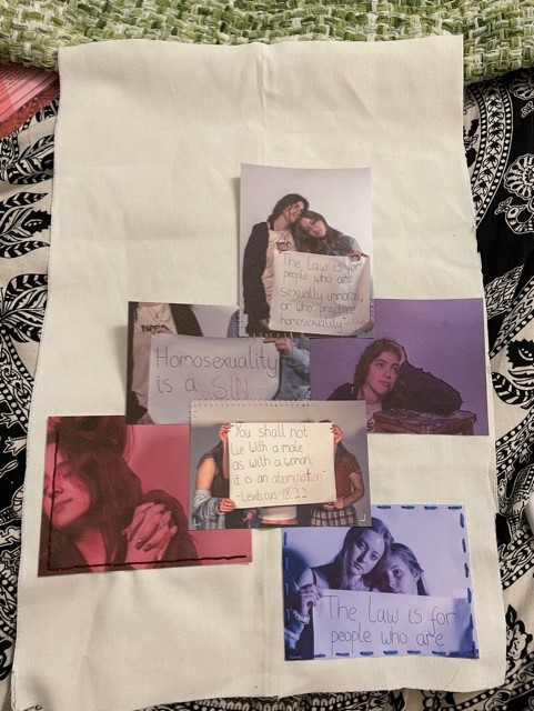
The idea behind this project is to create a narrative that highlights the two communities of religion and the LGBTQ+ community. With this we touched upon the issues of homophobia and hate, within certain religions, in this particular Christianity, towards the LGBTQ+ community and how often people are made to chose between the two. This was inspired by the tension that is often seen in Jersey between these two entities, and often the dismissal and disapproval of the two existing in the same space. Our presentation of this concept in image form, showcases a tapestry, which incorporates elements of the LGBTQ+ community and clashing religious aspects. Here photographs are stitched over and together, some of couples in a colour of the LGBTQ+ flag and some of harmful religious quotations. Our film elevates this idea, through the story of a lesbian couple who are torn between the religious aspects of their lives, and their longing to be together and true to their identities, whilst still being accepted to practice their faith. Displaying scenes of serenity and violence, we showcase the turmoil that is occurring in their heads. The aim of this film is not to condemn either of these communities but to offer a route to acceptance, that allows for a harmonious existence between the two. We believe that our project relates to the metaverse, that will exist in the near future, due to the fact that it has been described a potential utopia. This means that, in order for this peaceful, idyllic online world to exist, bridges must be built between divided communities, such as these, permitting a safe online space.

Film Editing

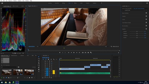
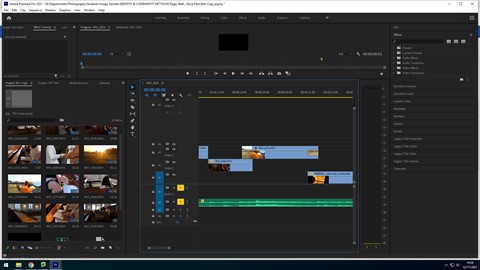
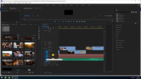
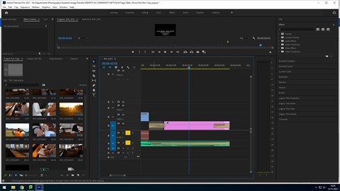
During the editing process for our short film, Tiago took screen shots at different stages to show our thought process behind the way in which we are piecing together the scenes from our film. For our film we obtained a soundtrack that we believed would match the mood of the film. We did this by searching for classical and cinematic music from websites that provided royalty free audios. Finally we managed to find a piece that we thought would work best which was named Sailing Away by Shane Ivers. When editing the film, Tiago first arranged the video clips in the order, showing the storyline, then went on to cutting these clips down and trimming them, in order to present the best part of the footage and cut to the beat. In addition to the audio of the music, we also have included a clip of a spoken Bible passage that quotes “Love thy Neighbour”, relating to the title of our film. This has been placed at the end of the film to conclude the message we are aiming to put across.

Here we chose to alternate the scenes of serenity and chaos to show the binary oppositions of faith and interpretation that are seen in religion, particularly Christianity. We obtained these clips of riots through searching for royalty free stock footage, as we believed using a real life documented event would be more impactful to the message of prejudice and homophobia that is presented through our film. In addition, we also thought that these clips in particular would work best, as they fit the colour grading in the film, with the fire replicating the sunset in the dream sequence and the warm tone of the church pews.

Accompanying the spoken Bible passage, we chose a scene of the couple reading and pointing at the Bible as the final shot as not only does it display the passage in which we are referring to, but it also links back to the idea that a strong faith is capable of withstanding the challenges and tribulations that are inflicted by the people who show hatred to others. Here Tiago added a cross fade in order to transition from the violence and chaos of the riots to the peaceful final scene smoothly.

Finally, Tiago added a credit scene at the end of our film, which displays the our names, the film title, the credits for the royalty free music and riot clips, the names of the actors and our school name. This was transitioned into with a crossfade also, as well as the end of the credits. He also faded out the music to give the film a gradual ending, using the constant gain audio effect.

Final Image development

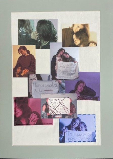
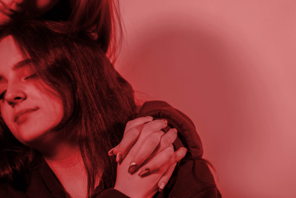
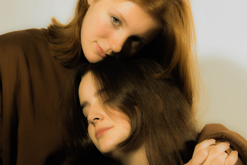
Using the edited images from our still image shoot, Bethany has created a single piece of embroidery that incorporates all of these photographs. We are using images with different hues here to produce a deconstructed representation of the pride flag.

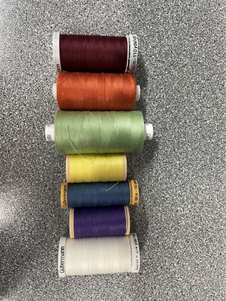
In order to do this, Bethany first laid oud these images in different formats and orders, seeing which arrangement worked best. After deciding on a layout, she then proceeded to stitch into the images separately creating patterns and designs on each, such as crossing out the negative words in the Bible passages displayed and creating dashed lines on the boarders and down the centre. In addition, Bethany also did this by using the same colour thread as the hue of each image, reinforcing the colours that represent the LGBTQ flag as some of the colours faded slightly as a result of the images being printed on a thicker paper, allowing embroidery without tearing. As well as this, she also used black for the images in their original colour. After this, she then went on to sewing the images onto a piece of a2 sized fabric, that acts as the background to the collage. As well as this she also glued some of the images onto the fabric, so that no further stitching on the image was required and that the photos could overlay. Once all the images were in place Bethany then assured the pieces all laid flat and then framed it in a window mount, so that the slightly frayed edges of the fabric were not visible and so that the image had a sturdy background.

This is our final image for our identity and community project, presenting the two communities of religion and LGBTQ+, combining them by presenting their differences and the way in which their can still be harmony between them despite this.