All posts by Olivia M-G

Filters

Author:
Category:

Repetition, Pattern, RHYTHM, reflection and SYMMETRY – Classwork

Jaromir Funke

Jaromir Funke

This black and white photograph taken by Jaromir Funke, showcases a geometric image containing a sphere and cube object. Here Funke has used these objects to cause the light to be reflected creating sharp and interesting shadows. These shadows result in geometric and directional lines, that lead your eyes towards the focal point which I believe is the cube in the center. In addition, the texture of this piece appears to be quite smooth and delicate due to the simplicity of the shapes and materials used, and the layout.

Furthermore, I believe the lighting in this image is artificial and harsh, because of the large contrast between the shadows and the reflected light, which seems to have been positioned in order to create the geometric and sharp shadow lines. Also, I think that for this photo Funke used a small or medium aperture as everything in the image has almost the same amount of focus, for example the cube in the center is slightly more focused than the sphere. Moreover, the shutter speed used for the image appears to be fast, as it displays a sharp and clear photograph.

Here you can see Funke’s influence of pictorialism, an approach to photography that emphasizes the beauty of the subject matter, through his use of typically mundane objects and romanticising them. It can also be said that he does this in the style of an abstract and documentary photographer.

Laszlo Moholy Nagy

Laszlo Moholy Nagy

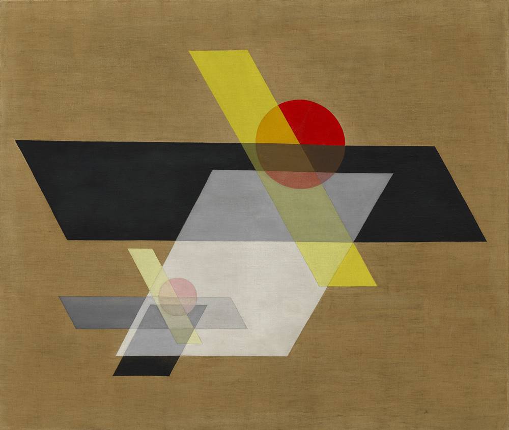
In this colour composition, by Laszlo Moholy Nagy displays geometric shapes in different colours and shades overlapping, on top of a brown background. These shapes create vertical and horizontal leading lines across the piece, drawing your eye towards the large, black parallelogram in the center, which is what I believe to be the focal point. You could describe this image as peaceful and organised, as opposed to cluttered due to the fact that Nagy has chosen to leave quite a bit of empty space around the sides of the composition. Furthermore, the texture of this piece is smooth, which could be due to the aspects of transparency of some of the shapes.

Here Nagy has foregrounded his aim to create art ‘that did not exist before us and that cannot continue after us’ and that is not just a passing fashion, through is unique and abstract style.

Comparison

These two images immediately display similarities through the use of geometric shapes in their pieces, as here, Funke has used a clear cube and a sphere to cause the light to be reflected creating sharp and interesting shadows. Furthermore, Nagy has used similar shapes as Funke in this piece, such as circles and parallelograms overlapping, resulting in the same geometric style. However ,Nagy has used colours in his piece to create strong, distinct lines and shapes, whereas Funke relies on the light and shadows to make these bold leading lines, as his image is in black and white. The Texture in both pieces appear to be smooth, as in Funke’s photograph the objects and surfaces with light reflected onto them are simplistic, just like the shapes in Nagy’s composition.

However, in Funke’s image you can see that he has chosen to take the photograph in hard lighting, allowing for dramatic shadows to be cast. Although, due to the fact that the piece from Nagy is a painting, lighting does not need to be considered, although the overall tone of the image is dark because of its earthy colours and shades.
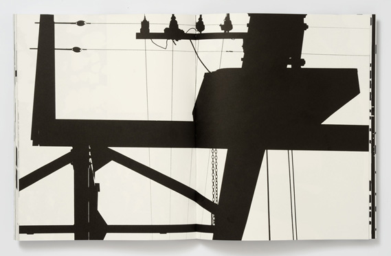
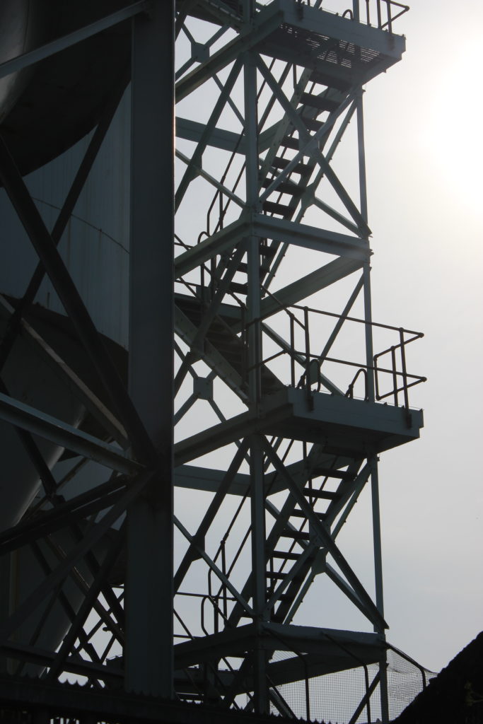
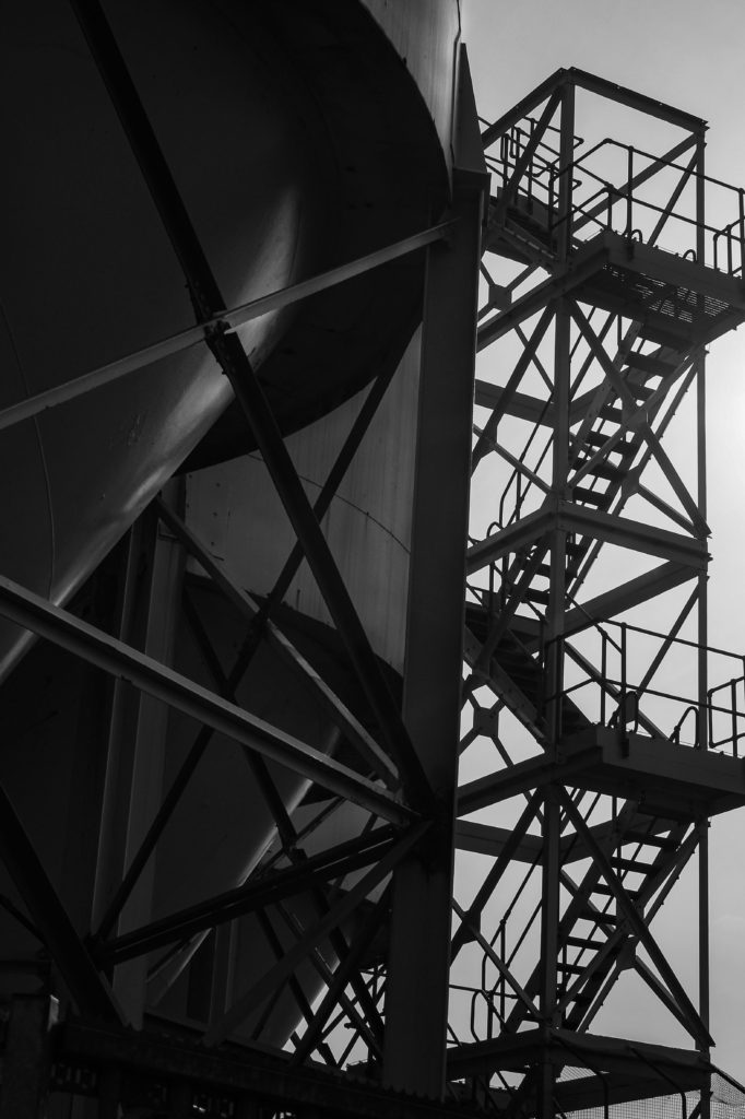
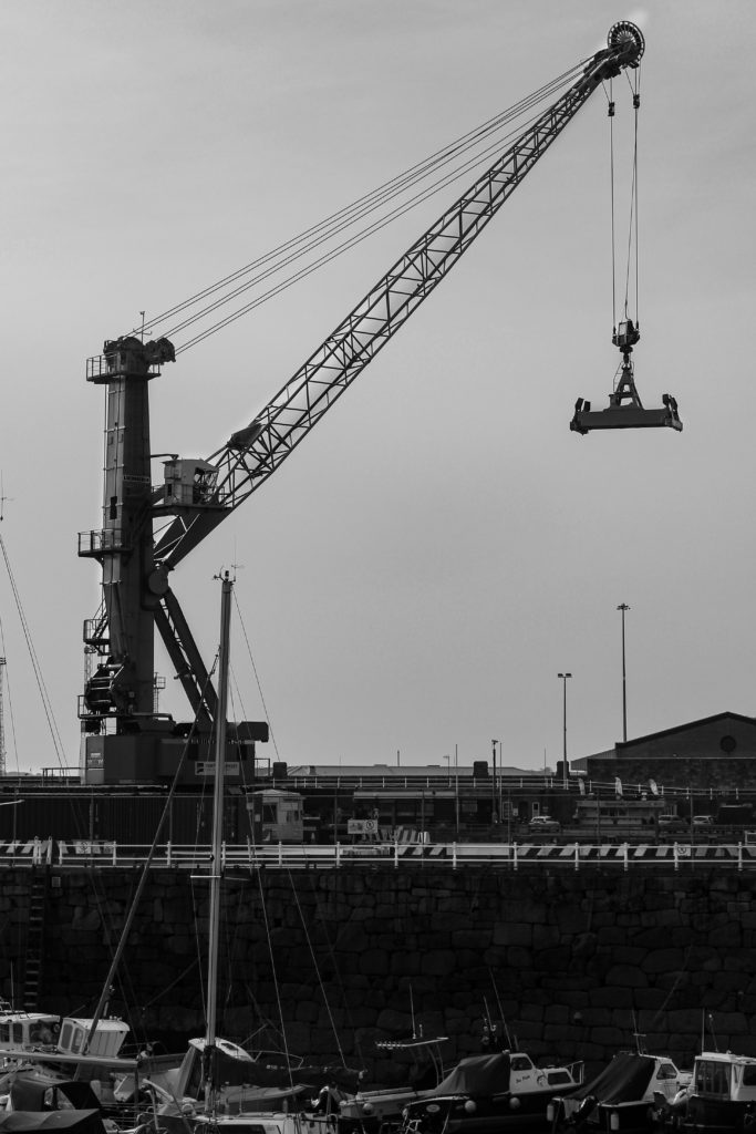
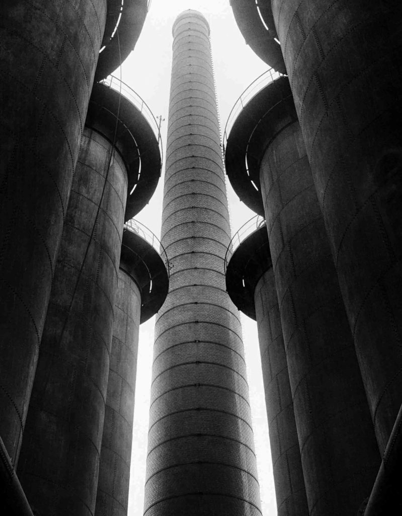
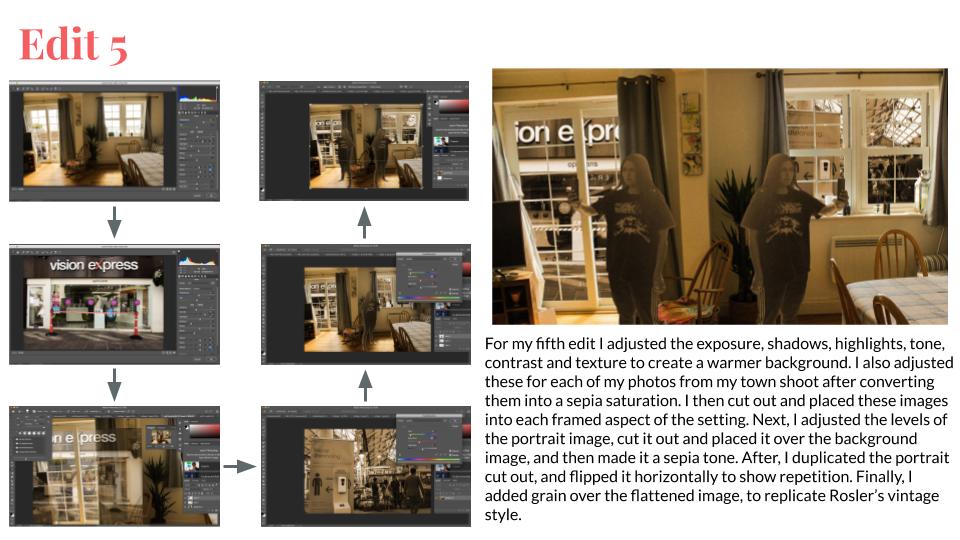
My Reflected Images

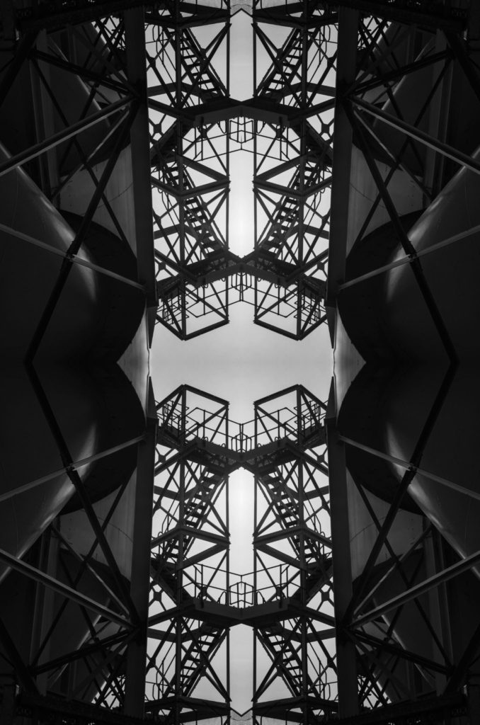
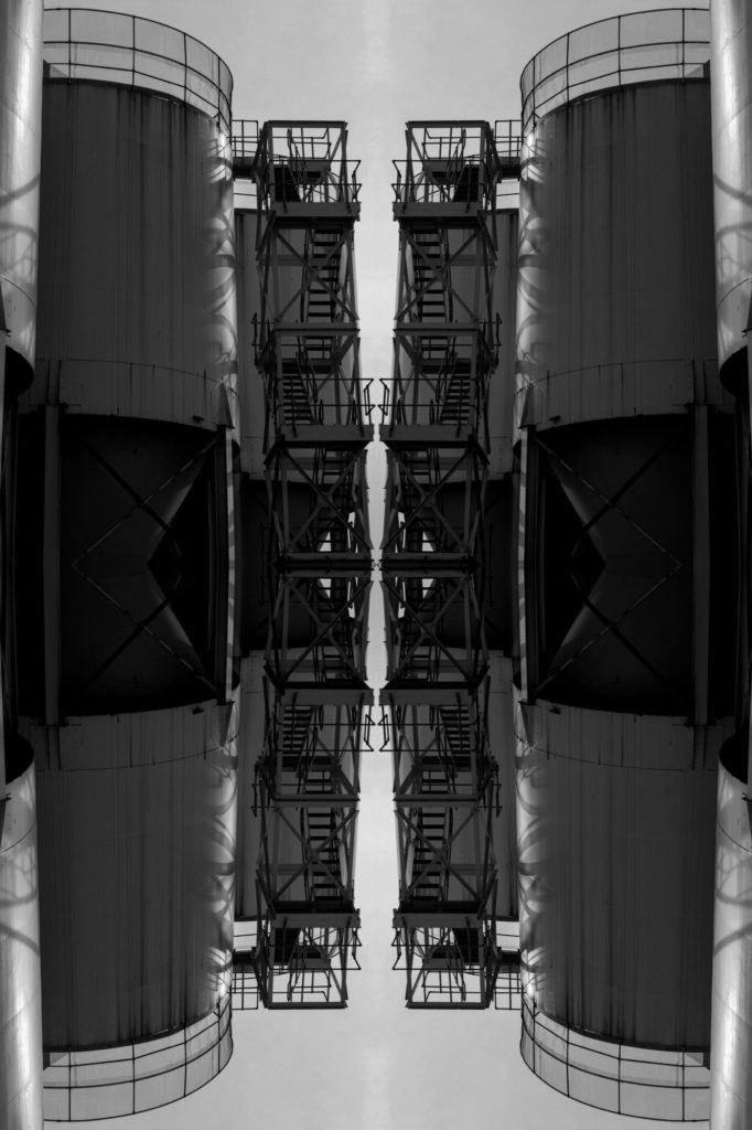
For these reflected image edits I used Photoshop to create a kaleidoscope effect on two photographs from my Albert Renger-Patzsch project. In order to do this I:

  1. Opened my image
  2. Selected the image and then copied it
  3. Changed the canvas size to either double the width or length of the original
  4. Pasted my image
  5. Flipped the image either horizontally or vertically
  6. Lined it up next the the original image to create the mirrored effect
  7. Flattened the image, then repeated steps 2 through 6 for the kaleidoscope effect

Surface and colour

Mood Board

Surface and colour mood board

Ernst Haas

Ernst Haas was an Austrian-American photographer, born in 1921, who is known for being a pioneer of colour photography opposing the better liked black and white style at the time. With these photos he was able to capture an aspect of movement in his images, by using a slow shutter speed which creates a blurred effect. Haas stated that he was ‘Bored with obvious reality’, and chose to use his photography as a way of transforming this into a subjective point of view.

Image Analysis

Ernst Haas – New York – 1952

This colour photograph taken by Ernst Haas displays a busy street containing moving cars and busses in primary colours, in the background, which contrast with the crowd of people in dark monochrome clothes, in the foreground. The blurred streaks from the passing yellow cars create directional, horizontal lines, that lead your eye across the image, from the foreground to the red bus in the background. You can see that Haas has framed this image to leave very little empty space, resulting in a crowded photograph.

In additions, the lighting of this image appears to be natural as it was taken outside, allowing for a small amount of shadows, meaning it was most likely during the middle of the day. Here, Haas has used a slow shutter speed to create a blur affect, to add the aspect of motion to his images. Due to the fact that most of this image is in focus, I can say that Haas used a small aperture, allowing for a wide depth of field.

From this photo you can see that Haas has taken this photograph with the aim of capturing his subjective point of view, similar to his other photographs, as the motion created by the slow shutter speed allows you to feel that you are presently there experiencing that moment for yourself.

Ernst Haas Inspired Photoshoot

Plan

In order to take photos in the style of Ernst Haas, using the slow shutter speed skill, I will aim to take photographs of passing cars along the Five Mile Road in St. Ouen. I will focus on capturing images containing primary colours, similar to Haas, by taking photos of coloured cars. To achieve the blurred affect I will use the Shutter Priority setting on my camera, allowing me to adjust the shutter speed as I see fit.

Contact Sheets

For my first shoot I took slow shutter speed images of cars going past along the road, through the window of my car. This is as the raindrops on the window created a texture layered over the image.


For my second shoot, I also took slow shutter speed photos of cars going past, however this time outside instead of through the widow. This allowed for the blurring of the cars to create strong, directional, horizontal lines moving across the image, similar to Haas’ work.

Here in these contact sheets I have highlighted the images I will edit in Photoshop in green, and crossed out the images that were perhaps too blurry or over exposed in red.

Photoshop Development

In photoshop I took five images from each shoot and edited them in a manner so they would look similar to the works of Haas. In order to do this I had to increase the vibrance and saturation to replicate Haas’ use of vivid colours in his compositions. I also used the channel mixer and colour balance to make these images appear warmer and less over exposed, due to the rainy conditions they were taken in, whilst also increasing the contrast for a more dramatic piece.

Final Image

I think that this is my best image from this project as the stripes on the van allow for strong, directional leading lines across the photograph. Also, it replicates Haas’ use of primary colours slightly, with the incorporation of blue in the sky and on the van. In addition, I think that the raindrops add a nice aspect of texture, causing it to be a more interesting image.

Evaluation

In order to achieve better quality images for this style of photography, next time I could go into town to take these photos, as it creates more of a crowded scene, like Haas’ work, and includes more architecture. Also, I could use a tripod so that the only blur I capture in the images are from the motion around me and not the movement of my camera.

Black Light

Keld Helmer-Petersen

Keld Helmer-Petersen was a Danish photographer, known for his unique experimentation with black and white images, using not only just a camera, but also flat bed scanners, in order to create dramatically contrasting photographs.

My Images

Before

In order to make my own Keld Helmer-Petersen edited images, I chose to use these four photos from my Albert Renger-Patzsch photoshoot. This is as I believe they would best display a strong contrast between black and white, through bold shapes.

After

To make these edits in the style of Petersen, I used the threshold tool on Photoshop allowing for a clear divide between light and dark, and creating a black and white image. Once I had edited each photograph, I then placed all 4 images on a white A4 background, creating a grid image.

Looking and seeing

Mood Board

A mood board can be defined as an arrangement of images, materials, pieces of text, etc. intended to evoke or project a particular style or concept.

Below is a mood board to display the theme of ‘Looking and Seeing’.

Ideas

Uta Barth

Uta Barth is a German-American photographer, born in 1958, who is known for her unique outlook on the style of her experimental photography. This is as she states, that her aim is to allow the audience to have freedom with their perception, and the thoughts it produces, instead of being passive to what the photographer wants you to see and feel. Barth does this by experimenting with focus and aperture, taking photos that are mainly blurry.

Saul Leiter

Saul Leiter was an American photographer and painter, born in 1923, known for being a contributor to early colour photography, whilst he documented the streets, architecture and people of New York, usually in dreary weather. Leiter used long lenses to compress space, taking pictures from unique perspectives, using negative space and large out of focus areas.

Ralph Eugene Meatyard

Ralph Eugene Meatyard was an American photographer, born in 1925, known for his experimental use of exposure in his photographs. Working as an optician, Meatyard was able to see how others perceptions of the world were varied, which is clearly translated in his work, especially in his series ‘Out of Focus’. This selection of abstract photos showcased black and white images of undistinguishable blobs, breaking down the conventional rules of photography. In addition, in his series ‘Zen Twigs’, Meatyard created images that displayed a blurred photograph containing one thin twig in focus which sliced through the image, foregrounding Meatyard’s precision when it comes to aperture.

Image Analysis

Ralph Eugene Meatyard – ‘Zen Twigs’ – 1960

This black and white image by Ralph Eugene Meatyard, which is part of his ‘Zen Twigs’ series, showcases one single twig placed in the centre of the photograph. This placement leaves a lot of empty space for the eye to wonder, at the same time this space allows for a prodiminantly light piece. In addition, this twig acts as a leading line, to attract your attention to the extremely out of focus landscape behind it, which appears to be coastal.

Similar to Meatyard’s other photographs from this series, this image has been taken with a large aperture, resulting in a blurred background and focused foreground. Also, it is clear that this photo was taken with a fast shutter speed, due to the sharp and precisely focused foreground. Furthermore, the lighting of this photograph appears to be natural, as you can make out that it is a coastline landscape in the background and it is overcast allowing for the twig to cast no shadows, causing an image with little intensity.

Moreover, from his dramatic experimentation with focus, you can tell that Meatyard’s profession as an optician has strongly influenced the nature of his photography, as it appears that he is trying to see commonplace scenes from a different perspective. Also, this piece signifies his fascination with Zen as it displays such a peaceful and solitary image.

Ralph Eugene Meatyard Inspired Photoshoots

Contact Sheets

For my first photoshoot in Meatyard’s style, I set out on taking a series of close up photographs of twigs and plants, similar to his ‘Zen Twigs series’. For this I used the Aperture Priority setting on my camera to get the most blurry background possible.

For my second photoshoot, aimed to take pictures of people walking in hard natural lighting, creating silhouettes, to replicate Meatyard’s ‘Out of Focus’ series. For this I planned on switching my camera settings to manual focus, allowing me to control the level of blurriness and distortion.

Favourite Edited Images

Final Image

I picked this photograph from my second photoshoot as my best image because, I believe that it best replicates Meatyard’s style of photography through focal experimentation. Also, I think the shapes created by the people walking are the most interesting, from this shoot especially, as they almost appear alien like. Furthermore, the lighting of this image works best as it has caused the figures to be silhouetted, allowing for a strong and dramatic contrast with the light background.

Evaluation

On reflection, I believe that I have successfully taken a series of images that clearly display that I have experimented with focus and aperture settings, and shown an understanding of Meatyard’s style and expression through this technique.

In addition, I think that my second photoshoot produced more interesting images than my first, however my first photoshoot included a wider variety of images and shapes.

In order to make my photos better, next time I would aim to take pictures of a larger number of people wearing dark clothing for better quality images and more variety. Also, for the twig photoshoot I would try and go to a more wooded area to allow for variety of shapes and patterns.

Contact Sheets

Contact sheets are a tool used by photographers, most of the time with film photography, that allow them to view each image they have taken. These consist of photographs from one photo shoot, which display the same object or idea. However, as technology has advanced contact sheets have slowly become more and more unnecessary, due to the digital age.

Contact Sheets are useful as they allow you to see each photo from your photo shoot and sort through them, deciding which one is your best.

Some examples of contact sheets can be seen below.

William Klein

Albert Renger-Patzsch Contact Sheets

These are the contact sheets from my photo shoot in the style of Albert Renger-Patzsch, in which I took photos of the area around the harbour and the recycling center. In this process I also looked for any patterns or repetition I could record. I chose this area as I believe it links to Patzsch’s work, in which he displayed industrial settings including boats, and large framework structures.

Favourite Edited Images

For my favourite images from the Patzsch style photoshoot, I used photoshop to adjust the contrast, exposure, shadows, highlights, texture, and clarity. Therefore allowing for them to look more similar to Patzsch’s work.

Final Image

I believe that this edit is my best image from this photoshoot, as I think it best portrays the style of post expressionism and is similar to Patzsch’s work in the New Objectivity movement. This is as the image showcases an everyday industrial structure with bold leading lines, creating a geometric image. In addition, I think that the framing of this image works the best as it leaves little empty space.

Albert Renger-Patzsch – The world is Beautiful

Albert Renger-Patzsch, a German photographer born in 1897, appropriated the New Objectivity movement, which occurred during the 1920s, using his photography skills to produce many infamous post-expressionist photographs. With creating these images, he viewed how he used his camera as a faithful recording of the world. Using these photos, he released his book containing one hundred images of industrial subjects, natural forms and mass produced objects. With this movement of New Objectivity came many artists, including people such as George Grosz, Otto Dix, Max Beckmann, and many more. These artist however mainly focused on abstract or conceptual portraits of ordinary people, as opposed to Patzsch who focused on buildings or objects. Photographers operating in similar styles as Patzsch, in the New Objectivity movement, include Karl Blossfeldt and Aenne Biermann. These artists and photographers snubbed the art forms of expressionists and romantic idealism, and instead took photos of the more dull realities of the world. Patzsch did this by taking images of mundane objects and architecture, often looking for repetition and bold lines.

Image Analysis

Albert Renger-Patzsch – The World is Beautiful

This black and white photograph taken by Patzsch showcases an industrial subject including many leading lines, created by the bridges in between each building. These bridges lead your eye across and around the image whilst also creating a geometric photograph. The tone of this piece is quite light, due to the white overcast sky and the lack of many harsh shadows. In addition, the light grey sky strongly contrasts with the sharp lines of the dark building. Patzsch has framed this image to foreground one of the bridges, located in the center, as the focal point.

Furthermore, you can see that the lighting of this photo is natural as Patzsch took this image outside, this is also signified by the natural shadows cast on the side of the building. This image was taken with most likely a fast shutter speed as it is clear and not blurry, however due to the time period we can say that the image was taken on film, which is the cause for the slight grain on the photo.

Moreover, Patzsch took this photo of this building in particular as part of the New Objectivity movement. This building was chosen to allow no room for any romantic idealism, and to simply display ordinary every day life for what it truly is. Giving commonplace architecture recognition and a place in the arts.

Albert Renger-Patzsch – The World is Beautiful

In addition, this other photograph from Patzsch’s series The World is beautiful is similar to the previous image, in the sense that they both share the quality of sharp directional lines. This again results in a geometric image, with this dark structure as the focal point contrasting with the light foggy background.

However, this image also differs from the previous photograph, due to the fact that in this piece you are able to see other structures in the background, as well as the foreground, although in the first image Patzsch has only allowed for one building in the frame.

The Formal elements – paper

In this lesson we took a series of photographs of pieces of paper. We did this by folding, ripping and scrunching it up to create interesting lines, shadows, patterns and shapes. For this photoshoot we took the images in hard lighting, created by our phone torches, resulting in harsh shadows strongly contrasting with the white of the paper.

Edited Images

For these edited images in particular I rolled up two pieces of paper and carefully placed them on a scrunched up piece of paper to create an almost sculpturesque piece.

Light: In both these photographs the artificial light originates from the torch at an angle above, lighting up the top piece of rolled paper, casting a harsh shadow on the bottom one and the scrunched up paper.

Lines: The lines in these images are varied as, in the base layer of scrunched paper the lines are short, thick, jagged and interrupted, producing an almost chaotic energy in the images. I believe that these act as a guide that lead your eye towards the focal point, being the stacked rolls of paper. This differs completely from the long, curved, thin lines created by the rolled pieces of paper, resulting in a contrasting calming energy.

Repetition: As an aspect of repetition I chose to include two rolled pieces of paper.

Shape: The lines created by the scrunched paper could be said to create geometric like shapes.

Space: I believe the focal points of the rolled paper add depth to these images, drawing focus to them and slightly blurring out the background. However, as I took these with my phone it was more difficult to control the aperture than it would be with a camera, which would have added to the depth of field.

Texture: The scrunched paper would produce a rough texture to this photograph, although the rolled paper adds a smooth texture to this piece also.

Value/Tone: I think there is a range of dark to light tones in this photo, as there are areas in which there is little to no shadows at all, and then there are other areas which are completely darkened by the harsh shadows.

Colour: By editing these photographs in black and white I have created a monochrome images, although I think that the white tones dominate these images due to the white paper being in most of the frame.

Composition: I arranged each piece of paper in these photos carefully to showcase the curved paper as the focal point. In the first image I placed the rolled paper in the centre creating what I believe to be a balanced photograph.