Here is an online link to my photobook ‘Manufactured Memories’.

The images seen on the pages of this newspaper supplement are extracted from a variety of projects and final outcomes produced over a two-year academic programme of study by a group of A-Level photography students at Hautlieu School. In their final year the themes of Identity and Community offered a specific focus and through a series of creative challenges students developed a body of work that were inspired, partly from visiting heritage institutions to learn about aspects of Jersey’s unique history of immigration and exploring migrant communities and neighbourhoods in St Helier in a series of photo-walks. In the classroom additional inspiration was provided from workshops on NFTs (non-fungible token) and digital art, embroidery and textile art, animation and film-making, zine and photobook design led by professional artists, designers and teachers.
As part of the research and contextual studies students were asked to engage with some of the key questions raised by the Government of Jersey’s Island Identity project and explore through their own photographic studies how they interpret and identify distinctive qualities of island life. What can we learn from looking at a set of photographs produced by young islanders? At first sight they show us a seemingly random set of images of places, people and objects – some familiar, others surprising. On closer inspection each image is a visual sign and also a conundrum. For example, a fish stuffed in a plastic bottle may ask us to consider more closely our marine environment, commercial fishing or food consumption. As a combined sequence of images they represent different views that in many ways comment on a wider discussion on some of the primary objectives explored in the Island Identity project, such as ‘how we see ourselves’ and ‘how others see us.’

The newspaper was kindly sponsored by Deputy Carolyn Labey, Minister for International Development and Assistant Chief Minister who in her foreword shares her personal thoughts on what makes Jersey special to her in context of the Island Identity project led by her department. She says, ‘identity involves searching our soul, engaging with difficult issues, and asking not only who we are, but how others see us and what a vision for the future might look like. The perspective of students and young people in this debate is critical. Identity is a broad and far-reaching concept, one unique to all of us. This collection of images recognises both our differences and our commonalties. These times may be uncertain, but in my view the topic – ‘what Jersey means to you’ – is a fundamentally optimistic and forward-looking one.’


The Identity and Community newspaper is the fourth supplement produced in collaboration between Hautlieu School Photography Department and Jersey Evening Post. In 2018 the first issue was The Future of St Helier and last year the themes of Love & Rebellion explored experiences of isolation and lockdown during the coronavirus pandemic. Photographer and teacher Martin Toft, comments: ‘The question of ‘what makes Jersey special’ matters a great deal to every islander and as visual signs, the images printed on these pages are an attempt – not so much to provide answers – but rather asking questions about the essence of this island we call home, and how it actively will overcome current challenges in shaping a prosperous future for all.’


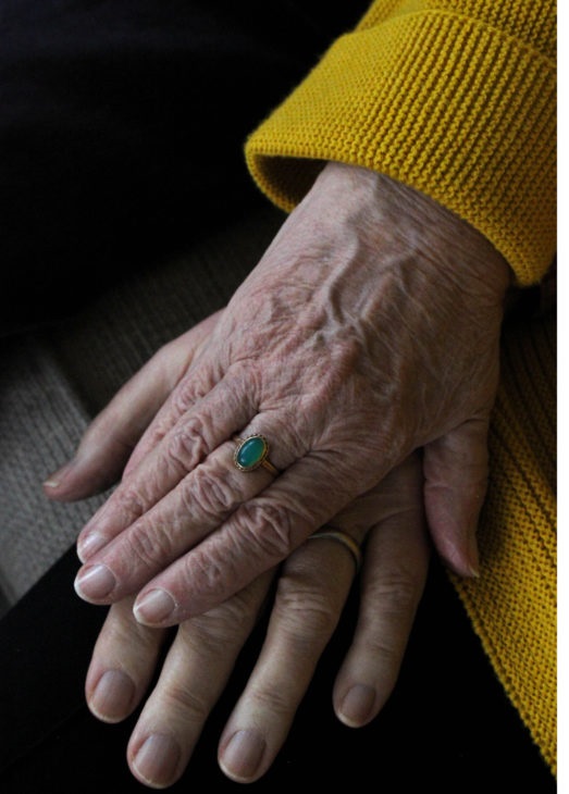

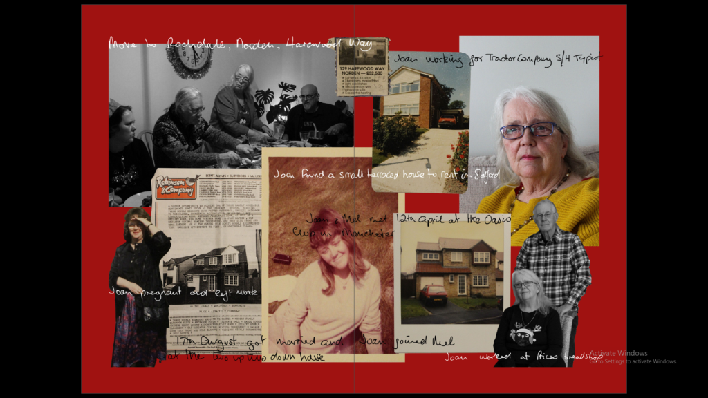
I found the experience of being a part of this newspaper very interesting, with being able to figure out which of my images would look best and experimenting with the layout, and which photographs look best as a small series. The images of mine that have been displayed in the newspaper include the small image on the bottom left, which displays a landscape that shows industrial structures edited into St. Ouens sand dunes, from my Anthropocene project. As well as this a full bleed image of my grandparents hands taken from my personal study project is featured as well as a double page spread of stitched photographs from the same project. It was a really exciting opportunity having my images displayed in a public place and having more people view my work. I think that the series of stitched images work best in the newspaper as it links to island identity in the sense that it touches on how my family moved to Jersey from England, which is similar to many other people who live on the island. Overall, I am very proud of the outcome of this newspaper.


The images I have selected for my final prints contain a mixture of reworked archival and newly produced images. I believe that these pieces best capture the essence of my photobook and the narrative as a whole. This is to highlight the intent behind producing family photographs and memories, commenting on the fact that many of these images conceal or fail to express the reality of the people in the frame, and deconstructing the message behind them.


With my final images, I used artsteps.com to create a virtual gallery in which it is possible to have a 360 view of the gallery space. Here, I used more of my images from my photobook that are not from my final prints to create a more full looking gallery space.


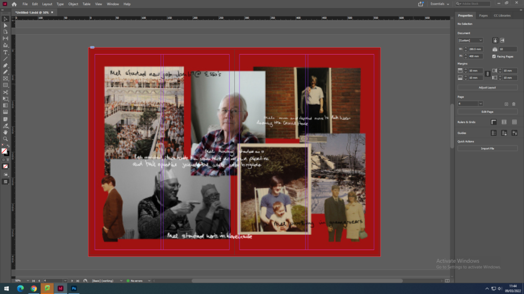
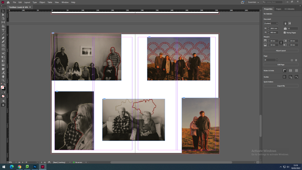
Using Adobe Lightroom, I imported all of my final images from my personal study project for my photobook. Here I uploaded the images onto different pages and experimented with the layout of them, seeing which images worked best on opposite pages and complimented each other. I adjusted the size of the photographs on these pages, working out which images worked best as full bleeds and which looked better with a white border. From this I found that a full bleed portrait image next to a portrait with a white border looked best for my layout, with some double page spread full bleeds for landscape images. Although, on some pages I tried placing a landscape and portrait alongside each other and found it looked best when the landscape overlapped to pages displaying the portrait, or with two landscapes stacked on top of one another on one page, opposite to the portrait. In addition to this, I also experimented with the order of the pages and their ability to aid the narrative, as well as presented a balanced feel to the book. With this I found that the double page spread of my stitched family portrait, was a good anchor for the central page of my photos.

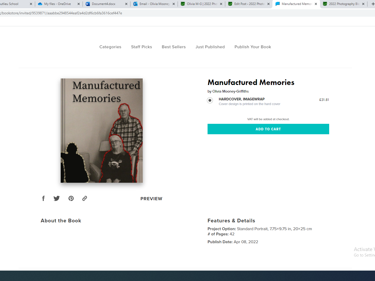
This is my final layout for my photobook named ‘Manufactured memories’ which includes over thirty images comprised of a montages, archival images and newly produced images, as well as my essay at the back of the book. I believe that this project went well, as I think I have produced a good amount of images that relate to the task of a personal study, as it is about my family, specifically my grandparents. In addition, I am happy with my layout and proud of the photobook I have produced.

For my front and back cover I used an image wrap of the photograph that will be central in my photobook. However for the cover I made the rest of my family, except from my grandparents, into silhouettes in Photoshop. I did this by using the quick select tool as well as the paintbrush tool to carefully fill in the areas I had stitched in white around. I believe this best represents the contents of my books as it displays the method of reworking images that will be presented throughout my book as well as highlighting who the book is focused on, this being my grandparents. The title manufactured memories was inspired from a quote by Joerg Colberg, featured in my essay, and describes the nature of most family photography and how my photobook aims to deconstruct this.

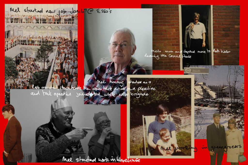
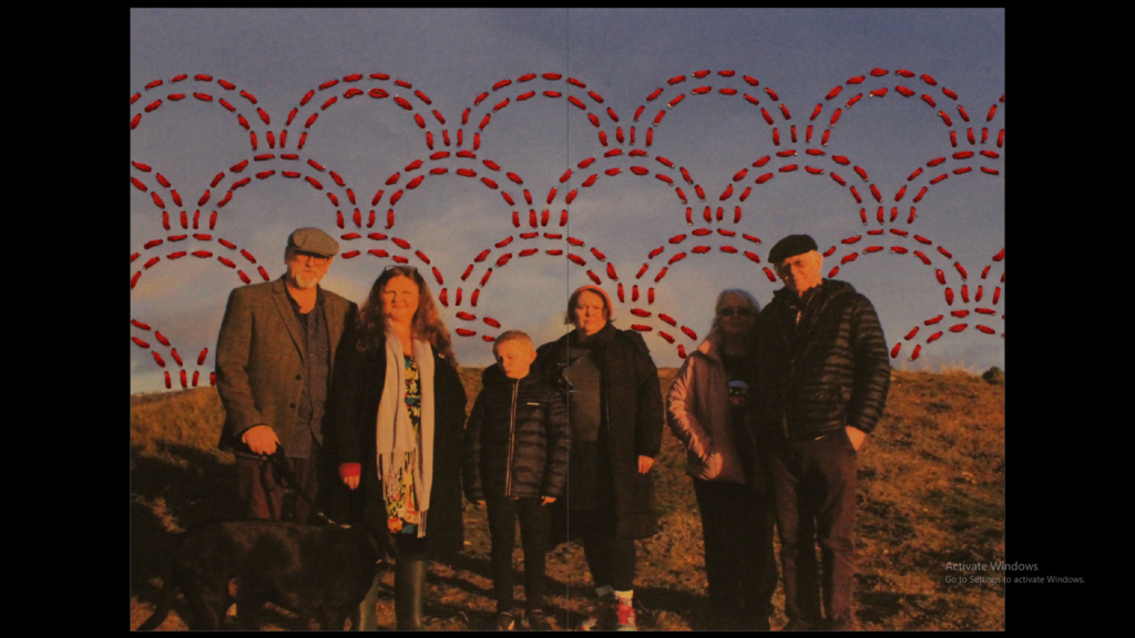
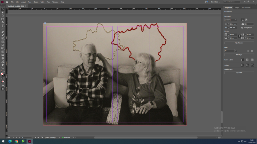
For these first pages, I decided to leave one page at the start of the book blank, allowing for my photographs to start on a double page and be equally distributed throughout the rest of the book. The first double page showcases two simple portraits of my grandparents, which were taken separately however work well together as it appears that they are looking at one another. The following page contains a candid image of my grandad taken at a family Christmas dinner, alongside a digitally edited archive image of him in his former workplace, with everyone’s but his face covered. On the third page I decided to place a close up of my grandparents hands and their rings next to a full bleed of an image of them both, in which I have stitched into and around them. The next pages display two landscape images overlapping, one being one of my own newly produced images, with county outlines stitched into them, and the other an archive image of my mum and my aunt taken during their moving of house. The 10th and 11th page are taken up by a full bleed, double page spread of a digital collage made featuring images and text relating to my grandad, on a bold red background.

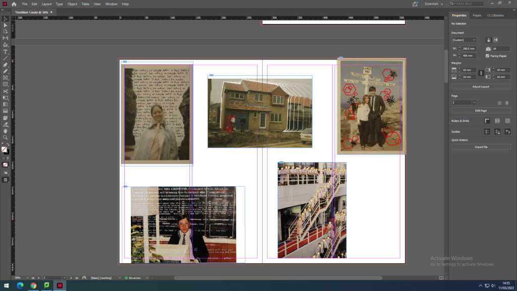
The pages after this present a full bleed, digitally altered image of my great-grandparents, concealing the upper halves of their bodies, next to one of my own images of my mum and step-dad. Following this is a digitally altered archive image of my grandad at his former workplace, surrounded by multiple emails regarding his retirement. The next two pages feature three images, two being candids from Christmas dinner, and the other a digitally edited archive image of my grandparents, with hexagons and the Manchester worker bee surrounding them. The central page of my photographs contains a full bleed, double page spread of a family portrait I have stitched into. After this is another three image page with two landscapes on one side, one being a stitched into family portrait and another a Christmas dinner candid, alongside a newly produced portrait of my grandparents, also with hexagons and the Manchester worker bee surrounding them, however this time stitched in. Following these pages are a digitally altered image of my grandma with text in her own handwriting surrounding her, with her old college ID and certificate for her nursery course next to it.

Next is a full bleed, archival portrait of my grandparents, mum and aunt, with an outline of my grandparents stitched in, alongside a Christmas dinner candid. Following this is another full bleed, double spread collage, this time featuring images, text and documents about my grandma. After this is a digitally edited, archival image of my families old house they moved into after my grandad’s new job, next to an archival image of my mum and aunt standing in the doorway of the house they were moving out of. The next pages display another close up of my grandparents hands, this time featuring another ring my grandad gifted to her, with a full bleed, stitched into portrait I have taken next to it. Following this is a landscape image of my aunt and her son (my cousin), next to an archive image of my grandma, mum, aunt and my sister as a child. The final photographic pages in my book showcase a full bleed, digitally altered, archival image of my grandma who is surrounded by a repeated sentence in her own handwriting, followed by a new portrait taken of my grandma, aunt and mum.

After all of my images, I have included my essay regarding this project, with my influences, analysis’ and intentions. This piece of text is also supported by images from other artists and quotes from other literary sources, which are referenced within my bibliography. I added this in by copying and pasting my essay in paragraphs, fitting the images it references around the text.
Once completing the layout and design for my photobook I then uploaded it to the website blurb which will allow me to order the photobook and print it for me.
When creating digital edits of my images to go into my photo book, I first used Adobe Lightroom to adjust the image qualities such as the contrast, exposure, tone, shadows and highlights. After doing this, I then exported my images out of Lightroom, making sure they had a large image size, and then used photoshop to rework them. I altered these images in a style similar to Carole Benitah, although making sure that the adjustments I made made sense and improved my photo book narrative in particular. I did this using both newly produced photographs as well as archival material. On photoshop I edited the images in order to make products such as photo montages, as well as using ideas from my experimentation with this style to create pieces that I believed would appear better if altered digitally opposed to stitching or other handmade alterations.


Using Photoshop, I digitally altered the images using different techniques to create singular edits. For example, in one edit I made multiple, red hexagonal shapes around an archival image of my grandparents. I then traced over an image of the Manchester worker bee, making it into a PNG, and then placed these around the photograph as well. I chose to do this as my family is from Manchester and the worker bee is one of the best known symbols for Manchester, representing the population’s hard work ethic and the city being a hive of activity. This symbol is often seen in mosaics around the city, which I believe the broken apart hexagons help represent also. In another edit I used Photoshop to erase sections of my great-grandparents. I did this by using samples of the gold-leaf texture from Carolle Benitah’s work, in order to create this appearance digitally without the material. To copy this texture digitally I used the clone stamp tool to create a silhouette of their upper halves. I believe that this texture adds to my narrative as it resembles a faded image and can be said to represent a faded memory of the people in the image, unable to fully recall their character. This also applies to my personal connection with them as I never met them however know of their memory through photographs.
When creating edits of my images by hand I first printed off images that had been slightly edited in Lightroom, with qualities such as contrast, exposure, tone, shadows and highlights. Here I used a mixture of both archival material as well as my newly produced photographs. With these, I decided that the method of stitching would work best to improve the narrative function of the images. To ensure that when stitching into the photographs that they didn’t rip I printed them off on card, providing a sturdier material than paper but still containing the levels of detail and saturation that may not have appeared if transferred onto fabric. When stitching, I stuck to the colour scheme of red, white and black thread, with red being the main colour used to symbolise blood lines and family. I used larger needles and thread to create the more basic patterns and create bolder shapes, and used a smaller needle and thread for the more intricate and smaller patterns, using a back stitch to achieve all of these pieces.

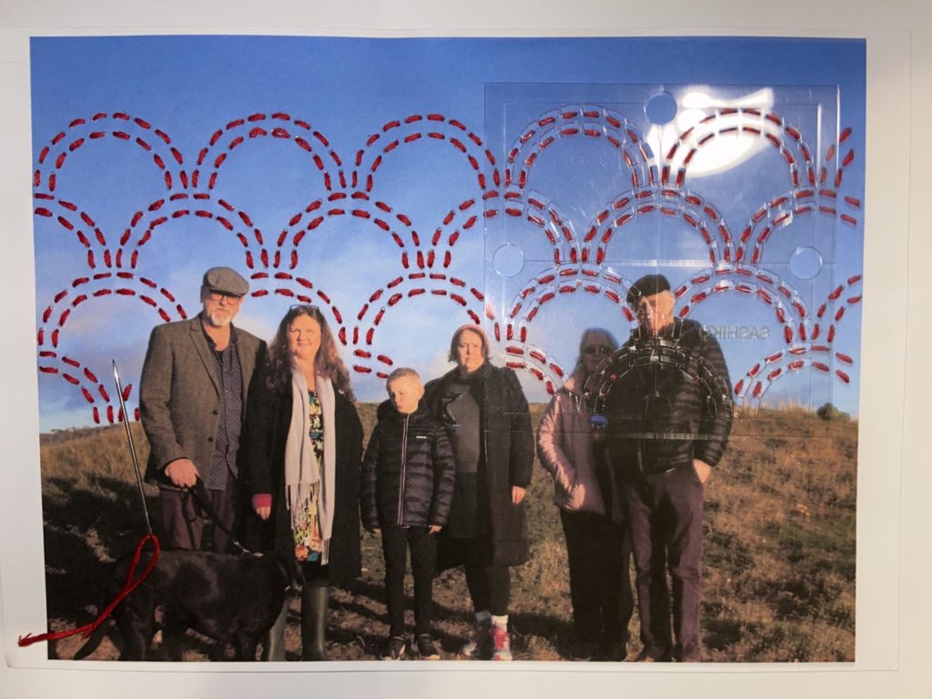
With this method, I made similar designs to my digital edits making sure they were coherent. For example, for one of the images I stitched into I created red hexagonal shapes and embroidered bees around the image, resembling the digital edit displayed above. I did this using a medium size needle for the hexagons and a small needle with smaller thread for the bees, as they were smaller and harder to stitch. I also used patterns to alter my photographs, such as using an arch template to plan my stitches, allowing them to be uniform and neat. For all of my stitched images, I first punctured holes into the card for where I would embroider. This ensured that the stitches were similar lengths.
As well as using new photographic images of my own, I will also be using old archival images from my family photo albums. For these photos in particular I took images from albums created by my grandparents revolving around their time moving houses and their jobs. As these were all physical copies, I had to re-photograph these images to allow me to edit them on Lightroom and Photoshop. I did this by placing the photographs on a white paper background, making it easier for me to cut out the background, with lots of light so there would be no visible shadows. I also took photographs of the documents that were in these albums, such as certificates, ID, work emails and advertisements for houses which my family moved into. These documents will add to the sense of of a family photo album that I am trying to create with my photo book as well as being useful in creating digital photomontages that replicate this appearance.
With these images I will rework them both digitally and manually, by hand, creating new meanings to these old photographs. This will also help these images to fit in with my new images I have made as part of the series, making them coherent as a set of photographs, as some of the images from the new photoshoots will be reworked also. Examples of ways I will use this archival material to produce images for my photobook include embroidered pieces as well as digital photomontages.

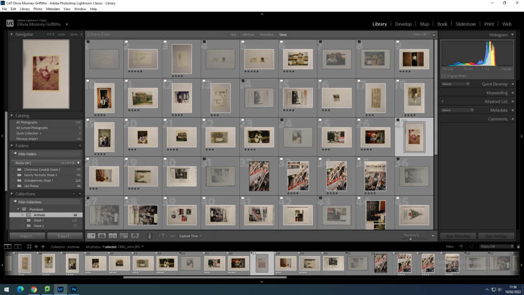
Once photographing all of my archival material, I then uploaded them to Adobe Lightroom. Here, I went through the photographs flagging the images I thought would best aid my photo book narrative. I then rated the flagged images out of 5, to further refine my selection. Once I had done this, I colour coded the images I had rated 4 or 5, with green being my best quality and most useful pieces of material and yellow being of lower quality but not useless however, as some may be useful for photo montages. From this selection process I decided which images I was going to edit and rework, these being the green images.

In order to edit my archival material digitally or print them out to be reworked, I had to use the perspective warp tool on Photoshop to make sure the photograph’s dimensions were straight and not stretched out. This allowed me to make the archival material the same image size as my newly produced images.
These montages I have created showcases various images of my grandad and grandma along with some pieces of text that contextualise their lives and work throughout the years. I created this using Photoshop, cutting out sections of some images, as well as tracing over images of my grandma’s handwriting to create the text. These pieces will also feature in my photobook as part of my personal study project. I have also laid them out on the page to be a full bleed, meaning the image will go to the edge of the page with minimal borders.
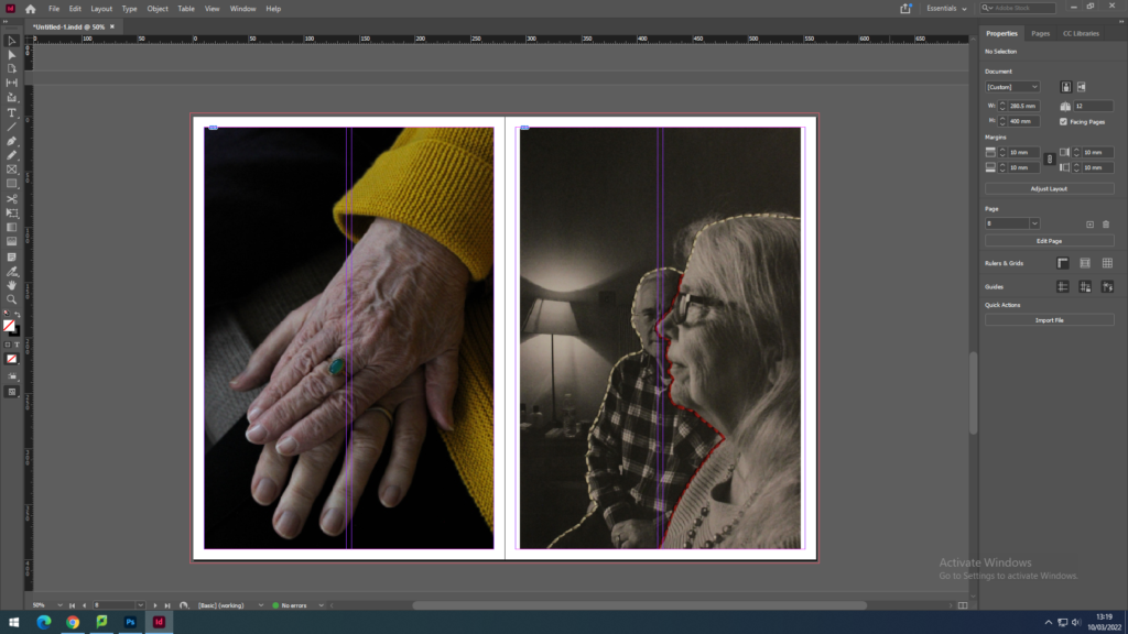
Here I have used again images from my personal study project and photobook to create a juxtaposing spread. Here, these two images contrast with each other due to the left image being in colour whilst the right is in black and white, excluding the stitching. However they are still relating in the way that they both part of the same project and feature my grandparents in different forms. The photograph on the left displays the hands of my grandma and grandad, showing a ring my grandad gave my grandma many years ago. On the right is also features both grandparents although with embroidery using white thread to highlight their strong relationship with each other and red thread to represent the bloodlines and family they have created.
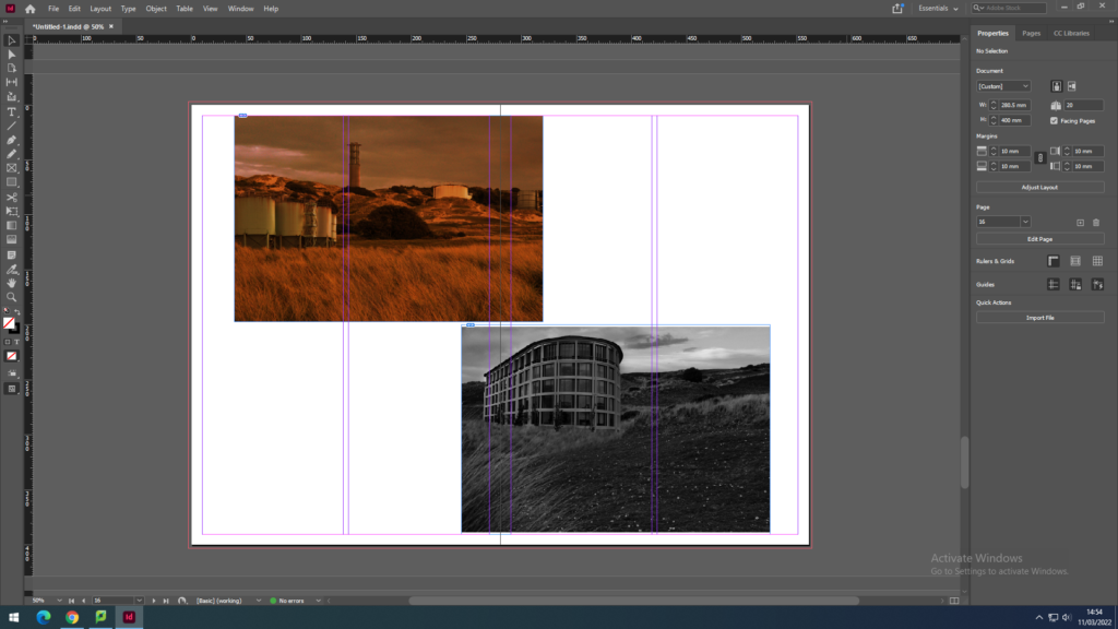
Here I tried using images from my Anthropocene project that show contrast through one image being in black and white and one being a colour image with a bold orange hue. These link together as well, due to them both displaying what St. Ouens bay would look like if it was not a protected piece of land.
This sequence showcases various digital edits I have made using archival images of my grandparents. These display the story of my grandparents hard work ethic that my personal study is based on, touching on subjects such as my grandads job and my grandma’s caregiving nature.
I have also created another spread of sequential images instead featuring reworked pieces I have created by hand, using techniques such as embroidery. These images in particular are taken from recent photoshoots also made for my personal study project.
In addition to potentially having one of my montage pieces I could also use the embroidered pieces from my personal study project.
3 words – Grandparent’s work ethic
A sentence – This photobook will depict how my grandparents worked hard to make a better life for themselves and their family.
A paragraph – My photobook narrative will present the story of how my grandparents put their family first and worked hard to provide them with a comfortable life. This photobook will use both old and new photographic images to retell the stories that are often not mentioned in my family, such as the dedication of my grandma to help bring up my grandad’s siblings after their parents moved away, as well as my grandad’s tireless work ethic that persisted through various economic struggles. It will also touch on my family’s Mancunian roots and their move from there, for my grandad’s job. In essence, this photobook is a form of appreciation to the older generations in my family for the comfortable life and opportunities they have proved me with, as well as celebrating our strong bond and love for each other.
How you want your book to look and feel – I would like the book to feel as if it were a family photo album compiled of both photographs and documents of the time.
Paper and ink – I will use the standard, classic paper for my photobook as I believe it will reflect the standard prints seen in normal family photo albums.
Format, size and orientation – My photobook will be a standard landscape size of 25×20 cm. This is as I think it will best accommodate the format of my images as well as being the same size as a normal photo album, in which many photos are attempted to feature over a single landscape page.
Binding and cover – I think that the best option for the cover of my photobook would be to make it as a hardcover, as it would produce a sturdy and professional appearance to the outside of the book, that could stand the test of time and be passed down through generations. For the binding of the photobook, I think that a standard binding would suit my layout best.
Design and layout – For the layout of my photobook I will place at least one image per page, with the exception of a few double page spreads. I would like my photobook to have a similar layout to that of a family photo album with some pages having two or more images on them, in a disjointed and collage like manner.
Editing and sequencing – The sequencing of my images will not be placed in chronological order due to the old photographs, but will instead be mixed together showing the contrast in my family then and now, showcasing how it came to be through my grandparents hard work.
Images and text – My images will be a combination of reworked archival photographs and new photographs featuring my family. With this, in my photobook I think it would aid the narrative to include small sections of writing next to some of the images, providing more context and in turn meaning to my work.

Here I created a mood board compiled of images showing different photographic books as well as some family photo albums. This will give me inspiration on how to layout my photobook, creating a strong narrative. In particular, I found that through producing this mood board, that I would like to incorporate sepia tones in my photobook, potentially through the colour of the pages to make the book feel as if it is more of a personal family album.
Before creating my final pieces with the photoshoots I have produced, I have experimented with different materials and methods to gain a sense of the best way I could rework both my archival and new photographs to produce new meaning, whether it is in photoshop or by hand.


Here I printed off some of the images I intend to include in my photobook and experimented with the medium of stitching. With this I used red thread, once again taking inspiration from Benitah’s work, to create both a running stitch and back stitch through my images. To develop my ideas, I looked at Benitah’s embroidery pieces, seeing how she had incorporated this element. Firstly, I tried tearing through and image and then stitching it back together, however if I were to do this again I would make the tear more obvious and messy to create a more dramatic outcome, as it is hard to see that the image has been torn in my replication. Next, I used a back stitch to outline a portrait of my grandparents, emphasising the message of togetherness and family. I believe I would like to incorporate this style into my photobook, although next time I would use this method on a black and white version of the image, to further separate the subjects from the background. Finally, I did attempt this again on a black and white image, but this time dissecting the photograph with the red thread, separating my grandparents within the portraits. Though this style did work well on the black and white image shown above, I don’t think I will use it to create and image that suggests ideas of emotional struggle, as I wish to instead promote ideas of familial bond and admiration.
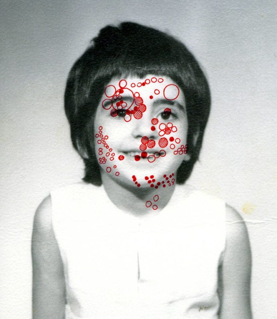


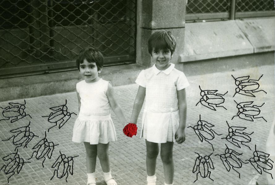

In addition, I also experimented with Posca pens by drawing over the top of my images, using designs from Benitah’s work to do attempt this. Firstly, I started with a simple design by drawing a series of circles over a portrait of my grandad. I liked the appearance of this alteration, although I don’t believe it added that much conceptual meaning to my photograph. After this, I attempted using a gold Posca pen to cover some of the faces in an image of mine, replicating the circles of gold leaf seen in Benitah’s reworked archival pieces. I did like the appearance of this piece and would consider including this design in my photobook, however using a less saturated gold to do this. I also was able to create a piece that related to my narrative, using these pens. This was as I took inspiration from an image of Benitah’s which included embroidered bugs surrounding two girls in a photograph. With this I had the idea of drawing on the Manchester bee, as well as hexagons instead of small circles, as it has been the city’s emblem for many years and represents the hard work ethic of Mancunians. I chose to do this as this is where my family is from and reinforces my narrative.


Furthermore, I also tried using paint to replicate the ink and beading that Benitah sometimes uses over the top of her family photographs. In my first experimentation using paint, I mixed acrylic red paint with water to create droplets over the portrait of my grandparents that resembled beads as well as the lightness of ink. However, I don’t believe I will use this technique for my photobook at is doesn’t produce a new meaning to the photographs in the way I want it, due to it feeling more heavy and negative. In addition to this, I also attempted to conceal the faces in a family portrait with red paint.I did this by making purposefully rough and messy brushstrokes on the image and making the paint light enough so that the faces were still slightly visible.

For these experiments I used Benitah’s known colour palette of red and gold that is seen throughout her work and attempted some different styles of reworking. This included using oil pastels, tearing the images as well as using Posca pens again. In the last, image I used a red oil pastel to produce a simple design, outlining my grandma’s hand. I like the look of this method, as the oil pastel provides a strong and vibrant contrast, that cannot be replicated using the Posca pens for example. Although, by using the pens it allowed me to create a detailed pattern in the first image, which I thought resembled the mosaics that are often seen around Manchester. Furthermore, I believe the tearing of the images, revealing red strips running down the page looked good, but would be best be showcased as a standalone alteration without the clash of the gold.
By doing this it has allowed me to realise the hand-made methods I would like to incorporate in my photobook, and which uses of these mediums best communicate the message of my narrative. In addition, from this I am able to see which of these styles might look better if done in photoshop.
For my third photoshoot in response to my personal study, I once again chose my whole family to be the subjects. Although for this shoot I took the photographs in a staged manner of family portraits. I chose two locations for this shoot to provide myself with a variety of images that somewhat resembled several archived family portraits I had viewed. These included an inside domestic setting, taken in the living room, and an outside pastoral setting, which was taken in the dunes near St. Ouens beach. For the inside portion of the shoot I used both natural and artificial lighting to capture these images, as there was not enough natural light to allow all members to be seen clearly. With this I used a both a medium shutter speed and ISO, as well as a small aperture. After moving outside to take pictures, I used only natural light as it was within the golden hour, providing large amounts of warm lighting to the portraits. Due to this, I used a fast shutter speed, mid to low ISO and a mid to small aperture, for these outdoor images.


Here I started selecting and narrowing down the images I wish to edit by first flagging the images I believe are of good quality, using the ‘P’ key to do this, as well as flagging the images I don’t wish to develop, using the ‘X’ key. With this I discounted images that were perhaps too dark or out of focus, as well as photographs in which my family did not all have similar facial expressions.

After I had gone through the 170 photographs that this shoot was comprised of, I then filtered out all the images I do not want to edit and went through the ‘P’ flagged images rating them out of 5. With this I found that the photographs I had taken outside were my strongest due to the warm glow of the golden hour.

Once I had done this, I filtered through my photographs again this time choosing to look at the ‘P’ Flagged images rates 4 and above only. Here I was able to view the best products of this shoot. Finally, I narrowed down the best of my images by colour coding them, with green being my strongest photographs and yellow as the weaker ones. This allowed me to determine which of the photographs that were of high quality but too similar to each other, were the best out of them.


