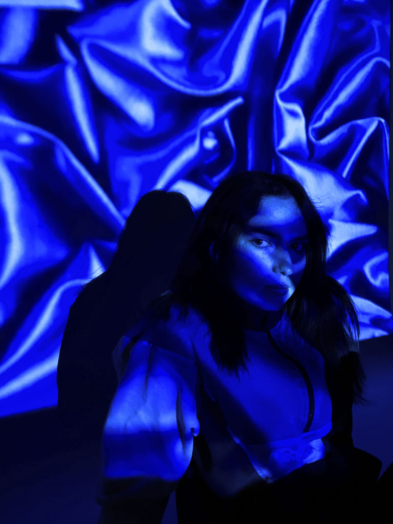
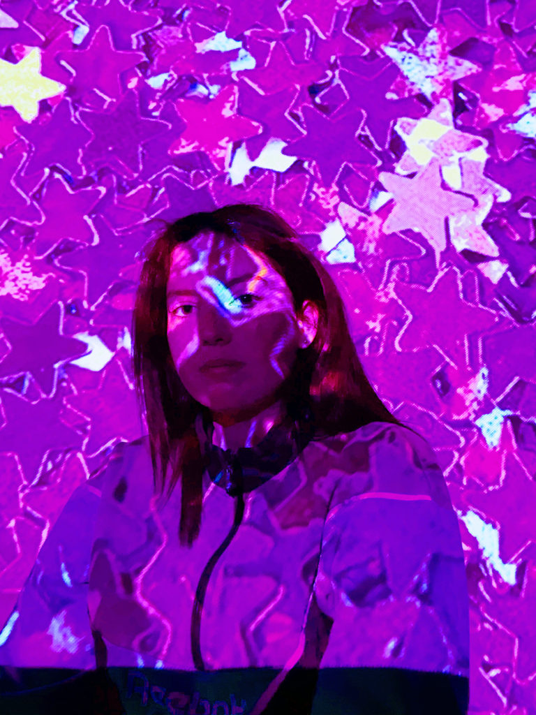
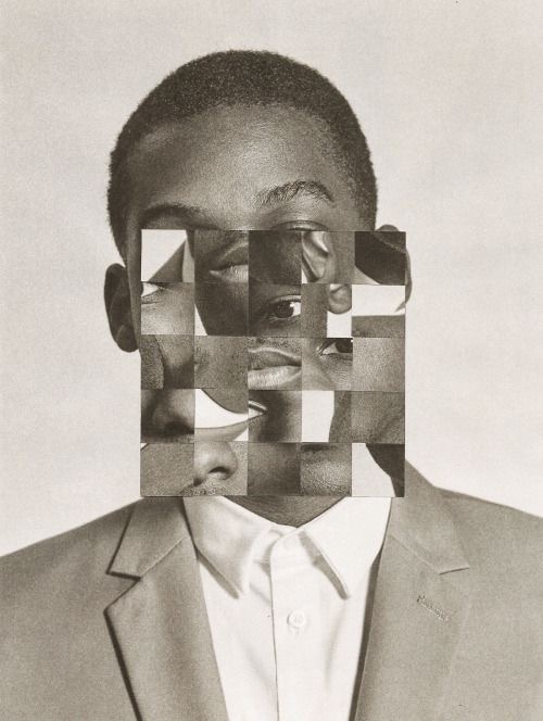
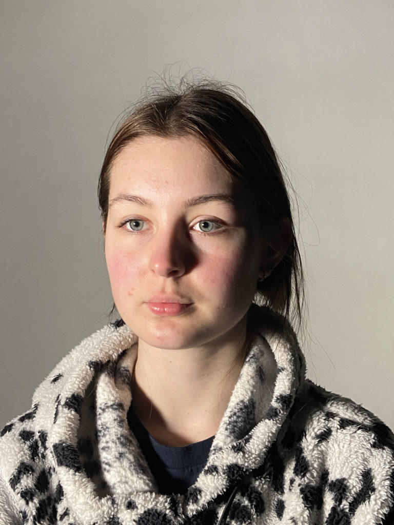
- Now that it’s over, what are my first thoughts about this overall project? Are they mostly positive or negative? My first thoughts about this project is that overall I think that I did well, although I know there are areas for improvement.
- If positive, what comes to mind specifically? Negative? I think that some things I did well were my presentation of my ideas and my case study and comparison. I think I could’ve analysed and evaluated my own final images in more detail.
- What were some of the most interesting discoveries I made while working on this project? I discovered that I prefer and find it easier to have a physical final piece that I can hold rather than an image on my blog.
- What were the challenges? I think that the thing I found most challenging was my time management, and also making sure that I had everything completed to the best of my ability.
- How did I come up with my final best solution? I took inspiration from a range of different photographers, but I also used my own imagination to experiment with different ideas.
- What most got in the way of my progress if anything? I think that my time management was the biggest thing that got in the way of me making a lot of progress.
- What obstacles did I overcome? I was struggling to come up with ideas for my final pieces, but once I had taken a break and thought about the type of message and feeling I wanted to present, I was fine.
- What did I learn were my greatest strengths? My biggest areas for improvement? I think that my greatest strength was that I was able to produce two final pieces that I was proud of, despite changing my mind a lot. I think my biggest area for improvement is my time management skills, and putting as much detail as possible into my blog posts.
- What would I do differently if I were to approach the same problem again? I would try to be as prepared as possible by making a checklist of everything I needed to produce and include in my blog posts, and tick them off as I went along. I would also try to make sure I had got enough done beforehand as possible, as it would put less strain on me during the controlled conditions.
- How will I use what I have learned in the future? I will use what I have learned in the future by ensuring I know what is expected of me to produce, and make sure that I put as much effort in as possible.
All posts by Niamh B
Filters
identity and place shoot 2
INITIAL IDEAS
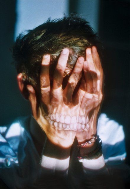
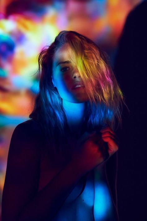
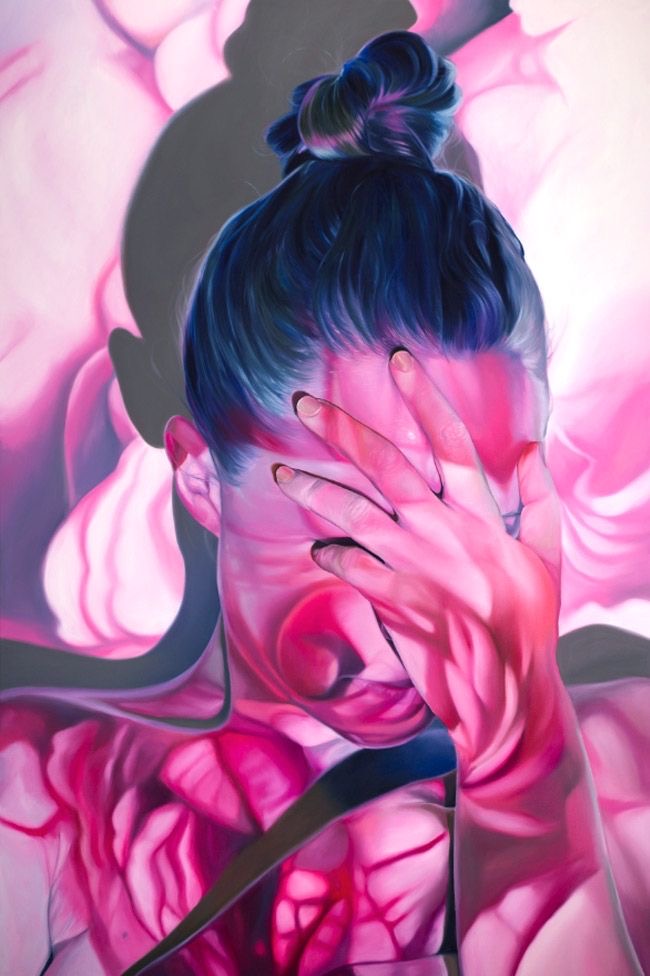
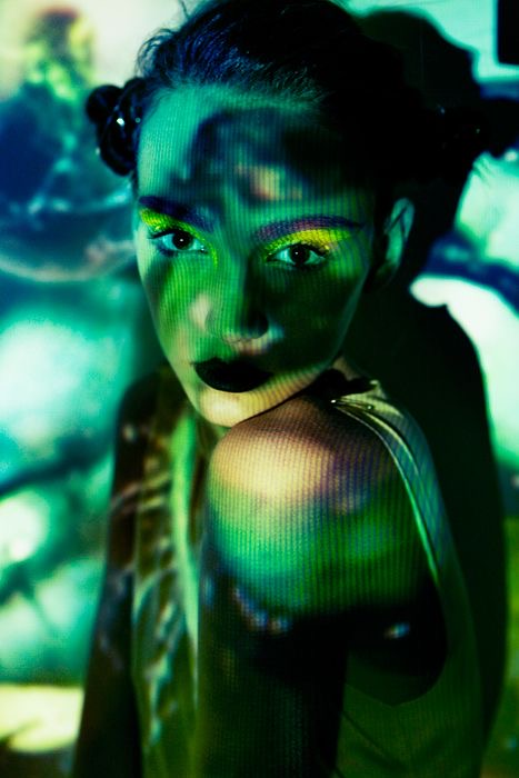
My idea for my second shoot is to explore the theme of gender identity. In order to portray this theme effectively, my plan is to use a handheld projector to project different images onto my subject’s face and body. After I have printed these images out, I will use a needle and various colours of thread to sew around different parts of the photograph. I think that this will be a successful way to show the concept of gender identity because I will be able to portray how people can choose to hide behind their presumed ‘identity’ in order to conceal who they really are. Additionally, it will also be able to show how members of society can sometimes project their views and opinions on others.
INSPIRATION
FIRST CONTACT SHEETS
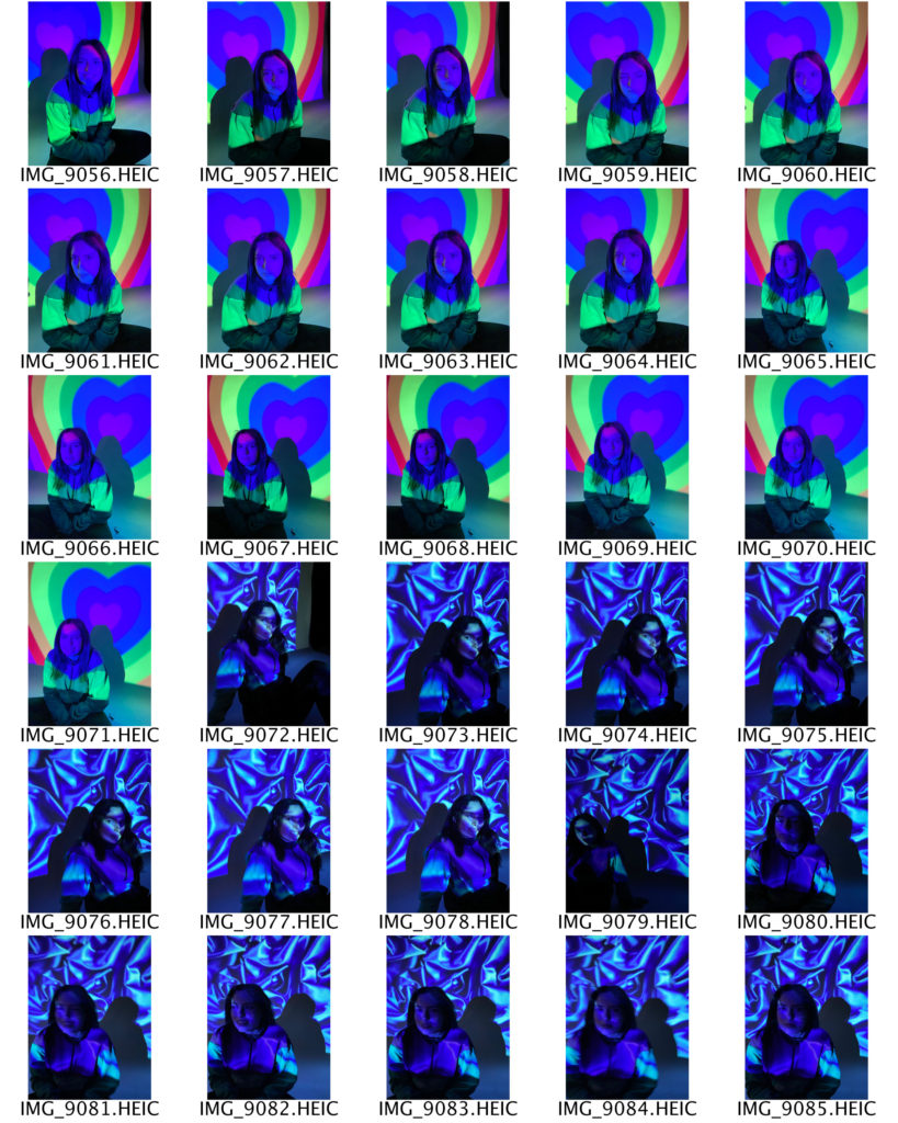
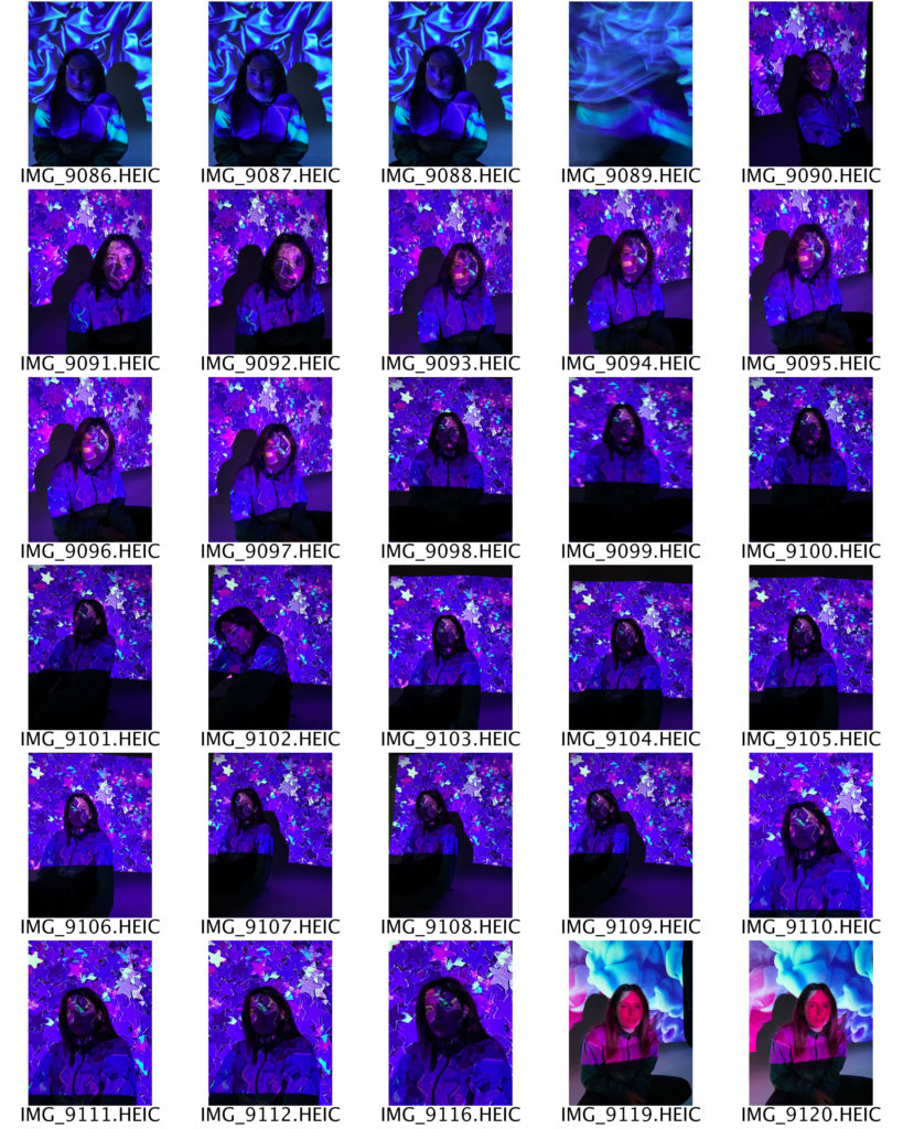
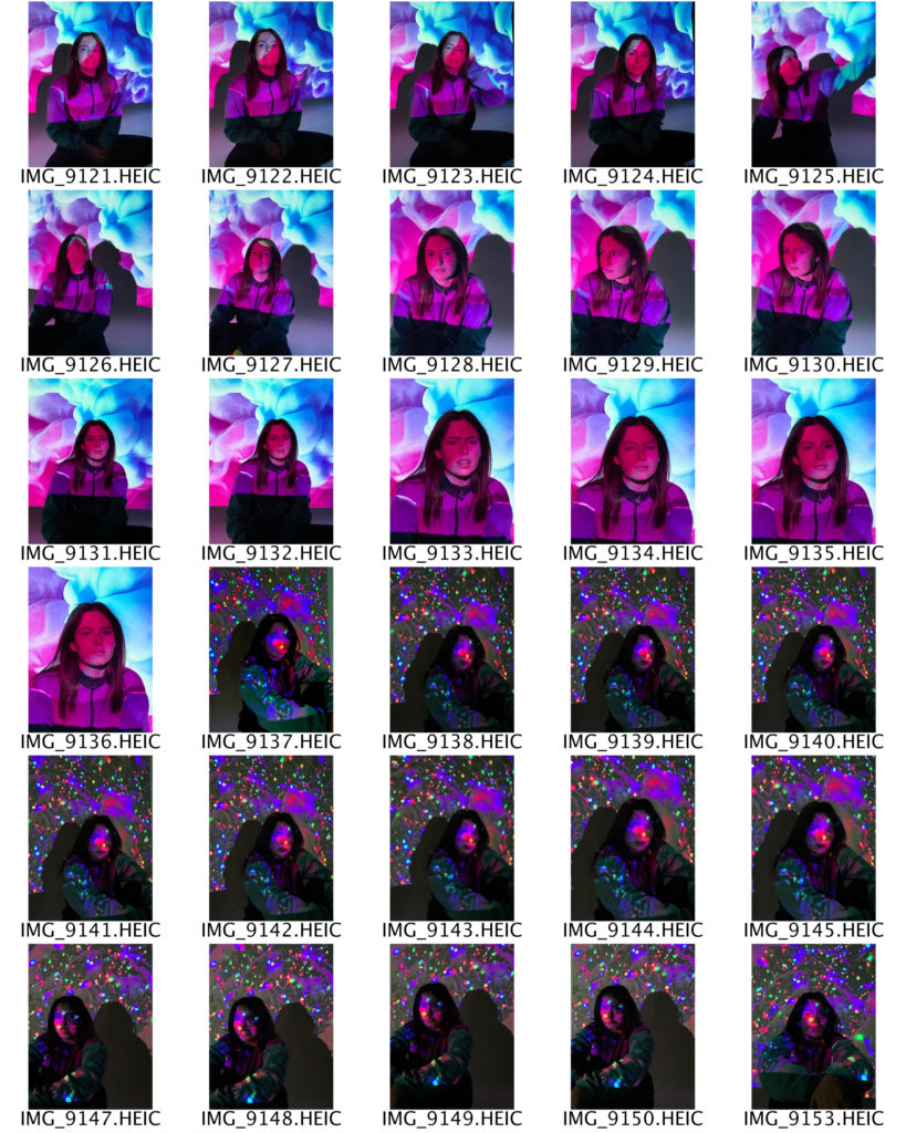
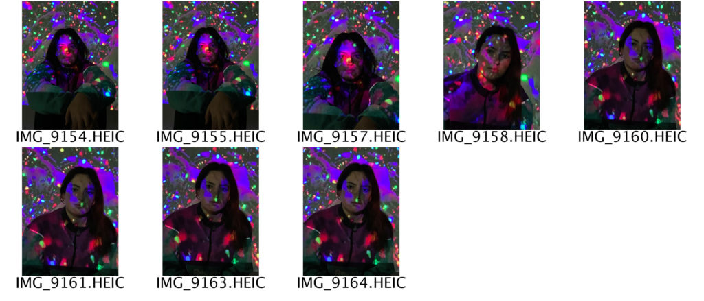
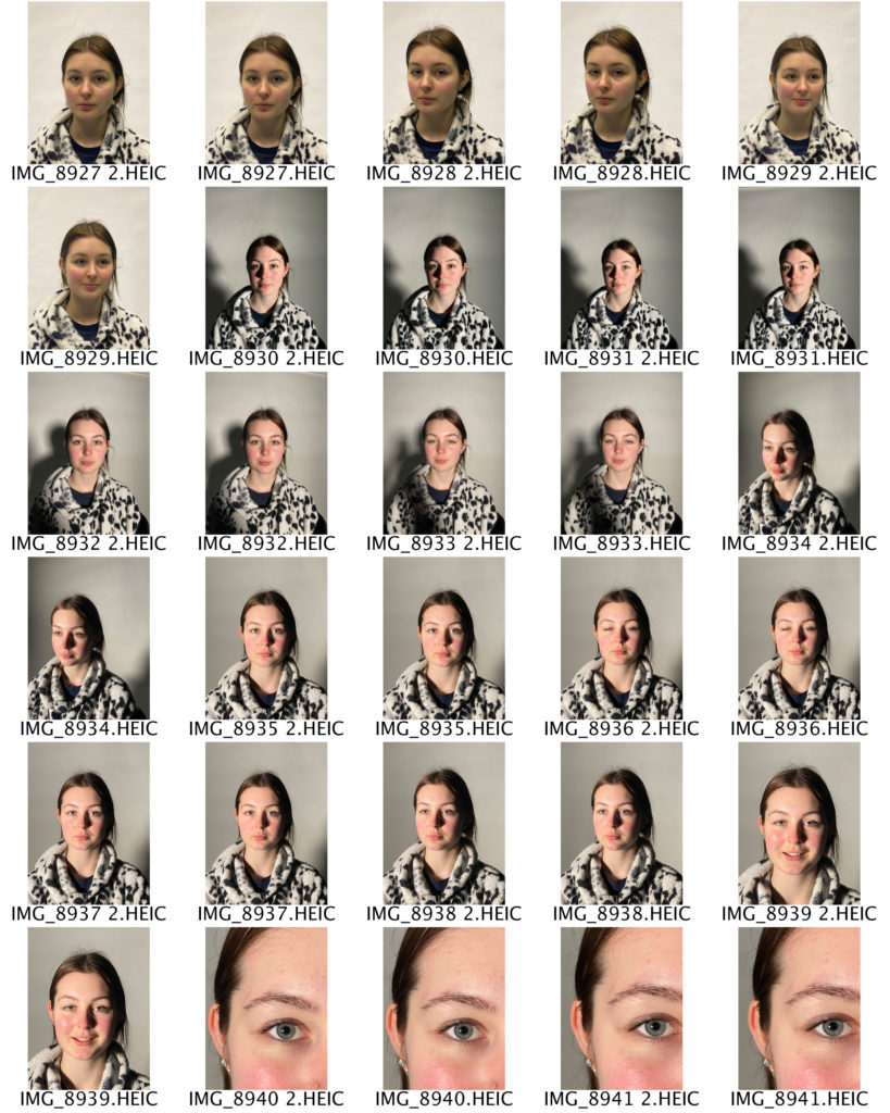
For this shoot I used a handheld projector against a plain white background, which helped to create my desired three dimensional effect. I chose and downloaded different images from the internet to project onto my subject because I wanted a range of dark and light tones. Additionally, the different images create contrasting moods and feelings. In order to ensure that my images are the best quality possible, I will edit and adjust some of the colouring on PhotoShop, as well as the sharpness and shadows.
EDITING PROCESS
PHOTOSHOP EDITING
To start with, I adjusted the brightness and contrast on all of my base images until I got an end result that I was happy with. I did this by selecting the image tab at the top of the screen and clicking adjustments, then brightness/contrast. For my second and fourth images, I brought the brightness most of the way down so that the shadows across my subject’s face would be more noticeable. Next, I decided to adjust the vibrance of my images, by selecting the image tab, then adjustments, then vibrance. I did this because I wanted all the colours in my photographs to be brighter. Then, I adjusted the saturation by selecting the image tab, then adjustments, then hue/saturation. I increased the saturation the most in my fourth image, as I wanted the viewer to be able to see the orange-toned colours more clearly. After that, I wanted to change the colour balance of my images. I did this by selecting the image tab, then adjustments, then colour balance. I slid my mouse across all three of the different colour scales until I was happy with the result, and the right colours had been emphasised.
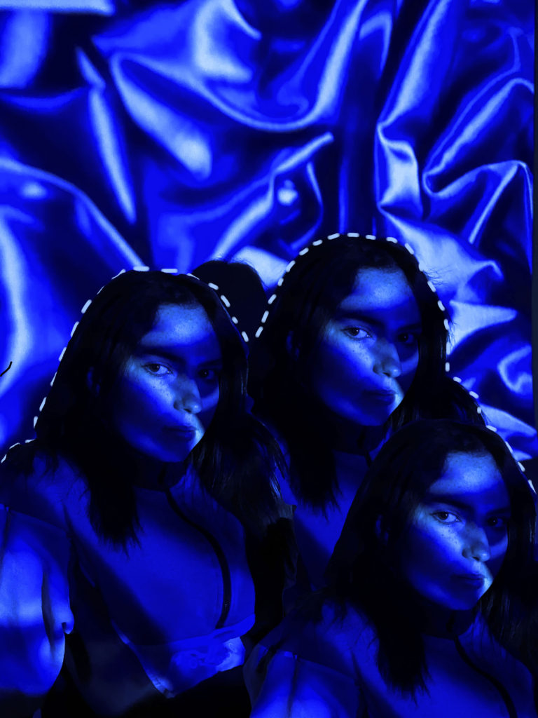
After I had made all the adjustments to my base images, I selected the one which I liked the most to use for my final image. I chose my second image and opened it in PhotoShop. I decided I wanted to duplicate my subject and have three of her all next to one another. To do this I selected the layer on the right hand side of my screen and duplicated it by pressing control c. Now that I had two layers I selected the new one and used the object selection tool to pick out my subject. I then copied the area outlined by the object selection tool and pasted it onto my background layer. I did this once more to get three subjects, and I then moved and adjusted them until I got an end result that I was happy with.
After I had finished duplicating my subject and arranged them into the position I wanted, I decided to add something else to my image so that it wouldn’t just be plain. I selected the brush tool and changed the size and hardness using the corresponding scales at the top of my screen. I then selected the soft round brush from the different options. I used the eyedropper tool to sample one of the colours from my image; I chose a pale blue colour which is as close to white as I could find. I began to trace the outline of my subjects with the brush, making small horizontal dashes which were close together. To finish, I adjusted the sharpness of the photograph by selecting the filter tab, then sharpen.
FINAL IMAGE
identity and place shoot 1
INITIAL IDEAS
My idea for this first shoot is to explore the concept of identity loss. In order to portray this theme effectively, my plan is to create a collage of my subject’s face using different materials such as old photographs, newspaper and magazine clippings, and paint. I think that this will be a successful way of showing identity loss as the end result will be an accumulation of many different factors, but it will also show how confusing identity can sometimes be, and that it is not just made up of one thing. Additionally, it will allow me to present various creative skills and ideas.
INSPIRATION
FIRST CONTACT SHEETS
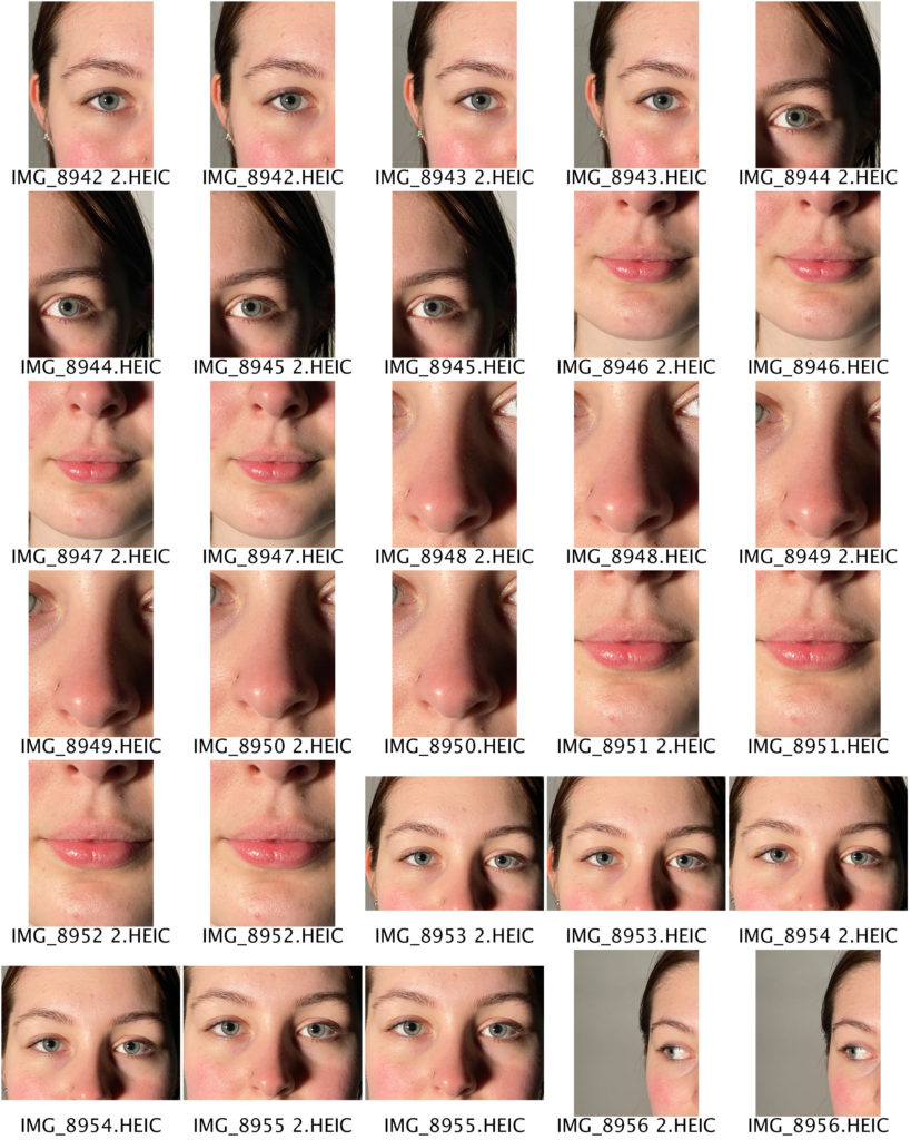
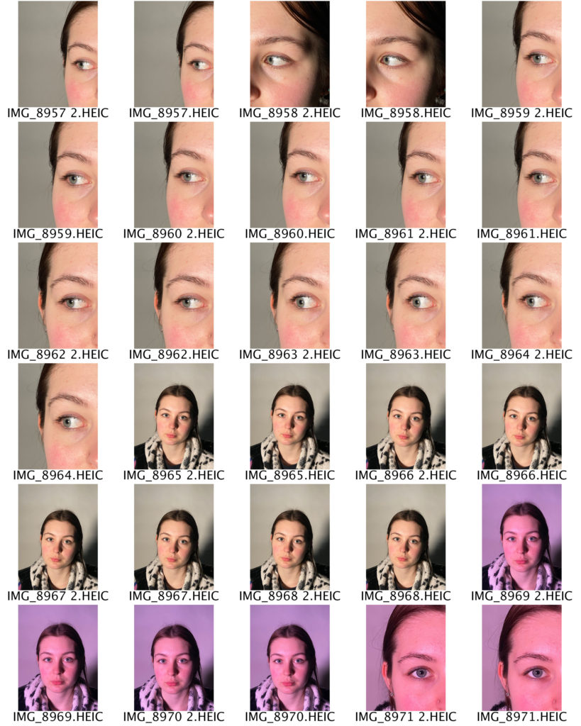
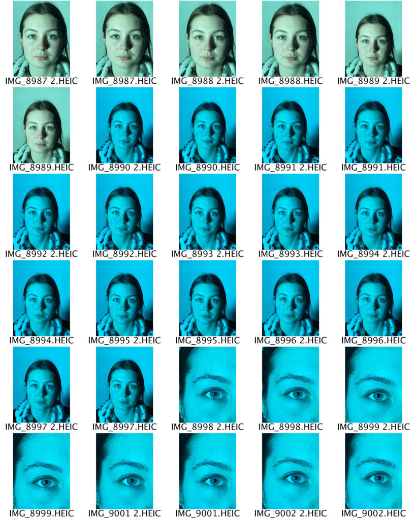
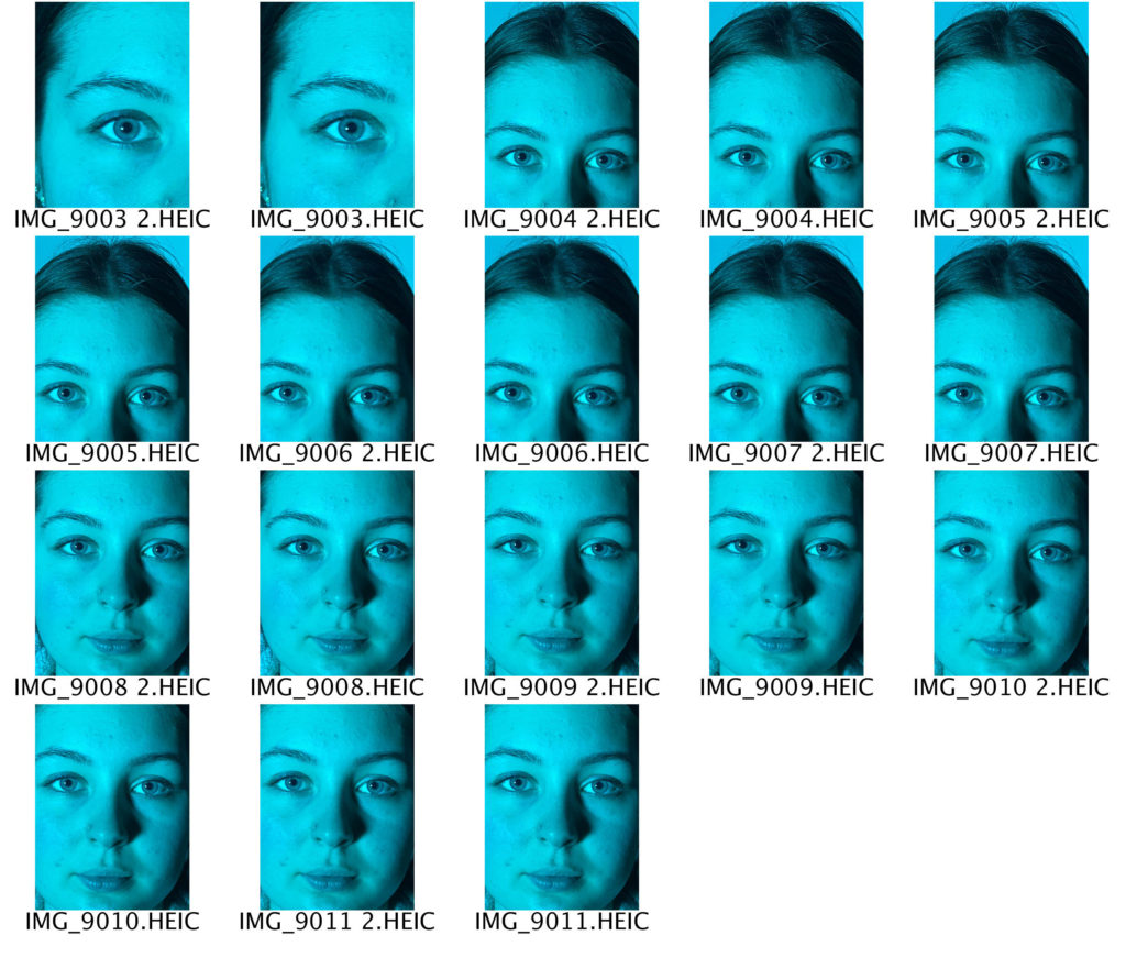
For this shoot I took some normal headshots which I will use as the base / background for my collage. I took these using different colour plastic sheets over an L.E.D light so that I would have a variety of images to work with. I then photographed close up images of my subject’s face, which I will cut out and arrange in different shapes, patterns, and orders over the base to create the look that I am aiming for. I will edit some of the photographs on PhotoShop into a black and white effect so each collage has a unique look and feel.
EDITING PROCESS
COLLAGE MAKING
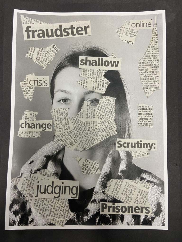
Firstly, I printed out some of the various close-up images I took of my subject’s face, and cut them up into squares and rectangles. I then printed out the pre-selected three black and white base photos. I experimented with placing and layering the close-up images on the bases, using a mixture of black and white, normal, and the two different colour options. I did this for about half an hour before I decided to try another idea, as I didn’t feel that it was going to plan. I looked through different newspapers to try and find different buzzwords which could relate to identity loss. The words that I found were; ‘nightmares, prisoners, shallow, change, madness, crisis, online, oddity, scrutiny, fraudster, images, judging‘. I then ripped out pages of the newspaper which were covered in text to use to mask my subject’s face. I experimented with the placement of the newspaper, originally deciding to cover their whole face, but after trying several different options, I decided to only cover the bottom half and a little bit on the right hand side, leaving their eyes completely exposed. After I had glued down the newspaper, I arranged the cut out words around my subject’s face and tested different angles and placements until I was happy with the final result. I then cut out a piece of plain black card which I used to back my piece.
FINAL PIECE
identity and place case study
CLAUDE CAHUN
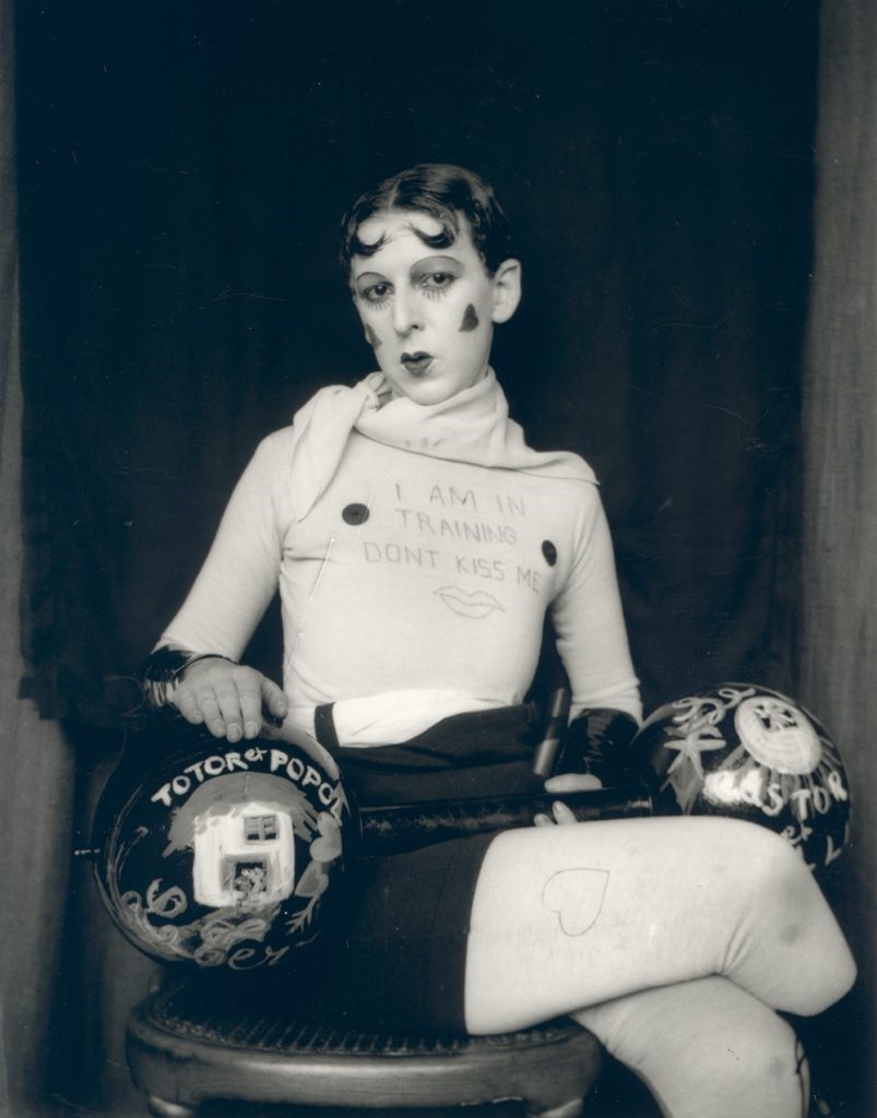
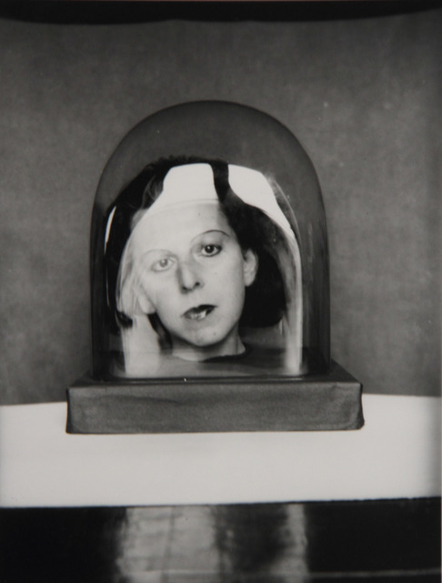
Claude Cahun (1894 – 1954) was a French surrealist photographer, sculptor and writer. Born Lucy Renee Mathilde Schwob, they adopted the pseudonym Cahun in 1917, and are best known for their self-portraits, in which they assumed a variety of different and eclectic personas. Cahun’s work challenged the traditional concepts of gender roles, and in their autobiography they state: ‘Masculine? Feminine? It depends on the situation. Neuter is the only gender that always suits me.‘ It is likely Cahun would have identified as non-binary today.
In 1937, they settled in Jersey with their partner Suzanne Malherbe (pseudonym Marcel Moore). Following the German occupation of the island in 1940, both Cahun and Moore became active as resistance workers and propagandists, working extensively to produce anti-German fliers, which they would place discreetly in soldiers’ pockets or in cigarette packages. Their resistance efforts were not only political, but also artistic; using their creative abilities to undermine and manipulate the authority they hated. In many ways, Cahun’s life was marked by a sense of role reversal, and like many early queer pioneers, their public identity became a commentary upon the public’s opinions of sexuality, gender, beauty, and logic. Their adoption of a gender neutral name and their androgynous self-portraits display a revolutionary way of thinking and creating, experimenting with the audience’s understanding of photography as a documentation of reality.
CINDY SHERMAN
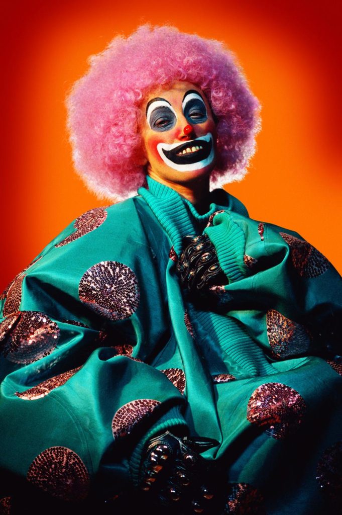
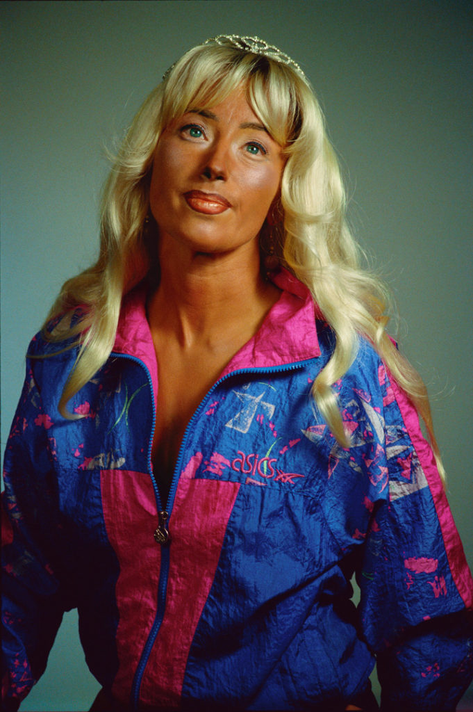
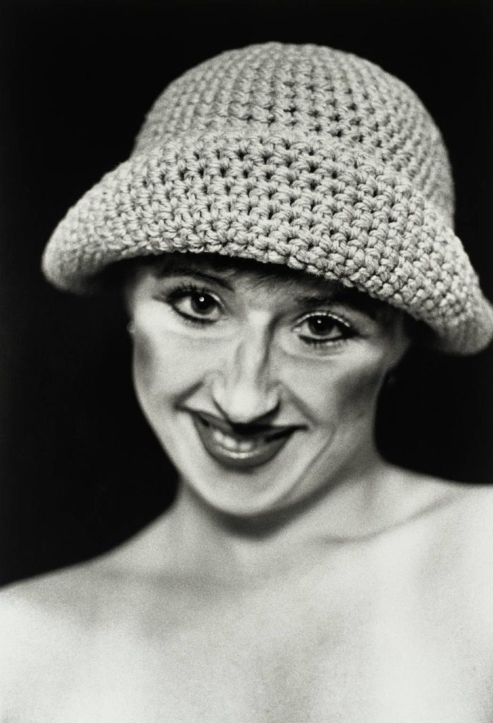
Cindy Sherman (1954 – ) is an American artist whose work consists primarily of photographic self-portraits, depicting herself in many different contexts and as various imagined characters. In 1972, Sherman enrolled in the visual arts department at Buffalo State College, where she began painting. During this time, she began to explore the ideas which became a hallmark of her work: She dressed herself as different characters, cobbled together from thrift-store clothing. Sherman works in series, typically photographing herself in a range of costumes. To create her photographs, Sherman shoots alone in her studio, assuming multiple roles as author, director, make-up artist, hairstylist, wardrobe mistress, and model. She explained to The New York Times in 1990, “I feel I’m anonymous in my work. When I look at the pictures, I never see myself; they aren’t self-portraits. Sometimes I disappear.” She describes her process as intuitive, and that she responds to elements of a setting such as light, mood, location, and costume, and will continue to change external elements until she finds what she wants.
Sherman’s work is often linked to feminism, since her photos call attention to the objectification of women in the media. Sherman’s 1981 series Centerfolds contains pseudo-voyeuristic images of young women. Her 2008 series Society Pictures addresses the obsession with female youth and beauty in American society. Her most recent series, the 2016 Imitation of Life, explores the glamour that can be found within mature women. By using stylized, vintage costumes and heavy makeup, Sherman is rendered as a subject that looks almost artificial, aside from her conspicuously-placed, aged hands, which point to the reality behind the illusion. Sherman has identified an uncertainty toward the Untitled series’ relationship with the male gaze.
IMAGE COMPARISON
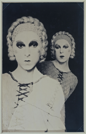
Despite the fact that these two photographs were taken almost 50 years apart, the message behind each of them is strikingly similar; that identity can be whatever you want it to be. Both photographers explore what it means to be perceived and judged by others, and, perhaps more harshly, by yourself. They have stripped themselves of all things, both physical and emotional, in order to transform themselves into re-invented and more developed versions of their previous selves, with both of them taking on the roles of various different personas and characters. For the brief moments during which they are in front of the camera, they are able to let go of what they and society thinks they ‘should’ be, and express themselves through their art form. Both images have been shot in plain black and white tones, with Sherman adding the effect in order to accurately portray her character’s time of relevance. They have also both been shot against a black backdrop, which means we can assume that they were captured in a studio of some kind. The black backdrop also allows the viewer to see Cahun and Sherman clearly, with nothing in the background of the images becoming a distraction to the eye. Additionally, it strips the photograph of any depth, making both images appear flat and two dimensional. Furthermore, the two subjects have very pale complexions, which contrasts heavily to the dark background. As these pictures were captured in a studio, it is highly likely that artificial lighting was used to illuminate the subjects, and we can see that by the way the light is spread evenly over Sherman, we can assume that 3 point lighting was used. Another similarity is that both Cahun and Sherman have used makeup to exaggerate their features as a way to emphasise their respective characters. For example, we can see that Cahun has drawn on her bottom eyelashes in order to make her eyes appear larger and more doe-like, and Sherman has applied a heavy amount of contour to her cheekbones. This can be linked to the theme of identity as makeup is often used by people to create an entirely new face, or alter the one they had before.
what is identity?
The term ‘identity’ is defined as the fact of being who or what a person or thing is, and a close similarity or affinity. An individual’s identity can be influenced by their environment and their upbringing, as well as social factors such as culture, political standing, friendships and relationships. Additionally, an individual’s identity may be defined by their loss or lack of it; if an individual is unsure about who they are or who they want to be, then this in itself is also their identity. An identity is something that everyone has, regardless of whether they know it or not.
MOODBOARDS
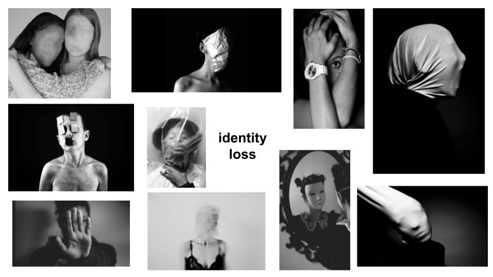
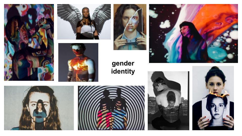
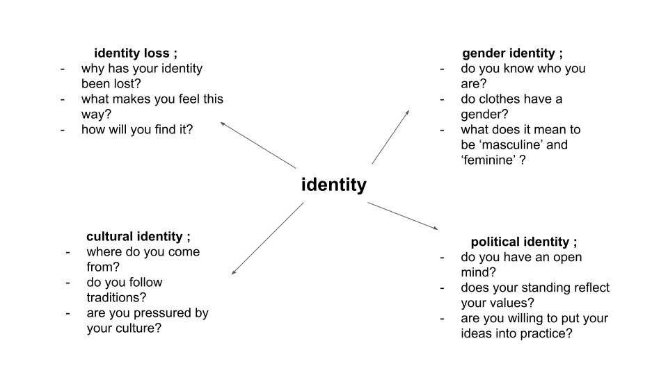
My first initial ideas for my two photoshoots were to explore the themes of identity loss and gender identity. I think that especially in recent years, society as a whole has learned to be a lot more open and accepting of people’s choices about how they wish to be seen, not only by themselves but by the rest of the world too. Additionally, social media and the internet has had a heavy influence on topics such as self-confidence and the idea of the ‘perfect’ life. This could be tied into the theme of identity loss as what is being posted online is not always the truth; these people have lost themselves in the world of perfection so much that they do not know who they are any more. With the LGBTQ+ community slowly but surely being widely accepted across the world, the strict, traditional gender roles which have been in place for generations are becoming less and less prevalent, allowing these lines of restriction to be blurred and crossed by all members of society. Freedom of expression is something which everyone is entitled to, and I think it would be interesting to document the different ways in which individuals achieve this.
photo montage history
Photomontage is the process and the result of making a composite photograph by cutting, gluing, rearranging and overlapping two or more photographs into a new image. It is often used as a way of expressing political disagreement. It was first used as a technique by the Dadaists in 1915 in their protests against the First World War. It was later used by the surrealists who explored the possibilities of photomontage by using it to bring together widely contrasting images, in order to reflect the workings of the unconscious mind. In 1923, the Russian constructivist Aleksander Rodchenko began experimenting with photomontage as a way of creating socially engaged imagery exploring the placement and movement of objects in space. Other artists who have used this technique are John Heartfield, the German artist who reconstructed images from the media to protest against Germany’s Fascist regime and Peter Kennard; whose photomontages explored issues such as economic inequality, police brutality and the nuclear arms race between the 1970s and the 1990s.
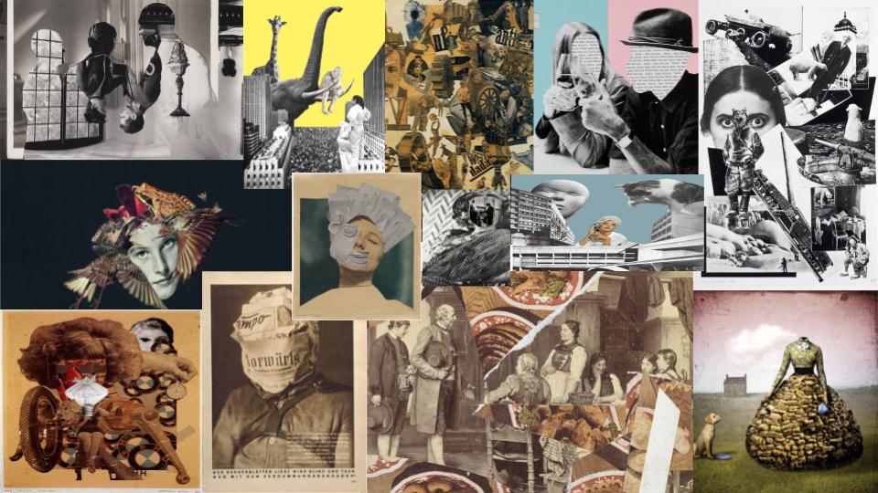
JOHN STEZAKER
John Stezaker ( 1949 – ), is a British conceptual artist. His work is surreal in tone and is often made using collage and the appropriation of pre-existing images such as postcards, film stills, and publicity photographs. Art historian Julian Stallabrass said, “The contrast at the heart of these works [by Stezaker] is not between represented and real, but between the unknowing primitives of popular culture, and the conscious, ironic artist and viewer of post-modern images.” One work included in an exhibition at Salama-Caro Gallery, London, in 1991, depicted an image of a punch clock together with the caption “Why Spend Time on an Exhibition Like This?”.
one point lighting studio portraits
Studio lighting is an essential part of most photographer’s work, as it allows them to create an effect which can be either natural or artificial. A photographer’s choice of lighting is an integral part of the composition of their photographs, and can be the difference between a good image and a bad image. Studio lighting in particular can be manipulated in so many different ways, allowing the photographer to create a numerous amount of images just by changing the lighting.
Rembrandt lighting is a standard lighting technique that is used in studio portrait photography and cinematography. It can be achieved using one light and a reflector, or two lights, and is popular because it is capable of producing images which appear both natural and compelling with a minimum of equipment. Chiaroscuro is the use of contrast in light and shading across an entire image composition. It is a technique that creates a three-dimensional quality in images on a two-dimensional plane. Chiaroscuro lighting was developed by Leonardo Da Vinci, Caravaggio, Vermeer, and Rembrandt.
MY RESPONSE
FINAL IMAGES
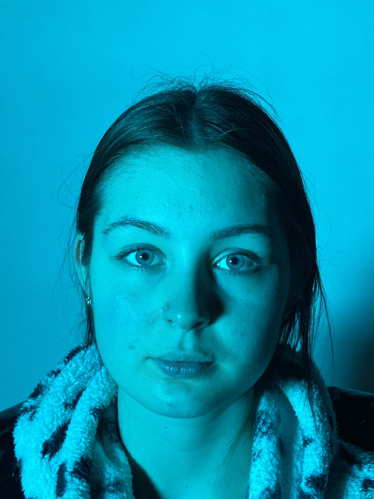
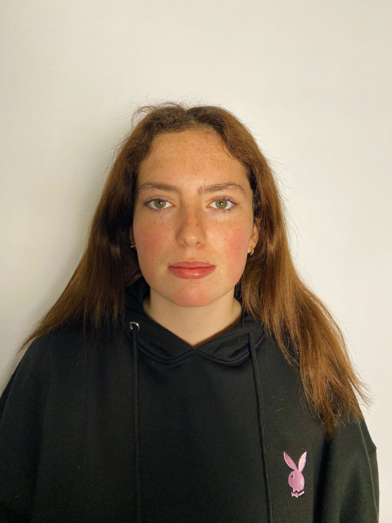
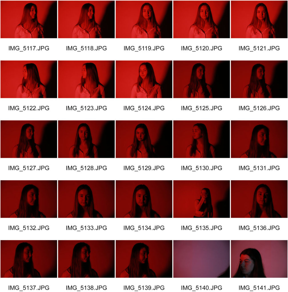
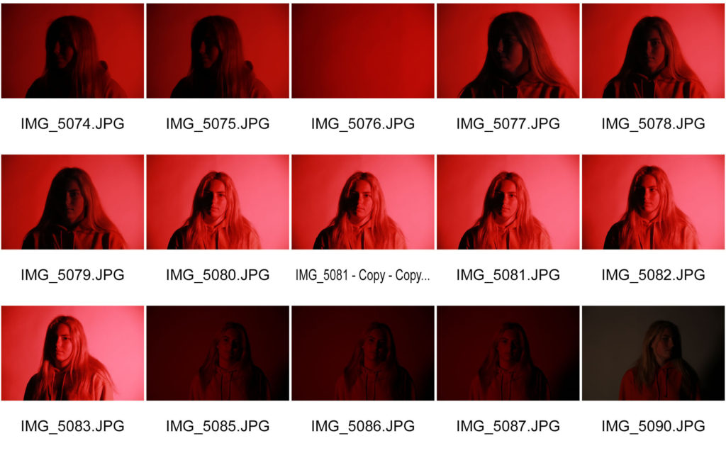
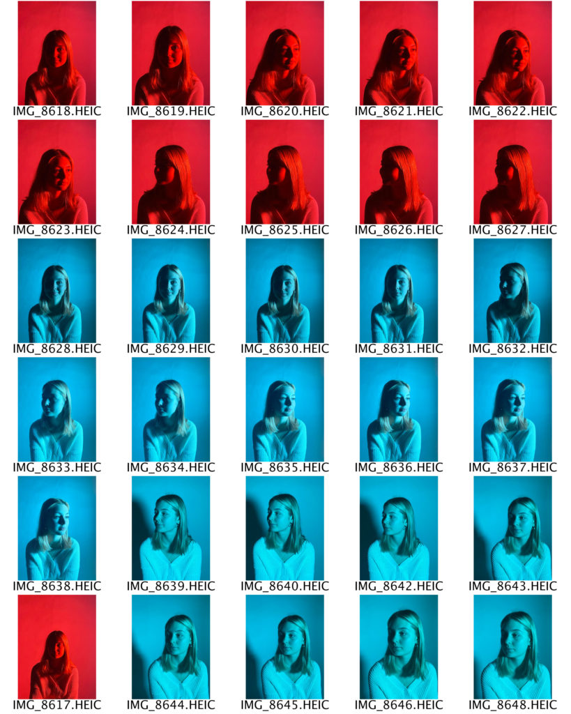
I have selected these three photographs as my final images because I think that they best show the Chiaroscuro lighting technique. The shadows being cast across my subject’s face fall in a triangular shape, which creates a three dimensional effect. I had my light set up on one side of my subject’s face and I switched sides regularly in order to create and explore different angles and shadows. I decided to use a colourful plastic sheet over an L.E.D. light instead of a spotlight because I wanted as much of my subject’s face illuminated as possible, but still with the shadows being cast over one side of her face. Additionally, I think that the colour adds a slightly modern touch to the old technique, and makes the photographs appear more vibrant and full of life. I chose the red and blue colours because they gave the best visibility through the camera lens, and were the most contrasting in tone.
headshots – deadpan
A head shot or headshot is a modern (usually digital) portrait in which the focus is on the person. Head shots are used in many different ways, for example actors, models, and other performers are usually required to present a range of head shots alongside their portfolio and CV when applying for a job. This is so their employer can see exactly who they are ( i.e. age, ethnicity, etc. ). It is therefore important that they are taken in the right and most flattering way.
THOMAS RUFF
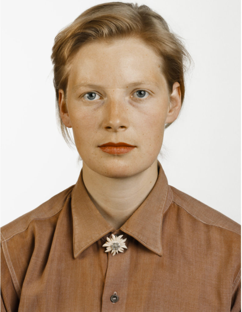
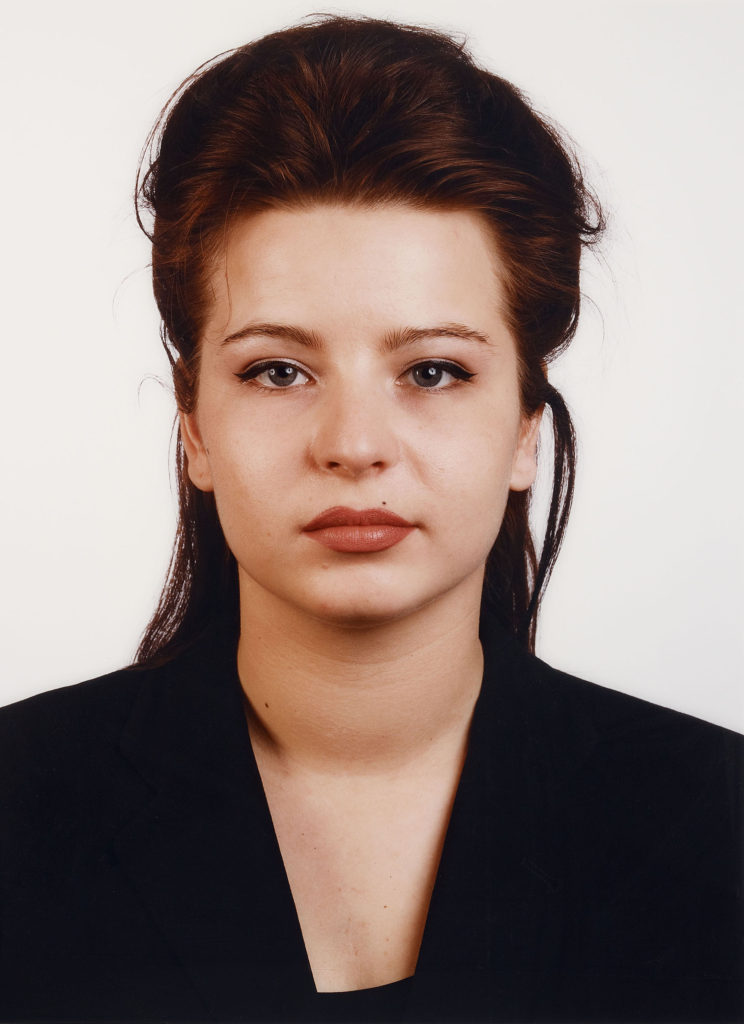
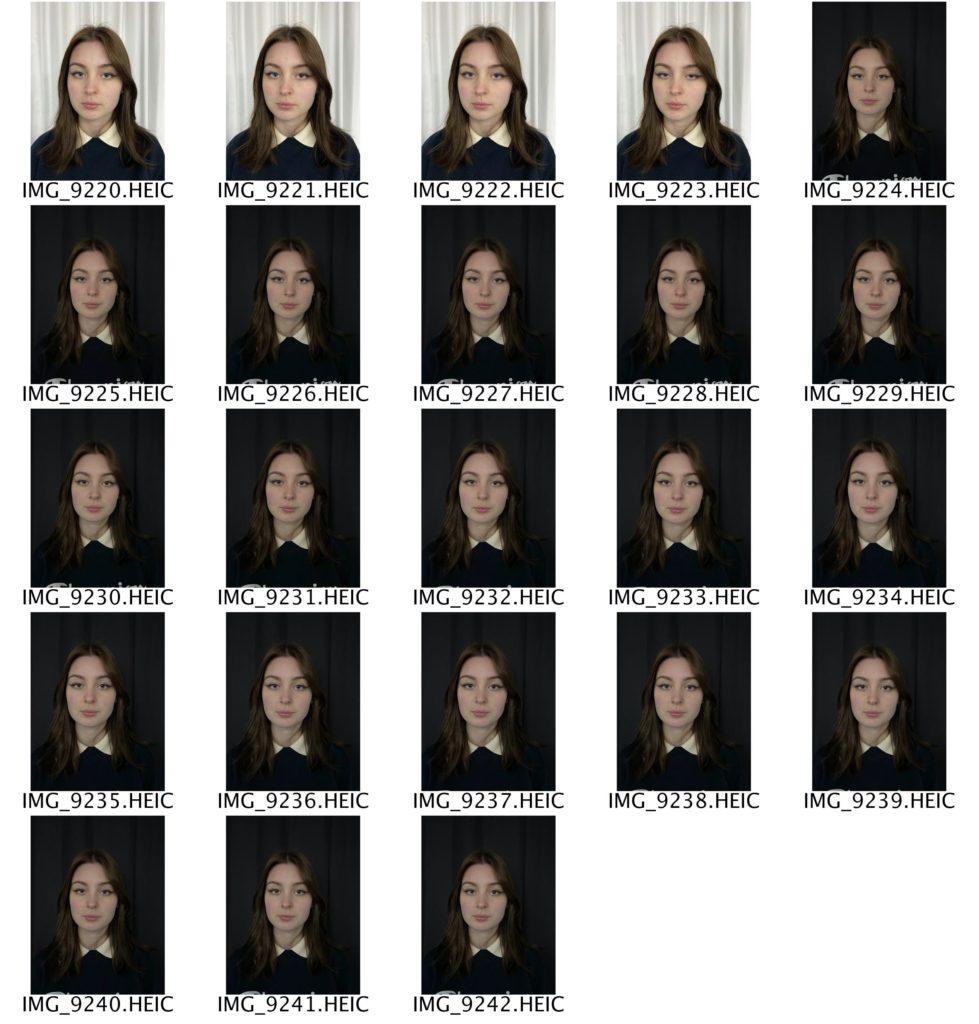
Thomas Ruff ( 1958 – ) is a German photographer who has been described as ‘a master of edited and reimagined images‘. In 1974, Ruff acquired his first camera and started to experiment, taking shots similar to those he had seen in many amateur photography magazines. During his studies in Düsseldorf, Ruff developed his method of conceptual serial photography. He began photographing landscapes, but while he was still a student he transitioned to the interiors of German houses, with typical features of the 1950s to 1970s. This was followed by similar views of buildings and portraits of friends from the Düsseldorf art and music scene. Between 1981 and 1985, he photographed 60 half-length portraits in the same manner: passport-like images, with the upper edge of the photographs situated just above the hair, even lighting, the subject between 25 and 35 years old, taken with a 9 × 12 cm negative and, because of the use of a flash, without any motion blur. The early portraits were black-and-white and small, but he soon switched to colour, using solid backgrounds in different colours. The resulting portraits depict the individual framed as in a passport photo, typically shown with emotionless expressions, sometimes face-on, sometimes in profile, and in front of a plain background.
MY RESPONSE – ACTION PLAN
WHO – My plan is to take photographs of my friends as they are easily available for me to shoot.
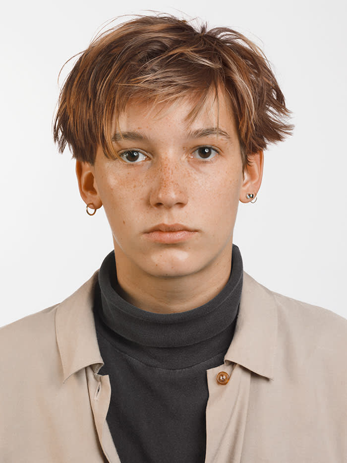
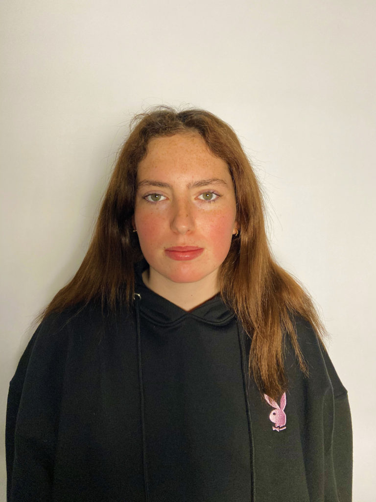
WHAT – I will be taking deadpan photographs in order to portray a ‘passport’ effect.
WHERE – I will take these photographs in the lighting studio against plain black and white backgrounds.
WHEN – I will be taking these photographs at the earliest opportunity in order to allow myself more time to edit and finalise my images.
WHY – I will be taking these photographs in order to showcase my knowledge and understanding of portrait photography.
CONTACT SHEETS
FINAL IMAGES
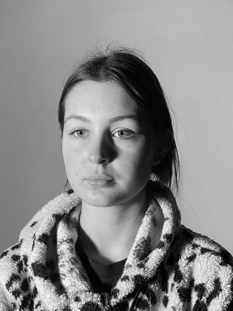
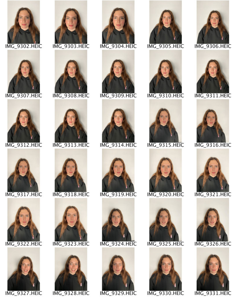
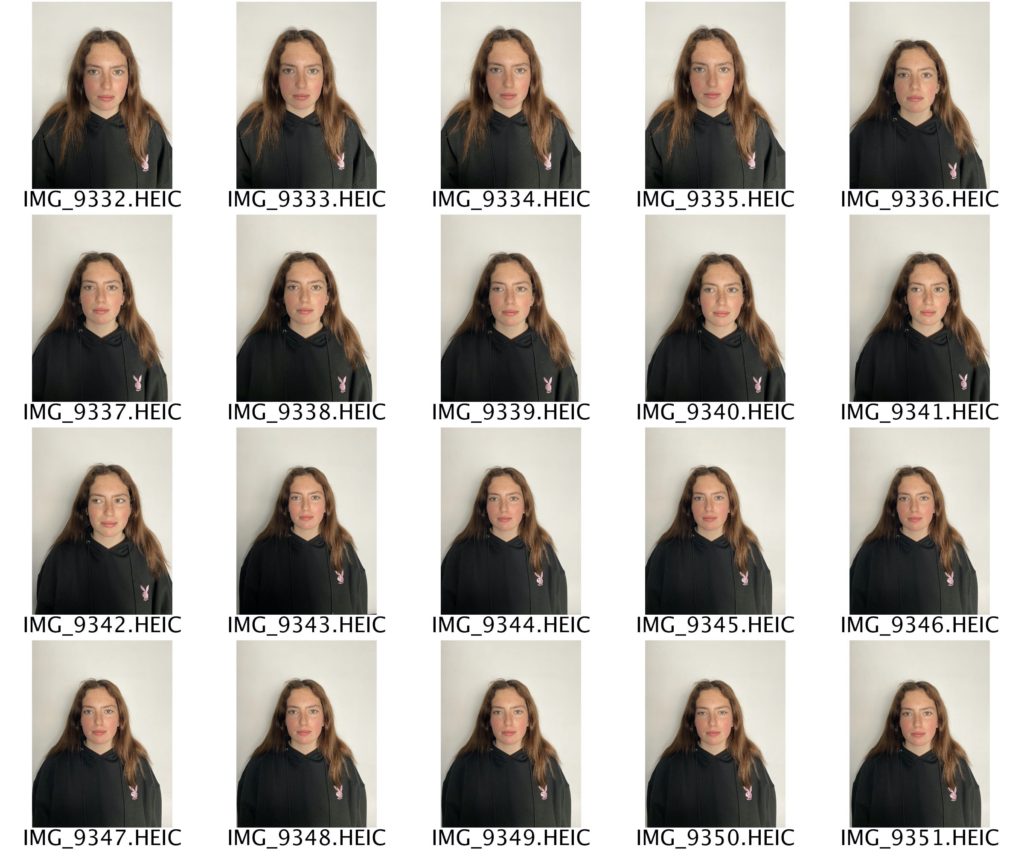
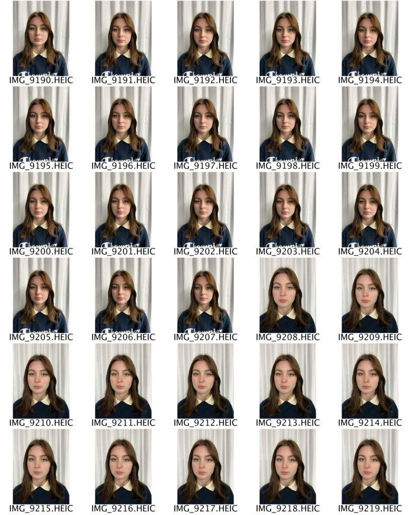
I have selected these two photographs as my final images because I think that they reflect Thomas Ruff’s work the most accurately. For example,e I have taken these photographs against a plain white background with my subject facing directly to the camera. My subject is placed in the middle of the photograph in order for there to be an equal amount of space and depth on all sides. I experimented with different angles and distances, such as shooting from up close to a few steps back. This allowed me to ensure that my photographs all looked as unique and different as possible, whilst still staying true to Ruff’s work. I edited my photographs using PhotoShop; firstly I sharpened them by selecting the filter tab, then sharpen. I then adjusted the vibrance by selecting the image tab, then adjustments, then vibrance. I slid along the scale until I was happy with the end result.
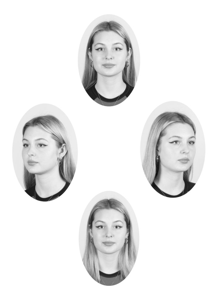
headshots – diamond cameo
HENRY MULLINS
Henry Mullins started working at 230 Regent Street in London in the 1840s and moved to Jersey in July 1848, setting up a studio known as the Royal Saloon, at 7 Royal Square. He would photograph the upper class such as doctors and political elites as they were able to afford to visit his studio. He would photograph the upper class such as doctors and political elites as they were able to afford to visit his studio.

MY RESPONSE
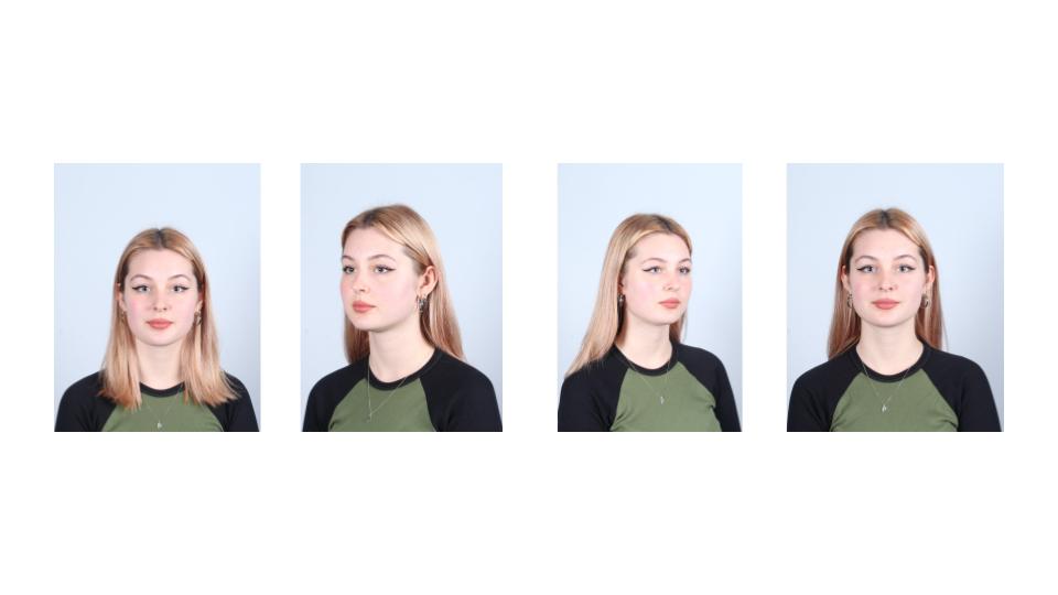
Before I started working on the diamond cameo, I adjusted the brightness and vibrance by selecting the image tab, then adjustments, then brightness/contrast first, then vibrance. Then I used the Marquee tool in PhotoShop to draw an oval shape around my subject, then I copied and pasted the image onto a plain white background. I repeated this four times, and I also added a black and white filter onto my images.
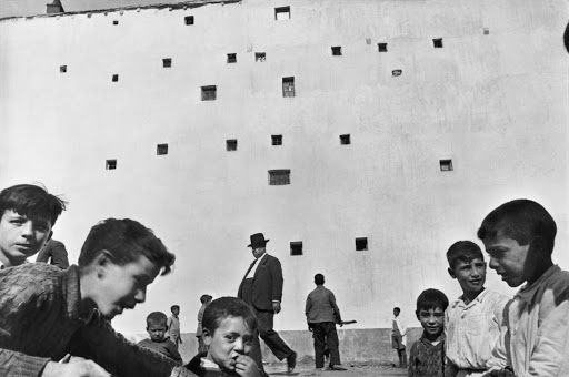
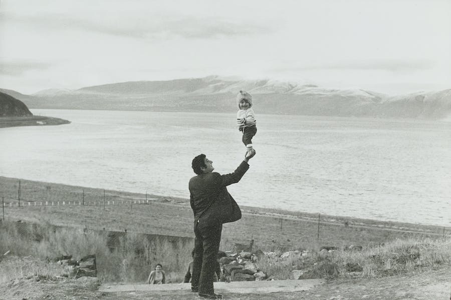
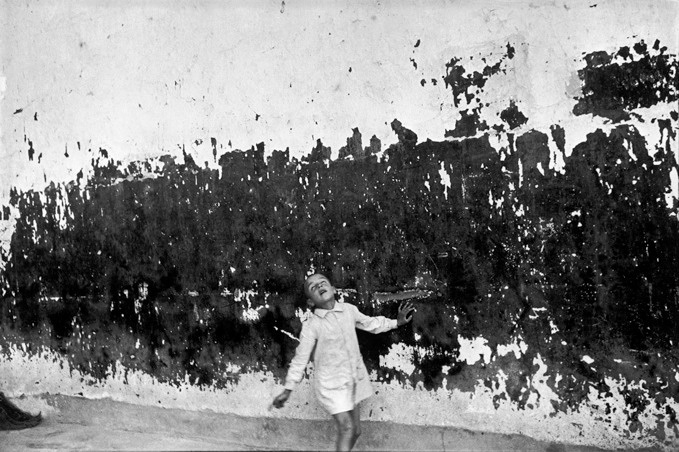
the decisive moment
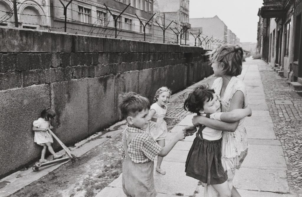
Henri Cartier-Bresson (1908 – 2004) was a French humanist photographer who is considered the master of candid photography. He pioneered the genre of street photography and viewed photography as a decisive moment.
Alongside Robert Capa, George Rodger, and David Seymour, Cartier-Bresson founded Magnum Photos in 1947, which today has approximately 80 members. Magnum Photos is a cooperative wholly owned by its photographer-members. This independence offers a great freedom of choice and treatment of subjects. Magnum photographs are famous for their journalistic and aesthetic qualities. Through its four editorial offices in Paris, New York, London, and Tokyo and a network of fifteen sub-agents, Magnum Photos provides photographs to the press worldwide. At the heart of this activity is a concern to encourage the photographers to carry out their individual projects and to act as sensitive witnesses to world events.
IMAGE ANALYSIS
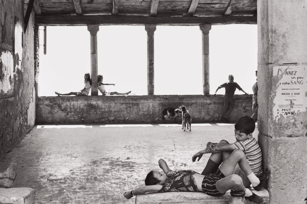
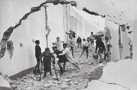
This photograph was captured in Simiane-la-Rotonde, France in 1969. It depicts several people, both children and adults, sat relaxing in what appears to be an old, derelict building. Cartier – Bresson has taken advantage of the bright and harsh natural light in this image, using it to illuminate the foreground of the photograph. This intense lighting also allows the people sat on the wall in the background to be silhouetted against the white, creating numerous contrasting figures. As the lighting in the photograph is so bright, it appears to be over – exposed, creating a more modern feel, even though the image was captured over 50 years ago. Cartier – Bresson has utilised the natural straight lines of the pillars in the background to create an interesting composition; it is an example of the rule of thirds, with the second pillar landing directly in the centre of the photograph, making it the main focal point which instantly draws the viewer’s attention to it. This image has a range of tones varying from bright white, to grey and black. Some of the darkest points of the photograph are the people silhouetted against the bright light in the background, again creating a heavy contrast between the two.

