
Here is an online link to my photobook ‘growing pains’ : https://www.blurb.co.uk/bookstore/invited/9561911/2574e6aec27e8c62a9a381f08e85e894e854214d
All posts by Niamh B
Filters
final prints
A3 PRINTS
A4 PRINTS
A5 PRINTS
identity & community newspaper
IDENTITY & COMMUNITY NEWSPAPER
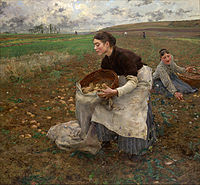
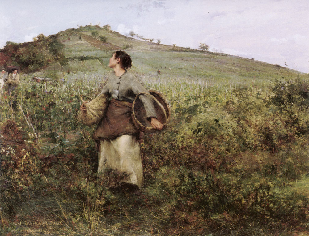
The images seen on the pages of this newspaper supplement are extracted from a variety of projects and final outcomes produced over a two-year academic programme of study by a group of A-Level photography students at Hautlieu School. In their final year the themes of Identity and Community offered a specific focus and through a series of creative challenges students developed a body of work that were inspired, partly from visiting heritage institutions to learn about aspects of Jersey’s unique history of immigration and exploring migrant communities and neighbourhoods in St Helier in a series of photo-walks. In the classroom additional inspiration was provided from workshops on NFTs (non-fungible token) and digital art, embroidery and textile art, animation and film-making, zine and photobook design led by professional artists, designers and teachers.
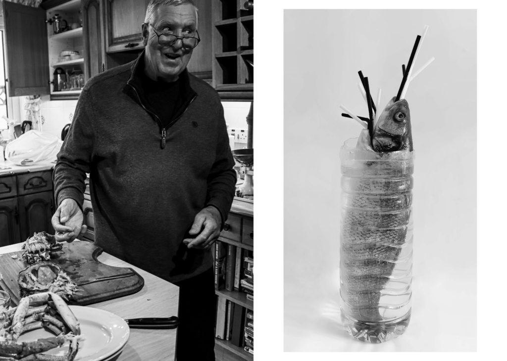
As part of the research and contextual studies students were asked to engage with some of the key questions raised by the Government of Jersey’s Island Identity project and explore through their own photographic studies how they interpret and identify distinctive qualities of island life. What can we learn from looking at a set of photographs produced by young islanders? At first sight they show us a seemingly random set of images of places, people and objects – some familiar, others surprising. On closer inspection each image is a visual sign and also a conundrum. For example, a fish stuffed in a plastic bottle may ask us to consider more closely our marine environment, commercial fishing or food consumption. As a combined sequence of images they represent different views that in many ways comment on a wider discussion on some of the primary objectives explored in the Island Identity project, such as ‘how we see ourselves’ and ‘how others see us.’

The newspaper was kindly sponsored by Deputy Carolyn Labey, Minister for International Development and Assistant Chief Minister who in her foreword shares her personal thoughts on what makes Jersey special to her in context of the Island Identity project led by her department. She says, ‘identity involves searching our soul, engaging with difficult issues, and asking not only who we are, but how others see us and what a vision for the future might look like. The perspective of students and young people in this debate is critical. Identity is a broad and far-reaching concept, one unique to all of us. This collection of images recognises both our differences and our commonalties. These times may be uncertain, but in my view the topic – ‘what Jersey means to you’ – is a fundamentally optimistic and forward-looking one.’
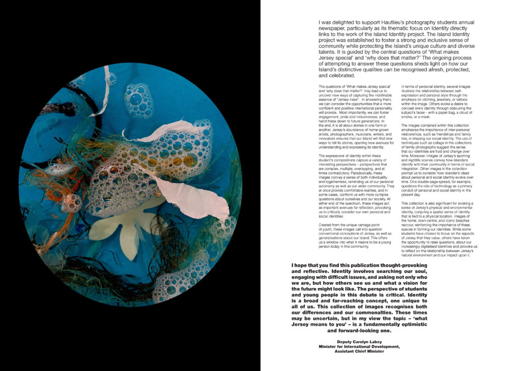


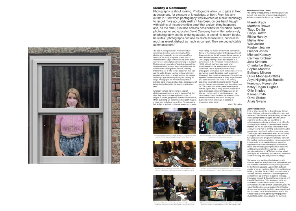
The Identity and Community newspaper is the fourth supplement produced in collaboration between Hautlieu School Photography Department and Jersey Evening Post. In 2018 the first issue was The Future of St Helier and last year the themes of Love & Rebellion explored experiences of isolation and lockdown during the coronavirus pandemic. Photographer and teacher Martin Toft, comments: ‘The question of ‘what makes Jersey special’ matters a great deal to every islander and as visual signs, the images printed on these pages are an attempt – not so much to provide answers – but rather asking questions about the essence of this island we call home, and how it actively will overcome current challenges in shaping a prosperous future for all.’


NEWSPAPER EVALUATION
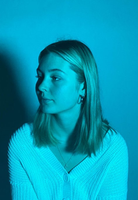
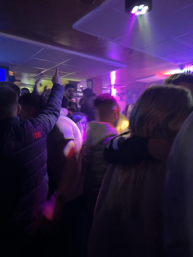
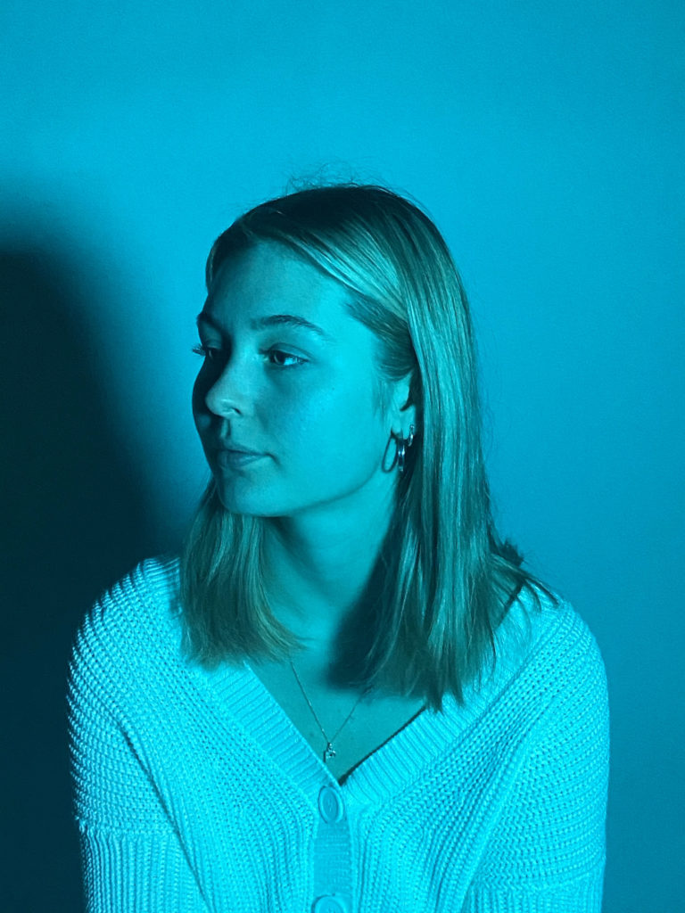
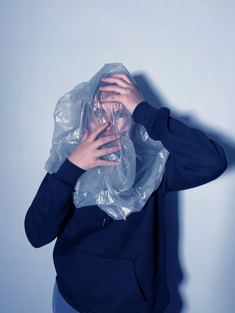
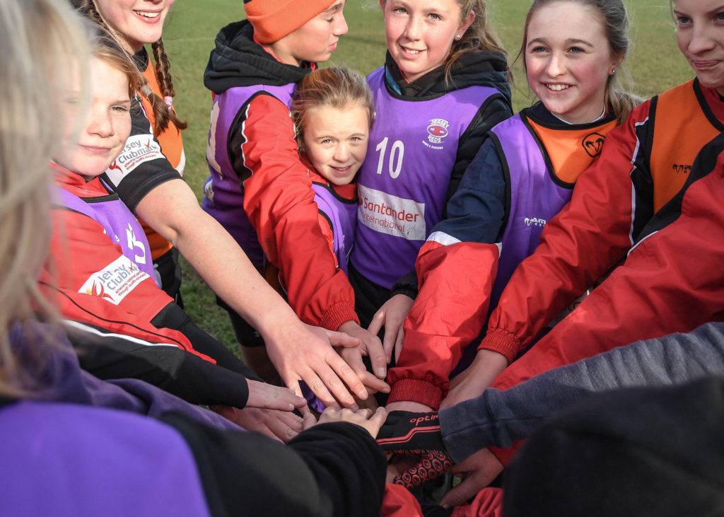
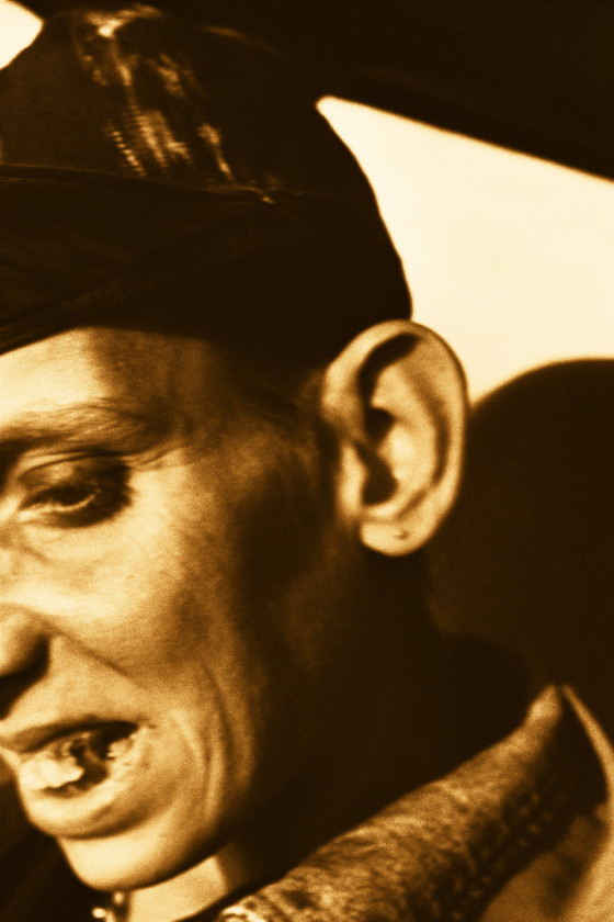
I enjoyed being part of a group when working on the Island Identity and Community project, because there was a variety of different ideas and perspectives, as well as creative processes. Additionally, all the members of the group shared the workload, which made the whole experience more enjoyable and less stressful. My contribution to this project was the portrait above. I captured this image in Year 12, during our studio portraits and headshots topic. I think that this portrait encapsulates the theme of identity more than community. This is because the image could be interpreted as a person hiding their identity (the shadows on the side of the person’s face) due to things such as fear or shame. Overall I am very happy that I was a part of this project, and how the final version turned out.
photobook process
SHOOT 1
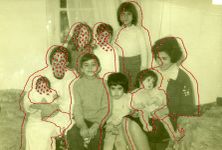
For my first photoshoot in my photobook project, I took photographs of old baby and childhood images of myself from my family albums. I also took photographs of some childhood objects, including my hospital and Christening bracelets, and my first stuffed animal. Additionally, I chose some objects from later on in my life, such as an 18th birthday card I received from a friend, and an 18th birthday badge. I decided to include these images and objects as a way to show my transition from baby, to child, to adult, and to add another interesting layer to my photobook by combining old images with new ones, which I think will be more engaging for the reader.
PROCESS
To start my shoot, I set up a tripod attached with two lights on either side on a table so that the lighting would be clear and even. I then placed a plain piece of white paper underneath where the camera would sit so that the background of my images would be clean and bright. I then attached my camera to the tripod with the lens facing downwards, and placed each of my physical photographs onto the paper and captured them accordingly. I made sure that the photographs were positioned as straight as possible to save myself further editing later in the process. I also took care to ensure that the two lights on either side of my camera did not reflect on the glossy surface of the photographs, as this would ruin the effect. Additionally, I also tried to eliminate any shadows that the photographs made on the paper. I then imported all my images onto my computer and into Lightroom, where I began to edit and adjust them as needed.
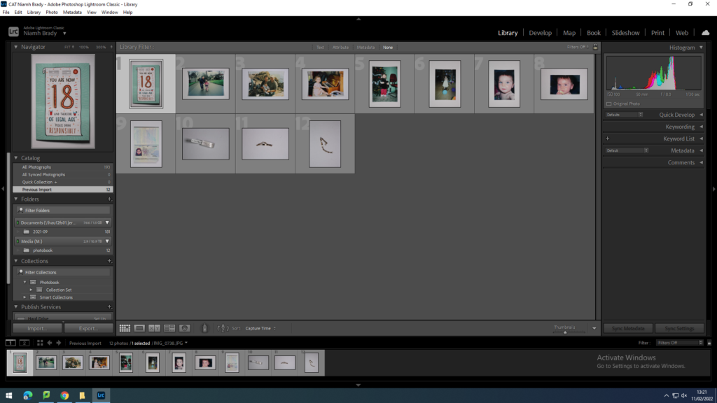
After I had imported all of my new images into Lightroom, I made a new collection called ‘Photobook’, with another collection set inside which I called ‘Shoot 1’, which I imported all of my images into. Usually after this I would go through a selection process, however since I only had a few images and I was happy with them all, I decided to keep them all.
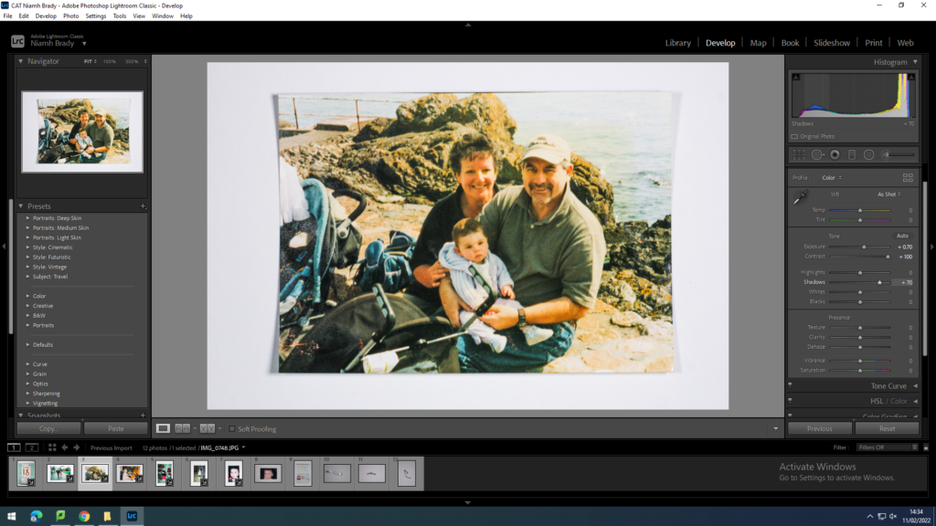
When editing my photographs, I mainly adjusted the exposure and contrast in order to make my images appear older than they actually are, as a way to further emphasise my transition through the different stages of life. By increasing the contrast, I could also add more colour and life to the more worn images, so that the detail within them could still be seen. Additionally, the old look of these photographs would juxtapose the new images, which would be bright and full of bold colours, adding another interesting visual layer to my photobook
SHOOT 2
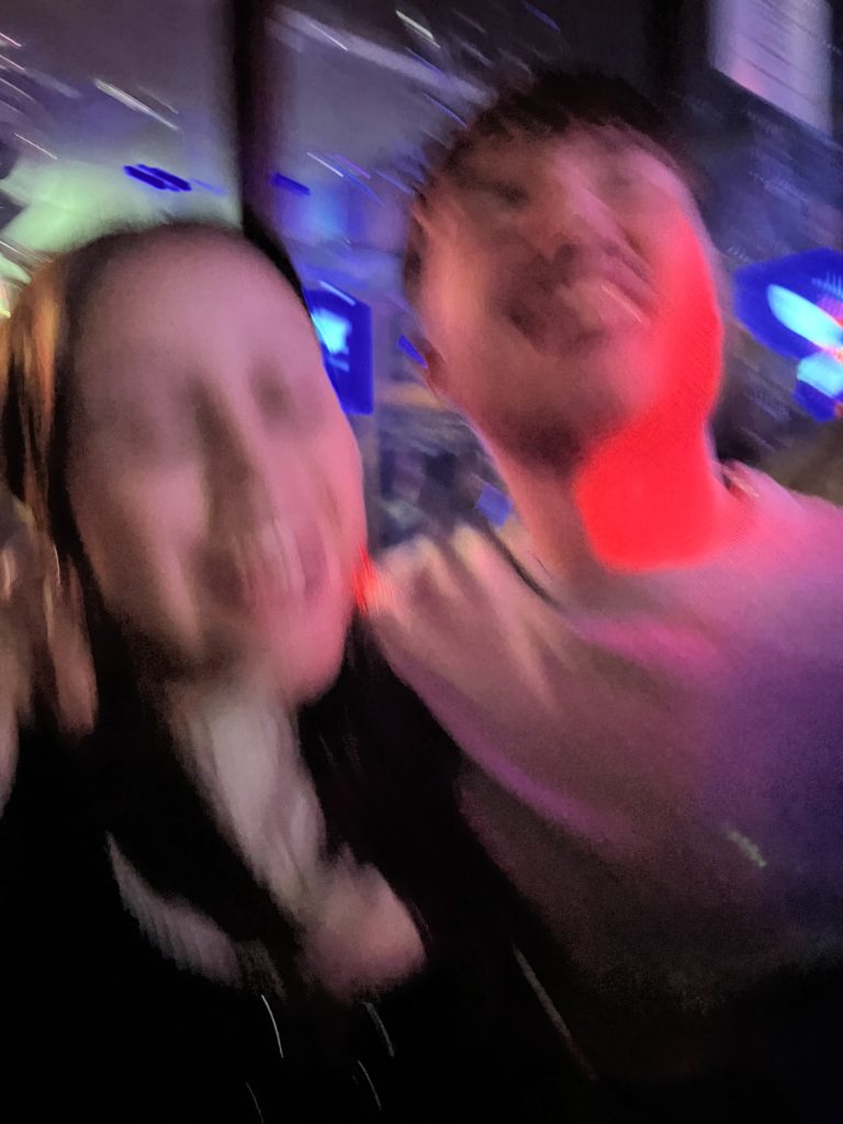
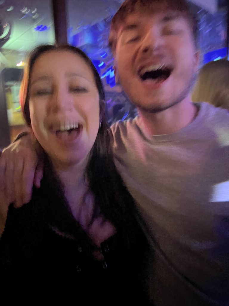
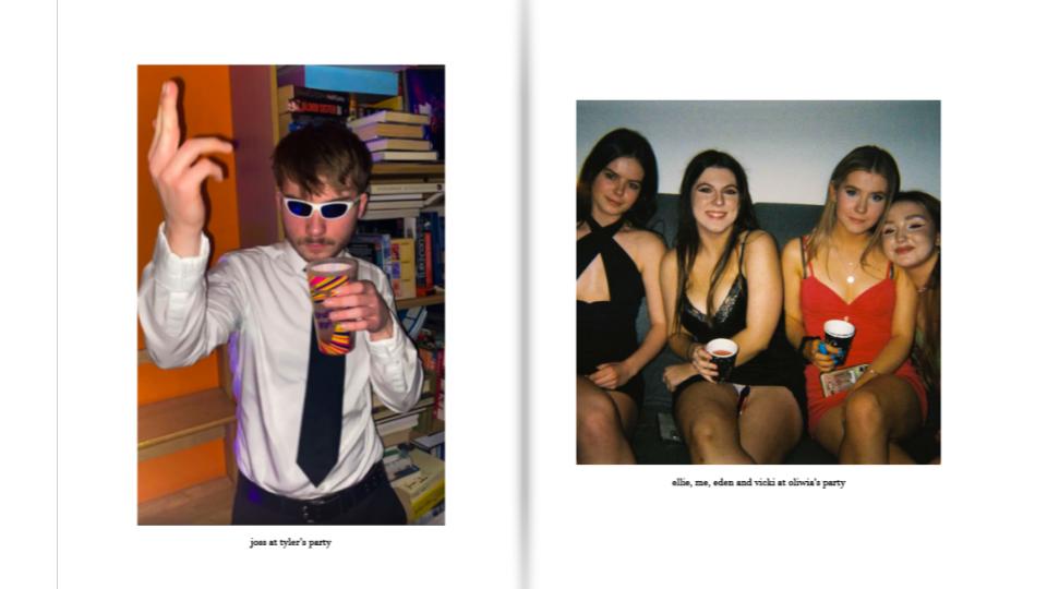
For my second photoshoot in my photobook, I aimed to capture as many candid and staged photographs of me and my friends when we were all together. I found that the best times to do this was on special occasions, such as friend’s birthdays or parties, or when we were all on nights out together. I tried to incorporate as much colour and life as possible, which would later juxtapose the old, much more muted feel of my baby pictures. I also aimed to keep the images as unfiltered as possible, as a way of allowing my audience to gain a real and raw insight into our lives.
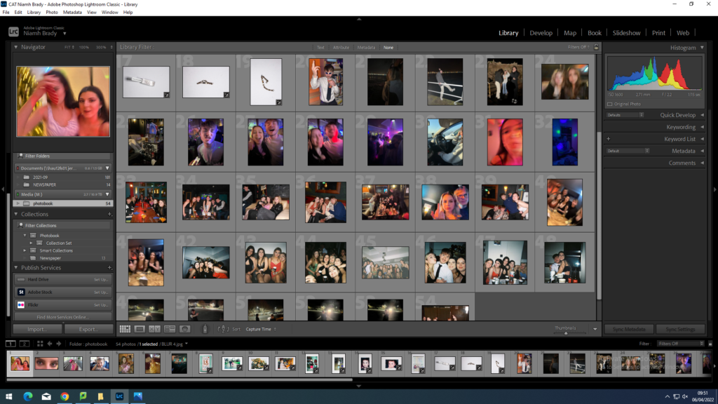
I imported all of my images into Lightroom into a folder I titled ‘Photobook’. I then began the selection process, whereby I filtered out any repetitive images, images of poor quality, or images which I thought didn’t fit in with the rest. By the end of the selection process, I was left with around 60 of my best photographs.
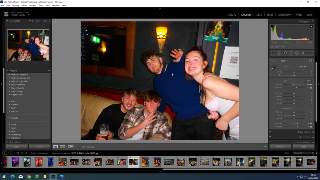
When editing my photographs, I aimed to emphasise all the bright colours already present, so as to make the images full of fun and life, in order to reflect how we were feeling. Additionally, I wanted to create a contrast to my baby photos, which I edited to appear older and more worn out. To do this, I mainly adjusted the vibrance, saturation, and contrast. For the most part I left the contrast the same way it was, as the images were already bright to begin with. I continued to adjust the different settings and features until I had a result that I was happy with for all of my images.
PHOTOBOOK
In order to begin the process of creating my photobook, the first thing I had to do was to decide to do either a portrait book or a landscape one. I decided to work with a standard portrait orientation, as most of the images I chose to include were portraits, and with the landscape photographs I could easily place them in the centre of the page without the book looking too messy or too disorganised.
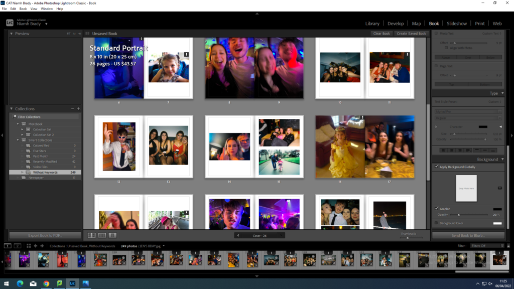
I then experimented with different types of layouts for my photobook, such as full bleed pages and double page spreads. I wanted to incorporate a range of different photograph sizes and layouts in order to keep my photobook interesting and engaging for the reader.
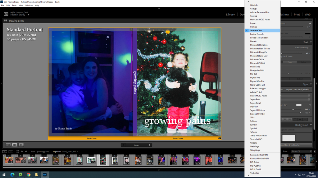
For the cover of my photobook, I decided to use two juxtaposing images; one of me when I was younger on the front cover, and then another of me when I was older for the back cover. I then had to decide on a title for my photobook. I wanted to use a title that would tell the readers what the book is about, but at the same time without being too explicit. I eventually settled on ‘growing pains‘. I chose to keep the title in all lower case letters as I think that it looks more aesthetically pleasing and it also references the younger versions of myself present in the book. In addition, most people my age now prefer to type this way on their phones and laptops, which again references another version of me in the book. I experimented with different text sizes and fonts until I found one that I was happy with; I chose to use the font ‘Javanese Text‘ throughout my photobook.
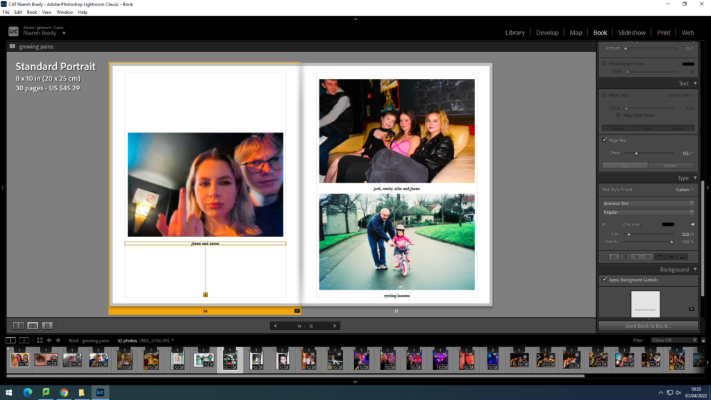
Towards the end of my design process, I also decided to add small captions underneath each of my images in order to help the reader understand more clearly what is happening in each photograph. I think that it adds another interesting layer to my photobook, making it appear more like a personal album rather than a photobook.
FINAL LAYOUT


newspaper design
For my newspaper spread I decided to incorporate work from various different projects and topics we have covered throughout our 2 year photography course, including studio portraits, landscape, and object photography. I chose what I think were my best work from these projects and experimented with different ways of laying them out in various sequences and narratives. To begin this process, I went through all of my published blog posts and selected the images that I thought best represented my progress and effort throughout photography. I tried to use images that were not too similar to each other, in order to keep the viewer interested. I then had to check that all the photographs were high quality, and that they had the appropriate number of pixels each. After that I imported all the images into InDesign and began to experiment with different layouts until I found one that I was happy with.
FINAL LAYOUT


book specification
PHOTOBOOK: Write a book specification; narrative, concept and design + mood board of layout & design ideas.
NARRATIVE
Narrative is defined as ‘a spoken or written account of connected events; a story‘. The narrative of a book, film, or piece of art is an integral part of getting your audience to understand and empathise with the piece of work, and to bring out the intended emotions behind the piece. For my photobook, my narrative will not follow the traditional, linear route, but rather be a mix-match of images from various points in my life, such as old photographs of me when I was a child, to more recent images of me and my friends. My reasoning behind setting out my project this way is that most people consider their childhood to be a blur of memories all jumbled up together, with only a few defining moments that stand out to them. By doing this, I hope to allow members of my audience to relate and empathise with my project in a more personal way than if my photobook were a conventional, straightforward story about growing up.
DESIGN
For my project, I have taken inspiration from various artists who have published their own photobooks, such as Jim Goldberg (Raised By Wolves), Carolle Benitah (Photos Souvenirs), and Larry Clark (The Perfect Childhood). I was intrigued by the layout of these photobooks, especially Jim Goldberg’s Raised By Wolves, which includes old photographs and objects integrated between the new images of his subjects. In doing this, Goldberg allows his audience to empathise with his subjects in a more meaningful way. In my photobook, I will use different page layouts, such as some full-bleed pages where my image takes up the entire space.
MOODBOARD

photobook essay
In what way have Jim Goldberg and Carole Benitah represented youth and identity through their work?
‘I decided to explore the memories of my childhood to help me understand who I am and to define my current identity.‘
For my area of study, I have decided to explore the theme of identity, more specifically the ideas of childhood and adolescence, and how the environment around you can have a significant effect on how you grow up, as well as how childhood can shape you into the adult you become. I have chosen to document this theme because teenagers are often ostracised by older members of society, and have gained a ‘reckless’ and ‘troublemaking’ stereotype. My aim with this project is to show how teenagers deal with this issue, as well as other problems they may face, such as pressure from school or problems with their home life. One of the artists who I will be focusing on is Jim Goldberg. His project ‘Raised By Wolves’ (1985 – 1995), shed a spotlight on the shunned and rejected members of society who lived along Los Angeles’ Sunset Boulevard; ‘I wanted to look at those people who were outsiders, like I was.’ (Goldberg, 2018). I have chosen to analyse Goldberg’s work because it is a raw, uncensored look at a world most people will never get to see, and it incorporates real-life people and their stories. Goldberg allowed his audience to sympathise and somewhat relate with his subjects through his use of personal objects which varied from hand-written letters and drawings to police and medical reports. This allowed the viewers to feel as though they were immersed in the world of ‘Tweeky Dave’ and ‘Echo’, and to draw attention to the problems that they face. The second artist that I will be focusing on is Carolle Benitah. Her project ‘Photos Souvenirs’ (2016) involved Benitah reworking her old childhood photographs from her family albums through the use of embroidery and stitching as a way to show how she had developed and to help her understand who she was; ‘Those moments, fixed on paper, represented me, spoke about me and my family, told things about my identity, my place in the world, my family history and its secrets, the fears that constructed me, and many other things that contributed to who I am today.’ (Benitah). I have chosen to analyse Benitah’s work because it gives her audience an intimate and personal look at her life, and the fondness and sometimes disdain with which she holds the memories of her childhood and her family, which I feel that most people will be able to relate to. For my response to these artists, I plan to capture candid images of myself and my friends when we are together in order to convey the unfiltered approach that Goldberg demonstrates. Additionally, I will also be incorporating old childhood and family photographs as a way to show how we have changed and developed, and as a response to Benitah.
Jim Goldberg’s Raised By Wolves uses a primarily documentary-style type of photography as a way of capturing an unfiltered look at the life of his subjects. Documentary photography found its roots as a way to record and accurately describe unknown, hidden, or difficult to access places, such as the ruins of Ancient Egypt or the undiscovered American wilderness in the nineteenth century. During the 1930s, the Great Depression brought about a new wind of change for documentary photography, both in urban and rural locations. Photographers such as Dorothea Lange, Walker Evans, and Russell Lee are generally credited for adapting the style into what it is today; accuracy mixed with empathy, and with the main goal of encouraging the public to engage in social change. Conversely, whilst Goldberg works with fairly recent images, Benitah uses a different approach. By reworking and adapting her old family photographs as a way to reflect who she is now, Benitah utilises various techniques such as embroidery and stitching. Although embroidery is now practiced all over the world, its origin can be traced back to the Middle East during the Cro-Magnon days, around 30,000 B.C.. Elaborately embroidered clothing, religious objects, and household items served as symbols of wealth and status in many cultures including Persia, Japan, the Byzantine Empire, and Europe. The discipline can also be affiliated with the impressionist art movement, which took place in the nineteenth century. Impressionism is characterised by its use of bright colours as opposed to darker, muted ones, and thin, barely visible brush strokes as a way of conveying the changing qualities of both light and movement. It could be argued that embroidery is therefore a by-product of this movement and vice versa, as the two areas of speciality have corresponding attributes and components. Moreover, if embroidery can be compared to impressionism, then therefore documentary photography can be connected to realism. Realism is defined as ‘the faithful representation of reality’, and is focused on showing an unfiltered look at everyday life. The movement rejected traditional forms of art, literature, and social hierarchy, and was inspired by the new way of thinking which was sparked by the Industrial Revolution in the mid eighteenth century. This shift in art style brought about an elevation of the working class as the main subjects of many artist’s paintings, as it coincided heavily with many new social philosophies, including Pierre Proudhon’s System of Economic Contradictions, or The Philosophy of Poverty (1846) and Karl Marx’s Communist Manifesto (1848). Documentary photography therefore shares many affinities with this art movement, which can be explicitly seen in Jim Goldberg’s work.

These two images, taken from Goldberg’s Raised By Wolves, give the viewer an intimate and profound look at the relationship that Goldberg had with the people he photographed, and specifically this subject, ‘Dave’. It is constantly argued whether documentary photography is a reliable source of information, as one can often feel like an outsider looking in to a world which they will never understand. As the photographer spends time with their subjects, they will inevitably form a kinship of some kind, which can lead to their images shifting from the stoic, detached report that is expected, into a deeply touching and sympathetic anecdote of their time spent together. In his review of Goldberg, Adam Wray states that, ‘[Goldberg] formed relationships with the runaways he began tailing around LA, becoming enmeshed in their lives. He provided his subjects both material assistance and friendship.’ (Wray 2018). This shows that the relationships Goldberg formed with his subjects are clearly conveyed throughout his work, and that it affects the way in which people will view it. In the two images above, it is clear to see that Goldberg and his subject have become close friends, and that they regard each other with a certain fondness which would not have occurred if not for the compassion and fragility with which Goldberg treated their lives as his subject matter. It could, therefore, be argued that Goldberg’s intention with this project was to not only draw attention to the lives of the homeless running amuck in California, but to also allow his audience to sympathise and appreciate their struggles in the hopes that the public’s attitude towards them will change. Goldberg treated them not as subjects, but as people who were just like him, which shows in his work as every person’s story was given equal attention, and he respected each person’s identity and did his best to portray them in a way which was truthful and real. The concept of identity is one which Goldberg explores heavily in Raised By Wolves, and can be seen by his choice to include various personal objects of his subjects in the project, ranging from notes and hand-drawn pictures, to medical and police reports and even items of clothing. This adds another layer to his subjects, and helps the audience identify them as not just people in pictures, but as individuals with different personalities and ways of expressing themselves. Additionally, this helps Goldberg in his attempt to break away from the traditionally stereotypical opinion and view that the public has about homeless and disadvantaged people.

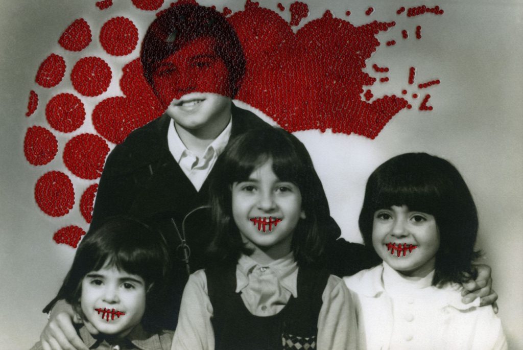
Carolle Benitah explores various different themes throughout her project Photos Souvenirs, including the concept of childhood, and how this stage in one’s life has a significant effect on the adult that they grow to become. Additionally, Benitah delves into the sometimes traumatising effect that this period can have on a person’s mental health, which she represents through stitching and embroidery. In his review of Bentiah, Laurence Cornet states, ‘As the years progress, people disappear from the pictures, leaving her alone, submerged in thought in a photograph in in front of the ocean, about to be engulfed by a needlepoint wave.’ (Cornet, 2014). Benitah utilises a bold red thread in order to represent her feelings of pain and nostalgia, which juxtaposes the seemingly happy experiences she is having in the photographs. In the image above, Benitah tells her audience a story which is only possible through her newly-changed mindset in regards to her childhood. Benitah transforms her old photographs into fairy tales, each one filled with memories and emotion, both old and new. Benitah herself describes this process likeable to an exorcism; ‘With each stitch I make a hole with a needle. Each hole is a putting to death of my demons. It’s like an exorcism. I make holes in paper until I am not hurting any more.’ (Benitah). The many reworked photographs speak heavily on Bentiah’s desire for love and attention as a young child, and her feelings now as an adult looking back on that time in her life. Additionally, the use of embroidery is viewed as a ‘feminine activity’ by Benitah, which adds another layer of depth as to why she chose to include this medium in her work; it expresses the pressures and expectations not only Benitah, but also every young woman, faces during their childhood, such as the burden of being a perfect child, a submissive partner, and a loving but distant mother.
Overall, these two artists showcase the two themes of youth and identity thoroughly throughout their respective work and projects. In the case of Benitah, her use of archival childhood photographs is used as a form of self-expression, and as a way to show her audience how her identity and her concept of self-understanding has shifted over the years. Additionally, Photos Souvenirs showcases Benitah’s transition from child to adult in a unique and new way, and is a thought provoking project which will be somewhat relatable to her audience, due to her feelings of melancholy and nostalgia. Goldberg, however, showcases identity through his use of personal objects belonging to his subjects, such as items of clothing, drawings, and even police reports detailing their behaviour. The theme of his project has a more intense focus on identity as opposed to youth, however he does include stories from his subjects’ childhood, and how these events have shaped them into the people they have become, much like when Benitah says ‘I decided to explore the memories of my childhood to help me understand who I am and to define my current identity’. These two artists have inspired me to take a unique and different approach to my project, by breaking away from the traditional means of including strictly new images in my photobook, but instead incorporating old family photographs and personal objects to break up the images and give a more interesting narrative and concept for my audience to enjoy.
Bibliography
Cornet, L. (22 April 2014). Carolle Bénitah: Photos-Souvenirs. photograph. (https://photographmag.com/articles/carolle-benitah-photos-souvenirs/) Accessed on 29 Jan 2022.
Morris, J. (May 2009). History of Embroidery. Fibre2Fashion. (https://www.fibre2fashion.com/industry-article/4135/history-of-embroidery) Accessed on 10 January 2022.
Rosen, M. (2 June 2021). Fingerprint: Tracing the Roots of Jim Goldberg’s Raised by Wolves. Magnum Photos (https://www.magnumphotos.com/theory-and-practice/fingerprint-tracing-roots-jim-goldbergs-raised-by-wolves/) Accessed 28 Jan 2022.
Wikipedia. (25 October 2021). Documentary Photography. Wikipedia. (https://en.wikipedia.org/wiki/Documentary_photography) Accessed on 27 January 2022.
https://www.lensculture.com/articles/carolle-benitah-photos-souvenirs
Wikipedia. (31 January 2022). Impressionism. Wikipedia. (https://en.wikipedia.org/wiki/Impressionism) Accessed on 26 January 2022.
Wikipedia. (7 November 2021). Realism (arts). Wikipedia. (https://en.wikipedia.org/wiki/Realism_(arts)) Accessed on 25 January 2022.
Wray, A. (5 May 2018). A Completely True Work of Fiction: Jim Goldberg’s Raised By Wolves. Magnum Photos (https://www.magnumphotos.com/arts-culture/art/jim-goldberg-raised-by-wolves/) Accessed on 29 Jan 2022.
art movements and isms
ROMANTICISM


Romanticism was an artistic and intellectual movement that ran from the late eighteenth century through the nineteenth century. It focused on strong emotion as a source of aesthetic experience, placing emphasis on such emotions as trepidation, horror, and the awe. It elevated folk art, language, and custom. Romanticism rose as a reaction against the excessive rationalism of the Enlightenment. It drew upon the French Revolution’s rejection of aristocratic social and political norms. It was also influenced by the theory of evolution and uniformitarianism, which argued that “the past is the key to the present.” This lead some Romantics to look back nostalgically to the Middle Ages and elements of art and narrative perceived to be from the medieval period. The ideals of the French Revolution influenced the Romantic movement in other ways. Romanticism elevated the achievements of what it perceived as misunderstood heroic individuals and artists that altered society, and legitimized the individual imagination as a critical authority which permitted freedom from classical notions of form in art.
IMPRESSIONISM


Impressionism was a radical art movement that began in the late 1800s, centered primarily around Parisian painters. Impressionists rebelled against classical subject matter and embraced modernity, desiring to create works that reflected the world in which they lived. Uniting them was a focus on how light could define a moment in time, with colour providing definition instead of black lines. The Impressionists emphasized the practice of plein air painting, or painting outside. Initially disapproved by critics, Impressionism has since been embraced as one of the most popular and influential art styles in Western history. Artists abandoned the traditional landscape palette of muted greens, browns, and grays and instead painted in a lighter, sunnier, more brilliant key. They began by painting the play of light upon water and the reflected colours of its ripples, trying to reproduce the manifold and animated effects of sunlight and shadow and of direct and reflected light that they observed.
MODERNISM


Modernism, in the fine arts, was a break with the past and the concurrent search for new forms of expression. Modernism fostered a period of experimentation in the arts from the late 19th to the mid-20th century, particularly in the years following World War I. In an era characterized by industrialization, the nearly global adoption of capitalism, rapid social change, and advances in science and the social sciences, Modernists felt a growing alienation incompatible with Victorian morality, optimism, and convention. New ideas in psychology, philosophy, and political theory kindled a search for new modes of expression. In the visual arts the roots of Modernism are often traced back to painter Édouard Manet, who, beginning in the 1860s, not only depicted scenes of modern life but also broke with tradition when he made no attempt to mimic the real world by way of perspective and modeling. He instead drew attention to the fact that his work of art was simply paint on a flat canvas and that it was made by using a paintbrush.
REALISM


Realism, in the arts, is the accurate, detailed, and unembellished depiction of nature or of contemporary life. Realism rejects imaginative idealization in favour of a close observation of outward appearances. Realism was stimulated by several intellectual developments in the first half of the 19th century. Among these were the anti-Romantic movement in Germany, with its emphasis on the common man as an artistic subject. Gustave Courbet is often considered the leading figure of Realism. He laid the groundwork for the movement in the 1840s, when he began portraying peasants and labourers on a grand scale typically reserved for religious, historical, or allegorical subjects. Prior to Courbet’s radical emergence, painters did not depict scenes as they saw them; instead, they idealized them, virtually erasing any flaws or imperfections. To Courbet, this approach was detrimental to painting, as it eliminated any sense of individuality.
CUBISM


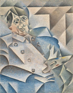


The Cubist style emphasized the flat, two-dimensional surface of the picture plane, rejecting the traditional techniques of perspective, foreshortening, modeling, and chiaroscuro and refuting time-honoured theories that art should imitate nature. Cubist painters were not bound to copying form, texture, colour, and space. Instead, they presented a new reality in paintings that depicted radically fragmented objects. The monochromatic colour scheme was suited to the presentation of complex, multiple views of the object, which was reduced to overlapping opaque and transparent planes. Some historians have argued that these innovations represent a response to the changing experience of space, movement, and time in the modern world. This first phase of the movement was called Analytic Cubism.
the history of photography
The Arab scholar Ibn Al-Haytham (945–1040) is generally credited as being the first person to study how we see; he invented the camera obscura to demonstrate how light can be used to project an image onto a flat surface. Earlier references to the camera obscura have been found in Chinese texts dating to about 400 B.C., and in the writings of Aristotle around 330 B.C. By the mid-1600s, artists began using the camera obscura to help them draw and paint elaborate real-world images with the help of finely crafted lenses. Magic lanterns, the predecessor of the modern projector, also began to appear at this time. Using the same optical principles as the camera obscura, the magic lantern allowed people to project images, usually painted on glass slides, onto large surfaces. They soon became a popular form of mass entertainment.
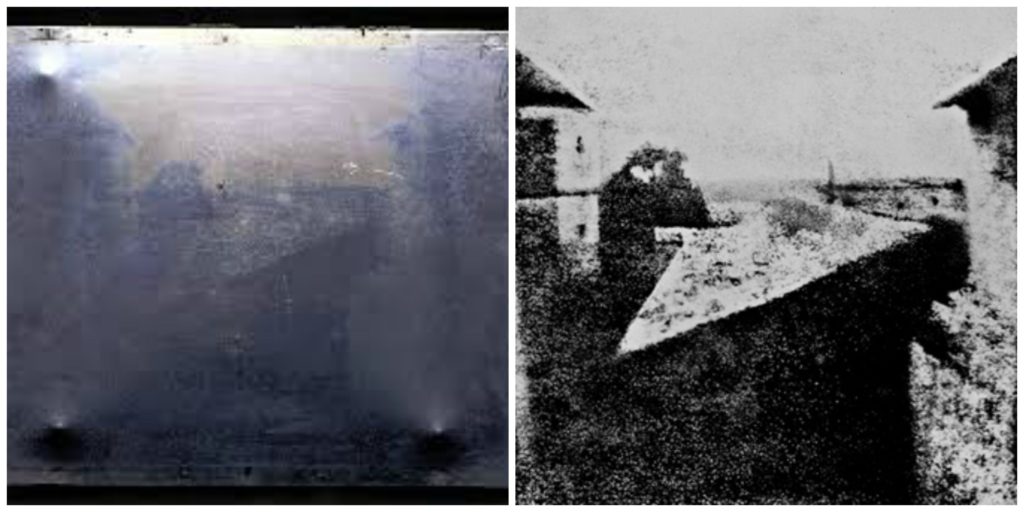
In 1826, French scientist Joseph Nicephore Niepce developed the first photographic image with a camera obscura. Niepce placed an engraving onto a metal plate coated in bitumen and then exposed it to light. The shadowy areas of the engraving blocked light, but the whiter areas permitted light to react with the chemicals on the plate. When Niepce placed the metal plate in a solvent, gradually an image appeared. These heliographs, or sun prints as they were sometimes called, are considered the first photographic images. However, Niepce’s process required eight hours of light exposure to create an image that would soon fade away.
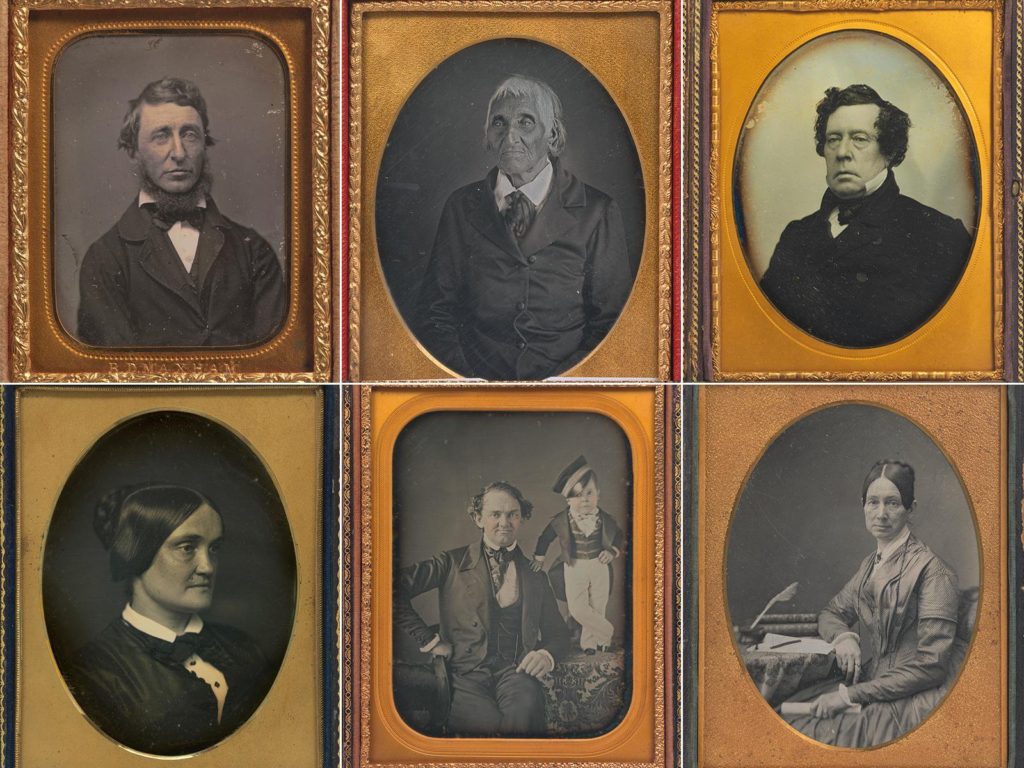
In 1829, Louis Daguerre formed a partnership with Niepce to improve the process Niepce had developed. In 1839, following several years of experimentation and Niepce’s death, Daguerre developed a more convenient and effective method of photography and named it after himself. Daguerre’s daguerreotype process started by fixing the images onto a sheet of silver-plated copper. He then polished the silver and coated it in iodine, creating a surface that was sensitive to light. Then he put the plate in a camera and exposed it for a few minutes. After the image was painted by light, Daguerre bathed the plate in a solution of silver chloride. This process created a lasting image that would not change if exposed to light. The daguerreotype gained popularity quickly in Europe and the U.S. By 1850, there were over 70 daguerreotype studios in New York City alone.
One drawback to daguerreotypes, however, was that they could not be reproduced; each one was a unique image. The ability to create multiple prints came about from the work of Henry Fox Talbot, an English botanist and mathematician. Talbot sensitized paper to light using a silver-salt solution. He then exposed the paper to light. The background became black, and the subject was shown in different shades of grey. This was a negative image. From the paper negative, Talbot made contact prints, reversing the light and shadows to create a detailed picture. In 1841, he perfected this paper-negative process and called it a calotype, Greek for “beautiful picture.”
In 1889, photographer and industrialist George Eastman invented film with a base that was flexible and could be rolled. The 35 mm film most people know today was invented by Kodak in 1913 for the early motion picture industry. In the mid-1920s, the German camera maker Leica used this technology to create the first still camera that used the 35 mm format. The drawback to nitrate-based film was that it was flammable and tended to decay over time. Kodak and other manufacturers began switching to a celluloid base, which was fireproof and more durable. Most films produced up to the 1970s were based on this technology. Since the 1960s, polyester polymers have been used for gelatin-based films.
Having perfected roll film, George Eastman also invented the box-shaped camera that was simple enough for consumers to use. Once the film was used up, the photographer mailed the camera with the film still in it to the Kodak factory, where the film was removed from the camera, processed, and printed. The camera was then reloaded with film and returned. Over the next several decades, major manufacturers such as Kodak in the U.S., Leica in Germany, and Canon and Nikon in Japan would all introduce or develop the major camera formats still in use today. Nikon and Canon would make the interchangeable lens popular and the built-in light meter commonplace.
Apple later introduced its smartphone camera with its first iPhone in 2007, and other companies followed, such as Google and Samsung. By 2013, smartphones with cameras were outselling digital cameras by more than 10-to-1. In 2019, more than 1.5 billion smartphones were sold to consumers, compared with about 550,000 digital cameras over roughly the same period.
artist refernces
JIM GOLDBERG


Jim Goldberg is an American artist and photographer, whose work reflects long-term, in-depth collaborations with neglected, ignored, or otherwise outside-the-mainstream populations. Among the many awards Goldberg has received are three National Endowment of the Arts Fellowships in Photography, a Guggenheim Fellowship, the Henri Cartier-Bresson Award, and the Deutsche Börse Photography Prize. His project Raised By Wolves (1985-1995) focuses on two young runaway protagonists, Tweeky Dave and Echo. Their personalities, their histories, and their dreams were given equal attention, and were often presented in their own words. The sensitivity with which Goldberg approached these particular subjects reflects the affection they held for one another, a feeling which is not much shown to the homeless. Goldberg began speaking with and photographing Raised By Wolves’ subjects in 1985, and started assembling the book itself in 1991. Raised By Wolves is Goldberg’s most shambolic instalment, mirroring the experiences of its subjects. The book is made up of photographs, fragments of conversations, hand-written notes and drawings, home movie stills, Xeroxes of government correspondence, and more.
CAROLLE BENITAH


French Moroccan photographer Carolle Benitah, who worked for ten years as a fashion designer before turning to photography in 2001, explores memory, family and the passage of time. Often pairing old family snapshots with handmade accents, such as embroidery, beading and ink drawings, Benitah seeks to reinterpret her own history as daughter, wife, and mother. The work of Carolle Benitah has been published in magazines such as Leica World, Shots Magazine, Photos Nouvelles, Spot, Center for Photography Houston, Foto Noviny, and Lens Culture, among others. The series Photos Souvenirs explores the memories of her Moroccan childhood and teenage years by reworking old family snapshots. In what the Benitah describes as “excavations,” photos are unearthed from albums, categorised, scanned, transposed onto new paper, and finally hand beaded and embroidered. This final step, accomplished with red, black, or gold thread and wire and glass beads is a revelatory act for the artist; ‘To embroider my photograph, I make holes in the paper. With each stitch, I stick the needle through the paper. Each hole is a putting to death of my demons. It is like an exorcism. I stab the paper until I don’t hurt anymore.’