All posts by Michael K

Filters

Author:
Category:

STREET PHOTOGRAPHY

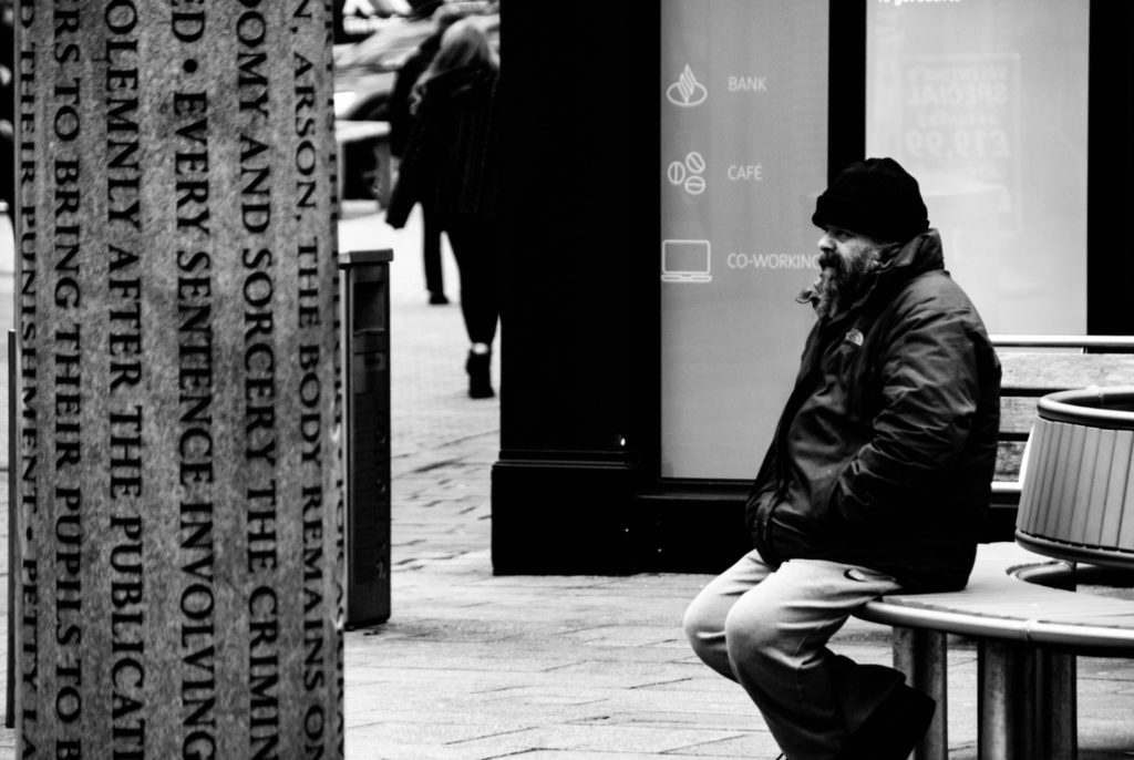
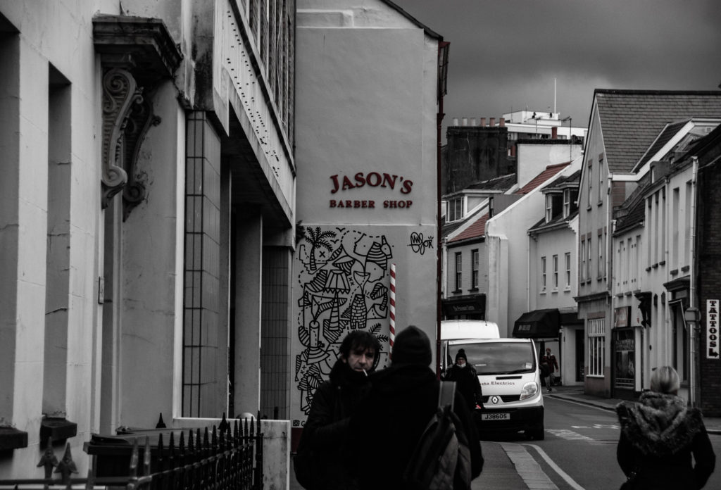
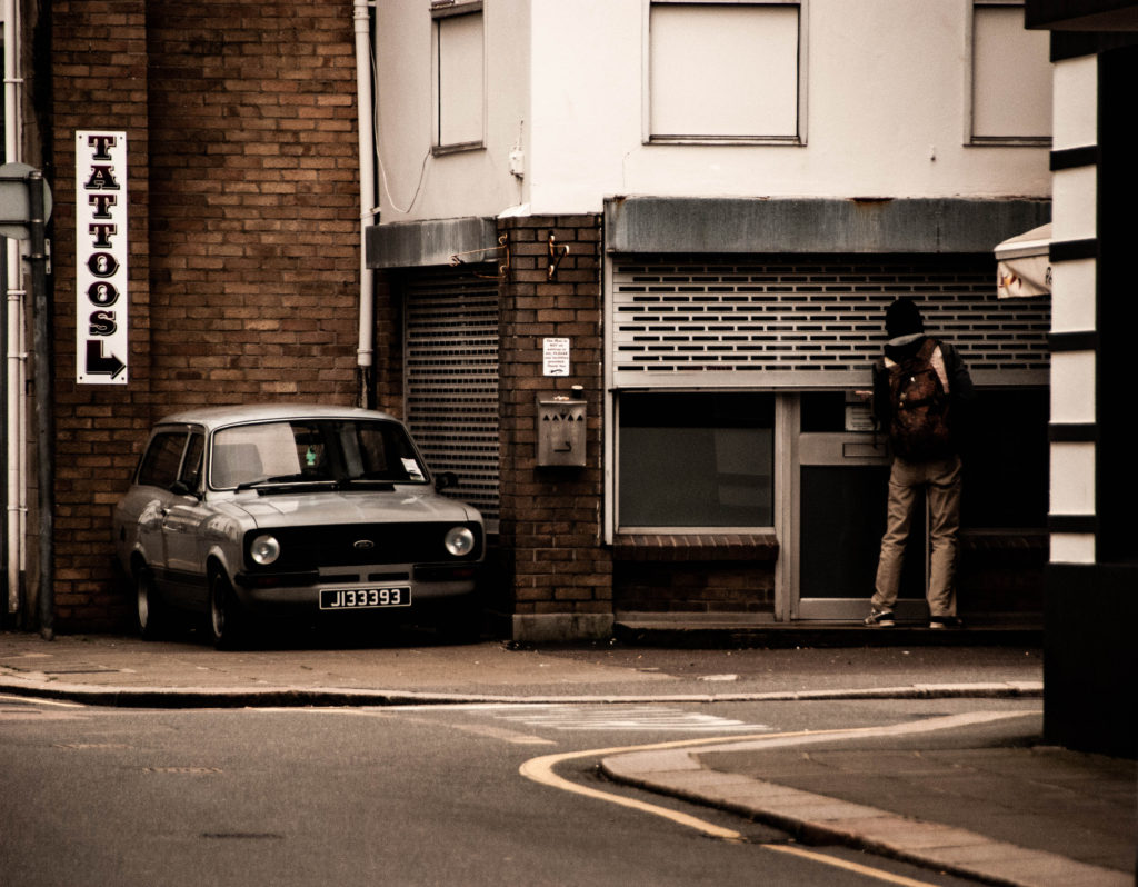
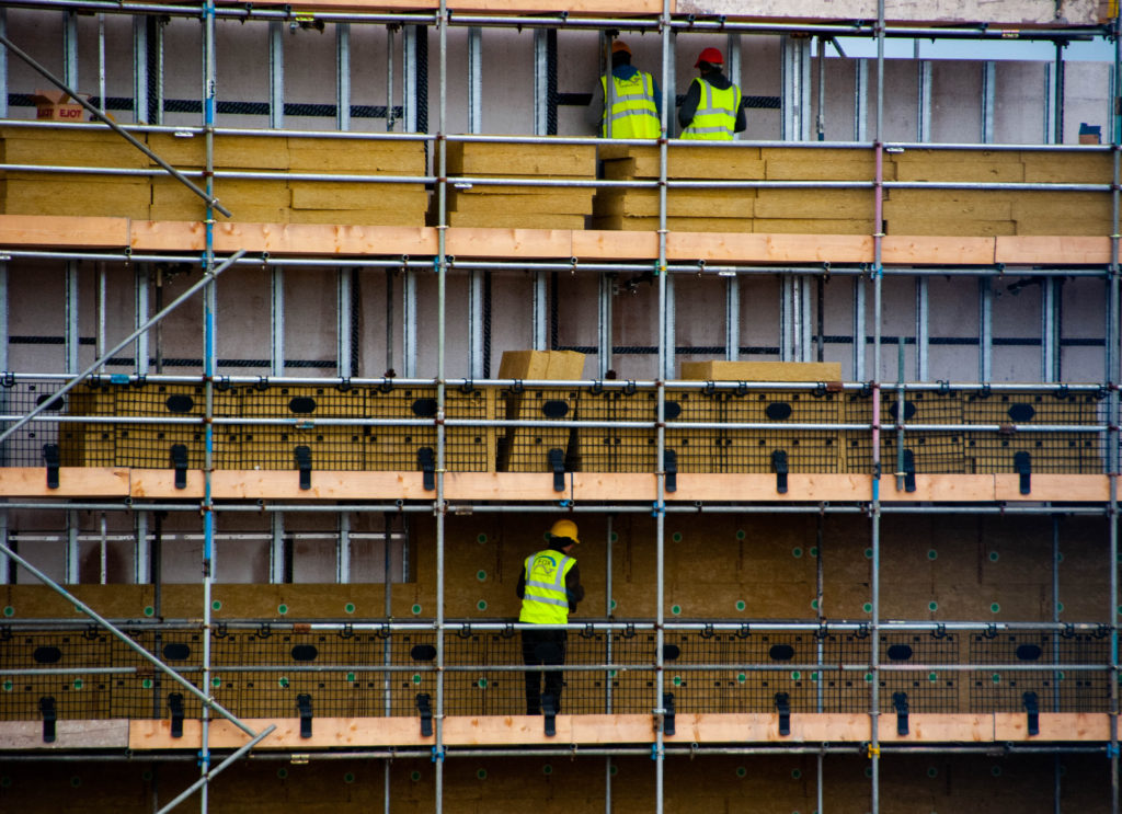
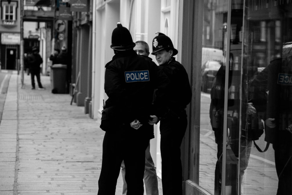
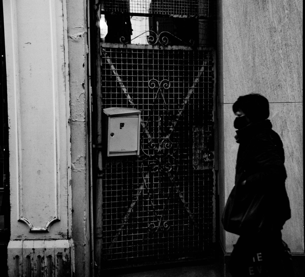
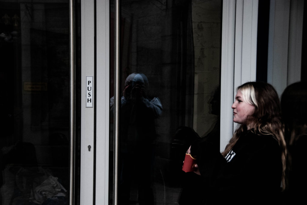
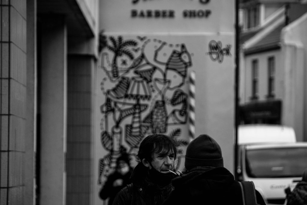
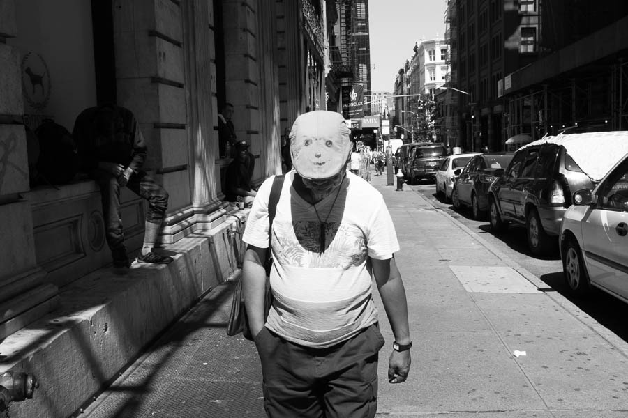
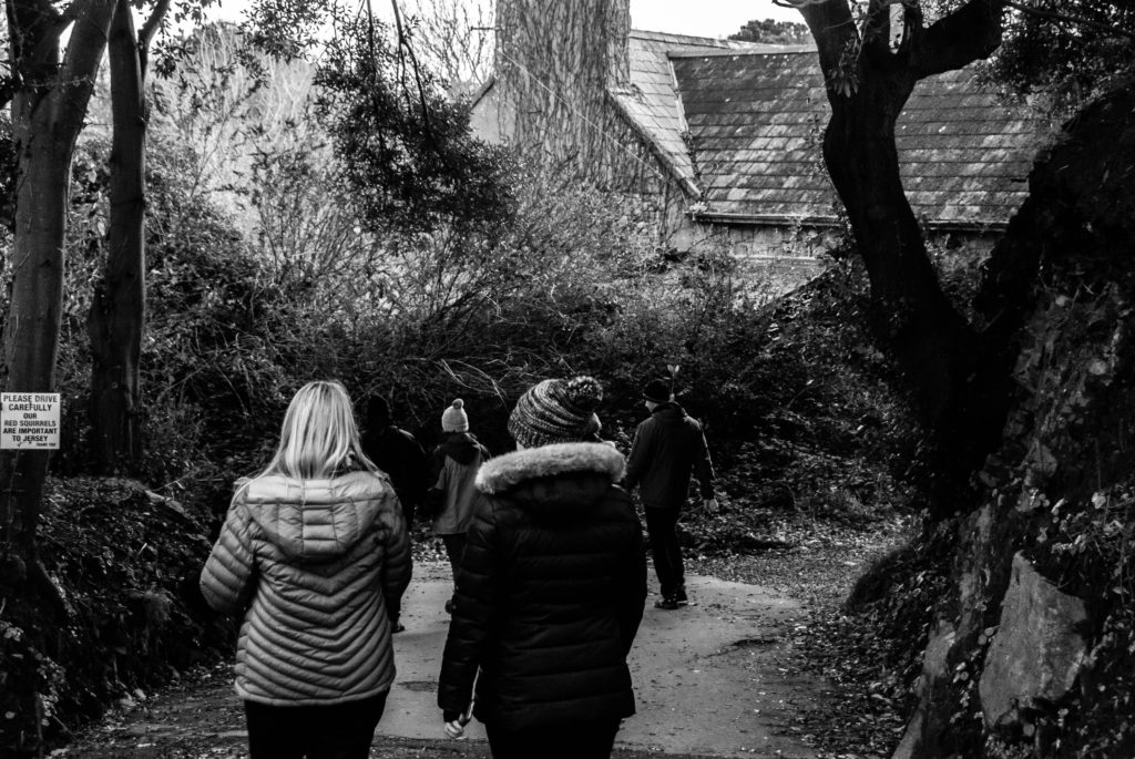
Street photography is an essence of photojournalism that by definition consists of photography of random encounters and chance incidents. Despite the name, street photography does not nessiseraly have to take place on the street or urban setting but is rather defined by the presence of public presence weather that be naturally occurring populations of people in the public eye or public settings, street photography is the public world seen through an artistic eye.

Mood Board
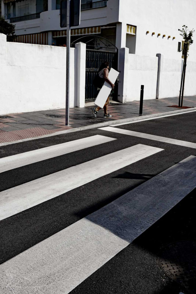
The best street photography always tends to contain an underlying social/political context that makes a statement and ignites thought.

Street photography has been a form of photographical expression and journalism for over a century. This is why this form of photography can also portray certain historical events or periods in history without words which is the exact reason these images can be so powerful. They can be used as a form of rebellion: Below is an image taken by Susan Meiselas in July 16, 1979 that gives a good example of this historical context; it is taken during the Nicaraguan rebellion; the image is extremely powerful portrays the emotion and essence that was felt of the time.
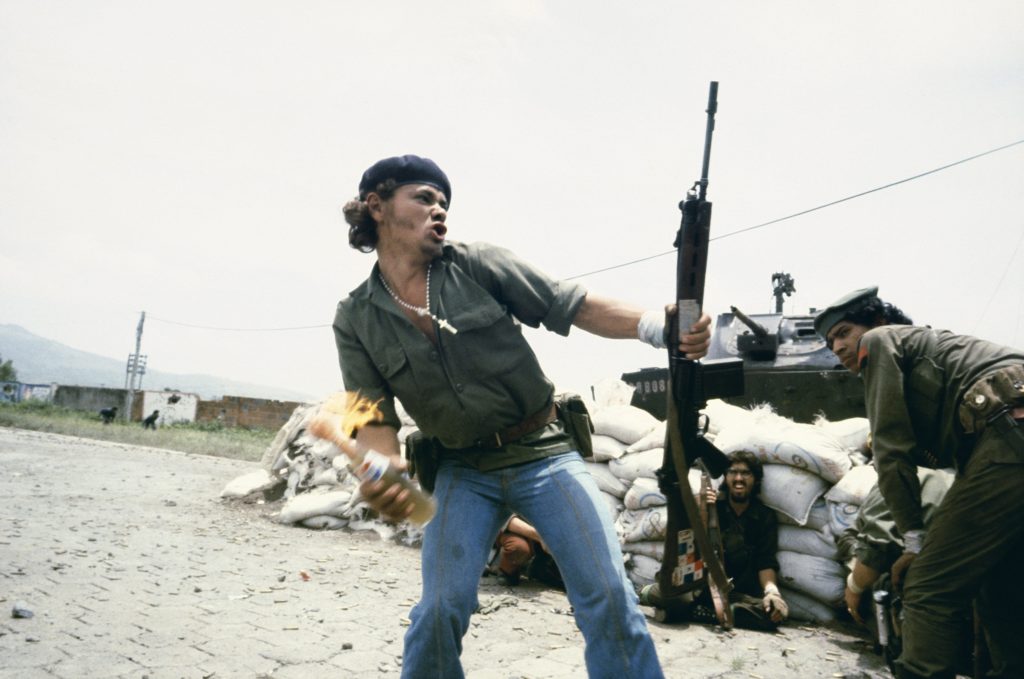
Susan Meiselas

Henri Cartier-Bresson

Henri Cartier-Bresson was a French photographer born in Chanteloup-en-Brie, Seine-et-Marne. He developed an early fascination with painting particularly with Surrealism.

After spending a year in the Ivory Coast in 1932, he discovered his true life long passion – photography. Taken prisoner of war in 1940, he escaped on his third attempt in 1943 and subsequently joined an underground organization to assist prisoners and escapees. 

In 1945, he photographed the liberation of Paris.

Henri Cartier-Bresson

After three years he had spent travelling in the East, in 1952, he returned to Europe, where he published his first book, The decisive moment. From 1968, he began to curtail his photographic activities, preferring to concentrate on drawing and painting.

In 2003, with his wife and daughter, he created the Fondation Henri Cartier-Bresson in Paris for the preservation of his work. Cartier-Bresson received an extraordinary number of prizes, awards, and honorary doctorates.

He was referred to as a humanist photographer and the master of candid.
Henri Cartier-Bresson

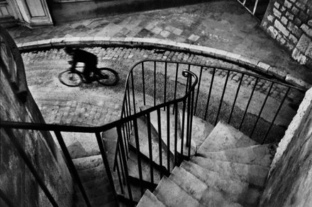
Seen above is an image from Henri’s book “The Decisive Moment” published in 1952. The composition is of a curved cobble street/ alley way surrounded by old buildings. There is a cyclist cycling expeditiously wearing black clothing on the street toward the left side of the composition. The photo is taken from the top of a spiralling staircase contained by a strong metal railing with evenly spread, parallel spokes, which meanders down towards the street in an uneven fashion. This gives the image a unique view point where the alleyway setting can be seen from above.

The photograph has low saturation and high contrast and it is also slightly underexposed and shot with natural lighting which gives the alleyway a low-key, darker, grungy look. The image is also taken with a slower shutter-speed which portrays the movement and briskness of the cyclist as he delays blurringly through the composition. Henri also framed the cyclist in the gap between where the railing stops and the strong line of the corner of a building. The image can give context to the rush and hustle that people can become enveloped in on these streets.

Henri co-founded Magnum Photo Agency in 1947. This was a cooperative agency where the founders where assigned different regions to photograph across the globe. Henri was assigned India and China. This is where he gained recognition for documenting Gandhi’s funeral in India in 1948 and the last stage of the Chinese Civil War in 1949

INDIA. 1948. Delhi. GANDHI’s funeral. Crowds gathered between Birla House and the cremation ground – Henri Cartier-Bresson

Joel Meyerowitz

Joel Meyerowitz is a street photographer from the Bronx, New York

Joe’s pieces portray humanity in its hustle, boisterous and everyday movement similarly to the works of Cartier-Bresson.

Joes works are more concentrated to the place he grew up and he goes about his work in a manner of capturing the essence of New York and documenting the city. This is different in Henri’s work; his is more diverse – he documents the essence of different cultures and political viewpoints from all over the world.

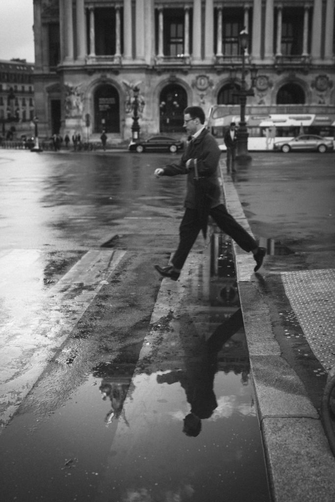
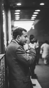
Both of the above images picture a man in smart attire mid stride in a city environment.

Both images give a background to what the life of the subject looks like and their everyday hustle. The images both capture the subjects movement and direction while including the environment around them which adds to the incite into the subjects background.

Both images have low saturation and high contrast which make the black suited subjects almost appear like silhouettes. They are both shot with slower shutter speed to capture some of the movement of the subjects. Henri’s composition is more three-dimensional as the reflection on the street below the subject adds another layer to the image and creates a horizontal symmetry. Joes image is exposed slightly more which gives it more clarity.

Photo Shoot Plan

What

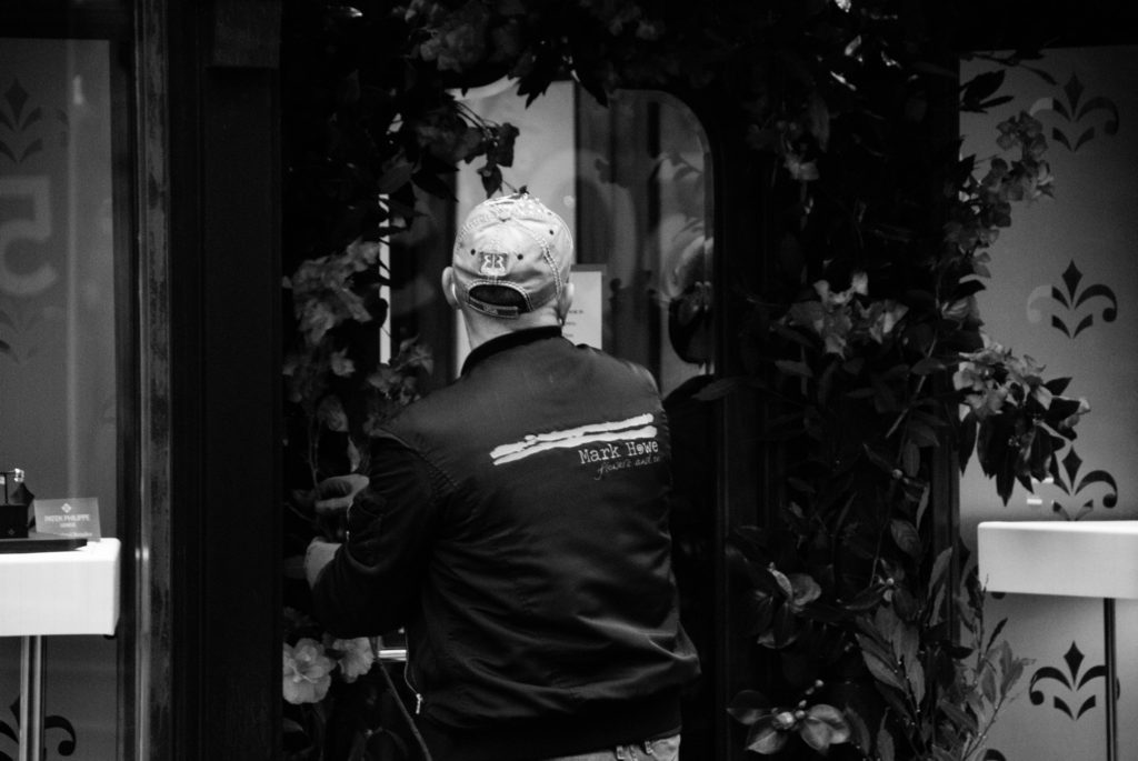
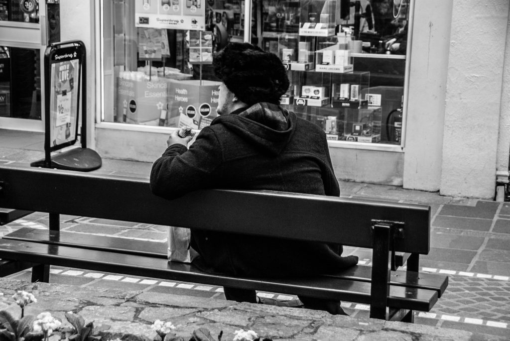
People on the streets

Who

Random interesting looking people

When

During day – good natural lighting. Overcast conditions – low key images – not too harsh lighting.

Where

Town, urban area

Why

To explore the techniques, methods of shooting street, photography, to capture the essence of people going about their day.

How

Talk to people, use lens with higher focal length, position myself in way that captures a unique viewpoint.

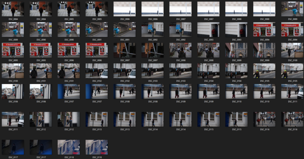
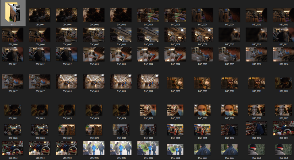
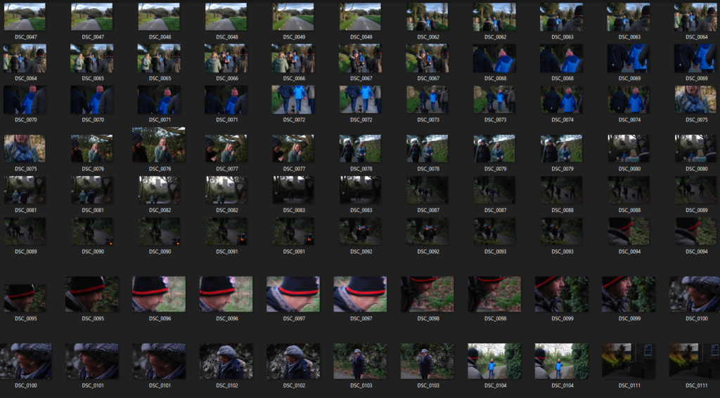
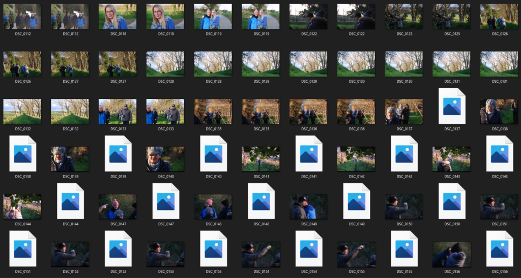
Contact Sheets

Final Edits

Final selections

CANDID PORTRAITS

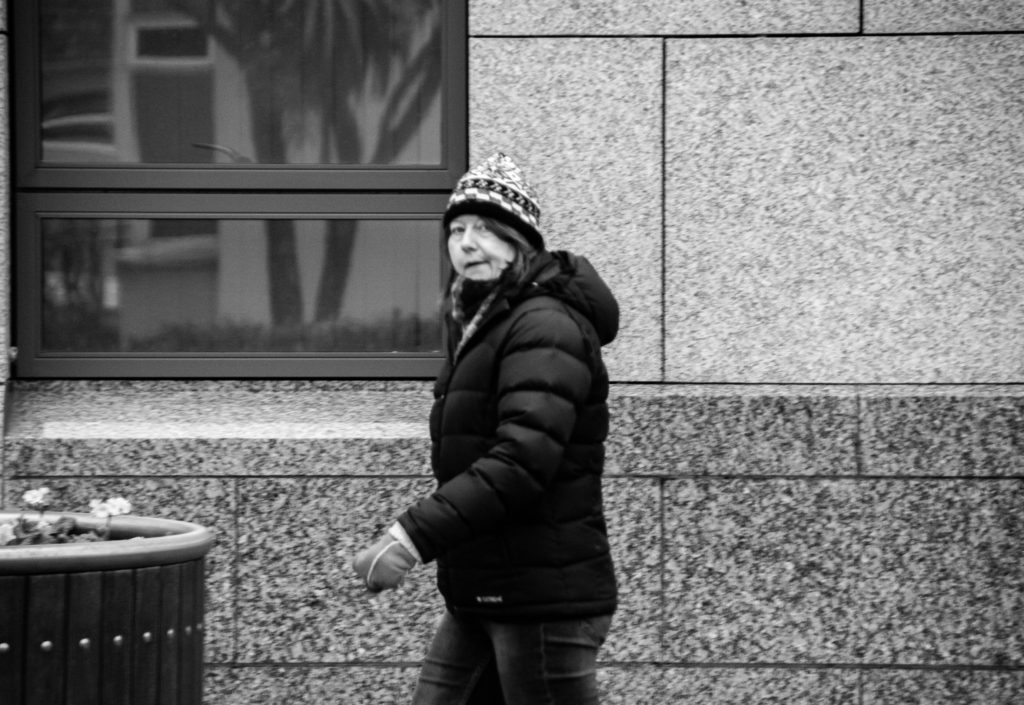
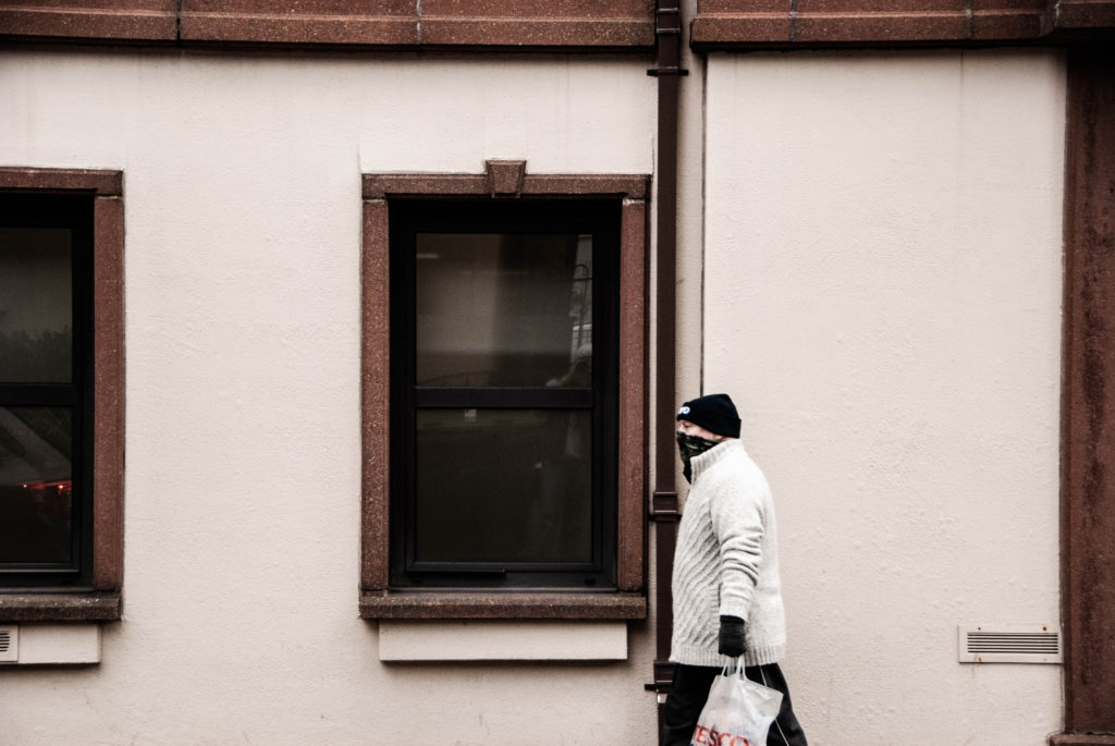
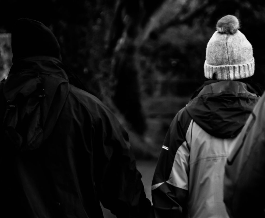
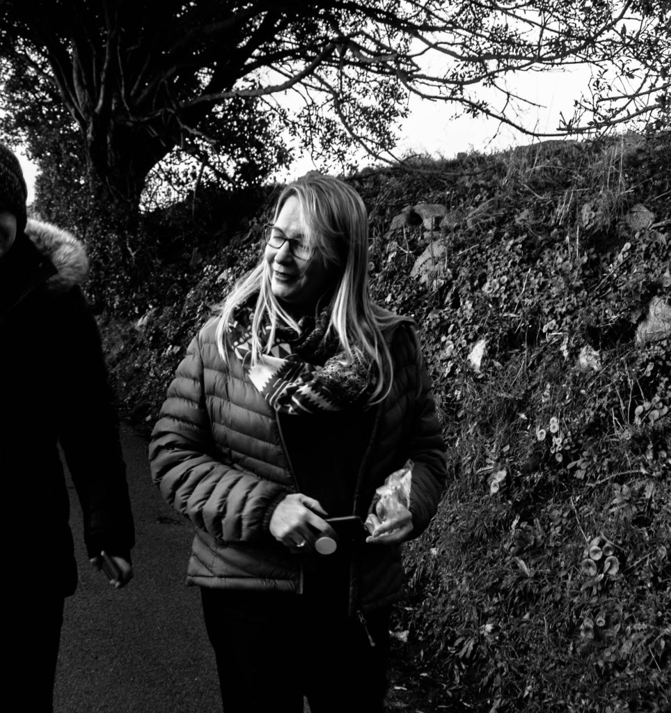
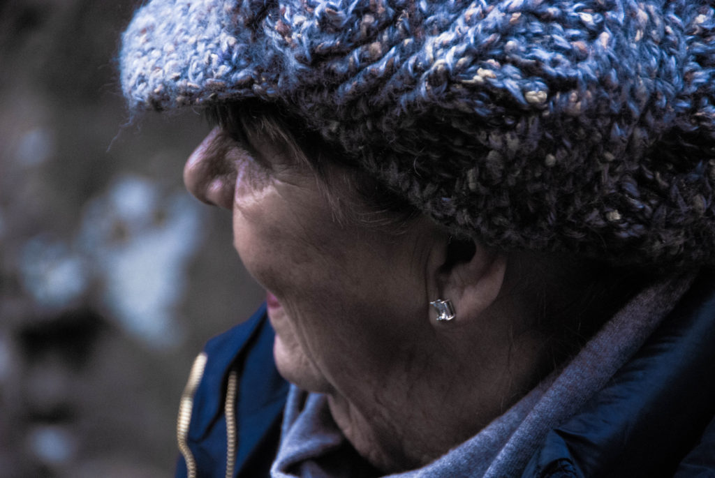
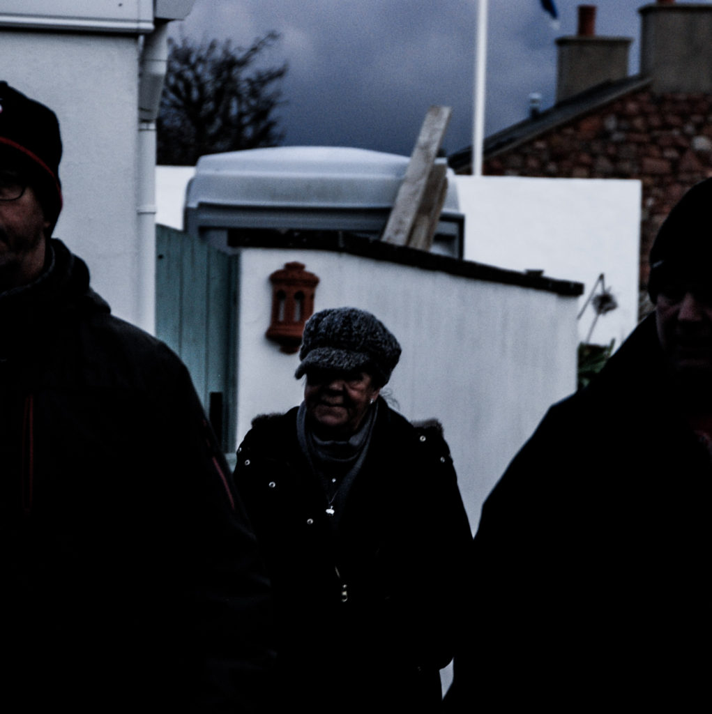
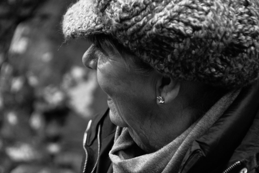
Candid portraits are unplanned, informal form of portraiture which consists of shooting more natural, fluid occurrences and behaviour of a person.

Photoshoot plan

Who – Strangers or friends that are unaware of the photograph being taken

Why – To capture candid moments of natural occurrence, capture everyday life through an all seeing eye.

What -Strangers or friends that are unaware of the photograph being taken in natural locations

Where – Populated area meant for leisure for the general public

When – During rush hour or the weekend when people are out

How – Shoot of the hip with large focus to isolate a subject.

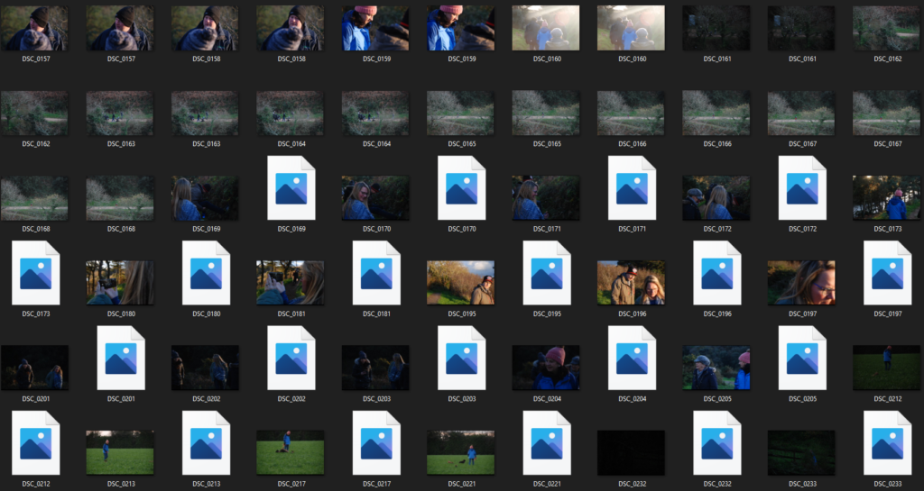
Contact Sheets

Final Images

Environmental Portraits

Environmental Portraits is a form of portraiture where the typical working environment of the subject is showcased.

Kremer Johnson

Kremer Johnson

The above three quarter length, head-on image taken by Kremer Johnson is a perfect example of an environmental portrait.

It is a good example because the image is of a man engaging with the camera wearing his wetsuit and fishing accessories while holding a spearfishing gun and sporting wet hair. This indefinitely shows us that fishing is his passion/job.

The image also has the ocean as the backdrop of the ocean which concludes the overall scene and setting of the environmental portrait.

The image is lit using natural light with aid from a more fluorescent light which fills in the right side of of the subjects face and creates a shadow which intensifies his features and helps drive the idea of a well weathered fisherman in the portrait. Kremer uses a smaller aperture to create a large depth of field by isolating the subject from the background and creating a bokeh effect. There is also use of a warmer white balance to accentuate the theme of pride.

Kremer has created texture by using a high resolution camera and lense combined with the lighting. The texture is constructed around the contrast of the smooth neoprene chest plate with water cascading down it and the fishermans rough hands and facial features and metallic gadgets which tells the story concealed in the portrait.

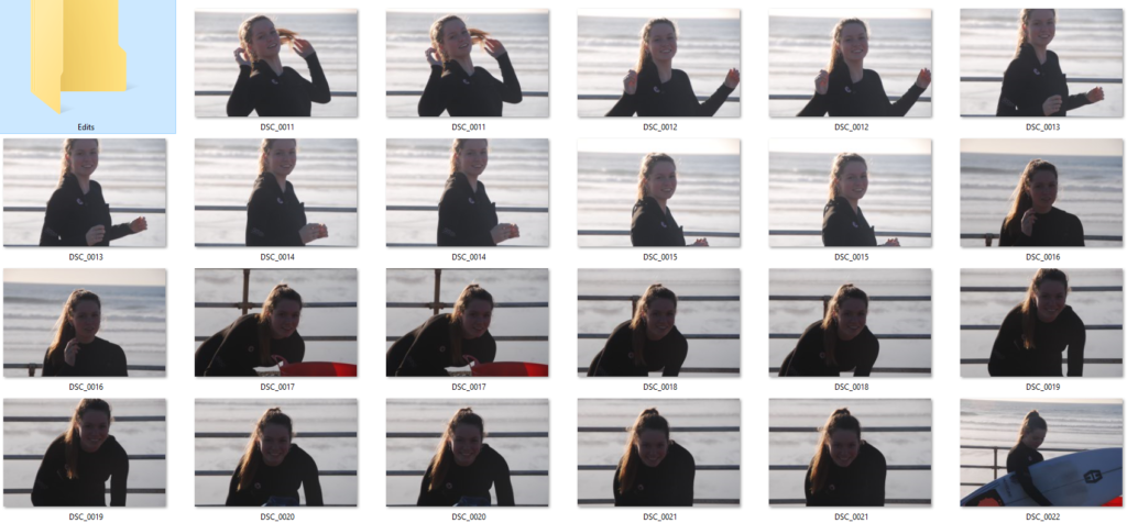
PhotoShoot Plan

Who – Surfer

When – Later in the afternoon so natural light is not too harsh

Where – By the ocean

What – Subject holding surfboard in a wetsuit.

Why – This portrays her passion/hobby clearly in the portrait.

How – Use a warm white balance and a combination of natural and manmade light.

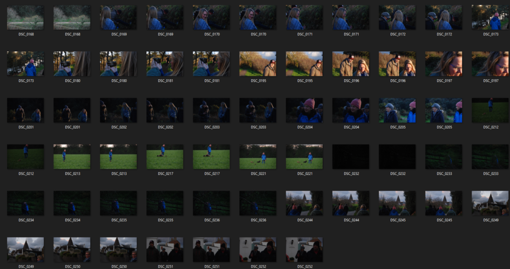
Contact Sheets

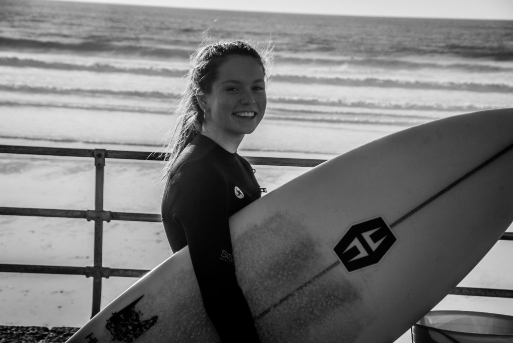
Final Images

I chose to use a low saturation and a high contrast to give my image more tonal depth and clarity. This helps outline the subject and make her the focal point of the portrait.

I used a combination of natural and fluorescent for the first few images the sun was hitting my subject from the side on creating an outline on one side whilst casting shadows on the other side to emphasize her facial details. for the last two images I wanted to light my subject head on so I use a one point lighting system and it worked well with the background.

I used a lower ISO to slightly udder-expose the images to relay a gloomier mood to emphasize the winter environment. This also gives us more context into the life of the subject relaying by informing that she is a more passionate surfer as she endures colder weather.

SELECTING, FINALISING AND DISPLAYING…

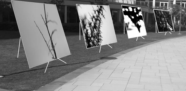
I grouped the above images together as they portray the same vertical leading line architecture both with each other, and with the gallery they are displayed in.

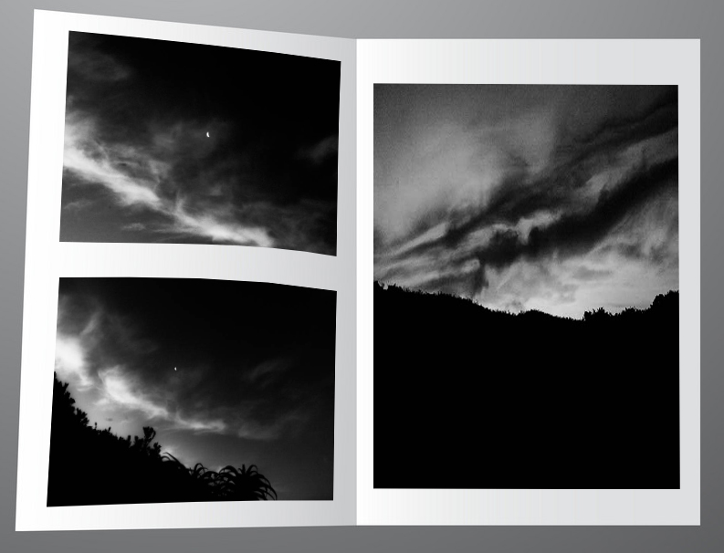
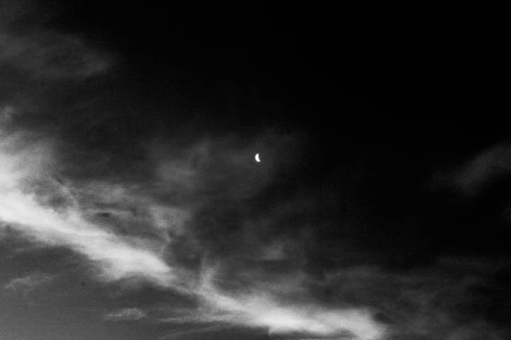
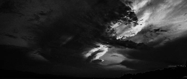
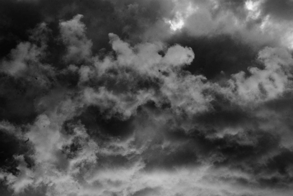
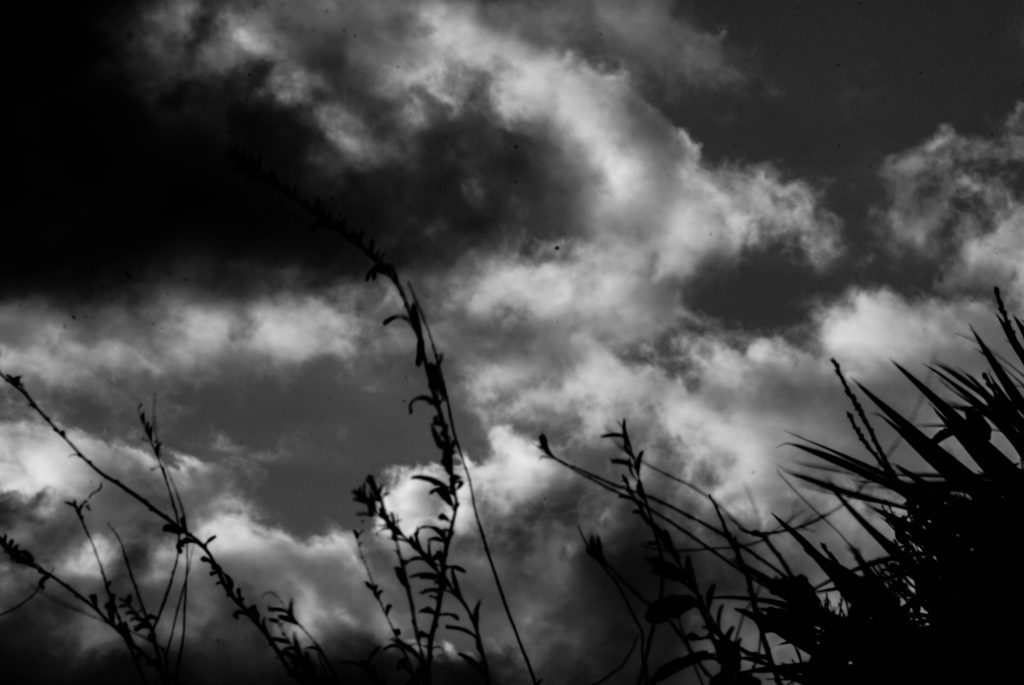
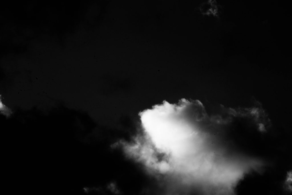
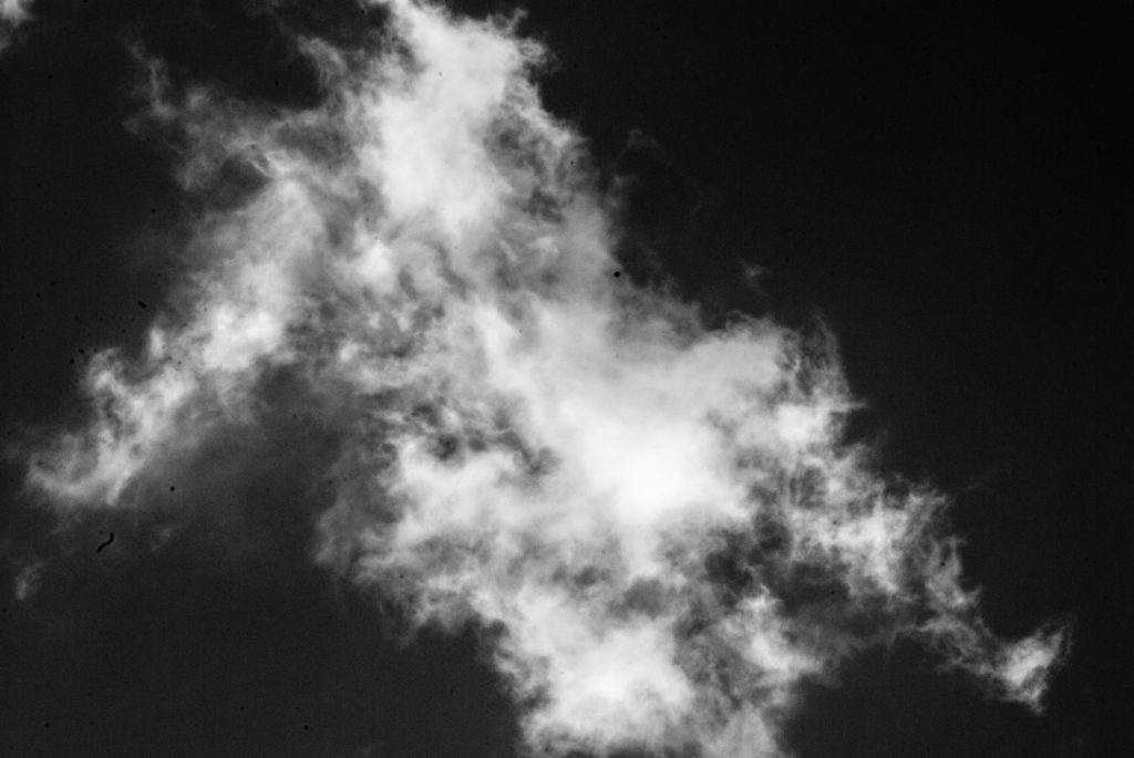
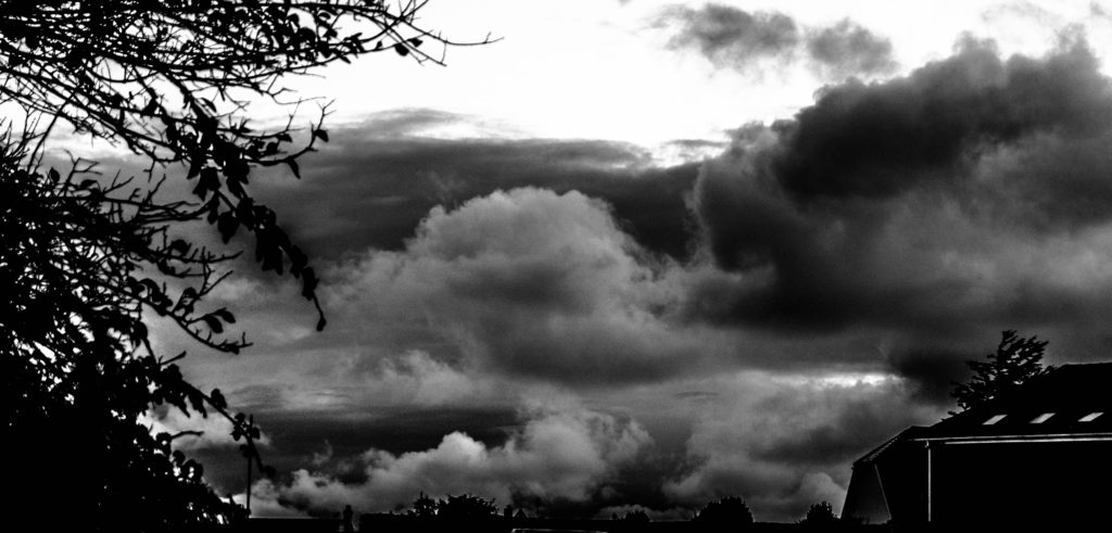
These images I decided to display in a digital zine format. They follow the same tonal and textual features showcasing the sandpapered clouds in a dark underexposed style.

The above images follow the same desaturated and geometric rectangle features which coincides with the gallery I chose which features grey walls and geometric rectangular architecture.

These images feature the same experimental focal style. They all have unconventional focus features with varying depths of field which made it suitable to use the immersive gallery which provides depth of field as some images look closer than the others.

The above images are curated together into that setting for the way they look like a portal into a different universe.

Method

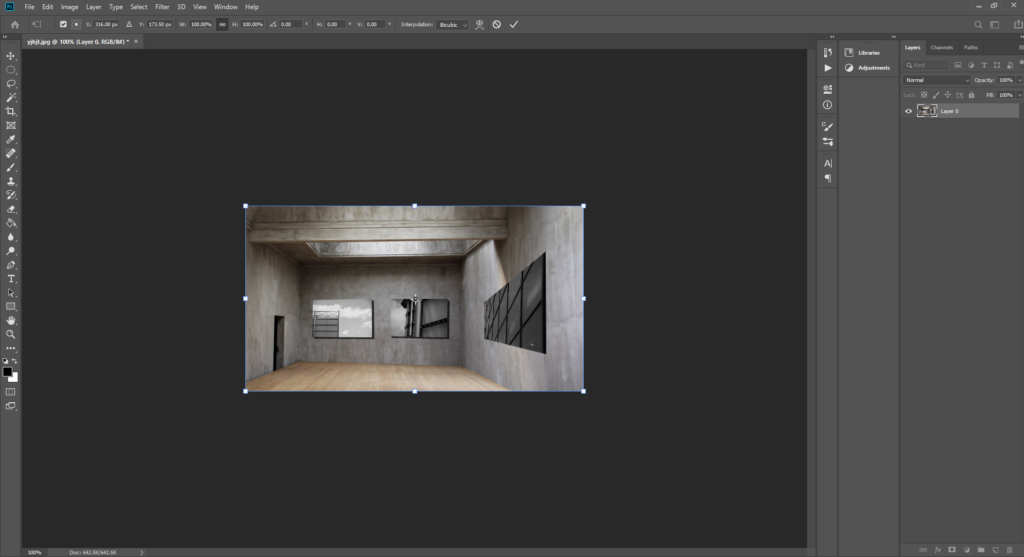
I first gathered my my images according to how aesthetic they would look simultaneously, into five sub-galleries

I then chose a fitting empty background to stitch the clusters of images onto. I chose backgrounds that possessed similar shape and form of the images and also any other visual elements such as similar cloud patterns.

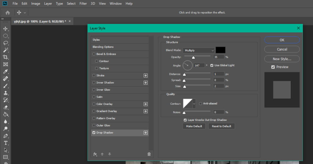
I then used photoshop to transpose these images onto the coinciding backgrounds by making use of free transform and warp to make the images look naturally apart of the background. I also added a drop-shadow to the images to help achieve this.

REPETITION, PATTERN, RHYTHM REFLECTION AND SYMMETRY -Alfred Stieglitz – patterns in the sky

Mood Board and Introduction

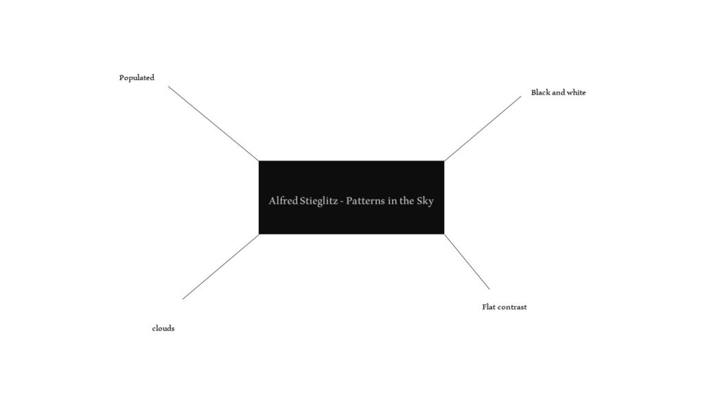
For this project I explored Alfred Stieglitz’s work on patterns in the sky.

Mind-map of ideas

Alfred Stieglitz

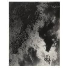
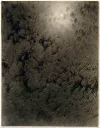
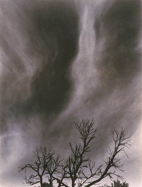
Alfred was an American Photographer born in 1864. He was an integral part in an acceptance of photography as an art form. He created a portfolio of pieces which focused on the pattern of things. His favorite way to capture this was by looking up and shooting patterns in the sky.

His images possessed flat, faded, contrast with bright, harsh highlights. They are also populated with pattern with little negative space.

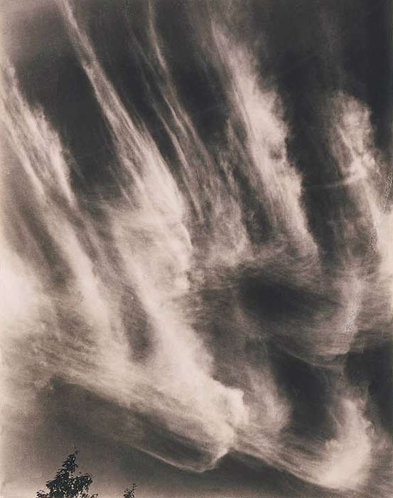
In this image Alfred captures an astral, melancholic but also euphoric, free emotion with this image. It seems as if an artist has painted on these clouds. The flat contrast and sandpaper clouds give this image a faded, rough texture.

He has used natural light streaming in from the corners of the image to give it an astral glow. He has still managed to, even though there seems to be harsh daylight, combat this by slightly under exposing the image by deepening the blacks of the sky by using the cameras film. he has used a small aperture to gain detail in the distant cloud formations and give the image depth. Alfred might have used a slightly longer exposure to drag the clouds across the composition. He has also used a higher ISO to add a fine grain to the image.

The image also contains a pattern of the repeating clouds sweeping upwards. There is also a significant depth in tone created by the blackened sky contrasting with the white clouds. The image is also populated with little negative space.

Photo Shoot Action Plan

Who: There will be no subject in this project.

What: Cloud patterns.

Where: I will be shooting near my house and close to the coast as there tends to be more interesting cloud formations there.

When: On an overcast day

How: DSLR 50mm – 80mm lens with small aperture capability, lense hood to prevent glare and a ND filter to grab blacker skies. Walk down to coast and around my neighborhood looking up and following cloud patterns

Why: To experiment and learn more about photographing pattern.

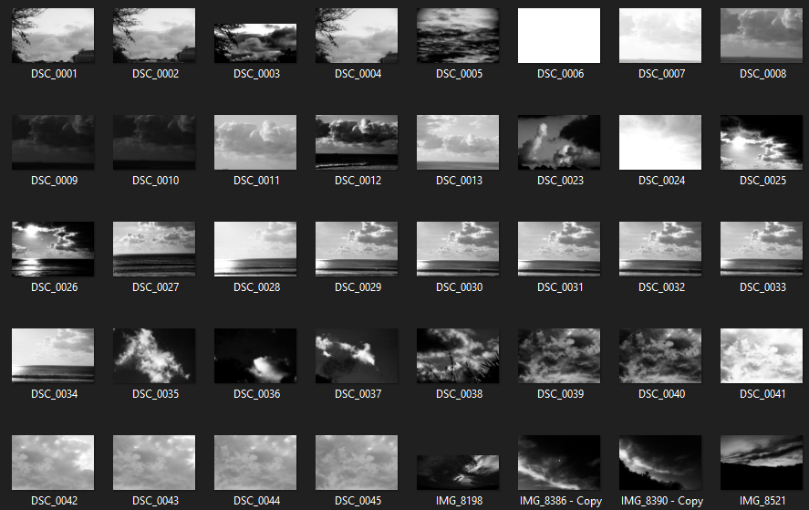
Contact Sheets

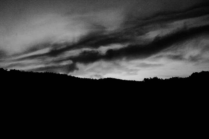
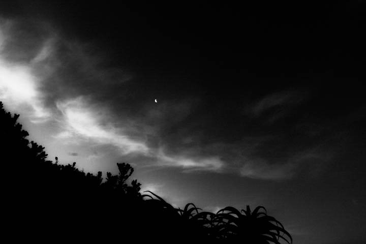
Final Compositions
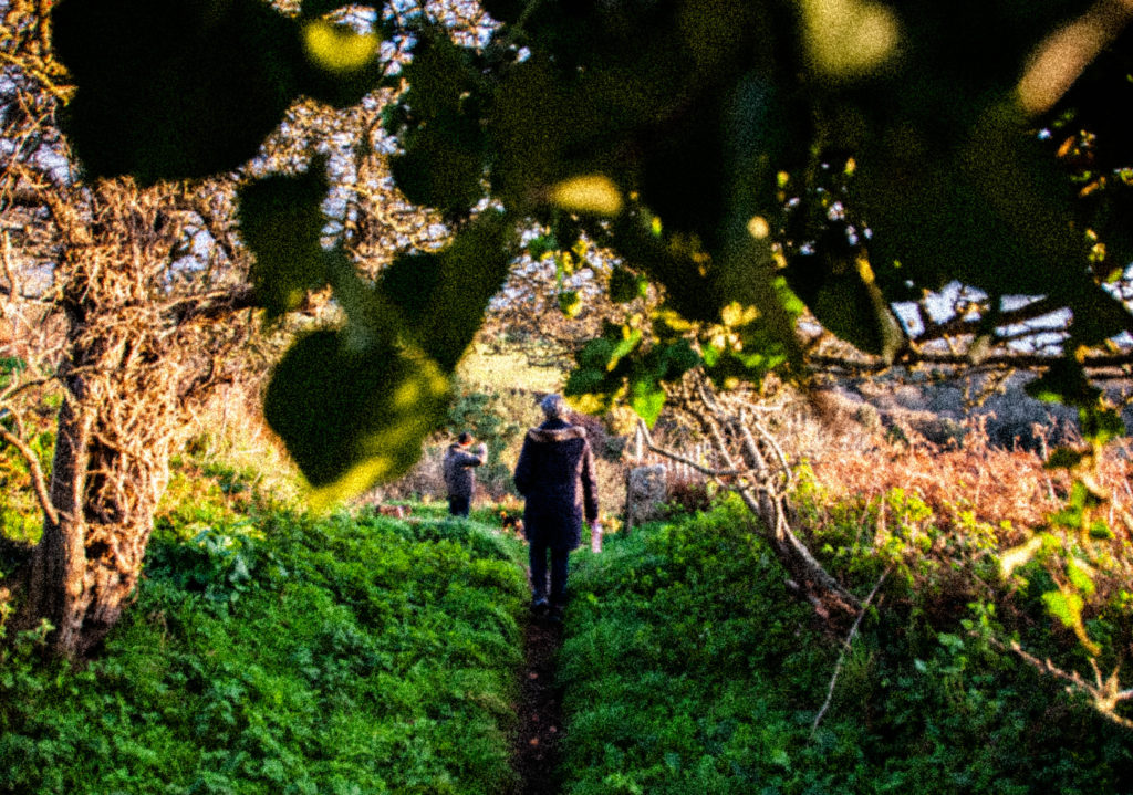
My above compositions portray the experimentation of pattern. They use deep tonal range with deep depth of field. My compositions featured similar elements to Alfreds work.
Both pieces include soft sweeping pattern work. They both use de saturated deep black negative spaces with the cotton clouds contrasting in the foreground. They both Make use of natural lighting adding accents to the patterns from a certain direction. They both use a small aperture to gain detail and depth in the clouds. They both consider a longer exposure time to drag the clouds out more. Both images hold a gloomy astral emotion. Finally, one difference is Alfred uses a flat contrast and my image contains a deeper contrast.
REPETITION, PATTERN, RHYTHM REFLECTION AND SYMMETRY – KALEIDOSCOPE

Process

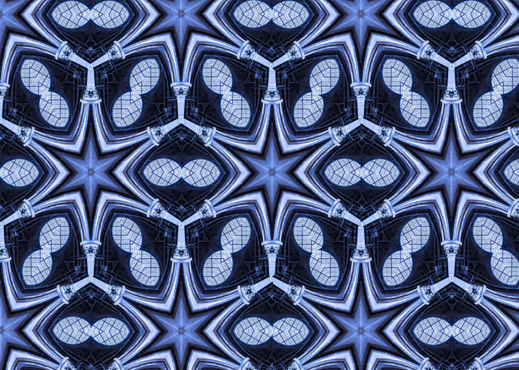
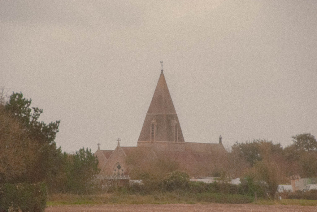
I imported an image I thought would look interesting in a reflected manner into photoshop. I chose an image of a church window with two rising parallel pillars either side of it.

I then used “ctrl + T” to enable free transform. I then rotated my image by 60 degrees by changing the angle in the top hotbar.

I then moved my image to the edge of the canvas to isolate an isosceles triangle. Once happy with the triangle I made it a seperate layer.

I then enlarged the canvas by 400%.

I then flipped the isosceles triangle on a vertical axis and lined it up with the original one to make an equilateral triangle.

I then flattened the layers and rotated the equilateral triangle around the same anchor point by 60 degrees. I then repeated this step to make a hexagon. I then filled in the rest of the image with the hexagons.

REPETITION, PATTERN, RHYTHM REFLECTION AND SYMMETRY – Image Comparison

Paul Strand Vs Jaromir Funke

I chose to compare and and contrast these two artists against each other as they both use light and shadowing techniques in very provocative ways.

Paul strand creates black and white images with exaggerated deep contrast by shooting sharp leading lines possessed by certain architecture in harsh light which creates long eloping shadows to form giving his images this contrast and tonal range.

Jaromir Funke similarly experiments with this harsh light and shadow forming technique to form these abstract black and white pieces.

The main differences between their pieces is that Jaromir creates more abstract unconventional compositions solely sue to the fact he intentionally creates his sets of random interesting objects that will clash well with light and form shadows while Paul shoots typical, mundane architecture but in a creative fashion to form his contrasting images.

Pauls image on the left contains harsh natural light to create the intense shadows bordering each of the subjects. He used a narrow aperture to create a deep depth which is supported by the leading lines running parallel through the image. His image has been infused with sharp highlights and deep blacks to accentuate the shadows and the images tonal range. His image also includes repetition, this is seen through all the duplicating steps. This image also has a sinister essence with the baby’s face emerged in a shadow it almost juxtaposes that an innocent being could be portrayed as having an evil soul

Jaromir Funke’s image contains abstract light experimentation that plays tricks on the mind. He uses a harsh fluorescent looking light to draw out shadows and create the images contrasting tones. The image contains a lot of sharp geometrical features which frame certain streams of light and let through others. His image is l=slightly under exposed to add depth to the shadows. A high ISO has been used to add sensitivity to the film which has created a slight grain and given the image texture. The space in the image is quite populated with little negative space. He has also shot the shapes at an angle instead of straight on which gives a unique perspective to how the shadows elope and given the image more depth.

Surface and Colour

For this project I will be exploring the different ways I can capture varying textures and colour schemes in an expressionistic consuetude. I will also be focusing on using ISO and white balance in an unconventional and creative manner.

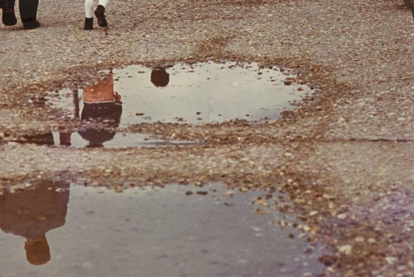
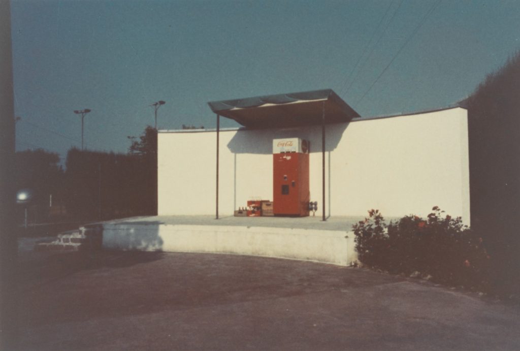
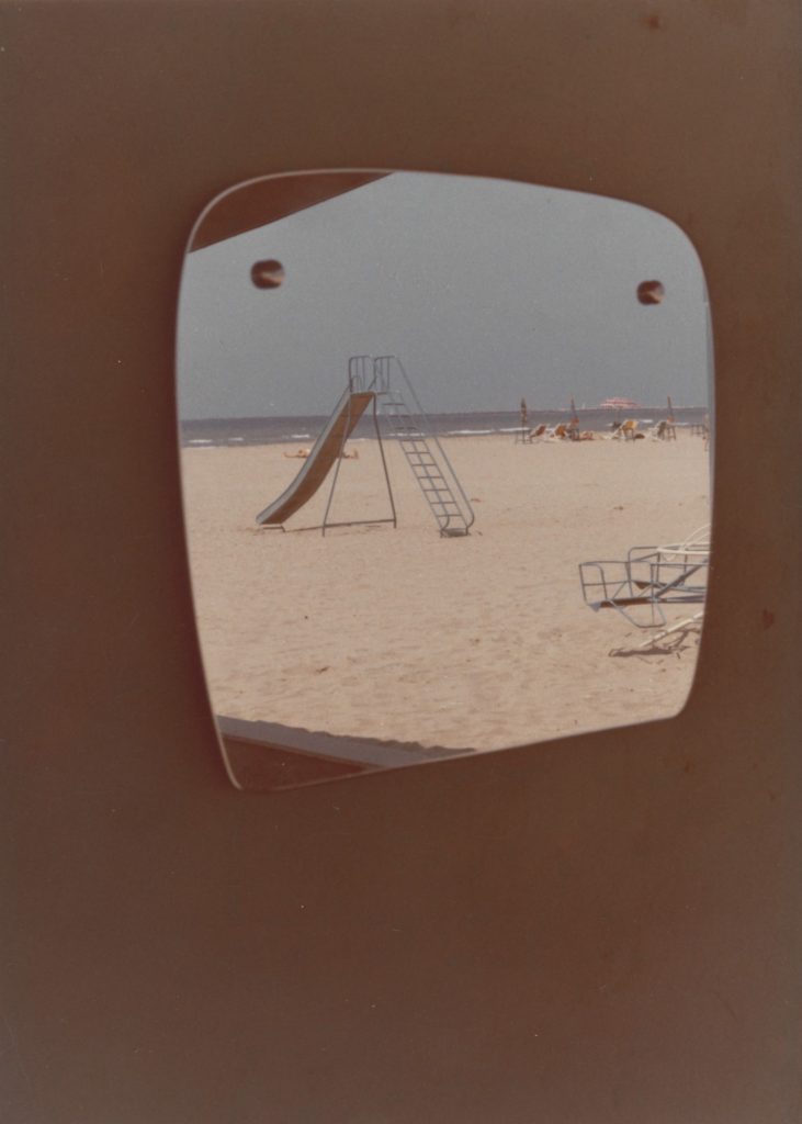
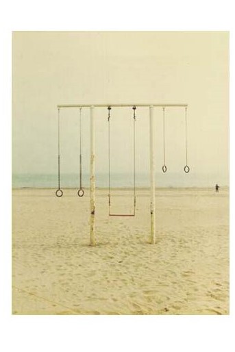
Luigi Ghirri

Luigi was an Italian photographer born 1943. He was a pioneer in his field and he focused on the contrast between fiction and reality.

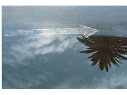
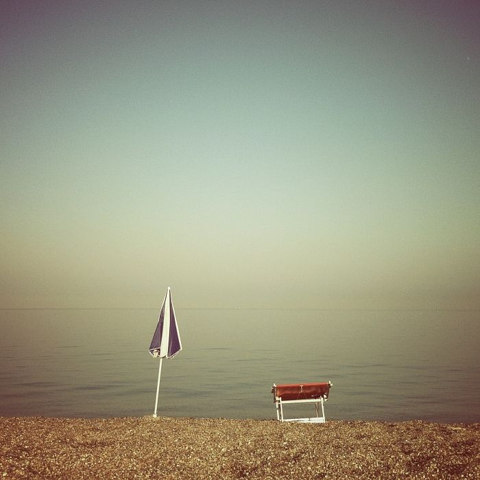
He creates minimalist compositions which focus on a consistent colour temperature and texture. The unique attitude in his work consists of very interesting textures created by a flat contrast. He experiments with the light sensitivity of his film which creates a fine grain on his images which also adds to the unique unprecedented texture of his compositions. He shoots untarnished, condensed backgrounds to accentuate the surface texture of the image. The flat contrast adds a faded look to his images.

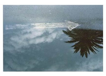
In the above image we can see Luigi also experiments with reflective surfaces to further the idea of the unprecedented surface texture present in his images. In the above image Luigi uses a specific white balance to create a cold colour temperature in the image. This temperature, combined with the puddle which is associated with rain, gives the image a bleak feeling. He also uses a flat contrast to add a faded look and texture to the image. He uses the puddle to create depth in his image and add a unique perspective to how we view the world and its textures. He also experiments with ISO to great a grain in the image to again boost the idea of unconventional surface textures. He uses natural lighting which is not too harsh to maintain the flat contrast in his works.

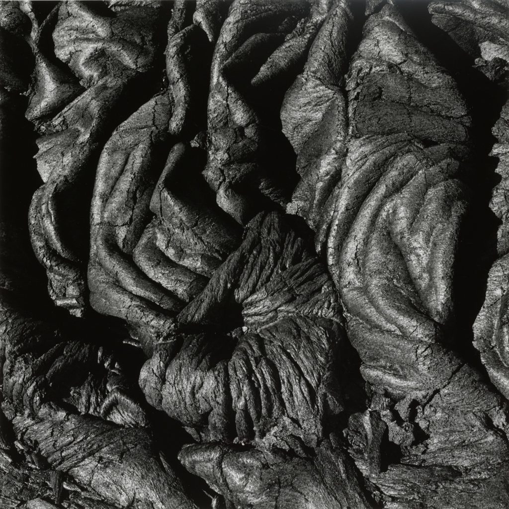
Aaron Siskind and the Boyle Family

Aaron Siskind was an American photographer born 1903. Looking at Aarons work in the context of Texture and colour, his pieces relate very well. He creates compositions that focus on the detail of things and he brings their texture into light. and creating

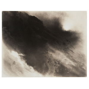
Aaron siskind – volcano

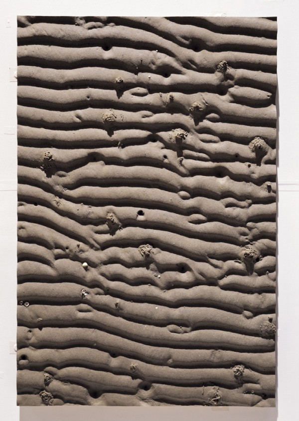
The Boyle family is a group of collaborative artists based in London who where popular in the 60s for their minimalistic macro photography. They created work with the focus point of flat surface texture based images.

Photo Shoot Plan

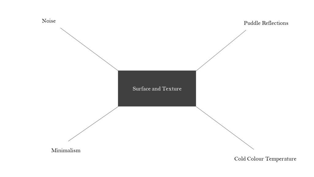
Shoot puddles, road imperfections/markings and minimal style objects around my countryside neighbourhood and in urban built-up areas. Use ISO in a creative way – use extremely high ISO to give my images grainy texture. Use white-balance creatively – give the images gloomy cold tonal temperature. Focus on surface texture.

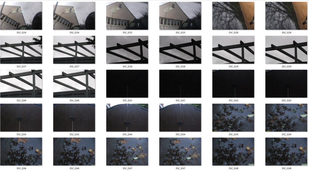
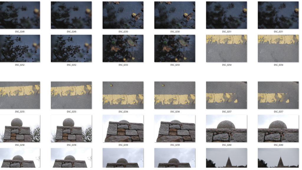
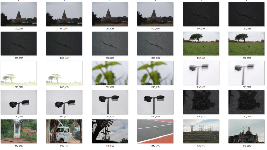
Contact Sheets

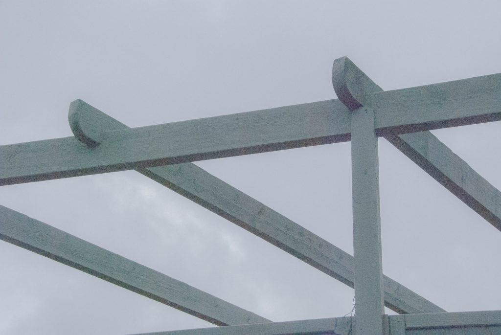
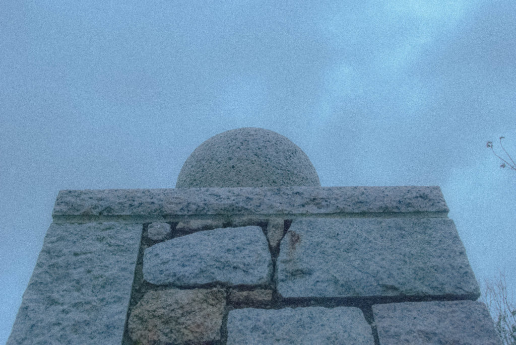
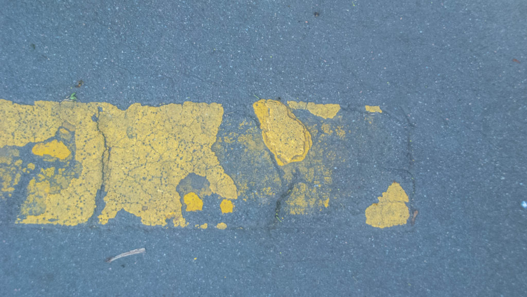
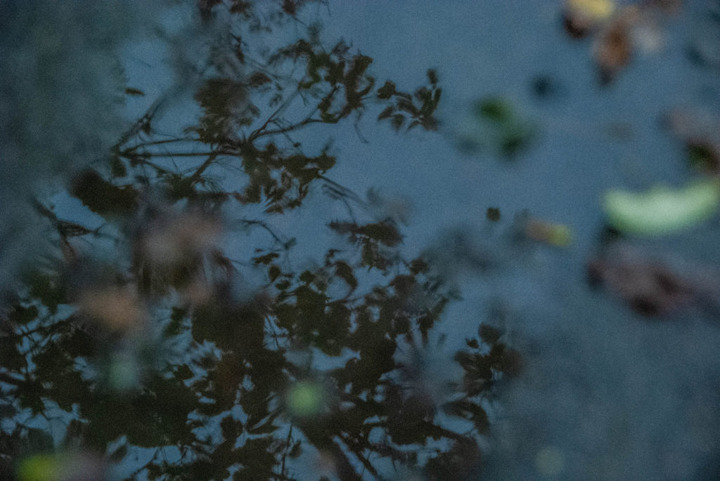
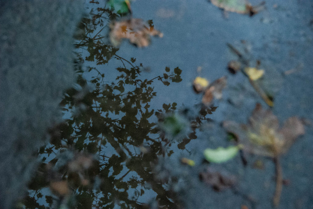
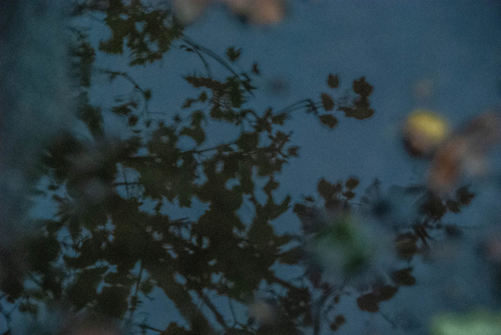
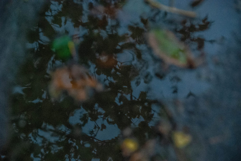
My Compositions Focused on Surface Texture and Flat Tonal Range/Colour Schemes

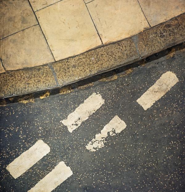
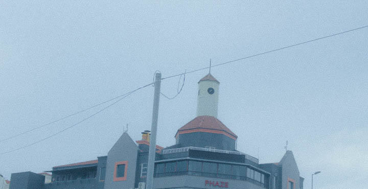
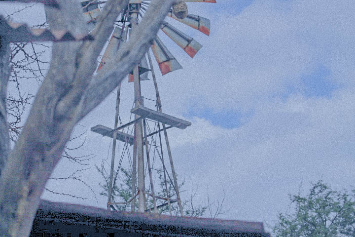
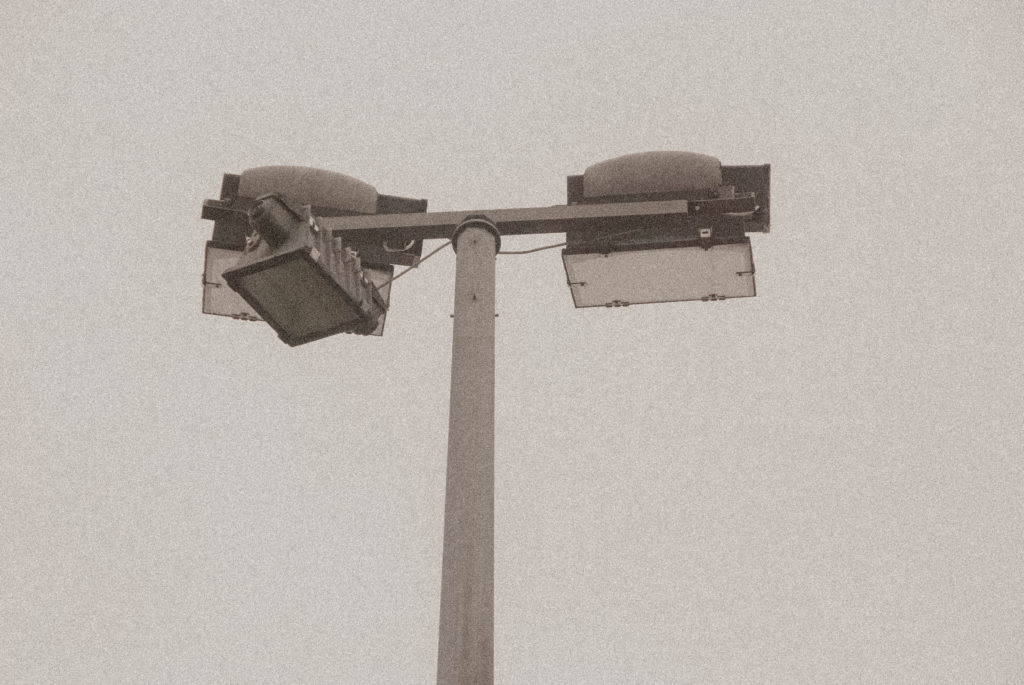
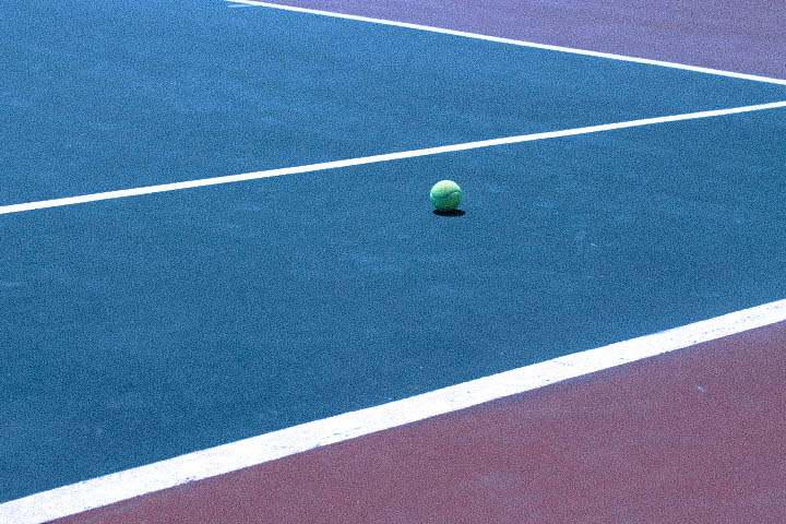
Taking inspiration from Luigi, when shooting my images I focused on using ISO in an unconventional way to create a grainy surface texture. I also used white balance to create a flat colour contrast.

I also took inspiration from my second reference and created detailed compositions highlighting texture in our world and creating a sense that one could rub their hand over my images and feel the road imperfections.

Black Light

Keld Helmer Peterson

A Danish photographer who was considered a pioneer in abstract photography in the 40s and 50s.

Keld experimented with the contrast in graphic black and white expression.

He was influenced greatly by constructivist artists and industrial machines/architecture.

Below we can see some of his compositions from his “Black Light” album where he experimented with extreme contrast to create abstract black on white compositions.

Process:

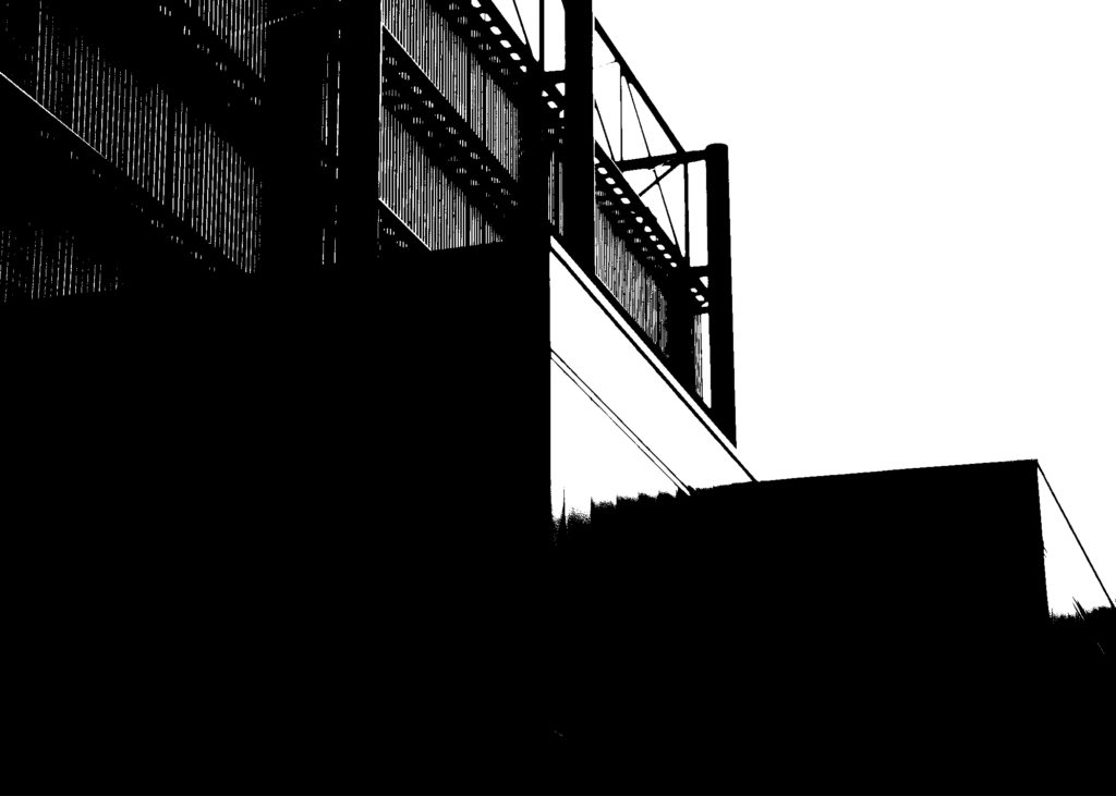
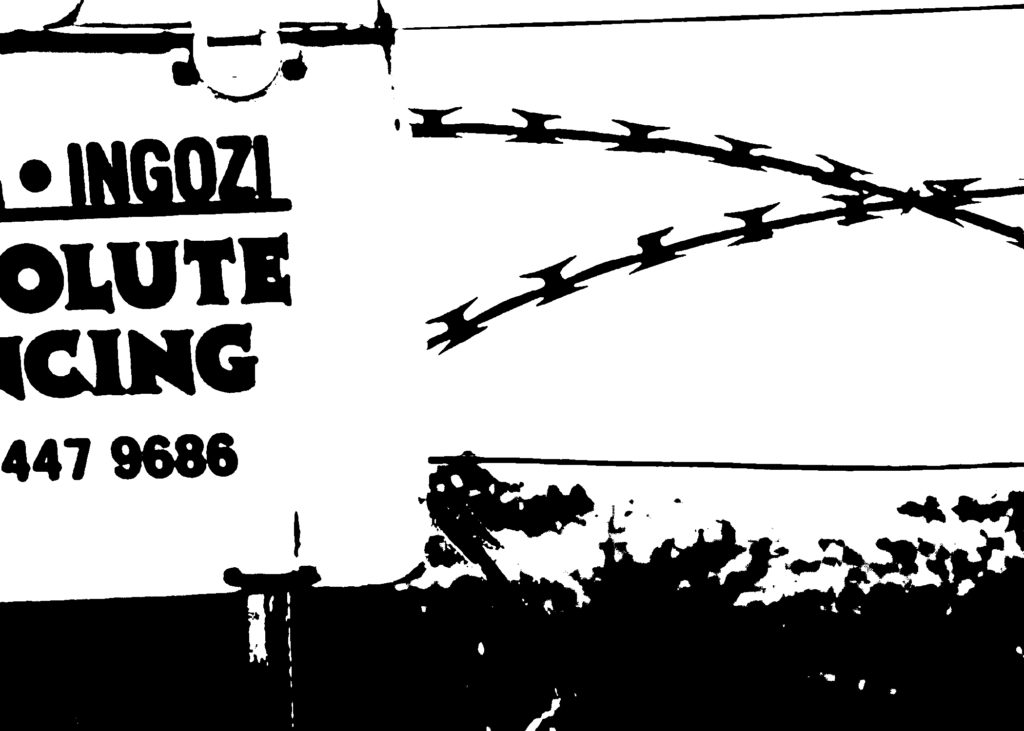
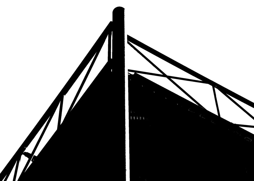
I chose 4 images that I thought would create a graphical black on white composition when edited. I opted for interesting industrial and man made elements with simplistic backgrounds.

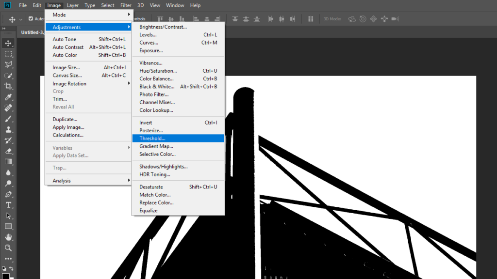
I then added greater contrast to the image. Following this I used the threshold tool in photoshop to exaggerate the tonal range and create an abstract composition.

My Images