All posts by Matthew B

Filters

Author:
Category:

Repetition, Pattern, Rhythm, Reflection And Symmetry

Ernst Haas compared to Nick Albertson
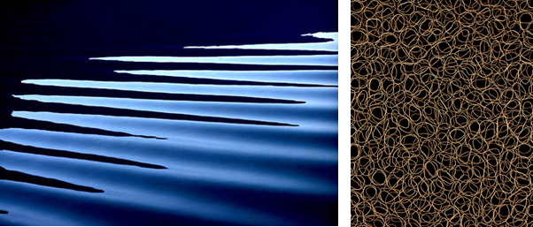
Ernst Haas (left) “Black Wave” – 1966 / Nick Albertson (Right) “Rubber Bands” – 2013

Haas takes more identifiable images, for example, a zoomed in shot of horizontal ripples on the surface of the water to create an abstract scene, where as Albertson only takes extremely close up images, to a point where you can identify what the subject is, which makes the image more fascinating as you question what the image is of.

Both images are visually appalling, as they both use circles, which is a clam looking shape as the are no pointy corners or sharp lines.

The lighting is more noticeable in Haas’s image, as there is a lot more definition due to a high contrast in the tones, because the water is at different levels, as it is 3D. On the other hand, Albertson’s image uses a black background so it is hard to tell where the light is coming from and if it is natural or artificial.

The lines on Haas’s image are horizontal and angled at a 45 degrees from the light, to create highlights and shadows in the corners of the images. The repetition adds more depth as you and see the ripples behind each other. Where as, Albertson’s photo was taken from a birds eye view directly above all the rubber bands to create a frantic and rushed mood as all the lines overlap each other.

Both images have little composition, they have a “less descriptive, more creative” approach. Which means that the image is mainly based off of it looks rather that it background and history.

The technology was different in the mid 20th century compared to the early 21st century, which is why Haas’s image has a lower quality as they only had 10mm-40mm lens which is why it is a little bit pixelated.

Haas’s image uses a fast shutter speed to capture the motion in a still frame. It also makes the image a bit under exposed as it isn’t letting in a lot light in as the hole which lets light enter the camera is small and closed up. The image has a cold tone as the colour blue is the most dominant.

Albertson’s image uses a high aperture to keep everything in focus, which makes it more chaotic as there is more to focus on in the image. Additionally, he uses a low ISO to reduce grain to create a cleaner image.

Surface And Colour

Minimalism

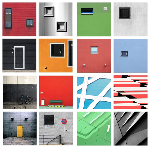
Minimalism as a combination of these two subjects, and is often used together in most photos.

The surface is important because, it is what creates the shadows and and highlights. It also makes it more unique as it can be dull or shiny, maybe even reflections.

The colour aspect is more about the tonal wheel, as the shadows make a light colour appear darker. This can be used to make a layered like image was depth of field is used effectively.

Julian Schulze

Julian Schulze was born in Hannover and is a Berlin based photographer. He is mainly focused on abstract and surreal genre of photography. He loves bold colours as well as colour combinations and compositions.

Julian Schulze is a master of minimalist photography, as he creates eye-catching and impressive minimalist compositions where each shot is composed using light, shadow, and colour to create a 2D or 3D scene.

Schulze describes himself as “focused on geometric abstraction and minimalistic work”

Kevin Saint Grey

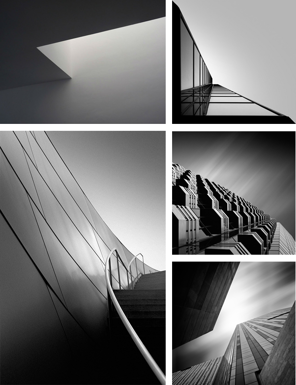
Kevin Saint Grey’s techniques are normally symmetry and long-exposure, and he manages to get amazing, creative photographs, by using camera movements while exploring unique angles while shooting architecture.

Kevin Saint Grey is a primarily black and white LA based photographer with a minimalist approach to his subjects which creates a drastic contrast.

He shoots mostly landscape and architecture, and his work distinguishes itself for the serendipity of black and white, “humanness” and silent images.

My Colour Photos

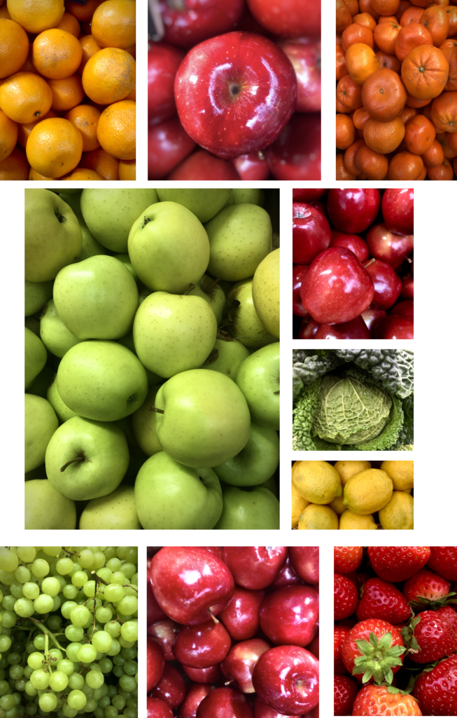
I like how they are vibrant as they make the image pop. I have used lots of repetition in my images, as I took them at the market in town. The images have a good amount of depth and definition. The light is artificial and coming from above, which is why the apples have a shine on them, and also because they were polished. This makes the subject more appealing.

My Minimalistic Photos

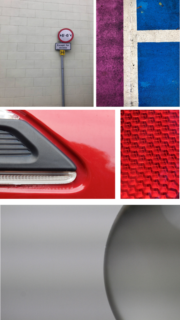
The first two minimalist photos both use the rule of thirds. The image on the left is only focusing on one subject, which is the sign on the pole, the wall behind is very dull, which is why it is classed as minimalist. The photo on the right is of the pattern on the floor in a car park. It uses vibe rent colours the clash together making it more visually pleasing.

The rest of the photos are taken of objects, although not the full object is in the frame as it creates a minimalistic effect. I only focused in on the small simple details.

My Surface Photos

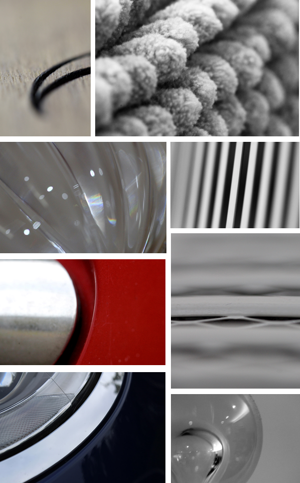
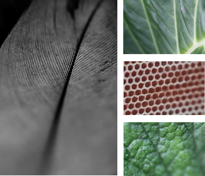
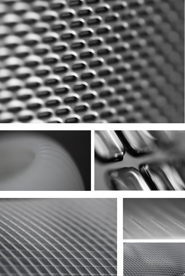
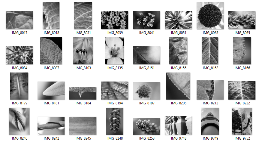
To capture the surface on these objects I used macro lens so I could zoom in closed to get very detail. All the images show repetition of patterns I found most of these patterns on natural objects like feathers and leaves, although I did take a photo of a matchbox to get the image with lots of dots. Then focused on a reflection strip in a cars headlights to get some crosshatched detail.

Black Light

 Keld Helmer-Petersen

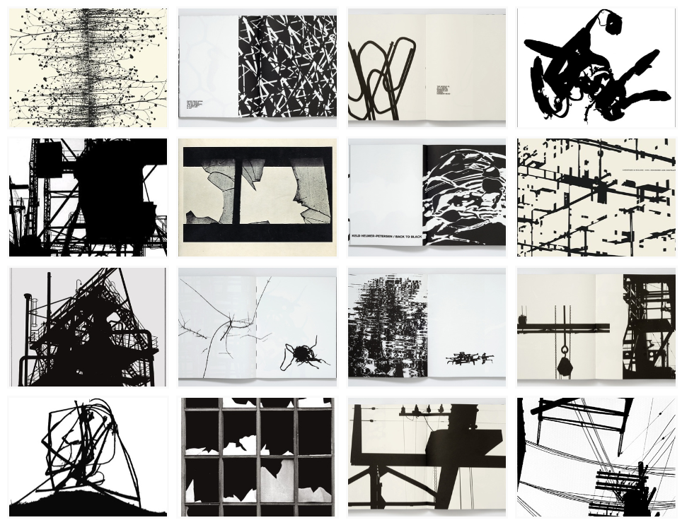
– Keld Helmer-Petersen was a Danish photographer who gained international recognition in the 1940’s and 1950’s for his abstract colour photographs.
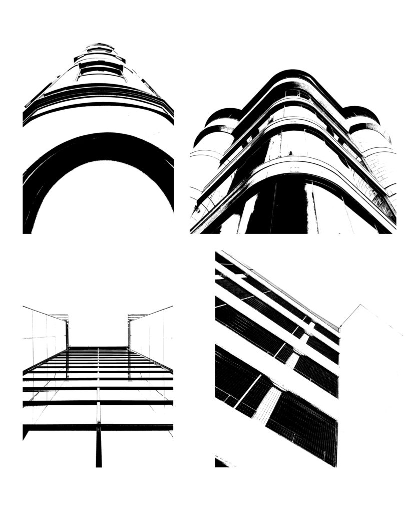
– His career lasted 70 years and he had strong interest in modern architecture, industrial areas and structures, which he would edit to be quite heavily contrasted, using strong black and white tones.
– He was very prolific and continuously experimented with different angles and perspectives.

All Keld Helmer-Petersen’s photos.

– As you can see he takes harsh black and white tonal images and increase the contrast in Photoshop.

Process

– First i chose 4 images i liked and opened them in Photoshop.
– Then, go to Image>Adjustments>Threshold.
– Adjust the threshold level slider, to how you want it.
– Crop the images to whatever size you want or 1000px x 1000px. And you can also rotate it in needed.
– Then you save the finished image.

Original Photos – (Before)

Edited Photos – (After)

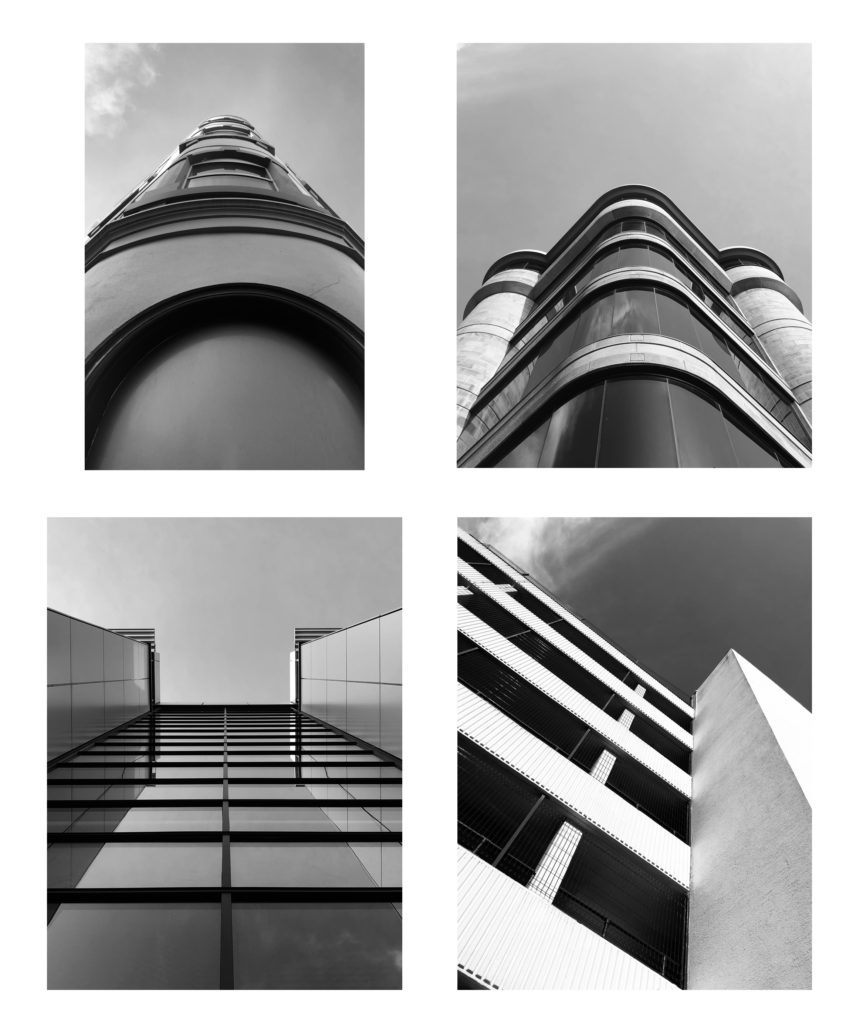
My edited photos.

Evaluation

– I like the outcome, as they look simplistic but include every detail needed.
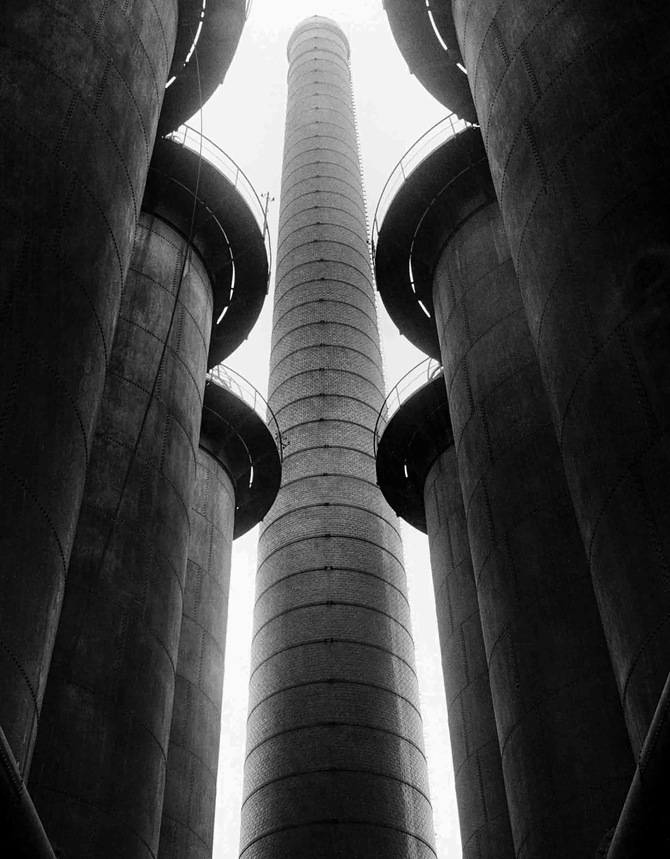
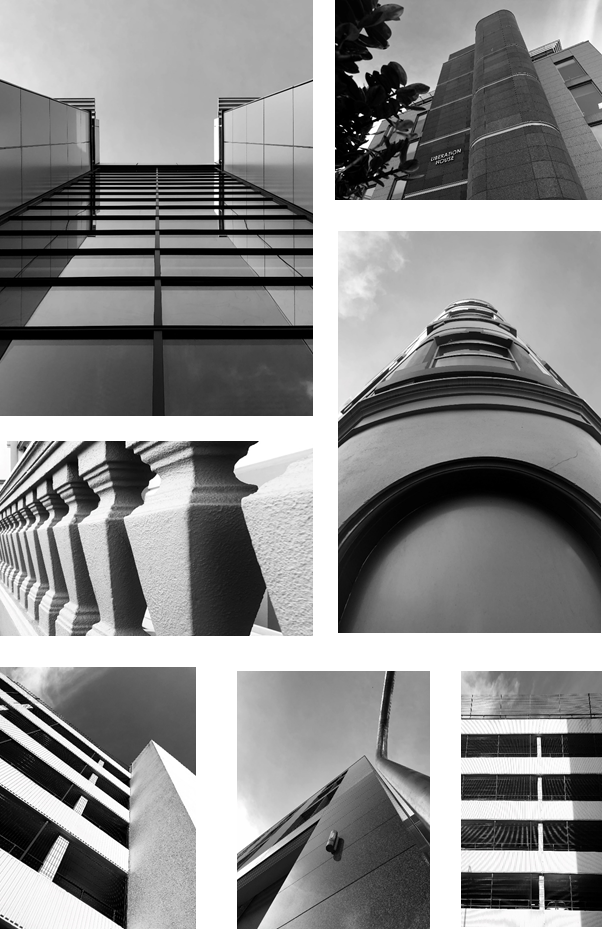
– The images are very geometric and include lots of parallel lines, which creates leading lines pointing to the sky.
– The top 2 images have curves, where as the bottom 2 are heavily consistent of straight lines.
– However, i don’t like how some of the black isn’t filled all the way, which creates a “patchy” look. As you can see in the bottom left photo, and the top right.

Original Photo

Evaluation

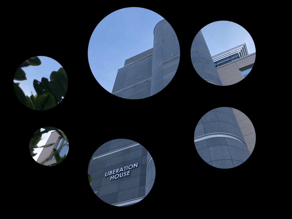
– I edited the image in Photoshop to create this effect. I like it as it makes you focus on the interesting parts, and subtracts the boring pieces.
– First, I made a plain black layer. Then I created 6 circles, and 6 of the same images and made the image a mask for the circle, and I did that 6 times. then positioned the circles where I want to see the image through the black layer.

Looking And Seeing

Abstract Photography

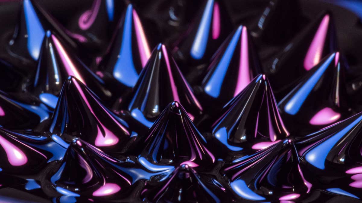
Abstract photography takes place when a photographer focuses in on a part of a natural scene, isolating it from the background. By zeroing in on the color, texture, line, shape, geometry, symmetry, or reflection of a scene, it warps our perception of the real world and familiar objects, making it look unique.

Abstract Photography Inspiration - Adaptalux.com
An image i found on Google, when i searched for “Abstract Photography”. (not taken by me)

Saul Leiter

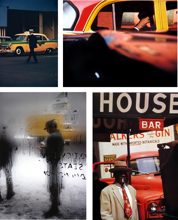
– Saul Leiter was an American artist and early pioneer of color photography. His interest began in his late teens.
– Leiter’s first exhibition of color photography was held in the 1950s at the Artist’s Club, a meeting place for many of the Abstract artists of that time.
– At the age of 23, he left theology school and moved to New York, which is where most of his photos were taken.

All Saul Leiter’s images.

I like Saul Leiter’s images as the use unique viberent colours in a city environment, which normally consists of grey and white buildings, instead of red green and yellow. He uses a high aperture to blur half of the image to create a focus on the main object in the image.
My ideas

– Fill up a bucket of water, and spray paint and mix it round. Then take photos of the patterns.
– Play a colourful video on my laptop and shoot the images through different glasses, eg, wine glasses and perfume bottles.

My Abstract Photos

How i did it
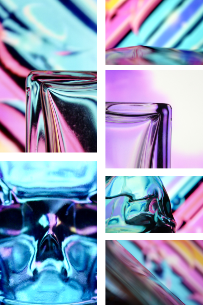
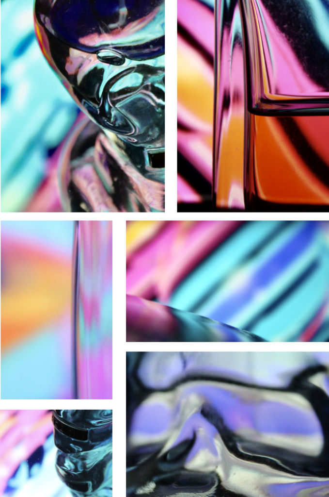
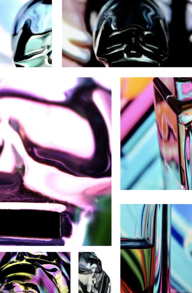
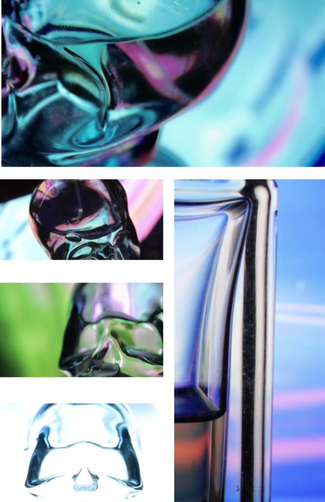
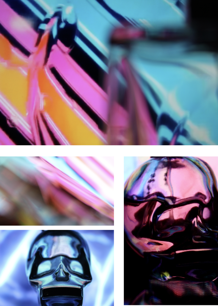
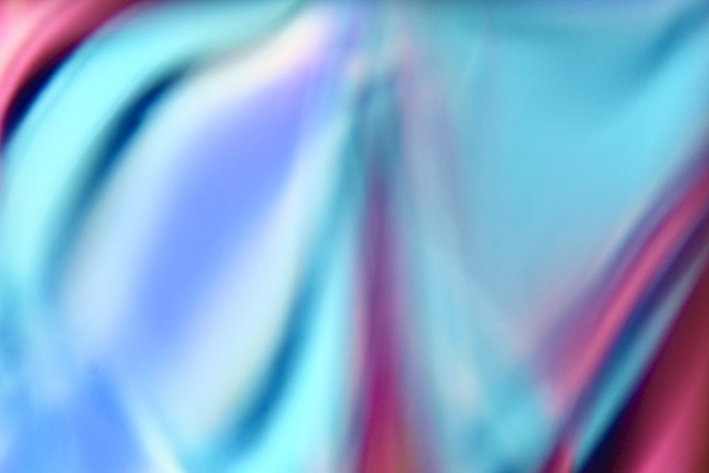
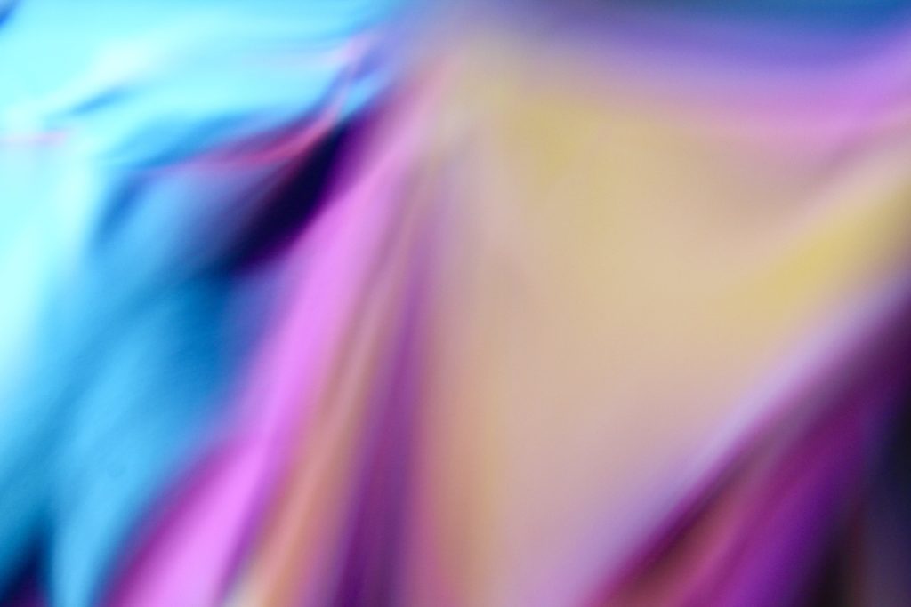
First, i opened up a video on my laptop with a colourful video playing, then i put a glass in front of the screen and took photos through the glass. I made sure the room was dark and the lights were off, to get a nice ambient effect.

Explanation
I like the outcome of these abstract photos, as they have a lot of vibrant colours, which is visually appealing.
They display a lot of unique shapes and patterns, as the glass distorted the appearance due to the curves and texture on the glass.
The colours compliment each other, which makes them stand out.
The photos are over exposed, which makes them more abstract as its harder to tell what the image is of.
The highlights compliment the shadows, although the black point is higher making the black more dominant, therefore bringing out the colours more

My Out Of Focus Photos

Explanation
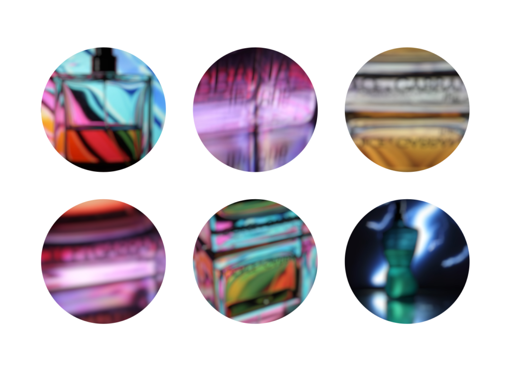
I changed my camera to manual focus and put it to the most blurry setting, and took photos of different objects in front of the screen, and through the glass, using the same method as the abstract images.
I edited the images to circles in Photoshop to make it different and look nice.

Formal Elements

How a simple plain A4 sheet of paper and be transformed into digital art, using formal elements.

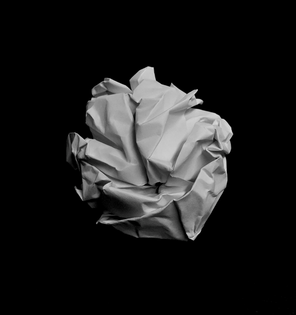
In this photo is scrunched up the paper into a ball shape, and then placed it on a black background and used a low exposure to blend the shadows on the ball into the background, which creates a higher contrast and brings the shadows out more.

I edited it black and white, to remove a yellow hint from the artificial light in the room.

The camera is positioned close to the subject to add more definition and to improve the image quality.

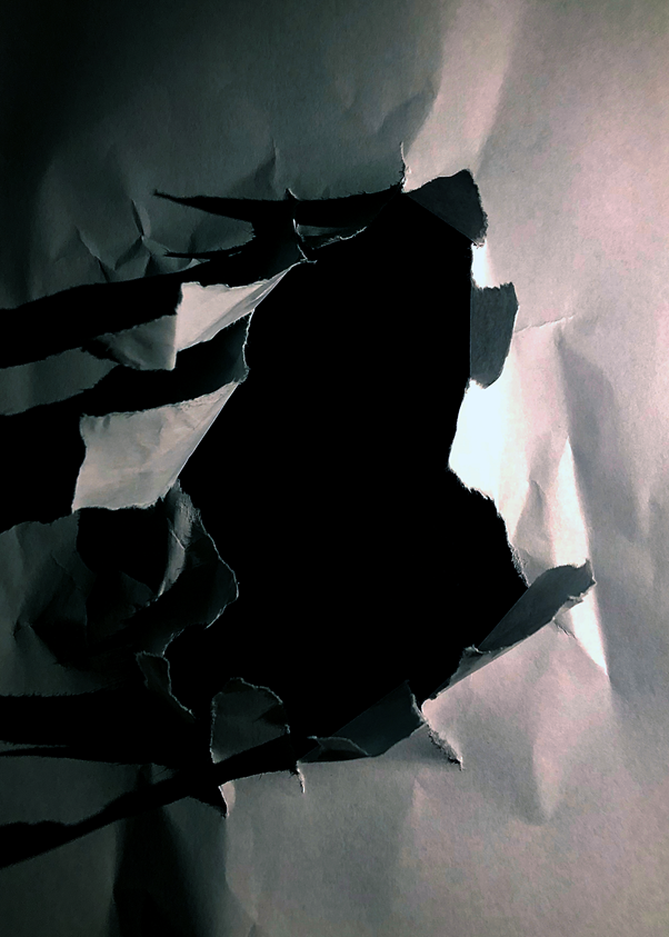
I ripped a hole in the centre of the piece of paper then put it on top of a black piece of card, to make it seem that the hole is deep.

The shadows add more detail as there is artificial light to the right of the hole. I pulled the tears up to create more depth and definition, as it increases the shadows as the light is at the same level as the subject.

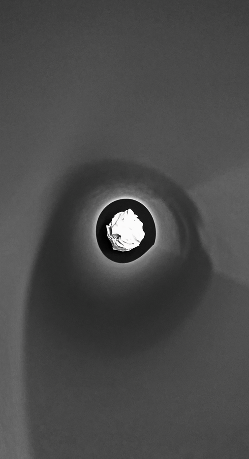
I used a piece of rolled up paper to frame the paper ball, by putting my camera at one end of the tube, and the ball at the other end. This focuses your eye on to the ball at the end of the tube.

This image has a lot of different emotion as there are curved lines, then sharper straight lines on the ball itself. The paper that I used to frame the ball softens the image, which is contrasted by the randomised, chaotic shadows on the paper ball.

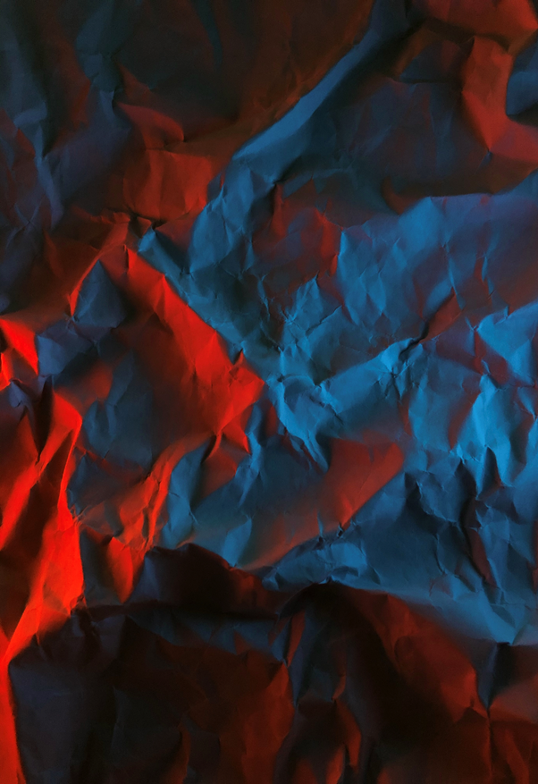
I creased up a sheet of paper and added two lights on the left and right, I used two phones and used the screen light on full brightness with two different colour pictures to create a coloured glow. The shadows show every small crease in the image, which adds more detail and definition.

The clash between the two colours creates unique shadows. It works well as red and blue as they aren’t complimentary colours.

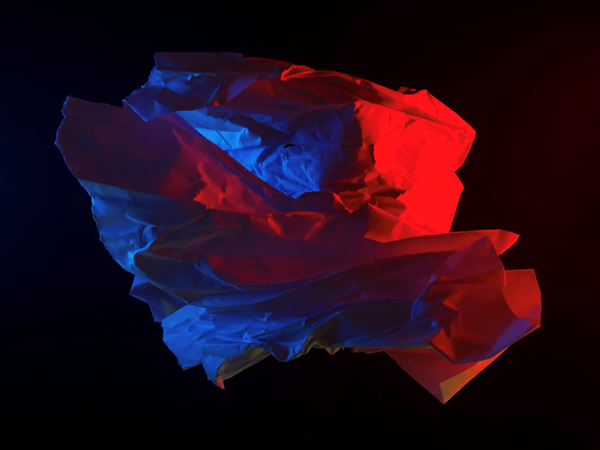
I randomly scrunched up a ball shaped object and lit it up with two phones. It created a random cast of shadows, and a nice depth with the red illuminated paper in front of the blue illuminated paper. It seems like the blue light is inside the subject but it is not, this created a layered effect, which i didn’t plan, but worked out well.

The random shape of the subject adds a unique effect as it can’t really be replicated.

The image is underexposed and has a high black point to create a gloomy effect.

The World Is Beautiful

New Objectivity by Albert Renger-Patzsch (686PH) — Atlas of Places

Albert Renger-Patzsch
– Renger-Patzsch was born in Wurzburg, on June 22nd, 1897. He was German photographer who began making photos at the age of twelve.

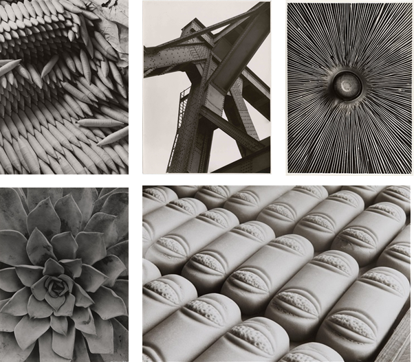
– In 1928 Reger-Patzsch published The World Is Beautiful, a collection of 100 images, which had lots of detail, mostly patterns in nature and man made structures.

– He likes to take photos of highly detailed and complex flowers and other nature plants. Additionally, he prefers to take photos of unique architecture.

– His nature photography captures what the eye can’t see. He captures each fold in and every detail in each picture.

– Renger-Patzsch makes his images black and white, which gives the image a high contrast, and reveals the tones more.

– The black and white makes it so that you focus on the geometric patterns rather than the colours.

– Lots of Renger-Patzsch’s images use leading lines, framing, repetition and rhythm. Which gives off a more visually pleasing image.
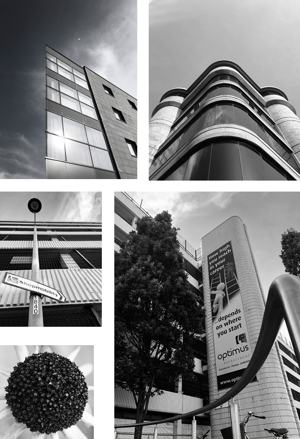
Image Comparison
– Both these images were taken by Albert Renger-Patzsch.

  • Firstly, the trees are natural and randomly positioned, where as the spades are carefully positioned.
  • There is more depth in the photo with the trees, as it fog makes the trees fade away.
  • The photo with the trees uses natural light, where as the photo of the spades is most likely artificial light.
  • Both photos have repetition of the subject.
  • The whole of each spade is in shot, however in the other photo, the top of the trees are cut off, this shows how big the trees are in comparison to the spades.

My Photos

Architectural Photos
– Firstly, I took photos of buildings that have detailed symmetry and patterns from the windows.
– I made sure that the sky was in all of them and i commonly used the line of thirds technique to make them to create a unique appearance.

Nature Photos
– I used a macro lens to get a close up shot of the objects I photographed. It made it so you can see every detail on the focus.
– It created a shallow depth of field, as I used a low f/number. This makes us focus on a specific object as the background is blurred.
– I took lots of photos of leaves as there have many natural patterns. Also, I took a close up of a feather, which as a repeated pattern with smaller lines coming off the central line.

Overall I made all the photos black and white, as it is in the style of Albert Renger-Patschz. The black and white effect, created a high contrast and made all the patterns more visible.

Contact Sheet

What are contact sheets?
– Contact sheets are a tool that dates back to the days of shooting on film, showing the whole roll of film on one sheet of photographic paper, to help the photographer select which images to print.
– They are now outdated as most photographers use digital camera.

Why are they important?
– You can quickly scan a series of images to find the good photos or the ones chosen to be enlarged. instead of wasting materials one bad ones

Life After Lockdown


Final Photo
  I chose this photo as my final photo because, It shows someone looking into the mirror and seeing their reflection but with a mask on, due to the global pandemic. It shows how serious the issue is, as the mask hides all facial expressions, even though you know the she is smiling. I chose this photo as I feel like everyone can relate to it as we all had to wear a mask at some point during this pandemic.
 
          How does it link to John Stezaker? Well I took his concept of adding two images and merging them into one, and adapted it to my style. Instead of a split in the middle I took a price of one photo and put it one another similar photo.
 
          The choice of the green light in the background draws attention the the face of the woman, because the colour contrasts to the subject in the foreground.
 
          The rule of three comes in play since the subject isn’t in the centre of the image, and instead on the first and third line.
 
          Framing is obvious as the reflection is in the mirror, as well as on the right. It was difficult to find an angle where I could get the reflection and the subject, without getting myself in the reflection.