All posts by Matthew B

Filters

Author:
Category:

Close Ups – Headshots

What is a close up image?

A close up is when the photographer only focus on a part of the face, which fills up most of the image. It draws more attention on their facial features and expressions.

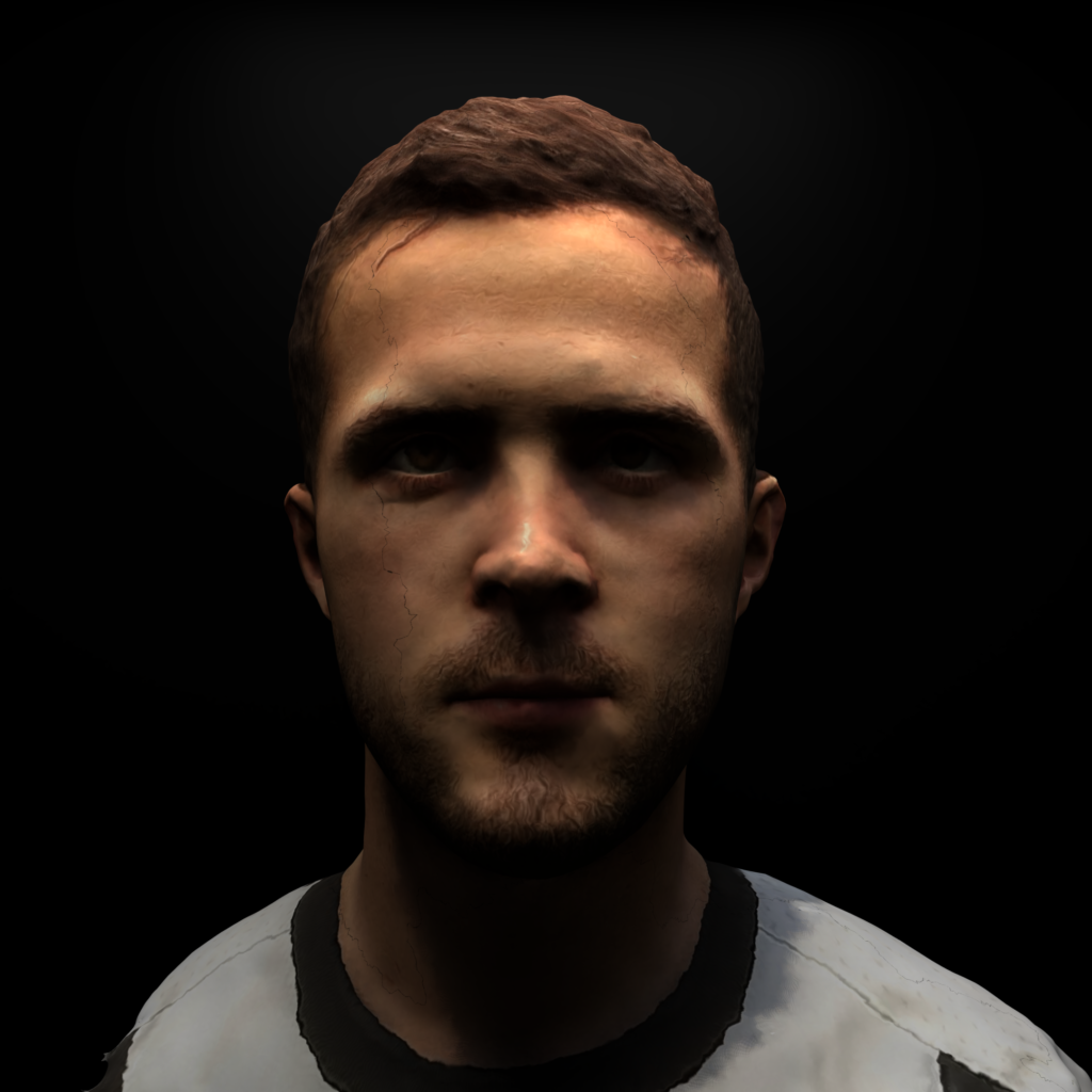
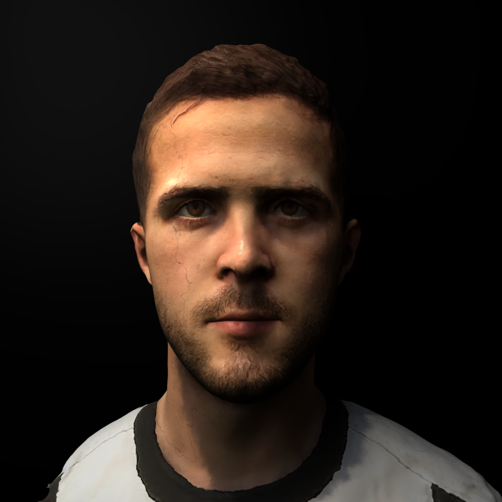
Satoshi Fujiwara – (reference)

Satoshi Fujiwara is a Kobe-born, Berlin-based artist and photographer.

He creates emphasis on facial features and expressions through the focal length.

He mainly uses different people to photograph as it tells a different story and has a different meaning every-time. He creates different angles and composition to make the viewer re think what the subject is feeling.
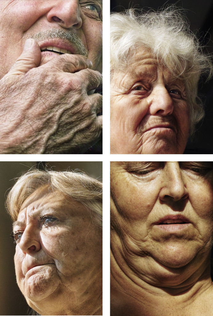
As you can see, Satoshi Fujiwara uses a low f stop to create high depth of field, as it creates a stronger focal point. In the images all 4 include high detail, where you can see every strand of hair, and detailing in the skin. The subject isn’t looking at the camera, and most of the entire head is in view. The exposure is good, as there is a balance between the shadows and the highlights.

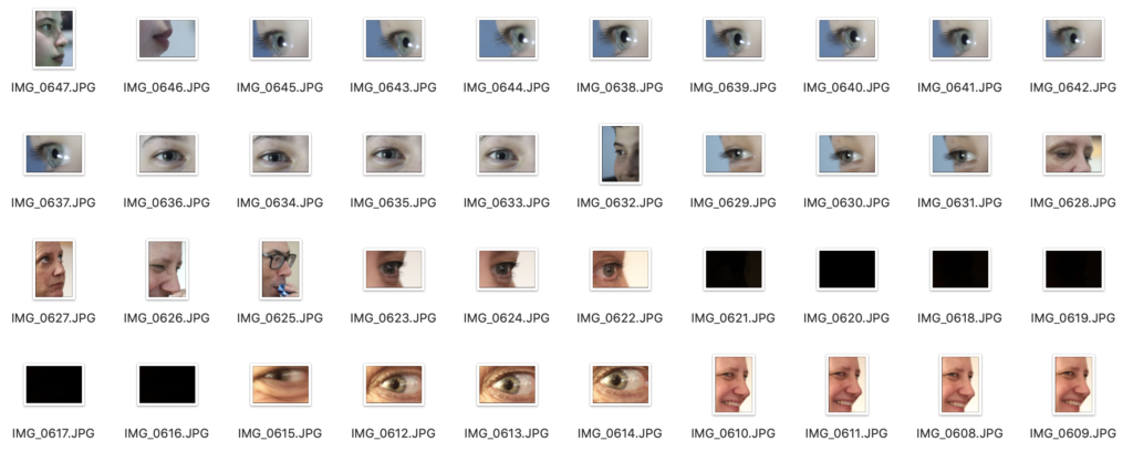
My images – Contact Sheet

I picked out 4-6 images that I felt were the best ones, which I would later pick 1 or 2 as my final images. This really helped decide what images were stronger.
Best Images

These were the best images off of the contact sheet, which I edited in Photoshop.
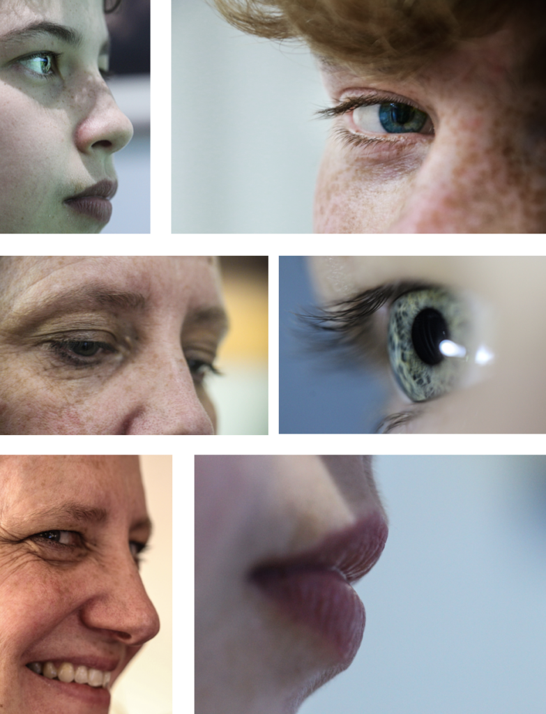
Final Images (1)

I chose 2 images as i thought they were both equally as good. They both focus on facial features, specifically the eye, like Satoshi Fujiwara work.
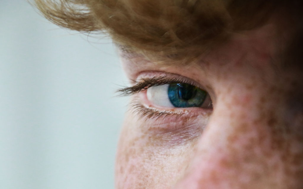
The eye is the centre piece in this image, which displays the complexity in the detail.

The blur around the outside of the eye make the eye the focus point, make it seem that the eye is staring at you.

The eye contact with the camera makes it a stronger image as there is more of a direct and emotional atmosphere between the viewer and the image.

Overall, the skin tones are nicely balanced and the composition creates a slight foreground, that contrasts the eye behind it.

Final Images (2)
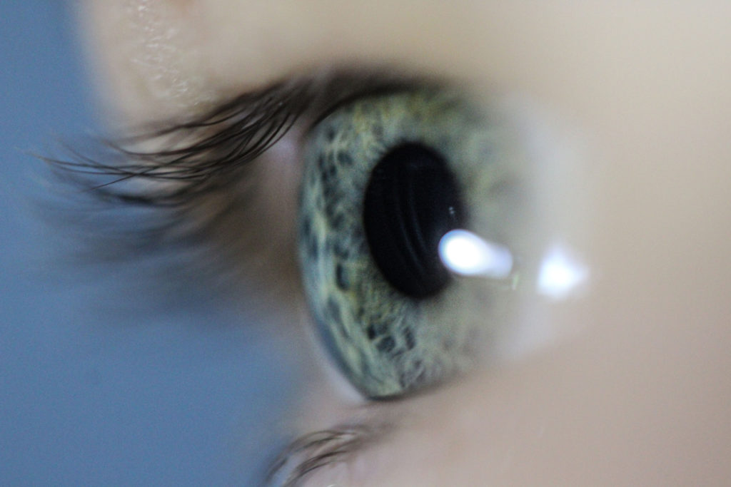
There is so much detail and intricacy in the eye which makes the image stronger.

Since I used a macro lens I was able to create a shallow depth of field. This made it so the eye and part of the eye lashes were focused, and the rest wasn’t, which draws more attention to the eye itself.

Overall, I like how the eye is in the centre and fills up most of the screen. The colours are strong and provide key details, although I feel like the blue background takes the blue and green eye colour and takes some of the value or significants away.
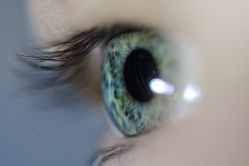
Therefore, this maybe be considered better, as that blue background is now more dull, as I desaturated it. Which brings more “life” and attention to the eye.

Photo Montage

What is a photo montage?

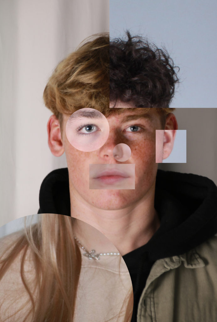
A photo montage is when you copy and paste parts of different images of different peoples faces, and put them into one image.
Brno Del Zou

Brno Del Zou is a French born artist in 1963. He uses fragmentation of the body in order to better understand it.
The body and the faces are revisited and their volumes are highlighted in order to create installations of multiple scales.
These “photo montages” suggest a clear aesthetic preference which does not hide the chaotic and “messy” side of our minds.

How I made mine?

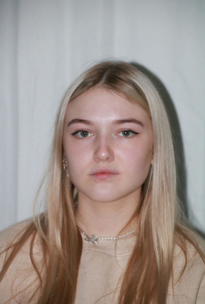
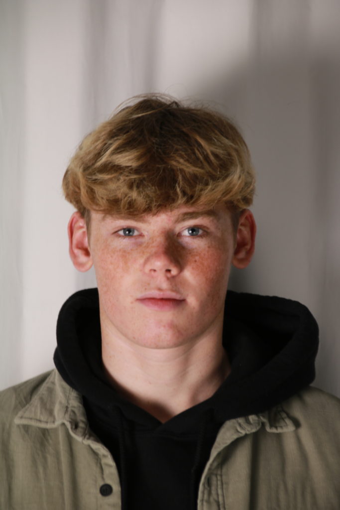
I started by taking images of my friends. They looked into the camera with no expression, this was because it would be easier to match their faces together in Photoshop

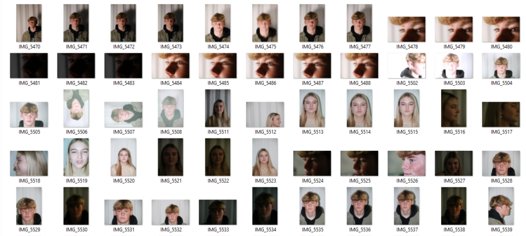
Contact sheet:

This were the 3 images I chose to use.

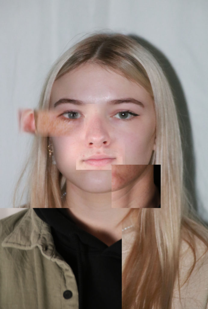
I made layers of shapes in Photoshop to create clipping masks so the image overlays the background image to create a “cut-out” section which would be another person face.

I moved the layers around to see what looked best then saved it.

Final Images

I experimented with different compositions as used circles and rectangles to show the different faces. Overall, I thought that all 3 looked good, but 1 stood out better.

Best Image

I like this image as it worked out well. The shapes that contained the other images contrasted the background image, I think it made it more clear so that you can see the edges. Therefore creating a better outcome. I lined the others images up with the background image so that it looks more natural.

Critique

I don’t really like the harsh lines, so I could of used the eraser tool the fade the image together, although I think that it would take the photo montage aspect away.

Headshots / Diamond Cameo / Multi-Exposure

What are headshots?

The purpose of a head shot is to get a professional image of the persons head, where the focus is only of them. They are often used to convey professionalism.

They are mainly used for politics and people of status, or more commonly Instagram and the social media profile pictures.

Henry Mullins

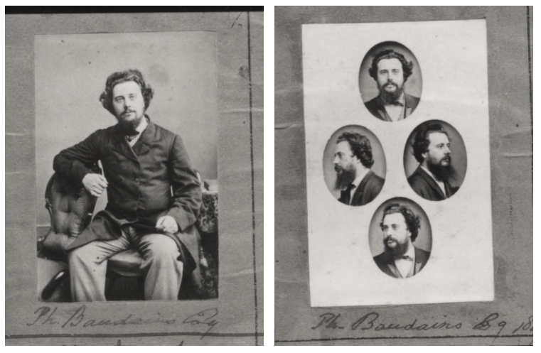
Henry MullinsĀ is one of the most famous photographers represented in theĀ Societe Jersiase Photo-Archive, producing over 9,000 portraits of islanders from 1852 to 1873 at a time when the population was around 55.000.

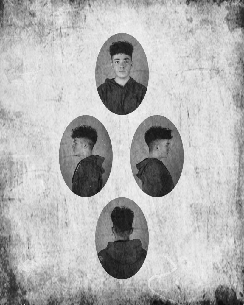
Mullins was famous for his “Diamond Cameo” he would print a Diamond shape cameo on his Carte de visite to show four different angles of a person, with almost one different card.

My Diamond Cameo

In photoshop I made 4 ovals and put them into the form of a diamond. then I dragged the 4 images on top of the ovals, then made them a clipping mask so that they went into the oval. Then a found a vintage background on Google and made it the background and also put a copy on top. The copy on top I changed the layer style and made the opacity 50 so that the pattern would be on top of the images as well.

Double / Muti Exposures

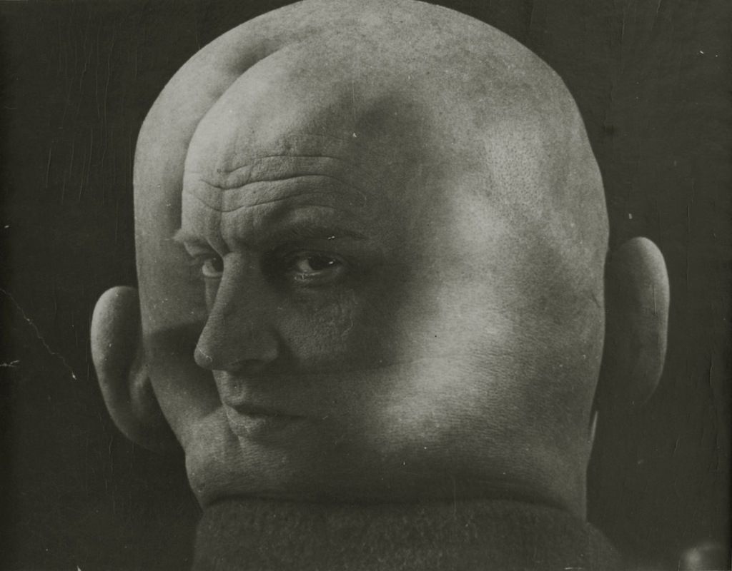
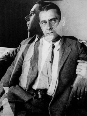
Double or multiple exposures are an illusion created by layering images (or parts of images) over the top of each other. This can be achieved in the camera settings, or on Adobe Photoshop by creating layers and then using blending options and opacity control. Artist have used these techniques to explore unique ideas and evoke dream-like imagery, or imagery that explores time / time lapse.

Alexander Rodchenko

Aleksander Mikhailovich Rodchenko was a Russian artist, sculptor, photographer and Graphic Designer.

He was one of the founders of constructivism and Russian design; he was married to the artist Varvara Stepanova.

This is his work in the style of double exposure. He used 2 photos the create the effect. the layer on top is slightly transparent so that you can see the layer behind it.

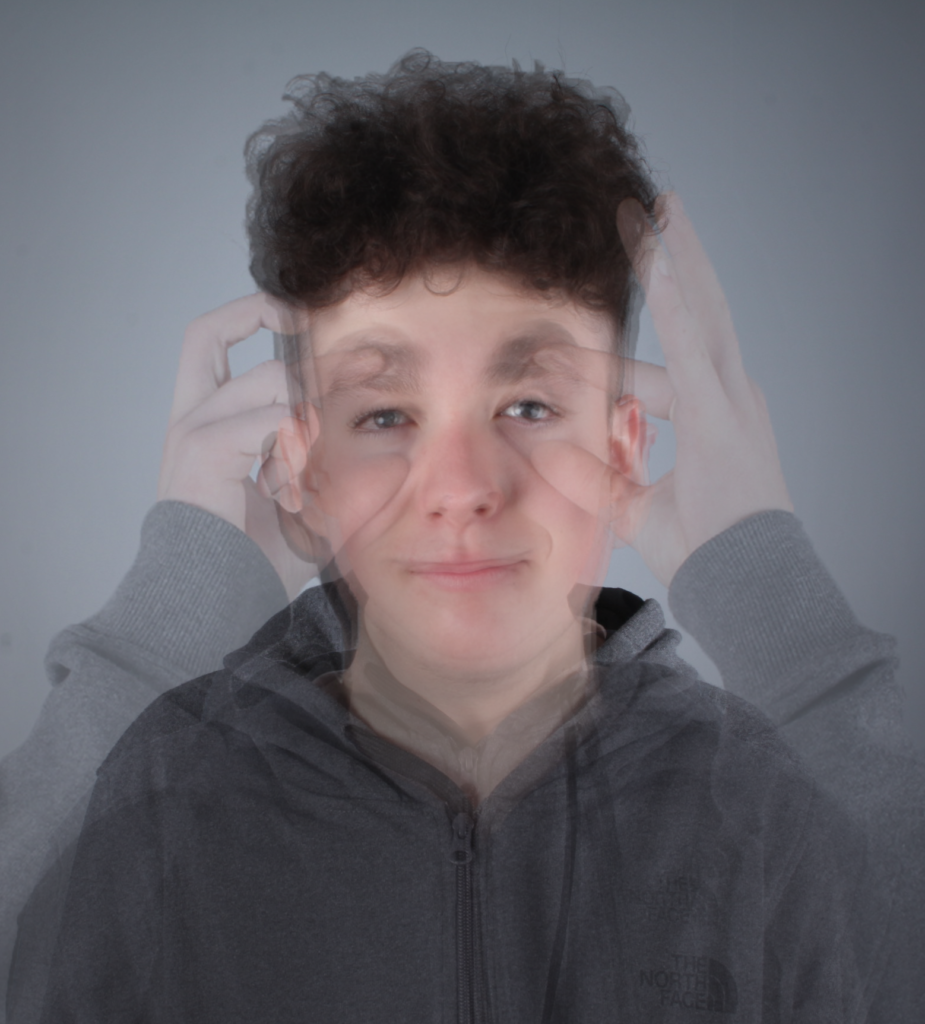
My Attempt

I edited this image with Photoshop, and used several photo which I took in the studio.

I used multiple photos and layered them over each other making the eyes the main point where I aligned them, this made a blur effect for everything else.

This worked out well, and is in the style of Alexander Rodchenko, it created a unique effect where it messes with the viewers perception of the image as there isn’t a plain, simple face, unless you squint your eyes.

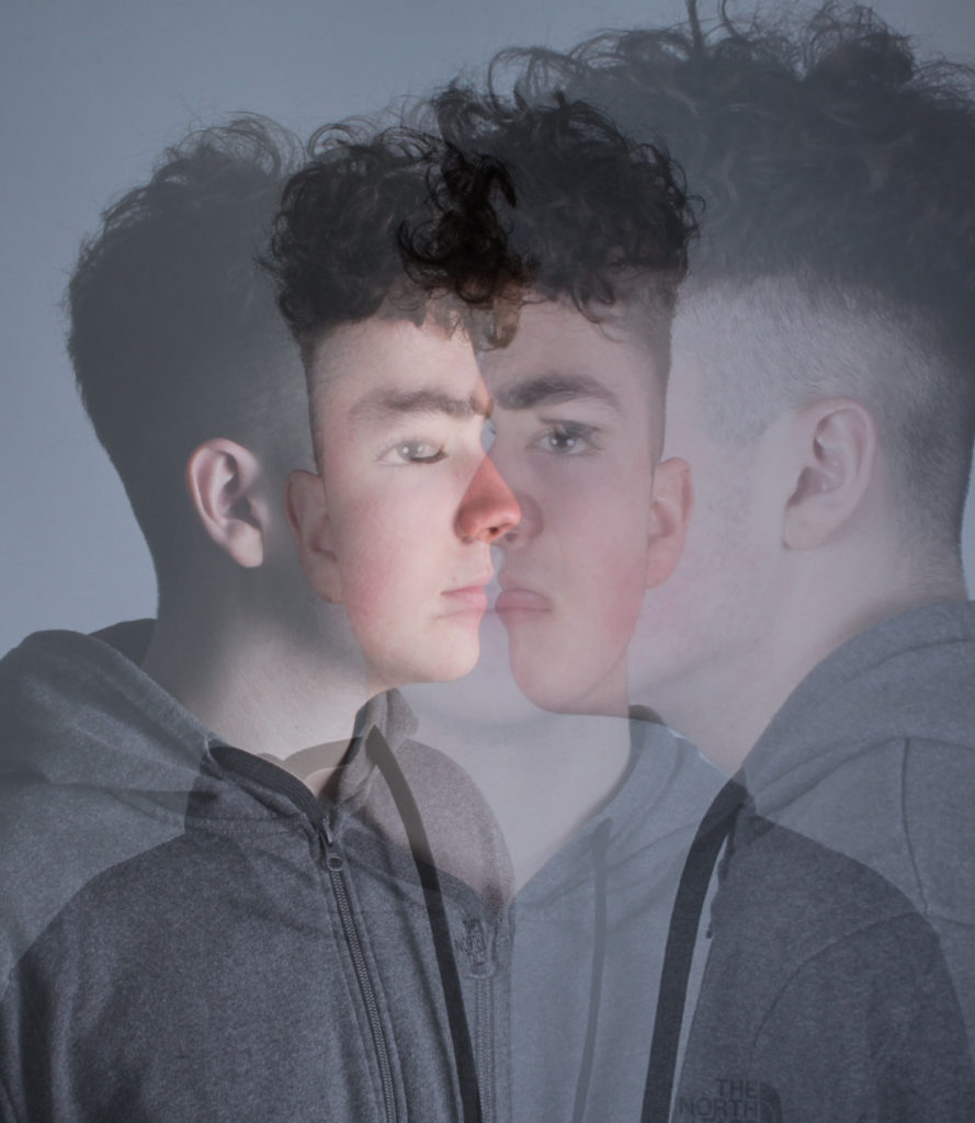
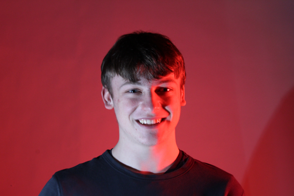
Left Image:

I love how the colours mix giving off a haze of lighter tones in the background.

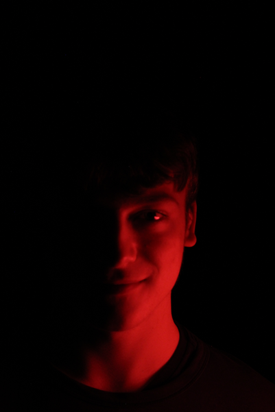
It uses 2 different images, both use 2 point lighting, using a red light and a white light to create a half and half coloured image.

I used one of the eyes to line them up and put the top image on a 50% opacity to see through to the background image.

Overall, i think that the white light, create a nice highlight which bring out the details on the face. This is also where the main overlay is, so it put a bigger emphasis on the multi-exposure aspect.

Right

Studio Portraits

Why is studio lighting important?

Studio lighting is an essential addition to most photographers’ arsenal. It allows us to create natural lighting effects in a variety of situations, and is far more controllable than a flash. It also adds mood and atmosphere.

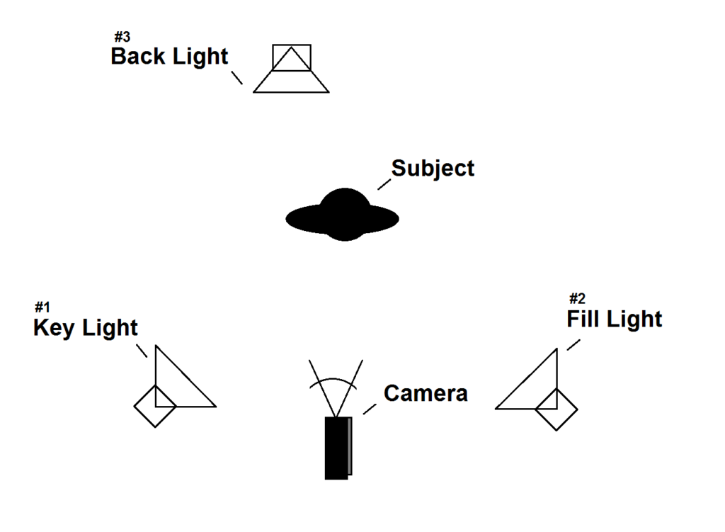
3-Point Lighting

It is used in photography, cinematography, and 3D visualizations, it is used to properly illuminate a subject in an effective and pleasing way by simply using three separate lights.

Fill Light

It is a supplementary light mainly used to lighten shadows in an image. Fill light is often used in portrait photography to create a contrast between the image subject and image background giving the scene a sense of depth

Chiaroscuro

technical term used by artists to describe their drawings or paintings that showed bold contrast and distinct areas of light and darkness.

Lighting Test

Because I was at home and had no one the photograph I used Blender and the lights in that program to experiment with lights.

Natural Light

Natural light is anything that produces light by itself. Natural sources of light include the sun, stars, fire, and electricity in storms.

Light intensity refers to the strength or amount of light produced by a specific lamp source.

The direction of the lamp determines the shadows and highlights

Light temperature, determines if the image has a blue tint or a orange tint. If it is balanced then it will appear normal and the white tones will appear white.

Golden hour is the first hour after sunrise and the last hour of light before sunset that produces a warm natural light. That window of time is determined by where you are geographically, as well as the season.

A reflector is a tool that helps a photographer to manipulate the light by providing another surface for the light to bounce off of.

My Photos

Final Photo 1

I like this photo as there is not direct eye contact in the photo, although it is still set up. I used 1 light to get the face highlighted and the background darker, this make it so that you focus more on the face. The background is also plain which attracts more attention to the subject. To edit it, I boosted the contrast and the saturation the add more pink to the face.

Experimenting with colours

I used some coloured filters on the lights, which created a coloured glow.

It made unique contrasts and clashes between the light different lights.

Final Images

I like this image as the white light is softly projected on the face, which highlights his facial features. The red draws attention to the image, and draws anyone in that looks at it. Also, the subject is centered, which is a nice touch.

I like how the images appears to merge out of the darkness, with the red glow, which gives off an evil glow.

Candid PORTRAITS And Street PHotography

What are candid portraits?

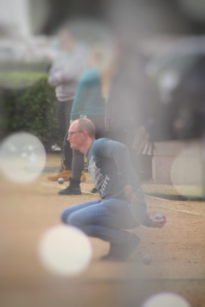
It is when you take a portrait photo of some one without them knowing to get a more realistic and a not staged image.

This is an image I took as the subject isn’t engaging with the camera, and also isn’t setup or staged in any way.

What is street photography?

It captures unmediated chance encounters and random incidents that happen in day to day life. It is also called candid photography.

Examples of street photography

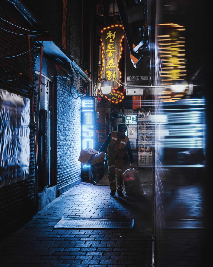
(First photo was taken by Teeman Jarvinen), (second photo was taken by Keenan Hastings), (Third photo was taken by Mats Alfredsson), (Fourth photo was taken by Martin U Waltz), (Fifth photo was taken by Dave Bottoms), (Sixth photo was taken by Marcin Baran), (Seventh photo was taken by @francesco_portelli)

Some other great examples : http://neocha.com/magazine/asia-by-night/

Henri Cartier-Bresson

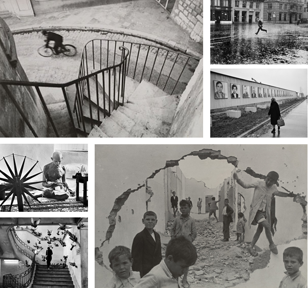
Henri Cartier-Bresson was a French photographer considered a master of street photography. He pioneered the genre of street photography, and viewed photography as capturing a decisive moment.

Famous Images

He was alive during August 22, 1908 ā€“ August 3, 2004, which is why his work is all in black and white.

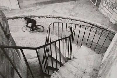
My Favoutite Henri Cartier Image

A Closer Look at the Iconic Cyclist Photo by Henri Cartier-Bresson

I like this image because he has used the railings to create leading lines, which draws the viewers eye instantly to the subject. The rule of thirds is applied in this image, the subject on the bike sits in the top left of the image.

The black and white effect creates a drama in the image, the emptiness makes the image stronger as it singles out the subject

Henri Cartier-Bresson X Magnum

In 1947, following the aftermath of the Second World War, four pioneering photographers founded a now legendary alliance. The Magnum Photos agency.

Cartier-Bresson helped deliver the highest quality photographic content and has extensive experience in creating significant visual records, which became note-worthy editorial, books, events, exhibitions, and digital campaigns.

Compare And Contrast

The image by Bresson was taken in black and white and has a high contrast, to make it have more definition. Jarvinen’s image is taken in Tokyo, where they have lots of neon and vibrant lights, that illuminate the subject. The lights have a soft infused glow to them, with gives the image a more positive aspect to it.

Both photographers uses reflections in the image. Bresson reflects the subject through a puddle in the horizontal axis, where as Jarvinen reflects the light on the right side of the image to create a blur effect through a window. This effect adds more detail to the image without over crowding it, and making it busy.

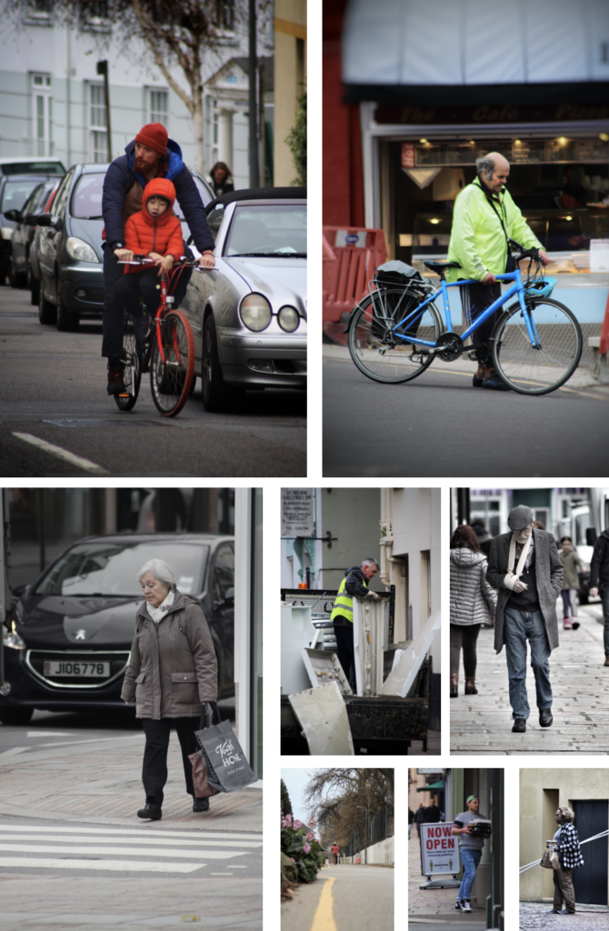
My Street Photography Pictures

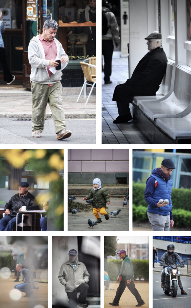
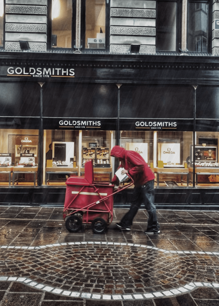
I took all these images on the same day except for the postman one. It was cloudy so I went for more dramatic shots, so that I could edit them with a more moody style.

My Final Images

To edit them I increased the contrast and saturation to make them pop out more.

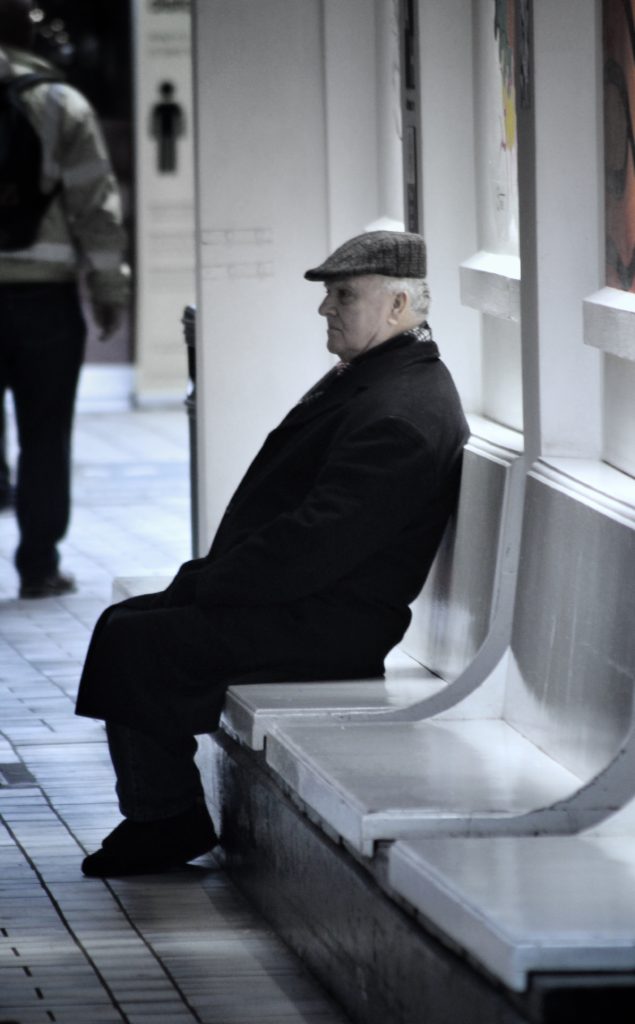
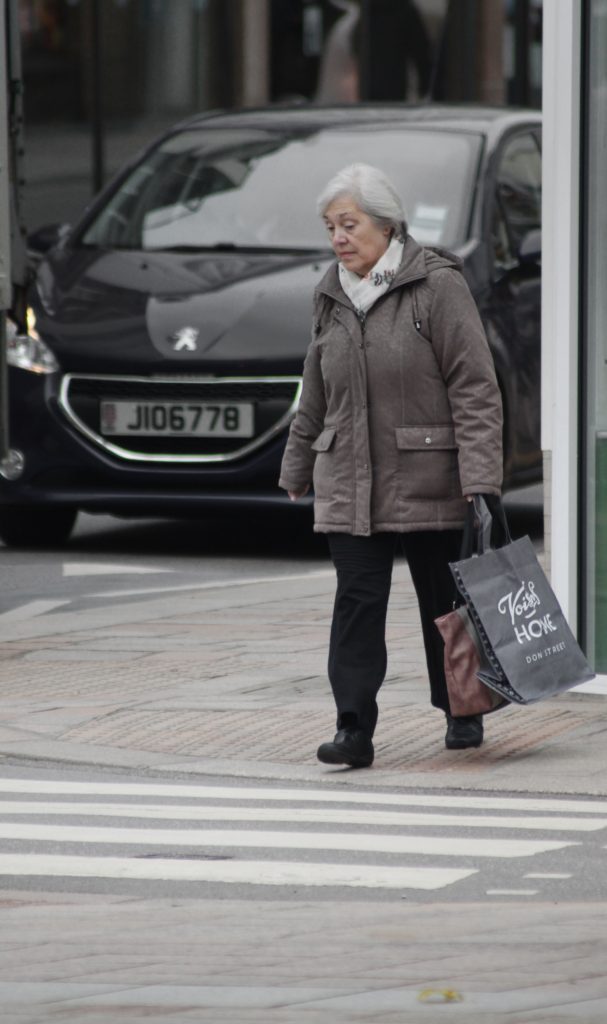
For the images that have a more of a rainy day atmosphere I decreased the saturation and individually masked over bright and colourful objects and toned the colours down, so that they blended with the image, for example the blue car in the background of the lady crossing the road, and the bright yellow cove sign in the image where the man is sitting down on the bench.

The image of the postman in the rain I edited a few more rain lines and used a motion blur, so that it would seem as if there were falling. I also increased the definition and made the colours more dark to give it the rainy day atmosphere.

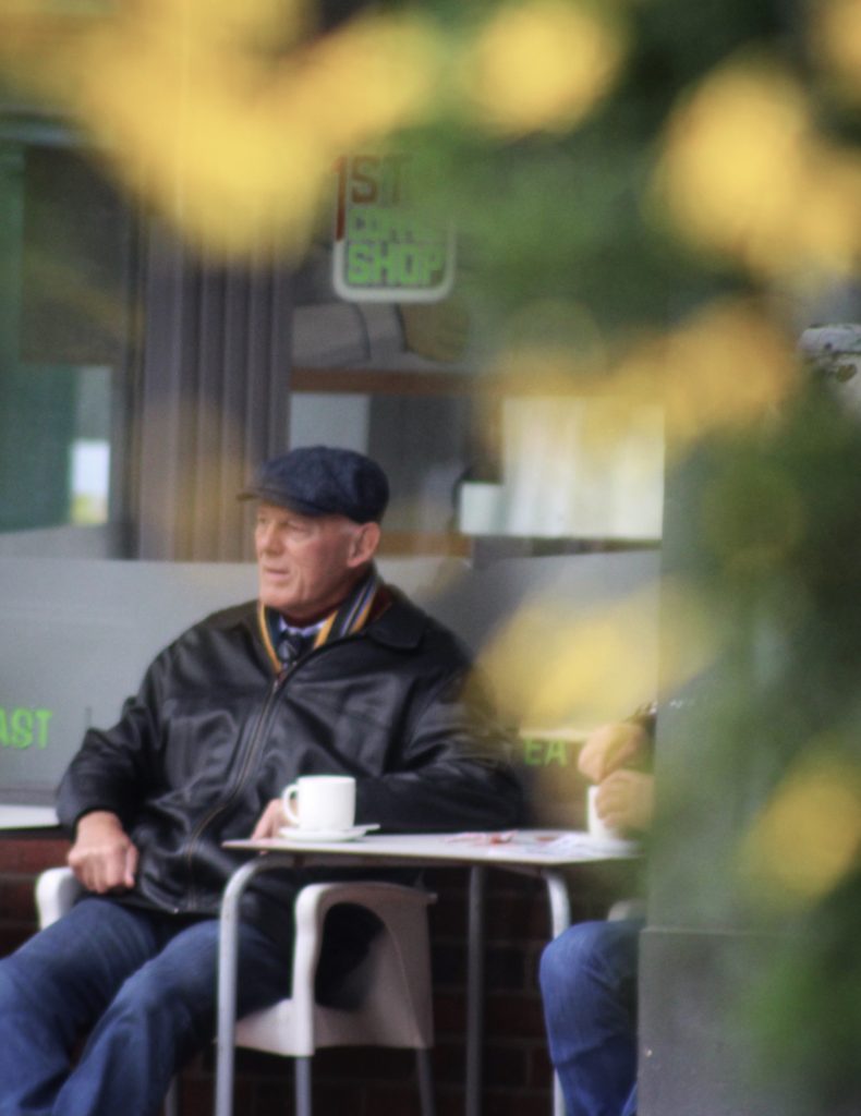
The photo that’s includes bokeh isn’t edited that much all I did was boost the saturation and used an “s” curve to manipulate the contrast. The create the bokeh effect I positioned my camera close to some lights to shoot through them, then focused on the subject, so that the lights would become out of focus.

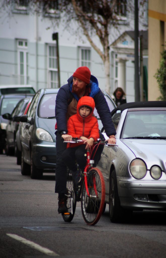
For the image where there are two people on a bike all increased the saturation, darken the background and brightened the subject, then finally added vignette.

My Best Images

I choose these 2 images as my final images as I thought they both were my strongest images that fitted into the candid photography niche. They both captured people acting natural, in an unstated environment.

The image on the left as strong detail and definition, which makes the image more dramatic, that combined with the rain, the deep reds and glowing shop windows creates a great image. the building is straight with the horizon, and there is a slope which the postman is pushing his cart up, this image show the struggle of every day life.

The image on right, the bright orange jacket contrast the entire background, the vignette helps lead you eye the to bike as well. I shot this with a focal length of f.5.4 so the people in the background are blurred.

Portrait / Environmental PORTRAITURE

What Is Portraiture?

Portrait photography draws attention to the subject. This is normally achieved through some combination of a shallow depth of field, composition, color, and lighting. It is aimed toward capturing the personality of a person or group of people.

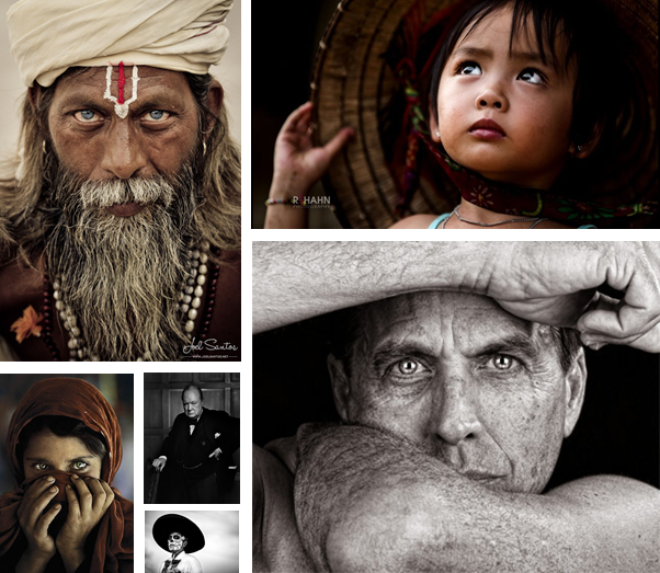
Mood Board

These are photos are inspirational, and I plan to take some of my own in a similar style.

Images from Google “famous/iconic portrait photography”

Complementary Photography

Complementary photography is marked by the current time period, and reflects our values and, challenges at that point in time.

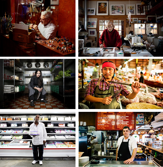
Environmental Photography

Environmental photography is when you take a photo of someone working in there environment, wearing there uniform, to create a more informative and dramatic photo.

Images from Google “environmental portrait photography”

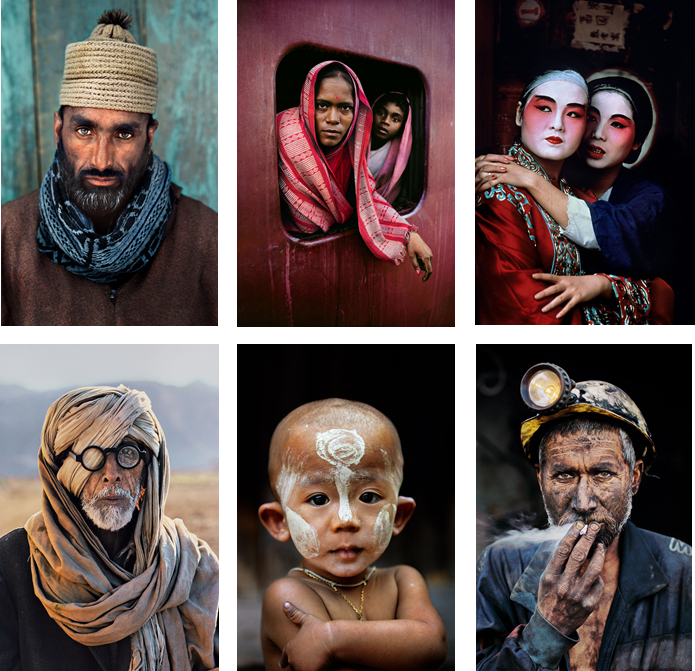
Steve McCurry

He is an American portraiture photographer, he was born in Philadelphia, Pennsylvania. He made many trips to India and Pakistan, he was also smuggled into Afghanistan. He  is best known for his evocative colour photographs that document both human struggles and joy. Having travelled the globe for over thirty years, McCurry has photographed warzones, burning oil fields, refugee camps, ship breaking yards and monsoons all over the world.

All images were taken by McCurry and published on https://www.stevemccurry.com/

Photo Shoot Plan

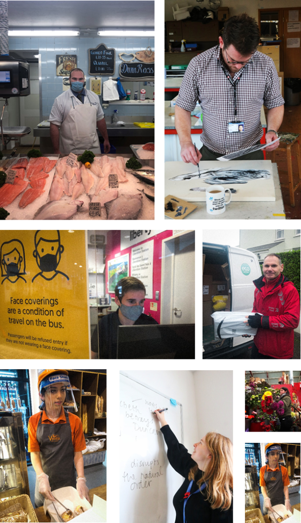
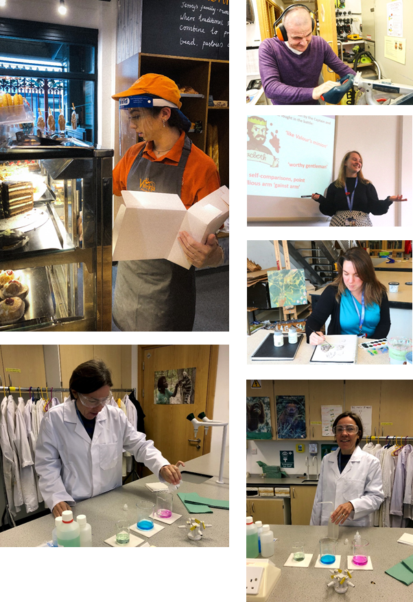
I plan to go into town and ask people that are working if i can take photos of them working naturally or stage a quick photo shot with them.

I plan to ask post men, bakers, shop assistants, fishmongers, and anyone else working in there environment.

I can take photos of them from the other side of the counter, which means the products they’re selling will be on display. Which helps the viewer understand their work environment.

My Photos

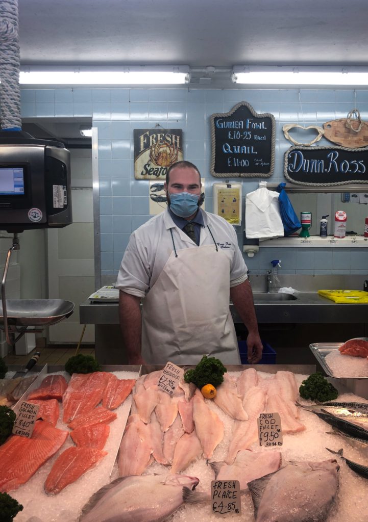
My Favourite Image

I like this because it shows the fishmonger in front of his filleted fish. The colours are vivid and they pop out as the rest of the image has a cold atmosphere as there are mostly cooling blue colours. The subject is centered, which sets the image up nicely. The whole image is in focus as it hows the work environment off. To take this photo I had to ask if it was ok to photograph them, I had to take it quick so it wasn’t to staged, although there is eye contact with the camera.

Image ANALYSIS

Technical
– Straight away the main focal point is defined in the image by using highlights, due to the subject being close to the camera, the natural light illuminates the front and top of him from the slots in the ceiling of the factory.
– The overall photo is dark, this contrasts with the highlights, and sets a mysterious mood.
– There is a high depth of field (example f.24), as everything in the foreground and background is in focus. The lights have a starburst like pattern which means, that there’s a small aperture, which allows more light into the camera.
– The image has warm tones, the orange train and the exposed skin, such as the head ans the hands.
– The shadows are more dominant than the highlights, which makes the mans face more detailed, the shadows appear under his eyes, which makes him look evil. This could be a reference to his criminal past.

Visual
– The man is sitting down with his chin resting on his hands, which are interlocked. His head is slightly tilted down, and has a sly grin. He is staring into into the camera, which is intimidating. This body language, makes him look like hes plotting something evil.
– The background of the image is framed using concrete pillars that are just behind the man. They are dirty and covered in a moss-like coat. The frame draws our eye to the abandoned factory.
– The fact that the abandoned factory is behind the man, is like his past has been left behind, as the man is Alfred Krupp, who was a factory owner, and made equipment for the Nazi’s. This is reinforced, as he is looking away from the abandoned trains, and instead hes looking directly into the camera.
– The photo has been thought about because, there is no empty space, and the image is split in two. The bottom half is the foreground which features the man. Then, the background which features the background, which is the abandoned factory.

Contextual
–  Arnold Newman, was an American photographer, who was born on March 3rd, 1918, and later died on June 26th, 2006. He was known for his environmental portraits of artists and politicians. Additionally, he was even know for his carefully abstract still life portraits, such as the portrait of Alfred Krupp.
– Alfred Krupp was born on August 13th, 1907, he was in a family company, know formally as Friedrich Krupp AG Hoesch-Krupp, it was a key supplier of weapons and material to the Nazi regrime and the Wehrmacht during World War II. He was later arrested for slave labor, which he served 3 years in prison. Then he died in 1967.

Conceptual
– He man is old, which means he been through a lot. This means his life is mostly behind him, which is why the factory in in the background as it was his job and responsibility to manage it, but now it isn’t.
– His hands are positioned close together as if he had hand cuffs on, which represents his time in prison.
– He is dressed smart as it contrasts from the dusty factory in the background,
– Alfred used slaves to build supplies for him. They probably had back problems from working a lot, which is why he is leading over, as it connotes pain and exhaustion.

Image Display

Selection Process

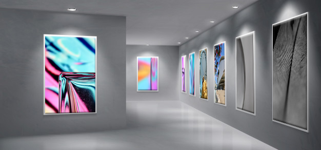
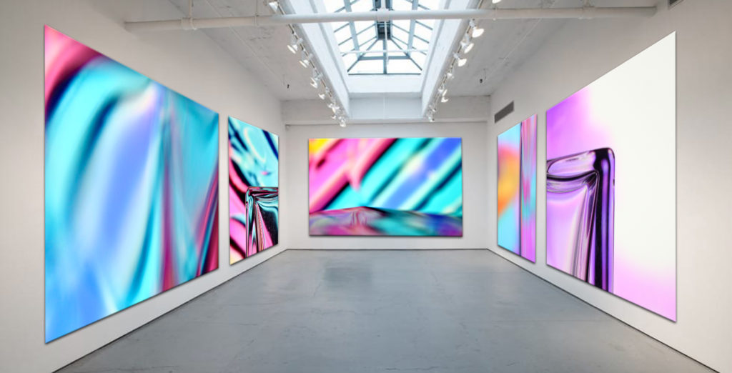
First I looked at all my abstract photos and decided one which ones were the best. I choose the ones that were the most colourful and used the rule of thirds as they tended to look better as it had more composition. For the other images I used other good images that I’ve taken to fill in the blanks.

Editing

After, I edited them and boosted the saturation by about +10 to make it ‘pop’ and cropped it to line up with the rule of thirds, to make it more visually pleasing.

Displaying

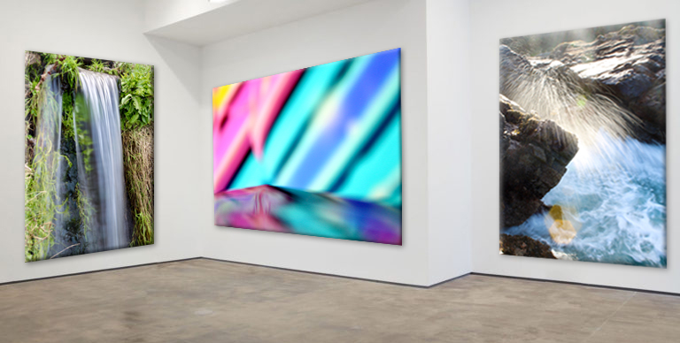
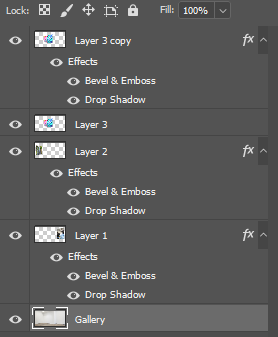
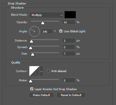
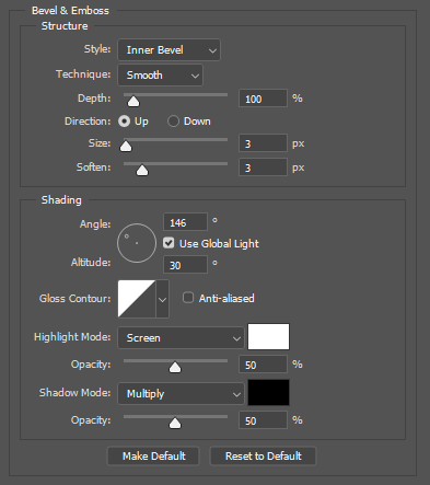
To Finalise the images I found 2 different art blank picture galleries on Google. I grouped my photos into two groups, portrait and landscape. The gallery with the large wall would be for landscape photos, and the other for portrait photos. I put my abstract photos into the galleries, I put the image onto the canvas in the gallery, where I wanted it to be, then in Free Transform mode I pressed CTRL and dragged on the corner of each edge of the image and moved it to the corresponding corner of canvas space in the gallery to match the perspective of the gallery and its 3D walls. After the image was properly on the canvas, I added Drop Shadow and angled it to the same as the direction in the base image. Then, I added bevels to the image to make it look 3D to make it realistic. To add the effects I right clicked the layer then went to blending options. As there were blank spaces in the gallery I put in other good photos that I’ve taken.

Evaluation

I really like how it turned out, as they look realistic and they all fit in naturally. The drop shadows and bevels really worked well. Overall, it was relatively simple but took a long time to added all the images in.

Only abstract photos.

Water Photo Shoot

I plan to take photos of the reflections on water at Bouley Bay and, in my sink the create bubbles in the water. There is also a small waterfall at Bouley Bay, so I plan to take photos of that using a long shutter speed to capture the motion in a blurred way, I might also do this to the waves and splashes on the rocks. I will need to make the shutter speed not to long, because it will be overexposed, as there is more light going into the camera, but it needs to be long enough to get the water as a smooth texture. I want to take the waterfall photo as it demonstrates my practical skills using a camera. I was inspired by Ernst Haas’ water and reflections photography.

Final Photos

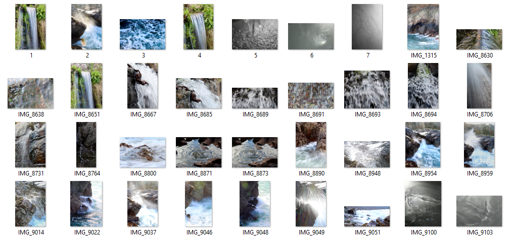
This contact sheet shows my semi-good images. It helped me choose which images to choose as my final images. It is a method of sub selection.

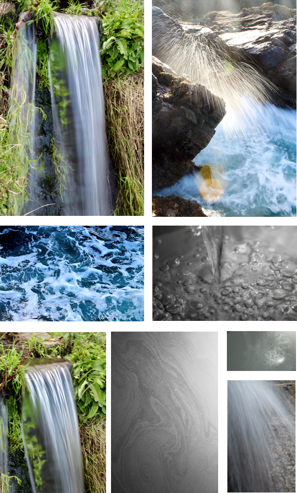
The photo of the waterfall is my favourite, because it shows the silky smooth water, fall over the rock. It has a wispy texture as the shutter speed is longer, which allows motion to be blurred. I was difficult to take as I had to hold the camera still so I didn’t get any camera shake, as it would blur the image.

The photo of the rock with the water splash mid-air is also one of my favourites. The long shutter speed makes the water droplets have a trail whilst were falling. I had to time it so when a big wave crashed into the rocks; I had the camera pre-focused, then I would press the button to take the image as soon as the splash came above the rock. The sun created a lens flare, as I was shooting into the sun. It created definition to the water droplets as they became lit up which meant you could see each individual one clearly.

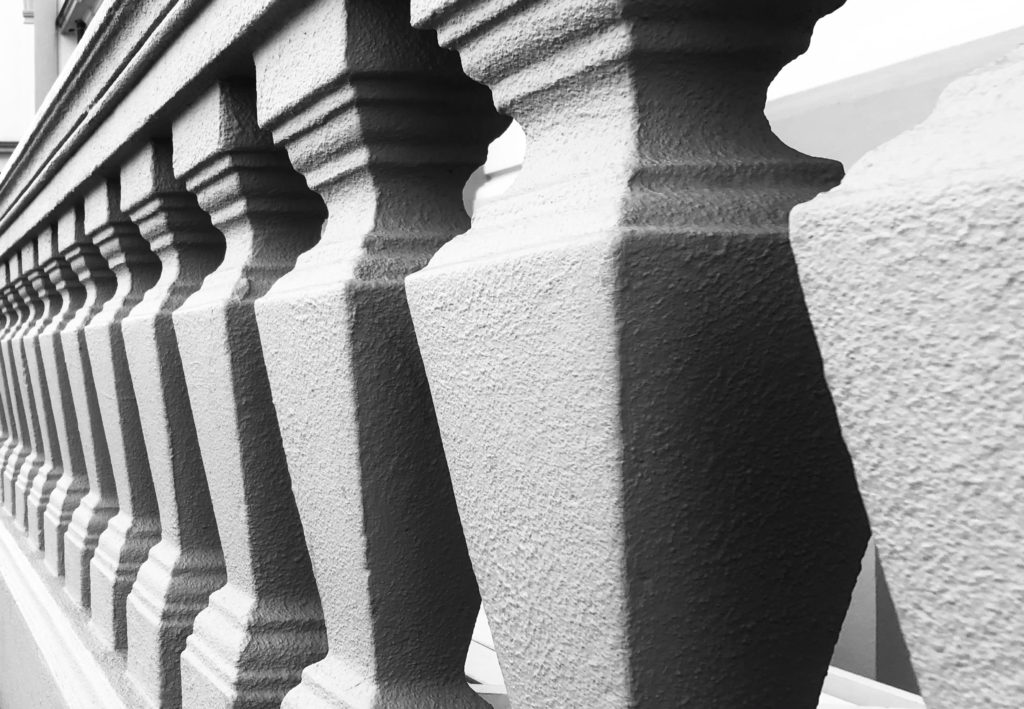
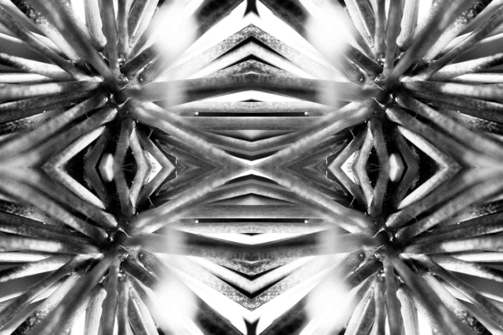
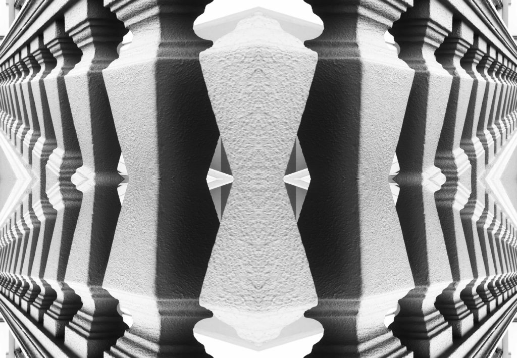
kaleidoscopic / reflected image in Adobe Photoshop

Original Images

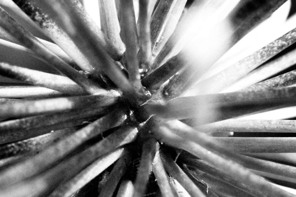
I took these images for the nature and patterns photo shoot.

Edited Images

I edited these in Adobe Photoshop 2018.

How i did it.

  1. First, i opened it original file.
  2. Select > All
  3. Edit > Copy
  4. Image > Canvas Size
  5. If i wanted to flip i on the left, i would anchor it on the right and double the inches on the width.
  6. Edit > Paste
  7. Edit > Transform > Flip Horizontal
  8. Drag the image to the right
  9. Flatten Image
  10. Repeat steps 2 – 4
  11. You would anchor it on the bottom and double the inches on the height, if you wanted to put the flipped image on top.
  12. Edit > Paste
  13. Edit Transform > Flip Vertical
  14. Repeat steps 8 – 9

I like how i turned out because they look unique and it creates a cool pattern, which is why its resembling a Kaleidoscope.

It looks best why the subject is touching two sides of the original image. So when you flip it, it will all be connected.