All posts by Matthew B

Filters

Author:
Category:

RURAL AND ROMANTICISM LANDSCAPE PHOTOGRAPHY

What Is Rural Landscape?

Rural landscape is photos of an area that is not densely populated or intensively developed that isn’t protected land.

Influential Landscapes – (Mood Board/Examples)

I found these images of landscapes off Google, and found their respected photographers. I want to try and do a long exposure of the water, and include the details of the rocks.

Ansel Adams – (Case Study)

Ansel Easton Adams was an American landscape photographer and environmentalist known for his black-and-white images of the American West.

At age 12, he was given his first camera during his first visit to Yosemite National Park. He developed his photography skills, and later he was contracted with the United States Department of the Interior to make photographs of national parks.

He is mainly recognised talent was that he showed a deep technical understanding of how tonal range is recorded and developed in exposure, negative development, and printing.

His Famous Photos :
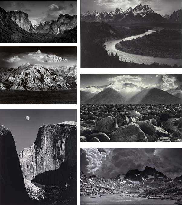
Ansel Adams Tonal Values

As you can see, Adams uses the excellent tonal values. For example, he used the darkest black, in the shadows of the mountains, on the other hand he has used the brightest white, in the highlights of snow resting in the mountain.

He uses filters to create and tone down the highlights in the sky. He mainly used a red filter and exposed it for 5 seconds, which created a darker sky, which is what Ansel Adams imagined. The top of the sky is normally grey the fades into a white.

Texture and Surface

The rocks always include high detail and lots of shadows. I can achieve this by increasing the clarity and texture in Photoshop. Black and white makes the detail stand out more as there are no colours that are distracting. There is normally a more dominant black and white colour, grey is used to display highlights and depth.

Composition

Adams uses leading lines to draw attention towards the main focal point, for example the river (2nd photo) progresses towards, and makes a path to the mountain in the background. This makes the image more powerful as there is more integrity and thought which has gone into it , creating this scenic view.

Adams sometimes uses rule of thirds; a composition guideline, to place more emphasis on a particular point, such as in the first photo.

Although, Adams also uses the foreground to his advantage. By including it into his image it adds depth and fills up blank/wasted space in the image.

What is Romanticism?

Romanticism was specified by its emphasis on emotion and character as well as emphasising nature. It also promoted the individual imagination of freedom from classical notions of form in art, since photography wasn’t popular as it had just stared in 1826, and romanticism was mostly reverent in the 1800 – 1850 era.

Romanticism examples in landscape

Keith Arnatt, ‘A.O.N.B. (Area of Outstanding Natural Beauty)’ 1982–4

This photo was taken by Keith Arnatt, in 1982-1984. in an “area of outstanding natural beauty” it was following a long-established scenic route, the C

Arnatt represents a landscape that cannot fail but to live up to expectation, full of interrupting buildings and sharp corners.

The foreground is dominated by a bald curve of tarmac and a café. This might appear to be a misrepresentation of romantic landscape, but early tourists were just as struck by pointed, sharp contrasts of greatness.

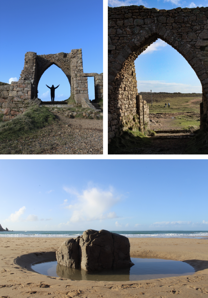
Where can I photograph in Jersey?
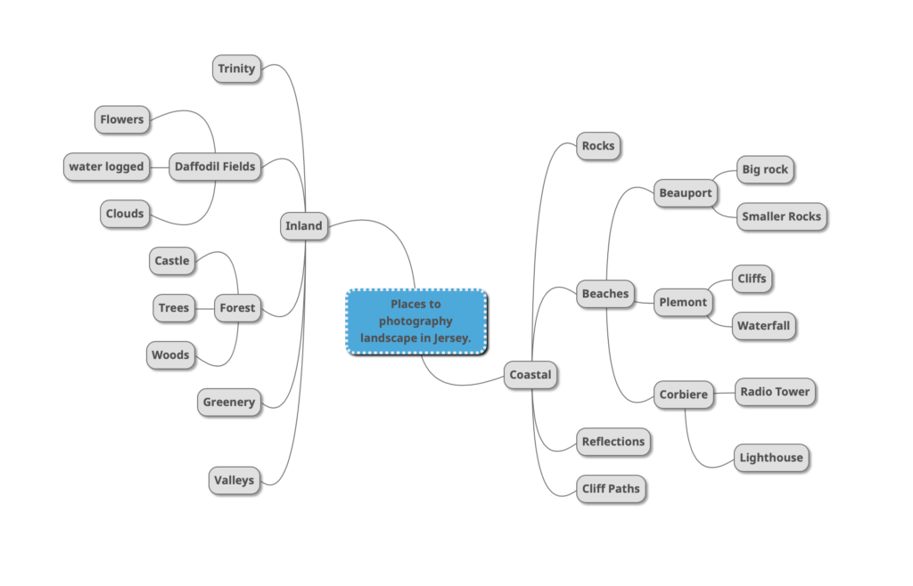
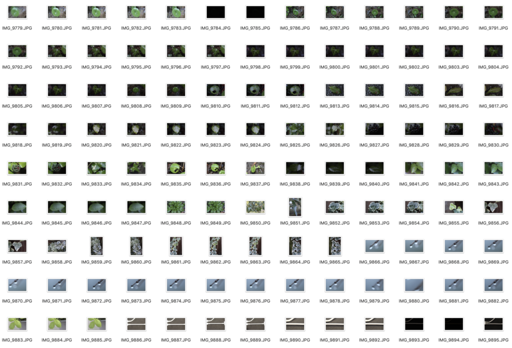
Contact Sheet (Simplified)

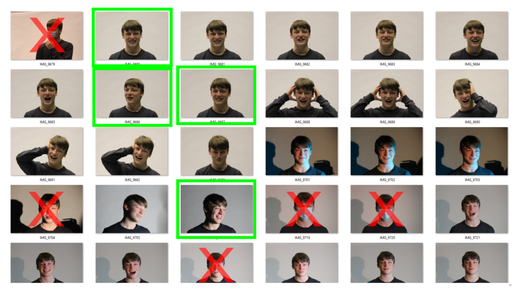
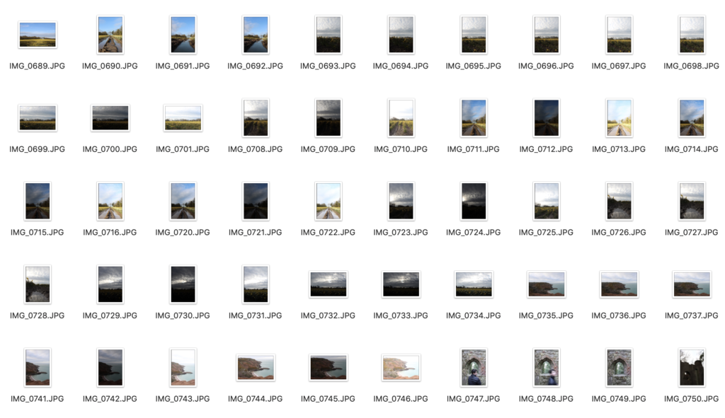
Since I took over 600+ images I only put 1 screenshot of a small section of images as my contact sheet.
HDR exposure bracketing technique. What is it?

Exposure bracketing is when you create pictures with different exposure settings. (Overexposed, Balanced, Underexposed.) The purpose of this is to cover more of the dynamic range. Bracketed photos are used later to create an HDR (high dynamic range) photo. For example, in a normal photo the sky might be overexposed, therefore, the dark image produced by the bracket settings will keep all the detail in the sky, so when you put it into Photoshop or Lightroom to make the HDR image it will merge all the images together and keep all the best parts for each image. Overall it will created a high detailed image that is perfectly exposed in all areas.

To learn how to setup this technique I used a Youtube tutorial, that uses a Canon camera, this is the link :

Exposure Bracketing (AEB) for better HDR with Canon DSLRs

All images below were taken with a tripod and a Canon DSLR 1300D, then edited in Adobe Photoshop.

Part Of The Process (HDR/Exposure Bracketing)
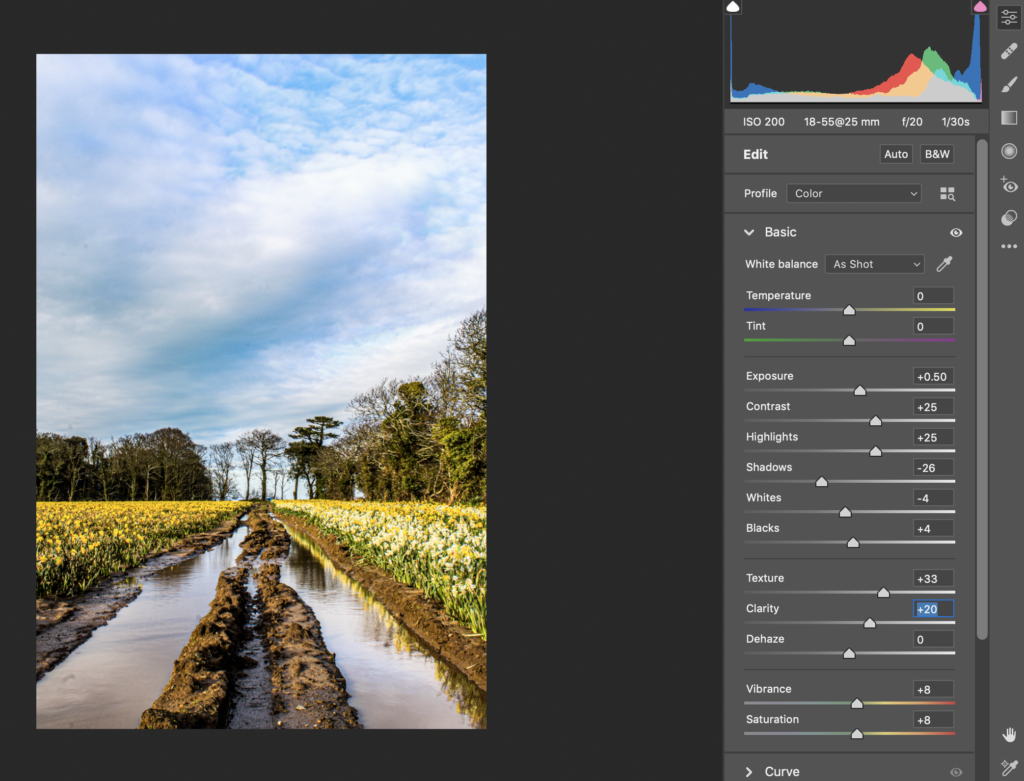
This is one of the screenshots from the first image I edited, it shows the Camera Raw Filter being added to HDR image. Photoshop merges the 3 images for you so I wasn’t able to screenshot it doing that.

My HDR Images
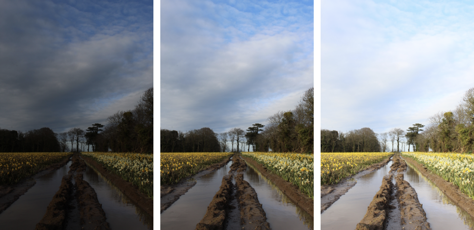
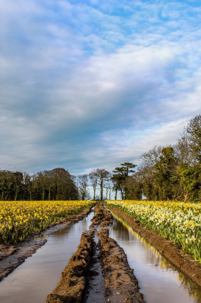
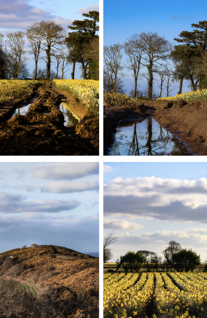
As you can see there are four photos above. The larger one is the final edit, which I made from the three images I took using bracketing technique, which I will show in every image.

This is my favourite one alongside the castle image. The image has high details in the highlights and shadows which creates a nice depth in the mud and rows of flowers. The tractor marks creates leading lines that focus on the tree that is centred in the image, as well the rule of thirds composition is used as the horizon rests on the bottom 3rd of the image. The colours are vibrant and isn’t over saturated, which is what I was worried about creating the HDR image.
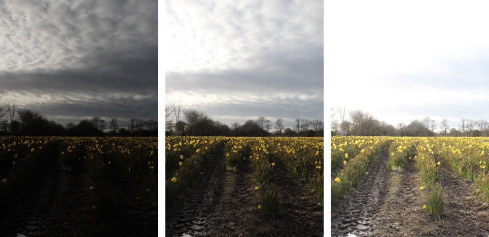
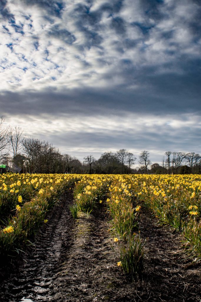
This image I wanted to create a moody atmosphere, as it was cloudy, so I added a gradual filter to the sky using a camera raw filter in Photoshop, and added a high dehaze, clarity and darkened the shadows to bring out the detail in the sky. After I added a more detailed texture to the ground to match the scene I created with he sky. By using the rule of thirds it makes it so that the yellow flowers aren’t all visible making it not destroy the grumpy atmosphere with contrast of happy flowers.

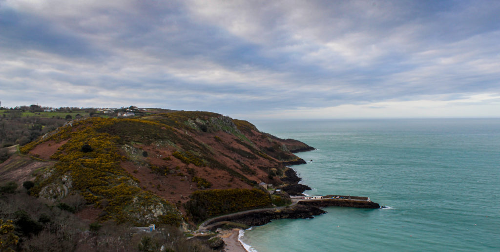
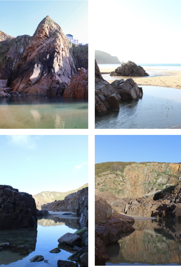
I wanted to show the scale of the coast in this image, by including the small pier as the comparison. There isn’t much detail in the clouds which makes you focus on the actual terrain, which is the effect is wanted to created. I love the different shades of blue coincide with each other, and how the water is a nice turquoise colour, where as the sky is a deeper blue.

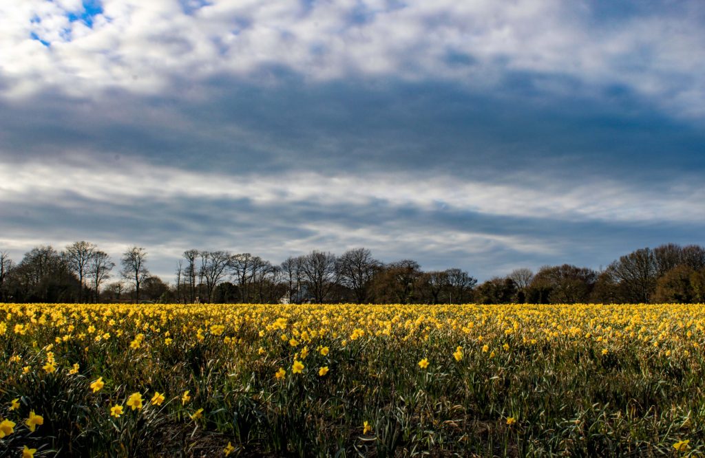
This image is a normal landscape image that looks like it would be a screensaver on a computer. I feel that there is a motion in the clouds which move horizontally, this also exaggerates the integrity in detail in the clouds, which could suggest a more complex understanding to just a picture with pretty flowers and cool clouds as the have this “heavenly” look to them.

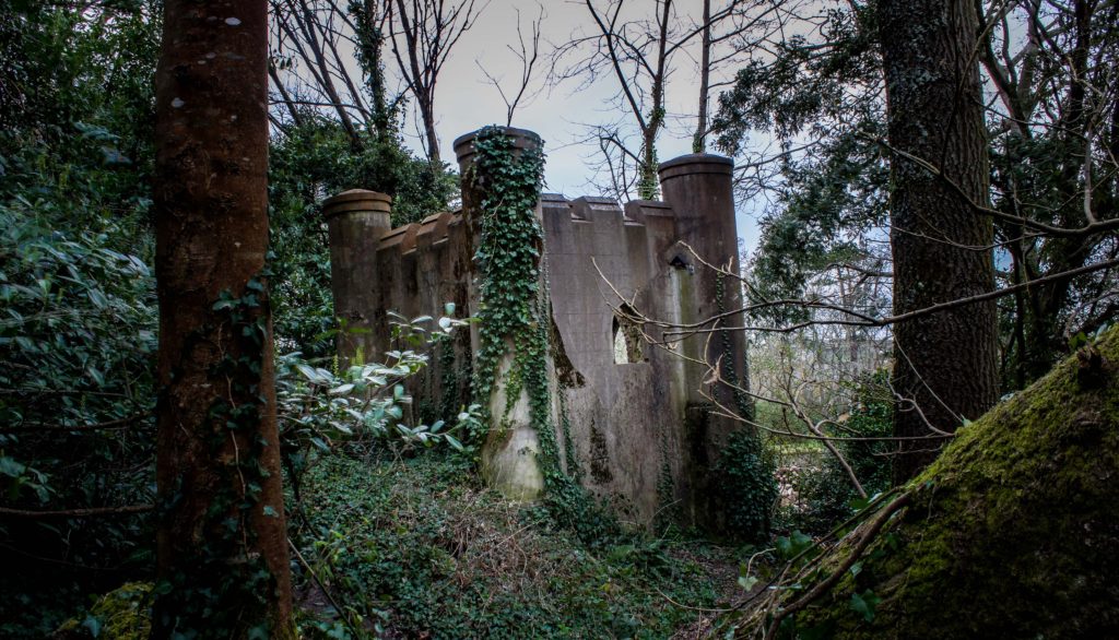
This is one of my favourite images. I was going for the abandoned look, so I made the camera tilt to the side so it looked like the castle was left and abandoned quickly, the visual aesthetic of overgrown ivy and vegetation adds a strong characteristic to the effect I was going for. The detail that the HDR image provided really helped show how the walls were washed out and how dense and compact the forest was. Overall, I’m really happy hoe this tuned out as I want planning to photograph this until suggested by family. The colours aren’t super saturated as it would have ruined the worn down look.
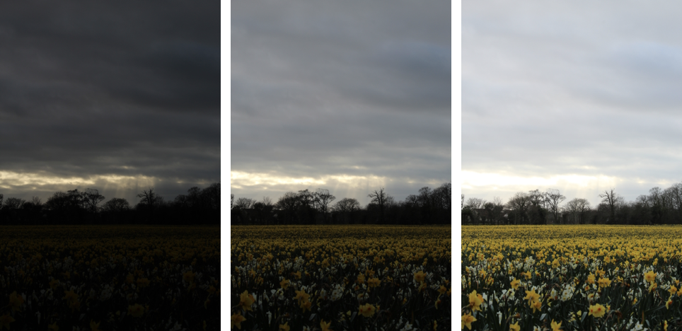
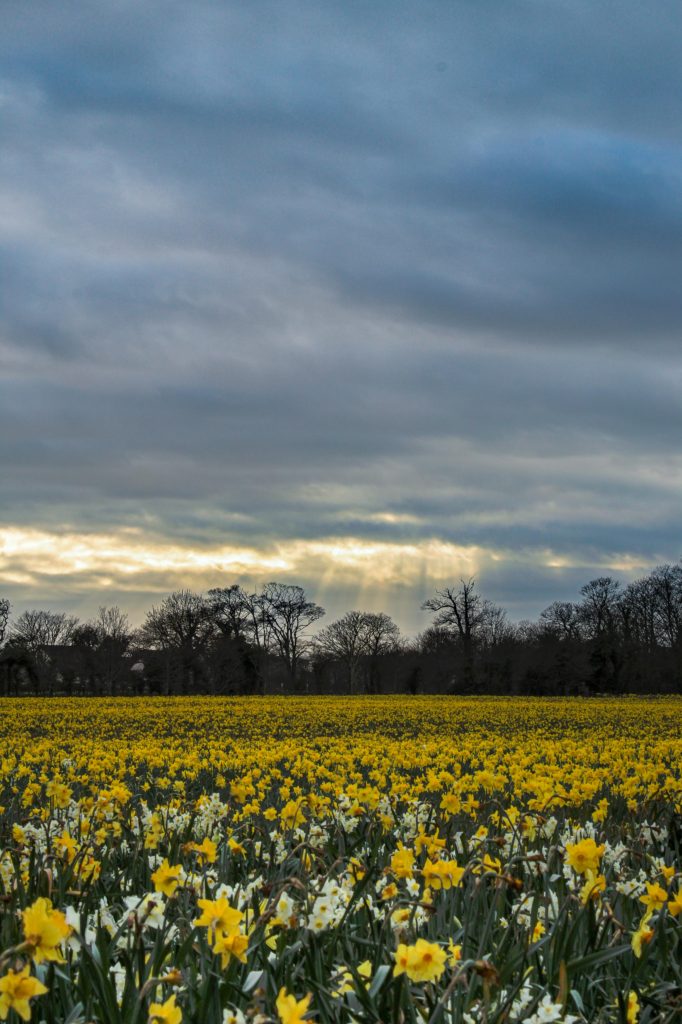
The sunlight was disappearing, therefore it was breaking through he clouds in the formation of rays, I thought this would be a good experiment of exposure bracketing as the were a steep difference between lights and darks, eg the sunlight and the forest line. I went for the moody evening vibes, when editing this photo. So I added a gradual filter to decrease the dehaze in the sky and underexpose it, then a radial filter to increase the temputerure of the rays of light to add more emphasis to it. The foreground is a bit blurry as the flowers were sawing in the wind. This is due to the 3 images being combined into one with a o.5 second time interval between each shot. Even with photoshop auto-align software is was not able to fix this, as the sky as-well as most the image was aligned, due to the tripod I used. I am pleasantly pleased how this turned out and like the aesthetic it gives off.

My Images

These were the good images from my combined photoshoots.
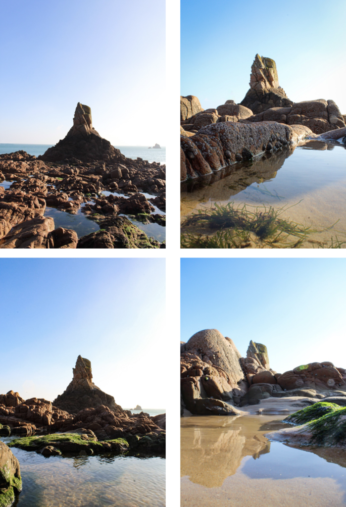
Best Images

These were the final best images for the 4 Photoshoots that I did. They were all edited in Photoshop and occasionally Lightroom.
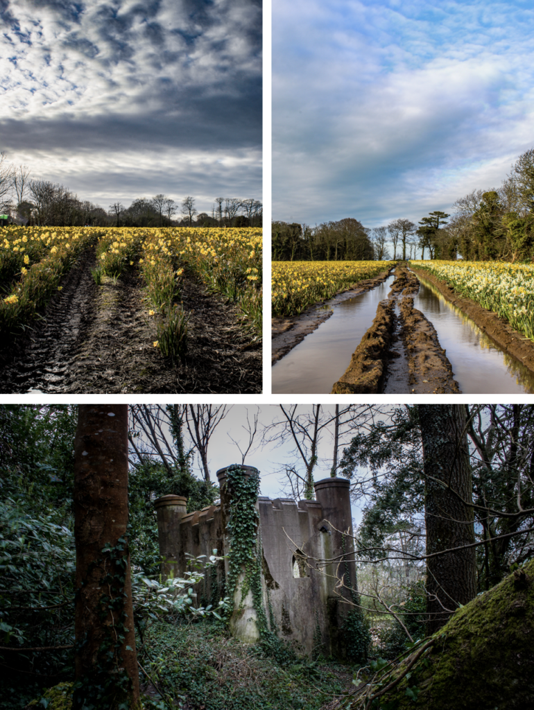
This set of images are the HDR images that I have previously explained what I like about them. Although these are my favourite 3, due to high detail and preservation of the colour almost an exact replica to real life.
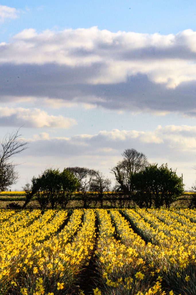
This image shows the linear pattern in the daffodil field, which contrasts between the irregular patterns in the clouds. The highlight on the clouds make it seem like this is an old pattern in the style of Picasso. The colours are nice and vibrant, which gives off a positive atmosphere.
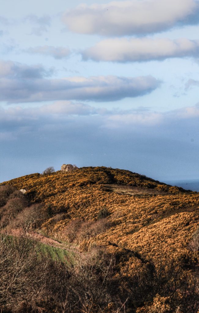
This image has that vintage feel to it, as the clarity is high, which brings out all the discoloured vegetation on the hill. The small cottage is marked using the rule of thirds composition terchnique. Similarly, this image also include detailed clouds, which was achieved by using a gradual filter in Photoshop.
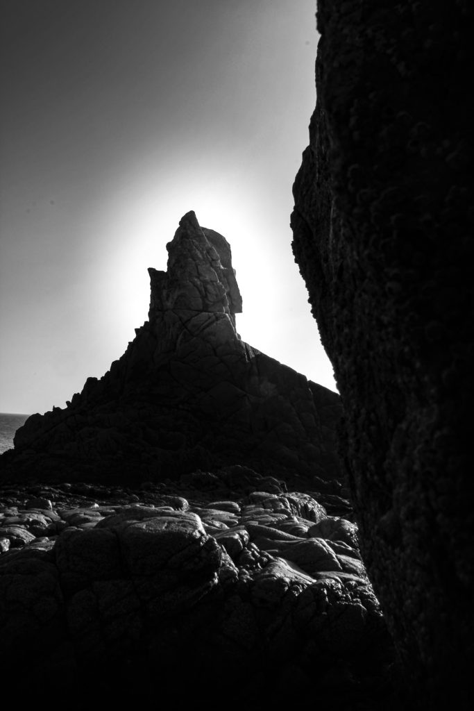
I wanted to focus on the highlights in this image, so I gave the tip of the rock a halo effect, as that was where the most light was. The increased clarity makes this image in the style of Ansel Adams, as he uses highly detail images mostly including rocks in all of his photos. The light was coming from the top right which makes for some unique shadows which I brought out by decreasing the darks and increasing the contrast. I like how it turned out as it feels mysterious and magical, probably due to the irregular shape.
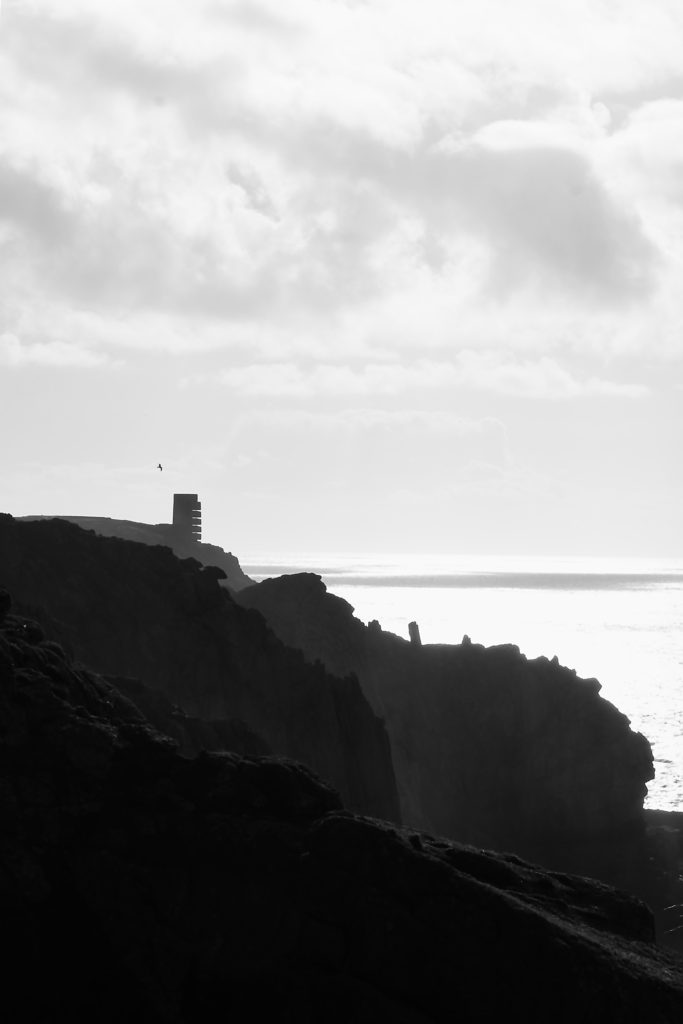
This image clearly shows the jagged cliffs catching the shadows of the cloudy afternoon. The foreground is dark, but as the cliff gets further away it gets lighter. This helps add more depth to the image. The tower is visible as it doesn’t fit into the landscape, which helps identify it as the main focal point. The clouds are slightly overexposed, although you can still see the texture in them. Overall I really love as the composition is good as it focuses on something in the distance and also include the natural part of Jersey.
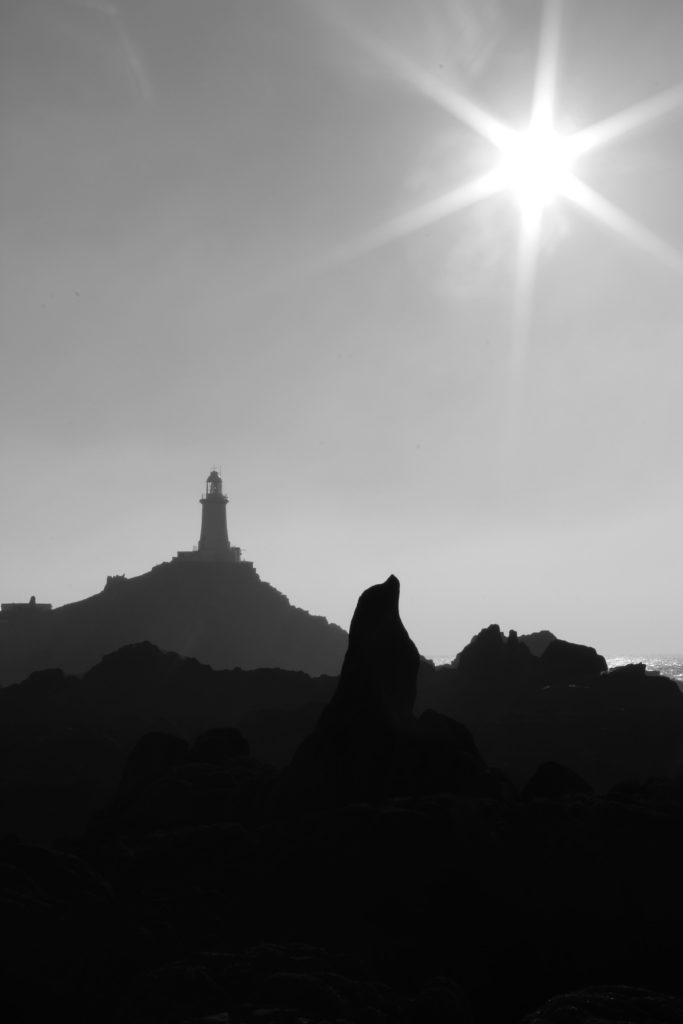
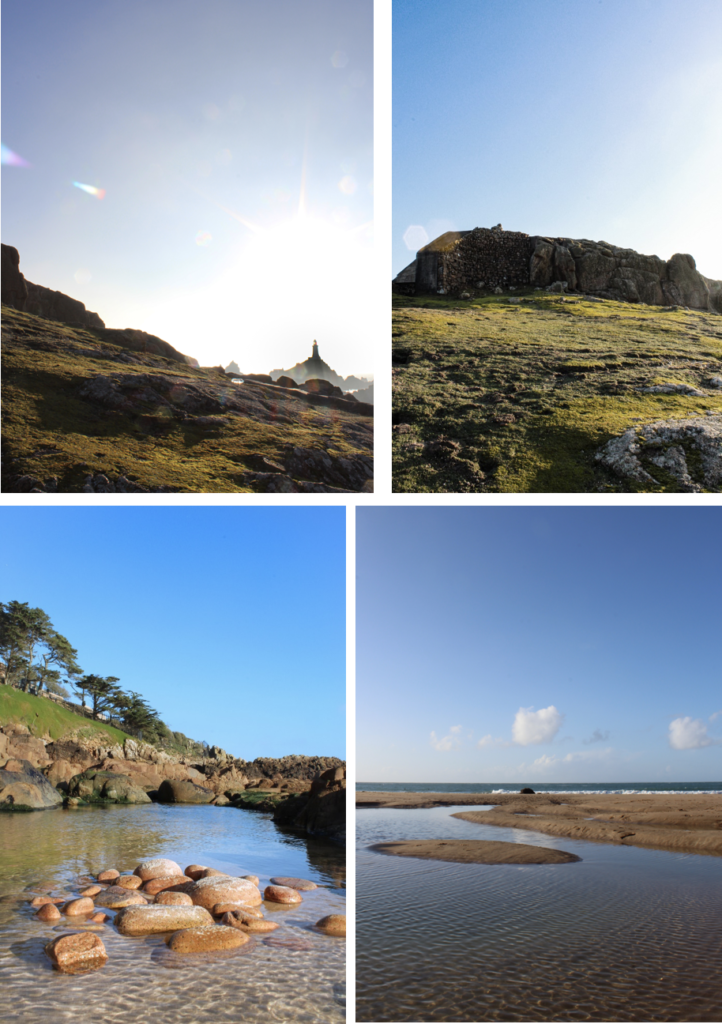
The 3 levels of dark tonal values, is what makes this image stand out. It consists of the blacks in the foreground, with the grey behind it, then finally to the light-grey figures in the background which the lighthouse is apart of. Overall the harsh contrast between the sky and the rocks juxtapose each other against light and dark. I achieved the star effect caused by the sun, by using a high f-stop value, eg. f-32.

Ansel Adams Comparison With My Own Image
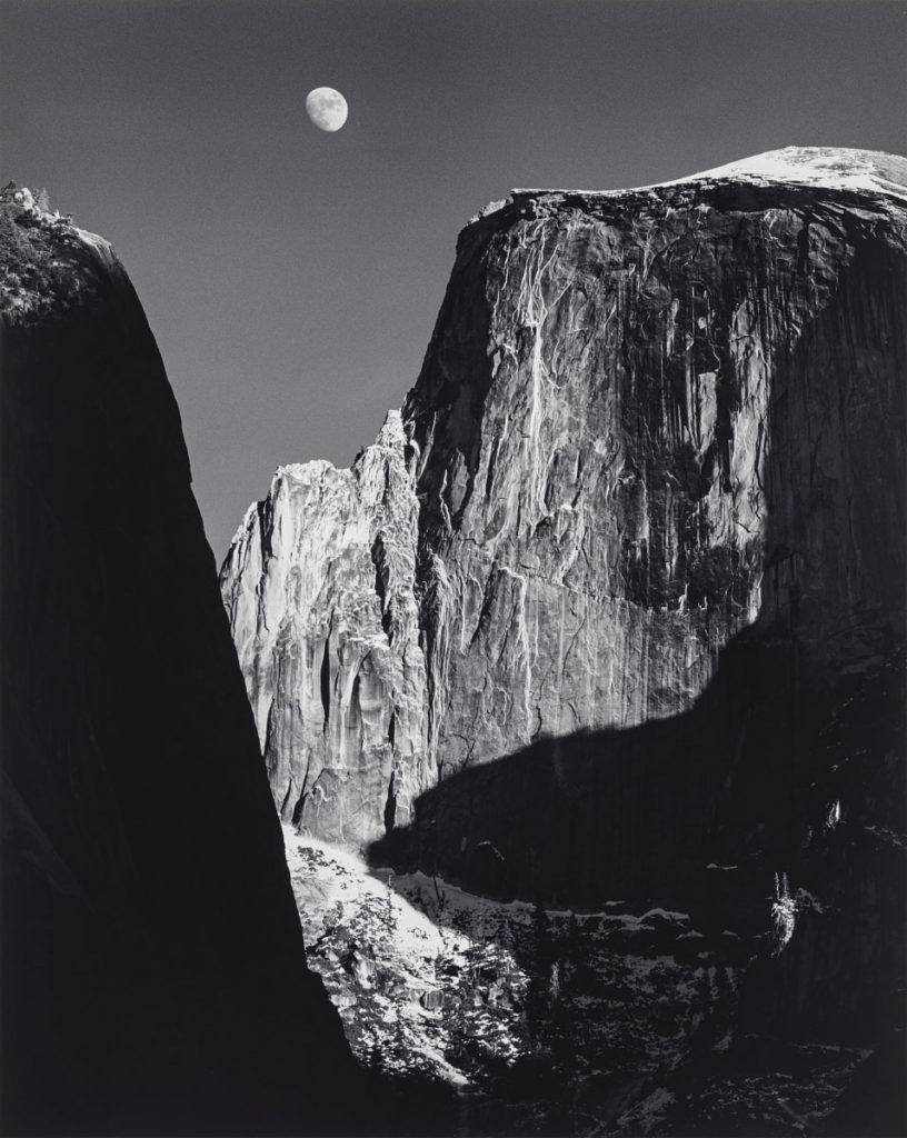
Similarly, both mine and Adams images are of a natural landscape, which display rock formations. Both include a dark portion of the foreground on the side of the image. Although, Ansel Adams image uses scale to exaggerate how large the mountain is, by including the moon, which is a huge natural satellite.

A black and white filter is used on both of the images.  Ansel Adams has covered the whole of tonal zone system, going from 0, being black through to 10 being white, displaying different shades. This really puts emphasis on the highlights as it creates a high harmonious contrast, which also brings out the structure int the image.

Likewise, both images use natural light produced by the sun, as the images were taken in daylight. Adams image has a gentle feel to it as the light has a gradual fade from white to black, which gives off a calm but expressive atmosphere. Compared to mine which has a more abrupt, intense change in tone and light, which produces a more energised atmosphere. However, mine could signify hope, as most of the image is in the negative colour; black, that expresses a more sad, depressing mood. Except for the “halo” at the top of the rock, which is like the light at the end of the tunnel, and-that means that there is a delicate, alive essence to this photo.

Self-Reflection Controlled Conditions

Now that it’s over, what are my first thoughts about this overall project? Are they mostly positive or negative?

Now that its over, my first thoughts are that it went really well, and i was mostly consistent throughout all of my blog posts.

If positive, what comes to mind specifically? Negative?

I think that my final images were really strong, and linked back to the photographer I researched and referenced.

What were some of the most interesting discoveries I made while working on this project?

I discovered that i’m good at explaining the process and showing it in steps. I also found out that there were more steps involved then I intentionally thought, for example the work I did in the style of Evilsabeth Schmitz-Garcia, that involved printing out and taking photos of the scans.

What were the challenges?

Time was a big challenge, as I finished with 4 final images, I felt that the time spent to edit them, and explain them, as well as presenting it, took longer than i thought.

What can I improve?

I could of shown more ways of my exploration of ideas, as it was my weakest point. I did think about by didn’t write much about how, and why I chose to do what I did, which is a big part about the process and presentation, as it leads on to how i edited the final image.

How will I use what I have learned in the future?

I have a better understanding of what I can improve and what I need to go into detail about more. I also feel that my Photoshop skills are more consistent.

CC – FINAL OUTCOME IN THE STYLE OF Birthe Piontek

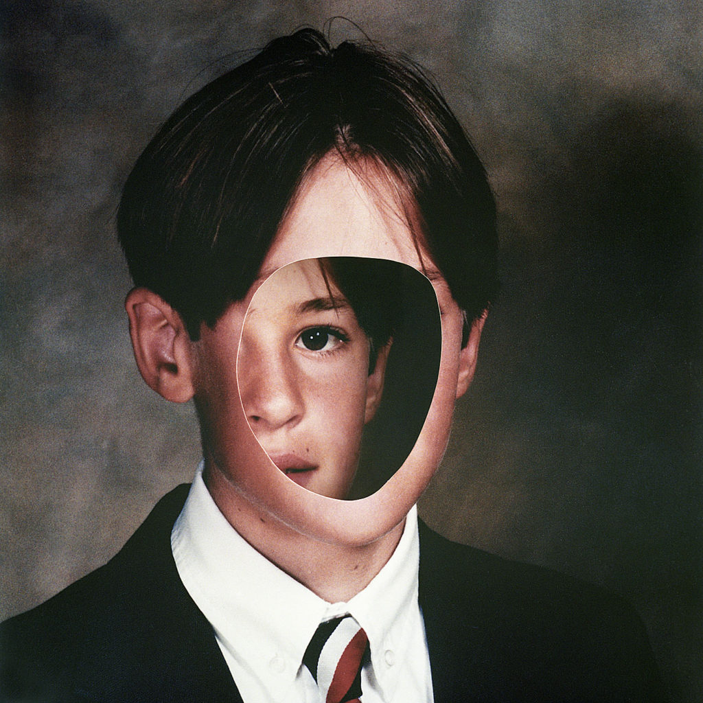
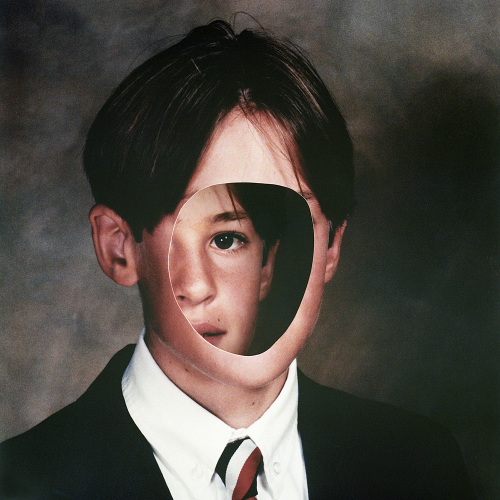
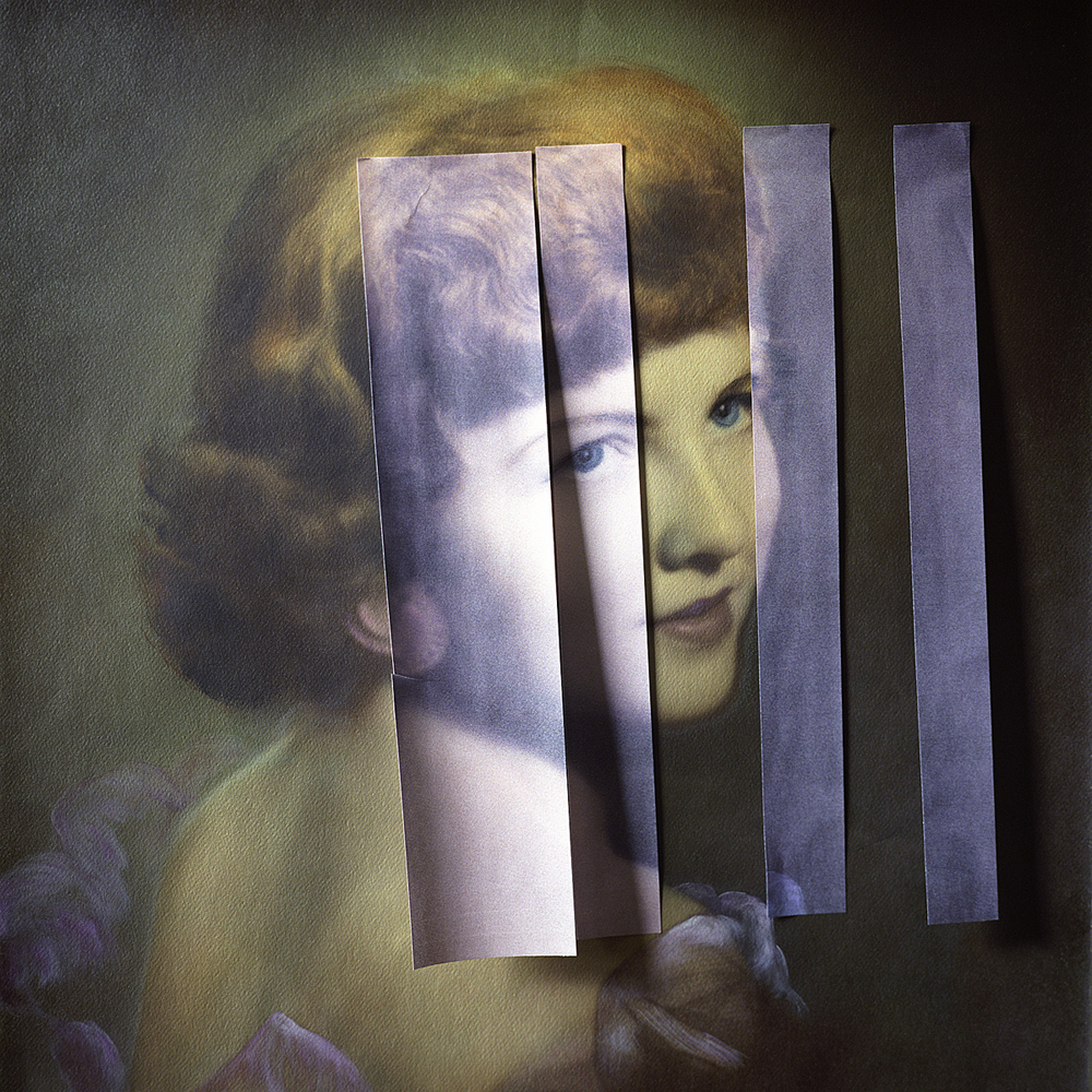
I wanted to create a set of images in the style of Birthe Piontek. This is the image that inspired me.

Firstly, I chose 2images to edit. I would edit 1 with no face, and create the hole in the head effect. And 1 of the face inside and 1 outside the head, as I think it relates to hiding your identity and the opposite showing your identity.

I chose these 2 images to edit :

Process of editing the hole in the head.

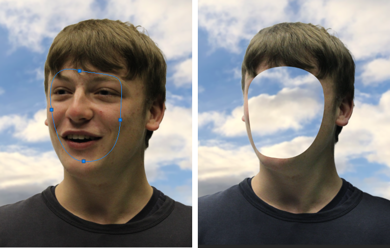
I started off by removing the background. I used the object selection tool then select and mask option then I refined the edges to make it smooth.

I then put the background in, which was a normal cloudy day. The problem was that the subject was a different colour to the background and it didn’t match. I used the curves adjustment and used the dark colour picker to select the darkest colour in the background then put that on the darkest colour on the subject. I did this for the mid-tones and highlights. This made it so both the subject and background matched. I added gaussian blur to the background.

I used the pen tool to create a smooth mask of the face then I deleted the selection, which made the hole in the face effect.

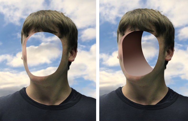
It didn’t look normal, so I used the pen tool again to create an edge, I changed the colour to a skin tone so it looked normal. Although the whole of the image was 3D except from the hole in the face.

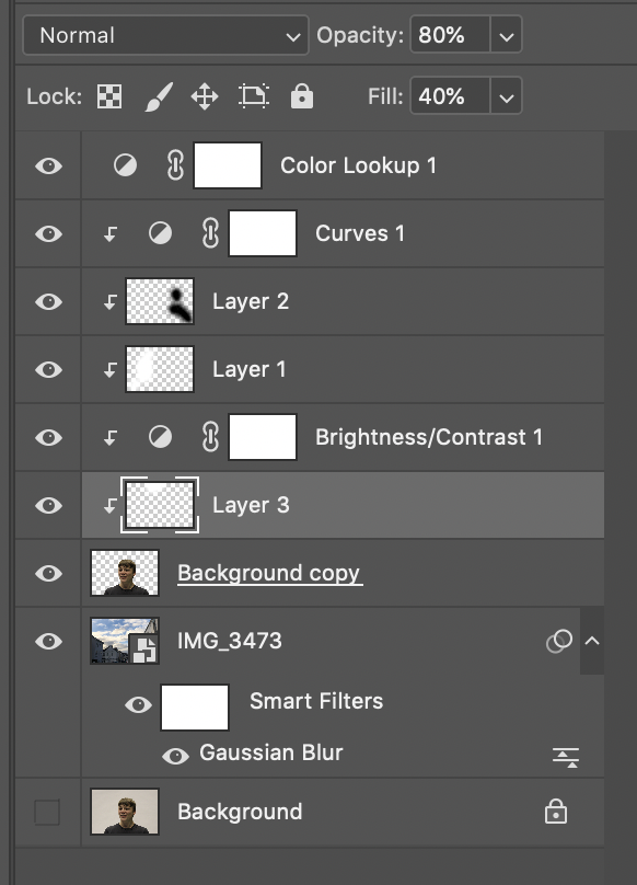
I used the pen tool to create the second layer which signified a 3D aspect. I added a shadow by creating a clipping mask, then using a black brush tool with 0% hardness. To contrast the shadow I added highlights by using a white brush tool with 0% hardness, after I added a soft light blend option, which made it more smooth.

These were all the layers with adjustments, so you can see the structure.

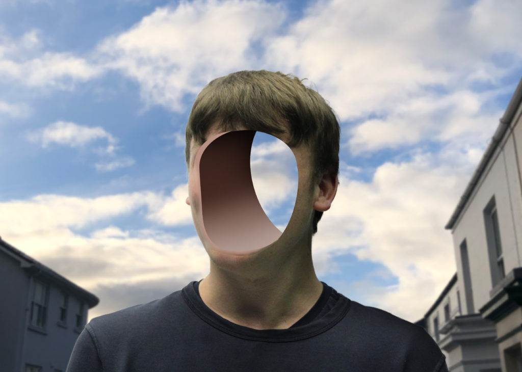
Final Image – 1

Reviewing my image, I really like how it turned out, as it is similar to Birthe Piontek’s image where he removed the face and you can see behind it. The background is clean and fits well.
I feel that the gaussian blur in the background makes you focus on the subject more.
I also like how you can clearly see through the background through the hole.

Critique

I don’t really like how the inside of the hole is fake, maybe I could of taken a sample of the skin off the face and textured the inside to make it realistic.

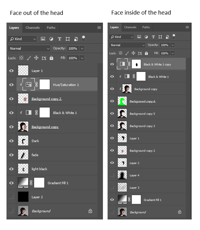
Process of editing face inside the head/off the head.

Firstly, I used the pen tool to create a clean mask selection of the face.
For the face inside I had to make sure that the mask wasn’t touching the edge. For the face outside the head I had to make sure that it was over the edge, to get all the side of the face. I moved the face outside the head to create the effect that it was coming off.

Next I used a black brush tool to create shadows and to blend the face into the shadows, which create a nice blend.

I used a black and white adjustment layer and put it on everything except of the mask of the face, because I think it gave a unique touch.

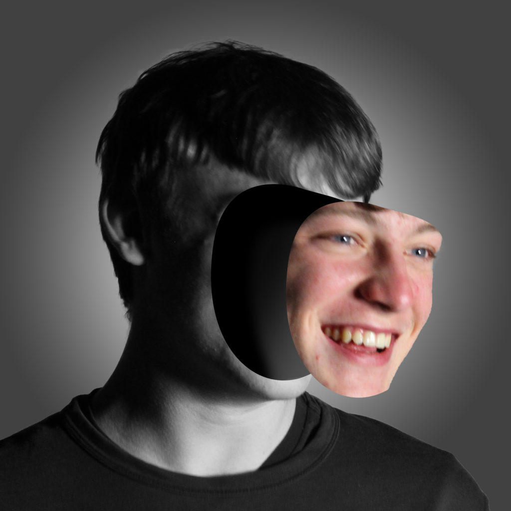
Final Images – 2

Evaluation

I like how this image turned out, as it unique and in the style of Birthe Piontek. I feel like the black and white filter works well, as the saying “showing your true colours” I think that it represents it as the face is the only coloured part in this image.
I think this image shows someone that is confident, and someone that “puts their face out there.”

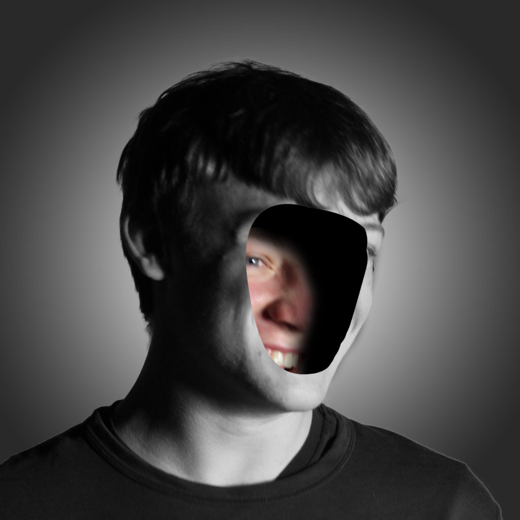
Final Image – 3

Evaluation

I think this images composition, is better. Not only is it in the same style as Birthe Piontek, but I think it shows someone that is more shy, therefore hiding their identity. It shows that as the face is hiding behind in the head.

Critique

I think the original mask of the face could be smoother as there is some ridges in the image, such as the pointy chin in the image where the face is coming off.
Also if the photo was a bit more clear, and facing towards the camera, it would be easier to mask out, instead its at an awkward angle, therefore harder to accurately mask a selection of the face.

You can see how similar they are side by side.

CC – Final Outcome In The Style Of Evilsabeth Schmitz-Garcia

Firstly, I started out to create an image in the style of Evilsabeth Schmitz-Garcia.

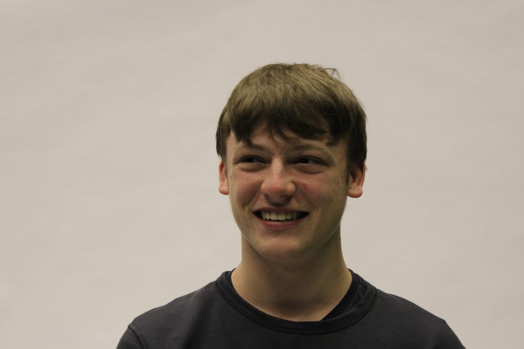
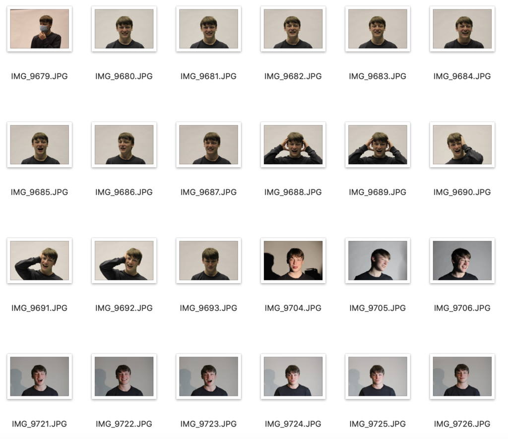
I would use the photographs from Photo Shoot 1. These were the photos that I took that were simplistic, and had a variety of facial expressions. This was because that was one of the key aspects of Evilsabeth Schmitz-Garcia’s work, other than the warped and manipulated effect.

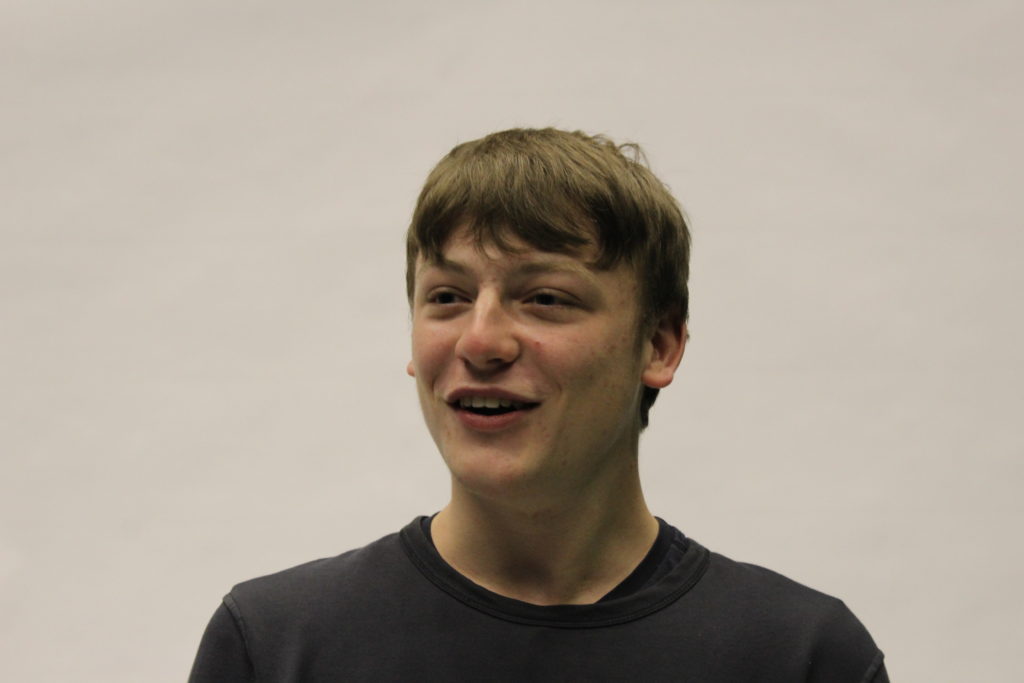
Overall, I chose the photo where the subject was smiling as most of Evilsabeth Schmitz-Garcia’s work has their mouth open or semi-open, as the manipulation effect works better.

This is the photo I chose to edit :

Process

In Photoshop I would need to :
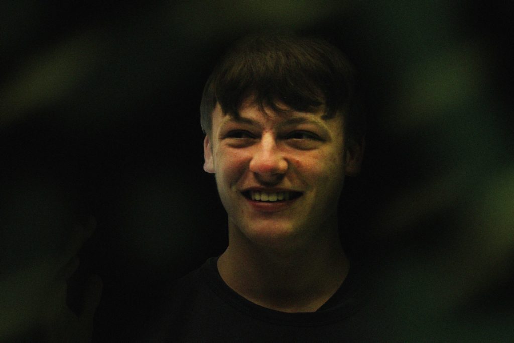
– Edit the background black (as all of Evilsabeth Schmitz-Garcia’s photos have a dark background)
– Add some green/yellow particles into the background (In Evilsabeth Schmitz-Garcia’s photos there is always some colouration in the background)
– Add grain/noise (to get the scan effect)
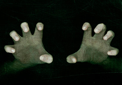
– Experiment with overlays, such as the hands I took in Photo Shoot 3.

After Photoshop I would print out the image and place it on the scanner. Whilst it is scanning i would move the printed photo along, this is how the manipulation effect occurs.

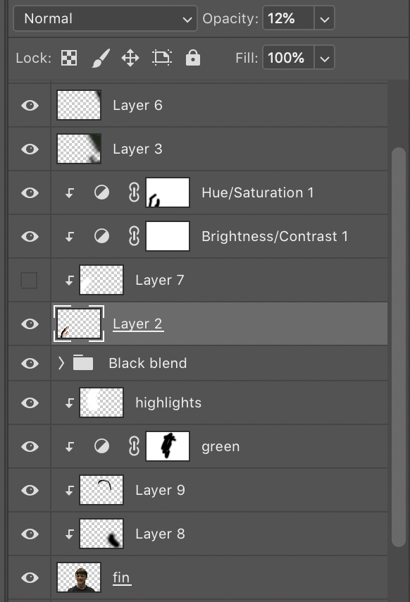
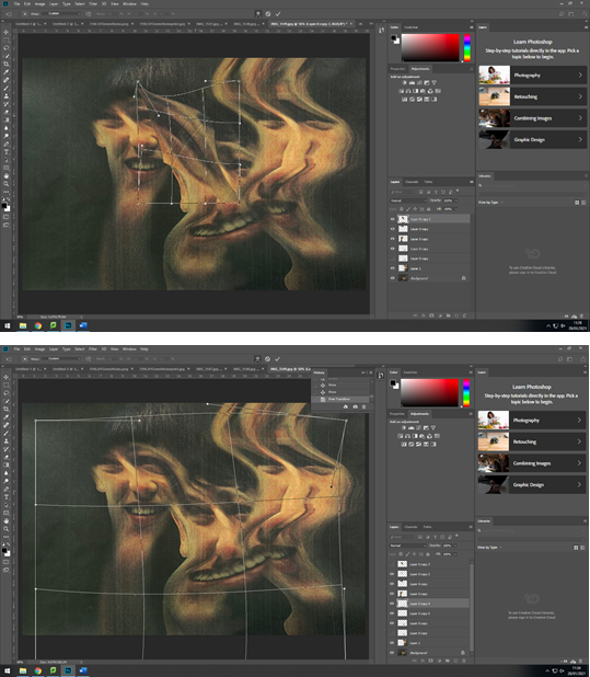
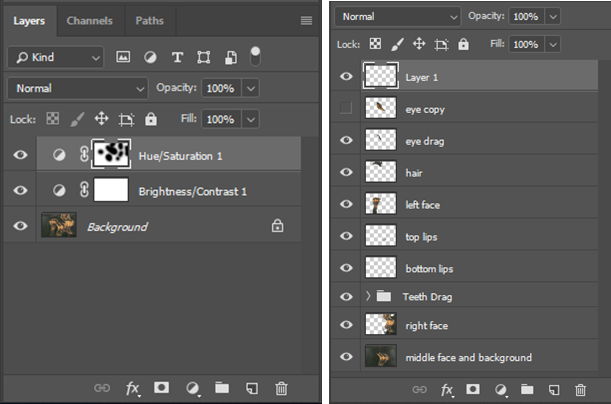
These are all the layers in Photoshop.

Firstly, I selected the object with the quick selection tool, then clicked the select and mask option. This would remove the white background so I could replace it with a black background.
To clean up the edges, I used the refine edge brush in the select and mask screen. This blurs the edges so any white space; cause by the lights, in the hair would get removed. This gave the cut out a clean look. After I outputted it onto a new layer then renamed it “fin”.

I created a black background layer under the “fin” layer, this made the edges of the face stand out too much and created a sharp line, which I didn’t want. To fix this I created a Clipping Mask then used the brush tool (black) with a hardness of 0% and smoothing of 0%. This made it so the brush wasn’t harsh and gave it a “gradient” effect, so it faded into the background.
On the left side of his face I added some “highlights” using the brush tool (white) at 0% hardness, I used a clipping mask then used the brush to create the shine effect, where the light was coming from. I had to turn down the opacity to 65%, otherwise the white was too overpowering.
I added a green tint to a part of the face, the layer named “green”. I used an adjustment layer then changed the hue to green. This made the whole face green, so I used the eraser tool with a hardness of 0% to remove the green from 70% of the face.

To add the background colours I used the brush tool with 0% hardness, the colours I used were green and yellow. I added motion blur to the colours, so they weren’t just block of colour in the background. I also turned down the opacity so the colours weren’t as bright to match the tones Evilsabeth Schmitz-Garcia used.

I experimented by adding a hand into the photo. I started by removing the background with quick selection and select and mask, which is the same process as the face cut-out. First of all, it seemed out of place as it was really bright, so I added an adjustment layer for brightness and contrast, which I turned down the brightness and turned up the contrast. After I turned down the opacity to make it so that was almost hidden, therefore not contrasting the main focus point.
I printed the image, although it was a bit dark so the increased the brightness and reprinted it.
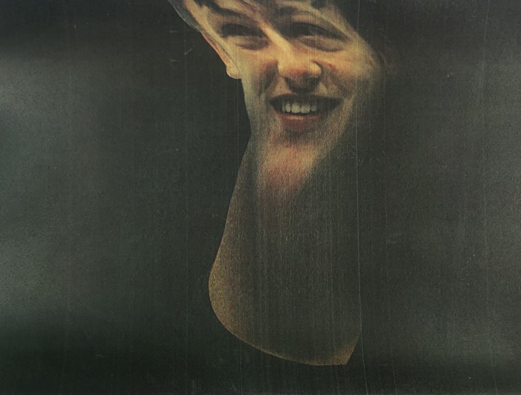
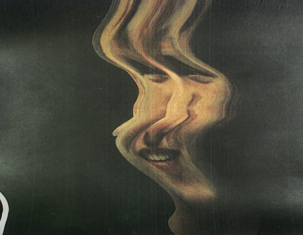
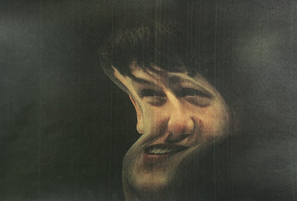
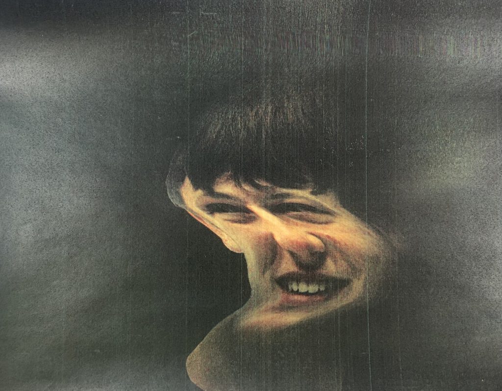
After, I placed the image on the scanner. As it started to scan I moved the image to manipulate the outcome. I did this about 20 times. I photographed the best 4 so I can take them into photoshop, and refine them. these were the 4 scanner outcomes:

I took these 4 images into Photoshop. Firstly I, found my base layer, which was the one in the top row far left in the selection above.
Then, I removed the background of the tall image with the eraser, then added it on top of the base layer. I used the eraser tool with a hardness of 0% to create a gentle gradient into the base layer.
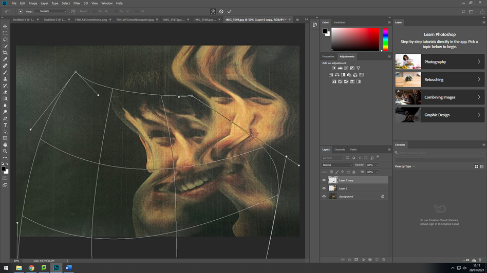
Next, I only masked out the lips from the tall face, and made duplicate copies of it. I used the warp tool to change the aspect ratio of it to match the image so it would look like it is being stretched and pulled between the faces. After, I added motion blur to smoothen it out.

After it all matched, I added another face as Evilsabeth Schmitz-Garcia normally uses 3 faces. I removed the background then uses the eraser tool again to fade it into the base layer (middle face).
After, I masked out the right eye from the new face then used the warp tool the connect it to the middle faces eye. I would need to use the eraser tool to get rid of the sharp edges.#

Once I had finished the composition of the image, I renamed all of the layers, then fattened the image. I added adjustment layers to make it more in the style of Evilsabeth Schmitz-Garcia.
I used a hue/saturation where I added the green effect that Schmitz-Garcia uses in here final images.
The brightness/contrast adjustment is a normal adjustment where I brightened the images and made the blacks more dark.

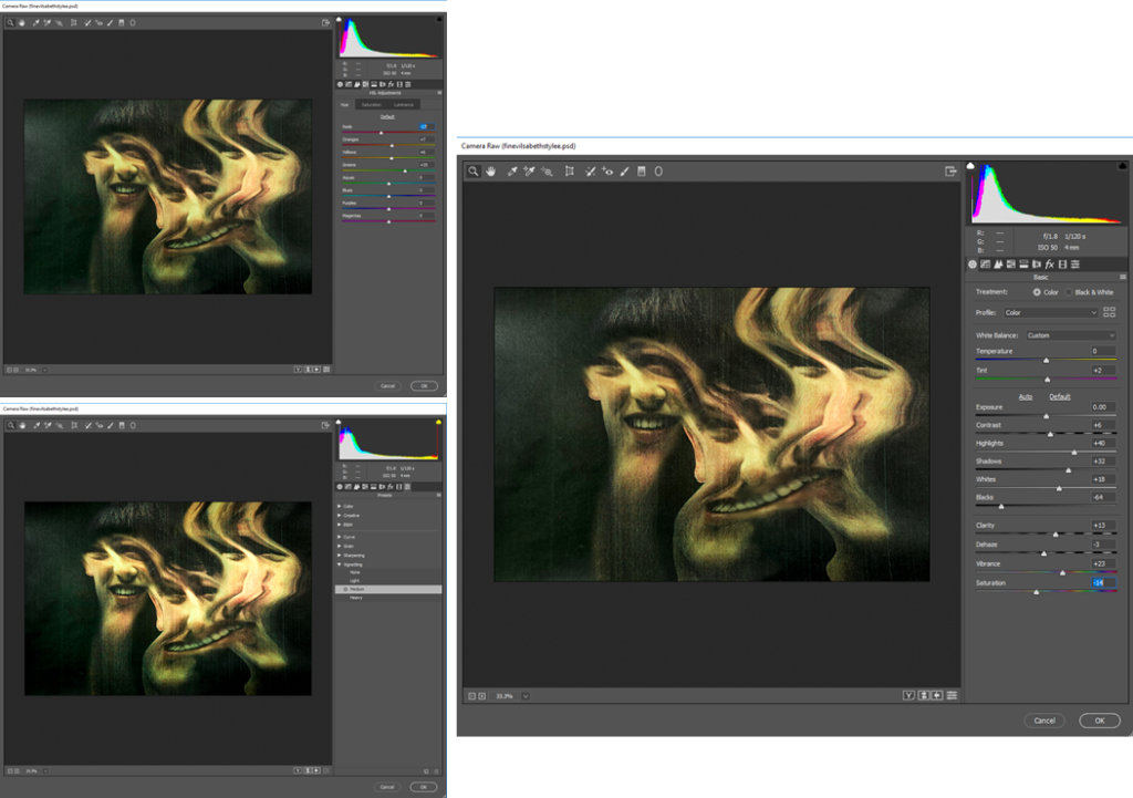
Finally I added a camera-RAW filter to touch up the final image. I started off by changing the tint, highlights, shadows, blacks, and the white. (right image).
Secondly, I changed the individual colours, but mostly the greens, yellows, and oranges. The greens I increased the most as it was one of the more distinguishable colours. The yellows and oranges I also increased to counter the green. As it was too strong in some areas.

After, I realised that the background was too shiny as I took the images of the paper with a camera. So, I decided to go over the background with the black brush tool and made opacity 75%. It fixed the problem and removed the lighter areas.

That is how I edited my image in the style of Evilsabeth Schmitz-Garcia.

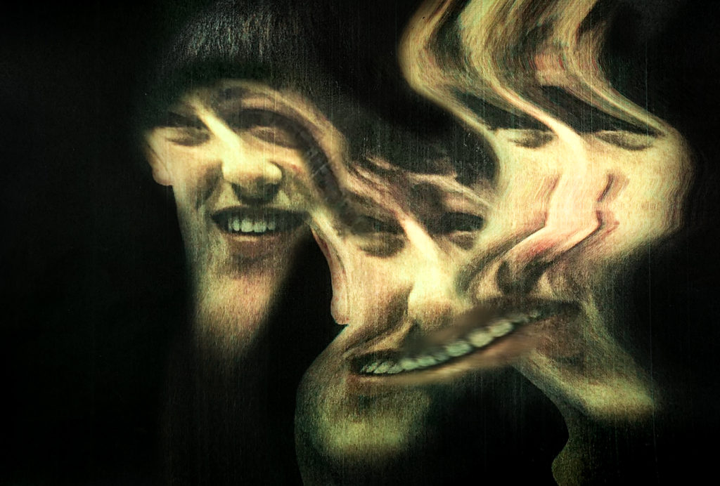
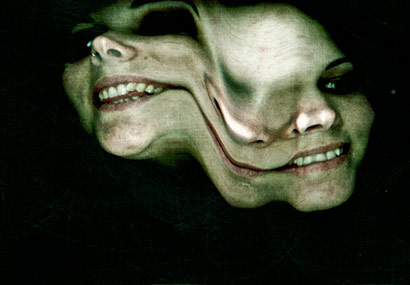
Final Image

Evaluation

Reviewing my image, I like how it turned out, and I feel that there is a strong connection between my image and Evilsabeth Schmitz-Garcia’s image.
The main reason she displayed her images in her style was to capture people with multiple personality disorder. I feel that the manipulation in my image shows that perfectly as there is no sharp interrupting lines between images, instead it looks like it is all one image.
The colours mostly match. I feel that the camera raw filter really helped me achieve this look.
The scanner produced lines on the my images similar to Evilsabeth Schmitz-Garcia image. This is because I actually used a scanner and was a good idea even though it was risky, and I didn’t think it would work.

This is my image side by side with Evilsabeth Schmitz-Garcia’s image that I based mine off, and inspired me.
As you can see they are fairly equal. Overall i think it turned out well.

Critique

Looking back it all went smoothly, except from when I went to print it and it turned out really dark. This is an easy fix, I could of printed it on higher quality paper or better printer. I fixed it by making the image really bright before printing, so when it printed it would be how it was on the screen.

Also if the printer saved a digital copy of the scan I wouldn’t need to take photos of the manipulated results, therefore getting a clearer version. Although, it did add more texture to the image, so it turned out better.

Originally, I was going the use the liquify filter in Photoshop to create the result. In the end I didn’t use it at all. Instead, I used the photocopier, which was a good idea.

CC – Idenitiy Photo Shoot

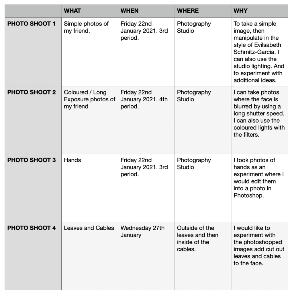
Photo Shoot 1 – Simple Photos

I plan to merge these photos together in Photoshop, create a hole in the head, or use a scanner to disfigure them in the style of Evilsabeth Schmitz-Garcia’s work.

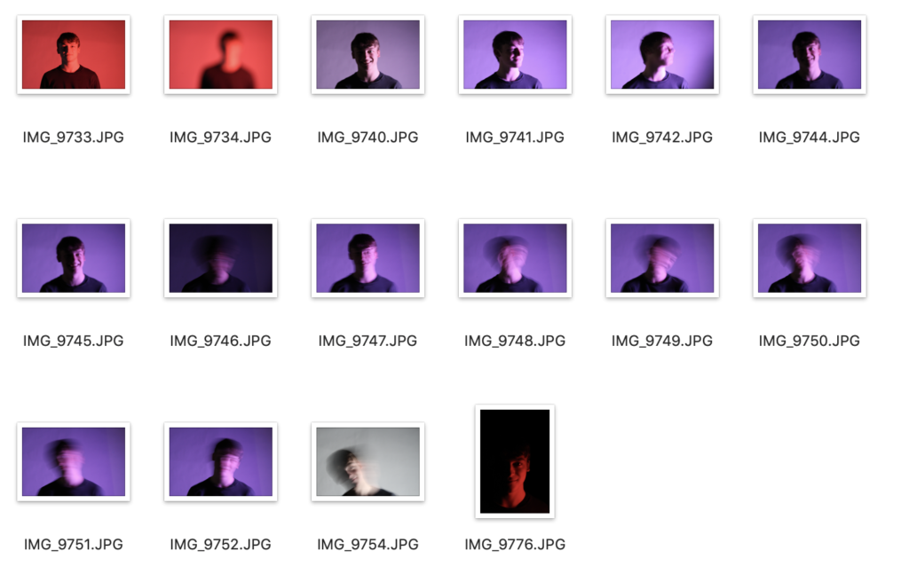
Photo Shoot 2 – Colour / Blur Photos

I use different colour lights to experiment which produces better tonal values and highlights.

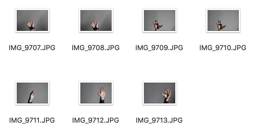
Photo Shoot 3 – Hands

I plan to edit the background out in Photoshop, then add it to another photo.
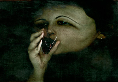
Photo Shoot 4 – Leaves And Cables

I looked for leaves and cables that would be a material to edit coming out of the face when I edit it in Photoshop in the style of Birthe Piontek.

CC – Birthe Piontek- Identity

Birthe Piontek is a Vancouver-based photographer is most widely recognised for her intimate, narrative-driven portraits.

Most of her work has a straightforward approach. In her recent series “Mimesis” she’s uses images that have a meaning and background to create collages which displays her personal portraits with an investigation into the complexity of human identity.

Piontek searches for found images on Ebay, in thrift stores and flea markets. She primarily looks for images like studio portraits and other non-candid scenarios in which the subject has direct eye contact with the camera.

She knows little about the people in the photographs, she uses them as source material to create her own fictions about their identities, she said, “I usually spend quite a bit of time with the image, looking at it and familiarising myself with it.”

Once she likes the outcome of a photograph, Piontek scans it, then reproduces the image, in many cases working from its copy. She begins manipulating the copy, sometimes cutting into it and incorporating other materials like glass, paint, foil and fabric to give the image an entirely new form. 

I would like to experiment in Photoshop in the style of Birthe Piontek. I would like my final outcome to be like the first image in this post, where the face out of the head.

CC – Identity Comparison

Technical

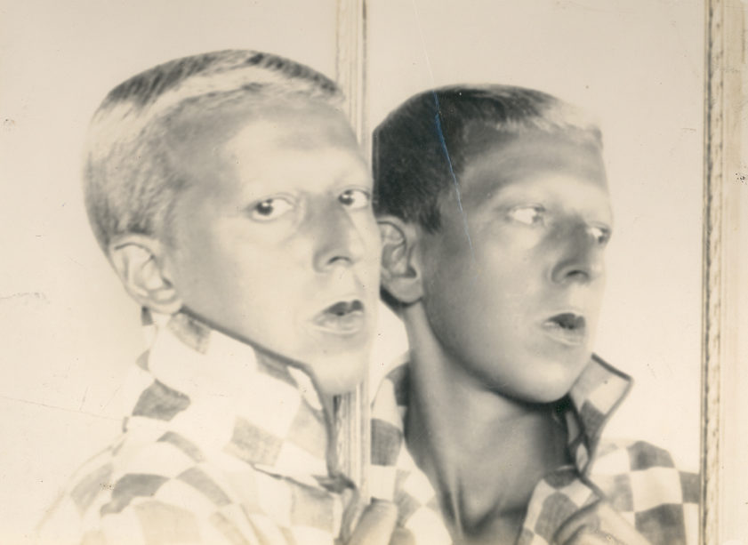
Cahun organises the photoshoot and brings preps, such as the ripped piece of paper then, she takes the photo which pretty much the final image. Where as, Schmitz-Garcia takes the photo then edits after using scannographies. this, shows that there is more of a process with Schmitz-Garcia’s photographs. This is partly due to the fact that equipment has been evolved, so there is more potential.

Schmitz-Garcia’s used a dark environment then lights up the face, usually there a a green tint. Schmitz-Garcia uses a more increased saturation. Cahun uses a more natural looking light, during the day.

Schmitz-Garcia’s looks like it would be a long shutter speed as the image is manipulated. Although it is slightly underexposed. Cahun uses a fast shutter speed to make sure there is no blur, also it is perfectly exposed.

Contextual

Cahun is representing more obscure identities within here photographs, it has a high historical context as it was in 1900s-1950s.

Schmitz-Garcia’s is displaying multi-personality disorder in the modern world, which is more relevant to our current time period, which is why i’d like to focus on it more.

Visual

Cahun’s photos are mostly in black and white, as it was the standard in the 1900s. Her shots tend to have an empty background, which makes you focus on the subject more.

Schmitz-Garcia’s photos are coloured but use more dull colours as they’re taken in low light, and have a more serious context. There seems to be some grain in her final results. This is due to the effect that the scanner creates. Schmitz-Garcia’s focus point takes up more of the whole space, as the image is moved out of place.

Conceptual

Schmitz-Garcia’s concept was to stretch the image to visually show different facial expressions and manipulate the figure, it shows something similar to what people with multiple personality disorder would display.

Cahun’s concept was to question identity, gender and the subconscious mind. Successfully she did it by using mirrors, teared paper, outfits and other props to piece together her individual identity and photograph it.

CC – Evilsabeth Schmitz-Garcia

She uses photography to represent Borderline Personality Disorder symptoms with photographs. She decided to use scannographies instead of photos because the pictures she took with her scanner gave her the look she wanted, like “someone trapped inside a dark place”, a dark place which could be a Borderline’s mind.

Her Life

Scanography is the art of recording a subject using a flatbed scanner. It is created in the same way that Xerox art is created using a photocopier, however scanners typically have the ability to create larger, higher quality digital files.

They capture movement in exciting ways, such as Evilsabeth Schmitz-Garcia’s ‘Borderline Personality Disorder’ portraits above, which have been distorted and stretched as the scanner arm moves across the screen. Scanners can also be used to take scans of objects place upon existing photographs, as per the example below.

She began her art studies in 2003, at “Escuela de Arte La Palma, Madrid”, where she had photography as an optional subject. She found out that she was fascinated with how photography worked so she used to spend hours taking pictures and developing them.

She began her own scannography experiments, in the end she chose this as her final project. She started scannographies as her teacher showed her example which inspired her.

How i would include her style?

I would like to include the merge aspect, where she merges multiple faces which I would accomplish using Photoshop, or long exposure to create a blur, therefore you see multiple faces.

I may use hands and edit them in, around the edge. To create a manipulative, and creative idea. It would make a uncomfortable, crawly image.

Finally, I may take the idea where she uses multiple faces to create a single image. I would use about 5 faces then make all of them blank, then show the process of editing facial features on which shows the development of identity.

CC – Claude Cahun – Identity

Claude Cahun - Archives of Women Artists, Research and Exhibitions

Who is Claude Cahun?

Claude Cahun was born Lucy Renee Mathilde Schwob on 25th October 1894, was a French lesbian photographer, sculptor and writer. Who died on the 8th December 1954.

Schwob adopted the name Claude Cahun in 1917 and is best known for self-portraits, in which Cahun assumed a variety of characteristics.

Cahun’s work was both political and personal, she explained, “Masculine? Feminine? It depends on the situation. Neuter is the only gender that always suits me.”

My opinion

She has a unique style, which is extremely experimental, and shows gender identity. I like how it is unusual and different, making her photos question her self-identity and give an illusion of questionable choices.

Personally I like how she has merged images together and also objects before taking the photo. I would like to try and include this idea in my photography, where I merge faces together.

CC – Identity And Place

What is identity?

Identity is the qualities, beliefs, personality, looks and expressions that make a person or group of people. People categories others identity as positive or destructive. A psychological identity relates to self-image and self-esteem.

Identity can be manipulated by various ways, such as parental upbringing, friends, family, culture, work, place and environment, I plan to use this in my photography work, mainly within Photoshop.

Mood Board

Initial Ideas

My first idea is to take about 3-4 photos then line them up in Photoshop, them merge them together, each photo will have the subject doing different facial expressions displaying various emotions. The 2 photos at each end will be anger with 1 hand on the hand creating a sandwich type concept. Additionally, I may add other photos of there face into the image, like the image of the girl with the lipstick on in the mood board.

Another idea is to mask the face in Photoshop and detach it from the head and fill it in with a black area behind the floating face, it could have items coming from behind the face out of the head.

Next, I could have a blank face then edit the faces upside down or swap peoples faces.

I could have 5 blank faces all the same then add facial features on each face, like steps. It shows the process of building identity.