All posts by Matthew B

Filters

Author:
Category:

Animation In Blender

For my groups NFT Film, we decided to use animation as a part of our video. I made all the aminated clips in Blender. I started off by finding low-poly art models of Sketchfab. then imported them into blender. Once in Blender I used simple animations to move the location of the scene, to give off the impression of the character walking.

This screenshot shows the timeline for the character walking. Every dot/diamond is a different movement of the character to make him walk. The character doesn’t actually move, it just walks on the spot. So I would have to animate the background. He walks on the spot as it makes it easier to only move the direction of the arms, legs etc, instead of the movement and lactation of everything. So the character and camera are stationary.

This is the scene, everything highlighted in orange is what is animated and included in the scene. I added 2 keyframes to the timeline. The first keyframe is where the buildings start, and the second is where they will end after the move and slide backwards. It slides backwards to give off the effect that the character is walking forwards. Each 2-3 second scene takes an estimated 8 hours to render.

This is the node setup for the lighting. I used a HDRI which is a spherical photo taken in real life, and the program works out where is sun is and creates the same lighting situation for inside the workspace. The orange box is the HDRI which is connected to the right two default boxes, then I added a remapping node to make the horizon of the world line up with the horizon I made in the workspace, so there aren’t photos of trees floating in the sky.

The Street Scene

Overall, the street scene is quite small. The scene is colourful which adds lots of contrast. All the scenes use depth of field to blur the background more as the character walks forward.

The left side is the object view, without the colour. Where as, the right side is the rendered, with colour.

The Farm Scene

This scene is more complex, as there is more shapes and objects. There is also larger range of colours, ranging from red to green, etc.

The Mansion Scene

This is one of my favourite scenes, as it features our main character walking outside his mansion. It is visually pleasing as uses a lot of dynamic shapes and contour.

The Beach Scene

This is one of the most colourful scenes as it uses mostly topical/beach colours. It contributes to having a diverse location for the 5 scenes.

The Space Scene

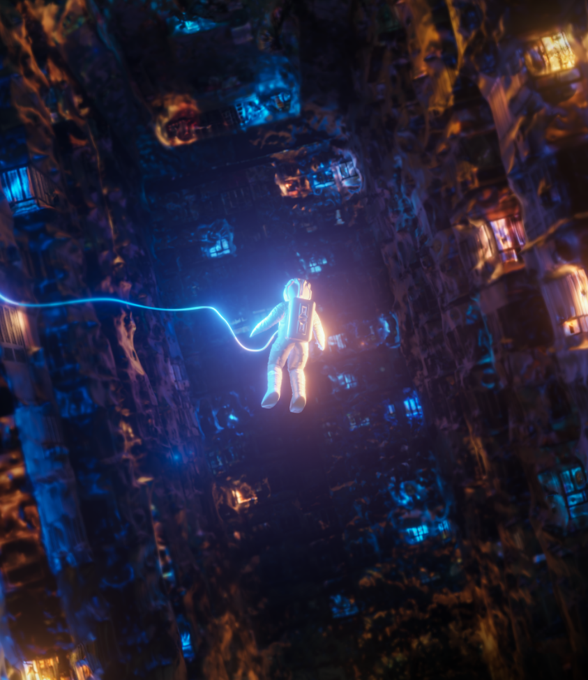
This was one of the harder scenes to make as I had to add a space helmet to him, however it is the most extreme scene as the character is in outer space.

The Zoom Out/In Animated House Scene

This animation was made to replace the original shot idea, to use a drone to zoom into a house, but we couldn’t do it due to privacy rules. So we used amination as a replacement as it fits in with the online/offline format and style.

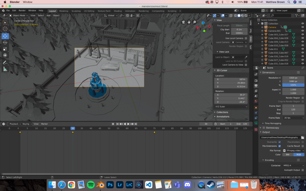
This is what the scene looks in blender. The greyed out screenshots are the view in shader view, where as the coloured view is the rendered view, which is what it looks like when it is finished.

The camera is animated with 3 keyframes, both for location and rotation. It ends still to let the clouds move in, which allows for a clean transition from this clip to another, using a white fade transition. Overall, this clip took 12 hours to fully render 120 frames in blender.

Overall, this scene is good as it ends with a clean transition, of the clouds covering the screen. The camera is mostly smooth which follows the exponential curve, which allows for fluid movement.

Animation Workshop

Liam Nunn, an artist and professional animator who came to do a workshop on how to use digital animation in Adobe After Effects using a rig he made an setup. He made a face of a lady which we could animate, and the whole animation would be 5-10 seconds.

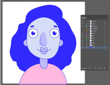
This is the basic default rig/template we started with, it didn’t move, as it isn’t animated yet.

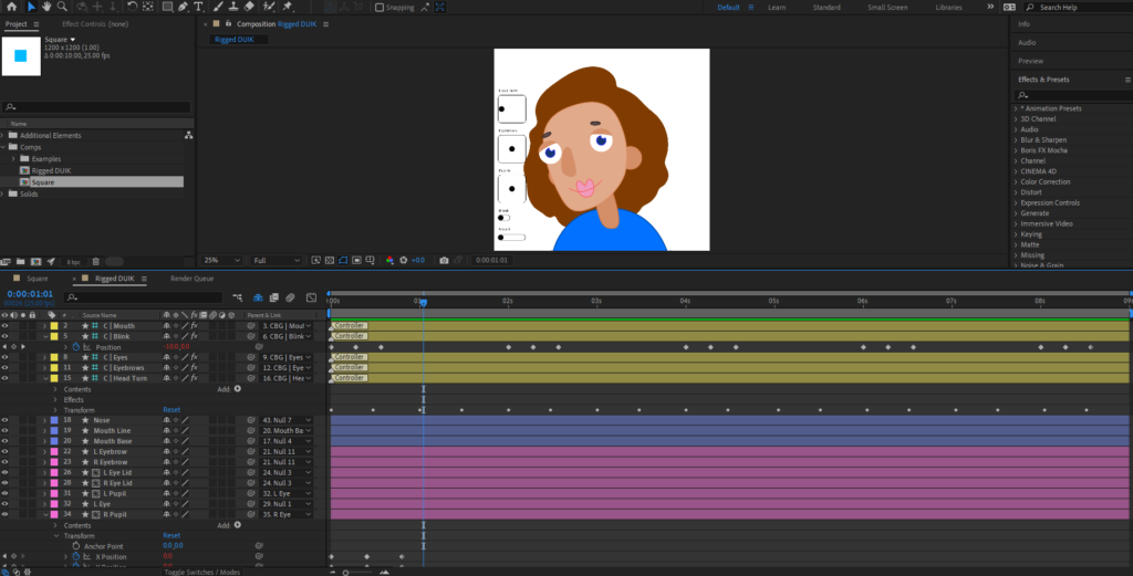
This is what it looks like in Adobe After Effects with all the keyframes to make everything move.

The small boxes on the left control what the facial features do, so we had the keyframe the small dot in the different boxes to move the corresponding’s elements for the face.

The different sections on the timeline were colour coded to help separate from what we should add key frames to and what should be left alone.

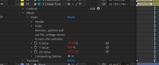
To make an element move you have to add a keyframe to where you want the action to finish on the timeline, then change the X and Y values.

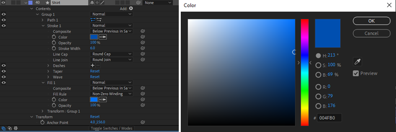
To change to colour of an object, you just have to open all the collapsed folders until you find the “color” section, then click the colour box and drag it to the colour you want, and click OK.

This is what I created. I changed the colours of the features and made the animation loop by making the end frame the same as the starting frame. Overall, It lasts 9 seconds, and I used lots of key frames to make the character look in every direction possible, blink, and move. I exported it in the format H.264 and then compressed it to have a low quality, which allowed me to post it on the blog.

Embroidery And Narrative – My Piece

We had a workshop led by Yulia Makeyeva using a combination of materials to work with such as images from, People Make Jersey exhibition panels and fabrics, textiles, beads, ribbons etc.

The aim of this workshops is to combine traditional methods of making art (analogue), such as embroidery and stitching with digital media like photography to create a short stop animation movie as a GIF.

The method and process

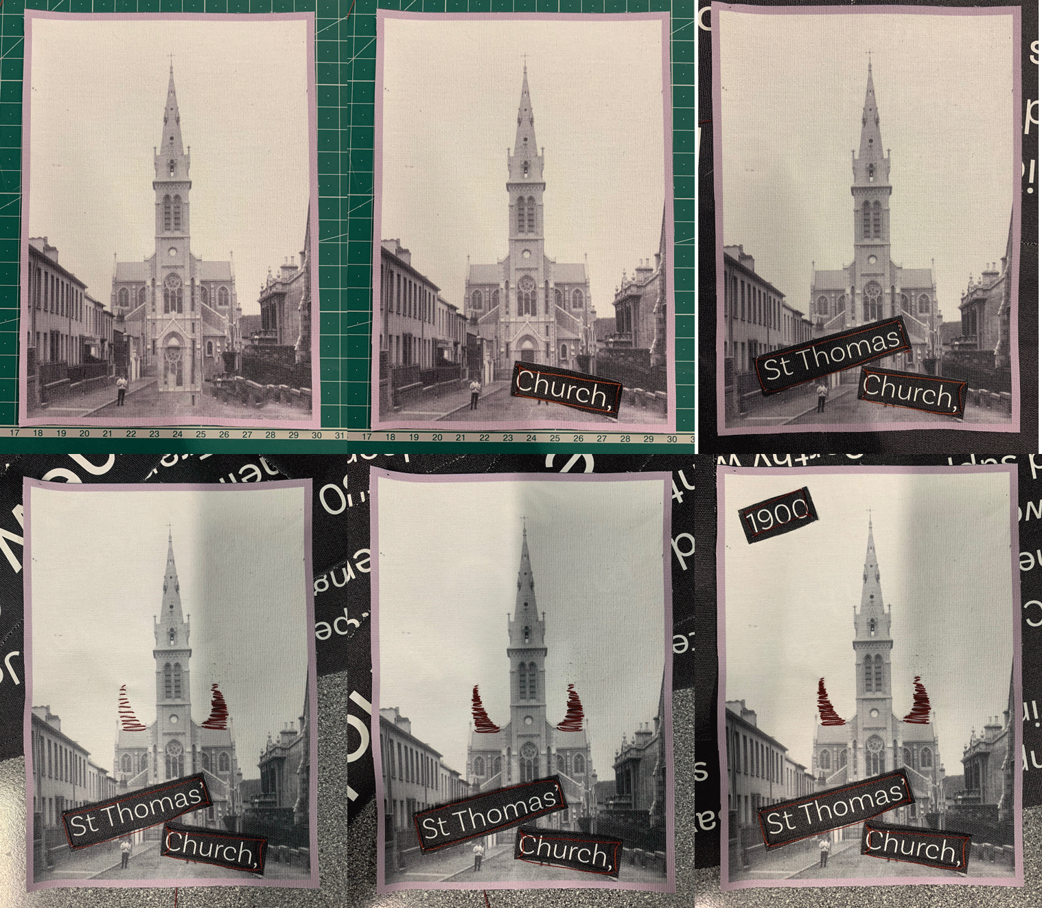
When making my piece I took photos to document the process. I used materials from the “People Make Jersey Exhibition” canvas wall displays, which were used before the exhibition closed. I cut up different elements and stitched them together, as well as stitching designs onto the picture of St. Thomas Church I found.

How to make a GIF in Photoshop
1. Create layer for each image
2. Window > timeline
3. Select > Create Frame Animation
4. Drop Menu > Make frames from Layers
5. Timeline > select Forever
6. File > Export > Save for Web Legacy > reduce image percent to 35%

This is the process of me making my “Demonic Church” piece. The last frame on the animation is slightly longer than all the other images, since it is the final result and I would like people to see the finished work.

Bayeux Tapestry Research + Artist Refrence – Michael Crompton

Bayeux Tapestry

The Bayeux Tapestry is an embroidered cloth nearly 70 metres long and 50 centimetres tall that depicts the events leading up to the Norman conquest of England concerning William, Duke of Normandy, and Harold, Earl of Wessex, later King of England, and culminating in the Battle of Hastings.

It tells the story of the events surrounding the conquest of England in 1066 by the Duke of Normandy. Crossing the sea in longships, long cavalcades on horseback, shields and coats of mail, fantastic creatures and battlefields.

It is a masterpiece of 11th century Romanesque art, which was probably commissioned by Bishop Odo, William the Conqueror’s half-brother, to embellish his newly-built cathedral in Bayeux in 1077.

Diplomacy and Propaganda: The Enduring Power of the Bayeux Tapestry - Fine  Art Connoisseur

This picture really shows how long the tapestry is, as it spans the entire room.

Michael Compton

Michael Crompton has been weaving since the early 1960’s. he had twenty six solo exhibitions throughout the UK and abroad, and his first tapestry studio was in the Weardale, Co Durham village of Ireshopeburn in 1977 until he moved to the area of Morecambe bay in 2004.

His work has developed continually from these early years but has always been inspired by nature, its cycles and seasons with associated colour and textual changes. He uses curved lines to emphasise movement and the passing of time.

In recent years he’s spent more and more time in researching, reading, writing, drawing and painting before moving to high warp frame looms.

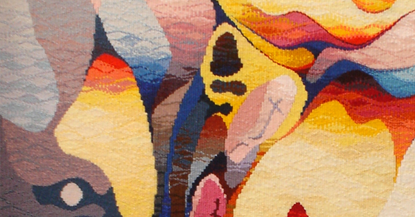
As you can see, Compton really makes use of the seasonal colours. For example, the orange correlates to autumn. The impressive factor is how the lines are curved and have a flow like attribute to them. Even thought Compton’s work is more abstract it still embraces the story telling aspect through the use of colours.

NFT Storyboard

What is a storyboard?

A storyboard is a collection of images that tell a story. Basically, it is a sketch of the ideas a person is trying to portray. It is another way of showing a game plan to an individual with interest on what is going on. The visual elements along with the captions allow for the story to be seen by the person reading it. Disney is to be credited with the creation of storyboards since 1920. Ever since then, it has been a great way to share information.

OUR STORYBOARD

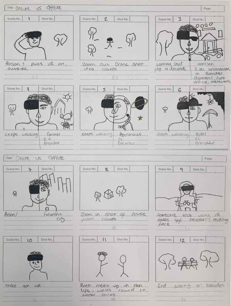
We printed a template out, and then drew on paper what we wanted our 30-second film to be. We drew the key scenes in each box.

NFT Community Project

This project will be based off of a central question, (below) and we will have to create a 30 second video and a still image in a group of 4. After, one of our creations will be minted as an NFT (non-fungible token) on the public Ethereum blockchain as part of the 2lives NFT exhibition based in Jersey.

What will the future of Jersey look like as a community in the metaverse?

The word “Metaverse” is made up of the prefix “meta” (meaning beyond) and the stem “verse” (a back-formation from “universe”); the term is typically used to describe the concept of a future iteration of the internet, made up of persistent, shared, 3D virtual spaces linked into a perceived virtual universe.

Mind Map

First, we got into groups of 4, to create a mind map about the different communities we related to/know of in Jersey.

The communities we thought of were mainly the hobbies we did out of school and subjects in school, such as, Online Community, sports communities, friend groups and the photography community.
Where as, other communities such as race, religion and gender we still wrote down as they are some of the biggest and most known communities in the world.

Mood Board

After we we made a mind map, we discussed what communities we thought we wanted to move forwards with for our project. So we chose the communities we were most involved with, they were the online world and the how its a different identity compared to in real life.

This ties in nicely with the 2lives exhibition and how we have an online presence which is different to our real life.

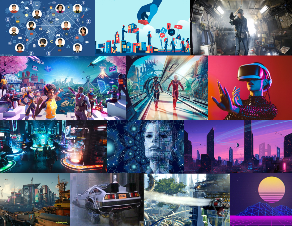
Since, the metaverse is virtual there is no limits. So we all thought it would look highly advanced and futuristic. There is a film called Ready Player One, which is what we think it will look like.

It is a dystopian world and people use a utopian metaverse to escape poverty and corruption. The concept of living two life’s; online and offline, is an idea which we liked, and relates to the exhibition name, 2lives.

STATEMENT OF INTENT

Together we are interpreting the theme of community as online and offline. And how we have bonded with people in person, but online they can be a totally different person. Also, online you can basically do whatever you want in a virtual world with anyone you want, where as in person you are limited to what’s around you. We plan to make a short film which visualises friends in real life and what changes when they go into the virtual world online.

CONCEPTWhat will the future of Jersey look like as a community in the metaverse?

Describe in:

3 words – futuristic, modern, advanced

A sentence – St Helier will be a futuristic, modern, advanced world where people are living the perfect utopia life.

A paragraph – The community of St Helier would be idealised as a perfect utopian life in the metaverse. It would have futuristic, modern, and advanced qualities, as there is no limit to a virtual world. It would most likely to be sunny all the time, with flying cars and trains, with holograms everywhere. To people living in St Helier, and their community would mostly communicate online using screens, rather than in person as quality of life would be increased and the way of living would have changed.

CONTENTHow will you make your film?

Our 30-second film will be very visual, so we will be using mostly photo and video responses, video recordings, animation, analogue/ digital montages to create a story about the online and offline community of St Helier. The use of audio and sound effects would be impactful to exaggerate actions in the video, and possibly some loyalty free music. We plan to animate some parts of the video to represent the online world, where as the other half we plan to meet up and record some scenes based off the storyboard.

NFT – Artisit Refrences

Pierce “Blizzy” Williams

Blizzy is a digital artist from the USA, he got into the digital art movement by creating game art for the popular video game Fortnite. His designs stared to gain interest on social media getting him 80,000 followers across all social media platforms. Now he works with huge content creators such as Faze Clan, Tfue, Mongraal, etc, his clients have an accumulate social network of 15+ million.

Blizzy has created many pieces of digital art, which he posted mainly on Behance and his Instagram account. However, Blizzy does have a wallet on Foundation (an NFT market place), although he has only brought NFT’s from other users, and not minted any, as of 13/09/2021.

Instagram: @frblizzy

Behance: https://www.behance.net/piercewilliams

Foundation: https://foundation.app/@blizzy_

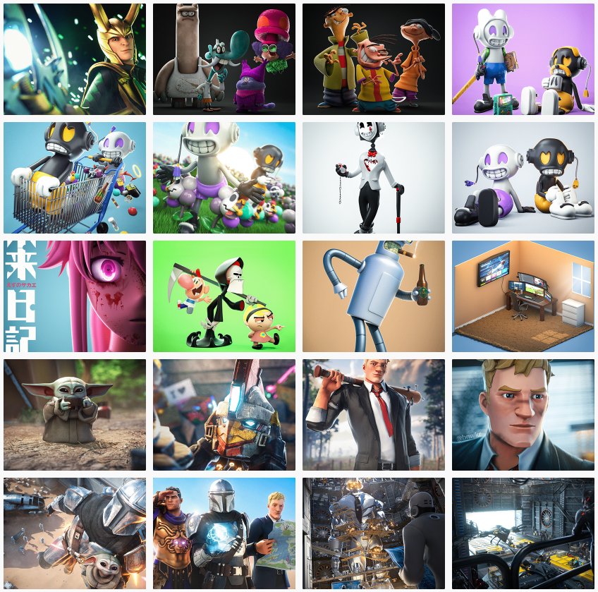
These are some of his most recent digital art pieces, which include some Fortnite art, and some of his own original creations.

Analyse

This is piece is called “RETRO GARDEN” https://www.behance.net/gallery/118487279/RETRO-GARDEN

The characters in this are called Glee and Gloom, the main focus in the image is on Glee, which is the happy character. This is why the scene is full of vibrant colours, as it helps portrays the happy, joyful atmosphere. The colour combination of white and purple suggests royalty, nobility, luxury, power, and ambition, contrasts to the colour palette black and orange which is commonly associated with a gloomy, eerie, spooky atmosphere. The use of depth of field draws attention to the foreground character and the smaller details such as the grass and flowers.

BORED APE YACHT CLUB NFTS

The Bored Ape Yacht Club is a collection of 10,000 unique Bored Ape NFTs— unique digital collectibles living on the Ethereum blockchain. Your Bored Ape doubles as your Yacht Club membership card, and grants access to members-only benefits, the first of which is access to THE BATHROOM, a collaborative graffiti board. Future areas and perks can be unlocked by the community through roadmap activation. Visit www.BoredApeYachtClub.com for more details.

The NFT market place Yuga Labs (the artist) sold their NFT’s on is Opensea, here. The main reason they are very popular, is not because of there design but their utility. Everyone that buys a Bored Ape NFT, gets access to future events and are then able to meet important people.

The Bored Ape NFT collection consists of 10,000 apes generated at random. That means trait assignment, including eyes, fur, and clothes, varies wildly from ape to ape.

Other artists that I think are interesting and good:

https://foundation.app/@mattey

https://foundation.app/@Octane

https://foundation.app/@HEXA

https://foundation.app/@Spancs

LOST – My NFT

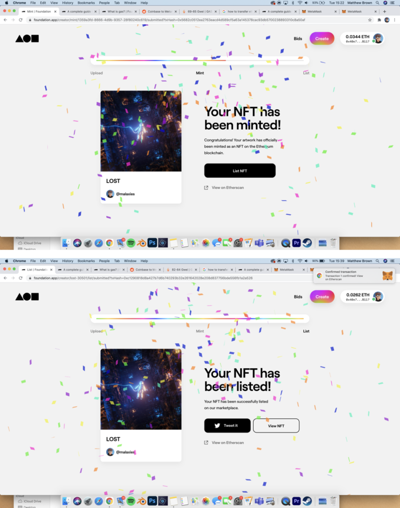
Before we started the NFT project, I already have experience with NFT’s as I created and minted one on the Ethereum blockchain through Foundation.

I chose to mint it on Foundation as at the the time it was the best place to buy and sell NFT’s. You had to get an invite to the platform in order to start selling, which I did after speaking with a few different artist and showing them my work. Foundation is probably still the best platform to sell single pieces, however opens is the best place to sell collections.

I chose to mint one on my pieces that I’ve already created using Blender (a free 3D modelling software) and Photoshop.

This is the piece I decided to mint:

https://foundation.app/@Malaxies/foundation/30501

It cost me approximately £80 to mint it on the ETH blockchain, and users can bid on it, or make an offer.

NFT – Research and Analysis

WHAT IS AN NFT?

A non-fungible token (NFT) is a unit of data stored on the decentralized public Ethereum (ETH) blockchain, that certifies ownership of a digital asset, which is unique and therefore is not interchangeable.

NFTs can be used to represent items such as photos, videos, audio, and other types of digital files.

The artist creates a piece of digital art, then mints it on the blockchain and lists it on a website for a fee, then users can buy the NFT for an exchange of ETH, sometime the NFT is sold with an utility which can be a real life print out or other items as well as the NFT.

HOW I WOULD DESCRIBE AN NFT?

Lets say you buy the Mona Lisa (NFT) with your money (Ethereum, ETH), now you own it, but when you go to collect it from the museum (blockchain, where all the NFT’s are on) the museum staff stop you and instead, they give you a recipe saying you own it. Basically, the recipe is a certificate of ownership.
DIGITAL ART

Digital art is the new way forward in the modern world. Anyone can create it at home on a computer using software such as, Photoshop, C4D, Adobe Animate, Blender, etc. Essentially, digital art is starting the replace physical art, as there is a lot of new ways to experiment with new ideas.

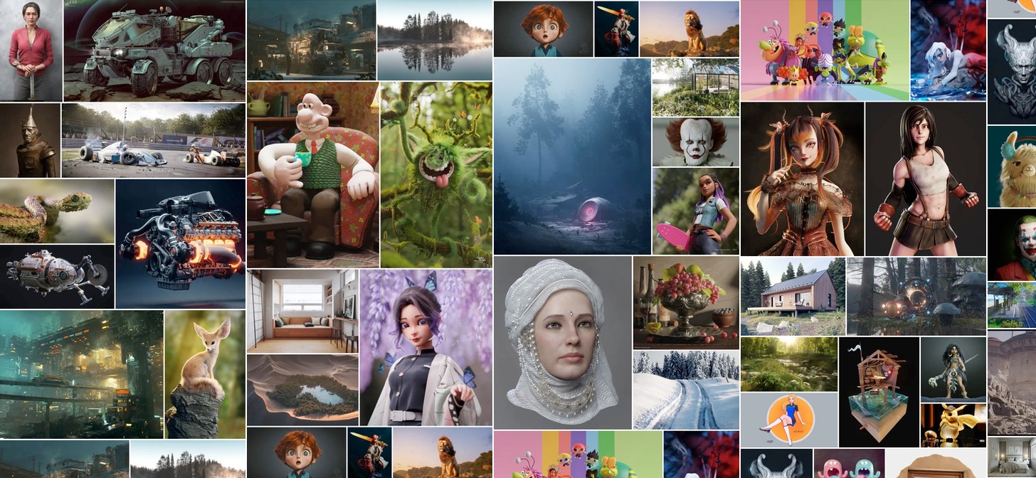
Here are some examples of digital art:

Year in Review: Best of Blender Artists, 2019 - BlenderNation

EVALUATION

I think digital art is more powerful than physical art as it is more modern and up to date with new technology, this means that there is more potential with digital art, as there are no limits. However, physical art has elements that digital art cannot possess, such as, emotion in the brush’s strokes and the texture, this is because digital art is mostly displayed on a screen, until holograms get better.

MY OWN NFT

I made some digital art, in a 3D software called Blender then used Photoshop to adjust the colours and other elements. After I minted and listed it on to a NFT market place called Foundation.

This the link to it: LOST

Summer Project – Surfing Community

I chose to photograph the surfing community because I surf myself, and because we live on an island most other people do as well. And, I feel that the surfing community isn’t captured a lot in Jersey, so I thought I will capture it in about 10 photos.

Technically, there are two side to surfing based on the board, short boarders and long boarders. I an mostly involved with long boarding as its what I learn on years ago.

PHOTOSHOOTS

Since there are so many variables to photographing surfers, it was hard to arrange and plan what time and what day. It had to be sunny; as it makes the shot look cleaner, as there would be better light. Plus, it had to be good swell, as most people go surfing when its 2ft plus. Both the weather and swell statistics can only be seen accurately a week in advance, which made it harder to plan shots, so I just went when it the time was right.

Shoot 1 – Kempt Tower

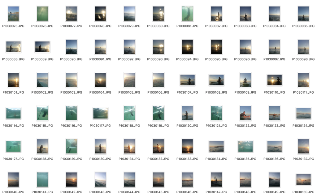
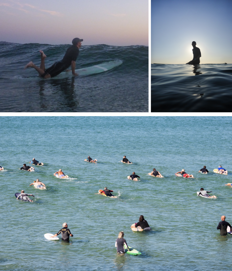
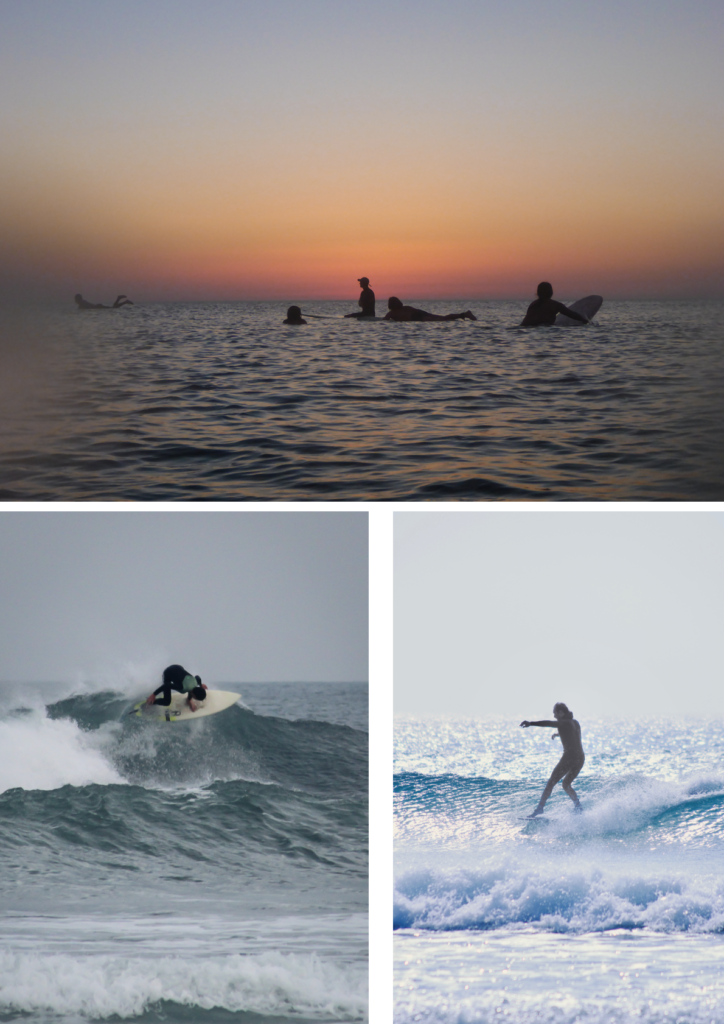
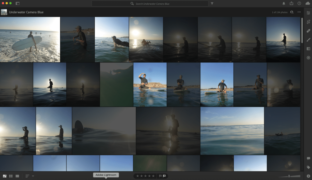
I went into the water with a waterproof camera and also a GoPro with a dome on to get 50/50 shots. I went in the evening, just before the sunset. The waves were really small, but it was a good time to take pictures of people sitting on their boards. It would be a closer insight into what it is like out back.

Shoot 2 – Water Splash, Connie Farmer Ceremony

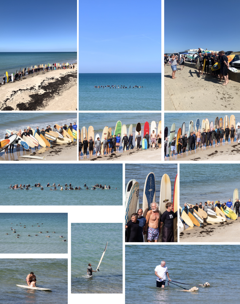
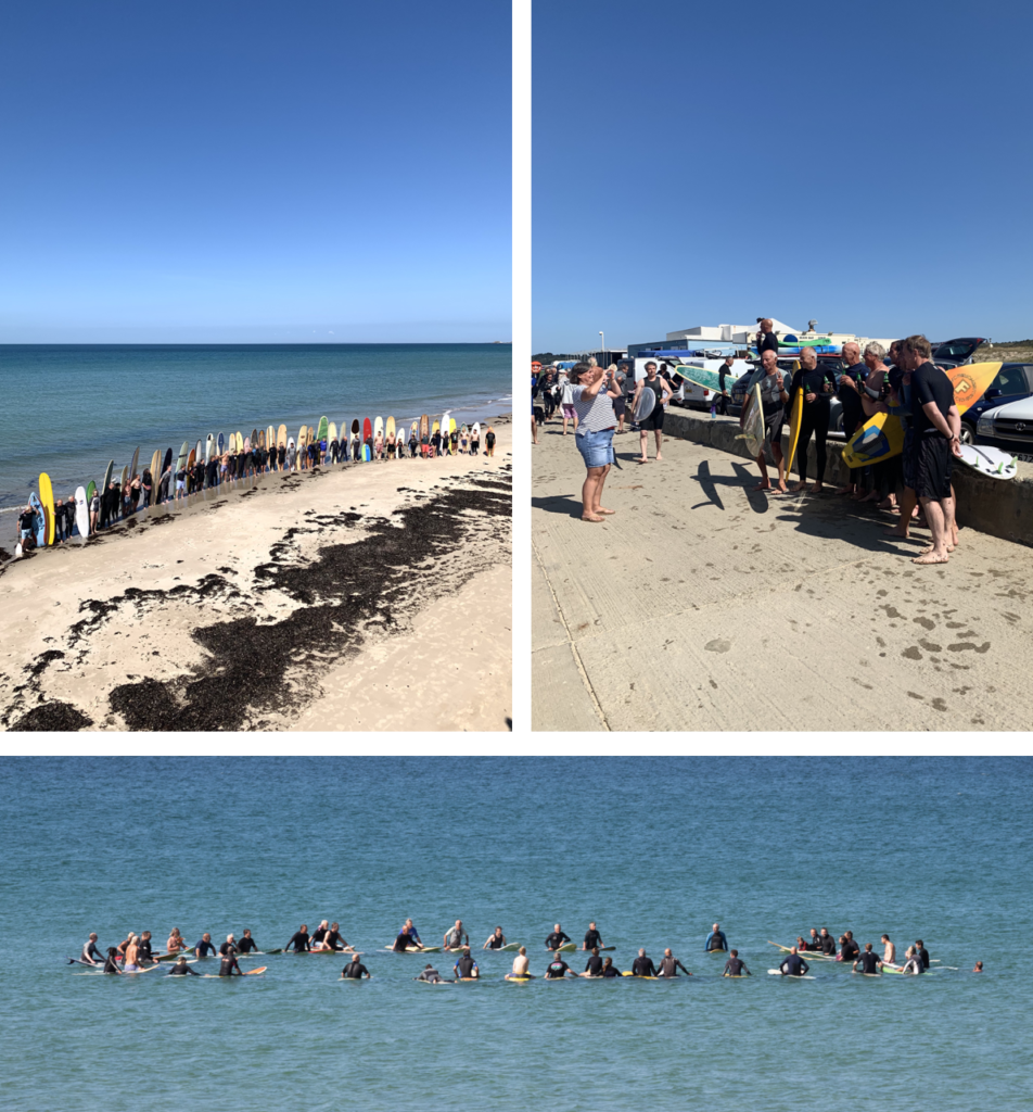
I was told that there was a paddle out ceremony, for Connie Farmer, who was a surfer in Jersey, which most the older people knew, and he was a really good surfer, and very athletic who passed away. So I captured the paddle out ceremony from the sea wall. They paddled out about 100 metres and made a circle to scatter his ashes. It shows the other side of the surfing community, and it shows how everyone is so supportive and respectful to each other, and it was great to see everyone come together.

Shoot 3 – Le Port + Shoot 4 (re-visited)

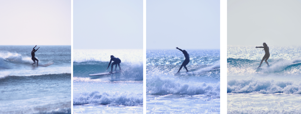
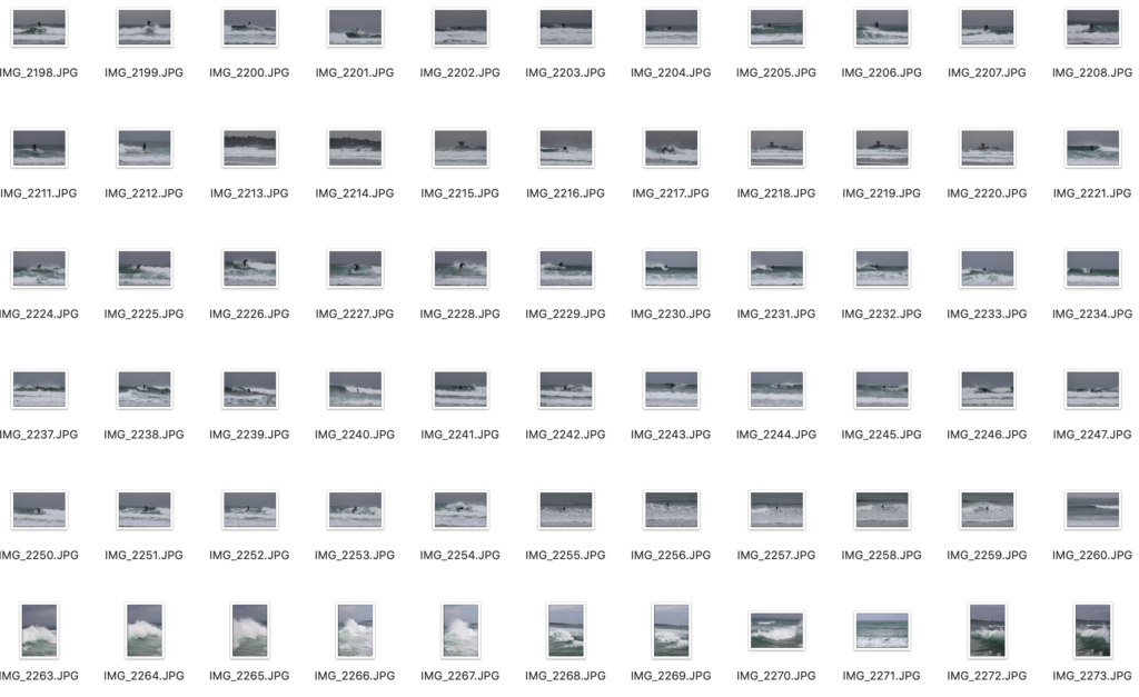
Le Port is always busy when the surf is good. So I decided to go there when the surf was good. I went down to the waters-edge and used a 100-300mm lens to capture the surfers riding the waves. Also, when the tide came up I went up on the sea wall, which gave me a better vantage point where I could see over the waves better.

I came to revisit Le Port and get more photos to have a better selection. Most the photos of fast action sports are blurry, I found 1 in 10 were not great. Which, is one of the main reasons I wanted to go back.

EDITING PROCESS

I used the same editing process for all the images. I used Adobe Lightroom CC, and used the Z and X to pick and refuse images. Then I edited all good ones, then exported them.

All I edited was contrast, saturation, clarity and, dehaze. Most the images didn’t need much editing don’t as I shot them in good lighting and used the right settings. Then exported them.

SHOOT RESULTS

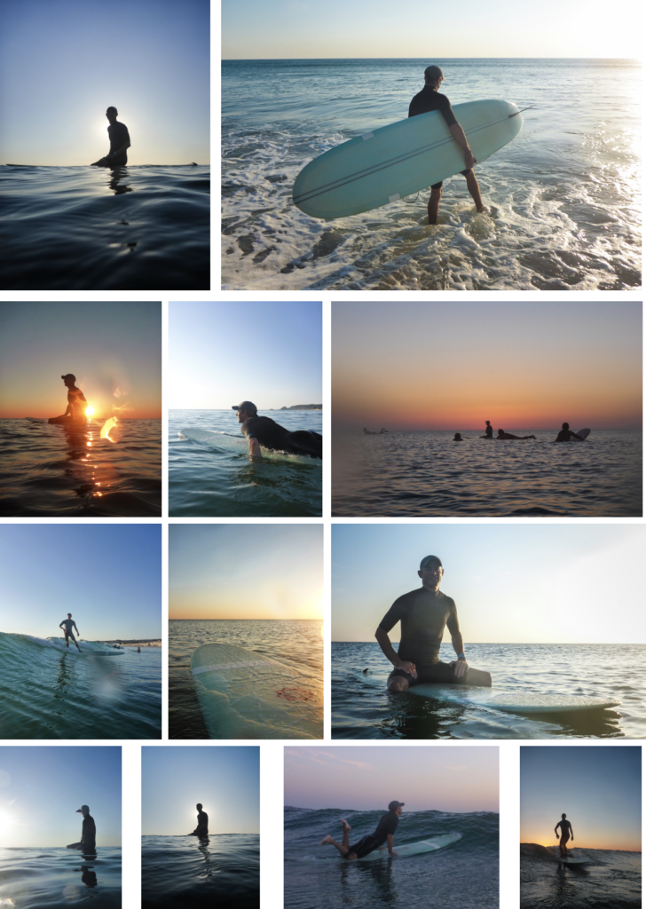
Shot 1 – All these images turned out good. there is a variety of daylight images and sunset images, since I took them before sunset. They have a greater insight into surfing as it shows what it is like to take part.

Shoot 2 – I managed to get some good compositions, this was mainly as I was higher than everyone and I used a good zoom lens to frame the shot how I wanted to, instead of limiting myself to 55mm. Which, is the usual average lens maximum zoom.

Shoot 3 – These were shot on a cloudy day, which wasn’t ideal. However, the swell was decent, which meant there were more people to photograph, and made for some more dynamic shots.

Revisited shoot 3 – I revisited shoot 3, to try and get some shots when it was sunny. However, they turned out more blue, but I did get some more good action shots.

THE BEST SHOTS

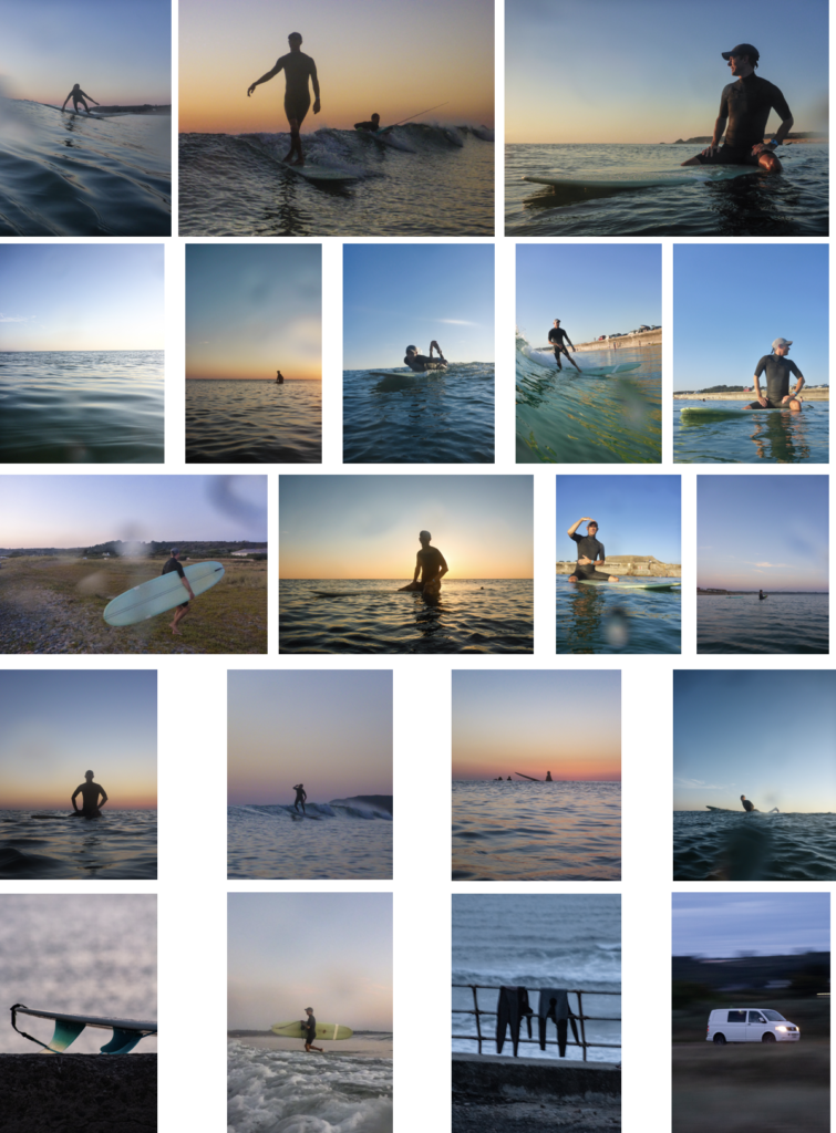
The story of these images shows the process in order of what happens when you go surfing. First, you paddle out, then sit on you’re board until a wave comes. Then it goes to the shots when people were getting out the water, and some wetsuit hanging up. The end shots give a strong ending to the image sequence, as it shows how the surfing community comes together in important times.

EVALUATION

Overall, I am pleased with the outcome of all the images. The only thing I would change is that, I would of gone to do shoot 1 when there were bigger waves so the shots would look more intense.

To develop my images further, I would try to capture more of the community aspect in greater detail, even thought I captured a strong insight into the community, since a iconic member passed away. As I felt I captured the journey and fun side of surfing more than the community side.