Here is the link the the online version of my photobook, Bouley Bay – by Matthew Brown
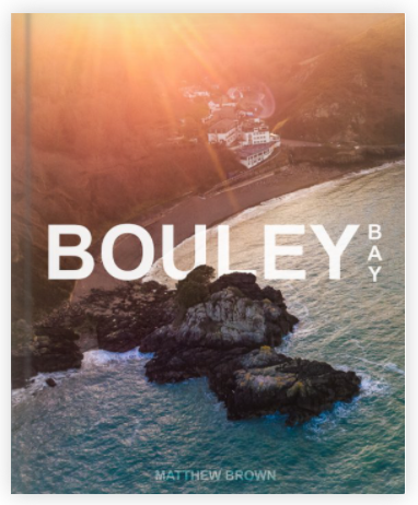
Here is the link the the online version of my photobook, Bouley Bay – by Matthew Brown

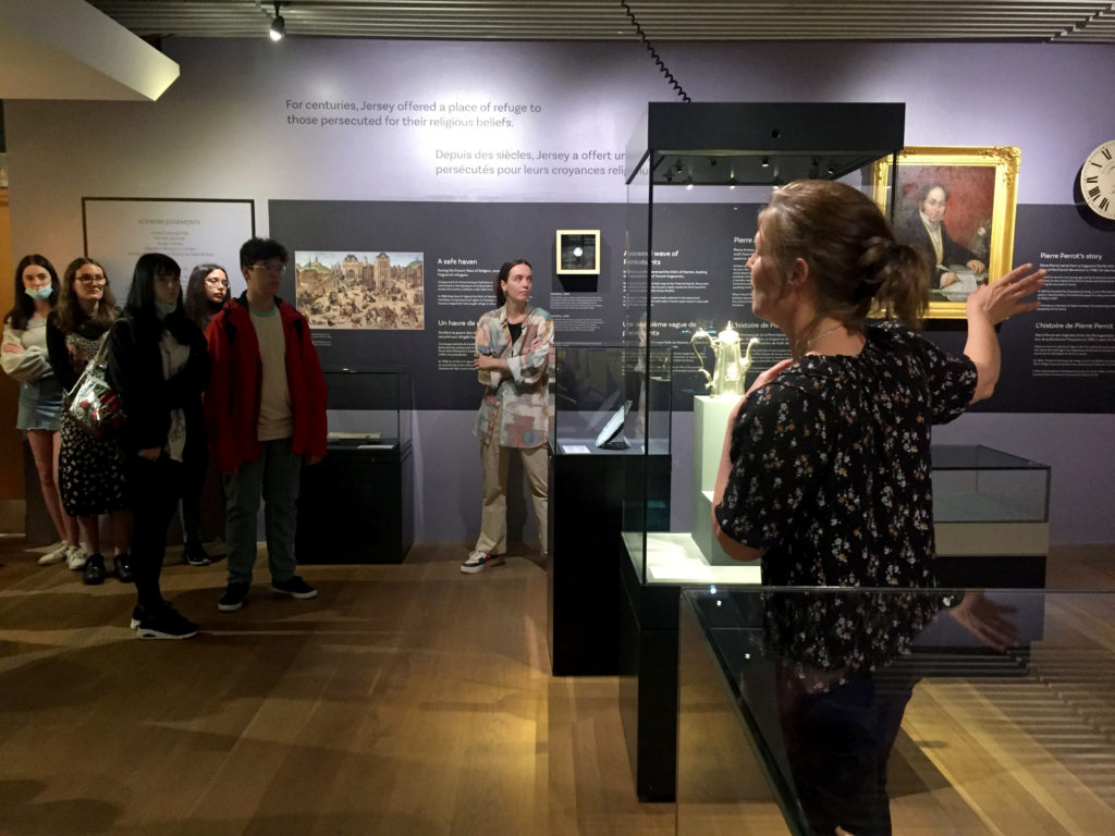
The images seen on the pages of this newspaper supplement are extracted from a variety of projects and final outcomes produced over a two-year academic programme of study by a group of A-Level photography students at Hautlieu School. In their final year the themes of Identity and Community offered a specific focus and through a series of creative challenges students developed a body of work that were inspired, partly from visiting heritage institutions to learn about aspects of Jersey’s unique history of immigration and exploring migrant communities and neighbourhoods in St Helier in a series of photo-walks. In the classroom additional inspiration was provided from workshops on NFTs (non-fungible token) and digital art, embroidery and textile art, animation and film-making, zine and photobook design led by professional artists, designers and teachers.
As part of the research and contextual studies students were asked to engage with some of the key questions raised by the Government of Jersey’s Island Identity project and explore through their own photographic studies how they interpret and identify distinctive qualities of island life. What can we learn from looking at a set of photographs produced by young islanders? At first sight they show us a seemingly random set of images of places, people and objects – some familiar, others surprising. On closer inspection each image is a visual sign and also a conundrum. For example, a fish stuffed in a plastic bottle may ask us to consider more closely our marine environment, commercial fishing or food consumption. As a combined sequence of images they represent different views that in many ways comment on a wider discussion on some of the primary objectives explored in the Island Identity project, such as ‘how we see ourselves’ and ‘how others see us.’
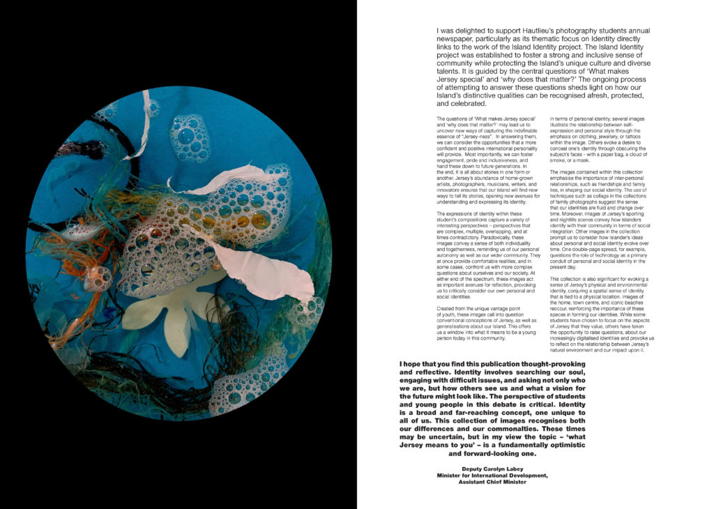
The newspaper was kindly sponsored by Deputy Carolyn Labey, Minister for International Development and Assistant Chief Minister who in her foreword shares her personal thoughts on what makes Jersey special to her in context of the Island Identity project led by her department. She says, ‘identity involves searching our soul, engaging with difficult issues, and asking not only who we are, but how others see us and what a vision for the future might look like. The perspective of students and young people in this debate is critical. Identity is a broad and far-reaching concept, one unique to all of us. This collection of images recognises both our differences and our commonalties. These times may be uncertain, but in my view the topic – ‘what Jersey means to you’ – is a fundamentally optimistic and forward-looking one.’


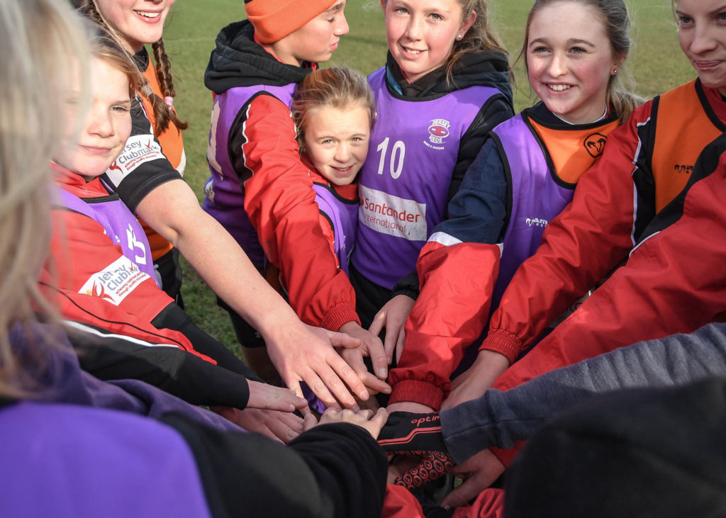
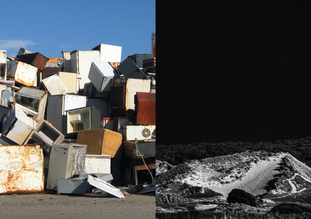
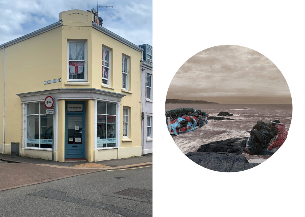


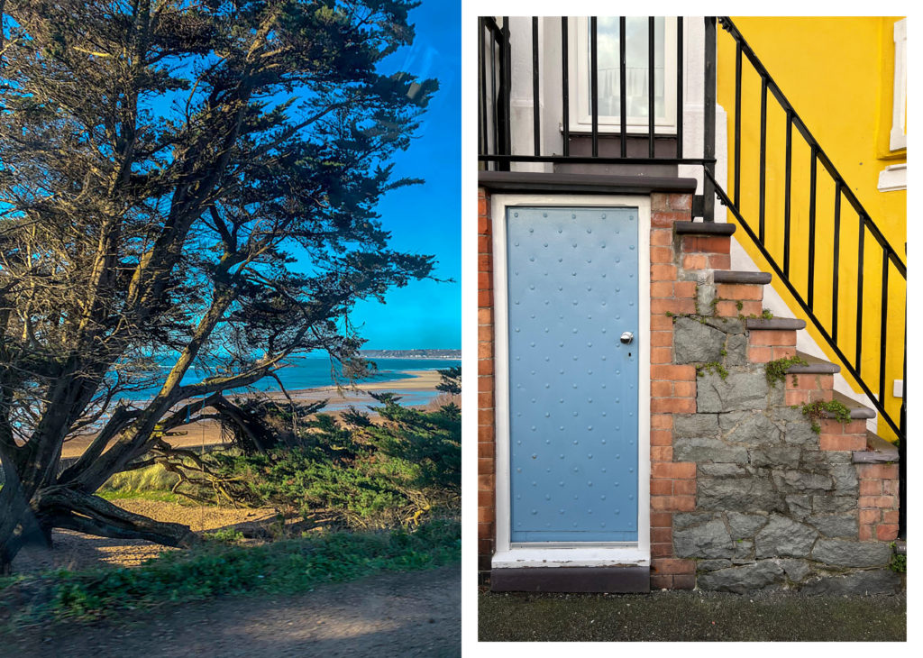


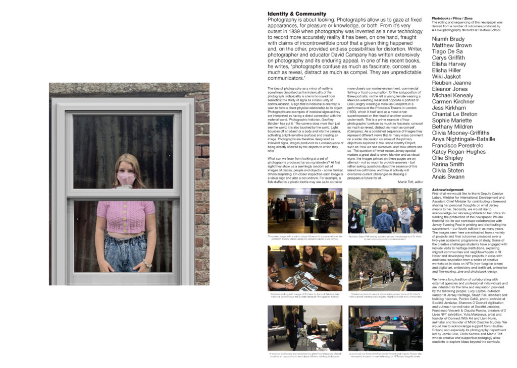
The Identity and Community newspaper is the fourth supplement produced in collaboration between Hautlieu School Photography Department and Jersey Evening Post. In 2018 the first issue was The Future of St Helier and last year the themes of Love & Rebellion explored experiences of isolation and lockdown during the coronavirus pandemic. Photographer and teacher Martin Toft, comments: ‘The question of ‘what makes Jersey special’ matters a great deal to every islander and as visual signs, the images printed on these pages are an attempt – not so much to provide answers – but rather asking questions about the essence of this island we call home, and how it actively will overcome current challenges in shaping a prosperous future for all.’
My featured images:

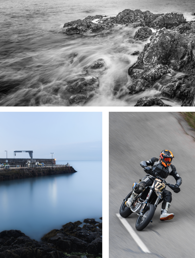
My images are used on the front and back cover, which I am happy about even though there is text and a watermark over it, and it is still visually strong.

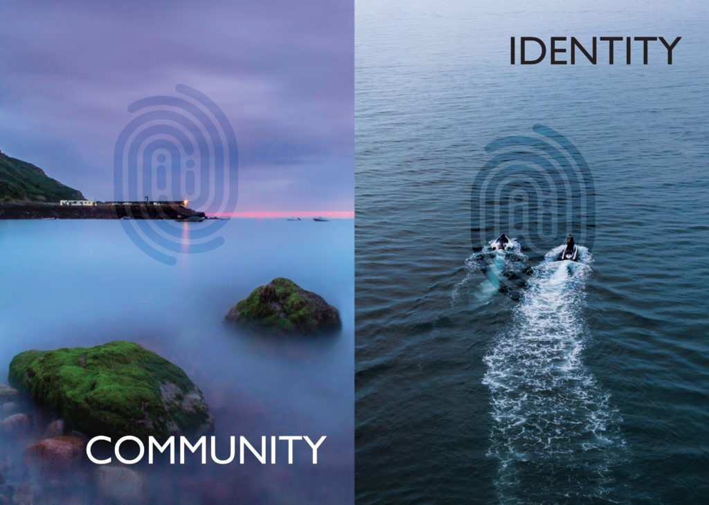
This is a double page spread containing my images, they contrast each other which is why they are displayed next to each other.

The two images above are used to contrast other students work.
Overall, I am happy with the amount of work I have in the newspaper.
I wanted to select a group of images that I used in my portfolio, which I made in my own time, so that I could print and mount some of the images.
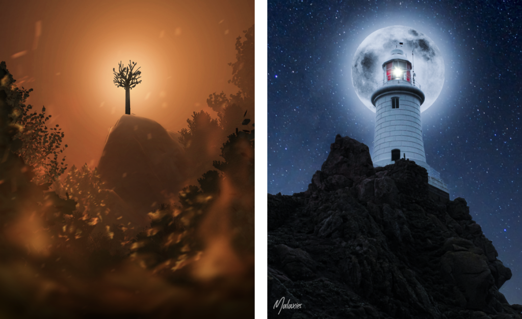
Firstly, I would like to print these 2 examples of my graphic design skills. For the image on the left I used Blender (3D modelling software) and Photoshop, it was the image that I entered into the Eco Active Competition about climate change. For the right image, I made it in Photoshop and is a strong example of photo manipulation using 3 images.
Firstly, I would like to print these 2 examples of my graphic design skills. For the image on the left I used Blender (3D modelling software) and Photoshop, it was the image that I entered into the Eco Active Competition about climate change. For the right image, I made it in Photoshop and is a strong example of photo manipulation using 3 images.
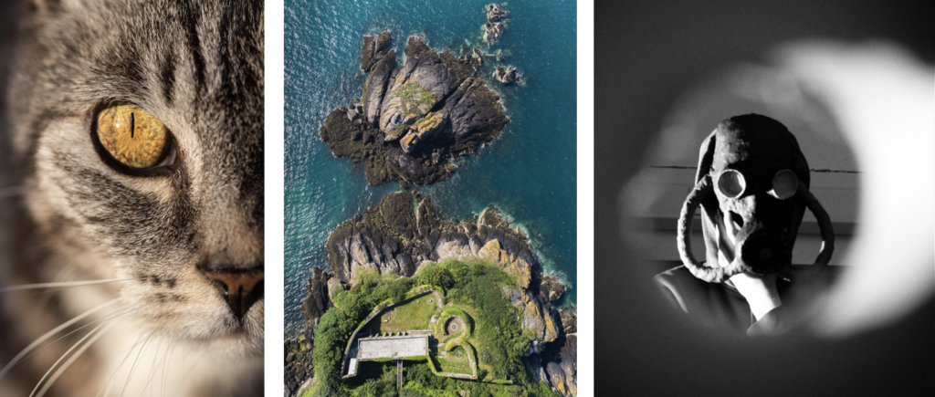
Secondly, I would like to print these 2 images from my Portfolio, as they are my favourite images from it.
The image of the cat I shot during ‘golden hour’ which gave the eye, the central focal point, a vivid golden effect that emphasises the detail of the cat’s iris. I used a macro lens to get really close to the subject. This created more attention to the eye positioned in the centre of the image, and created a slight soften blur to the nose, whiskers, and the mouth. However it still maintains the detail of the hair and the pattern of the cat.
For the aerial image, I used my drone, a DJI Mavic Mini 2, to fly above L’Etacquerel Fort, one of the many Heritage sites in Jersey. The photo was taken from the cliff path, at a height of 120 metres. I boosted the greens and blues to get a more natural look to the environment. I feel this image works well as the curved lines in the architecture contrast the jagged cliff rocks, showing the footprint of the fort really well.
Finally, the mask mask photo, I wanted to create an old, World War 2 atmosphere. In order to do this I took the shot through a cardboard tube with a ripped end, which created a frame around the subject which gives the appearance that the subject is inside a room and you are on the outside of the door looking in through a peephole.
My online Portfolio on Behance: https://www.behance.net/MatthewBrownPhotos
Personation (Virtual Gallery)
To showcase my images I will make a virtual gallery in Photoshop, so that it looks like my images have been displayed in an actual gallery.
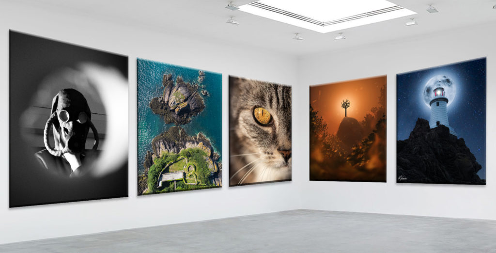
I used CTRL-T to warp the image so that the top and bottom edges of the photo are parallel to the the floor and ceiling. After all the images matched the perspective of the gallery I used blending options to make the images look real and 3D, such as, bevel and emboss and, drop shadow.

Overall, I think that these extra images help display my photographic and post production abilities and therefore the main reason which I wanted to include them in the next print job.
NFT Project Image
I also wanted to include the poster image from the NFT project, which looks like this:
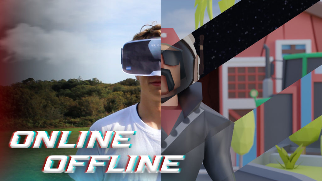
I used the same technique to make a gallery in Photoshop, by using bevel and emboss and drop shadow.
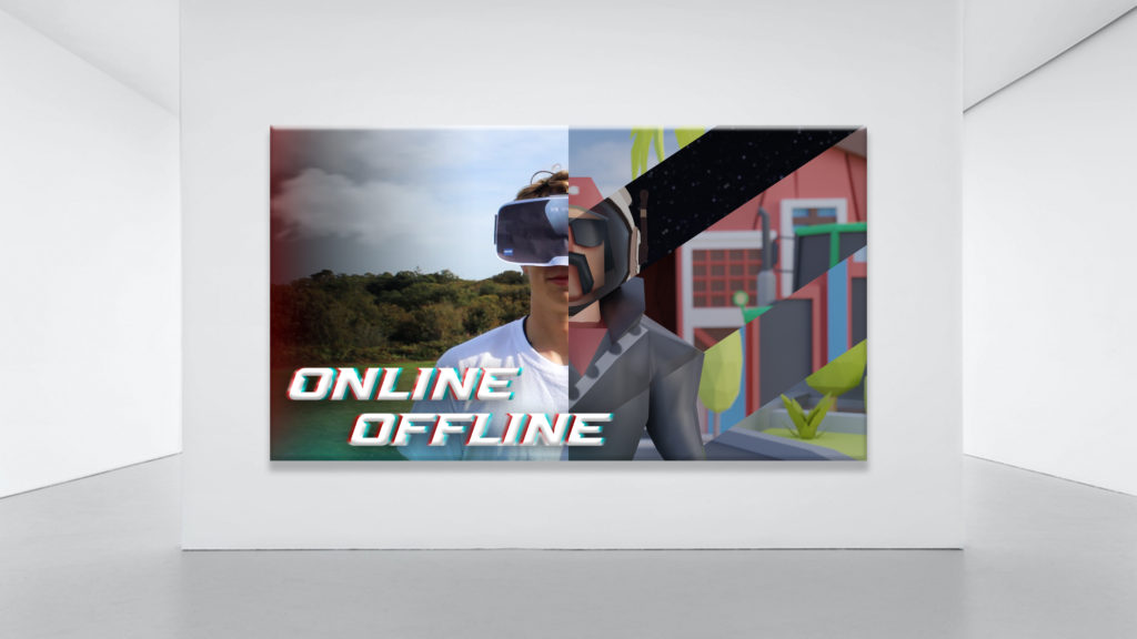
It will be printed A3 unless the quality is bad as its 2560 × 1440 pixels. If it can’t be printed A3 then A4 is ok.
To decide the images that I wanted to print and mount, I used my photo book and picked my favourite images. I would also decide an additional 5 images from my Portfolio that I would print.


In total there are 7 images in the book that I would like printed. I chose them as they stand out and demonstrate great camera skills. I feel that they represent the photo book very well as they are the best ones from it, however they don’t take the value away from the book as it have created contrast and juxtaposed some of the images by paring them with objects and other different images.
Presentation (Virtual Gallery)
To showcase my images I will make a virtual gallery in Photoshop, so that it looks like my images have been displayed in an actual gallery.
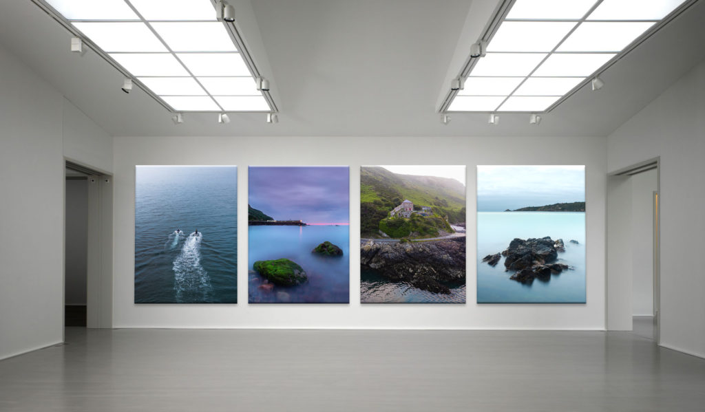
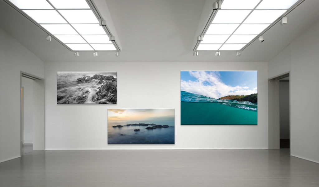
After postponing the images where I wanted them, I used blending options to make the images look real and 3D, such as, bevel and emboss and, drop shadow.

Overall, I am happy with my selection of images to print as they are my strongest images from my most recent project.
Printing
These are the images that I decided to print A4:

These are the images that I’m printing A3:

I took all the photos that I wanted to use and, that I have already edited from the photoshoots in Photoshop, then I created a new collection set in Lightroom Classic to import the photos into.
The editing process is shown on the photoshoots blog posts.
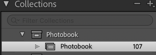
After importing the photos into the photo-book collection I used the “pick” and “reject” method using the “P” and “X” keys.
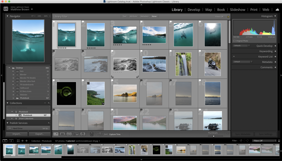
Next, I used the different colours to visualise what type of photo each image was, e.g. aerial (yellow), underwater (blue), hillclimb (green), etc.
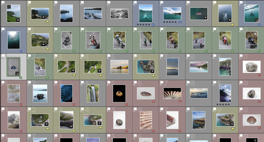
These are all of the images that I plan to use in the final book design.
My Book Specifications
Before I design the book I need to decide the specifications and think about the design.
This is information about how I will make the book and about the materials and requirements it needs.
How you want your book to look and feel.
Ideally, a hardback book would be nicer as it has a more genuine feel to it, and it lasts longer. However, it is more expensive compared to a regular, softback book.
Paper and ink
The premium paper will make the images better and isn’t to different to the standard paper, price wise.
Format, size and orientation
I will use a normal A4 book. (8×10 in)
Binding and cover
I will use a hardcover with an image wrap, with Mohawk proPhoto Pearl 140#.
Title
Bouley Bay
Design and layout
Editing and sequencing
I will try and create a zoom effect with the images and use certain objects to carry to flow of the book.
Images and text
There won’t be any text except for the essay at the back of the book.
2. Produce a mood-board of design ideas for inspiration. Look at BLURB online book making website, photo books from photographers or see previous books produced by Hautlieu students on the table in class.
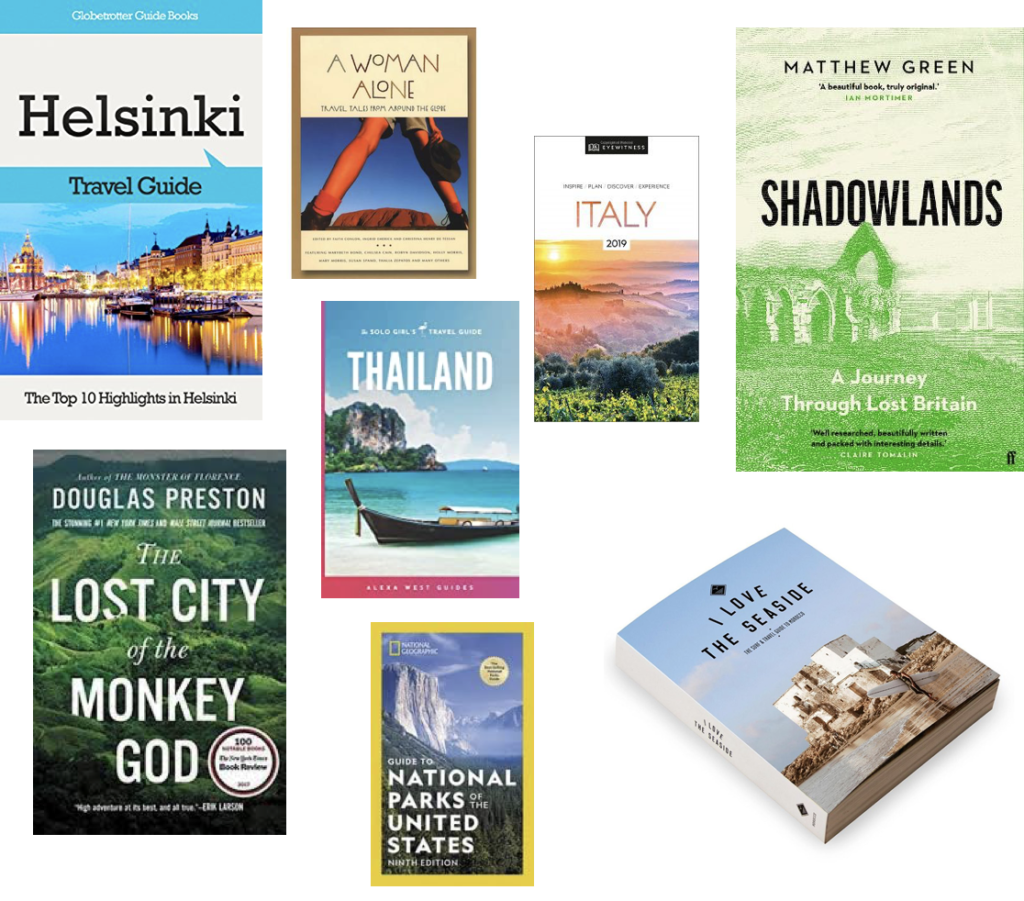
This is a mood board of books that have inspired my design process. I found them Blurb’s bookshop page on their website.
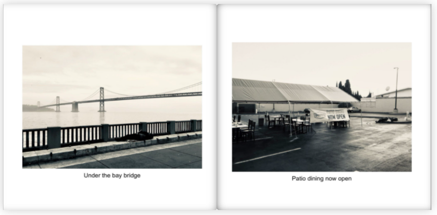
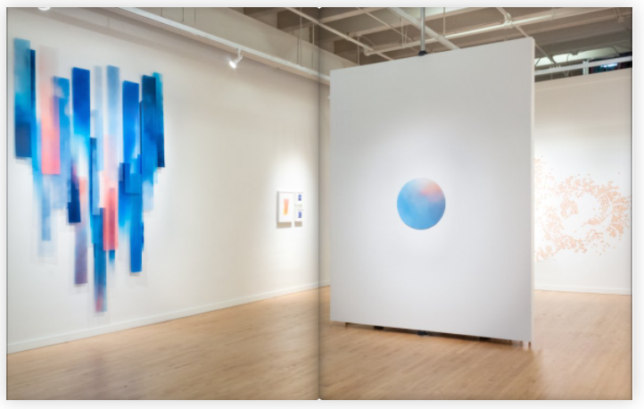
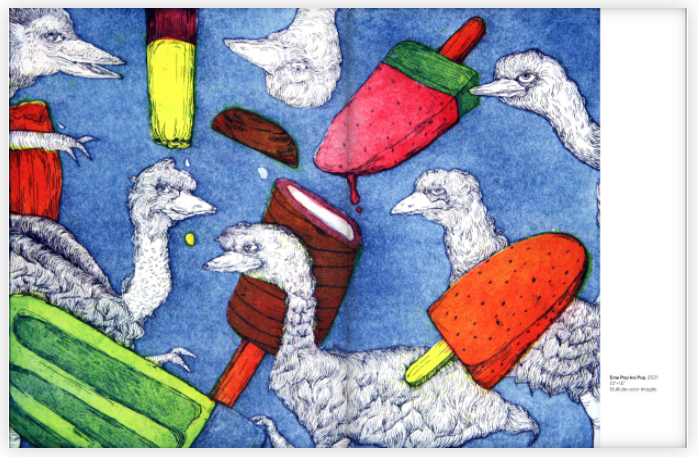
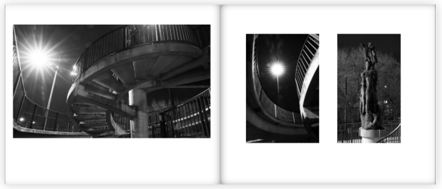
I mostly chose these pages from these books as the display the images in a unique way that engages with the user.
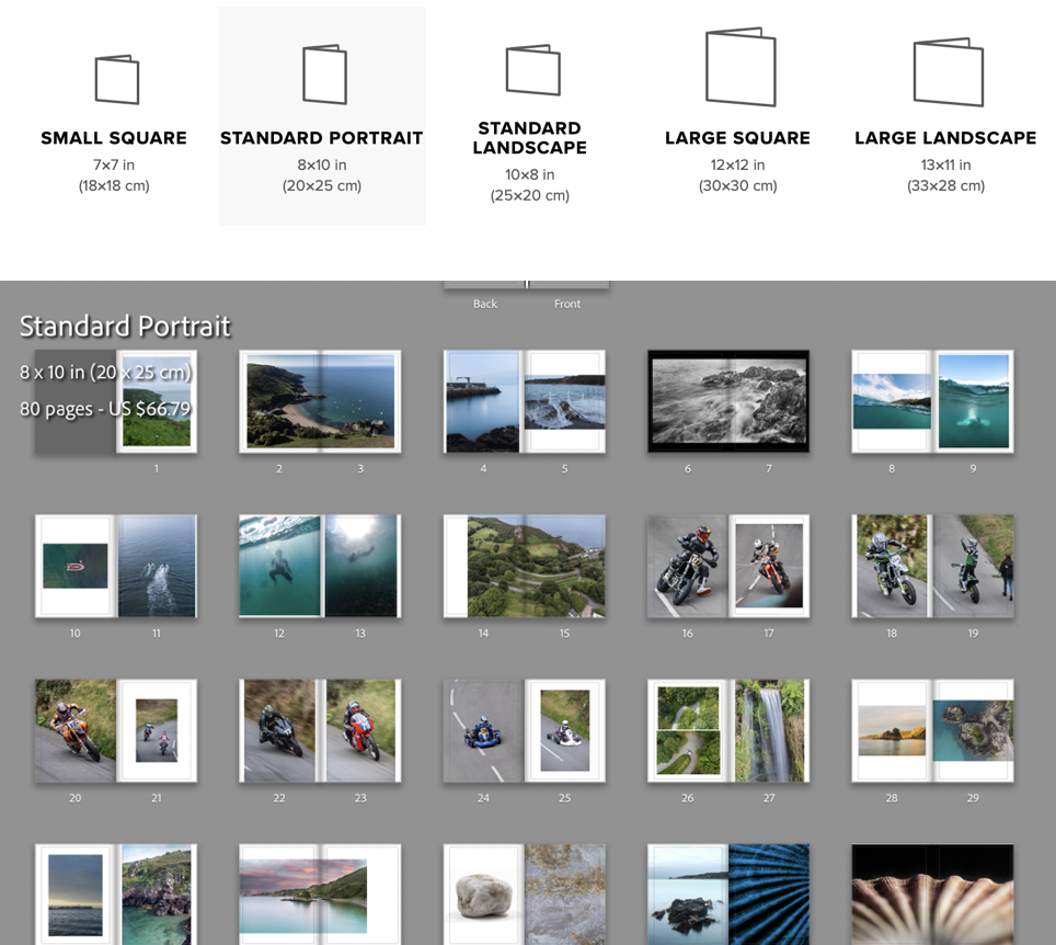
I reorganised the order which I the photos would be in, in the photo-book. Then I clicked the book button where I chose to use the “Standard Portrait” book, then put the images in the order that looked the best.
I made use of the page setups to arrange the images to create an interesting composition. I mainly had two images on the double page spread and, they either linked with each other or were opposites.
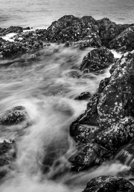
To create a narrative I tried to create a zoom effect. I started by getting images that where of a general overview of the bay, then I focused on the pier, the water coming on to the pier, then I focused on the long exposure shots of the water on the rocks, which transitions to underwater photos. Once there is a brief introduction to the bay there it focuses on the hill climb which brings in the areas “character”. After I introduce the bay again by using the greens hill and the green around the waterfall in the bay, which shifts the focus back to the bays features like the L’Islet, and the heritage site. I often compared close ups of objects and match colours to create an interesting concept and presentation.
My favourite images are these below, I chose them as they are unique and interesting, and showcase great camera skills.
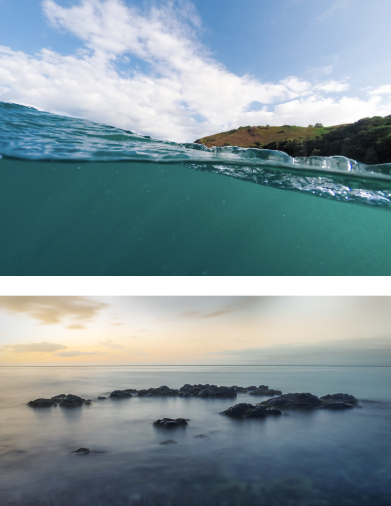
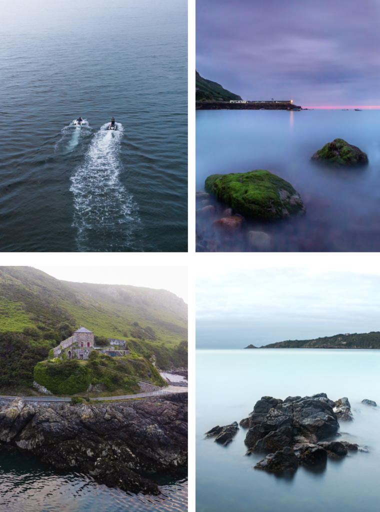
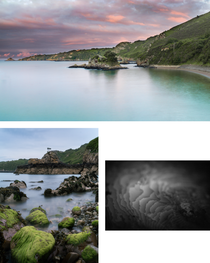
I achieved my goal, which was to accurately recorded a physical location through images. These images above are the strongest images I have taken which help showcase the environment that is Bouley Bay.
Unfortunately, I deleted all of my work, which meant the pervious book design disappeared. Therefore, I had to redesign the book, which isn’t necessarily a bad thing a I had too many images. This helped me reduce the size of the book and add more contrast, as the pervious version was more illustrative.
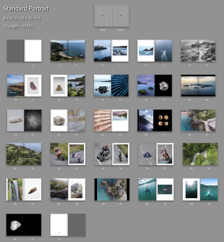
This result is more balanced as there is a greater mix of content and I feel that I have used a wide range of different page layouts to shift the viewers focus whilst looking a different images. My favourite pages are, 8-9, 14-15, 16-17, and 32-33.
I decided to add 2 more images. One would be a 2 page spread using full bleed and, then second would be a single image, which would probably be on a double page however, it would only use up one page. I plan to do this to a few more images earlier on in the book and eliminate some of my weaker images.
Creating the book cover
I decided to use an image that had a wide view of the bay which clearly shows where and what the book is about. I am using the image from the extra photoshoot I made with my drone. For the back of the book I wanted to have an abstract image where it is hard to work out where it was taken. Doing this makes lets the front cover have all of the attention. These are the two images I’m using for the book cover:
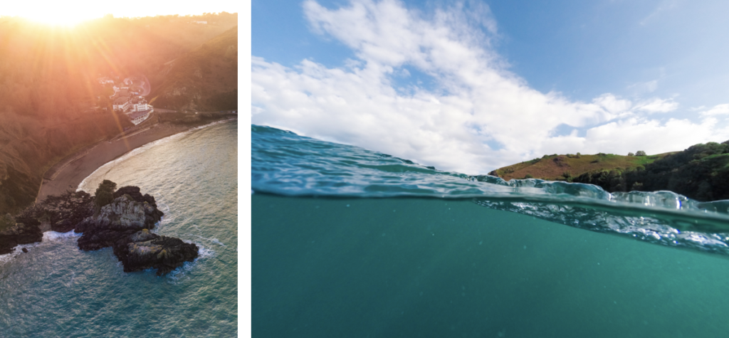
I needed to create a design for the spine, I thought I would blend the edges of the two images above to create a fade between them. After, I would add text to the front cover, and the spine.
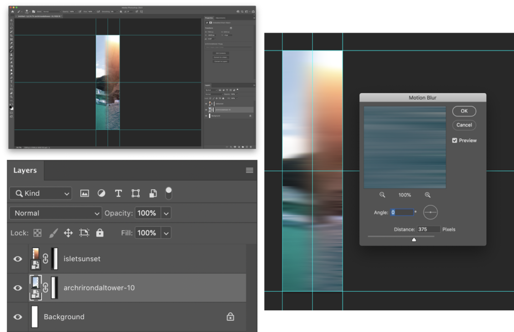
I used layer masks to create a gradient fade on the edges that meet with the opposite image. Then used motion blur to smoothen the transition between the images. This will look better when I add the text to the image.
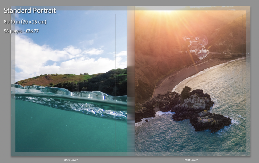
This is what it looks like without the text on the cover. As you can see it looks good, even without the text.
I have created a mood-board to gather inspiration on books about places to decide how to design a title. These are the designs that inspired me:
Using Photoshop I have made 3 different front cover designs, and just needed to chose with one I wanted to use. I used clipping and laying masks to help me design and layout my process throughout creating the cover.
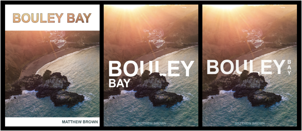
I decided to use the design on the right as it is more ascetically pleasing than the others as, it is on one line and incorporates a more complex design whilst keeping it simple.
The design on the right I used blending option on the text such as, stroke and inner shadow, with a clipping mask of the image to let the image show through.
For the two similar covers, I used a layer mask to remove parts of the text to show the island, to give the simple look and complex effect.
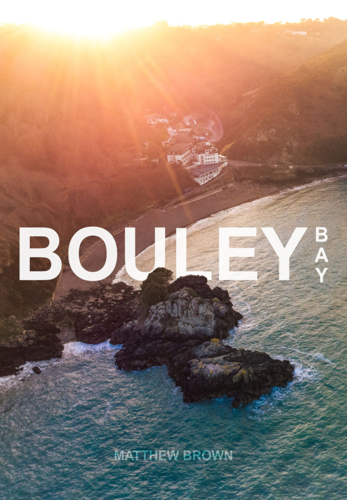
I changed a few small details, such as moving the text up a bit. Then I added and replaced the image on the front of my book and on the spine to see what it looked like completed.
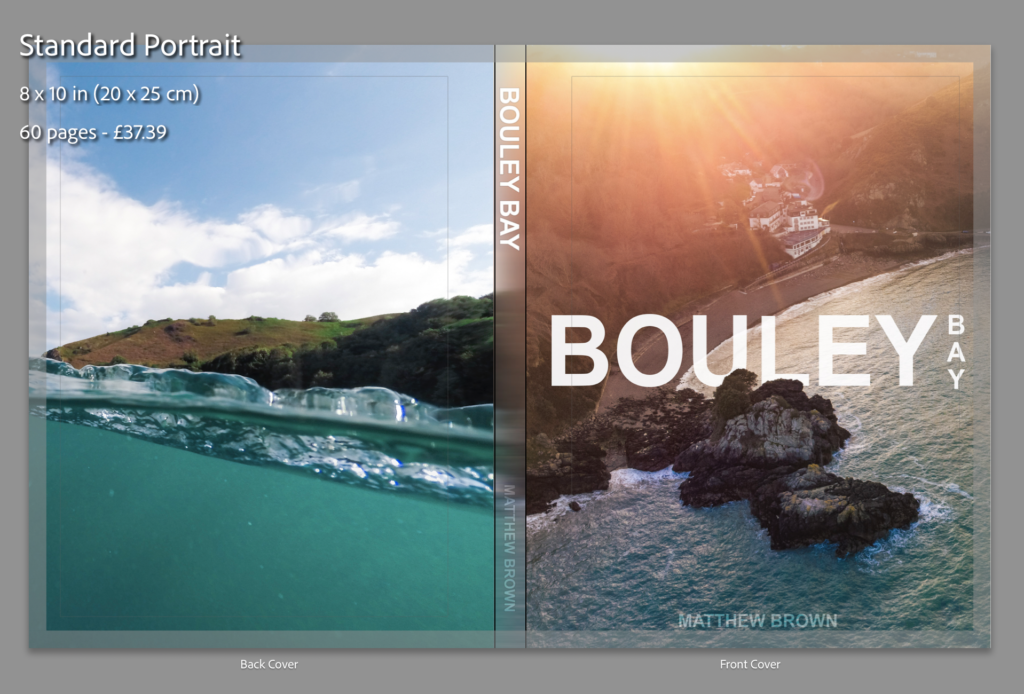
I added the text to the 2 files (spine image and front cover image) that I had open in Photoshop to my the final cover images.
I quickly made an inside cover page with just text on, which is the same as on the front cover.
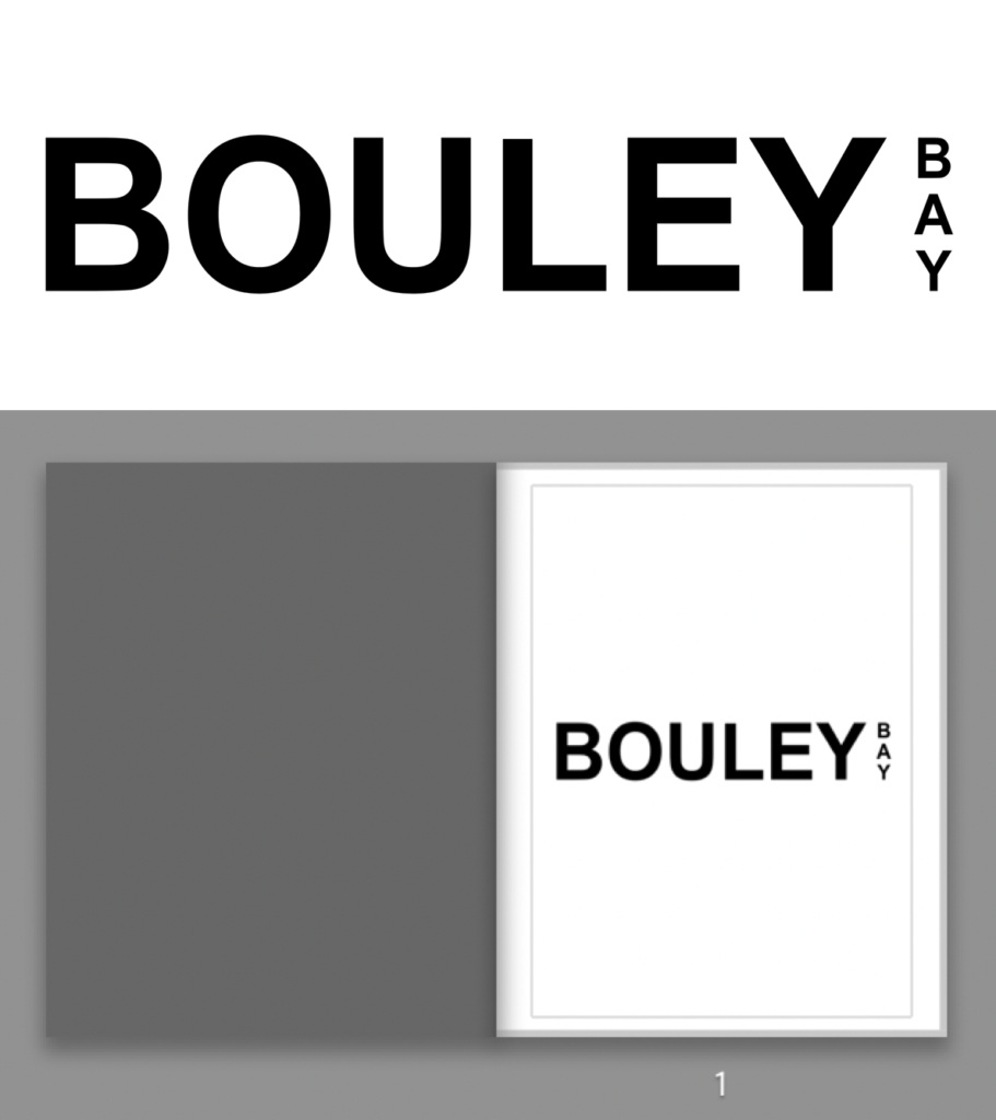
Final design and layout
These are the rest of the pages in my photo book:
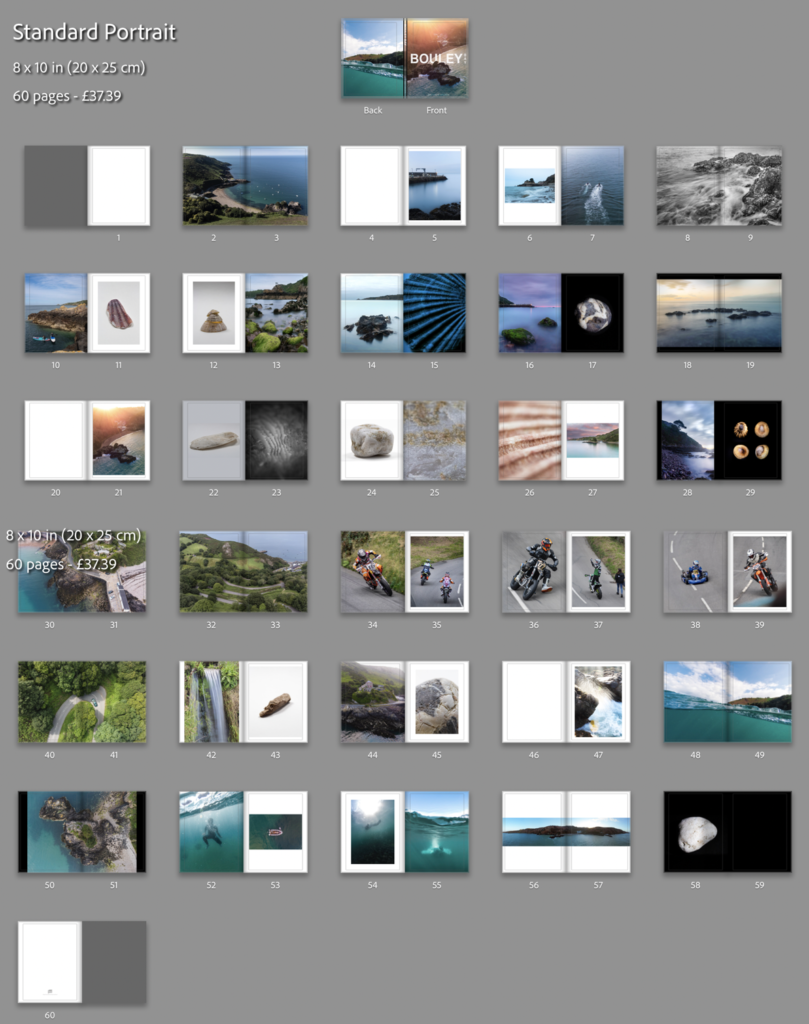
After some last small adjustments, I’ve come to my final presentation of the photo book. I removed the panorama of the bay, the image on page 54 (underwater image), and I change the bleed on some of the images to removed some of the borders, you can see the before (above) and after (below) of the changes that I’ve done.
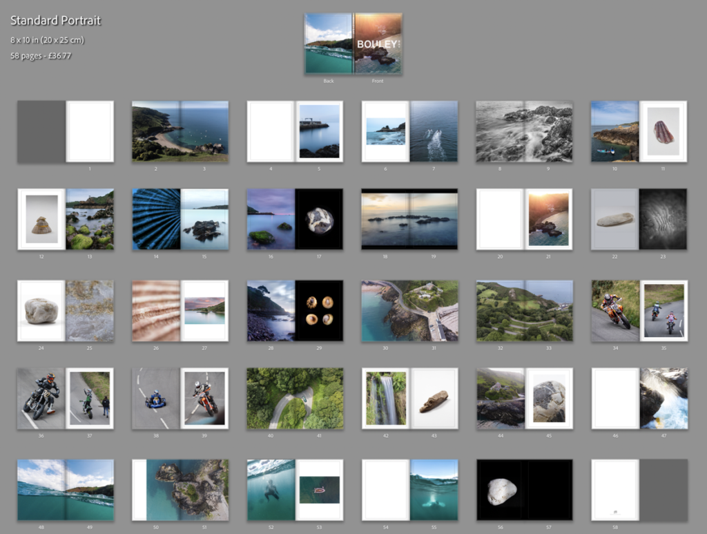
I feel that this is the best design and layout, as it includes multiple double page spreads, 2 image layouts with borders, full bleed pages and single page spreads. I decide not to add my essay into the back of the book as I feel that it would ruin the “professional” look.
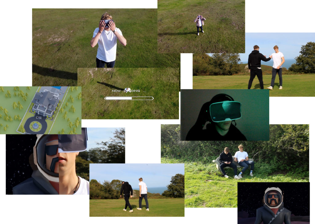
I plan to use 4-8 images which strongly summarise my work. Mainly from my recent project of Bouley Bay, the castle in the woods near Bouley Bay, and the two black and white photos from the Jersey Museum trip, of the staircase and the pigeons. And depending on how much space I have left I might include some screenshots of the NFT film.
These are the images that I plan to use:

They are all high definition which is needed to print in the newspaper. (The long edge must be 4000+ pixels)


To create the newspaper composition in InDesign. I used some the images above to make two pages of a newspaper
I made an InDesign document with the correct dimensions for a newspaper the imported the images into the area I selected with the x tool.


Above I have thought about a wide range of different design layouts which includes, one page full-bleed image (sunset at Bouley Bay), a sequence of images (multiple images of Bouley Bay), large scale image with a border (Hill Climb Motorcyclist), and a juxtaposition between two images (inside/outside town images).
After rethinking my design layout, I remade the pages so that the images were bigger and had more juxtaposition to create a stronger spread layout.


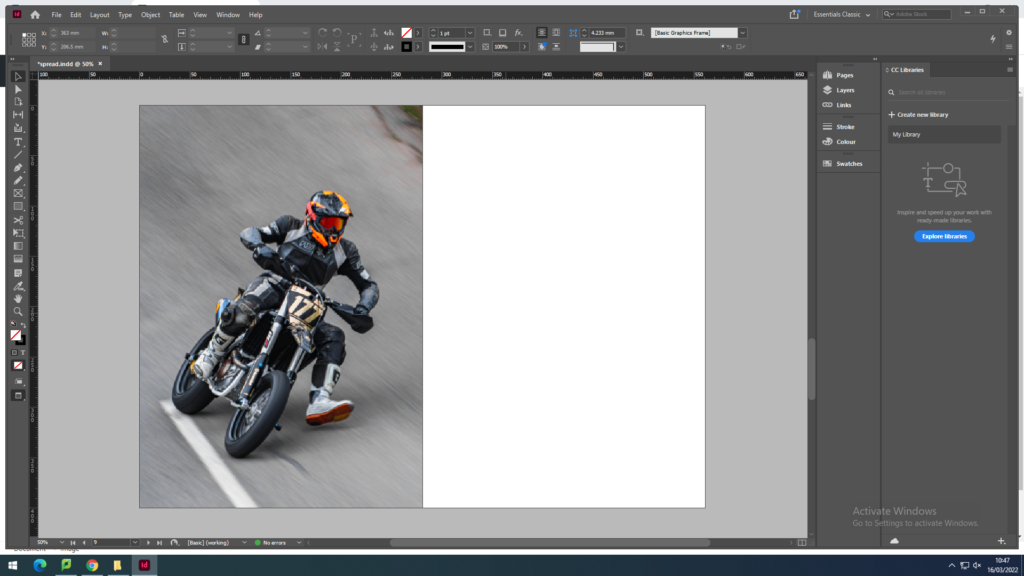
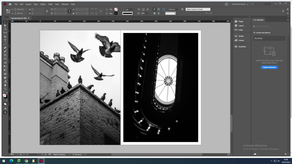
I removed one of the biker images, as it was too small because it was less then 4000 pixels on the long edge, so I replaced it with a rock to create a focus on the close up studio shoots I got of small features of Bouley Bay. I ended up contrasting it with a granite heritage building.
However, I still thought I could include more contrast between the landscapes and objects.


I felt that there was a good amount of varity and juxtaposition between my images.
So I decided to package the document and save it into the shared folder where the newspaper editor (Mr Toft) can access it.
The main reason I wanted to create another photo shoot was because I needed a strong image for the front cover. My plan was to get a wide drone shot of the whole bay mainly focusing on the L’Islet.
This is a contact sheet of all the images I got for the shoot:

These are my favourite images after images after editing:


The first image has the most potential for a front cover. Whereas, the panoramic photos would be good for a double page spread. There was a panoramic setting on the drone which I utilised. I add to merge them together in Photoshop using the merge feature to create one image. After, I used my normal editing techniques, which includes a camera-raw filter.

I edited all my images in Photoshoot after choosing what images I wanted to use by marking them with tags on my laptop. This image was a landscape, however I cropped it to make a more interesting composition and remove all of the distractions. Then a used a Camera-RAW filter to colour grade the image and do basic adjustments to contrast, temperature, and shadows. I also used 2 gradual filters to emphasis the orange form the sun and, blue for the water. I used a radial filter on the L’Islet to increase the shadows to that the L’Islet is more prominent.
Overall, this photoshoot was successful, as I got a good front cover image, however it can’t be a full wrap image only a front cover image. Although by doing this extra photoshoot I was able to produce an extra page in my photo-book. The final outcome was different to what I imagined in my head. I planned to go when it was high tide, sunny, and not windy or rainy. However after waiting a few weeks the conditions were never prefect so I decided to go during a mid tide and at sunset. This actually worked out better than I expected, as the orange and blue contrast is really strong and one of my favourite colour combinations.
This blog post is for the images that I took whilst on other photoshoots that don’t fit into the category of the shoot, and general images of Bouley Bay.

I think these two images fit in with the project, I really like how the right image shows the playful, fun aspect of the bay. Plus, the composition works well as the rocks create a good “frame” around the paddle boarders.
Bouley Bay Hill Climb
For these photos I used a 100-300mm telephoto lens to allow me to fill the frame with the subject. I used a technique called panning to create motion blur.
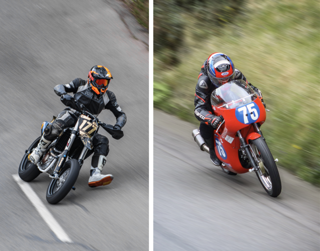
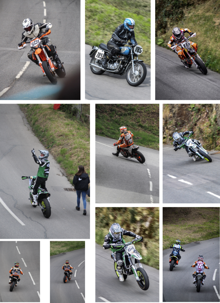
These are the best edited images that I produced during the photoshoot. I made this extra photoshoot so that I could introduce character of the are into the photo-book, as Bouley Bay Hill Climb is an event which most people in Jersey know about.
Overall, this photoshoot was very successful. I was able to produce strong images and I managed to capture a panning image, which I had to match the shutter speed to the speed of the bike, whilst doing a panning motion.
How can photography capture and explore an environment, and accurately record it’s atmosphere to a viewer?
Introduction
“I am interested in the influence of place, and the shape of it around us, as we follow in the footsteps of those who came before.” (anna-Katrina Jędrosz, Isle, 2019).
Environmental documentary photographer Hanna-Katrina Jędrosz said this is how she experienced and encountered a place. She is an influential photographer to my project as I’m studying the environment surrounding Bouley Bay in Jersey. I plan to investigate different features, like Fort Leicester, the Islet, and boats, and other elements of the bay through different methods of photography, such as long exposure, aerial photography, and minimalistic close ups in a studio. This location is especially important to me as I grew up in that area, and regularly went to the beach in the summer. There are many memories that brings cheerfulness, for-instance meeting my friends at the pontoon in the bay, and many barbeques in the hot summer evening. I know this area extremely well and is relishing the opportunity to explore it from different perspectives and viewpoints. Using a selection of photos I have produced, I plan to prove that using photography you can accu depict an environment in detail. I plan to look at photographers Hanna-Katrina Jędrosz and Robert Adams as they document landscape environments well in in a clear way that captures the area in detail. I am using historical context of the bay from the Societe Jersiaise, because they have images and in-depth information on the history of the bay, which I can use in my project to juxtapose time. There are a few links to my pervious projects, such as the Anthropocene project, and how I linked it to water pollution by capturing images around Bouley Bay, which I used to create a photo manipulation from in Photoshop. I have also taken photos at Bouley Bay in other projects, for example, long exposure of the mini waterfall, and a slow shutter speed of waves crashing on the rocks near the L’Islet. For my current project I would like to develop long exposure photography of the bay, and it’s smaller features, also aerial photography to capture unique angles that showcases the bay that aren’t accessible to the average beachgoer. It would be displayed via a photobook that consists of images of the bay, the history of the bay and, images relating to the bay. All of the images that I will use in the photobook I will edit them in Photoshop, mainly using the camera-raw filter as it works extremely will since I only shot in RAW which, produces a .CR2 image. This helps me bring back shadows, highlights, and colour in post production as there is greater dynamic range. Compared to a JPEG file which uses compressed data as there is less information in the image file, so recovering and editing the images is more challenging. The processes I use the most in Photoshop are gradual and radial filters, spot healing brushes, and the clone stamp tool.
Historical/ theoretical context within art, photography, visual and popular culture
There are four main art movements and isms in photography and, they are, Pictorialism, Realism/Straight Photography , Modernism, and Post-Modernism. I plan to look at modernism, creating images inspired by Robert Adams and, Ansel Adams.
Pictorialism
Firstly, pictorialism was most popular in the time period 1880-1920, and the goal of it was to make photographs look like art, and to make them look handmade. There were many methods of creating this effect. The main two ways were to rub Vaseline on the camera lens to blur parts of the picture. Scratch the negative, and use chemicals to create an interesting print, information from The Genius of Photography. (Archive, 2007). Alfred Stieglitz was later dubbed Hill “the father of pictorial photography” and featured his and Adamson’s photographs in his publications and at the Little Galleries of the Photo-Secession in 1906. (TheArtStory, 2018).
Realism and Straight Photography
Realism and Straight photography was effective approximately around the time period 1915, and its purpose was to use the photographic medium and it’s ability to provide accurate and descriptive records of the visual world, information from The Genius of Photography. (Archive, 2007). Gustave Courbet was the first artist to self-consciously proclaim and practice the realist aesthetic. After his huge canvas The Studio (1854–55) was rejected by the Exposition Universelle of 1855. (Britannica, 2020).
Modernism
Modernism is what relates to my project the most, and I what Robert Adams fits into, as he is most know for taking photos of the American West, which is the same objective that Ansel Adams had, who is considered the most important landscape photographer of the 20th century. (Britannica, 2020). Ansel Adams and Robert Adams are both environmentalists and use photography as a tool to highlight areas of the natural world that they care about. However, Ansel focuses his lens on the beauty of nature and he produces romanticised images, compared to Robert, who photographs the man-made world in the American West.
Modernism is characterised intellectually by a belief that science could save the world and that, through reason, a foundation of universal truths could be established. The common trend was to seek answers to fundamental questions about the nature of art and human experience. (The Genius of Photography, 2007). To get answers to their questions they would have to view the situation from a different angle, the quote sums it up nicely. “Our vision will be changed because we can see the world from unfamiliar viewpoints, for instance, thought a microscope, from the top of high buildings, from under the sea.” (Photography: A Critical Introduction, 1988: 19) This implies that by viewing the situation differently, there is a whole new way of thinking that introduces new ideas and new concepts, as it was a whole new notion, “modernism aimed to produce a new kind of world and new kinds of human beings to people it. The old world would be put under the spotlight of modern technology and the old evasions and concealments revealed.” (Photography: A Critical Introduction, 1988: 19). This is explains the changes in art movements and, how people are focusing on the future by putting the old movements behind them, however not completely forgetting them, which would help embrace the future and, what it holds.
Postmodernism
Finally, Postmodernism is the newest art movement and ism, and it has been in place since the second half of the 20th century. “Writers on postmodernism postulated the idea that modernity had run its course”. (Photography: A Critical Introduction, 1988: 21). Meaning that there was a new way of work, which allows new artist to take lead and express themselves.
Postmodernism is relativism, and it is the belief that no society or culture is more important than any other. It explores power and the way economic and social forces exert that power by shaping the identities of individuals and entire cultures. (The Genius of Photography, 2007). It gives everyone a fair chance as, “no longer governed by, so called, ‘grand’ or ‘master’ narratives.” ((Photography: A Critical Introduction, 1988: 21), which allows people to embrace the full chance of freedom, so they can create what they ideal.
There are many examples of post-modernistic art, however the most recognised founder of the Postmodernism movement is Jacques Lacan, who was a prominent French psychoanalyst and theorist. His ideas had a huge impact on critical theory in the twentieth century and were particularly influential on post-structuralist philosophy and the development of postmodernism. (Tate, 2017). A good example of Postmodern work would be “The Destroyed Room” that was created by Canadian artist, Jeff Wall in 1978.
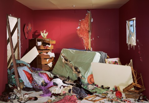
This image shows exciting and vibrant colours that contrasts the abandoned, destroyed room. It aims to explore themes of violence and eroticism inspired by Eugène Delacroix’s monumental painting The Death of Sardanapalus. (Gagosian, 2018). The emotion that Wall is trying to express within his artwork is the anger and hatred after a breakup from a relationship. This explains why the main colours in the image is red, because red represents violence and blood. However, red is also the main colours that dominates Delacroix’s painting, along with the skin tones of the women in the painting. Therefore, I believe that Wall has created a modern version of Delacroix’s painting by taking inspiration form it, however instead of focusing on people and their emotions, he has focused on objects and belongings to visualise a heartbreak .
Robert Adams
The first photographer I have decided to study is Robert Adams, as he is a historical photographer who has documented the extent and the limits of our damage to the American West, recording it in over fifty books of pictures, both reasons to despair and to hope. (Fraenkel Gallery, 2012) His work is very well known and he fits into the modernism art movement, as his photos embrace its social, political and aesthetic potential, experimenting with light, perspective and developing?, as well as new subjects and abstraction. (Tate, 2016). Adams study on the American West link to my project in the same way that Jędrosz’s work does. This is through the study of an environment within an area. After reading a small section in Robert Adams book, “Beauty in Photography”, Adams describes how an image is meaningful even if it isnt the best image in the world. “For a picture to be beautiful it does not have to be shocking, but it must in some significant respect be unlike what has preceded it (this is why an artist cannot afford to be ignorant of the tradition within his medium). This is quote is from Adams influential book Beauty in Photography (which provides a theory on his approach to landscape photography), and it means Adams feels that for an image to be good it must be different and unique compared to what other people have captured.
When analysing one of Adams many books, “Beauty in Photography” he started the essay off with the quote, “The beautiful places to which we journey for inspiration surprise us by the melancholy they can induce.” (Adams, 1996: 13). A reviewer said, “I found this to be an interesting statement and one I can agree with. I am not really a landscape photographer myself, I can appreciate a good image but I often feel uninspired in my own attempts.” (35mmc, 2020) This really shows how Adams produces exceptional photographs which have the ability to inspire other people, which is why he is considered one of the most important and influential photographers to capture the American West. By Gilman (the reviewer) being inspired to practice photography herself, means that Adams has had a strong influence on her, however when Gilman realises that she is not a master at photography, it makes her more appreciative of Adams work. Many people may agree to the statement, “I often feel uninspired in my own attempts.” (35mmc, 2020). And the main reason is because they are not decided to photography in the same way that Robert Adams is, therefore the work they have produced seems bad and less important when being compared against Adams work.
When Adam’s was asked in an interview, “How do you go about finding the photograph you want to take?”, he spoke about how Ansel Adams pre-visulises all the details and specially plans the photoshoot, however Robert Adams doesn’t take the same approach and he said, “You do try to get as much as you can right there on the spot when you make the exposure, but there are a lot of surprises in photography. If you’re not interested in surprises, you shouldn’t be a photographer. It’s one of the great enlivening blessings of the medium.” (Art21, 2017). This shows how Robert Adams has a natural eye for photography and is very good at improvising according to his surroundings. It also shows how Adams had patience as he would have ended taking more photos than he planned and each exposure would have taken a long time. Finally Adams is also saying how unique and different each shoot can be, by using the word, “surprising”, this is the way to get the best photographs, which Adams described as the, “blessings of the medium.”
These are two of his photographs that I picked from a wide range of Adams work in Western America.


These two images where both taken by Robert Adams. The image on the left shows temporary caravan housing which contrasts with the mountain in the background, as the rectangular lines on the caravans clash with the smooth nature lines from the mountains on the horizon. The bottom half of the image being congested creates a busy, active, loud atmosphere that creates a conflict in emotion with the tranquil, clam, peaceful mountains and clear sky. Despite the cameras not being as advanced, this image is very clear and contains lots of details.
The image on the right is a more zoomed in shot to create a deeper personal connection. This effect is achieved by focusing in on the drive way of the house. The image is slightly under exposed, which makes the highlights more noticeable, therefore making the car a focus point. Adams commonly makes the 50/50 split in the image rather than using the rule of thirds, but in both of these image it works out well.
Hanna-Katrina Jędrosz.
The second photographer I’ve decided to study is Hanna-Katrina Jędrosz. She is a contemporary photographer who does documentary work with places, people and the environment in focus. In 2017 she did a photo series on the Rummu quarry. It stands as a remnant of the cold war. She highlighted the recent trials of refurbishing the area into something more beneficial to the nearby society. (Academy, 2021). This links with my study on a geographical point, such as Bouley Bay. I can study how Jędrosz has captured the quarry in a way which makes the viewer see the historical value of the site, before it is destroyed. Jędrosz uses several photographs from different vantage points to represent the location. Doing so she creates unique and interesting angles that reflects the areas age and emotion. The shots consist of a variety of close ups of walls with iron rods in them, barbed wire fences vanishing into the horizon and, a low squatted building on a frozen lake. All of the images have been shot during winter, and what seems to be a single photoshoot. This gives the collection of images a general look, which is a cold atmosphere, however it would have been nice to see the location in different seasonal states, as it would have give the quarry a whole different look. Although, after research, this aproach of showing the area in different lighting, seasons and, moods goes against Jędrosz’s way of work as this question in an interview was asked, “What influenced your photography?”, and she replied, “The people and places I photograph have the biggest influence on my photography. I try not to impose too much, and to respond to what’s happening in front of me in a genuine way, to make photographs that are a documentation of an encounter.” (Academy, 2021). This is evidence that Jędrosz likes to capture the initial, untouched environment, and how she doesn’t want to manipulate the location, as it wouldn’t produce an authentic image. This would take some of the meaning away from the final image.
Jędrosz fits into the contemporary documentary photographer category, which is a style of photography that provides a straightforward and accurate representation of people, places, objects and events. (Tate, 2017) These are my two favourite images from the Rummu Quarry photo collection, and they are an accurate representation of place, as she has used the quarry landscape to set the scene. Photos captured for contemporary documentary purposes, like Jędrosz’s images, are often used in reports such as, in the newspaper and on the news. Jędrosz’s images of the quarry were useful as the Rummu Quarry was being assessed for redevelopment, therefore she documented the quarry before it was repurposed or destroyed.


The image on the left is my favourite image. It shows the area in a wider perspective, and Jędrosz has made an extremely powerful composition by including small hints of the side of the cliff, which creates depth to draw the eye into the middle of the image, where the building is located. The spacing between the building and the land is mostly consistent, which adds to create a visually appealing composition. The building having the same colours as the rocky cliffs around it means that the blue, frozen ice emphasis the focus on the building. The blue ice constructs a balance between the light blue, hazed sky, which makes the viewer notice the brown areas more, this is because blue and brown are the main two colours in this image. Overall, the vantage point Jędrosz has taken this image from and inspired me to use high pinot to take images from to get the aerial photo type look.
The photo on the right is extremely different to the other image. It doesn’t show the general area that is surrounded by miles of trees, instead it show the security measures in place and provides a more realistic representation of what it would of been like to work at the quarry when it was open during the rein of the Soviet Union. The meaning changes when you look into the historical context of the quarry. “The workers were drawn from the near by Rummu Prison” (Hanna-Katrina, 2010?). Knowing that prisoners use to work at the quarry creates links to the barbed wire fences, and the graffiti, which could have been done by the released prisoners or street artists.
Conclusion
In conclusion, both Jędrosz and Adams capture an environment in detail and, they accurately recreate the atmosphere as if the viewer was there. The main similarities between both photographers, is that they both include a wide variety of shots from the same location to provide more infomation about the place. For example, a wide angle view of the location, and a close up shot of objects in the environment. On the other hand the main difference is that Adams shoots in black and white, where as Jędrosz shoots in colour.
For Adams only being able to shoot in a monochromatic format, the image he produces often contains a more moody atmosphere which creates stronger emotions, as there is a greater contrast between certain elements in the image. Plus, shooting in black and white can removed some visual distractions by removing distracting colours to simplify the final image. Without colour, it is sometimes easier to make out the photographic camera techniques used in an image such as, framing, form, positioning and, surface texture. Robert Adams once claimed, “Black and white are the colours of photography,” (NYTimes, 2012) meaning that Adams feels that he doesn’t need colour to create the perfect image. On the other hand, colour is an important variable in landscape photography. It creates a visually appealing image which draws the viewer into the image where they can notice smaller details, which might have been missed if the image was in black and white, as colour in landscape photography can help differentiate depth and detail in an image. Colour can be used to convey emotion such as, cold and warm, it can also show emotion using the lighting conditions and the weather.
Another difference is that Adams composition in his images seem more precise, compared to Jędrosz. The main reason I think this happened is because Adams uses a large-format camera which is much slower to operate and can only make one exposure at a time, whereas Jędrosz uses a digital camera, so she can quickly and efficacy capture images. The large format camera was the best camera at the time for taking landscape images, as it had incredible detail and focus, a shallow depth of field and, interchangeable lenses. Both photographers capture different environments in their own style, and affectively showcase a whole geological location with a selection of images.
MT: You need to redo the way you reference sources as it doesn’t make sense. Use Harvard system of referencing
Bibliography
Jędrosz, H.K. (2019) Isle. Available at: https://www.isle-stories.co.uk/hanna-jedrosz (Accessed: 12 January 2022).
The Genius of Photography. (2007) Available at: https://archive.org/details/tGoPhoto (Accessed: 30 January 2022)
Anonymous. (2018) TheArtStory. Available at: https://www.theartstory.org/movement/pictorialism/ (Accessed: 30 January 2022)
Britannica, The Editors of Encyclopaedia. “realism”. Encyclopedia Britannica, 29 May. 2020, https://www.britannica.com/art/realism-art. Accessed 30 January 2022.
Britannica, The Editors of Encyclopaedia. “Ansel Adams”. Encyclopedia Britannica, 29 May. 2020, https://www.britannica.com/biography/Ansel-Adams-American-photographer. Accessed 30 January 2022.
Tate, “Postmodernism” Tate. (2017) Available at: https://www.tate.org.uk/art/art-terms/p/postmodernism (Accessed: 30 January 2022)
Academy, “Hanna-Katrina Jędrosz”, Academy. (2021) Available at: https://academy.wedio.com/documentary-photographers-in-london/#2-hanna-katrina-jędrosz (Accessed: 30 January 2022)
Hanna-Katrina Jędrosz, “Rummu Quarry”, Hanna-Katrina. (2010?) available at: http://www.hannakatrina.co.uk/oldstone/sdgtnd6c7vm0n20r5ggsqxm2ypx7hx (Accessed: 31 January 2022)
Hanna-Katrina Jędrosz photo (Left): http://www.hannakatrina.co.uk/oldstone/rxrz38mskho1qqik5jgu89qm038f6d
Hanna-Katrina Jędrosz photo (Right): http://www.hannakatrina.co.uk/oldstone/ixspoh80iz62t8aslein3hsqgsq5tv
Fraenkel Gallery, “Robert Adams”, Fraenkel Gallery. (2012) Available at: https://fraenkelgallery.com/artists/robert-adams (Accessed: 31 January 2022)
Tate, “Modernist Photography”, Tate. (2016) Available at: https://www.tate.org.uk/art/art-terms/p/photography/a-z (Accessed: 31 January 2022)
Adams, R (2005) Beauty in Photography. Aperture; 2nd Revised ed. edition (June 15, 2005)
Robert Adams Photo (Houses/Left): https://www.google.com/search?q=Robert+Adams+photos&safe=active&rlz=1C1GCEA_enJE982JE982&source=lnms&tbm=isch&sa=X&ved=2ahUKEwj538ncodz1AhWPQEEAHZeDCpgQ_AUoAXoECAEQAw&biw=1920&bih=937&dpr=1&surl=1#imgrc=A4-HKkh00u4fPM
Robert Adams Photo (Car/Right) https://www.google.com/search?q=Robert+Adams+photos&safe=active&rlz=1C1GCEA_enJE982JE982&source=lnms&tbm=isch&sa=X&ved=2ahUKEwj538ncodz1AhWPQEEAHZeDCpgQ_AUoAXoECAEQAw&biw=1920&bih=937&dpr=1&surl=1#imgrc=aVnrgzYwWffsHM
Gagosian, “Jeff Wall”, Gagosian. (2018) Available at: https://gagosian.com/artists/jeff-wall/ (Accessed: 8 February 2022)
Tate, “Documentary Photography”, Tate. (2017) Available at: https://www.tate.org.uk/art/art-terms/d/documentary-photography (Accessed: 8 February 2022)
Art21, “Photography, Life, and Beauty – Robert Adams”, Art21. (2017) Available at: https://art21.org/read/robert-adams-photography-life-and-beauty/ (Accessed: 8 February 2022)
Martha Schwendener, “A review of ‘Robert Adams’ the place we live in New Haven”, NYTimes (2012) Available at: https://www.nytimes.com/2012/09/02/nyregion/a-review-of-robert-adams-the-place-we-live-in-new-haven.html (Accessed: 8 February 2022)
Holly Gilman, “Review of ‘Beauty in Photography’, by ‘Robert Adams'”, 35mmc. (2020) Available at: https://www.35mmc.com/09/12/2020/beauty-in-photography-by-robert-adams-book-review-by-holly-gilman/ (Accessed: 8 February 2022)
Liz Wells, “Thinking about photography – modernism”, Photography: A Critical Introduction. (1988) Available at: https://hautlieucreative.co.uk/photo21al/wp-content/uploads/sites/41/2021/01/Photograph-as-document_modern-and-postmodern-debates.pdf (Accessed: 8 February 2022)
Liz Wells, “Thinking about photography – The postmodern”, Photography: A Critical Introduction. (1988) Available at: https://hautlieucreative.co.uk/photo21al/wp-content/uploads/sites/41/2021/01/Photograph-as-document_modern-and-postmodern-debates.pdf (Accessed: 8 February 2022)
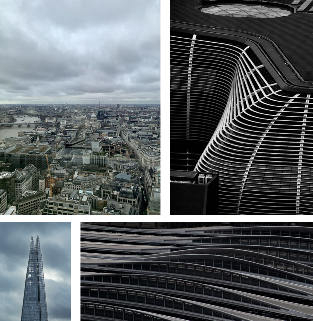
I used my phone camera to get a few wide angle photos of buildings whilst I was walking and when I didn’t have my camera out. Then used a 100-300mm telephoto lens to focus on parts of buildings and, whilst shooting off rooftops such as, The Garden at 120 and, Sky Garden in the city of London. And I also used a 18-55mm lens on my camera to get sharper photos of the skyline and individual buildings. Using my camera I took a total of 319 photos.
Sky Garden
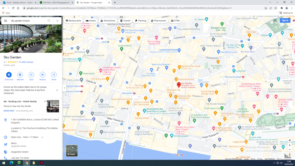
I was a video online showcasing spots around London, and Sky Garden was one of them. You had to book a free ticket to access the rooftop, and there was a long queue of about 20-30 people. Most of the night/sunset time slots were fully booked. It is located here:
Once you come out the lift there is a café and access to the outside part where you can take photos. There is great opportunities to shoot down such as, the streets, and at the different bridges. However the main two subjects are the Shard, and Tower Bridge, and maybe St. Pauls Cathedral. I also focused on the Skyline over at Canary Wharf.

Garden at 120
I saw people online showcasing this location in the same video as the one that mentioned Sky Garden. Its was really easy to access and there was no queue, so security was very quick. It is located here:
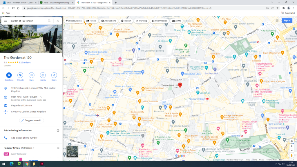
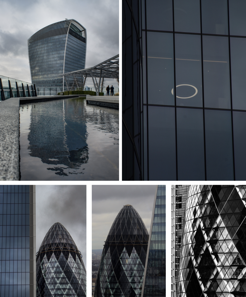
There is a full 360 degree view when your on top of the building, which allows you to get amazing shots of the Gherkin building and the Walkie Talkie building (where sky garden is located). There’s good opportunities to shot up into the surrounding buildings as it isn’t as elevated as Sky Garden. On the roof top there is a small water fountain which let me get some reflection shots of the Walkie Talkie building.

General London
The photos were taken over 2 days, the first evening I shot during sunset which gave the vibrant pink and orange atmosphere. Later that evening I got all of the night shots around St.Pauls, Tower Bridge, and near the Scoop, which was great for leading lines.

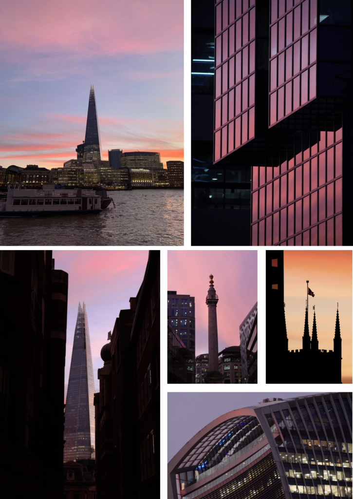
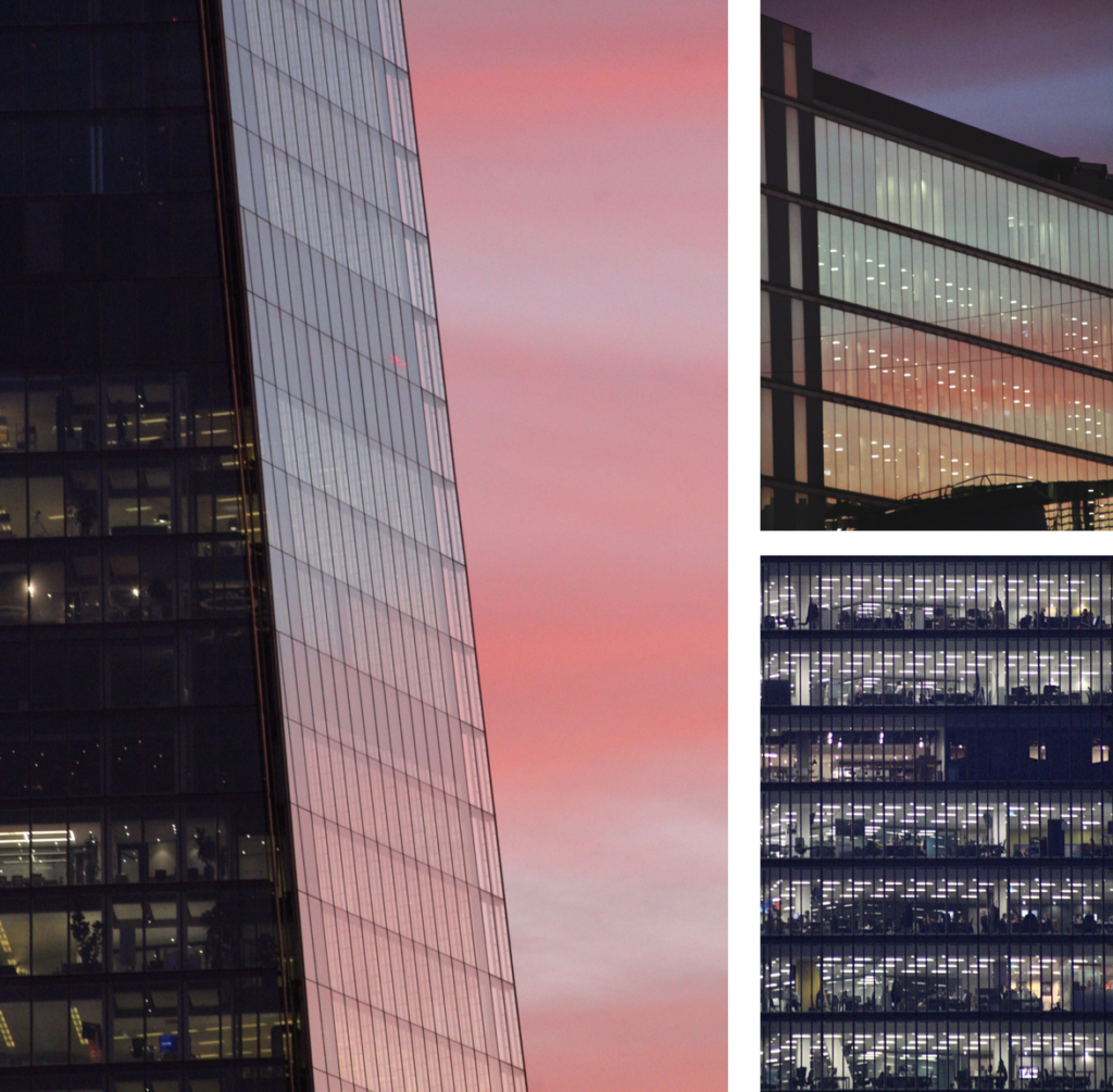
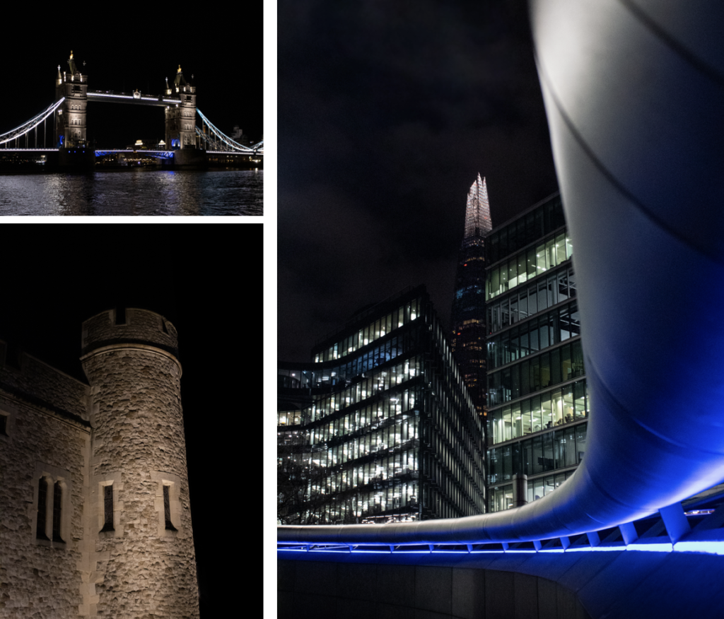
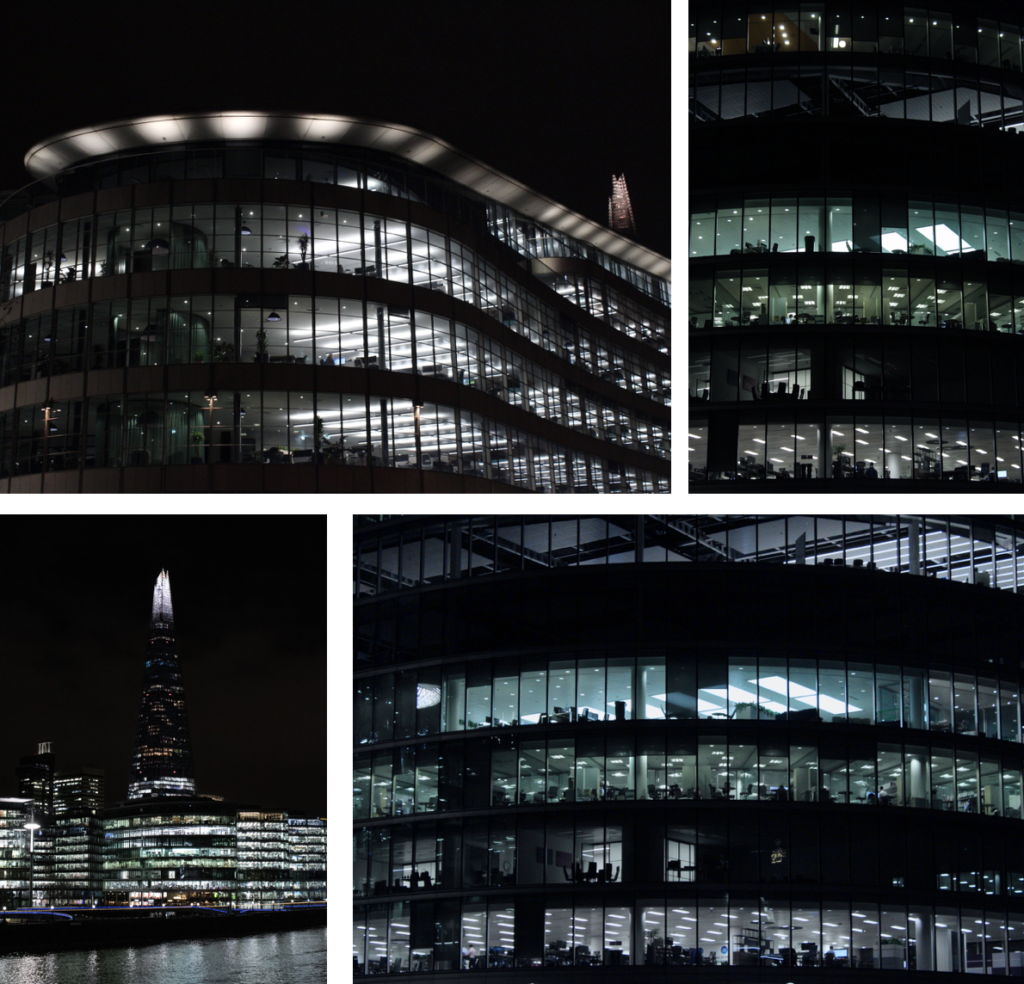


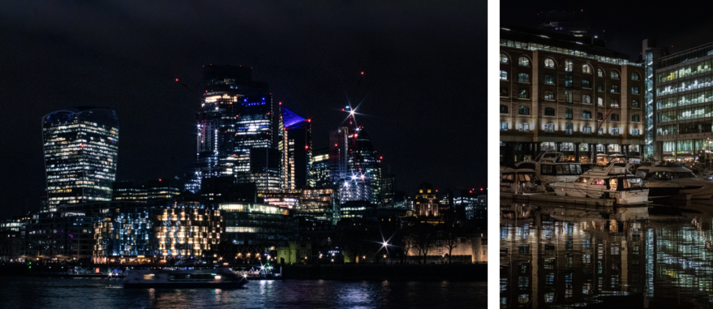
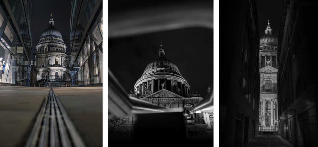
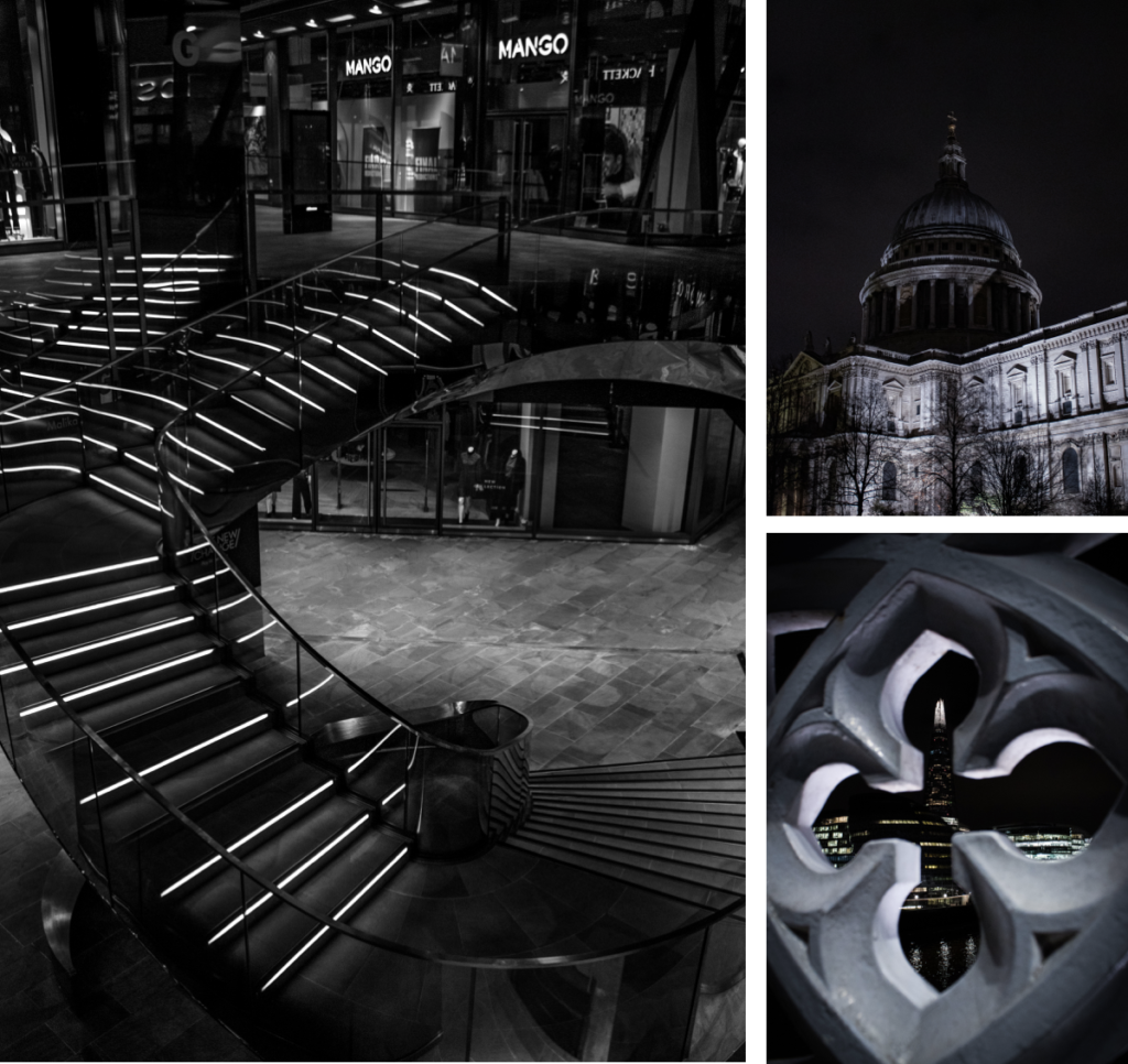
Overall, I’m very happy with all the outcomes and it has produced 15 crazy images. The different lighting helped my take a wide range of photos and the different locations were interesting to shoot from.