As an introduction to our year 13 project, we visited the Jersey Museum, specifically to look at the exhibition that was on there at the time- this exhibition was all about migration within jersey- for example which groups arrived, when they arrived and why they arrived. The exhibition stated ‘Every Jersey resident has an immigration story – whether their family came here 500 years or five years ago. This exhibition explores some of these stories and the ways in which immigration has shaped and influenced the Island we know today.’
To me personally, what stood out the most were the Aliens registration cards. Aliens Cards were introduced following the Aliens Restriction Act which was passed in 1920. Under this law all aliens over the age of 16 resident in Jersey and of non-British birth had to register with the Office of Immigration. In the exhibition, some were on display- these specific cards had families today that are still in Jersey.
Although I am half polish, my mother was the first in her side of the family to migrate to Jersey- and it wasn’t on purpose so I personally don’t have family that would have migrated in the time of the Aliens cards, but I was still interested to find the registration cards of polish immigrants and found a woman called Wanda Casimir Mrowezynska, born 23/04/1860 in Warseouvie [?], Poland. Nationality: Polish. | Jersey Heritage
Aside from the museum, we went out on a 30-minute walk around St Helier with Stuart Fell to look at architecture- I already knew that certain architecture can say so much about a specific time period however he explained how. When on this walk, many things were pointed out that I would have never thought twice about- for example one building that was built with traditional Jersey red brick (altered to create a mixture of grey and red) had another floor built onto it and if you looked closely you could see the difference in the bricks. This was only something that I distinctly remembered however he showed us many other buildings and the history behind their architecture.
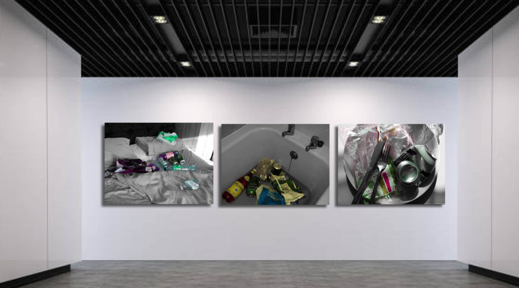
Above are my final chosen and edited images. When beginning this project, my idea was to work with the idea of Marine Pollution. Marine pollution is a combination of chemicals and trash, most of which comes from land sources and is washed or blown into the ocean. This pollution results in damage to the environment, to the health of all organisms, and to economic structures worldwide. Instead of stating the obvious in my photographs, I wanted to create a metaphor within them. As stated in my action plan in a previous blog, I wanted to ask the question, ‘What if it was me?’ and most importantly, ‘What if it was you?’. The waste that was placed in these photographs does just represent the waste in the ocean, however, as you can see they are placed in different places around a home- and this represents the ocean, home to more, both discovered and undiscovered creatures, that live here with us on land. Our apathy towards waste and the ocean is leading not only invasion of their lives but also destruction. Not only do these photographs portray that metaphor, they also symbolise the circle of life. The bed represents sleep and rest. The plate represents nourishment, eating to stay alive and the bathtub represents health and hygiene. These are the 3 basic necessities of life. Another thing we are taking away.
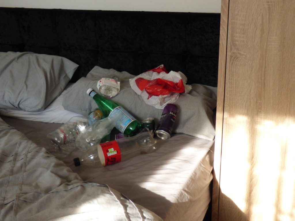
Image 1 ‘Falsely Comfortable’
Image one is of my own bed at home- as also stated in an earlier post, it is one of my safe places that brings me comfort and relaxation. In the photograph, the duvet is pulled back, exposing a large amount of waste. This contradicts the idea of comfort. Not only that, it represents the fact that people ‘keep the cover on’- the majority of the population don’t think twice about the subject of ocean pollution. Even if they do, ‘making the bed’ take the thought back to the back of their head. Its time to pull the duvet back for good.
It was also stated by somebody that my image had similarities to an artwork called My Bed by Tracey Emin.
‘Still filthy, still repulsive, and still one of the most moving works of contemporary art, Tracey Emin’s My Bed, 1998 gave us a delicious glimpse into the lifestyle of a despairing 35-year old artist. The crumpled bed sheets still seemingly ooze with her bodily secretions, the blood stain from her period clearly visible to all onlookers’. She decided on this piece after a breakup, spending a week in bed. This particular display was very personal to her but at the same time was also very empowering- it shows the imperfection as well as means of mental health and how some experience it. Although a lot more graphic than my photograph, it is a messy bed, filled and surrounded by waste as is mine. It also represents a side that people do not often think about- for her this would mean depression, for my photograph it means marine pollution.
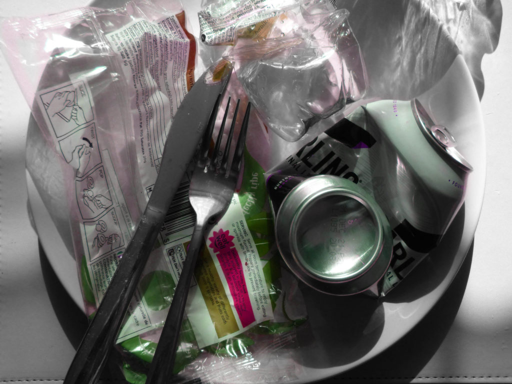
Image 2 ‘When’s Dessert?’
Image 2 at first glance is a dinner plate with plastic waste and a can on it, along with a metal knife and fork. This represents contamination of the ocean and the destruction of the food chain. Due to the pollution in the ocean, both chemical and plastic, many animals and fish are dying out. This alters the food chain, creating less food for some. The way the cutlery is placed on the plate symbolises that the person has finished eating- however the plate is still full and therefore they didn’t eat anything.
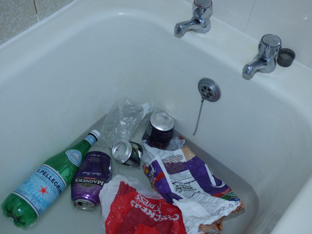
Image 3 ‘Self-care Routine’
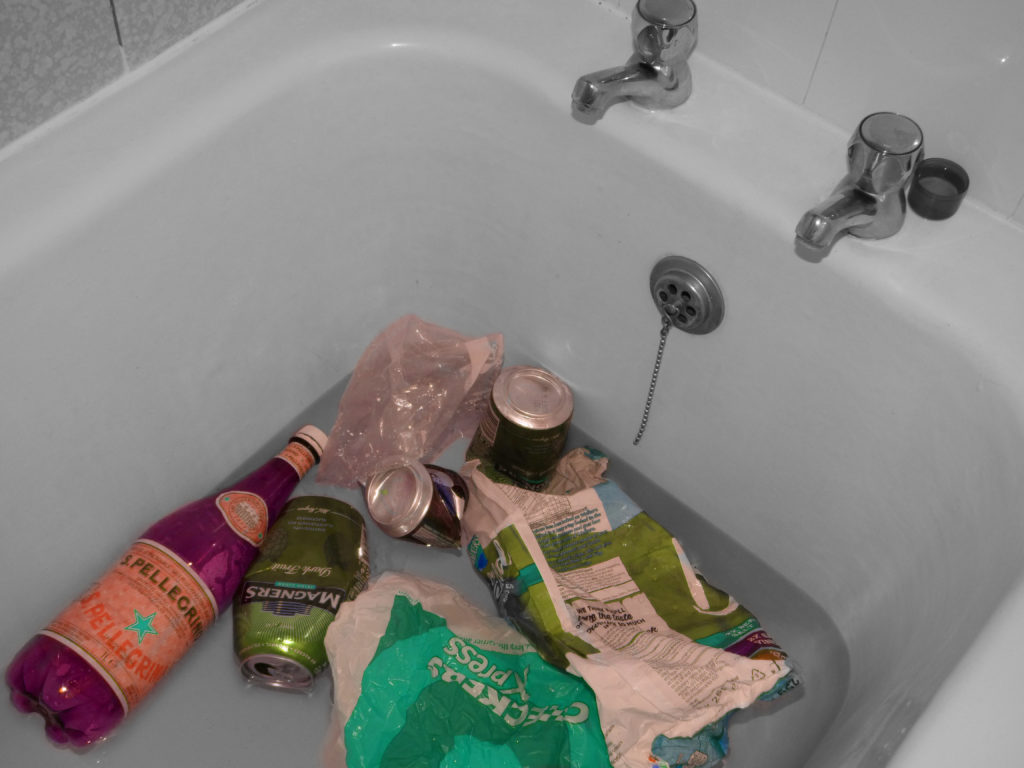
The final photograph, Image 3 is a bathtub, only a few inches filled with waste floating around. The small amount of water represents the ocean and how many of us care about it. The amount of waste is large for the small amount of water which represents how big of an impact we are all making- and not in a positive way. Along with the other images it also symbolises one of the necessities of the circle of life- hygiene, water and health.
As for the colour choice, this was briefly mentioned but although it was partly for the aesthetic side, it shows the unatural side of polluting our oceans- its just something that should not be happening.
Using photoshop, I tested different ways in which I could present my images and at the same time figuring out which colour combinations worked best.
1
2
3
4
In example 1, I tried putting together the images with different hues. I didn’t particularly like this outcome- although the images were supposed to be messy it seemed like they were too messy and didn’t go well together. The image in the middle was too dim and overall it didn’t work. Example 2 did look better; the images were symmetrically lined up and the colour scheme matched although it felt too simple to me. When making example 3, I really liked the composition, it felt easier to look at all the images, and finally what came to mind is which of these holds the most importance? They are all important of course but some slightly more than the other. So I decided on the plate being the largest image, the bed being the middle and the bathtub being the smallest- overall I liked the final composition and presentation.
Photographer Comparison:
Brett Stanley:
Brett’s photographs are about how we blindly pollute the ocean on a daily basis as you can see in the image above. In my work, the concept is slightly different because in my photographs it is right in front of you, you aren’t doing it blindly, you just don’t care.
Jeremy Carroll:
The message conveyed through Jeremy Carroll’s work and mine is almost the same. Through their work they asked the question, what if it was you? My photographs did the same thing. This photographers work took more of a graphic, painful point of view- showing exactly what creatures of the ocean feel through the use of human models where as my message was portrayed in a calmer manor, where people are made to think about it some more. They way in which the photos were taken are very different, these here are portraits in a studio where as mine are more objects set in place using natural lighting.
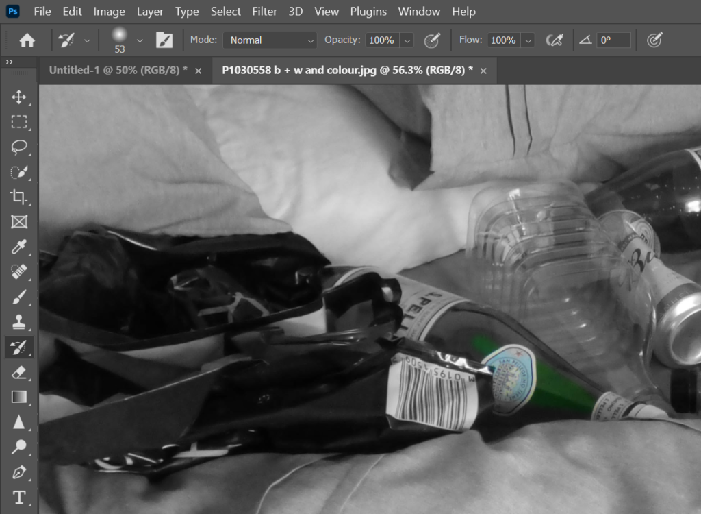
When it comes to editing, I wanted to try a few things. My raw images are quite bland, and I wanted to make my images pop a little more.
I chose on of my favourite ‘Bed’ images to experiment on first.
I started by turning the image fully black and white- this was to make the background monotone for the waste to stick out. Then, using a history brush tool, (brings back the original state which would be colour) I recoloured the waste.
This was the outcome. I think it looked quite cool and at the same time looked normal. The background was already quite monotone but making it fully black and white made it stand out that little more. I liked it alot but i wanted to experiment some more.
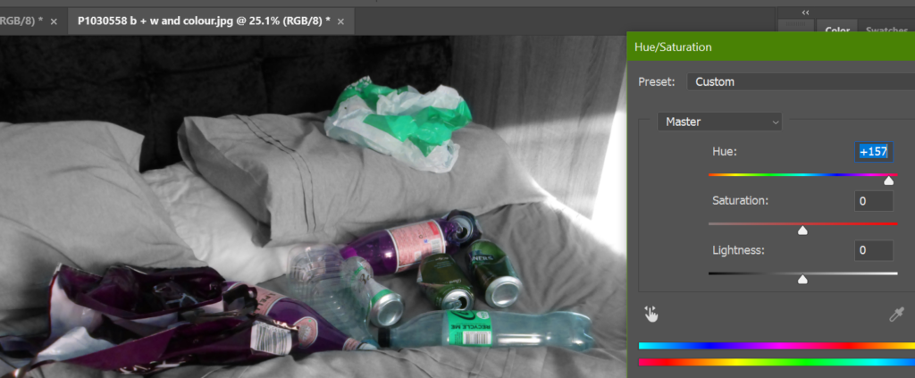
To do so, I decided to completely change the colour hue. I eventually chose the hue that resulted in turquoise and purple- it made the setup look more unnatural. I like this because the way we are polluting the ocean is unnatural in itself.
I continued and did this to a few other images that I liked and this was the oucome.
Looking at them altogether made me realise that the colours look a little too similar- I like it a lot but I just wanted to try different hues in the different photographs.
I also like this outcome but it just comes to putting these images together and finding out which sequence and colours look best when presented.
To begin, I chose 3 images from each shoot- the ones I believe were the most successful and the ones I would like to work with.
1
2
3
I chose these 3 from my bathtub shoot. Image 1 was originally larger but I chose to crop it down as there was too much unnecessary space, therefore taking the focus away from the message. Image 2 is more of a low view in the tub- the taps aren’t on show and all you can see is the drain. I liked this image due to the simplicity and it may make viewers look and think about what it is- however I did use flash, creating this lit texture in the tub which I personally dont think looks good. Image 3 is my favourite out of the three images. The taps create good contrast and I like the diagonal angle as well as the curve in the tub, creating a modern style and interesting composition.
1
2
3
These 3 photographs are all quite similar however I like the angle of image 1 and 3. Like in my bathtub photos, I like how they are taken at an angle. In image 2, the angle is straightforward, there are a few things that look ‘in the way’ such as the plant and wardrobe and it looks uneven. When taken at an angle, you cant tell.
1
2
3
My plate images are my favorite ones, I love the lighting and how the plastic reflects it. Image 1 was taken before I added cutlery. I have a glass dining table so when I tried to take images of the plate on the table it looked tacky, so I used my floor- although image one visually meets the aesthetic, viewers may not be able to know what they are looking at- so out of these images I like 3 the most. The cutlery is clear and on the plate as well as the waste. In image 2 the light is a tab bright and the fork is not fully in view.
For the photographs above, I filled my bathtub with a few inches of cold water and dumped some trash that I had collected onto it. This included Plastic bags, wrappers, cans and bottles. I realised that there wasn’t a load and taking pictures of the whole tub didn’t quite reach the ‘exaggeration’ I was hoping for so I bunched it all together and took close-up photographs to make it look fuller. These contact sheets are to show my most relevant photographs.
For my bed photoshoot, I kept the trash mostly in the same place, only testing different angles and viewpoints so that i would have a variety to choose from. My main idea was to keep these images quite simple, this is because further on I would like to edit them using photoshop and eventually put them together as a final result and I don’t want it to be too crowded.
Using just plastic bottles and cans on my plate, I thought this would be a great addition to my ‘what if it was me?’ idea. Not only are we polluting the ocean, this affects many food chains within it.
For the theme of Anthropocene, the era of which humans have made significant impact on earth, I have chosen to work with the idea of pollution in the ocean. Instead of taking a straightforward response such as photographing waste on beaches, my idea is to put humans in a sea creatures point of view and ask the question: what if it was me? Although Jeremy Carroll portrayed the struggle of a sea creature through portraiture, where she tied up and restricted people in her photographs, I would like to take a more object based/ maybe abstract approach. My main idea is to collect trash for a short while and place it around my home in places where I personally feel most comfortable. I take pride in keeping my home clean and tidy so this will specifically apply to me and others like me. My places of comfort will be representing the ocean- home to all the sea creatures. The plastic waste that I place around will represent the invasion and discomfort we place upon those creatures. When it come to how these photographs will turn out, I would like to use photoshop to edit them in interesting ways, perhaps changing the hue for a ‘cool’ result- but not too much to distract the viewer from my message.
“What would you do if you found yourself trapped in a dangerous material that you just couldn’t wriggle out of? It’d be a pretty desperate situation, but it’s one faced by our marine cousins on a daily basis: entanglement in plastic – millions of tonnes of which end up in the ocean each year – affects hundreds of species. To try and make this tragic result of our litter more relatable, an artist has come up with a new exhibit that brings the situation a bit closer to home.” Jeremy Carroll’s exhibit, appropriately entitled ‘Entanglement’, depicts humans caught up in waste typically found in seas and along beaches. Photos include a person with fishing nets around his neck and shoulders, and another with their head and arm caught in a plastic basket. The striking photos act as a stark reminder of the issues sea life faces as a result of our inadequate approach to marine plastic prevention.’ While many of us feel saddened by the harm inflicted on marine wildlife, many people still take an “out of sight, out of mind” approach to justifying the use of disposable, single-use plastic products.
These photographs were taken in a studio using studio lighting, you can tell due to the bright white background. Photograph 1 is of a male wearing a snorkelling kit tangled in what looks to be the type of rope found on beaches which were previously used to hold buoys down as well as small boats. The bright green rope is tied tightly around his neck and his head is tilted up, as if gasping for air. There is also some form of red and yellow plastic that is tied around his breathing tube which could also be a reason of why it seems that he cannot breath and here is a longer rope tied around his upper body, which is visibly tight due to his skin and fat puffing out. In the photograph his skin looks like its glowing and smooth although he is a male (males stereotypically are portrayed as tough)- this could be to show the delicacy of a fish for example as well as that stereotype not applying to sea creatures. If it were tied around a fish they would most likely be in excruciating pain due to their fins and gills.
Brett Stanley
‘Brett is an underwater portrait photographer who has been doing this for over ten years. He loves being under the water and adding photography to that is just a bonus. His natural calm nature in the water really shows through and helps his clients to feel comfortable, which is the first aim of any underwater shoot. Whilst based in Los Angeles, USA, the Australian born photographer travels frequently and relishes the chance to work with new people and new locations all over the world. Always looking to innovate, Brett has built custom equipment and perfected his techniques to make every photoshoot the best it can be.’
I will be focusing on one specific shoot with documentary filmmaker Christine Ren who has a unique set of experiences and skills: she has degrees in marine affairs/policy and biology, worked as a ballet dancer and is an experienced diver. When she decided to combine these personal attributes to make art advancing ocean conservation efforts, she ended up with some intriguing results.
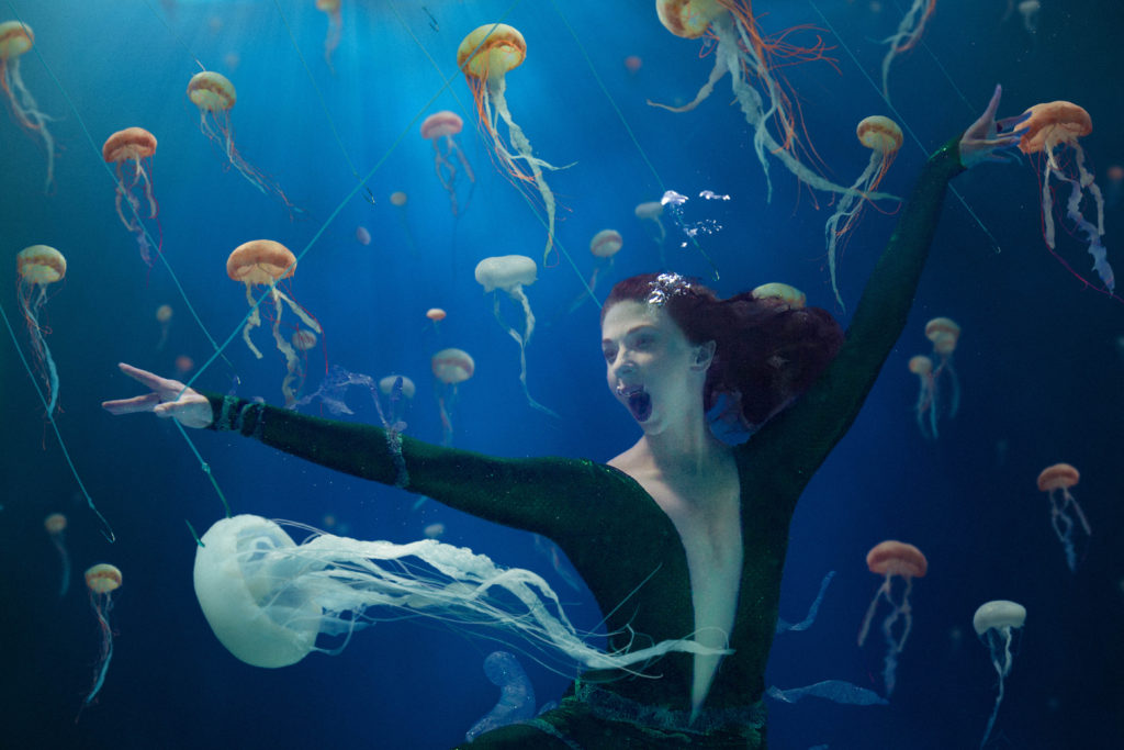
Jellyfish Soup
Blind Spots
Jellyfish Soup
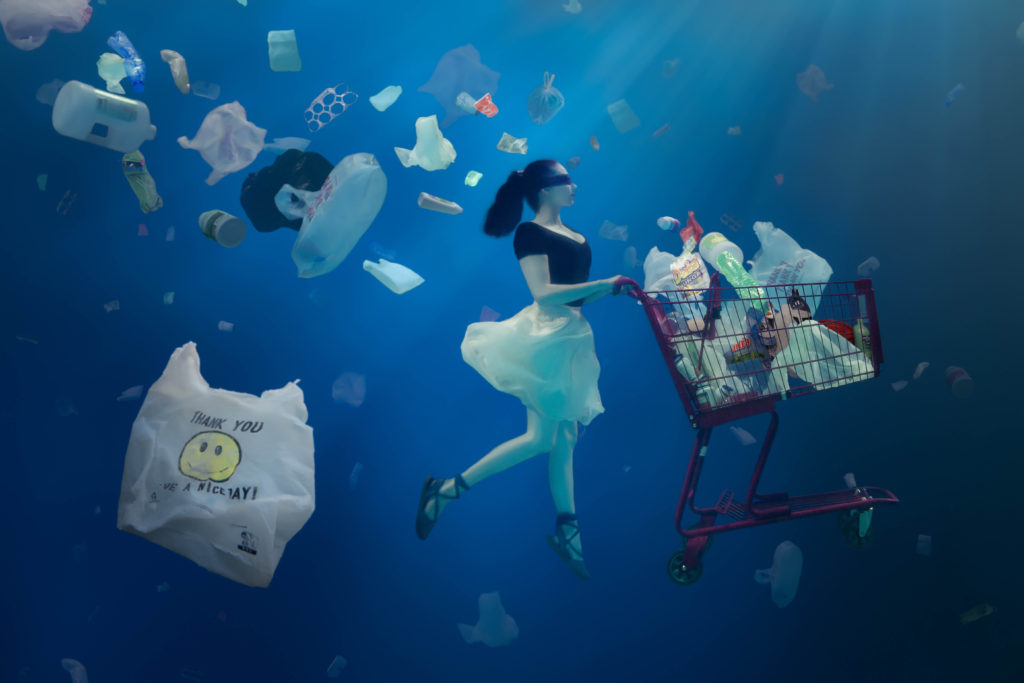
‘Blind Spots’
This particular photograph by Brett Stanley is of a woman underwater, blindfolded in a ballerina costume. She is holding a red shopping cart full of plastics of which are floating out of the cart and all around her. This represents how even when we as human beings do a normal daily/weekly function such as shopping, the plastics in our cart slowly make their way into the ocean. Another point I thought about as to why the woman is wearing a ballerina costume could only be because she is a ballerina in real life, however, in my mind ballet is a very delicate and beautiful sport, showing that even the finest people in the world are causing destruction to the ocean blindly. The background is a dark sea-blue representing deep ocean and in the background you can faintly see plastic bags, as well as the midground, where the woman is, with a mixture of different plastic items such as bottles, containers and wrappers. It looks as if the woman is leaving this trail of plastic behind her. In the foreground there is one particular thing that stands out which is the white plastic bag with a yellow smiley face that reads ‘Thank you Have a nice day!’. I believe that this was placed there on purpose to be ironic and slightly humorous. The bag originally says that as a thank you note to the person that attended the store, but now was staged to make is seem as the ocean has pushed this bag into place, ironically thanking the human race for polluting it with their trash. The photograph was actually taken in a pool by ocean lover and photographer Brett Stanly, and the woman in this photo is Christine Ren who has degrees in marine affairs/policy and biology, worked as a ballet dancer and is an experienced diver. She contacted Brett in the hopes of making art advancing ocean conservation efforts and together they made this photograph. The one I am writing about now is called ‘Blind Spots’ and the reasoning is to show the majority of the populations apathy towards plastic, and how we are blindly polluting the ocean. As mentioned, the photograph was taken in a pool and therefore was staged- as you can see there was a lot of work put into this image which shows just how much they wanted to get this message out perfectly.
The photographer stated that he used Aquatica Housing and Sea & Sea lights, so he used proper underwater lights designed for this purpose, In the photo, the lighting that stands out is shining down onto the woman in a streaky form, as if the sun was putting her in the spotlight. It is quite delicate lighting, representing the delicacy of nature.
Comparison
Jeremy’s work is all about ‘what if it was you being strangled by plastic waste?’. He is putting humans in the position of the oceans population- graphically showing us what we are doing to the ocean in a way that people could understand. On the other hand, Brett is showing us what we are doing in a passive-aggressive viewpoint- instead of being graphic, he is saying ‘this is what you are doing anytime you go shopping’. However both of these photographs are clearly about ocean pollution- in Jeremy’s photograph the man is wrapped in rope that we probable have all seen laying around on a beach as well as wearing a snorkelling mask, and Brett’s photograph is a woman blindly polluting the ocean with a shopping cart full of plastic waste UNDERWATER.
Jeremy focuses more on the creatures of the ocean whereas Brett focuses on the ocean as a whole- nevertheless they are both about ocean pollution.
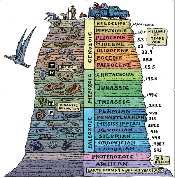
What is Anthropocene? The word Anthropocene is derived from the Greek words anthropo, for “man,” and cene for “new,” coined and made popular by biologist Eugene Stormer and chemist Paul Crutzen in 2000. The formal definition to this word is ‘an unofficial unit of geologic time, used to describe the most recent period in Earth’s history when human activity started to have a significant impact on the planet’s climate and ecosystems.’ so, it is the era of which humanity impacts the earth substantially – an era we are in now. Many say that this began during the industrial revolution, the transition to new manufacturing processes in Europe and the United States, in the period from about 1760 to sometime between 1820 and 1840 when human activity had a great impact on carbon and methane in Earth’s atmosphere. Others think that the beginning of the Anthropocene should be 1945. This is when humans tested the first atomic bomb, and then dropped atomic bombs on Hiroshima and Nagasaki, Japan. The resulting radioactive particles were detected in soil samples globally.
Anthropocene sits on top of Holocene, but is not an official unit of geologic time.
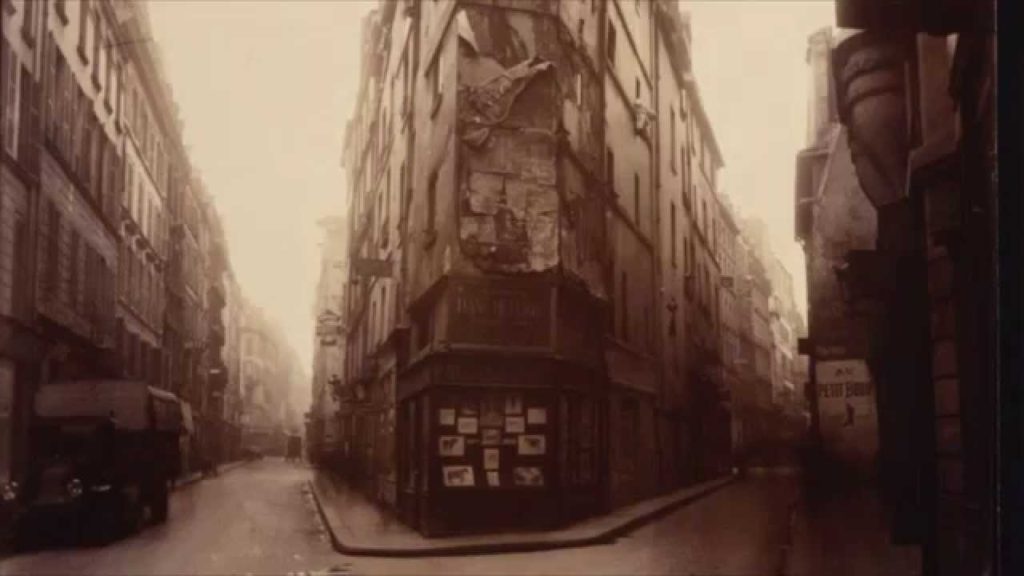
Eugène Atget was a French photographer best known for his photographs of the architecture and streets of Paris. He took up photography in the late 1880s and supplied studies for painters, architects, and stage designers. Atget began shooting Paris in 1898 using a large format view camera to capture the city in detail. Noted for his determination to document all of the street scenes of Paris before their disappearance to modernization, most of his photographs were first published by Berenice Abbott after his death.
Cour du Dragon
Corner of rue de Seine and rue de l’Échaudé c. 1919 Arrowroot print Clark Art Institute, 1998.39.1
The building being photographed in the image above, is located on the intersection of Rue de Seine and Rue de l’Échaudé. This intersection is located in the sixth arrondissement of the city in the Saint-Germain des Prés neighborhood which is on the left bank, or Rive Gauche. The Rive Gauche is known for its high-end shopping and elegance, and the Saint Germain des Prés neighborhood is specifically known for its rich cultural history. When Atget photographed this building in 1924, the façade was pretty torn up. The exterior of the building appears to be falling apart with parts of the building literally peeling off and whole sections missing. Furthermore, the bottom half of the building is darker than the top half, and there are flyers plastered on the window. There also appears to be a larger poster placed above the window. There is a singular old-fashioned car/lorry on the left. When looking down the two roads on either side of the centre building, the further away it is, the lighter it gets. There are two possibilities of why this is, which is either that the image is over exposed and it looks this way because the sky was very bright OR the weather was bad and there was fog. Which ever side you pick may change your perception slightly. I think that it being fog suits the image well. Its black and white, the walls are worn down and the streets are empty- It adds to the gloomy vibe. It is unknown as to why Atget took all these photographs, but they became a big part of the history of Paris within photography. Looking at these photographs, I think he was trying to capture the essence of old Paris, trying to create the feeling of nostalgia. Perhaps he knew that the world around him was changing once again. In some of his photographs, maybe even claustrophobia- lots of tight spaces and dark alleyways. In this photograph specifically, there are many dark tones that gently splurge into lighter tones.
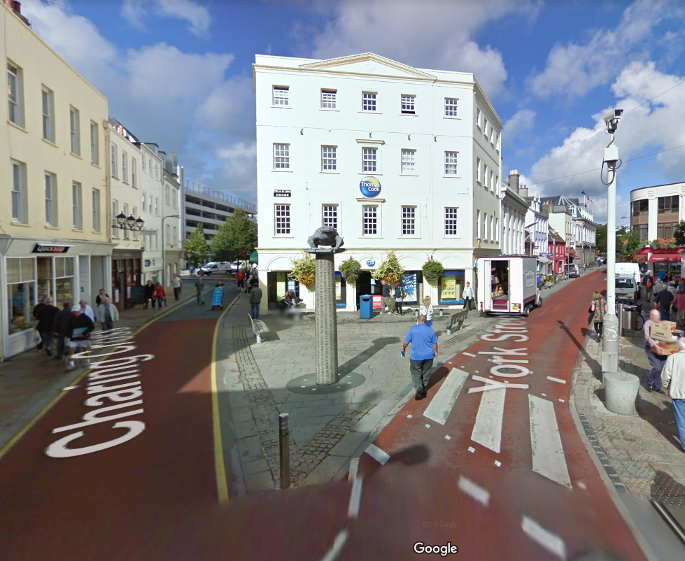
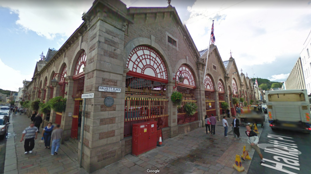
When I saw this old photograph of Atget’s, I instantly pictured some streets in jersey. I went into google maps and took a screenshot of what place in Jersey came to my head, which is the first picture below. I then started traveling around the area via google maps in search for similar places, or where I could potentially take photographs like the one above. However there are many places in jersey such as alleyways and tight areas where I could take photographs referring to the other work of Atget, but this search was only for the analysed image.