All posts by Katey R-H

Filters

Author:
Category:

analysing an image

Wynn Bullock: Sea palms
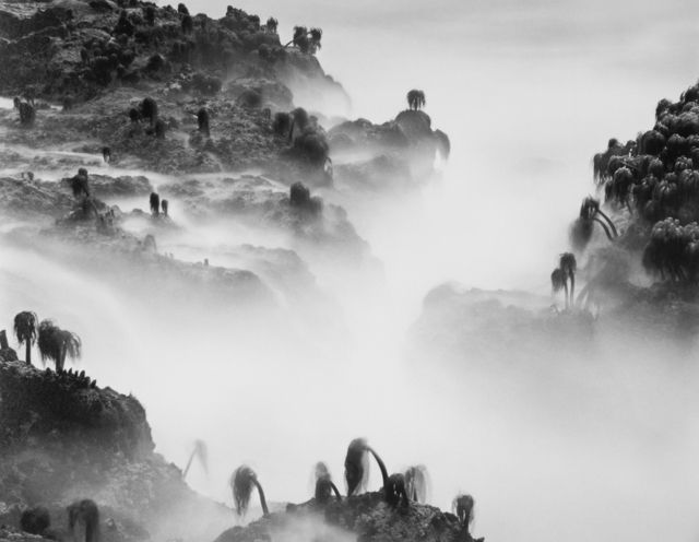
Keywords: atmospheric, mysterious, illusion, calming, moody, dystopian, monochromatic, eerie, contrast. Form: This landscape photograph taken by Wynn Bullock in 1968 in the US depicts sea palms on rock forms, shrouded in mist which creates an eery atmosphere. This image is very monochromatic tones of black, grey and white. The lack of colour in this image adds to the drama and it is difficult to decipher what the scale of the image is, adding to the mystery of the image. Most of the sea palms in this image seem to be leaning to the left as if they are dying or have been blown over by strong winds or a storm. I feel that this image depicts a dystopian society that has no human connections/ has only been touched by the elements. Process: This photograph has been taken either looking across or slightly down on the landscape. The image was taken in daylight using strong light to enable the photographer to capture a strong range of tonal shades. Utilising Ansel Adams ‘zone system’ 1-10. I sense that Bullock would have waited for a specific time and weather conditions to capture his vision. Another process could be that he utilised a slow shutter speed to create the image. This could explain the lapping rock pool water becoming smoke/haze like in appearance due to its movement and some sea palms being blurred. Content: Bullock talks about how his photographs serve as visual metaphors for larger ideas, such as the passing of time and the inevitability of death. This particular image was taken in 1968 and during this time the US was going through a state of shocking assassinations, a much hated war and a spirit of rebellion through violent rioting and the dawn of the television age. Perhaps the drooping, dying sea palms in this image are a reflection of society at the time. The sea palms could also depict the US citizens at this time, or the US soldiers fighting in the war, with the surrounding fog and mist representing tear gas and the ruins of battlegrounds.

photoshoot plan-

Inspiration

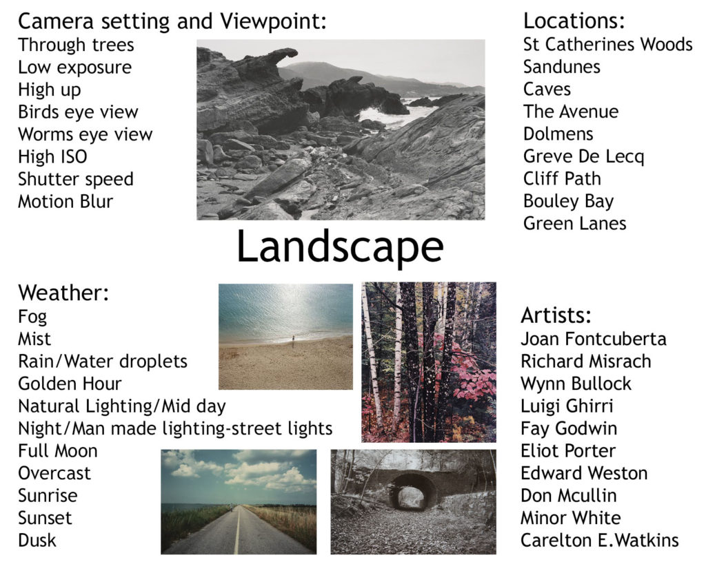
For this photo shoot I am going to explore rural scenery on the Island which I can take successful landscape imagery of. I am going to stay away from taking photographs of the obvious, touristy places such as the towers, St Brelades beach, sunsets at St Ouens, etc. Instead I am going to take inspiration from photographers such as Fay Godwin, Richard Misrach, Eliot Porter and others. I am going to go to places such as: the sandunes, St Catherine’s woods, Plemont caves, Dolmens, Greve De Lecq, Cliff paths, Bouley Bay and green lanes.

romanticism

What is Romanticism?

Romanticism was an artistic and intellectual movement which took place in Europe between the late eighteenth and mid-nineteenth centuries. Understood broadly as a break from the guiding principles of the Enlightenment – which established reason as the foundation of all knowledge – the Romantic Movement emphasized the importance of emotional sensitivity and individual subjectivity. For the Romantics, imagination, rather than reason, was the most important creative faculty. Nature was also a source of inspiration in the visual arts of the Romantic Movement. Breaking with the longer tradition of historical and allegorical paintings, which took scenes from history or the Bible as their principle subject matter, Romantic artists like J. M. W. Turner and John Constable – as well as print-makers and engravers like Samuel Palmer and Thomas Bewick – chose instead to depict the natural world, most notably landscapes and maritime scenes. Romantic artists depicted nature to be not only beautiful, but powerful, unpredictable and destructive. This constituted a radical departure from Enlightenment representations of the natural world as orderly and benign.

Romanticism in Landscape Photography

Photographers tend to idealistically portray the natural world. Turning ruin and poverty back to landscape, images of the natural world currently depict an almost surreal, fantastical world that we imagine is more like that of a CGI movie than the stuff of real life.

Rural landscape case study

Fay Godwin

Fay Godwin (17 February 1931 – 27 May 2005) was a British photographer known for her black-and-white landscapes of the British countryside and coast. She produced portraits of dozens of well-known writers, photographing almost every significant literary figure in 1970’s and 1980’s England, as well as numerous visiting foreign authors. Fay said, ‘My way into photography was through family snaps in the mid-1960s. I had no formal training, but after the snaps came portraits, reportage, and finally, through my love of walking, landscape photography, all in black and white. A Fellowship with the National Museum of Photography in Bradford led to urban landscape in colour, and very personal close-up work in colour has followed.’ After the publication of her first books, she was a prolific publisher, working mainly in the landscape tradition to great acclaim and becoming the nations most well-known landscape photographer. Her early and mature work was informed by the sense of ecological crisis present in late 1970’s and 1980’s England.

Image Analysis

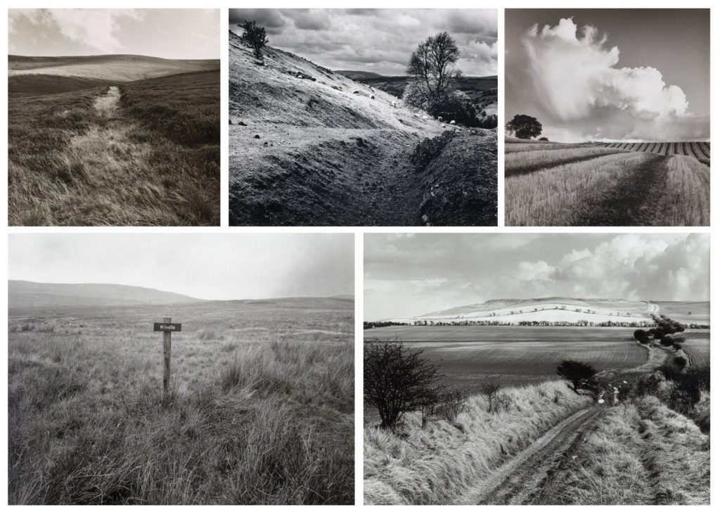
In this image Godwin has used the natural lighting as the image has been captured in an outdoor environment. In this particular image there are a range of tones, varying from dark shades in the grass and bright, almost white tones in the sky and clouds. In addition, the photograph being taken in black and white sharpens the contrast between colours in the image. Although this image has dark and light tones in it, neither are exactly black or white they are just darker and lighter. This leaves the image feeling more natural and untouched, where as if it was edited where the dark parts of the image were fully black it wouldn’t look like an image of nature. To capture this image Godwin has positioned herself in the middle of the path, which has lead to the leading lines that are presented to the viewer, creating a singular focal point. The focal point in this image is very clearly where the pathway meets the hill in the background and looks as though it ends. The way she has positioned herself to take this image also places the end of the path in the middle of the photograph , which again draws the viewers eyes to this particular point in the image.

rural landscape photography -introduction

Rural landscape photography is in many ways similar to photographing urban landscapes. The difference is rural photography is about capturing the ‘life’ in the countryside. The term ‘rural landscape’ describes the diverse portion of the nations land area not densely populated or intensively developed, and not set aside for preservation in a natural state. The rural landscape provides natural resources, food and fiber, wildlife habitat and inspiration.

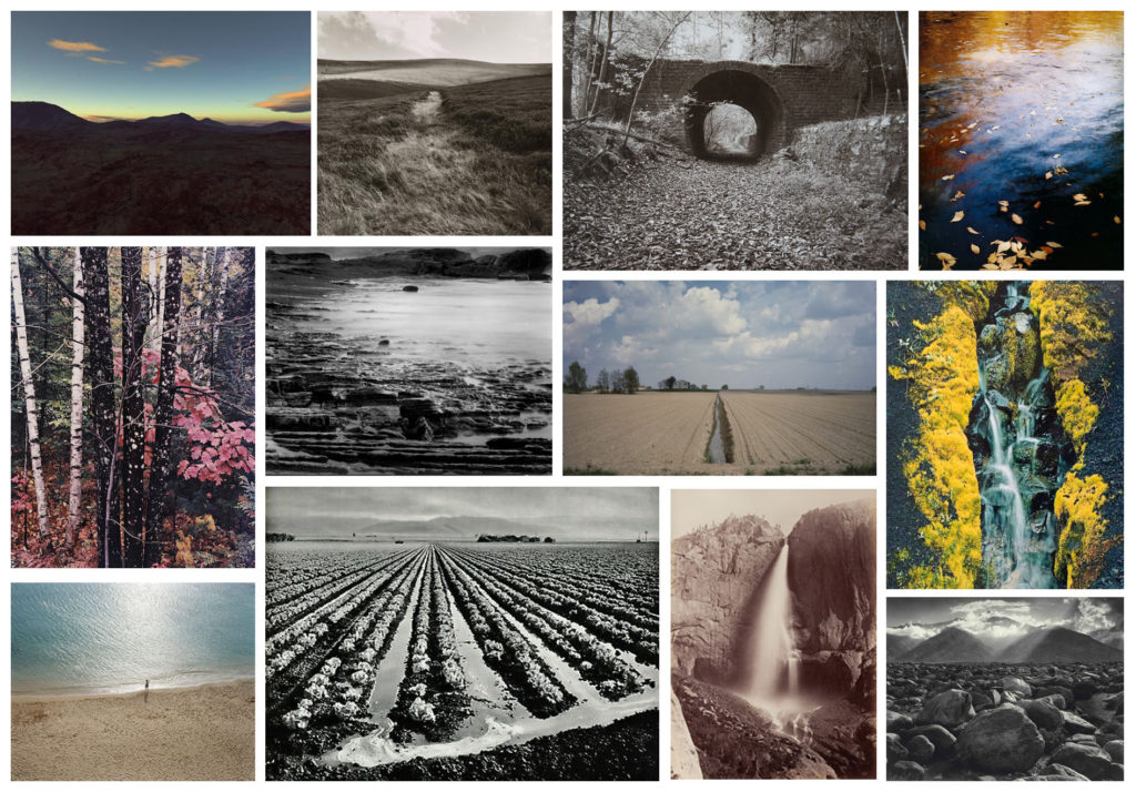
Mood Board

Mind Map

Composition in Rural Landscape photography

Main subject: often, in a not so good composition it is hard to tell what the main subject is. The image has too many elements, creating chaos. Isolate your main subject and let the rest of the landscape compliment it. Create depth: in rural photography one of your challenges is to create depth in the photographs. One way to give a sense of three dimensions is to make sure to include a foreground a middle ground and a background in your composition. Most successful landscape photographs are captured in this way. Different Angles: Move around and look for better angles to photograph. The first vantage point you pick at a given scene is rarely the best. Always look again. Include the sky: An interesting sky with clouds gives dimension to an image. If it is an overcast day with a white boring sky, you should consider not including the sky at all as it doesn’t add anything to the image. Weather: Don’t let the weather stop you. Stormy clouds can be beautiful. A dramatic sky over an abandoned house can take your rural photo to the next level. Go out in different weather and make the most of it. After rain comes sun – within minutes the sun can break through the clouds and create some beautiful sun rays. Create Mood: On the countryside, with fewer people, it can be quiet. Try to create loneliness or a mood that makes the viewer feel you are photographing far away from the city. Rural landscape photography is about reflecting the less busy everyday life in the countryside compared to the busy life in the cities.

analysis and evaluation

The Process

To start off this whole process I researched in depth the true meaning of identity. I then created a mood board of images that caught my eye, and a mind map of types of identity that I could explore.

Afterwards I researched specific photographers that explore identity. I made mood boards of the photographers that I liked and researched them in more detail. I then made a new blog post doing a comparison of Claude Cahun and a photographer of my choice, Zarita Zevallos. Next, I completed a case study on Claude Cahun, where I created a mood board of her work and analysed one of her images.

After I felt I had researched into identity enough I started looking at my own photographers to take inspiration from. After some research I decided I wanted to use Lissa Rivera for my artist reference, as I felt her images were eye catching and interesting. I then planned out my photoshoot by deciding who, what and where to take my images. Next, I carried out the photo shoot. After taking my images I selected my favourite images from the shoot and edited them the way I liked. After that I made a blog post for my final ideas.

photo shoot plan

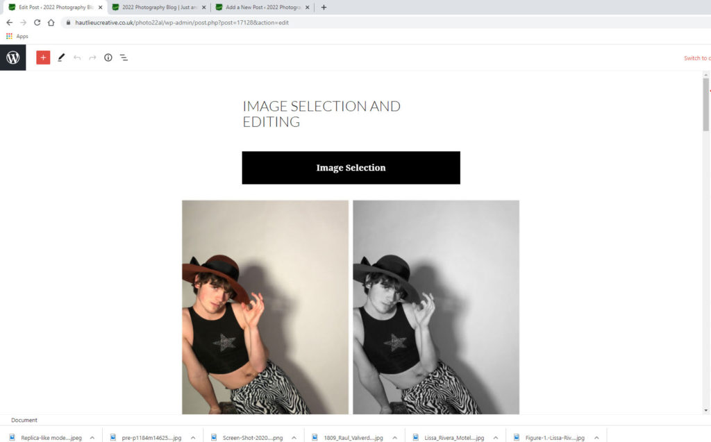
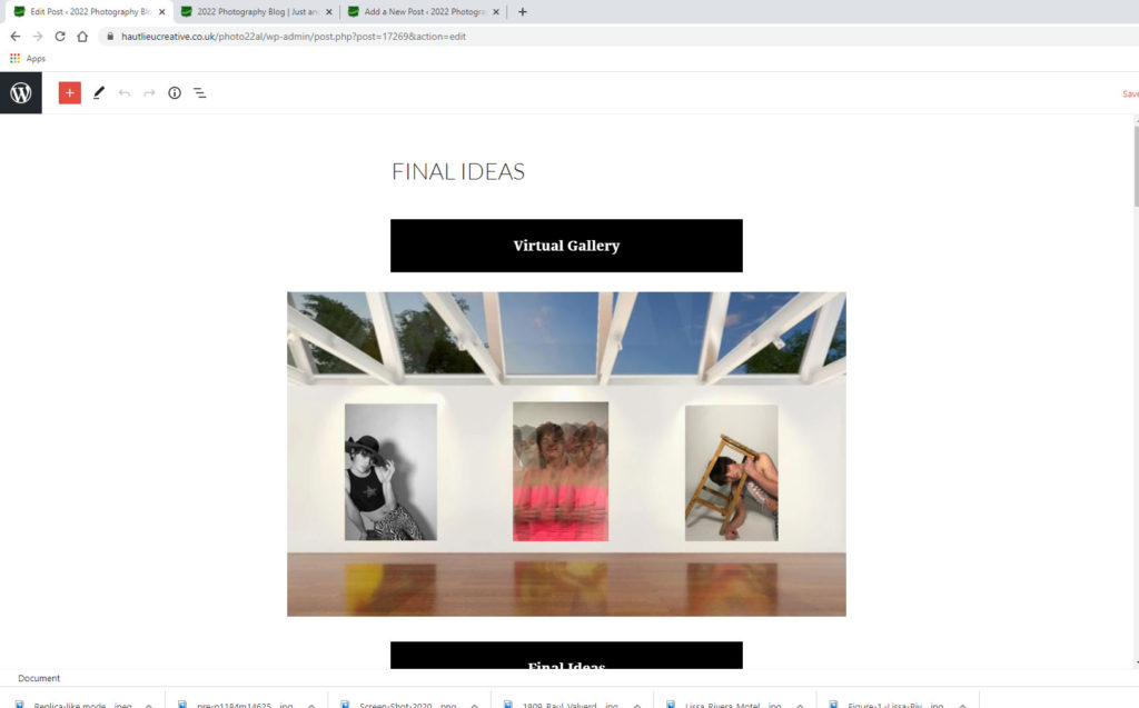
For this photo shoot I am going to use the studio and take images of Drew dressed in women’s clothing. I am going to choose multiple different outfits for this shoot. The images I will be taking in this photo shoot are inspired by Lissa Rivera’s project ‘Beautiful Boy’ which sees her producing images of her boyfriend dressed in women’s clothing. For this shoot I am planning on using studio lighting and a white backdrop, with props such as chairs/stools. To best recreate Lissa Rivera’s images I am also going to have him posing in ways perceived as feminine.

Pictures for inspiration

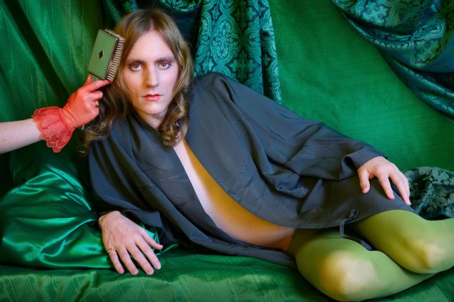
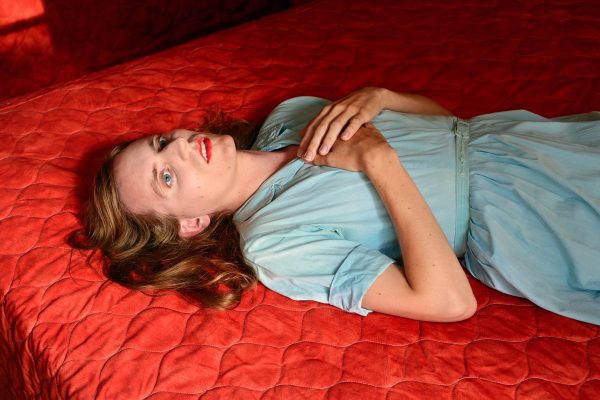
These are my favourite images from Lissa Rivera’s project that I would like to take inspiration from for my photo shoot. However, Lissa Rivera has coloured backgrounds that match or contrast the colours he is wearing and I am planning on having a white background.

Photoshoot 2

For my second quick photo shoot I want to take images of my two friends who have matching hair. I feel like this links to identity as they both have unique hair (pink strips at the front) . Although if you seen them separately you would believe they had hair that is out of the ordinary when they are together it seems like a normal thing as the both of them have it. I also want to take images of one of my friends with her face covered. This links to identity as it seems she is hiding away and putting on a front.

artist reference- inspiration

Lissa Rivera

Lissa Rivera’s ongoing series ‘Beautiful Boy’ focuses on her romantic partner. While they were friends, he once revealed to her that he had worn women’s clothing almost exclusively in college, but after graduation struggled to navigate a world that seemed both newly accepting yet inherently reviling of male displays of femininity. Lissa Rivera thought that photography could provide a space to experiment, and he eventually became her muse and romantic partner. When taking pictures of him she connects to his vulnerability and shares a deep and intimate connection with him. However, it is important to show his femininity as strength, and together they investigate feminine fantasies presented throughout the history of photography and cinema. Lissa Rivera believes that by presenting her partner within the lineage of great beauties and populating the media with the images, they are claiming in their voice what is attractive and beautiful.

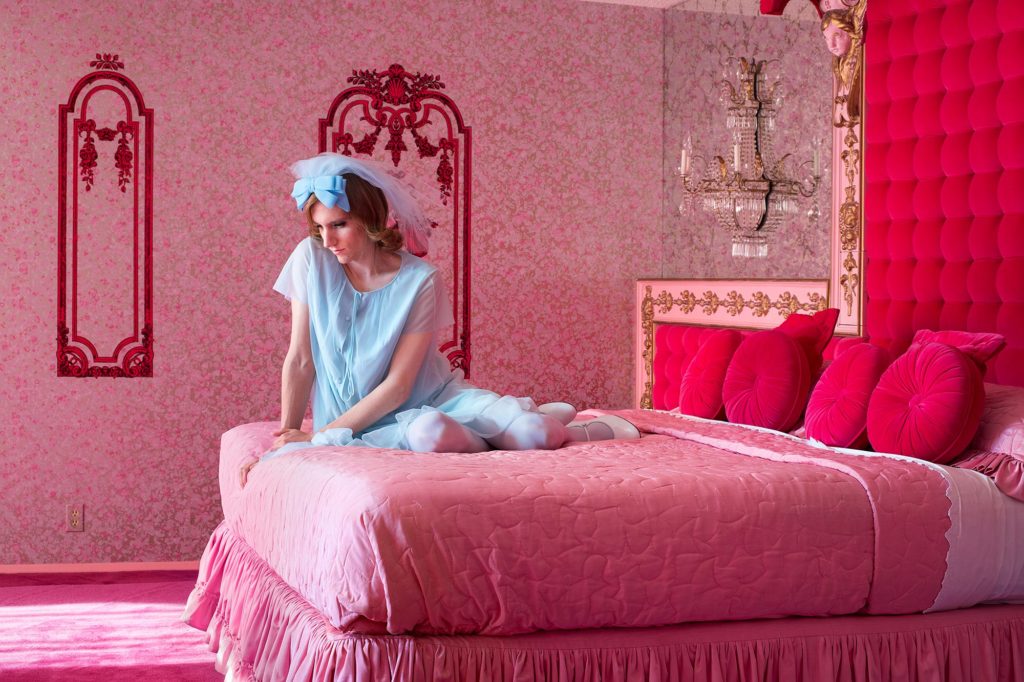
Image Analysis

The colours in this image are very bright and eccentric. The pink and blue tones in this image match well together, not exactly because they compliment each other, but because culturally, they’re seen as opposites. Not only is he dressed feminine in this image but the background could also be seen as feminine as pink is typically seen as a ‘girls colour’. The lighting in this image looks natural as there is light coming through a window or something of the sort directly onto him. Lissa Rivera explained that she “thought about the way Diane Arbus portrayed women in their bedrooms: women who at once had achieved the highest echelon of femininity and domestic opulence, yet at the same time were somewhat of a prisoner to it. Their skill at projecting glamour gave them real power, but at the same time it seems to have isolated them somehow, from other people or from themselves. She felt like the house was somewhat of a mausoleum, preserving a bygone set of ideals that are at once vulgar and supremely innocent in their aspiration.”

claude cahun case study

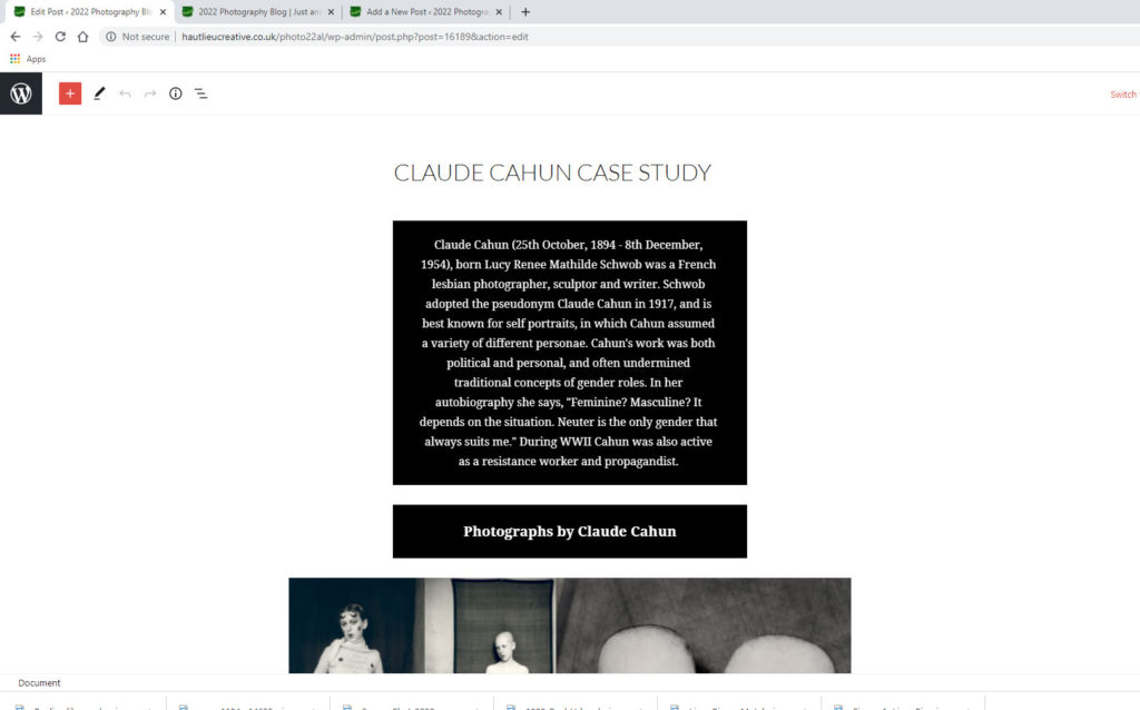
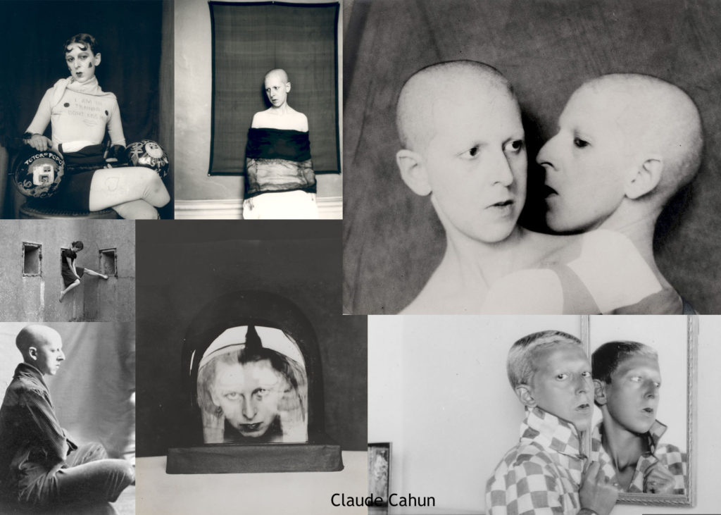
Claude Cahun (25th October, 1894 – 8th December, 1954), born Lucy Renee Mathilde Schwob was a French lesbian photographer, sculptor and writer. Schwob adopted the pseudonym Claude Cahun in 1917, and is best known for self portraits, in which Cahun assumed a variety of different personae. Cahun’s work was both political and personal, and often undermined traditional concepts of gender roles. In her autobiography she says, “Feminine? Masculine? It depends on the situation. Neuter is the only gender that always suits me.” During WWII Cahun was also active as a resistance worker and propagandist.

Photographs by Claude Cahun

Image Analysis

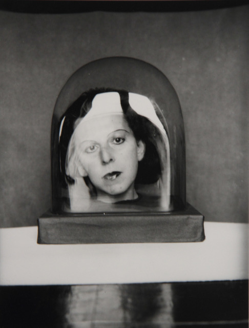
This image is very monochrome, with different light and dark tones that contrast each other well. The composition of this image is well thought out with her head in the glass being the focal point in the center of the image. I believe this image has a deeper meaning and hasn’t just been created because it’s nice to look at. I think this image is a reflection of Claude Cahun’s life as she is trapped in this glass dome and on display in this image, which could imply she felt the same way because people would look and pay attention to her but would never think of her as anything other than a woman because it wasn’t as normalized in her time as it is currently. This image is perfectly thought out as it doesn’t give away too much but it shows enough about Cahun to get you thinking.

COMPARISON

Claude Cahun and Zarita Zevallos

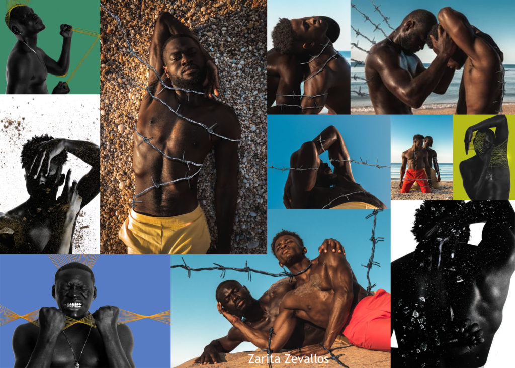
There is clear differences between these photographers and some less obvious similarities. Firstly, all of Claude Cahun’s images are very monochromatic and faded grey tones, where as Zarita Zevallos’ images are extremely bright and colourful. Both photographers are exploring identity and escaping the labels others have given them. Claude Cahun pushes gender boundaries and explores sexual identity by giving herself multiple identities in her images. However, Zarita Zevallos is exploring race and using the barbed wire and the edited image in the bottom left corner to show the men in the images are trying to break free from the stigma that has wrongfully been surrounding black men for years. Claude Cahun created some of the most startlingly original and enigmatic photographic images of the twentieth century, she brought more attention to gender fluidity and sexuality and has been referred to as being ‘years ahead of her time’. Zarita Zevallos, through her hyper-reality portraiture expresses what is going on in a specific community or society in general. Her goal is not only to denounce, educate and create awareness but to incite a movement/change. Both photographers were using their photographs to express their views.