All posts by Jess K

Filters

Author:
Category:

Black Lights

Keld Helmer-Petersen

Keld Helmer-Petersen was a Danish photographer who was inspired by Albert Renger-Patzsch. He became famous through his colour photographs but he also published several books of black and white images that explore dramatic contrasts of tone. Some of these photos were only black and white without any tones as they had been removed.

Helmer-Petersen published his first photobook, “122 Colour Photographs” in 1948. His work was then noticed for its inventive photos, which he turned landscapes and buildings into abstract patterns. He embraced coloured photos as black and white photos were only seen as being serious.
My interpretation

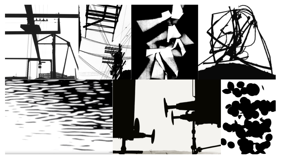
Before

Firstly i picked out 5 images which I liked and then I changed the lighting by using threshold, after doing that one of the images didn’t respond well and it turned into a black smudge. I then cropped the images to cut out some of the smudged areas and focus on the silhouette. With the photo of the boat i decided to invert the image and focus on the boat being black instead of white as that’s what Helmer-Petersen focused on, there were also some white dots so I used the black pen to colour them out.
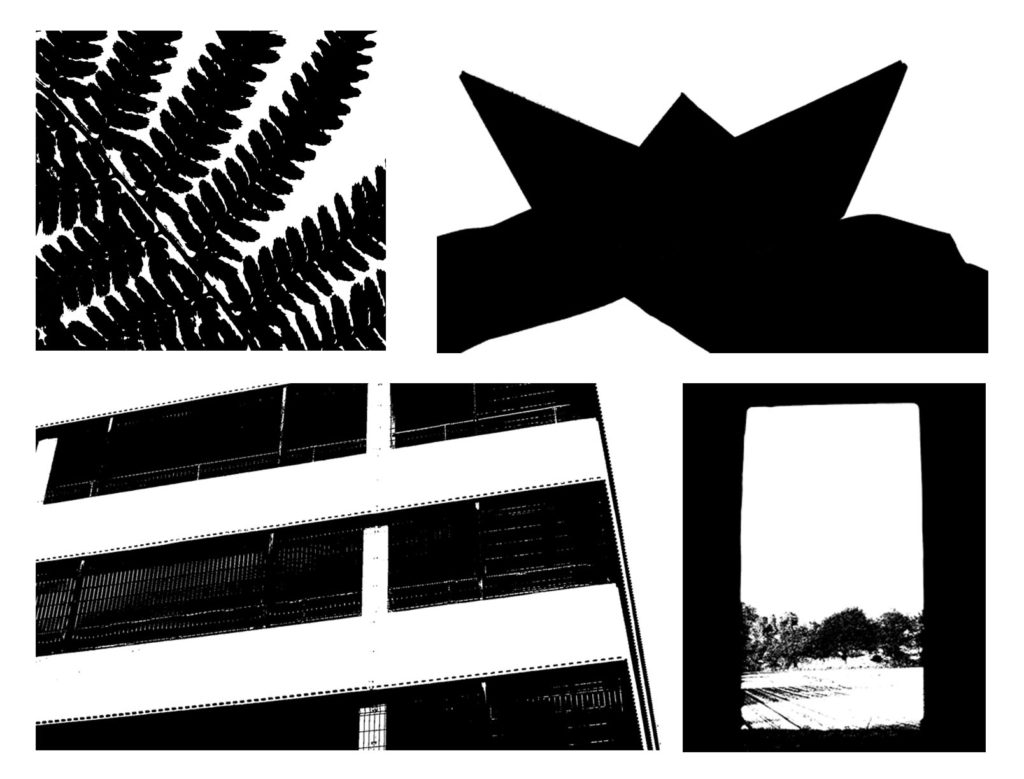
After

Albert Renger-Patzsch – The World Is Beautiful

Albert Renger-Patzsch and the New Objectivity

Renger-Patzsch has always been involved with photography since the age of 12 when he first started taking photos, after the first world war where he was part of the military service, he then went on and studied chemistry at Dresden Technical College.He then returned to photography in the early 1920s as a press photographer for the Chicago Tribune.

~~~~~~~~~~~~~~~

IMAGE ANALYSIS

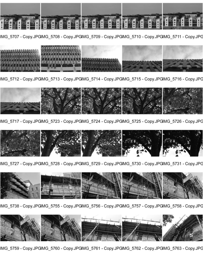
Power lines – In the photo of the power lines the lighting of the photo is natural yet the lighting is quite harsh on the object as the tonal range is quite varied with strong shadows defining the outline. The light is coming from the top right corner, you can see that the level of control lacks as he doesn’t control the lighting nor how everything is aligned. The focus point of the photo is the bottom line on the middle circles with a sharp depth of field. The tone of this photo is very controversial as there are a contrast of darks and lights. The texture of the shapes are very smooth with 3D shapes which mainly has two lines going from the top left to bottom right.

~~~~~~~~~~~~~~~

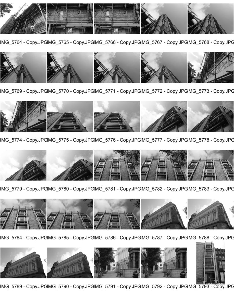
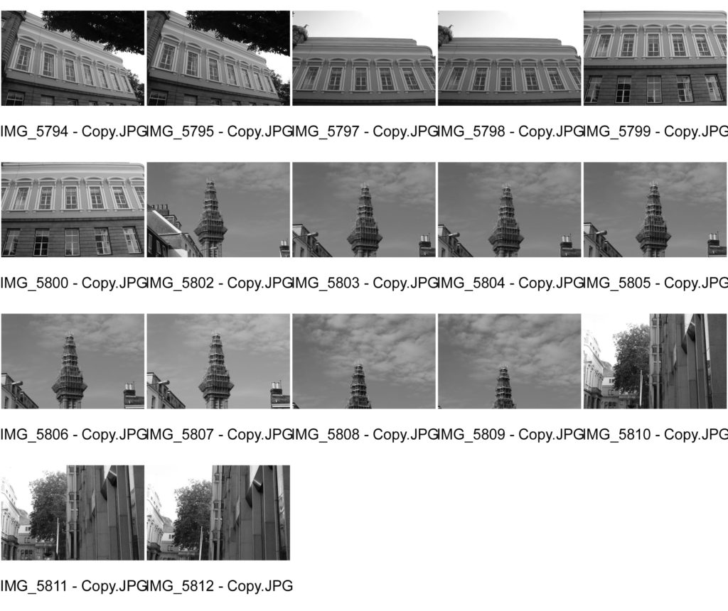
Building – This photo has daylight lighting which you can see coming from the top left corner casting very gentile shadows. The focus of the image are the two front rectangles going from one building to another. the shutter speed must be fast as the image is quite dark in areas showing that it didn’t have a slow shutter speed. The tone of image is very wide as in the sky you can see it’s very white colourless whereas the shadows are quite dark making it harder to see the detail in the shadow. You can see repetition in the photo with the rectangle blocks going from the two building which is repeated behind going to another building.

~~~~~~~~~~~~~~~

SIMILARITIES 

In both these photos they use natural daylight lighting used from everyday, they both have lines going across the image coming from a noticeable centre point. Both of the photos show repetition with the lines going across even though the power line has more repetition and the building has less but they both show repetition. Both the images are man made and not natural objects found in the wildlife showing how he focuses on man made objects.

~~~~~~~~~~~~~~~

DIFFERENCES

 In the power line photo it has sharp deep shadows with a wide tonal range whereas the building photo has very light shadows and a small tonal range. With the photo of the power lines the cables going across the image are to be seen as messy and chaotic whereas the building has a clear set destination for the lines and gives a calm feeling to the person looking at the photo. In the power line photo is has a very smooth texture to it whereas the building photo has a rough texture due to the walls with white and black tones showing there is strong texture to it. The windows also have rough texture where some are missing and some are black.

~~~~~~~~~~~~~~~

My interpretation

paper and formal elements

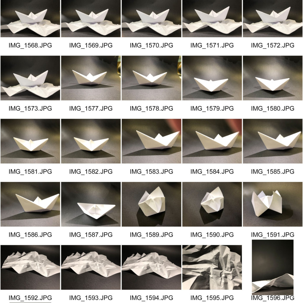
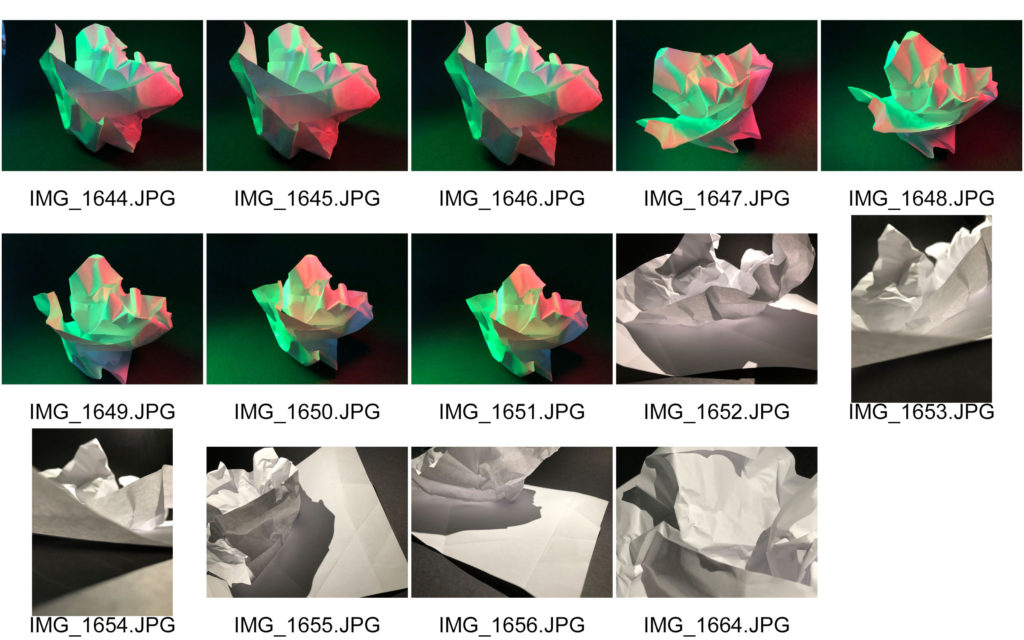
Light: the brightest areas of the photos are the centre of the objects as with the boats it’s inside the boat unless it’s on it’s side then it’s the side facing up. The shadows face different ways whether the light is coming from the left, right, centre or even from the bottom. The shadow is always seen as we wanted a contrast of tones across our photos. We used a semi harsh artificial light to cast where we want the shadow to be and sometimes we would use two lights to strengthen the lights.

Focus Image

Line: There are multiple lines that intercept each other, some are straight lines coming from different directions on the boat whereas the lines on the paper underneath are very angular and unpredictable.

Repetition: There’s repetition in da boat with the angles reflected vertically giving the boat symmetrical structure whereas the piece of paper underneath is random giving the image a chaotic feel to it.

Shape: The edges from the image is very straight and sharp which relates to each other because they cross over each other without loosing the direction they’re going in.

Space: The image is very shallow as it only has a mid ground and a background with small open spaces behind the boat and piece of paper underneath it.

Texture: In the photo you can see that it has a very smooth texture on the boat as you can see that there are no bumps or lumps on it where as the piece of paper underneath would have a bumpy texture as the folds give it a creased took.

Value/Tone: Black and white tones can be seen throughout the image going from the lightest at the centre going darker with shadows of the boat and piece of paper.

Colour: In the focus image it doesn’t use colour except the yellow light going across the image reflecting off the black background. In other photos we used colour which the saturation has been toned down to give a more diluted colour.

Composition: The boat and paper have been arranged in the centre with the boat as the focus of the photo and the paper underneath to represent the sea.