All posts by Francisco P

Filters

Author:
Category:

the new topographics

The new topographics was the turning point in history in 1975 which was a shift away from photographing traditional landscapes, to photograph of landscapes that are unromanticised, industrial urban landscapes. This movement of new landscape photography was made because of the fact that society wasn’t recognising the issues of how the world was being slowly decaying from the natural landscapes being altered to urban, man made buildings taking over, raising awareness of the issue that was on the uprise. The photographers that where involved in this movement where 10: Robert Adams, Lewis Baltz, Bernd and Hilla Becher, Joe Deal, Frank Gohlke, Nicholas Nixon, John Schott, Stephen Shore, and Henry Wessel.

Pitheads 1974 Bernd Becher and Hilla Becher 1931-2007, 1934-2015 Purchased 1974 http://www.tate.org.uk/art/work/T01922

As you can see from the image above, this photograph is perfect in terms of the explanation of the “new topographics”. This reasoning behind this is because in the image you can see how there are industrial images as the main focus when you look at the image, however, if you look in the surroundings of these images you can see that there is some natural scenery in the surroundings of these industrial landscape images. This is because the photographers that where apart of this movement tried to get across that if society carries on with having urban/industrial landscapes cover up the world, we wont be having many more natural landscapes or even beautiful scenery to appreciate from what the world has given us.

Plan

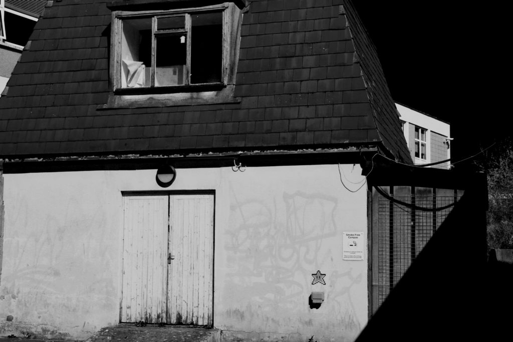
Where – photo shoot will be taken around oakfield sports center and highlands.

What – I will be taking some deadpan images of industrial buildings

When – I will be carrying out this photo shoot during the daytime at around 1pm.

How – These photos will be taken at head height with the camera facing starring onto the object that i will be taking pictures of with the setting’s being exposure/80 and IOS/400.

Why – I am taking these pictures in inspiration of the new topographic in taking my own pictures to do with this project.

Contact Sheet

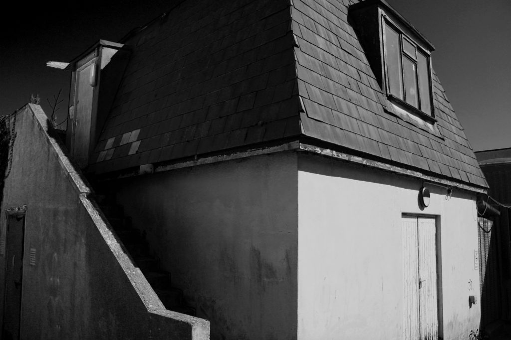
Final Images

From my final images, i got them to look so appealing in the compositions of black and white through editing. The process I went through in editing the images where making them black and white, then i went ahead and changed the colours that where in the images originally to enhance some proportions of the images. For example, it is shown in my images that you can see some dirt and textures that are enhancing from the edit making them appealing.

Comparison

Frank Gohlke

My Image

In both images, the lighting used is petty much identical, Frank’s image was lighted by natural light coming from above and behind the two focal points of the image which is directly above the structures. I know this because it shown in the picture’s that there are shadows on the ground in front of the objects on the ground. In my image, I used an aperatu

Juxtaposing Archive Images

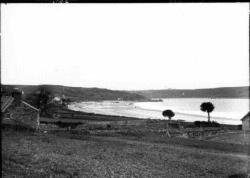
Archive images are images that are stored and kept away images for people to be able to see them in the future, for the purposes of learning about the history of an image or to see the difference of an image through out the years to analyse it.

This is an archive image of St.Brelade’s that was taken with the view of the bay facing towards Ouaisne, in between the years 1850- 1920 as an assumption due to there being no information on when the image was taken.

Juxtaposed Image

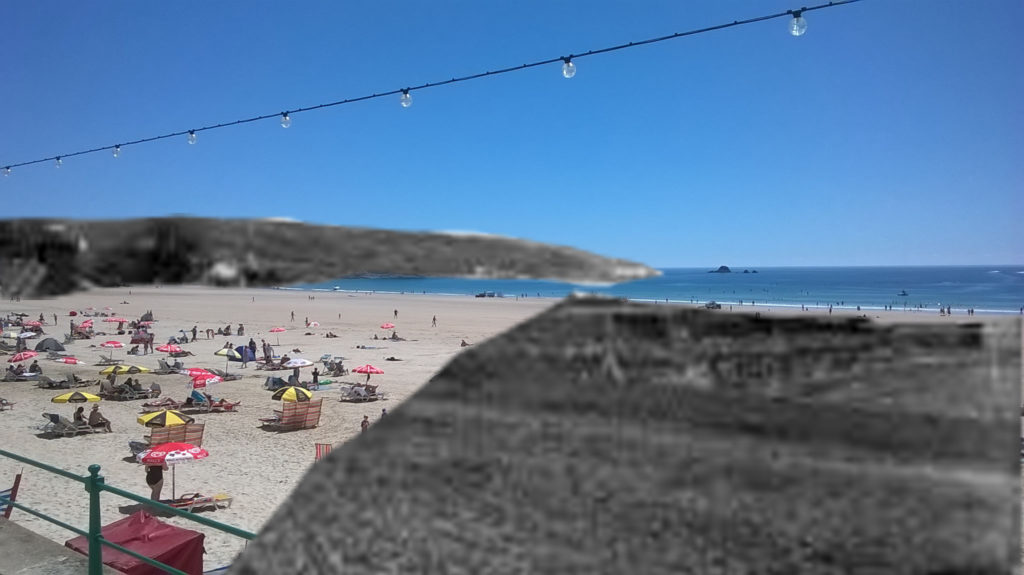
Here is the image that I ended up editing by the use of two images of St.brelade’s bay from years ago and St.brelade’s bay today. The process i went through in creating this image was by getting up both of the images on photoshop, then cutting out certain parts of the old St.Brelade’s bay, then copying and pasting it onto the new one and adjusting the cut outs to fit in the image.

rUral landscape introduction

Rural landscape is photography that’s taken in the countryside in order of capturing the life of the countryside for people to look at the image and really realise that the we have beautiful places around us possibly all the time. For me I find that rural landscape photography is used in order for people to really analyse the images of rural landscapes, so that they can really see the beauty in some places because usually people go to amazing places and ignore the whole situation however, these landscape images are almost a reminder for people to look at. Moreover, when these types of images are looked at, people might even see things that they wouldn’t have even noticed whilst being at these places in person. Rural landscapes can also come with an emotional value behind them because the image could be so appealing to people that they have a reaction to the image possibly imagining that they are at the place in which the photo was taken of, imaging how it would feel like being there in that picture.

Landscape introduction

Landscape photography is capturing images outdoors either nature or urban places that have an emotional connection with them or even a wow factor to them. For example, if someone was to go to some cliff sides on a windy day, they would be amazed by the scenery thats happening with waves crashing on cliff sides and you could take a picture of it because of how intriguing that scenery was. Landscape pictures are taken because the people who where amazed by the scenery want other people to see the scenery and want them to imagine what it would be like to see that picture for themselves in real life and see the reaction that a person could have to the picture giving it emotional value.
Moreover, there are different types of landscape pictures that could be taken, which are rural, costal, urban, industrial and altered landscapes.

Photot-montage history

A photo. Montage is the process of making a composite photograph by cutting out segments of an image and rearranging them and gluing them once they are rearranged or oven overlapping two or more photographs into one new image.

 Author Oliver Grau in his book, Virtual Art: From Illusion to Immersion, notes that the creation of an artificial immersive virtual reality, arising as a result of technical exploitation of new inventions, is a long-standing human practice throughout the ages. Such environments as dioramas were made of composited images.

The first and most famous mid-Victorian photomontage (then called combination printing) was “The Two Ways of Life” (1857) by Oscar Rejlander, followed shortly thereafter by the images of photographer Henry Peach Robinson such as “Fading Away” (1858). These works actively set out to challenge the then-dominant painting and theatrical tableau vivants.

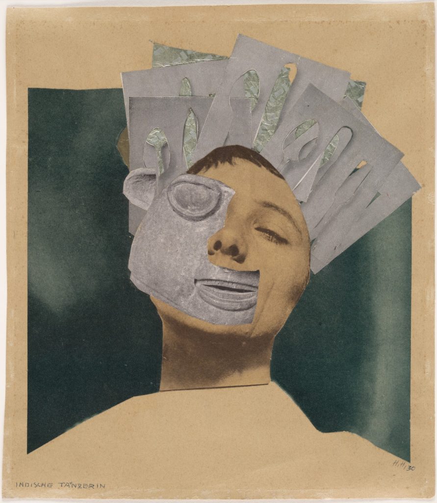
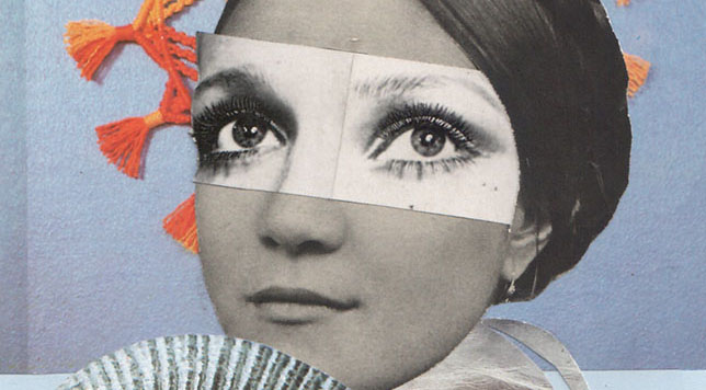
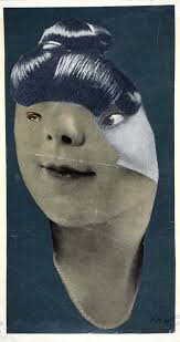
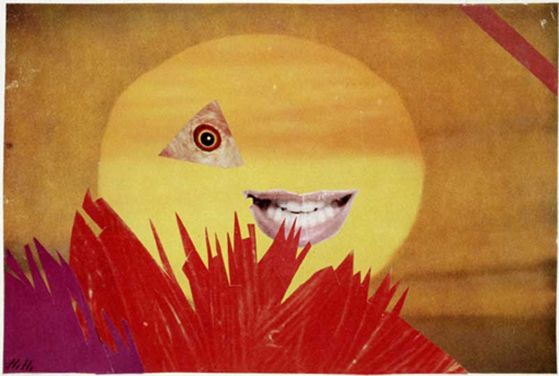
Examples of Hannah Hoch’s photography work.

Final Piece

Before up taking this task, the photographer that I decided to choose from in order to gain an influence/ idea was Kensuke Koike

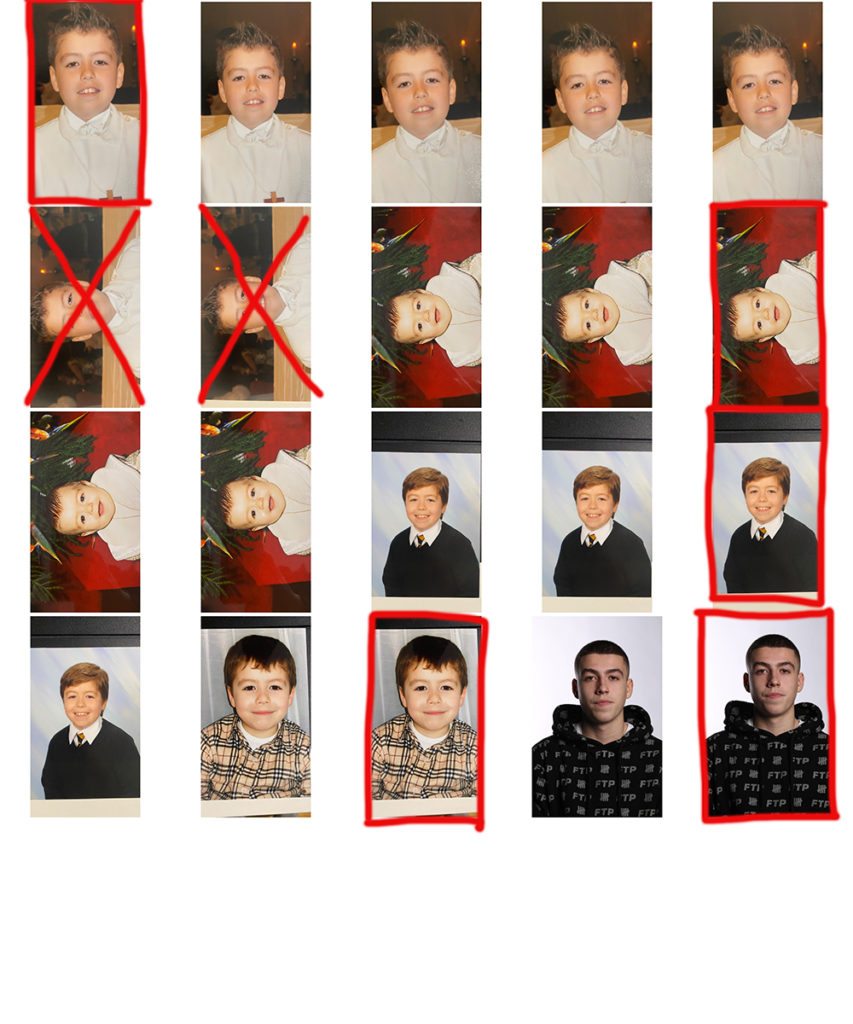
from his photgrpahy i decided to get pictures of myslef from a young age, to an older age with a plan

Who- Pictures of myself from different ages

What- I will be getting some albums from my house in shelves and taking pictures from photos in the albums of me at various ages.

When- This would of been done before the mock in order to be prepared for it on the day having images to edit from.

Why– I thought getting pictures of myself would be the easiest way in talking about the topic of identity.

How– Taking pictures with a camera in a room with a bright like supposedly my kitchen of the pictures in the albums

Contact Sheet of images

Influencer Chosen

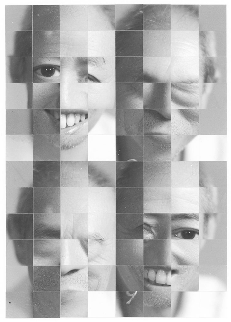
The Photographer i decided to be influenced by was Kensuke Koike

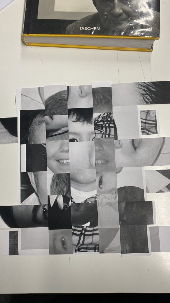
The reason I have chosen to be influenced by the work of Kensuke Koike is because I feel like his style of Photography is very appealing to look at but also his work goes a lot deeper than just the appearance. His work goers deeper with links to identity because of the way that he modifies his photography with geometrical cut outs of a face and rearranging it into a different format. The link to identity with his work is that a standard portrait picture should never be a final outcome to identify someone for who they are or what they look like, because the identity of someone can be very vast as to an appearance like their cultural backgrounds and you could even go to say his work can be based on origami which is quite culturally big in Japan . Moreover, his work linking to identity is quite based on Japanese societies and culture as he grew up in Japan as quite a few of his pictures are of Japanese people.

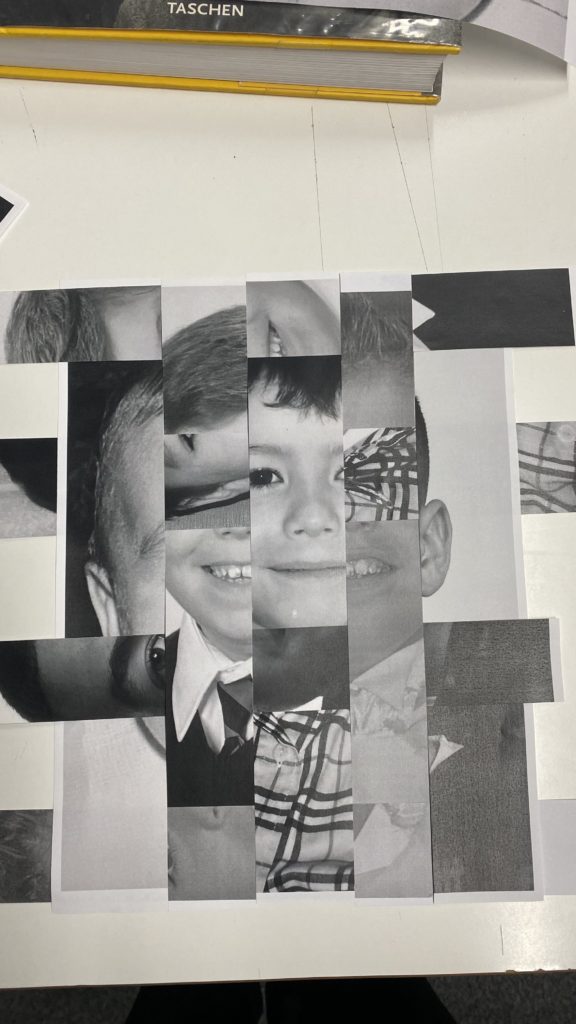
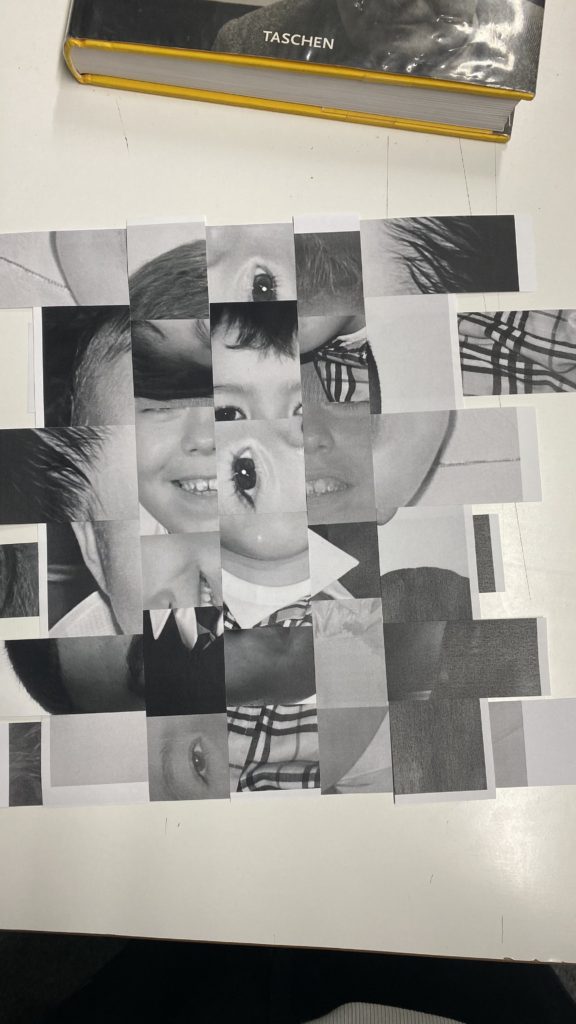
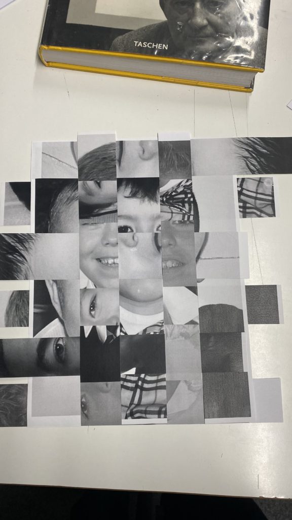
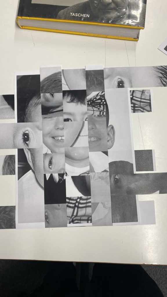
Therefore, I found that my final piece was most similar to his work due to the fact that I have rearranged the photos I had taken and put them into different orders making a different variation of the original images. Moreover, I had my images in black and white which links to most of his work. Finally, I decided to make a GIF which is a silent animation in with my work appearing to shift throughout the slides changing in appearance, Kensuke has also done this on his Instagram page by uploading clips onto his page of his work pieces also being able to move by either unfolding them or moving the picture side to side.

Final Piece

Process in making my final piece

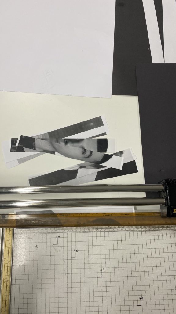
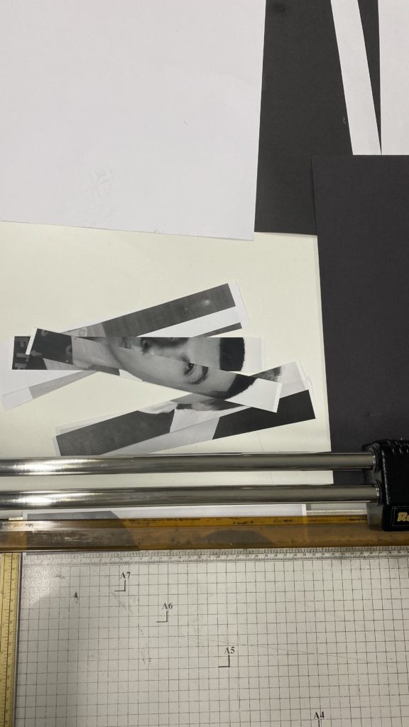
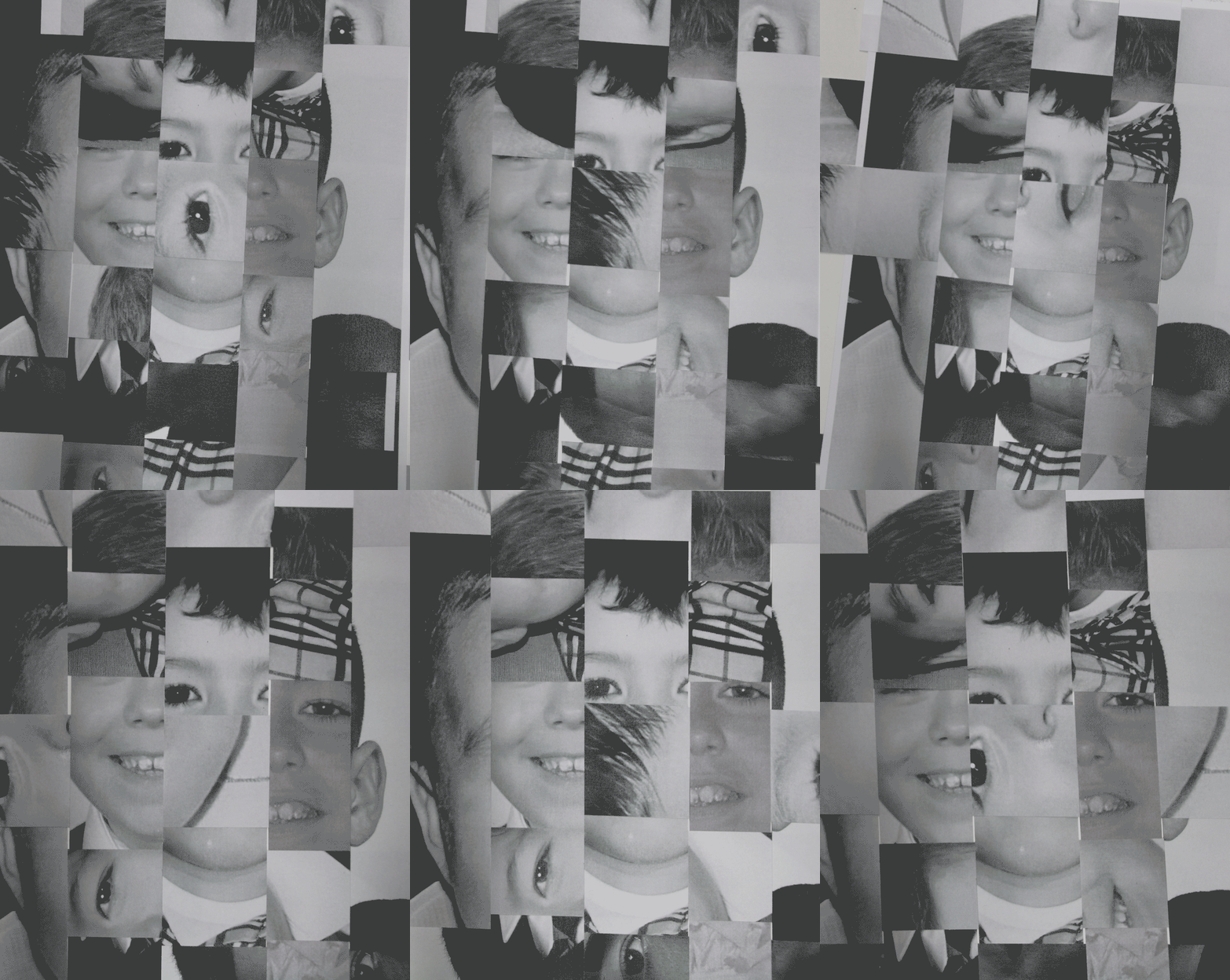
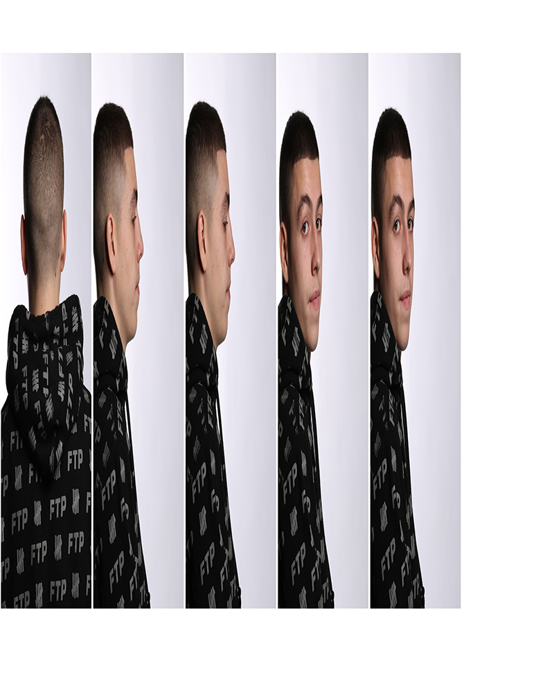
To start off I had to select five different images of myself which is shown up above in my contact sheet of images. Once I had selected the 5 images i had to cut them into 5 different segments vertically in order to get 5 different cut outs from one image of my face which is shown from the 2 images down below.

Once that was done, I then got all the separate cut outs of my face and weaved them together created the image that I thought was best suited for my final piece. As the different cut outs where weaved together, this allowed me to manipulate what the image could look like by sliding the different segments of the cut out pieces having different parts of my face across the image (shown down below with images). As I manipulated the appearance of the picture, I would then take pictures of what the picture looked like as i moved the different cut outs from one another in order to create a GIF for my final piece.

Final Piece

Evaluation on Final Piece

Technical– The lighting that was used in taking the images for my final piece was fluorescent lights, this cause the image to be bright as the light sources was about 1 metre away from the image, This cause the manipulation in the image having nice contrasts between the shades of black, white and grey. the camera was set up with an Iso of 100, aperture of f5.6, shutter speed of 1/100 and finally set with an auto white balance.

Visual- The colour of the final outcome was black and white as I had printed the 5 images in black and white, the tones in the images was quite dark as their wasn’t any bright highlights of white in any of the images. The shape of the images where 2d flat as the images cut out on the table where set flat. I had to cut out pieces of the images in straight lines, then I weaved the images together in order for them to look mixed up and have the image look complex.

Conceptual– There is personally a lot of meaning behind this piece as I am exploring the idea of my journey throughout childhood to now and how I have developed and improved myself. I have included portraits of myself from a variety of different ages representing the fact that, although I have changed, it is still part of me and is what I went through in order to get to where I am today. Each individual image of myself holds a memory that I am able to look back on and appreciate the journey I have had, I believe this allows me to study the nature of myself and help to recognise why I do what I do. It also encourages me to continue to build on and improve myself more into the further future. Overall, this concludes to the point that my identity has changed throughout my journey from a baby to a teenager and I feel like my final piece shows this as different ages of my face are shifting throughout the piece, almost demonstrating the evolution of me becoming the person who i am today and still to this day changing my identity as I grow up.

Claude cahun comparrison

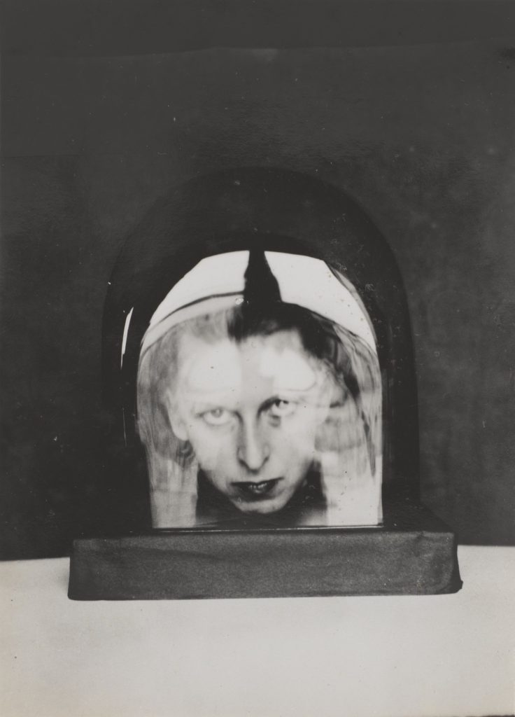
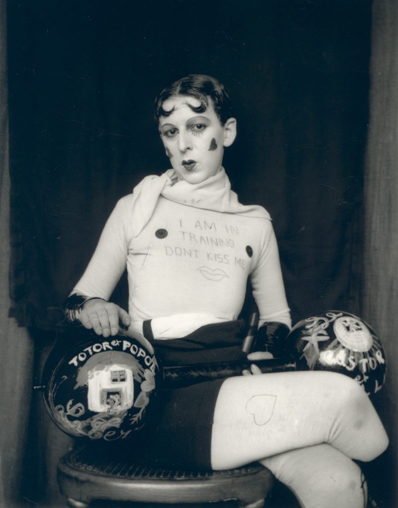
The two images above form Claude Cahun and Carole Benitah both explore identity. This is because in the pictures Their appears to be a lack of identity due to the simplicity of both pictures. In Claude’s picture you can only see her head in some sort of object that appears to be made of either plastic or glass as there are reflections coming off this making it difficult to fully see Claude’s face. Moreover, you can only see her head in the picture as well which gives this a lack of identity as you can’t really see much of the person in the picture.

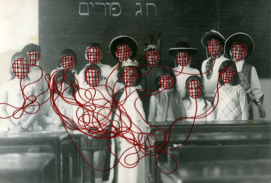
As for Carole’s picture, the faces in the picture are covered in what appears to be red stitching on every face with the strings coming off them tangled up. This shows a lack of identity just like Claude’s picture even though they aren’t to similar because due to the faces being covered up you don’t really have a see for what the emotions on the people’s faces are meaning you couldn’t really imagine what their expressing if they are. Either happy or miserable.

Looking at both of the images, the pictures look similar in the format of how they were taken. They both appear to have a fairly fast shutter speed of 1/125 as there isn’t much movement that is blurred in the images. Another comparison in hoe the pictures where taken, they both appear to of have an aperture of f16 in both pictures as the background and the main appeal of the pictures are both clear visually. As for the ISO, it appears to have a low sensitivity of 200 because you can see some sort of speckles in the pictures but I think this is due to the when the pictures where taken as cameras weren’t as good as they are now.

Claude Cahun cASE STUDY

Claude Cahun was a Born-on October 25th in 1894 and was born in Nantes into a Jewish family who was a lesbian transgender which was expressed later on in her life with the photography that she worked with. 

Cahuns work was involved around writing, photography and theatre. Claude was mostly remembered for her highly staged self-portraits and tableaux that incorporated the visual aesthetics of Surrealism. During the 1920s Claude produced a large number of self-portraits in various guises such as aviator, dandy doll, body builder, vampire and angel. Most of Claude’s portraits include the artist looking directly at the viewer with her head shaved, most of the time revealing her shoulders, and a blurring of gender indicators and behaviours which goes to undermine the patriarchal gaze.

In 1937 Cahun and Moore settled in Jersey. Which was in the time period of the fall of France and the German occupation of Jersey and other Channel Islands, they became active as resistance workers and propagandists.  Against the war, Cahun and Moore produced a lot of anti-German fliers. The couple would then attend many German military events. In Jersey, strategically placing their pamphlets in soldiers’ pockets, on their chairs, and in cigarette boxes for soldiers to find. Cahun and Moore’s resistance efforts weren’t only political but also artistic actions, using their creative talents to manipulate and undermine the German authority. This was done in many ways with Claude dressing up as a transgender taking photos in which would show the mix that she could go between like dressing up as a pretty doll with weights besides her.

A seen in the picture above, it’s quite apparent in stating that you can see the picture was most likely taken in the 1940’s as the picture is in black and white due to the technology in cameras wasn’t as good as it is now. However, this works quite well as the contrast between black and white stands out great with the writing that is written on her top also, the love hearts that are drawn onto Claude’s face. It appears that there was some sort of stand possibly used to keep the camera in position in taking this picture of Claude. The tones in this picture are light bas you can see that everything in the picture is visible, even the background also, you can see that there are light reflections coming off the weights meaning there was some source of light used to make the picture overall stand out. Finally, in this picture Claude is dressed up as a pretty doll with weighs alongside her, this goes to show how she was trying to portray that society shouldn’t judge you for wanting to be free as she seems to be confused in picking between being male or female which could be caused due to society being so judgmental.

Diamond cameo

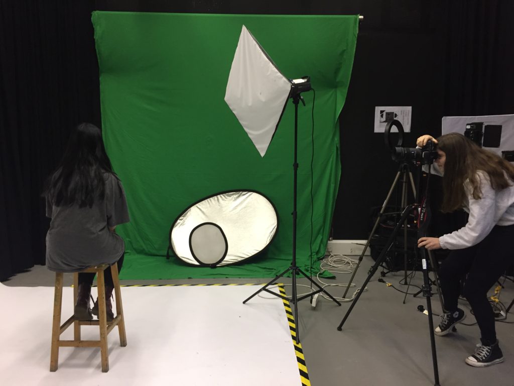
-Camera setting for flash lighting Tripod was used in order to keep the camera still for a high shutter speed.

-A transmitter was on the camera to set off the flashlights.

-ISO was at 100

-Exposure was done manually with a 1/125 shutter speed and the aperture was set at f/16

-Focal length was 105mm with the use of a portrait lens.

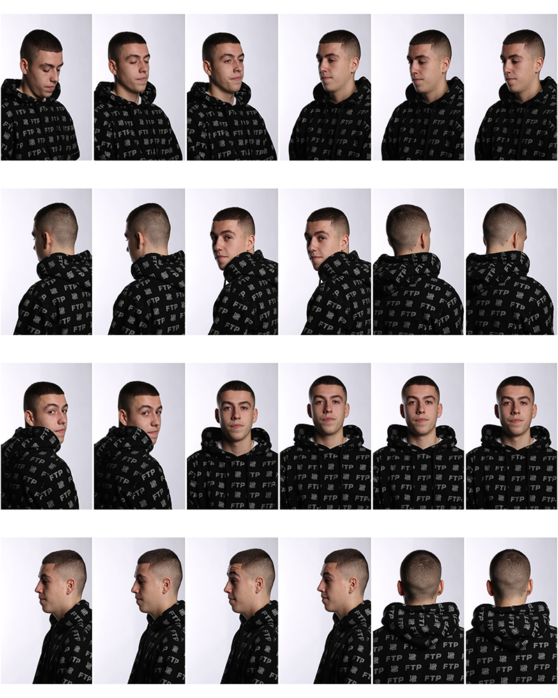
Contact Sheet

Editing 

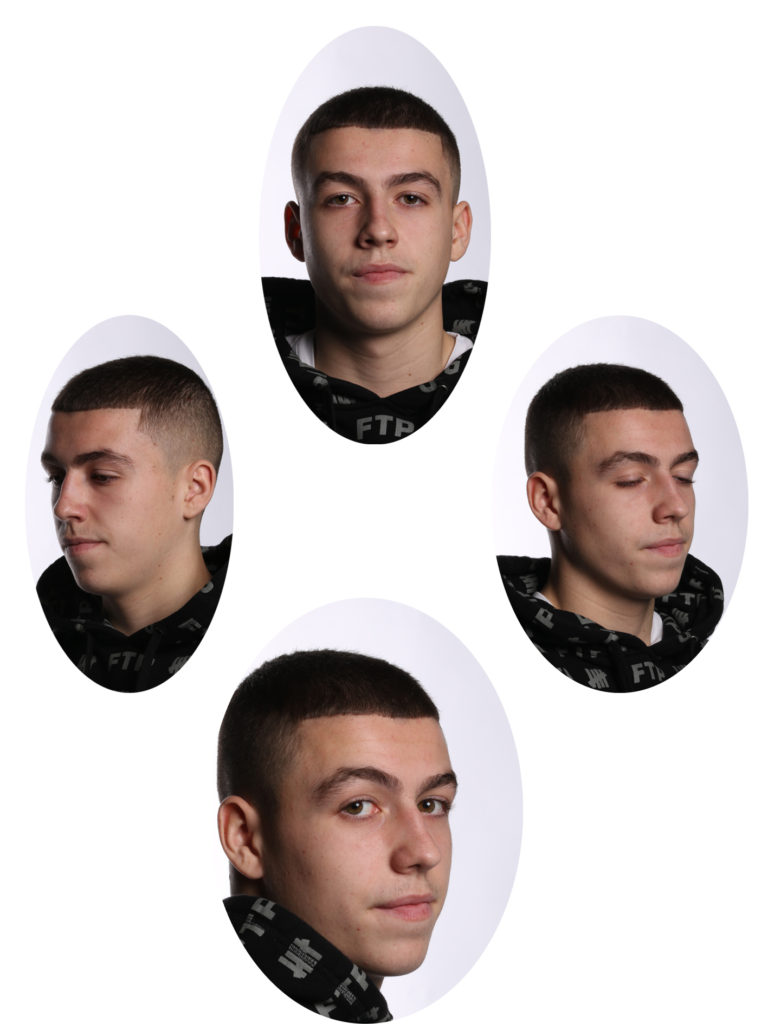
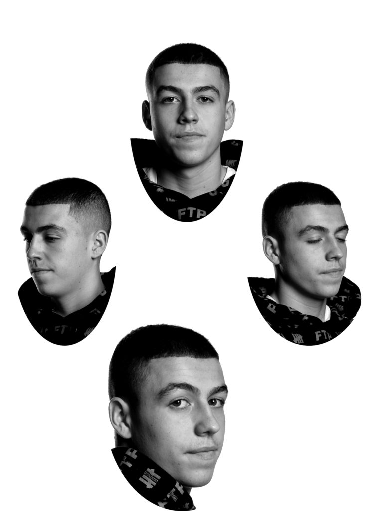
I started off by getting the oval shaped template in order to cut out my face in the images in an oval shape to be like Henry Mullins.

After that, I copied and pasted the selected oval shape on my head onto a different page on photoshop with the 4 different angles I had chosen from the photo shoot.

Finally, once all the different pictures where copied and pasted onto a different page I flattened them to make it one image and edited it with the use of levels and changing it to be black and white to make the Diamond Cameos.  

Pictures

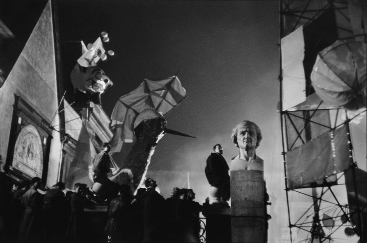
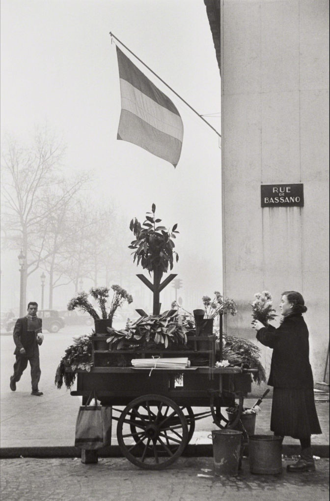
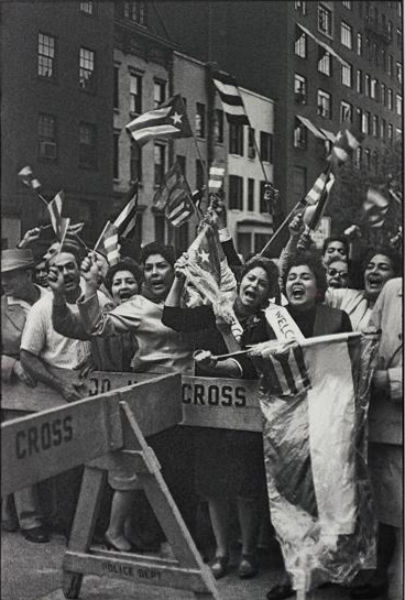
Henri Cartier-bresson the decisive moment

Biography

Henri Cartier-Bresson (1908-2004), arguably the most significant photographer of the twentieth century, was one of the co-founders of Magnum Photos in 1947 and champion of the “decisive moment”. He brought a new aesthetic and practice to photography, initiated modern photojournalism, and influenced countless followers.

Mood Board

Image Analysis

Technical: In this image it is clear the the lighting used for this picture was used with nature lighting and the picture is in black and white due to the times he was in with taking the picture. As for the aperarture he probably had the camera set at f11 because the picture is clearly focused on all the people in the image however their is a slight blur to the buildings in the background. For the shutter speed it was set to be quick as the picture is very sharp not having any one in the image appearing to be smudged or blurred in their movements. Finally, for the ISO it was set at a low sensitivity most likely at a 50-100 as the image is focused on just the people in the image not showing any dust particles or anything else in the place in which he took the picture in

Visual: The colour of the photo is in black and white once again due to the eras in which he took the picture in, on top of that the tone appears to be fairly bright as the picture is clear in what you can see. Moreover, their is somewhat of a contrast in this image from black and white, with the buildings in the background and you can tell the image is cropped in order to have a focal point on the people who appear to be protesting.

Contextual/ Conceptual: The image shows that the people In the image appear to be protesting for a matter of an event that is happening in their country to do with the government which is a great picture that Cartier-Bresson captured and he could show the world that even in countries that are corrupt or even in poverty still fight for their rights.

Magnum Photo Agency

In 1947 Cartier-Bresson founded Magnum Photos which was a co-operative photography agency that was accompanied by other photographers such as David Chim’ Seymour, Robert Capa and George Rodger. Cartier and his fellow photographers had a realisation that photography was incredibly powerful in the use of it being a communication tool, and their agency placed them at a vanguard industry. Cartier’s objective was to cover India and China however, he ended up travelling widely for the next twenty years making assignment’s in the USA, Italy, France, Yugoslavia, Egypt, Greece, Iran, Pakistan and Indonesia making him become one of the world’s most sought after photojournalists. 

One of his personal favourite trips was being able to go to Moscow as he was the first foreign professional photographer to be allowed in the USSR since the death of Stalin in 1953. With help from the locals Cartier Bresson was set about photographing daily lifestyle in his usual style of photography however, there was restriction from him taking pictures of military building’s, bridges and other “sensitive” subjects. This trip that he took aboard created an amazing series of photographs that were published in Life Magazine in 1955. His pictures where mostly taken a across her Western World which most people had little idea about what it was like living daily lives in places like the USSR.

Aside from his influential book the Decisive Moment, Cartier Bresson published over thirty further publications, with the last one being Landscape Townscape, published in 2001. He retired from his professional photography career in 1968 wanting to live out the rest of. His life with his wife, later one dying in his own home in Provence on 3 August 2004.

Comparison

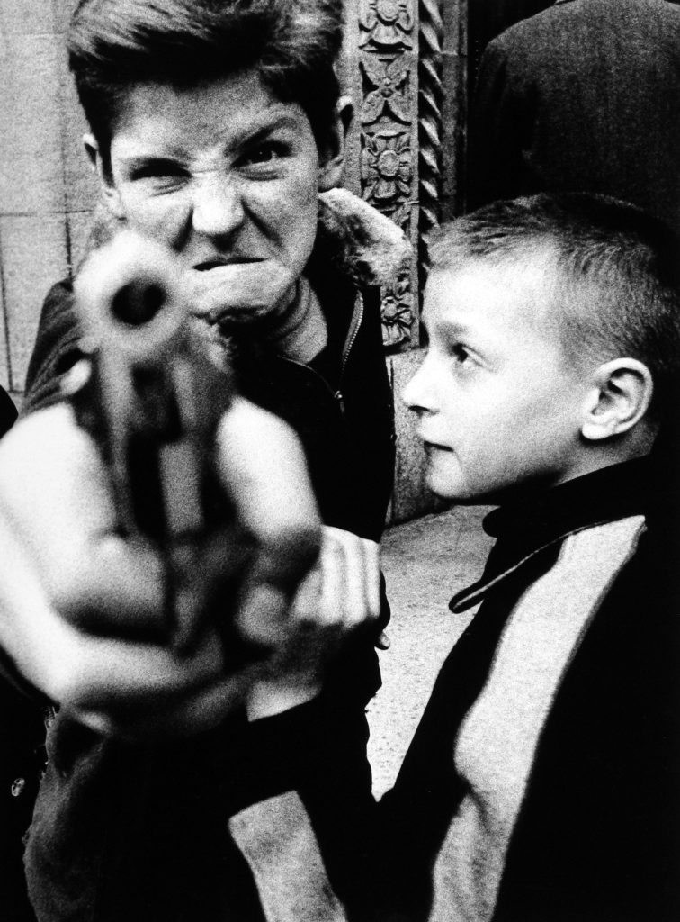
These two pictures have comparisons from Henri and William. This is shown with the two images being in black and white having the contrast from the black and white making different figure stand out in the images also, in the images being in black and white you know that both photographers where taking pictures in similar eras. Moreover, in both images their is a focus point on it being the people in the images which leads to the effect of certain images becoming blurred like the gun in the boys hand and some of the flags that are moving in the images. Another comparison is that you can see the images have been cropped down to make the images neater. The final comparison in the images is how both images seem to have angered people in them giving the pictures a background on what they are about, like in William Kleins image, it goes to show how their was gang violence on the streets, whereas with Henri’s, you can see it is some kind of protest that has caused to anger the citizens from inequality.