

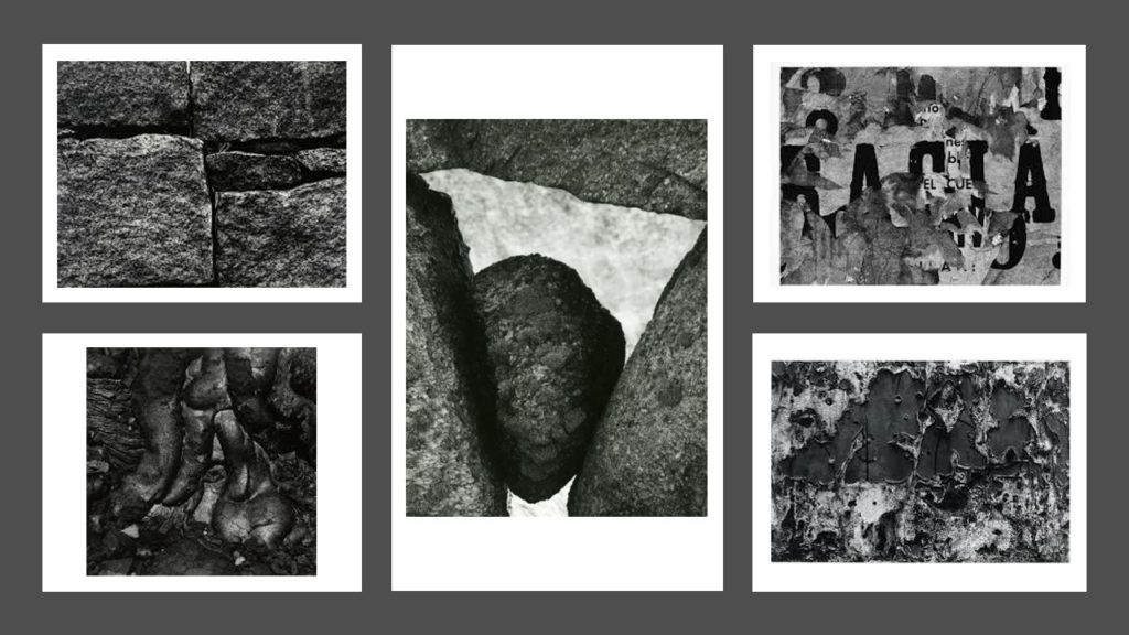
Aaron Siskind
Siskind was born in New York in 1903 and died in 1991.
Siskind focuses on taking photographs that don’t necessarily have a meaning however, his images can be interpreted in many ways. He focuses on layers in his images, it is very rare to see smooth surfaces in his work.
Siskind identified with the ideas and styles of the abstract expressionist artists in New York in the 1940s.
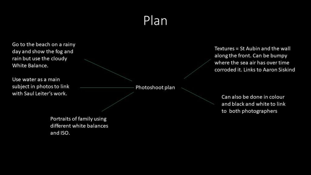
Plan:
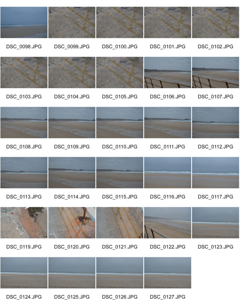
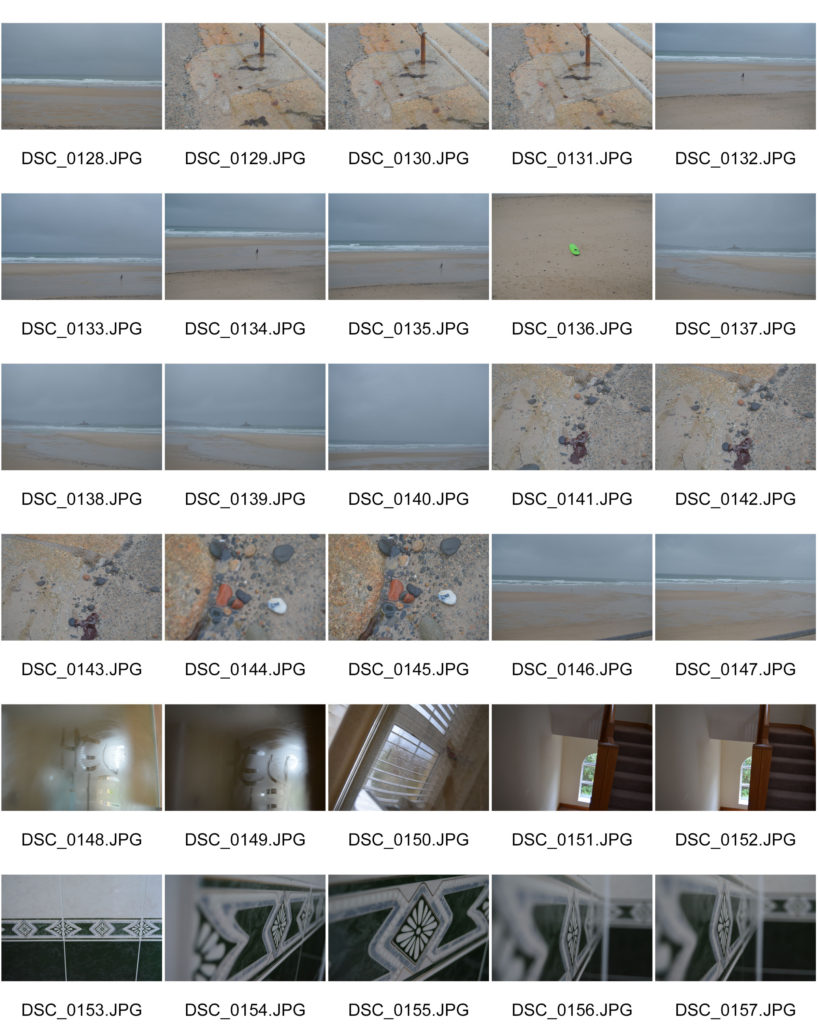
Shoot (Contact sheets on another blog)
I’ve included the images I took in school because I feel that you can see how i have used the different white balances and changed the ISO best on those images. This is because the main feature in those images didn’t move allowing the viewer to notice the difference in tone.
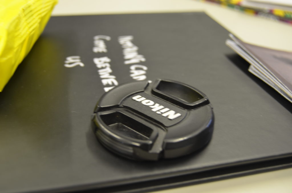
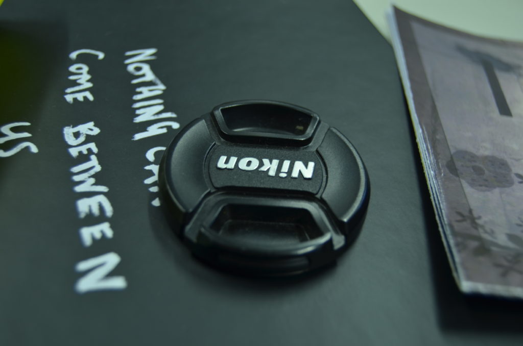
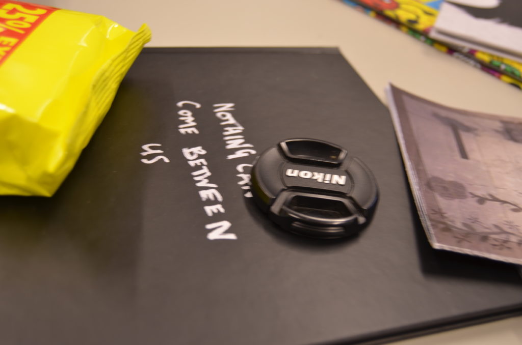
Favourite Unedited outcomes:
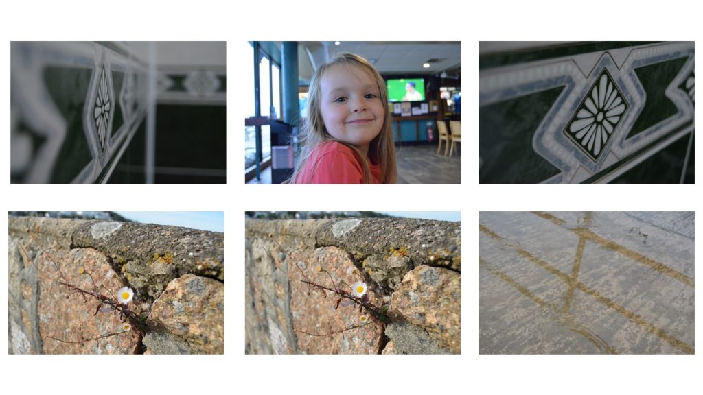
Favourite edited outcomes:
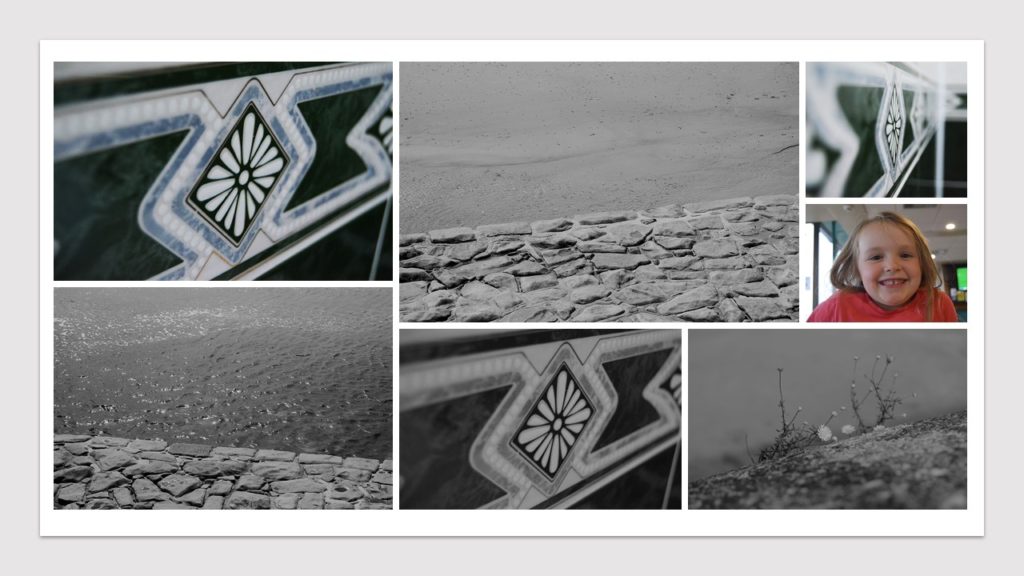
Favourite images
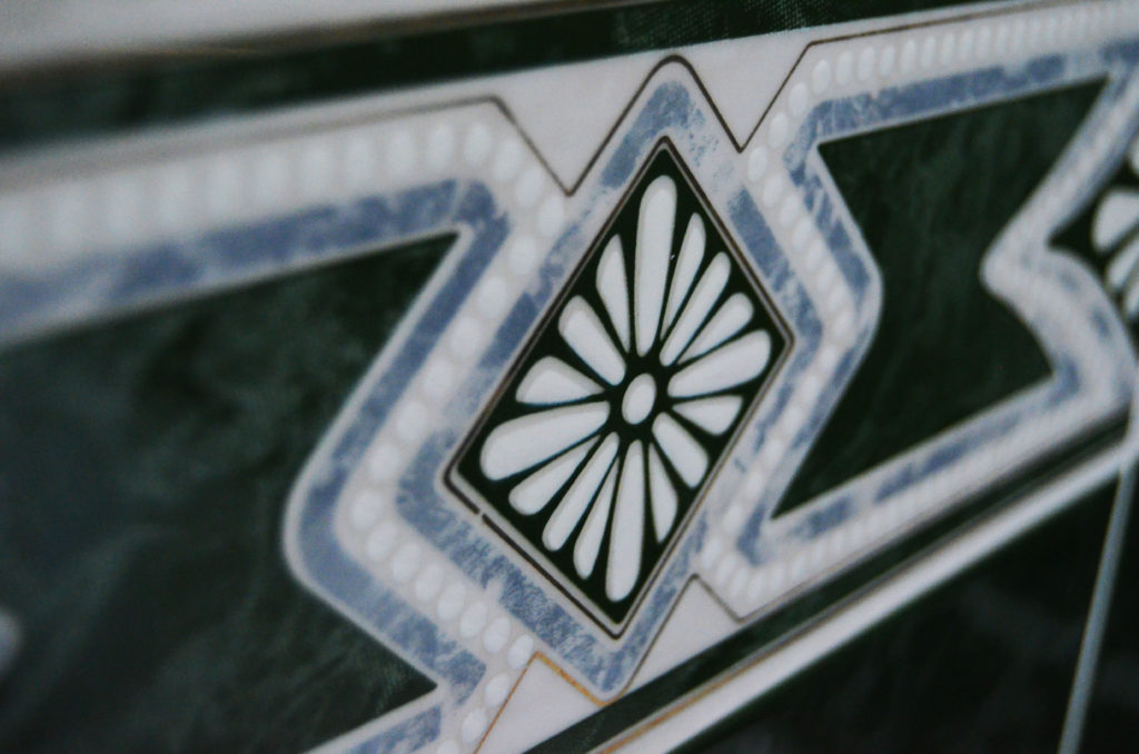

The coloured image is one my favourite images because I feel like the viewer not only sees colour but the different textures on the tiles. .I took this using a 120 ISO and the fluorescent white balance, with a manual focus and shutter speed. .The smooth looking texture of the tile at first glance contrasts the little details of the of the central details like the diamond which is slightly raised and each petal in the centre of it is also raised. The cool tones in the image gives the viewer the feeling of relaxation and this is also supported by the simplicity of the design on the tile.
The black and white image is the same but i went onto photoshop, turned it black and white, then made the contrasts in the photo more prominent so that the viewer can see the bumps around the flower like shape in the centre of the image.
The black and white image also shows the camera focused on the centre of the tile because if you look on the left hand side of the image you can see the details of the tile almost merge into one thing.
Ralph Eugene Meatyard

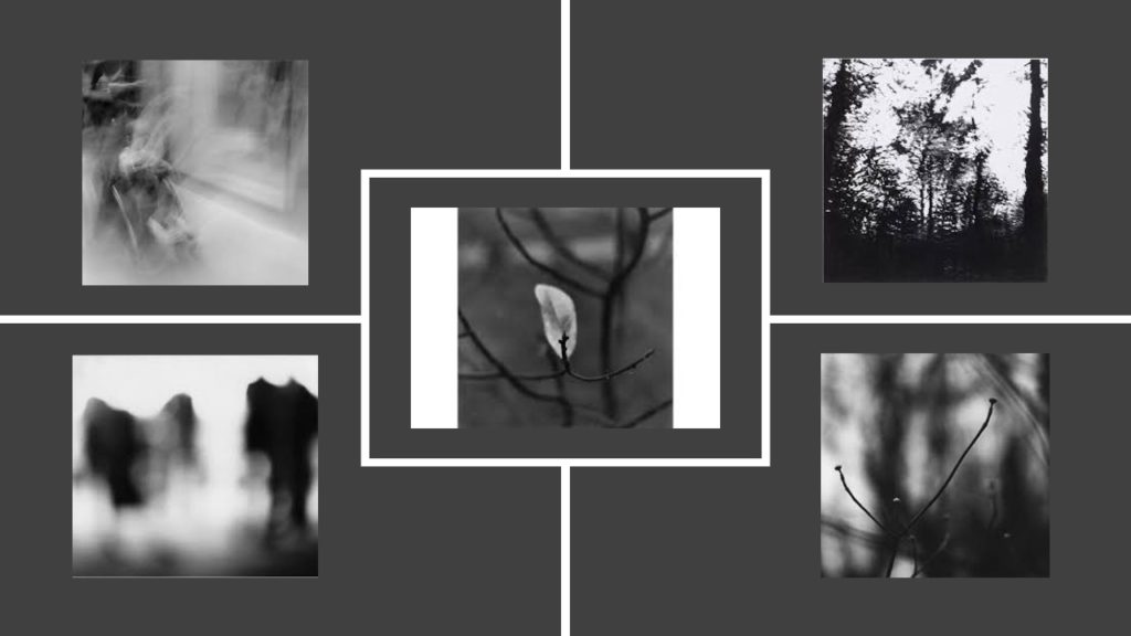
The image allows the viewer to sense either a calm or eerie mood. The bare twigs on the trees gives the viewer a sense of loneliness or depression as there is arguably no life on the trees. One could link bare trees to winter,which is cold, and can be a miserable time of year for some people.
On the other hand, one could also interpret this image as calming as there isn’t much going on with it and nothing is too busy.
In addition, only the front of the twigs are in focus which allows the viewer to see all the little details on the twigs and even see the little buds that are beginning to form on them.
The image is black and white which also gives the impression that the image is made to create a sense of loneliness and depression.
The twigs have a reasonably smooth texture which could be interpreted to show that life is normally simple however there will always be little bumps in the road. No one’s life is perfect.
Keld Helmer-Petersen

Petersen is seen as one of the best photographers in the 20th century. His career spanned 70 years and he had strong interest in modern architecture, industrial areas and structures. He started photographing in the late 1930s and first made his name with 122 Colour Photographs in 1948.
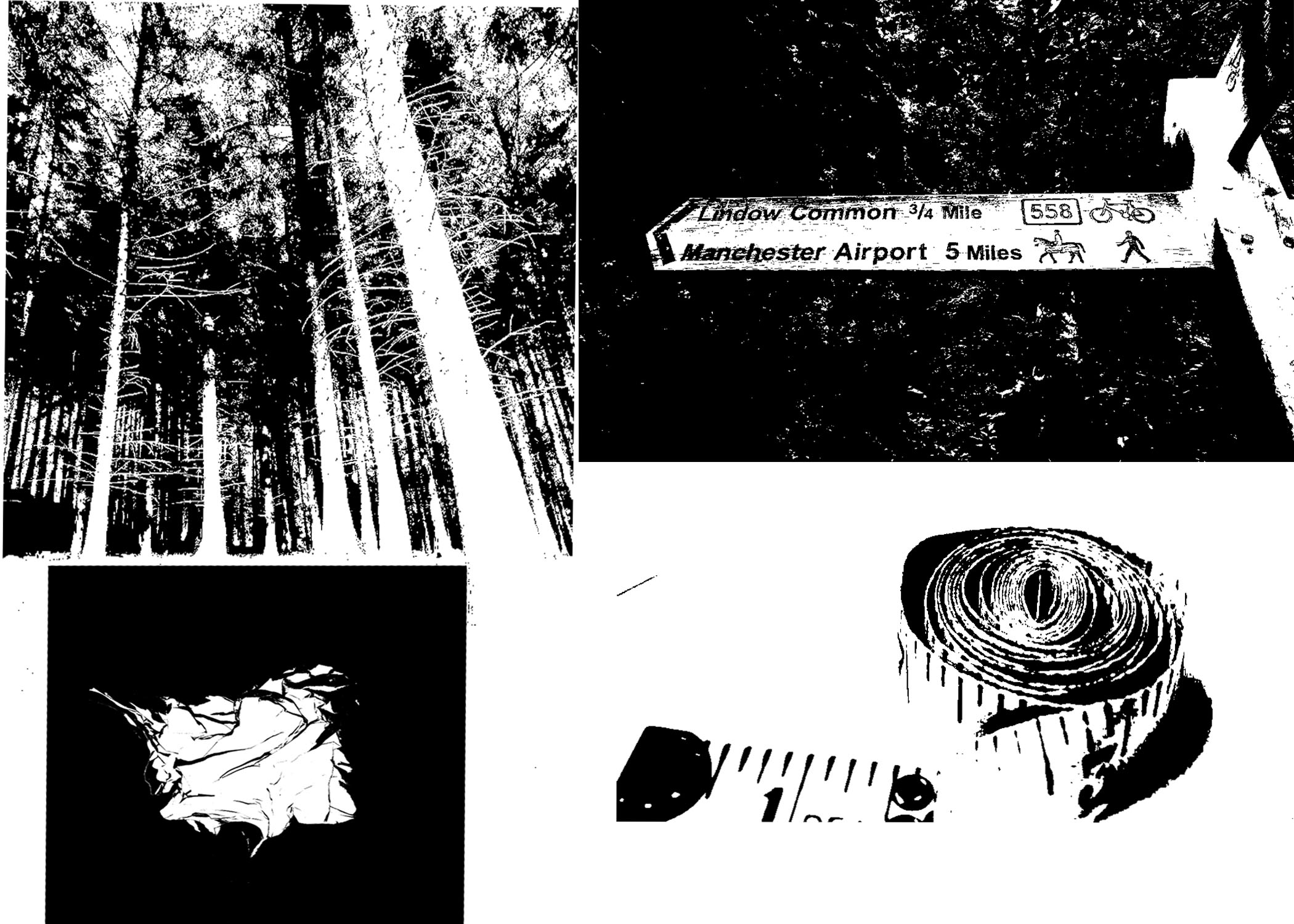
Keld Helmer-Petersen’s black and white images explore dramatic contrasts of tone. In some, we are only presented with images that are black and white. All mid tones have been removed. He created and found these images, using both cameras and flat bed scanners to achieve the effects he was looking for.
My version
Artist Research-Ralph Eugene Meatyard

Meatyard was born in 1925 in Illinois,USA. When he turned 18 he left to join the Navy as he was 18 during world war 2. Once he returned from fighting, he began to train to be an optician.
Meatyard purchased his first camera in 1950 to photograph his newborn first child. Once his children were older and he had a larger understanding of his camera, he began to take more images of his children and also took images so blurry many couldn’t figure out what it actually was.
Inspiration
SHOOT
For this shoot I wanted to try and figure out which parts of the image I wanted in/out of focus. I had only been taught how to manually use my camera, so I was pleased with how they turned out.
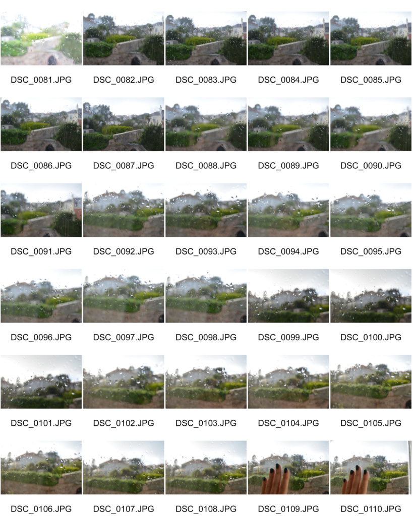
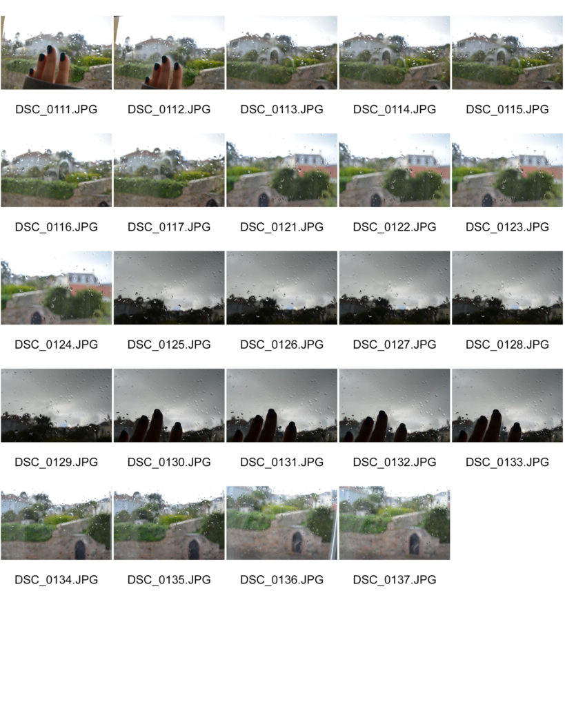
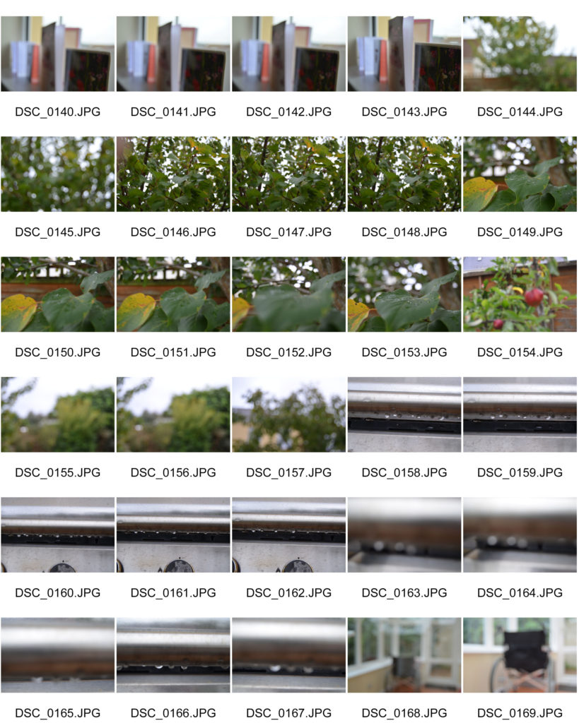

Successful outcomes (unedited)

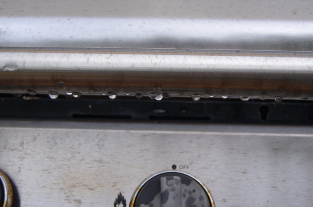





Successful edits








Favourite image

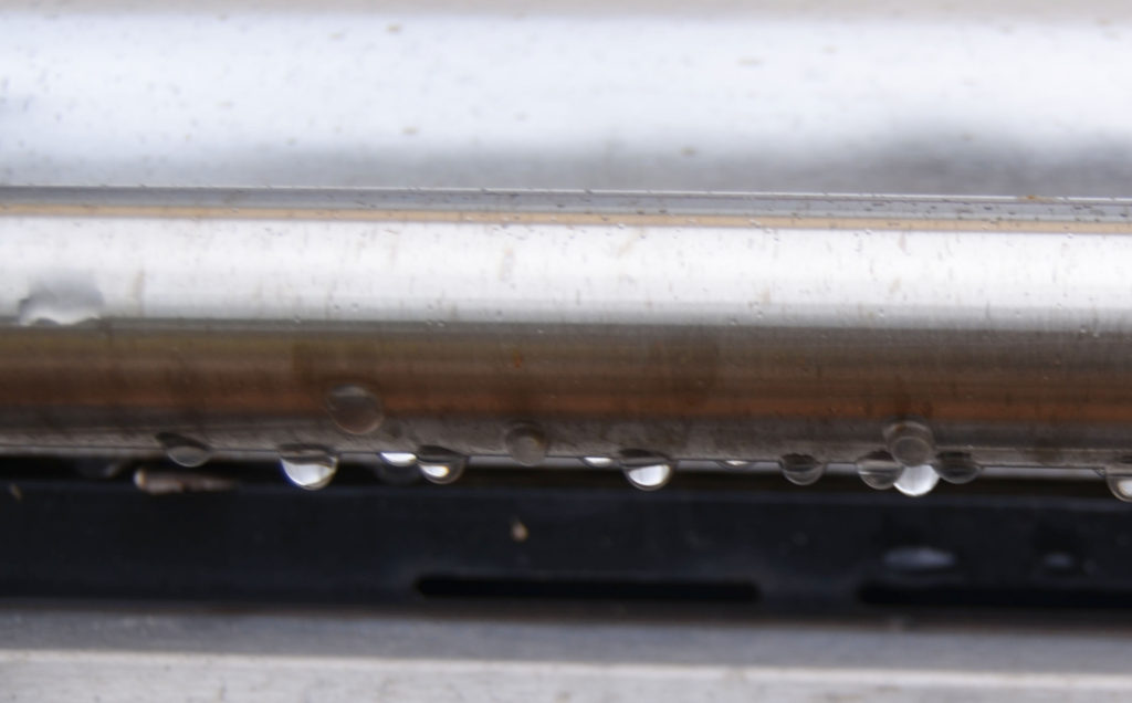
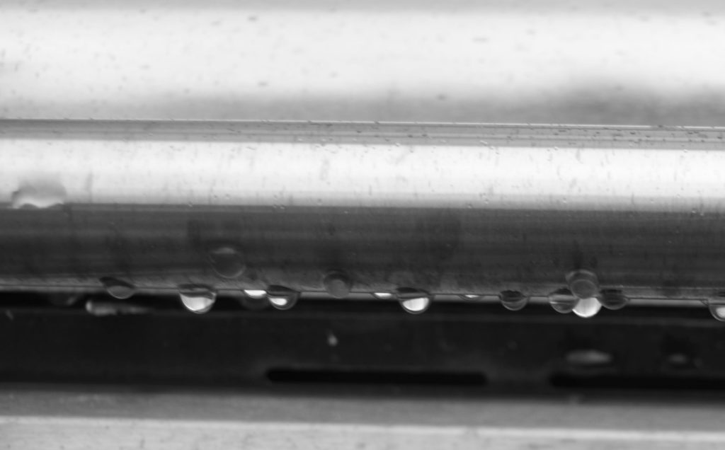
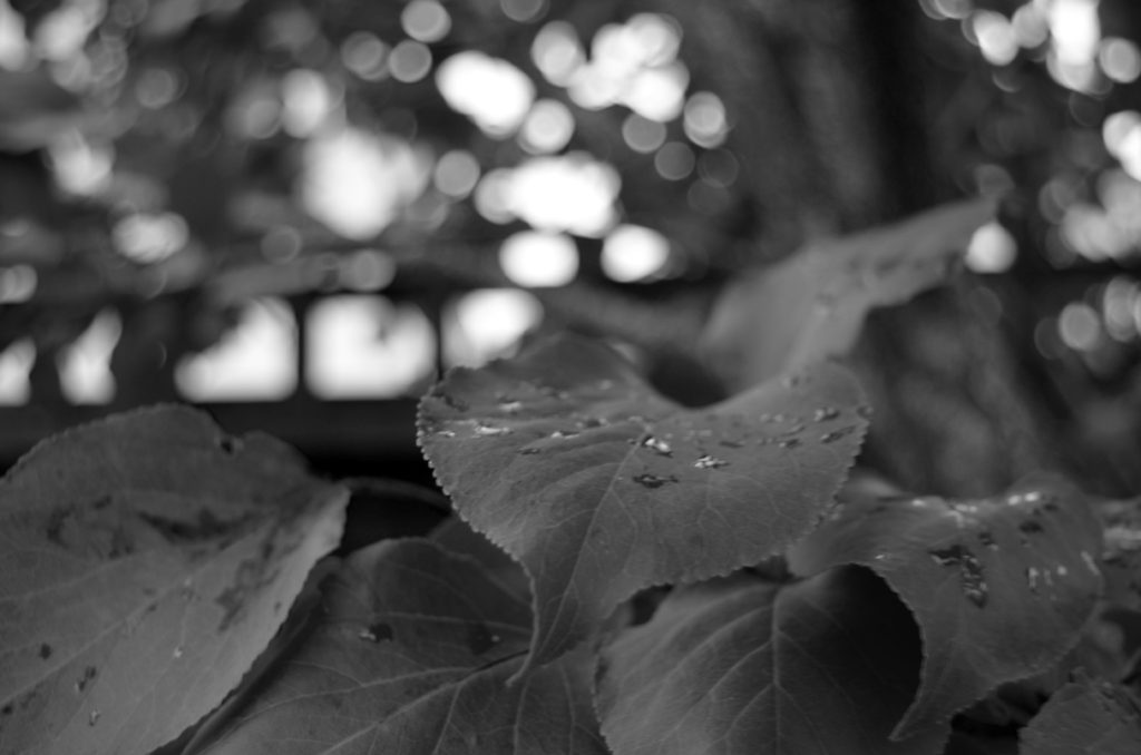
This is my favourite image because I like the fact that you can still see the contrast in colours of the wheelchair; especially the metal because the sun had caused the top of the frame to be a silver colour and the bottom to be a slightly brass/copper colour. This allows the viewer to think about which colours are in the image and look outside what is in the centre of the image.
I made sure that the image was blurred to stick with the inspiration of Ralph Eugene Meatyard. I like the fact that you can still vaguely see the different textures of the wheelchair. The room I was in was very light and I thought that it worked with the dark colours of the central features like the chair, wheels and handles of the wheelchair.
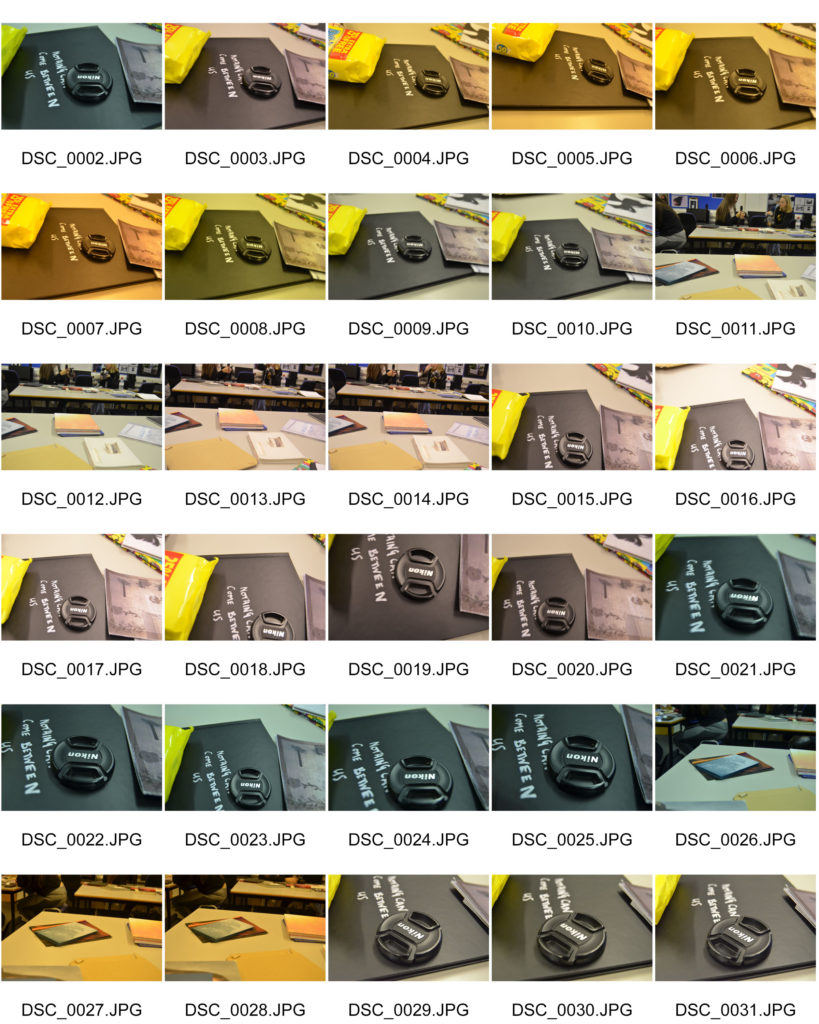
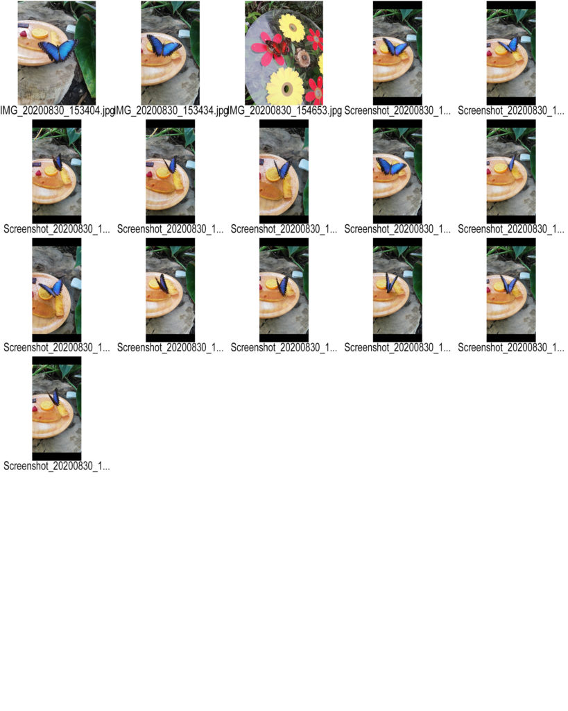
Contact sheets date back to when you took images on film. Now they aren’t used a digital cameras have a SD card in them.
A contact sheet is all the developed negative images laid out onto photographic paper. They aren’t full size, instead they are used to give the photographer an idea on how the images look.
Contact sheets are helpful as they allow the photographer to see all the images, select the best quality images and then develop the images they want without wasting resources.
William Klein
William Klein is a photographer who was born on April 19th 1928. He was born in New York, however during WW2 he was stationed in Germany and later France, where he would later settle after being discharged in 1945.
He sometimes used his contact sheets to tell a story. However he mainly used them like others, to decide which images he wanted to use.

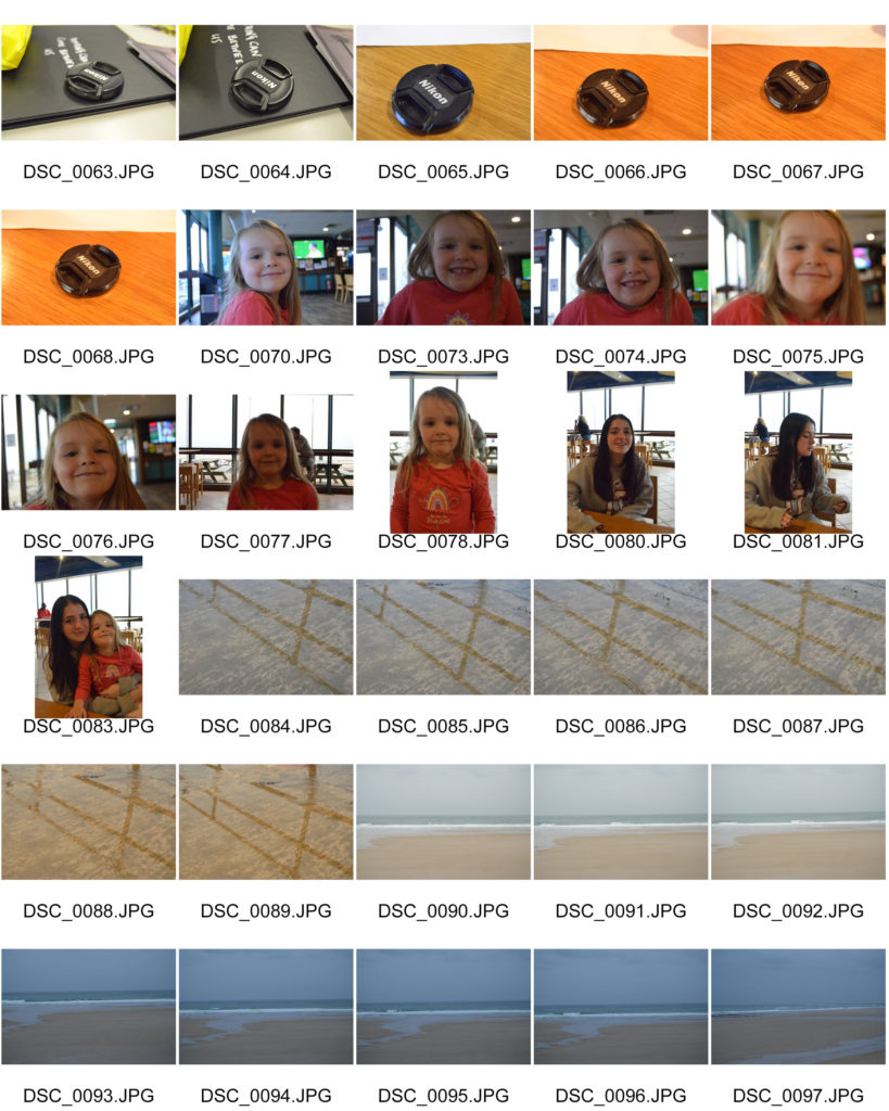
My Own contact sheet
ALBERT RENGER PATZSCH
German photographer Albert Renger Patzsch was a pioneering figure in the objectivity movement, which sought to engage with the world as clearly and precisely as possible.
He focuses on black and white photography and noticed the changes that the world was facing during that period in time. The industrial revolution was still reasonable new at this stage so where lovely views once were, large buildings constantly creating smoke and smog replaced them.
In addition to this, he focuses on repetition of patterns and items so I will try and make sure that if I take a picture of one singular thing, it will have a pattern or texture that is repeated.
His project “the world is beautiful” looks at the way the camera interacts with things in the world. One of photography’s fundamental attributes is its capacity to adopt a range of relationships with its subject. Renger-Patzsch’s approach embodied his belief that ‘one should surely proceed from the essence of the object and attempt to represent it with photographic means alone’ (taken from the national gallery of Australia)
Image Analysis

It looks like this image was taken in a natural light as there is no glare on the buttons from where the flash had hit it. In addition, the buttons have a slight shine from the sunlight.
Some of the buttons have a slightly rough texture causing the light to only make the first half of the button shine as the raised bumps are creating a shadow for the rest of the button.
The image has a playful and nostalgic mood as many people who went to haberdashery shops always saw 100s of buttons lay around in different places. The viewer may have played with the buttons on their shirts or cardigans causing happy memories to flood back.
Image Analysis

This image shows lots of loaves of bread all lined up on a wooden surface. They seem to be uncooked as there is no varying shades on the bread that the viewers can see. However there is a few different textures allowing the reader to focus on the ends of each loaf rather than the middle.
The fact that they are all an equal shape and are all in rows and columns allows the viewer to see that this was taken in a factory or bakery because not many civilians had the time to make that many loaves of bread.
However, the image creates a homely mood because even by looking at the image, the viewers could be able to imagine what the smell of the freshly baked bread would be like once this batch had come out of the oven.
The tones in this image are mainly light, except for the gaps in-between each loaf and also between the wood and the bread, where they block the raised parts of the bread block out the light for the loaves either side of it. This repeats throughout the whole image.
Images by Albert Renger Patzsch

Shoot One



Favourite Images (unedited)
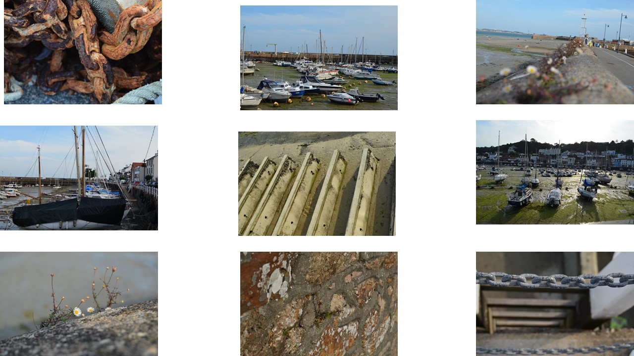
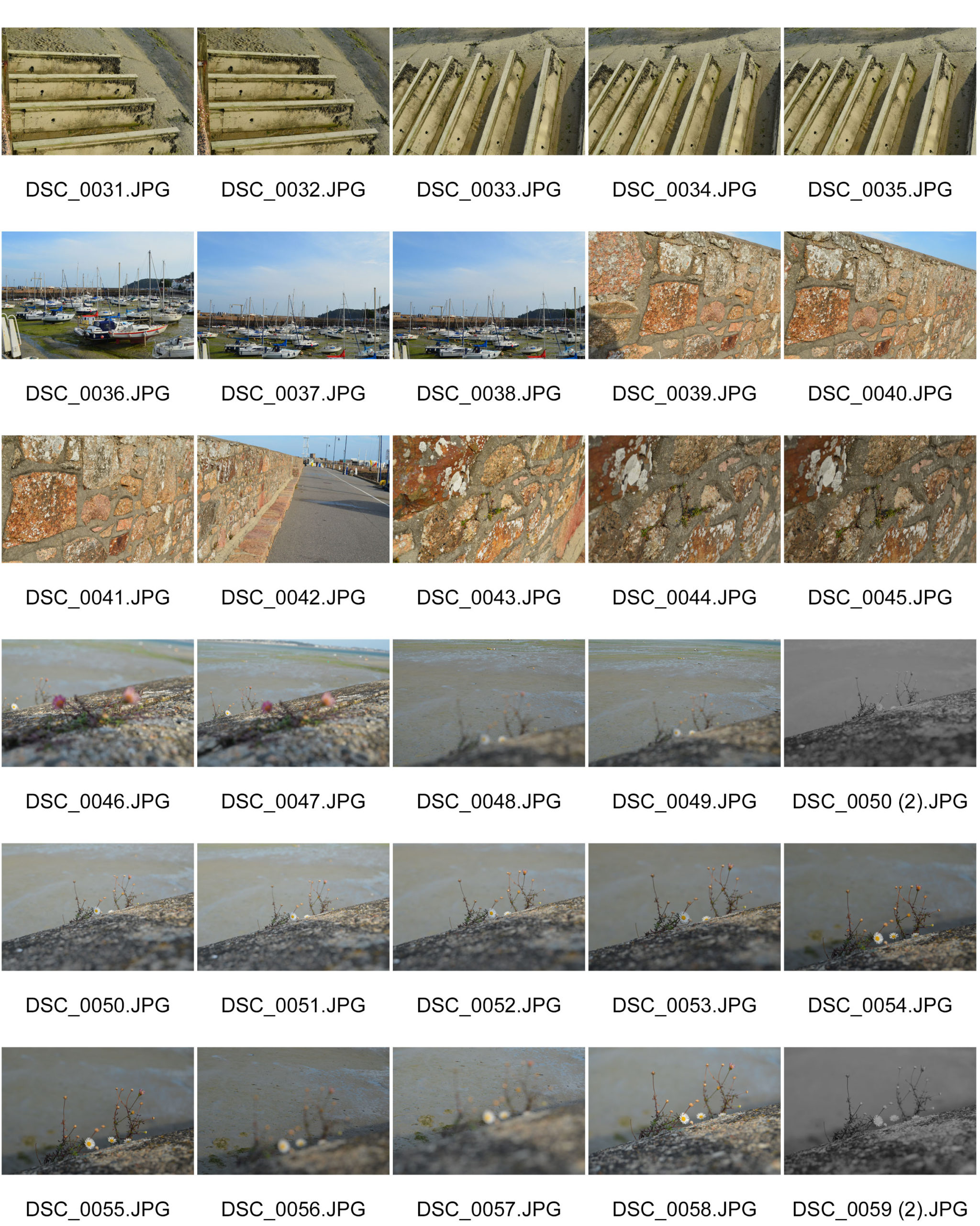
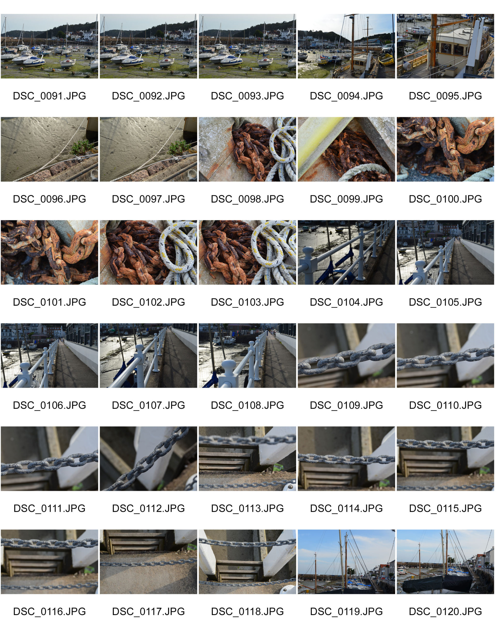
For my First shoot, I went out to St Aubin. I went there because it has so many things that repeat. For example, the boats that are parked in rows in the harbour; the ladders surrounding the harbour so people can get out, the chains attached to the anchors and also chains that are used as a barricade.
Favourite Unedited image
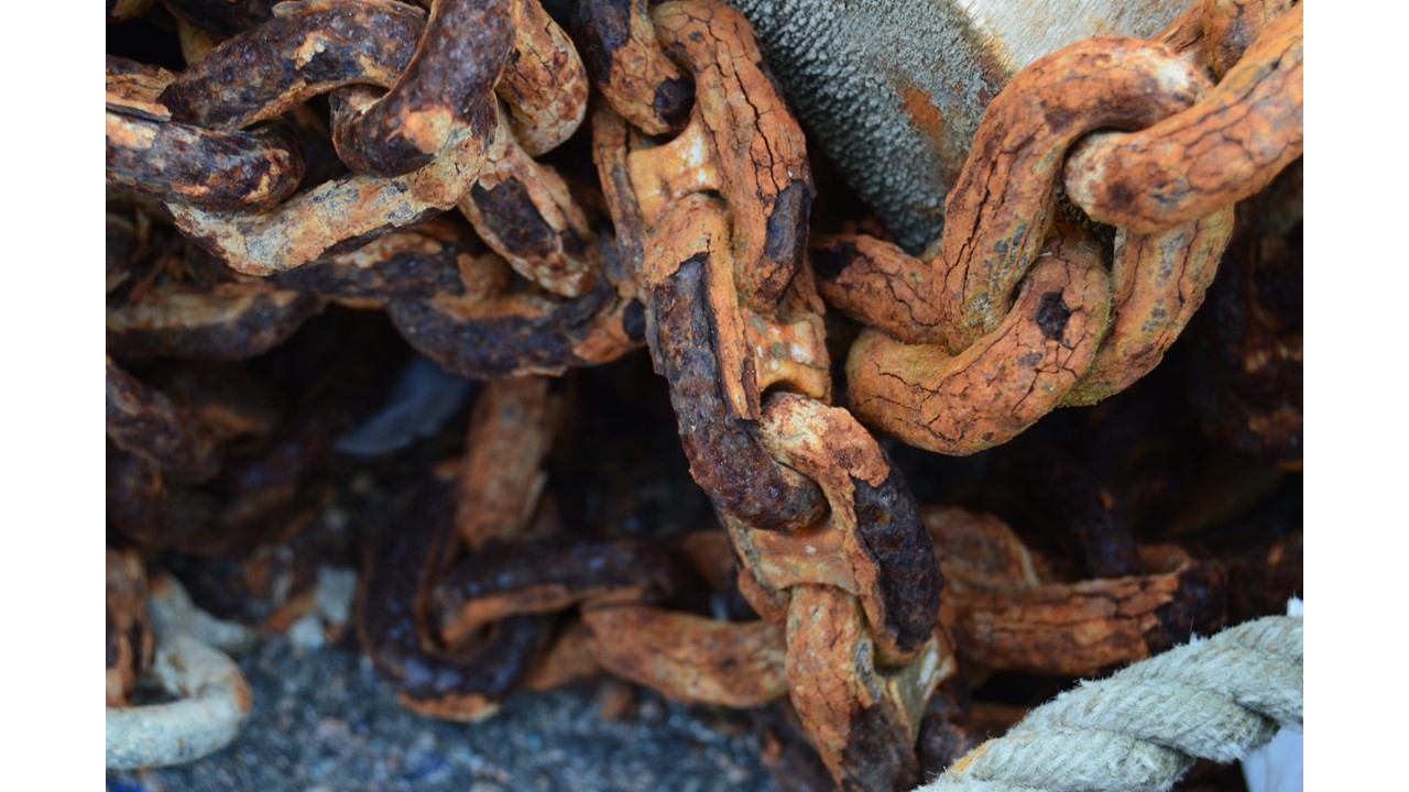
My favourite unedited image would probably be the rusty chain as it shows that they can be used for a very long time ; and was created in mass during the Industrial Revolution when Renger was alive.
Lighting: The natural light allows the copper colour to pop and also highlights the peeling of the corroded metal.
The shadows that are created on the floor by the coiled up chain allows the viewer to focus on something other than the rusty chain, it allows the view to wonder whether the dark patch has anything underneath or whether it is just an empty space.
The links in the chain allow the viewer to see a common pattern; however, the cracks that are created by the rusty chain allow the viewer to focus on the different shapes that the corrosion had created.
Edited Images

Favourite edited image

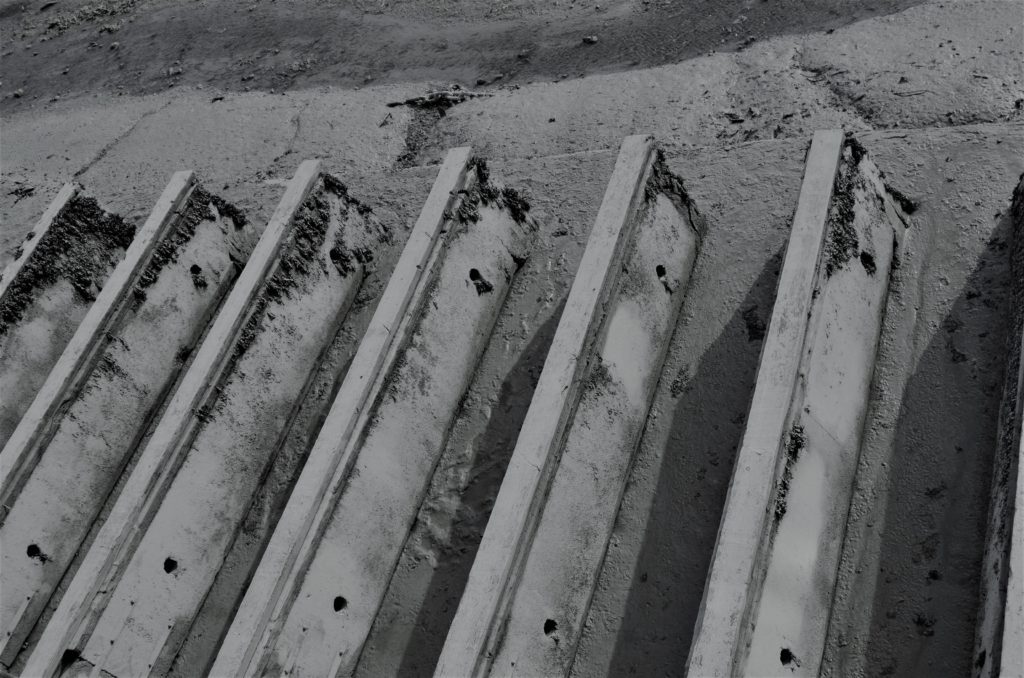
This is my favourite outcome from this shoot because I love the texture on the chain and how it’s beginning to corrode and therefore has chunks of each link missing. The chunks that are missing from the chain are a way to keep the viewer interested in the image because if it was just a normal chain it would be boring as most chains are the same. One could say the corrosion gave it some character.
The sunlight also hit the corners of each link causing there be be a shadow in the centre of the links as each link blocked another’s light.
The chain is a little off centre because I wanted to keep the drop from behind the chain in shot.
Shoot two
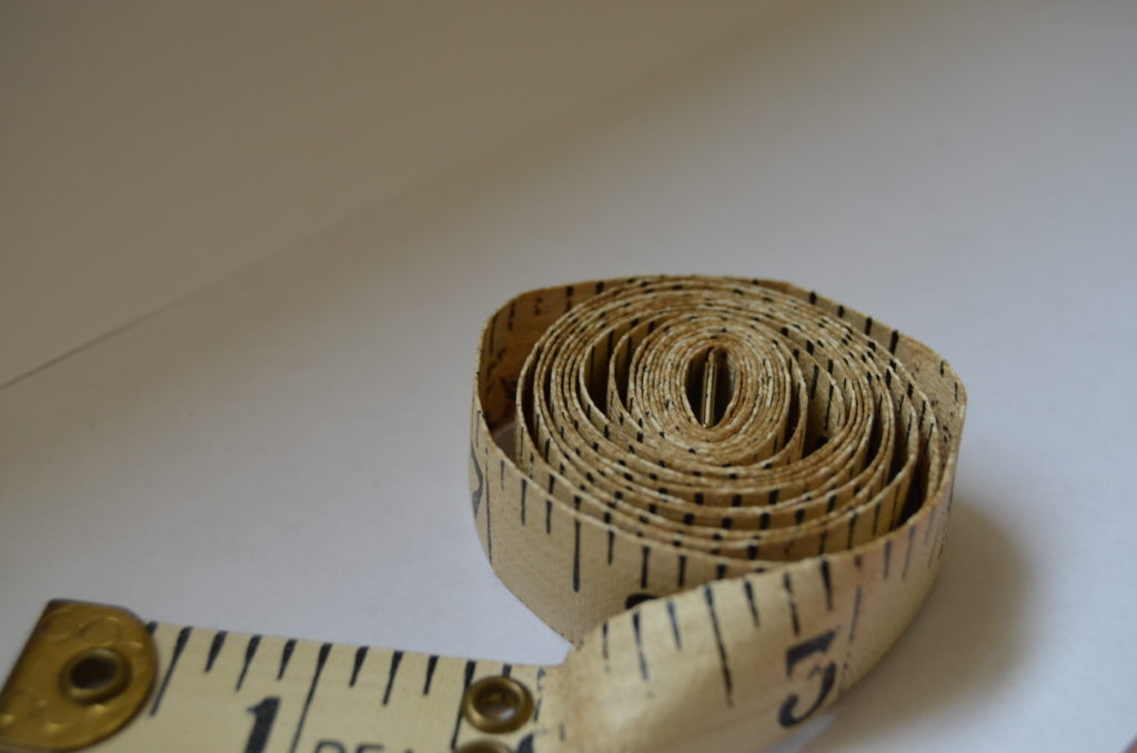
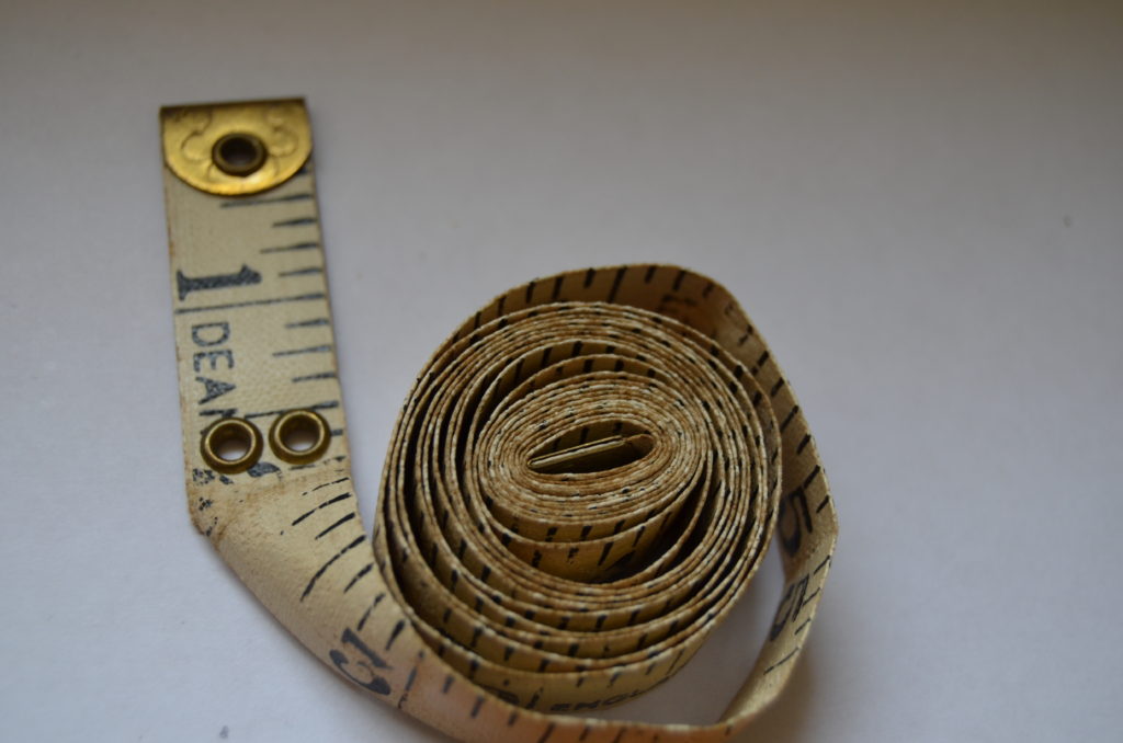
For my second shoot I was inspired by Patzsch’s image of five buttons on a plain white surface. My mum does a lot of sewing, so I took a few photographs of what was in her sewing box. The tape measure is between 80-90 years old as it was my Great Grandmother’s. I used the tape measure in particular because of its age, and the fact that Patzsch’s images were taken in black and white which is often associated with the past.
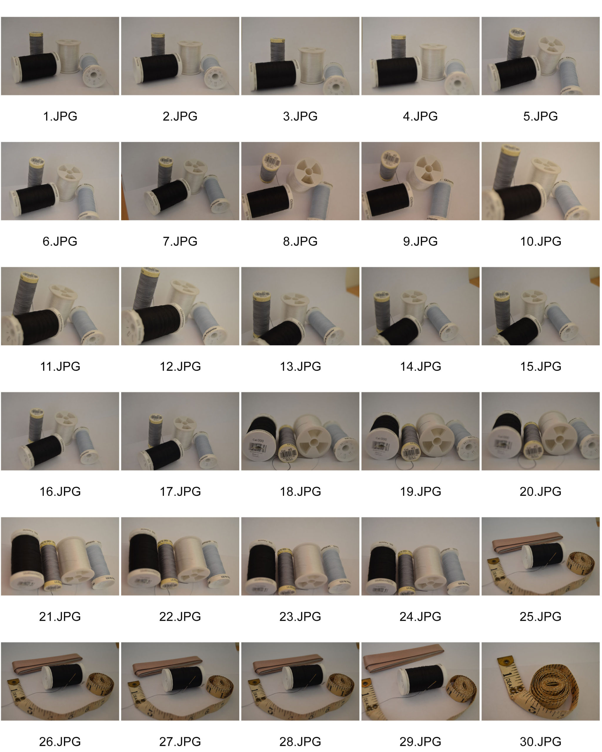
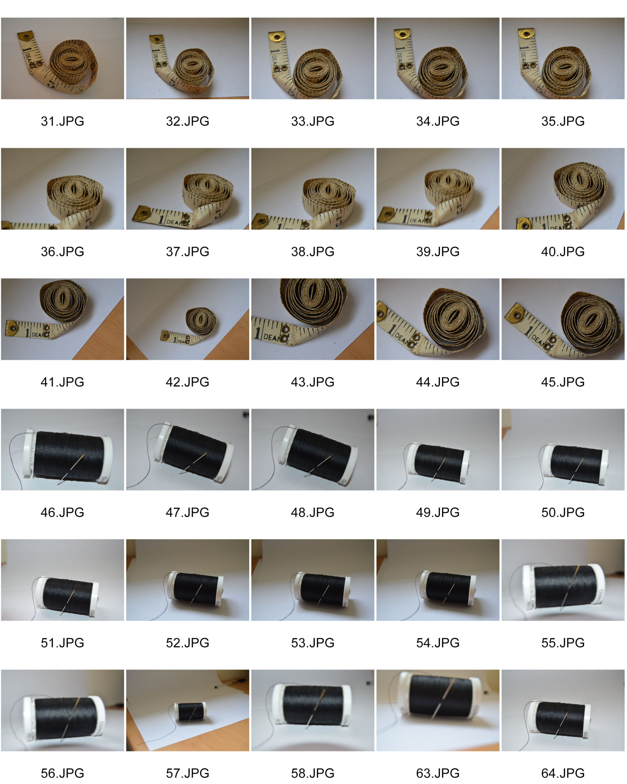
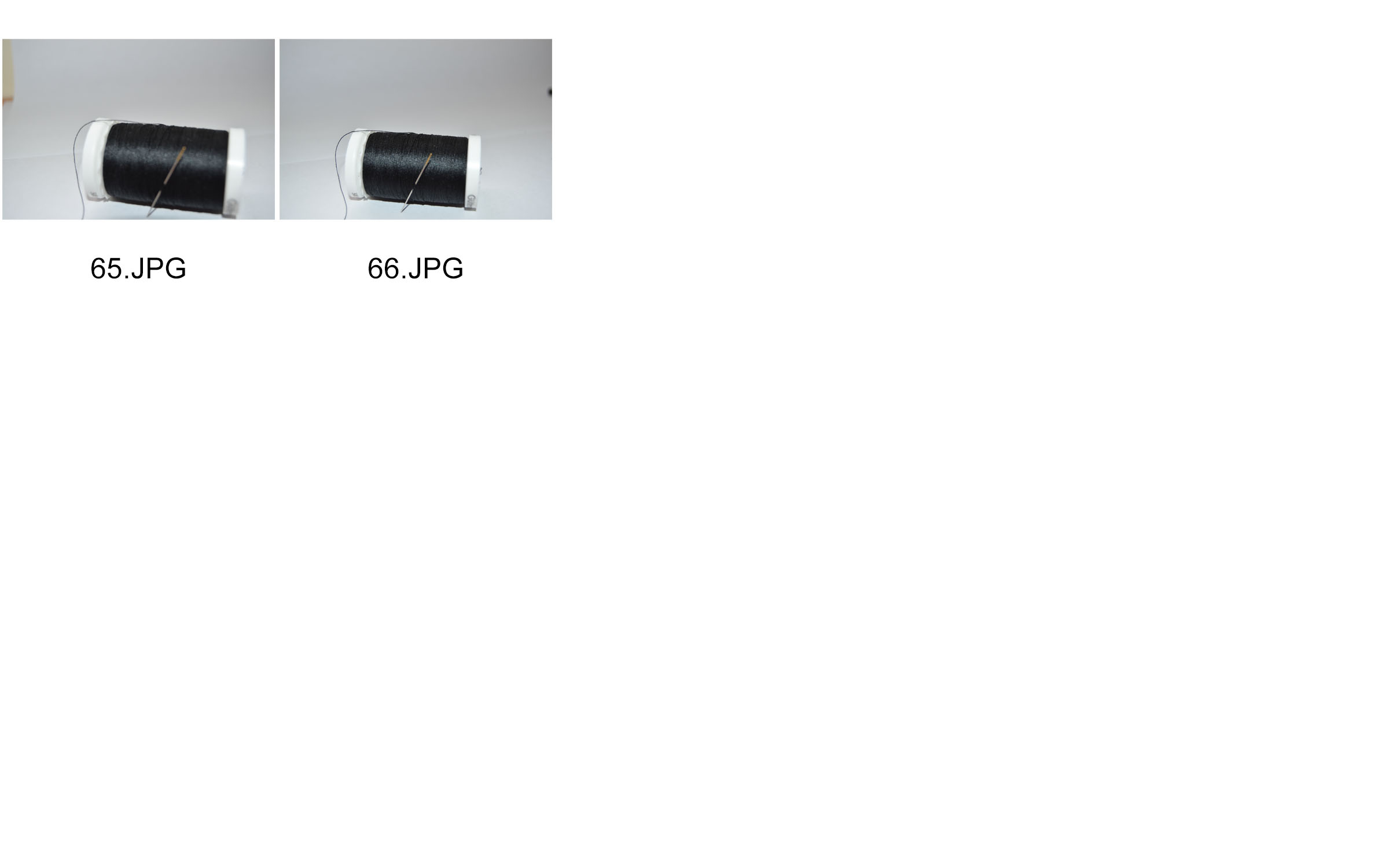
Successful unedited images

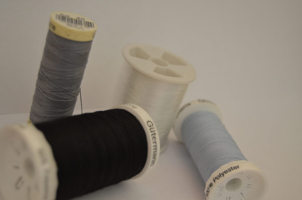
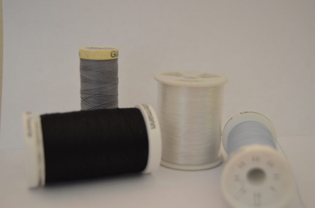
Successful Edits


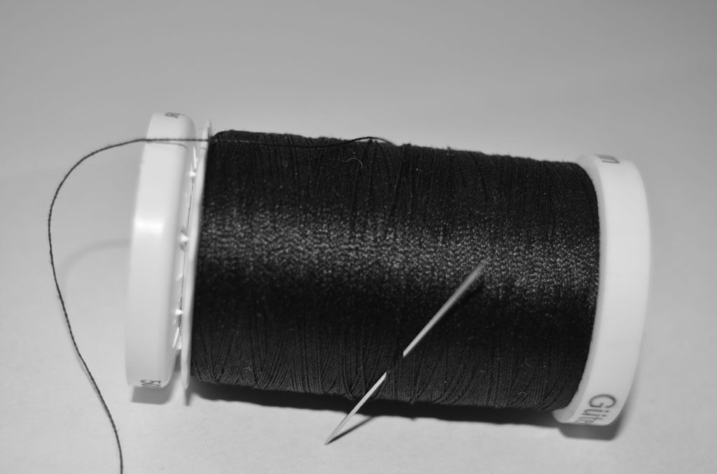
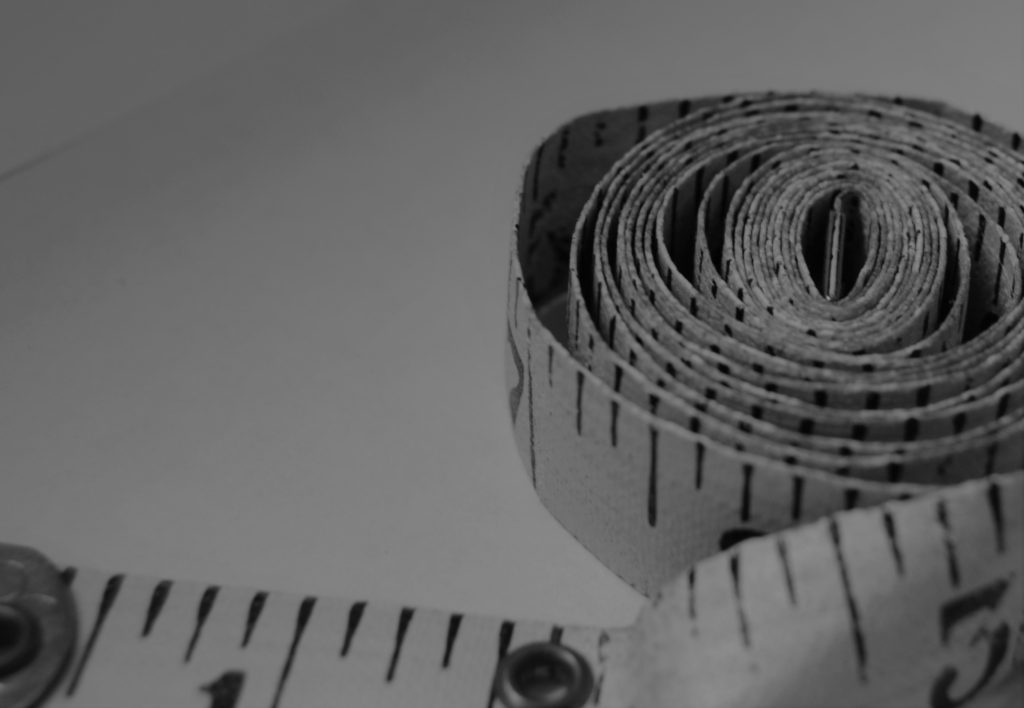
These are my most successful edits. I prefer some of these images more than the first shoot I did. I loved taking the close ups of the tape measure and thread as individuals rather than in the group with other items.
Favourite Image

I cropped this image to make the tape measure be the focus of this image, however I didn’t make it central because I wanted to keep the end of the tape measure that was lose in the image as well.
I didn’t have the flash on my camera as I wanted the light to be smooth. So the light used was from the window just as the sun was above it, so it created a natural glow on my surface.
The tape measure, because of it age, has some dints in the fabric which creates kinks in the what seems like an infinite spiral. In addition, the tape measure’s paint has worn a bit which links with the main idea of things changing over time. This tape measure is very old, and I think it works well with the black and white filter.
Before and after editing
