All posts by Elisha Hi

Filters

Author:
Category:

Blog Post 1 : Define, describe and explain street photography.

Street Photography

Street photography, a genre of photography that is taken of everyday life in a public place. The more busy the public setting is enables the photographer to take candid pictures of strangers, often without them knowing which is a positive as street photography is not often posed, its whats happening in the moment. Street Photography is not often photos down the streets of towns and cities, its a photographer walking around and  encountering random incidents within public places. This style is capturing a person or a group of people in their own thoughts, their own actions, their own day to day life. As the years go on , street photography has developed, but here are some examples of some modern and old street photography…

Mood Board –
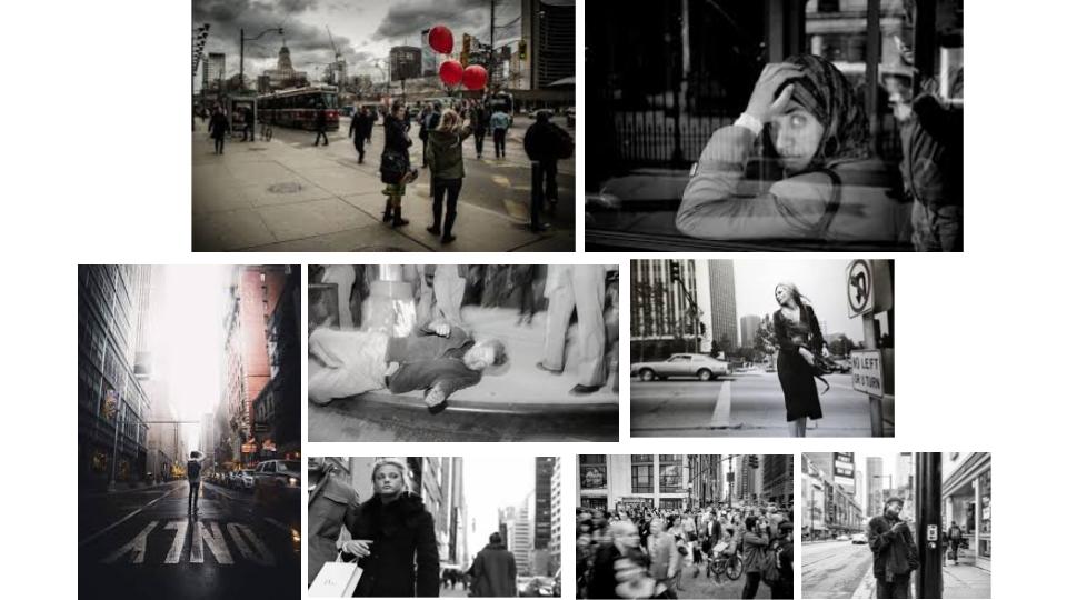
Modern and Old Street Photographers …

These images above are a range of scenes that can be found in day to day life. Weather it be someone on their way home on a bus, or a fallen drunken guy, they’re all no staged, live moments captured in a photograph. We can make out the type of incident that is happening by simply the facial expressions by the innocent people and their body language. For example , the top right image has a woman resting her head on her hand with wide open eyes . This indicates that she is tired and the fact that she is sitting down what it seems like a bus, makes out that she might be on her way home from a long day of work. This example is a clear indication that this is one way to capture a live moment in the day (street photography).

Street Photography does not have to be capturing a portrait of just one face , the cities we live in are filled with thousands/millions of people . This is an advantage to photograph what goes on in E.G rush hour, lunch times, quiet nights, Friday and Saturday night clubs etc…

IMAGE ANALYSIS

IMAGE ANALYSIS AND INTERPRETATION OF ALFRED KRUPP

Arnold Newman | Portrait of Alfred Krupp | 1963

This environmental portrait was taken in 1963 by Arnold Newman, creating a menacing feel due to the low lighting and specific shadows around the mans face. The man is Alfried Krupp, a Nazi war criminal who owned many factories, mass producing dangerous arms, vehicles and other weapons. He is also known to have heavily profited from the racist slave labor imposed by the Nazis. The images intimidating atmosphere comes mostly from the dark shadows surrounding Krupp’s eyes, created by butterfly lighting, giving him a sinister appearance. His eyes are also the focal point of the image. The dark, more negative essence is further emphasized around Krupp as the background is obviously much brighter. The background is a post war view of one of Krupp’s factories. Newman uses all sorts of techniques to give the image this unnerving feel. Firstly he deliberately positions his camera so Krupp is central in the image, ignoring the rule of thirds. This, combined with the depth shown going into the background gives Krupp a sense of undeserved power.

SELECTING AND FINALISING AND DISPLAYING

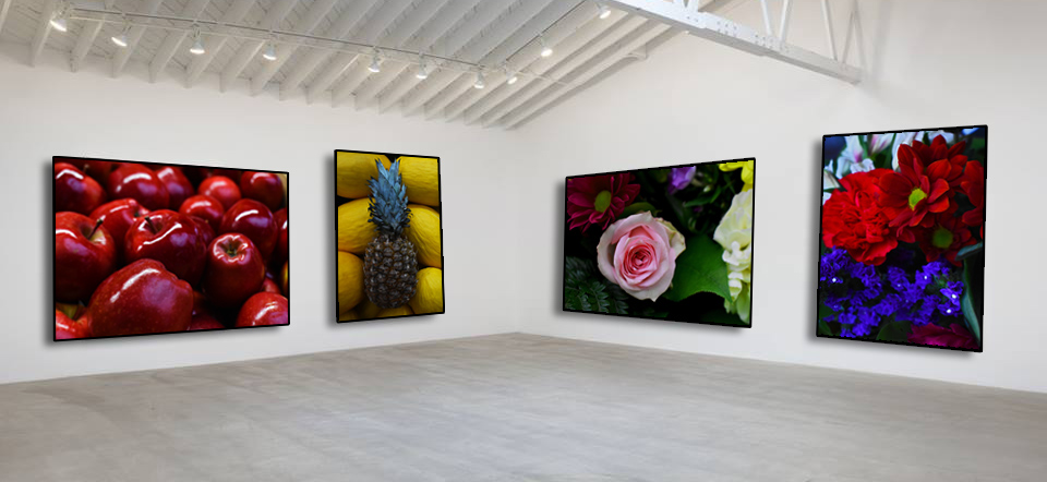
These images above are my best colourful abstract photographs and I have selected them to be in my final piece of the abstract unit as for there high quality , eye catching liveliness. They relate to each other in the sense that they all come from something living such as the flowers and the fruit which would have originated from a plant. These images with a little amount of editing such as increasing the vibrancy level on the colours and changing the levels with the highlights and shadows formed in the photographs , they are all displayed in a gallery (photoshopped).

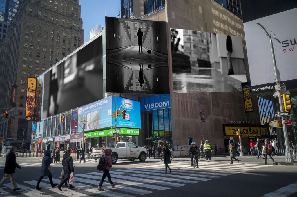
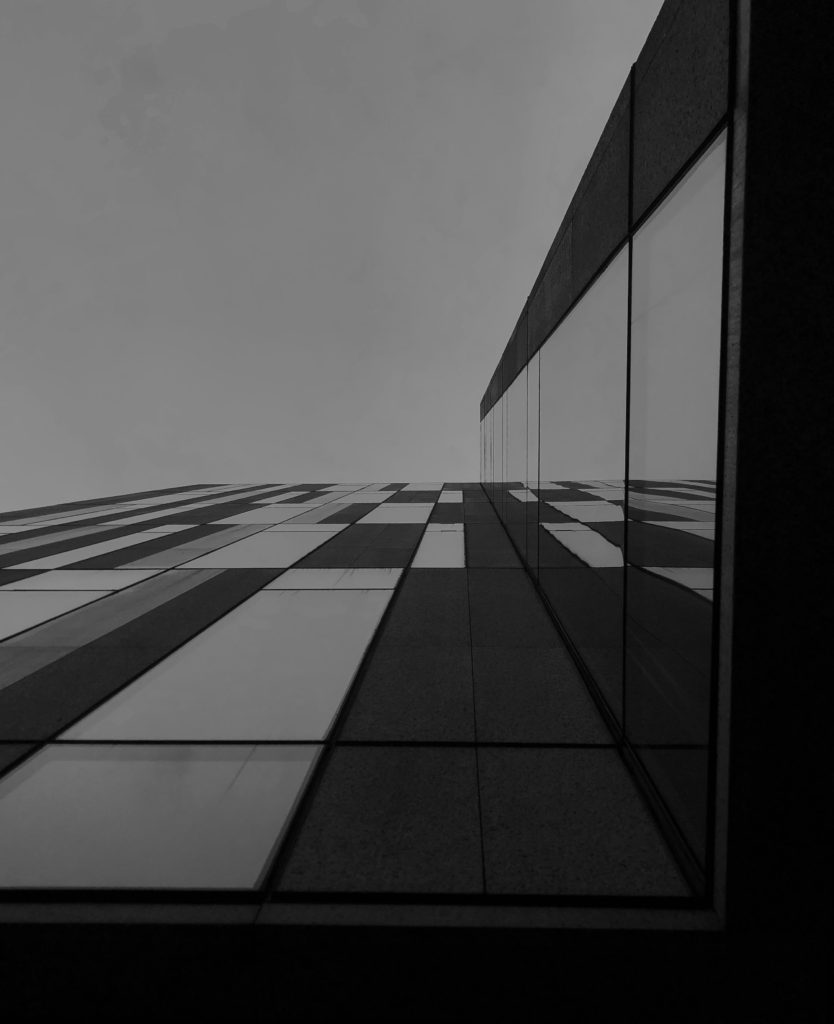
For my next selection of images used I have chosen a more street work style of photography and I have displayed my work on billboards in a city. The images selected relate to abstract photography as for the blurred backgrounds/foregrounds and the reflection work. They are effective in black and white in this scene to blend with alley ways in towns and cities and simply look better.

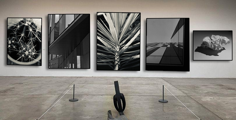
These black and white abstract photographs are all placed in a gallery with a more of a modern style of photography to them. They relate with the abstract work as for the tonal range of dark to light can be noticed almost instantly. With minimal editing these photos where the ones that caught my eye.

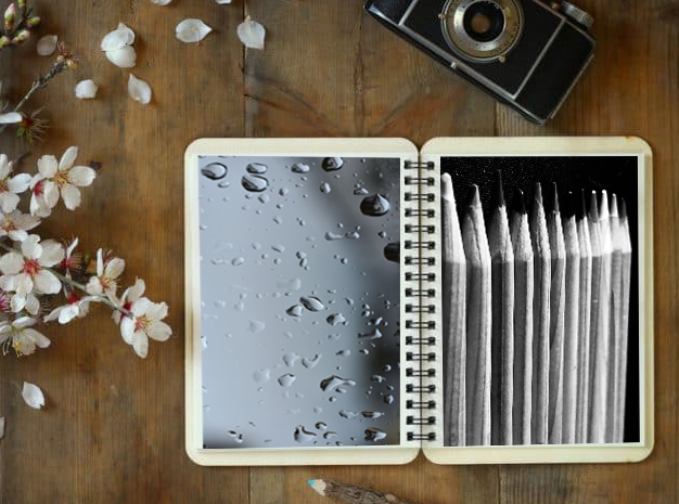
These last images I have chosen simply link with the abstract unit as for the repetition of the object that I have photographed. These images have been displayed in a sketchbook as photos. The black and white colour of the images creates a more abstract feel as there is a larger focus on the shapes of the objects as the colour is not apparent.

portraiture introduction

The word PORTRAIT is defined as a painting, drawing, photograph, or engraving of a person, of the face or head and shoulders. A portrait is designed to capture someone in there own self such as there personality , lifestyle , glamour ect. In modern day this is can be done by using high tech lighting equipment , backdrops, poses by the models themselves and of course Photoshop where editing skills can change a photo. The first portrait ever to be taken was in 1839 were an American photographer , Robert Cornelius , took the first ever portrait photograph of a person. He removed the lens cap, ran into the frame and stood still for ten minutes, before returning the cap to its position.

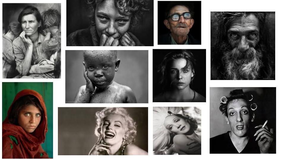
Selected images off google – famous iconic portraits.

Contemporary Portrait Photography – is a photograph from our own time, compared to an image from a much earlier period. It can be described as an image that shows and reflects are values and challenges to this day.

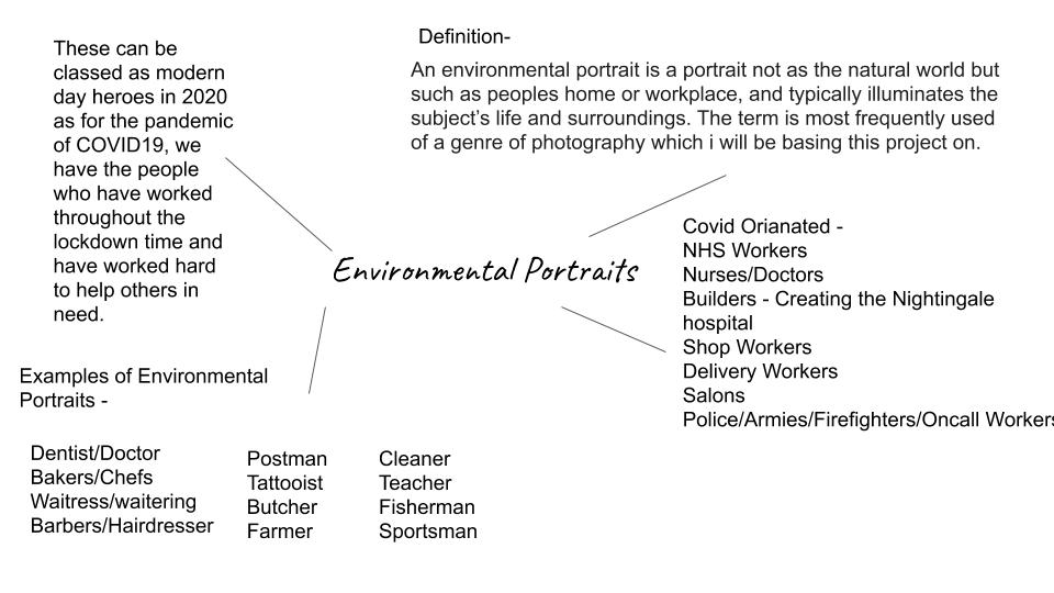
Environmental Portraits

Mary Ellen Mark

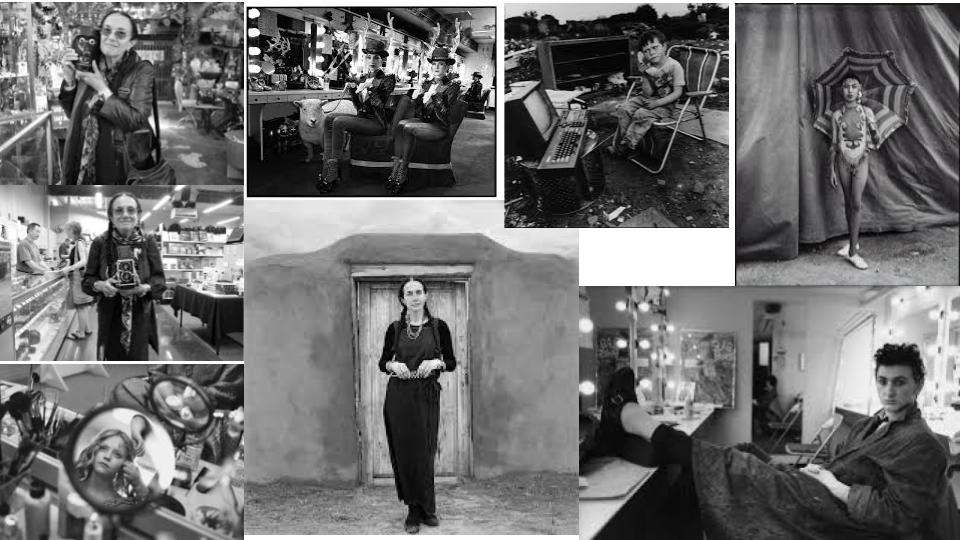
Mary Ellen Mark was an American photographer known for her photojournalism, documentary photography, portraiture, and advertising photography. She photographed people who were away from mainstream society and toward their own personality and what they do from day to day life. Whether that be a working environment or a hobbies , she loved to take photographs of people who supposedly look like they are happy.

Images by Mary Ellen Mark

In the 1960’s , Mary decided to take on photography as a side carer as the passion for it grew. These images above in black and white are effective as for they bring out the mood and personality of the model . A good example would be the image below…
Mary Ellen Mark | Head On Photo Festival
Mary’s Image

This iconic image gives off an uncomfortable feeling as the girl to the right seems to be in a calm and resting state whilst the hippo next to her reaches out with its great big mouth , bigger than her , and in a sense showing some aggression towards her. The mouth seems as it could swallow her whole , but to prevent this she defends herself with only a stick. With her short shorts, boots and gloves , standing outside what it seems to be a tent , this looks as she and the hippo are part of a circus. The girl seems confident in herself as she stands proud with a brave face and a relaxed standing posture. This links to environmental portraits as she’s in her element , she’s doing what seems to please her and make her happy.

Photoshoot Plan

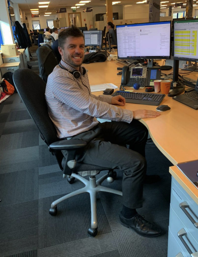
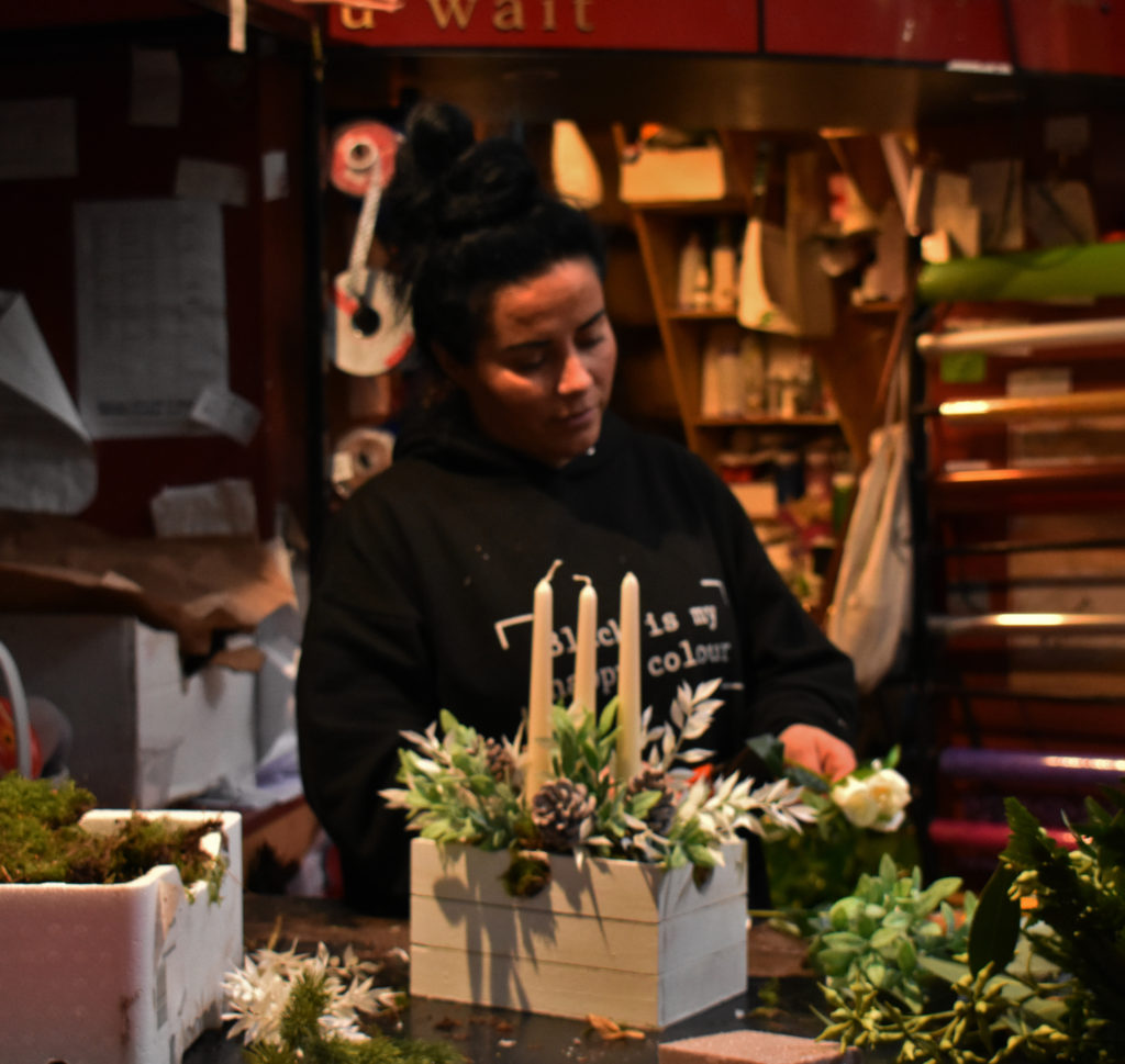
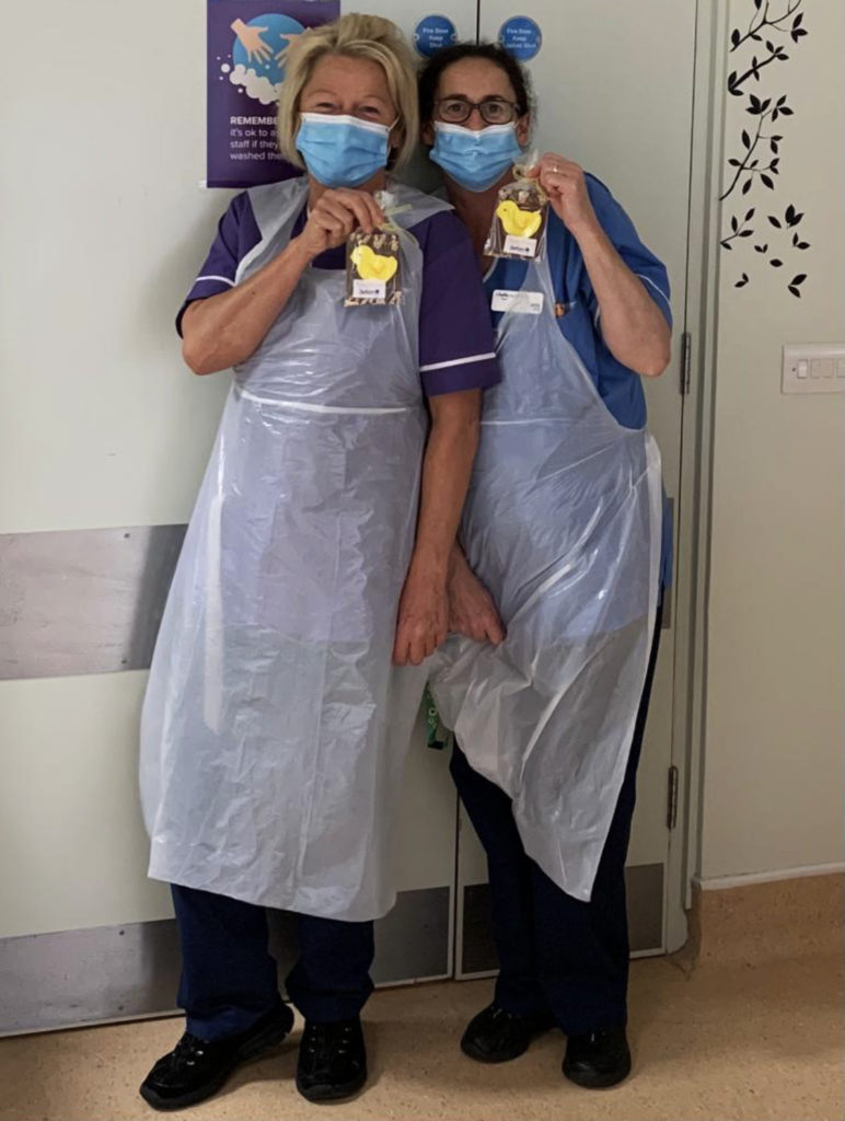
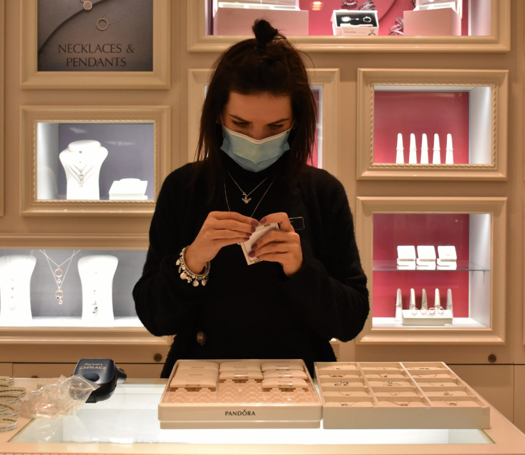
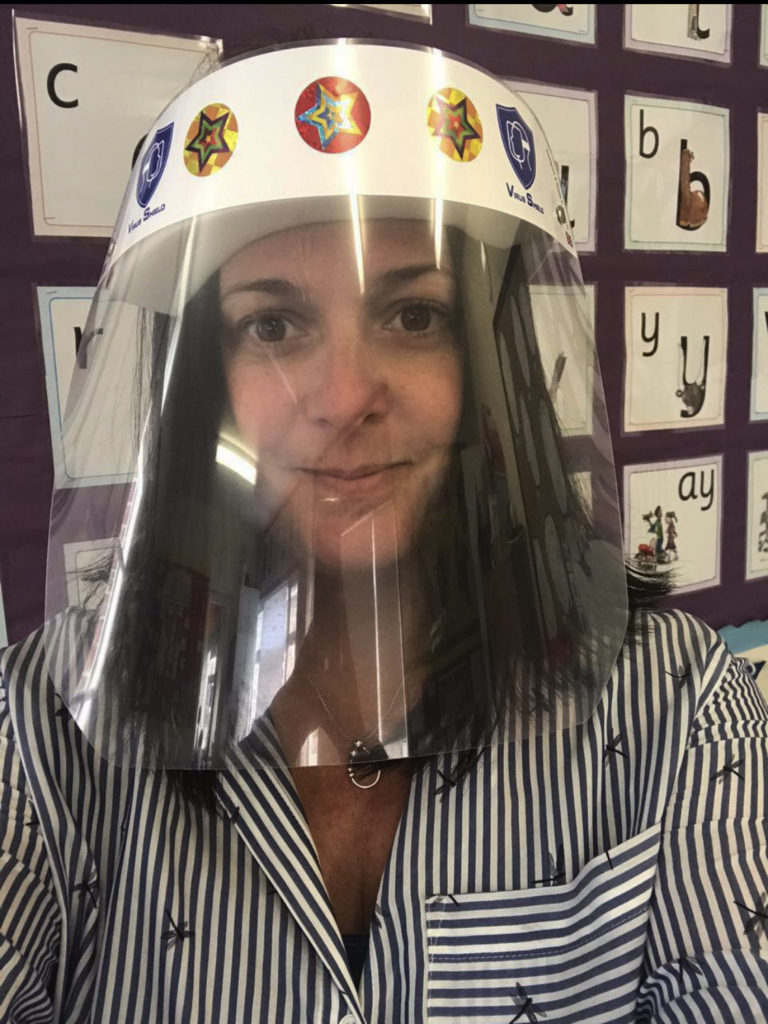
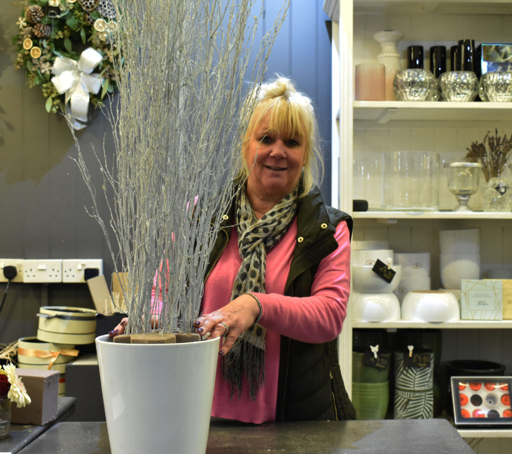
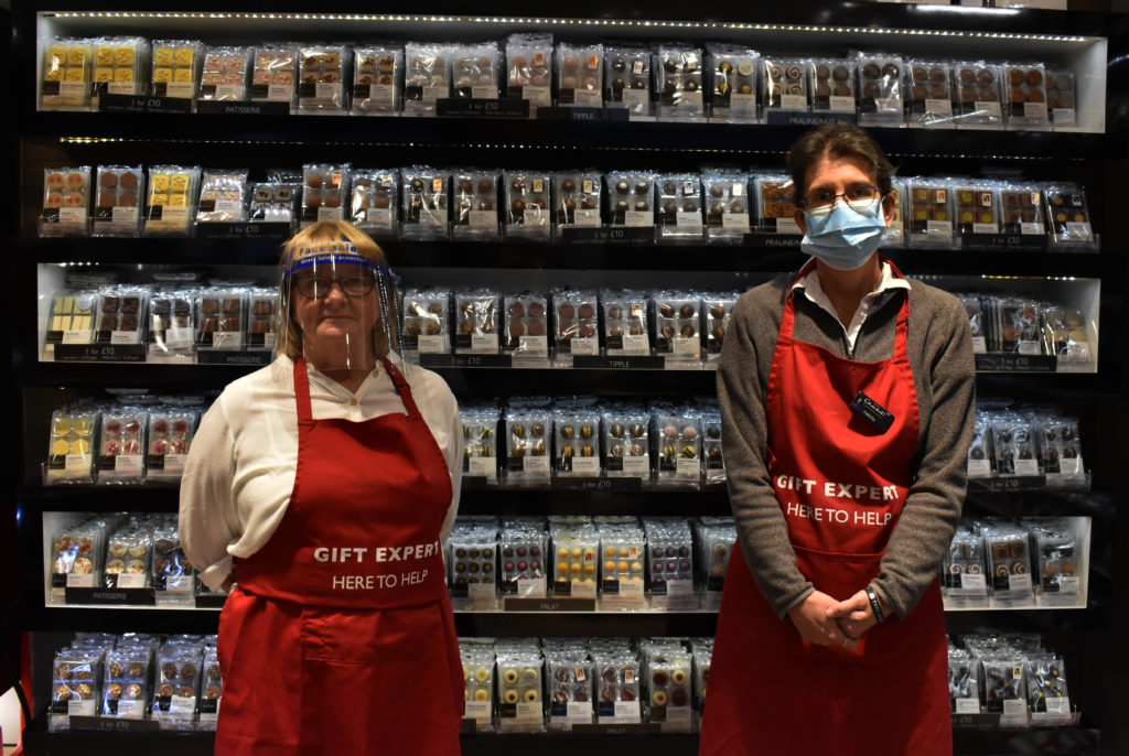
Who – I will be taking photos of family members and public people in their work environment.

How – Using a DLSR camera with a 500mm lens. Photographs will be taken with a natural white balance for the biggest range while editing.

Where – The market in town, small businesses, the hospital ect.

When – The day time to capture natural lighting , but this doesn’t really matter to what I am going to be photographing as they are going to be taken inside.

What – People in their work environment – environmental portraits.

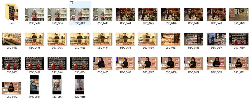
Contact Sheet

My Best Selection Of Images

These images above I cropped and edited on photoshop to bring out the best quality of them. In photoshop i simply heightened the contrast and lowered the brightness level a tad just to make the image more intriguing to look at.

These images give a range of different types of jobs and carers which make people happy in their working environment.

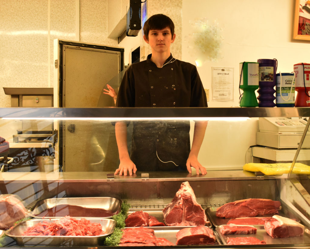
I feel like these photographs link to Mary Ellen Mark’s images as the majority of the people are looking straight at the camera with a relaxed mood to them. I chose an image to represent Mary’s work more and changed it into black and white to see the similar style between the two…

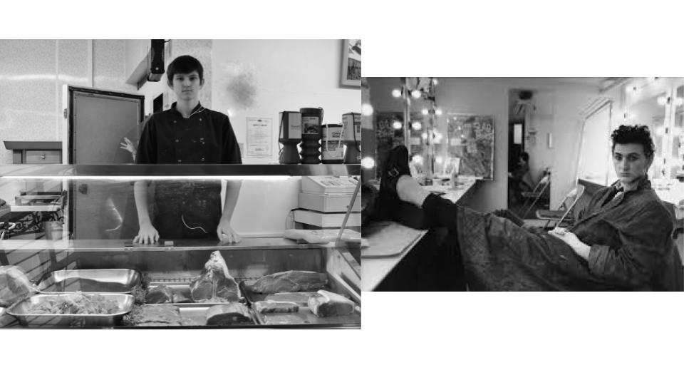
The picture on the right is Mary Ellen Mark’s work. The picture on the left is my work.

These two images have similarities as both men have a relaxing , no posture facial expression. This implies that their mood/personality has a slight importance to their job. Both of their body postures seem to be relaxed and confident in themselves. This can be seen as the butcher boy has his hands resting on the sides of the table which can suggest that he is proud of his job. On the other hand the actor sitting in the dressing room seems to have a more chill vibe as for his legs crossed over themselves.

Both photographs capture these men in their working environment which links to the fact that they are environmental portraits.

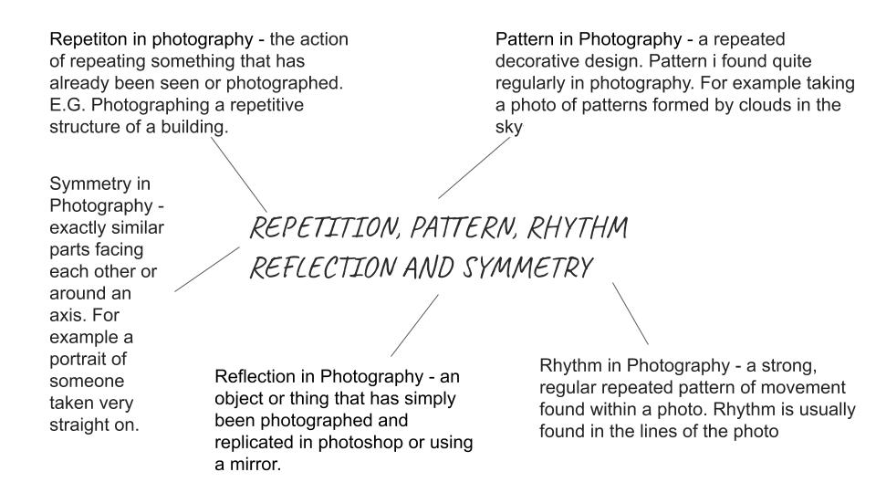
REPETITION, PATTERN, RHYTHM REFLECTION AND SYMMETRY

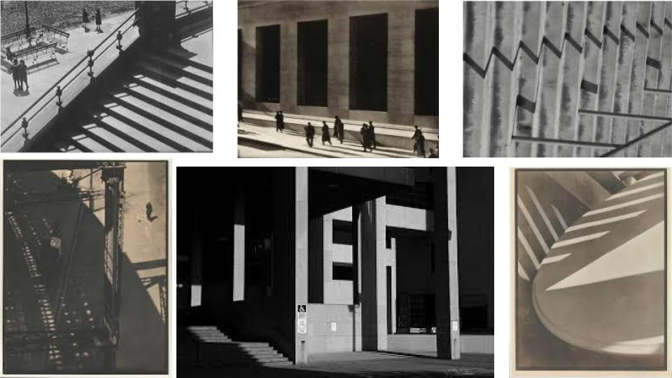
Paul Strand

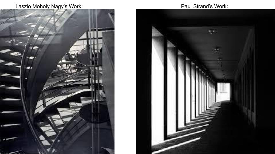
 Paul Strand was born in New York in 1890. When he was 17 years old, he began taking photography courses. His photographs moved from soft-focus scenes of modern New York that reflect the energy and movement of the city and its inhabitants more sharp, focused expressions of objective reality. 

Images By Paul Strand

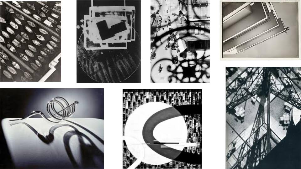
Laszlo Maholy Nagy

Laszlo Moholy-Nagy , born 1946, was a Hungarian painter and photographer as well as a professor in the Bauhaus school. He was highly influenced by constructivism.

Analysis Between Both Photographers

Natural light floods both image from left to right. Pauls work has a strong tonal range from light to dark. Hard shadows are formed from the pillars and stairs and overrules the amount of light take in in both photographs. Laszlo’s image has a higher quantity of objects that create detailed lines , especially when photographed in black and white. These lines are a much softer tone than Pauls work as The pillars form more harsh and thick lines which are repetitively in line with each other along the floor and the left hand side. This refers back to the topic of reflection as the pillars in Pauls work reflected downwards onto the floor. Pattern is found in Laszlo’s work as the thin shadow lines cross over each other forming some sort of chequered pattern. The darkest tone in Pauls image is the nearly completed border that is nearest to the colour black whereas Laszlo’s work has a blurred light formed at the top of the image that fades down to the darkest part of the photograph , the first steps on the bottom left. As both photographs are taken in black and white , the dominant colour black, surrounds the natural light in Pauls work. As for Laszlo’s work , the black and white colour quantity is equal throughout the whole photograph. Both images being in black and white gives a subtle appearance as not too much is going on in the images.

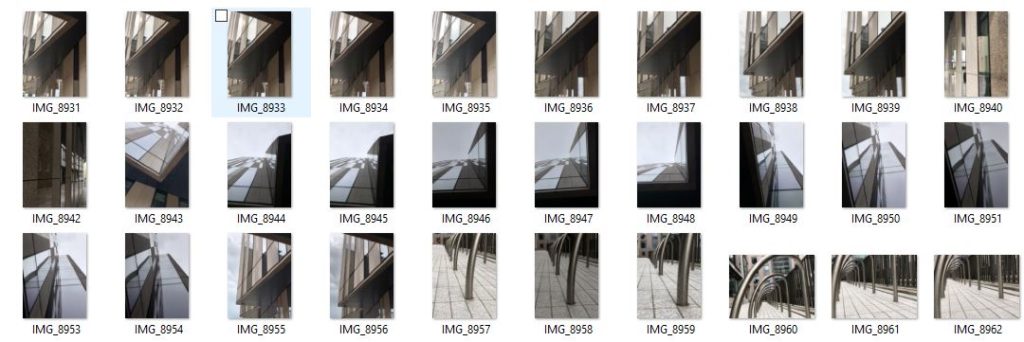
My Photoshoot – Contact Sheet –

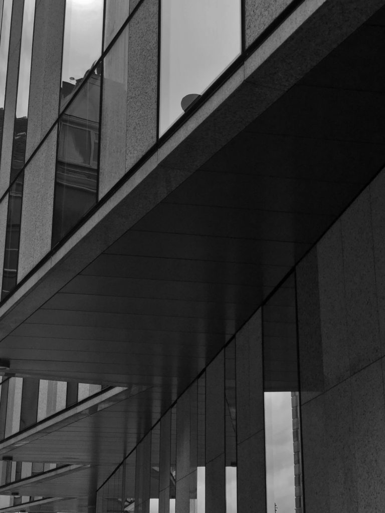
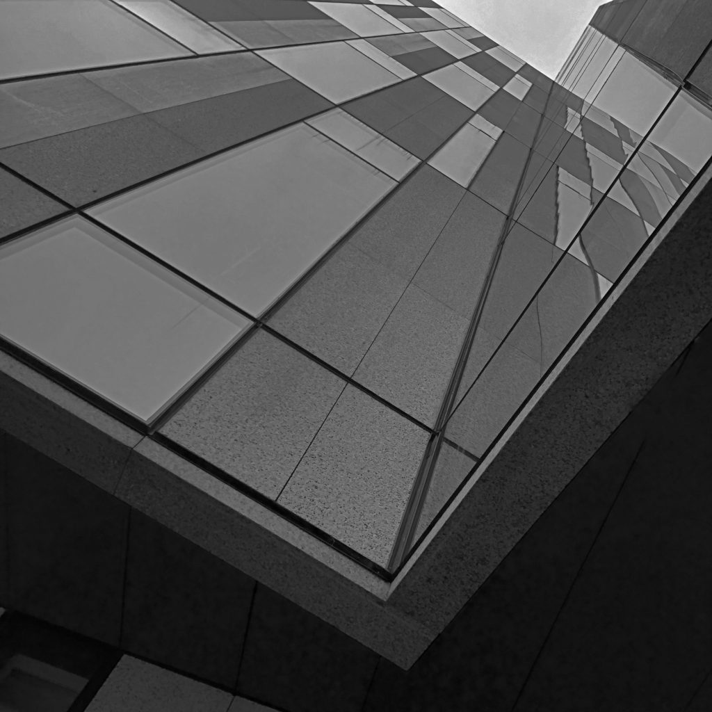
I think these images I took of buildings down the waterfront , St.Heiler , are similar to both Lazslo and Paul’s work in a sense that they have pattern and repetition in the structure of the buildings and streets. I took a few of these images into photoshop and changed them into black and white to refer back to both photographers above’s work.

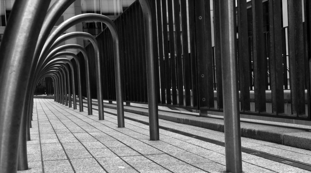
This last image with the mental rails relates back to the theme of patterns and repetition as for the same railing is repetitively put in a straight line and is photographed at an angle that captures a good quantity of the rails. White bricks with dull, contrasting black lines in between , lay on the floor of the image creating a simple, easy pattern.

In all final Photos , a bit of editing such as changing the contrast/brightness levels. As well as darkening the shadows that are formed by the natural light and a bit of toning/cropping/rotating, they came out in my opinion pretty decent.

Reflection and symmetry

Original Image
Image Edited on Photoshop

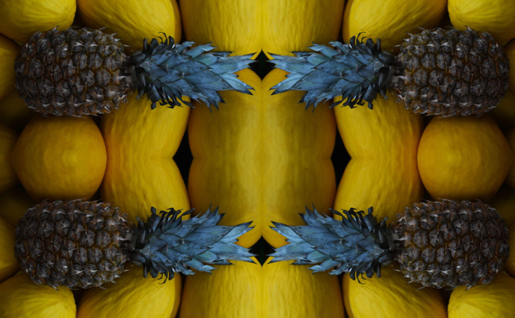
In Photoshop i have created a symmetrical and reflected image by re sizing the image canvas, then coping the original image and flipping it horizontally and for the tips of both images to be touching to create an effect of it being one image. Next I coped the whole image to paste it again whilst increasing the image canvas size to then flip the image vertically to finally have four pineapples that are reflecting each other in a first glance one image look.

surface and colour

In this project I will be exploring the different surface/texture and colour schemes relating to photographers I have researched. Throughout a few photoshoots I will be focusing on using the ISO and white balance on my camera.

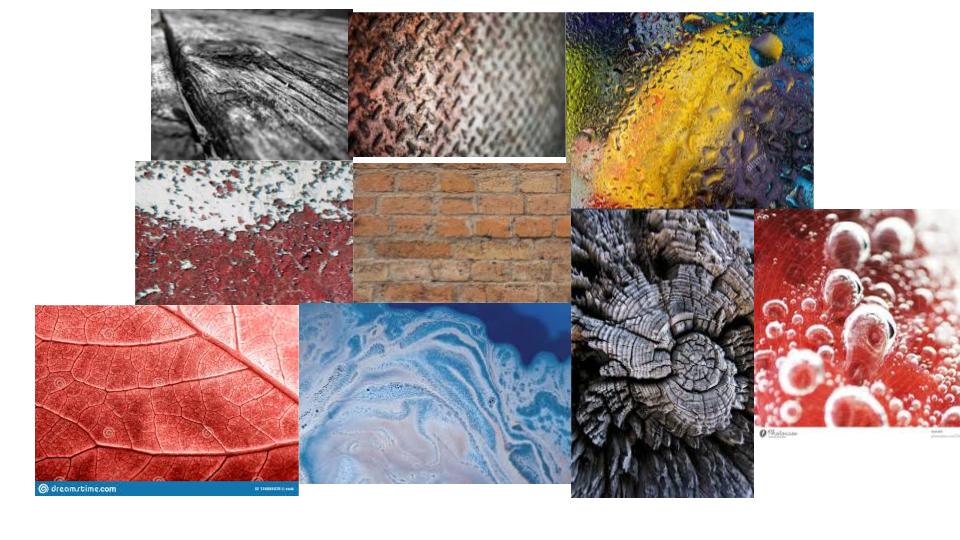
MOOD BOARD OF SURFACE AND COLOUR PHOTOS

Online Photos created on google slides

Ernst Haas

Haas was born in Vienna in 1921, and took up photography after the war. In 1986 Haas passed when living in the United States. In 1951 Haas moved to the USA and began experimenting with Kodachrome colour film. He went on to become the premier colour photographer of the 1950s. In 1962 a retrospective of his work was the first colour photography exhibition held at New York’s Museum of Modern Art.

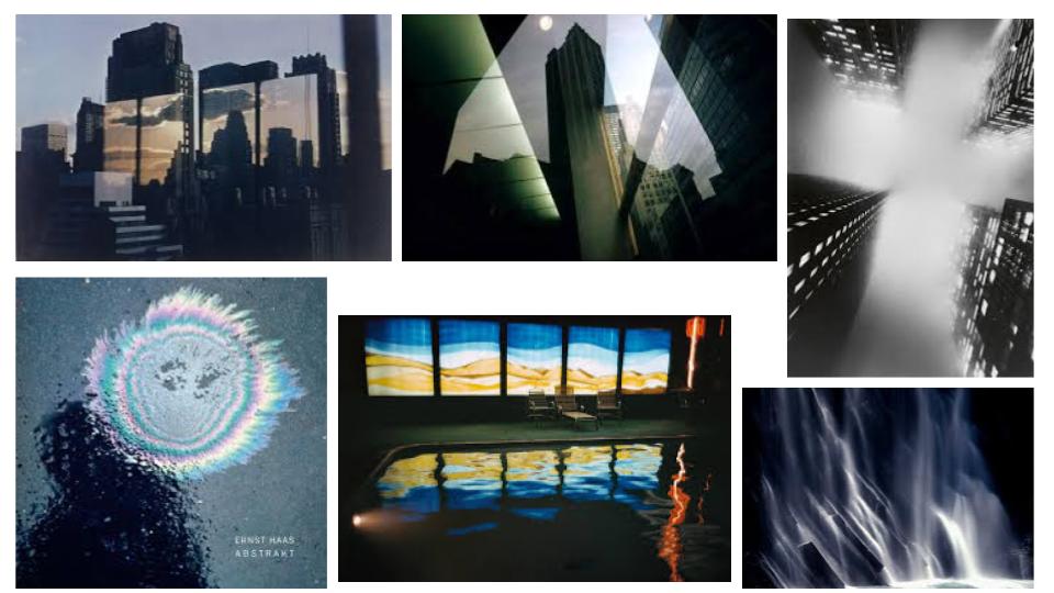
Ernst Haas images
Ernst Haas, Projected - David Campany

Analysis (Using The Formal Elements)

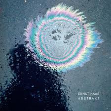
This oil spill on what it looks like a tarmac surface has natural soft light flooding in. A dark dull shadow is in the left of the image as for the coloured oil being the brightest section. The image itself does not contain any straight lines but consists of coloured circles surrounding themselves. There is a repeat of circles around each other which resembles repetition in this image. The shapes in this image contains big circles and little oblivious bubble circles which are representing rain drops on the surface. The feeling of this surface would be rough and wet as the rain drops and oil are liquid. And for the tarmac surface is known to be rough. Between the oil and the shadow the tonal range from light to dark is significantly spotted as the lightest part of the image meets the darkest area. The light in this image overalls the dark tones found as for the bright colours and the reflection of the water droplets. The image seems to be quite dull and shown as a sad mood as for the rain on a dull grey coloured background. But the colourful circles brighten up the image and gives it move of a exciting approach. The soft primary blue and yellow set the scene in the circles as the rest with more of a subtle pastel colour. The colour that fills up most of the image would be the shades of grey from the surface and shadow. The structure of this image is created un naturally as for the oil spill being deliberately placed there to create a contrast against the grey/black tarmac. The photographer has taken the image with the focal point, the oil spill, slightly above the centre of the image which gives the photo a more spontaneous nature.

Photoshoot Plan:

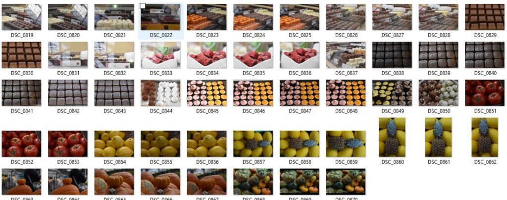
WHAT – I will be photographing water droplets and bubbles for my surface and texture shoot and for my colour shoot I will be taking photos of fruitNveg/flowers/chocolate.

WHERE – I will be at my house for the water drops to be on my bedroom window and for the bubbles to be created in my sink. For the colour shoot I will be going to the town market and rearranging fruit/flowers ect to a certain look.

Photoshoot – Surface:

My first shoot was taken in the theme of surface/ texture based off Ernst Haas photos. I used his repetition of the use of water in my photos to link back to his work and style.

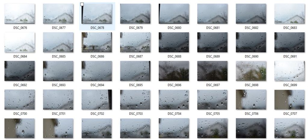
Contact Sheet 1:

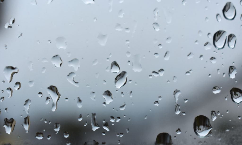
In these final photos I changed on photoshop the contrast level to be stronger as well as the exposure level lower to create a more visual effect on the water droplets.

Contact Sheet 2:

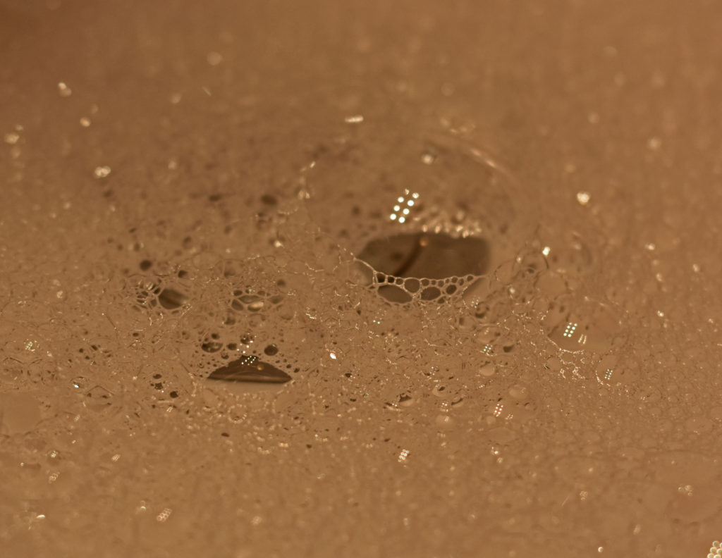
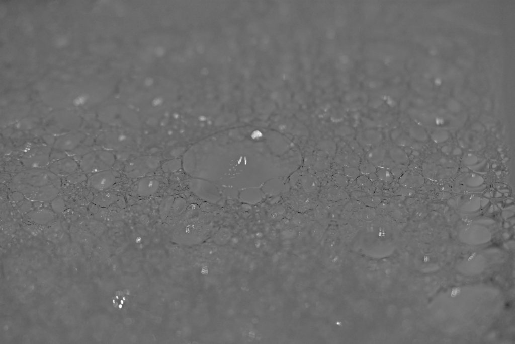
In the first image I have cropped the image to look at the most in focus part of the bubbles. I lowered the vibrance and heightened the saturation to create a warmth atmosphere. In photoshop I changed the last image into black and white and heightened the shadow level to make the bubble lines/curves more visible.

Photoshoot – Colour:

As for this photoshoot not relating to images from Ernst Haas , I have taken photos that relate to different themes of colour.

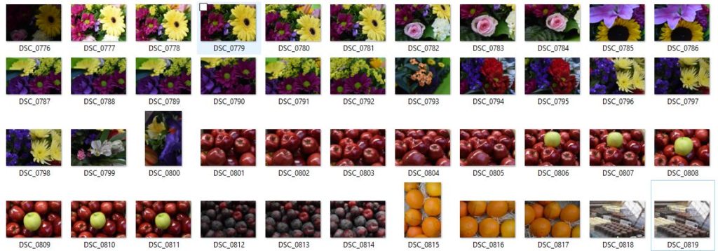
Contact Sheet 1:

Contact Sheet 2:

Best Colour Photos:

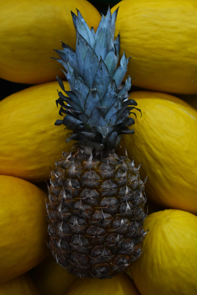
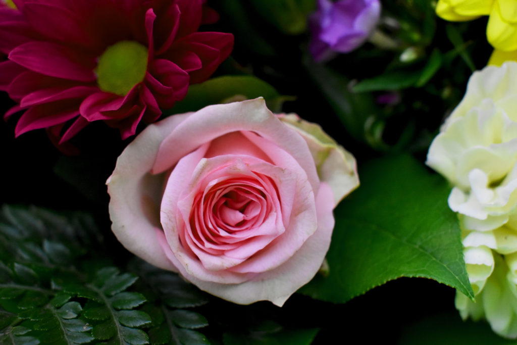
For my best photos out of my previous contact sheets i have adjusted them slightly to create a more intriguing look. For my first photo i have placed a pineapple among yellow watermelons for a strong contrast between the colours of yellow and cyan/green. To have the focal point on the pineapple I erased some black obvious specs on the watermelons and cropped the image to be more central. Finally I heightened the contrast levels and darkened the shadow level slightly as well as making a more vibrant appeal to the image. For my last image of the main feature (the pink rose) i tried to capture the different amounts of colour in one photo which created a bright and bold image.

The formal elements

Jaroslav Rossler

Jaroslav Rossler was born in Czechia, in 1902. A great example of photography in the eyes of “The Formal Elements” is Rossler’s work as he finds the beauty in the simplicity of objects. At 21 years old he started his journey in photography. Creating typographic layout for magazines was a big part of his career. Jaroslav Rossler’s work was heavily influenced by futurism and cubism, this lead him into creating his art of abstract photography.

Jaroslav Rossler images

My Inspiration from Jaroslav Rossler

I took inspiration from Rossler’s work to approach the theme of “The Formal Elements”. I did this by taking a photoshoot of different pieces of paper at different angles and backgrounds to capture the sharp crisp edges of the paper as well as the contrasting deep shadows.

(these are found in my “Paper paper paper” blog)

My Best Photo Out of the Photoshoot Before And After Photoshop

Using The Formal Elements To Analyse My Work

Light – The lighting in this image is artificial by our phone torches whilst the rest of the room is blacked out to create the best shadow effect. The light falls from the top right of the image onto the crinkles of the paper and the background. The lighting is also quite harsh on most of the image as we can see the contrast between the deep under shadow and the highlights of the paper ball.

Line – The lines created by the creases/folds and crinkles in the ball of paper are all very thin and most are straight. Curves and thick lines do occur in the bigger folds in the paper ball. The outlining of the main under shadow of the paper ball is directed to the left indicating that the lighting is coming from the top right hand corner of the image.

Repetition – There is no repetition found in this image

Shape – The only main shape that can be seen straight away is the bottom shadow as it is outlined and one colour, black.

Space – Simple but effective with a wide background and a solid foreground. Quite empty and pain space without the paper ball being there.

Texture – This paper ball is a rough surface to feel and look at with the edges being sharp and pointy.

Value/Tone – The tonal range from light to dark is strong in depth in nearly every part of the image. The most effective contrasting light to dark area of the image is where the under shadow is. The lightest area of the image would be the tips of the paper where the light hits first as well as the bottom of the image where no shadow is formed. The image has a monochrome appearance where the light and dark balance each other out due to the contrast between the shadows.

Colour – In the image we can see that it has been changed to pure black and white. The balance between the colours black and white is even.

Composition – The focal point of the image is the paper and it ignores the rule of thirds as the paper ball is central.

Looking and seeing

Ralph Eugene Meatyard

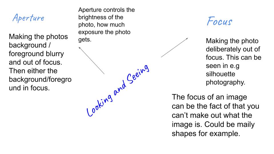
 Ralph Meatyard was an American photographer who had an eye for out of focus and aperture photography. He liked to work in black and white to emphases the images he was taking. Meatyard was inspired by Zen Buddhism and jazz, this inspired him to take photos of otherworldly faces on human bodies, to the ambiguous and unknowable in human nature. He liked experimenting with framing, multiple exposures, and blurring to produce haunting, abstracted images of natural and manmade environments. 

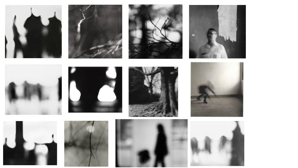
Mood board of Ralph’s work that has inspired me for my photoshoot:

Ralph Meatyard

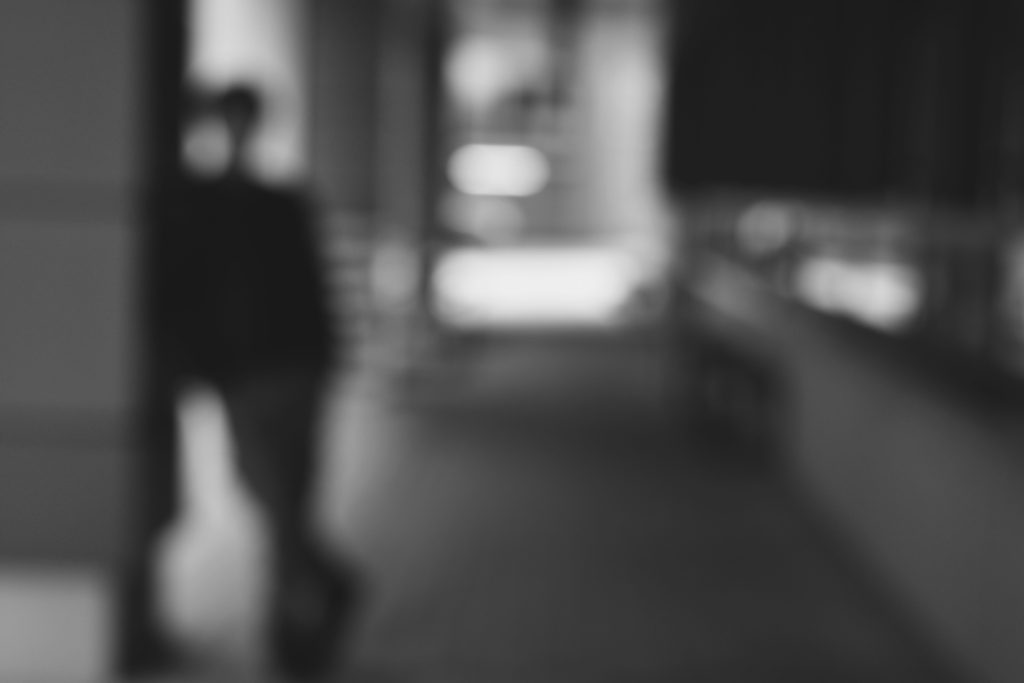
Ralphs images above focus mainly on the aperture of the image. The blurred images define the shapes of nature and human bodies. The high quality focus in the foreground of the twigs and the out of focus background creates a cool method of aperture in his photography.

Here is my photoshoot based of Ralph’s work.

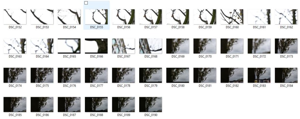
Contact Sheet 1

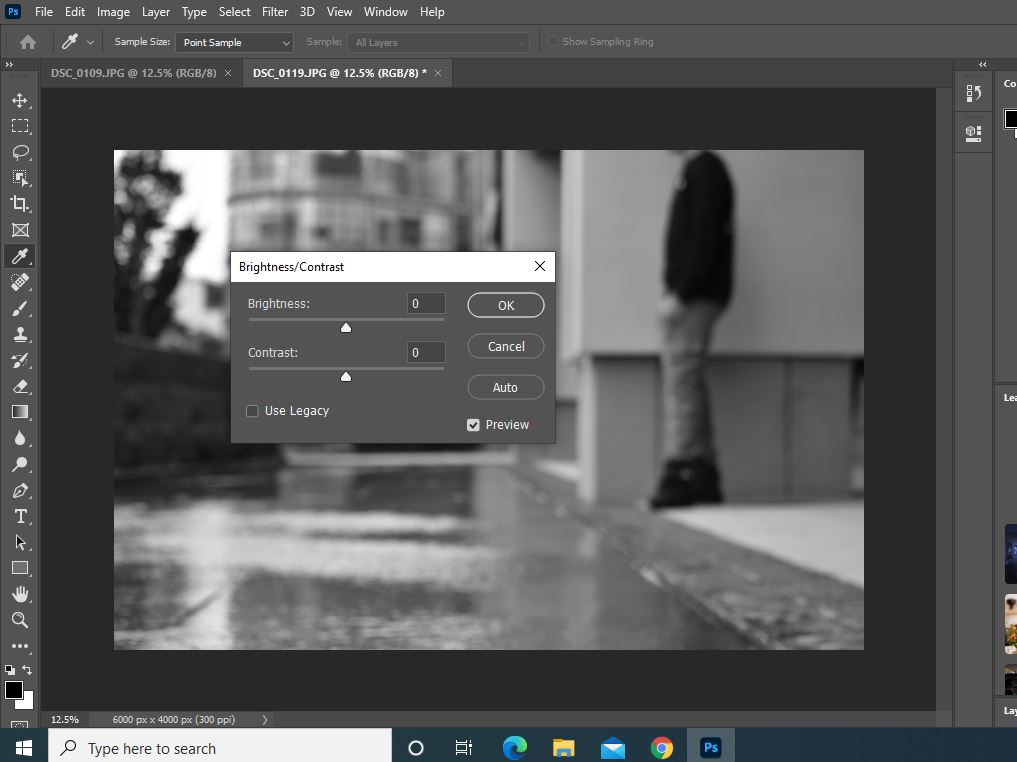
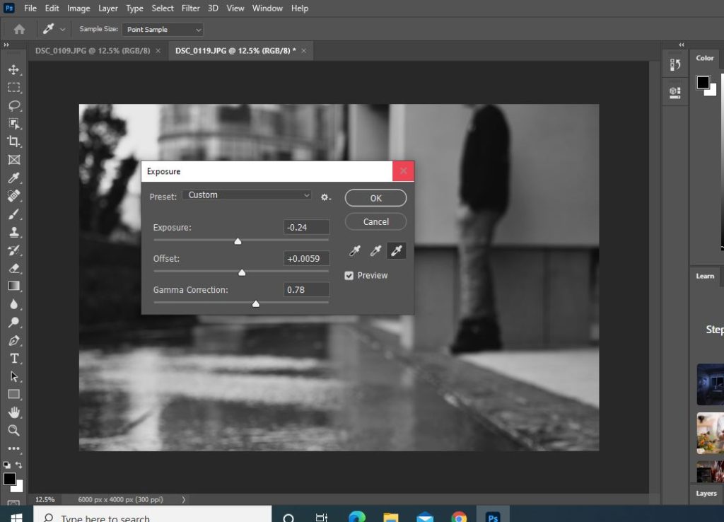
How to use Photoshop:

These are the main features of photoshop I used for my final photos for each contact sheet I have done. Changing the photo first into black and white then playing around with:

Exposure

Brightness/Contrast

Highlights/Shadows

Contact Sheet 2

Best images from contact sheet 2 that is edited on Photoshop:

Contact Sheet 3

Best image from contact sheet 3

Contact Sheet 4

Best images from contact sheet 4

black light

Keld Helmer Peterson

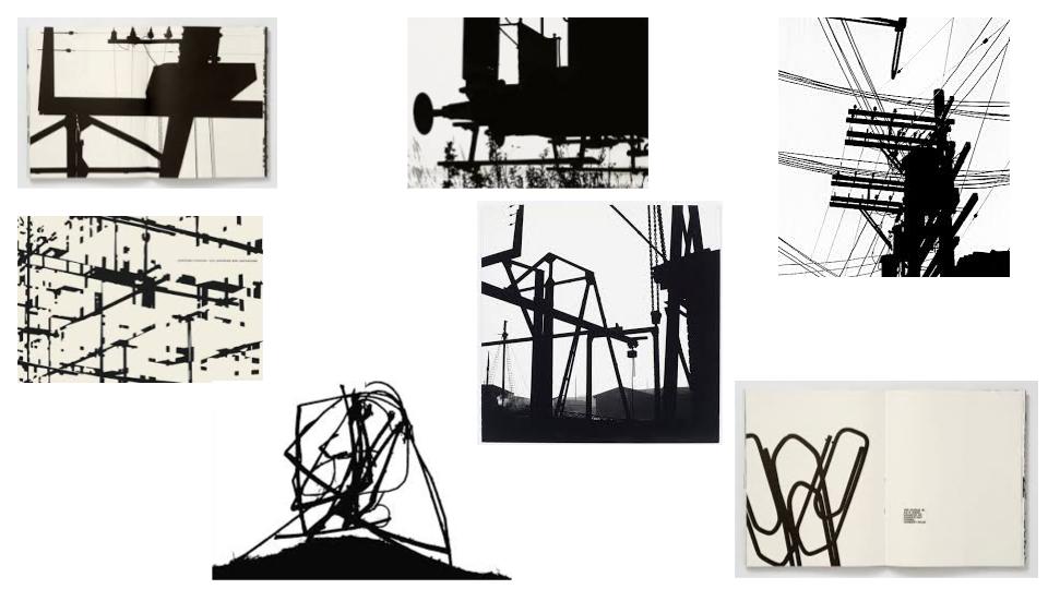
Keld Peterson was a Danish Photographer who had an interest in abstract photography in the 1940’s – 1950’s. His photography involves strong contrast levels between white and black. His work manly evolves around building structures and defined shapes. He was greatly influenced by the industrial machines/architecture during his time.

A mood board of Keld Helmer Peterson’s work:

Keld Peterson

As you can see his work has great depth in his tonal range of light to dark. he almost captures just shapes that you can barely make out what they are. His work is almost the definition of abstract black on white composition images.

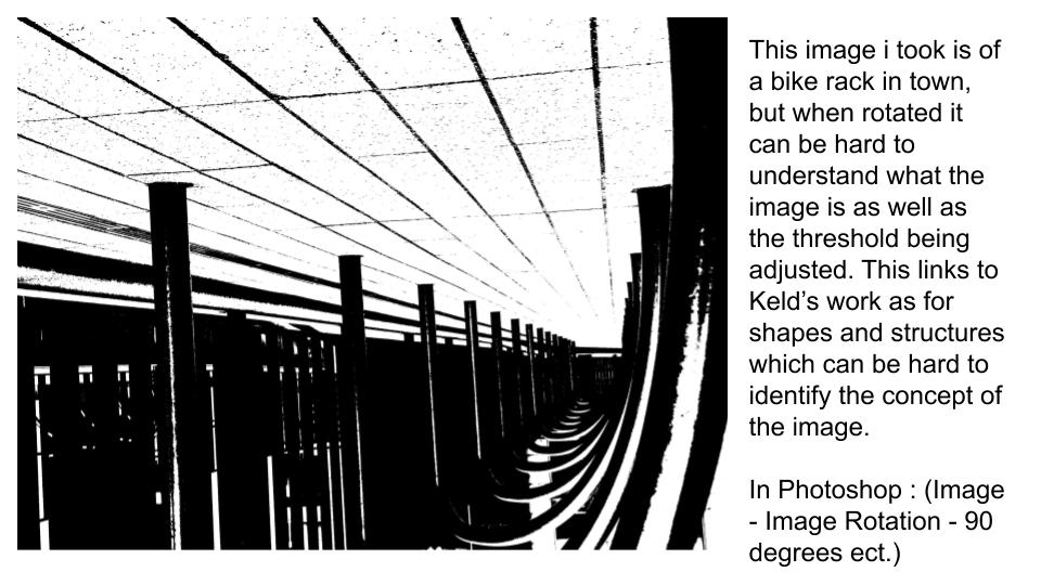
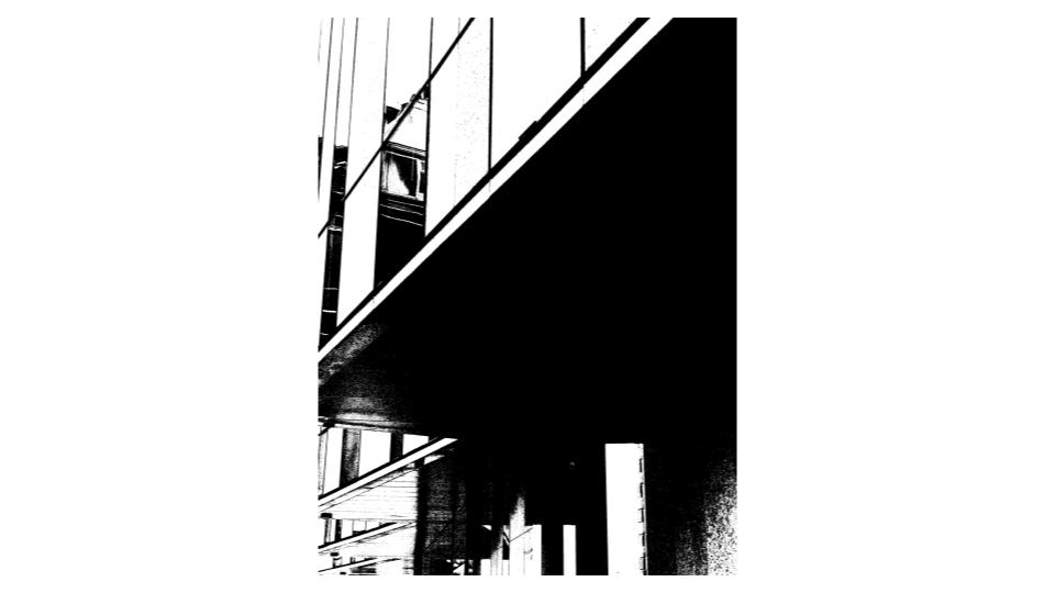
Here is my work before editing on photoshop. I chose to take images of sides of buildings and rails in town as for Keld’s work I thought it would link well with shape and abstract photography.

Adobe Photoshop / Best 4 Photos

Using the threshold icon (image – adjustments – threshold) in photoshop I can create an image inspired by Keld Peterson. This first image can be found in my next four images I took below;