All posts by Elisha Hi

Filters

Author:
Category:

Headshots – deadpan / passport / typologies

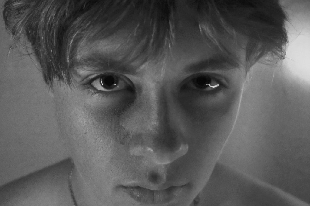
Deadpan simply is described as a portrait of the shoulders up. The face central, eyes directly looking into the camera, and background plain and empty. No shadow just either a white, grey or plain colour to fill the image. The words dead and pan is a slang word for a face. Deadpan photography is a cool, detached, and unemotional presentation and, when used in a series, usually follows a pre-defined set of compositional and lighting rules. Its another image word to use for a passport image. Passport images have a lot of rules compared to a lot of portraits. But some deadpan images will be allowed to use if the right size and colour.

Examples

Deadpan Portraits | Noah Waldeck
Image Lab - Emma Marks: Deadpan PortraitureNaomi James Photography: Week One: Deadpan Portraits cont.

My Experiments of deadpan images and passport images

Evaluation-

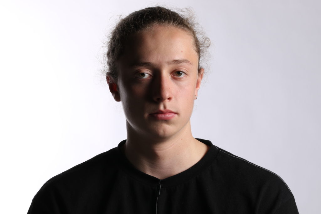
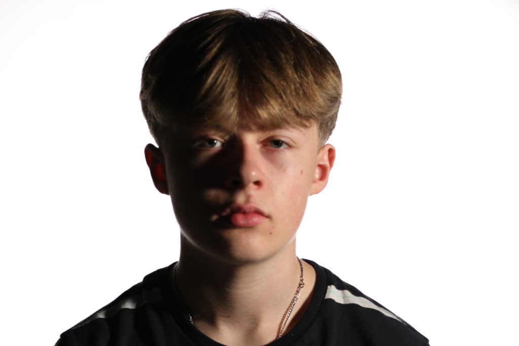
These two images are a good example of a deadpan image as for the dead facial expression and how central the face and shoulders are to the camera. The white background clearly outstands the portrait itself. The image on the right has a better background as all of it is white and no shadow or greyness is seen. The shadow created on the left side of the faces in both images by the spot light in front creates a cool, natural portrait. But this would not be acceptable for a passport photo or a successful perfect deadpan photo. If I was to do this photoshoot again I would direct the light either straight in front of the model, or place another spotlight/main light on the shadow side of the face to cancel out the shadow formed.

Headshots – Up Close! – inspired by Satoshi Fujiwara

Satoshi Fujiwara

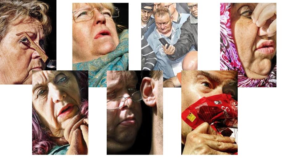
 Satoshi is a photographer and artist based in Berlin. The portraiture she bases her work on mostly is up close images of human faces. These images are taken as street photography, with the models not knowing that they are being photographed. Some examples are seen below…

Images by Satoshi

My experiments

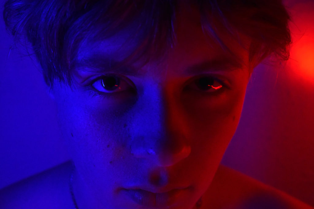
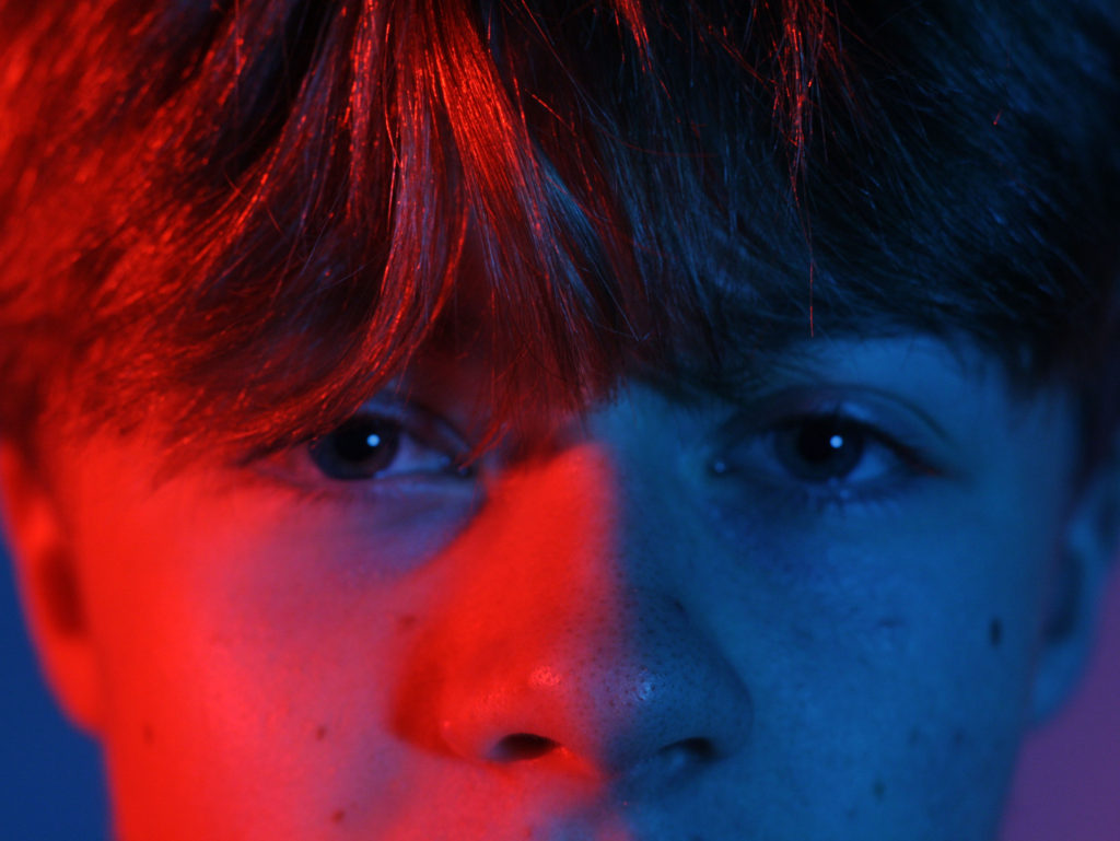
These images i tried to get as close up as I could to the face but my camera would not focus if too close. There are two colorful images as for Satoshi’s work seems to have a lot of color to it. These images are not street photography images but have similarities to Satoshi’s work in the sense that the portrait taken is up close and cuts out the edges of the face. If i was to do this shoot again i would take some photos in town that way i could capture people in the moment and get some better images that linked to Satoshi’s work.

Headshots – montage- cut n paste

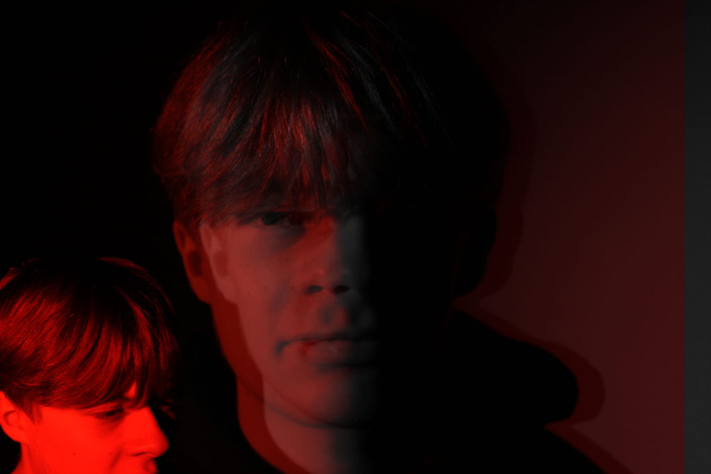
For this image i used two images and one of those i duplicated to create a double exposure image. With the smaller portrait in the corner i simply used the lasue tool to cut around the head and copied the head on top the main image. Using the magic wand tool i cropped out any white or standing out parts of the cut and paste image to make the image merge together better. One of the images of the duplicated image i changed into black and white to create a more contrasting and interesting image to look at. This montage is simple and diverse. It has a sense of darkness to it as for the red glow effect on the face and the black background. This black background fades in with the right side of the face. This makes the contrast between the left side of the face being red and the right side being black strong and effective to the overall image.

Headshots – double / multi exposures

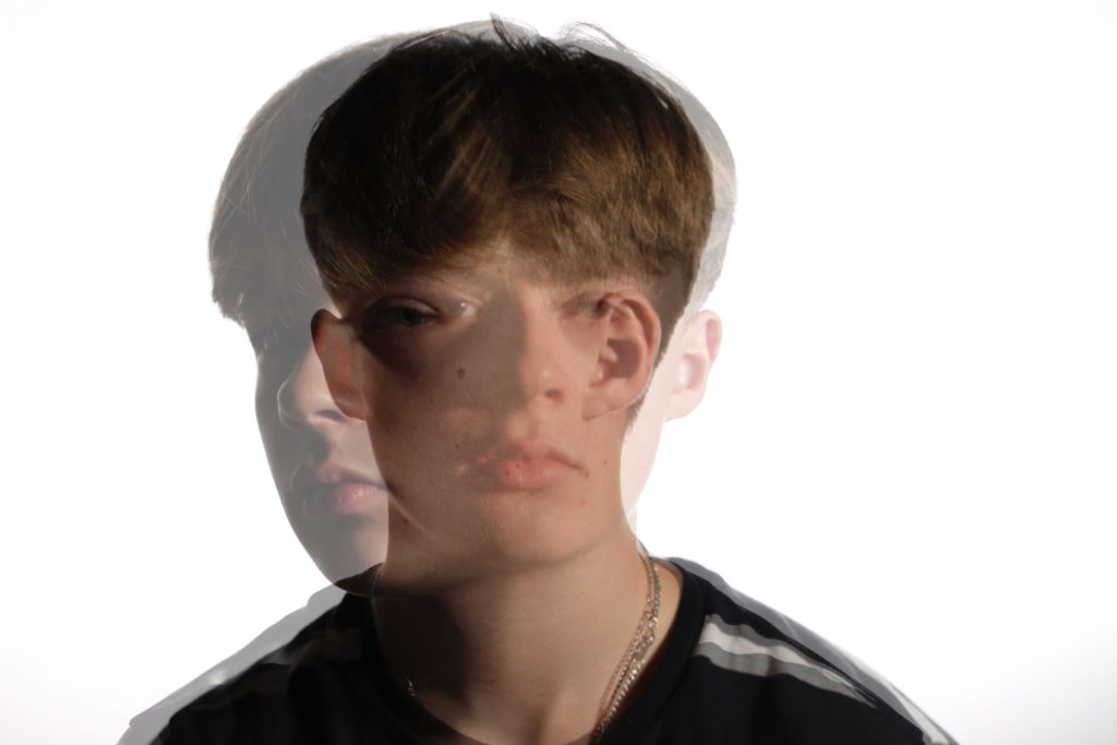
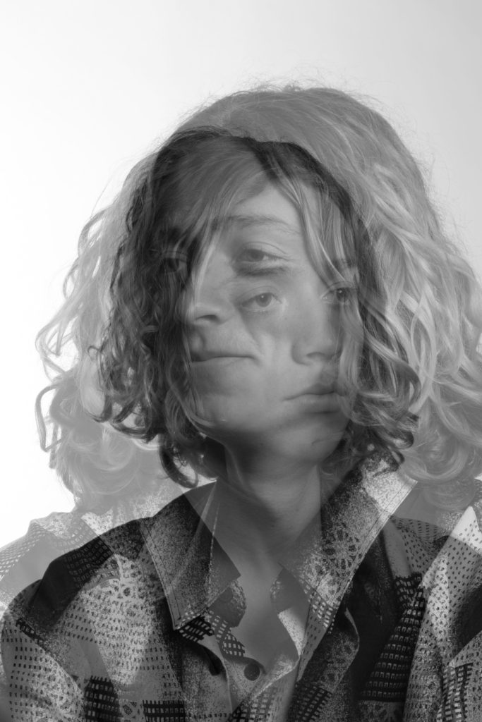
By selecting two images of the same portrait, i have merged them together by changing the opacity of the image that is on top of the original image to make a double exposure portrait. This portraits are interesting to look at as your eyes try and focus on tow portraits at the same time. To get the best outcome for each image, I have chosen two portraits, the first one of a face facing the camera and then the other face facing s different way. This way we can still see both images. These photographs were taken in the studio using a spot light for a main light and the same light directing on the wall behind the model to get rid of the shadow. This creates a white background.

SELF-REFLECTION BLOG POST

Now that it’s over, what are my first thoughts about this overall project? Are they mostly positive or negative?

My first thoughts about this project are that I feel as if I should have thought more in depth about what the assessment was asking me to photograph rather than going off on my own idea which might not link very well to what is asked of me.

If positive, what comes to mind specifically? Negative?

My positive views about this project are that i enjoyed the topic of identity and place. It seemed as if the whole identity theme was not too hard to understand and easy to find something to work on.

What were some of the most interesting discoveries I made while working on this project?

During this project I found out how to use different light to effect different parts of photos that I was taking. For example, to get a glow effect on a front of a face, use mostly a white light , and then use coloured light in the background.

What were the challenges?

I found it tricky to find an artist that related to my work and my final outcomes. The artist in the end that I chose was good enough to relate to but wasn’t very helpful when coming to analysis and comparing my work and theirs.

What is the most important thing I learned personally?

The most important thing I have learned during this project is that I definitely need to get more work done before the exam as I was very close of running out of time.

How did I come up with my final best solution?

My final solution to this project was to use inspirations from other photographers and input that into my work, then i would confidently know that my work has some sort of connection to the topic.

What most got in the way of my progress if anything?

The time that I had I felt as if I wasn’t going to have enough time, therefore I worried and struggled to focus on what needed to be done with the time that I did have.

What obstacles did I overcome?

In the end I didn’t doubt myself that my work was that bad, so i overcame my fear of thinking that my work was rubbish when actually it came out okay.

What did I learn were my greatest strengths? My biggest areas for improvement?

My greatest strengths that I found was analysing a photographers piece of work and working in the studio. In the studio I used equipment that I hadn’t really used often and my images turned out good. I improved on my editing skills in photoshop and how to recover an image that had not gone to plan with wording and comparing it to a certain photographers work.

What would I do differently if I were to approach the same problem again?

If I came across some images that I was not happy with in the exam, I would make sure that I had enough other images to use and another plan if needed.

What could I do differently from a personal standpoint the next time I work?

I would make sure that if I would have the exam again or a similar one, I would check my images first before choosing my best ones in the exam.

What can I improve?

I can improve on my knowledge of how to evaluate my own images and how to link them back to the question asked or the topic or a photographer. I would write more in detailed of what my point is for my work and explain exactly what i am trying to get across to people in my images.

How will I use what I have learned in the future?

Hopefully in my next exam i can improve by getting a better grade than I did before by using my free time to make the exam be easier for me and for me not to stress. I can also think more about what is being asked and be more creative with my final outcomes.

WWW – WHAT WENT WELL

In my opinion , my (what went well) would be my research and analysis and understanding of the topic. This is shown as I got I better grade in that part of the exam then the other parts. My own understanding for the work I can write in detail and I can add in other views of the topic from different people.

What are your strengths and weaknesses?

As said before I feel as if my strengths in this project were the analysis with both a photographers work and my own.

My weakness in this project would defiantly be the skill level of using photoshop.

EBI – EVEN BETTER IF

I feel I could improve my work if I came up with a more creative and advanced outcome with my final images. This could be either how i present them on the blog, or how and when and where I take them. I could change my idea on the topic and think of something more interesting that I would have more to write about.

Photo-shoot 2

Photo-Shoot Plan

Who – A male 17 year old – My boyfriend.

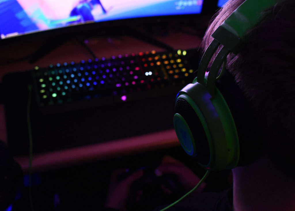
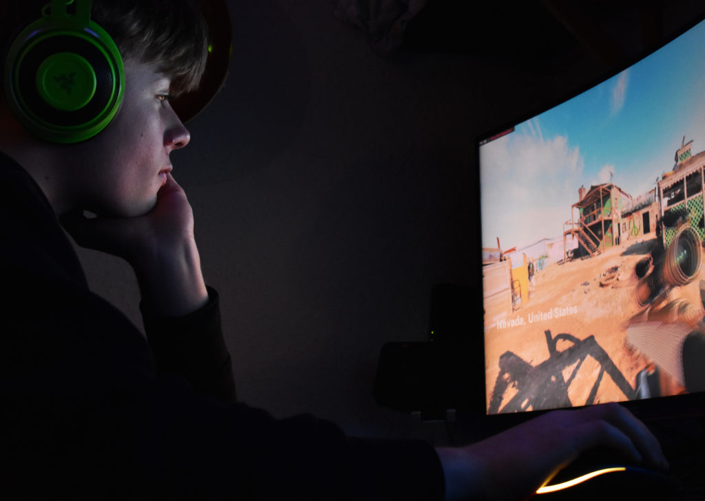
What – A photo-shoot of my boyfriend gaming, in his car and on his motorbike.

Why – This photo-shoot is taken to capture a teenage boys lifestyle that society stereotypes to be. It shows what his identity is likely to be and what he (his age group) are known to do in their life.

Where – At my house and on the street roads of St. Brelade.

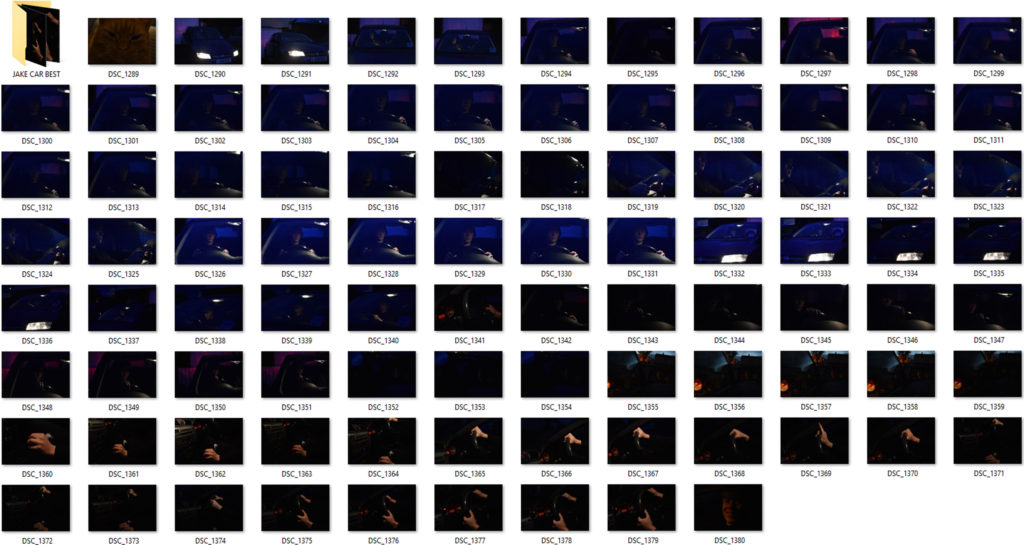
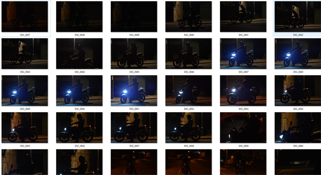
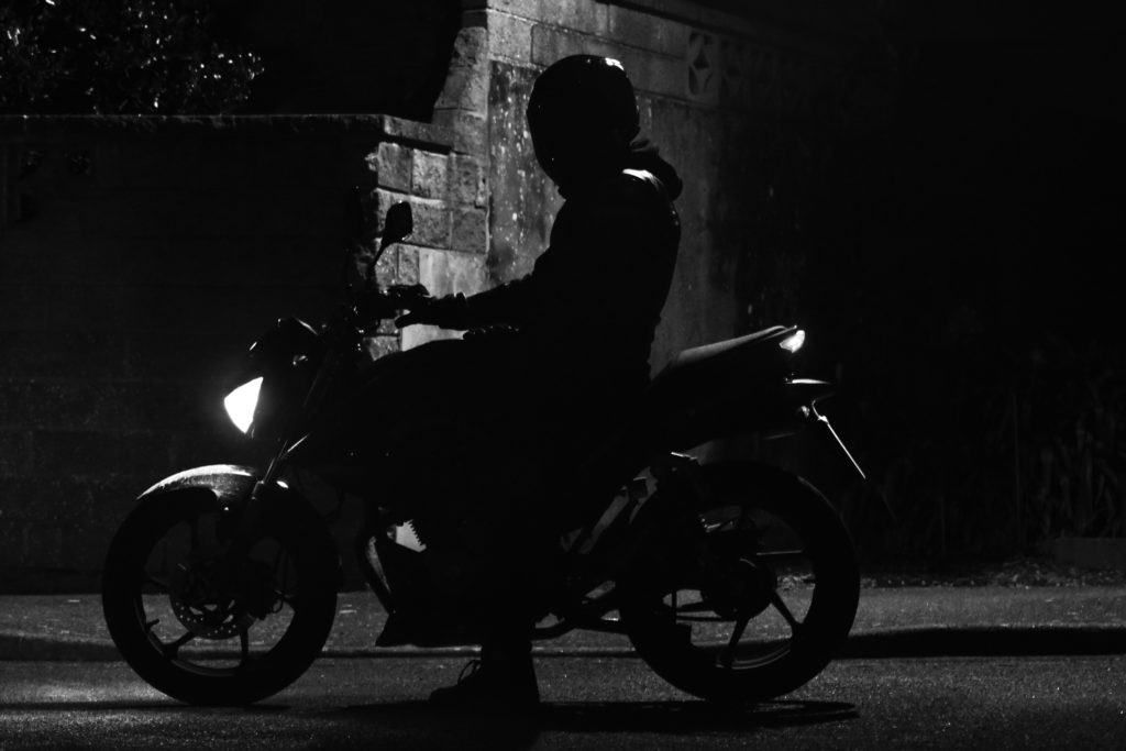
How was the photo taken – For the gaming photos , using LED lights for a glow effect and a spot light to create more light in the room was how the photos are seen. Camera settings were used at a low exposure and 400/600 ISO was used. For the car images, a light inside the car was used to mainly pin point the objective that I was photographing. A high ISO – 1600/3400 was used to actually see the image as it was low light in the day as well as a low exposure – 1/50 – 1/40. For the motorbike photos the same camera settings applied as it was low light in the day. A single street light was used to create a silhouette figure of the bike and my model. (all black).

When – Late evening / 22nd and 23rd of January

Contact Sheets

Car contact sheet
Gaming contact sheet
Motorbike contact sheet

Editing Techniques Shown

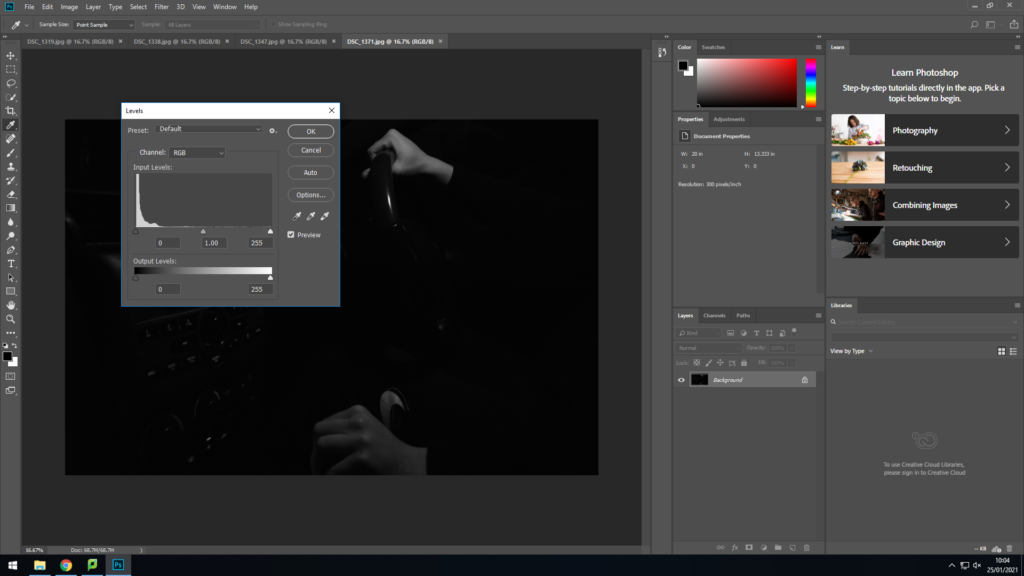
For both motorbike and car images I changed them into black and white photographs. I increased the contrast levels and either increased or decreased the level of black or white depending on how much you could see the image. I also used the dodge tool to emphasis the light features in the face for the car photos and the highlights of the motorbike.

Changing the vibrance level of the picture increased the glow that was coming off the LED lights in the background outside of the image. The light coming off the monitor in front of his face projected a white glow on the front of his face which I lowered in highlights and shadows in adjustments in photoshop.

Best/Final Outcomes

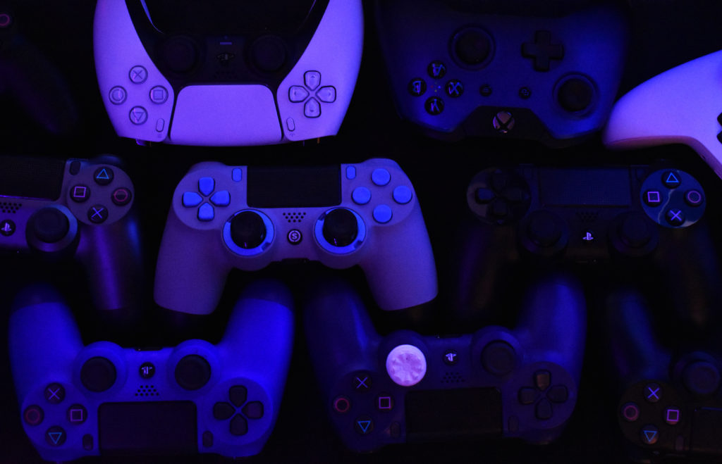
These gaming images relate to this teenage boys identity as gaming is a big part of his life. Its something he loves and enjoys doing. Modern day teen boys are known for there love f the online gaming world. Where hours and days would be spent online. This hobby may be his safe place, a place where he enjoys himself with no worries. The bright colours found all around the images represent his love and passion for gaming and how it fills a hole in his identity. The concentrating expression on the face in the portraits above gives off the impression that he is completely zoned out, as if no one is around him.

These photographs were taken at very low light in the day, nearly no light at all. Using only a single spot light in the car , editing on photoshop was needed to be done to see the images clearly. These photographs have an old style to them, as if they were taken in the 1960’s. The light parts of the face and hand are the main features that contribute to the photo for making it look the was it looks. The body of the boy blends in with the blackness of the background and the rest of the car to emphasis his facial expression. The seriousness of his face and the way only one hand tightly grips the wheel of not just the car but the motorbike too, implies his love for vehicles and what he feels almost proud of.

Linking To A Photographer

This old fashioned look with these dull black and white photos links to Bruce Davidson’s work. This is seen below…

The Renowned, Unknown Bruce Davidson - The New York Times
Image By Bruce Davidson
Image By Me

These two images placed together seem to have the same sort of lighting as light in Bruce’s work hits mainly the face and coat of the lady and man on the bus. Both images seem to have the same tonal range of black and white as well as sharp lines found between contrasting parts of the images between black and white.

Apart from the images physically linking together, Bruce Davidson over the years of work has taken photos of teen life in the mid/late 19 hundreds. This links to my work as the whole concept of the photo-shoot is to show a moderns teen boy’s life and what his personal identity is.

EVALUATE AND CRITIQUE

If I was to do this photo-shoot again with the car and bike theme I would use more natural light to bring out the dark areas to make it more of a modern day photo rather than replicating an old style of work from years ago. I might have used more colour in my work to connect to my models lifestyle and his identity to others and himself.

photo-shoot 1 – Best/Final Outcomes

PERSONAL RESPONSES TO FINAL IMAGES

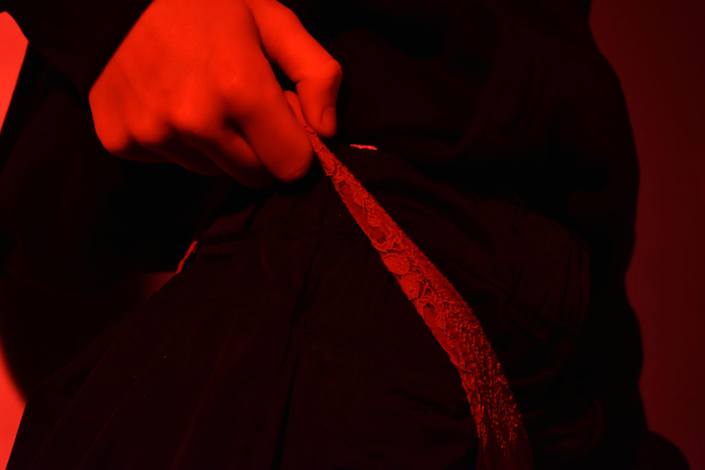
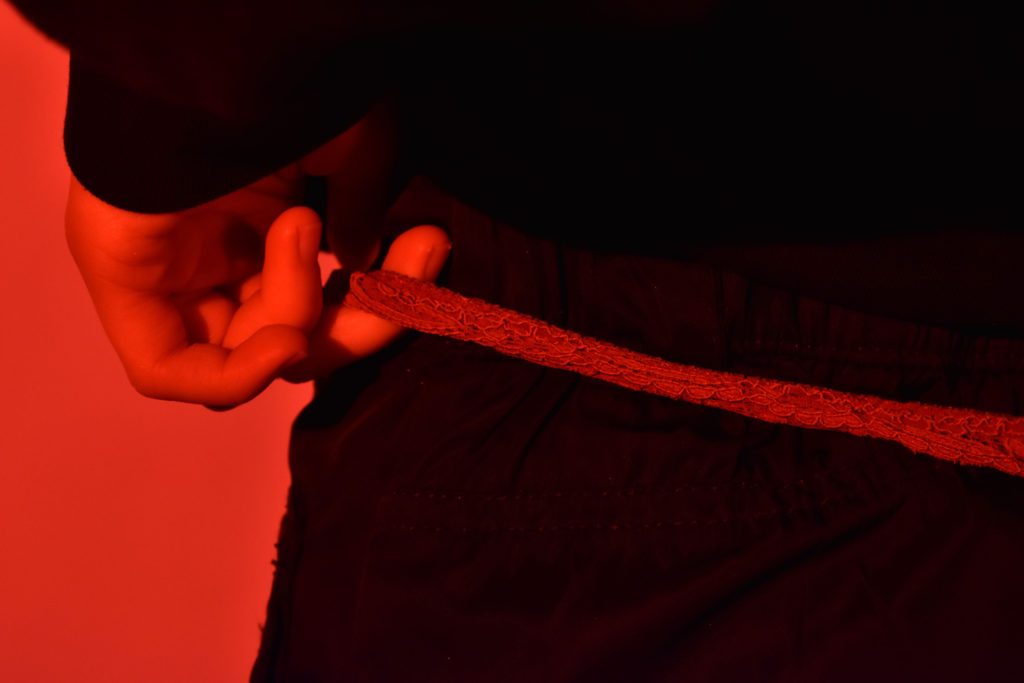
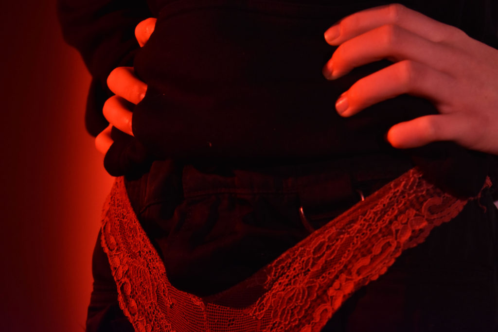
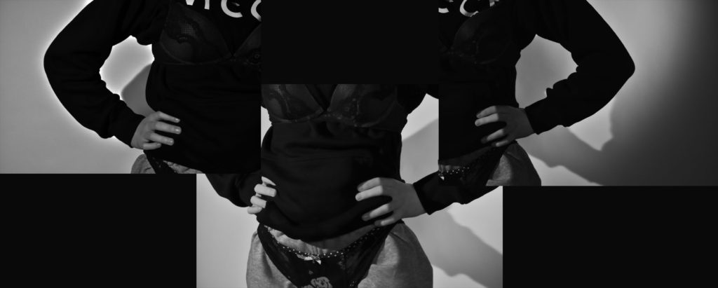
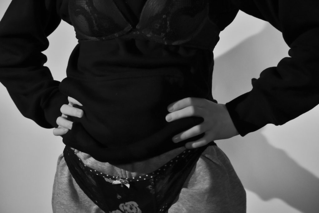
My final images link to the concept of body image. These photographs act out what the typical stereotype teenage girl should be wearing. The baggy clothes express what the girl wants to look like, who she wants to show her identity as and what she wants to wear. But in todays society , people are so hung up on appearance and looks, outfits can define someone as a person. Wearing tight underwear and bras that fill out ladies breasts is what they are expected to wear , that’s what people (men or women) are happy and excited to see. There’s barely nothing on personality anymore. These problems all over the world lead to many issues such as eating disorders, anxiety, depression.

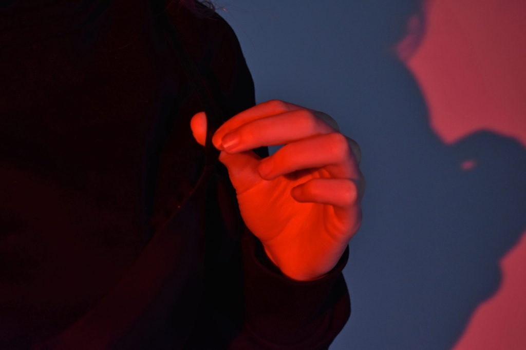
My images in colour represent anger, fear, hate as for the colour theme being red. My final image, a collab of three images, are changed to black and white to express the dullness and fear that this girl feels in herself for wearing somethings that she is tricked into having to wear by society. Her hands placed around her waist as if she isn’t happy with her body indicates that wearing this sort of clothing makes her unhappy.

Linking To A Photographer

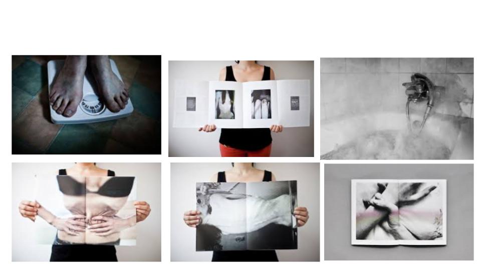
Laia Abril’s photography links to my photo-shoot as part of her work she bases around body image and eating disorders. These people that are either underweight or have eating disorders reflects on their identity and how they see themselves differently to others. This image below I tried to recreate with my own photography…

Laia’s work being very colourless made me change my image into black and white for them to relate to each other better. A white background in both images and an unseen face of a figure of a lady makes the image more effective as we as viewers can only guess what the model feels judging off body gestures and colour.

Evaluate and Critique

If I was to do this photo-shoot again , I would firstly present my final outcome with a better presentation, for example … Laia Abril has shown her work in a book. If I had more time I would have taken images of a mirror and presented my images onto mirrors to replicate the unhappy body image of my models self.

photo-shoot 1 – plan and contact sheet

Photo-Shoot Plan

Who – My female friend

What – Images of a girls body with underwear worn on the outside of clothing such as joggers and a jumper with pants and bra worn on top of them.

Why – This photo-shoot i took is to capture a female expressing her feelings about her body image to others. It also taken to show what society expect females should be wearing , how others (men or women) foresee what females look good in.

Where – In the schools photography studio.

How was the photo taken – A set up in the studio with two spot lights either side of my model , one slightly in front of the other and a main light 45 degrees from my model. The back drop was a white infinity backdrop. Camera settings were ….. 400 ISO…. 1/100 and 1/125 Exposure….. White balance – incandescent.

When – during school time (Thursday 21st January)

Contact Sheet

Editing Techniques Shown

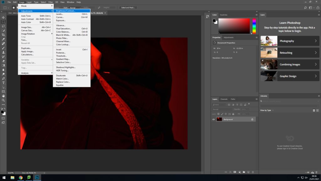
To get rid of the logo that clearly stands out in the image , i used the spot healing brush tool, as well as turning the image into black and white in my final outcome. (Image , adjustments , black and white)

Most of my images had little editing such as changing the brightness and contrast levels. This gives a more effective glow to the highlights of the photograph.

Laia Abril

Laia Abril was a Spanish photographer who was born in 1986. She studied on cases such as rape , abortion and eating disorders. Her work typically studies hard , painful subjects that seem difficult to talk about , therefore she photographed these tough times to record these events for either the person that is going through the situation or for her own work. She did this to spread the word about these tragic events that happen in day to day life.

Mood-Board

This image has an empty alt attribute; its file name is laia.jpg
Images by Laia Abril

These images by Laia express difficulties in eating disorders that are found in many female and males around the world. 85% of the UK women agree that they are not happy about how the look body wise and how they feel uncomfortable with their physical state. As some of Laia’s work is hard to look at , these images above show only a few of what these issues look like. They are strong , powerful and sensitive photographs that some viewers may find disturbing. But that is the whole point of why Laia is expressing her work on these problems. They indicate someone’s identity , how they are known , how they are seen. Many people would ask why? Why do these horrible things to themselves? These images shows a physical state , but all have a story behind them. Fear, loneliness, anxiety , all link to these issues that people face. Capturing it in an image may help them understand what they need to overcome.

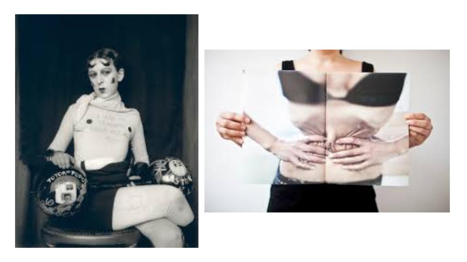
How Claude Cahun’s work And Laia’s work Link?

This image has an empty alt attribute; its file name is links-between-laia-claude.jpg
Left Image – Claude Cahun Right Image – Laia Abril

These two photographers have similarities such as how peoples appearance indicates how others think of them. An example of this would be a girl coming out as being gay, then hated by others for it. A man with an eating disorder and seen as stupid to others. They both link to the theme of identity as for how these choices they make are a part of their life. These images show a strong message to what these people think of themselves such as the right image by Laia. This image is seen as a women squeezing her waist and showing her rips. This indicates that she wants her body image to be different , maybe skinnier. As for the viewers we see someone already too skinny or perfect, but in their own mind they see someone different to that. This could come from bullying, abuse or life in general. Her body seems pale , bony and unwell. But having the confidence to be photographed for the world to see is a set to take to seeing what herself needs to overcome. These images relate to each other as for they show different identities. They suggest these people want to live a different life to what the first were born with as for the eating disorder and a man wanting to be a women.