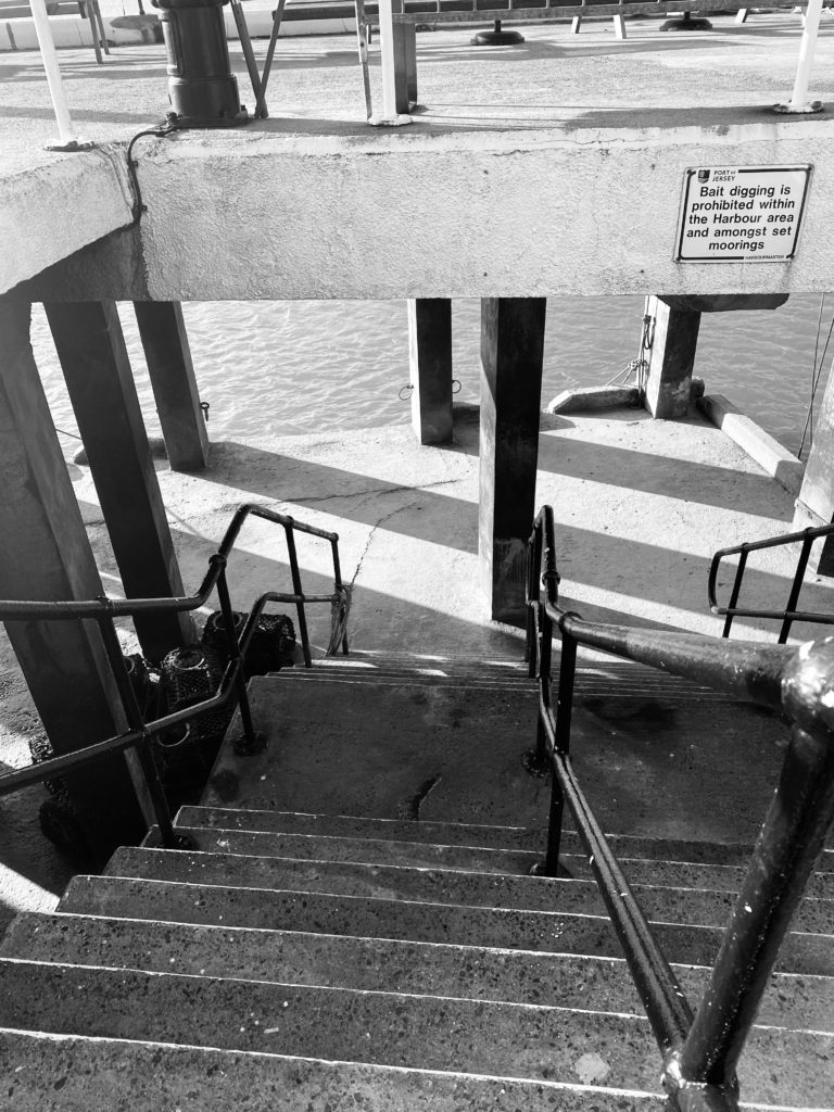
Portrait photography is a type of photography where you aim to capture a singular person or a group of people, this can be done by using a variety of light sources, backdrops and positions in which the people are posing in. There are several different types of portraiture photography which consist of Traditional, Lifestyle, Environmental, Candid and street, Glamour and Boudoir,Fine art, Conceptual, Surreal and finally self portraits.
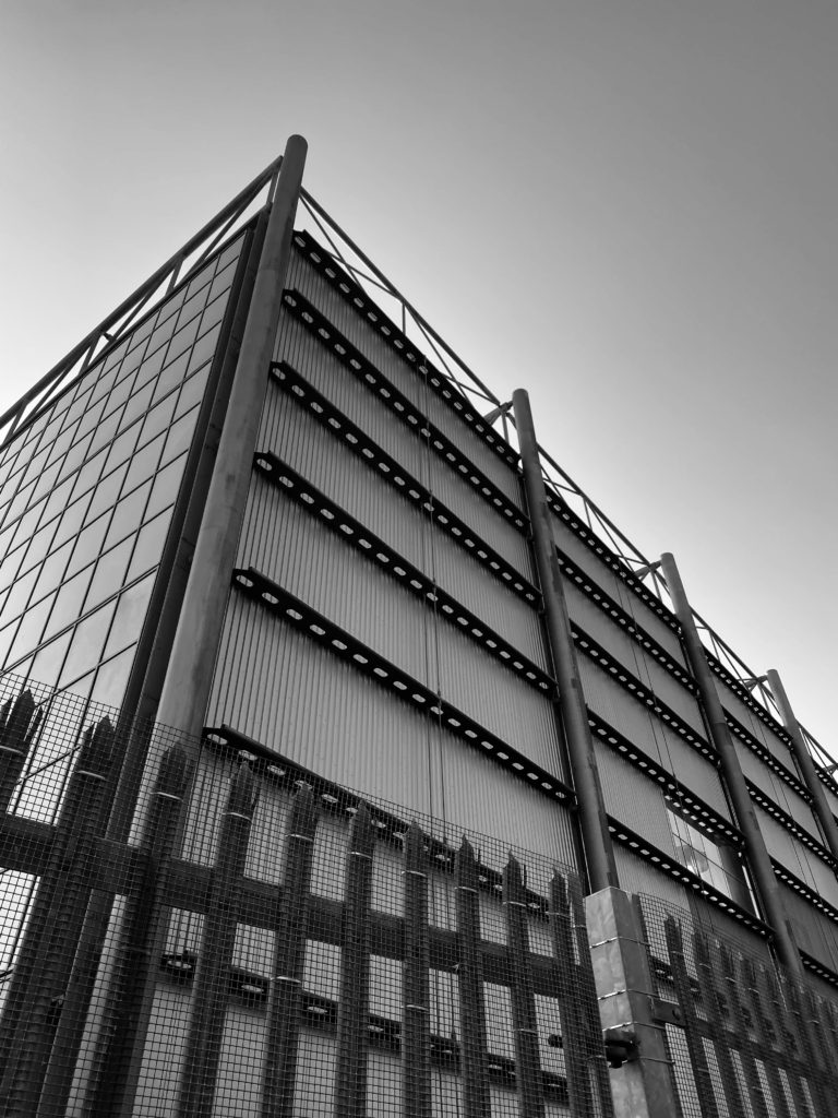
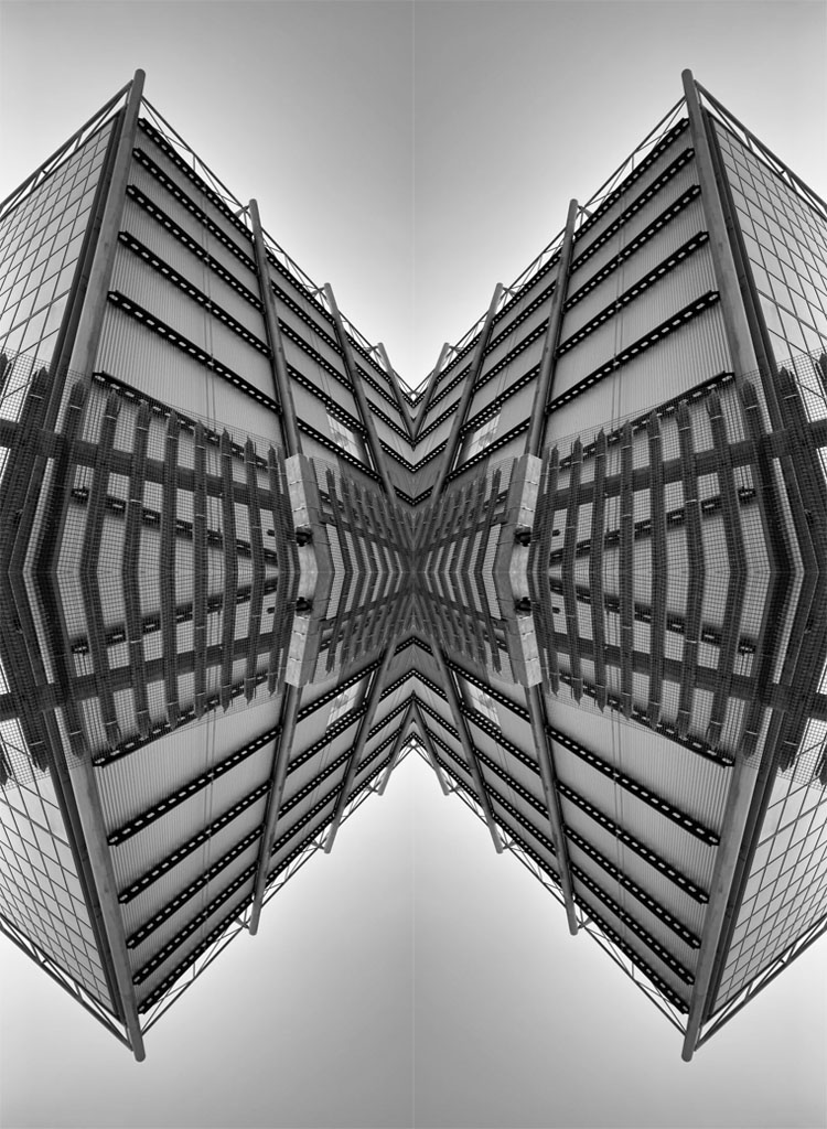
First I increased the canvas size so that it would be easier to fit my overall reflected images. Then I opened the photo in which I wanted to work with and I duplicated the original layer. After that I pressed (ctrl+T) and shift to keep the image the same proportion as well as convert it to the other side of the campus. Next I duplicated both layer one and two and pressed ctrl + T to reflect it to the bottom half of the canvas.Overall i feel that this worked well as it allows you to see the image in a different perspective.
Alvin Langdon Coburn photo compared to Alfred Stieglitz
COMPARISON
As you can see Both of these photographs lack colour as they have been adapted to black and white which highlights the tones and shadows. Additionally they both have unique pattern that are different as well as reposition of the same objects in the photos. For example in Alfred Stieglitz you can clearly see the repetition of clouds in the sky as well as in Alvin Langdon Coburn’s photo you can see the symmetry of the glass/mirror object which appears to be the main focus of this photograph.
However there are also multiple differences in these photos which can be seen through Coburn’s use of vertical and horizontal harsh lines throughout his image. Whereas Alfred Stieglitz did not use lines in his photography as he chose to picture a realistic object such as clouds which have a relaxed contrast to them as they are not in strictly straight lines.
Luigi Ghirri was an Italian photographer who gained a reputation for his contemporary photography which varied from fiction and reality. The photograph above has some neutral tones which is due to the natural light coming from all angles. Additionally you can also see the main focus as it the center of the of photo which is the bench whereas the non-focus is he background. Finally there are also multiple leading lines in this photograph which can attract ones attention to view the photo.
Ernest Haas
Ernest Haas was a photojournalist and a colour photographer who enjoyed taking photos of different types of genres. The photograph above shows reflection and repetition of the pattern of flowing water. The tones of the water are very darkening as I feel that this photo has no artificial lighting so therefor it is not brightening the image up in anyway. Additionally the texture of the photograph looks very smooth and soothing this is because we already know that water is not a rough or an uneven surface.
The Boyle Family photograph
The Boyle Family photography is very basic to other artists work as they take pictures of objects which we rarely notice as its a surface which we walk on typically everyday. They are a group of artists based in London who generally take pictures of everyday objects like the one above. As a group they decided to go against the stereotypical type of photographers which are usually being solo while taking photos and that they wanted to take photos as a group.
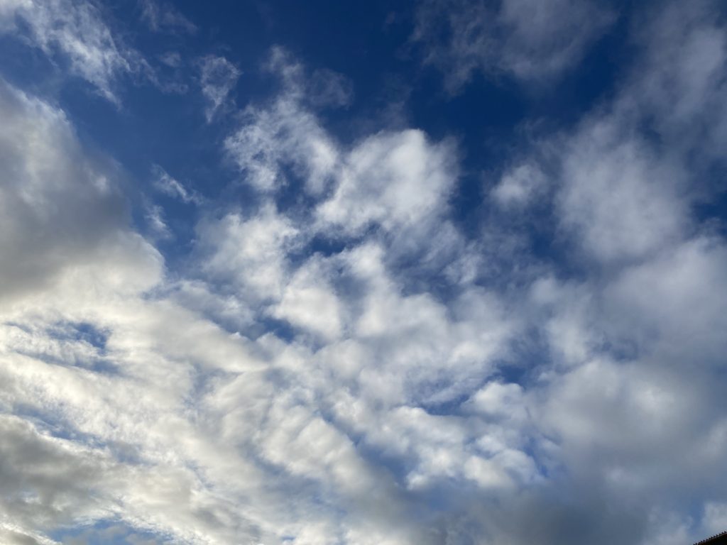
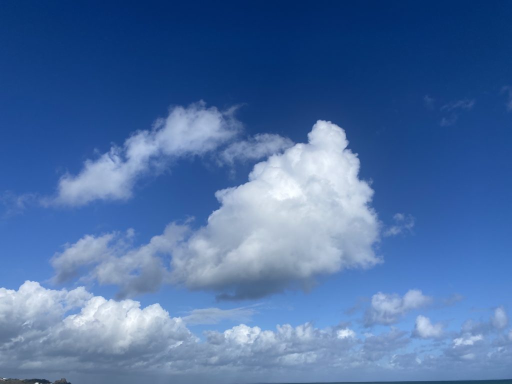
Alfred Stieglitz (born January 1, 1864 – July 13, 1946) was an American photographer and modern art promoter who has a career in making photography an accepted art form. He was best known for the modinest movement.
These photos show a large range of repetition as the majority of his photos are taken of the sky so therefor they consist of clouds.
MY PHOTOS:
MY BEST PHOTOS:
I feel as these photos work best as you can clearly see clear repletion of clouds as well as the bright tones the sky has which reflects on the clouds which adds further contrast. Additionally the warmth light helps the photographs show depth as well as enhances them making them show clear details.
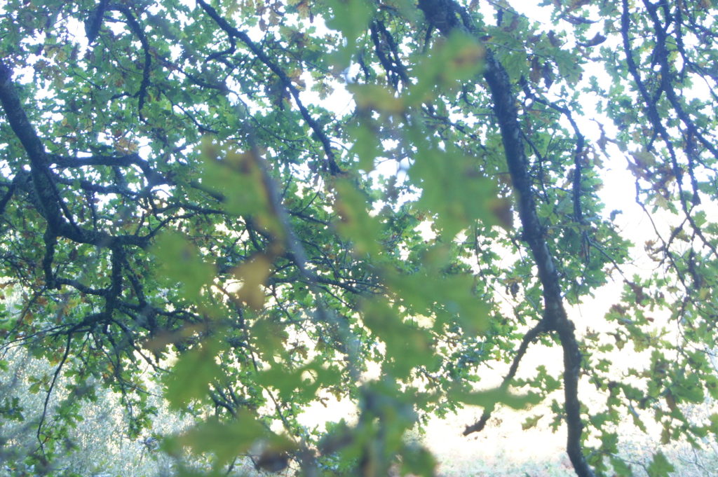
Saul Leiter was a American photographer and painter whose work in the 1940s and 1950s was an important contribution to what came to be recognized as the New York school of photography. He enjoyed taking night photography, colour photography and depth of field photography, which is shown in the photo above. In the image above the tones are very neutral due to the black and white adjustment which has be made. You can clearly see the different focuses of the photos as one twig is very clear compared to the background which is blurred.
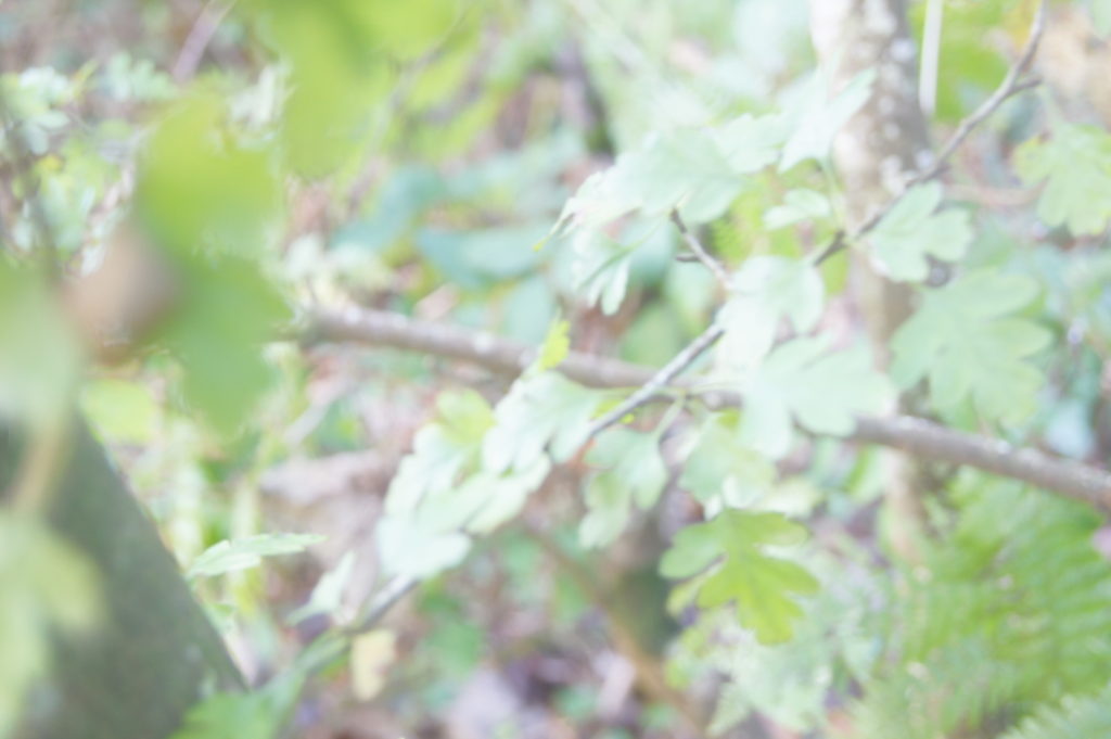
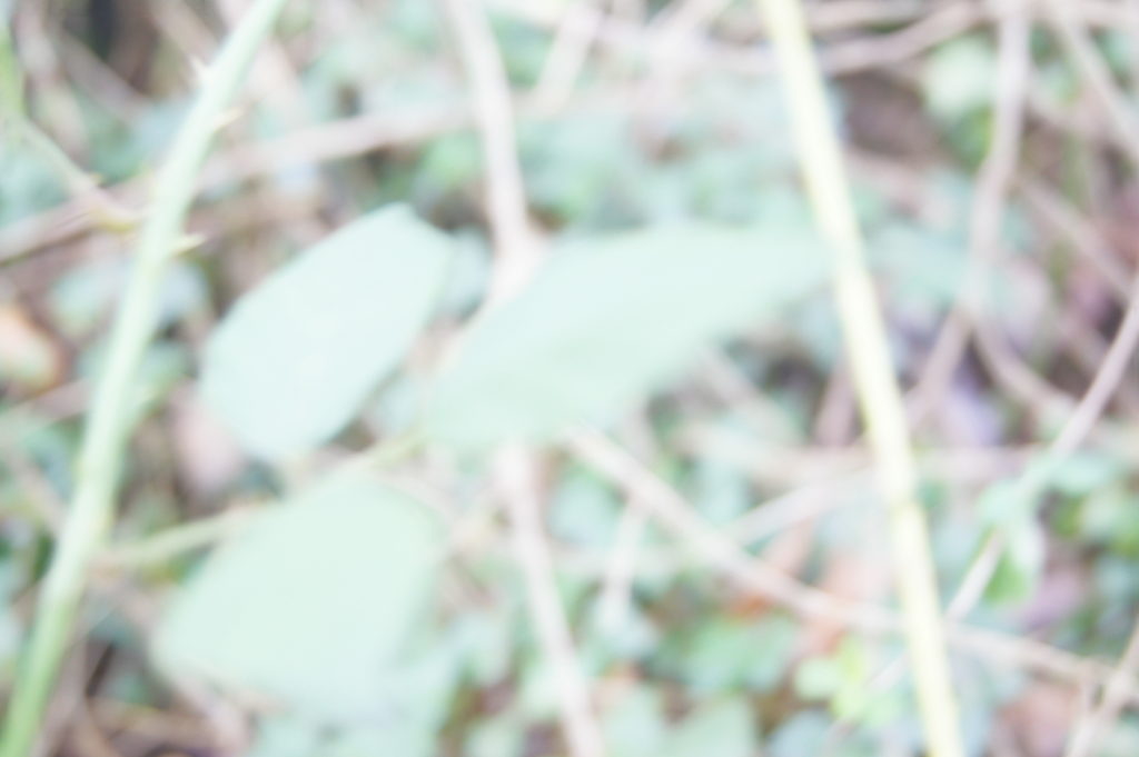
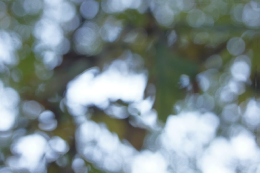
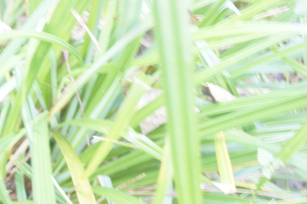
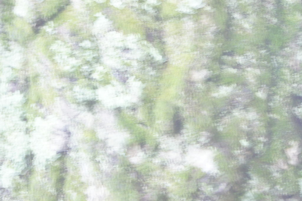
Uta Barth
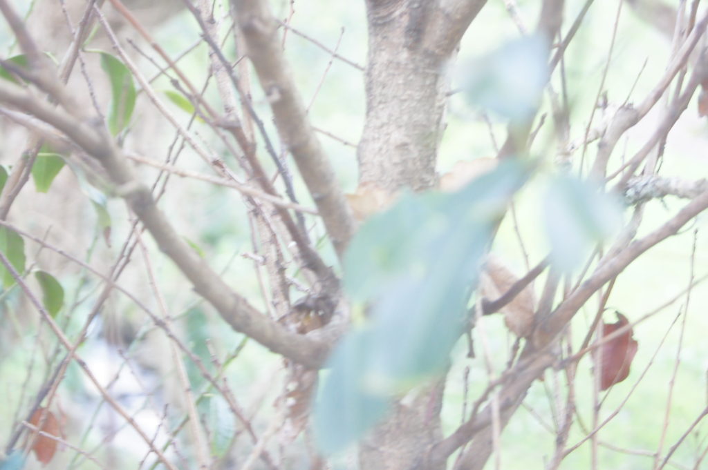
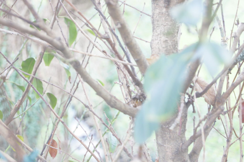
Uta Barth’s photography is a German-american photographer who mainly takes photography of optical illusions, perception and non-place. Her work emerged in the late 1980’s to 1990’s , which included her inverting the notion of background and foreground. This may have changed the viewers perception of her work due to the optical illusions as well as the different focuses. For example in the image above it shows that the background is out of focus, whereas the figures of people are still in focus. I find her work very compelling as it attracts all of you attention to certain parts of the photograph.
Ralph Eugene Meatyard
A second artist which I decided to look at is Ralph Eugene Meatyard who is an american photographer. I feel that the image above creates a darkening mood as the baby dolls are highlighted due to the fact that they are the main focus of the image. However the figures in the back also add to this as you can still identify that they are young children who are wearing intimidating masks over their faces. Additionally the way the photograph has been changed to black and white adds to the darkening mood that has already been created, as the tones have been enhanced because of the lighting.
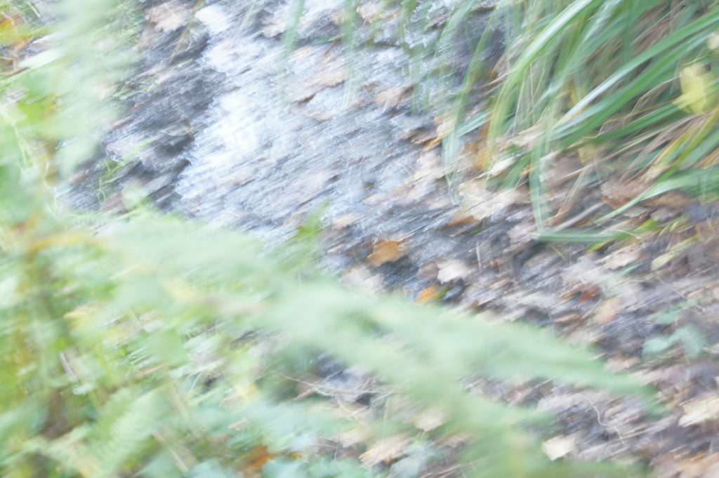
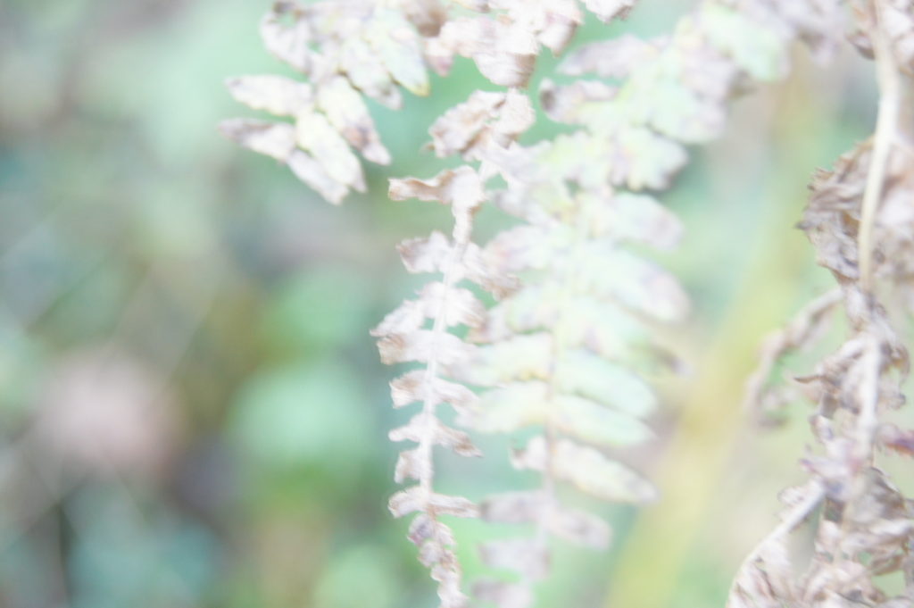
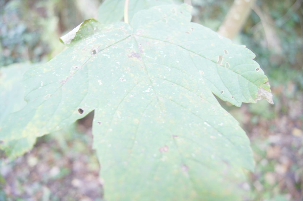
MY PHOTOS
MY BEST IMAGES
I feel that these are the best images which I took as they reflect Uta Barth’s work the best as it focuses on certain objects which in this case were leaves and blurred the background adding contrast to the photographs. I done this by experimenting with the aperture as well as the iso on the camera. The lighting off all of my photos in this shoot are natural as they were taken in natural settings which enhances them.
Keld Helmer-Peterson was a Danish photographer who was inspired by Albert Renger-Patzsch. He is mainly known for his colour photography, however he also published multiple books of black and white images showing dramatic contrasts of tones.
Keld Helmer-Petersen’s Image
My Images
First I selected the images I wanted to work with in Photoshop. Then I cropped it to the way in which I liked and clicked image, adjustments, and then threshold to adapt where the darkest and lightest parts of the photo are. Overall I feel that they reflect Keld Helmer-Petersen’s photography well due to the way in which i manipulated my photographs.
A contact sheet is a piece of photographic paper on to which several or all of the negatives on a film have been contact-printed. Usually it is a positive print of the total negatives from the roll of film or a shoot and often each image is the same size as the negative itself. This is done to help the photographer analysis the images quickly and chose which photos are their best ones out of the shoot.
Albert Renger-Patzsch was a German photographer who began taking photos from the age of twelve. He mainly focuses on architectural photos, macro photos and object photography which he then puts into black and white adding more tones and details. His famous book which he published in 1928 ‘The World is Beautiful’ inspired several other photographers to start paying close attention to objectivity. Albert Renger-Patzsch also explored all seven formal elements such as: form, light, rhythm, line, texture, and repetition throughout his years.
ANALYSIS:
These photos are similar are different in several ways. The first thing I noticed when I started looking at these two images is that they are both in black and white showing different tones which enhances the textures. Secondly I also noticed that neither of the photographs show nature as one is architectural and the other shows a pattern which has been created by Albert Renger-Patzsch.
However there are also several differences, for example one of the photos have been taken from a close and straight angle whereas the other has been taken from a distance at a looking up angle which adds contrasts to both of the images in different ways. Another difference I noticed was the lighting tones as one of the photos have more of a warm tone compared to the other photo has more of a dark and natural tones.
MY RESPONSE
BEST IMAGES
I personally believe that these are the best images I have took for this shoot, this is because I feel that they reflect Alberts Render – Patzsch as you can see clearly the direction of which the light was coming from. I started of by taking photos from a straight on angle then I later developed the idea of taking photos from a lower angle, which I think make the photographs more abstract.
Additionally I tried to avoid editing my photos in order to make them feel more realistic as this is what Albert Renger – Patzsch did throughout the majority of his photographs. The tones of the images are very different throughout due to the way in which the lighting is coming from which creates different shadows and shades.
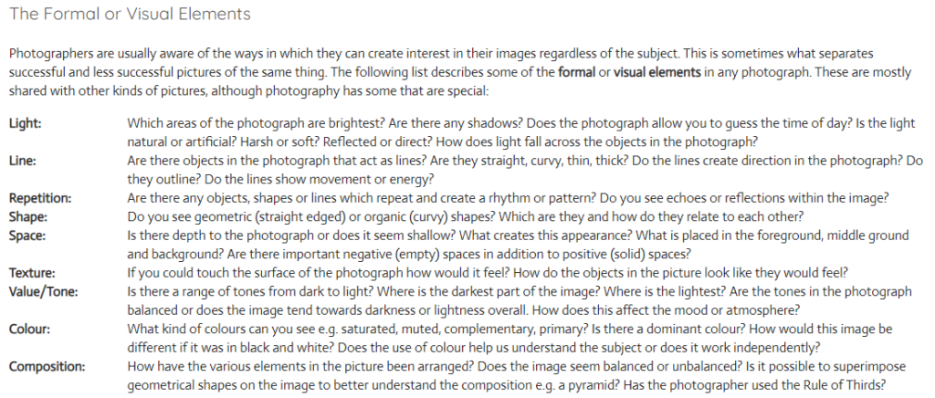
There are seven formal elements of photography which consist of: Line, Shape, Light, Repetition, Space, Texture, Value/Tone, Colour and composition. However in every photograph sometimes it can be challenging to find all seven elements. For example Martin Creed is a very well known artist for using light in several ways. To get inspiration for my photos I started off by looking at Martin Creed’s photograph of his paper ball, which personally I found very peculiar as it’s such a basic photograph but has several formal elements. However as it’s in black and white it allows more contrast to be shown which enhances the photo in several other ways. I then went on to try to recreate his photo which I feel worked to a certain extent.
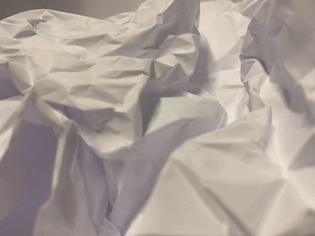
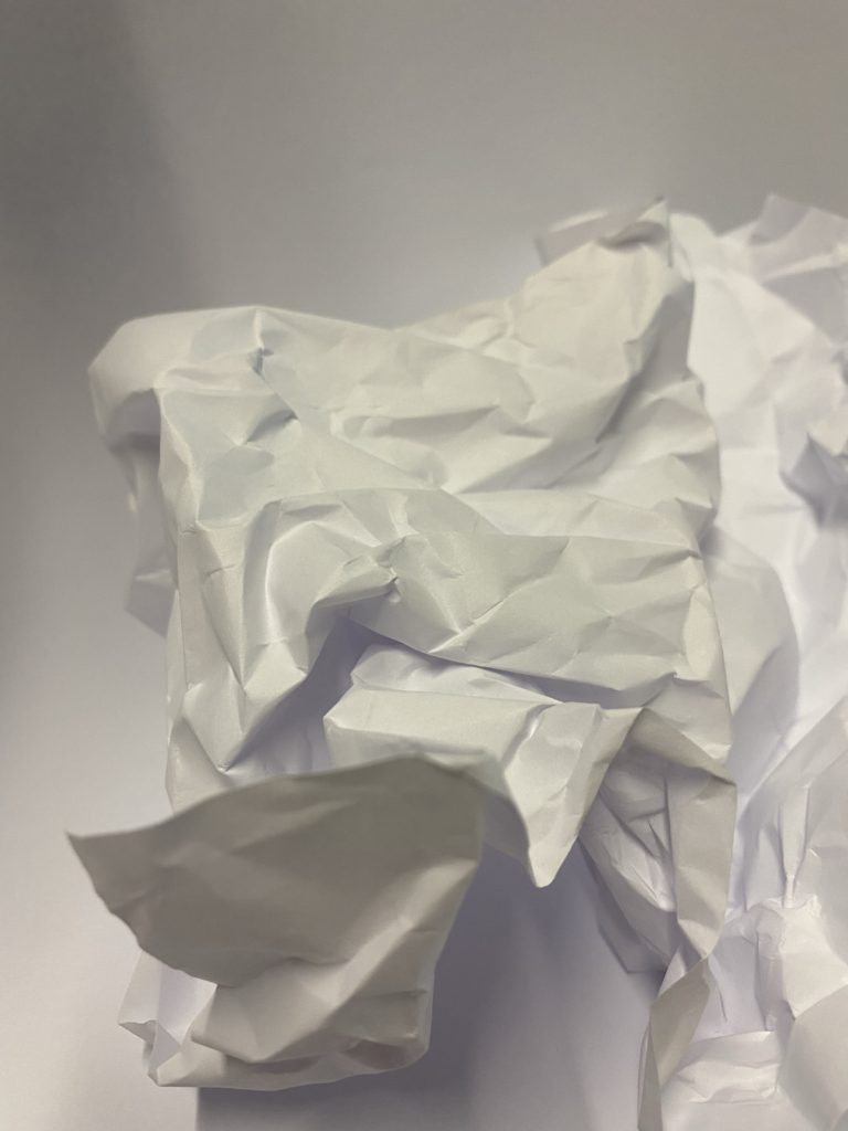
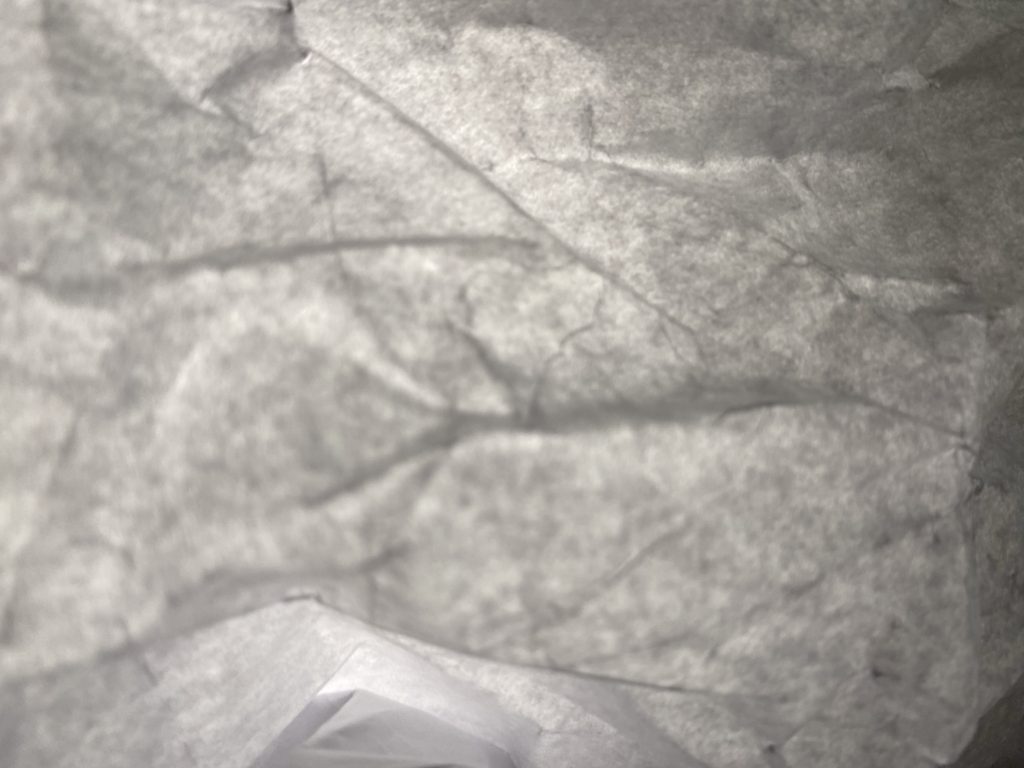
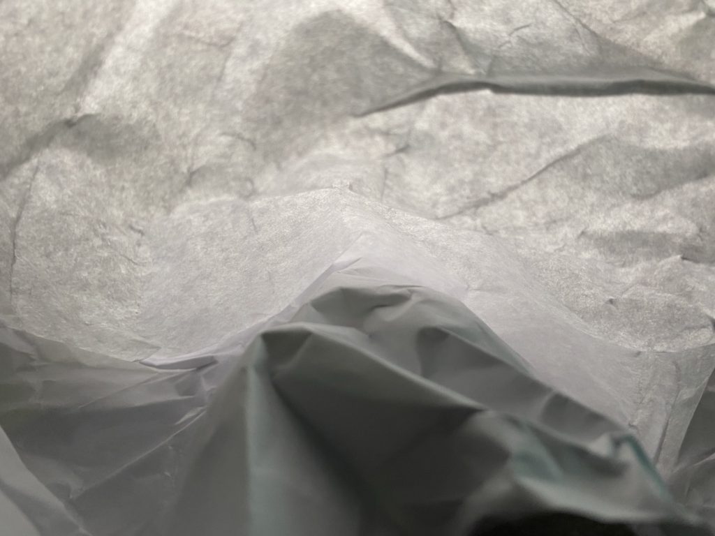
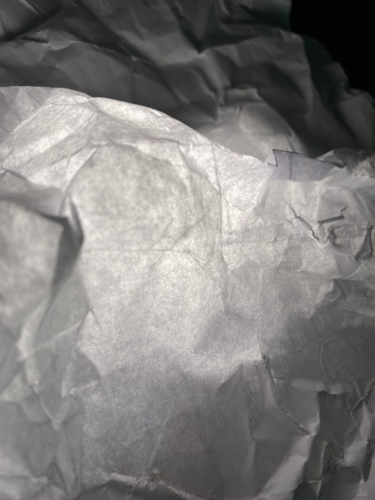
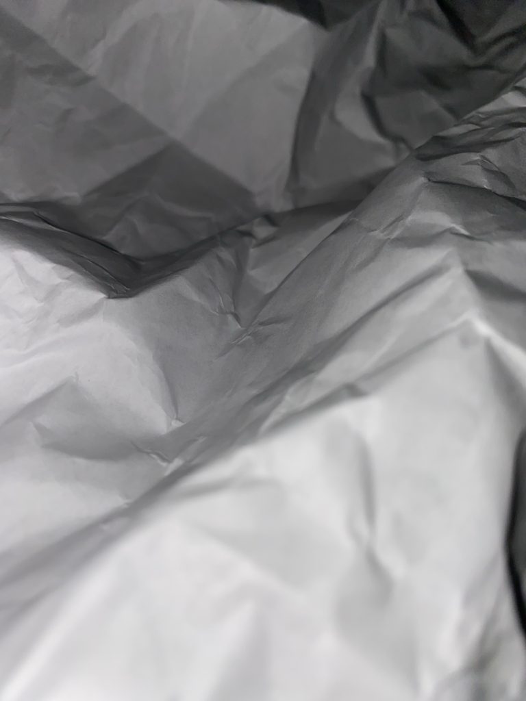
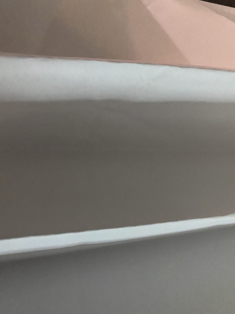
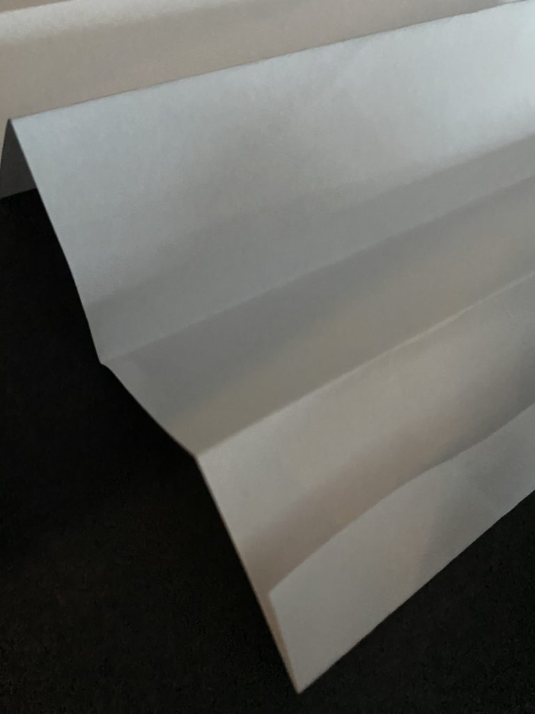
PAPER SHOOT
BEST IMAGES
Light- The light in these photos are artificial as we used a torch to add harsh lighting to these photos rather than a soft natural lighting, which I feel enhances the texture of the paper. We can also chose the angle in which the light is coming from therefore we can adapt where the shadows are.
Line- I adapted the lines of the paper in different ways such as folding the paper in vertical lines as well as scrunching the paper up and then unfolding it to make a pattern of unorganised lines.
Repetition- In several of my photographs the lines and shapes are repeated this is due to the way I chose to fold them.
Shape- The shape of the paper is adapted throughout the photos as I decided to keep the paper flat whereas sometimes i decided to keep the paper scrunched up.
Space- As you can see I have rarely left space between the angle of the camera and the paper its self as I chose to take macro photos rather than distant photos.
Texture- The texture of my photos look very rough and uneven.
Colour- In my photographs I have chosen to adjust them to black and white as I feel that it enhances the photos and shows more details.
Composition- I decided to place the paper in the center so the photos didn’t look uneven.


![no title]', Uta Barth, 1995–7 | Tate](https://encrypted-tbn0.gstatic.com/images?q=tbn%3AANd9GcQNRmGcz9fN-0_4SupX-L72Ypx_CnHG5JvOAyx0cJZwXrIvqCs%3Ahttps%3A%2F%2Fwww.tate.org.uk%2Fart%2Fimages%2Fwork%2FP%2FP78%2FP78225_10.jpg&usqp=CAU)