All posts by Chantal LB

Filters

Author:
Category:

PhotoMontage

Photomontage is the process of copying, pasting and layering multiple photographs onto one photograph in order to create a new image. This can be done physically, for example printing and cutting, or digitally on photoshop. This process is typically done with portrait images to create an almost warped piece of art.
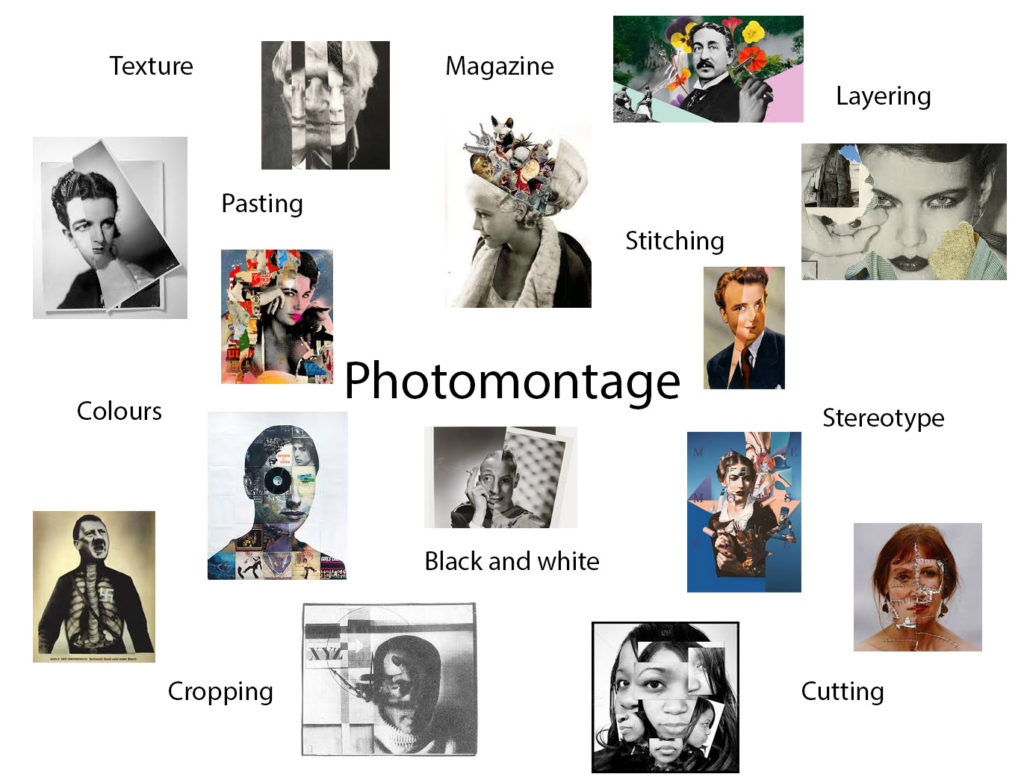
Examples of photomontage

Raoul Hausmann, ‘The Art Critic’ 1919–20
“The Art Critic” – Raoul Hausmann (1919-1920)
‘Cut With Kitchen Knife Dada Through the Last Weimer Beer Belly Cultural Epoch in Germany’  
“Cut With Kitchen Knife Dada Through the Last Weimer Beer Belly Cultural Epoch in Germany” – Hannah Hoch (1919)
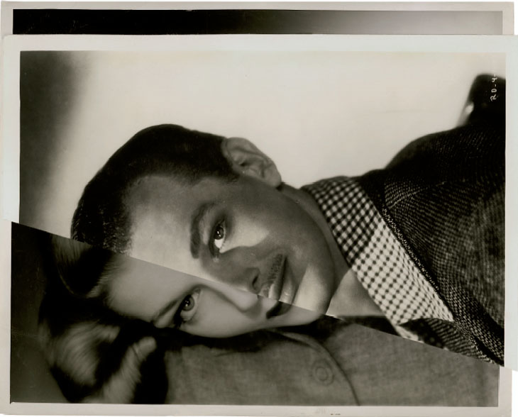
“Marriage I” – John Stezaker (2006)

John Stezaker

John Stezaker. Marriage XV. 2006 | MoMA
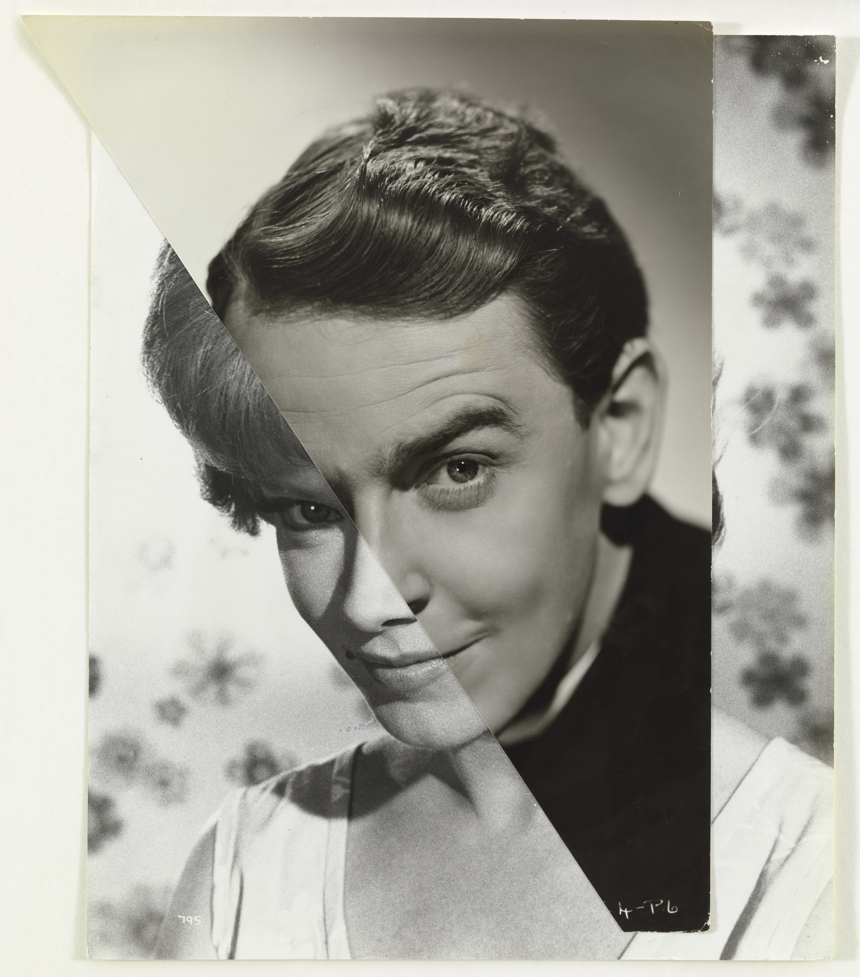
“Marriage XV” – John Stezaker (2006)

John Stezaker is a British conceptual artist born in 1949. Stezaker attended the Slade School of Art in London when he was in his early teens, and graduated with a Higher Diploma in Fine Art in 1973. He was best known for his work in photocollage, where he would take existing images from postcards, film stills, etc. in order to create juxtaposing artworks. John Stezaker was widely recognised for his photocollage series, “Marriage”, where he layered portraits of vintage movie stars to create a disjointed image for the viewer. Stezaker has had his work featured in exhibitions in The Museum of Modern Art in New York, the Tate Modern in London, the Tel Aviv Museum of Art and many more. Until 2006, Stezaker tutored in Critical and Historical Studies at the Royal College of Art in London, until he retired.

Examples of John Stezaker’s work

“Mask XIV” – John Stezaker (2006)
John Stezaker: 'I was trying to create a sort of photographic cubism'
“Kiss II” – John Stezaker (1978)
“Double Shadow II” – John Stezaker (2014)

Analysis of John Stezaker’s work

Image result for JOHN STEZAKER
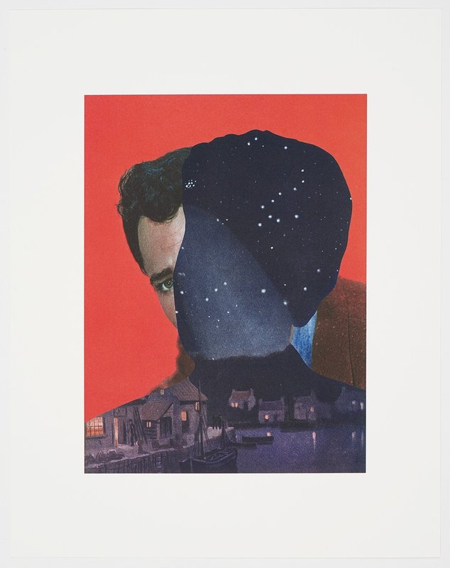
“Mother Night” – John Stezaker (2018)

This photograph, created by John Stezaker, is titled ‘Mother Night’. This piece of work companions another labelled ‘Father Sky’, which were part of Stezaker’s ‘Dark Star’ series. In these portraits, vintage film stars were photographed against studio backdrops sometimes involving illusionistic pictorial grounds.

The lightest part of the image can be found in the highlight of the actor’s face, especially seen in the forehead and around the eyes. The darkest areas are seen in the outlined figure-shapes night landscape, however the darkness is contrasted with the tiny dots of light seen in the stars of the scene or in the lit windows. In the portrait itself, it is most likely lit using hard, artificial lighting as the portraits are taken in a studio and have harsh highlights.

The outline of the night sky create a contrast between tones and colours as the darkness juxtaposes the light. It also provides a contrast in direction, as the two figures face different angles. There is also contrasting straight-edged lines that are found in the buildings of the night scene.

There is no use of repetition in this photograph, however there is a sense of reflection within the water of the night scene, as the stars and artificially lit buildings reflect against the water in rippled motions.

The majority of the shapes in this photograph are organic and curved, however these are contrasted against the geometric, straight-edged lines that are seen in the buildings of the night scene.

There is little example of depth within this photograph, although it can still be seen. For example the shadows and highlights in the actors face prove a sense of depth, and also the houses in the night scene slowly fade into the background creates a sense of depth that is still quite shallow. The solid background behind the actor lacks depth as it is a negative space. The night sky also contains a lot of negative space in the top thirds of this scene, however this is contradicted by the stars in the sky.

There is juxtaposing textures within this image, especially in the night scene. For example, the rippling water creates a smoother texture, whereas the brick house and cobbled roads create a rougher texture.

There is a large range of tones in this image from dark to light. The lightest tones can be seen in the highlights of the face of the actor as well as both artificial and natural lighting in the night scene. The darkest tones can be seen in the dull mountains in the background of the night scene, and the sky in the night scene also. Overall, the image tends towards darkness, as the night sky section of the image takes up a large amount of empty space with the photograph it has been layered over.

There is a range of both vibrant and muted colours within this piece by John Stezaker. The saturated red of the background portrait contrasts with the more dulled tones of the skin from the portrait. These colours are then juxtaposed again by the sombre tones of the night scene positioned over the models face. The dark blues and blacks of the night scene create an eerie atmosphere when placed against the vivid red.

The composition if the image appears to be somewhat balanced as the two silhouettes in their own tones are roughly the same size but are angled in different directions. There is also a fair balance between the light and dark tones which adds another element of balance. The rule of thirds is not used in this instance as there is no geometrical shapes that can be superimposed into this image which can be said to make the understanding of the composition difficult.

John Stezaker inspired photoshoot
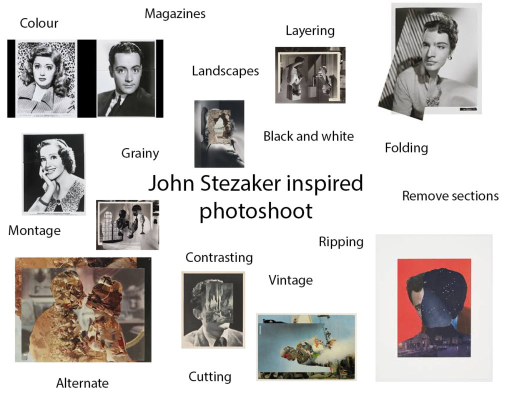
Identity and Place – self reflection

  1. Now that it’s over, what are my first thoughts about this overall project? Are they mostly positive or negative? My initial thoughts after the controlled conditions exam are both positive and negative.
  2. If positive, what comes to mind specifically? Negative? In terms of positive, I think my written work was good quality as I spent most of my time on those pieces, however I think my actual photographs could have been better.
  3. What were some of the most interesting discoveries I made while working on this project? I enjoyed learning about Francesca Woodman as she died at the early age of 22 so I think her life story was very interesting.
  4. What were the challenges? I think the hardest part of the project was capturing the photos themselves, as we had a timed limit and COVID made it difficult to take images of people.
  5. What is the most important thing I learned personally? I’ve learnt that I need to take my images earlier in case I don’t like the outcome and need to take them again. I also need to plan my final plan for my images in advanced.
  6. How did I come up with my final best solution? I decided to use Woodman’s simple method of long exposure and black and white for her study and I edited my images inspired by Carolle Benitah on photoshop rather than physically.
  7. What most got in the way of my progress if anything? COVID got in the way of my progress as the bus times were limited so travel was difficult and there was a lack of people I could take photographs of. Also the time limit made the project difficult.
  8. What obstacles did I overcome? I managed to finish my project within the 5 hour time limit.
  9. What did I learn were my greatest strengths? My biggest areas for improvement? I think my strengths are my written work and detailed analysis and my weakness was my photographs and editing.
  10. What would I do differently if I were to approach the same problem again? I would explore more ideas for my final photographs and prepare more in advanced with taking the photos.
  11. What could I do differently from a personal standpoint the next time I work? Manage my time better in the 2 weeks leading to the exam and become more motivated to go above my expectations.
  12. What can I improve? Taking physical photographs and exploring ideas.
  13. How will I use what I have learned in the future? I will plan my photoshoots in the weeks leading to the exam and practice photoshop techniques.

Identity and Place – Final Images and Evaluation

Carolle Benitah Inspired Photoshoot

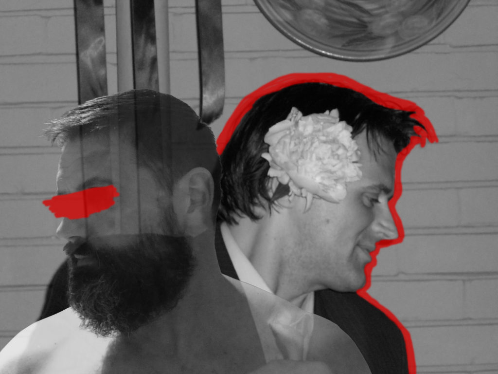
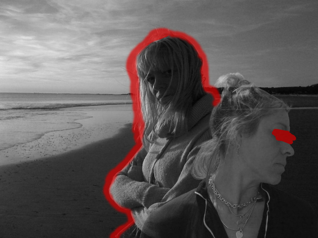
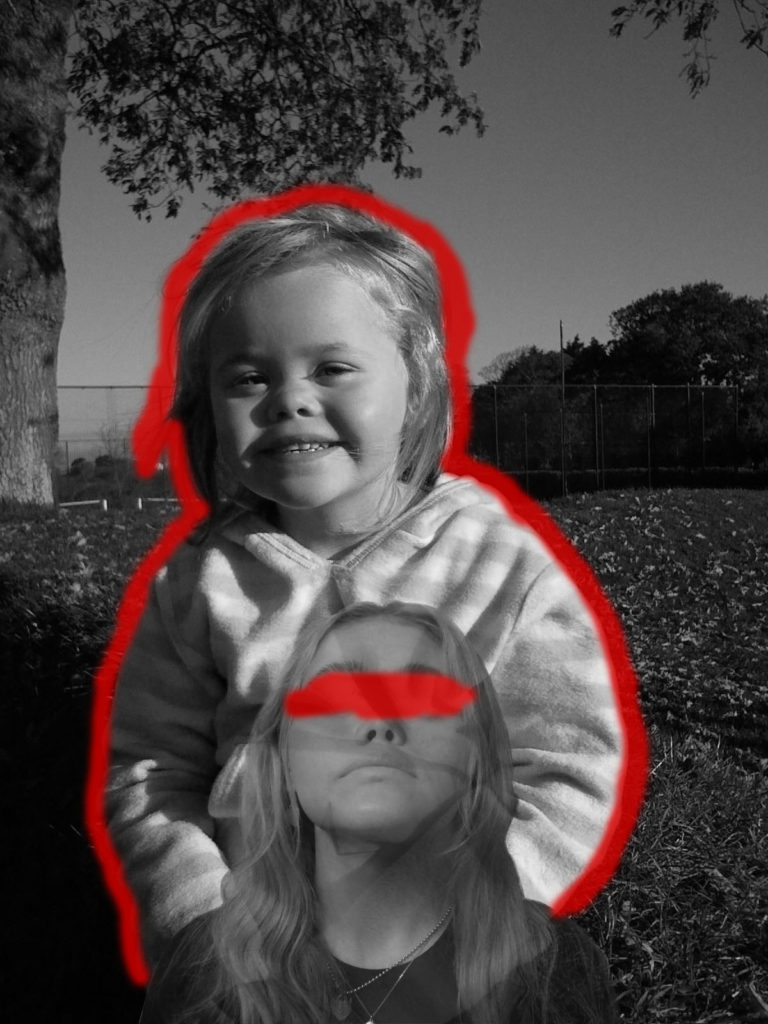
I believe my attempt at recreating Carolle Benitah’s work with the theme of identity and place was successful as you can see clear similarities between my work and the work of Benitah, and I think I executed my ideas clearly by using inspiration of Carolle Benitah but adding my own ideas and methods to the images. I decided to colour over the eyes in each image as Benitah, herself often does this and I believe it adds a sense of curiosity and mystery as to how the individual has changed throughout their past purely through their appearance, and removing the eyes removes the emotion from the face, which allows the viewer to focus on the blank expression and the change in appearance, rather than emotion or personality.

In terms of identity and place, I think my images represent this theme well as it displays the past of both my relatives and myself, and how this formed my identity. I decided to also show the past versions of my parents as they also helped to form my identity, and it also shows how their own identity has changed from their past.

Francesca Woodman Inspired Photoshoot

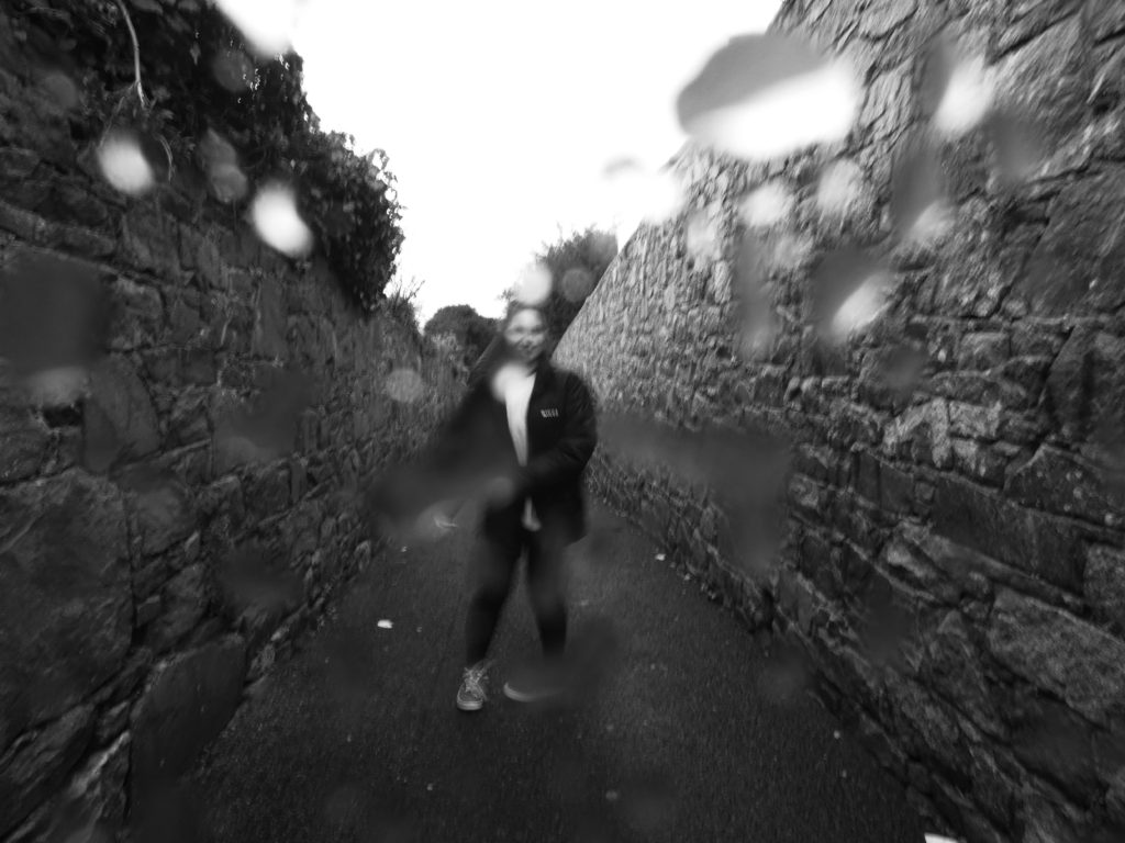
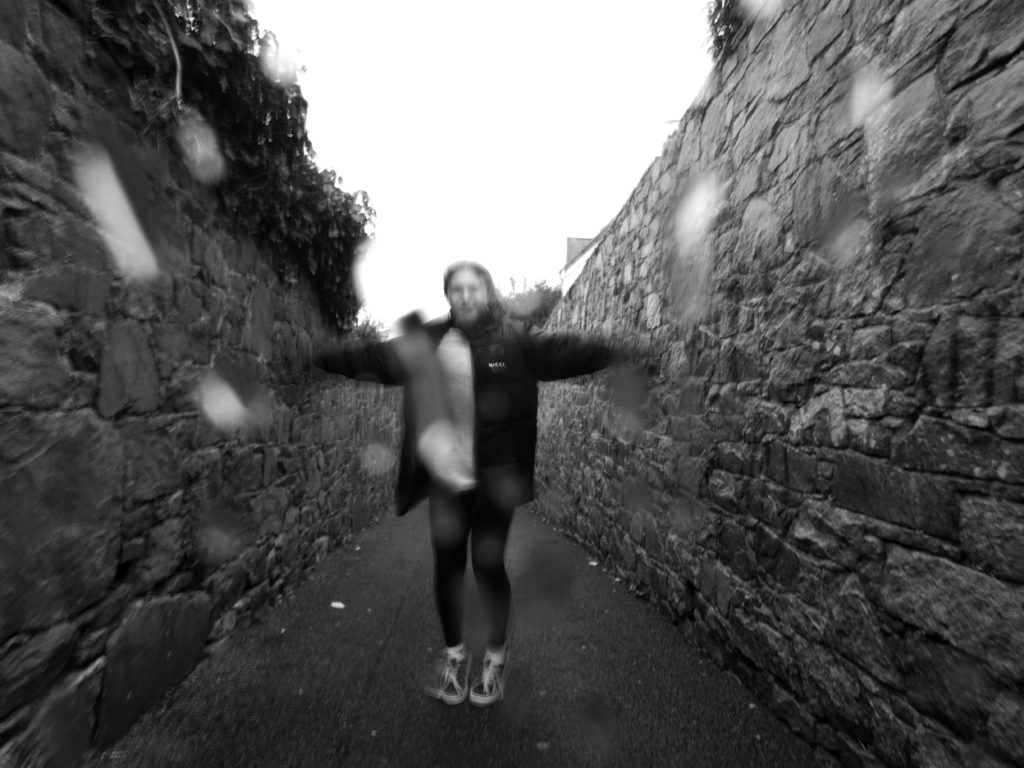
I decided to study Francesca Woodman’s work for this project as she focuses on the struggle of mental illness and especially depression. Myself and my family, as well as millions of others, have struggled with their mental health in different periods of time which is why I believe it is an important part of a person’s identity, as it can affect both physical and emotional aspects of someone’s identity. I decided to use Woodman’s common method of long exposure, I feel like this represents mental illness in the sense that it produces a ghost-like movement and some may say living with a mental illness is almost like a ghost living in the present world, as they can feel excluded and lonely.

I think my attempt at recreating Francesca Woodman’s work was successful as similarities can be identified, the main similarity being the use of long exposure to give the photographs an uneasy atmosphere. I also used Woodman’s theme of the monochromatic filters for the same reason.

There is also visual differences between my work and the work of Francesca Woodman, such as the natural lighting used by Woodman is slightly softer and not as bright. Her photos also contain a lot of empty space, whereas the only empty space in my images is in the sky.

If I was to re-shoot these images I would have done them in an empty building with natural, soft lighting in order to achieve the same sort of shadows that Woodman’s images display. I also believe the use of the negative space would have added to the ominous aesthetic of the images, so I would change my location in order to shoot these images again.

Identity and Place – Francesca Woodman comparison to my work

This image has an empty alt attribute; its file name is 50628.jpg
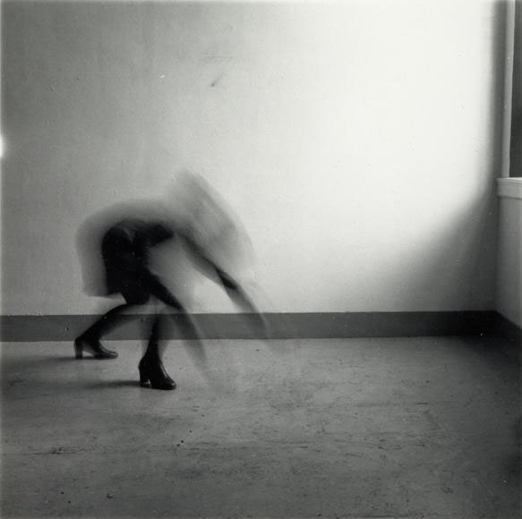
“Space 2, Providence, Rhode Island” – Francesca Woodman (1976)
My Work

I believe my work is similar to the work of Francesca Woodman but they also have their differences. They are similar in the sense that they both use the method of long exposure to capture the movement of the model in the photo in an almost ghost-like way. They both also have a monochromatic theme, which adds to the ominous atmosphere, as well as the dark coloured clothing which features in my work and the work of woodman.

However, they are different in the sense that the natural lighting used by woodman is slightly softer than the one in my photo. The setting of Francesca Woodman’s photograph is also filled with empty, negative space whereas my image contains a lot of filled, positive space. The overall composition of Woodman’s images are a lot more simple than my own, as she takes her photographs in an empty room which I did not have access to within the time limit of the project.

Identity and Place – Carolle Benitah comparison to my work

Photos-Souvenirs - Photographs and text by Carolle Benitah | LensCulture
“Pomplondin” – Carolle Benitah (from series ‘Photos-Souvenirs’ published 2016)
My Work

My recreation of Carolle Benitah’s work has both similarities and differences to Benitah’s images, for example they are similar in the sense that the images are brought to life with thin lines of colour, which juxtaposes against the monochrome background. I chose to add colour through the paintbrush tool on photoshop, whereas Benitah uses the traditional method of embroidery.

I used old family photos in my final photographs, which Benitah also uses in her work. I chose to combine my own photography into my work so I took simple portrait headshots of my mum, dad, and myself.

The main difference between my work and the work of Carolle Benitah is that I digitally edited my photographs, and Benitah edits her images physically.

If I was to do this project again I would have attempted Benitah’s method of embroidery to add colour to my photographs, as I feel like digitally editing colour onto the images removes a sense of rawness from the images, and I think the contrast in textures and patterns would have created more interest to the viewer.

Identity and Place – Carolle Benitah photoshop development

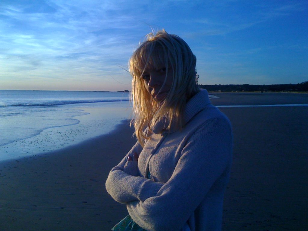
Original Image
Edited Image
Original Image
Edited Image
Original Image
Edited Image

How I developed my photos

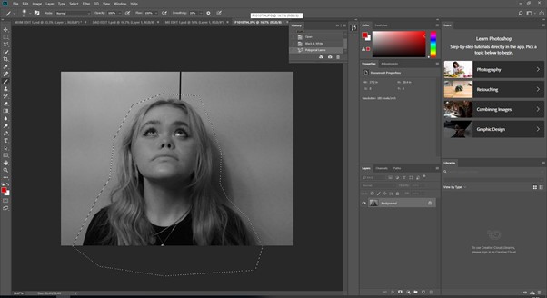
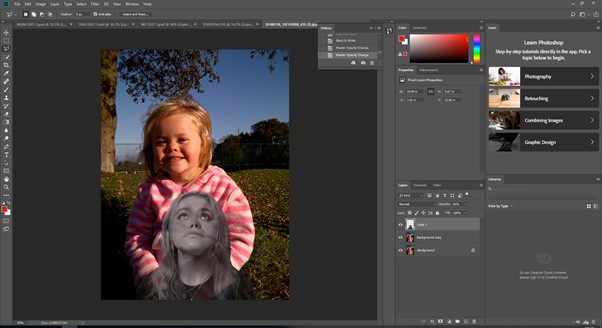
First, I cut out my face from a recent portrait of myself using the polygon lasso tool in order to remove the background.

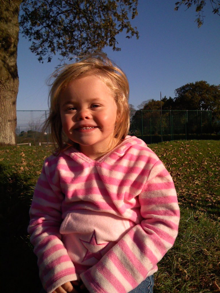
I then copied and pasted this onto an old, childhood photograph of myself and lowered the opacity of my newer cut-out.

Finally, I turned both photos into black and white and added colour around and on the images, similar to the work of Carolle Benitah.

Identity and Place – Francesca Woodman Photoshop development

Original Image
Edited Image
Original Image
Edited Image
Original Image
Edited Image

How I developed my photos

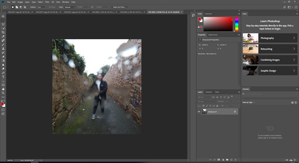
First, I cropped my chosen image in order to focus on the focal point and to make the image more central and even.

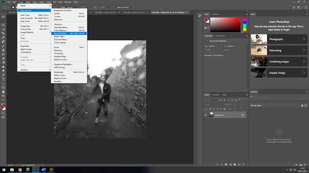
I then changed the colour of the image to black and white as Woodman’s work is mostly in black and white. This adds the eerie aesthetic of Woodman’s style of photography.

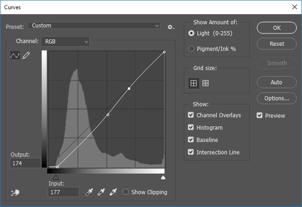
Lastly, I edited the curves adjustments to achieve the sombre darkness contrasting with the lighter areas.

Identity and Place – Carolle Benitah inspired photoshoot
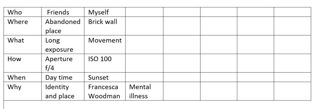
Photoshoot plan

Carolle Benitah inspired photoshoot
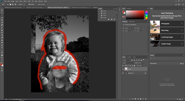
As I was using old family photos for this final piece, I wanted to incorporate my own photography into these images. Therefore, I took simple headshots of my mum, dad, and myself at different angles in order to show comparison between the past and present. I used softer lighting for these portraits as I was going to cut them out and wanted to avoid harsh shadows.

Identity and Place – Francesca Woodman inspired photoshoot
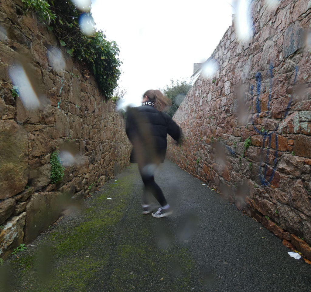
Photoshoot plan

Francesca Woodman inspired photoshoot
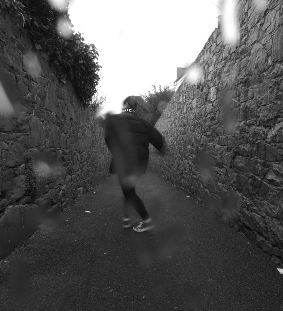
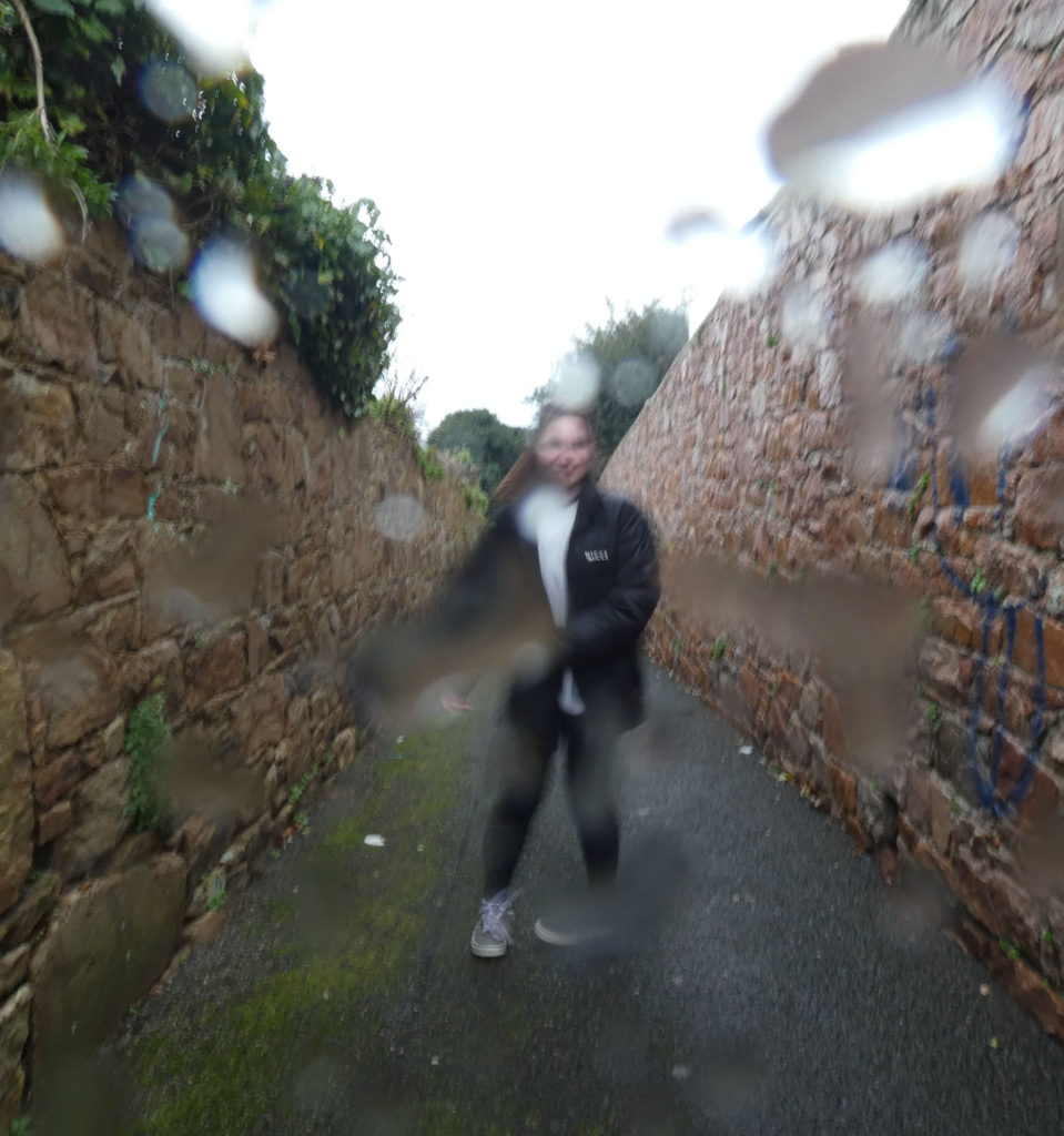
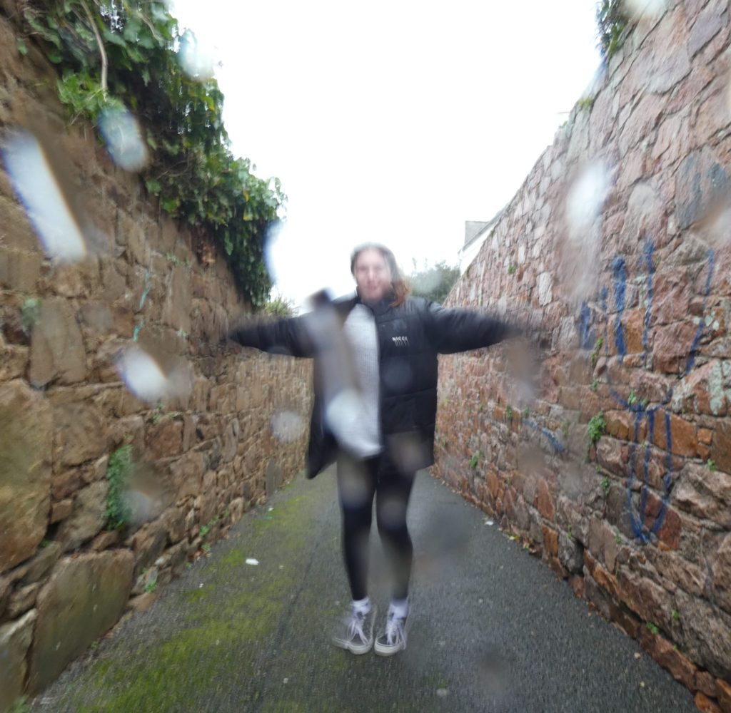
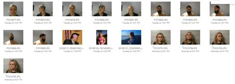
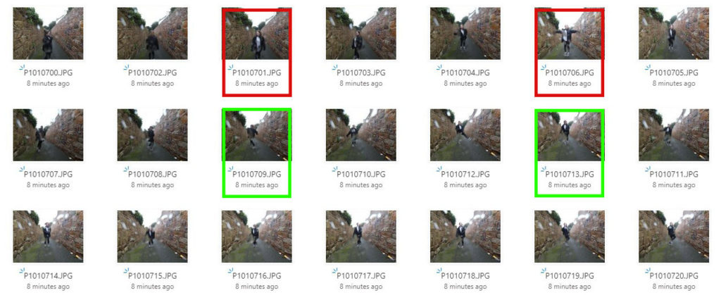
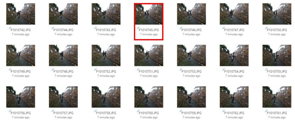
I believe the images highlighted in red are my least successful images as they don’t capture the blurry movement that Francesca Woodman displays in her work. Also, the rain on the lens covers the majority of the model in these images, which makes them more difficult to comprehend in terms of the idea that I wanted to achieve.

The photographs highlighted in green are my most successful images, in my opinion, because they share the similar ominous affect that in common in Woodman’s work. Although the raindrops on the lens were not intentional, I think in these images they add to the hazy aesthetic of which Woodman achieves in her work.

Identity and Place – Francesca Woodman Study

Francesca Woodman

Francesca Woodman: House #3, Providence, Rhode Island, 1976.jpg
“House #3, Providence, Rhode Island” – Francesca Woodman (1976)

Francesca Woodman, Born in New York in 1958, was an American photographer famous for her monochrome photography of both herself and other female models. The main common feature in Woodman’s work is her use of movement captured by long exposure, creating a ghostly affect. Her videography has been featured in exhibitions around the world, like the Helsinki City Art Museum in Finland, the Tate Modern in London and the Cisneros Fontanals Art Foundation in Miami. Woodman continued her inspirational work that brought mental health issues to life until she died at the age of 22 in 1981.

Examples of Francesca Woodman’s work

https://www.tate.org.uk/art/artists/francesca-woodman-10512/finding-francesca

“Space 2, Providence, Rhode Island” – Francesca Woodman (1976)
“Untitled, Providence, Rhode Island” – Francesca Woodman (from Polka Dots Series – 1976)
“Polka Dots, Providence, Rhode Island” – Francesca Woodman (1976)

Analysis of Francesca Woodman’s work

“Space 2, Providence, Rhode Island” – Francesca Woodman (1976)

This image, titled “Space 2, Providence, Rhode Island” depicts Woodman’s underlying sense of human fragility. This depiction of mental health struggle is exaggerated to prove that although through first glance a person may look okay, however their mental illness consumes their entire existence in many cases.

The moody and ominous lighting is provided by natural sunlight shining through the window in a downwards direction. Although the shadows casted are harsh and dark, the edges on the shadows are blurred and hazy, proving the lighting to be slightly soft. The darkest areas of the photograph can be seen in the shadows and the ghostly figure, these areas are juxtaposed against the brighter areas such as the light casted onto the walls through the window.

The straight, thick lining along the floor could be said to be seen as a leading line as it directs the viewers eyes to the mysterious figure towards the middle-left of the image from either side of the photograph.

Although there is no representation of repetition in this image, there is a strong sense of echo, displayed by the delayed movement of the model. This is due to the use of long-exposure by which the camera lens is open for a longer period of time in order to capture the late movement within the picture. The method of long exposure provides an eerie tone to the photograph.

There is a combination of both organic and geometric shapes within this image. Straight-edged shapes can be seen in the lining of the floor and the triangular-shaped shadow in the bottom-right hand corner of the photograph. On the other hand, organic and curved shapes can be seen in the indistinct figure just off the centre of the image, as her back is curved.

It is difficult to work out the depth of field within this photograph as the majority of the background is empty, negative space. This means that there is little comparison in focus between the foreground and background. However I believe there is a narrow depth of field as the edges of the image are slightly blurred.

There is little representation of texture shown in this image as that is not the main focus of Francesca Woodman’s work, although if I had to comment on texture I would say it is smooth as there is no rough or jagged edges seen in the image.

There is a range of tones from dark to light in this image which creates an uneasy atmosphere for the viewer. the darkest tones can be seen in the shadows and in the model crouching in the left thirds of the image. The lighter tones can be seen in around the window, as the natural sunlight beams in and highlights a small section of the photograph. This image tends towards darkness as the majority of the image is in darkness.

There is no colour in this image because of Francesca Woodman’s common theme of greyscale aesthetic within her series of images. The lack of colour brings to light a visual representation of how many people view mental illness as seeing life ‘without colour’. I believe that if this image was taken in colour it would take away the sense of mystery and doomy ambience of the photograph.

The composition of the image is very simple, as the background is very empty and there is a singular focal point in the photograph. I would say this image is unbalanced as the camera is set at a leaning angle rather than central and the focal point is not dead-centre in the photo. There is no influence of geometric-shaped positioning which makes the image harder to comprehend and understand and the rule of thirds is not used either.

Francesca Woodman inspired photoshoot moodboard