All posts by Chantal LB

Filters

Author:
Category:

Anthropocene Project Evaluation

Naomi White

Naomi White | Engulfed, Plastic Currents (2012) | Available for Sale | Artsy
“Engulfed” from “Plastic Currents” series – Naomi White (2012)
My work

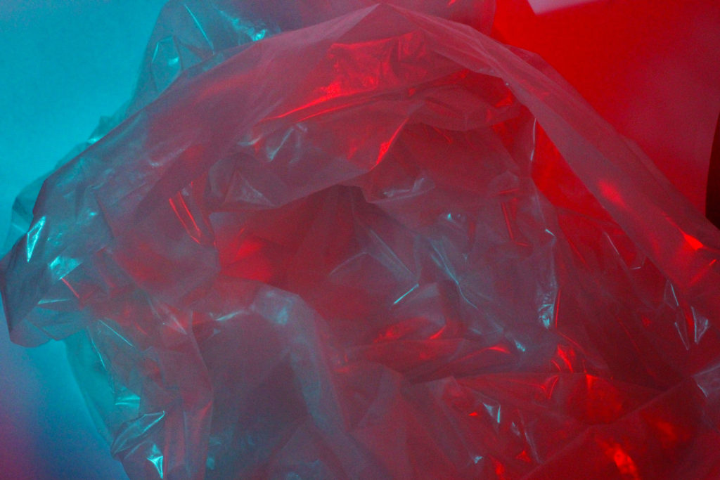
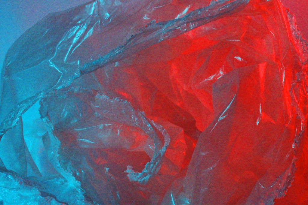
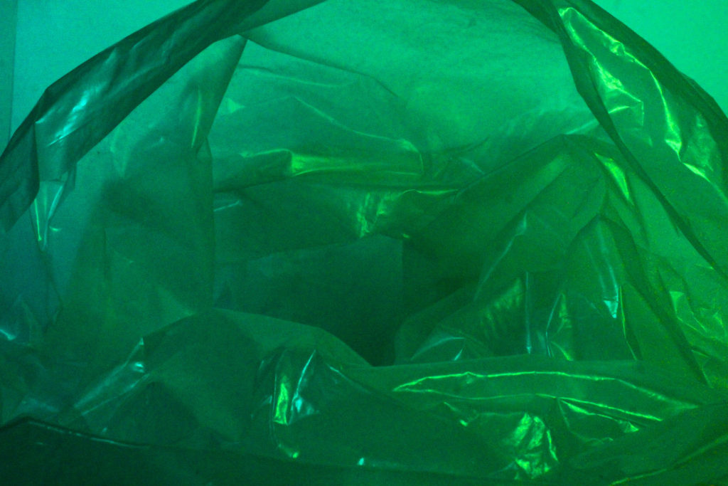
In my opinion, I think I was successful in creating work influenced by Naomi White for the theme of Anthropocene because although my work is not a complete recreation of Naomi White’s work, I feel like they have distinct similarities such as the use of plastic bags and contrasting colours, and the influence of White’s work can be reflected through my work. I decided instead of using the same, blinding white background to contrast a coloured plastic bag, to use coloured acetate over the studio lighting in order to achieve the same juxtaposing tones seen in White’s work. This is partly due to the lack of resources I had as I could not find a coloured plastic bag so instead I improvised and used a clear plastic bag and projected the colours using light. Furthermore, my work focuses more on taking photographs of the inside of the bag rather than the outside. I believe this decision allows for the abstraction of the images to be enhanced, as the photo is more ambiguous and the object cannot be recognised straight away.

If I was to have another attempt at creating my own work with the influence of Naomi White, I would prepare more in advanced to find a coloured plastic bag or use the same blinding background as seen in White’s work in order to achieve a clearer contrast of colours, rather than the opposing colours blending together. Also, I would take more images so I had a wider choice of photographs to choose from for my final pieces.

In terms of the theme of Anthropocene, I feel like Naomi White’s work has a distinct relation to aspects of Anthropocene as she uses a man-made and artificial material that is a crucial cause of both air and sea pollution to create art, this is why I chose her to influence my work as I also feel like she takes a more abstract approach to the idea of Anthropocene and how humans have made a negative impact on the environment.

Darian Mederos

IMG_1042.jpg
“The Wait” – Darian Mederos (2019)
my work

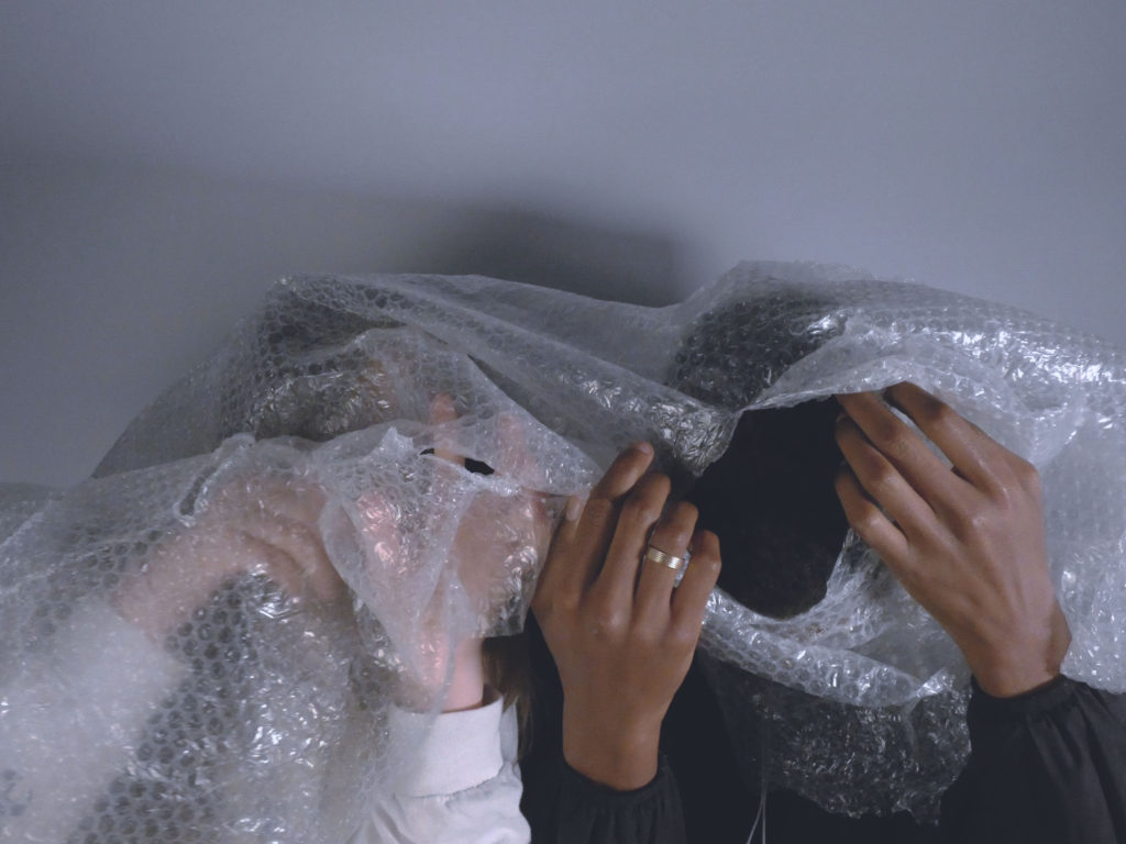
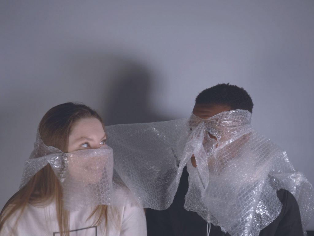
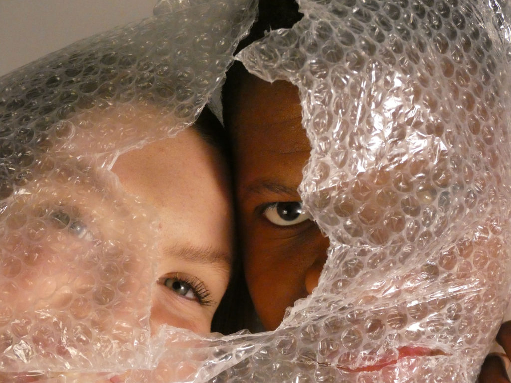
I believe that I was also successful in my attempt to produce my own photographs with the influence of Darian Mederos, as they both produce a similar message in terms of Anthropocene, although it is done in a more subtle way compared to Naomi White’s work. I think there is visible similarities between my work and the work of Darian Mederos, the most obvious being the use of bubble wrap in order to disguise sections of the face or body. Both my work and Mederos’ work have the same, cool-toned hues which I think assists to enhance the deeper message of the images. To add my own influence into my work I decided to rip holes in the bubble wrap to disguise only parts of the face rather than the entire body, aswell as using the bubble wrap in more of a physical way by wrapping sections of the face and body in the plastic material. I did this because I felt like by simply covering the lens in a layer of bubble wrap, my images would be too similar and when I use the plastic in a more invasive method, it allows for the theme of Anthropocene to be more distinct and spreads a message that because of humans mass-producing artificial materials such as plastic, we are simply harming ourselves aswell as our environment.

If I were to use Darian Mederos as an influence for my work again, I would maybe take a more personal approach to the photographs by adding more emotion to the images through the face of the model, rather than the blank expression on the models in the majority of my photos. I could also use an alternate background or setting in order to further the personal aspect of the images.

Although Darian Mederos’ work consists of paintings rather than photographs, I still think he is a suitable reference in terms of Anthropocene because Mederos also uses plastic within his art, which can be interpreted into alternate messages in relation to Anthropocene. I chose Darian Mederos as an influence for my work as his work focuses on portraiture, which I believe would give a wider variety to my final images overall. Anthropocene can also be seen in his work in a more subtle way than Naomi White’s work and his images are a lot more personal, and I think this furthers the idea of humans destroying themselves with their own creations.

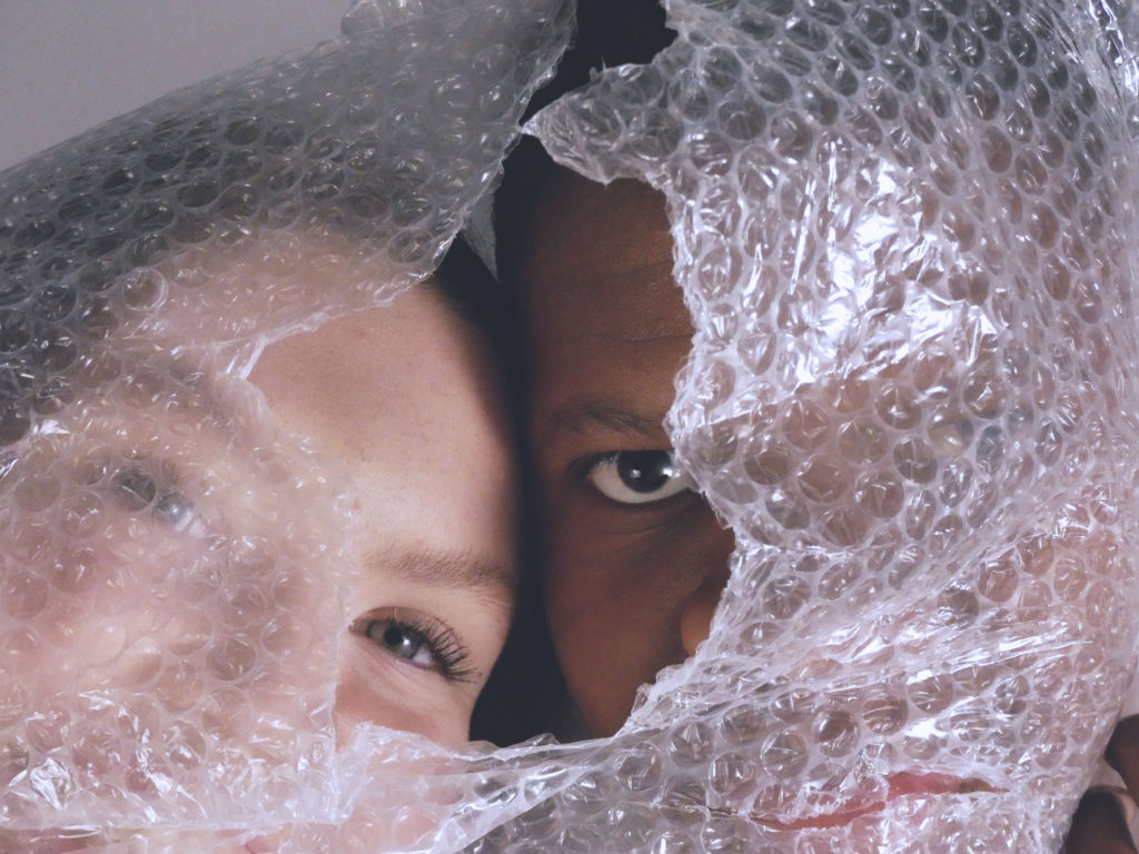
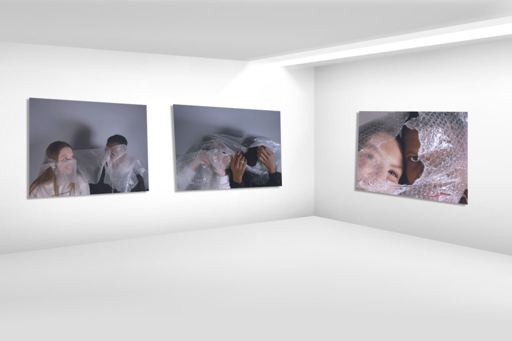
Final images and display ideas – Darian Mederos inspired photographs (Anthropocene)

Final Images

Image Gallery

Ideas for displaying

To display these photographs, I can also use the idea of burning the edges of the paper to create an intense contrast between the muted tones of the photograph and the intense black of the burnt edges.

Alternatively, I could incorporate juxtaposing textures in my display by using real bubble wrap over sections of the photograph. I can also use this idea as a form of physical editing rather than editing my images purely using photoshop.

Comparing Darian Mederos’ work to my own (Anthropocene)

Comparison between Darian Mederos’ work and my own

Portrait of Camilla by Darian Rodriguez Mederos on artnet
“Portrait of Camilla” – Darian Mederos (2020)
My work

My work is similar to the work of Darian Mederos in the sense that bubble wrap is used to create a sense of enigma, as the face is not fully revealed or has a slight blur. Cooler tones with muted colours can also be seen within both images as well as the use of slightly harsher shadows and highlights. There is also a sense of depth of field in both photos as particular sections of the image are in focus. For example in Mederos’ work, the bubble wrap is in focus which blurs out the entire face, whereas in my work the holes in the bubble wrap allows for areas of the face to be in focus.

However there is also prominent differences between the photographs, such as my photo being a close up images rather than a full portrait. Furthermore, the bubble wrap in my work has been ripped, so sections of the face can be seen in focus, in contrast to Mederos’ work in which the whole face is blurred. An obvious difference between my work and the artists work is that Darian Mederos’ work is a painting, however I am using his work for inspiration rather than to recreate exactly.

Overall, I believe I successfully created my own work with the influnce of Darian Mederos as my inspiration for the theme of Anthropocene. I thought Mederos’ work represents Anthropocene in a unique and subtle way although it can carry a deeper meaning.

Further Photoshop experimentation – Darian Mederos (Anthropocene)

Experimenting with Photoshop

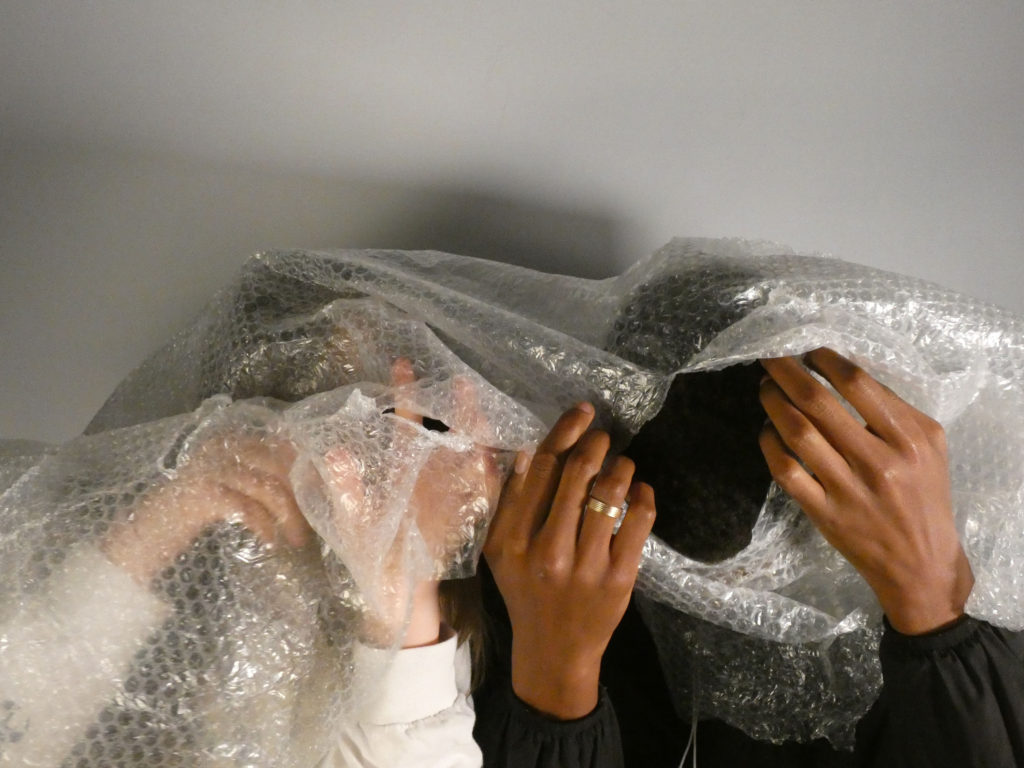
Original Image
Edited through change in exposure and curve levels.
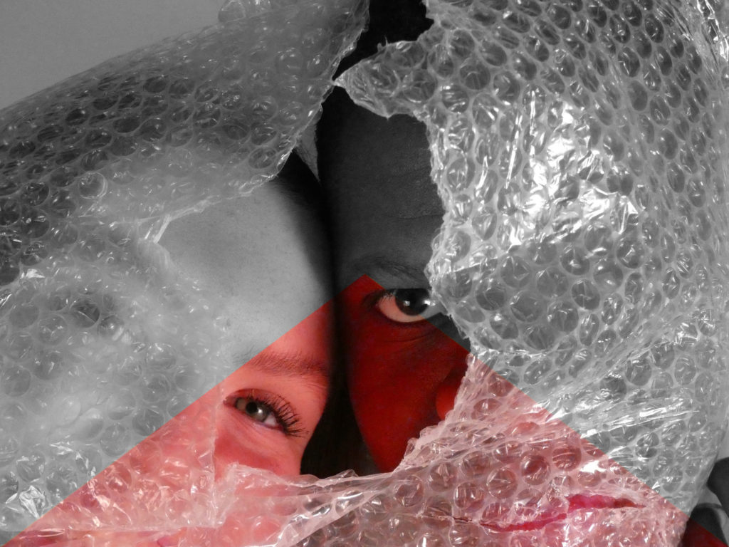
Edited using polygon lasso tool, image layering and black and white filter.
Edited using iris blur and altering curves and exposure.
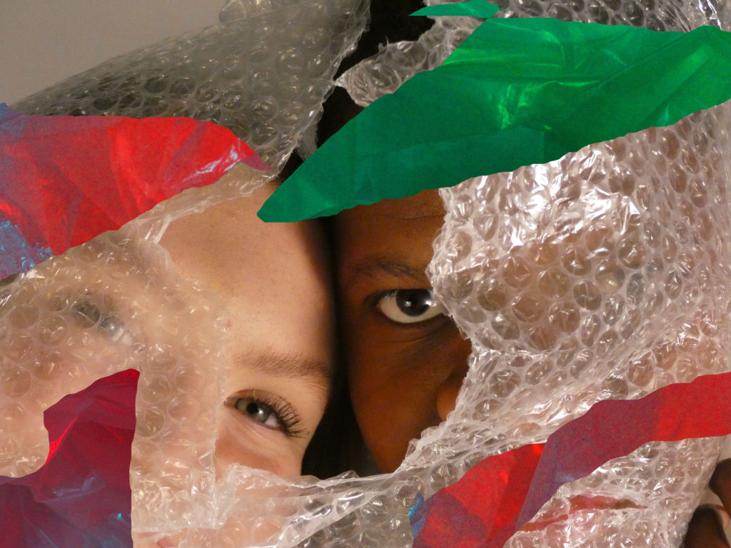
Edited using polygon lasso tool and editing colour hues of sections.
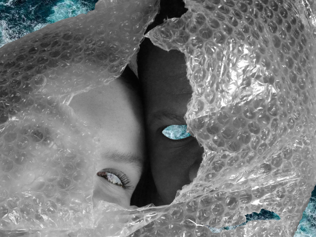
Edited using magnetic lasso tool and cutting shapes from Naomi White inspired photoshoot.

Darian Mederos inspired image editing (Anthropocene)

Original and Edited Images

Original Image
Original Image
Edited Image
Original Image
Edited Image

How I edited my Images

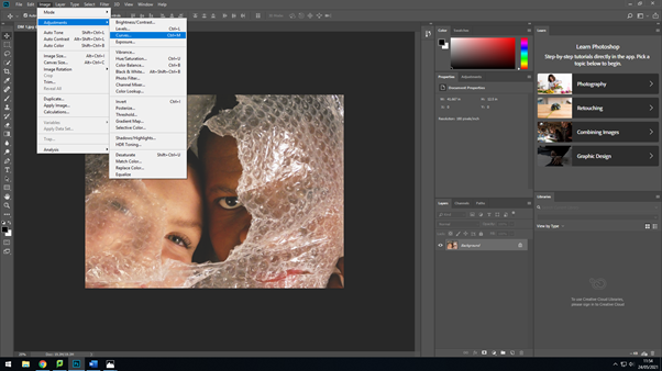
I began with altering the brightness and contrast of the image, I increased the brightness and lowered the contrast of the image to make the tones more subdued.
I then altered the curves of the photograph to further mute the tones and increase the overall brightness of the image without getting rid of the distinct shadows and highlights.
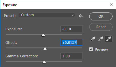
I lowered the exposure and increased the offset of the photograph to add brightness to the photo, but also keep the contrast of shadows and highlights.
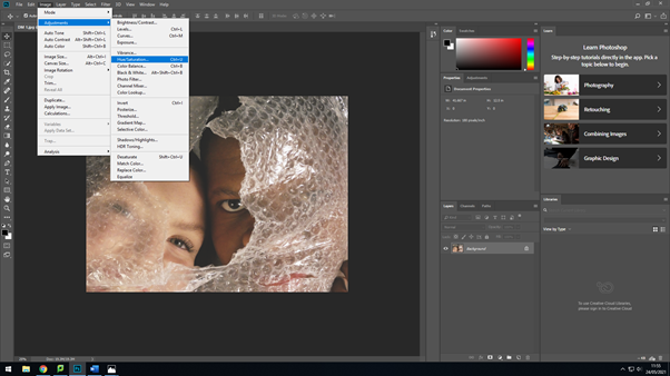
Next, I added a slightly blue hue to the image as some of Mederos’ work have a cooler tone, which I thought would suit the theme of Anthropocene more than a warmer tone as it creates a more chilling atmosphere to the image.
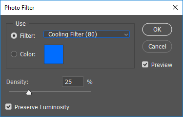
Finally, I added a cooling filter to enhance the darker tones of the image and further the slightly menacing feeling to the image in order to keep to the theme of Anthropocene and create a deeper message and undertone.

Darian Mederos Inspired Photoshoot (Anthropocene)

Photoshoot plan

Darian Mederos Inspired Photoshoot

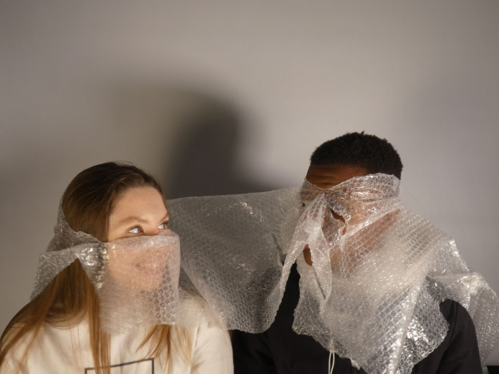
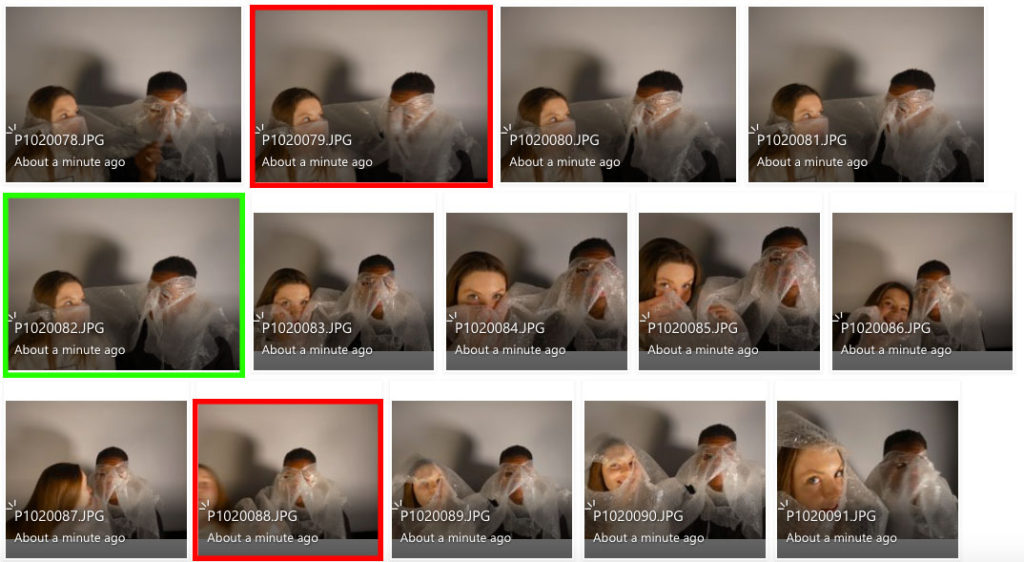
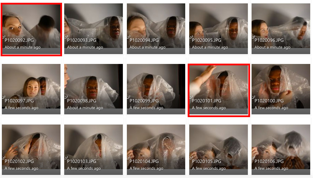
I believe the images highlighted in red are my least successful images as the shutter speed was set too slow, making the images more blurry than intended, this makes them unsuccessful as the original artwork by Darian Mederos focuses on depth of field rather than movement.

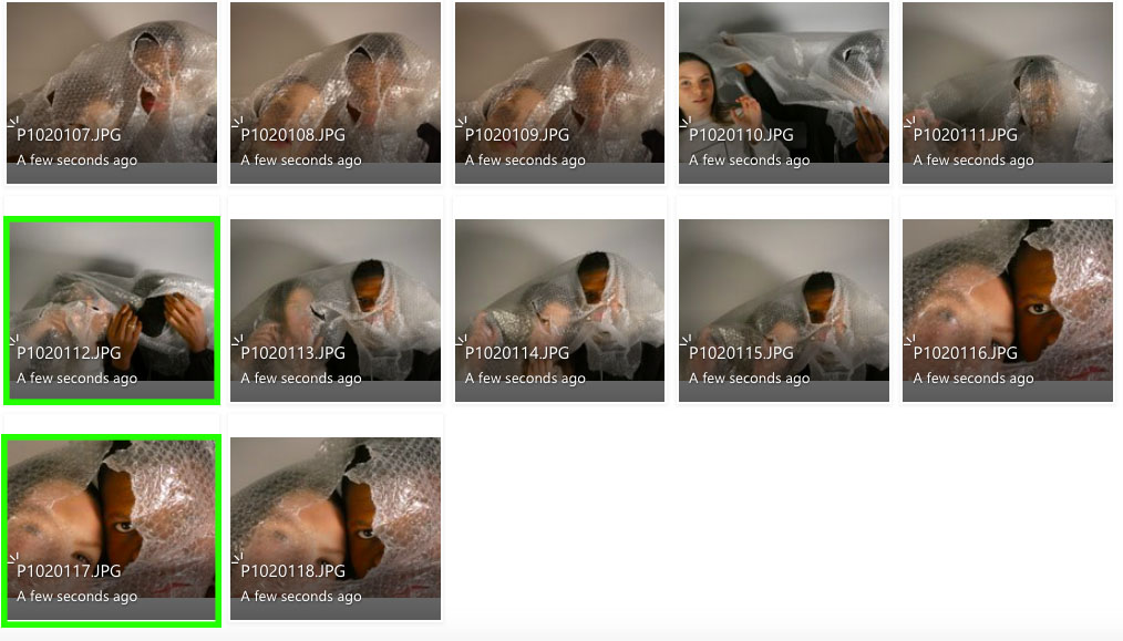
I think the images highlighted in green are my strongest images as they are more accurate recreations of Darian Mederos’ work. I also feel like they represent his focus on depth of field more, as some aspects of the images are more blurred than others.

In addition, the contrast of different race adds another factor of human relationships both uniting and separating due to the harm to environment that we all play a part in, no matter who we are or what we believe. At some point, all humans have contributed to the production or purchase of plastic, which eliminates the segregation of who is to blame for the destruction of our planet, as we have all played a part. It can also be seen as a call to action for humans to band together in order to restore nature and live harmoniously.

To edit these images I will enhance the muted tones in my photographs, in a similar way to the artwork by Mederos, and also darken the tones in order to provide a deeper, menacing message in relation to the theme of Anthropocene.

Camera and light settings

For this photoshoot, I used harsh studio lighting to achieve the contrasting shadows and highlights in the images. I set the lighting to a slightly warmer tone to recreate the muted tones and colours that can be seen similarly in Darian Mederos’ work.

For the first few images in this photoshoot, the shutter speed was too slow for my desired outcome of the images, I predict the shutter speed was around 1/30 as slight movements made aspects of the image blurry. Once I had realised this, I altered the shutter speed to a faster setting of 1/1000, so the movements in the photographs wouldn’t come out blurry. I set the ISO to 50, and I set the aperture to a lower setting of around f/11 in so I could capture a slightly more narrow depth of field to juxtapose the aspects of the image that were in focus, compared to those that were slightly out of focus.

My best images

Comparing Darian mederos and Naomi White (Anthropocene)

Comparison between Naomi White and Darian Mederos

Portrait of Camilla by Darian Rodriguez Mederos on artnet
“Portrait of Camilla” – Darian Mederos (2020)
Naomi White | Engulfed, Plastic Currents (2012) | Available for Sale | Artsy
“Engulfed” from “Plastic Currents” series – Naomi White (2012)

In terms of similarities, Naomi White and Darian Mederos’ work both focus on the use of plastic in order to create a sense of mystery and abstraction. In both these images in particular the tones of both images are rather muted and subdued. The work by White and Mederos provide the theme of Anthropocene as they use man made, polluting materials to create their work by showing them in an artistic light.

On the other hand, the work by both artists are different in the sense that Darian Mederos’ work focuses more on portrait-based work when compared to Naomi White’s abstract-focused work. Also, Mederos’ work is a painting whereas White’s work is an edited photograph. The tones in White’s image are much warmer in comparison to Mederos’ work that provides a lot of cooler tones.

Despite both works having differences that contradict each other, I think they represent Anthropocene in a similar way, as they create ambiguity through the use of artificial materials.

Darian Mederos artist study (Anthropocene)

Darian Mederos

Darian Mederos — Conde Contemporary
“Sophia III” (From The Obscura Series” – Darian Mederos (2018)

Darian Mederos, born in Cuba in 1992, is an artist who focuses his work on studying the human emotion in a distorted way. Mederos believes emotion develops our human experience, ‘revealing everything at once or nothing at all’. Mederos attended the first two years of art school at Leopoldo Romañach in Cuba. He then applied to La Academia Nacional de Bellas Artes San Alejandro in Havana, Cuba, and was accepted into the school. Darian Mederos left Cuba by himself at age 22 and flew to Miami and in less than six weeks was picked up by his gallery of record Conde Contemporary. Mederos’ work has been shown in LA, New York, Shanghai and other cities around the world. His work also resides in private collections worldwide, including London, Malaysia and Italy. I believe Darian Mederos’ work can be an example of Anthropocene due to the human life being drowned out with the use of plastic.

https://www.darianmederos.com/about

Examples of Darian Mederos’ work

IMG_5835.JPG
“Untitled” – Darian Mederos (2019)
IMG_6451.JPG
“The Distortion of Adoration” – Darian Mederos (2019)
IMG_4467 copy.jpg
“Sophia I” (From The Obscura Series) – Darian Mederos (2018)

Analysis of Darian Mederos’ work

IMG_7460.JPG
“Embracing Doubt” – Darian Mederos (2020)

This painting by Darian Mederos is labelled “Embracing Doubt”. This painting is part of a series developed by Mederos to prove that the human emotion cannot be concealed. I feel like this series can also be seen as representation for Anthropocene as it displays the human emotion being drowned out through the use of plastic.

The lighting in this image is soft and could either be seen as natural or artificial. There is no harsh shadows or highlights being represented in this painting, however the high points of the face such as the nose and chin are softly illuminated. The brightest sections of the painting are found in the woman’s white clothing as well as parts of the woman’s face that are highlighted, like the lips and the nose. I believe the lighting is being directed from straight in front of the face, as the shadows are not cast at a particular angle.

The use of bubble wrap over the model in the portrait creates a repetition of curved line, these thin lines distort the vision of the image creating a blurry effect. These lines do not create any sort of movement or direction, however they are used as a form of repetition.

The use of repetition can be seen in the form of repetition of shape and line through the use of the bubble wrap which conceals the portrait with the repeated small circles. The repeated circles can be seen as a form of echo also.

This painting consists of purely organic, curved shapes. This can be seen in the repetition of circles and the organic curves of the model’s face. This means that there is a lack of juxtaposition within shape as no straight-edged shapes can be seen.

The image contains a shallow depth of field as the minute circles of the bubble wrap are in focus when compared to the facial features of the model behind the plastic. The area around the model’s face can be seen as empty space due to the off-white colour of the clothing, which lacks detail. The rest of the image is positive space as it it detailed with the small circles or the model’s face.

The bubble wrap in the foreground of the image has been concealed by the bubble wrap, this creates a juxtaposing, bumpy texture which contrasts against the smooth texture of the model’s face. There is a rather strong focus on texture in this painting as bubble wrap has an iconic and recognisable texture.

There is little representation of darker tones in this painting, however dark can still be seen through the hair of the model and around the eyes of the woman’s face. The majority of the tones have lighter hues to them, for example the woman’s clothing and her fair skin. The image tends towards lightness, which creates a contrasting mood compared to the inferred dark message of the painting, that being the human emotion being concealed.

The colours of this image are rather muted with a hint of vibrancy. The muted and more dull colours are seen in the woman’s face with her pale skin and the cream-coloured clothing she is wearing. Alternatively, this is juxtaposed with the vibrant, red lipstick the woman is wearing, which can be used as a focal point as the contrast is rather extreme. If the image were in black and white I believe it would add a further level of seriousness and develop the darker message of concealed human emotion. On the other hand, a monochromatic version of this image would lose the high contrast of the muted and vibrant colours. This focus would be transferred more towards the contrasting light and dark tones of the image.

The image has a rather simple composition, as although the image is artificially set up, there is a calm atmosphere to the image as it is not too busy. The image does not follow then rule of thirds and there is a lack of a distinct focal point. The composition is balanced as the empty spaces are evenly distributed between the positive spaces.

Final Images and display ideas – Naomi White inspired Photographs (Anthropocene)

Final Images

Image Gallery

Ideas for displaying

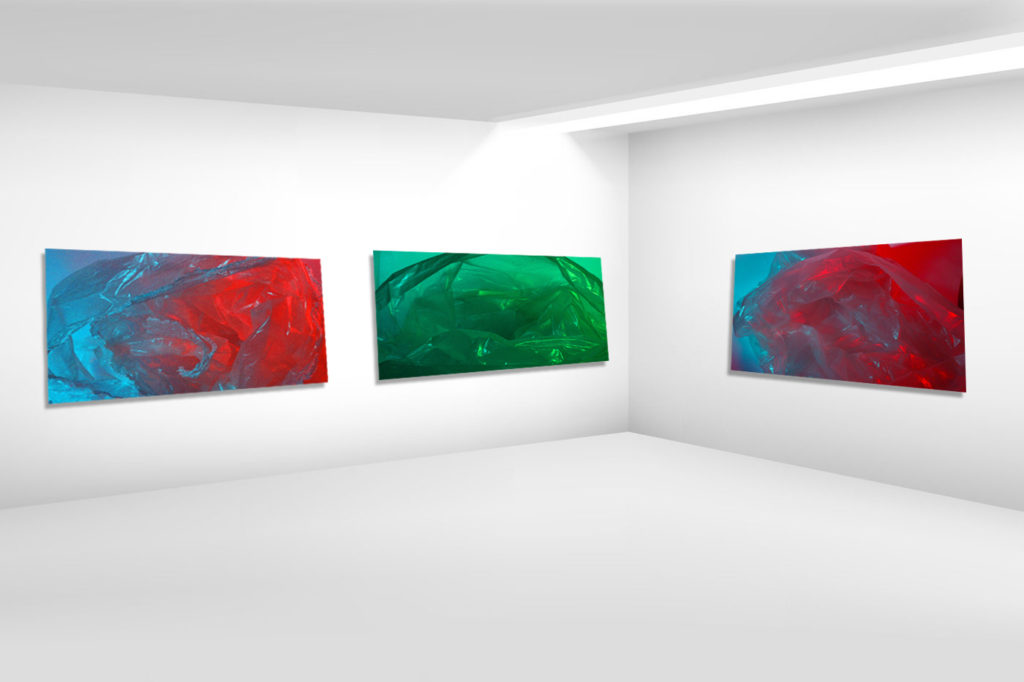
To display these images I could print them onto clear or coloured acetate, which is similar to the material taken in the original image. I think clear acetate would keep the colours in the similar tones as they are in my final edits, whereas coloured acetate may alter the colours and tones of the final displayed image.

I could also print the images out onto printing paper and burn the edges of the paper. I feel like this would reinforce the original idea of Anthropocene, with humans causing more harm to the environment rather than helping it.

Comparing Naomi White’s work to my own (Anthropocene)

Comparison between Naomi White’s work and my own

Naomi White | Crescendo, Plastic Currents (2012) | Available for Sale |  Artsy
“Crescendo” part of “Plastic Currents” series – Naomi White (2012)
My work

The prominent similarities between my work and the work of Naomi White and my work is the use of plastic in order to create art. Furthermore, the colours in both photographs are vibrant and the tones are very contrasting within both images. Finally, there is a strong sense of contrasting shadows and highlights due to the use of studio lighting.

On the other hand, there is also visible differences between the image created by White and my own work. For example, White only uses one colour in her photos, which creates a jarring contrast against the white background. However, because I used coloured acetate over the studio lights, multiple tones and colours are projected onto the plastic. Furthermore, my image lacks the blinding, white background that White uses in order to create an intense juxtaposition between the coloured plastic.

Overall, I believe my recreation of Naomi White’s work was successful because they carry similar ideas and messages, however I altered specific aspects of Naomi White’s work in order to make my images more unique and prove that White’s work is an ideal influence in terms of Anthropocene.