All posts by Chantal LB

Filters

Author:
Category:

looking and seeing

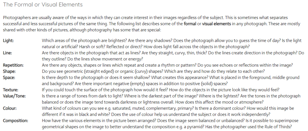
Abstract photography – Abstract photography is the method of depicting a visual image that does not have an immediate association with the object world and that has been created, it often takes a second glance to recognise the object being photographed.

Ralph Eugene Meatyard: 
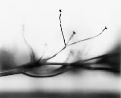
Part of “Zen” series – Ralph Eugene Meatyard (1960)

Born in Illinois, in 1925, Ralph Eugene Meatyard used a multitude of methods to achieve his experimental, expressionist photographs. These include multiple exposures, motion-blur, and other methods of photographic abstraction. Meatyard derived inspiration from poets he adored and his fellow members of the Lexington Camera Club, combined with his own creative flare and the influence of others Meatyard successfully formed his career in photography with his own form of expression. He took these unique photos where he lived in Lexington, Kentucky, before he later passed away in 1972.

Analysis of Ralph Eugene Meatyard’s work:
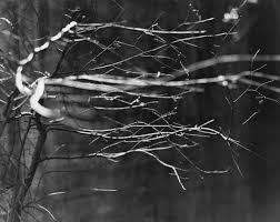
“Zen number 7” – Ralph Eugene Meatyard (1959)

Light- The natural lighting of this image softly illuminates the focal point of the image, that being the twig in the foreground of the image. There are no harsh shadows in this image as the lighting is soft.

Line- The thin, jagged lines of the branches lead your eyes towards the middle of the image, and then to the right-side edge.

Repetition- The repetition of line is present in this photo, as the pattern of irregular lines in the foreground direct your eyes along the screen, from left to right.

Shape- The organic shape of the branches are unorganised and random, therefore they have little relation to each other in terms of shape and regularity.

Space: There is a very narrow depth of field in this photograph. The branches in the foreground of the image are in focus, whereas the background is blurred out. I believe the photo was taken with an aperture of f4 or below.

Texture- The spiked branches in the image give the photograph a rough texture, as the lines in the image are ridged and sharp.

Value/Tone- There is a varied tone to the image, as the background to foreground fades from dark to light. The branches in focus are highlighted amongst the background, which makes them the focal point for the viewer. The branches are lightest part of the image and they are contrasted against the dull background.

Colour- The muted, monochromatic tone of the image accentuates the contrast between light and dark. There is a cold hue to the image, which highlights the juxtaposition of light and dark further.

Composition- The image has a very unorganised composition, the shapes are organic which makes it harder to understand the composition. There is also regularity to the image, which makes the composition more complicated and uneven.

My response to Ralph Eugene Meatyard’s work:
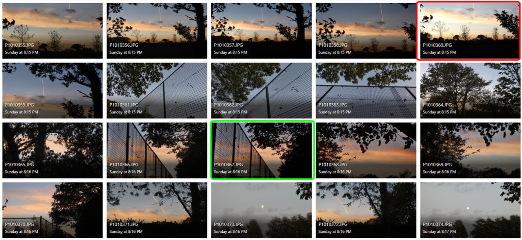
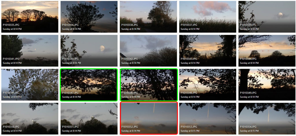
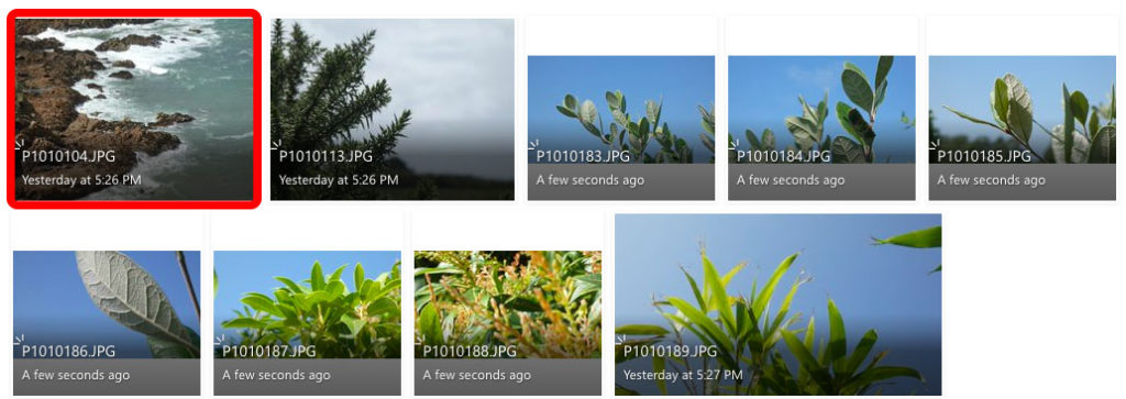
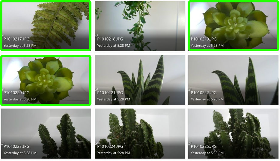
I believe the images highlighted in green are my most successful photographs for this shoot. I think this because they either relate to the artist’s theme of contrasting light and dark the best, or they use the artist’s method of blurring the image with change in shutter speed.

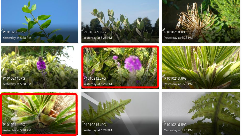
I think the images highlighted in red are my least successful images purely because they have the least relevance to the artist I have studied, or because the light in the photographs is too over-exposed.

To take the ‘Out of Focus’ images, I used an ISO of 400, and changed the shutter speed settings on my camera to achieve a ghost-like effect.

Photoshop Development:

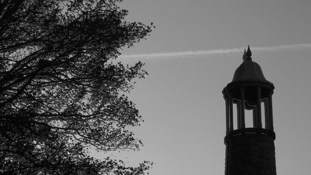
Original Photograph
After – Using cropping and black and white filter.
Original Photograph
After – Using black and white filter.
Original Photograph
After – Using cropping and black and white filter.

Overall, I think the biggest similarity between Ralph Eugene Meatyard’s and my own work is the use of juxtaposing black and white tones that create a contrast against each other. However, I think to improve my photos in the style of Ralph Eugene Meatyard, I need to change aperture settings, etc on my camera so that the lens focuses on the twigs and branches rather than the area around them.

Ann Hamilton
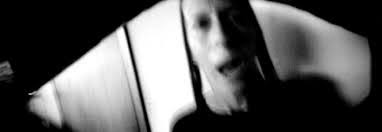
From “Face to Face” series – Ann Hamilton (2001)

Born in 1956, Ann Hamilton is an American artist best known for her large-scale multimedia instillations. Hamilton received a BFA in textile design from the University of Kansas in 1979, and then lived in many states in Canada, before deciding to achieve an MFA in sculpture at Yale in 1983. Ann Hamilton then produced several series of works between 1984-2018, but her work in the 1980’s is what brought the artist to light. While teaching at UC Santa Barbara, Hamilton began experimenting with photography, which she would often combine with other elements involving her current work with textiles. This began her work in photography and helped to evolve her successful career.

Analysis of Ann Hamilton’s work:

From “Face to Face” series – Ann Hamilton (2001)

Light: The soft, natural lighting gently illuminates the actual photograph, however harsh lighting could have been used around the image to create the

Line: The curved lines around the edges of the image act as a border to the photograph, these can be seen as leading lines that lead to the figure in the middle third of the photograph. The lines start of thicker at the corners of the image but begin to thin out as they reach the middle.

Repetition: There is little repetition in the photograph as the image focuses on the aspect of portrait rather than patterns and repetition. On the other hand, there is a slight echo with the use of shutter speed, which gives the figure a ghost-like affect.

Shape: The shapes in the image are organic and natural, because of this they have little relation to each other, the image is not artificially set up therefore it is hard to find comparable shapes.

Space: I believe there is a narrow depth of field in this image as the background is slightly more blurry than the foreground. However even the foreground is slightly blurry due to the use of slow shutter speed.

Texture: The image has a rough texture because of the jagged edges around the border and the wrinkly features of the face on the figure.

Value/Tone: There is a range of tones in the image, due to use of soft lighting which creates the contrasting shadows and highlights. The darkest part of the photograph is the shadows cast under the trees. The lightest part of the image are the illuminated features of the lady.

Colour: The photograph has a monochromatic filter to exaggerate the echo affect from the slow shutter speed.

Composition: The composition of the image is natural and not artificially set up, therefore it is difficult to superimpose geometrical shapes onto the image in order to understand the composition better.

Comparison of Ann Hamilton and Ralph Eugene Meatyard’s work:

Ann Hamilton and Ralph Eugene Meatyard both focus on the use of depth of field in different ways. Meatyard uses a narrow depth of field in order to draw the viewers eyes onto the focal point. Hamilton uses a slightly wider depth of field in order to keep more of the image in focus, but keeps the foreground as the main focal point. However Hamilton uses a slower shutter speed in order to achieve an echoed affect.

Both photographers use a monochromatic theme in these photos in order to accentuate the beauty of light and dark rather than colour. Hamilton and Meatyard use softer, natural lighting in these photos so the shadows and highlights are less harsh.

Although both Hamilton and Meatyard use the theme of focusing in their style of photography, they almost use them in an opposite way, which exemplifies the contrast in shutter speed photography.

black light

Keld Helmer-Petersen:

Keld Helmer-Petersen, a Danish photographer born in 1920, was recognised for his abstract photography in the 1940’s and the 1950’s. Helmer-Petersen’s passion for modern architecture, industrial areas and structures inspired his experimental photography, as he challenged the possibilities of the photographic image. He was a self-taught photographer who learnt from other photographers, such as Albert Renger-Patzsch. through technical manuals and photobooks. In the early days of his career, he joined amateur photographer clubs, where he would develop his photography skills further. Helmer-Petersen produced his first photobook, ‘Fragments of a city’, in 1960, which contained images of the city of Chicago. Keld Helmer-Petersen began teaching photography at the Academy of Architecture in Copenhagen until retiring in 1990.

Analysis of Keld Helmer-Petersen’s work:

Part of “Fragments of a city” series – Keld Helmer-Petersen (1960)

Light- The lighting in the image is hard to decipher as there is no highlights or shadows in the image. However I believe the image was taken in daylight, perhaps early afternoon in order to achieve the iconic shapes and lines.

Lines- There is a distinct pattern of lines in the image, as they cross over one another and create intricate designs. There is a contrast of both thick and thin lines in this image, which can be seen as a form of juxtaposition.

Repetition- There is a clear repetition of lines in this image, they direct your eyes along the screen, to the focal point of the large, black sillouette.

Shape- The shape of the image revolves around geometric shapes and lines, that are both thick and thin.

Space- It is hard to depict whether the image has a wide or narrow depth of field, as the image is simply a pattern of line and shapes in a silhouette, therefore this aspect of formal elements is irrelevant to the photo.

Texture- It is also hard to work out the texture of the image, but the repeated lines have a smooth surface, therefore I would say the overall texture of the image is rather smooth.

Tone/Value- There is no gradient of tone to the image, as it is simply pure black and white. However these contrast each other with the juxtaposition of light and dark.

Colour- There is no colour to the image, this is to signify the gloomy silhouettes of the geometric lines in the photograph.

Composition- The composition of the image is very organised, however there is no rule of thirds used in the image as the object was not set up by the photographer, the image rather focuses on the entire structure of lines instead of a singular focal point.

My Response to Keld Helmer-Petersen’s work-

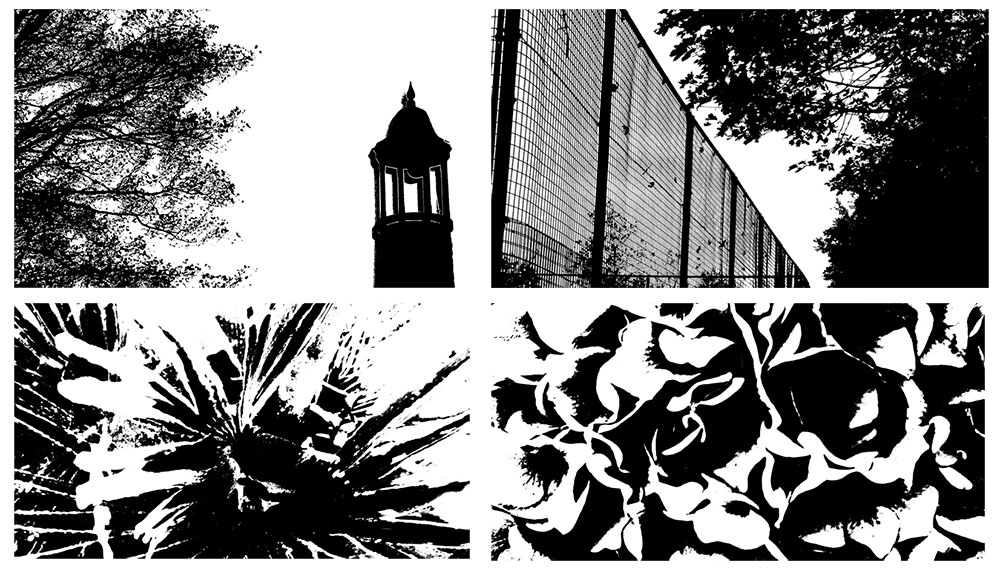
Original Images Used-

Photoshop Development:

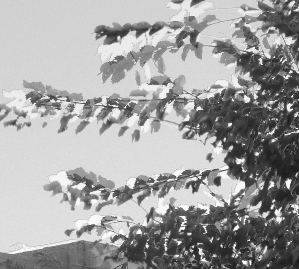
To achieve the same affect that Keld Helmer-Petersen used on his images, I used the threshold tool on photoshop to imitate the same silhouette-like appearance on the photographs.

I believe my work resembles the work of Helmer-Petersen well as it gives off the same silhouette aesthetic that he achieves with his work. It allows the shape and pattern of the object to be highlighted amongst the background behind it. However my work focuses more on natural aspects of shape, with the use of plants, whereas Helmer-Petersen often uses artificial structures for his work.

contact sheets

Contact sheets display a series of thumbnails from a photoshoot, these were mainly used when film photography was more popular. they are an easy way to visualise all photos at once and allows you to select your more interesting photos simply.

Thomas Lang:

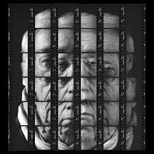
“Gesalt” – Thomas Lang (2018)

Thomas Lang is a portrait photographer who was born in Paris, France. His set of photographs from his series “Gesalt” was produced in 2018 as a form of displaying his portrait photography in an abstract form. He fractures the face of his model into a mosaic-like puzzle. Here, he uses contact sheets as a way of displaying a whole photograph in sections.

My example of a contact sheet:

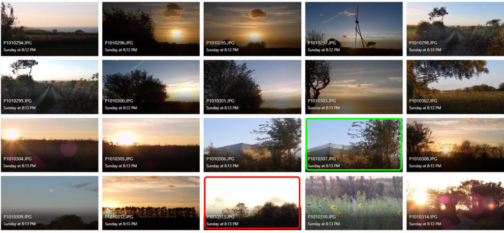
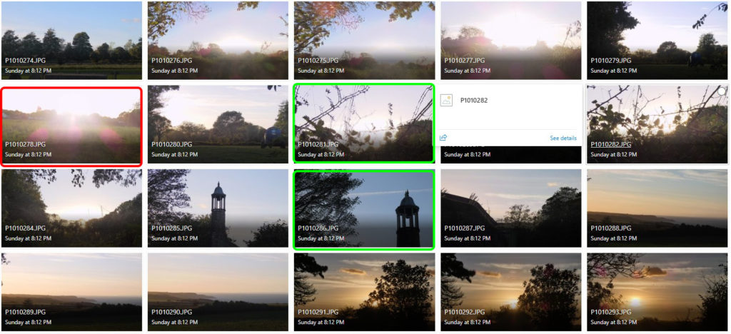
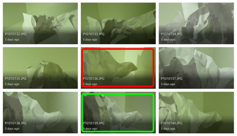
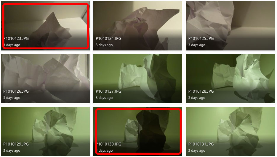
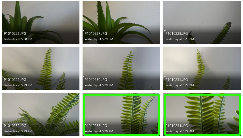
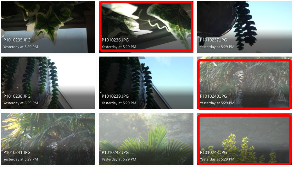
This is an example of a contact sheet from my project of creating a response to “The Formal Elements”. Here I have used the shape tool in photoshop to highlight my most successful and least successful images from the photoshoot.

This way of using contact sheets easily allows me to view a multitude of photos at once and pick out the photos that instantly grab my attention over others. I can them highlight them for future reference to show why I liked them, and why I thought they were more successful.

the formal elements – paper

Jaroslav Rossler

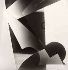
“Light Abstraction” – Jaroslav Rossler (1923)

Jaroslav Rossler was born in Czechia, in 1902. Rossler is an example of a photographer who focuses his work on “The Formal Elements”, as he finds the beauty in the simplicity of objects. He started his journey in photography at 21 years old, as he used this skill in his career creating typographic layout for magazines. Jaroslav Rossler’s work was heavily influenced by futurism and cubism, this lead him into creating his art of abstract photography.

“Akt” – Jaroslav Rossler (1926)

I took inspiration from this photograph titled: “Akt” by Jaroslav Rossler to approach the theme of “The Formal Elements”, as it perfectly represents the beauty of simple composition to focus on lighting and shadows. The geometric shapes of the paper create crisp, sharp shadows into the background to create a juxtaposition between light and dark.

My Response:

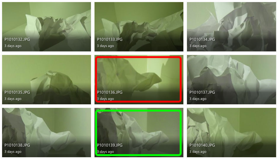
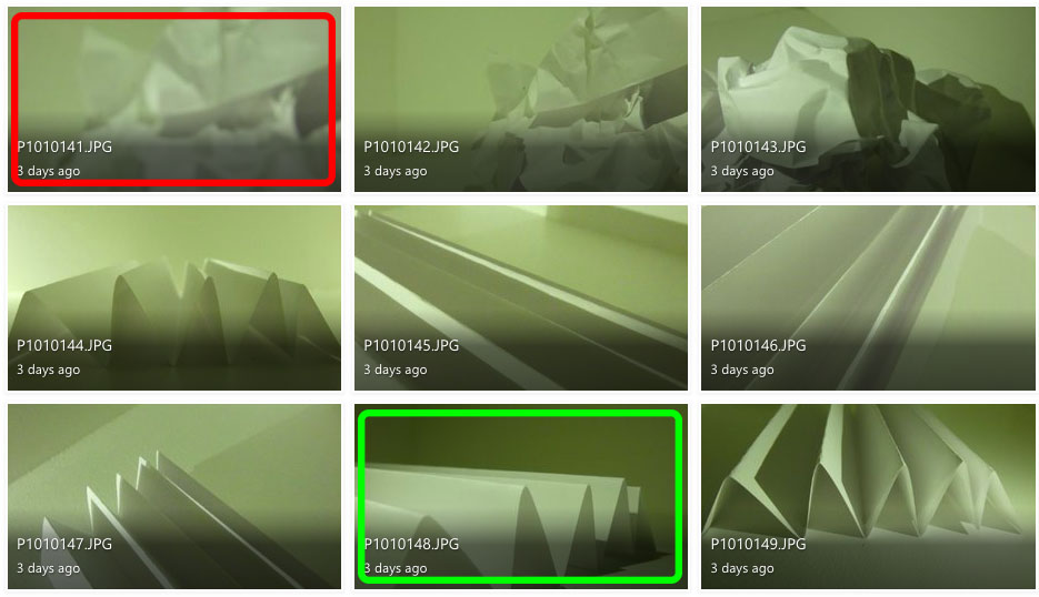
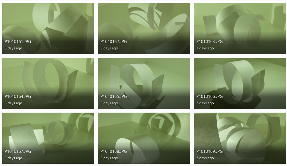
To explore “The Formal Elements” I photographed paper and explored lighting and texture by using artificial lighting to change the intensity and movement of shadows and distressed the paper in different ways to experiment with different shapes.

I don’t like the images in red because they are either out of focus or the lighting makes it difficult to define the creases and shadows.

I believe the images in green are my best photographs because they have distinct, contrasting shadows and shapes.

Photoshop development:

for the first two images, I used the invert adjustment and the monochrome filter to distort the images original shadows and lighting but still keep the same uniformed, lack of colour.

For the third image I used the invert filter again to switch the shadows and lighting but used colour hues and adjustments in order to achieve the pink-toned look of the photograph.

Using the Formal Elements to analyse my photographs:

Light: For this image I used artificial lighting. The light source is coming from the bottom left, behind the paper to create distorted shadows in front of the shapes.

Lines: The lines of the paper vary in size, however they all have the same, uniformed, triangular shape. I believe the leading lines are the straight bends at the top of each fold which directs the viewers eye to the almost pyramid-like shape of the paper.

Repetition: The form of repetition I used in this photograph is the repeated pattern of folds in the paper, that create the repetition of triangular shadows.

Shape: The folding of the paper creates a geometric repetition of triangular shapes leading to the centre of the image.

Space: Although the image is very organised and minimal, I believe the shadows add a sense of depth to the image. The negative space in the background allows the viewer to focus on the sharp shape of the folds, rather than the chaos behind.

Texture: The smooth texture of the paper is juxtaposed with the sharp folds to create a contrast of texture.

Value/Tone: There is a range of tones from dark to light in this image, with the top of the folds being the lightest part of the image and the sheltered area under the folds contrasting this with the brooding darkness. Overall, the photo tends towards lightness in the image.

Colour: Although there is minimal colour within this image, there is a slight green hue to the image. I think this is purely a reflection from the artificial lighting mixed with my current camera setting, however it gives the image an almost ominous tone.

Composition: The composition of the photo is very simplistic in order to showcase the simple geometric shape of the folds. the focal point of the folds is present from the bottom left third and into the middle third.

the world is beautiful

 Albert Renger-Patszch

Albert Renger-Patszch was a German photographer born in 1897 and later died in 1966. Renger-Patszch began his photography career at the early age of twelve, and got his first job in photography in the early 1920’s for the Chicago Tribune. He opened his first photography exhibition 1927 and produced his second book, “The World is Beautiful”, in 1928. This book focused on the aspect of New Objectivity, a German movement as a reaction against expressionism. “The World is Beautiful” displays one hundred of Renger-Patszch’s best photographs which focus on natural forms, industrial subjects and mass-produced objects. Like Edward Weston, in the United States, Renger-Patszch believed that the value of photography was in its ability to reproduce the texture of reality, and to represent the essence of an object.

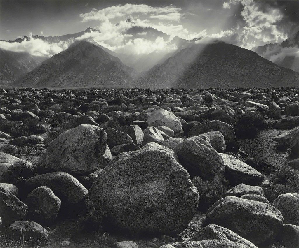
Albert Renger-Petzsch’s iconic black and white work could be compared to the work of Ansel Adams, who’s career in photography was also relevant at the time of Renger-Petzsch’s work. The main similarity they share is the uniformed, black an white theme, which allows the viewer to focus on the shape, pattern and lighting rather than the colours.

“Mount Williamson, Sierra Nevada, from Manzanar, CA” – Ansel Adams (1944)

Photo Analysis

Contextual:

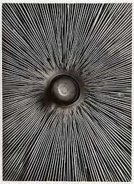
This image, named “Fungi Lepiota Procera” was featured in Albert Renger-Patszch’s famous book: “The World is Beautiful”. It is a photograph from his botanical study is of the underside of a mushroom found in woods and pastures within the northern hemisphere.

Conceptual:

“Fungi Lepiota Procera” was taken as a part of Albert’s famous publication in 1928 which contained 100 of his best images that focused on the New Objectivity movement. The purpose of this publication as a whole was to disregard old-fashioned expressionism and to explore the universality of both natural and man made life throughout the world. Essentially, the Renger-Patszch’s idea was to capture the mundane everyday objects and bring their beauty to light by cropping sections of the image and adding a sleek monochrome tone.

Technical:

I believe artificial lighting was used for this image as the photo is of high quality and bold shadows are created. The harsh lighting creates a clear contrast between light and dark within the lines which is exaggerated by the monochromatic effect. the lighting is coming from straight ahead as the shadows aren’t cast in a particular direction and they are all rather even around the surface. The photo is quite flat as there is no background to compare depth against the focal point, and the whole image is in focus, so it is hard to tell if there is a narrow or large depth of field.

Visual :

A pattern of repetition is the main focus of this image, with the repeating lines pointing towards the centre of the mushroom to create a focal point, that being the stalk of the mushroom. the focal point is in the centre third of the image and the other two thirds are taken up by the fine lines leading from the stalk. There is no colour in this photo which accentuates the intense shadows in between the contrasting, white lines

“The World is Beautiful” inspired photoshoot:

I feel like the images in green are my more successful photos as they display better patterns of line and repetition, like the ones seen in Albert Renger-Patszch’s work.

I don’t feel like the images highlighted in red are as successful as my other images because they don’t show repetition or patterns of lines like the work of Renger-Patszch, and for a couple of the images the lighting is too over-exposed. I think these images are less relevant to the subject of “New Objectivity”.

Photoshop Development:

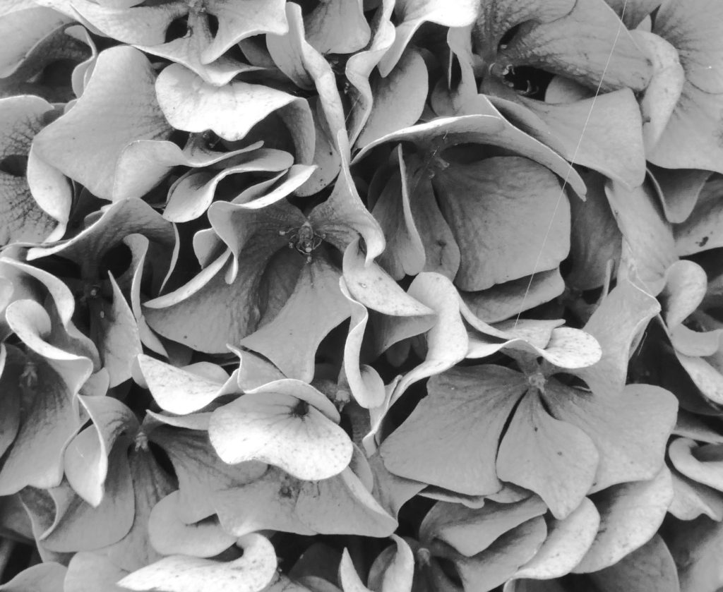
For the first edit, I took a close-up photo of a hydrangea and cropped a section that I felt was the most interesting, with a repetition of curved lines. I used the invert tool to change the shadows and highlights and then changed the image to fit the monochromatic theme of Renger-Patzsch’s work.

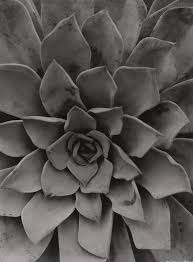
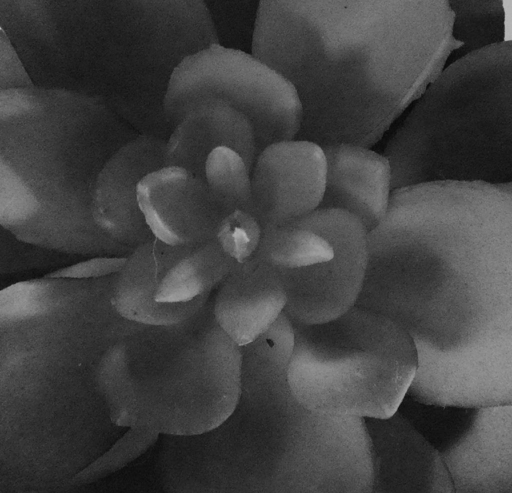
For the second and third edits, I cropped what I felt like was the focal point of two succulents and used the monochrome filter to fit Renger-Patzsch’s black and white theme. These two photos are more relevant to the theme of New Objectivity as they display clearer patterns, texture and repetition.

I used natural lighting in these photos to prove the true, natural beauty of the subjects in their natural form. I chose to focus on Renger-Patzsch’s photographs on natural forms, as I felt the patterns and repetitions produced by nature are more interesting to the viewer as they are not man-made, therefore there is less explanation to the way they look which, in my opinion, makes them more beautiful.