To mount my boards, I had to decide whether I wanted them to appear raised and stick them onto foamboard before finally putting them onto black or white mount board, or to keep the images on just foam board or just mount board. For my street photography images I decided to use foam board first and then mount board. To do this I used spray glue to stick my images onto foamboard, I then cut the images out using a paper cutting knife to achieve sharp and neat edges.
Once my images had been cut out onto foam board, I decided the placement of the images and then used double sided tape to stick the foam board onto the mount board. I decided to use black mount board as it makes the black and white contrast appear harsher.
Once the images had been stuck I used the paper cutting knife again to trim the board to have a black border around the images.
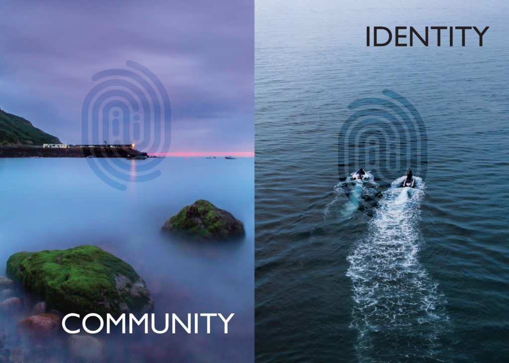
I enjoyed creating my images with the theme of identity and community as it gave us the freedom to choose whether we wanted to focus on identity or community, and we could also make the project personal to our own identities and heritage. I also liked the idea of displaying our images in a newspaper, as the public have access to our images and it creates a sense of nostalgia for older Jersey citizens. I think my images came out successfully as the idea of personal identity is incorporated with the image of Lillie Langtry (with her being a distant relative to my family), as well as the use of portraiture which is my preferred type of photography.
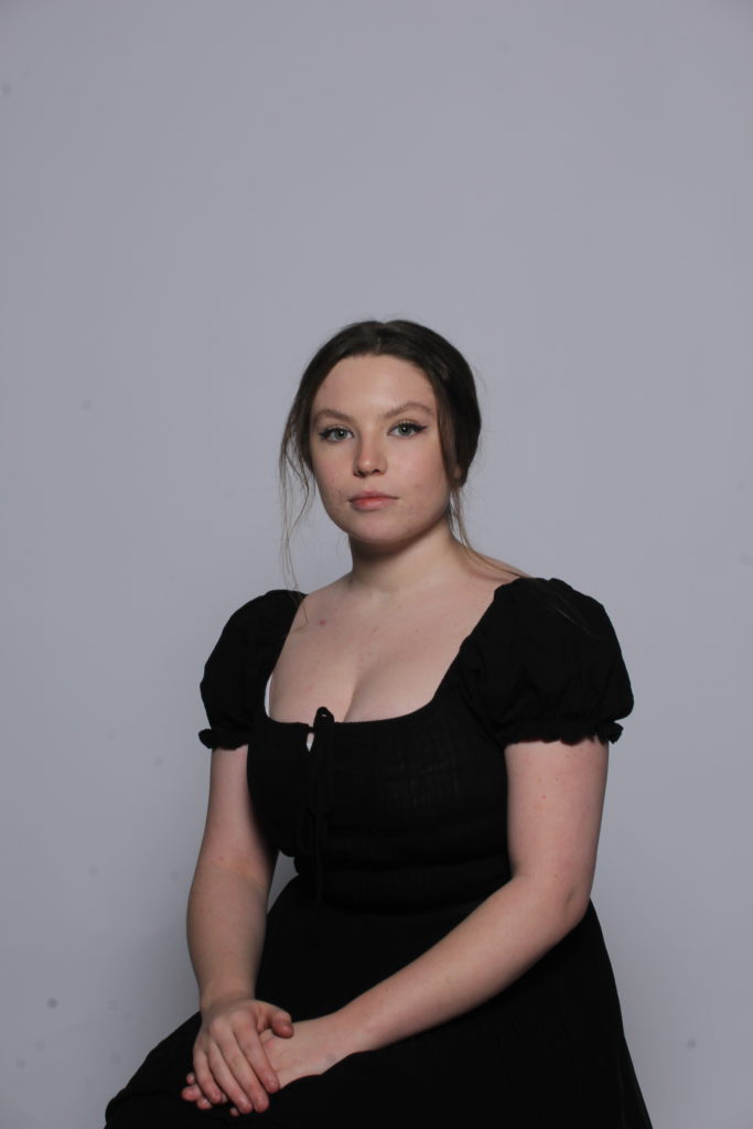
My Image
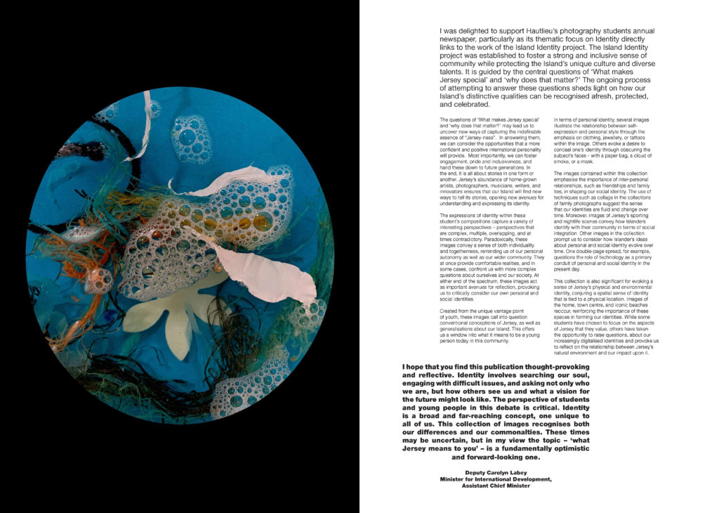
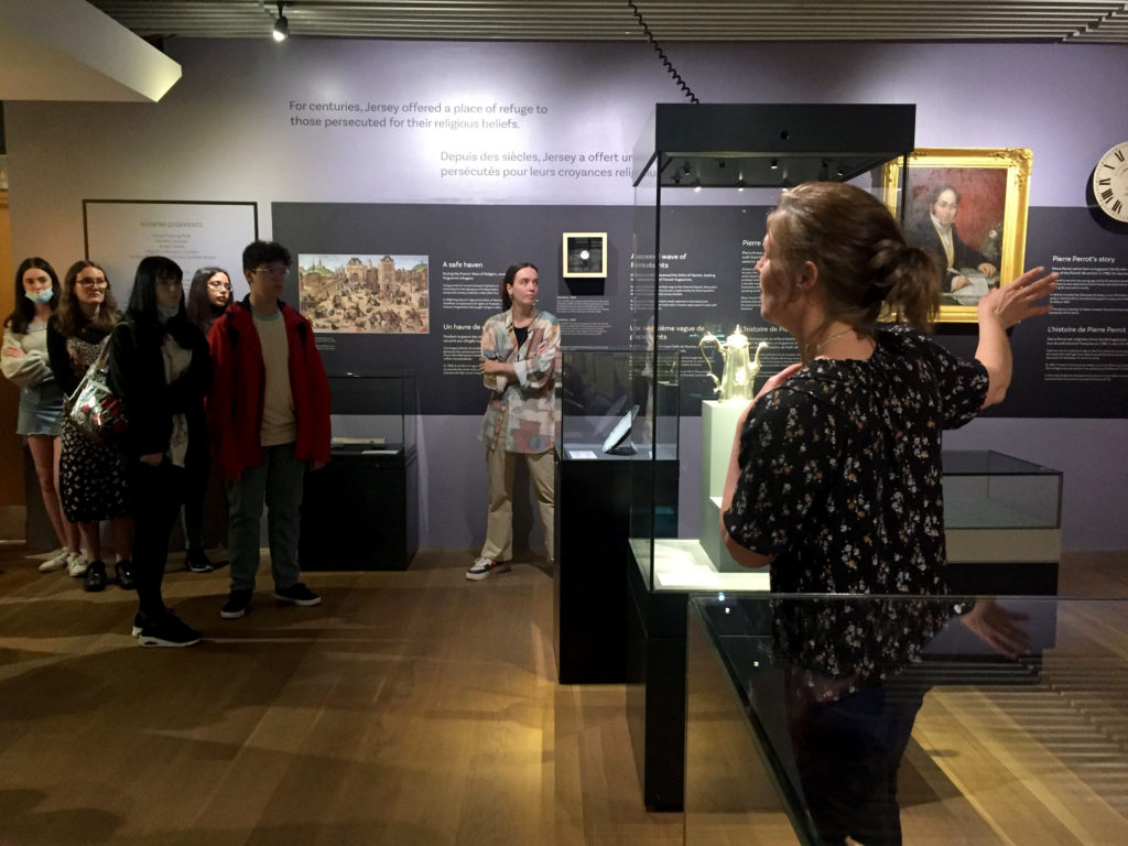
The images seen on the pages of this newspaper supplement are extracted from a variety of projects and final outcomes produced over a two-year academic programme of study by a group of A-Level photography students at Hautlieu School. In their final year the themes of Identity and Community offered a specific focus and through a series of creative challenges students developed a body of work that were inspired, partly from visiting heritage institutions to learn about aspects of Jersey’s unique history of immigration and exploring migrant communities and neighbourhoods in St Helier in a series of photo-walks. In the classroom additional inspiration was provided from workshops on NFTs (non-fungible token) and digital art, embroidery and textile art, animation and film-making, zine and photobook design led by professional artists, designers and teachers.
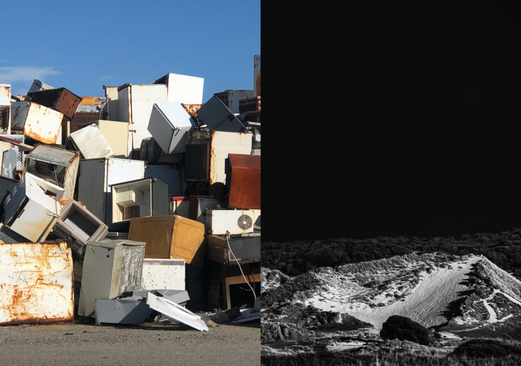
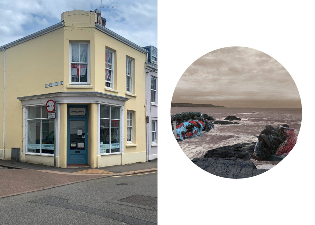
As part of the research and contextual studies students were asked to engage with some of the key questions raised by the Government of Jersey’s Island Identity project and explore through their own photographic studies how they interpret and identify distinctive qualities of island life. What can we learn from looking at a set of photographs produced by young islanders? At first sight they show us a seemingly random set of images of places, people and objects – some familiar, others surprising. On closer inspection each image is a visual sign and also a conundrum. For example, a fish stuffed in a plastic bottle may ask us to consider more closely our marine environment, commercial fishing or food consumption. As a combined sequence of images they represent different views that in many ways comment on a wider discussion on some of the primary objectives explored in the Island Identity project, such as ‘how we see ourselves’ and ‘how others see us.’
The newspaper was kindly sponsored by Deputy Carolyn Labey, Minister for International Development and Assistant Chief Minister who in her foreword shares her personal thoughts on what makes Jersey special to her in context of the Island Identity project led by her department. She says, ‘identity involves searching our soul, engaging with difficult issues, and asking not only who we are, but how others see us and what a vision for the future might look like. The perspective of students and young people in this debate is critical. Identity is a broad and far-reaching concept, one unique to all of us. This collection of images recognises both our differences and our commonalties. These times may be uncertain, but in my view the topic – ‘what Jersey means to you’ – is a fundamentally optimistic and forward-looking one.’
MY IMAGE
The Identity and Community newspaper is the fourth supplement produced in collaboration between Hautlieu School Photography Department and Jersey Evening Post. In 2018 the first issue was The Future of St Helier and last year the themes of Love & Rebellion explored experiences of isolation and lockdown during the coronavirus pandemic. Photographer and teacher Martin Toft, comments: ‘The question of ‘what makes Jersey special’ matters a great deal to every islander and as visual signs, the images printed on these pages are an attempt – not so much to provide answers – but rather asking questions about the essence of this island we call home, and how it actively will overcome current challenges in shaping a prosperous future for all.’
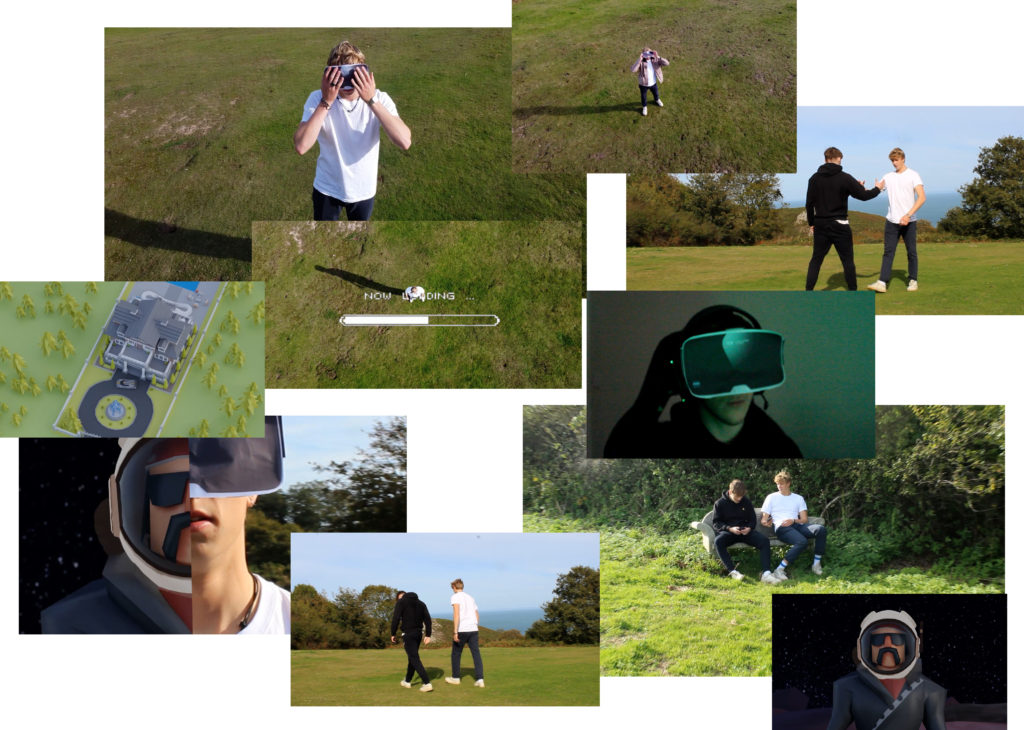
Various workshops and school trips for inspirations, recording and experimenting with new images and ideas of making
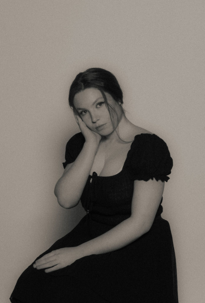
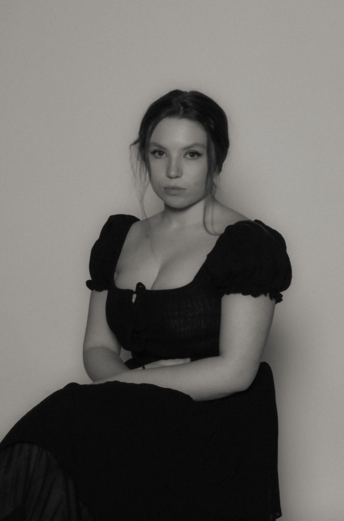
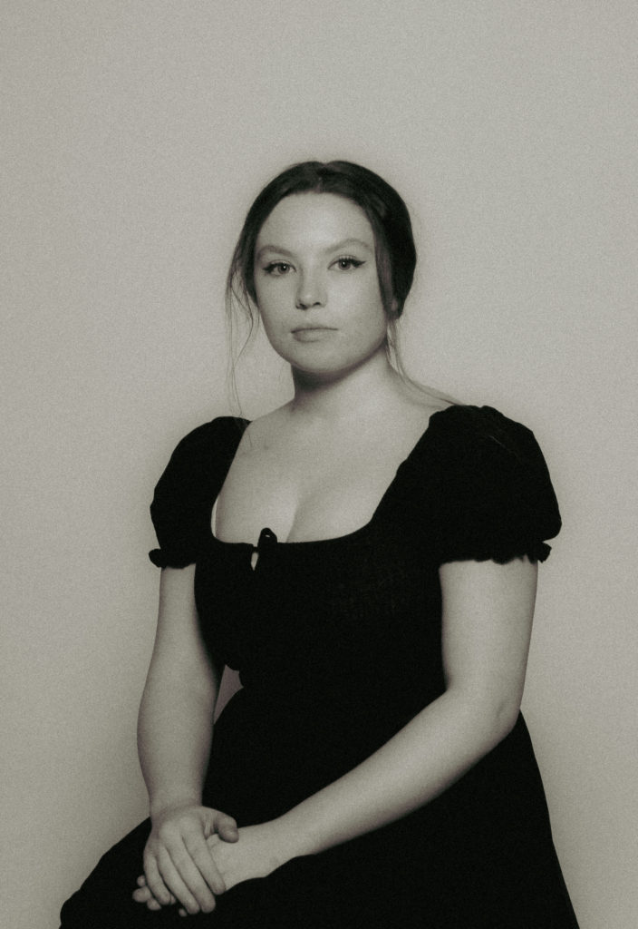
For my second photoshoot, I wanted to take portraits in an outdoor setting, similar to those of Lillie Langtry’s portraits taken in nature. To do this I picked an outside area with agriculture such as trees and flowers in order to capture the cascading sunlight onto the face. I also used the same costume from my first photoshoot to incorporate the vintage style of Lillie Langtry’s era. I used both a short and long lens to achieve a strong depth of field in some of my images, to recreate the same depth of field in the photos of Langtry.
Recreating Lillie Langtry’s portraits
Once adding my images into Lightroom, I rated them through the flag and colour system to narrow down the large group of images into a selection that I wanted to use and edit for my final images. The images highlighted in green are what I believe to be my most successful images and those which I want to further improve.
Editing my images
To edit my images, I began by adding a black and white filter to the images, and adjusted the exposure and contrast in a similar way to my first photoshoot to give the images a vintage aesthetic. By altering the exposure and contrast it enables the images to become lighter and softens the contrast between the highlights and the harsh shadows.
Then I added a yellow tone in colour grading to the images to create the idea of the images being faded and weathered. I also altered the temperature and tint of the image to make the images have a warmer yellow tone to them.
To add detail to the images, I added a grain affect and lowered the clarity and texture of the image to reinforce the image being ‘vintage’ and to recreate the grain and textures of an old film camera.
For my second photoshoot, I want to recreate images of Lillie Langtry with the natural and agricultural scenery.
Lillie Langtry by Henry Van der Weyde (1885)
To recreate images similar to this, I am using the same costume from my first photoshoot to give the images an antique aesthetic and to give the impression that the image was taken during the same era as Langtry in a fashion sense. I am also going to take the images outside rather than the studio to achieve the same cascading, natural lighting. I want the setting to feature agriculture such as trees and flowers to reiterate the ‘feminine’ ambience of the photo above.
I will try to achieve the strong depth of field that is displayed in the photographs of Langtry by using both a short and long lens.
Through Lightroom I chose my best three images and edited out the imperfections such as smudges on the camera lens. Once the images were edited, I exported them into a sperate folder in order to export into InDesign.
My Final Images
Experimenting with layout
As my photographs were all portraits, I only used single page spreads to keep the dimensions of the image correct. For two of the images I kept a white border around the edge, and to create some juxtaposition I stretched one image out to the bleed of the page. I like this layout as it provides a sense of an old family photo album, which adds to the vintage aesthetic to the photographs.
My first photoshoot focuses on the headshot portraits and half-body shot portraits. I used studio lighting to make the images more dramatic, and to easily light up the face.
Once putting the images into Lightroom, I used the flag method to see which images I prefer over the others at first glance, and which of those I did not want to use. I rejected the images where the lighting is too dark as well as the images with poses or facial expressions I didn’t think represented my ideas for the photoshoot as well.
I then used the star rating method and the colour rating method to decide which, out of my favourite images were the ones I wanted to further develop in the editing processes. I decided on 9 photographs which were both taken in landscape and portrait.
Once choosing my most successful images, I used a repeated editing process for the images to look uniform in black and white, with a slight yellow hue to them to create a vintage and weathered look to the images.