All posts by Cerys G

Filters

Author:
Category:

Photo montage 2

John Steazaker was born in England in 1949 and is currently working in London. Stezaker is one of the leading artists in modern photographic collage and appropriation. Employing vintage photographs, old Hollywood film stills, travel postcards and other printed images, he creates fascinating small-format collages that bear qualities of Surrealism, Dada, and found art. Stezaker overlays and conjoins distinct images to create new personalities, landscapes and scenes.  His works have been featured at The Museum of Modern Art in New York, the Tate Modern in London, Tel Aviv Museum of Art and many others.

Analysis of one of his photomontages

This image is called ‘Bridge’ and comes from Steazaker series , ‘Mask XIV’. Mask XIV is a collage created by superimposing a postcard on a black and white photograph. The photograph is a film publicity portrait of an unidentifiable actor taken during the 1940’s or 1950’s. The postcard is a colour image mounted over the actor’s face. This image shows a rocky cavern in which a sandy track curves around a central pillar. On the bottom left the card is captioned ‘Zig zag path, Folkestone’. Folkestone is a port town in Kent, the town lies on the southern edge of the North Downs at a valley between two cliffs. The postcard covering the actors face appears to have been taken from inside of a cave looking out through two openings towards the light.  Stezaker has positioned the postcard on the actor’s face so that the dark silhouette of the rocky openings and the natural curves of the cave line up with the contour and shape of the actor’s face making it look like his ‘eyes’. The way Steazaker has placed the postcard has created a humanlike approach to the image as the two openings of the caves create an eye shape look and the middle rock looking like a nose. This gives the viewer a very real view on the image and gives us a sense of the two images merging into one and framing a new person. The fact the actors face is covered makes the image feel more mysterious as we don’t know who this is and why he is being covered.

STREET PHOTOGRAPHY

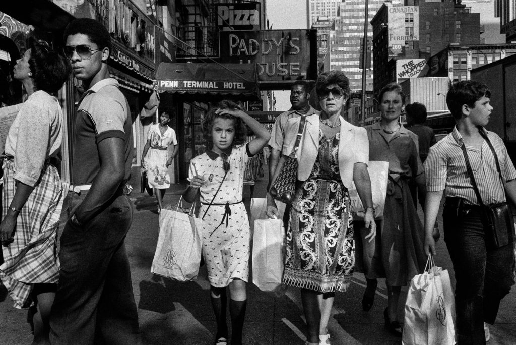
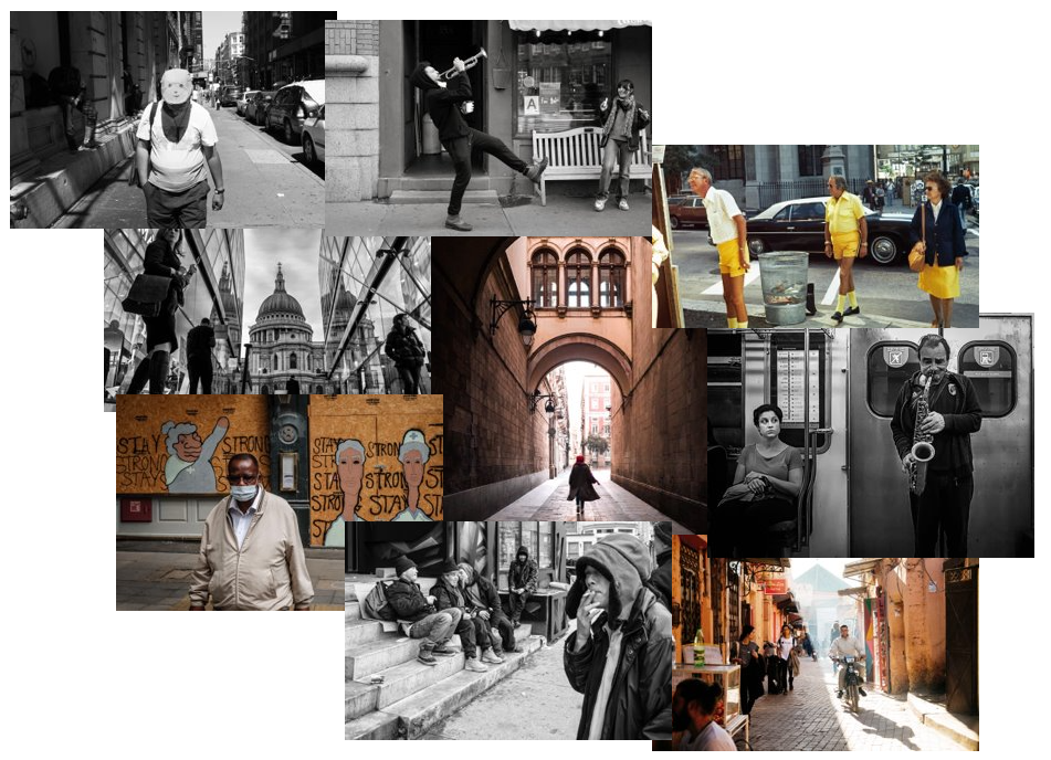
Street photography is a genre of photography that records everyday life in a public setting. The publicness of the setting enables the photographer to take candid pictures of strangers, normally without their knowledge. Street photography does not necessitate the presence of a street or even the urban environment. Though people usually feature directly, street photography might be absent of people and can be of an object or environment where the image projects a decidedly human character in facsimile or aesthetic.
Street photography also includes candid portraits, which is often used to refer to the type of portrait taken when the subject is unaware of the photographer.

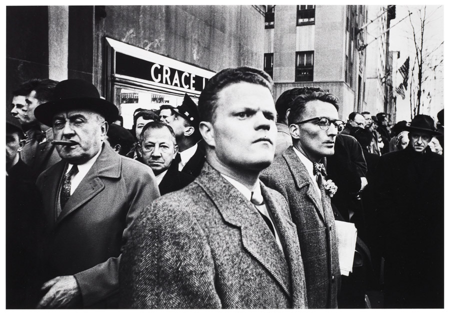
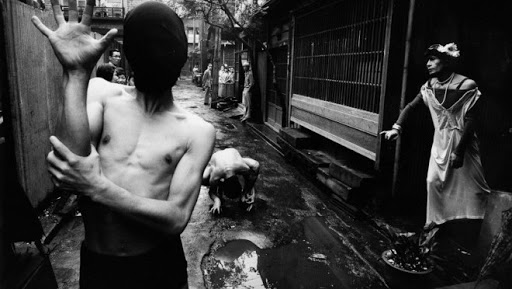
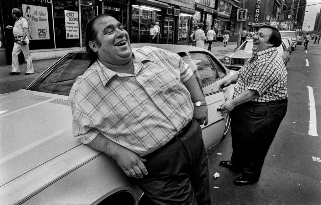
Examples of street photography:

Here is a video of Bruce Golden , an American street photographer known for his candid close-up photographs of people on the streets of New York City, in action on the streets of New York.

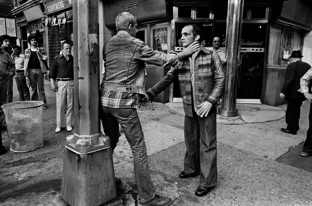
Street photography can tell a lot about a persons lifestyle, class and a lot about a persons existence. Street photography captures people in their rarest moments which can show a lot about a persons true emotions. Usually it’s a form of candid photography, when the person isn’t aware they’re being photographed, which creates more realistic and powerful images.

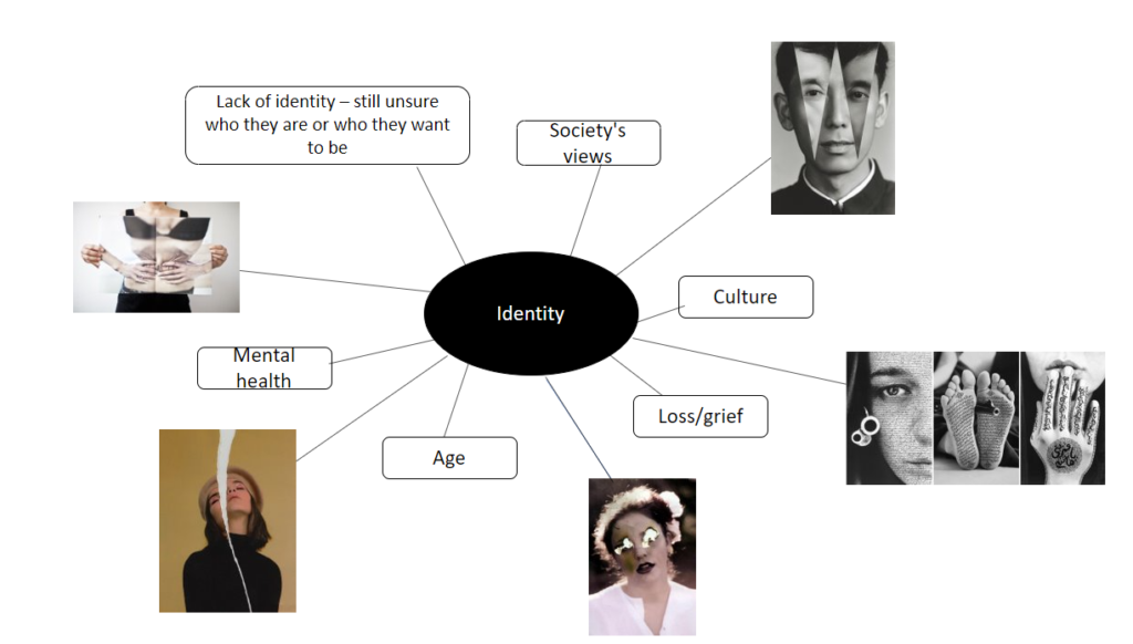
Mindmap of ideas

Self- reflection

Now that it’s over, what are my first thoughts about this overall project? Are they mostly positive or negative?

Now I have finished I feel my project went well, I was very happy with my final outcome images and felt they went the way I wanted / expected them to come out like. However, I do feel I could of gone a bit more into depth into my research on my artist and her style of work, although there was limited information on my photographer.

What were some of the most interesting discoveries I made while working on this project?

I found the physical editing of my images interesting and how cutting and destroying images can completely change the meaning of the image.

How did I come up with my final best images?

For my final images I just experimented and used my photographers images as inspiration to come up with the ideas I used for my final images.

What could I do differently from a personal standpoint the next time I work?

I think next time I should be more prepared and have more of an idea of what images I wanted to produce before my shoot as this could have made my images better.

How will I use what I have learned in the future?

What I have learnt from this project will be helpful to me in future exams as I know I need to be more prepared and maybe experiment more with lighting.

FINAL IDENTITY

Final images

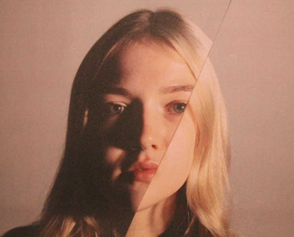
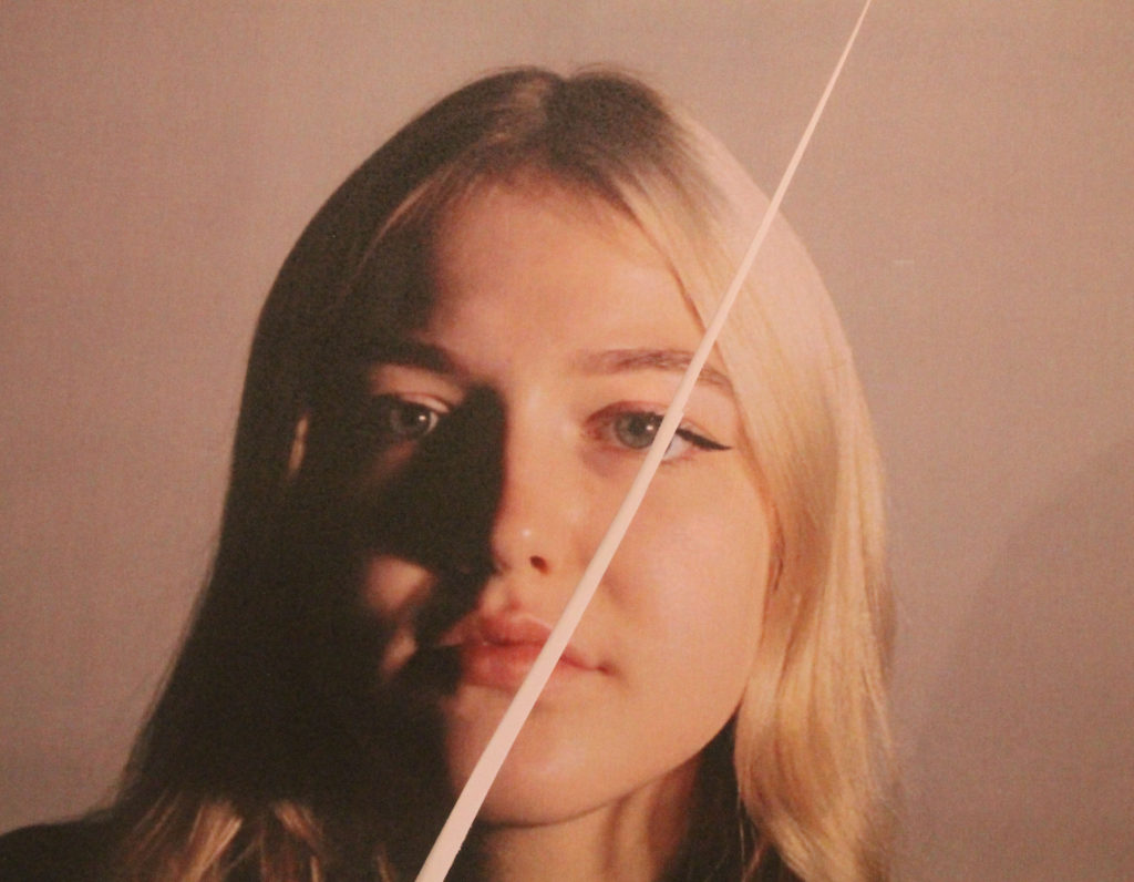
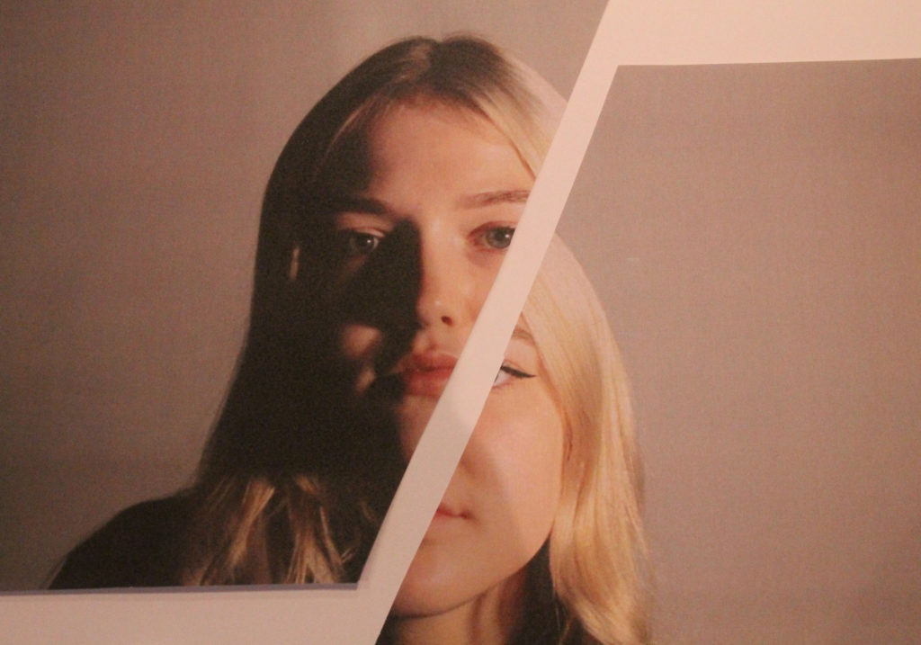
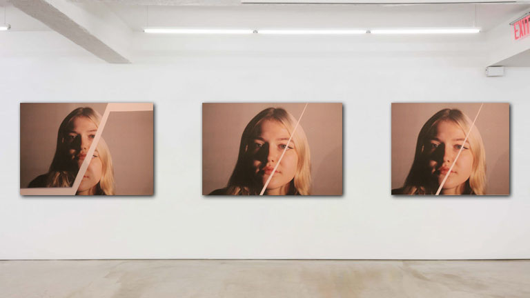
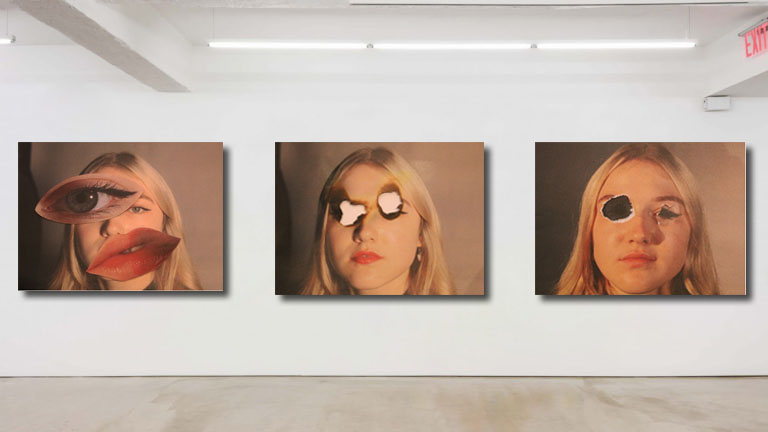
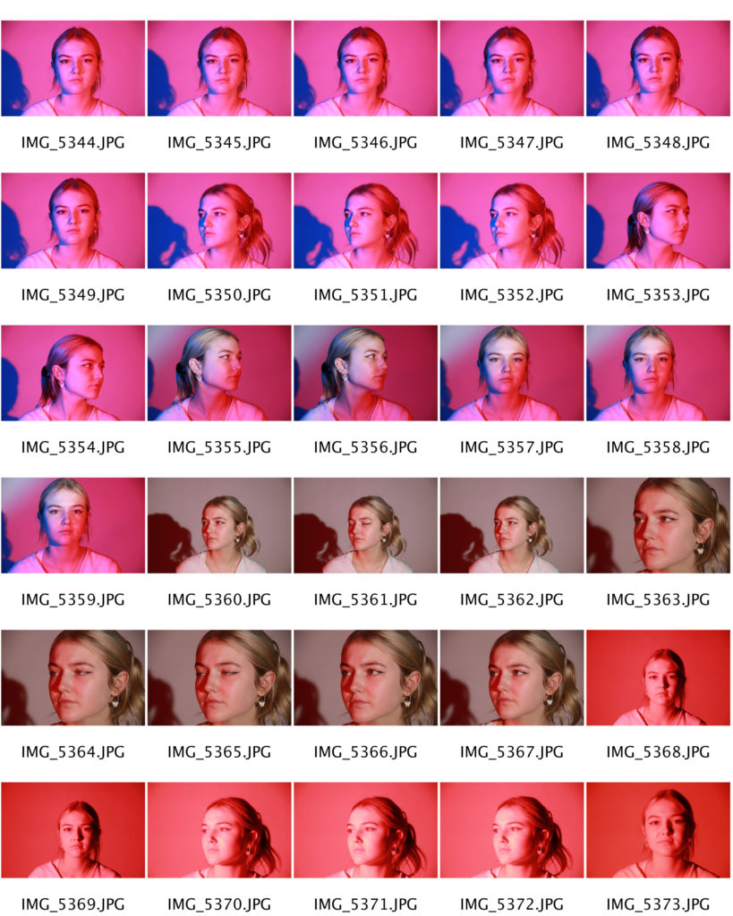
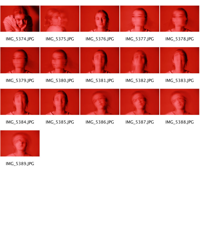
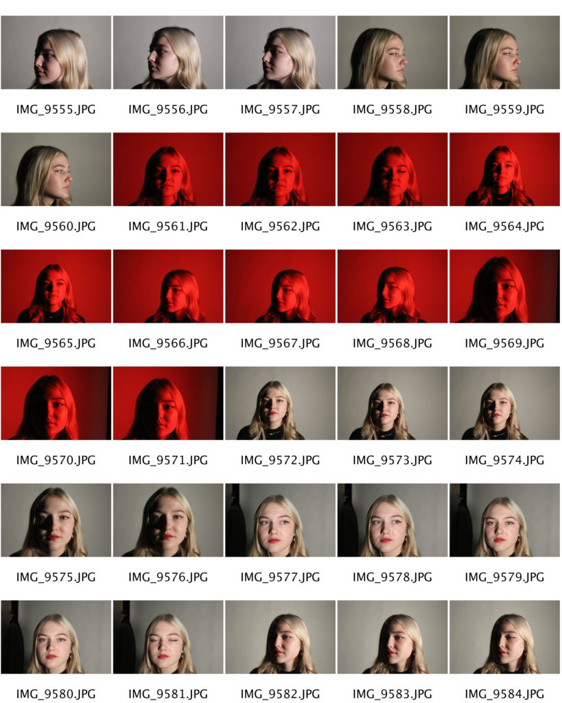
To create my final images I took photos of a fellow student. I took photos of looking dead at the camera. To create the lighting in my images I used a mixture of one point and two point lighting. This created shadows on parts of her face to add a contrast of lighting.
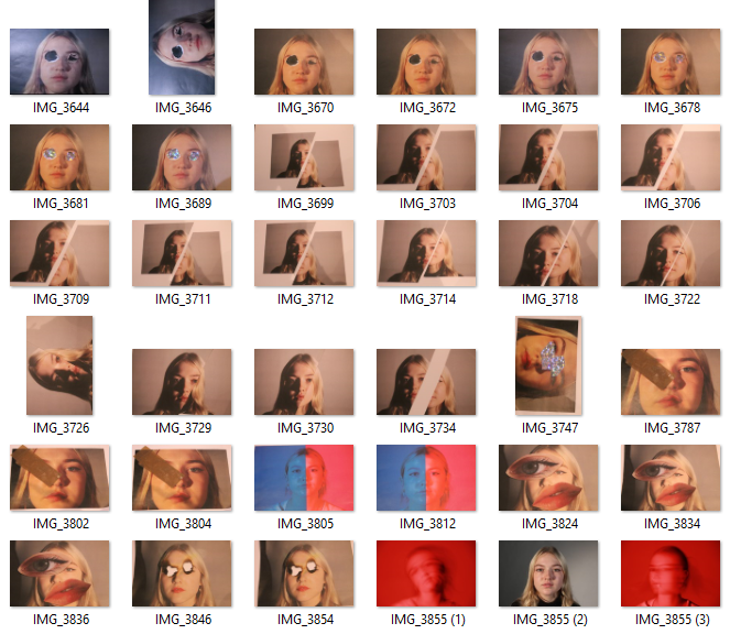
Once I had a good amount of images from different angles and different types of lighting, I then selected 20 images that I thought where my strongest images. I decided to merge my 2 shoots together as I felt this would give me the best outcome as I could use my strengths from both shoots.
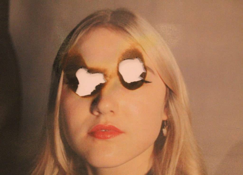
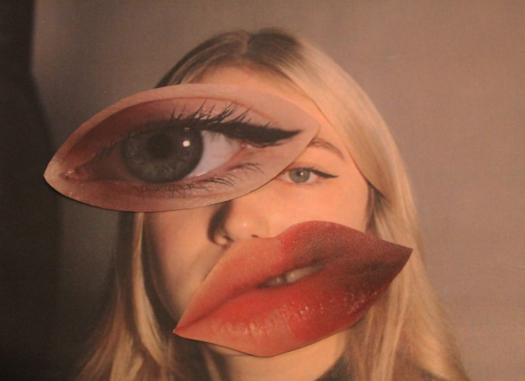
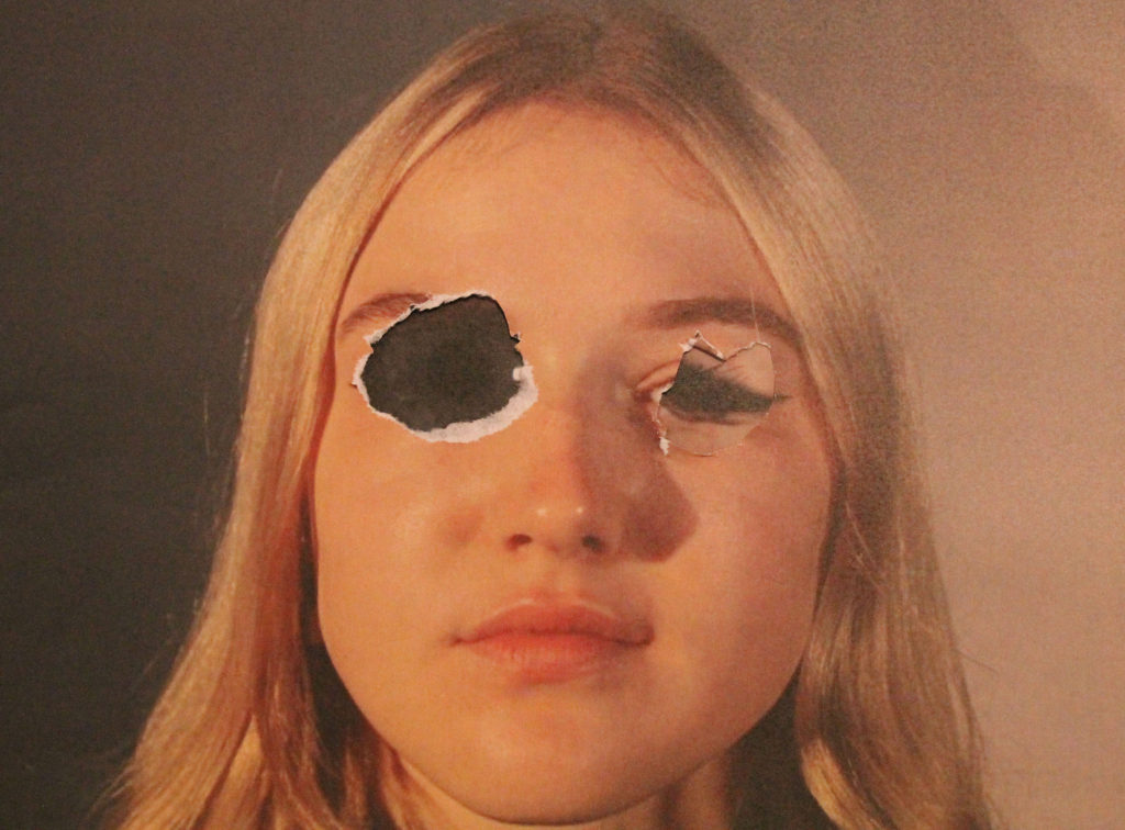
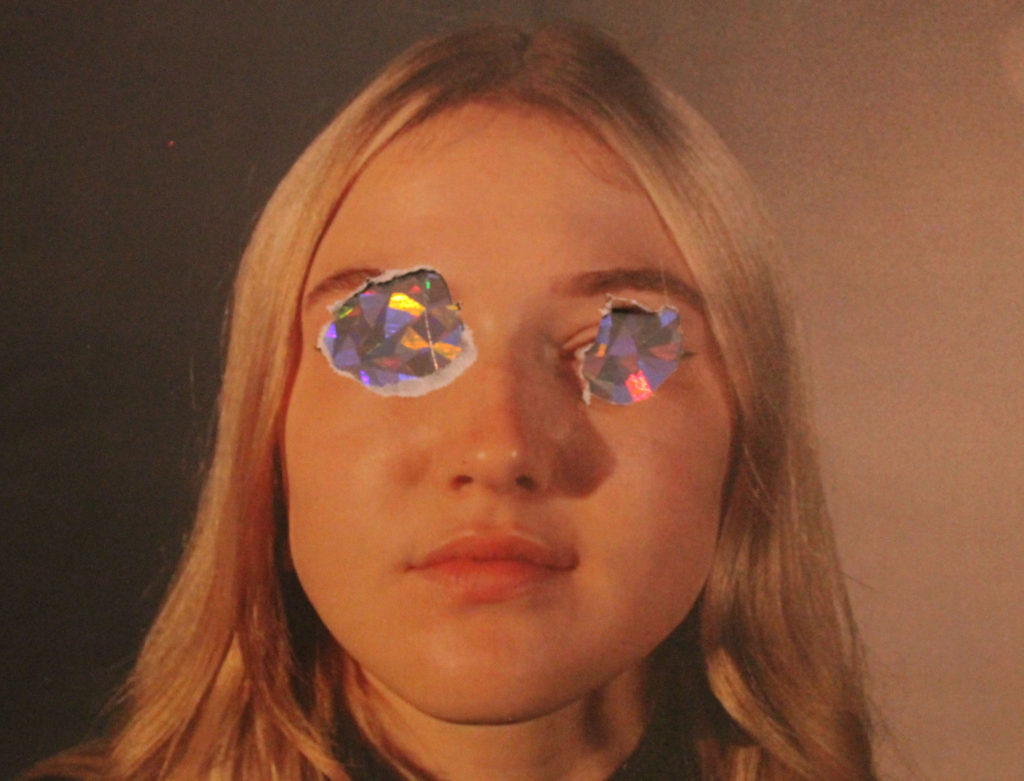
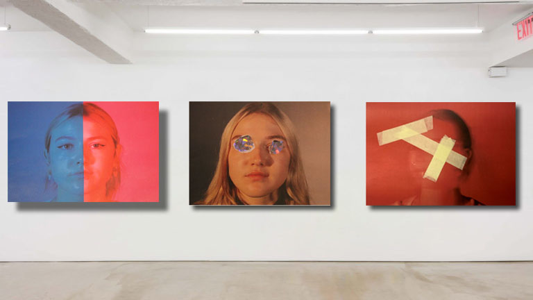
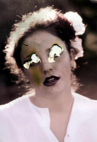
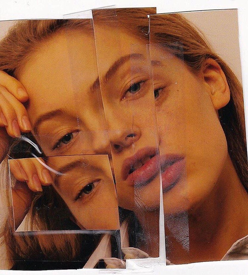
I then printed out these images and started experimenting in ways similar to Rosanna Jones style. I cut out parts of the models face and stuck them on top of an image of her face to create an enlarged effect. This also related to Rosanna’s style of the idea of notions of embodiment. I also experimented with burning the models eyes on a piece of paper, similar to an image from Rosanna’s “Destroy” shoot. Although as my image was printed onto regular paper , not photograph paper, it created a yellow tinge to the area around the eyes.
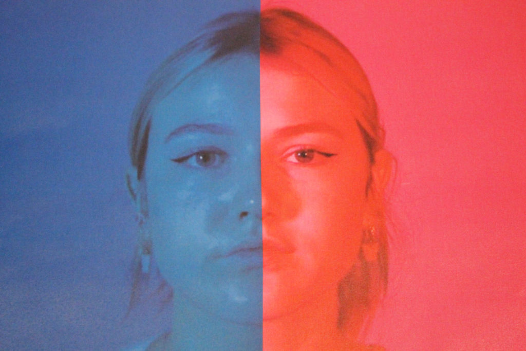
I also decided to experiment with using colour filters and creating a ‘half and half’ visual. Although Rosanna herself did not do this, I still felt it could link to her aims of exploring visual identity as blue is seen as a colour related to boys/men and pink relating to girls/women, so using a comparison of both colours could create that uncertainty of visual identity.
Once my images were taken I adjusted there saturation and cropped them on Adobe Photoshop, but this was the only editing I had to do to my images.

I felt my process went well as I feel I came out with some strong images which relate well to my photographer. I did experiment with some images that did not turn out the way I wanted them too or how I felt they would look so I did not use those images. I tried replicating some of Rosanna’s images but also tried to be creative and come up with some of my own ideas which still relate to Rosanna’s aims.
I am pleased with all my final outcomes and feel that I have picked my strongest images from the ones taken. All my images relate to Rosanna’s

I feel as there is a strong link between my images and Rosanna Jones’ images and ideas, therefore I am confident my images represent my intention of exploring notions of embodiment and visual identity.

IDENTITY SHOOT

Initial ideas:

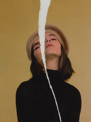
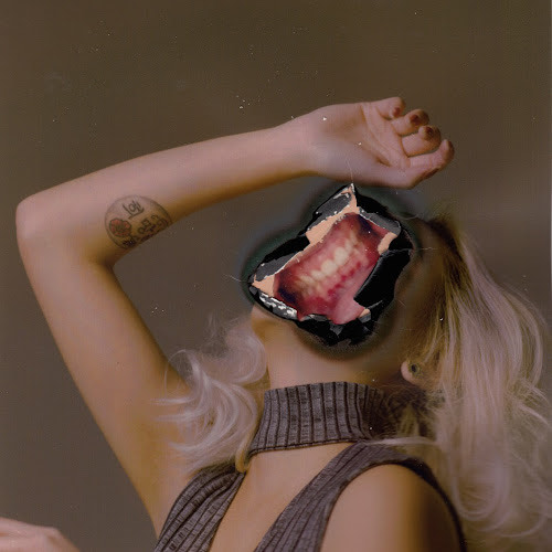
My shoot is based on tearing up images that society creates off how people should look and feel a certain way. My photoshoot was based off Rosanna Jones shoots “Destroy” , “Girls” and “Burn”. All of these projects focus on destroying and manipulating photos. I am going to take photos of my friend in the photography studio with artificial lighting. I will then print out selected images from my 2 shoots and manipulate the images in multiple ways. I am thinking of ripping up some images and sticking tape and objects onto the images to create images similar to the style of Rosanna Jones.

Rosanna Jones

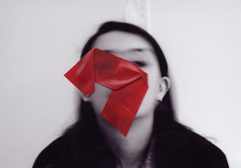
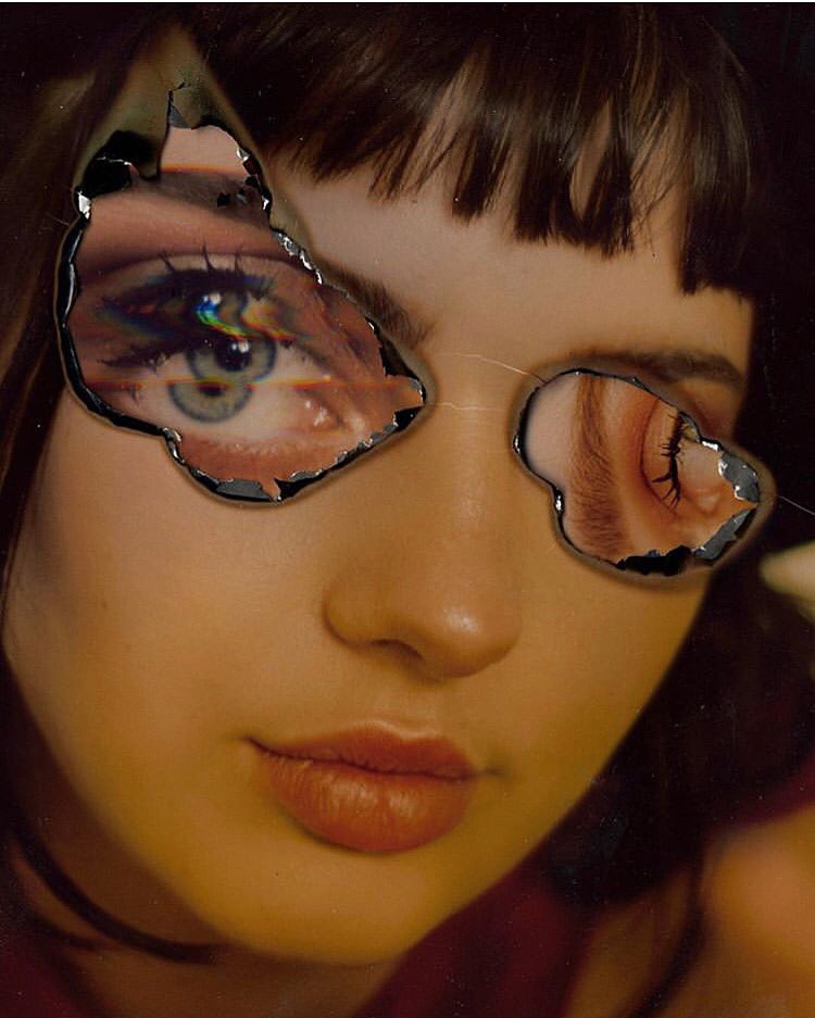
Rosanna Jones is a photographer from London. Rosanna’s work specialises in a blend experimental blend of art and photography and celebrates the possibilities with an image. Her trademark is based on ripping up, painting over and destroying images. Her work is aimed at examining visual identity and notions of embodiment. Rosanna says that her images hold a personal meaning for her and reflects her own personal life. Jones work draws attention to the idea that a persons photo can immortalise them.


Shoot Plan:


Who – I will be photographing a fellow photography student.

Where – The photography studio, using artificial lighting.

When – During a school day, as I used artificial lighting it did not matter what the time of the day was.

Shoot 1:

Shoot 2:

Image selection

Identity

What is Identity?

Identity can be defined in many different ways. Identity can be described as the fact of being who or what a person or thing is, the way you are viewed by the world and the characteristics that define you. However people in photography normally portray the word identity as something that you truly are whether you show it to the world or not, for example being gay but not coming out. The photography based around identity tries to portray the real identity of the person being photographed and show who they truly are compared to how the world sees them. Identity photography can also be used to show objects, people or hobbies people love and they feel expresses them.

Claude Cahun

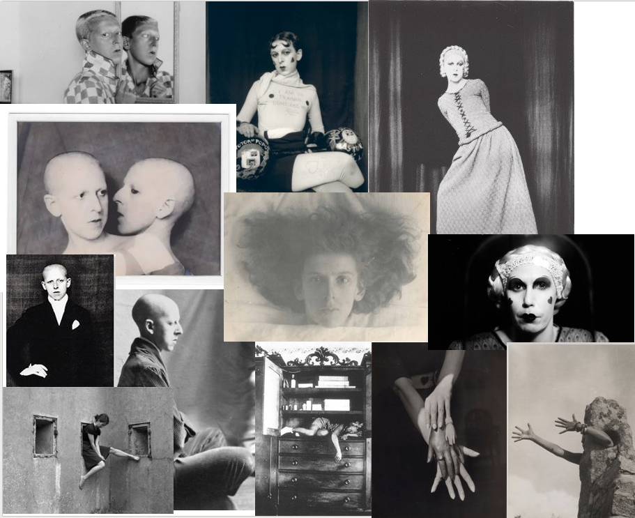
Examples of Claude Cahun’s work

Claude Cahun was born in France on the 24th October 1894 and was born as Lucy Schwob. Lucy Schwob later became Claude Cahun to be gender neutral. She was a lesbian, photographer, sculptor and writer. Cahun was born into a prominent intellectual Jewish family with a Mother who suffered mental health issues meaning she was brought up by her blind Grandmother. As a teenager Claude suffered from multiple mental health issues such as depression , anorexia and suicidal thoughts. Also at this time she met her love and future lifelong partner Suzanne Malherbe, however Claude’s Father married Malherbes mother making them step-sisters although this did not stop them.
She began making photographic self-portraits as early as 1912 (aged 18), and continued taking images of herself through the 1930s. Her images portray a dizzying kaleidoscopic mix of mystery, exuberance, and sobriety. She had an obsession with examining gender, using herself as subject.  A year later she published her first collaboration with Malherbe titled  “Vues et visions”.  In her self-portraits, she presented herself sometimes as a man, sometimes as a woman, and sometimes so heavily made-up and costumed that it was impossible to determine her persona’s gender. A series of self-portraits from 1927–29 show her masquerading as a feminized male wearing lipstick, painted-on heart-shaped rouge, and a shirt with painted-on black nipples  that reads, “I am in training, don’t kiss me.”
Cahun died on December 8th , 1954 and it wasn’t until 40 years later that her work was noticed and appreciated by people.

Street photography post 2

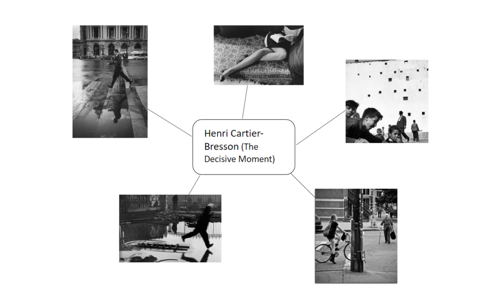
Henri Cartier – Bresson – “The Decisive Moment”

Henri Cartier-Bresson was born on August 22, 1908 in Chanteloup, France.His theory that photography can capture the meaning beneath outward appearance in instants of extraordinary clarity is perhaps best expressed in his book (The Decisive Moment). Cartier-Bresson’s rise as a photographer was rapid. By the mid 1930’s he’d shown his work in major exhibits in Mexico, New York, and Madrid. His images revealed the early possibilities of street photography.
Henri Cartier-Bresson: The Decisive Moment examines Cartier-Bresson’s influential publication, widely considered to be one of the most important photobooks of the 20th century. It was to develop its emphasis on the photograph itself as a unique narrative form. The exhibition details how the decisions made by the collaborators in this major project have shaped our understanding of Cartier-Bresson’s photographs.

Bruce Gilden, an American street photographer best known for his candid close-up photographs of people on the streets of New York City. Gilden and Cartier-Bresson both have very similar photography techniques and outcomes.

MULTI EXPOSURE

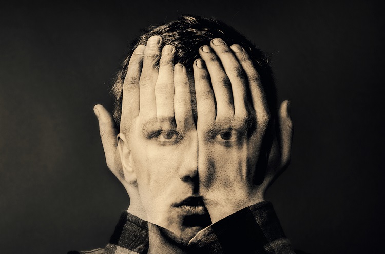
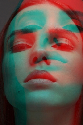
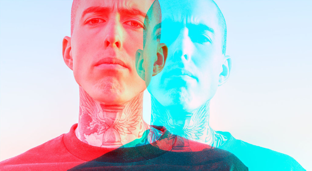
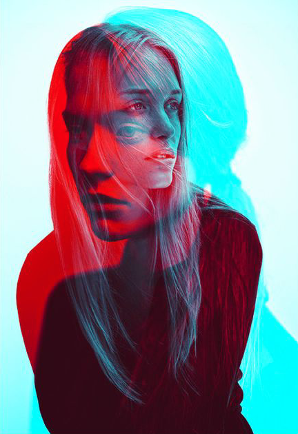
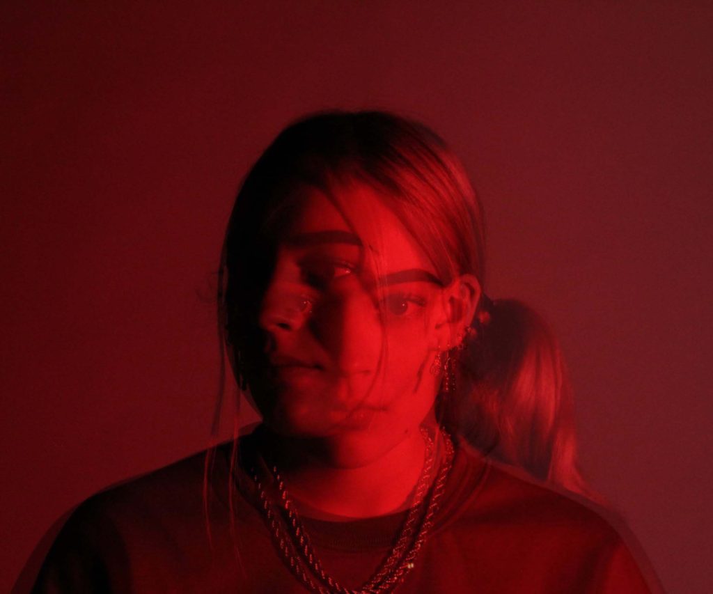
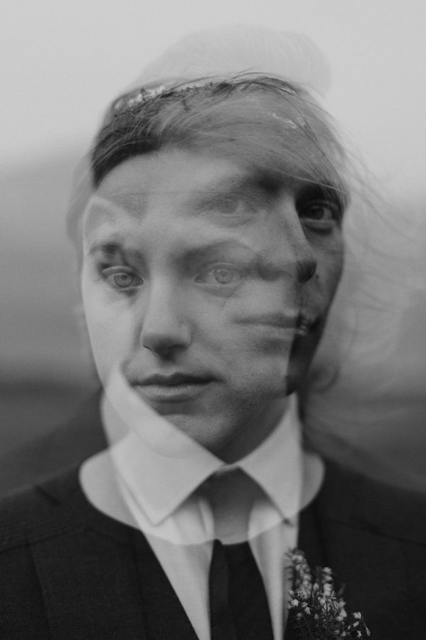
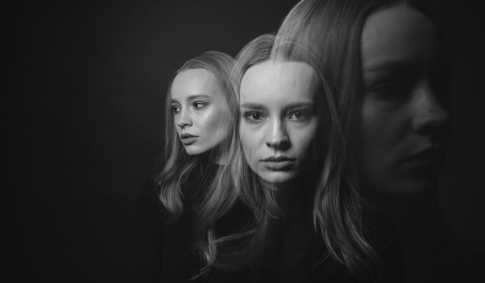
A ‘multiple exposure image is a type of photograph that is created by exposing the same frame of film to light more than once. Multiple exposure images allow a photographer to superimpose one subject over another on the same frame of a photograph.

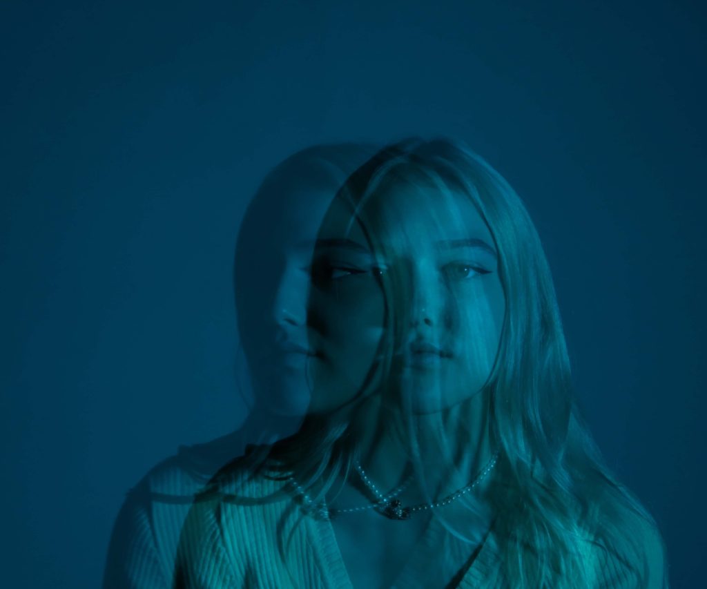
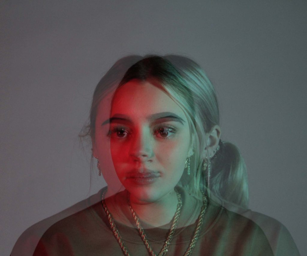
My multi exposure images

To create these images I used Adobe Photoshop. I picked 2 images and then layered them and made them the same size and then changed the opacity of one of the layers to create the multi exposure look.

UP CLOSE PORTRAITS

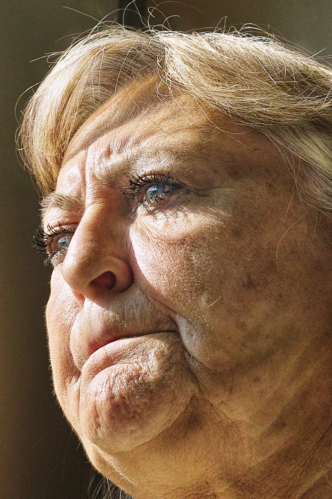
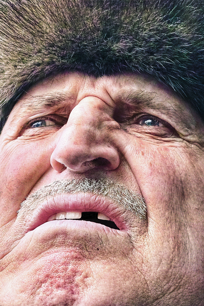
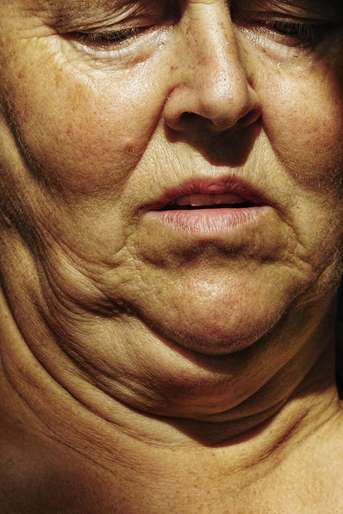
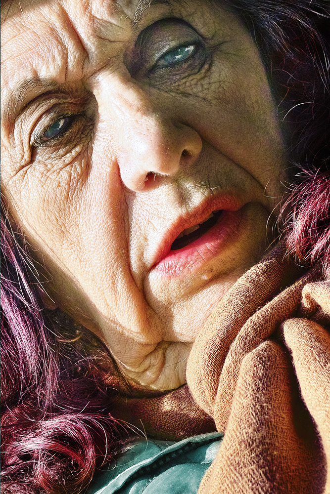
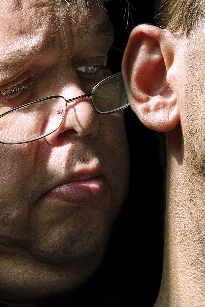
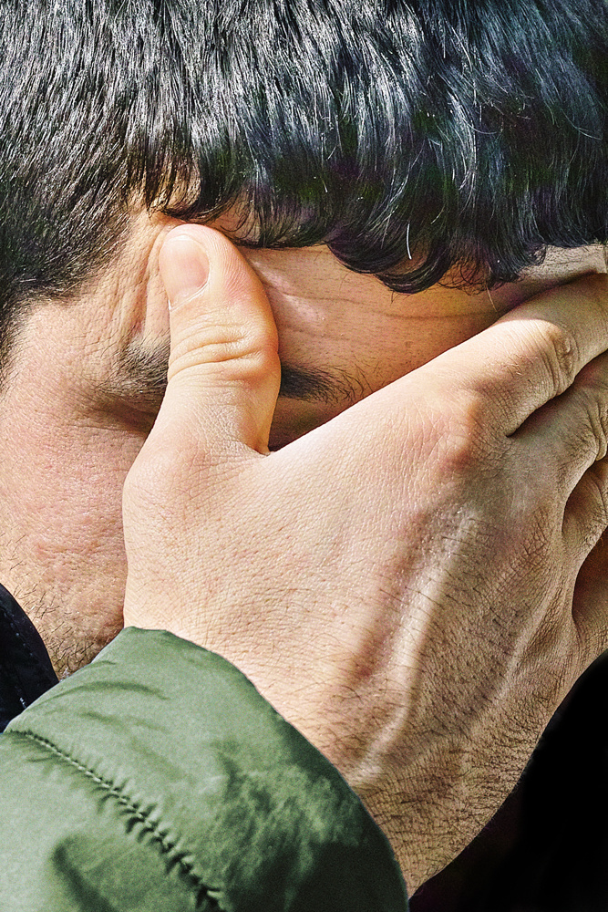
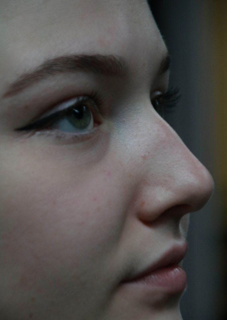
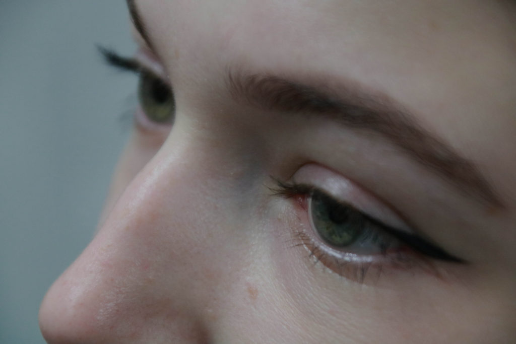
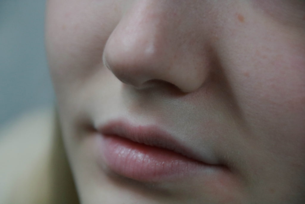
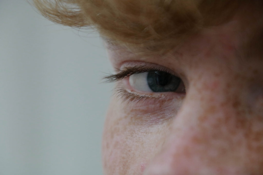
Close up portraits give the most detail and in depth details of a person’s facial features.

Satoshi Fujiwara: Code Unknown: In Michael Haneke’s 2000 film Code unknown, there is a scene in which the protagonist’s lover, a photographer, secretly snaps pictures of passengers sitting across from him on the train.’

Street photography – my analysis

My ideas

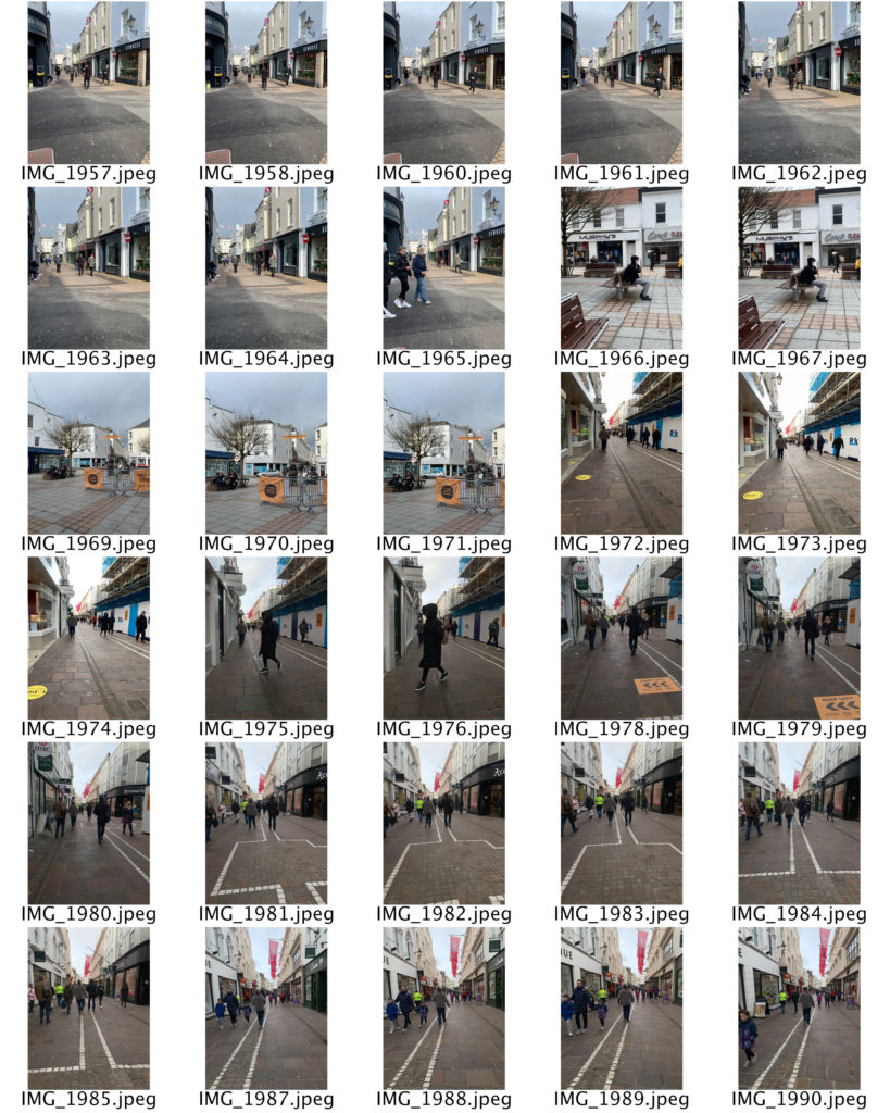
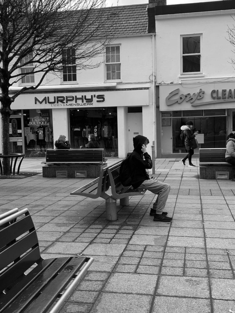
I chose these images as my final images as I felt these where my strongest images that fitted into the candid/street photography idea.
I liked these images as they were all people in the moment and unaware of the images being taken which means I captured them in their candid moments.
I decided to put all my final outtakes into black and white as that is what a lot of street photographers had their images in black and white and I felt it throughly captured the image the best.