Here is an online link to my photobook: https://www.blurb.co.uk/bookstore/invited/9539908/0c1b1a6cb81869e30eeb705328505f658cdba91f
All posts by Cerys G
Filters
Analysing my photobook
Overall I am very happy with the outcome of my photobook. I feel my photobook represents the theme of identity and community well.


Within my photobook I used a few different designs however keeping the same designs consistent throughout. I used different layouts throughout to make it more interesting and avoid repeating the same design too much. It took a lot of experimenting with different images to see what worked well together and what looked better as a full bleed image compared to a smaller image. I am very happy with the outcome and layout of my book as I feel it is not repetitive but also not over complicated. At the end I created a polaroid page of all the images within my book and more. I wanted to do this as polaroids are a old way of taking images and my book is all based off old childhood images. I also felt it wrapped up my book nicely and was like a flash black like the book was a flash back of my childhood.
photobook editing
To begin my personal study project I decided to experiment with different ideas. I knew I wanted to use childhood images within my photobook so I experimented with different ideas based around childhood and memories. I tried different things like using different tools in photography, photographing landscapes and exploring different ideas and concepts until I found an idea I felt interested me and thoroughly represented my ideas.
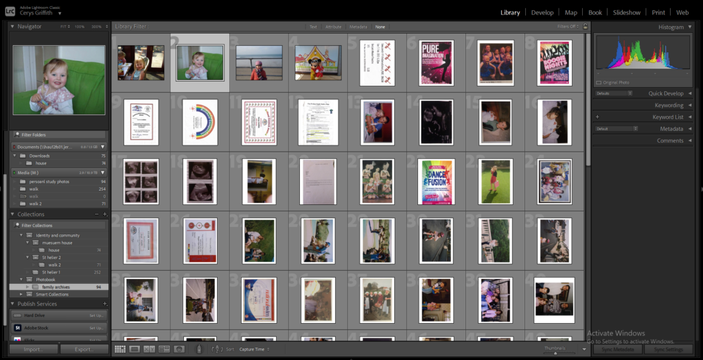
First I imported all my chosen childhood images into Lightroom and into a folder within my photobook folder so I could organise all my images for this project in one place.
Photoshop experimenting
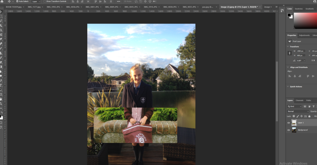
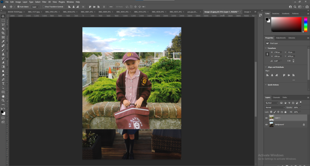
I then began experiment with different tools within photoshop. I started with a basic tool within photoshop by overlapping 2 images and changing the opacity. I liked the final outcome of this image showing what I was and the growth.
I then began experimenting with the polygonal tool and began created different shapes ontop of the image.
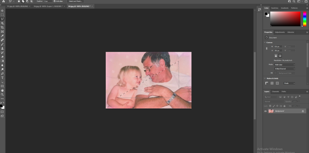
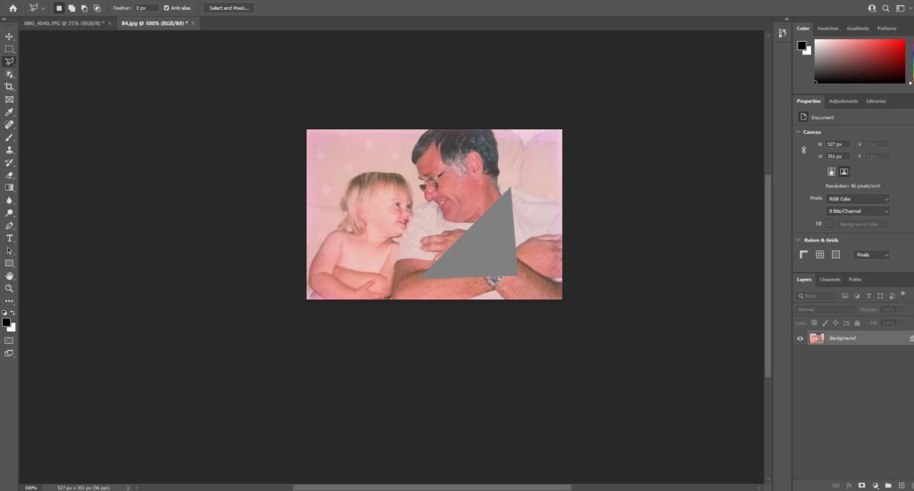
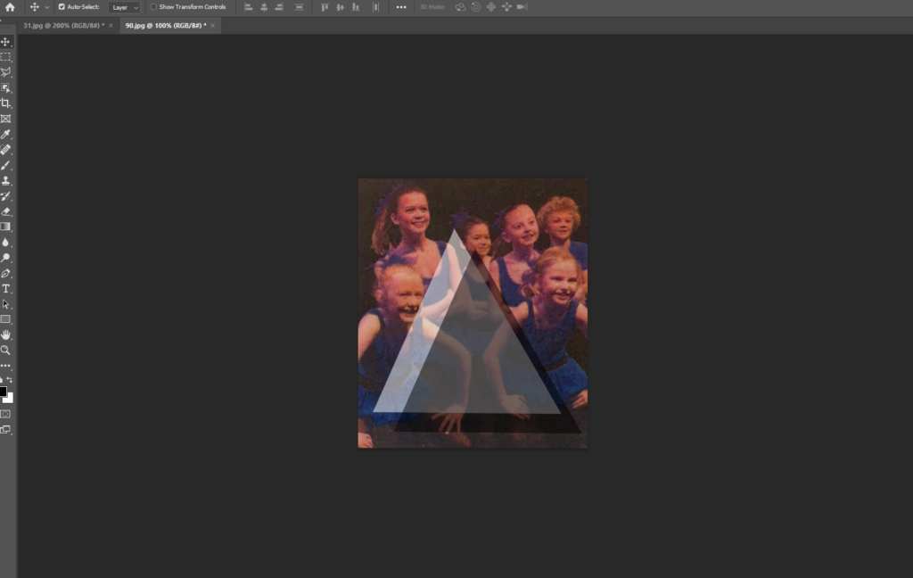
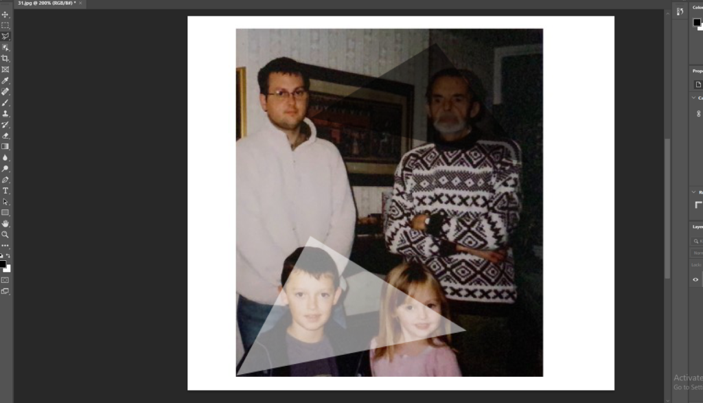
I continued to experiment with the polygonal tool on different images, using different colours shapes and sizes. I liked this experimentation as I felt it added something to the image and gave me freedom to add a different meaning and feel to the image by splitting up the image.
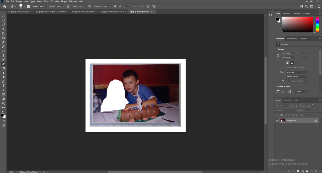
I also experimented with the drawing tool and experimented with cutting people or objects from an image. I didn’t like this option as I felt it looked messy and didn’t represent my intentions well.
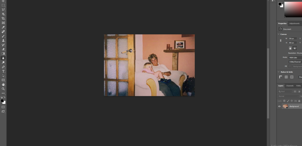
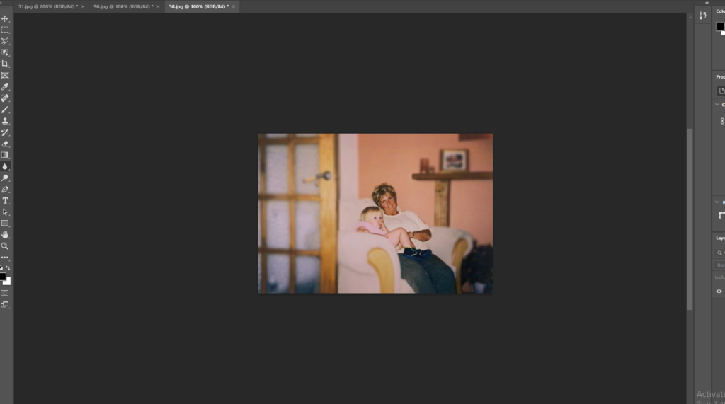
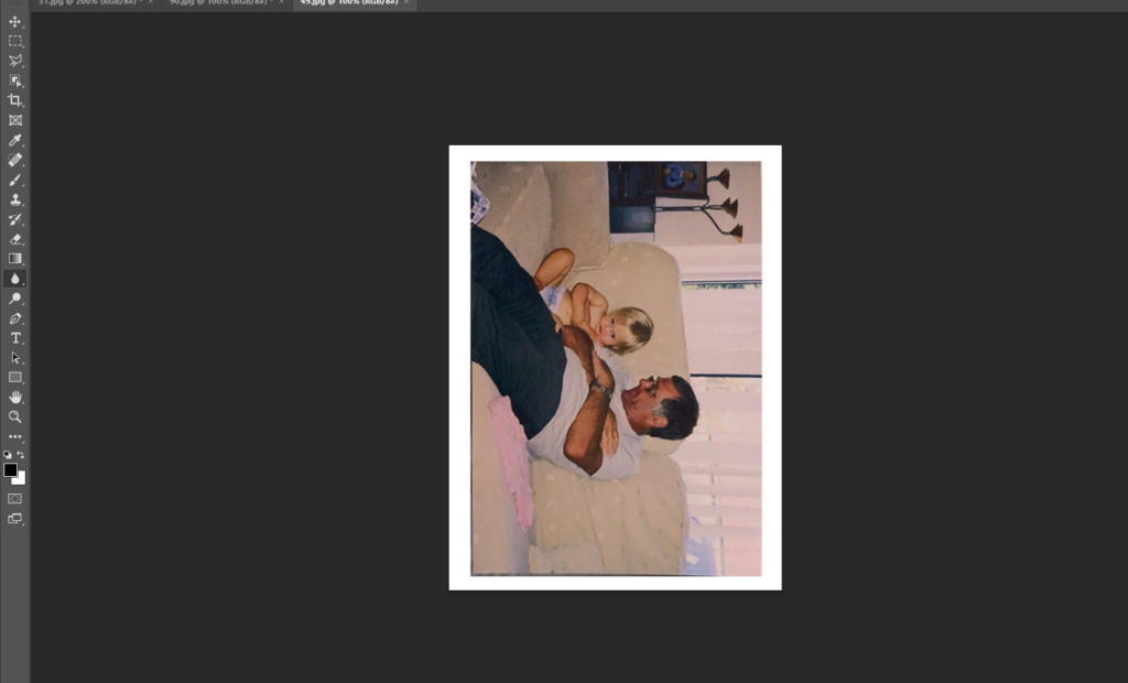
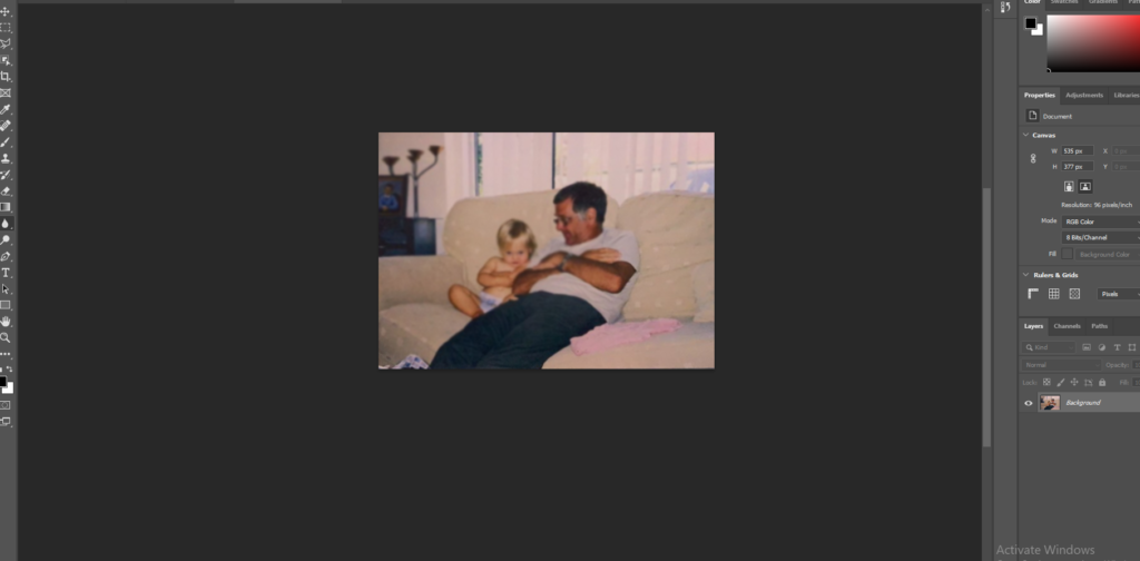
I also decided used the blur tool on a few images. I tried blurring the whole image and just blurring the background of the main subject of the image. I liked this as it created a focus on the subject of the image.
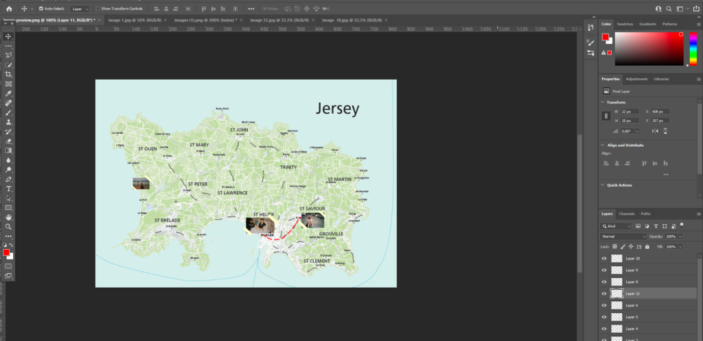
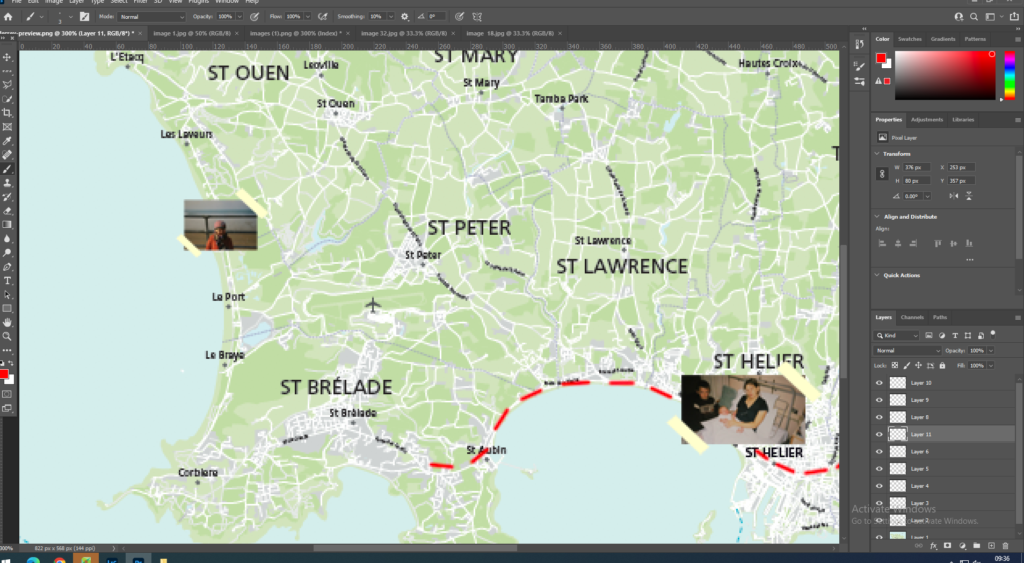
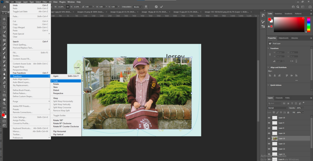
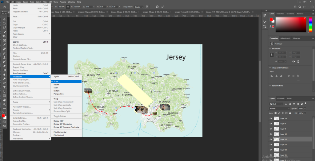
I got an image of a Jersey map and then decided the images I wanted to place on the maps. I then placed these images on the maps and adjusted the scale of the images to the size I wanted by going to Edit > Transform > Scale. I left some images bigger than others as I wanted some images to stand out more than other images.
I then used the brush tool to draw lines between all the images and create a path. I chose to use the colour red for the lines to make the path stand out.
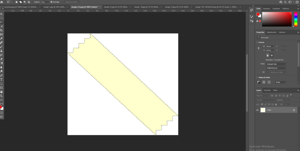
Next I added on some ‘tape’ to make the images look stuck down. I used the ‘Polygonal’ tool to cut out the tape and then pressed Ctrl C to copy the selected part onto the map. I then adjusted the scale doing the same process as I did with the images.
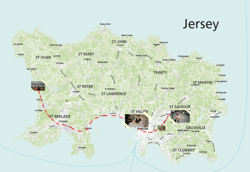
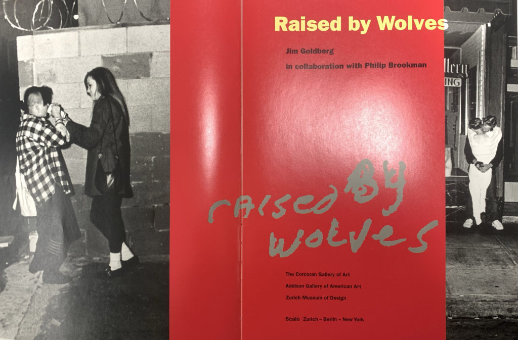
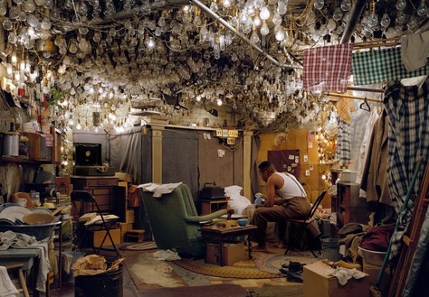
I then took inspiration from an image in Jim Goldbergs book ‘Raised by Wolves’ where he placed images and drew on a map of where he was photographing. I wanted to do this to pin point key images to places around where I live and grew up. I put on images from where I was born to where I first went to school or even core memories.

My work 
Jim Goldberg
Image selection
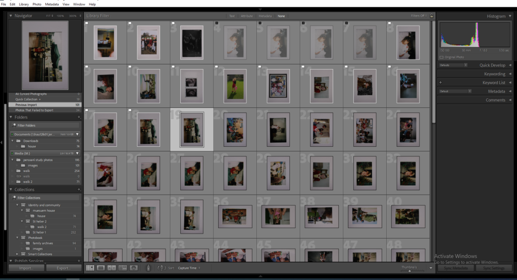
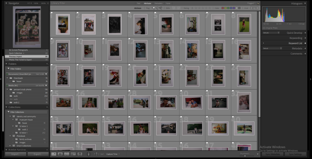
I went through all my images I collected and went through and flagged the images I liked and wanted to start editing and experimenting with. The second image shows all my flagged images.
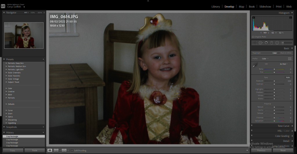
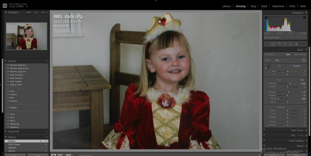
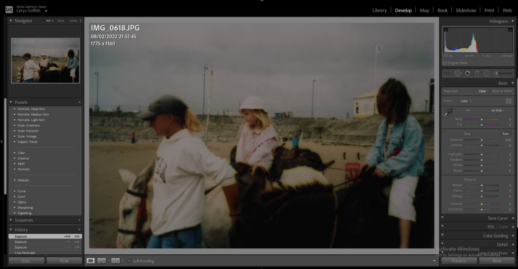
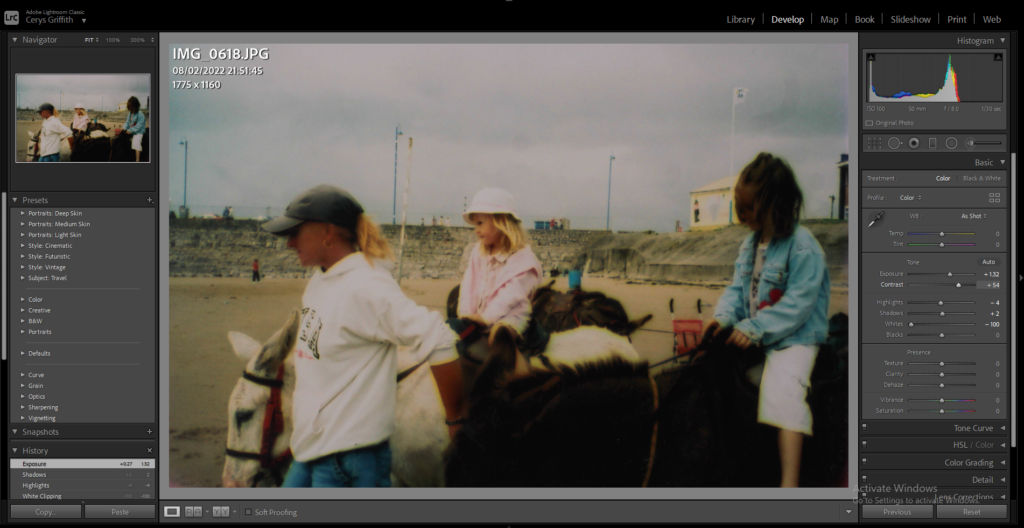
I then went through all my flagged images and began editing them. A lot of my images were very dark so I brightened them up and changed the colours, exposure and contrast on all of the images.
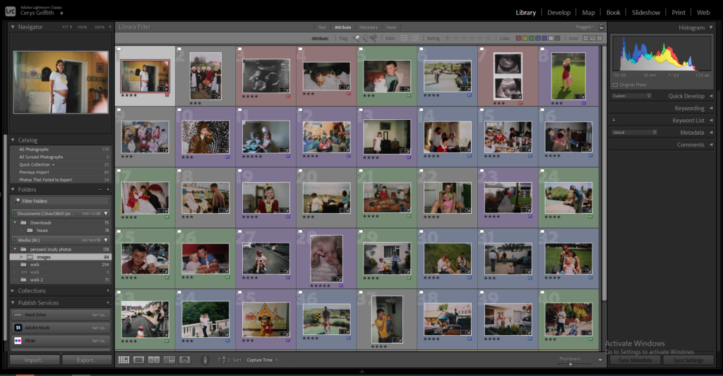
I then decided to colour code my images into different categories, e.g = colours, family members, ages, to make it easier to piece together my final photobook.
Editing
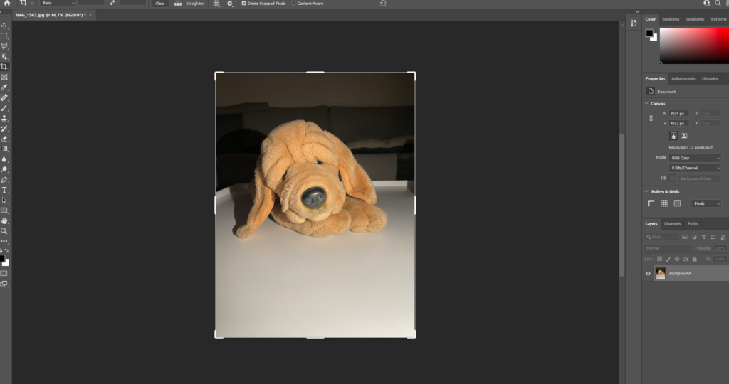
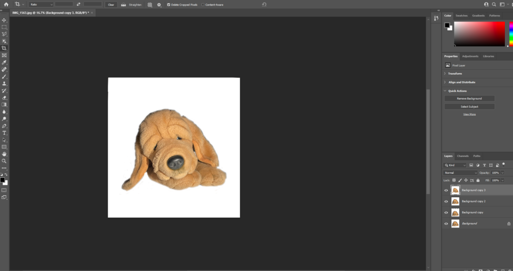
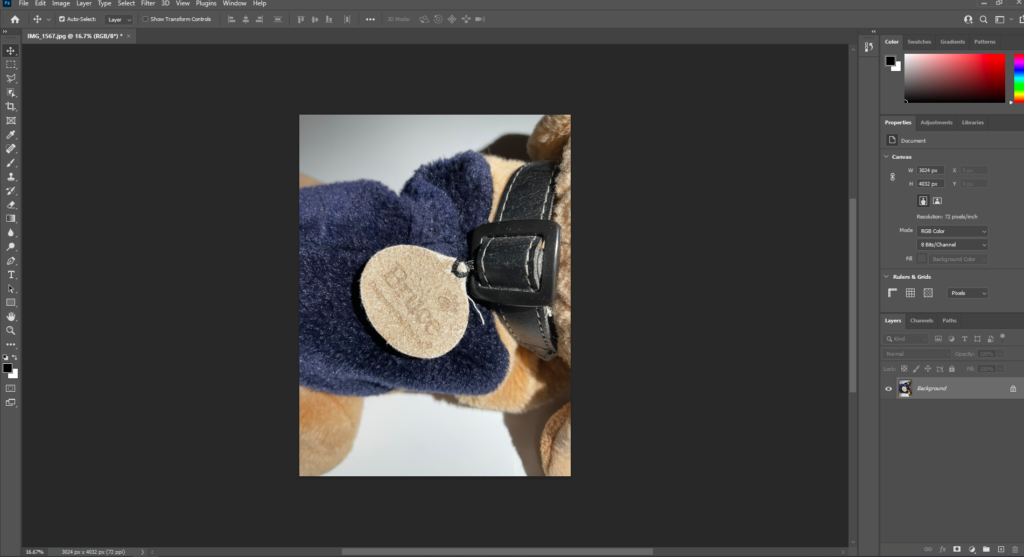
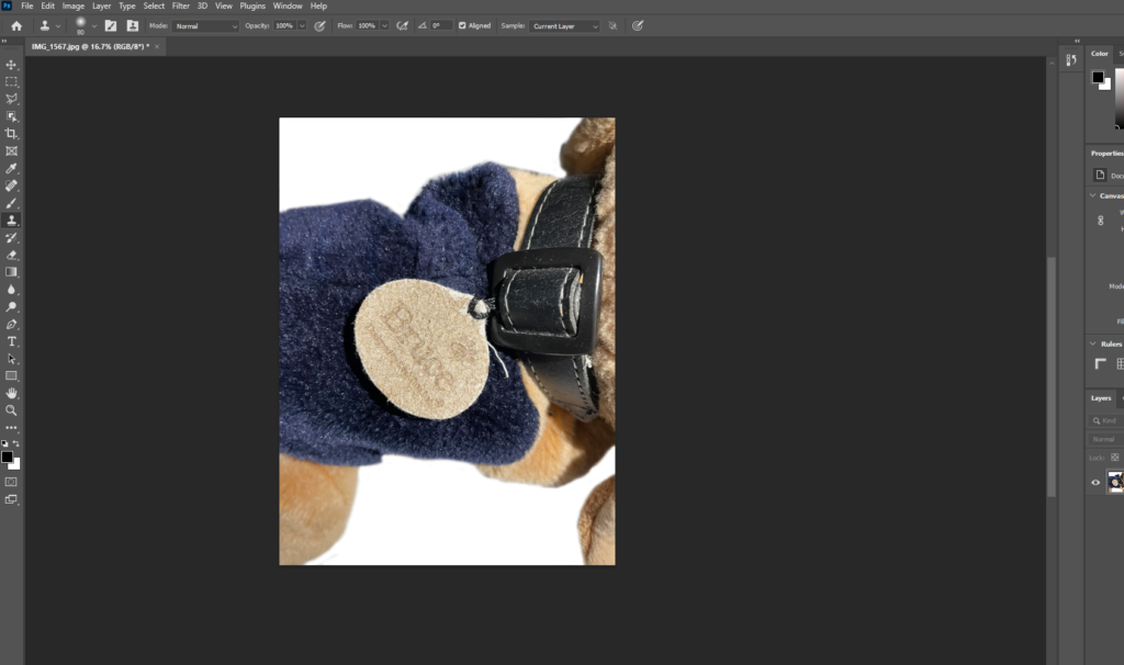
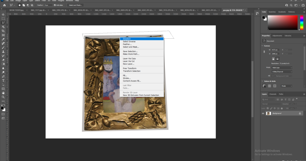
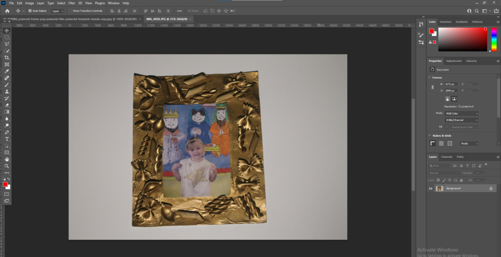
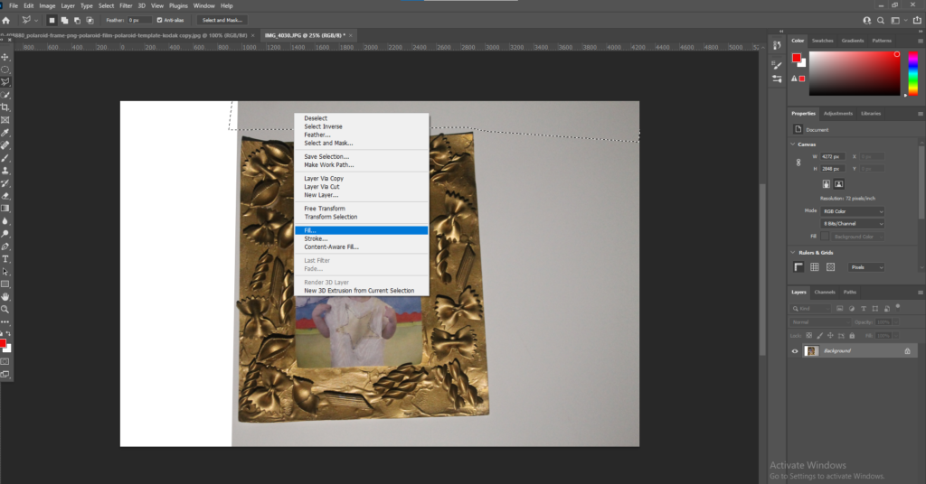
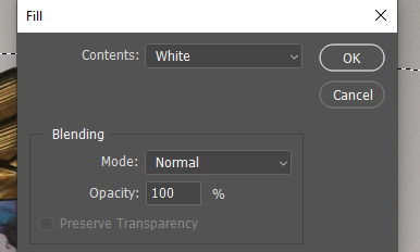
I wanted the images of the objects to have a plain white background so they blended in with the background of the paper in the photobook. To do this I started my using the Polygonal tool and selecting the majority of the background and right clicking on my mouse, it then brings up the option to fill the selected shape. I filled the selection with white to create the white background.
I then used the ‘Clone stamp tool’ to get the finer parts around the object in the image. I help the mouse over the white parts, pressed alt and then with a thin brush went around the object.
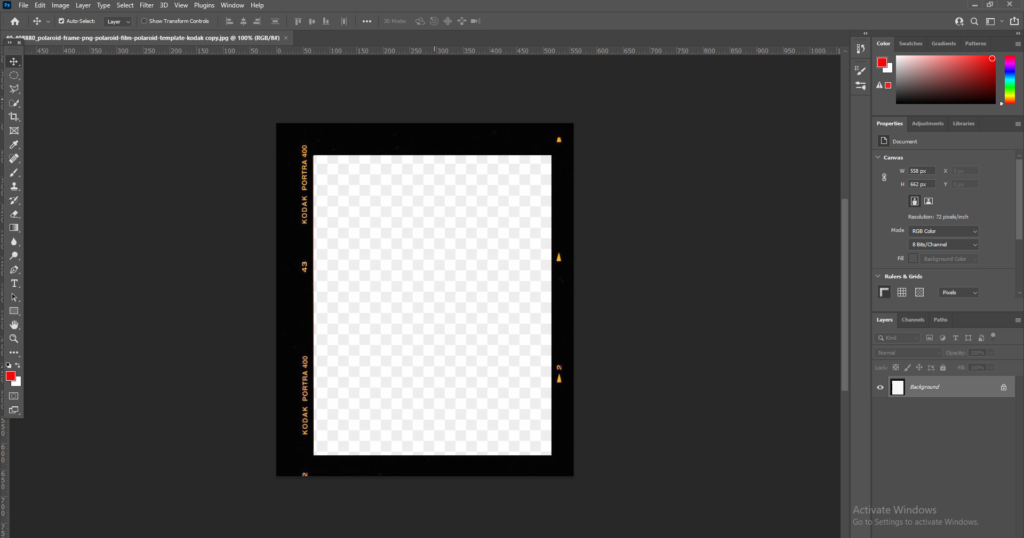
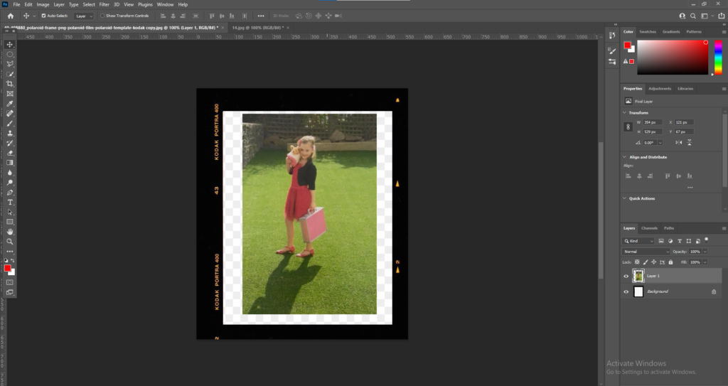
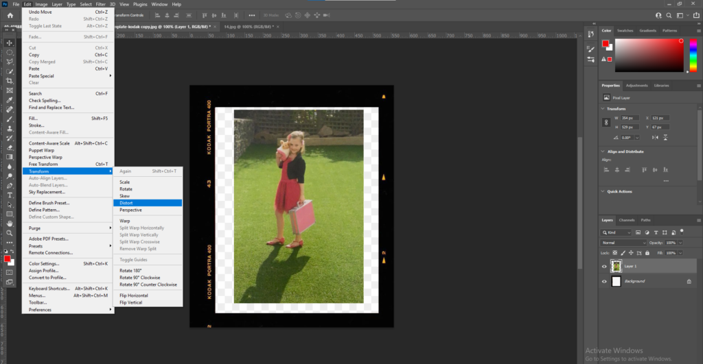
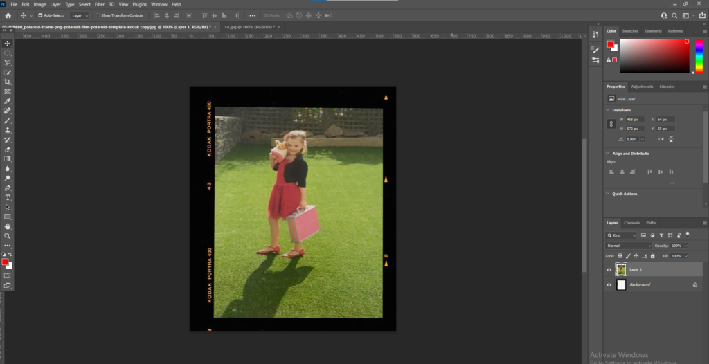
I put lots of my images into a polaroid template as I wanted to create a page in my book full of polaroid’s. To do this I downloaded a polaroid template and opened it within Photoshop. I then placed the image I wanted to use over the top of the template. Then I had to use the distort option in Edit > Transform > Distort and then move the edges to make the image fit into the template.
Inspiration
My main inspiration for my book was from Jim Goldberg’s book ‘Raised by Wolves’. His book was all about the homeless children fending for themselves in Los Angeles and San Francisco. For 10 years Jim Goldberg took to the streets to meet and photograph homeless runaways and then a gather collection of photographs, snippets of conversation, handwritten notes, drawings, snapshots which then created the book ‘Raised by wolves’. Although my book has a very different aspect and meaning behind it I liked the realistic and real view Goldberg took on his book. I also liked the presentation of Goldberg’s book and how he used text to add context and bring the book to life.
Designing photobook
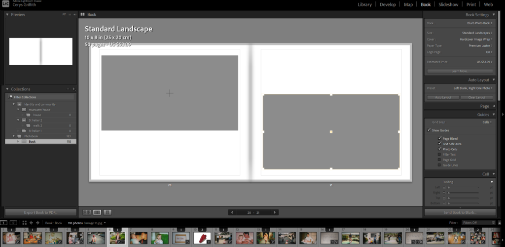
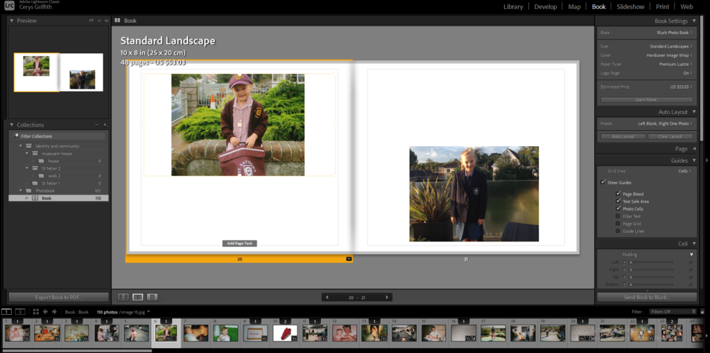
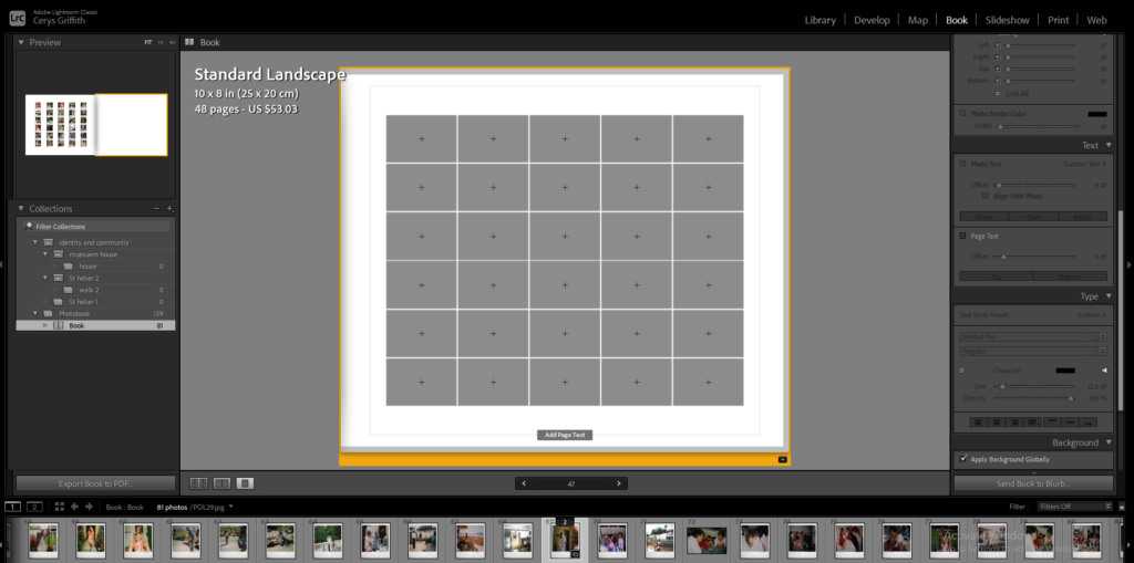
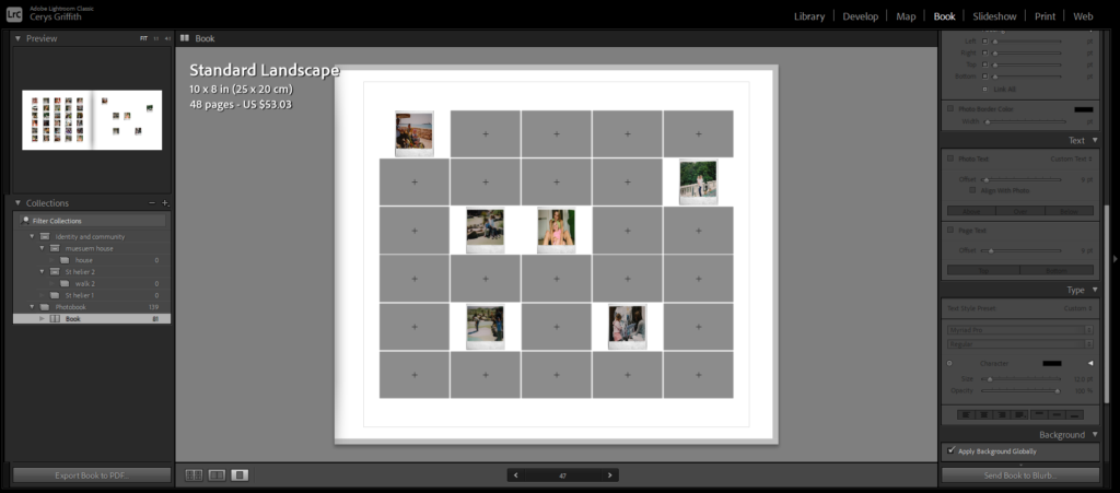
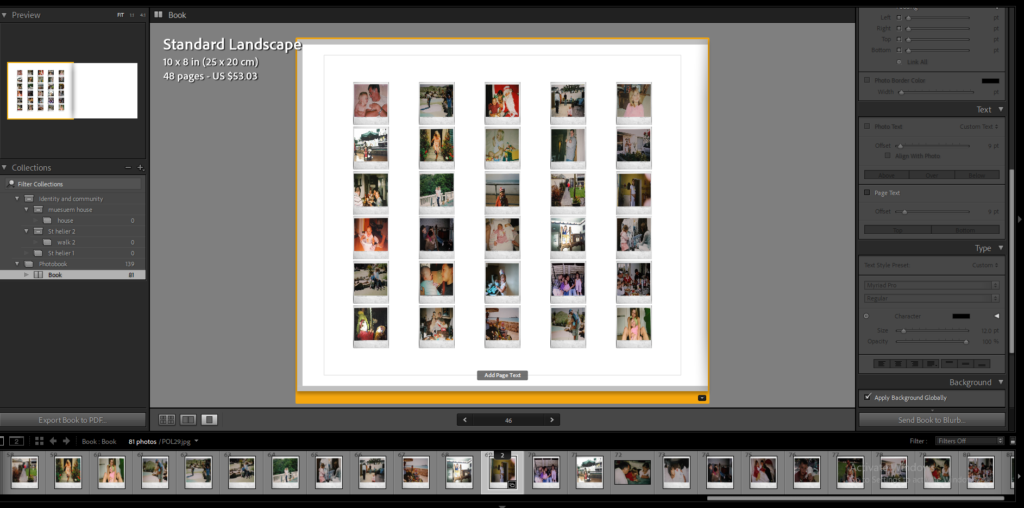
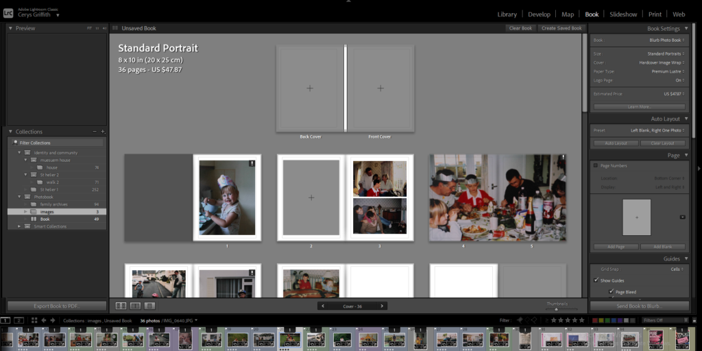
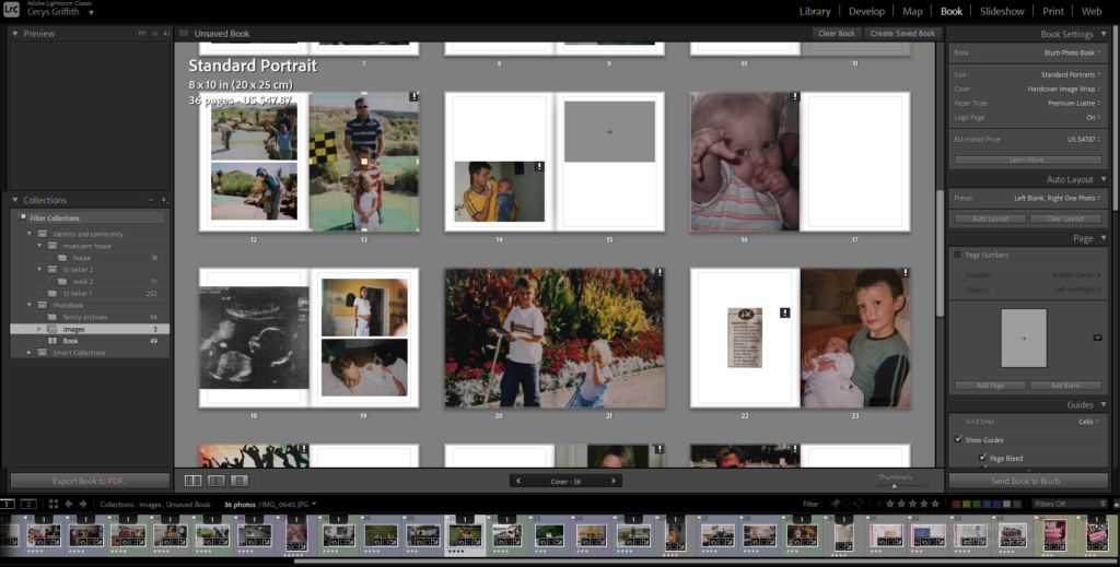
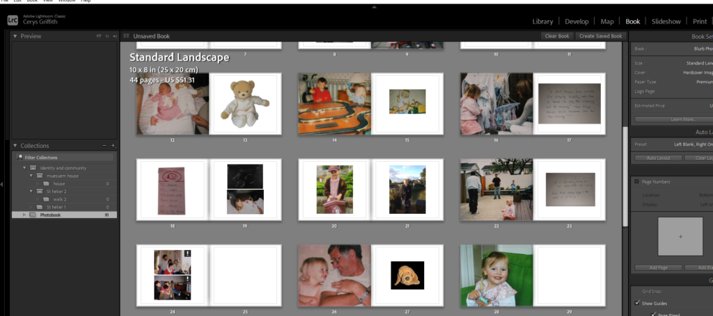
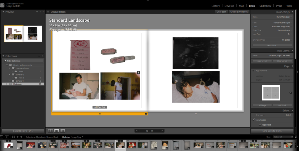
Here I am experimenting with my images to see how I want my final outcome to look and to experiment with different layout options. I experimented with full bleed, images on one side of the page , multiple images on one page. This helped me to gain more of an idea of how I wanted to present my final photobook as I got to see how different images work together and experiment with different juxtaposition’s.
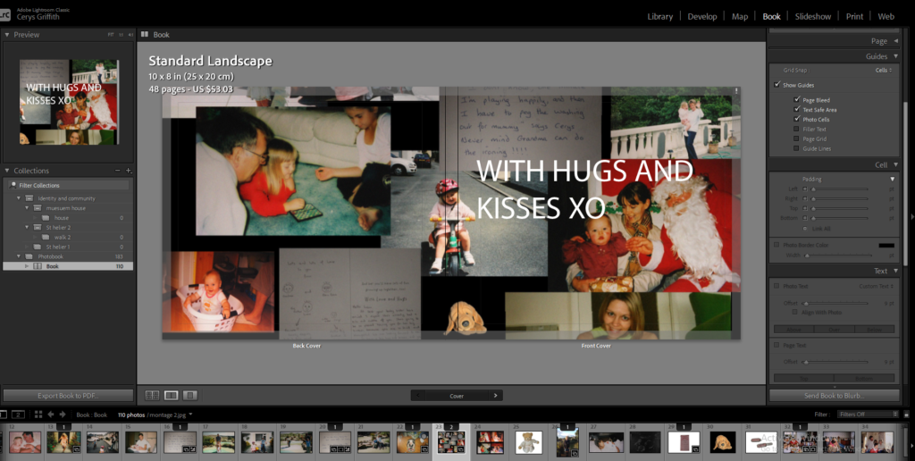
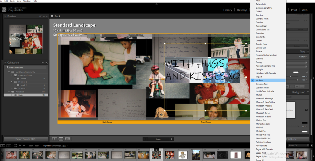
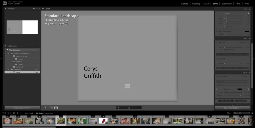
I then had to come up with a title for my book which I took from a card within the photobook. I then changed the the style of the writing to suit my photobook more. I decided to use the font ‘Ink Free’. I also added my name onto the back of my book and changed the colour of my background to a light grey colour.
IDENTITY & COMMUNITY NEWSPAPER
IDENTITY & COMMUNITY Newspaper
The images seen on the pages of this newspaper supplement are extracted from a variety of projects and final outcomes produced over a two-year academic programme of study by a group of A-Level photography students at Hautlieu School. In their final year the themes of Identity and Community offered a specific focus and through a series of creative challenges students developed a body of work that were inspired, partly from visiting heritage institutions to learn about aspects of Jersey’s unique history of immigration and exploring migrant communities and neighbourhoods in St Helier in a series of photo-walks. In the classroom additional inspiration was provided from workshops on NFTs (non-fungible token) and digital art, embroidery and textile art, animation and film-making, zine and photobook design led by professional artists, designers and teachers.
As part of the research and contextual studies students were asked to engage with some of the key questions raised by the Government of Jersey’s Island Identity project and explore through their own photographic studies how they interpret and identify distinctive qualities of island life. What can we learn from looking at a set of photographs produced by young islanders? At first sight they show us a seemingly random set of images of places, people and objects – some familiar, others surprising. On closer inspection each image is a visual sign and also a conundrum. For example, a fish stuffed in a plastic bottle may ask us to consider more closely our marine environment, commercial fishing or food consumption. As a combined sequence of images they represent different views that in many ways comment on a wider discussion on some of the primary objectives explored in the Island Identity project, such as ‘how we see ourselves’ and ‘how others see us.’
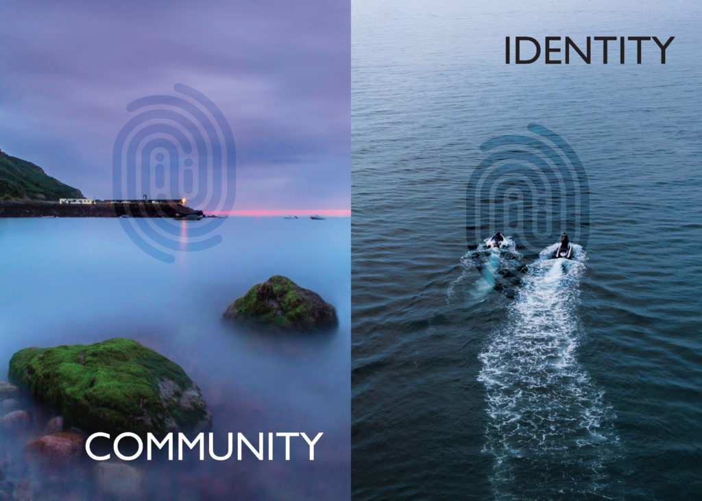
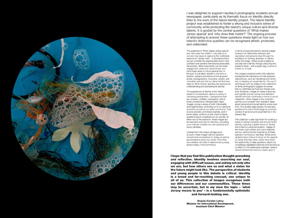
The newspaper was kindly sponsored by Deputy Carolyn Labey, Minister for International Development and Assistant Chief Minister who in her foreword shares her personal thoughts on what makes Jersey special to her in context of the Island Identity project led by her department. She says, ‘identity involves searching our soul, engaging with difficult issues, and asking not only who we are, but how others see us and what a vision for the future might look like. The perspective of students and young people in this debate is critical. Identity is a broad and far-reaching concept, one unique to all of us. This collection of images recognises both our differences and our commonalties. These times may be uncertain, but in my view the topic – ‘what Jersey means to you’ – is a fundamentally optimistic and forward-looking one.’


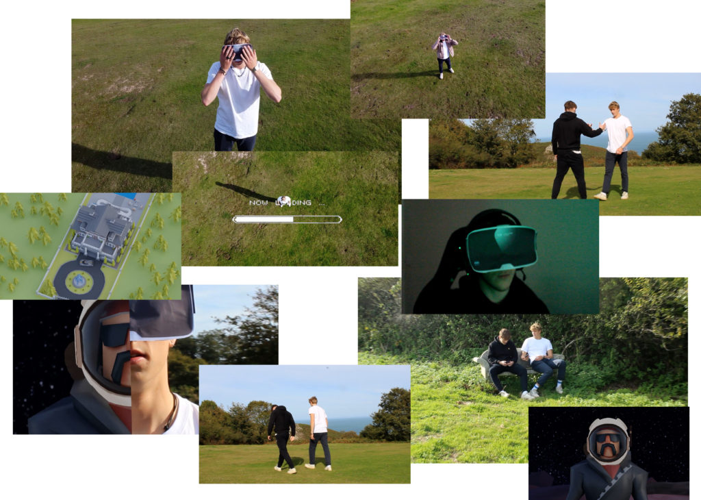
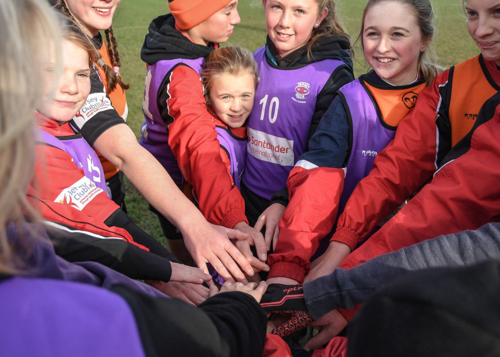
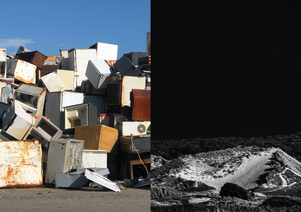
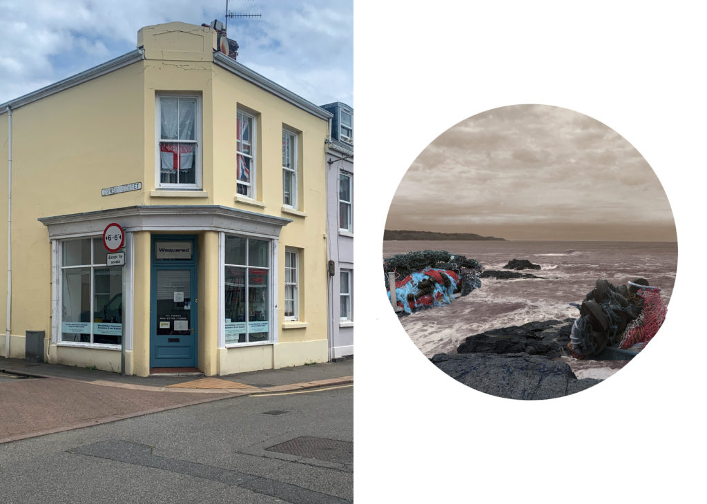


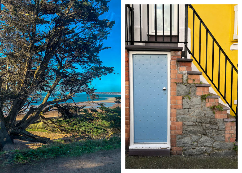


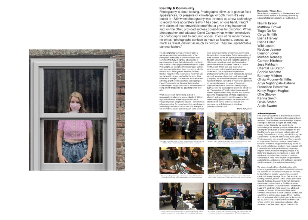
The Identity and Community newspaper is the fourth supplement produced in collaboration between Hautlieu School Photography Department and Jersey Evening Post. In 2018 the first issue was The Future of St Helier and last year the themes of Love & Rebellion explored experiences of isolation and lockdown during the coronavirus pandemic. Photographer and teacher Martin Toft, comments: ‘The question of ‘what makes Jersey special’ matters a great deal to every islander and as visual signs, the images printed on these pages are an attempt – not so much to provide answers – but rather asking questions about the essence of this island we call home, and how it actively will overcome current challenges in shaping a prosperous future for all.’

The image on the left is my image in the newspaper.
Evaluation
All the images above are extracted from 2 years of work from various different projects and students within our A level photography course.
I enjoyed creating the newspaper as I feel it was a good way for me to reflect on all my work from all my projects since the beginning of Year 12. It was a completely new form of presentation compared to how I normally present my work. I felt the newspaper allowed us as a class to show the public all the different topics we have worked on and create a newspaper on all different topics and tie it all together under the topic of ‘Identity and Community’. Creating the newspaper allowed all the photography students to represent their strengths within photography. I used my images from Year 12 as I felt they best fit into the ‘Identity and community’ theme of the newspaper. I chose an image from my zine project when we explored the different cultures within Jersey and photographing different heavily cultured areas to show all the identities lying within Jersey. I liked my image as in the windows where flags representing different cultures with a clothing shop underneath. I am very happy with the final outcome of the newspaper and feel it represents all of our projects well.
newspaper
For our final project of the whole photography A – level all students put together a newspaper based on the theme of ‘Identity and community’. There was a mixture of old and new images from every project.
When creating and designing the newspaper I made multiple My aim was to experiment with different sizes, styles and themes. The task was to create different pages with various different layouts.
Process
To insert my images I had to create a box using the rectangle frame tool, I made the box the size I wanted my image to be.


Then I began editing my images to suit the themes and colours I was aiming for. I adjusted the brightness, contrast and exposure of all the images and cropped and rotated them when I needed to.
Sequence
I began experimenting with the different layouts.
Juxtapositions


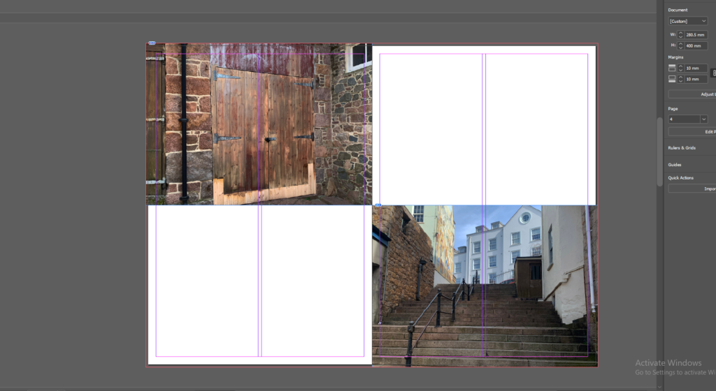


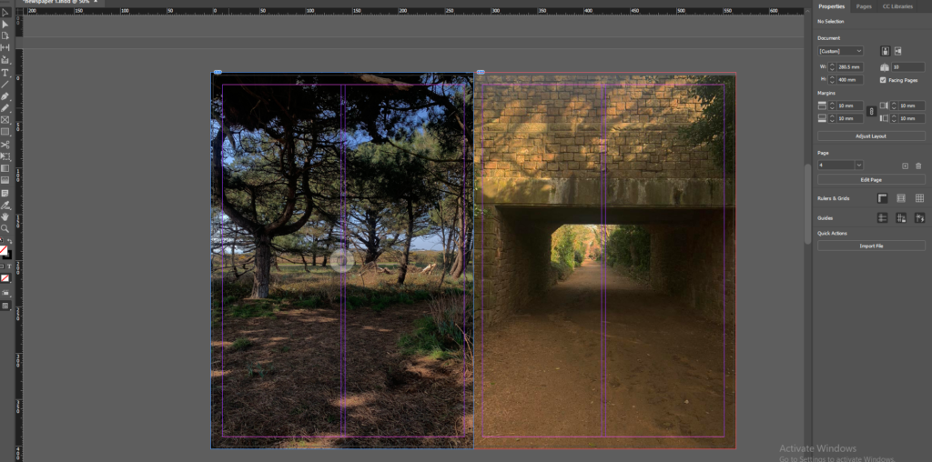
Full bleed


Montage


essay
– How does Jim Goldberg explore childhood through his work
Childhood is seen as being the stages between birth and puberty. Innocent, care-free, happiness and imagination are common words used when describing childhood. There are many stages of childhood, the early stages of a child’s life are when they are learning through observing and communicating with others, usually supported by an adult figure, this forms the beginning of a child’s autonomy. Children start nursery which initiates their social lives and further enhances their communication skills. As a child matures through the different childhood stages they grow into adolescent children and develop massively socially and mentally. They start to make new friends and gain new skills which enables them to become more independent and magnify their own personality and individuality. The onset of adolescence creates various physical, psychological, and behavioural changes. The way a child is brought up and their environment through these stages sets them out for their life.
Homelessness exposes children to environments that can cause danger to their physical and mental wellbeing. Homeless families often have limited access to health care, vaccinations and basic hygiene practises. Children growing up suffering with homelessness are challenged with stressful and traumatic situations which often they are too young to understand which leads to severe emotional distress and can accumulate over time, creating problems in adulthood. These stressful changes often create a higher result of mental disorders, which become exhibited in homeless children’s behaviour.
Jim Goldberg explores childhood in the late 19th Century. Goldberg began creating the ideas behind and photographing ‘Raised by Wolves’ in 1985 and later started assembling the book in 1991. Between the years of 1985 and 1991 Goldberg bore witness to chaotic reality of street life in a culture of urban poverty. Goldberg shows childhood in an ‘unusual’ manner and from a perspective that is not usually related to childhood.
My inspiration for my personal photobook stemmed from Goldbergs ‘Raised by Wolves’ project as I liked his use of a mix of not only images but text and annotations to support his intentions. For my personal study I will be collating my baby photos and objects that have significance to me and photographing them. To create the final outcome of my book I will be using old images, old drawings and diaries and significant objects from my childhood.
Raised by wolves explores street kids as they endeavour their lives full of addiction, abuse, and violence. Goldberg goes out into the streets of Los Angelos and San Francisco and follows these kids around whilst taking an outsider perspective to his project. Goldberg used half-truths and falsehoods in the children’s stories to reflect what people want or need to believe and leave the book open to peoples own interpretations. Raised by wolves transformed the role that photography played as it highlighted the differences between documentary and narrative and revealing the compromises between myth, history, and identity. As an outsider it was difficult to capture the true emotions and create a sympathetic feel for these kids when he hasn’t experienced their lifestyle. Goldberg used a mixture of images and written text to present the children’s personality, thoughts, and feelings. In an interview Goldberg said “I had always been interested in dialectical arguments, or positions… And when I thought of youth, I thought of my own teenage hood and childhood, and other people I knew who were often scapegoated, not appreciated, or not given a chance. The end result was trouble for them. I wanted to look at those people who were outsiders, like I was..” (Goldberg: 2018). Goldberg experienced a childhood of middle class and wanted to give these children a chance to be heard where they would normally be socially rejected.
Solomon-Godeau produced an essay discussing and exploring the concept of inside/out. Solomon-Godeau talks about the aspects of being an insider vs an outsider and the affects it can have on the outcome of an image. Within the essay she dissects the different positions, describing being an insider as “trusting, engaged and empathetic” whereas on the contrary she describes being an outsider as “unsympathetic, voyeuristic and distant.” Solomon-Godeau presents an insider as someone who has lived or is living through what they are trying to capture, thus creating an emotional and intimate image. She sees an outsider as someone who is trying to capture something they have not experienced themselves and the images being emotionless.

Jim Goldberg 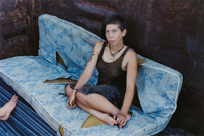
Mike Brodie
These two images from Goldberg and Brodie show the differences being an insider vs being an outsider creates. In Brodies image it shows a more intimate side of the subject, showing where she may sleep or socialise. The subject is looking directly into the camera, looking relaxed and comfortable. Brodies image is raw and intense with emotion. The image is clean with sharp lighting which aids the deep emotions expressed within the image.
Goldberg images looks like a snapshot taken without much thought or composition. Goldberg’s image has little intimacy as he is capturing a teen walking through the street instead of Brodie who captures his subject within their personal space.
Being an insider can thoroughly change and adapt the meaning and emotions presented in an image. As an insider a photography is able to build relationships with the subject and allow them to feel comfortable and relate to the photographer. With Brodie his subjects were able to show their real personalities and their environment as he was one of them and understood what they were experiencing. This can enhance an image as the viewers as seeing the subject’s true self’s and make the viewers feel sympathetic towards the subject’s situation rather than judging them for it. Whereas, with an outsider’s perspective the subject may be putting on some form of an act as this is a new person. They may act and show emotions differently to how they really feel day to day. The subject may not feel comfortable with the photographer and therefore may be reserved and help back which would not properly present the true emotions and meaning behind the images. From a photographer’s perspective they may not fully be able to capture their ideas fully as they have not experienced that themselves, so they are just photographing based off society’s stereotypes and views on that matter. In regard to, Jim Goldberg, he uses text to let his subjects describe their own experiences with their own words to try and gain an insider perspective.
Goldberg found a specific interest in the lives of two boys named Dave and Echo, he was intrigued by their likeable personalities and their crowds of friends. He began to form a close relationship with these two teens and became immersed in their lives. Dave and Echo were two fascinating but extremely troubled runaways. Dave described his highly Christian parents as a junkie slut and a biker from hell, although untrue the representation seemed fitting for a couple who then went on to turn their back on their dying son. Goldberg uses narratives to give more of a close formed relationship between the subject and the viewer. The narrative makes the viewer feel empathy for the subject rather than judging them. Goldberg challenges the norm and the stigma behind homeless, troubled youths and creates a different image for the viewers.
Dave and Echo have a special part within the book as they talk more deeply about their childhood and their upbringings which Goldberg presents in an interview manor. Goldberg uses a collection of photographs, pieces of conversations, handwritten notes, drawings, snapshots, and the routine of daily life to show these children’s childhood and how their lives and routines is completely different to most teens their age. He presents their personalities, histories, and dreams to give these teens equal attention, and allowed them to present themselves in their own words allowing them to properly express their feelings when they may have not normally had the opportunity.
Although Goldberg does not present a typical childhood, he is capturing the childhood and day to day lives of teens with an unusual life.
In conclusion, Goldberg’s photobook ‘Raised by wolves’ presents childhood in an unusual way and presents children and youths who would typically not been given a chance. Goldberg uses a combination of images, text and diary entries to represent the youth’s thoughts, views and emotions. Goldberg takes an outsider’s approach to Raised by Wolves as he has never experienced that type of lifestyle which is a hard approach to take when trying to present a group of ‘socially rejected’ people which is why he supports his images with text so the subjects themselves so he can also gain an insider’s view. Goldberg’s book is similar to Mike Brodies photobook “‘A period of Juvenile Prosperity” in the fact they both went out exploring and capturing runaway homeless teens. However, Brodie takes an insider’s approach as he was one of the homeless teens and therefore he just captured the people he was surrounded by and the environments which they stayed in. The difference between and outsiders’ perspective can entirely change the way a viewer interprets the book and the emotions presented from the subjects. Solomon-Godeau discusses this concept within her essay ‘Inside/out,’ discussing the different concepts and how this can affect one’s images and final outcome.
Bibliography
Solomon-Godeau, A. (1994), Public Information Desire, Disaster, Document. San Francisco: SFMOMA.
Jim Goldberg (2018), Magnum Photos, A Completely True Work of Fiction.
Jim Goldberg (2021), Magnum Photos, Fingerprint: Tracing the Roots of Jim Goldberg’s Raised by Wolves.
Miss Rosen (2021) Blind magazine, Tracing the Roots of Jim Goldberg’s “Raised by Wolves”.
personal study – inspirations
Identity mindmap:

I created a mindmap based on my initial ideas for my personal study. I started by finding some topics which interested me and then developed those ideas and started thinking about how I could turn these ideas into a shoot. I found this helped me to then go on and create a moodboard with artist references and helped me to clearly pick and find a theme that I was most interested in and had the more inspiration for.
Childhood
John Stezaker
John Stezaker was born in 1949 in Worcester, United Kingdom, and attended the Slade School of Art in London and graduated in the 1973. He is a contemporary British conceptual artist who is best known for his collages of found images taken from postcards, film stills, and commercial photographs. Stezaker’s work resembles early-Surrealist and re-examines the various relationships to the photographic image. Through his careful juxtapositions, Stezaker adapts the content and contexts of the original images to convey his own meanings. He adds meaning to his images by intertwines images of landscapes, famous portraits and layers them creating silhouttes and curves. He creates interesting and fascinating small-format collages that have qualities of Surrealism. Stezaker said “My ideal is to do very little to the images, maybe just one cut: the smallest change or the most minimal mutilation” as he feels what he does is destructive however also has meaning behind the actions. His works have been featured at many museums such as The Museum of Modern Art in New York, the Tate Modern in London, the Tel Aviv Museum of Art and many more.
Ken Nwadiogbu
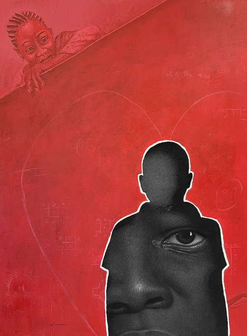
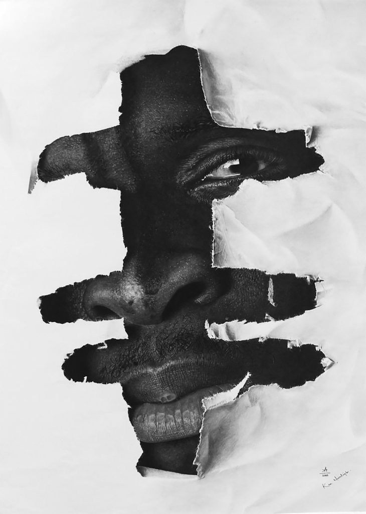
Ken Nwadiogbu is a visual artist who creates innovative conceptual drawings on various surfaces as he engages in multidisciplinary modes of storytelling. His interest in art, as well as his career began while earning his degree in Civil and Environmental Engineering despite the fact he had no formal training. His work was inspired by issues which related to him and those around him as he grew up, he began creating works that reflect his society with the hopes of making a change within his community. He calls his method of work contemporealism which is a fusion that is centered around hyper realism and contemporary art. Gender equality, African culture, and Black power are a few aspects of his current research and artistic practice. Nwadiogbu work constitutes a silhouette of a human, which he embeds an eye or parts of a face into his ultimate theme of creating consciousness to what represents our collective reality through art. Ken Nwadiogbu is constantly revitalising his practice by challenging modes of Black representation and he is constantly updating how he works by using new variants of photography to present his work for example NFT’s.
Jim Goldberg
Jim Goldbergs was born in 1953 and is an American artist and photographer whose work reflects long-term collaborations with those who face neglection, been ignored, or otherwise outside the mainstream populations. Goldberg is best known for his photography books and multi media exhibitions especially for his trio serious of photography books called Rich and Poor, Nursing Home and Raised by Wolves. Goldberg is part of an experimental documentary movement in photography, using a straightforward approach based on a fundamentally narrative understanding of photography.
For my project I will be focusing on Goldbergs book ‘Raised by wolves’ which combines ten years of original photographs and text, home movie stills, snapshots, drawings and diary entries. He used this book to document the lives of runaway teenagers in San Francisco and Los Angeles. From 1985-1995, Goldberg was working on the streets of Los Angeles and San Francisco getting to know numerous homeless teens and building the relationships that would come to form the basis of Raised by Wolves.
art movement + isms, pictorialism + Modernism
Pictorialism
Pictorialism is an international style and aesthetic movement that dominated photography during the later 19th and early 20th centuries. It was an approach to photography which emphasized beauty of subject matter, tonality, and composition rather than the documentation of reality and was an imitate of art.
Time period:
1880 – 1920
Key Characteristics:
From the 1880s and onwards photographers strived for photography to be art and resemble hand made art by trying to make pictures that resembled paintings e.g. manipulating images in the darkroom, scratching and marking their prints to imitate the texture of canvas, using soft focus, blurred and fuzzy imagery and using Vaseline on their lenses.
Artists associated –
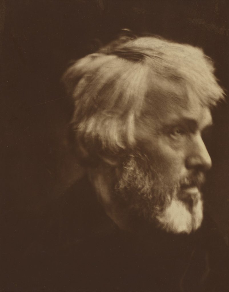
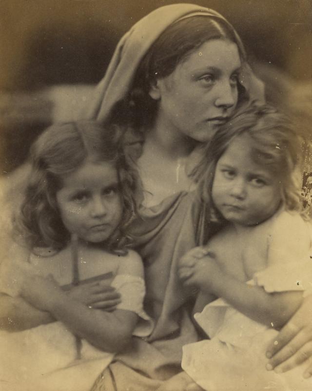
Julia Margaret Cameron
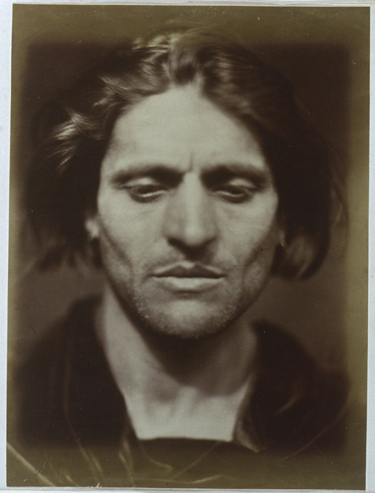
Julia Margaret Cameron was a British photographer who is considered one of the most important portraitists of the 19th century. She is known for her soft-focus close-ups of famous Victorian men and for illustrative images depicting characters from mythology, Christianity, and literature. In her works in particular, her artistic influence was Pre Raphaelite, with far away looks, limp poses and soft lighting. Cameron’s photographs were unusual in their intimacy and she had a visual habit of created blur through both long exposures, where the subject moved and by leaving the lens intentionally out of focus.
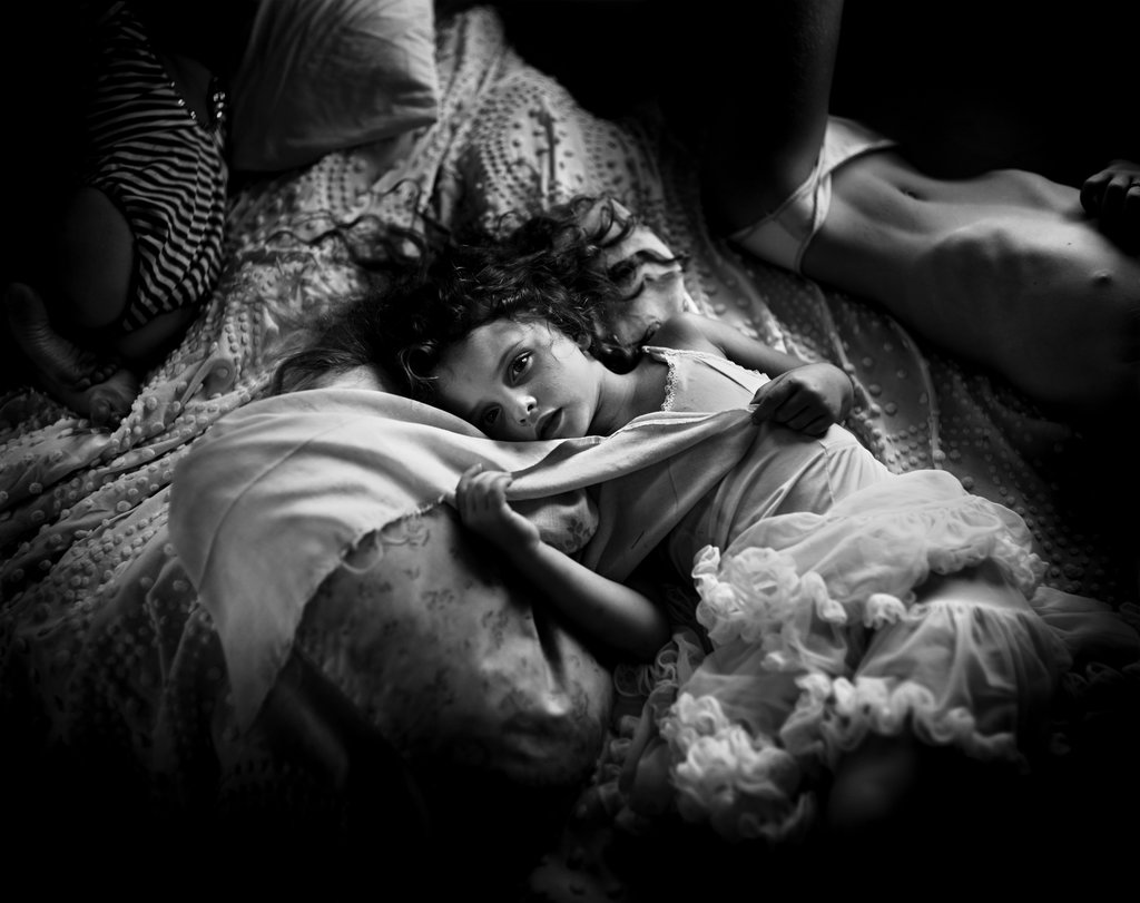
Sally Mann
Sally Mann is an American photographer, widely known for her large-format, black-and-white photographs, at first of her young children, then later of landscapes suggesting decay and death. Mann created a haunting series of photographs that tells a story about the one subject that affects us all, the loss of life. She created a project called ‘What Remains’ which was created in 2004 is a five part meditation on mortality and explores the ineffable divide between body and soul, life and death, spirit and
earth. In ‘What remains’ Munn reflects on her own personal feelings towards death as she examines the boundaries o contempary photography.
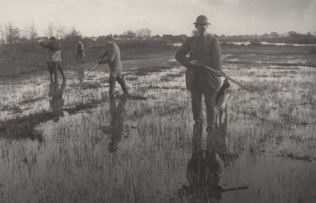
Peter Henry Emerson
Peter Henry Emerson was born 13th May 1856 and died 12th May 1936, he was a British writer and photographer. His photographs are early examples of promoting straight photography in an art form. Emerson is known for taking photographs which displayed rural settings and for his disputes with the photographic establishment about the purpose and meaning of photography. Initially he was influenced by naturalistic French painting, he argued for “naturalistic” photography and took photographs in sharp focus to capture country life as clearly as possible. His first photo album was published in 1886 and was titled ‘Life and Landscape on the Norfolk Broads‘ and it consisted of 40 platinum prints that were inspired by these ideas. However after a while he became dissatisfied with rendering everything in sharp focus, as he didn’t like that the undiscriminating emphasis it gave to all objects was unlike the way the human eye saw the world. He then started experimenting with soft focus, but was unhappy with the result of this aswell. He was experiencing difficulty with accurately recreating the depth and atmosphere which he saw as necessary to capture nature with precision. Although he was getting frustrated with his photography he carried on to take many photographs of landscapes and rural life in the East Anglian fenlands and went onto publish seven further books of his photography through the next ten years.
Modernism
Modernism was a broad movement surrounding all the innovative isms of the first half of the 20th century. Although different modern-isms were often incompatible they all rejected the dominance of older movements such as Classicism and Naturalism in favour of new experimental ways of producing art.
Time period:
Early 1900s and continued until the early 1940s.
Key Characteristics:
It was a broad movement encompassing all the avant-garde isms of the first half of the 20th century. Early modernity is characterised by a belief that science could save the world and that a foundation of universal truths could be established.
During the modernism photographers began to embrace its social, political and aesthetic potential by experimenting with light, perspective and developing, as well as new subjects and abstraction.
Surrealism
Surrealism was founded in Paris in 1924 by the poet ‘Andre Breton’ and continued Dadaism’ exploration of everything irrational and subversive in art. Surrealism was more explicitly preoccupied with spiritualism, Freudian psychoanalysis and Marxism. It aimed to create art which was ‘automatic’ which meant that it had emerged directly from the unconscious without being shaped by reason, morality or aesthetic judgements. The Surrealist also explored dream imagery an they were an important art movement within Modernism involving anything from paintings, sculpture, poetry, performance, film and photography.
Artists associated:
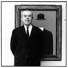
Rene Magritte
René François Ghislain Magritte was born on the 21st November 1898 and died on the 15th August 1967. In the 1920s, he began to paint in the surrealist style and became known for his witty images and his use of simple graphics and everyday objects, giving new meanings to familiar things. Often his images were depicting ordinary objects in an unusual context, his work is known for challenging observers’ preconditioned perceptions of reality. His imagery has influenced pop art, minimalist art, and conceptual art. Magrittes earliest paintings date back to 1915 which then sparked his career in surrealism. With his art becoming more and more popular he was able to pursue his art full-time and was celebrated in several international exhibitions.
Post Modernism

Post modernism was a reaction to modernism and was influenced by disenchantment brought on by the second world war. Postmodernism was the collective name given to the shattering of modernism. In photography this was the direct challenge to the ideal of fine art photography whose values were established on an anti-commercial stance.
Time Period:
Late 20th century
Key Characteristics:
Postmodernism makes references to things outside the art work, e.g. political, cultural, social, historical,psychological issues.
Postmodern work are aware of and make reference to the previously hidden agendas of the art market and its relation to art museums, dealers and critics.
Postmodern work often uses different approaches in the construction of the work such as collaboration, parody, recycling and reconfiguration.
Postmodernism favours the context of a work including examining subject and the reception of the work by its audience.
Artist associated:
Jeff Wall
Jeff Wall was born in 1946 in Vancouver, Canada, where he still lives. Wall is a leading contemporary photographer whose work is concerned with ideas about the nature of images, representation, and memory. He has been producing carefully staged photos since the end of the 1970s.
nft editing process
Video plan:
Video:
Our video will have transitions in the title for example we included a gradient/fade into the next clip so the everything went together smoothly. We also included montages/transitions like having multiple clips playing at the same time sharing a screen all in small boxes spread out around the screen.
Title and credits:
We wanted to include a credits page and a title page, we made this on photoshop then imported it into Adobe premiere.
Music: We chose to get music from each decade to place over the clips from that decade which we will use YouTube Audio library, download the music and then import into premiere.
Sound effects: We used the Media sound effects to get the sound effect of a phone ringing for when the phone is put down in the first clips.
Editing process film
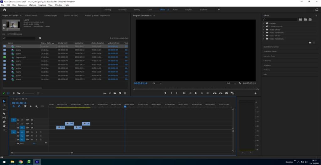
Here I imported the files and cut out the sections of the clips we didn’t need to make the clips sync and create shorter clips.
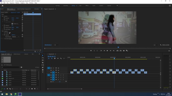
Then we positioned the videos so that they fit the frame by using the left hand panel and altering the ‘scale’ and ‘positioning’.
Cropping the clips
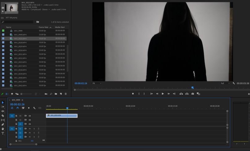
Then I cropped the beginning and end off of the clip to leave me with a clean cut clip with only the parts of the video I needed.
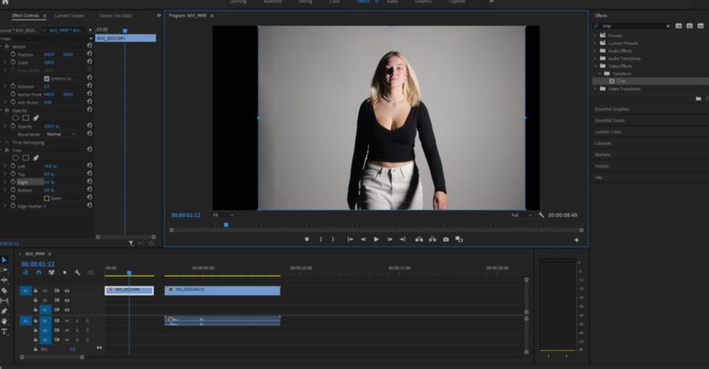
I added each clip to the timeline one at a time and carried on cropping the clips to leave us with only the parts we needed and to ensure all the clips aligned.
Layering clips
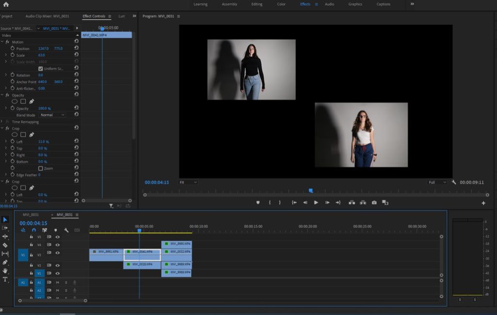
To layer the clips and create more than one clip on the screen at once I had to:
– Selected effects control in the top left
– Adjust the scale of the image which made the clip box smaller allowing the space for one than one image
– Then I adjusted the positioning of each clip which allowed me to move the clips to the sides and up and down

I then did this again but adding 4 clips onto the screen instead of 2.
Changing speed of clips
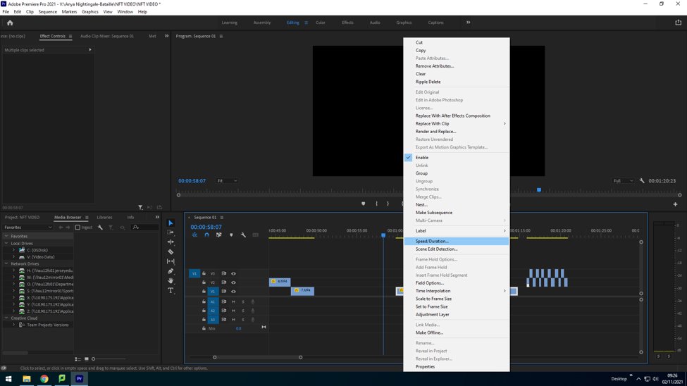
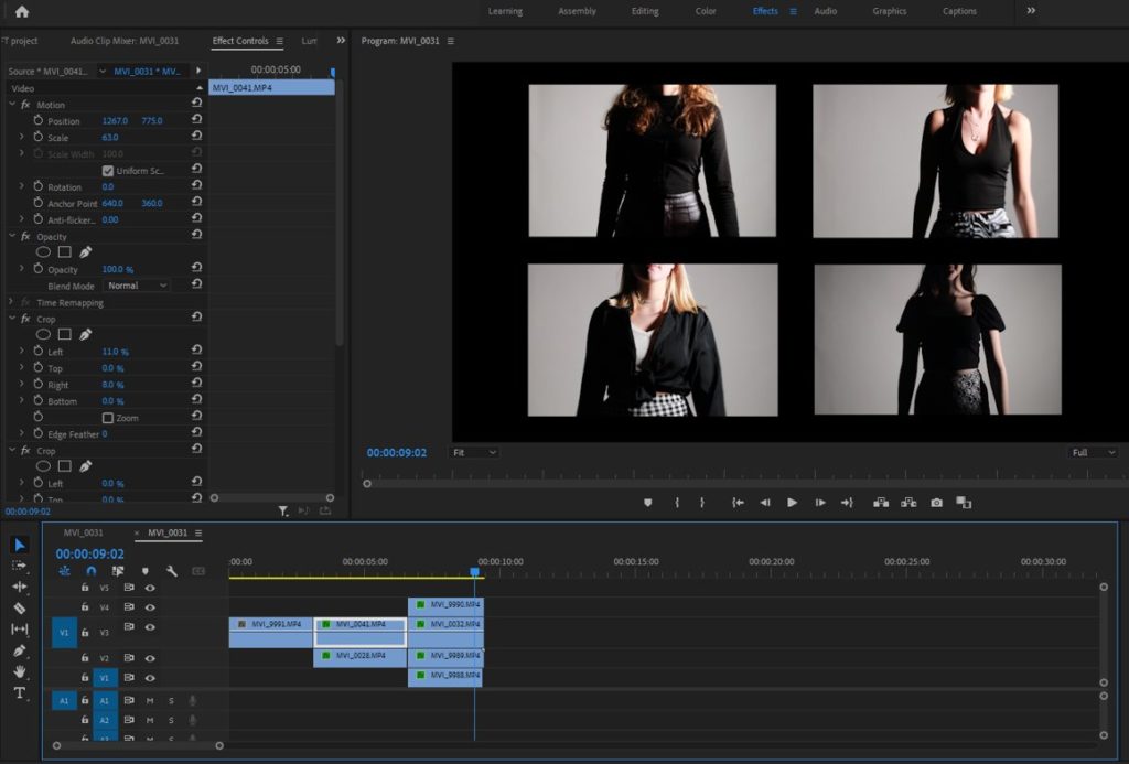
Some of our clips were too fast or faster than other clips which meant we needed to adjust the speed. We also had a period in over videos were we sped up all our clips to create a fast paced clip.
To do this I right clicked and selected the “speed duration”. Then change the percentage to make the clip faster or slower.
Title
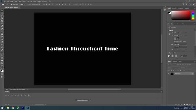
We then made the title page on Adobe photoshop. We decided to use a black background with a central white written title.
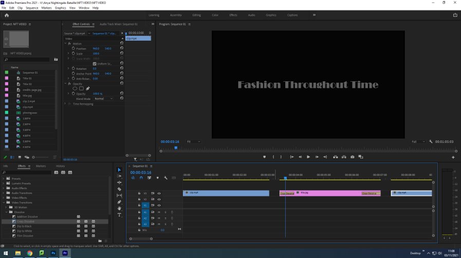
Then we imported it into premiere and added a ‘dissolve’ transition to the start and end of the title page to let it flow in-between scenes.
Editing process image
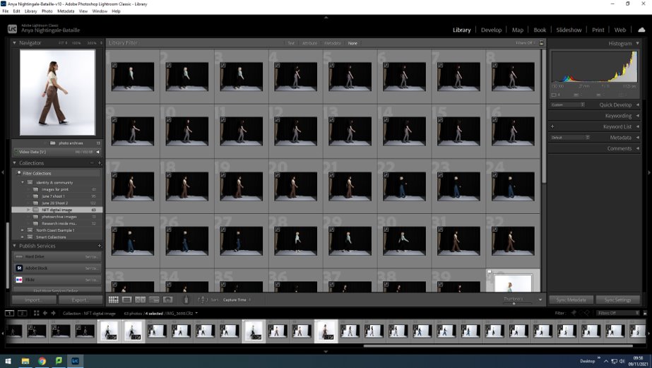
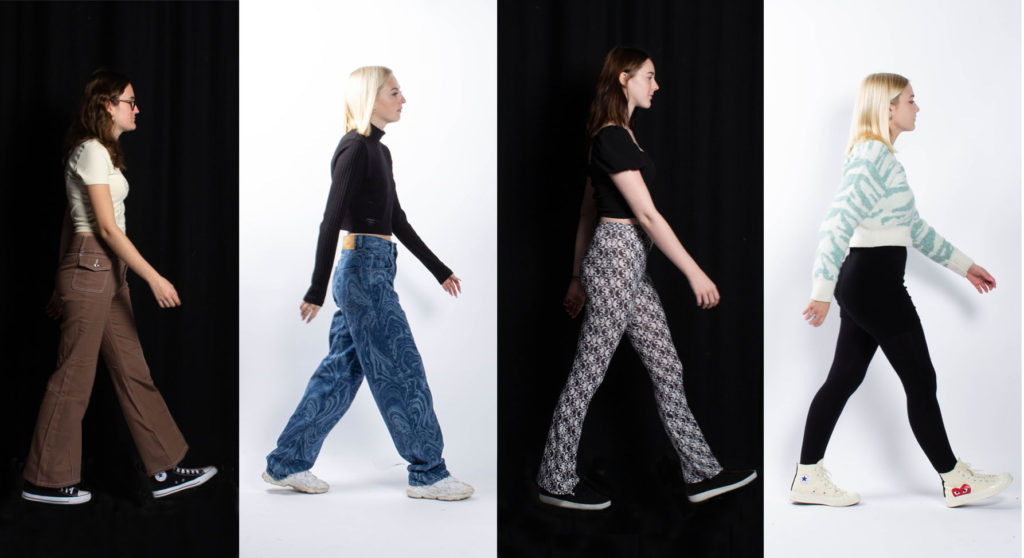
To start our still image we imported the images we took into Lightroom and flagged the images we wanted to use for our digital image. Our images consisted of the 4 people from the group, each in a different outfit from a different era.
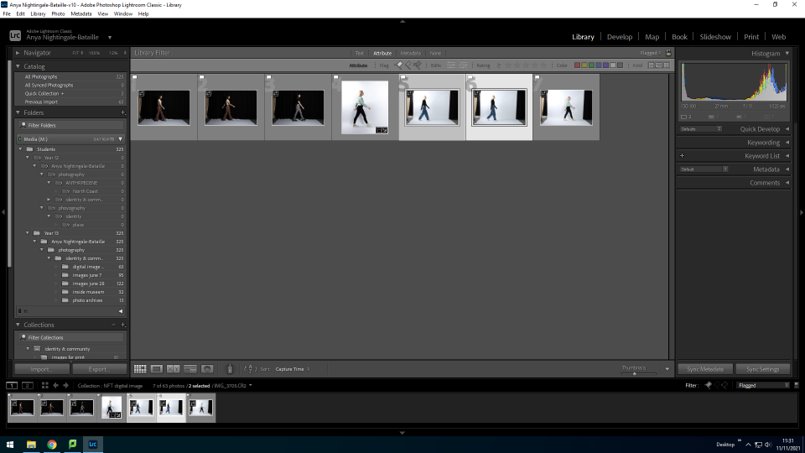
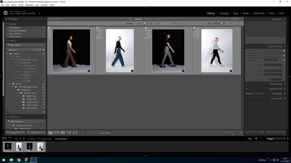
We then had left 4 flagged images which we felt were out best images and the ones we would use to create our final image. Now that we have our 4 final images we began to edit each image by adjusting the background, brightness, contrast, exposure and highlights.
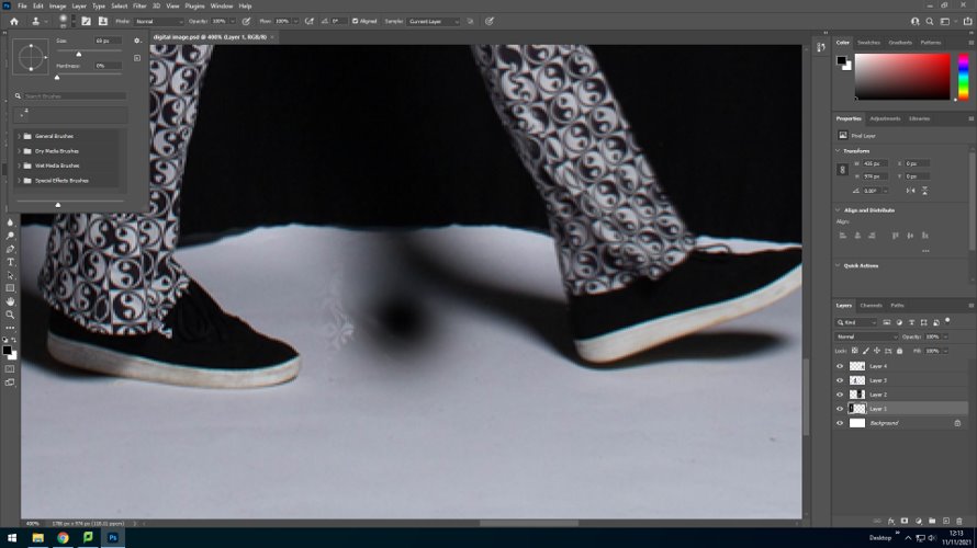
Some of our images with a black background had a white floor which we had to edit to create a fully black background for the image. To do this, we opened the images in Photoshop and used the ‘Clone Stamp tool’ and selected a black area and drew around the feet.
Once edited our images went from this:
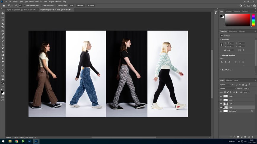
To this as our final outcome:
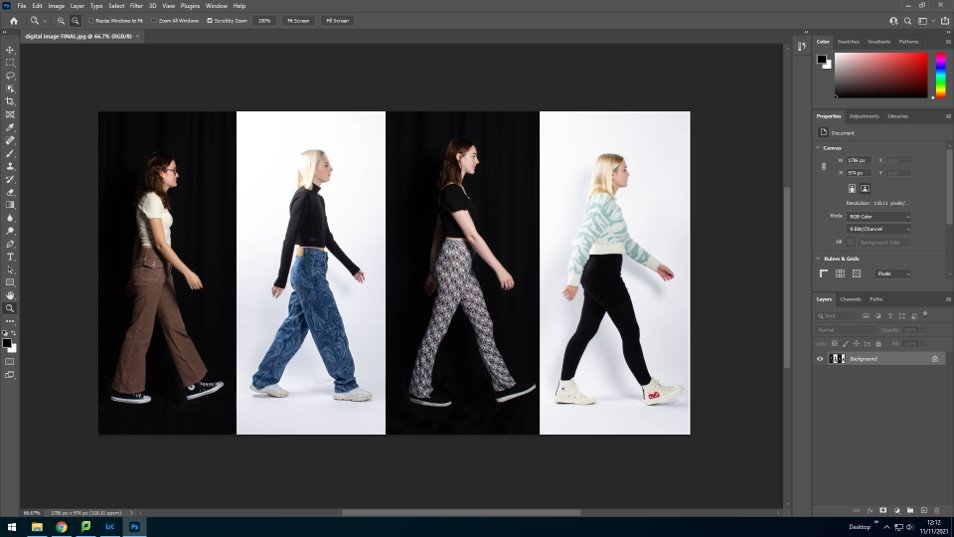
Final still image
Final NFT video
https://web.microsoftstream.com/video/8c3bf225-0b55-436d-9ce7-387214bea506
personal study statement of intent
What you want to explore?
In my personal study I am going to be exploring the theme of Identity. Identity is the qualities, beliefs, personality, looks and expressions that make a person. In my study I will be looking into my childhood and objects and drawings from my childhood which I will incorporate into creating a book. I have chose to explore this as it is personal to me and so therefore I feel I can fully capture all the emotions and meaningful imagery that I need to represent my childhood and how that has shaped me into the person I am today. I feel that I will be able to create a more meaningful project as it will be relative and personal to my life and my experiences.
How you wish to develop your project?
To develop my project I will go through all my baby images and diaries to find images that have meaning to me and best represent my identity, I also will be taking and using drawings and writings I did as a kid to help guide the meanings of the images.
When and where you intend to begin your study?
To begin my study I will create a mind map and then develop the into a more detailed and specific mood-board including ideas based on childhood and collect a number of artists that I can look into. When researching artists I found myself most interested in Jim Goldbergs project “Raising wolves” which combines images, texts, drawings and diary notations from runaway teens in Los Angeles. Although in my personal study I will be focusing on my own life I still felt like I could take inspiration from his project as I want to use other parts of my childhood other than just images to capture a more telling story, and then use a disposable to create images similar to Goldbergs style of me now. I will present my final outcomes in a photobook.
For my first shoot I plan on just experimenting with my ideas and different ways I can capture me now and my old memories. This shoot may not be used in my final outcomes however I feel it will be useful to put my ideas into practice to ensure I will be able to capture my idea the way I want to. This shoot can help me plan my final outcome better and give me more of an idea what I hope it to look like.


