All posts by Carmen Altamirano

Filters

Author:
Category:

animation-Gif

GIF

I created my first GIF following these instructions:
1. Create layer for each image
2. Window > timeline
3. Select > Create Frame Animation
4. Drop Menu > Make frames from Layers
5. Timeline > select Forever
6. File > Export > Save for Web Legacy > reduce image size to 720x 720 pixels
Embroidery
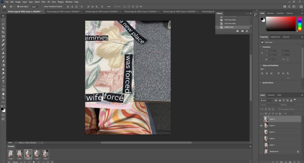
We used embroidery with Yulia Makeyeva and we recorded an image using our iPhone of every step when we creating our embroidery by cutting our figures, shapes, words and re-stitching. Our embroidery had to be related to our groups project which is feminism. I chose carefully my fabric, I chose a fabric with flower pattern to demonstrate that women were compared to flowers because of how “delicate” they were. I also went for a satin white fabric to represent how women had to keep their virginity to be considered as pure, or fit for marriage. And pink for a “for the colour of femininity”. the pieces of frabrics are attached with a red thread that means the blood that women lose once a month. in the middle there is the word Femmes which means women in French.

First intent:

Seconde intent:
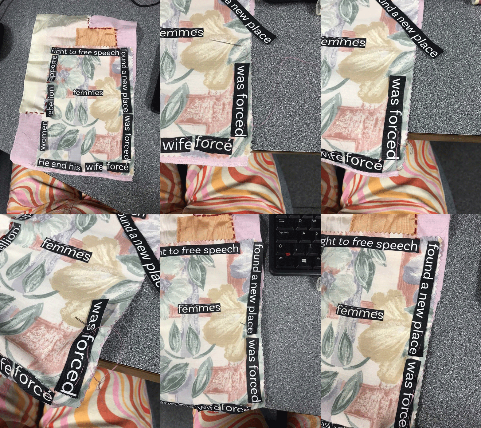
After we finished taking several images we re-assembled our images as a GIF on a timeline using Adobe Photoshop. This first intent wasn’t successful since the video wasn’t long enough and didn’t much detail into it. So for the seconded GIF I decide to have a minimum of 10 photos so it could be longer, I ended up putting 14 photos in my GIF and I prefer it than the first one.

nft project

NFT

NFT, Non-Fungible are used to authenticate images, or any object on the Internet. For example, you can freely download images from the canvas La Promenade de Monet, but there is only one original. An NFT can be used to certify that you have the original from Monet. Of course, art isn’t the only thing that NFTs could change on the Internet. The NFT will globally impact the notion of digital property. NTFs could be used to prove ownership of domain names, for video game items, but also physical objects.

A community of the future will celebrate diversity, equality and inclusion and propose a new digital world; a metaverse where everyone is equal regardless of class, race, gender and age. A digital ecosystem that transcends all virtual identities into a utopia for peace, prosperity and progress.
Feminism

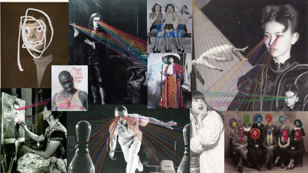
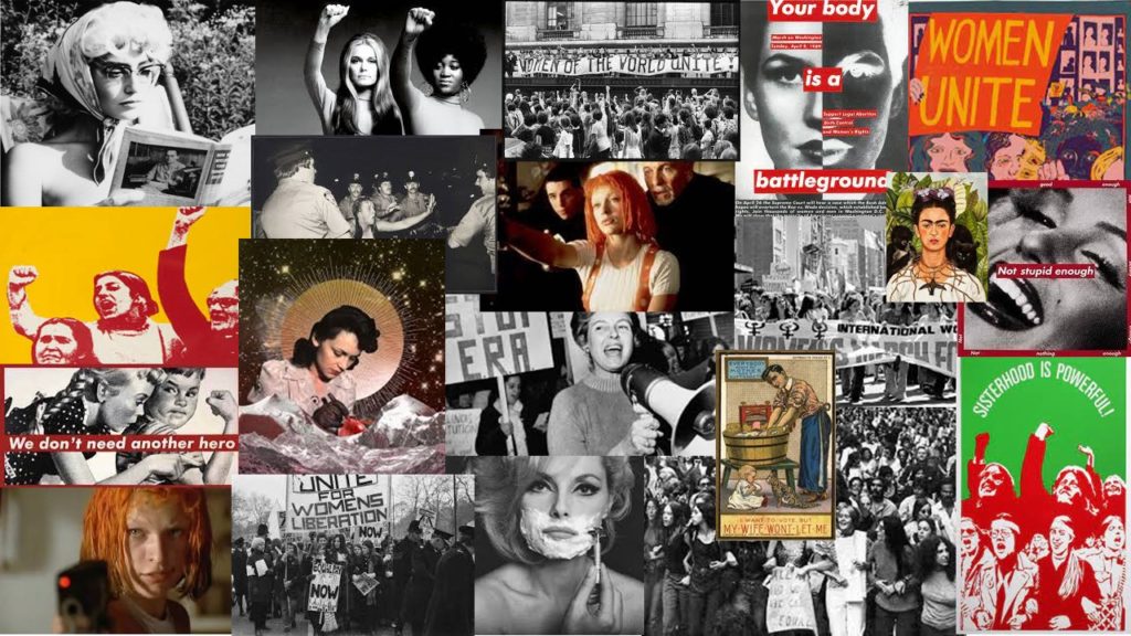
For this project, in groups we made a brainstorm and a mind map to answer at the question of what is a community and how communities may change in the future. A community that we were exited to represent were women so we decided to base our NFT work around the subject of feminism. We produced a mood board presents communities of women fighting for our rights, role models that we can see in movies or in the real world. Is important that we show a world of equality, diverse and freedom in our group project. But for that we need to look at the history of feminism how did it started, who were the woman involve, how it is in our society now and how could it look in the future. For the animated video, we decided that it would be interesting to separate our video in three parts. The first is inspired by the artist Cindy Sherman, and it would be about how woman were represented media/movies at the time. After the second part we want to take inspiration from Clare Rae to show how women no longer want to be sexualized and be treated like objects so they hide their bodies from men. The final part is about gender equality, how now woman are free to show their bodies without being sexualised, accept diversity in woman…

design & layout

Design and Layout

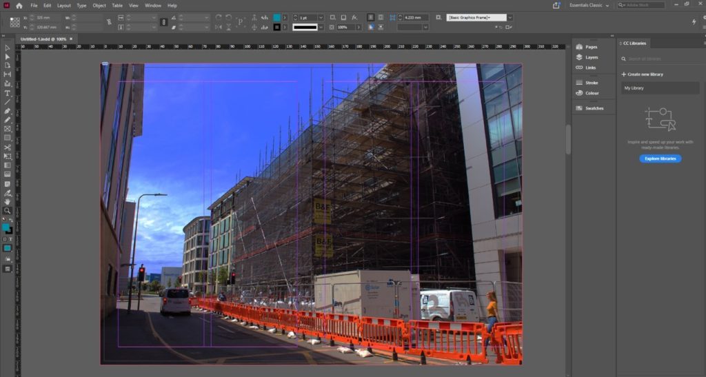
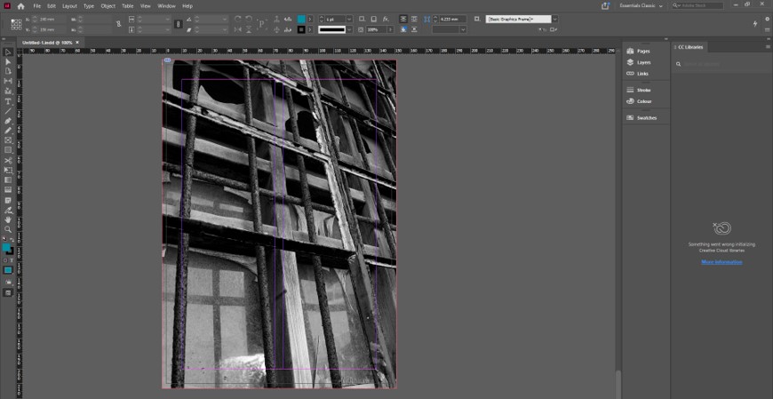
In class we were asked to ask to create a zine with our Images from the community/identity project. To create our own zine in InDesign we followed the following instructions:

Create new document
width: 148mm
height: 210
pages: 16
orientation: portrait
columns:2
column gutter: 5mm
margins: top, bottom, inside, outside: 10mm
bleed: top, bottom, inside, outside: 3mm

It was a work of research, analysis and exploration. We explored different design, format, sizes and orientation. We were free to placed the images we wanted and how we wanted to placed them. We were also free to decide our title. This is mine: I decided to title it “Au vieux temps” that means to the old days. I wanted a title that represents the history of jersey communities. I wanted it to be in French because France is part of my identity. Then “in the old days” is an expression used in France

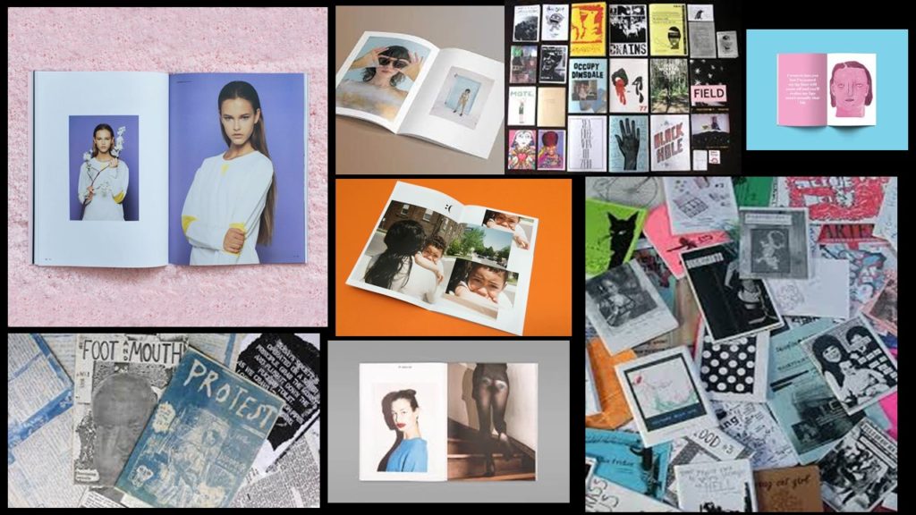
But what is a zine?

A zine is a self-published, non-commercial print-work that is typically produced in small, limited batches.  Zines are created in many DIY ways, but traditionally editions are easily reproduced—often by crafting and then photocopying, folding, and stapling the pages into simple pamphlets.  You also may also sewn, taped, glued them. There are no rules! People in general create zines to be more motivated, self-expression and artistic passion. Zines are usually inexpensive and sometimes distributed for free. Zines can touch on a variety of topics from music and art, to politics, sexuality, humor or even personal memoir.  Their can be written, drawn, printed, collaged… Zine’s structure may be narrative, journalistic, comic-like, or completely abstract.

PRESENTATION & EVALUATION: PHOTO-ZINE

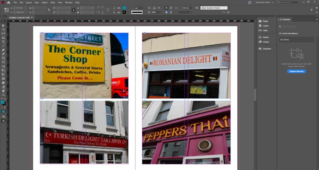
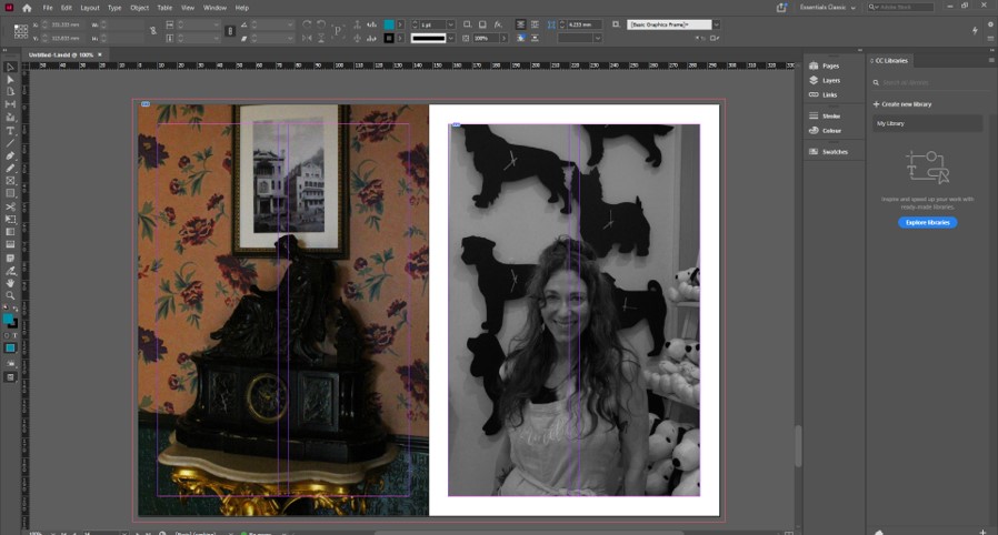
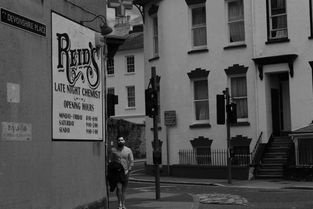
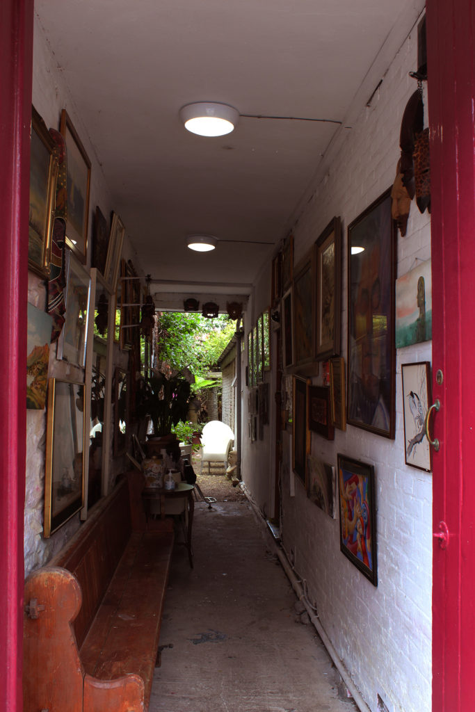
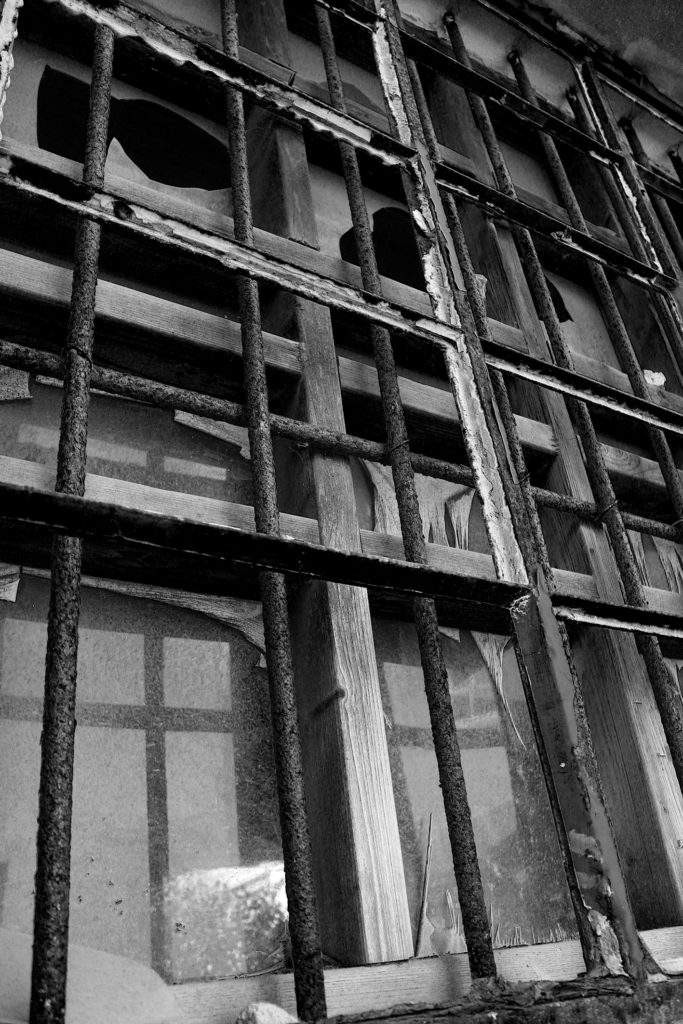
Here’s how I arranged my images. We had to have a total of 16 images with the theme of Community and Identity. I wanted the images (that are in the same page) to have something in common e.g colors, geometric shapes, patterns, people… I find that this activity has let us be creative which I appreciated

narrative and sequencing

STORY: What is your migrant community story?

  1. stories and identity
  2. Their stories, their identity and communities
  3. This images represent, people in jersey and objects/ places from jersey

NARRATIVE: How will you tell your story?

I will use imagery to tell my story because so their can be different intreptation of the story in my image. I’ve purposely arranged them into a sequence so it feels like a little story.

AUDIENCE: Who is it for?

My zine is more for younger people around my age (16 to 20) but in reality everyone can enjoy. Is also for people from jersey so they can enjoy looking to their island. And how beautiful the island is. Here are the images I used for my story:

historical Artists : Victor Hugo

Victor Hugo

Who was Victor Hugo?

Victor Hugo was born February 26, 1802 in Besançon and died May 22, 1885 in Paris. He was a French poet and playwrighter , he marked the history of the nineteenth century, and is still recognized thanks to his literary works, and also by his political speeches. He wrote works very well known as Les Châtiments (1853), Les Contemplations (1856) and Les Misérables in 1862.

To Jersey from France

Because of his political opinion, Victor Hugo could not stay in France during the reign of Napoleon III, and had to refuge in a discreet place. He moved to Jersey in 1852 and he stayed until 1855. Thanks to his refuge he was able to publish his political pamphlet against Napoleon III Napoléon le Petit and Histoire d’un crime. During his period of leaving in jersey he also composed and published some of his best work like Les Misérables, Les Châtiments 1853; Les Contemplations 1856 and La Légende des siècles 1859. Very quickly Victor Hugo becomes very interested in photography. He wants to use it as a political tool to show his image in France. So it becomes a family affair. His sons Charles and, François-Victor, organize a photographic workshop . The Jersey workshop was a unique adventure. It was both a look at the landscape that sometimes inspired Victor Hugo’s drawings and a testimony to an outlaw in exile. The Jersey Workshop was a photographic studio in the greenhouse at Marine Terrace. Victor Hugo’s project was to create a book on the Channel Islands illustrated with images. But the book was never finished, he still produced an intense production of salted paper prints.
The purpose of the workshop was to preserve the memory of the exiles, the portraits which were taken were placed in many albums which were sometimes adorned with paintings or collages by Charles Hugo.

identity and community

People and place 

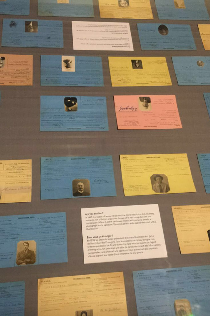
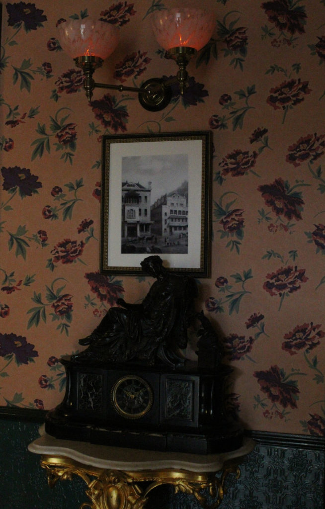
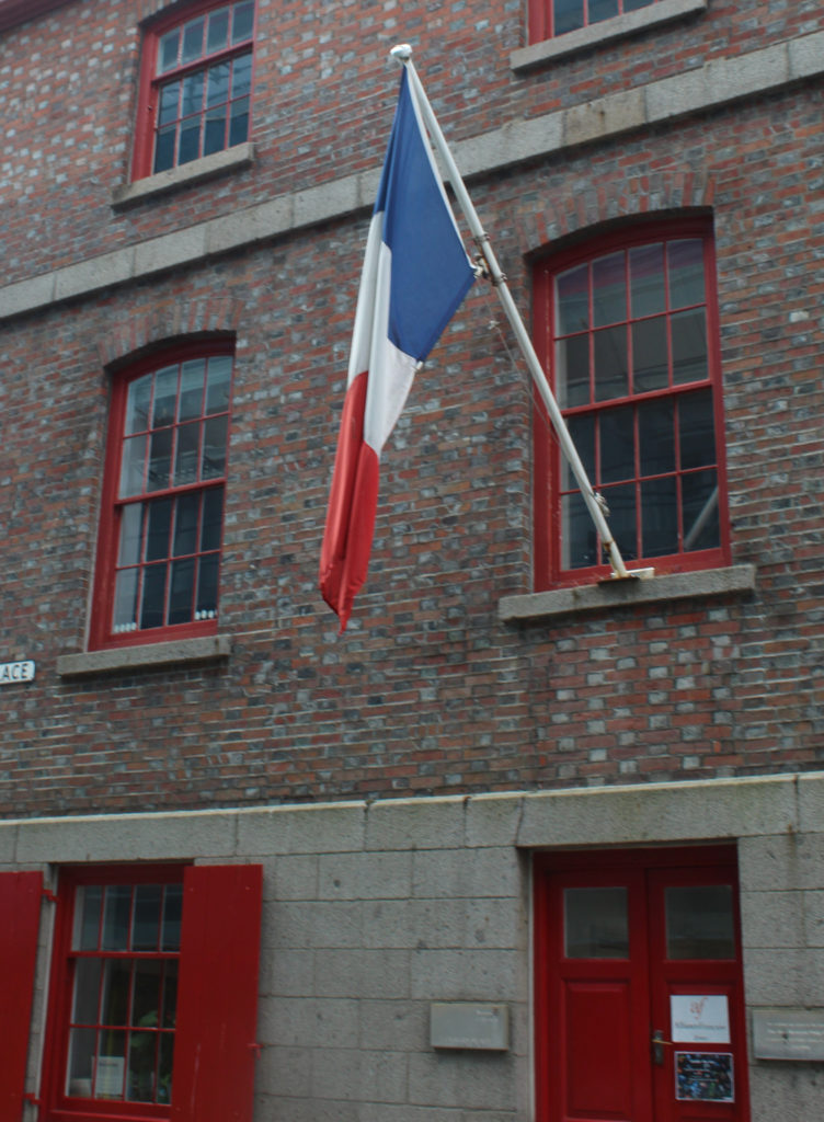
 On Monday June 7th, we discovered an exibition called  ‘People Make Jersey’ at the Jersey Museum. This exibitionn explores the history of  Inmigration who has influenced and changed jersey. And explores why people have moved in the island over the centuries. We learned about religious persecution and that due to Jersey’s geographical proximity to France, Jersey has provided a refuge and a place of safety for like French catholiques in the 19 century. We discovered that during periods of political appival Victor Hugo and other immigrates across Europe find a refuge in the island during the 19 century. We also learned about economic migration, that people have come to the island to have a better life for their families. They showed us legacy we can see in the island. We saw testimonies from inmigrants.

FINAL IMAGES

Final images

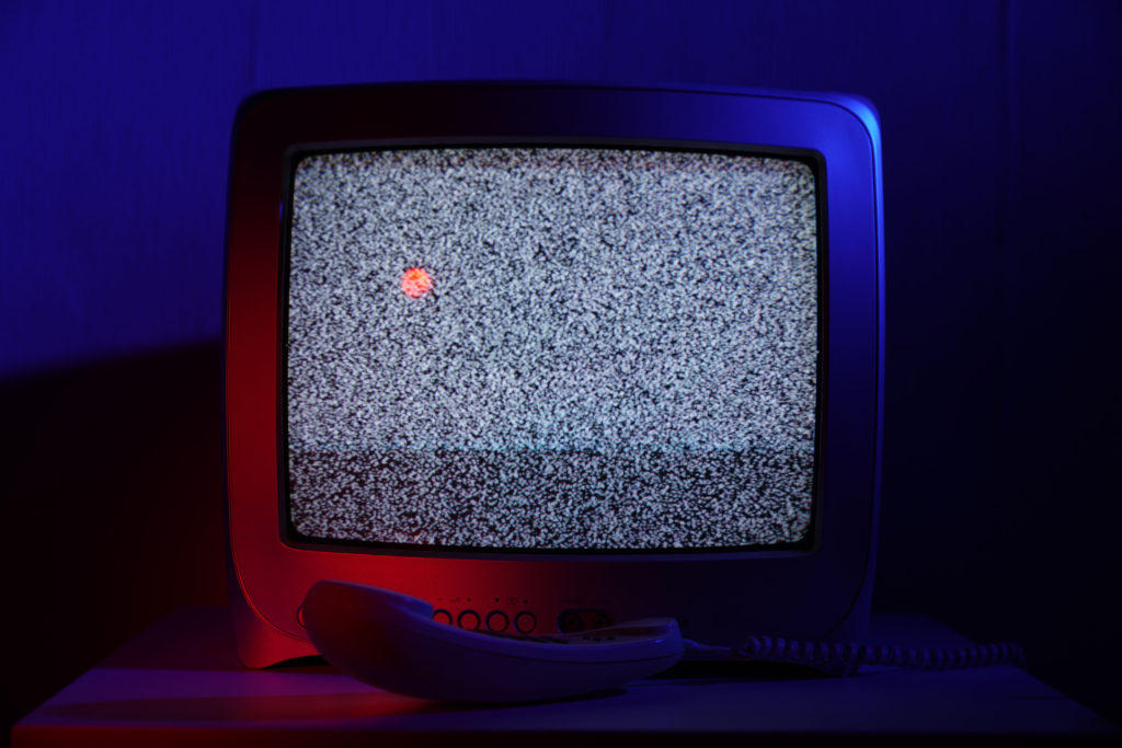
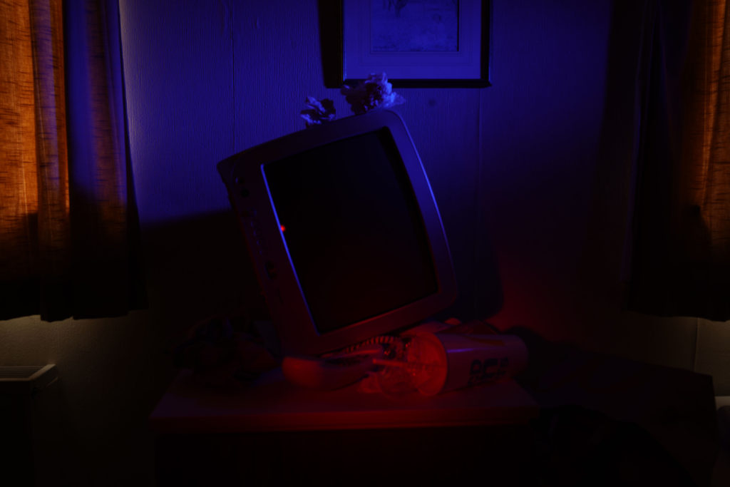
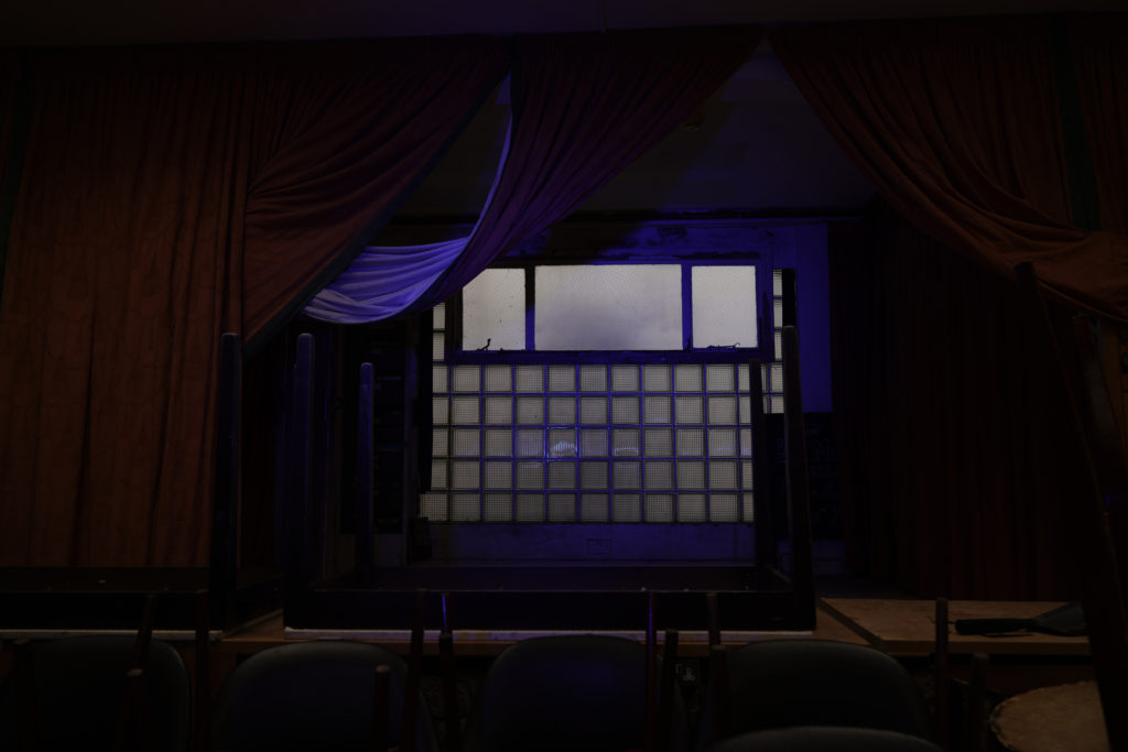
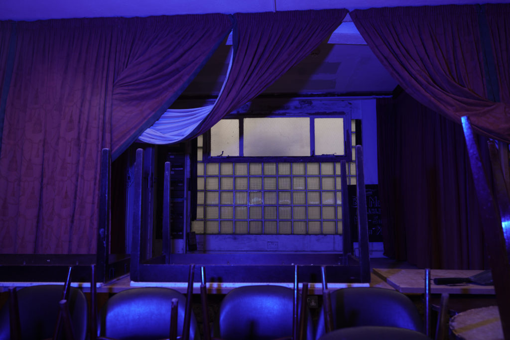
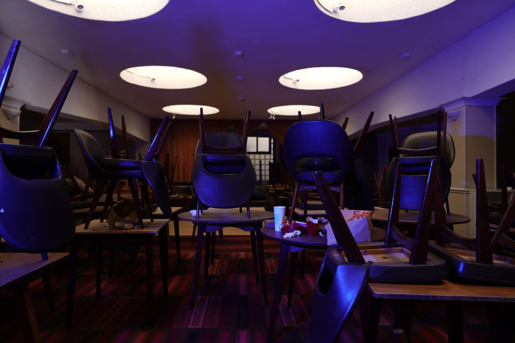
To recreate Troy Paiva’s style I used two continuous lights and added a grid and coloured gels to them. The grid allowed me to narrow the light so that it only lights specific part of the objects I wanted. The colours gels allowed me to add contrasting warm and cool colours just like Troy Paiva does. The camera was set to a very slow shutter speed of between 30 seconds and 8 seconds of exposure time. Since we where shooting in the dark this permitted some ambient light to get sucked in to the exposure. As I moved from the location to location, I had to change the shutter speed to adapt to the ambient environment and in some shots I decided to use flash light rather than continuous light. This helped to isolate the subjects. Off course the camera was always on a tripod. This is very important for slow exposures.

photo that I chose:

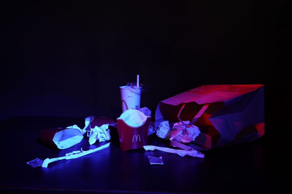
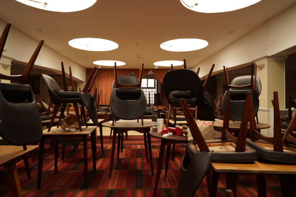
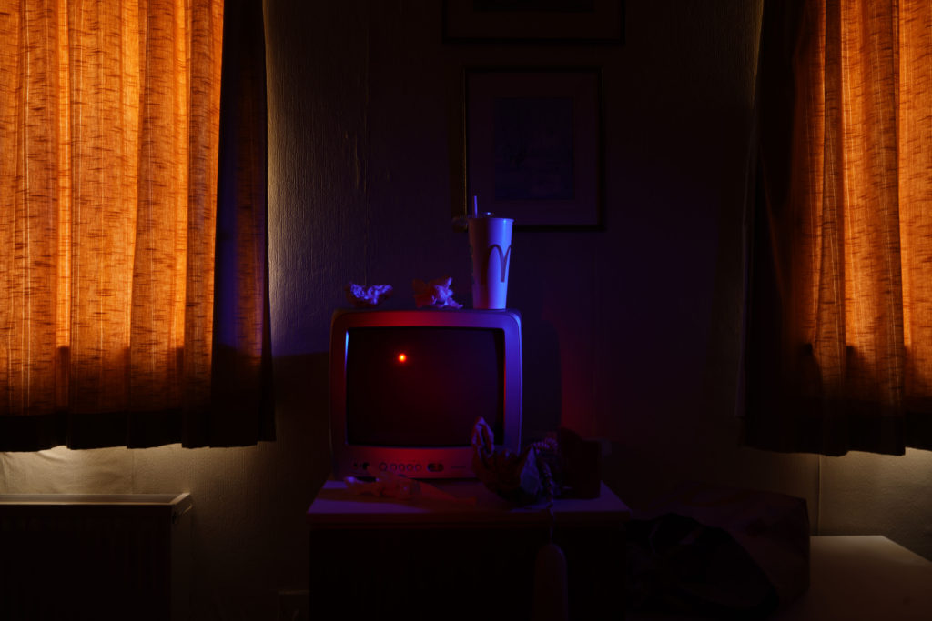
The three first pictures are from the same shoot ”Domestic waste”. Each of those three pictures presents different waste. The image I especially like is the first one the ”McDonalds rubbish” because it makes you question how something that is loved by young, old people can be very bad for the environment and pollutes our planet. Those packaging can be found everywhere like on street floors or the beach … But what if we took the packaging of our favourite fast food and turned it into an inspiration from a 17th century painting. Is like what Mat Collishaw or Krista van der Niet does. Let’s convert our waste into art!

The second picture I especially like is the third one since
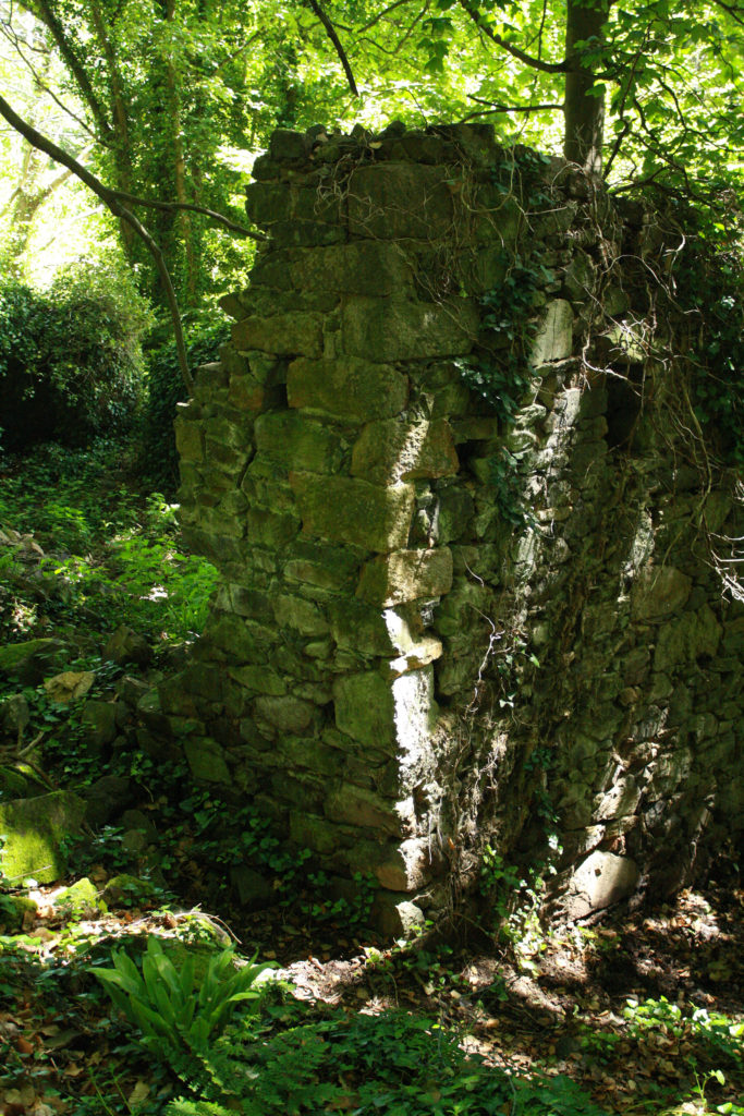
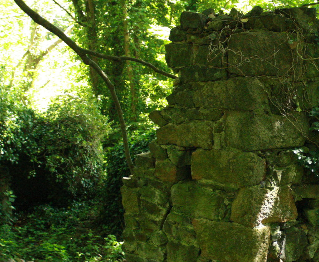
we can see a place that use to be used, now completely abandoned. The colours and patterns of the floors let us guess from what period the hotel was. We can see the unused chairs left on the tables, rubbish everywhere the carpet is dirty… and all this makes me think about what this room was for before, why is it no longer used. The only thing left now are the memories. The last two photos are from my second shoot ”Ingrained in nature”. This shoot had a different meaning for me since I wanted to represent the fight that nature must wage against an anthropogenic element, in the end nature tries to adapt to it and grows up despite everything. The building is hidden in nature,
and its colours are the same as the forest: brown, green, yellow, blue

Review and Reflection

I like the finals results of my photos I think I managed to interpret what I wanted to show. In the first controlled conditions I did, I was a bit disappointed because I didn’t focus on little details because I was not well organized in terms of time. But in this controlled conditions I got better organized and I managed to put the details I wanted like well place the objects, change them, transform them and I also explored more in my idea than the last time. Another thing I had to improve in my last controlled conditions was lighting and sincerely I think it’s something that I handled well in this theme.

colour- controlled conditions

In general I like to explore with colours in my work and specifically for this theme I have used a lot of colour. Over the years the meaning of colours has evolved and depending on the sociocultural context and other factors such as age or gender, they are capable of evoking one or more sensations. The most curious thing is that, despite its long history, it is still an area in which much remains to be discovered.

Colour Theory/History


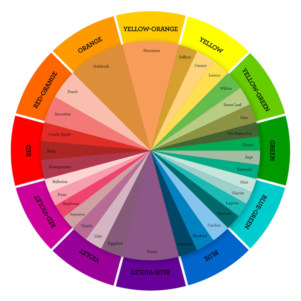
Colour theory is a set of principles for choosing the best colour combinations. This harmonious relationship of colour can be represented visually with what we know as a colour wheel. Within the colour wheel there are two ranges of colours, warm (expressing joy, passion or enthusiasm) and cold (expressing relaxation, success or professionalism).

To understand how colours affect us we must be clear about these basic concepts. We must keep in mind that when photography was born (1839) everything was in black and white, so the first photographers could not count on color as an ally to build their compositions. They had no choice but to focus on other aspects such as light, lines or textures to make photos stand out more among them. From 1935 on, the first color slide film (Kodachrome) began to be used and that opened up a whole world of possibilities. Modern photographers could now show a more realistic representation of a scene and with colors similar to those seen through the human eye. Although color photography would also have another purpose, because photographers were going to find a new way to attract attention and add impact to their images

Todd Hido

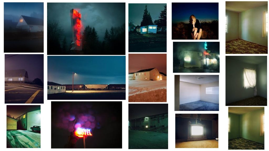
The majority of Todd Hido’s photos of rural scenes are taken during single, lengthy drives. The principle subject of his work is the nature of normal and counterfeit light in the American scene, as in reflected sunrays or the enlightenment of a TV pouring from a mysterious window. Todd Hido use a lot of cold colours that gives you the feeling of isolation and abandonment.


Shoot 1-domestic waste

Plan

What: Soil pollution: The most common type of pollution caused by household waste, industrial waste and agriculture. Knowing the causes of pollution on earth will require us to be a better guardian of the world that we are living on. #

Why: On this shoot i decided to focus on the domestic waste left behind because i want to make people aware of the waste that they leave and is contantly causing damage in our planet.

When: Like Troy Paiva, I chose to do this shoot in the evening. Troy Paiva takes pictures around the evening, using openings of a few minutes to catch the discernible time entry on a lonely edge.

Where: I chose to shoot in a place that is derelict and that represents the things that have been left behind because they no longer have or can find any utility.

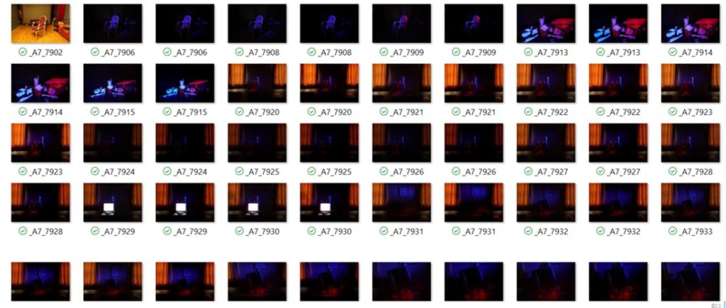
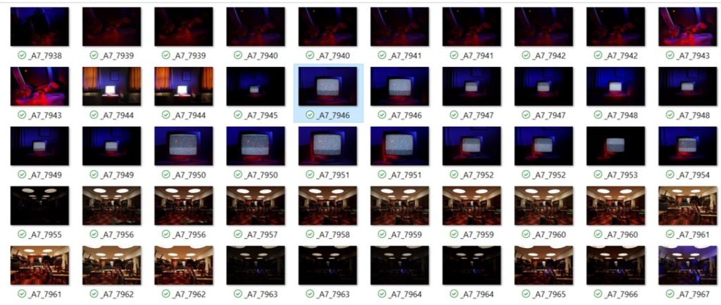
Contact Sheets

My First Selection

Comparison


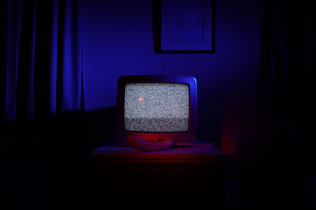
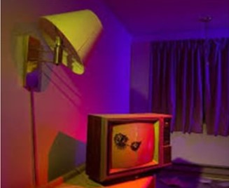
Both of the images let you guess that they are taken in the evening because the colours effect are more efficient on the image and there’s use of flash. The lights are obviously artificial lights since they are colours effects. I decided to use strong colours (blue / red) while Troy Paiva use lighter colours (pink / purple) which have less impact on objects. In Troy Paiva’s photography purple is the dominant colour and in mine is red. The tones are almost the same in both of them we can dark parts around the objects that’s what makes them stand out however mine shadows are darkest than in Paiva’s image. The lightest parts are on the objects. This contrast creates a mysterious atmosphere on both of them. We can see on both of the images different geometric shapes like the tv, table and some organic shapes like the curtain, the waste… The object that can be found in the two photos is the old tv who is not from this generation however Troy Paiva’s tv looks more old and damaged. On the image of Troy Paiva the photo is taken from further away so the Tv is in foreground on the middle and the lights are exposed on the background this creates a lot of space on the image while I decided to zoom in so that the TV is not the main object on the foreground but also the waste and the lights are on the objects
as my image is taken from very close and the objects are stacked on top of each other there is no space.