To finish our project we needed to print our final images and frame them like we did in year 12. We could choose as many images as we wanted and we had the choice between A3, A4 and the smallest A5. I personally chose to print images from my latest project “not so cholo” project plus two images I printed last year. I chose four images in A3 because they were in landscape format, I thought they would look better enlarged to see the details and decided to print my portraits in A4. After printing, we needed to frame them. In the framing part we also had different options for framing. These are the results of my impressions.
Our task was to put our final prints in an internet gallery. To begin, one has to look for an empty gallery on the internet and be careful and determine if the proportions of the paintings are adequate. Then you open photoshop and start modifying your images. To make your image fit into the boxes, you play around with the transform utility to transform your image. You have to obviously make it smaller, distort it and rotate it that should do the trick. To finish, it is a recommended option is that you put a shadow below your image so that it looks more real. To put a shadow on your image, you press the blending options button and there you can play with the shadows, that is, put the darkest shadow further away… Also if you want you can put texture on your image or whatever you want. And this is how I create my gallery.
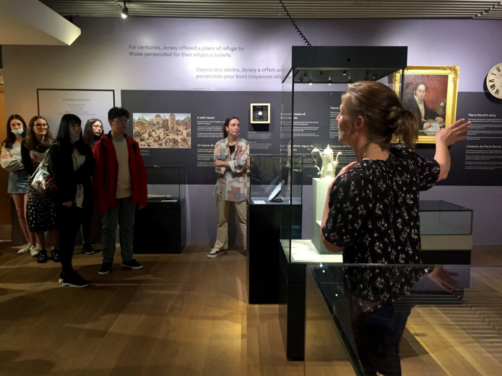
The images seen on the pages of this newspaper supplement are extracted from a variety of projects and final outcomes produced over a two-year academic programme of study by a group of A-Level photography students at Hautlieu School. In their final year the themes of Identity and Community offered a specific focus and through a series of creative challenges students developed a body of work that were inspired, partly from visiting heritage institutions to learn about aspects of Jersey’s unique history of immigration and exploring migrant communities and neighbourhoods in St Helier in a series of photo-walks. In the classroom additional inspiration was provided from workshops on NFTs (non-fungible token) and digital art, embroidery and textile art, animation and film-making, zine and photobook design led by professional artists, designers and teachers.
As part of the research and contextual studies students were asked to engage with some of the key questions raised by the Government of Jersey’s Island Identity project and explore through their own photographic studies how they interpret and identify distinctive qualities of island life. What can we learn from looking at a set of photographs produced by young islanders? At first sight they show us a seemingly random set of images of places, people and objects – some familiar, others surprising. On closer inspection each image is a visual sign and also a conundrum. For example, a fish stuffed in a plastic bottle may ask us to consider more closely our marine environment, commercial fishing or food consumption. As a combined sequence of images they represent different views that in many ways comment on a wider discussion on some of the primary objectives explored in the Island Identity project, such as ‘how we see ourselves’ and ‘how others see us.’
The newspaper was kindly sponsored by Deputy Carolyn Labey, Minister for International Development and Assistant Chief Minister who in her foreword shares her personal thoughts on what makes Jersey special to her in context of the Island Identity project led by her department. She says, ‘identity involves searching our soul, engaging with difficult issues, and asking not only who we are, but how others see us and what a vision for the future might look like. The perspective of students and young people in this debate is critical. Identity is a broad and far-reaching concept, one unique to all of us. This collection of images recognises both our differences and our commonalties. These times may be uncertain, but in my view the topic – ‘what Jersey means to you’ – is a fundamentally optimistic and forward-looking one.’
The Identity and Community newspaper is the fourth supplement produced in collaboration between Hautlieu School Photography Department and Jersey Evening Post. In 2018 the first issue was The Future of St Helier and last year the themes of Love & Rebellion explored experiences of isolation and lockdown during the coronavirus pandemic. Photographer and teacher Martin Toft, comments: ‘The question of ‘what makes Jersey special’ matters a great deal to every islander and as visual signs, the images printed on these pages are an attempt – not so much to provide answers – but rather asking questions about the essence of this island we call home, and how it actively will overcome current challenges in shaping a prosperous future for all.’
Various workshops and school trips for inspirations, recording and experimenting with new images and ideas of making
The newspaper was a pleasant experience. The diary is made up of images from this year and last year of each student. It’s quite nice to be able to see the images of each student, the different styles. We can see the progresse that each student made during two years. In the newspaper they are images of families, team work, tatoos, pollution… All the images make a very interesting and different assemble. In the newspaper my image is juxtaposed with a black and white image showing a mask as mine. Overral i’m very proud with how the newspaper turn out.
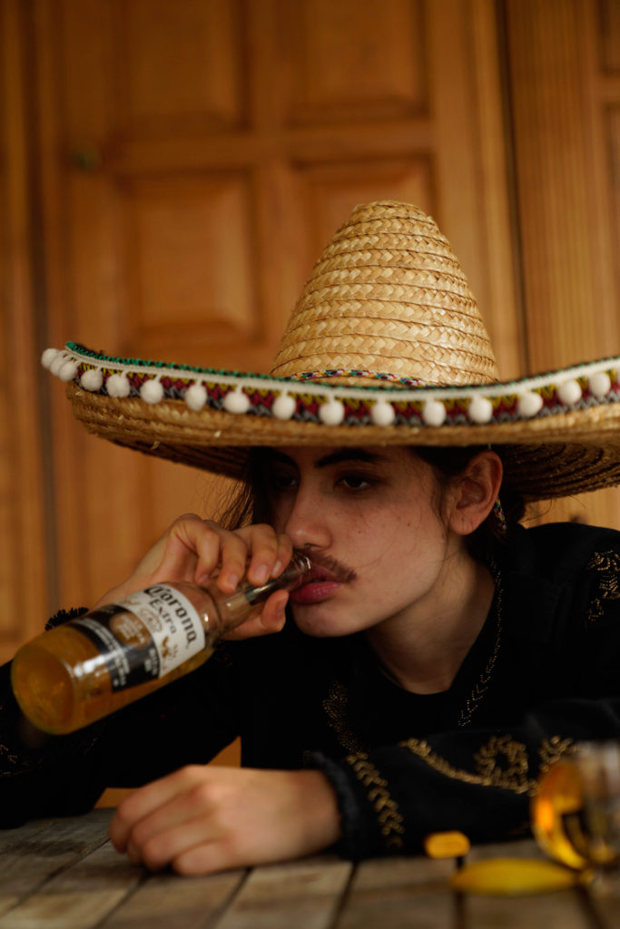
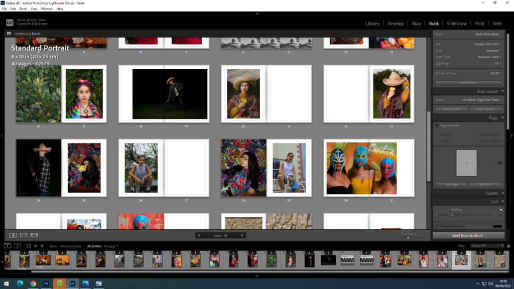
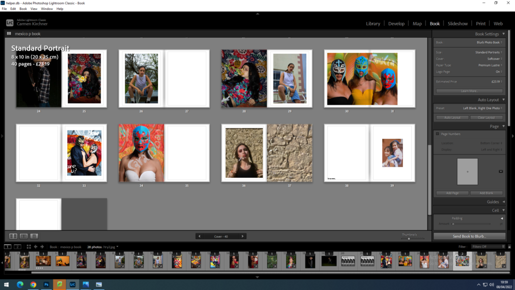
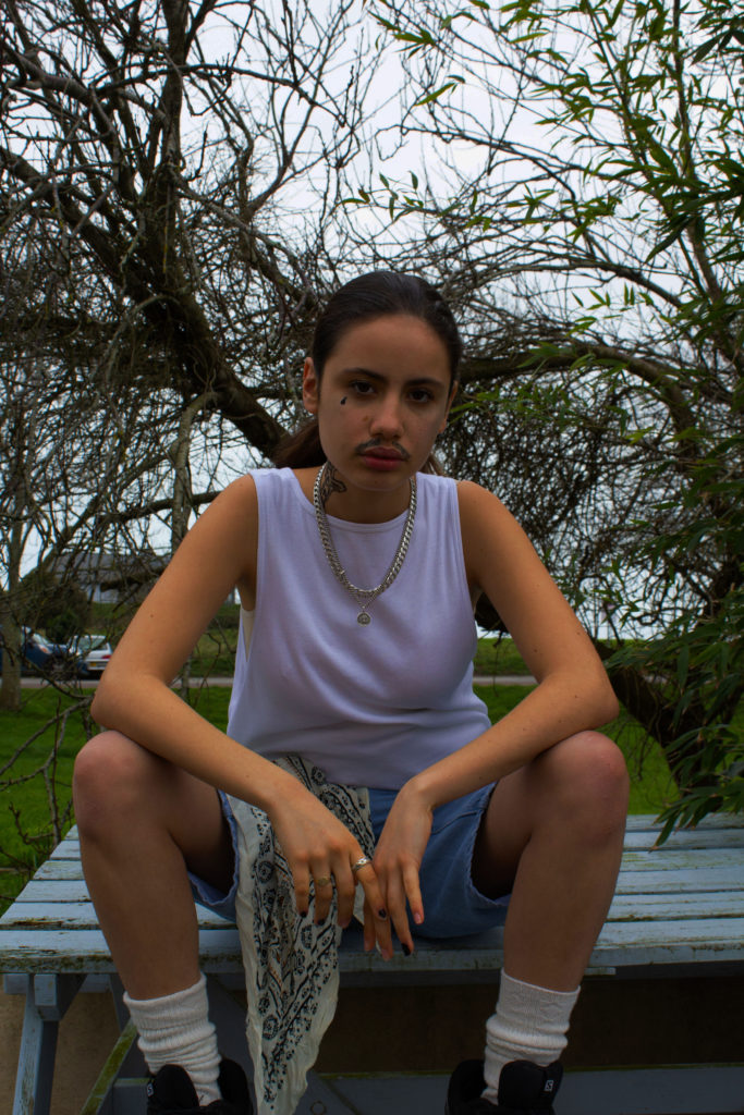
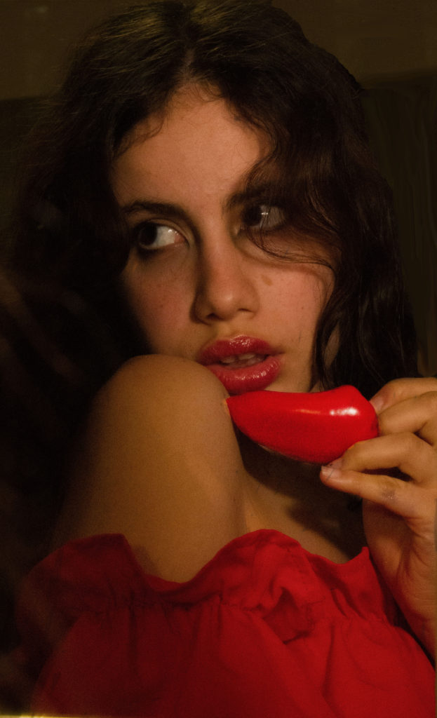
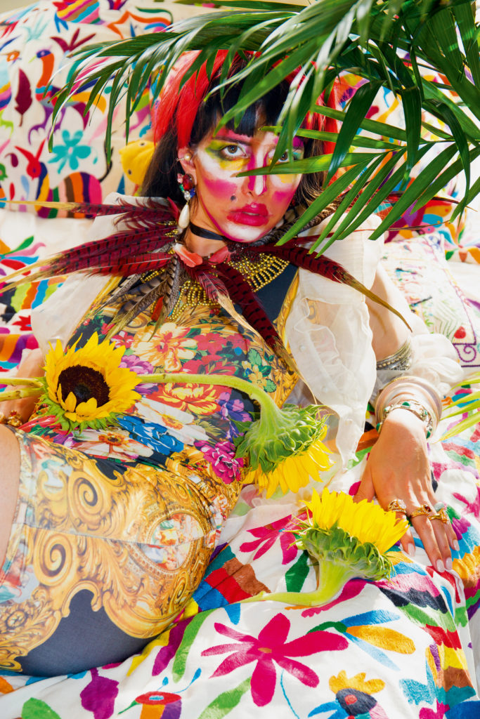
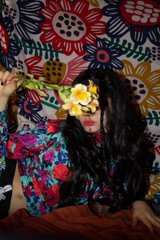
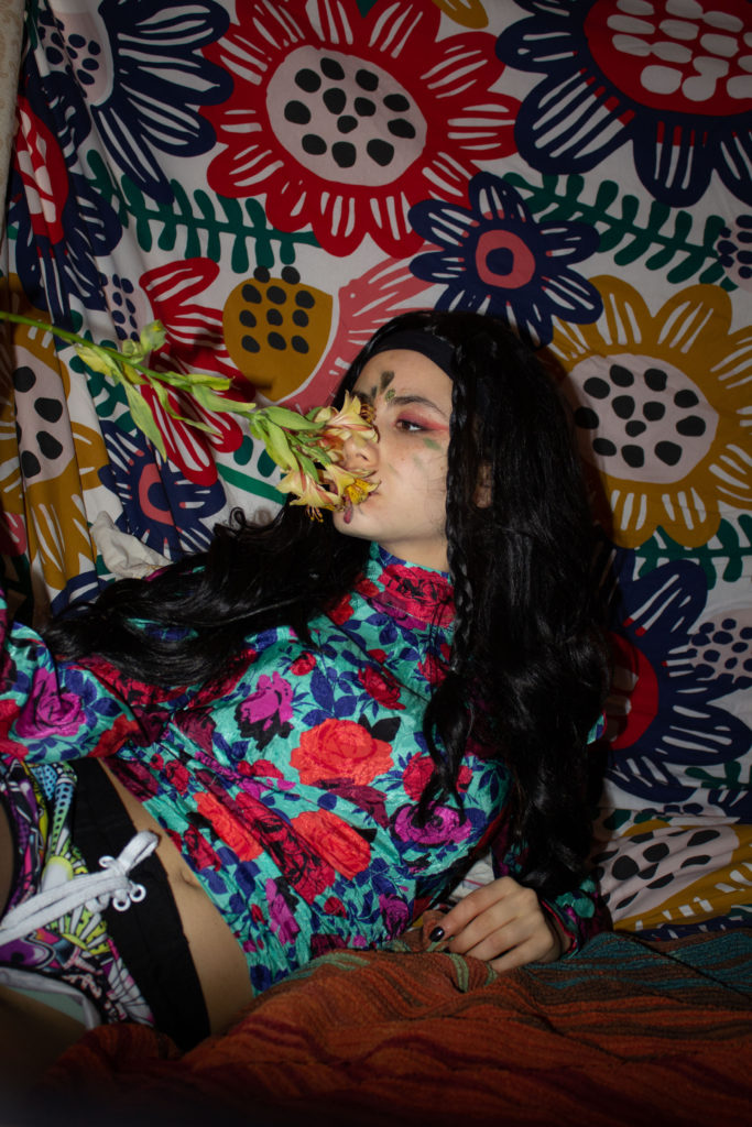
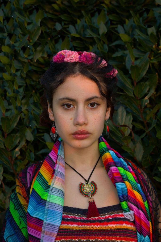
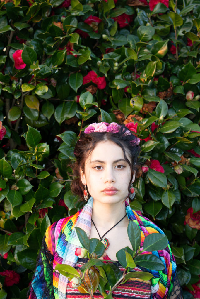
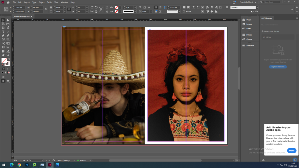
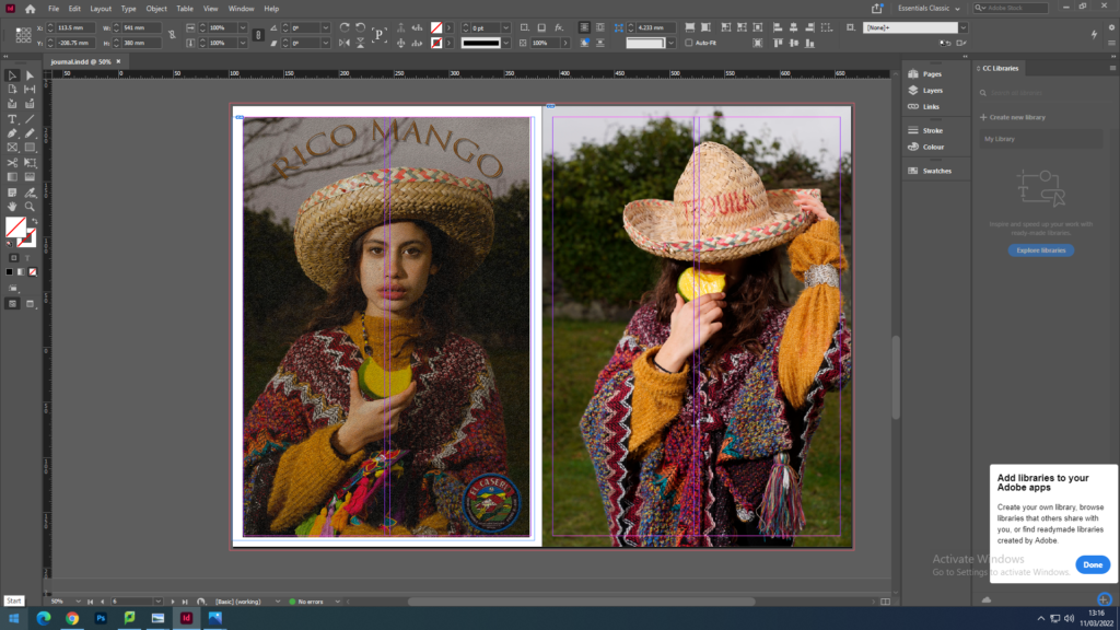
My book is a standard portrait size, which is soft cover and the paper type is premium gloss. I wanted my cover to have a Mexican graphic, so I searched for a Mexican pattern on the internet and after a few selections, I chose this image. On the first page you can see in the middle my Title “Not so cholo”.Cholo is a young man who belongs to a gang, with characteristics in the way he dresses and expresses himself; They usually live in northern Mexico or on the border with the United States. It translates as “not so cholo” what I want to interpret with this title is that it is not because we are from a place that we are officially the stereotypes that are presented from that country “I am not as cholo as you think I am”. It is also a play on words in Spanish with the saying “No tan solo” which means not very lonely. The next page is an image of me dressed as a Mexican gang member, my inspiration was of course how we present them in the media. I put my landscape portraits on a full page because obviously the proportions would be better. The sixth image is me diffracted into a drunk Mexican and I juxtaposed it with a drawing of the Mexican lottery called El Borracho, a game that is played a lot in Mexico.Some of my images are juxtaposed with just the same background for an aesthetic detail. My final image is an image of me and my mom because I want to thank you for making me a part and showing me this culture. I want to honor it and show that those ridiculous stereotypes are just offensive and don’t really represent us.
what? what stereotype should I put in Mise en scene : gangs in movies ; La Mexicana ; Gardner and ”spicy” Latina
how? Pay attention to details like the clothes, the accessories, make-up, background, lights, the mood… to create the Mise en scene.
when? March
where? I want each photo to be a different story so for me it would be more suitable if I do each photo in a distinct location, They mostly be in house but I want to be spontaneous so anywhere that reminds of Mexico or I think is a perfect place for one of my stories would be great.
Cindy Sherman
Edit
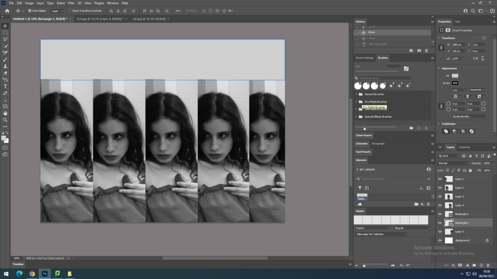
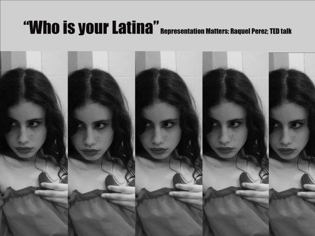
For my project I wanted to do some research on the consequences of Latinos stereotypes. I watched a TED by Raquel Perez which is about the representation of Latinos in society. She talks about how frustrating it is when you are not Latina ”enough” because we don’t know the language enough, the colour of our skin is not tan enough. Because we don’t look like the Latino stereotype that we see on the TV therefore we must not be. I decided to edit one of my images and called it “who is your Latina”. The meaning behind the title is to question society how or who do we have to be to be considered Latina. To edit my image is use photoshop, I started by selecting my image. I copy, pasted my image to another white plain image. I had to cut it so it fit proportionally and paste the same image five times. I wanted to put the title at the top of my collage so I selected a rectangle above. I then used the eye dropper tool which helps you to have a sample of a colour of your image. Finally I wrote the title and flattened the image.
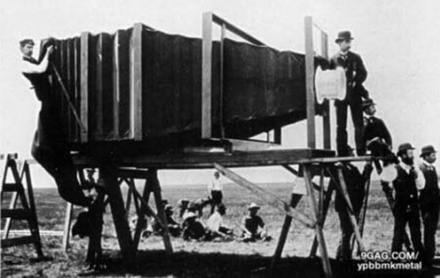
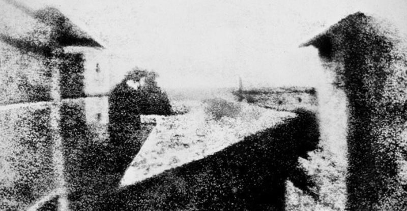
The word photography comes from the Greek words phos “light” and graphos “written” or “recorded”, so it is a writing with light or a recording made with light. The history of photography spans from the 19th to the 20th century, but has many antecedents in earlier times. It is one of the most revolutionary technologies that man has developed. Photography has made an impact on the sciences, the arts, and historical documentation. It also gave rise to other technologies, such as cinema, among others. The idea of capturing images and preserving them is something that humans have wanted since ancient times. It is what gave the appearance of painting, sculpture and, later, photography. There were old attempts to capture an image automatically, especially by means of the camera obscura principle, which is the same as that of photographic cameras. The camera obscura is a closed space, totally dark, in which light penetrates through an opening in one of its sides and projects an up side down image of what happens outside. This technique was known from the time of Aristotle or later from the Arab scholar Alhazén. From that work, scientists such as Giovanni Battista della Porta or Gerolamo Cardano experimented with the camera obscura in 1558. In the 16th century, the German Johann Zahn developed this technique in a wooden device, which was ready to become a camera. The first image obtained in history was made by the French scientist Nicephorus Niepce. He achieved results by prolonging exposure to light of pewter plates covered in bitumen, inside a dark room. The first image was in 1826 and took eight hours of exposure in broad daylight. In 1827 Niepce met Louis Daguerre and they signed a work agreement that left the latter with all the knowledge of Niepce’s photographic techniques after his death in 1833. Daguerre added to the mechanism a polished silver plate, on which the impressions, thus greatly reducing the exposure time. Later the daguerreotype appeared. This new technique allowed portraits to be taken, and was the best-known form of photography for a long time. However, other inventors were studying their own methods to obtained similar prints.
what? This time I’ll focus more in the fashion side show the beauty of Mexico. Shoots: Mexican objects, Garden of flowers (between the flowers), Family photo, Strong women Frida Kahlo or Carmen Miranda
how? Colours and patterns will be needed. Pay attention to details like the clothes, the accessories, make-up, background, lights…
when? March
where? I want each photo to be a different story so for me it would be more suitable if I do each photo in a distinct location, They mostly be in house but I want to be spontaneous so anywhere that reminds of Mexico or I think is a perfect place for one of my stories would be great.
Carmen Miranda
My full inspiration will be on Martinez Gutierrez. Her photos are so colourful and represent indigenous people in a modern way that will be my challenge to acquire. She uses a lot of fun makeup and outfits all well thought. Here are some images i would like to produce
Martine Gutierrez is an American artist born 1989. She has become a published musician and producer, featured by several fashion houses including Dior and Acne. As a photographer, Martin explores the relationship between gender, identity, and perception, redefining and reshaping boundaries through the staged photograph.
Cindy Sherman was born in 1954 in New Jersey. She is an American photographer. She is best known for her imagery, particularly her “disguised” self-portraits, which generally criticize social role-playing and sexual stereotypes. Sherman presents viewers with an ambiguous portrayal of women as sex objects. Sherman stated that the series was “about the fakeness of role-playing as well as contempt for the domineering ‘male’ audience who would mistakenly read the images as sexy.” She is her own model in her photographs, using wigs and costumes that evoke images from the realms of advertising, television, film, and fashion and that, in turn, challenge the cultural stereotypes supported by these media.
Feminism?
Sherman and Gutierrez both participate in making image which reflects femenism.In 2014 Martine Gutierrez created a series called Girlfriends. Girlfriends is a series of black-and-white images in which Martine Gutierrez poses with a single mannequin, They were composed and taken in upstate New York at Gutierrez’s grandmother’s cabin. It is evident that Gutierrez’s use of mannequins is as girlfriends, as in many of her works of art. But Gutierrez also uses the mannequin to soulign the mannequin’s idealistic appearance. Especially in its artificiality, it is the “perfect” body, comparing with the reality of the imperfect human body. Despite the hundreds of portraits toying with female stereotypes that Cindy Sherman has produced throughout her career, Sherman’s big artistic break came with the “Untitled Film Stills.” To make the series, the artist served as both photographer and subject, transforming herself with makeup, wigs, and elaborate costumes into figures that recalled the movie stars of an earlier generation. With the series Serman explains how ridiculous it is that women in movies are always young, thin and pretty.
Image analysis
Girlfriends anita and marie 7 (2014)
In the image of Gutierrez there are two female characters, the two characters look identical but when you look closely you can realize that one of them is actually a mannequin. The outdoor environment makes me think of a scene in Forest Gump that happens in the southwestern United States. But the sitting seems to be a Mise in Scene, it is clear that this is not reality or the artist is using a background. We can say by the fact that you can see in the background at the top of the sky some undulating parts. Including the mannequin and using a background are the choices the artist made. She make us wonder who or what in this image are real. What are we defining real? Cindy Sherman is also in what we might consider the American Southwest. She’s sitting in a tree, which would be an unusual thing to discover out there, that makes it seem like it could also be taken in a studio. Like in Martine Gutierrez image we wonder what’s real or is the setting real? But this time Cindy Serman chose to just use her as a model in her image.
Our next project is newspapers. We choose photos to put on the newspaper based on images from both our current and previous projects, including zine project based on historical migrant neighbourhoods in St Helier or work we did in Yr 12 too (Identity, Anthropocene, Landscape) and select the best images. We then need follow these instructions to create our zine:
Create new document in InDesign with these dimensions: 400mm(h) x 280.5mm(w), 10 pages, Orientation: Portrait, 2 columns, Column gutter 5mm, Margins: 10mm, Bleed: 3mm
Only use in high-res TIFF/JPEG files (4000 pixels)
Use design ideas and layouts from your zine/ newspaper research as well as taking inspiration from artists listed here as a starting points for your spreads.
Incorporate texts and typography where appropriate.
The images I have chosen to use our from my identity project nd Mexican stereotypes photos. I think both intresting photos and topics to discuss and I think they are the best work i have done. I had a lot of fun making them and is a topic that is important to me, is part of who I am.
we must design the following spreads:
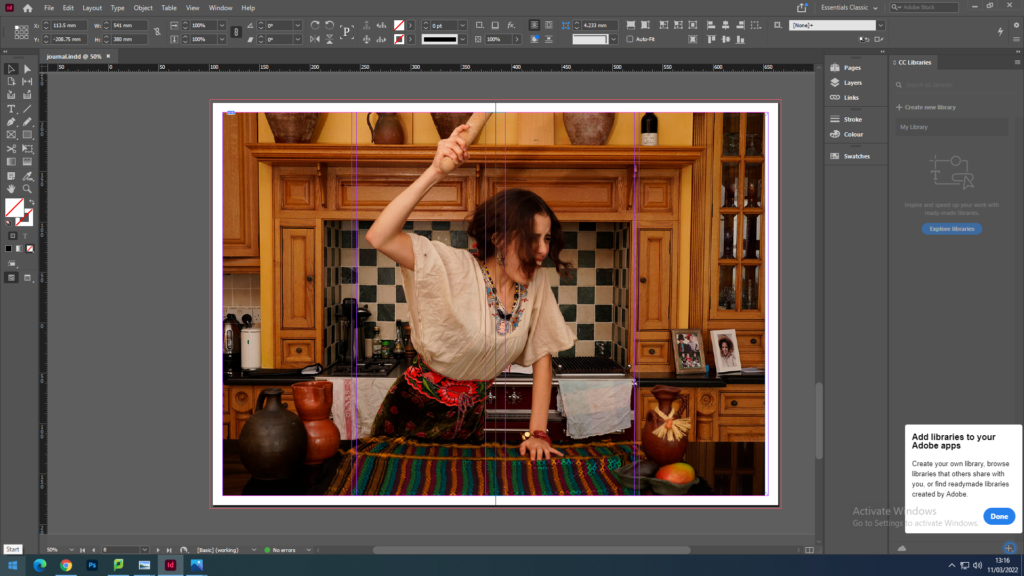
FULL-BLEED
JUXTAPOSITION
SEQUENCE
MONTAGE
I decided to put my image full-bleed wich means selecting one image as a full-bleed spread because my image is an in landscape and I thought the image in full-bleed had a good balance on itself.
For created a montage on the left image and the other one is the same shoot but with none editing. To create a montage I choose to work in Photoshop for more creativity and the I import it into InDesign as one image.
Sam Harris was born in London. As a teenager he taught himself photography, turning his bedroom into a darkroom. During the 90’s Sam has photographed portraits and done illustrations for a range of British artists. He has also collaborated as a photographer for magazines such as The Sunday Times Magazine, The Telegraph Magazine and Dazed & Confused. Today, Sam Harris creates covers for artists’ books, directs and shoots films, leads workshops in Australia and of course continues to take photographs. The book I have chosen from this artist is called The middle of somewhere. The middle of somewhere is an A4 book portrait. The book is about 100 pages including a travelogue, the images are all in colour. The cover it’s an beautiful green with some and an yellow fun draw pattern , it creates texture it. It’s an hard, perfect binding cover. There also a long white tape which the title is written on. At first view it seems like a diary or an album photo which symbolise that the book is personal. While doing my research on the book I realized that the cover had a lot of meaning and sense since the photographer Sam Harris explains his pictures is like his family diary. The book revolves around his two daughters, Uma and Yali growing up. After Sam Harris left his my photographic career behind in London in 2002, Sam Harris and his family passed several nomadic years before settling down in Australia where his series began. His work is a celebration of childhood, family life, love and their simplistic lifestyle surrounding their environment. As he witness his daughters’ transformation he urge to preserve something of their time living together. We also sometimes find dates and a travelogue to follow their story. In his album we can see fights between sisters, arguments between parents, laughs… We also find daily objects like little notes from his children, everyday brushes, creams, to do lists which reinforces the idea of a diary. Sam Harris has exhibited over several countries like Spain, Greece, Argentina , Portugal and France. His photobook ‘The Middle of Somewhere’ won a Lucie Award in 2015.