All posts by Bethany M

Filters

Author:
Category:

artist reference – danny alexander

Alexander is an American photographer from Louisville, with a degree in philosophy, he turned to photography after realizing he would need a creative outlet along side his career in corporate.

‘Since picking up a camera, I’ve worked with numerous magazines to highlight, document, and promote individuals within the community, businesses, and over 100 restaurants. I’ve completed several projects which have been featured on websites such as The Phoblographer, won several awards, and in 2016 I became a semi-finalist for Adorama’s Top Photographer reality show competition.’

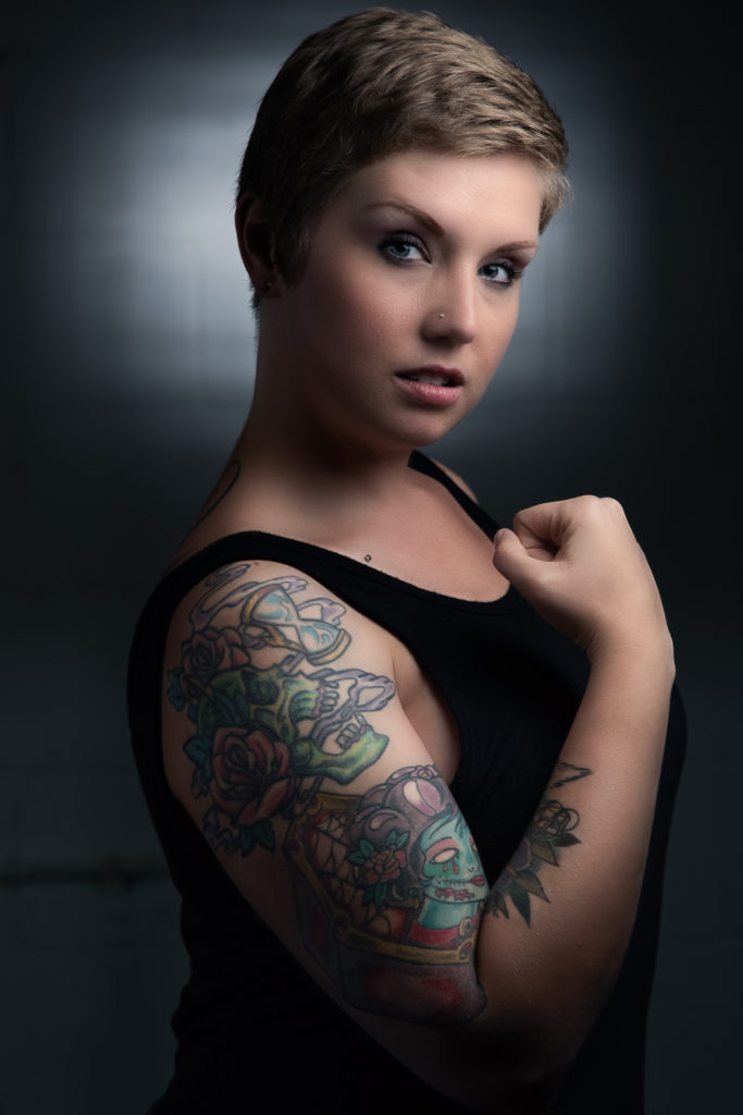
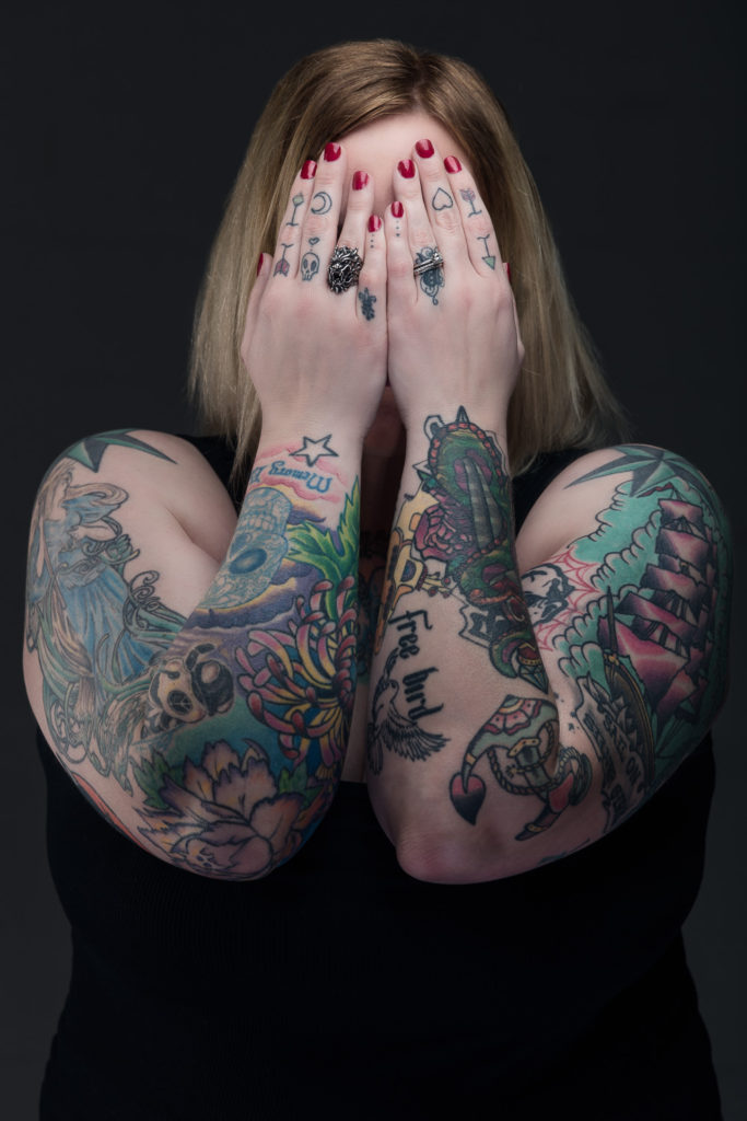
 Danny has completed several projects including the year long 52 Portrait Project and, more recently, a tattoo portrait series entitled Skin as Canvas. Of which Danny calls an “intimate representation of some aspect of that person’s life.” He started this project due to finding body art and those who dedicate their bodies to it fascinating. The idea of permanently modifying their bodies for art and offer this intimate insight that is on display to the public. ‘I wanted to highlight this in the series by removing all other possible tells of that person’s character, like clothing and environment, and have the viewer look past just the aesthetics of tattoos and try to decipher its meaning.’

Image Analysis

This photo by Alexander demonstrates model with an aline spine tattoo as the main focus.

The light source is positioned in a way to extenuate the tattoo and draw the viewers attention to the focus. The little soft lighting seen gives an unusual innocence that isn’t usually associated with tattoos, challenging the negative view points and allowing the subjectivity of body art.

The studio lighting causes a contrast as it allows the photographer to move and angle the light however he wants. Lighting only on the tattoo represents the darkness of space around the solar system and how broad it can be / how small we are to our surroundings beyond earth. This could possibly be a reflection of how we see others around us and how we don’t know the depth of all the identities around us.

As the model is wearing all black clothing, it leaves viewers focus to the tattoo. This also means that the dull clothes give no insight to the viewer seeing their personalities or styles, leaving tattoo meaning up for interpretation by the viewer. This gives the opportunity for them to connect to the model based on the own interpretation and therefore viewing it more personally.

The history of photography

The camera obscura is initially one of the first concepts of converting landscapes into images. It was achieved by blacking out all light sources in a small room, only leaving a small hole correlating to the landscape that is wanted to come through. The result was that an inverted image of the outside scene was cast on the opposite wall, which was usually whitened. This technique has been used for many reasons ; Firstly was widely used for viewing eclipses of the Sun without endangering the eyes, then progressed to be an aid to drawing. With the subject being drawn posing outside and the image reflected on a piece of drawing paper for the artist to trace. Portable versions were built, followed by smaller and even pocket models, making the art more available to the general public. The interior of the box was painted black and the image reflected by an angled mirror so that it could be viewed right side up.

The camera obscura (source: Wikimedia Commons). | Download Scientific  Diagram

This adaptation is the main stepping stone to Nicéphore Niépce’s work with light sensitive plates. He did this by coating  pewter with various light-sensitive substances in an effort to copy superimposed engravings in sunlight. He called this heliography, meaning sun drawing. Niepce trialled many different substances to find the most effective one for his aim. He tried paper sensitized with silver chloride, but was only partially able to fix the image. He next tried a light-sensitive material bitumen of Judea, a kind of asphalt, which hardens on exposure to light. He achieved his final aim in 1826 by permanently fixing the view from his workspace onto a pewter plate. Metal had the advantage of being unbreakable and was better suited to the subsequent etching process to produce a printing plate.

Louis Daguerre used this finding with the intention of improving the very long exposure times by either chemical or optical means that Niepce gave in on.

statement of intent

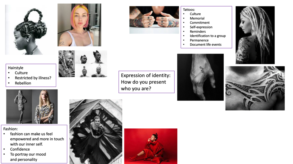
My aim is to explore the question that I have about people’s identity ; How do you present who you are? I wish to dive into the expressive forms of tattooing, the permanence of a part of who you are. Over the year, I have had the continuous stream of questions like ‘Why would you do that to your body?’ , ‘You know that’s permanent right?’ and ‘I could never do that to myself?’. There has always been a stigma around people with tattoos which upsets me as it can be a beautiful artform to express your identity.

In this project I will document my friends’ and families’ tattoos and pair the photos with what they mean to them, either a handwritten note from them or an object/photo that ties in with the meaning behind. I’m exited to do more research into this subject matter, including the history and culture values which i can add to my final piece if appropriate.

I will present my final photos as a photobook as I preferer working with still images, not only that but as the images are still and physical, it gives the viewer more time to absorb the essence of what tattooing can achieve.

reveiw and reflect

From your Personal Investigation based on IDENTITY & COMMUNITY write an overview of what you learned so far (both as Yr 12 and Yr 13 student) and how you intend to develop your Personal Study.

1. Describe which themes, medium (photography, film), approaches (documentary, tableaux, conceptual), artists (incl contextual references to art history, movements and isms) and photographic skills, processes, techniques and methods (incl learning new software) inspired you the most and why.

During my investigation of Identity and Community I feel as if my skills and efficiency has successfully developed. In the last project which was completed in groups, I found that I preferred the medium of still photography than film material, I felt more confident in the collage created as that form of presentation is my favourite to do. However, the film within our group still had an amazing concept that I feel was well executed by whom was delegated to edit and film our materials. Our group took the choice to push the mediums of the project and to use embroidery, using very useful skills that were taught to us by Yulia M , on our still photography. In the next year, I wish to continue prioritising photography over filming as that is what I feel the most comfortable and confident

One approach I would like to explore is the documentary some time this year. I feel like a real, raw in look at someone’s identity, capturing the genuine essence of how a person may express themselves.

My favourite artist in which I have studied so far is Carolle Benitah, using her work as a reference in two of my projects. I always come back to her work due to how strong Benitah has been influencing my initial ideas, weather that is connected to the literal physical embroidery she presents or how her work gives a sense of ambition to think ‘outside the box’ and try a new, different approach to my final pieces.

Over the course of the year, I can see through revisiting old blog posts that my skills and understanding of writing an image analysis has improved greatly as having more experience with the subject makes it easier to analyse and critique other work. When starting the subject, I found photo analysis the hardest part of the projects, although I still am not the best, I feel a personal accomplishment

statement

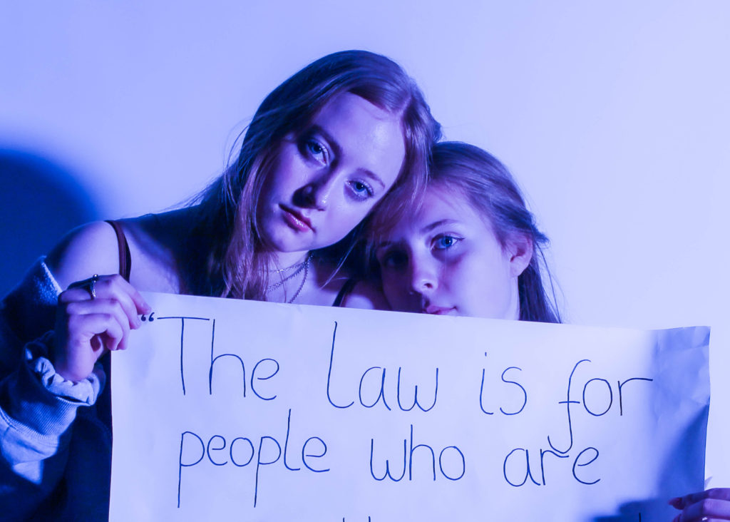
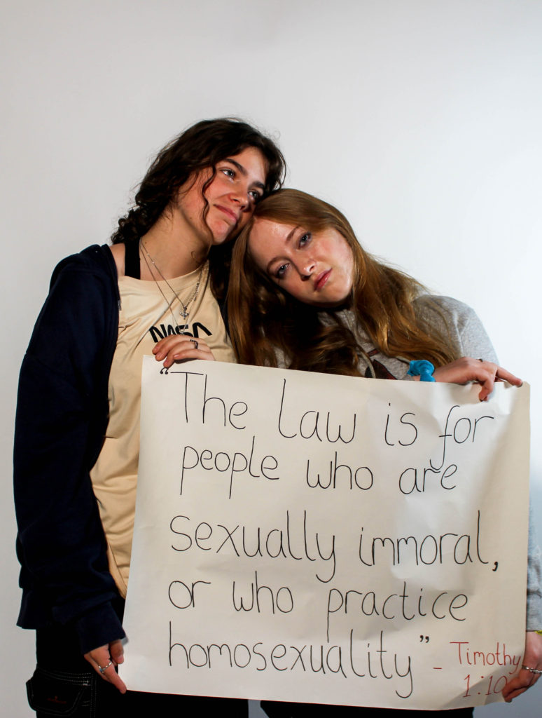
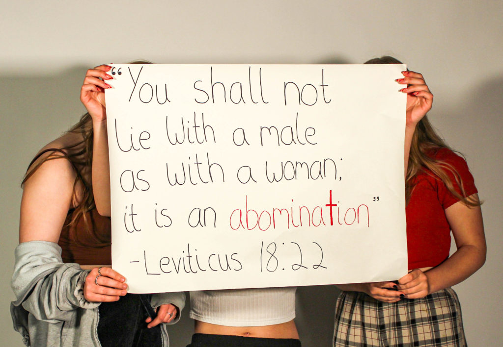
The idea behind this project is to form a narrative that highlights the 2 communities of faith and also the LGBTQ community. With this we tend to touched upon the problems of bias and hate, inside bound religions, during this explicit Christianity, towards the LGBTQ community and the way usually folks ar created to selected between the 2. This was galvanized by the stress that’s usually seen in Jersey between these 2 entities, and sometimes the dismissal and disapproval of the 2 existing within the same area. Our presentation of this idea in image type, showcases a tapestry, which contains parts of the LGBTQ community and incompatible spiritual aspects. Here pictures are seamed over and along, a number of couples in an exceedingly colour of the LGBTQ flag and a few of harmful spiritual quotations. Our film supports this idea, through the story of a lesbian couple at the United Nations agency who are torn between the spiritual aspects of their lives, and their desire to be in harmony and true to their identity, all by being accepted by their religion. Showing scenes of serenity and violence, we tend to show the turmoil going on in their head. The purpose of this film is not to condemn either of these communities, however, to provide a path of acceptance that allows for a harmonious existence between the two because Jesus taught:

25 “Therefore I tell you, do not worry about your life, what you will eat or drink; or about your body, what you will wear. Is not life more than food, and the body more than clothes? 26 Look at the birds of the air; they do not sow or reap or store away in barns, and yet your heavenly Father feeds them. Are you not much more valuable than they? 27 Can any one of you by worrying add a single hour to your life[e]?

28 “And why do you worry about clothes? See how the flowers of the field grow. They do not labour or spin. 29 Yet I tell you that not even Solomon in all his splendour was dressed like one of these. 30 If that is how God clothes the grass of the field, which is here today and tomorrow is thrown into the fire, will he not much more clothe you—you of little faith? 31 So do not worry, saying, ‘What shall we eat?’ or ‘What shall we drink?’ or ‘What shall we wear?’ 32 For the pagans run after all these things, and your heavenly Father knows that you need them. 33 But seek first his kingdom and his righteousness, and all these things will be given to you as well.”

We are all inclined to believe that our project, which is part of the Metaverse, may exist in the near future, due to the undeniable fact that it has gone public, which is a potential utopia. This means that for this idyllic and peaceful online world to exist, bridges must be designed between divided communities, like this one, creating a safe online zone.

evaluation

With our digital images, I think that by using the medium of embroidery to put the collage together, it created a sense of vulnerability that these people had to endure. Indeed, it has helped show their sexuality and the comments that inflict harm on them and their community . If I could comment on anything that could be improved regarding this image, it would be to make the colours of the individual photos bolder, by printing them on canvas or lighter paper, rather than the heavyweight paper we used.

Overall, I believe that our film and still image that we produced as a group has been successful, due to the fact that we have achieved our goal by producing a visual representation of the turmoil and discrimination that people who are members of the LGBTQ and religious communities suffer, and with the film offered a lighthearted resolution. Some aspects of the film that I believe worked well and allowed for this to happen, were the religious setting scenes, due to the fact that we were able to shoot on location, in a real church. Furthermore, by using clothing to signify the comfort of the characters in different setting, for example wearing conservative white clothing in the church and leisurely and comfortable clothing in the dream sequence, I think it helped to enhance our vision. Another thing that helped the filming process, was using a camera frame to make scenes in which the camera is moving look smoother. Although this doesn’t mean that the camera was perfectly steady, it most definitely helped us produce a more professional outcome. In my opinion, I think we can improve the riot scenes because we used the original video to make it more real. However, I think if possible we could use scenes more closely related to the theme of the film, such as religious protests against progressive legislation for the LGBTQ community.

filmimg and planning

To start our filming process, Tiago constructed a clear and detailed plan for us to refer back to throughout the day. This was extremely beneficial as it helped us stay on focus of what we wanted to achieve and to help us look for little details that can be changed or use to our ability whist at the location to improve efficiency.

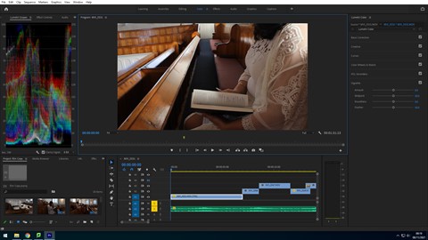
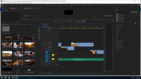
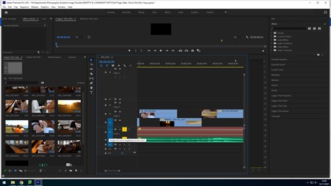
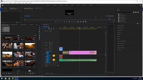
While editing the film, Tiago took screenshots of the process as he went. For our film we obtained a soundtrack that we believed would match the mood of the film. We did this by carefully searching for classical and cinematic music from websites that provided royalty free audios that was appraise for all three atmospheres, the church, dream sequence and riot clips. We came across a piece Sailing Away by Shane Ivers. Tiago first arranged the video clips in the order, showing the storyline, then went on to cutting these clips down and trimming them, in order to present the best part of the footage and cut to the beat. In addition, we obtained a recording of a bible passage, specifically one that quotes “love thy neighbour” to relate to the title of the film.

Here we chose to alternate the scenes of calm and chaos to show the binary oppositions of faith and interpretation that are seen in religion when it comes to the LGBTQ+ community, particularly Christianity. We obtained these clips of riots through searching for royalty free stock footage, as we believed using a real life documented event would be more impactful to the message of prejudice and homophobia that is presented through our film. In addition, we also thought that these clips in particular would work best, as they fit the colour grading in the film, with the fire replicating the sunset in the dream sequence and the warm tone of the church pews.

Finally, Tiago added a credit scene at the end of our film, which displays the our names, the film title, the credits for the royalty free music and riot clips, the names of the actors and our school name. This was transitioned into with a crossfade also, as well as the end of the credits. He also faded out the music to give the film a gradual ending, using the constant gain audio effect.

FILM STILL IMAGES

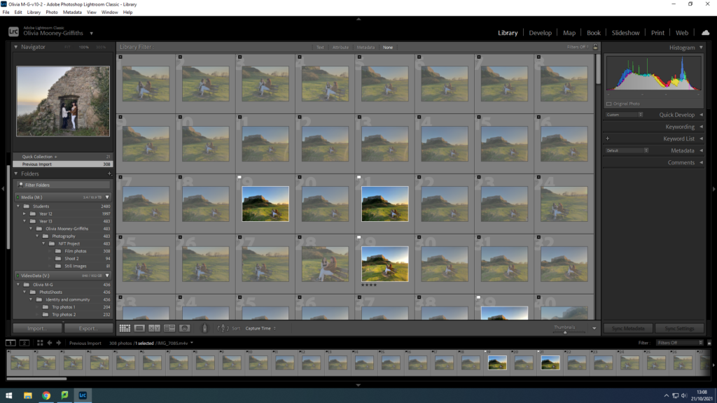
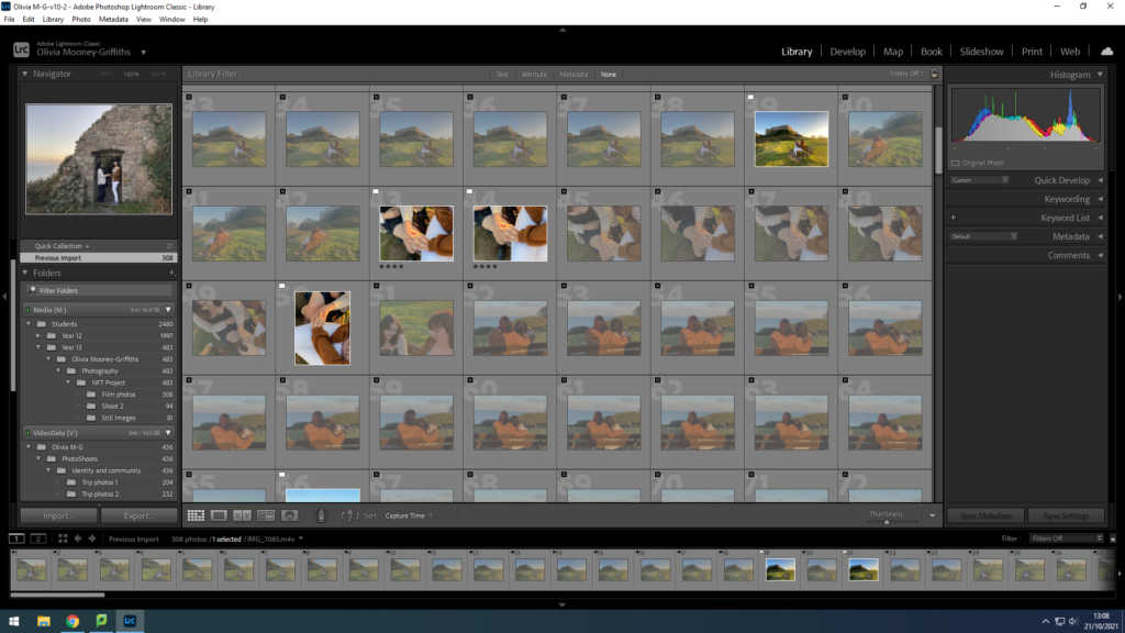
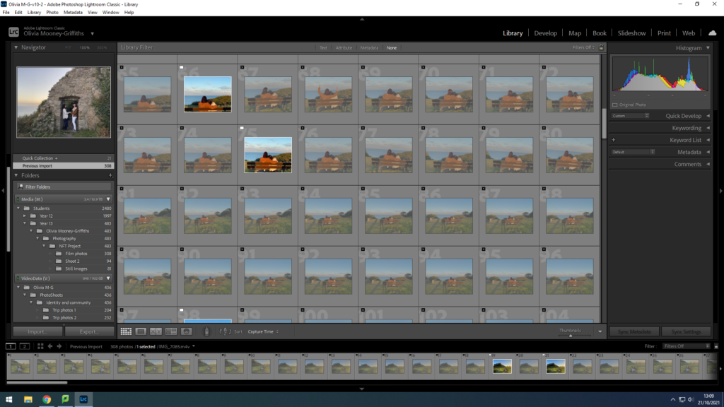
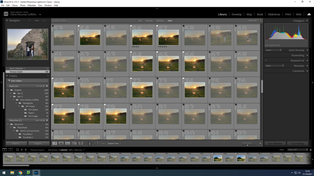
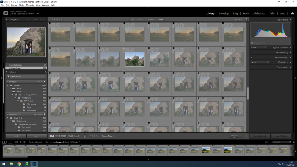
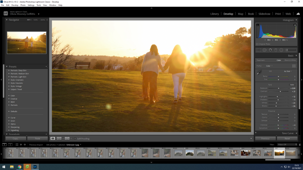
during filming, we took the opportunity to take stills of the scenes as we went along , allowing for more photographs that tell our story of the crossover between the Religious and LGTQ+ communities, as well as our studio images. These photographs include scenes such as the couple in the church and the dream sequence in our film that showcase the couple’s idealistic world for them, in which they are free from restraints and internal conflicts. Within Lightroom, Olivia sorted through which images she thought were best in the sense that they best conveyed our message and were clear and in focus, and that also related back to our original storyboard.

This photo sets the scene of the main character, practicing her religion through reading the bible. This shows a personal relationship with Christian religion for the character and shows that to the audience clearly. When editing, Olivia started off by slightly decreasing the exposure and increasing the contrast, causing a more dramatic setting which will later show a juxtaposition to the lighting of the dream sequence. After this, she then went on to adjust the shadows, highlights, whites and blacks within the image, by increasing the highlights and whites and decreasing the shadows and the blacks, further creating a larger contrast.

This still image displays the scene in which the couple are separated due to fear, still however sharing glances at each other. This conveys how in some instances people belonging to these two communities have to conceal part of their identity in order to be accepted. Olivia edited this photo in the same style as the scene before.

This photograph is a still image of one of our establishing scenes for the dream sequence. This is as the wide shot foregrounds the dream like and scenic setting, due to the castle in the background and vibrant green grass. Here this colour grading contributes to the film by matching the mood to the vibrancy in contrast to the dark slightly duller tones in the church. For the dream sequence Olivia edited the still images by decreasing the exposure due to the large amounts of sunlight already in the photograph. In addition, she also increased the contrast and adjusted the highlights, shadows, whites, blacks and saturation within the image.

This final scene of the dream sequence displays the couple holding hands again, feeling at peace with both sides of their identity, walking through the vibrant, green setting into the sunset. This again reinforces the idea of an ideal world that the characters are longing for themselves. whilst Olivia edited, she kept the essence of the photo bright and vibrant

still images and planning

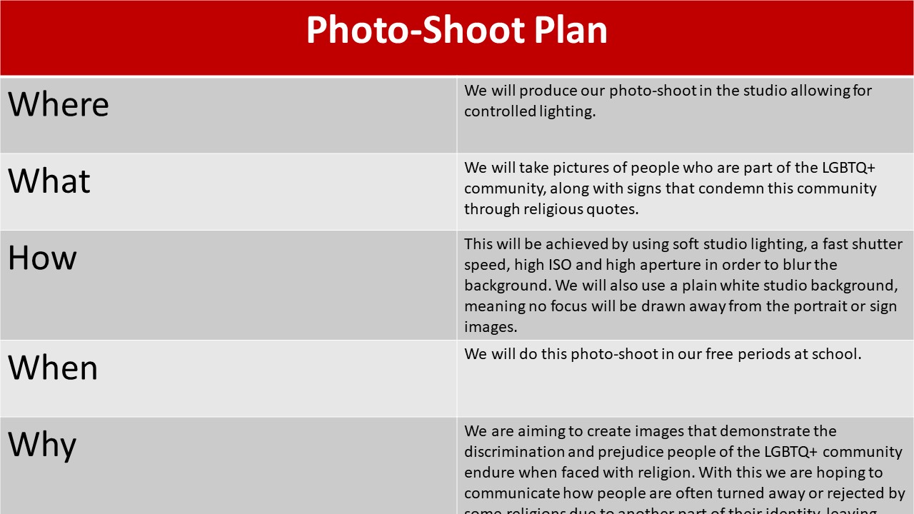
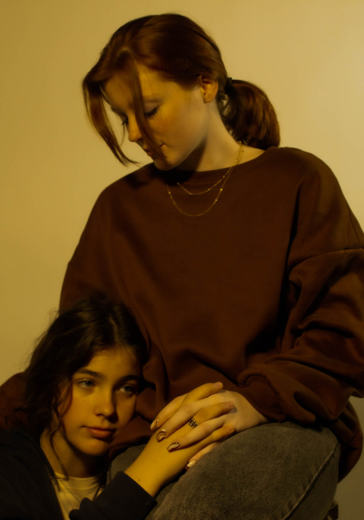
When looking for models, we decided that it may be difficult to find a good handful of young people confident enough in themselves to be photographed for being LGBTQ+. Therefore, for more comfort, we decided to use close friends that may not be apart of the LGBTQ+ community, but still understand the importance of the affects homophobia has on the community.

When taking the photos, Olivia and I took turns to direct and shoot the models. As we both have slightly different ideas and visions, doing the photoshoot together meant we could learn from each other and collect more materials than if only one of us did the shoot.
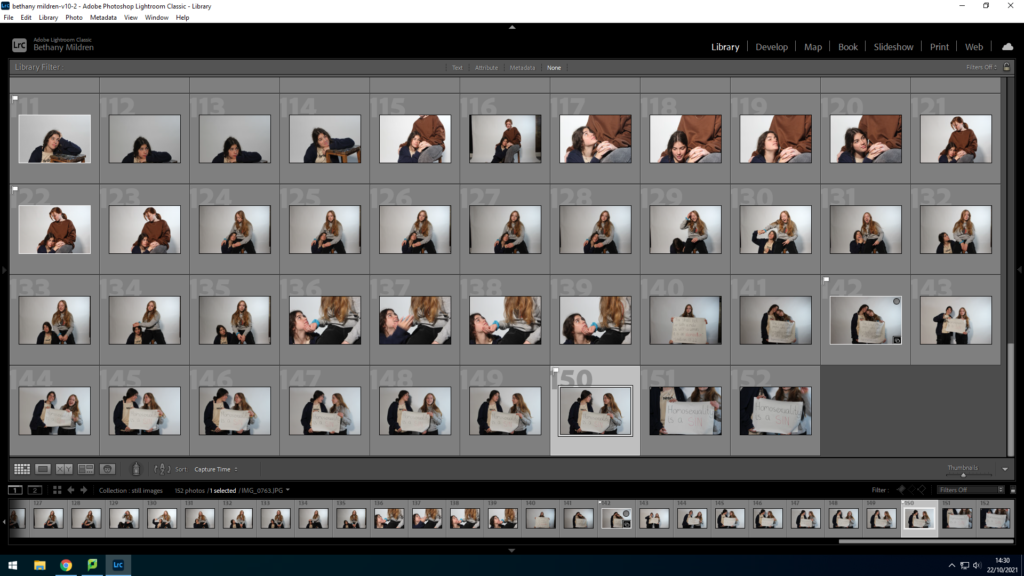
contact sheet

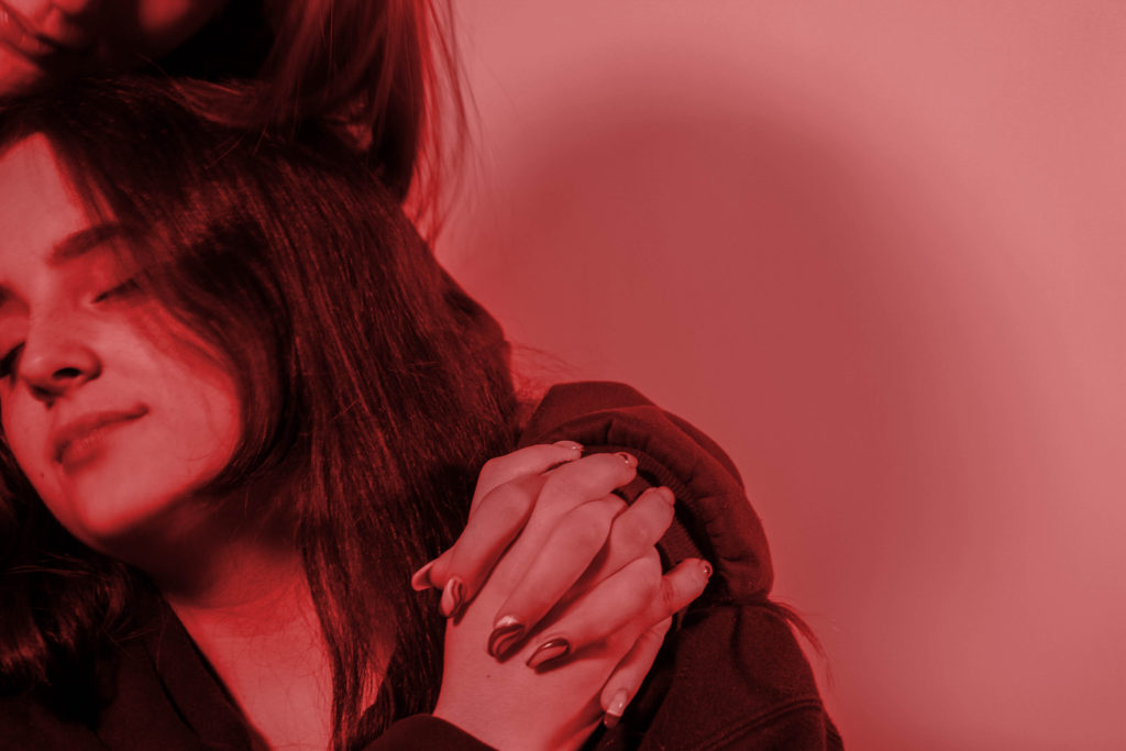
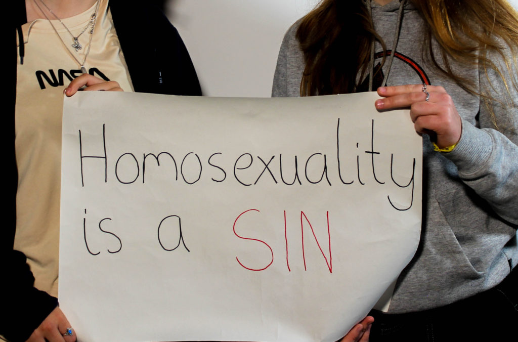
We completed the shoot over two days, using different lighting and different people to widen the variety of photos to choose for our final collection. To start the editing process, I went through the photos and flagged my favourite photos that I felt portrayed the topic well. Using clear photos of the sign, cropping out the models to draw the focus into the issues these phrases can cause. I paired them with photos of the same sex models acting happy and comfortable in their ‘relationships’.

Final photos

From the photoshoots, I selected 9 of the best photos use use in a physical collage, using techniques learnt from the embroidery workshop. I decided to add a colour overlay over 6 of the images, each of these overlays are also found to be the colours that form the LGBTQ+ pride flag. These will also be integrated with the normal colour images that mainly showcase the passages on the signs that condemn the LGBTQ+ community. By stitching together our images, it also presents a metaphor for the merging and relations of the two identities that a person should be able to share without discrimination. In addition, this assortment of colours and images can also be linked to artwork seen in religious settings, such as stain glass windows seen in many churches.