All posts by Anya Nightingale-Bataille

Filters

Author:
Category:

Anthropocene: Introduction and Ideas

Anthropocene: The unofficial current geological age, the period during which human activity has been the major influence on the climate and the environment.

Humans as a whole impact the physical environment in many ways: overpopulation, pollution, burning fossil fuels, and deforestation. Even the basic things like plastic use/waste can impact the environment majorly. These changes have triggered climate change, soil erosion, poor air quality, and undrinkable water which are global problems.

Examples Of Anthropocene in Photography:
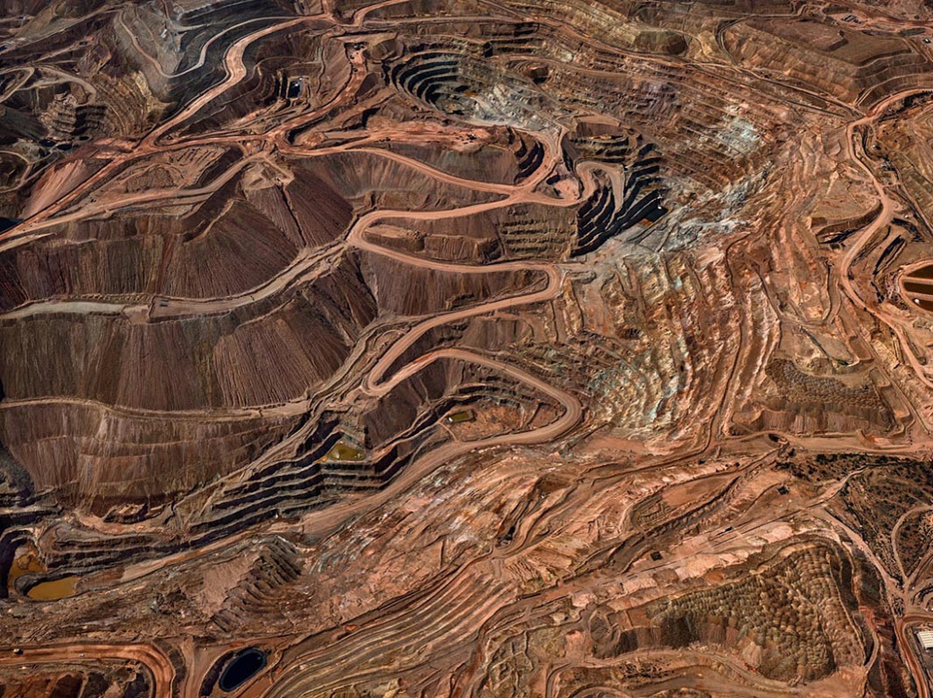
Anthropocene, the human epoch in the words and photos of Edward Burtynsky -  LifeGate
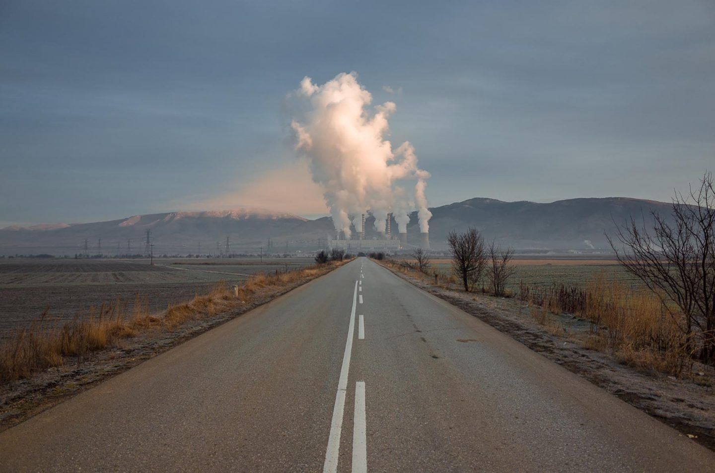
George Marazakis Photographs The Anthropocene - IGNANT
Anthropocene Archives | 1854 Photography

Ideas

Case Studies

Yao Lu

https://www.brucesilverstein.com/artists/yao-lu/biography

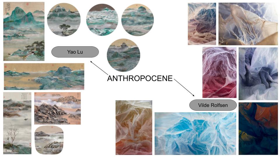
Yao Lu focuses on his concern about the changes of the environment and the consequences of modernisation in china leading to rapid industrialisation and urbanisation. Also showing the difference between past and present through using aspects of the traditional Chinese style of painting to create similar images. Lu creates his photomontages in circular, fan-shaped and scroll-like frames.

At first glance they look very harmonious with the old traditional buildings and small figures walking in nature, but the beautiful mountain scenes are actually dump sites which have scaled out of proportion.

His photographs serve as a warning to the viewer about the consequences of large-scale transformations for the society.

Examples Of His Work:

Yao Lu - Ancient Springtime Fey, 2006 | Bruce Silverstein Gallery
Ancient Springtime Fey, 2006
Yao Lu - Fishing Boats Berthed by the Mount Yu, 2008 | Bruce Silverstein Gallery
Fishing Boats Berthed by the Mount Yu, 2008
Yao Lu - Early Spring on Lake Dong Ting, 2008 | Bruce Silverstein Gallery
Early Spring on Lake Dong Ting, 2008
Yao Lu -  View of the Autumn Mountains in the Distance, 2008  | Bruce Silverstein Gallery
View of the Autumn Mountains in the Distance, 2008
Yao Lu -  Dwelling in the Mount Fuchun, 2008  | Bruce Silverstein Gallery
Dwelling in the Mount Fuchun, 2008
Yao Lu -  Autumn Mist in the Mountain with Winding Streams, 2007  | Bruce Silverstein Gallery
Autumn Mist in the Mountain with Winding Streams, 2007

Yao Lus’ images are based on landscapes in China which he recreates with waste scenes and landscapes to make a final composition of a very scenic, calm and peaceful atmosphere. It clearly shows the impact of waste on the environment and tells the story itself with the precision of composition, line, density and its framing, which are all the elements in painting.

When taking my own photos and creating my final images I will take similar landscapes but with cliffs/coastlines incorporated with piles of waste in dump sites, to get the same effect of the calm peaceful scene, which when you look closer you notice the dumpsites.

Vilde Rolfsen

Plastic Bag Landscapes series includes structures, formed by discarded bags found on Oslo’s streets, being transformed by light to make shapes resembling snow scapes or icy caverns. The plastic bags used for the project are all sourced from the street.

“I want people to stop and think about the plastic cups lying around and blowing away. No one cares, because it’s normal’.

When taking images for this series Vilde Rolfsen wanted to take ordinary objects out of their usual context and place them into an artificial environment to create awareness around the issue of plastic waste to the land and oceans, more specifically the use of plastic bags. Rolfsen also hopes her work will remind people to think more about their own consumption patterns.

https://www.anothermag.com/art-photography/3675/plastic-bag-landscapes-by-vilde-rolfsen

Examples from Plastic Bag Landscapes:

Plastic Bag Landscapes

Vilde Rolfsens’ images where she takes ugly plastic bags and turns them into beautiful images creates an atmospheric impact as they have a lot of movement in them and look very much like the water/sea.

I will take plastic bags and other waste and photograph them with different coloured lights to get the same wave/movement effect. I also want to attempt to make them look like the sea or different landscapes rather than just different coloured plastic bags.

I would also merge the two photographers ideas together and make a landscape with the plastic bag as the sea or even clouds/wind.

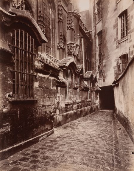
Urban Landscapes: Eugène Atget

Eugène Atget

Eugène Atget was an French photographer who took images of the rapid disappearing and elements changing of Paris during the 19th century, best known for his photographs of the architecture and streets of Paris.

He began his career as a commercial photographer. Atget’s clients were primarily painters and sculptors which he produced images of architectural details, doorways, and antiques. He searched for abandoned gardens or empty courtyards for his subject matter.

http://www.artnet.com/artists/eug%C3%A8ne-atget/2

Examples Of His Work:

Paris to New York: Photographs by Eugène Atget and Berenice Abbott,” Taft  Museum of Art, through January 20, 2019 :: AEQAI
Courtyard St. Gervais and Protais 1899-1900
Beauvais, Impasse Beauregard, 1910
Eugène Atget | Artnet
Street Scene, Paris, ca. 1900

Photo Shoot Plan

Who I will be taking the photos and do not need any models as I will be focusing on the landscape.
WhatCoble streets and old buildings.
WhyEugène Atget photos are of the old paris streets and these photos will look similar to them.
WhereLocation 1: Old street behind the Museum.
Location 2: Old street in St Aubins.
WhenI’ll go during the day so that there natural lighting because I want my photos to show the streets in detail. 
HowI will be taking them from eye-level.

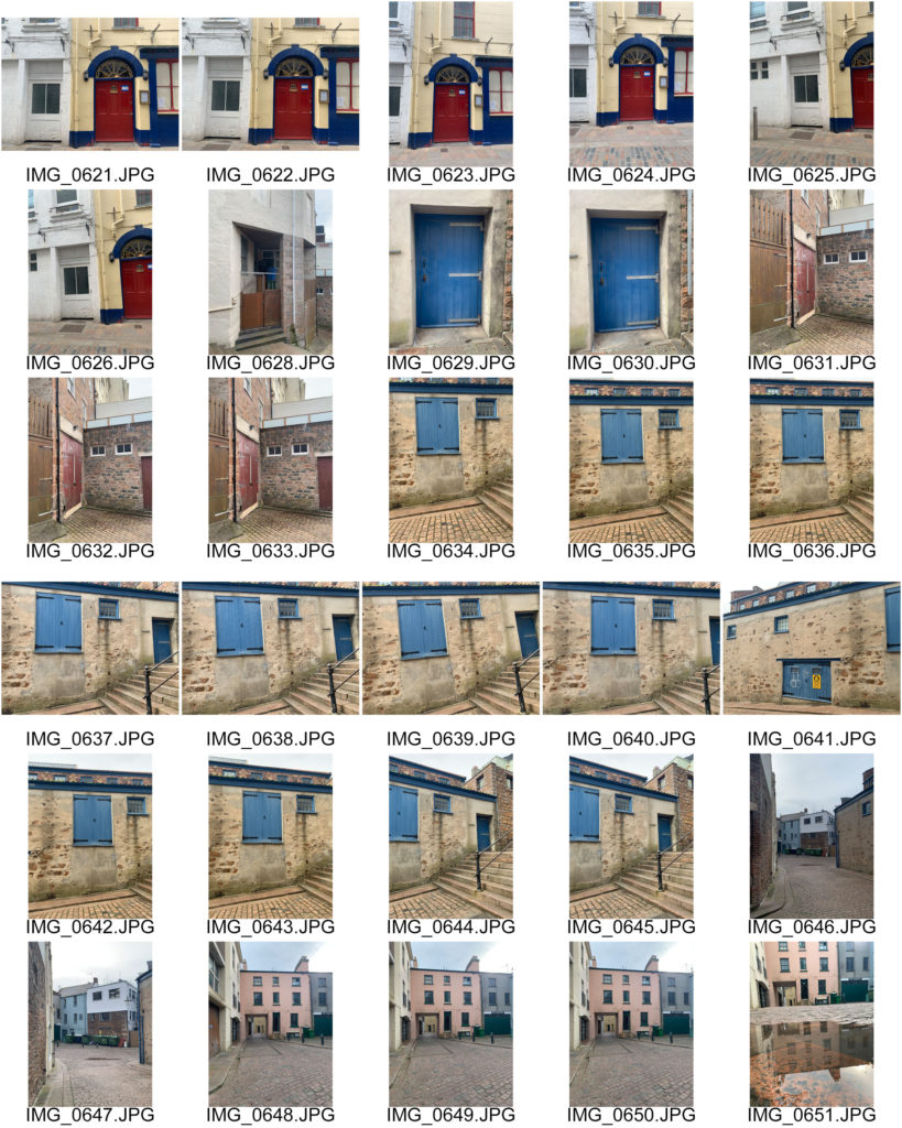
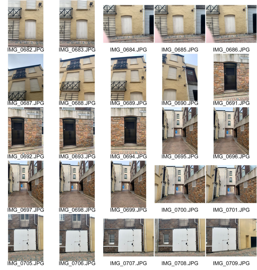
Contact Sheet

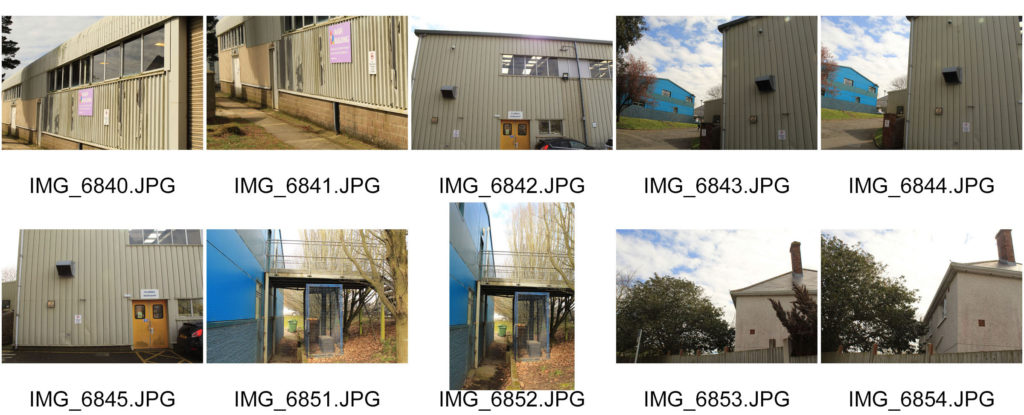
When taking these photos I was focusing on the shapes created with the buildings, doors and walls in the photo and tried to make the subject (mainly the big doors) the focal point. To develop these further I will be adjusting the images to make them look older and more part of the 19th century like Eugène Atget photos.

The New Topographics: Lewis Baltz

Introduction

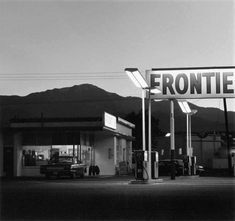
New Topographics are photographs of a Man-Altered Landscape, more buildings as opposed to the natural environment. New topographics was a term made up by William Jenkins in 1975 for a group of American photographers (such as Robert Adams and Lewis Baltz) whose pictures had a similar basic/structural aesthetic which were mostly black and white prints of the urban landscapes such as parking lots, suburban housing and warehouses. It has been influential in contemporary photography, both for architecture and its cerebral style. 

What was the new topographics a reaction to?

Topography was both an insight into the increasingly suburbanized world around us, and a reaction to the idealized landscape photography about the natural and the elemental, contrasting both ideas, making the opposite stand out more.

Examples Of New Topographics:

New Topographics | Frieze
Presentation “New Topographics: Photographs of a Man-Altered Landscape” |  Luminous Eye
Robert Adams : Pionnier de la photographie de paysages modifiés par l'homme

Lewis Baltz

Lewis Baltz documents the changing American landscape in the 1970s in his series, “New Industrial Parks Near Irvine, California.”

In this series he photographed industrial pictures focusing on parking lots, offices and industrial parks creating a contrast with the structure. He often displayed his images in a grid format meaning that the images must be able to be seen collectively as a group or series.

He takes care to title his pieces with specific information on each site’s location, so that viewers could return to the same exact place.

Examples Of His Work:

Museum of Contemporary Photography
#45, from the “New Industrial Parks Near Irvine, California” portfolio 1975
2001_3 copy.jpg
#10, from the “New Industrial Parks Near Irvine, California” portfolio1974
2001_5.jpg
from the “New Industrial Parks Near Irvine, California” portfolio 1974
The New Industrial Parks by Lewis Baltz (577PH) — Atlas of Places

Shot with a 35mm lens on a 35mm camera (usually at eye level), and aiming for maximum depth of field, Baltz does this for clarity and precision.

Image Analysis

Lewis Baltz « The Albertina Museum Vienna
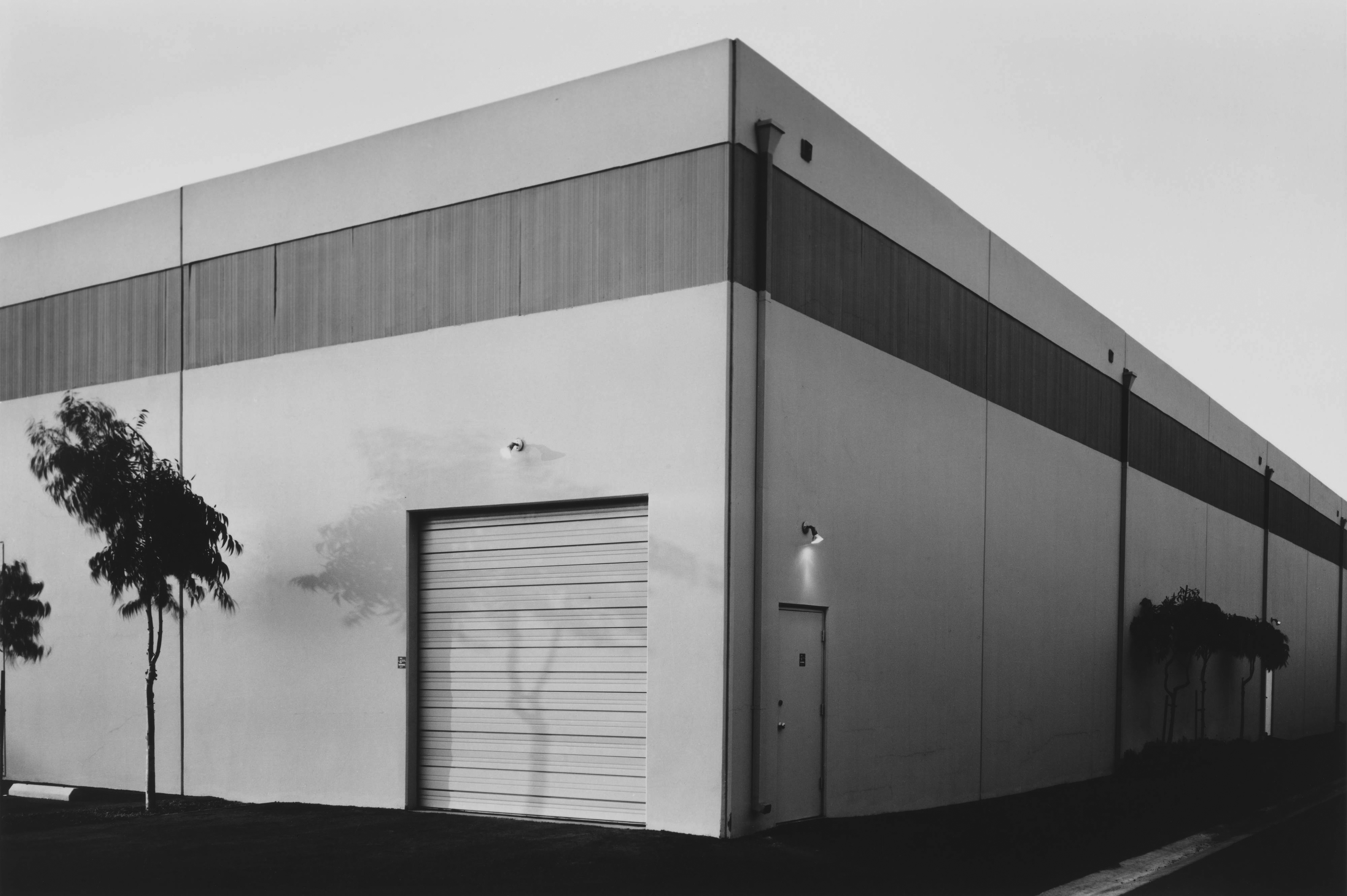
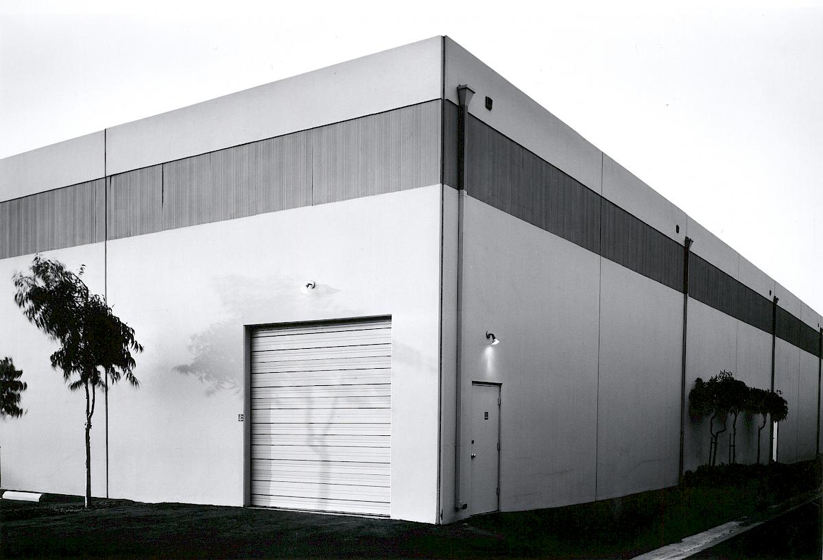
Southeast Corner, Semicoa, 333 McCormick, Costa Mesa, from the series The New Industrial Parks Near Irvine, California 1974

Content – A picture of a warehouse corner with trees and grass around it. It is taken from eye level like the topographic genre. The image has no title only a title inculudng the address so that people can go to the places he went to. There is not a single point of focus, It has been framed as a scene, rather than bringing attention to any particular element.

Formal Elements – The image is in black and white which creates a high tonal range. This highlights the solid contrast between light and dark and the structural elements in the warehouse, which gives the image an interesting composition. The sky being clear also emphasises this contrast as it creates a clear, strong line. Baltz used natural light from the sky to get a bright image. The sunlight has also changed this image as there is a faint shadow of the tree on the left which appears on the warehouse, this also makes the right side more exposed then the right creating further juxtapositions. the lines in the warehouse start from the centre of the image and go down to either side giving the image a large depth of field and making the warehouse look 3D.

Mood – The image is strong and impactful. this creates an intiidating feel to the image as the warehouse is very bold and sharp. The plain sky and warehouse also gives a sense of isolation.

Photo Shoot Plan

Who I will be taking the photos and do not need any models as I will be focusing on the landscape.
Whatwarehouses, industrial buildings.
WhyThis represents the new topographics the best as it shows industrial buildings as man made things.  
WhereLa Collette warehouses.
WhenI’ll go on a day where it is not sunny so the sky is grey and contrasts better with the buildings. 
HowFrom eye level.

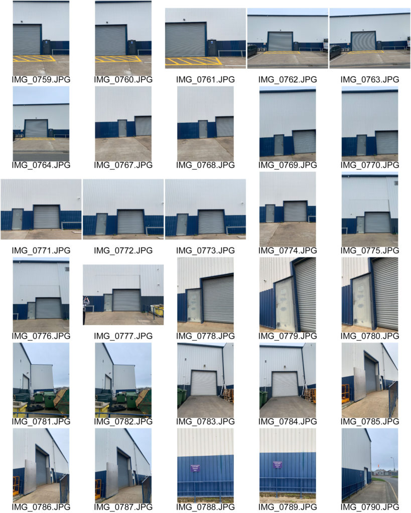
Contact Sheet

When taking these images I focused on the eye level aspect of industrial photography, and get a lot in the shot because I need to edit the images so they are angled correctly and wanted more of a scene in some images. I think the structural aspects are well executed, the lines of the building structure give them a man made feel which best represents New Topographics and Industrial Landscapes.

School Photo Shoot

Urban + Industrial Landscapes: Introduction and Ideas

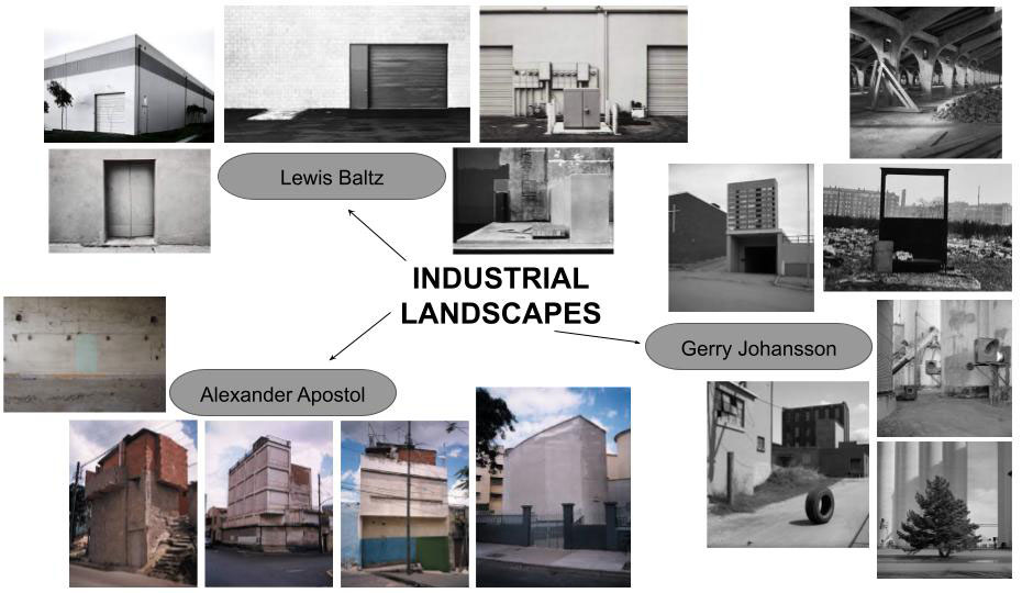
Industrial Landscape

Industrial landscapes are man made landscapes which look very industrial, mainly construction sites, power plants, chimneys, and factories.

Industrial landscapes are rising in natural habitats and urban areas, changing the natural aspect of earth creating unique geometrical shapes.

The contrast between the sharp unique silhouette of a factory within our natural world. Photographers have made abstract shapes with industrial buildings. Monochrome photography is also popular for industrial photos to get the image to contrast more.

Examples Of Industrial Landscape Photography:

Urban Landscape

Urban landscape photography focuses on more culture and lifestyle.

Humans rarely appear in the photographs yet you can feel the presence of life and culture. Both cautionary and confessional, they also define challenges facing our global future.

Examples Of Urban Landscape Photography:

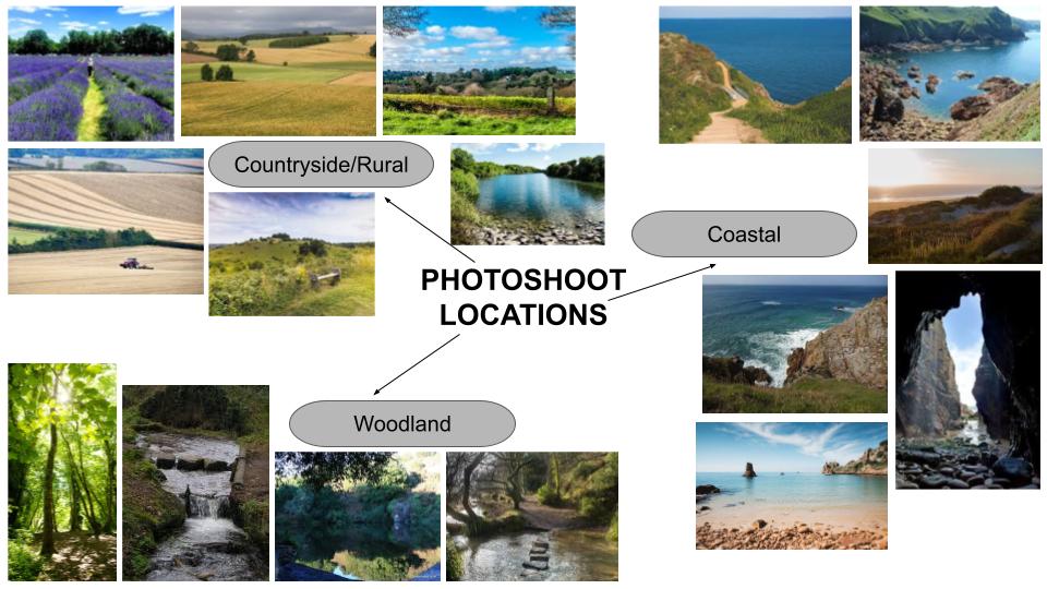
Photo Shoot Locations

When taking my photos I want to focus on the idea of dereliction, old and new, altered landscapes and car parks. With an overall look on change.

Locations around Jersey:

Charlie Waite: Final Outcomes

Editing

I used photoshop adjustments to alter the light and colour in each image, specifically brightness/contrast, exposure and vibrance. When editing them into black and white I changed the colour levels in each image to make the highlights and shadows more contrasting to each other. In Image 4 I used the clone tool to make the mud less bright as the light was reflecting off the mud and I wanted it to be darker.

original image 1
original image 2
original image 3
original image 4
original image 5
original image 6

Final Outcomes

Rural Landscape: Lisa Wood

Lisa Wood

Lisa Wood is an American photographer that takes abstract photographs of farmland landscapes using multiple exposures and time lapse techniques to create a collage-like affect.

https://theinspirationgrid.com/art-of-farmland-surreal-photos-by-lisa-wood/

Examples of her work:

Stunning Rural Landscapes By Lisa Wood | Bored Panda

Photo Shoot Plans

Who I will be taking the photos and do not need any models.
WhatI am going to take photos of the cliffs and sea at Devils Hole, also pictures of the woods on the path down.
WhyI want to take the photos here as there is a mix of landscapes. There is the cliffs and sea but also almost a forest on the path down. I think the more costal pictures of the cliffs and the sea will work well with the style of Lisa Woods images because her images are split into sections and look like collages.
WhereI will take photos of the more woodland area, being the trees and even fields. 
WhenI want to go during the day where the natural light is bright. I want the weather to be more sunny rather than grey as this will work well with the more green places.
HowI will be taking them on my camera.

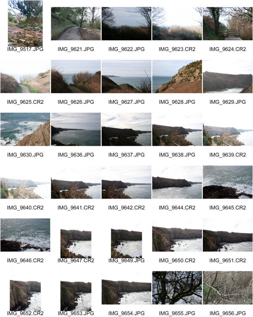
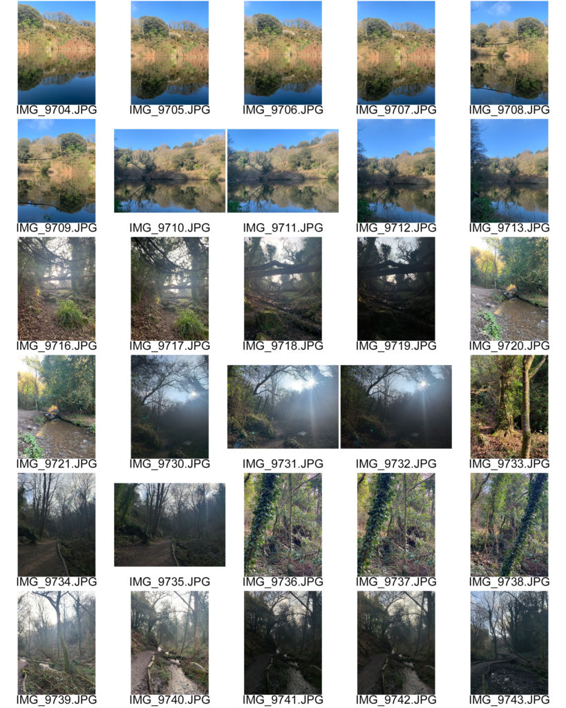
Contact Sheets

I took the above photos on my phone as back up photos incase the ones on my camera did not turn out well after transporting them.

These images were taken on my camera which looked perfect on the screen when I was checking them while still being outside, however once I had transported them across to my phone I realised that most of them were either over or under exposed.

When taking these images I focused on the rule of thirds and tried to keep the horizon in the middle/upper third. When developing these further I can combine the images where the sky is brighter or darker with the images where the cliffs and sea look normal to have a clear juxtaposition but still making them look like one image.

Rural Landscape: Charlie Waite

Charlie Waite

https://www.charliewaite.com/

Charlie Waite is an English landscape photographer known for his “painterly” approach to the use of light and shadow in a photo. Born in England, he worked in theater and television for ten years before switching to photography. His style is unique in that his photographs convey a spiritual quality of serenity and calm.

During the 1980s Waite became a master of the big view with interpretations of European landscapes, carrying on with ‘straight’ photography, like Ansel Adams and Edward Weston, making his works known for his painterly approach, that captured nature.

The late 1990s Waite photographed simpler architectural cameos within landscape, exploring the arcs and lines that thrive in both contemporary and classical architecture. In each image relationships of colour, form, design and light all portray a positive emotional response together in harmony. He also captured images focusing on more minimalist compositions using the geometric patterns formed by the environment.

https://boshamgallery.com/artists/25-charlie-waite/biography/

Examples Of His Work:
Charlie Waite, West Of Malaga, Andalućia, Spain, 2019 | Bosham Gallery
West Of Malaga, Andalucia, Spain, 2019
Charlie Waite, South of Granada, Andalusia, 2017 | Bosham Gallery
South Of Granada, Audalusia, 2017
Charlie Waite, Shangri-La, Yunnan, China, 2007 | Bosham Gallery
Shangri-La, Yunnan, China, 2007
Charlie Waite | British Landscape Photographer, Tutor and Lecturer | Charlie  Waite Photography
Valensole Study II, France, 2004
Charlie Waite's 25 top locations for landscape photography | Digital Camera  World
Cranborne Chase in Wiltshire, UK
Glorious Charlie Waite landscapes
Damme I, Belgium, 2006

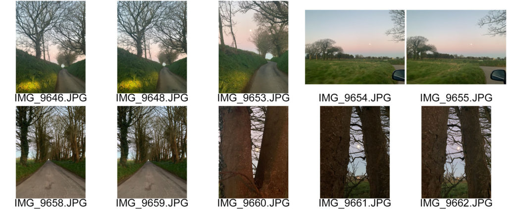
I will take photos of fields on a cloudy but sunny day so that the clouds can give the fields a patchy look as they will block the sun light on certain parts. Also I will go to a field where there are crops growing, maybe the lavender farm in St Brelade. I will try and get a photo where the field has vertical lines leading up to the horizon like Charlie Waites’ image of Valensole Study II, France. I will aslo go to a road where the trees are in a row to the sides of the road with a gap to the end creating depth.

Photo Shoot Plans

First Photo Shoot:

Who I will be taking the photos and do not need any models.
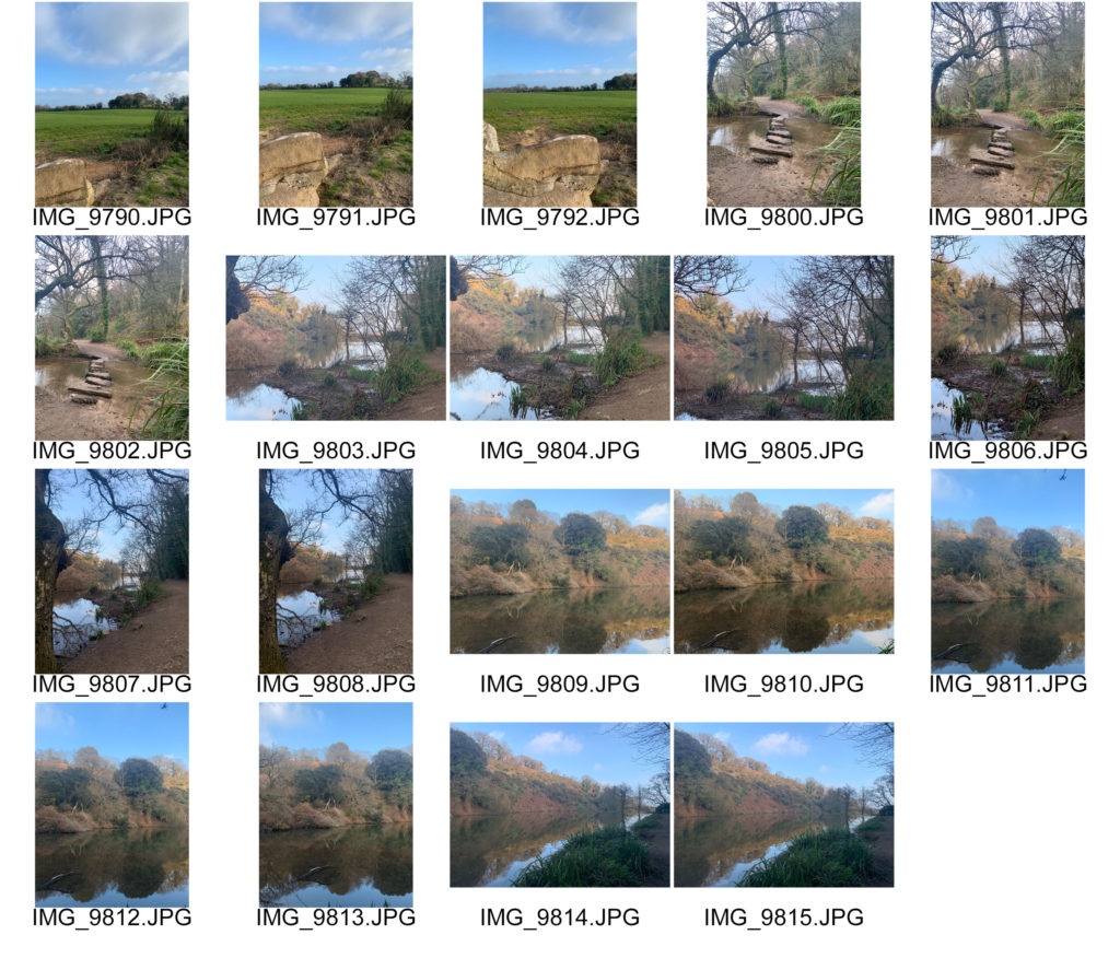
WhatI will be taking photos through the trees and of the path.
WhyI want to focus on rural landscapes with natural settings such as woodlands; trees, stream and land.
WhereSt Catherines Woods.
WhenI want to take photos in the middle of the day with the sun coming through giving the image a warmer light and having the sun rays coming through the trees. Therefore I will need to make sure the weather is clear and sunny.
HowI will take photos on my camera.

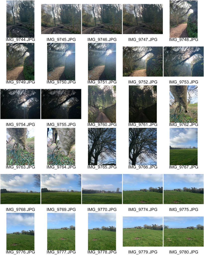
Contact Sheets

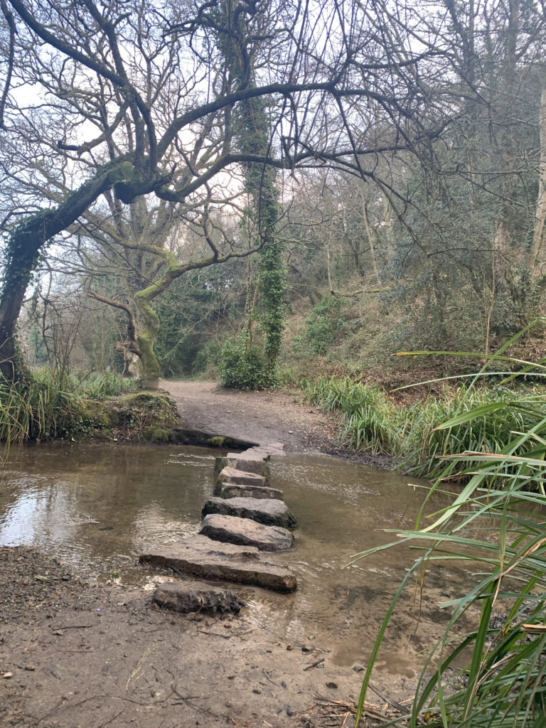
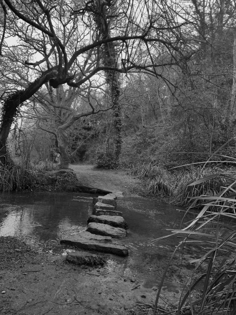
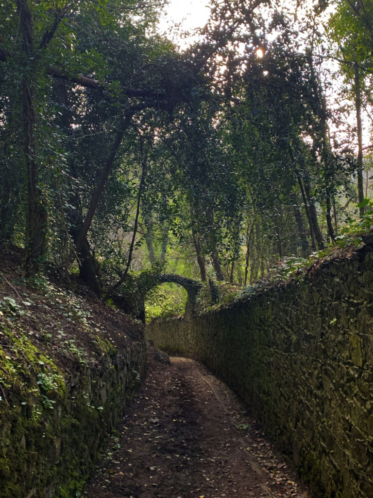
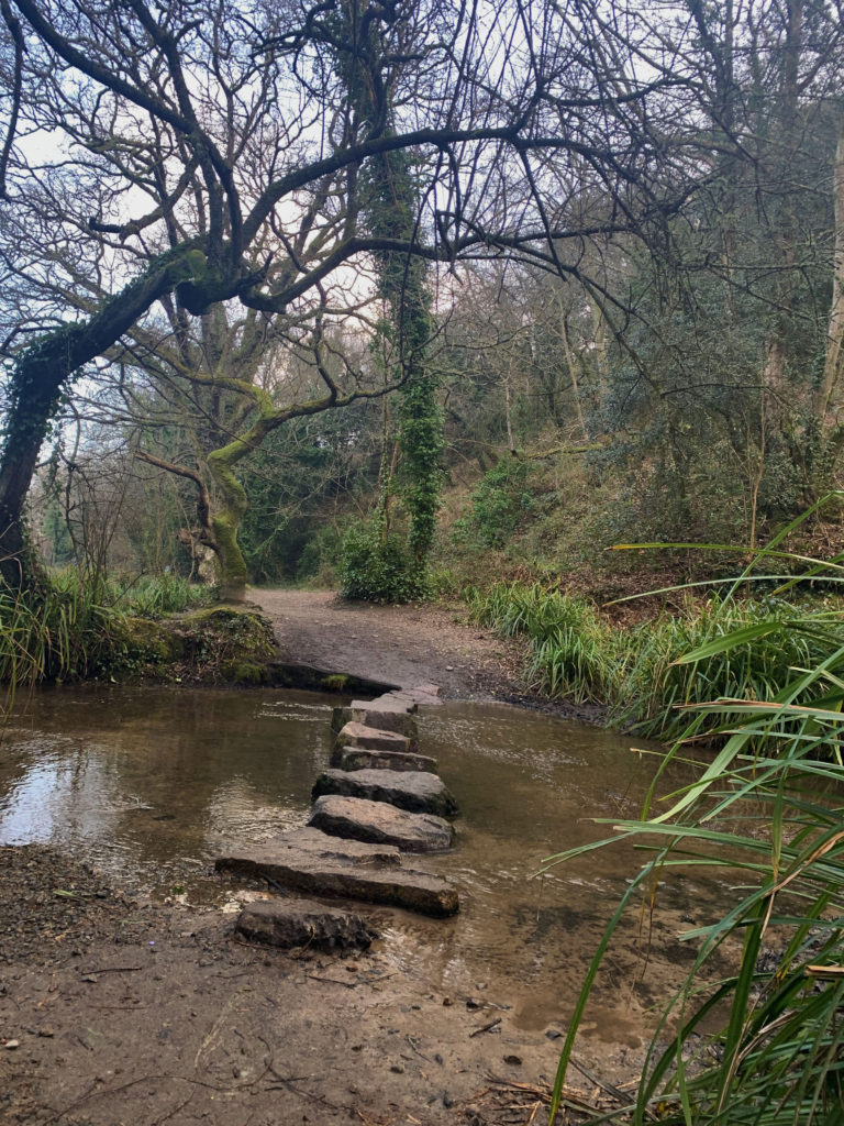
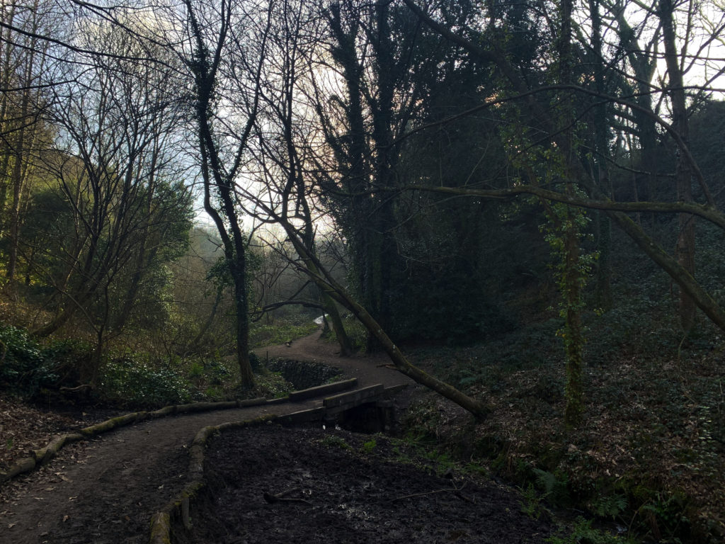
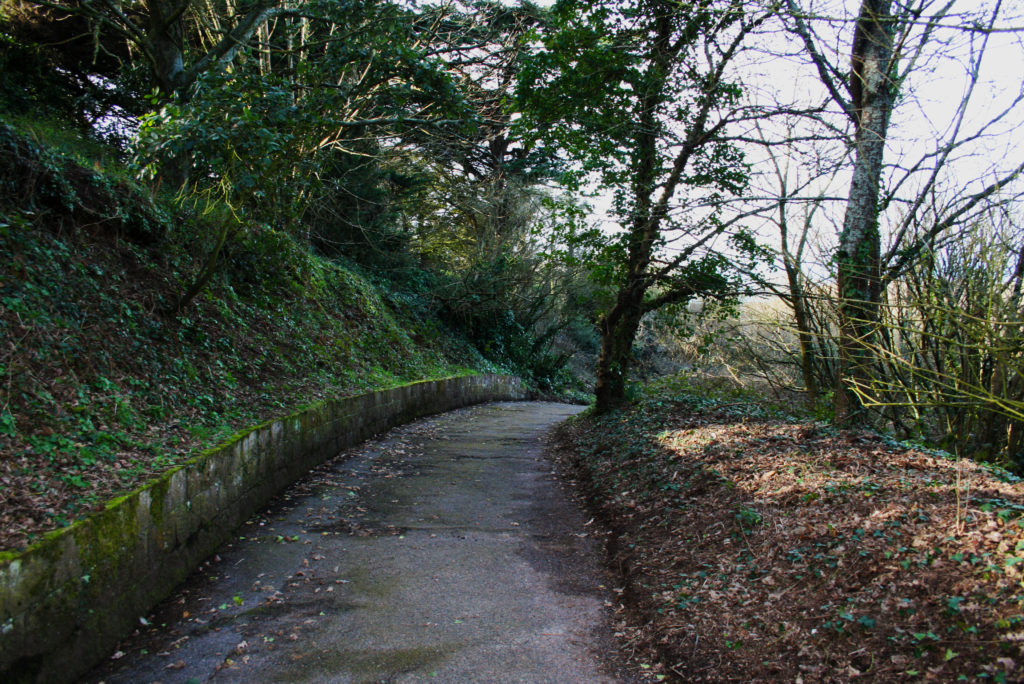
When taking these photos I was focusing on where the viewers eye would be led. In Charlie Waites’ images there is a clear leading line directing the viewer which is what I wanted to focus on. I wanted to use the structures in the trees and man made things like the paths to create this effect.
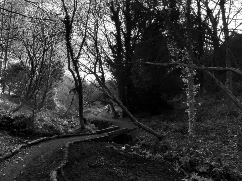
These images were taken casually on the same day, not part of any planned photoshoot, but I wanted to include them as they show the concept of leading the viewers’ eye.

Image Analysis: Fay Godwin

Key Themes – Fay Godwin’s work was inspired by the sense of ecological crisis in the late 1970s and 1980s in England. She was part of The Ramblers which is a charity which protect the places people love to walk. They believe everyone, everywhere should be able to experience the joy of walking and have access to green spaces to walk and are against the privatisation of land. Godwin loved to walk and that is what inspired her to start landscape photography.

Path and Reservoir above Lumbutts - The British Library | SurfaceView
Path and Reservoir-1977

Content – A picture of the open countryside including hills, fields, a reservoir and sky. Is taken from on top of a hill above the small village in the distance. On one of Fay Godwins walks she has stopped to take a photo. She has titled the image ‘Path and Reservoir‘ which tells us that she wants those two elements to be the main focus, perhaps because she wants us to realise the beauty and importance of the land in this image and that everyone should be able to see it and it should not be privatised as this is what she believed. Before knowing the title of it, it is a normal image of a landscape, but the title and the knowledge of Fay Godwin makes the viewer see the photo differently.

Formal Elements- As the image is in black and white, this creates a high tonal range in the image and creates a high contrasting image, this makes the mood feel dark and gloomy, along with the weather. The natural lighting from the dark grey sky also adds to the dark atmosphere to the image. The image follows the Fibonacci spiral as the path leads the eye from the bottom to the hill tops which then flow towards the village ending at the reservoir. It also contains the principles of the rule of thirds as the horizon is in the top third of the image and the focal point being the reservoir and village in the right side third of the image.

Mood- The image is very atmospheric and creates a sinister feel as the weather is very dark and the location is very open. It seems that it was taken on a windy day in the winter where the weather is depressing.

Rural Landscape: Introduction and Ideas

Landscape photography is capturing an image that embodies the spirit of the outdoors and makes the viewer feel like they are there.

In landscape photography it is important to get the right aperture, shutter, and ISO to work together to give you the perfect exposure otherwise the image may result in looking dull and not capture the best photo. This means not overexposing the highlights and underexposing the shadowy areas.

Rural Landscape Photography

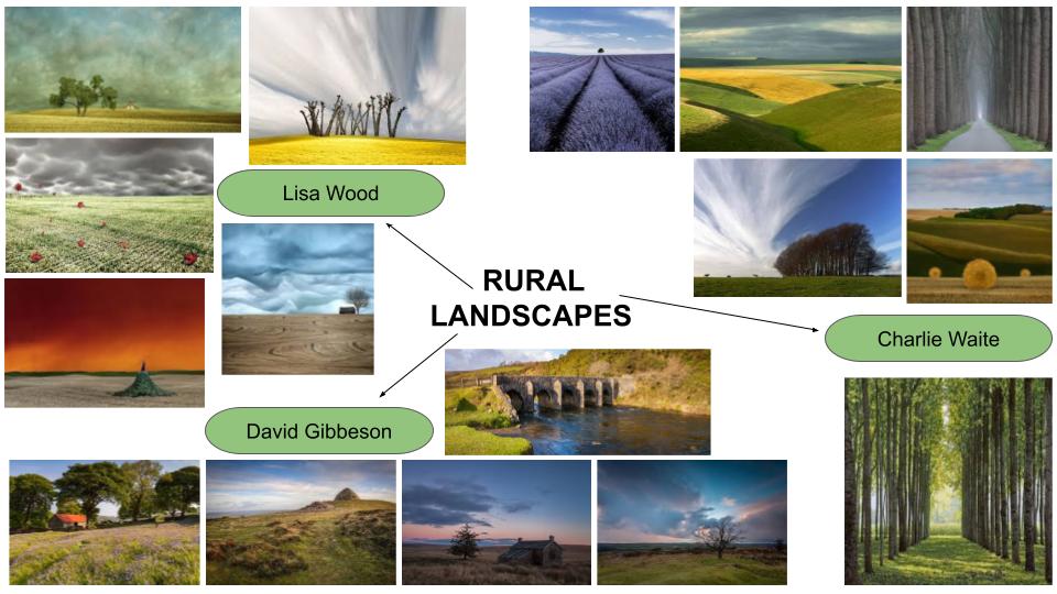
Rural landscape describes the land area which is not densely populated or developed. The rural landscape provides natural resources, food and fiber and wildlife habitat.

Rural landscape photography is about capturing an image in countryside capturing the essence of life.

Lisa WoodDavid GibbesonCharlie Waite

Romanticism

Romanticism is an artistic and cultural movement originating in Europe at the end of the 18th century, and increased interest in nature, emphasis on the individual’s emotion, horror, dread, terror and imagination. Emotion and feeling were important, not only from the artist creating the work but also how it should be presented. Instead of atmosphere we get an emphasis on the mundane, the overlooked, the nondescript, failure.

The Key themes are emotion and imagination, nature , and social class. To be influenced greatly by the evolving world around them.

Land Revisited (after Fay Godwin) - Keith greenough photography
A defense of romanticism
Romanticism in Landscape Photography - Photo Writing - Exploring  Photography.

Romanticism in literature:

https://examples.yourdictionary.com/10-key-characteristics-of-romanticism-in-literature.html

Composition

Golden Ratio:
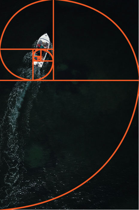
An aerial photo of a boat at sea with the golden ratio grid overlayed

The golden ratio can be used to offer a sense of harmony, and is one way to balance an image. It leads a viewer’s eyes around an image in a balanced way, meaning they will view it in a certain way following the line and ending at the end of the spiral.

It is used to emphasise movement in a photo to create a dynamic feel.

This is best used for images where there are many things happening in the scene. They could be people, buildings, and other subjects or objects.

Rule Of Thirds:

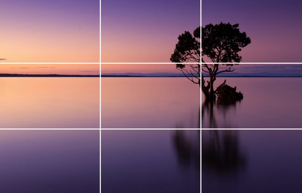
The rule of thirds is a compositional rule about breaking the flat and conventional angles. Cameras Often have the grid on the screen when taking a photo to help use this rule.

when taking a photo keep the focal point/object one of the intersecting points. By doing this, it makes the image more aesthetically pleasing and is more intriguing then placing the object in the middle of the photo. Do not place the horizon in the middle instead aim for the top or bottom third.

The rule of thirds is best to add interest to minimal scenes. These scenes don’t have any distractions as you won’t have many different subjects in the middle ground or background.

Tips for Using the Rule of Thirds in Photography

Ideas

I will make sure to go to each location when there is different weather, for example the woodland location I will go when it is a misty day but also when the sun is out because then I could get the sun light through the trees. The coastal I would like to go on a day where it is bright so I can get a contrast with the caves and cliffs. The Countryside/fields I want to photograph on a day with clear skies either no clouds or full with clouds so the I can incorporate the 1-10 spectrum.

Self-Reflection Blog Post

Now that it’s over, what are my first thoughts about this overall project? Are they mostly positive or negative?

I found the photographers interesting and the topic interesting, however I do not like my blog posts much and feel that they turned out different to what I expected.

What were some of the most interesting discoveries I made while working on this project?

I found Rania Matar’s A Girl and Her Room interesting, how she compares the American life to the Middle East.

What were the challenges?

My Alec Soth photo shoot was difficult to organise because I needed to organise it along side my dad as he drove me to Corbiere.

What most got in the way of my progress if anything?

My organisation because I left everything to a few days before the exam.

What did I learn were my greatest strengths?

Greatest strength was when in the exam conditions I worked well with the time I had.

What would I do differently if I were to approach the same problem again?

I would make sure to prepare more before the exam and give myself less work so that I had time to do extra things or try to improve the quality of my work further and go into things with more detail.

What can I improve?

I could have done a third photo shoot with the photographer i looked at where I was planning to do a collage with new and old photos to make my final outcomes more interesting.

How will I use what I have learned in the future?

I will get more organised earlier before the exam.

Set yourself some targets for moving your photography forward. These could be skills based, analytical understanding, written analysis, organisation, blog post structure.

I would take more photos and act on all the things I said I was going to do.