All posts by Anya Nightingale-Bataille

Filters

Author:
Category:

Personal Study Essay

Essay

How is narrative constructed in the work of Shipla Grupta and Umberto Verdoliva?

I am going to look at the theme of identity within family heritage, childhood, and location, focusing on how photographers create narrative with images. I find this interesting because it adds more depth to an image and creates more meaning. Narrative in photography also creates questions for the viewer and a sense of nostalgia or sentimentality which connects to the viewer, adding more value to a piece. The two photographers I will be looking at are Shilpa Gupta Umberto Verdoliva, I have chosen these two photographers because in their works they both explore storytelling and narrative in their own distinctive ways, looking at unique topics and different photographic processes. 

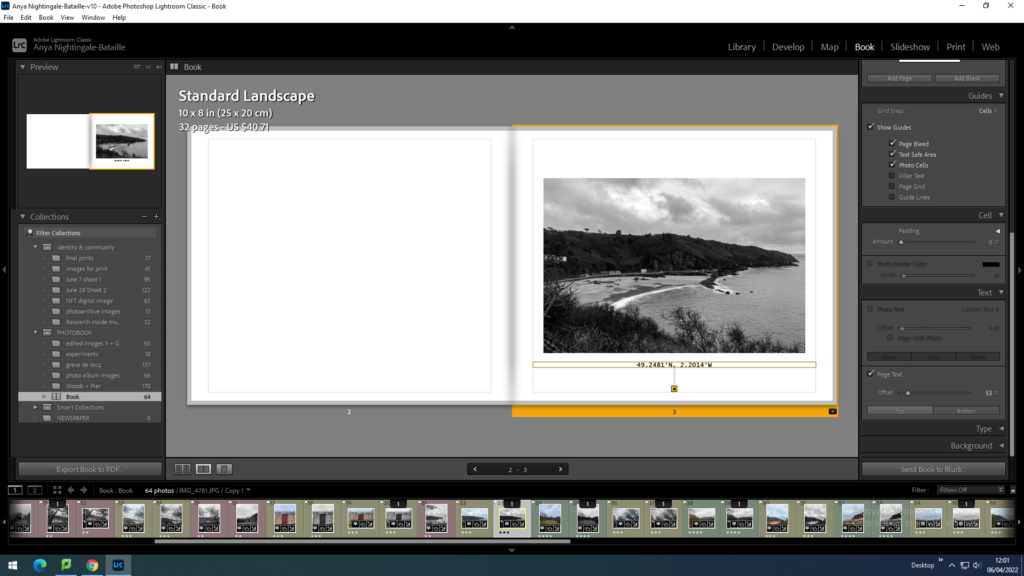
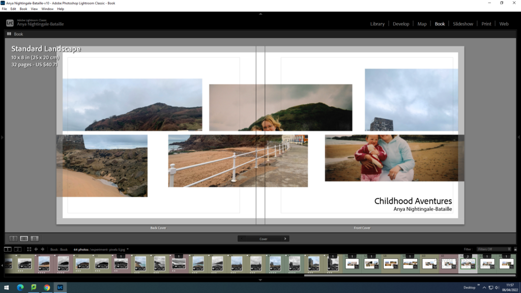
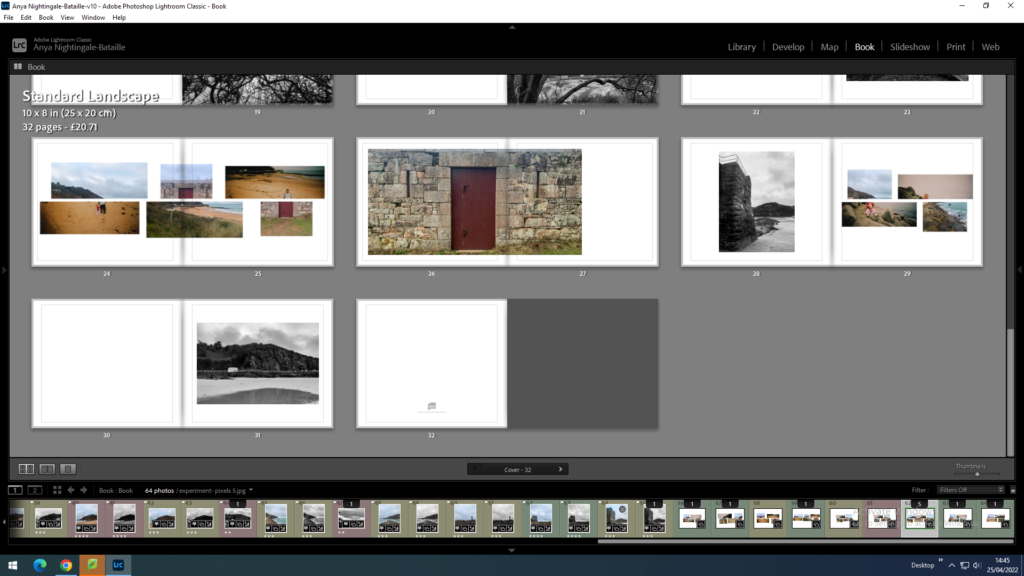
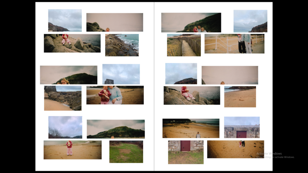
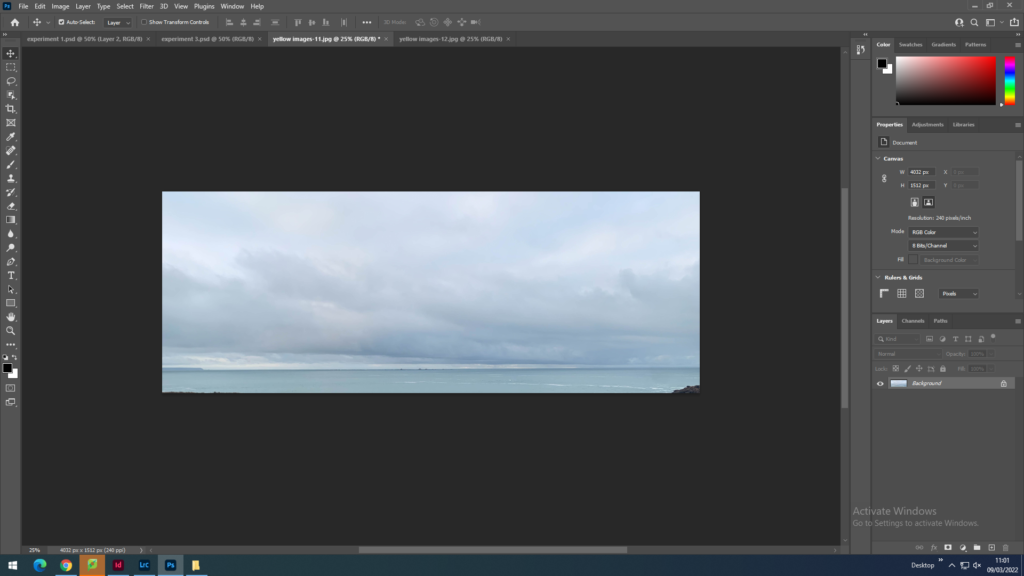
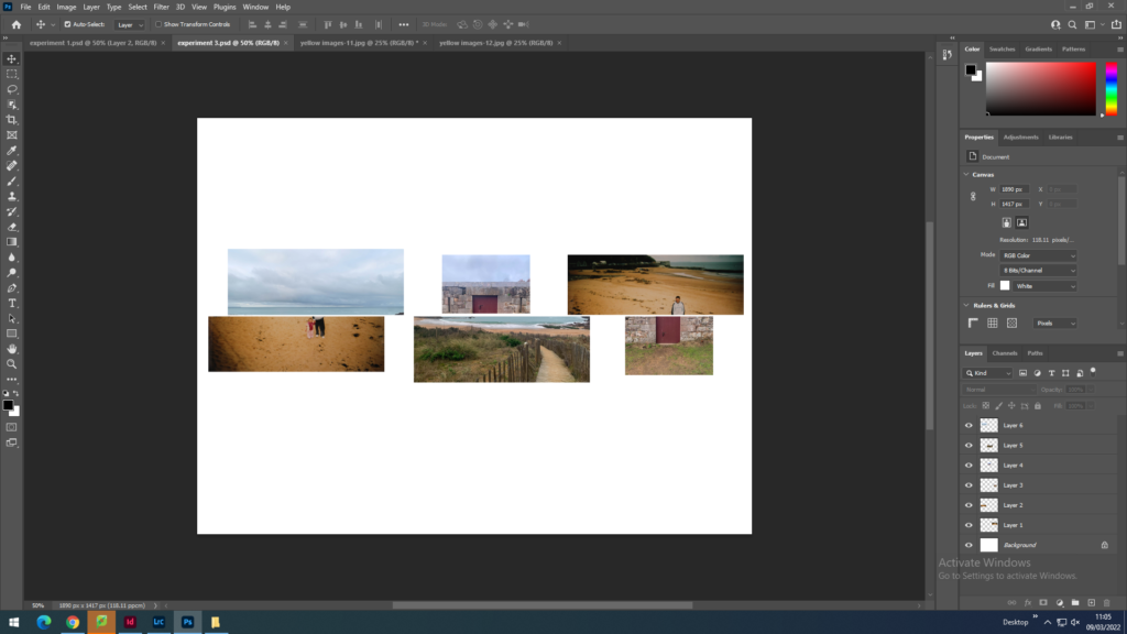
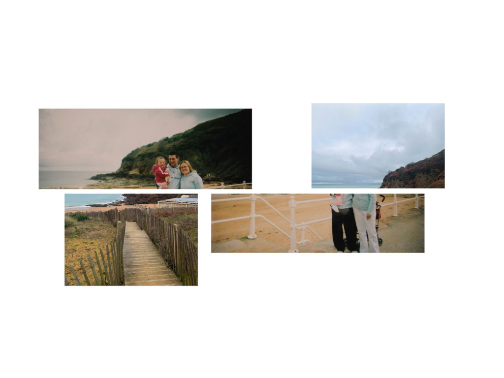
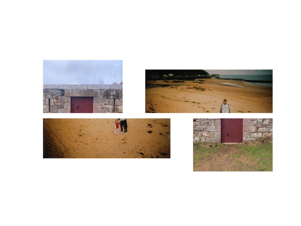
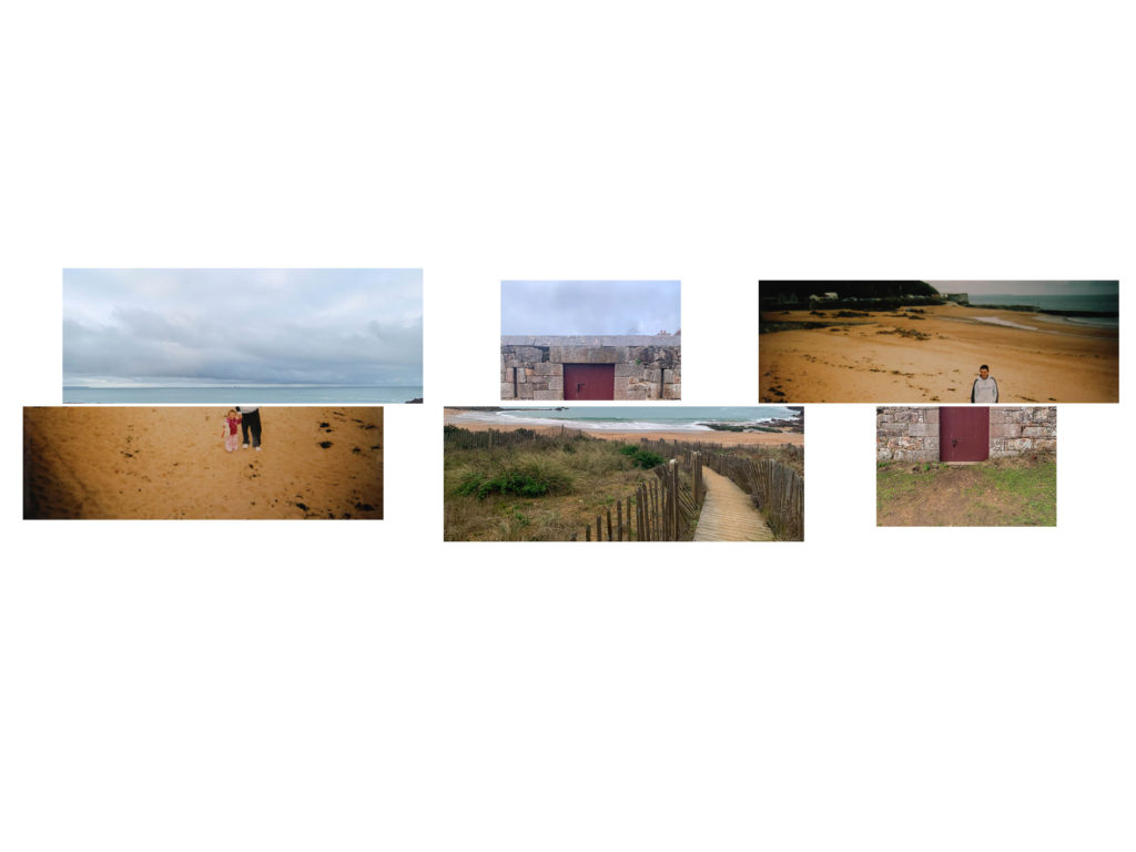
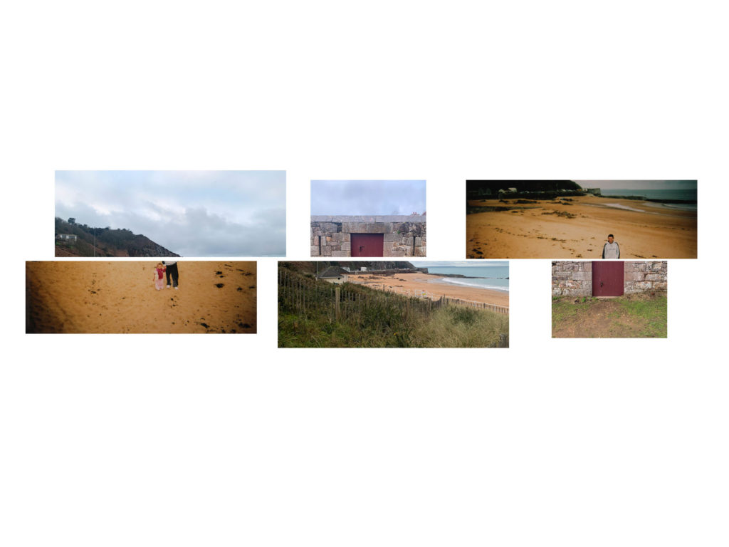
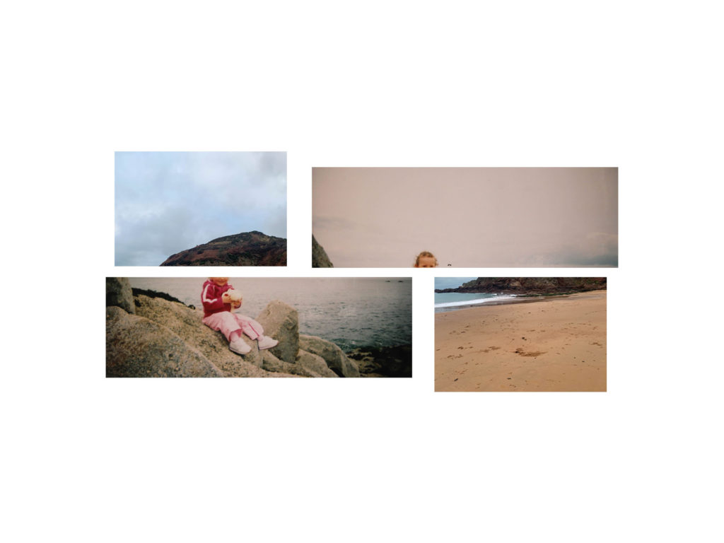
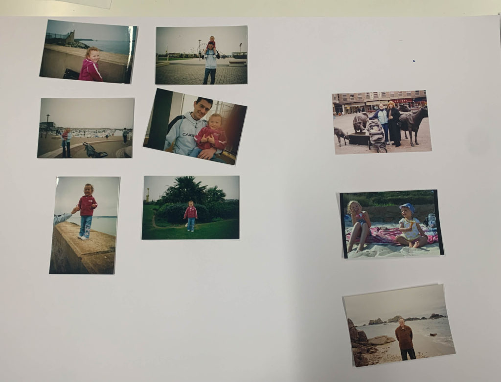
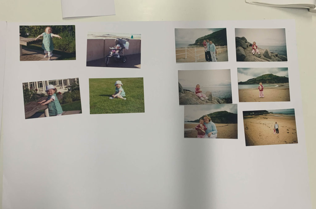
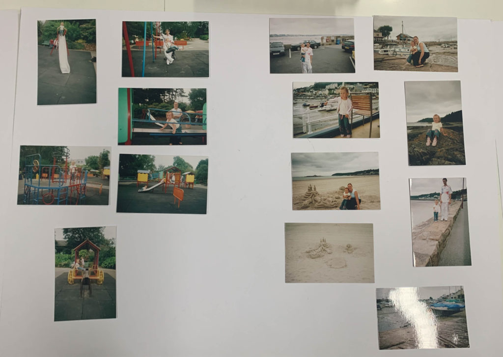
In my current project for Identity, I am looking at location and upbringing by going through my own families archive of images and taking new images from the same locations of the old images around Jersey, focusing on a more photographic approach instead of a casual snapshot. I will take inspiration from both photographers mentioned and create double exposers and split my images in half to create a more interesting set of images. 

Looking at both photographers I am studying, realism and pictorialism seem to have an influence on their photographic styles. Pictorialism is an art movement that started in 1880 and came from photographers who wanted to prove photography as an art form. They were heavily influenced by artist of the time and would manipulate their images to make them look more like art. Pictorialists would use techniques like Vaseline on a camera lens to get a blurrier effect, scratching negatives to create a brush stroke effect and mixing chemicals. Realism is an art movement that started in 1915 as a reaction to pictorialism, certain people did not like the manipulation that would go into the pictorialst photographs and wanted to take pictures as they were, providing records of the world. 

2013_275.JPG
Alfred Stiegltiz, The Asphalt Paver, NY, 1892, printed 1913.
Edward Weston: Dunes, Oceano
Edward Weston, Dunes, Oceano, 1936.

Both have abstract approaches to taking photos and often find themselves focusing on shapes and forms. Umberto Verdoliva’s images in his project What is a dream? have a more pictorialist approach to them because they are artier in nature and have been manipulated to create his final outcomes.  

Storytelling is something that has been around for a while, since humans could speak and before through cave drawings, in forms of myths, legends, fables, anecdotes, or ballads. A story is a series of related events or experiences which unfold over time, likely to follow the structure of exposition, conflict, climax, resolution. Narrative is not necessarily a story it is also the way a story is told and interpreted. David Campell, professor, and political scientist says that ‘in telling visual stories about the world, photography is narrating the world’ which suggests that narrative aids photography and is more than photography alone which is often linked to context. A photograph is non-verbal in nature and captures a moment in time removed from a timeline, a singular image can tell a story individually, also images put together in a certain way can tell a story through sequencing.  

Interpretations of narratives in photography can change the way a viewer looks at an image, whether this be clear with context behind an image, or something left to the viewer to analyse inside their own mind. Photographers developing a visual story should focus on what story they are going to tell and how they are going to communicate this to the viewer. 

Narrative in photography can be shown in various ways such as photo collage where each photo represents different events and the contrast between these images creates a relationship to the viewer. Photobooks are also a way of conveying a narrative through photography even though they would not be thought to have a narrative in the sense of a sequence of events unfolding over time. Photobooks concentrate on an overall theme, concept, or idea. This is done by the way they are presented on a page and throughout the book. 

My first photographer I will be looking at is Shilpa Gupta who is an Indian artist who uses a broad range of mediums to create her images and artworks, often interactive typically using sculpture, installation, text, photography and audio and visual technology. She creates artworks that focus on human relations, subjectivity, and themes such as desire, conflict, security, technology, borders, and censorship. 

 I will be looking at her project Altered Inheritances- 100 (Last Name) Stories focusing on the key themes of narrative and family. In this project she looks at family heritage through family names where she presents her images split in half and reassembles them to form a misaligned set of images which she exhibits in a room and the different sets are presented next to one another in a long strip. 

Altered Inheritances – 100 (Last Name) Stories | Artworks | Collections | M  HKA, Museum of Contemporary Art Antwerp
Gallery view from Shilpa Gupta, Altered Inheritances- 100 (Last Name) Stories, Pigmented inkjet prints in split frames, 2012-2014.


She takes historical photographs, snapshots, and scans of abstract drawings. The text on the images tells the story from hundreds of different people who had to abandon their last names after crossing boarders and migrating somewhere new. The abstract geometric shapes of the split images with the line split in the middle works as both a divider and connector with framing the isolation from identification and belonging. 

This story is similar to what was seen in the Jewish Evacuation during World War 2, migrations of Bengalis from East Bengal to India, or from one place to another. Gupta says this act is ‘a crucial step towards sacrificing your tribe, ancestor, family, parent’ by her misaligned images because if we change our story, we complete something better, inspiring, and practical but we also lose ourselves. 

In the exhibition where Shilpa Guptas’ Altered Inheritances is exhibited and Zarina the walls of the gallery and work is installed in the Tyler of a house plan. Divided into different parts of the gallery both artists artworks complement each other and conversing with each other as well as the people who view them.  

The house in Zarina’s work turns into the form of the presentation itself in the gallery. Shilpa Gupta looks at the divide in people sharing common culture and the deportation of these people within state boundaries like West Bengal and Bangladesh. These two regions are similar but are part of two countries meaning they attract and repel each other. Gupta looks at the political divide and takes this as the crucial matter that splits communities turning them alien to the other half which can be seen further in her work by the physical divide of her images. 

Shilpa Gupta, Altered Inheritances- 100 (Last Name) Stories, Pigmented inkjet prints in split frames, 2012-2014

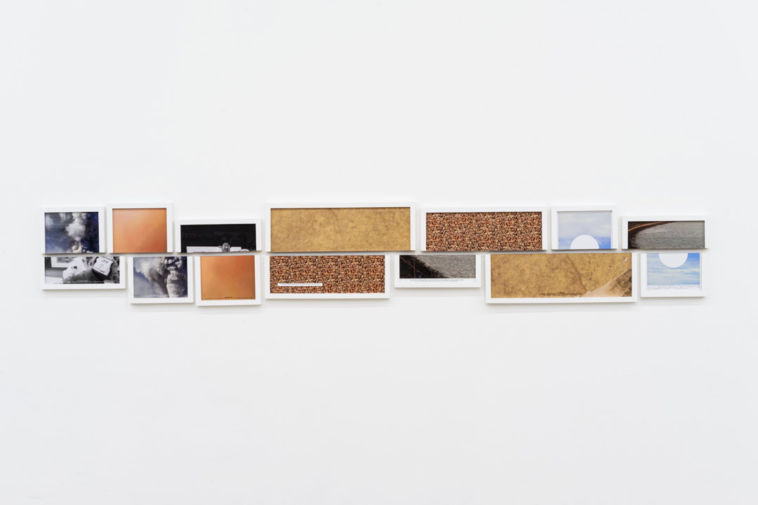
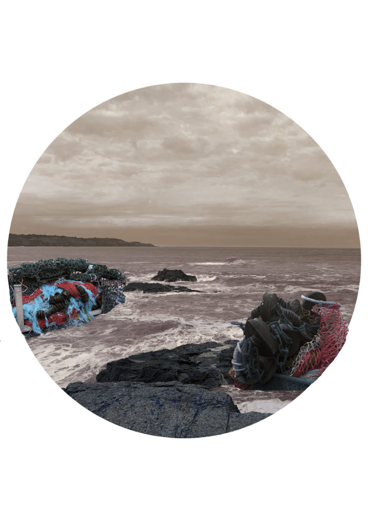
Shilpa Gupta’s work is inspired by the issues with how south Asians are treated in the gulf and how they survived by changing their names, changing their identity.  In the above sequence there is seven split images including images of surfaces, landscapes, and a portrait image. 

In the middle of the sequence there is an image of a coastal scene where there is people stood next to a beach with rocks and the sea. Under the image there is a quote that reads, ‘In 1970’s, when he boarded the overnight train to the dream city, he left his surname behind. He chose a new one, something sounding ‘more local’, more Maharashtrian, something that could effectively camouflage his Gujrati back ground. He had been told he would be dealing with several who resisted new entrants into Mumbai. Vaishav Rathore Panchal’ typed in a type-writer front.

Image from above sequence

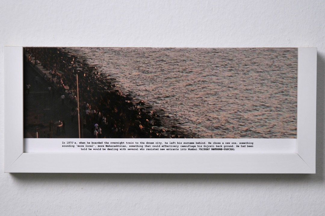
The image is muted in colour and has a warm tone to it. The texture in the waves, people and rocks creates a high tonal range and makes the overall feel of the image gritty. As this is in the middle of the sequence, the rough texture could indicate the middle of a story where there is usually a turning point in the plot. This could relate to this image as there is a lot of grain which implies that there is more character, something is happening.

The contrast between the people and the sea creates a diagonal divide, cutting the people from the sea, this could link to the cutting of their freedom as the people who were forced to change their names to fit in with a new society lost that freedom of expression and perhaps lost themselves. The image is taken from above looking down which gives the image a different perspective and creates a more interesting point of view.

The quote suggests that there is a serious divide in Mumbai between people who are fleeing to safety and people who already live there which is reflected in the image by the divide between the light and dark from the people and the sea.

At the end of the sequence there is an image of the sky, with the quote, ‘When he was getting married, he wanted him and his wife to have the same name, but felt it was unfair to ask her to take his surname. So they both changed their surnames to something new ‘, handwritten under the image. 

Image from above sequence

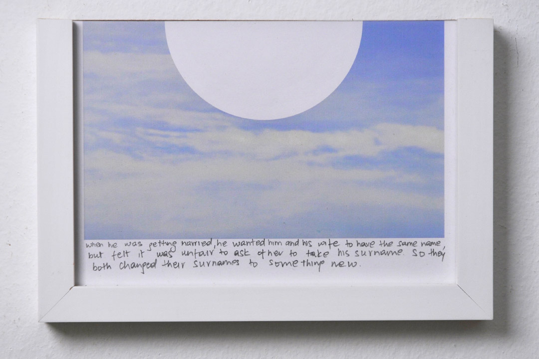
The image is quite monochrome and only has two colours, being white and blue. There is not much tonal range in the image creating a low contrasting image which is soft in colour. The image is taken from eye-level, in level with the horizon capturing the whole sky as the sole image. The natural daylight from the sky adds to the soft, bright atmosphere, this could be a metaphor because the image is at the end of the sequence and could symbolise a happy, peaceful ending.  

Gupta has added a white geometric circle into the centre of the very organic image creating a contrast between them. This creates a divide between the calm and soft background and the harsh crisp circle.  

The quote under the image and the blank circle could suggest an empty space, a new beginning for the people who changed their names or could be symbolising heaven where everything is pure and tranquil. 

My second photographer I will be looking at is Umberto Verdoliva and his project What is a dream? Focusing on how he has created a narrative through layering images/ multiple exposures. He takes two real moments captured over time and merges them to create a new meaningful and unique image. Recreating a scene, an atmosphere, short reality/snapshot from something that existed in different times and places. 

04_what is a dream.jpg
Image from What is a dream?
02_what is a dream.jpg
Image from What is a dream?

He currently lives in Treviso, Italy and produces most his work from the streets of his whereabouts. Umberto Verdoliva’s images are part of street photography which is a genre of photography that records everyday life in public places. Being in the public setting enables the photographer to take candid picturesof strangers, sometimes without them knowing. Street photography does not have to be taken on the streets, the aim of it is to capture culture and lifestyle. Images should tell a story or document a moment. Some street photography is created to make the viewer pause and question themselves. 

Verdoliva likes street photography because it has helped him think about his daily routines and life, constantly looking for poetry and beauty in his surroundings and street life around him. 

In 2013 he founded ‘SPONTANEA’ which was an Italian group dedicated to street photography, but this ended in 2019. Verdoliva has presented workshops, exhibitions, portfolio readings, presentations and writes articles on photography, showing his passion for the subject. 

Verdoliva takes an interesting approach to street photography, looking at angles and geometric, his style being sensitive. Taking ordinary moments and transforming them into something extraordinary to focus on the poetry and significance. All his photographs are made on film and are double exposed to create the effect of two images one which means that preparation is important for his images. Always out and about looking for connections between things and people and the atmosphere/feeling in each place. He creates new realities by merging, mixing element from completely different places. By his precision and careful planning, we learn how attentive he is as a photographer as well as his sure sense of composition and in showing a story in a short fragment in time. 

07_what is a dream.jpg
Image from What is a dream?

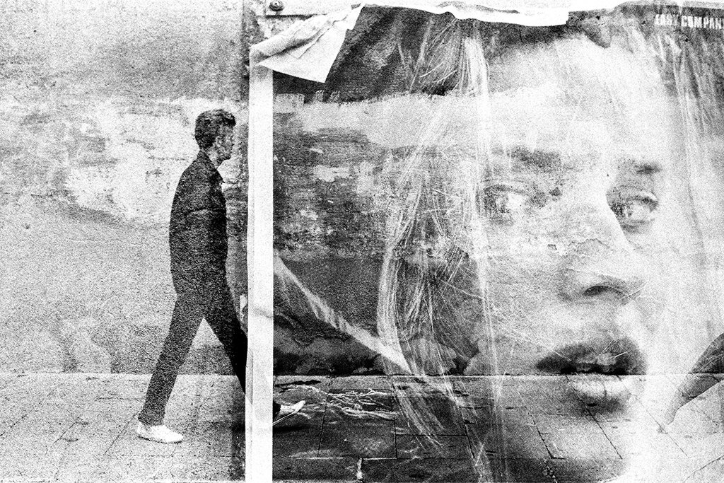
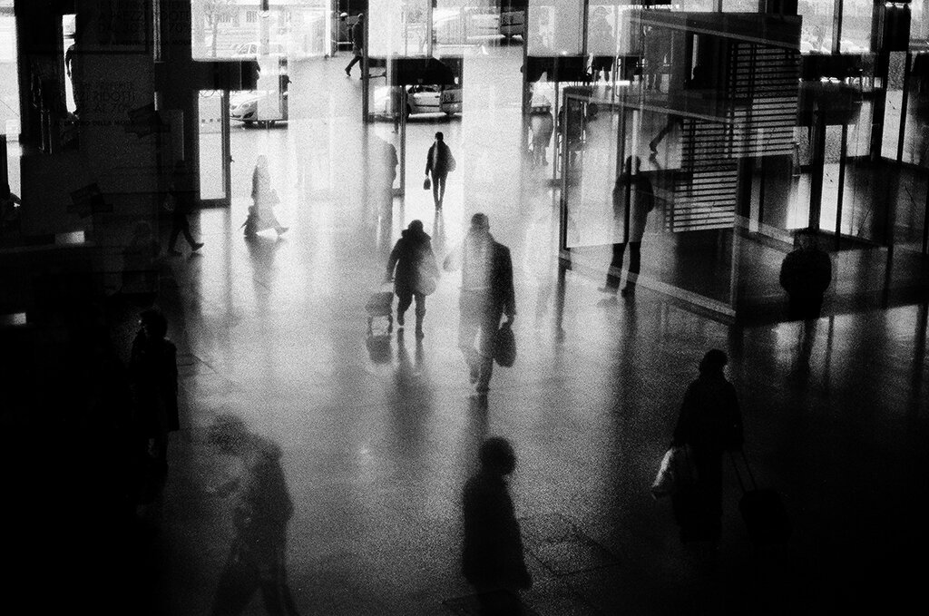
The image includes a man walking on a pavement into what looks like a plastered picture of a close up shot of a woman, like he is walking into a new world. The street picture is taken at eye level from a slight distance so he could get the man and the pavement in the picture. Verdoliva takes his pictures at random when he is out but plans for possible outcomes. The image has no specific name but is part of his ‘What is a dream?’ series which is about getting the viewer to use their imagination. 

The image is in black and white which creates a high tonal range throughout the image emphasising the contrast between light and dark. The lighting would have been from the natural daylight which translates to the images’ softness, it is not harsh and bold, which creates a ghostly feeling as it is light and empty. even though the image has layers to it, it still has a short depth of field and feels 2D. There is a lot of textures in the outcome from the wall in the background, the peeling plaster sheet and the close-up portrait adds to the textures. These create quite harsh lines, like dry brush strokes in a painting, adding depth and grain to the image.  

The background image with the man walking follows the rule of third as the horizon is in the bottom third and the main subjects are off centre, creating the perfect composition. The Woman also looks like she is looking over her shoulder as if the man is following her which creates an atmospheric feeling. 

The image contains a mixture of geometric and organic shapes like the hair in the portrait of the girl and the run-down wall in the background and geometric shapes like the pavement lines which also is a form of repetition. The white solid line which is the edge of the paper that the man is walking into, could link to the idea of walking into a new world using the Solid white line as a divide between the two places, acting as a door. This creates a dark and eerie mood overall in the image. Verdoliva would have planned this as likes to get people to question themselves and their imaginations while looking at his images especially for this project.  

Both artists approach narrative in photography differently but still tell the story they want to be told. They use multiple images to tell a story, Umberto Verdoliva uses double exposures and Gupta uses sequencing. When it comes to the stories themselves that each photographer is trying to portray they are different. Gupta focuses on the history of people migrating to India for safety whereas Verdoliva does not base his narratives on anything, he looks for opportunities around him and tells the story he wants in that moment.

03_what is a dream.jpg
Umberto Verdoliva, Image from What is dream?
Shipla Gupta, Image from Altered Inheritances

Both of their photographic styles also contrast each other, Verdoliva clearly takes his images in a street photography style, capturing things in the moment. In contrast Gupta’s images seem to be more pre meditated in the way that her images are structured. She also includes a lot of objects in her sequences which is very different to street photography that focuses on scenes and people.

My own outcome

When creating my own responses using old family photos and new images I took inspiration from Gupta’s sequences and split my images like she has. In my opinion this links to the divide in time because the old family images are from around 15 years ago and the new images are taken in the present day.

My own outcome

This idea of merging two different moments in time and creating a new outcome also links to Verdoliva’s work because that is what he does with his images and is his main principle behind taking them.

Bibliography:

Elena Martinique 2016, Reading the Narrative Photography 

https://www.widewalls.ch/magazine/narrative-photography

Elizabeth 2020, Complete Guide to Street Photography for Beginners 

Complete Guide to Street Photography for Beginners

https://photographylife.com/what-is-street-photography/embed#?secret=65xT4aacyD#?secret=RC9Use3CCT

Eolo Perfido YEAR, Umberto Verdoliva: my natural way of seeing things 

Umberto Verdoliva: my natural way of seeing things

https://www.exibartstreet.com/news/interview-umberto-verdoliva/embed/#?secret=dmTH8vArE1

Kai Behrmann YEAR, Street photographer Umberto Verdoliva “Man and Environment” https://artofcreativephotography.com/streetphotographers/umberto-verdoliva/embed/#?secret=cq16dJBznn

Mahan Moalemi YEAR, Shilpa Gupta and Zarina’s “Altered Inheritances: Home is a Foreign Place” March 18–July 13, 2019 

https://www.art-agenda.com/criticism/273820/shilpa-gupta-and-zarina-s-altered-inheritances-home-is-a-foreign-place

Quddus Mirza 2019, Back to the frontier 

https://www.thenews.com.pk/tns/detail/567864-back-frontier

NAME YEAR, SHILPA GUPTA – Today Will End 21 May – 12 Sep 2021 

https://www.muhka.be/programme/detail/1405-shilpa-gupta-today-will-end

Personal Study: Final Prints

Using the quick selection tool to get the white boarders off the images.
Changing the angle of the images to fit the angle of the wall.
Adding a drop shadow to make them look more realistic.

Gallery view

I decided to have a gallery where it is split into two rooms because of the different images. In the first room there are landscape images which are more about the environment and includes images from the landscape and Anthropocene project. In the second room the images are more focused on the topic of people and these are from the identity project where I focused on the theme of family.

Individual Images

Identity & Community: Newspaper

Evaluation

I enjoyed making a newspaper as a group working on the identity & community project and found it an interesting experience, seeing everyone’s different ideas of the theme and the outcomes they had from this was fascinating to see.

This image has an empty alt attribute; its file name is Identity_Community_Page_10-1024x730.jpg
My image on the right.

For the newspaper I focused on island identity and how this could change due to external influences such as Anthropocene. The image in the newspaper shows this by changing the natural landscape to man made ‘rubbish’ often found in the sea or stuck on natural landscapes.

Identity & Community Newspaper

The images seen on the pages of this newspaper supplement are extracted from a variety of projects and final outcomes produced over a two-year academic programme of study by a group of A-Level photography students at Hautlieu School. In their final year the themes of Identity and Community offered a specific focus and through a series of creative challenges students developed a body of work that were inspired, partly from visiting heritage institutions to learn about aspects of Jersey’s unique history of immigration and exploring migrant communities and neighbourhoods in St Helier in a series of photo-walks. In the classroom additional inspiration was provided from workshops on NFTs (non-fungible token) and digital art, embroidery and textile art, animation and film-making, zine and photobook design led by professional artists, designers and teachers.

As part of the research and contextual studies students were asked to engage with some of the key questions raised by the Government of Jersey’s Island Identity project and explore through their own photographic studies how they interpret and identify distinctive qualities of island life. What can we learn from looking at a set of photographs produced by young islanders? At first sight they show us a seemingly random set of images of places, people and objects – some familiar, others surprising. On closer inspection each image is a visual sign and also a conundrum. For example, a fish stuffed in a plastic bottle may ask us to consider more closely our marine environment, commercial fishing or food consumption. As a combined sequence of images they represent different views that in many ways comment on a wider discussion on some of the primary objectives explored in the Island Identity project, such as ‘how we see ourselves’ and ‘how others see us.’

The newspaper was kindly sponsored by Deputy Carolyn Labey, Minister for International Development and Assistant Chief Minister who in her foreword shares her personal thoughts on what makes Jersey special to her in context of the Island Identity project led by her department. She says, ‘identity involves searching our soul, engaging with difficult issues, and asking not only who we are, but how others see us and what a vision for the future might look like. The perspective of students and young people in this debate is critical. Identity is a broad and far-reaching concept, one unique to all of us. This collection of images recognises both our differences and our commonalties. These times may be uncertain, but in my view the topic – ‘what Jersey means to you’ – is a fundamentally optimistic and forward-looking one.’

The Identity and Community newspaper is the fourth supplement produced in collaboration between Hautlieu School Photography Department and Jersey Evening Post. In 2018 the first issue was The Future of St Helier and last year the themes of Love & Rebellion explored experiences of isolation and lockdown during the coronavirus pandemic. Photographer and teacher Martin Toft, comments: ‘The question of ‘what makes Jersey special’ matters a great deal to every islander and as visual signs, the images printed on these pages are an attempt – not so much to provide answers – but rather asking questions about the essence of this island we call home, and how it actively will overcome current challenges in shaping a prosperous future for all.’

Various workshops and school trips for inspirations, recording and experimenting with new images and ideas of making.

Photobook: Editing + Developing + Evaluation

When making my photobook I want to make sure the images flow into each other. I will make sure they do this by looking for things in common between images such as things that are inside the image, colour or textures. I will also look for contrasting attributes such as composition and the main subject of the image.

For the layout I want to create a balanced book which has double page spreads, singular images and pages with two individual images fitting the pages differently, some being full bleed and the rest with a white boarder.

Changing the page layouts:
This image has an empty alt attribute; its file name is image-122-1024x576.png
Double page spread
This image has an empty alt attribute; its file name is image-123-1024x576.png
Full bleed double page spread
Full bleed image
Image with white boarder around

When constructing the front cover I wanted to make a wrap around cover meaning the image will follow onto the back cover too. I also wanted to have the cover image in the middle page of the photobook to link it together.

I added the title and my name to the front cover of the photobook. I also added the coordinates of Greve de Lecq to the first page under the image which sets the scene for the entire book.

Adding texts:

Final book layout

Back and front cover
Pages 1-11
Pages 12-23
Pages 24-32

Evaluation

I think that the photobook looks how I intended it to with different layouts and a clear flow of images throughout that link to each other. The images used are clear of where they are but also have different views of Greve De Lecq that is not photographed as much. The black and white contrasting the colour images works well with the look and message because the colour images include the old images from my childhood and black and white is often linked to the idea of old times which links to my project about re-visiting places I visited as a child and seeing things from a different perspective.

Newspaper Spreads

Set up:
Dimensions: 400mm(h) x 280.5mm(w), 10 pages, Orientation: Portrait, 2 columns, Column gutter 5mm, Margins: 10mm, Bleed: 3mm
I used the rectangle frame tool to make the box so that I can import an image onto the page by pressing Ctrl D and selecting from files.

Juxtaposition: 2 images which contrast each other

I have used these two images to contrast each other by the lighting and the overall atmosphere, but also compliment each other through composition and structure.

Sequence: A series of images (4-12) to create a sequence as a grid, story-board, contact sheet or typology.

1
2
3

I have included 3 different versions of a sequence because the first image may print out too small but I like the gap around the images and the shape this gives. The last composition has the images bigger on the page but the shape is lost and there is no white boarder on the edges of the page.

Montage: layering a set of images to create a new outcome.

I chose to layer these to images as they are taken from the same location but in different years and with a different view and different photographic styles, one focusing on the land scape and one focusing on a person. Also the path in the image below matches with the shape of the rocks creating a synergy with the two.

Other Spreads

When creating these spreads I wanted to fill the pages with more images as it is for a newspaper. The previous spreads would have a lot of empty space which works well with the images but not for a newspaper.

Personal Study: Development of images from Shoot 2

First I imported the image onto photoshop so that I could crop it in half perfectly by halving the height.
Then I dragged them onto a new file on photoshop and resized them by editing the width and the height in the properties toolbar and moved them around to get the right sequence.

Experiments

When creating these outcomes I wanted to make interesting compositions rather than having a perfect rectangular shape. I wanted to have the similar misaligned compositions as Shilpa Gupta and create a split between the old images and the new. I wanted to create some smaller sequences but also some longer sequences so that I had a variety of different shapes and lengths.

When choosing the images that would be in the same sequence I looked at the subjects, orientation and colour in each image and decided which ones would match or contrast well with others.

Experiment 1
Experiment 2
Experiment 3.1
Experiment 3.2

I decided to create a different version of experiment 3 because once I had cropped the images I realised that one was cropped as half sky and half land. I do not like how the sky was just a block of colour in the sequence therefore, I changed it to an image that had less of the sky in the top third, which makes the image more interesting and helps the sequence flow better.

Experiment 4.1
Experiment 5.1
Experiment 5.2
Experiment 6
Experiment 7
Experiment 8

Personal Study: My Book Specification

Narrative: What is your story?

3 words:

Memory, place, family

A sentence:

How memory is connected to a sense of place and people.

A paragraph:

I want to connect to places in Jersey where I had visited as a child, re-living the memory and creating a sense of nostalgia throughout the book. Comparing and contrasting the old with the new. Focusing on the themes of memory, place and family.

Design: How you want your book to look and feel?

Paper and ink: Classic paper (118 gsm), smooth semi-matte finish

Format, size and orientation: Standard Landscape, 10×8 in, 25×20 cm

Binding and cover: Soft cover, Printed on the front cover, back cover and spine, gloss finish.

Title:

Design and layout: I plan to have my split sequences throughout the book, some on a double page spread, some taking up 3/4 of a double page spread and some singular images with a black page next to it.

Editing and sequencing: I want the images to flow nicely and have singular images throughout the photobook to break up the sequence from the split sequences.

Images and text: I will not have any text with my images. At the end of my book I will have my essay.

Mood board

In these photobooks I liked the different ways the images are presented and would like to take inspiration from the 3 photobooks when creating my own. I specifically like the grid/sequence layout Jon Ruffolo has used, using portrait and landscape images to create an interesting spiral-like shape. This will work well with my images because I have made some split sequences which are a similar shape. I also like how

Carolle Bénitah: Photos Souvenirs

Robert Doyal: 2022.03 Occasional

Jon Ruffolo: Warrenville, Illinois

Personal Study: Shoot 2 Lightroom

Location: Greve de Lecq

I imported the images into Lightroom.
Rejecting the images which I do not like.
Flagged images.
Using the star and colour rating system after developing each image (editing the lighting).
This image has an empty alt attribute; its file name is image-10-1024x576.png
Creating virtual copies and editing them into black and white to help with the selection in the book.
Final selection of images.

In my final selection I wanted to keep different orientation of images (portrait and landscape) so that I could pick and choose which ones would fir best in the book when I have all my images.

In this shoot I wanted to focus on the landscape and get different angles of the same location in a way trying to tell the story of the landscape. I chose Greve de Lecq because I have some old images from my archive from this location and I wanted to re visit it in the present day focusing on location rather than memories or people.

The lighting in these images is slightly different to what I intended because I wanted a more natural softer light to match my first shoot at St Catherine’s but the weather had changed and the sky was grey. However it is a different location and the images do not look too harsh or high-contrast which can work in the book.

When comparing my images to my artist references this shoot also resembles the work of Shipla Grupta because the focus is on the landscape and she uses similar compositions in her work. When I develop my images further, splitting them and creating double exposures they will relate more to my artist references but for now I am focusing on the compositions and lighting of each image and once I have all my shoots I will start to manipulate them more.

Personal Study: Photo Album Images

I took images from my own personal family’s photo album of me outside around Jersey. I chose images that have a clear location that I can go back and photograph and certain places that have multiple images. When I go to the locations I will be focusing on the landscape around that certain area. I also chose a few images which did not have other images that matched them, but I picked them with the intention that they could potentially work well alone.

This image has an empty alt attribute; its file name is IMG_4714-1024x781.jpg
This image has an empty alt attribute; its file name is IMG_4716-1024x680.jpg

To get them on the computer for editing my photobook I used a tripod which was positioned directly over a blank piece of paper facing downwards towards the ground. I then imported them into Lightroom so that I can edit them.

Cropping each image to get rid of the white boarder.
Rotating each image so they are facing the right way.
I used the colour ratings to group together the images from the same days so that it was clearer.

Personal Study: Shoot 1 Lightroom

Location: St Catherine’s

Imported images from shoot 1.
Rejecting and selecting images.
Filtering out flagged images.
Rating using the stars.
Rating using the colours.
Filtering out the red images for editing.
Selecting images using X and Y view to compare and select the best one.
Selected images before editing.
Using the develop tool to edit.
Synchronising settings with similar pictures by pressing sync settings.
creating virtual copies and editing those into black and white.
Final selection of images.

I wanted to keep similar images within the final selection so that when I construct my photobook and can choose which compositions work better with the other images in the book.

In this shoot I wanted to focus on the landscape and have different perceptions of the heavily photographed places where people usually get an average sunset picture. I did this shoot to get some interesting images to fill the photobook as I do not have any old photos which link to this location but still wanted to include it because as a family we visit St Catherine’s often and is one of the rare moments where we do something all together.

The soft lighting in these images is something I intend on having in all my future images if possible.

When comparing my images to my artist references this shoot resembles the work of Shipla Grupta, because in her project Altered Inheritances- 100 (Last Name) Stories some of the images in the sequences have a similar composition. In certain images she has focused on one thing and photographed that in the centre of the image, making it the clear focal point.