
Final Images
Ralph Eugene Meatyard Images

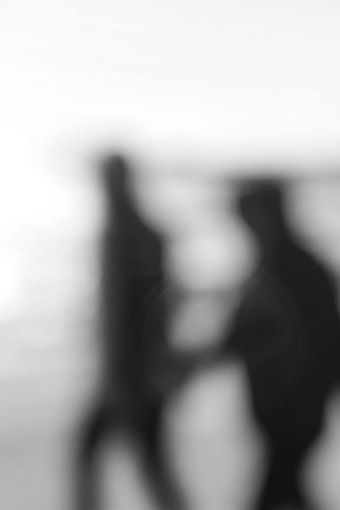
I believe this pair of images from my looking and seeing project, and my Ralph Eugene Meatyard inspired photoshoot, best display the formal elements of light and space through experimentation with focus. This is due to the fact I have used the overexposed light in the background to strongly contrast with the dark figures in the foreground. Also, using the Aperture priority setting on my camera I was able to take blurred photographs similar to Meatyard’s work.
Alfred Stieglitz Images
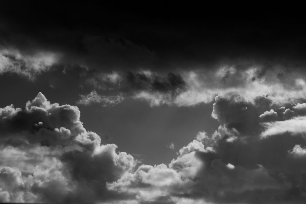
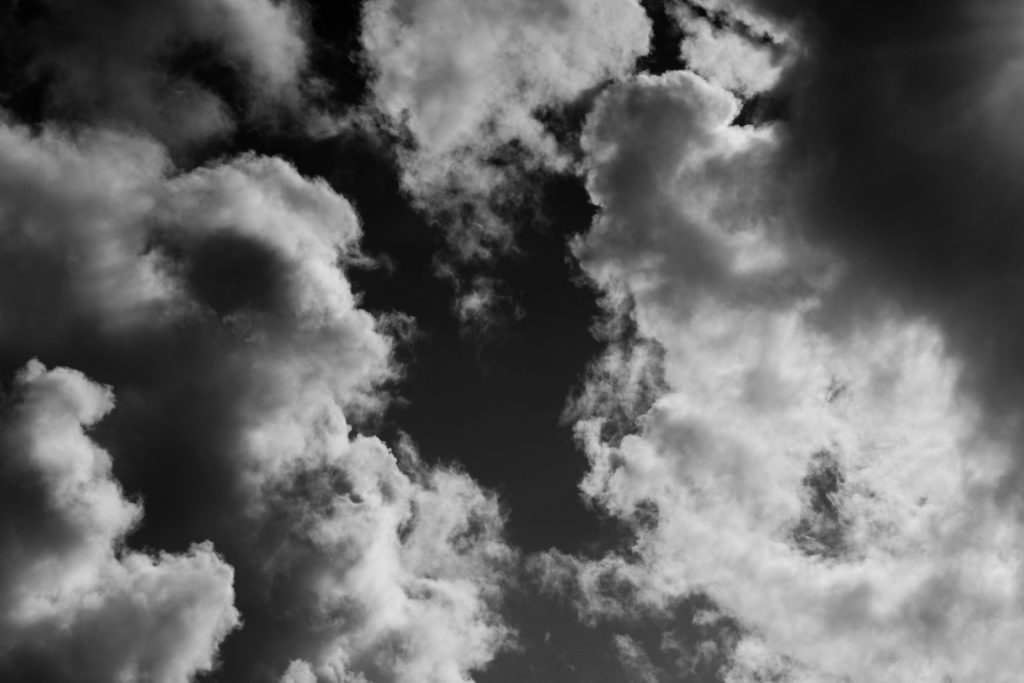
I believe that this pair of photos from my Repetition, Pattern, Rhythm, Reflection and Symmetry project, and the Alfred Stieglitz style photoshoot best display the formal element of repetition. This is as the clouds in the images create ever changing shapes and patterns that incorporates a unique texture to the pieces. Also by adjusted the white balance on my camera settings every now and then, I was able to take clear and sharp photos whilst the brightness continuously changed due to the clouds.
Albert Renger-Patzsch Images
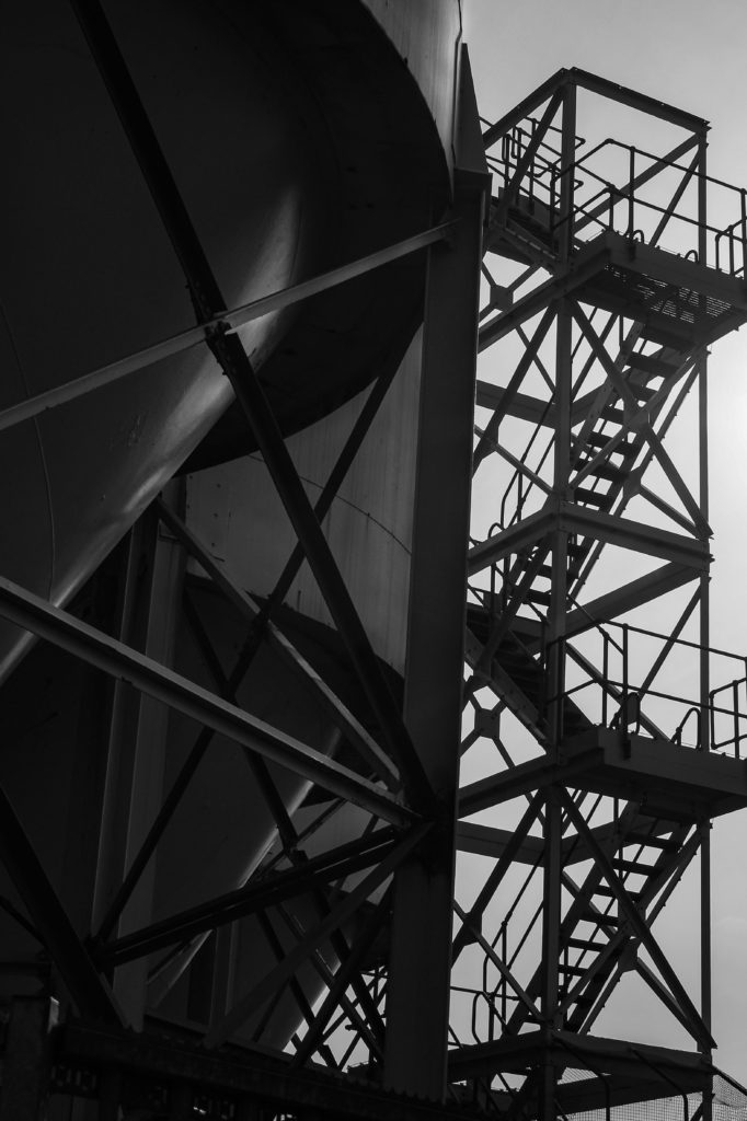
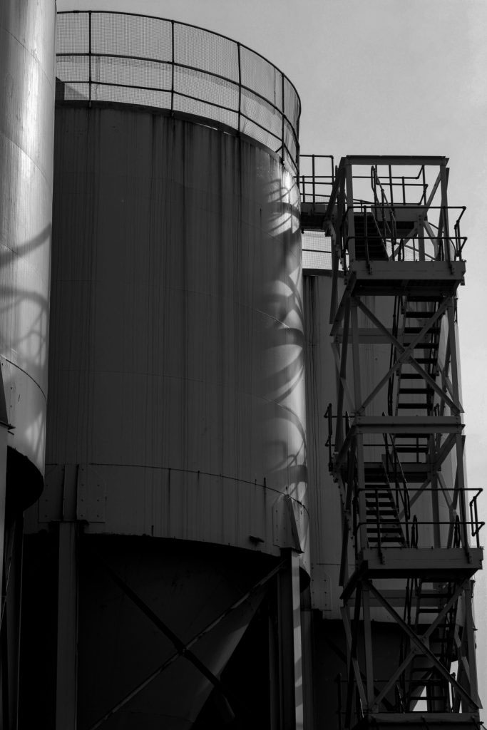
I believe that these images from my Albert Renger-Patzsch inspired photoshoot, best showcase the formal elements of line and shape. This is as the industrial structures create geometric patterns within the lines of the framework. By taking photos of architecture which could be perceived as mundane, I replicated Patzsch’s New Objectivity style of work.
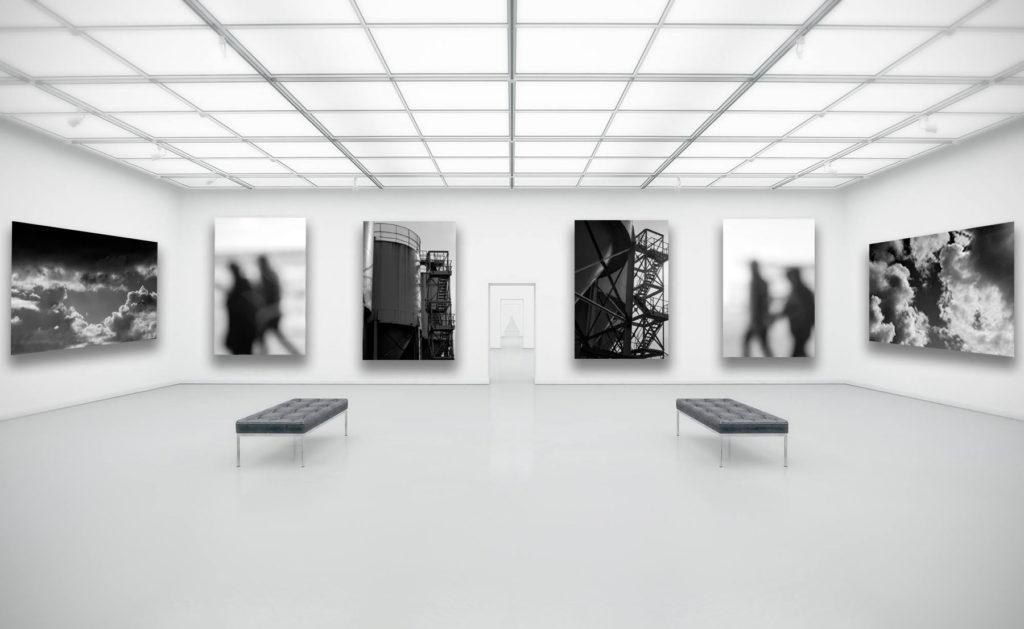
I selected these images to display in my gallery together as I believe that they best showcased the style and my understanding of the photographers I studied. These being my two cloud photos from my Alfred Stieglitz shoot, the two industrial architecture photos from my Albert Renger-Patzsch shoot, and two of my blurred images from my Ralph Eugene Meatyard inspired shoot. These images are all linked by the formal element of colour, this is as they have all been edited to be black and white.
To get these images into this format I first chose an empty gallery space image from the internet that matched the tones of my final images, and then uploaded it to Photoshop. I then dragged in my selected photos to the gallery, and then made the decision to have the four portrait image facing forwards, and the landscapes to the side, creating an almost symmetry. I also alternated the industrial and blurred images to allow the space to feel well balanced in tones. In order to create a more realistic look, I then edited in a drop shadow for each image in the opposite direction of the light source.