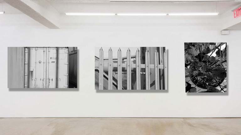

I chose these 3 images as they all are focused on the difference focus can make. I like the first image as the bars in front are out of focus but the container behind the bars are in focus creating a sense of looking into something. The other 2 images are very in focus and focus on specific points.
All these images are in black and white to create a more old , eery look to them.
I chose these images to go together as I felt they were all similar in the sense that they all focused on one object and made one object the centre of the images.

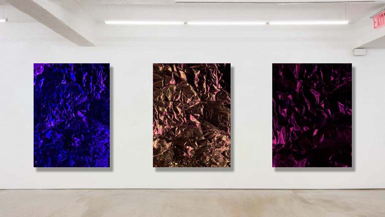
I chose this set of images as I like the shadows created from the angle of the lighting. The shadows create creases and create a sense of depth in the images. All the colours in the 3 images contrast each other and create a nice sequence.
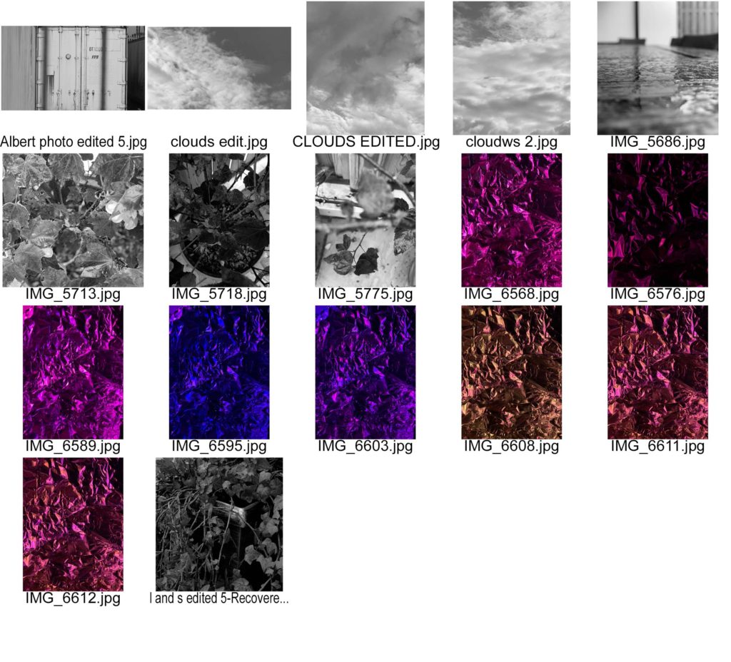
I used artificial lighting to create these images as I liked how the different colours created different feelings for the viewer. The different colours also highlights different points of the tin foil highlighting different parts in each image.

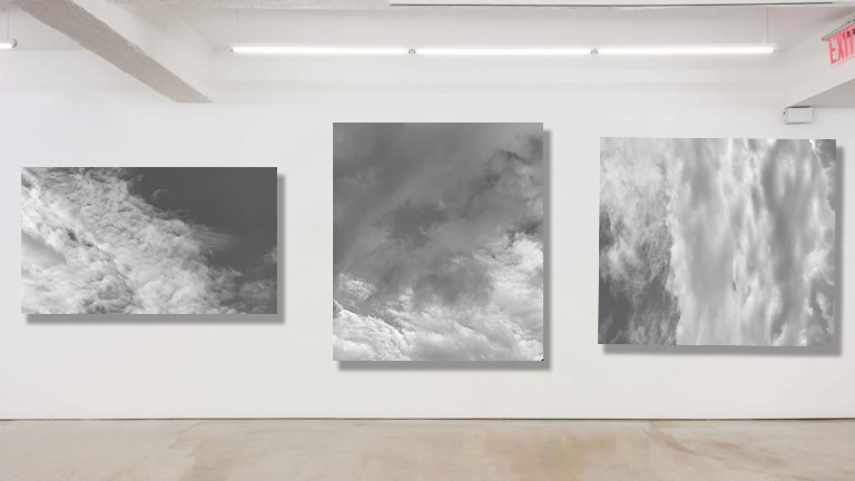
For this set of images I got inspiration from Alfred Stieglitz shoot ‘Equivalent’. This was a shoot focusing on different patterns in the sky. All his images were black and white making the sky look very sinister. I chose to use these images of patterns in clouds as I found all the different patterns intriguing and how Alfred could make the sky look so sinister and dark. These were my final images as they were the most abstract looking.
There is different tones of grey’s and I like how to dark’s and lights contrast each other creating patterns and shapes.
