Selected Images – Water & Reflections
Selected Images – Nature & Aperture
Selected Images – Saul Leiter & Shutter Speed
Gallery Presentation

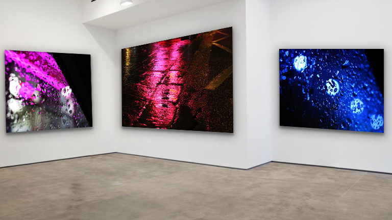
I have chosen this set of 3 images because I believe they link to each other well and hold many photographic techniques. For example, these images have a rough rigid texture due to their uneven surfaces. The repetition of water in the photos produces a 3D-like effect and show rhythm & movement. Additionally, each image has a bold dominant colour. The raindrop photograph on the left has a dominant magenta colour which creates an eye catching effect next to the dark black shadows that diagonally fall beside it. The central image has a warmer pink dominant tone which stretches from the top to the bottom of the photo. This bold colour is reflected on to the street puddle, creating a river-like effect and a main focal point for the observer. The far right image has a dominant blue colour, which creates a cooler temperature in the image. Furthermore, each image has a diagonal composition which captures the bright artificial light in an abstract way. The high contrast between highlights and shadows in these photos draw focus towards the center of the images. I think this series of vibrant and textured images form a striking display, sure to capture people’s attention.

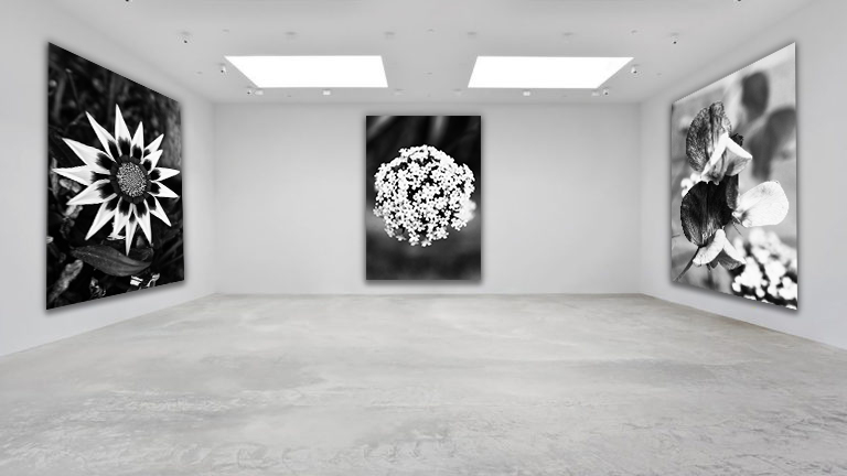
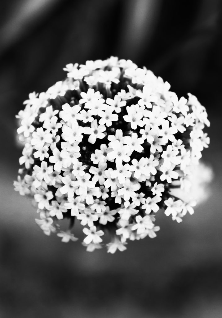
Secondly, I have chosen these 3 nature-based images as I like the similarities and techniques they hold. In each image I have captured a singular flower using a low aperture setting to let it have complete focus. I really like the way these images show a shallow depth of field because of their harshly blurred backgrounds. Additionally, I have edited this set of images with a black and white filter as they reflect the work of Albert Renger-Patzsch. Furthermore, I enjoy the way each image links to one another in terms of composition. The main floral subject of my images falls directly in the centre of the frame, creating a clear focal point for the observer. Also, the main subjects in the images all have a similar circular shape which adds to the organic natural mood of the photos. I have also arranged these images in a dark to light gradient pattern, with the far left image holding the most shadows and the far right holding more highlights. The high contrast in these images really mirrors Patzsch’s work and creates a dramatic series of compelling photos.

Finally, I have chosen this set of 4 images to present in a gallery format because of their link to Saul Leiter’s ‘Red Umbrella’ work. One thing I enjoy about these photographs is the repeated motif subject which can be spotted in all images. I think this adds a sense of atmosphere and story to this series as it is like we travel with the umbrella, visiting new locations and scenes. Another thing I really like about this series of images is the clear focal points they hold. The striking colour of the red umbrella draws the observer’s attention while still allowing them to take in the whole mood of the image. Moreover, these images work well together because of their warm temperature and range of hot colours, which creates a cosy atmosphere. In addition, these images hold lots of experimentation with shutter speed and aperture which reflect Leiter’s abstract way of capturing photographs. I really like how this series of images has turned out in this gallery setting as I believe their bright saturated colours and abstract subjects create an eye-catching display.


